25 French Country Kitchen Ideas for Renovators Who Want Something That Actually Lasts
There is a quiet distinction between kitchens that are designed to impress and those that are built to endure. French country kitchens, at their best, belong firmly in the latter category. They rarely announce themselves. Instead, they settle into a home with a kind of ease that feels almost inevitable, as though they have always been there and will continue to be long after more fashionable schemes begin to feel tired.
What I have seen, time and again, is that longevity in kitchen design is not a matter of style alone. It is rooted in decisions that sit beneath the surface. The difference between aesthetic imitation and structural authenticity becomes immediately apparent over time. A kitchen that merely borrows the visual cues of French country design, painted cabinetry, rustic beams, a few antique accessories, may feel convincing at first glance. But without the underlying logic of proportion, material honesty, and spatial flow, it often reveals itself as a pastiche. It performs the look, but it does not live it.
Authentic French country kitchens are shaped by how they function day to day. Work surfaces are positioned with intention, often allowing for generous movement, typically in the range of 100 to 120 cm between key zones, so the space feels accommodating rather than compressed. Materials are selected not for perfection, but for how they respond to use. Natural stone, usually around 30 to 40 mm thick, develops subtle markings over time. Timber cabinetry carries variation in grain and tone, softening rather than deteriorating. These are not incidental choices. They are what allow the kitchen to evolve without losing its coherence.
This is precisely why French country design resists obsolescence. It is not anchored to a moment. It draws from a language of materials and forms that have already proven their longevity. Limewashed walls diffuse light gently across the day, avoiding the flatness that often dates painted finishes. Flooring, whether terracotta or worn stone, grounds the room with a sense of permanence. Even the imperfections, the slight irregularities in texture, the softened edges, begin to feel like assets rather than flaws as the years pass.
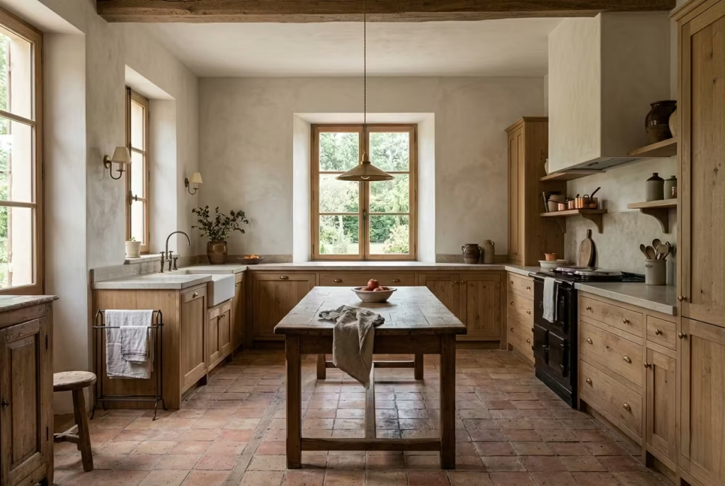
In practice, the kitchens that age best are rarely the ones that try to capture attention. I remember working on a project where the client initially leaned toward a more polished interpretation, sleek cabinetry, uniform finishes, very controlled detailing. It looked composed, but it felt oddly fixed, as if there was no room for the space to breathe or adapt. Over time, we shifted the approach.
We introduced a freestanding table in place of a rigid island, widened the circulation paths to just over 110 cm, and chose materials that would carry subtle variation rather than uniformity. The result was not dramatic in the conventional sense, but it had a quiet confidence. A few years later, it has only improved. The surfaces have softened, the layout continues to support daily life without friction, and nothing feels out of place.
That, ultimately, is the measure of a lasting kitchen. It does not rely on novelty to remain relevant. It becomes part of the rhythm of the home, absorbing use, light, and time without resistance. French country kitchens achieve this not by trying to stand out, but by understanding, with remarkable clarity, when to step back.
What “Lasting” Really Means in Kitchen Design
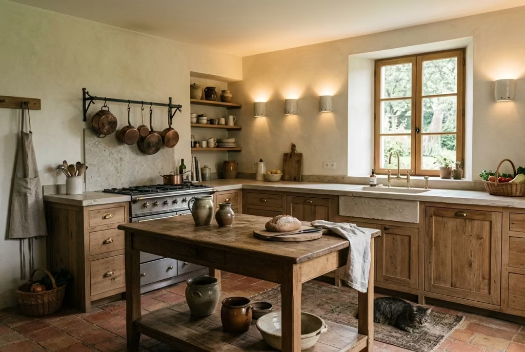
Lasting design is often reduced to durability, as if the only measure of success is how well a surface resists wear. In reality, the kitchens that endure are not simply the ones that survive daily use. They are the ones that continue to feel right, years after the initial decisions have settled in. A lasting kitchen holds its ground both physically and emotionally. It adapts quietly, absorbs change, and remains relevant without needing to reinvent itself every few seasons.
Beyond durability: emotional longevity, patina, and adaptability
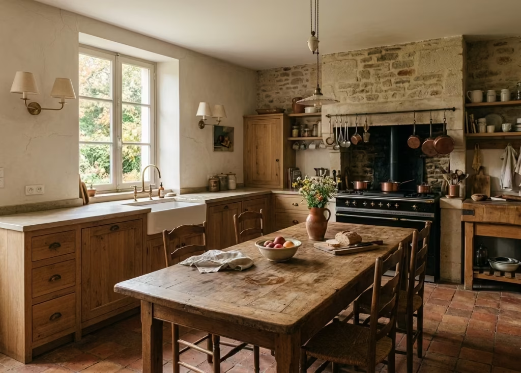
Durability is the baseline. Emotional longevity is the real benchmark: A kitchen may remain structurally intact for decades, yet still feel dated or disconnected within a few years. I have walked into spaces where the cabinetry was technically flawless, finishes still intact, surfaces barely marked, and yet the room felt curiously lifeless, almost as if it had been paused in time. That is the difference between something that lasts and something that lingers.
Emotional longevity comes from how a space evolves with its occupants. In one project, we designed a kitchen around a central oak table, approximately 200 cm by 90 cm, instead of a fixed island. Initially, it served as a preparation surface. Over time, it became a place for informal dining, work, and gathering. The edges softened, the surface developed subtle marks, and the table began to tell its own story. Nothing about it felt worn out. It felt lived in, in the best possible sense.
Patina plays a central role here. It is not deterioration, it is transformation. Natural stone worktops, typically 30 to 40 mm thick, develop slight etching and tonal shifts. Timber cabinetry gains depth as light and use interact with the grain. These changes, when anticipated and embraced, add a layer of authenticity that no new installation can replicate.
Adaptability sits alongside this. A lasting kitchen does not lock you into a rigid way of living. Circulation zones, ideally between 100 and 120 cm, allow movement to remain comfortable even as routines shift. Storage that is deep and flexible, such as larder cabinets between 60 and 80 cm in depth, accommodates changing needs without requiring structural alterations. In simple terms, the kitchen grows with you rather than working against you.
Pros
- Develops character over time rather than declining
- Supports evolving lifestyles without major renovation
- Feels personal and grounded
Cons
- Requires a mindset shift away from perfection
- Some materials demand acceptance of visible wear
The role of natural materials and restrained palettes
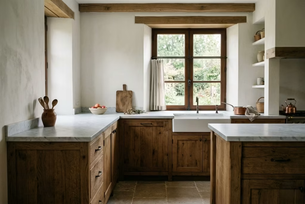
If longevity has a language, it is spoken through materials: Natural materials carry an inherent variability that manufactured finishes often lack. Stone, timber, lime-based plasters, each responds to light, temperature, and touch in subtle ways. This responsiveness keeps the space visually active, even within a restrained palette. It is a quiet kind of richness, one that reveals itself gradually rather than all at once.
I tend to specify limestone or marble for worktops where appropriate, usually honed rather than polished, at a thickness of around 30 mm. The finish diffuses light rather than reflecting it sharply, which helps the surface settle into the room. For cabinetry, solid or veneered timber with visible grain, often oak or chestnut, introduces depth without relying on contrast.
Colour, in this context, is handled with restraint. Chalky whites, muted greys, soft earth tones such as sage or clay, these shades sit comfortably across changing light conditions. They do not fight for attention, which is precisely why they endure. A palette that whispers, rather than shouts, tends to age far more gracefully.
There is also a practical dimension. Natural materials often age more forgivingly. Minor marks blend into the overall texture rather than standing out. A painted synthetic surface, by contrast, tends to highlight every imperfection once it begins to wear.
Pros
- Ages gracefully with minimal visual disruption
- Creates depth without reliance on trends
- Enhances light quality throughout the day
Cons
- Higher upfront cost in many cases
- Requires informed sourcing and skilled installation
Why imperfection often outperforms precision over time
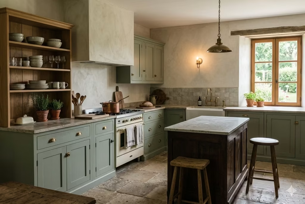
Precision has its place, but in kitchen design, too much of it can feel brittle. A perfectly uniform space often struggles to absorb the realities of daily life. The moment something shifts, a surface marks, a finish dulls, the entire composition can feel compromised.
Imperfection, when considered carefully, offers resilience: In one renovation, we deliberately avoided perfectly aligned cabinetry runs. Instead, we introduced slight variation through freestanding elements and open shelving. The result was a kitchen that felt composed but not rigid. When everyday life inevitably introduced small inconsistencies, nothing felt out of place. The design had already made room for them.
This approach is particularly relevant in finishes. Hand-applied plaster walls, for instance, create subtle tonal movement. Tumbled stone flooring, often in tiles ranging from 20 to 40 cm, introduces variation in edge and surface. Even hardware, such as unlacquered brass, evolves naturally, shifting in tone over time rather than remaining static.
There is an old idea that comes up often in practice: do not put all your eggs in one basket. In design terms, it translates to avoiding over-reliance on a single perfect element. When every part of the kitchen carries a degree of softness or variation, the space becomes far more forgiving. It holds together, even as individual elements change.
Pros
- Greater tolerance for everyday wear
- Feels authentic and relaxed rather than staged
- Reduces visual stress over minor imperfections
Cons
- Requires careful balance to avoid looking unresolved
- Demands confidence in design decisions
A lasting kitchen, in essence, is not one that resists time. It is one that collaborates with it. When materials, layout, and detailing are chosen with that in mind, the result is a space that does not need constant correction. It settles, it adapts, and over time, it becomes something far more valuable than new.
The Foundation Layer Layout Decisions That Anchor the Space
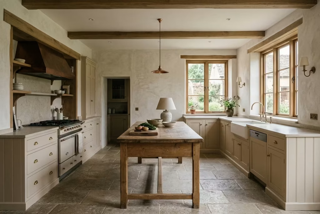
Before materials, colours, or decorative elements enter the conversation, the success of a kitchen is quietly decided in its layout. This is the layer that rarely draws attention, yet it carries the entire weight of how the space will function, feel, and endure over time.
I have seen beautifully finished kitchens fall short simply because the underlying plan was compromised, circulation too tight, work zones awkwardly placed, or proportions slightly off, enough to create friction in daily use.
A well-considered layout, by contrast, tends to disappear into the background in the best possible way, allowing movement to feel natural and unforced. It sets the rhythm of the room, almost like an invisible framework, shaping how light travels, how people gather, and how the space adapts as life inevitably shifts around it.
Generous Work Zones That Allow Movement, Not Just Function
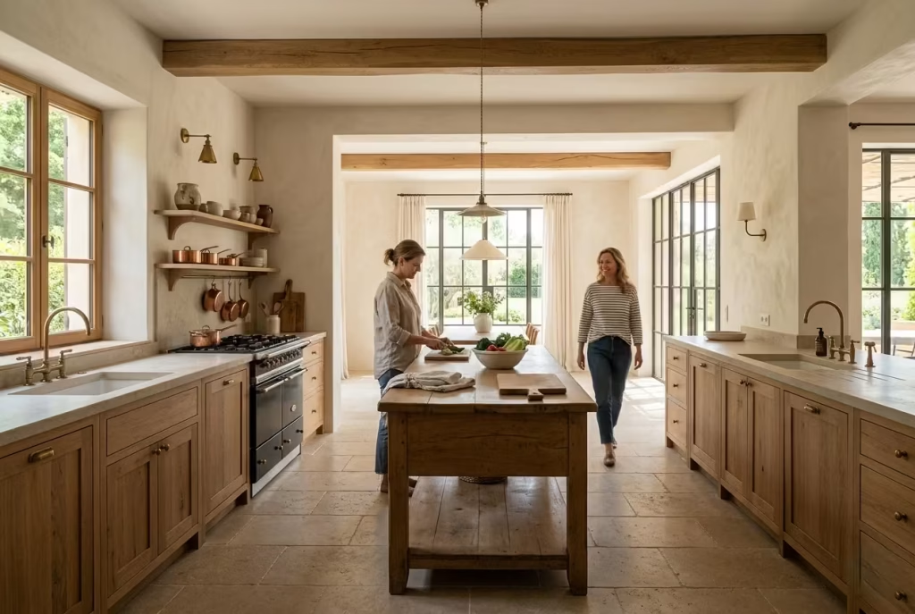
There is a noticeable difference between a kitchen that technically works and one that feels effortless to move through. Generous spacing is often the quiet factor that separates the two. When I plan French country kitchens, I rarely treat circulation as leftover space. It is the backbone of how the room will live day to day. Keeping a distance of around 100 to 120 cm between opposing counters or key work zones allows the kitchen to breathe. It gives enough room for two people to pass without hesitation, for doors and drawers to open without conflict, and for the space to feel accommodating rather than restrictive.
I learned this the hard way early in my career. One project, modest in size, was designed with tighter clearances, closer to 85 cm in places. On paper, it seemed efficient. In reality, it quickly became a pinch point. Every movement felt negotiated. Cooking alongside someone else turned into a subtle dance of stepping aside, shifting position, adjusting constantly. It did the job, but it never felt settled. By contrast, when we later reworked the layout and pushed the spacing just beyond 105 cm, the entire experience changed. The kitchen stopped feeling like a corridor and started behaving like a room.
What makes this particularly relevant in French country design is the emphasis on ease and informality. These kitchens are not meant to feel rigid or overly optimised. They should carry a sense of openness, where movement happens naturally, almost without thinking. A slightly wider passage, considered early on, can quietly transform how the space is used for years to come. It is one of those decisions that pays dividends long after the dust has settled.
From a practical standpoint, this spacing also supports long-term usability. As needs evolve, whether it is accommodating family, entertaining guests, or simply allowing for a slower pace of living, the kitchen continues to perform without feeling strained. It is a case of giving the space a bit of breathing room now, so it does not feel boxed in later.
Pros
- Enhances daily comfort, especially in multi-user kitchens
- Reduces friction between work zones, making cooking feel more fluid
- Supports long-term adaptability as household needs change
Cons
- Demands careful planning in smaller footprints where every centimetre counts
- May require compromises in cabinetry depth or storage quantity to maintain proper clearance
In many ways, generous spacing is not about adding more, it is about allowing what is already there to function better. When a kitchen flows without resistance, it tends to feel right, even if you cannot immediately explain why.
You May also Like: 25 Black Kitchen Cabinet Design Ideas That Transform Your Kitchen
Freestanding Furniture Layouts Instead of Fully Fitted Units
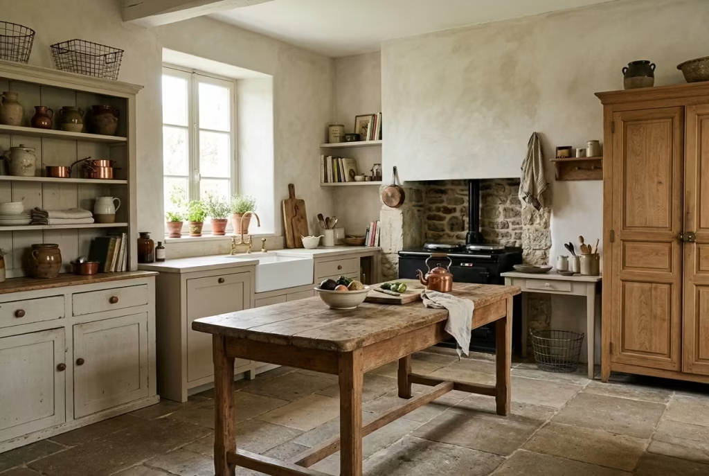
A fully fitted kitchen can feel resolved the moment it is installed, but that sense of completion often comes at a cost. It leaves little room for the space to evolve. Freestanding furniture introduces a different rhythm altogether. It breaks the visual rigidity of continuous cabinetry and allows the kitchen to feel assembled over time rather than delivered in one sweep. In French country design, this layered approach is where much of the character quietly emerges.
In practical terms, I still work within familiar dimensions. A standard depth of around 60 cm, or 24 inches, remains a reliable baseline for work surfaces and storage. The difference lies in how that depth is handled. Instead of maintaining a perfectly aligned run, I often interrupt it intentionally. A slightly shallower dresser here, a deeper antique cupboard there, perhaps extending to 65 or even 70 cm in certain sections, creates a gentle variation that feels far more natural to the eye. It is a subtle move, but one that stops the kitchen from feeling like a single, monolithic block.
I tend to introduce antique or semi-custom pieces whenever the space allows. Not as decorative gestures, but as working elements within the kitchen. A reclaimed oak cabinet, slightly irregular in its proportions, can house everyday crockery just as effectively as any modern unit. A freestanding prep table, often around 180 cm long and 80 to 90 cm deep, can anchor the room while remaining flexible in use. These pieces bring with them a sense of history, even if newly made, that cannot be replicated through uniform joinery alone.
There is also a psychological shift that happens in these spaces. When everything is built-in, the kitchen can feel fixed, almost set in stone. Freestanding elements soften that perception. They suggest that the room can adapt, that it is not locked into a single way of living. It is the difference between a space that feels staged and one that feels lived in, as if it has been gathered piece by piece over time.
That said, this approach does ask for a more considered hand behind the scenes. Services such as plumbing, electrics, and ventilation need to be carefully coordinated so they do not disrupt the visual calm. It is not a case of placing furniture freely and hoping for the best. Each piece still needs to earn its place, both functionally and proportionally.
Pros
- Introduces flexibility, allowing the kitchen to adapt over time
- Adds depth and character through variation in form and material
- Creates a more relaxed, collected atmosphere rather than a fixed installation
Cons
- Requires precise planning to integrate appliances and services seamlessly
- Can reduce the efficiency of storage if not carefully balanced
When done well, a freestanding layout feels less like a design decision and more like a natural evolution. The kitchen begins to tell its own story, not all at once, but gradually, as each element settles into place.
Central Tables Over Islands Where Space Allows
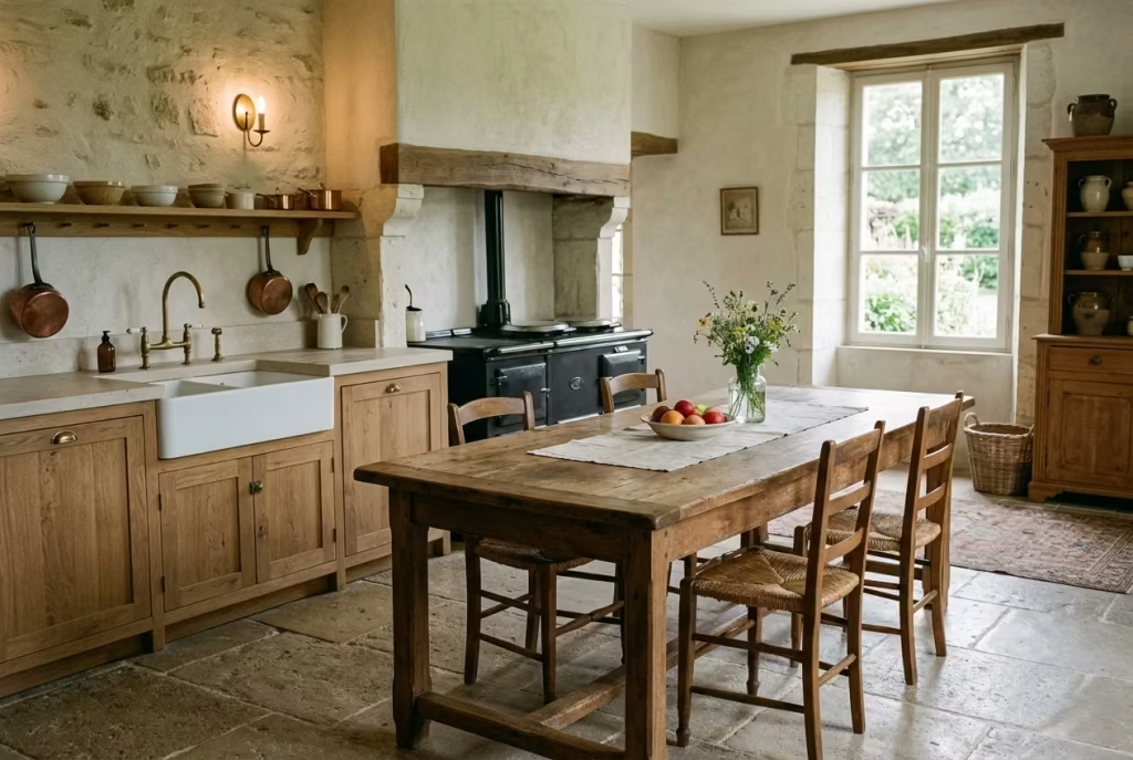
The kitchen island has become almost automatic in modern planning, but it is not always the most enduring solution. In French country kitchens, a central table often carries far more weight, both functionally and atmospherically. It shifts the focus from fixed utility to lived experience. Rather than anchoring the room with something permanent and immovable, a table introduces a sense of openness, as if the space can adapt at a moment’s notice.
A well-proportioned farmhouse table, typically between 180 and 240 cm in length and around 85 to 95 cm in width, sits comfortably at the centre without overwhelming the room. What matters just as much is the clearance around it. I aim for at least 100 to 110 cm on all sides so movement never feels restricted. When that balance is right, the table becomes more than a surface. It turns into the heart of the kitchen, where preparation, dining, conversation, and even the occasional bit of work happen without the space feeling over-programmed.
I often encourage clients to think of this choice as a shift in mindset. An island tends to define how a kitchen should be used. A table, on the other hand, leaves the door slightly ajar. One day it hosts a quiet breakfast, the next it becomes a place for rolling dough or gathering with friends. It wears many hats, and does so without drawing attention to itself. In one project, we introduced a reclaimed oak table at roughly 200 cm long. Initially, the client worried about losing the structure an island provides. Within weeks, it became the most used surface in the house. Meals lingered longer, conversations stretched out, and the kitchen felt less like a workstation and more like a living space.
There is also something to be said about the visual softness a table brings. Unlike an island, which often reads as a solid block, a table allows light to pass beneath and around it. This small detail can make a noticeable difference, especially in kitchens where natural light is limited. The room feels lighter on its feet, less anchored, more at ease.
Of course, this approach is not without compromise. A table does not offer the same level of concealed storage as a built-in island. It asks you to be more deliberate elsewhere, perhaps through deeper perimeter cabinetry or a well-designed larder. It is a case of robbing Peter to pay Paul, but when handled carefully, the trade-off often feels worthwhile.
Pros
- Encourages a more social, relaxed way of using the kitchen
- Adapts easily to different activities without feeling forced
- Softens the visual weight of the room, allowing light and movement to flow
Cons
- Provides little to no hidden storage compared to an island
- Requires strong supporting storage planning around the perimeter
When space allows, a central table brings a kind of quiet generosity to the kitchen. It does not dictate how the room should behave. Instead, it invites life to unfold naturally around it, which, in the long run, is what makes a space truly last.
Material Language Surfaces That Improve With Age
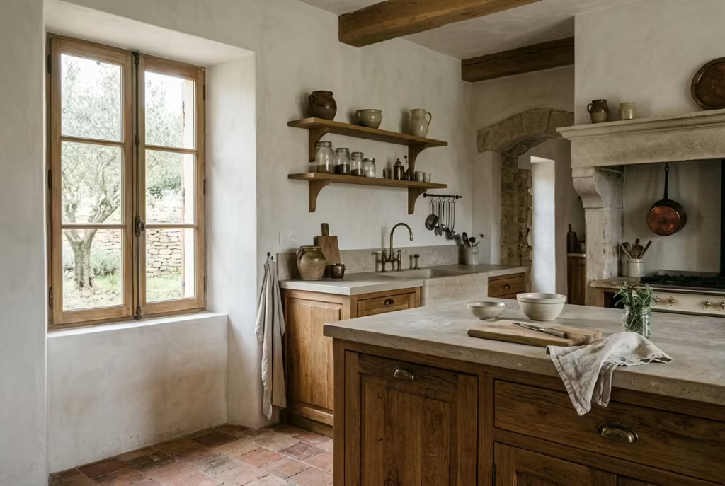
If layout sets the foundation, materials decide whether a kitchen merely survives or genuinely matures. This is where longevity stops being theoretical and becomes tangible. Surfaces are not static; they respond to light, touch, and daily use, slowly revealing their character over time.
I have found that the most enduring kitchens rely on materials that welcome this process rather than resist it. Stone that softens, timber that deepens, finishes that develop nuance instead of fading flat.
When chosen with restraint and a clear understanding of how they will age, these elements do more than hold up, they settle in, almost like a well-worn path that only becomes more convincing with every step.
Natural Stone Worktops That Wear In, Not Out
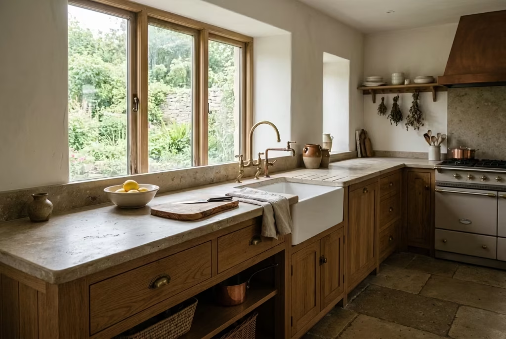
Natural stone is one of those rare materials that does not simply occupy a kitchen, it evolves with it. Unlike synthetic surfaces that aim to stay visually unchanged, stone accepts time as part of its design language. Limestone, marble, and soapstone each carry their own temperament, yet they share the same fundamental quality: they develop character rather than resisting it. In a well-considered French country kitchen, this is exactly what gives the space its quiet authority.
When I specify stone worktops, I typically work within a thickness range of 30 to 40 mm, or roughly 1.2 to 1.6 inches. This proportion feels grounded without becoming visually heavy. It anchors the cabinetry beneath it and creates a sense of permanence that lighter surfaces often struggle to achieve. The edge detail matters just as much as the material itself. A softly eased or slightly rounded edge tends to age more gracefully than a sharp, over-defined profile, which can start to feel brittle over time.
What makes natural stone so compelling is its ability to wear in rather than wear out. A marble surface, for example, will gradually develop a soft patina, particularly in high-use areas near sinks and preparation zones. Rather than seeing this as damage, I tend to view it as the surface settling into its role. Soapstone behaves differently again, darkening subtly and developing a velvety depth that feels almost tactile in low light. Limestone, with its gentle variation, absorbs the rhythm of daily life in a way that feels understated but deeply authentic.
I remember a project where a client initially hesitated over marble, concerned about staining and etching. Over time, those early imperfections became part of the kitchen’s identity. What started as hesitation slowly turned into appreciation, as the surface began to reflect how the space was actually lived in, not just how it looked on installation day. It was a classic case of letting go of perfection and allowing character to take the lead.
That said, stone is not without its demands. It requires a degree of acceptance, even discipline in how it is used. Acidic spills, heavy impacts, and neglect will leave their mark more readily than on engineered alternatives. It is not a surface that forgives carelessness. But for those willing to embrace its nature, it rewards in ways that manufactured materials rarely can.
Pros
- Develops a natural patina that adds depth and authenticity over time
- Introduces a sense of permanence and craftsmanship to the kitchen
- Each surface becomes unique, shaped by real use rather than repetition
Cons
- Sensitive to staining, etching, and acidic substances
- Requires informed maintenance and a more mindful approach to daily use
In many ways, natural stone teaches a quiet lesson. It reminds us that longevity is not about resisting change, but about absorbing it gracefully, until the surface itself becomes a record of life lived well within the space.
Aged Timber Cabinetry With Visible Grain
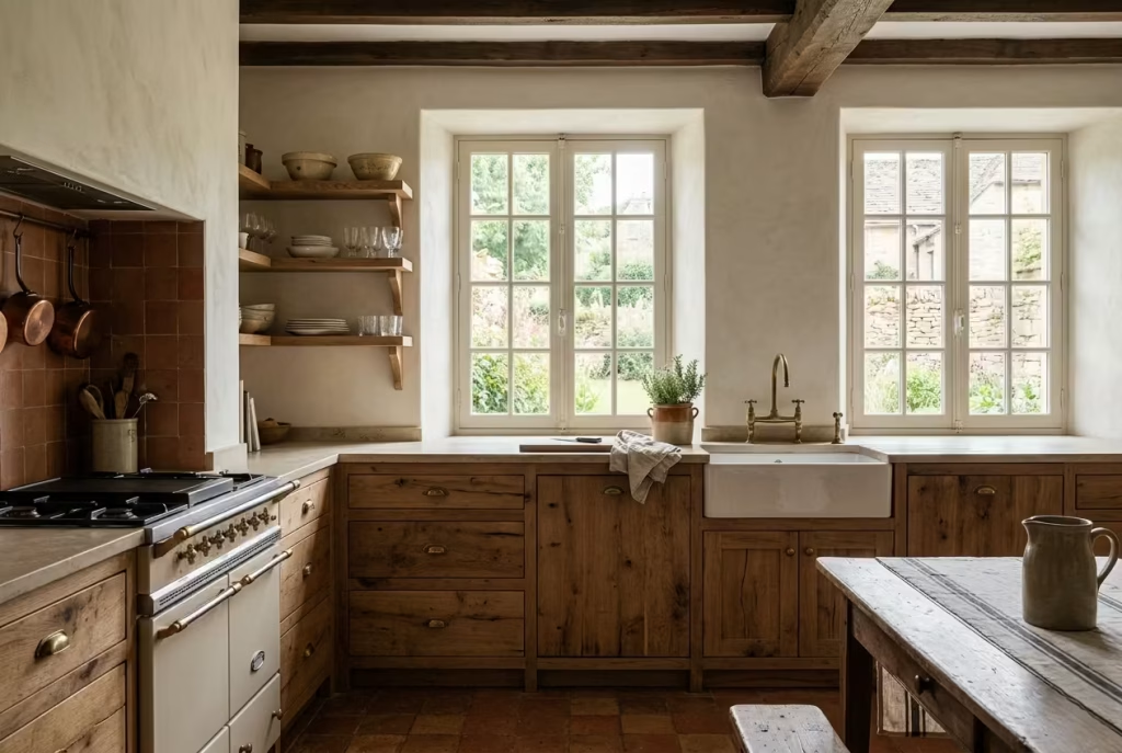
Timber cabinetry is where a kitchen quietly shifts from being designed to being felt. There is a distinct difference between a surface that simply covers storage and one that carries depth, texture, and a sense of time within its grain. Aged timber, whether oak, chestnut, or reclaimed pine, does not try to hide its story. It wears its character openly, and that honesty is precisely what allows it to sit so comfortably within French country design.
When I work with timber cabinetry, I tend to favour species like oak for its stability and fine, structured grain, chestnut for its softer tonal variation, and reclaimed pine when a more rustic, time-worn presence is needed. The key is not uniformity but controlled variation. Grain direction, tonal shifts, and even subtle imperfections are not flaws to eliminate, they are the very elements that prevent the kitchen from feeling sterile or over-produced.
In practical terms, I often avoid overly processed finishes. A lightly oiled or matte-surfaced timber, rather than a high-gloss lacquer, allows the material to breathe visually. Cabinet depths usually sit around 60 cm, but I am not afraid to break that rhythm slightly, introducing shallower sections or deeper pantry elements where the design calls for it. This variation keeps the eye moving, which in turn prevents the kitchen from feeling static or overly symmetrical.
I recall a renovation where reclaimed oak was used across the lower cabinetry. At first glance, the variation in tone between the panels felt almost too pronounced for the client. But once installed and lived with, the space transformed. Light interacted differently across each door face throughout the day, creating a subtle play of shadow and warmth that no factory-finished surface could replicate. Over time, the timber mellowed further, settling into the architecture like it had always belonged there.
What makes aged timber so effective is its ability to soften a space without dulling it. It brings warmth, yes, but also a quiet depth that grounds everything around it. In kitchens dominated by stone and plaster, it acts almost like a counterbalance, absorbing light rather than reflecting it, which helps prevent the room from feeling visually cold or overly formal.
Of course, working with natural or reclaimed timber is not without its challenges. Variation in grain, tone, and even structural behaviour means sourcing must be handled with care. Not every batch will align perfectly, and that is where experience becomes critical. The goal is not to force uniformity, but to curate variation so it feels intentional rather than accidental.
Pros
- Introduces natural warmth and tactile depth that synthetic finishes struggle to replicate
- Ages gracefully, often improving in character with use and exposure
- Creates a grounded, lived-in atmosphere that feels authentic over time
Cons
- Requires careful sourcing to manage variation in tone and grain
- Can be less predictable in finish consistency compared to manufactured cabinetry
When handled with restraint and a steady design hand, aged timber cabinetry becomes more than storage. It becomes the quiet backbone of the kitchen, steady, unpretentious, and increasingly beautiful the longer it is lived with.
Limewashed or Textured Wall Finishes
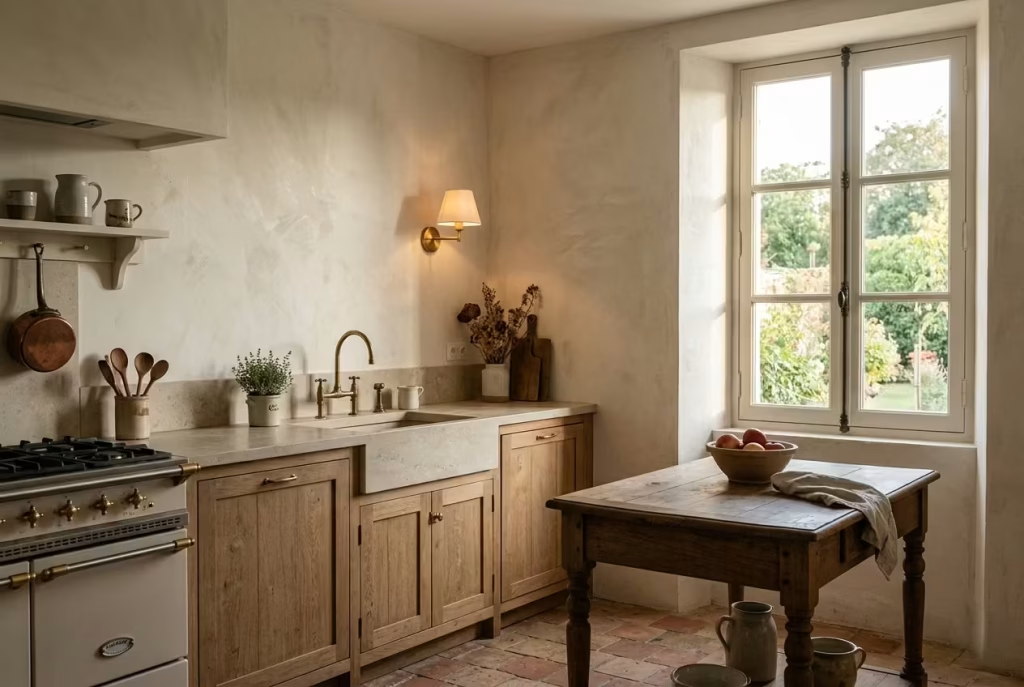
Wall finishes are often treated as a backdrop decision, yet in French country kitchens they quietly influence everything else in the room. Limewash, in particular, changes the way light behaves across a surface, softening it almost instinctively, as if the walls themselves are gently breathing with the space. Unlike flat paint, which can sometimes feel sealed and static, limewashed or mineral-based finishes carry a subtle movement that becomes more noticeable the longer you live with them.
There is a distinct difference between a surface that simply covers and one that participates in the atmosphere of a room. Limewash sits in the latter category. It is breathable, both literally and visually, allowing walls to retain a sense of texture and depth rather than flattening them into a uniform plane. In practical terms, I often specify it in kitchens where natural materials like stone and timber are already doing a lot of visual work. It acts as a soft counterbalance, ensuring the room never feels overly dense or visually heavy.
One of the most compelling qualities of textured finishes is how they interact with light throughout the day. Morning light tends to skim across the surface, revealing gentle variations in tone. By late afternoon, the same wall can feel warmer, almost enveloping. It is not dramatic in the conventional sense, but it creates a living quality that shifts subtly as the day unfolds. In one project, a south-facing kitchen with limewashed walls took on an almost golden haze in the evenings, softening the entire atmosphere without a single change in lighting design.
From a technical perspective, limewash is typically applied in multiple thin coats, often allowing the underlying surface to remain slightly visible. This is where its character comes from. It does not try to hide imperfections entirely, instead it absorbs them into its finish. That quality alone makes it incredibly aligned with French country interiors, where restraint and imperfection are often more valuable than precision.
I have seen clients initially hesitate with this finish, mainly because it does not offer the uniformity of standard paint. But once installed, it tends to shift perception quickly. The slight variation in tone and texture stops feeling irregular and starts feeling intentional, almost like the room has been softened rather than decorated.
That said, limewashed and textured finishes are not without their demands. They require a more skilled hand during application, and touch-ups are not as straightforward as repainting a flat wall. It is a finish that rewards patience and proper craftsmanship rather than quick fixes.
Pros
- Creates a soft diffusion of natural light that enhances atmosphere
- Adds depth and subtle variation without relying on colour or ornament
- Ages gracefully, often becoming more visually interesting over time
Cons
- Requires skilled application to achieve a balanced, consistent finish
- Less straightforward to repair or match compared to standard painted surfaces
In many ways, limewash is less about covering a wall and more about letting it participate in the life of the kitchen. It settles into the background, yet quietly shapes the mood, proving that sometimes the most powerful design moves are the ones that speak the softest.
Terracotta or Tumbled Stone Flooring
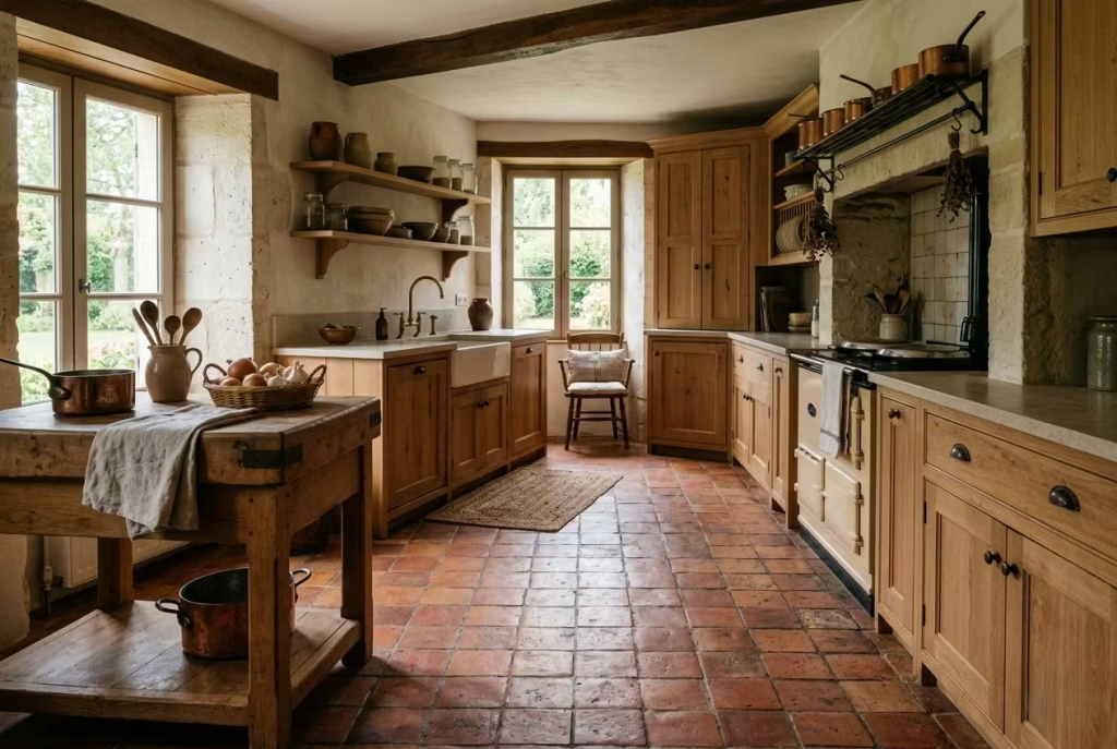
Flooring is often the quietest decision in a kitchen, yet it is the one that anchors everything else. In French country interiors, terracotta or tumbled stone rarely behaves like a backdrop. Instead, it sets the tone from the ground up, both visually and physically, giving the room a sense of weight that feels reassuring rather than heavy. It is the kind of surface that does not compete for attention, yet somehow holds the entire composition together.
In terms of proportion, I tend to work with tiles in the range of 20 to 40 cm, or roughly 8 to 16 inches. This scale feels balanced in most kitchen footprints, offering enough variation in joint lines to create texture without becoming visually busy. Larger formats can sometimes feel too contemporary for this style, while smaller tiles risk overcomplicating the rhythm of the floor. It is a subtle calibration, but one that has a noticeable impact on how grounded the space feels once installed.
Terracotta, in particular, brings a warmth that is difficult to replicate. Its surface absorbs light rather than reflecting it, which gives the kitchen a softer, more intimate atmosphere. Over time, it develops a natural variation in tone, especially in high-traffic areas, which only adds to its character. Tumbled stone behaves in a similar way, though with a slightly more muted palette, often leaning towards soft greys and earth tones that sit quietly beneath the rest of the design.
I remember a project where we replaced a polished porcelain floor with reclaimed terracotta. The shift was immediate. The room felt less like a showroom and more like a lived-in space almost overnight. Footsteps sounded different, softer somehow, and the visual temperature of the kitchen dropped into something far more inviting. It was a reminder that flooring is not just a surface you walk on, it is something you live with every single day, whether you notice it or not.
From a practical standpoint, these materials bring a strong sense of durability. They are not easily worn down, and in fact, they tend to improve with age as surface variations develop naturally. That said, their weight and installation requirements cannot be overlooked. Subfloor preparation is critical, particularly in older homes where structural capacity and level changes must be carefully assessed. It is one of those areas where cutting corners rarely pays off in the long run.
Pros
- Highly durable and capable of developing attractive surface character over time
- Grounds the kitchen visually and enhances spatial warmth
- Works exceptionally well with natural materials like timber and stone
Cons
- Heavy materials requiring proper structural assessment before installation
- Demands careful subfloor preparation and professional handling
When done well, terracotta or tumbled stone flooring does something quietly powerful. It removes the feeling of transience from a kitchen. The space stops feeling like it has been placed on top of a structure and starts feeling embedded within it, as if it has always belonged there.
Cabinetry & Joinery Quiet Details That Define the Room
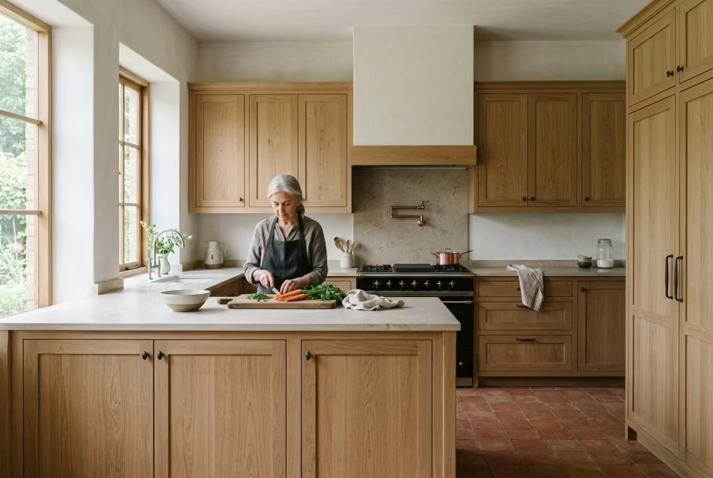
Cabinetry and joinery are often underestimated because they do not demand attention in the way finishes or decorative elements do, yet they are precisely what gives a kitchen its structure, rhythm, and long-term clarity. In French country design, this is where restraint becomes most important. Every door alignment, edge profile, and proportion quietly shapes how the room is perceived and, more importantly, how it functions day after day. I have seen beautifully specified materials fall flat simply because the joinery lacked sensitivity, while simpler kitchens feel remarkably composed when these details are handled with care. It is, in many ways, the discipline of the unseen that determines whether a space feels resolved or slightly unsettled.
Inset Cabinet Doors Instead of Overlay Styles
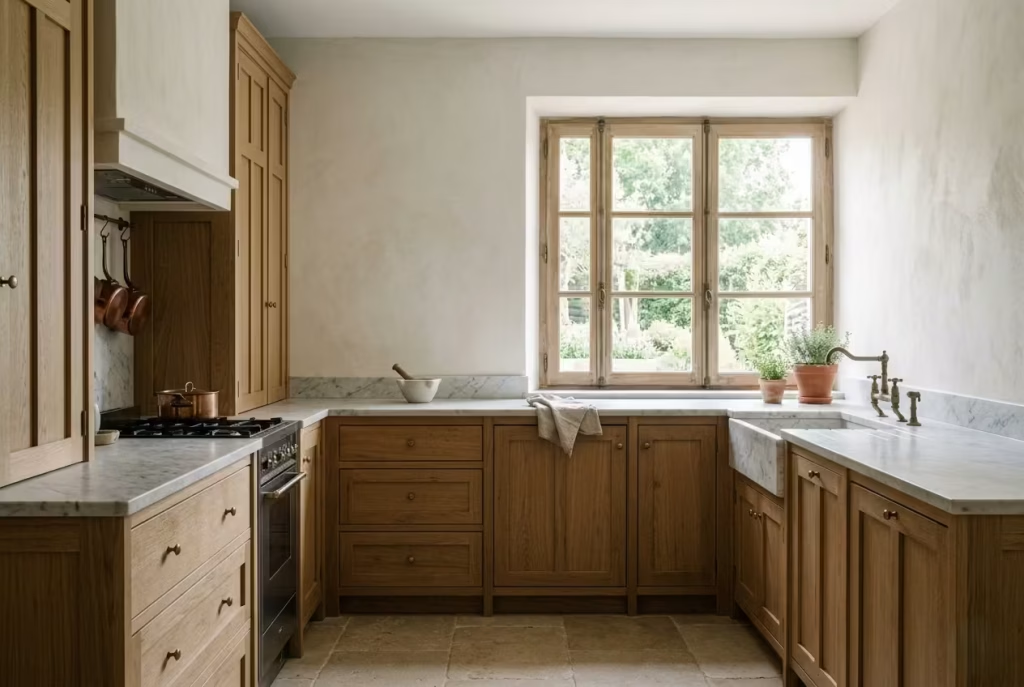
Inset cabinetry is one of those quiet design decisions that rarely announces itself, yet it changes the entire tone of a kitchen once you start living with it. Unlike overlay doors, which sit on top of the frame and create a more continuous, uninterrupted surface, inset doors sit flush within the frame itself. The result is a subtle grid-like rhythm that feels more architectural, more considered, and ultimately more enduring in character.
In French country kitchens, this detail carries particular weight because it introduces a sense of craftsmanship that feels intentional rather than mass-produced. The alignment between door, frame, and reveal has to be precise, typically within millimetres, which immediately raises the standard of execution. When done well, it creates a calm visual order that never feels rigid, almost like a well-tailored garment that fits the space without trying too hard.
I often find that inset cabinetry works best when the surrounding materials are doing some of the expressive work. For example, when paired with natural stone worktops around 30 to 40 mm thick and timber cabinetry with visible grain, the inset detailing acts as a stabilising force. It does not compete for attention, but it holds everything together in a quiet, almost invisible way. In one project I worked on, switching from overlay to inset completely changed how the kitchen was perceived. The room felt less like a collection of units and more like a crafted piece of architecture that had been carefully stitched into the house.
There is also a tactile quality that should not be overlooked. The slight recess of the door within the frame creates shadow lines that shift subtly throughout the day. Morning light might catch the edges softly, while evening light deepens the joints, giving the cabinetry a sense of depth that flat overlay doors often lack. It is a small detail, but over time it becomes part of the room’s personality, something you feel as much as you see.
Of course, this level of precision does not come without compromise. Inset cabinetry requires tighter tolerances and more skilled craftsmanship, which naturally increases both cost and installation complexity. Hinges need to be carefully calibrated, and seasonal movement in timber must be accounted for, especially in traditional or solid wood constructions. It is not the easiest route, but it is often the one that ages most gracefully.
Pros
- Creates a refined, architectural look with strong visual order
- Develops subtle shadow detail that enhances depth over time
- Feels more bespoke and crafted compared to standard overlay systems
Cons
- Requires high-precision joinery and skilled installation
- More sensitive to material movement and long-term adjustment
Inset cabinetry, when executed properly, has a way of quietly anchoring a kitchen. It does not shout for attention, yet it sets a standard that everything else naturally aligns with, like a well-composed sentence that simply feels right the moment you read it.
Softly Painted Cabinetry in Muted Tones
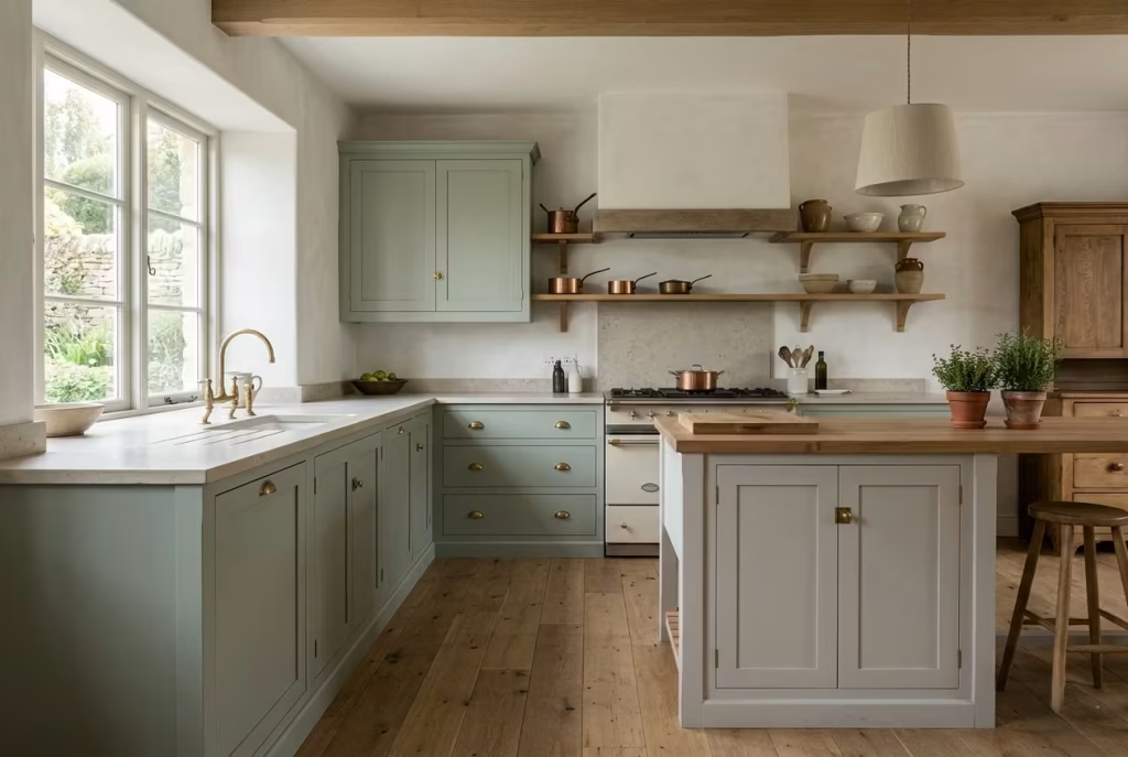
Muted cabinetry is where restraint begins to show its real intelligence. In French country kitchens, colour is rarely used to dominate the space. Instead, it works quietly in the background, shaping atmosphere rather than dictating it. Softly painted cabinetry in tones such as chalky whites, subdued sage, pale stone grey, or muted clay allows the kitchen to breathe, rather than feeling visually boxed in by overly assertive colour choices.
What makes these tones so effective is not just their palette, but their behaviour under changing light. A soft grey-green that feels cool and understated in the morning can shift into something warmer and more grounded by late afternoon. I have seen kitchens completely transform throughout the day simply because the cabinetry was tuned to respond to light rather than resist it. This is where muted colour becomes less about decoration and more about atmosphere, almost like a slow conversation between surface and sunlight.
In practice, I tend to avoid anything overly saturated or trend-driven. Strong colour statements can feel compelling in the short term, but they often age quickly, like a voice that speaks too loudly for too long. Muted tones, by contrast, tend to settle into the architecture. They allow materials like stone worktops, typically around 30 to 40 mm thick, and timber flooring or joinery to take on more presence without visual conflict.
I recall a renovation where the cabinetry was initially specified in a much deeper green, bold and highly pigmented. On paper it looked striking, but once installed, it overwhelmed the natural light in the room. We softened the tone significantly, pulling it back into a more desaturated sage. The difference was immediate. The space stopped feeling heavy and started to feel composed, almost as if it had taken a deep breath and finally relaxed into itself.
There is also a long-term advantage to this approach. Muted cabinetry tends to age more gracefully because it does not rely on visual intensity to remain relevant. Instead, it acts as a quiet backdrop that allows other elements in the kitchen to evolve. Hardware patina, timber variation, and surface wear all sit more comfortably within a subdued palette, rather than competing with it.
Pros
- Ages gracefully and remains visually relevant over time
- Enhances natural light by softening reflections and contrasts
- Allows other materials in the kitchen to take visual priority
Cons
- Requires careful calibration to avoid appearing flat or lifeless
- Subtle tones can shift noticeably under different lighting conditions
Softly painted cabinetry works best when it is not trying to make a statement. Its strength lies in understatement, in allowing the rest of the kitchen to speak while it quietly holds the composition together in the background.
Open Shelving Used Sparingly, Not Excessively
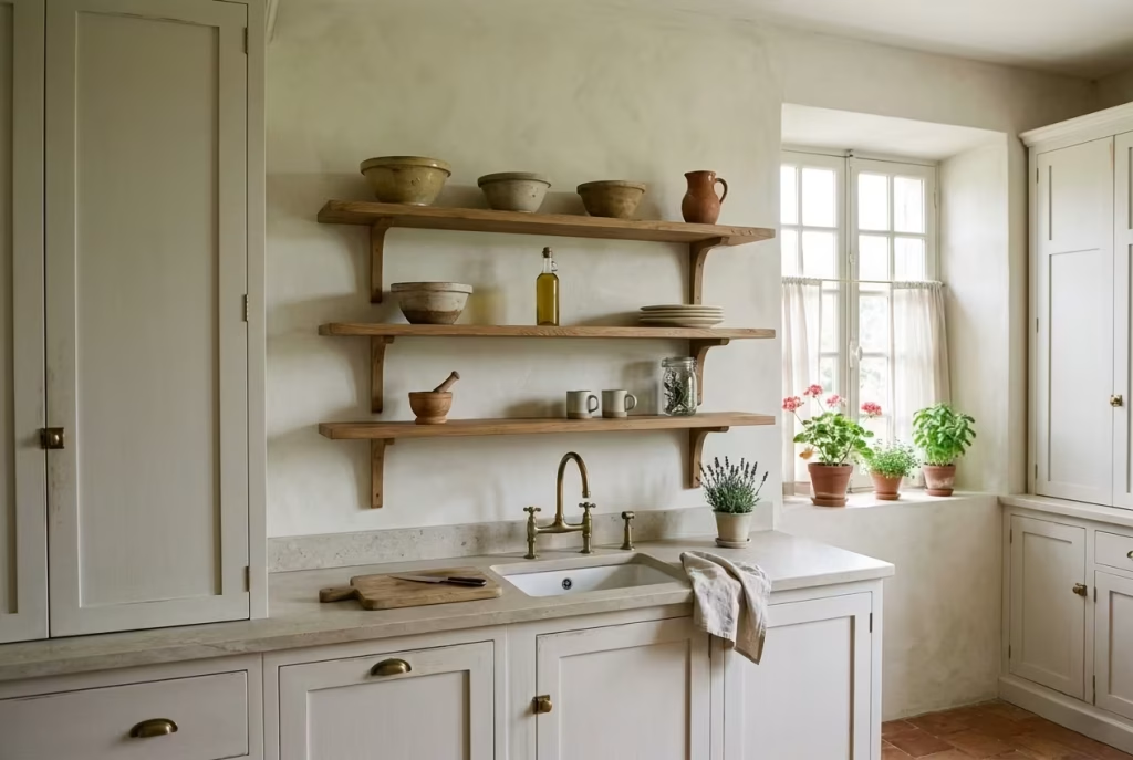
Open shelving has a way of seducing a design early on. It promises ease, openness, and a sense of lived-in charm, yet in practice it can quickly tip from thoughtful to chaotic if overused. In French country kitchens, restraint is what keeps it believable. When used sparingly, open shelving acts less like storage and more like a visual pause, a moment where the eye can rest between more grounded, closed cabinetry elements.
The key is proportion. I rarely extend open shelving across entire walls. Instead, I introduce it in short, deliberate runs, often between 90 and 150 cm in length, or as a single focused section within a larger composition. This might sit above a preparation area or adjacent to a window where natural light can soften the display. Anything beyond this tends to lose its impact and starts to feel more like obligation than intention.
What makes open shelving work in this context is curation, not accumulation. A handful of well-chosen objects, stoneware, glass jars, aged ceramics, or everyday cookware, carries far more visual weight than a densely packed display. I often think of it as editing rather than filling. When everything is on show, nothing stands out. But when space is left intentionally open between objects, each item begins to breathe and gain presence.
In one project, we introduced a narrow 120 cm oak shelf run above a limestone countertop. Initially, the client was tempted to fill it entirely. Over time, we deliberately reduced what was displayed. What remained was a small collection of daily-use pieces, nothing staged, nothing overly styled. The result felt far more authentic. The shelf stopped reading as a feature and instead became part of the rhythm of daily life, quietly shifting with seasons, use, and habit.
There is also a practical reality that cannot be ignored. Open shelving collects dust, requires regular upkeep, and exposes everyday items to visual scrutiny. It is not a set-and-forget solution. That is precisely why restraint matters. When used excessively, it becomes labour-intensive and visually noisy. When used selectively, it earns its place and avoids tipping the balance of the kitchen.
Pros
- Introduces openness and visual breathing space within cabinetry layouts
- Encourages a more personal, lived-in display of everyday objects
- Softens heavier built-in elements by breaking visual continuity
Cons
- Requires ongoing maintenance and regular re-styling
- Can quickly appear cluttered if not carefully edited and controlled
In the end, open shelving works best when it behaves like punctuation in a sentence. Used too often, it loses meaning. Used sparingly, it clarifies everything around it, giving the kitchen moments of lightness that feel intentional, not accidental.
You May also Like: 25 Kitchen Colour Ideas That Transform Your Space Instantly
Traditional Larder Cabinets With Deep Storage (60–80 cm / 24–31 inches depth)
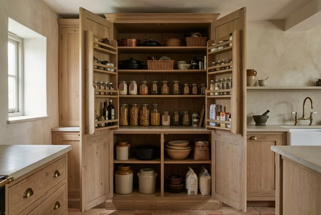
A traditional larder cabinet is one of those quietly transformative elements in a kitchen that rarely gets the attention it deserves until you actually live with it. It is not about display or visual impact. It is about depth, order, and the ability to absorb the everyday chaos of kitchen life without letting it spill into the rest of the room. In French country design, this kind of storage behaves almost like a hidden anchor, steadying everything around it while remaining largely unspoken.
At a practical level, I tend to work with depths between 60 and 80 cm, or roughly 24 to 31 inches, depending on the footprint of the kitchen. This additional depth is not just about capacity, it is about creating zones within the cabinet itself. Lower sections for heavier items, mid-level shelving for daily essentials, and upper areas for seasonal or occasional use. When designed properly, a larder becomes less of a cupboard and more of a self-contained system, quietly keeping order behind closed doors.
Why restraint matters
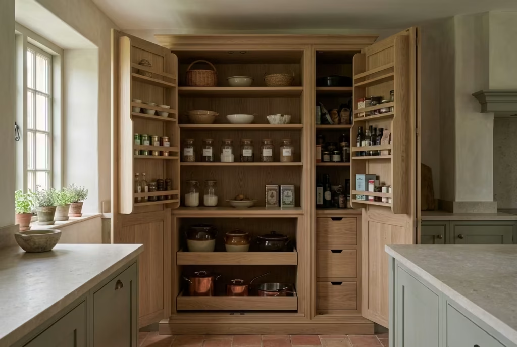
Restraint in larder design is often misunderstood. Clients frequently assume that bigger automatically means better, but in reality, unchecked depth without structure can become counterproductive. I have seen cabinets that were technically generous in size but so poorly organised that they became difficult to use. Items get pushed to the back, forgotten, and eventually duplicated, which defeats the purpose entirely.
The real discipline lies in proportioning storage to lifestyle rather than simply maximising volume. A well-considered larder does not try to hold everything. It holds the right things, in the right way, without becoming a black hole for clutter. When restraint is applied correctly, the cabinet stops feeling like storage and starts functioning like rhythm, almost like a quiet discipline embedded into daily life.
Real-life usage patterns
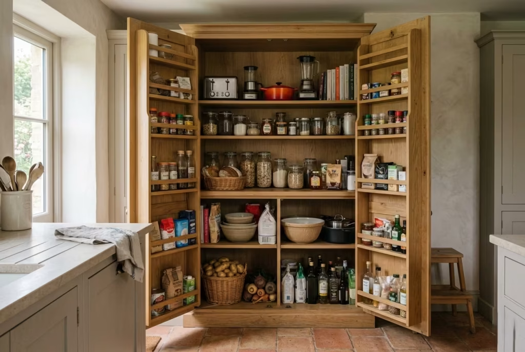
In practice, larder cabinets often become the most used yet least visible part of the kitchen. In one project I worked on, a 70 cm deep larder unit was positioned just off the main cooking zone. At first, it was intended purely for dry goods and appliances. Within months, it organically evolved into a daily hub. Breakfast items lived at eye level, baking essentials were grouped lower down, and rarely used items naturally migrated to the top.
What became interesting over time was not just what the cabinet held, but how it changed behaviour. The client stopped scattering storage across multiple areas. Everything consolidated. The kitchen felt calmer, not because there was less in it, but because everything finally had a place that made sense. It is one of those quiet shifts that only reveals itself after weeks of living with the space, when routines settle and friction disappears.
Where clients often overdo it
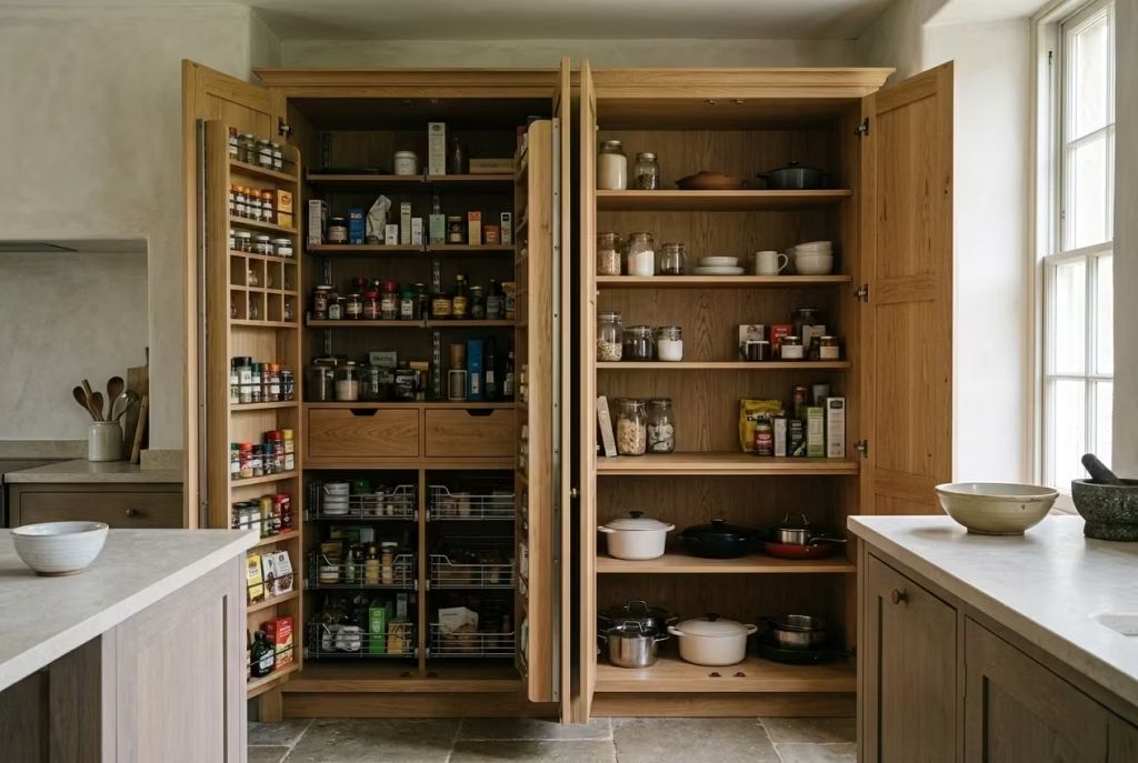
The most common mistake with larder cabinetry is overcomplication. It usually starts with good intentions, adjustable shelving, internal drawers, integrated baskets, sometimes even refrigerated sections, but quickly escalates into a system that feels more engineered than lived in. When every inch is hyper-organised, the cabinet begins to demand attention rather than quietly serving the space.
Another frequent misstep is overfilling the depth itself. Without careful zoning, deeper cabinets simply encourage stacking, and stacking leads to loss of visibility. Out of sight very quickly becomes out of mind. Before long, the cabinet turns into a storage archive rather than a functional part of daily cooking.
The most successful larders I have seen take a different approach. They accept that not everything needs to be optimised. Some space is deliberately left slightly loose, allowing movement, flexibility, and a degree of imperfection. Ironically, this looseness is what keeps the system usable over time.
Pros
- Exceptional storage capacity without visually crowding the kitchen
- Encourages organised, centralised living rather than fragmented storage
- Can significantly improve daily efficiency when properly zoned
Cons
- Can become chaotic if internal structure is overcomplicated or poorly planned
- Deeper spaces require discipline to prevent items being lost at the back
A well-designed larder cabinet does not try to impress. It simply works in the background, day after day, quietly absorbing the rhythm of the household. When done right, it becomes one of those elements you barely notice, yet would immediately miss if it were ever gone.
Architectural Details The Invisible Layer of Authenticity
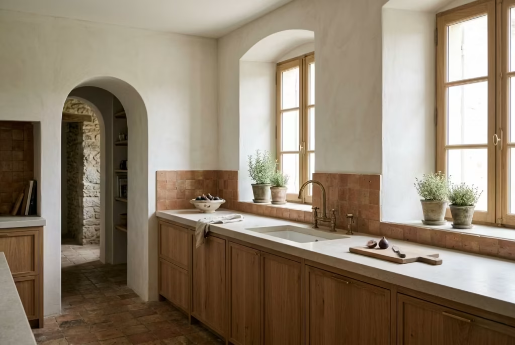
Architectural details are often the least photographed part of a kitchen, yet they are the ones that determine whether the space feels convincing or merely assembled. In French country design, this layer operates almost in the background, quietly shaping proportion, light, and spatial rhythm without ever demanding attention.
I have always found that when these details are resolved properly, the kitchen begins to feel inevitable, as if it could not have been designed any other way. It is this sense of quiet rightness, achieved through thresholds, reveals, and structural gestures, that separates a decorative interior from one that feels genuinely rooted in its architecture.
Exposed Ceiling Beams (Structural or Decorative)
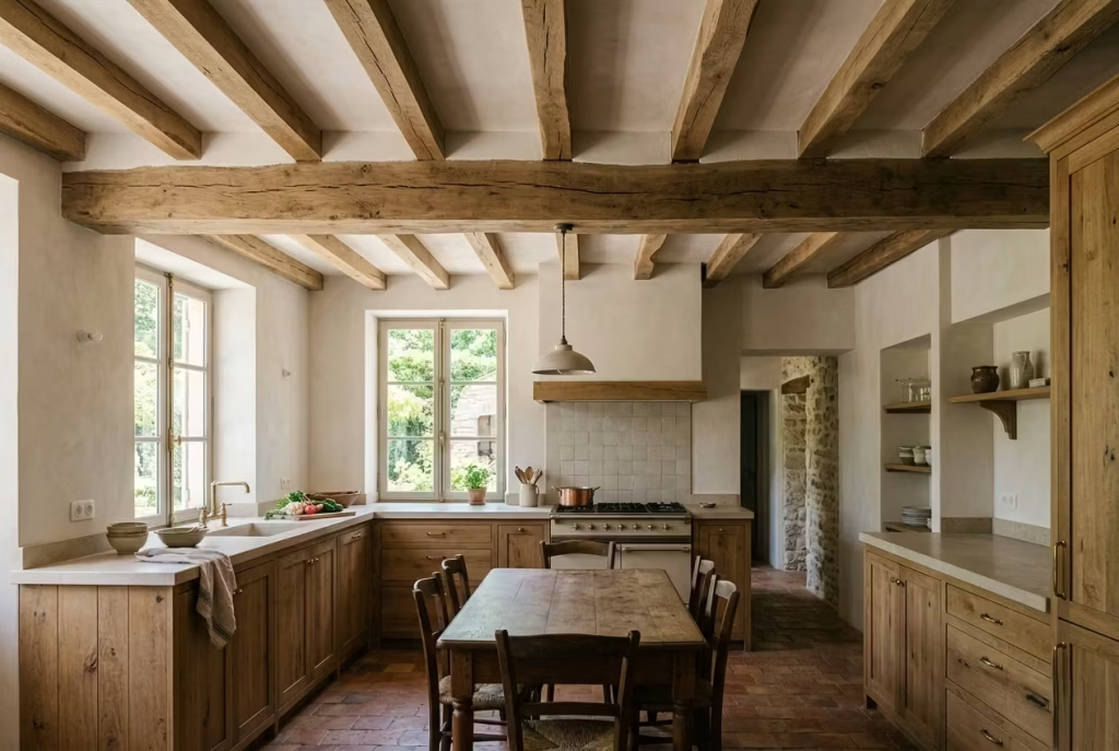
Exposed ceiling beams carry a kind of quiet authority that is difficult to replicate through any purely decorative gesture. In French country kitchens, they do not function as surface embellishment, they act as spatial punctuation, defining volume and grounding the room in a more architectural reality. Whether genuinely structural or carefully introduced as a decorative intervention, beams have a way of changing how a space is read almost instantly, pulling the eye upward and giving the kitchen a sense of permanence that feels deeply rooted rather than applied after the fact.
When I work with beams, I treat proportion and rhythm as non negotiable. Spacing is rarely random. Instead, it is guided by the scale of the room, often aligning with key architectural elements such as window bays or cabinet runs. In many cases, I prefer slightly irregular spacing rather than rigid uniformity, especially in older properties where absolute precision can feel out of place. A subtle variation of even 5 to 10 cm between beam centres can soften the overall composition and prevent the ceiling from feeling overly mechanical.
Material choice plays an equally important role. Oak is often the most reliable option, particularly when left in a natural or lightly aged finish that allows the grain to remain visible. In some projects, reclaimed timber introduces a level of variation that feels almost impossible to manufacture convincingly. The small imperfections, saw marks, tonal shifts, and softened edges, all contribute to a sense of authenticity that sits comfortably within the French country language. Even when beams are newly fabricated, I tend to avoid overly uniform staining, as it can flatten their presence and strip away character.
There is also a spatial effect that should not be underestimated. Beams naturally draw the eye upward, which can subtly alter the perception of scale within the room. In kitchens with lower ceilings, typically around 240 to 260 cm, carefully proportioned beams can actually enhance the sense of height rather than reduce it, provided they are not overly bulky. They introduce rhythm overhead, which helps the space feel more structured without becoming heavy or oppressive.
I remember a project where the ceiling initially felt flat and visually unresolved, despite strong material choices elsewhere in the kitchen. Once we introduced a series of reclaimed oak beams, the entire atmosphere shifted. The room suddenly gained depth. It no longer felt like a container for design elements, but like an architectural space with its own identity. Interestingly, nothing else in the kitchen changed, yet everything began to feel more intentional.
Of course, there are considerations that cannot be ignored. Decorative beams require careful integration with lighting, ventilation, and any ceiling-mounted services. If introduced without planning, they can quickly become visually intrusive rather than enhancing. There is also a risk of overuse. When beams are too frequent or too dominant, they can start to overwhelm the space, making it feel busier than it should be.
Pros
- Introduces strong architectural character and visual depth
- Enhances the perception of volume and structure within the room
- Brings warmth and authenticity, especially when using natural or reclaimed timber
Cons
- Requires careful coordination with lighting and ceiling services
- Can feel visually heavy if overused or poorly proportioned
When handled with restraint and clarity, exposed beams do not simply decorate a ceiling. They frame the entire kitchen from above, quietly reinforcing its structure and giving the space a sense of permanence that lingers long after the first impression has faded.
Deep Window Reveals and Timber Frames
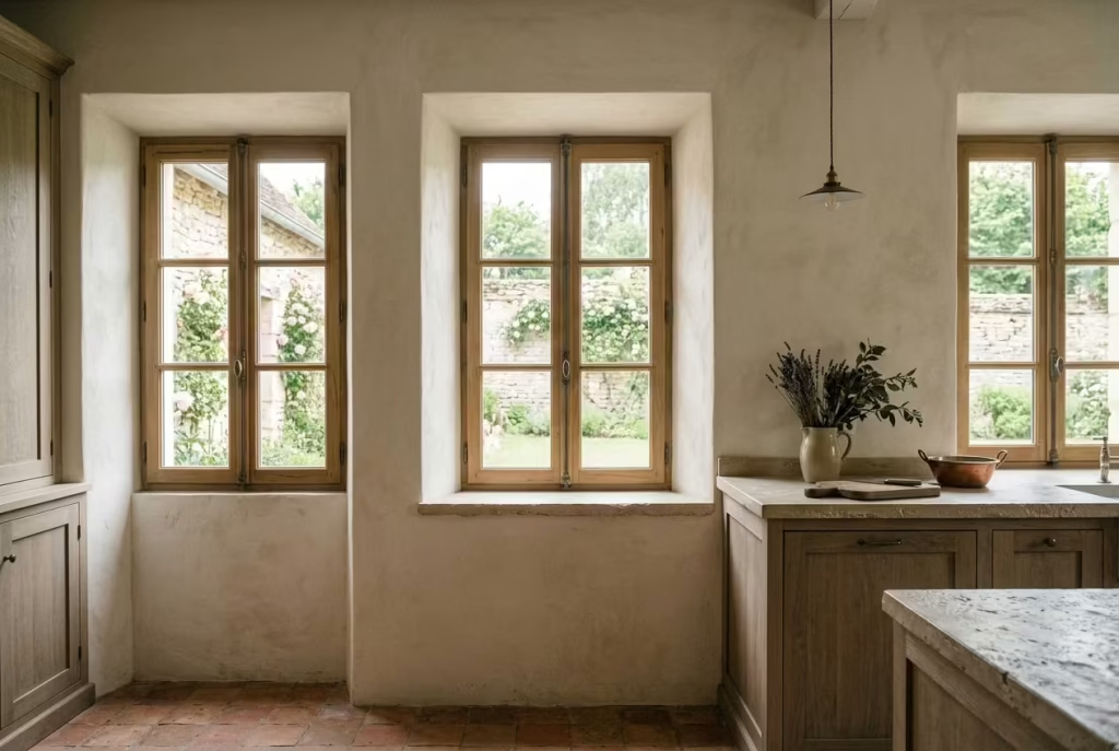
Deep window reveals are one of those architectural gestures that quietly reshape how a kitchen feels, without ever announcing themselves as a feature. In French country design, they act almost like a transitional pause between interior and exterior, softening the boundary so the room feels less sealed off from the world outside. When a reveal is properly considered, light does not simply enter the space, it settles, shifts, and pools in a way that feels almost layered, as if the window itself is holding the light for a moment before releasing it into the room.
In practical terms, reveal depth often becomes a defining detail. In traditional masonry or thicker wall constructions, reveals can easily range from 15 to 30 cm or more, depending on structure. I tend to treat this depth as an opportunity rather than a constraint. Instead of flattening the window line with minimal trim, I encourage a more pronounced internal reveal, which allows the wall thickness to become part of the design language. It creates a subtle shadow line that changes throughout the day, giving the kitchen a sense of quiet movement even when nothing else is happening.
Timber frames, when introduced within these reveals, add another layer of warmth and tactility. Oak or softly aged hardwoods are often my preference, particularly when finished in a way that retains grain visibility rather than hiding it beneath heavy coatings. The frame does not need to be ornate. In fact, the more restrained it is, the more convincing it becomes. A simple, well-proportioned frame that sits cleanly within the reveal can make the window feel grounded, almost architectural in its presence, rather than purely functional.
I recall a project where we replaced standard plastered reveals with deep-set timber-lined openings in a south-facing kitchen. The change was immediate and surprisingly emotional. Morning light began to travel differently across the room, catching the edges of the timber and casting soft gradients onto the surrounding walls. It was no longer just a window. It became a moment within the architecture, something you noticed without quite realising why.
There is also a psychological dimension to deep reveals that is often overlooked. They slow down how the eye reads the boundary between inside and outside. Instead of a sharp transition, there is a gradual shift, almost like easing into another space rather than stepping abruptly into it. This subtle layering is what gives French country interiors their sense of ease. Nothing feels forced or overly immediate. Everything has a degree of softness to it, even the architecture itself.
However, this detail does require careful coordination. Deep reveals can interfere with furniture placement, particularly around sinks or worktops positioned near windows. They also need to be resolved properly at junctions to avoid visual heaviness or awkward shadow build-up. When handled poorly, they can feel bulky rather than elegant, which is why proportion and restraint remain essential throughout.
Pros
- Enhances natural light by creating depth and softness in its distribution
- Strengthens the connection between interior and exterior spaces
- Adds architectural character without relying on decorative excess
Cons
- Requires careful planning to avoid clashes with cabinetry or work surfaces
- Can feel visually heavy if proportions are not well balanced
When done well, deep window reveals and timber frames do something quietly powerful. They turn light into an architectural material, shaping how a kitchen is experienced hour by hour, season by season, without ever needing to demand attention.
You May also Like: Transform Your Space 25 Maximalist Kitchen Ideas You’ll Love
Plaster Range Hoods Instead of Metal Extractors
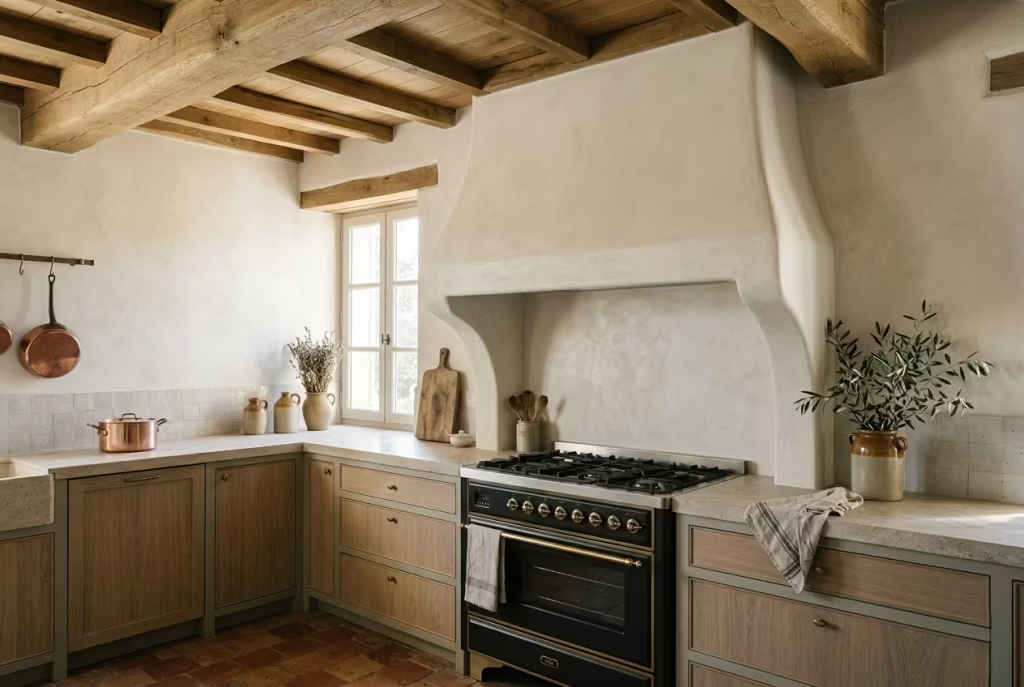
A range hood is one of those unavoidable functional elements in a kitchen, yet it is also one of the easiest places where visual disruption can creep in. In many modern kitchens, metal extractors sit like technical add-ons, efficient but emotionally detached from the rest of the space. In French country design, the plaster range hood offers a very different proposition. It does not sit on top of the kitchen as a device. It becomes part of the architecture, shaped and softened until it feels as though it was always meant to be there.
What makes plaster hoods so effective is their ability to absorb rather than interrupt. Instead of reflecting light or drawing attention through contrast, they blend into the surrounding wall plane, often extending in a gentle taper or curve that echoes traditional masonry forms. I tend to treat them almost like sculptural transitions, moving from cabinetry to ceiling in a way that feels continuous rather than imposed. When proportioned correctly, typically aligning with the width of the cooking zone beneath, they anchor the hob area without visually overpowering it.
There is also a material honesty to plaster that works particularly well in this context. Whether lime-based or finely finished gypsum, the surface has a softness that metal simply cannot replicate. It diffuses light subtly, picking up shadows from nearby cabinetry or ceiling beams and shifting gently throughout the day. In one project, a softly off-white plaster hood became the quiet focal point of the entire kitchen, not because it demanded attention, but because everything else seemed to orbit around its calm presence.
From a design perspective, I often find that plaster hoods perform best when they are not over-detailed. The temptation can be to add mouldings, trims, or decorative profiles, but restraint is what allows them to feel timeless. A clean, uninterrupted surface with carefully considered proportions tends to age far better than something overly ornate. The aim is not to replicate historical forms exactly, but to capture their spirit in a way that feels relevant within a contemporary home.
There is a practical layer to this as well. Plaster hoods require careful integration with extraction systems, which must be fully concealed and properly vented. This is not a decorative overlay that can be added at the end of a project. It needs to be considered early, alongside cabinetry layouts and ceiling structure. When this coordination is missed, the result can feel compromised, no matter how beautiful the surface finish might be.
I remember a renovation where the client was initially drawn to a polished stainless steel extractor, largely for its perceived efficiency. It worked perfectly well on a technical level, but once we placed it within the broader French country scheme, it felt disconnected, almost like a piece from another language entirely. Replacing it with a softly curved plaster hood immediately changed the hierarchy of the room. The cooking zone became integrated rather than isolated, and the entire kitchen felt calmer, more cohesive, and far more grounded.
Of course, plaster hoods are not without their considerations. They require skilled craftsmanship, careful finishing, and ongoing maintenance awareness, particularly in high-use kitchens where steam and cooking residue can build over time. But when executed properly, they repay that attention with longevity and visual harmony that metal alternatives rarely achieve.
Pros
- Blends seamlessly into the architectural language of the kitchen
- Softens the visual impact of a typically dominant functional element
- Offers a timeless, sculptural quality that enhances overall cohesion
Cons
- Requires early-stage planning and precise coordination with extraction systems
- Needs skilled craftsmanship and thoughtful maintenance over time
In many ways, a plaster range hood is less about concealment and more about integration. It takes something inherently functional and folds it back into the architecture, until it feels less like an appliance and more like part of the room’s natural rhythm.
Arched Openings That Soften Circulation
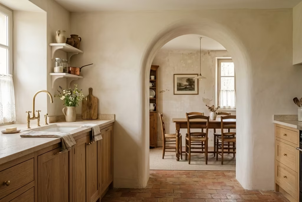
Arched openings have a quiet way of changing the emotional temperature of a kitchen without altering its footprint. Where straight-edged doorways tend to feel direct and functional, arches introduce a sense of ease, almost like the architecture itself has decided to soften its tone. In French country design, this subtle curvature is not about decoration. It is about transition, guiding movement from one space to another in a way that feels unhurried and natural, rather than abrupt or overly defined.
From a spatial perspective, I often use arches to ease circulation between key zones, particularly where a kitchen opens into a dining or utility area. The typical clear opening remains generous, often around 90 to 120 cm in width depending on the layout, but the curved head softens the visual boundary. Instead of reading as a hard stop, the threshold becomes more of a gentle passage, as if the room is quietly exhaling as you move through it. That small shift in perception can make a surprisingly large difference to how settled a space feels overall.
What I find particularly effective is how arches interact with proportion and height. Even in ceilings that sit around 240 to 260 cm, a well-scaled arch can subtly lift the eye without making the space feel stretched or exaggerated. The curve naturally draws attention upward in a controlled way, which helps distribute visual weight more evenly across the room. In one project, introducing a shallow plaster arch between the kitchen and pantry completely changed the rhythm of movement. What was once a functional cut-through began to feel like a considered transition point, almost like moving between chapters of the same story.
There is also a psychological layer to arches that is often overlooked. Straight lines tend to signal efficiency and urgency, while curves introduce a sense of ease and continuity. In daily use, this translates into a kitchen that feels less segmented and more connected. You are not stepping through rigid boundaries, you are flowing between spaces that feel gently linked. Over time, this has a real impact on how the home is experienced, especially in kitchens that serve as both working and social environments.
From a detailing standpoint, I tend to favour restraint. The most successful arches are rarely overly ornate. A simple plastered curve, aligned carefully with surrounding wall planes and skirting lines, usually achieves far more than heavily moulded interpretations. When the finish is clean and the proportions are right, the arch begins to feel like it belongs to the structure rather than sitting on top of it. It becomes part of the architecture’s grammar, not an added flourish.
Of course, arches need to be handled with care. Poorly proportioned curves can feel forced, and in smaller spaces they can sometimes reduce usable wall area for cabinetry or storage. This is why they work best when integrated early in the design process, rather than introduced as an afterthought. When they are planned properly, they rarely feel like a feature. Instead, they dissolve into the background and quietly do their job, which is exactly where their strength lies.
Insight: why these details matter more than you think
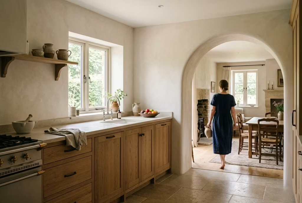
Arched openings are not about nostalgia or stylistic reference alone. Their real value lies in how they shape movement and perception. They are the kind of architectural decisions that do not announce themselves immediately, but reveal their importance over time. A kitchen with well-considered thresholds feels different from the moment you enter it. It feels settled, composed, and naturally at ease, as if every transition has been thought through with a steady hand rather than an impulsive one.
Pros
- Softens transitions between spaces, improving flow and continuity
- Enhances spatial perception without changing floor area
- Adds a subtle architectural character that feels timeless rather than trend-driven
Cons
- Requires careful proportioning to avoid feeling oversized or awkward
- Can reduce straight wall runs needed for cabinetry or storage
When done well, arched openings do something quietly powerful. They remove the sense of interruption from a kitchen’s circulation and replace it with continuity. Nothing feels forced, nothing feels abrupt, and over time, that sense of ease becomes one of the most valuable qualities the space can offer.
Lighting Atmosphere Over Illumination
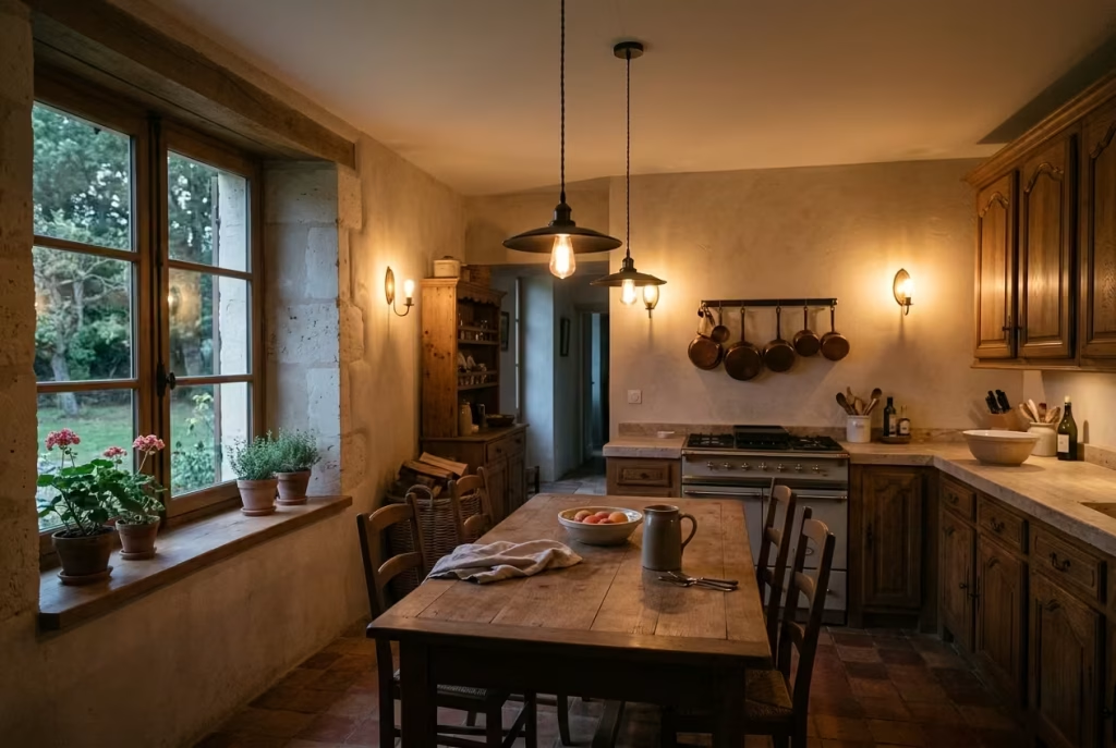
Lighting in a French country kitchen is never just about brightness or technical output. It is about shaping how the space feels at different moments of the day, how materials respond to shadow and warmth, and how the room quietly shifts in mood without any obvious intervention. I have often found that the most successful kitchens are not the most brightly lit, but the ones where light is layered with intention, allowed to fall softly across stone, timber, and plaster rather than flooding the space indiscriminately. When lighting is treated as atmosphere first and function second, the kitchen begins to feel less like a workspace and more like a lived-in environment that settles gently into itself over time.
Layered Lighting at Different Heights (Not Just Ceiling Spots)
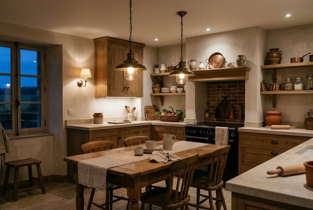
Lighting, when done well, behaves less like a utility and more like an invisible architecture that shapes how a kitchen is experienced from morning to night. Relying solely on ceiling spots is a common misstep. It flattens the room, strips away depth, and leaves surfaces feeling overly exposed, almost as if the space is under interrogation rather than gently illuminated. In French country kitchens, the aim is quite the opposite. Light should be layered, staggered, and allowed to sit at different heights so the room feels lived in rather than clinically lit.
I typically think of lighting in three distinct bands. The first is ambient light, often ceiling based, which provides the overall wash of illumination. The second is task lighting positioned lower, usually around 150 to 165 cm at wall light level or beneath cabinetry, ensuring work areas are properly supported. The third is accent lighting, which might sit within shelving, above beams, or around architectural features, subtly drawing attention to texture and material. When these layers work together, the kitchen gains a sense of depth that single-source lighting can never achieve.
What makes this approach particularly powerful is how it interacts with materials. Natural stone worktops, typically around 30 to 40 mm thick, begin to reveal soft variations under angled light rather than appearing flat. Timber cabinetry shows grain more clearly when light grazes across its surface rather than hitting it directly. Even plaster walls, especially lime-based finishes, take on a gentle movement throughout the day as light shifts between layers. It is not about making the space brighter, it is about making it more dimensional.
In one renovation, the original design relied heavily on recessed ceiling spots. On paper, it was efficient, but in reality, the kitchen felt slightly hollow, almost like every surface was being lit equally and nothing was allowed to stand out. Once we introduced wall-mounted sconces, under-cabinet strips, and a few carefully placed pendants, the transformation was immediate. The room stopped feeling flat and began to breathe. Shadows returned, which is often where the real character of a space lives.
There is also a rhythm to layered lighting that becomes more apparent over time. In the morning, lower task lighting supports functionality without overwhelming the space. During the day, natural light carries most of the weight. In the evening, accent and ambient layers take over, creating a softer, more intimate atmosphere. This gradual transition prevents the kitchen from feeling static. Instead, it moves with the day, almost like it is quietly adjusting its tone in response to how it is being used.
Of course, layered lighting requires discipline in planning. It must be integrated early, alongside cabinetry and electrical layouts. Retrofitting different lighting heights later often leads to compromise, both visually and functionally. But when it is done properly, the result is a kitchen that feels less like a lit room and more like a carefully composed environment.
Pros
- Creates depth and visual warmth across materials and surfaces
- Supports different functions throughout the day without harsh transitions
- Enhances the architectural quality of the kitchen through shadow and variation
Cons
- Requires early coordination with electrical and joinery planning
- Poor execution can lead to visual clutter if layers are not balanced
When lighting is layered rather than flattened, the kitchen stops feeling like a single illuminated space. Instead, it becomes something far more nuanced, where light and shadow work together in quiet balance, shaping atmosphere in a way that feels both intentional and effortlessly natural.
You May also Like: 30 Kitchen Makeover Ideas That Make Old Kitchens Feel Brand New
Antique or Patinated Metal Fixtures
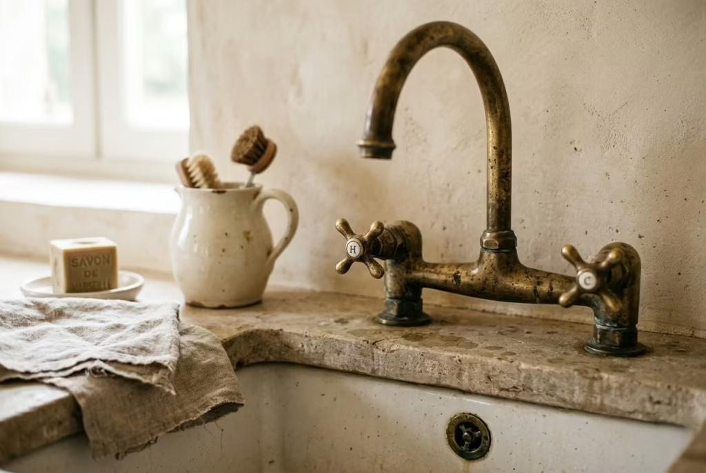
Metal fixtures are often treated as finishing touches, yet in a French country kitchen they carry far more weight than that. They are the points of contact, the elements you touch every single day, and over time they quietly define how the entire space feels in use. Choosing antique or patinated metals shifts the narrative away from perfection and into something far more grounded, where surfaces are allowed to age, soften, and develop character rather than remain static and untouched.
Why patina matters more than polish
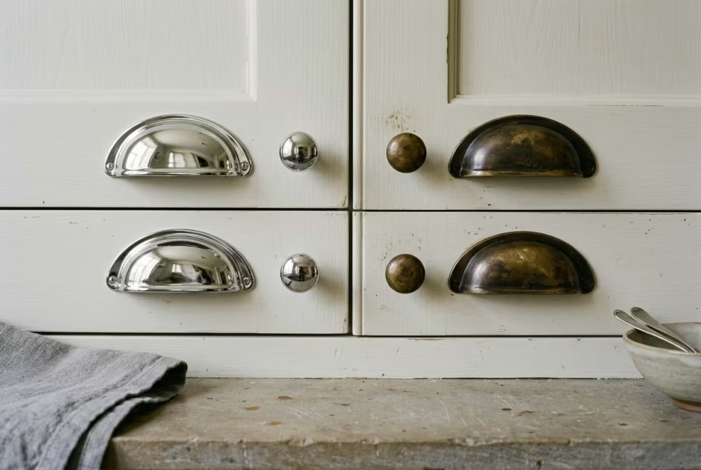
Highly polished fixtures can look striking at first, but they tend to feel visually fixed, almost like they are resisting the passage of time. Patinated metals, on the other hand, embrace it. Brass that slowly deepens in tone, bronze that softens at the edges, iron that gains a subtle, muted sheen, all of these finishes tell a story that evolves rather than freezes. I often describe patina as a kind of visual memory. It records touch, humidity, cleaning, and daily use in a way that feels honest rather than artificial.
In one renovation, we replaced bright chrome handles with unlacquered brass across cabinetry and drawers. At first, the client was unsure, concerned it might look uneven. Within months, the transformation was already visible. The handles closest to the hob developed a warmer tone, while those on less frequently used cabinets remained lighter. Instead of feeling inconsistent, it created a natural hierarchy within the kitchen, as if the space itself was quietly mapping out how it was being lived in.
How antique finishes anchor the kitchen
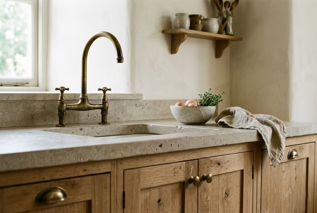
Antique or patinated fixtures work best when they are not isolated design statements but part of a broader material conversation. In kitchens with stone worktops around 30 to 40 mm thick, timber cabinetry, and limewashed walls, these metals act as connectors. They bridge warm and cool tones, soft and hard surfaces, without demanding attention.
I often think of them as the punctuation marks of a kitchen. They are small, but they shape rhythm. A well-aged brass tap set against a honed limestone counter does not shout for attention, yet it quietly completes the composition. Similarly, iron or aged bronze cabinet pulls introduce just enough contrast to prevent timber surfaces from feeling overly uniform.
Where clients often overcomplicate things

One of the most common missteps is trying to control patina too tightly. Clients sometimes expect an even, pre-aged finish that looks consistent from day one. The reality is that true patination is inherently uneven. It develops at different rates depending on exposure, use, and even touch. When this variation is accepted rather than corrected, the material becomes far more interesting.
Another issue is mixing too many metal finishes without a clear hierarchy. While a degree of variation can work, especially in French country interiors, it needs to feel intentional. Otherwise, the space can start to feel visually fragmented, as if every element is speaking a slightly different language.
Pros
- Develop a natural, evolving finish that adds depth over time
- Blend seamlessly with natural materials like stone and timber
- Bring warmth and character that polished finishes often lack
Cons
- Patina develops unevenly, which may initially feel unpredictable
- Requires acceptance of change rather than control over appearance
- Needs thoughtful coordination to avoid visual inconsistency
Final reflection
Antique and patinated fixtures are not about recreating the past. They are about allowing materials to behave honestly in the present. When you stop trying to freeze them in a perfect state, they begin to do something far more valuable. They integrate into the rhythm of daily life, quietly recording time as it passes, until the kitchen no longer feels newly installed, but comfortably settled, as if it has always been there.
Wall Lights Positioned at Eye Level (150–165 cm / 59–65 inches)
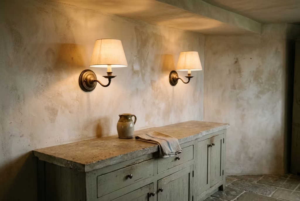
Wall lighting at eye level is one of those understated decisions that quietly transforms a kitchen without ever calling attention to itself. While ceiling lighting tends to dominate the overall brightness, eye-level wall lights introduce a more human scale of illumination, the kind that feels intimate, grounded, and closely connected to how people actually experience a space. In French country kitchens, this detail often becomes the difference between a room that feels simply functional and one that feels emotionally settled.
Why eye-level placement changes everything
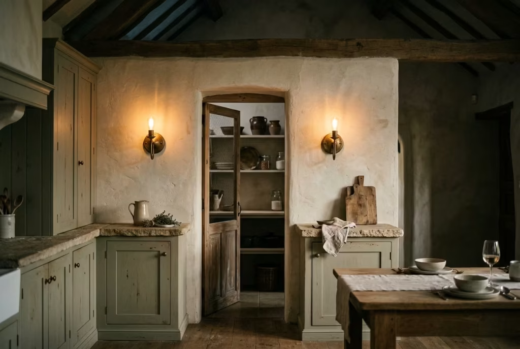
Positioning lights at roughly 150 to 165 cm shifts the entire perception of the room. Instead of light falling from above in a uniform wash, it begins to interact with the architecture at a more personal height. Faces are softly illuminated, wall textures become more visible, and materials such as limewash, stone, or timber take on a deeper, more nuanced presence.
I have found that this height creates a kind of visual intimacy that overhead lighting alone cannot achieve. In one project, we installed simple aged brass wall sconces flanking a pantry opening. During the day, they were almost invisible. In the evening, however, they became the defining element of the space, casting a soft glow that made the entire kitchen feel warmer and more inviting, almost like the room had quietly shifted into a different mood.
The role of light in shaping atmosphere
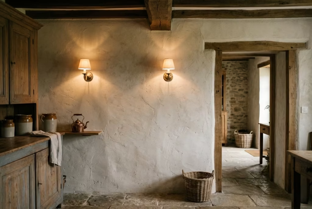
Wall lights at eye level do more than illuminate, they frame experience. They help define circulation routes, highlight architectural openings, and soften transitions between zones. When placed thoughtfully, they can subtly guide movement through the kitchen, almost like visual markers that lead you from one area to another without the need for obvious signage or strong overhead brightness.
This is particularly effective in French country interiors where restraint is key. A pair of sconces positioned along a plaster wall or beside a timber-lined opening can create rhythm and balance without overwhelming the composition. The light is never harsh. It sits gently against the surface, revealing texture rather than flattening it.
Where planning becomes critical
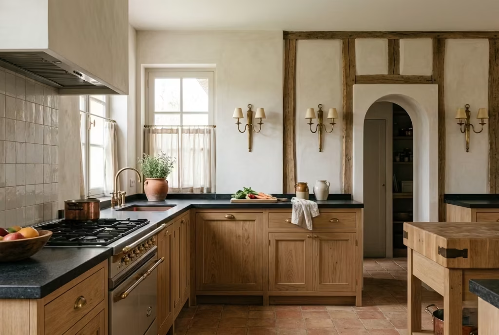
The challenge with eye-level wall lighting is not the aesthetic, but the timing. It must be considered early in the design process, long before plastering or joinery is completed. Once cabinetry heights, window reveals, and furniture positions are fixed, retrofitting wall lights at the correct height becomes far more complicated.
I have seen situations where lighting was added too late, resulting in awkward placements that conflicted with shelving, splashbacks, or even sightlines. When this happens, the elegance of the idea is lost, and what should have been a subtle architectural gesture ends up feeling forced.
Proper planning ensures that the lights sit naturally within the composition, aligned with vertical rhythms in the room, such as door frames, cabinetry divisions, or structural openings. When everything is coordinated, the result feels effortless, almost as if the lighting was always part of the architecture rather than an addition to it.
Pros
- Creates a warm, intimate atmosphere that enhances mood and comfort
- Adds depth and texture by interacting directly with wall surfaces
- Supports spatial rhythm and helps define movement within the kitchen
Cons
- Requires early-stage planning to integrate correctly with joinery and services
- Poor placement can disrupt visual balance or interfere with functional elements
Final reflection
Wall lights at eye level are not about increasing brightness. They are about changing perception. When used thoughtfully, they bring the kitchen closer to human scale, softening its edges and allowing materials to speak more quietly but more clearly. It is a detail that does not demand attention, yet once experienced, it becomes difficult to imagine the space without it.
Colour Palette Subtlety That Ages Gracefully
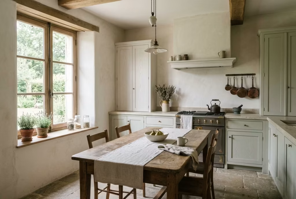
Colour in a French country kitchen is never just a surface decision, it is a long-term atmospheric choice that quietly determines how the space will age, soften, and settle over time. Rather than relying on bold statements that can quickly feel dated, the most enduring kitchens lean into restraint, allowing muted tones to work in the background like a steady rhythm rather than a loud chorus. I have often found that when colour is handled with a lighter touch, the architecture, materials, and light are finally allowed to take centre stage, creating a kitchen that feels balanced, lived in, and naturally at ease as the years go by.
Chalky Whites Instead of Pure Whites
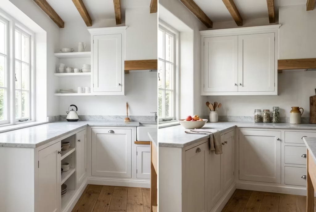
Chalky whites sit in that subtle space where colour almost stops behaving like colour and starts acting like atmosphere. Unlike pure white, which can often feel clinical or overly sharp under natural light, chalky whites carry a softness that allows a kitchen to breathe. They diffuse light rather than reflect it aggressively, which immediately changes how the entire room is perceived, especially in French country interiors where warmth and texture matter just as much as brightness.
Why pure white often falls short over time
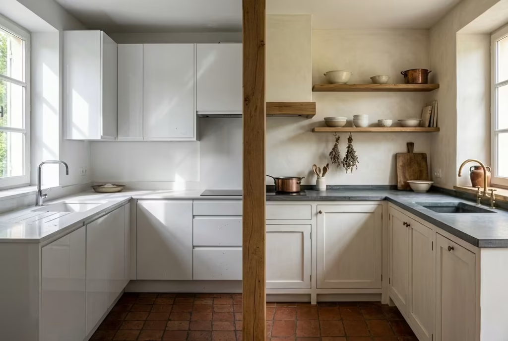
Pure white kitchens tend to look impressive on day one, almost like a blank canvas that has been freshly stretched. But over time, that same clarity can start to feel unforgiving. Every shadow becomes more pronounced, every imperfection more visible, and every material contrast more rigid. I have walked into kitchens where pure white cabinetry, once pristine, began to feel slightly sterile, almost as if the space had lost its softness.
Chalky whites avoid this issue entirely. They introduce a subtle undertone, often with hints of cream, stone, or grey, which prevents the surface from feeling flat. Instead of bouncing light harshly around the room, they absorb it gently, allowing a more natural and layered visual experience to unfold throughout the day.
How chalky whites interact with material depth
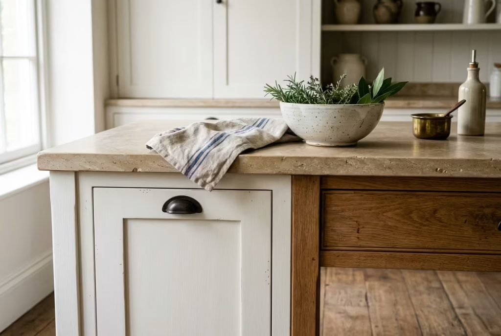
One of the most compelling qualities of chalky whites is how effortlessly they sit alongside natural materials. When paired with limestone worktops, typically around 30 to 40 mm thick, or timber cabinetry with visible grain, they act as a quiet stabiliser. They do not compete for attention, yet they prevent the space from feeling visually fragmented.
In one renovation I worked on, we replaced stark white cabinetry with a softened chalk tone. The difference was immediate but subtle in the best way. The stone surfaces suddenly felt warmer, the timber flooring appeared richer, and even the light from the windows seemed to settle more comfortably across the room. Nothing dramatic had changed, yet everything felt more cohesive, as if the kitchen had finally exhaled.
The role of light in shaping perception
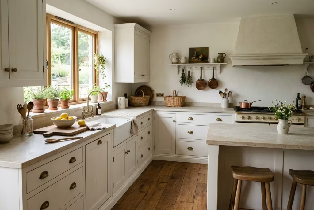
Chalky whites are particularly responsive to natural light. In the morning, they can feel almost cool and airy, giving the kitchen a sense of freshness. By late afternoon, they take on a warmer, more grounded tone, blending seamlessly with the changing light conditions. This adaptability is what gives them longevity. They do not fight the environment, they respond to it.
This shifting quality is what keeps the palette from feeling static. A kitchen painted in chalky white never reads the same way twice, which is precisely why it avoids the trap of visual fatigue that pure white spaces can sometimes fall into.
Where clients often underestimate their value
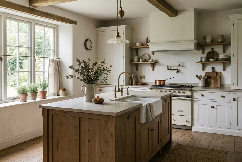
A common misconception is that chalky whites are simply a safer version of white, when in reality they require just as much consideration, if not more. The undertone must be carefully selected to complement surrounding materials, otherwise the space can lean too warm or too cool without intention. Lighting also plays a critical role, as artificial light can subtly alter the perception of tone in the evening.
However, when balanced correctly, chalky whites have a way of making everything else in the kitchen feel more considered. They do not compete with stone, timber, or metal finishes. Instead, they allow those materials to breathe, creating a composition that feels layered rather than flat.
Pros
- Softens natural light and creates a more atmospheric, lived-in feel
- Complements a wide range of natural materials without visual conflict
- Ages gracefully, avoiding the clinical feel often associated with pure white
Cons
- Requires careful selection of undertone to suit surrounding materials and light
- Can shift in perception depending on artificial lighting conditions
Earth-Based Tones: Ochre, Sage, Clay
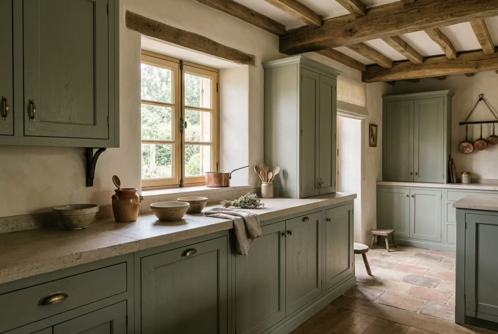
Earth-based tones sit at the very heart of French country kitchens because they carry something that feels instinctive rather than designed. Ochre, sage, and clay are not colours that shout for attention, they sit quietly in the background, almost like they have been borrowed from the landscape itself. When used with restraint, they bring a grounded, lived-in quality to a kitchen that feels less like decoration and more like a natural extension of the home.
Why earth tones feel timeless rather than trendy
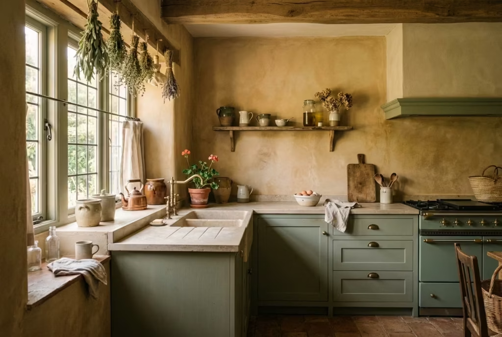
There is a reason these tones rarely feel dated. They are not tied to fashion cycles or fleeting aesthetics. Instead, they echo materials that have existed for centuries, sun-baked clay, weathered stone, dry herbs, and aged plaster. Because of this, they tend to age with remarkable grace. I have seen kitchens designed a decade ago in muted clay or softened sage still feel relevant today, not because they were bold, but because they were balanced.
Ochre in particular introduces a gentle warmth that sits somewhere between golden and earthy brown. It catches natural light beautifully, especially in morning hours when sunlight is low and soft. Sage brings a quieter, more herbal calm, often working well in spaces that already contain a lot of natural timber or stone. Clay tones sit in between, offering depth without heaviness, like a colour that has been softened by time itself.
How these tones interact with architecture and material
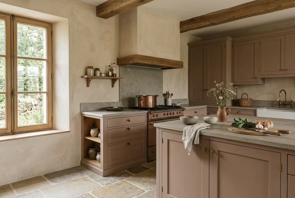
Earth-based palettes work best when they are not isolated as feature colours but woven into the fabric of the space. When paired with limestone worktops, typically around 30 to 40 mm thick, or aged oak cabinetry, these tones stop feeling decorative and start feeling structural. They do not sit on the surface, they belong to it.
In one project, we introduced a muted clay tone across cabinetry in a kitchen that already had tumbled stone flooring and limewashed walls. The effect was subtle but transformative. The space no longer felt like separate elements placed together. Instead, everything began to read as one continuous language, as if the kitchen had grown from the same material palette rather than being assembled from different parts.
The emotional temperature of colour
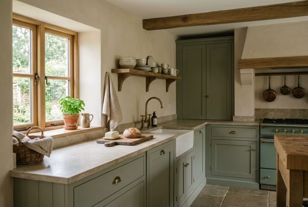
What often gets overlooked with earth tones is their emotional impact. These colours do not simply change how a space looks, they change how it feels to be in it. Ochre can introduce a gentle warmth that makes a kitchen feel more welcoming without becoming overpowering. Sage tends to slow the visual rhythm of a room, creating a sense of calm that feels almost restorative after a long day. Clay sits quietly in the middle, offering stability and grounding without demanding attention.
I have found that clients often underestimate this emotional layer. They may initially choose colour based on aesthetics alone, only to realise later that the atmosphere of the kitchen has shifted in a more profound way. It is not uncommon for a space with earth-based tones to feel more settled, more forgiving, almost as if it encourages slower living without consciously trying to do so.
Where restraint makes all the difference
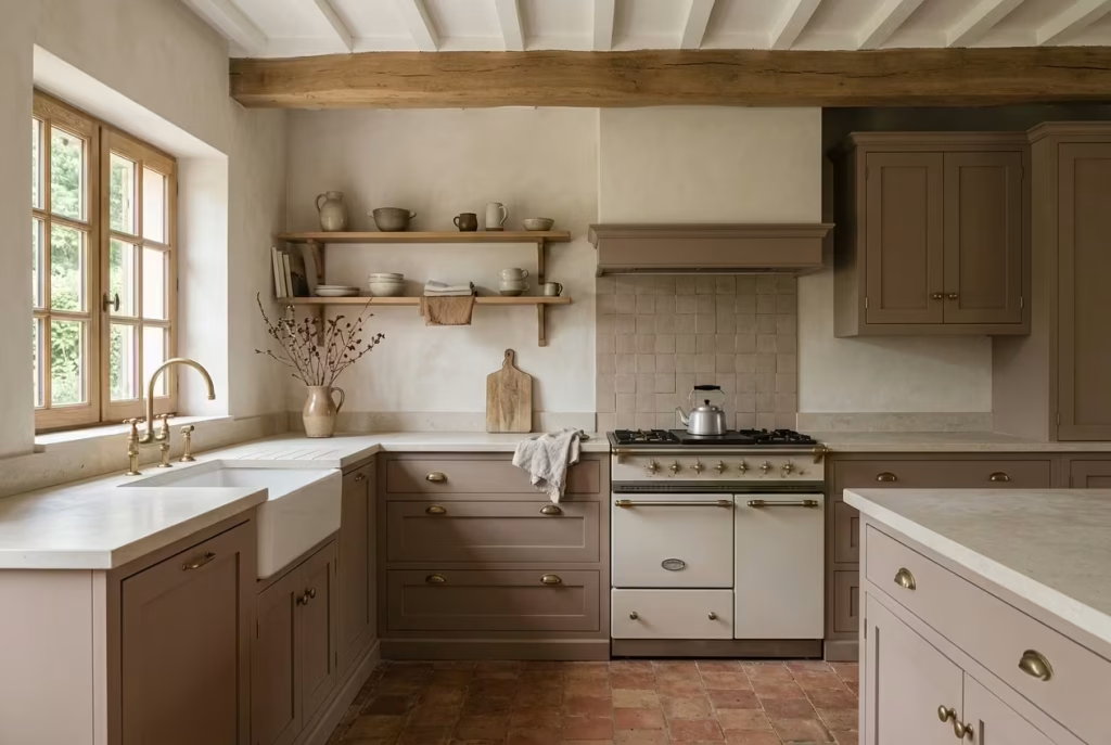
With earth tones, restraint is everything. The temptation can be to layer multiple shades too freely, but without a clear hierarchy, the palette can lose its clarity. I tend to treat these colours as supporting notes rather than dominant voices. One primary tone, carefully chosen, is often enough. The rest of the palette should quietly orbit around it, rather than compete with it.
Lighting also plays a critical role. These tones shift significantly under artificial light, particularly warmer bulbs, which can intensify their depth. When planned carefully, this variation becomes an advantage, allowing the kitchen to feel different throughout the day without any physical change.
Pros
- Creates a grounded, natural atmosphere that feels inherently timeless
- Works seamlessly with stone, timber, and limewashed surfaces
- Ages gracefully and avoids visual fatigue over time
Cons
- Requires careful balance to prevent colour overload or imbalance
- Can shift noticeably under different lighting conditions, requiring thoughtful specification
Controlled Contrast Rather Than High Contrast
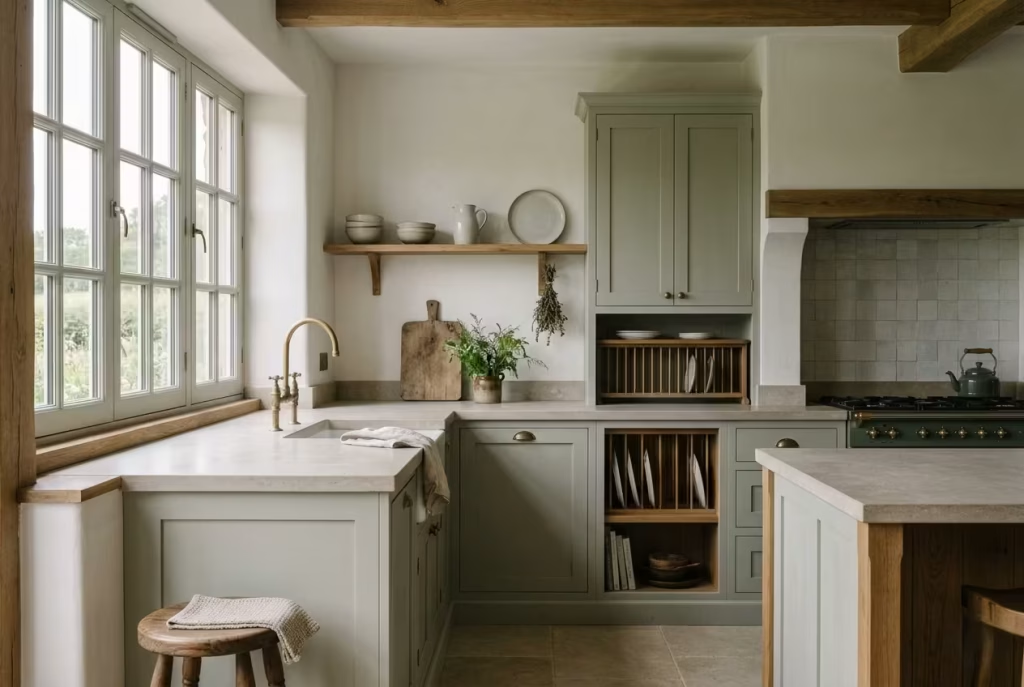
Controlled contrast is where a kitchen quietly finds its maturity. It is not about eliminating difference between tones and materials, but about refining it so the space never feels visually aggressive or fragmented. In French country kitchens, this approach allows the eye to travel comfortably, rather than being pulled sharply from one extreme to another. The result is a room that feels composed, grounded, and unhurried, almost as if every element has been gently negotiated into place rather than forced into opposition.
Why high contrast often loses its appeal
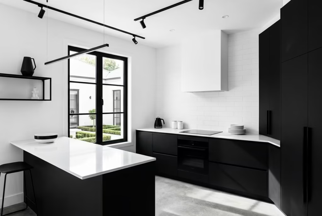
High contrast interiors can feel compelling at first glance. The sharp dialogue between black and white, dark and light, can create immediate visual impact. But over time, that same intensity can become tiring. The eye is constantly adjusting, constantly reacting, and the space begins to feel more like a composition built for attention rather than for living.
I have seen kitchens where deep black cabinetry was paired with stark white walls and ultra-refined finishes. Initially, they photographed beautifully. But after a few years, they started to feel slightly rigid, almost theatrical in a way that no longer aligned with daily life. What once felt striking began to feel static, like the space had frozen in its original concept.
Controlled contrast avoids this trap by softening the extremes. Instead of absolute black and pure white, you move towards charcoal, off-white, warm greys, and muted neutrals. The contrast still exists, but it is quieter, more forgiving, and far more adaptable over time.
How controlled contrast shapes spatial harmony
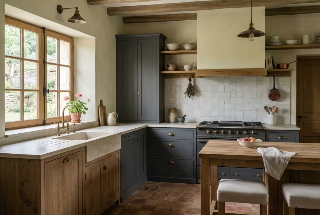
When contrast is carefully moderated, materials begin to work together rather than against each other. A softly toned limestone worktop, typically around 30 to 40 mm thick, can sit comfortably against aged oak cabinetry without creating visual tension. Similarly, a muted plaster wall can support darker metal fixtures without feeling disconnected or overly stark.
In one renovation, we deliberately replaced a high-contrast palette with a more restrained tonal range. The cabinetry shifted from near-black to a softened graphite, while the walls moved from pure white to a chalky neutral. Nothing dramatic changed in isolation, yet the entire kitchen felt calmer. The materials stopped competing for attention and started supporting one another. It was the difference between a conversation and a confrontation.
The role of restraint in long-term design
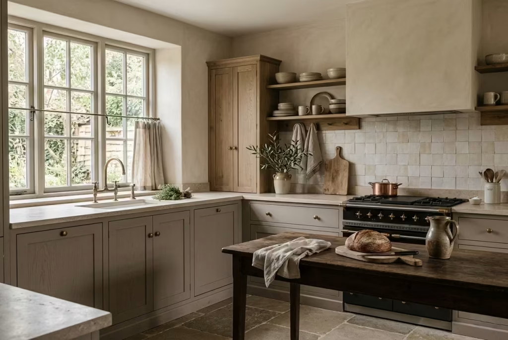
Restraint is often misunderstood as limitation, but in reality, it is what allows a space to remain relevant over time. Bold contrasts tend to anchor a design too firmly to a specific moment. They rely on visual impact to maintain interest, which naturally fades as trends evolve. Controlled contrast, on the other hand, has a quieter resilience. It adapts more easily to changes in styling, lighting, and even lifestyle.
I often describe it as designing in layers rather than extremes. Instead of pushing elements to opposite ends of the spectrum, you work within a narrower tonal band and allow texture, material variation, and light to do more of the expressive work. This creates a kitchen that feels cohesive rather than composed of competing statements.
Where clients often misjudge contrast
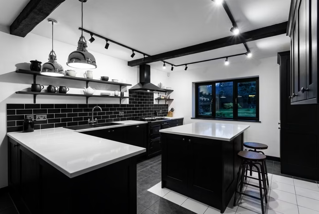
One of the most common mistakes is assuming that contrast automatically creates sophistication. In reality, sophistication often comes from subtlety. When contrast is too strong, it can overpower the architecture and reduce the longevity of the design. Another frequent misstep is introducing too many contrasting elements at once, which fragments the visual language and weakens the overall composition.
Lighting also plays a critical role here. High contrast schemes can become even more extreme under artificial lighting, especially in the evening, where shadows deepen and differences become more pronounced. Controlled contrast behaves more gently under the same conditions, maintaining clarity without becoming harsh.
Pros
- Creates a balanced, visually comfortable environment that is easy to live with
- Ages more gracefully than high-contrast schemes that rely on visual impact
- Allows materials and textures to take precedence over colour extremes
Cons
- Requires careful tonal calibration to avoid a flat or underwhelming result
- Demands a more considered approach to lighting and material selection
Hardware & Fixtures Small Decisions With Long Impact
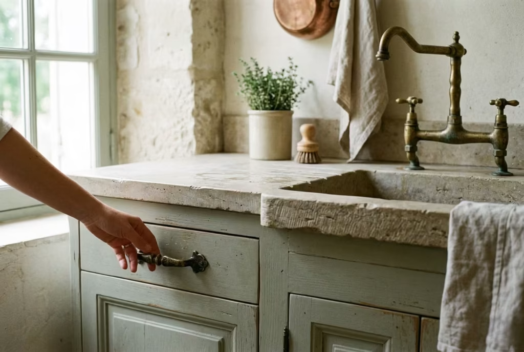
Hardware and fixtures are often treated as finishing touches, yet in practice they are the most frequently touched and repeatedly experienced elements in a kitchen. In French country design, this is where subtlety becomes essential.
These details may be small in scale, but they carry disproportionate weight in how the space feels day to day. I have always found that the difference between a kitchen that feels merely well designed and one that feels genuinely considered often comes down to these contact points, the tap you turn without thinking, the handle you reach for a hundred times a day, the finish that slowly reveals its character over years rather than weeks.
Unlacquered Brass That Naturally Ages
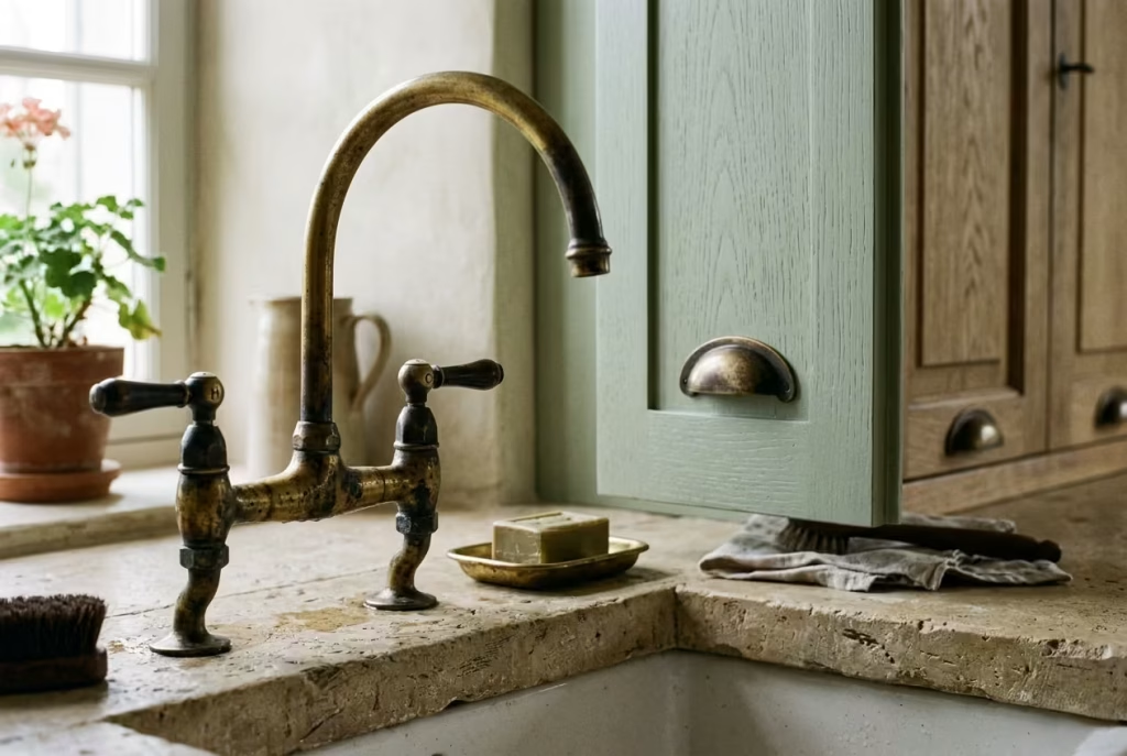
Unlacquered brass is one of those materials that quietly rewrites the idea of perfection in a kitchen. Unlike coated finishes that are designed to stay unchanged, it is intentionally left open to the air, touch, and time. This means it does not stay static. It evolves, slowly and almost imperceptibly at first, then more clearly as months turn into years. In French country kitchens, this gradual transformation is not a flaw to manage, but a quality to embrace, almost like watching a space learn how to live.
Why natural ageing matters more than a fixed finish
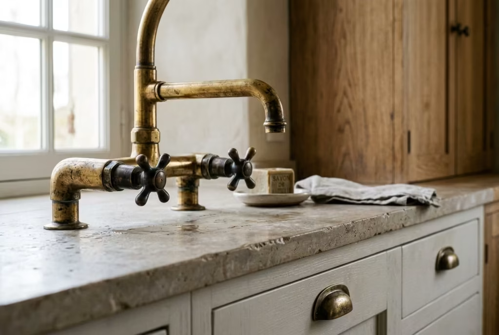
There is something slightly deceptive about finishes that remain identical from day one. They can look pristine, but they often lack narrative depth. Unlacquered brass does the opposite. It begins bright, almost reflective, then slowly softens into warmer, deeper tones as it reacts to humidity, cooking vapours, and everyday handling. The areas most frequently touched, handles, taps, cabinet pulls, develop character faster, while less-used surfaces remain lighter. Over time, this creates a subtle map of use across the kitchen, a kind of visual memory that no manufactured finish can replicate.
I remember a kitchen where we installed brass tapware and handles throughout. Initially, the client was unsure about the uneven ageing that would inevitably occur. Within a year, however, that variation became the most talked-about feature of the space. The tap had darkened slightly where hands naturally rested, while the edges of drawer pulls carried softer tonal shifts. Instead of looking inconsistent, it felt honest, almost like the kitchen was quietly documenting daily life in real time.
How brass interacts with materials and light
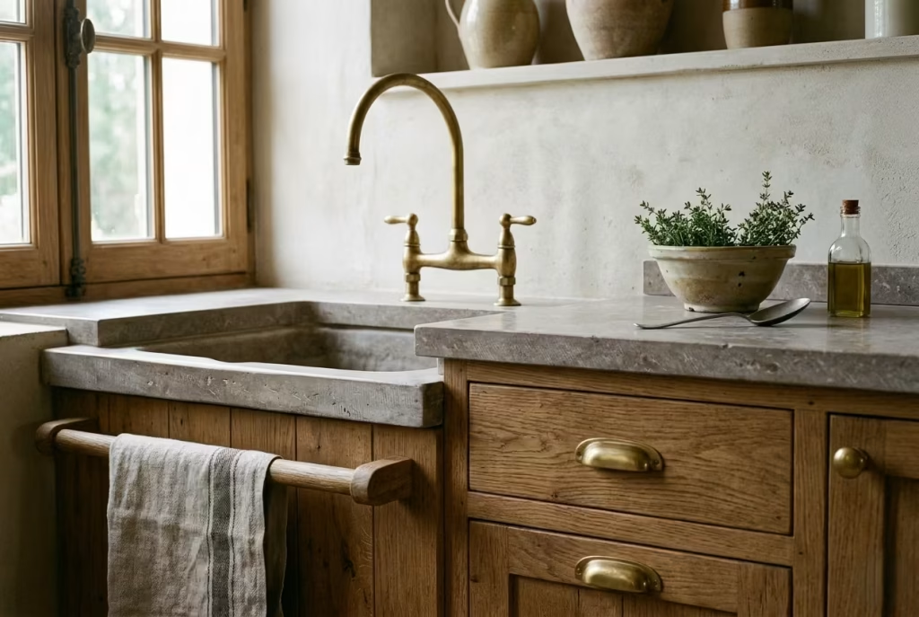
Unlacquered brass works particularly well in French country kitchens because it sits comfortably alongside natural materials without competing for attention. Against limestone worktops, typically around 30 to 40 mm thick, it introduces warmth without overwhelming the stone’s texture. Paired with timber cabinetry, it acts almost like a connecting thread, gently bridging cool and warm tones within the same composition.
Light plays a significant role in how brass develops. In brighter morning conditions, it can appear almost golden and lively. By evening, under softer ambient lighting, it deepens into richer, more subdued tones. This shifting quality means the kitchen never feels visually fixed. Instead, it changes character throughout the day in a way that feels natural rather than staged.
The beauty of imperfection over time
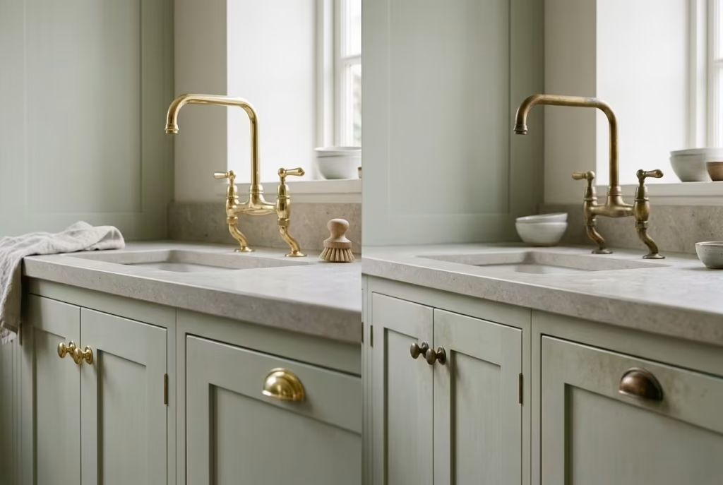
One of the most misunderstood aspects of unlacquered brass is the expectation of control. Clients often assume they will need to maintain a consistent finish, but the truth is the opposite. The material becomes more interesting precisely when it is left alone. Polishing it back to uniformity interrupts its natural progression and removes the very quality that makes it compelling in the first place.
In one renovation, a client initially polished all brass fixtures regularly to maintain a uniform appearance. The result, while neat, felt slightly lifeless. Once they stopped intervening so frequently, the material began to develop depth and variation. The kitchen gained a softer rhythm, as if it had finally been allowed to settle into itself rather than being repeatedly reset.
Where clients often underestimate its value
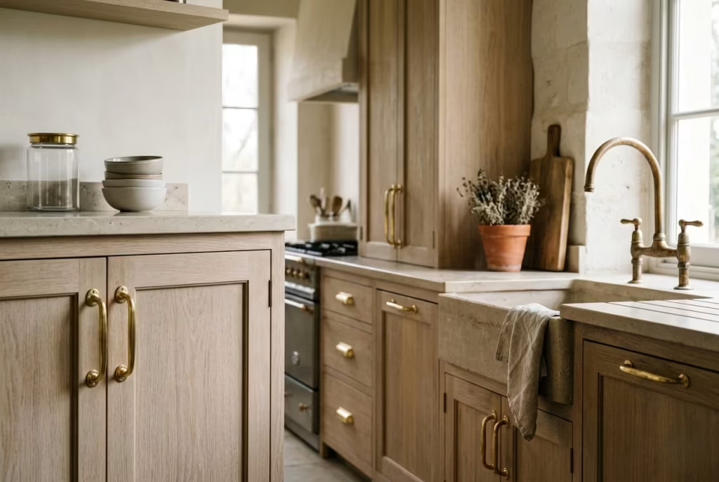
The most common hesitation with unlacquered brass is unpredictability. People tend to want control over how surfaces will look in five or ten years. But in reality, this unpredictability is exactly what gives the material its strength. It resists stagnation. It avoids the frozen look that many sealed finishes eventually fall into.
Another misconception is that ageing will make the kitchen look neglected. In practice, when paired with thoughtful materials like stone, timber, and limewashed walls, brass does not read as worn. It reads as layered. The key is consistency of intention across the design, rather than consistency of appearance in every individual element.
Pros
- Develops a natural patina that adds depth and individuality over time
- Works harmoniously with stone, timber, and traditional materials
- Creates subtle variation that reflects real daily use
Cons
- Ages unevenly, which may initially feel unpredictable
- Requires acceptance of change rather than control over finish
- Not suitable for those who prefer a static, uniform appearance
Bridge Faucets and Traditional Tapware
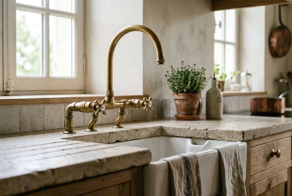
Bridge faucets and traditional tapware sit in that rare category of design elements that feel instantly familiar, almost instinctive, even when they are newly installed. In French country kitchens, they carry a kind of quiet authority that modern monobloc designs often struggle to replicate. There is something about their proportions, the visible structure of hot and cold feeds, the gentle arch of the bridge itself, that anchors the sink area with a sense of permanence and craftsmanship.
Why traditional forms feel more grounded over time
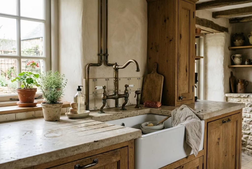
What makes bridge faucets so enduring is not just their appearance, but their relationship to how a kitchen is used. Unlike minimal single-lever designs that prioritise concealment, traditional tapware embraces structure. You can see how it is built, how it functions, and how it sits within the architecture of the sink area. That honesty, almost old-world in its clarity, tends to age far better than designs that rely on visual reduction.
I have noticed this particularly in long-term projects. Kitchens fitted with bridge faucets in aged brass or brushed nickel rarely feel out of place years later. Instead, they settle into the room, quietly becoming part of its rhythm. The handles soften with use, the finish develops subtle variation, and the entire fixture begins to feel less like an installed object and more like something that has always belonged there.
How proportion and detailing shape the sink area
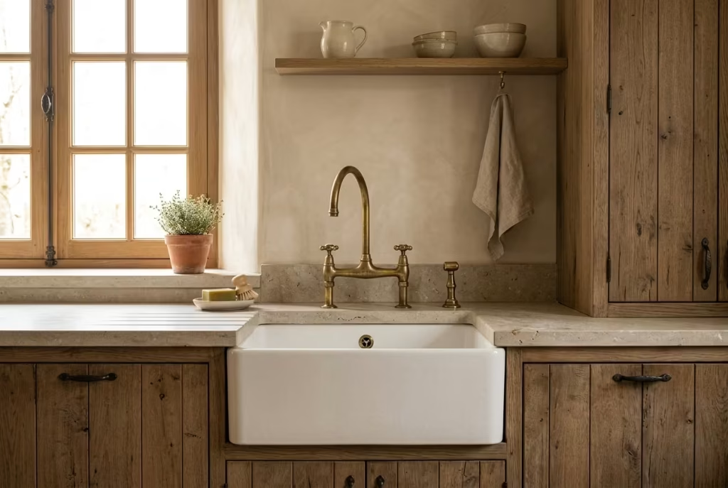
In French country kitchens, the sink zone is often one of the most visually active areas, so proportion becomes critical. Bridge faucets typically span a modest width, often around 20 to 30 cm between handles, with a gentle arch that lifts the form slightly above the sink line. This elevation is not just functional, it creates a visual pause, allowing the eye to rest before moving across surrounding materials such as stone worktops or timber cabinetry.
When paired with apron-front sinks or deep Belfast basins, the effect becomes even more cohesive. The faucet does not dominate the space. Instead, it completes it. In one renovation, we installed a traditional brass bridge tap above a honed limestone sink. Over time, the combination softened beautifully. The stone absorbed splashes and movement, while the brass developed a warmer tone. Together, they created a pairing that felt increasingly natural, almost as if the two materials had grown into each other.
The role of tactile experience in daily use
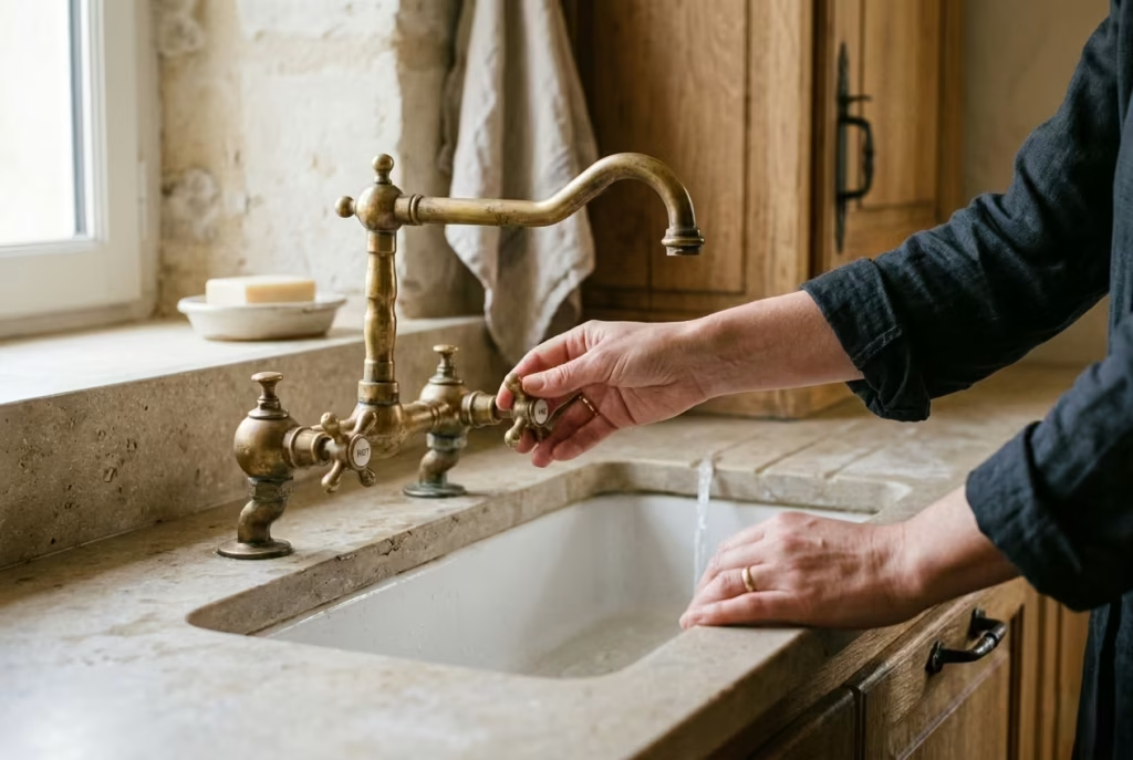
One of the most overlooked aspects of traditional tapware is how it feels to use. The separate hot and cold controls require a more deliberate interaction. You turn them, you adjust, you engage with the fixture rather than simply flicking a lever. This small moment of physical involvement can subtly change how you experience the kitchen, making even routine tasks feel slightly more intentional.
There is also a psychological dimension to this. In a world where many interfaces are designed to disappear, a bridge faucet does the opposite. It invites awareness. It slows things down just enough to be noticeable, without becoming inconvenient. Over time, this creates a rhythm in daily use that feels grounded rather than rushed.
Where clients often underestimate its impact
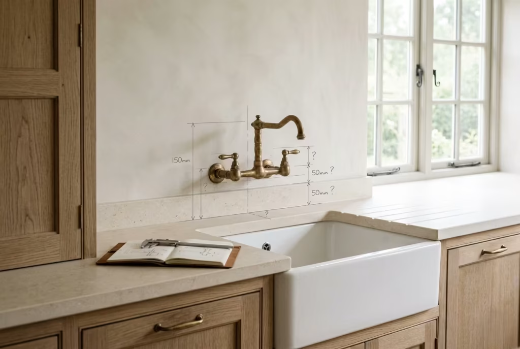
A common hesitation is the assumption that traditional tapware feels outdated. In reality, it is often the opposite. While highly minimal fixtures can sometimes age quickly as trends shift, bridge faucets tend to remain visually stable. Their language is not tied to a specific design moment, which gives them longevity.
Another frequent oversight is scale. When proportion is wrong, either too large or too delicate for the sink and surrounding surfaces, the effect can feel unbalanced. This is why I always consider the tap as part of the wider composition rather than a standalone choice. It needs to sit comfortably with countertop thickness, typically around 30 to 40 mm, and align visually with cabinetry detailing and sink depth.
Pros
- Timeless design language that integrates easily into traditional interiors
- Develops subtle character through use and material ageing
- Enhances the tactile experience of everyday kitchen tasks
Cons
- Requires careful proportioning to suit sink size and surrounding elements
- Can feel overly traditional if not balanced with contemporary restraint
Mixed Metals Used With Discipline
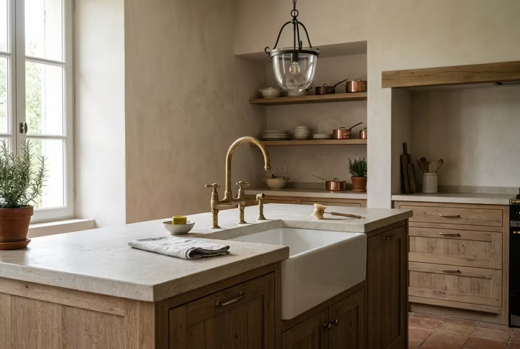
Mixed metals can either look richly layered or completely at odds, and the difference usually comes down to discipline. In a French country kitchen, this is not about throwing brass, iron, nickel, and bronze into the same pot and hoping for the best. It is about creating a quiet hierarchy, where each finish has a role to play and none is trying to steal the show. When handled well, mixed metals add depth, warmth, and a sense of lived-in sophistication that feels far more natural than a kitchen where every fixture matches too neatly.
Why mixed metals need a clear hand
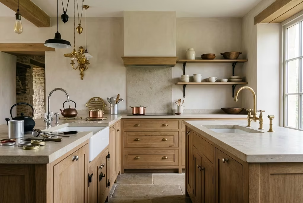
The temptation with mixed metals is to treat variety as a shortcut to character. In reality, it often does the opposite if there is no governing logic behind it. I have seen kitchens where every hinge, handle, tap, and light fitting came in a different finish, and the result felt less collected and more accidental, as if the room had been assembled in a rush. That is the trap. A strong mixed-metal scheme should never look like indecision dressed up as design.
What works far better is a dominant finish supported by one or two quieter companions. For example, unlacquered brass might lead at the tap and cabinet pulls, while aged iron appears in shelf brackets or a pendant frame, and a softer nickel tone is reserved for a secondary fixture. The key is that one finish carries the voice, while the others act like supporting notes in a well-composed chord. It is a case of keeping one foot on the ground while letting the composition breathe.
How to make mixed metals feel intentional
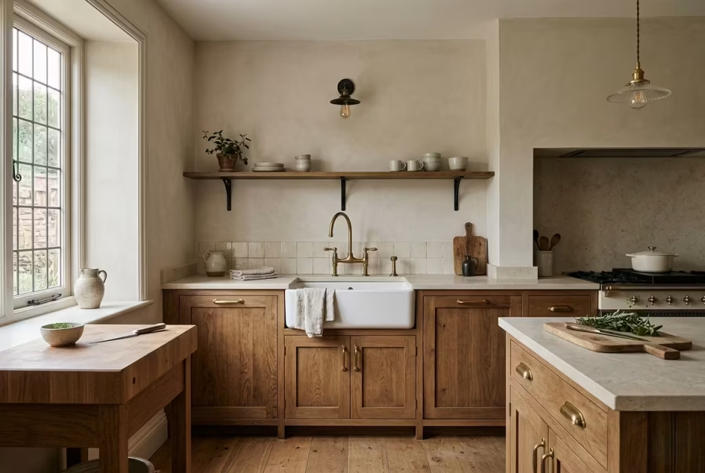
The real skill lies in repetition and placement. If a finish appears only once, it can feel isolated. If it appears in a few strategic points, it begins to read as part of the room’s language. I often repeat a metal at least three times across the kitchen, even if the pieces are small. A tap, a pendant detail, and a cabinet pull can be enough to tie the scheme together without making it feel overly matched.
There is also a tonal dimension to consider. Warm metals such as brass and bronze tend to sit comfortably beside timber cabinetry and limestone worktops, both of which are common in French country kitchens. Cooler metals like nickel or pewter can work too, but they need balancing elements around them so the room does not lose its softness. In practice, the most successful combinations usually rely on contrast with restraint, not contrast for its own sake.
I remember a project where we paired aged brass hardware with a very subtle blackened iron detail in the open shelving supports and wall lights. On paper, it sounded slightly risky. In the room, however, it felt completely at ease because both finishes were softened by natural materials and muted wall colour. The lesson was simple. Mixed metals do not need to match, but they do need to belong to the same conversation.
Why evolving finishes are part of the appeal
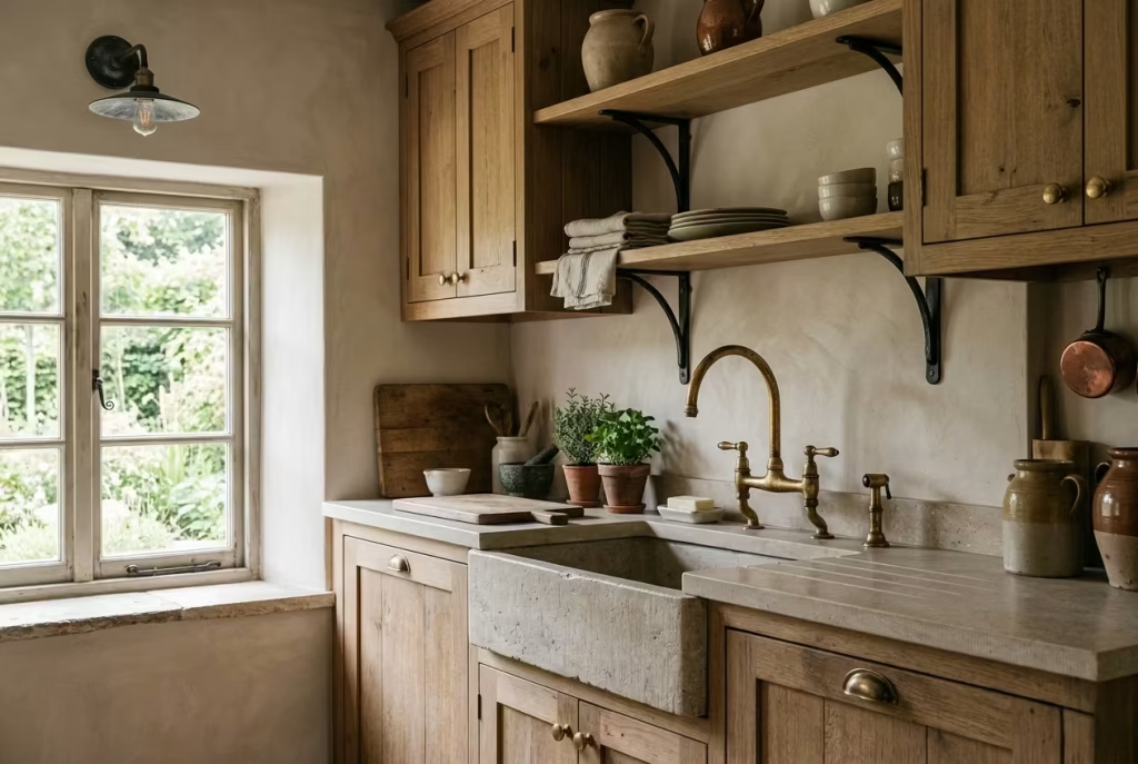
This is where the insight becomes important. Finishes should evolve, not remain static. A kitchen that holds every surface in a fixed, untouched state can begin to feel oddly sterile over time. Mixed metals, especially those that age naturally, introduce a sense of movement. Brass deepens, iron softens, nickel dulls slightly, and the room slowly develops a layered honesty that no catalogue-perfect finish can really imitate.
That evolution matters because kitchens are not static rooms. They are used, touched, cleaned, cooked in, and lived with every day. When the metals are allowed to age in different ways, they begin to reflect that reality. It becomes less about maintaining an immaculate finish and more about allowing the room to tell its story in small, visible ways.
Where clients often overdo it
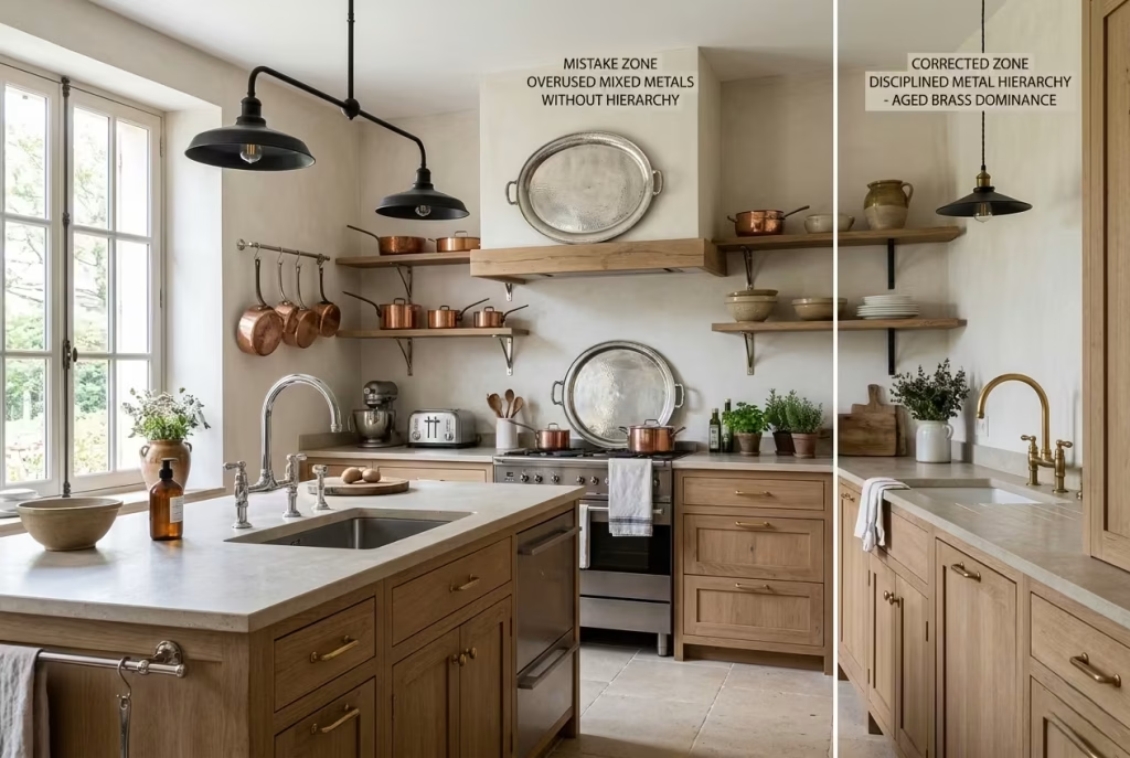
The most common mistake is using too many finishes with equal emphasis. When every metal tries to be the star, the composition falls apart. Another issue is mixing finishes that are too close but not close enough, which can create a faint sense of awkwardness rather than harmony. The eye notices the difference, but not in a pleasing way. It is like hearing slightly off-key notes in an otherwise strong melody.
A disciplined approach avoids that. It gives the eye a clear order, the hand a familiar touchpoint, and the room a sense of coherence that lasts. That is what makes mixed metals feel elevated rather than busy.
Pros
- Adds depth and warmth without relying on uniformity
- Allows the kitchen to feel collected over time rather than installed all at once
- Works beautifully with natural materials when the balance is well judged
Cons
- Can look chaotic if too many finishes compete for attention
- Requires repetition and planning to feel intentional rather than random
- Demands restraint, which is often harder than it sounds
The Final Layer Styling That Feels Lived In, Not Staged
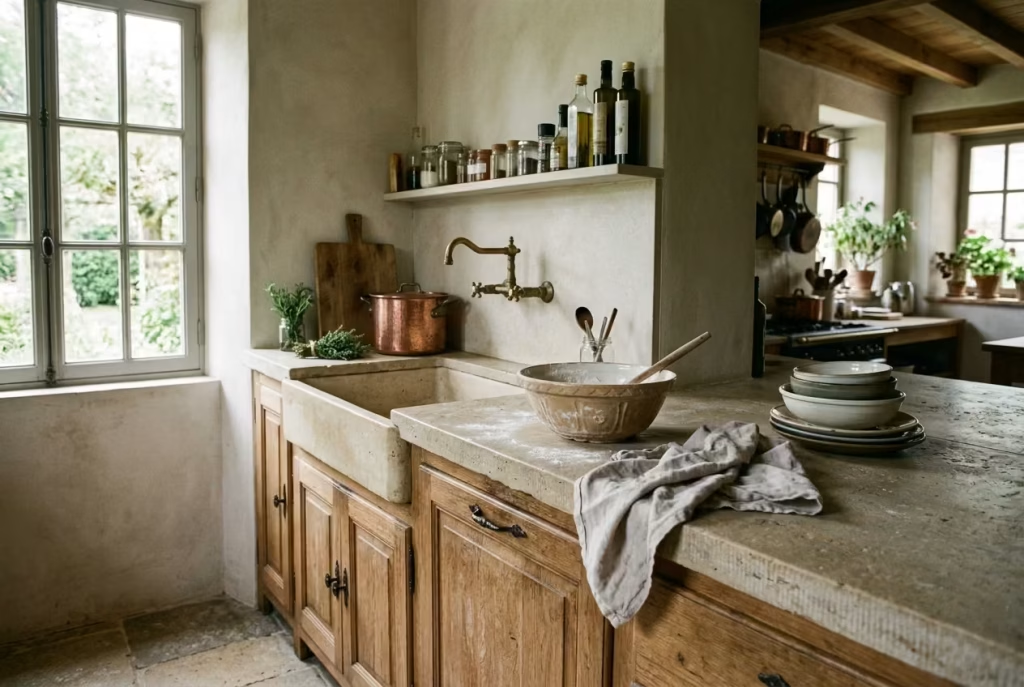
Styling is often where a French country kitchen either comes alive or loses its honesty. It is the final layer, but it should never feel like a performance. The most enduring spaces I have worked on are the ones where objects are not arranged for effect, but gathered through use, memory, and quiet preference. A ceramic bowl left on the counter, a linen cloth slightly softened with time, a stack of well-used crockery placed without ceremony, these are the details that allow a kitchen to feel settled rather than staged. When styling is approached with restraint, it stops being decoration and starts becoming part of daily rhythm, almost like the space has been gently lived into rather than carefully arranged for display.
Functional Styling With Everyday Objects
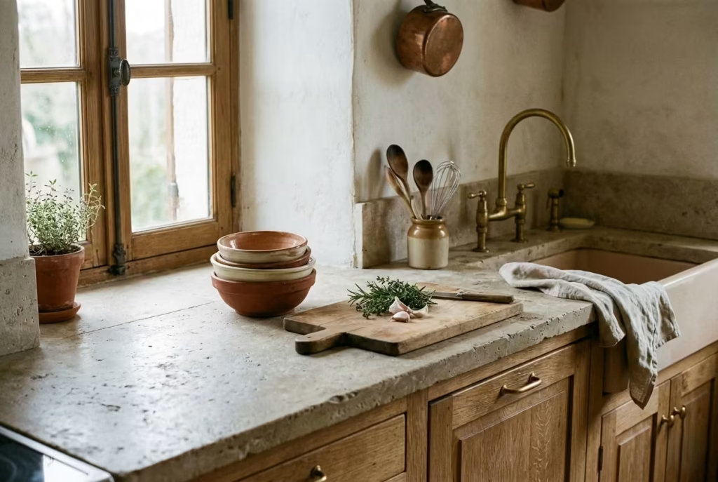
Functional styling is where a kitchen quietly stops trying to look designed and simply begins to feel lived in. In French country interiors, this final layer is less about adding decorative objects and more about allowing everyday items to earn their place visually. Ceramics, linens, and cookware are not props here, they are the real vocabulary of the space, speaking in a tone that feels honest, unforced, and grounded in daily rhythm.
Why everyday objects create authenticity
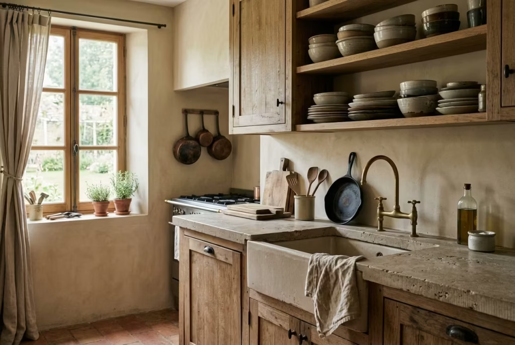
There is a clear difference between styling a kitchen and living in it. Over-styled spaces often feel slightly detached, as if nothing is ever allowed to be used. Functional styling works in the opposite direction. It allows objects to remain visible because they are genuinely part of daily life, not because they were selected for display.
A stack of handmade ceramics near the cooking zone, slightly irregular in tone and shape, brings a sense of warmth that no curated accessory can replicate. Linen tea towels, softly worn at the edges, introduce texture and movement without effort. Even cookware, when thoughtfully chosen, becomes part of the visual language rather than something to hide away. Over time, these elements create a quiet sense of continuity, almost like the kitchen is telling its own ongoing story through use rather than arrangement.
I have seen kitchens where the most beautiful styling came not from adding anything new, but from simply allowing the right objects to remain visible. In one project, a set of everyday stoneware bowls was originally meant to be stored behind closed doors. Once placed on open shelving and used daily, they became one of the most grounding elements in the entire space, subtly reinforcing the kitchen’s sense of calm.
The discipline of editing rather than adding
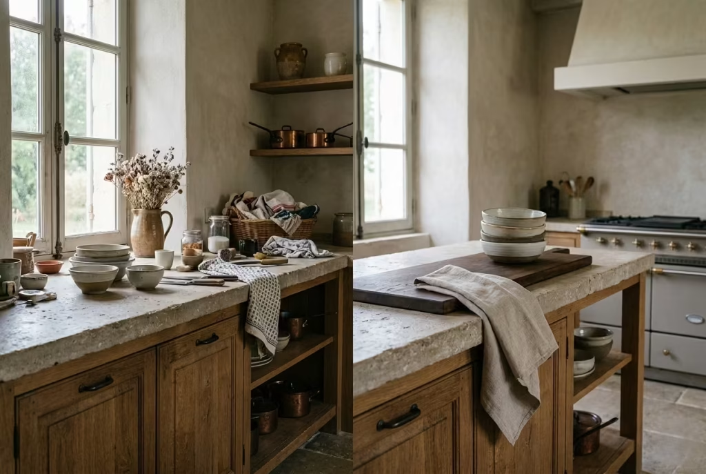
The real challenge with functional styling is not what to include, but what to leave out. It is very easy to tip into visual clutter under the assumption that more objects will create more character. In reality, the opposite tends to happen. When too many items compete for attention, the space begins to lose clarity and feels more chaotic than considered.
I often approach this stage as a process of quiet editing. Instead of introducing new objects, I focus on reducing until only the most meaningful, useful, and visually coherent items remain. A few well-chosen pieces, repeated in different areas of the kitchen, will always feel stronger than an excess of unrelated objects scattered across surfaces.
Linens are a good example of this principle. Rather than multiple patterns and colours, a limited palette of natural tones such as off-white, muted flax, or soft grey creates cohesion. When folded casually over a counter edge or draped over a chair, they add softness without disrupting the overall composition.
Where functionality and aesthetics quietly overlap
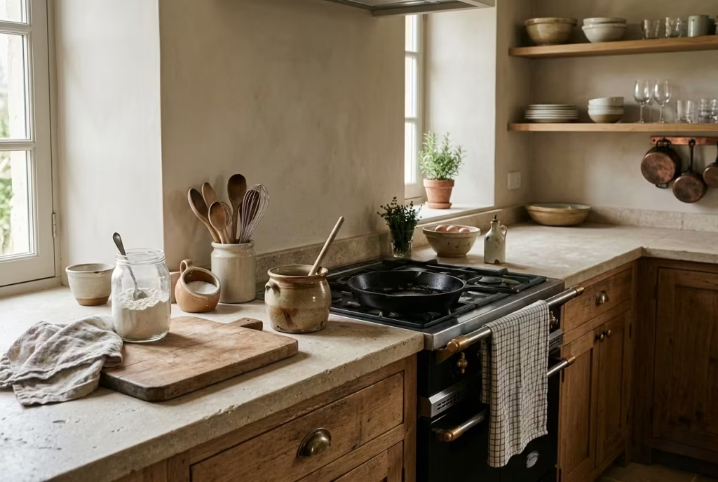
One of the most interesting aspects of functional styling is how naturally beauty emerges when objects are used regularly. A well-worn wooden spoon resting in a ceramic pot, a cast iron pan left on the hob after cooking, or a glass jar filled with everyday ingredients, all of these moments feel unintentional, yet they often create the most compelling visual layers in the kitchen.
This is where French country design feels most grounded. Nothing is staged, yet everything feels considered. The kitchen does not rely on constant restyling to stay presentable. Instead, it evolves through use, with objects shifting naturally depending on need, season, and habit.
Where clients often overcomplicate styling
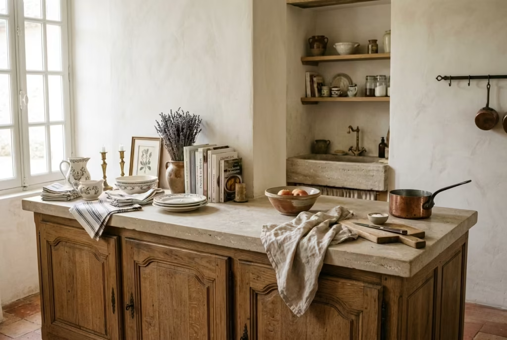
A common mistake is treating styling as a final decorative exercise rather than a continuation of daily life. Clients sometimes introduce too many curated objects at once, often purchased specifically for display, which can quickly undermine authenticity. The result feels static rather than lived in.
Another issue is over-organising functional items. When everything is perfectly aligned or overly symmetrical, the kitchen starts to lose its ease. Real life is rarely symmetrical, and when styling reflects that softness, the space feels more believable.
Pros
- Creates a natural sense of authenticity rooted in daily use
- Allows the kitchen to feel lived in rather than overly styled
- Requires minimal intervention once a thoughtful baseline is established
Cons
- Demands ongoing restraint to avoid gradual clutter
- Requires careful selection to ensure cohesion between everyday items
- Can feel visually inconsistent if not gently edited over time
Common Renovation Mistakes That Undermine Longevity
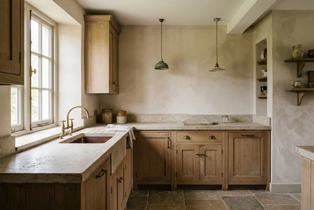
Longevity in kitchen design is rarely undermined by one dramatic decision. More often, it is the accumulation of small misjudgements that slowly erode how a space feels and functions over time. In French country kitchens, where material honesty and restraint are central, these mistakes tend to become even more visible as years pass. What looks refined on completion can quietly lose its grounding if the underlying decisions are not made with how the space will actually live, age, and evolve in mind.
Over-restoring instead of preserving
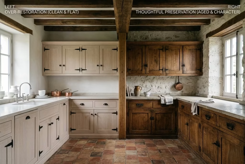
One of the most frequent missteps I see is the urge to over-restore, especially in older properties where original character still exists. In the pursuit of perfection, clients often strip away patina, soften every imperfection, and replace naturally aged surfaces with overly refined finishes. On the surface, the result can look clean and polished, but it often loses the very texture that gives a kitchen its depth.
I have walked into restored kitchens where timber has been sanded back to an almost uniform tone, stone has been re-honed to remove every trace of age, and ironwork has been refinished to look factory-new. Initially, it feels impressive. But over time, something essential is missing. The space no longer carries the quiet evidence of time, and without that layer, it can feel slightly disconnected from its own history.
Preservation, when done thoughtfully, allows the story of a material to remain visible. It does not mean neglect. It means knowing when to stop, when to leave a surface as it is, and when its imperfections are actually part of its strength.
Choosing uniformity over variation
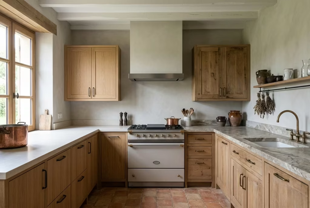
Uniformity can feel safe at the design stage, but in lived-in spaces it often becomes the very thing that flattens atmosphere. When every surface, colour, and texture is perfectly matched, the kitchen can begin to feel static, almost like it has been frozen at the moment of completion.
Variation, on the other hand, introduces rhythm. Slight differences in timber tone, subtle shifts in stone veining, or the natural ageing of metals all contribute to a space that feels alive. In French country kitchens, this layered inconsistency is not a flaw, it is the point. It allows the eye to move, to pause, and to rediscover details over time rather than absorbing everything in a single glance.
I often remind clients that perfection is visually efficient, but it is rarely emotionally engaging. A kitchen that holds gentle variation will almost always feel more grounded than one built on strict uniformity.
Ignoring how materials age in real conditions
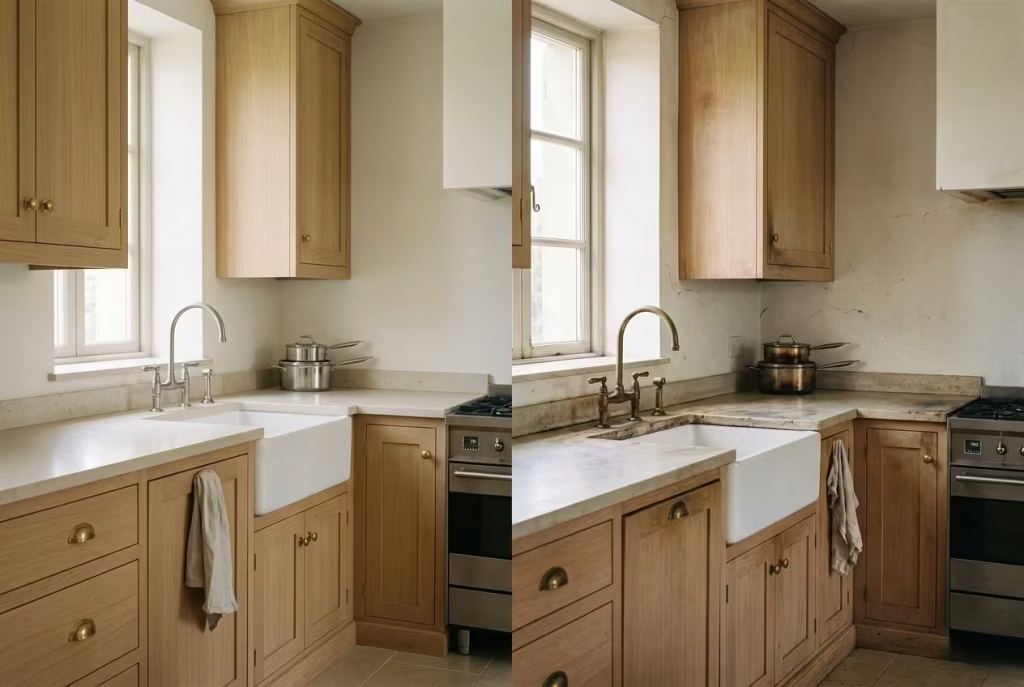
Design decisions often look very different once they are exposed to real life. Materials that appear stable in samples or showrooms can behave unpredictably when subjected to heat, moisture, light, and daily use. This is where many renovation mistakes begin.
Unsealed stone may darken in high-use areas. Soft metals will patinate unevenly depending on touch and exposure. Even painted finishes can shift subtly under different lighting conditions. These changes are not failures, they are natural responses. The issue arises when they are not anticipated.
In practice, I always consider how a material will look not just on day one, but after one year and five years of use. A kitchen that ages well is rarely the one that resists change. It is the one that anticipates it. When this thinking is absent, the result can feel increasingly mismatched over time, even if it initially appeared flawless.
Designing for photos rather than daily use
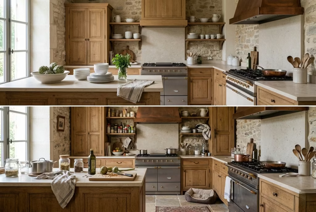
Perhaps the most modern mistake is designing for imagery rather than habitation. Kitchens that are overly styled for photographs often prioritise symmetry, staging, and visual impact over comfort and usability. While they may perform well in a static frame, they can feel less intuitive in daily life.
Real kitchens are not static compositions. They accumulate objects, shift throughout the day, and respond to use in unpredictable ways. When a design ignores this reality, it often struggles to maintain its coherence once it is lived in. Surfaces become cluttered because storage was not considered practically. Beautiful arrangements lose their clarity once everyday objects enter the space.
I have seen kitchens that looked exceptional in their finished photography but felt slightly restrictive in use, almost as if they were waiting to be reset rather than actively lived in. The most successful spaces, by contrast, accept a degree of natural disorder. They are designed not just for the camera, but for the quiet repetition of daily life.
Real-Life Reflection: Why the Best Kitchens Never Feel Finished
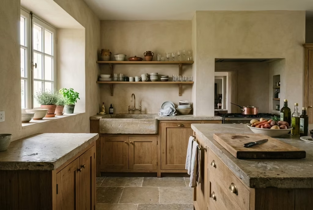
There is a quiet truth that becomes more obvious with every project I work on. The kitchens that feel the most successful, the ones that genuinely stand the test of time, rarely feel complete in a final, closed-off sense. Instead, they carry a sense of openness, almost as if they are still gently becoming what they are meant to be. That unfinished quality is not a lack of resolution, it is often the very thing that gives them longevity.
A personal observation from projects
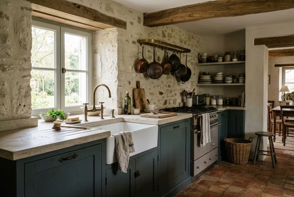
Across different homes and different clients, I have noticed a consistent pattern. The kitchens that age the best are not the ones that were overly finalised at the outset. They are the ones where decisions were made with enough restraint to allow future adaptation. A surface left slightly more natural than polished. A palette that leaves room for variation rather than locking every tone into place. A layout that supports how people actually move, rather than how it looks in a fixed moment.
I remember one particular project where everything felt resolved on installation day. Cabinetry aligned perfectly, materials were balanced, lighting was carefully layered. Yet what made the space truly come alive was not that initial completion, but what happened afterwards. A brass tap slowly softened in tone. Linen cloths began to accumulate naturally on surfaces. A ceramic bowl found a permanent place near the sink simply because it was always being used. The kitchen did not degrade, it settled, and in that settling it became more authentic than it ever was on day one.
The idea that lasting spaces evolve naturally
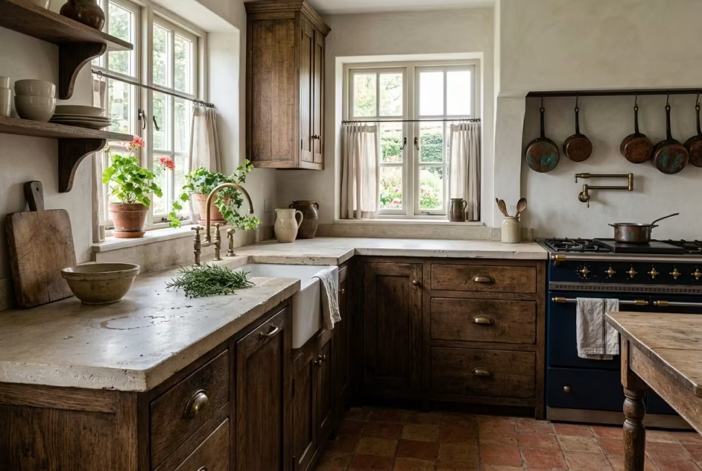
Longevity in design is often misunderstood as permanence, but in reality it is closer to controlled evolution. A kitchen that resists change too strongly can begin to feel static over time, almost as if it is holding its breath. The more enduring spaces are the ones that accept subtle transformation as part of their identity.
Materials shift. Light changes. Habits develop. And instead of resisting these forces, the best kitchens quietly absorb them. Timber darkens in areas of frequent touch, stone develops softer tonal variations, and metals gain depth through everyday use. These changes are not flaws to correct, they are the slow evidence of life being lived properly within the space.
When a kitchen is designed with this in mind, it never feels like it has reached a final destination. It feels more like a steady progression, where each year adds another layer of quiet character rather than demanding reinvention.
Kitchens as living environments, not static compositions
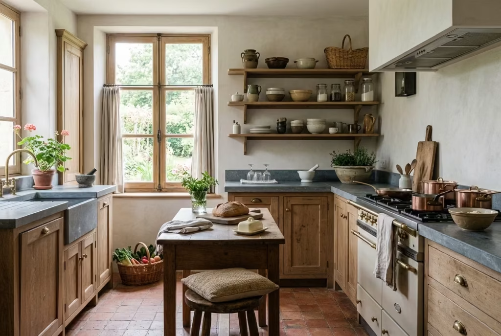
The most important shift in thinking is understanding that a kitchen is not a finished composition to be preserved like an object. It is a working environment, constantly interacting with people, routines, and time. The moment it is treated as something static, it begins to lose its natural rhythm.
In lived reality, nothing remains perfectly arranged. Objects move, surfaces are used, and order shifts throughout the day. When a design anticipates this, rather than fights against it, the result is a space that feels more forgiving and far more resilient. Storage becomes intuitive. Surfaces accommodate use. Materials are chosen not just for how they look, but for how they behave under pressure and repetition.
I have always found that the most successful kitchens are the ones that do not demand constant correction. They allow life to unfold without interruption, and in doing so, they quietly gain character rather than lose control.
Final Thoughts: Designing for Patina, Not Perfection
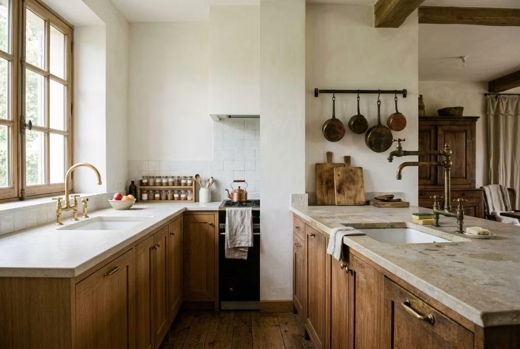
There comes a point in every well-resolved kitchen where perfection stops being the goal and quiet endurance takes its place. In French country design, the most compelling spaces are rarely the most flawless ones. They are the ones that accept time as part of the design process, allowing surfaces to soften, tones to shift, and materials to gather a sense of history that cannot be manufactured on day one.
Reinforcing the philosophy of enduring design
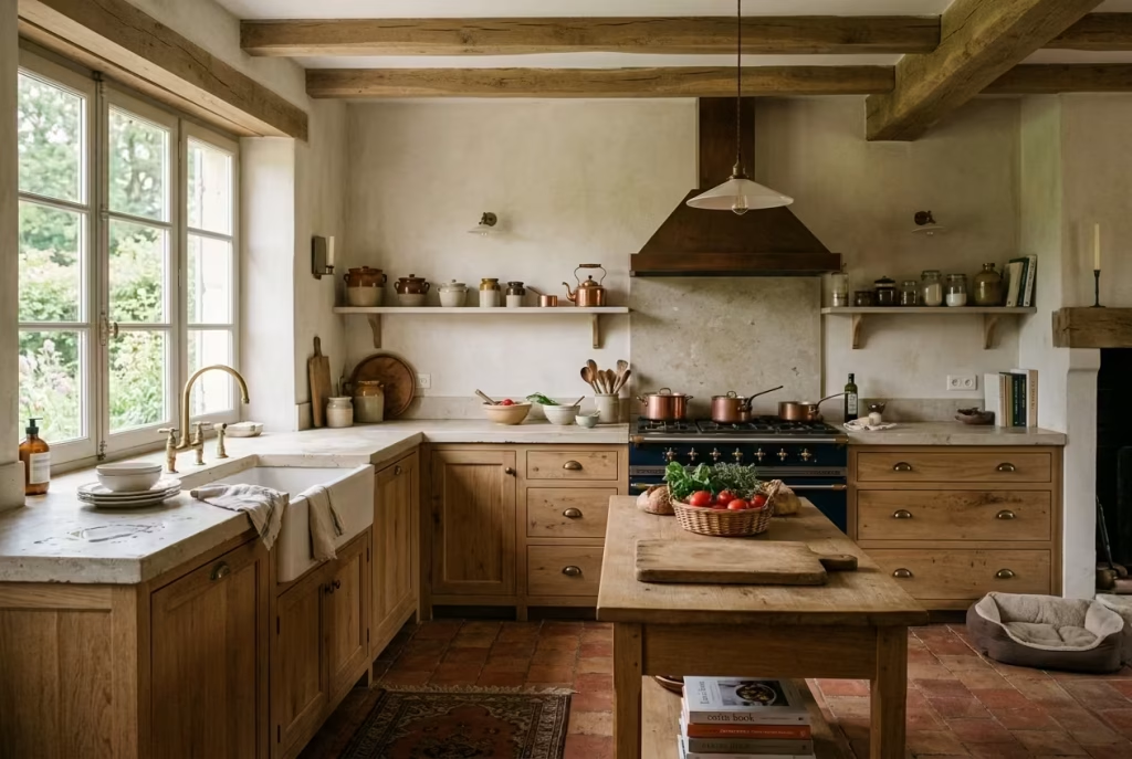
Enduring design is not about resisting change, it is about absorbing it gracefully. A kitchen that is built solely to look complete at the moment of installation often struggles to maintain its relevance over time. By contrast, a space designed with patina in mind understands that age is not something to hide from, but something to work with.
I have often found that the most successful projects are the ones where nothing feels overly fixed. The cabinetry is precise, but not rigid. The materials are carefully chosen, but not over-controlled. The lighting is structured, but allowed to soften the edges of the room as the day unfolds. Over time, this approach creates a kitchen that does not deteriorate in appearance, but deepens in character.
Encouraging restraint, material honesty, and thoughtful layering
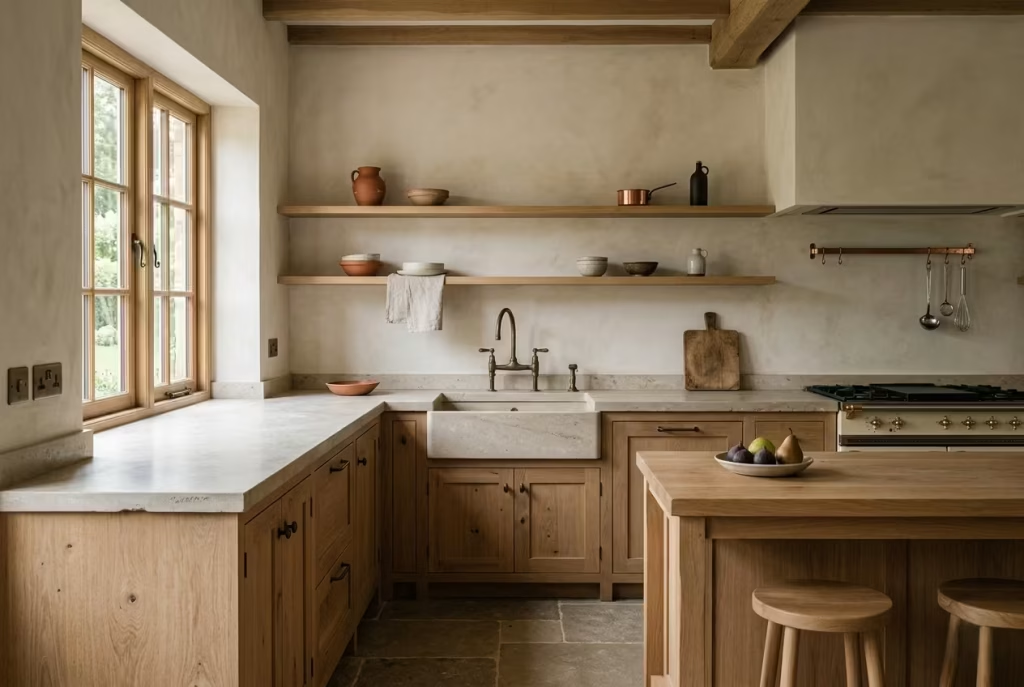
Restraint is often misunderstood as absence, when in reality it is clarity. It is the decision to stop before a space becomes overdesigned, to allow materials to speak without competing voices, and to accept that not every surface needs to be perfected. In French country kitchens, this restraint is what allows the architecture to breathe.
Material honesty plays an equally important role. Stone should look like stone, timber should behave like timber, and metals should be allowed to age rather than remain artificially static. When materials are honest, they do not need excessive styling to feel complete. Their natural behaviour becomes the decoration in itself.
Layering then brings everything together, but it must be done with intention. Not as accumulation, but as quiet progression. From layout to material, from lighting to hardware, each layer should support the next without overwhelming it. When this balance is achieved, the kitchen begins to feel composed rather than constructed, as if it has grown into itself over time.
Ending on a quiet, confident note
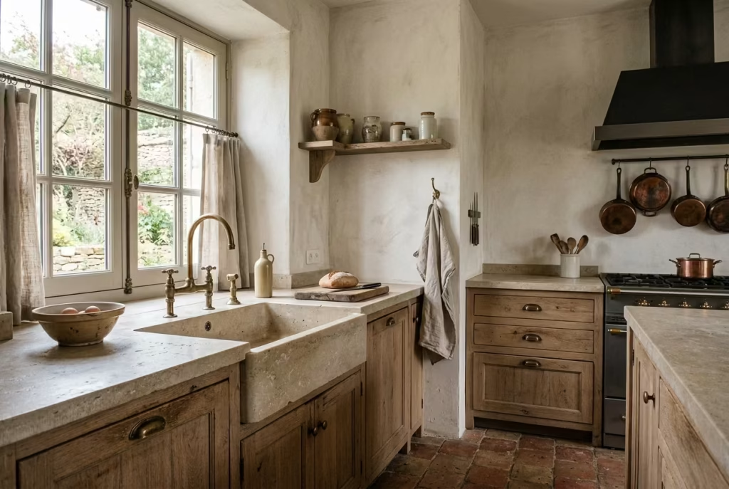
Ultimately, the most enduring kitchens are not defined by perfection, but by patina. They are the ones that accept fingerprints, softened edges, and subtle shifts in tone as part of their identity. Instead of resisting time, they move with it, allowing each year to add something quietly meaningful to the surface of the space.
A kitchen designed this way does not demand attention. It earns it slowly, almost imperceptibly, until one day you realise it feels exactly as it should. Not flawless, not finished, but comfortably settled, with a sense of ease that no purely pristine interior can hold for very long.
Frequently Asked Questions About French Country Kitchen Renovation
What makes a French country kitchen feel authentic rather than themed?
Authenticity comes from restraint, proportion, and material honesty. A French country kitchen should feel rooted in the architecture of the home, not dressed up with obvious clichés. Natural stone, timber, limewashed walls, traditional joinery, and a softened colour palette usually carry far more weight than surface styling alone. The best rooms feel quietly resolved rather than heavily staged.
Which materials age best in a French country kitchen?
The most enduring materials are usually the ones that develop character rather than resisting it. Honed stone, aged timber, limewash, terracotta, and unlacquered brass all tend to improve with time. They soften, deepen, and gain presence as they are used. That said, they need to be chosen with care, because their beauty lies in how they change, not in how they remain untouched.
Is a French country kitchen suitable for a modern home?
Yes, provided the design is adapted thoughtfully. French country style works beautifully in both period properties and contemporary homes when the architecture is handled with confidence. The key is not to force old-world details into a space that does not suit them. A modern shell can still hold a French country kitchen if the proportions, materials, and finishes feel grounded and considered.
Do French country kitchens need a lot of decorative detail?
Not necessarily. In fact, too much ornament can quickly tip the room into imitation. The strongest French country kitchens often rely on quiet architectural gestures rather than excess decoration. A deep reveal, an inset door, a plaster hood, or a well-placed timber frame can do far more for the atmosphere than shelves full of decorative objects.
How do you keep a French country kitchen from feeling too rustic?
Balance is everything. I often find that a room becomes more refined when rustic elements are paired with clean detailing and disciplined proportions. For example, a reclaimed timber table can sit comfortably alongside elegant inset cabinetry and a restrained colour palette. It is that tension between warmth and order that stops the space from becoming overly quaint.
What colours work best for a timeless French country kitchen?
Muted, natural tones tend to age best. Chalky whites, sage, clay, ochre, soft greys, and earthy neutrals all work well because they respond gently to changing light. They also sit comfortably alongside natural materials, which helps the whole room feel cohesive rather than over-designed. Bold colour can work, but it usually needs to be handled with far more discipline.
How can I make the kitchen feel lived in without making it look cluttered?
The answer lies in editing, not adding. Functional objects such as ceramics, linens, cookware, and cutting boards can create warmth when they are chosen carefully and allowed to sit naturally in the space. The trick is to avoid over-styling. A few useful, beautiful items placed with confidence will always feel more authentic than a room packed with decorative extras.
What is the biggest mistake to avoid in a French country kitchen renovation?
Trying to make everything look perfect. Perfection often removes the very qualities that give this style its charm, such as softness, patina, and a sense of lived experience. A French country kitchen should feel settled, not sterile. The most successful renovations leave enough room for the materials, the light, and the life of the household to shape the room over time.