20 Cozy Modern Farmhouse Entryway Designs for a Welcoming Home
Before a guest notices the living room, admires the kitchen, or settles into a comfortable seat, they experience something far more powerful: the arrival. The entryway is the home’s opening chapter, quietly shaping expectations and creating an immediate emotional impression. A well-designed entrance does more than connect indoors and outdoors. It signals comfort, character, and a sense of belonging from the very first step across the threshold.
This is precisely why modern farmhouse entryways continue to resonate with homeowners. They offer warmth without excessive ornamentation, character without visual heaviness, and practicality without sacrificing beauty. Rather than relying on rustic clichés or themed décor, the most successful spaces blend natural textures, thoughtful storage, and architectural simplicity to create an atmosphere that feels inviting year-round.
In my own residential projects, I have found that homeowners often focus their attention on kitchens, living rooms, and primary bedrooms while treating the entryway as little more than a passage. Yet this overlooked space carries a surprising amount of responsibility. It manages daily routines, absorbs the transition from outdoors to indoors, and establishes the visual rhythm that flows throughout the rest of the home.
The strongest modern farmhouse entryways are not necessarily the largest or most elaborate. They are the ones that feel effortless. Natural wood, layered textiles, aged metal finishes, and carefully planned storage work together to create a setting that feels welcoming from the moment the door opens. Like a firm handshake or a warm greeting, a thoughtfully designed entryway leaves a lasting impression long before the rest of the house comes into view.
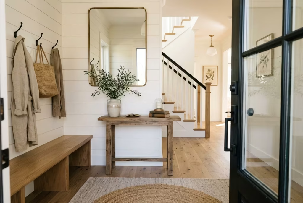
In the ideas ahead, you’ll discover inspiring ways to create an entrance that feels both beautifully considered and genuinely lived in.
Shiplap Walls with a Built-In Bench
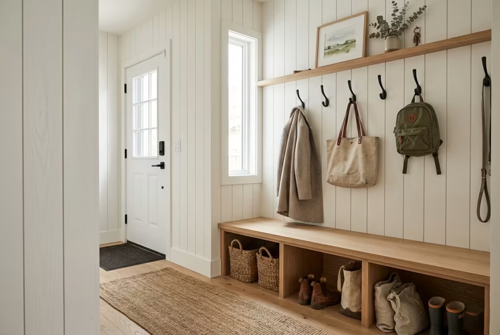
Few design features capture the welcoming spirit of a modern farmhouse entryway quite like shiplap walls paired with a built-in bench. It is a combination that feels timeless rather than trendy, practical yet polished. More importantly, it solves one of the most common problems homeowners face at the front door: creating a space that works hard every day without looking purely functional.
Why It Works
The beauty of this approach lies in its ability to blend architectural character with everyday usability. Shiplap introduces subtle texture and depth, preventing walls from feeling flat or sterile. At the same time, a built-in bench creates an intentional landing zone where daily routines can unfold naturally.
When people arrive home carrying shopping bags, removing muddy boots, managing children, or searching for keys, having a dedicated place to sit transforms the experience. What might otherwise become a chaotic drop zone becomes a space with purpose.
I often describe a well-designed entry bench as the unsung hero of the home. It rarely steals the spotlight, yet it quietly earns its keep every single day.
The vertical lines of shiplap also help frame the entryway, drawing the eye upward and making modest spaces feel more substantial. In homes where the entrance opens directly into living areas, this architectural detail helps establish visual separation without adding walls.
Ideal Room Dimensions
One of the advantages of this design is its flexibility. For a compact entryway, a wall measuring approximately 1.8 to 2.4 metres (6 to 8 feet) wide can comfortably accommodate a built-in bench while maintaining circulation space.
Medium-sized entryways often benefit from feature walls spanning 2.7 to 3.6 metres (9 to 12 feet). In larger farmhouse homes, extending the built-in system across 4.2 metres (14 feet) or more creates a mudroom-inspired look with integrated storage, hooks, and cabinetry.
As a rule of thumb, maintaining a clear walkway of at least 900 mm to 1.2 metres (36 to 48 inches) in front of the bench prevents the space from feeling cramped.
Recommended Bench Measurements
After designing numerous family-focused entryways, I have found that comfort and practicality depend heavily on getting proportions right. Recommended dimensions include:
- Bench height: 430 to 480 mm (17 to 19 inches)
- Bench depth: 400 to 500 mm (16 to 20 inches)
- Individual seating width: 600 mm (24 inches) minimum per person
- Storage cubby height: 250 to 350 mm (10 to 14 inches)
- Hook height above bench: 1.5 to 1.7 metres (60 to 67 inches)
A common mistake is making benches too shallow. While they may look sleek in photographs, they quickly become uncomfortable in daily use. A slightly deeper seat creates a far more relaxed and inviting experience.
Materials to Consider
Material selection plays a significant role in determining whether the space feels authentic or forced. For shiplap walls, I frequently recommend:
- Painted MDF for cost efficiency
- Solid pine for authentic farmhouse character
- White oak for premium projects
- Moisture-resistant timber in wet climates
For the bench itself:
- White oak offers exceptional durability and ages beautifully
- Maple provides a clean, contemporary appearance
- Walnut introduces richness and contrast
- Painted hardwood works well for classic farmhouse schemes
Performance fabrics on seat cushions are worth their weight in gold, particularly in homes with children or pets. They resist stains while maintaining a refined appearance. Natural linen, textured cotton blends, and performance bouclé fabrics all pair beautifully with modern farmhouse interiors.
Real-Life Designer Insight
One project that immediately comes to mind involved a busy family of five renovating a suburban farmhouse-style home. Their original entryway consisted of little more than a narrow hallway with scattered shoes, backpacks, and coats constantly spilling into adjacent rooms. Instead of simply adding furniture, we designed a custom built-in bench measuring 2.7 metres (9 feet) wide with integrated drawers below, vertical shiplap panelling above, and a row of oversized brass hooks.
The transformation went far beyond aesthetics. Within weeks, the family noticed smoother morning routines. Children naturally gravitated toward designated storage areas. Sports equipment stopped migrating into living spaces. Even guests instinctively understood where coats and shoes belonged.
What struck me most was how such a relatively modest intervention changed the rhythm of daily life. Sometimes the smallest design decisions end up moving the needle the furthest.
Pros
- Creates instant farmhouse character
- Adds valuable seating for daily routines
- Maximises underutilised wall space
- Encourages organisation and reduces clutter
- Can include concealed storage compartments
- Works in both compact and spacious entryways
- Increases architectural interest without major structural work
- Provides long-term functionality for growing families
Cons
- Custom built-ins require a higher initial investment
- Permanent installation limits future layout flexibility
- Shiplap requires precise installation to achieve a premium appearance
- Painted surfaces may need occasional touch-ups in high-traffic homes
- Deep benches can overwhelm very narrow entryways if improperly sized
Reclaimed Wood Console with Oversized Mirror
A narrow entryway can sometimes feel like a missed opportunity. The walls sit close together, natural light may be limited, and there is often little room for decorative elements. Yet some of the most memorable farmhouse entrances I have designed have emerged from exactly these constraints. Rather than fighting against a compact footprint, the key is to work with it.
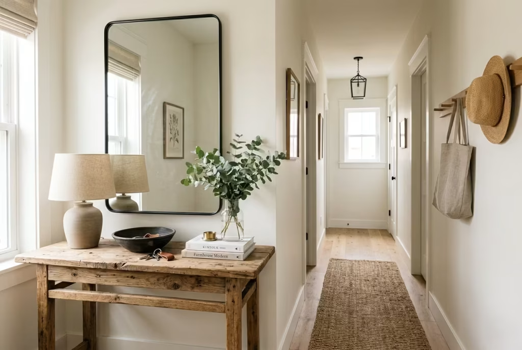
A reclaimed wood console paired with an oversized mirror is one of the most effective ways to transform a tight entrance into a space that feels layered, welcoming, and visually expansive. The combination brings together character, practicality, and light reflection in a way that few other design features can achieve. It is a classic example of working smarter, not harder.
Creating Depth in Narrow Entryways
Narrow entryways often suffer from a tunnel-like effect. Without visual anchors, they can feel more like passageways than intentional parts of the home. This is where the pairing of natural wood and reflective surfaces earns its stripes.
The reclaimed wood introduces history, texture, and warmth. Every knot, grain variation, nail mark, and weathered imperfection tells a story, creating a sense of authenticity that new materials often struggle to replicate.
The oversized mirror performs a different but equally important role. By reflecting both natural and artificial light, it creates the illusion of additional space. What was once a confined corridor suddenly feels brighter, wider, and more inviting.
I often tell clients that mirrors are not merely decorative accessories. Used strategically, they become architectural tools. In smaller entrances, they can make a room feel as though the walls have stepped back a few inches, which can make all the difference.
The result is a space that feels balanced rather than boxed in, welcoming rather than restrictive.
Mirror Placement Strategies
Mirror positioning is often where success or failure is determined. An oversized mirror placed directly above the console creates a strong focal point while visually expanding the room. Ideally, the mirror should occupy roughly two-thirds to three-quarters of the console’s width. This relationship feels balanced and intentional.
In narrower hallways, vertical mirrors often work particularly well because they draw the eye upward, emphasising ceiling height and creating a greater sense of openness.
For entryways with access to natural daylight, positioning the mirror opposite or adjacent to a window allows it to bounce light throughout the space. It is one of the oldest tricks in the book, but it remains remarkably effective. A few placement guidelines I frequently follow include:
- Centre the mirror approximately 150 mm to 250 mm (6 to 10 inches) above the console.
- Keep the mirror aligned with the console rather than extending dramatically beyond it.
- Use larger mirrors whenever possible. Undersized mirrors often make spaces feel smaller rather than larger.
- Consider arched mirror shapes for a softer farmhouse aesthetic.
One common mistake homeowners make is hanging mirrors too high. A mirror should engage with the furniture below it and feel connected to the composition rather than floating awkwardly on the wall.
Choosing Authentic Reclaimed Wood
Not all reclaimed wood is created equal. In recent years, many products have been manufactured to imitate aged timber, but genuine reclaimed wood possesses a depth and character that is difficult to reproduce. The subtle colour variation, irregular grain patterns, and naturally aged surfaces bring an honesty to the design that feels grounded and enduring. When sourcing reclaimed wood consoles, I often recommend looking for materials salvaged from:
- Old barns
- Historic agricultural buildings
- Industrial warehouses
- Vintage timber mills
- Former railway structures
Wood species such as oak, pine, elm, and chestnut tend to age beautifully and work particularly well in modern farmhouse settings. The goal is not perfection. In fact, some of the most appealing pieces contain visible signs of previous use. Minor imperfections become part of the narrative, adding richness that new furniture often lacks.
That said, authenticity should never come at the expense of functionality. Ensure surfaces are properly sealed, structurally sound, and suitable for daily use.
Styling Without Visual Clutter
One of the fastest ways to diminish the impact of a beautiful console is to overload it with accessories. A narrow entryway benefits from restraint. Every object should contribute to the overall composition rather than compete for attention.
In many projects, I follow a simple principle: fewer items, better items. A thoughtfully styled console might include:
- A ceramic table lamp
- A handcrafted bowl for keys
- A vase with seasonal greenery
- A stack of two or three carefully selected books
- A decorative tray for organisation
The aim is to create visual rhythm while preserving breathing room. When styling farmhouse interiors, I often encourage clients to leave at least one-third of the console surface completely clear. Negative space allows the eye to rest and helps the room feel calm rather than chaotic. As the saying goes, sometimes less really is more.
Suggested Measurements
Getting proportions right is essential, particularly in tighter spaces. Recommended console dimensions:
- Height: 760 to 860 mm (30 to 34 inches)
- Depth: 300 to 400 mm (12 to 16 inches)
- Width: 1.2 to 1.8 metres (4 to 6 feet)
Recommended mirror dimensions:
- Height: 900 to 1500 mm (36 to 60 inches)
- Width: Approximately 65% to 75% of console width
Clearance recommendations:
- Minimum walkway width: 900 mm (36 inches)
- Ideal walkway width: 1.1 to 1.2 metres (43 to 48 inches)
For particularly narrow entrances, selecting a console with a depth closer to 300 mm (12 inches) helps maintain comfortable circulation without sacrificing functionality.
Pros
- Makes narrow entryways appear larger
- Reflects light and brightens darker spaces
- Introduces authentic farmhouse character
- Provides a convenient drop zone for daily essentials
- Adds visual interest without occupying excessive floor area
- Works well in both traditional and contemporary farmhouse interiors
- Allows seasonal styling updates without major redesigns
- Creates a polished first impression
Cons
- Genuine reclaimed wood furniture can be expensive
- Large mirrors require secure installation
- Reflective surfaces need regular cleaning
- Overstyling can quickly create visual clutter
- Poor-quality reclaimed wood may warp or crack over time
- Very narrow spaces require careful sizing to maintain circulation
Board-and-Batten Walls with Warm Brass Hooks
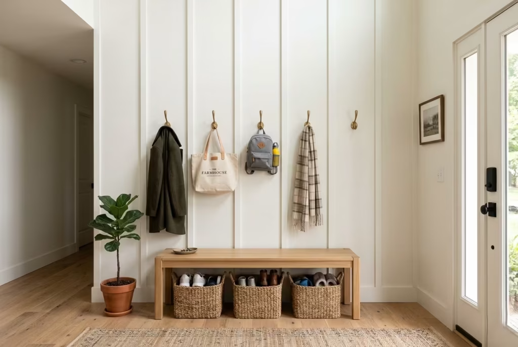
Some design features quietly endure while others come and go with changing tastes. Board-and-batten wall treatments belong firmly in the first category. Rooted in traditional craftsmanship yet surprisingly adaptable to contemporary interiors, they bring structure, depth, and architectural interest to an entryway without demanding attention.
When paired with warm brass hooks, the result feels refined but approachable. There is an inherent honesty to the combination. The wall treatment introduces rhythm and visual order, while the metallic accents add warmth and utility. Together, they create an entrance that feels thoughtfully composed rather than heavily decorated.
In many homes, the entryway is expected to perform a difficult balancing act. It must welcome guests, support busy routines, conceal everyday clutter, and establish the aesthetic direction of the house. Board-and-batten walls help achieve all of these objectives while remaining visually calm.
Blending Traditional Character with Modern Simplicity
One reason this design continues to resonate is its ability to bridge two seemingly different worlds. Board-and-batten detailing carries historical roots, often associated with traditional farmhouses and period homes. Yet when executed with clean proportions, restrained colours, and streamlined accessories, it feels remarkably current.
I often find that homeowners are drawn to farmhouse interiors because they crave warmth and familiarity. What they do not want is a space that feels overly themed or weighed down by rustic clichés. Board-and-batten provides that sweet spot.
The vertical battens create a subtle framework that guides the eye upward, helping ceilings feel taller and rooms more substantial. At the same time, the clean geometry introduces a sense of discipline that complements modern furnishings beautifully. The effect is similar to a well-tailored jacket. It provides structure without stiffness and character without excess.
Whether painted in crisp white, soft greige, muted sage, or warm taupe, board-and-batten adds visual richness while maintaining a sense of restraint that allows other elements to breathe.
Hook Spacing Recommendations
Brass hooks may seem like a minor detail, but their placement has a significant impact on functionality. Too few hooks create frustration. Too many create visual noise.
The goal is to anticipate real-life behaviour rather than idealised habits. People rarely hang a single coat with perfect precision. They arrive carrying bags, scarves, dog leads, umbrellas, sports gear, and countless other items that require temporary storage. For most households, I recommend the following spacing guidelines:
- Standard hook spacing: 200 to 300 mm (8 to 12 inches)
- Family entryways: 250 to 350 mm (10 to 14 inches)
- Children’s hook zones: 1000 to 1200 mm (39 to 47 inches) from floor level
- Adult hook zones: 1600 to 1750 mm (63 to 69 inches) from floor level
In larger households, incorporating two rows of hooks can be a game changer. The lower row remains accessible to children, encouraging independence, while the upper row accommodates adult outerwear and larger items.
This small adjustment often pays dividends in daily routines, reducing the constant cycle of coats and backpacks ending up on nearby chairs or countertops.
Family-Friendly Storage Planning
Beautiful entryways quickly lose their appeal when clutter begins to accumulate. The most successful designs acknowledge this reality from the outset. Over the years, I have learned that storage works best when it feels effortless. If family members must open multiple doors, navigate awkward compartments, or move decorative objects simply to store a coat, the system eventually breaks down.
Board-and-batten walls work particularly well because they create a framework around which practical storage solutions can be organised. For family-oriented homes, consider incorporating:
- Open hooks for daily-use items
- Storage benches for footwear
- Cubbies for backpacks and sports equipment
- Floating shelves for baskets
- Dedicated umbrella storage
- Seasonal storage zones above eye level
One project I completed for a family with four young children demonstrated this perfectly. Their previous entryway looked attractive immediately after being tidied but rarely stayed organised for more than an hour.
We introduced full-height board-and-batten panelling alongside individual storage stations assigned to each family member. Hooks, cubbies, and labelled baskets gave every item a designated home.
The transformation was not merely visual. Morning departures became smoother, misplaced belongings became less frequent, and the entire entrance felt calmer.
Good design often succeeds not because it changes how people behave, but because it makes desired behaviours easier.
Durable Paint Finishes
Because entryways absorb heavy daily use, finish selection deserves careful consideration. This area experiences repeated contact from coats, bags, shoes, pets, and curious children. Paint that looks beautiful in a showroom can quickly show wear under real-world conditions.
For board-and-batten walls, I generally recommend:
Eggshell Finish
- Soft appearance
- Easy maintenance
- Suitable for most family homes
Satin Finish
- Increased durability
- Better stain resistance
- Slightly more reflective
Washable Modern Matt
- Contemporary appearance
- Improved cleanability
- Excellent for design-led interiors
Colour selection also influences the overall atmosphere. Soft whites create brightness and openness. Warm greiges introduce subtle sophistication. Muted greens connect beautifully with natural materials. Dusty blues provide a fresh interpretation of classic farmhouse palettes. The best choices often feel quietly confident rather than attention-seeking./
Pros
- Adds architectural depth without structural renovation
- Creates a timeless farmhouse aesthetic
- Helps entryways feel taller and more substantial
- Provides practical hanging storage
- Works in both traditional and contemporary homes
- Easy to customise through paint colours and hook styles
- Encourages better household organisation
- Relatively cost-effective compared with major millwork installations
- Adaptable to compact and large entryways alike
Cons
- Precise installation is essential for a professional appearance
- Poorly spaced battens can feel awkward or disproportionate
- Brass hardware requires occasional maintenance
- Dark paint colours may highlight dust and scuff marks
- Limited enclosed storage compared with full cabinetry systems
- Installation costs increase in homes with uneven walls
You May also Like: 25 outdoor entryways to transform your outdoor arrival into a composed, lasting first impression
Vintage Farmhouse Door with Contemporary Lighting
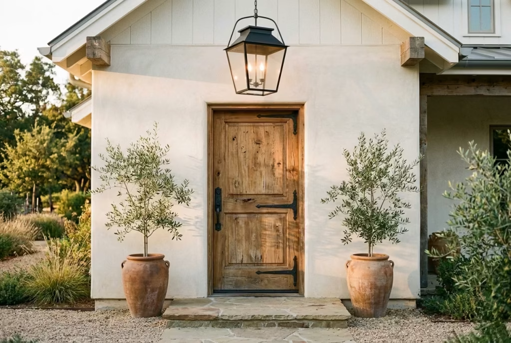
Some entryways feel welcoming the moment you approach them. Long before the door opens, there is already a sense of personality, history, and warmth. More often than not, that feeling comes from a carefully considered combination of architectural character and modern refinement. A vintage farmhouse door paired with contemporary lighting achieves exactly that balance.
The contrast works because each element brings something the other lacks. The aged door contributes soul, texture, and a story shaped over decades. The modern light fixture introduces clarity, freshness, and visual precision. Together, they create an entrance that feels rooted in the past while remaining firmly connected to contemporary living.
In an era where many homes can feel overly polished or somewhat interchangeable, this pairing introduces individuality. It creates the impression that the house has evolved naturally over time rather than being assembled from a catalogue.
Mixing Heritage and Modern Elements
One of the biggest misconceptions in residential design is that everything must belong to the same period to feel cohesive. In reality, some of the most compelling interiors thrive on contrast.
A beautifully aged farmhouse door, complete with weathered grain patterns, hand-forged hardware, and subtle imperfections, brings authenticity that new materials often struggle to replicate. Every scratch, dent, and variation contributes to a sense of lived experience.
Contemporary lighting, on the other hand, prevents the entrance from feeling trapped in the past. This contrast creates tension in the best possible way. The rustic texture of the door becomes more noticeable when placed alongside clean-lined fixtures. Similarly, the simplicity of modern lighting feels more intentional when positioned against a backdrop rich in history.
I often compare this approach to pairing a vintage leather jacket with a perfectly tailored shirt. Each piece enhances the other. The objective is not to recreate a historic farmhouse. Instead, it is about borrowing the warmth and craftsmanship of traditional elements while embracing the comfort and sophistication expected in modern homes.
Statement Lantern Selections
Lighting serves a practical purpose, but in an entryway it also shapes atmosphere and first impressions. A thoughtfully chosen lantern fixture can become the visual anchor of the entire entrance.
For modern farmhouse settings, oversized lanterns often perform particularly well because they provide scale and presence without appearing overly ornate. Some of my favourite options include:
- Black metal lanterns with simple geometric frames
- Aged brass lanterns with warm finishes
- Mixed-material fixtures incorporating glass and metal
- Minimalist lantern pendants with clean silhouettes
- Large-scale carriage lights for grand entrances
Size matters more than many homeowners realise. A fixture that feels too small often disappears into the architecture, while an appropriately scaled lantern creates a strong sense of arrival.
As a general guideline:
- Ceiling heights of 2.4 metres (8 feet): lanterns approximately 300 to 450 mm (12 to 18 inches) wide
- Ceiling heights of 2.7 metres (9 feet): lanterns approximately 450 to 600 mm (18 to 24 inches) wide
- Double-height foyers: lanterns often ranging from 750 mm to 1200 mm (30 to 48 inches)
The right fixture should command attention without overwhelming the surrounding architecture.
Restoring Original Doors
Whenever possible, I encourage homeowners to preserve original doors rather than replace them. Many older doors were constructed from solid hardwoods such as oak, pine, chestnut, or fir, materials that are often difficult and expensive to source today.
In one renovation project involving a 1930s farmhouse-inspired property, the owners initially planned to remove a heavily weathered front door. Years of paint layers, surface scratches, and worn hardware had convinced them it was beyond saving. After careful restoration, however, the door became the defining feature of the home.
Once stripped, repaired, and refinished, beautiful grain patterns emerged beneath decades of wear. The imperfections remained visible, but they became assets rather than flaws. When restoring original doors, consider:
- Repairing damaged panels rather than replacing them
- Retaining original hardware where possible
- Upgrading weather seals for energy efficiency
- Refinishing rather than painting when attractive timber is revealed
- Preserving unique craftsmanship details
Often, the character homeowners are searching for is already sitting right in front of them.
Creating Focal Points
Every successful entryway needs a visual destination. Without one, the eye tends to wander, making the space feel fragmented or forgettable. A vintage door naturally attracts attention due to its texture and craftsmanship. Contemporary lighting reinforces this effect by drawing focus toward the entrance. Together, they establish a strong hierarchy within the space.
Additional elements can further strengthen this focal point:
- Oversized planters framing the doorway
- Natural stone thresholds
- Seasonal greenery
- Architectural trim details
- Decorative sidelights
- Statement door hardware
One principle I consistently follow is avoiding competition. If the door is the star of the show, surrounding elements should support rather than overshadow it. Too many decorative features can dilute the impact and create visual confusion.
The strongest entrances often rely on a handful of well-executed details rather than an abundance of decorative accessories.
Pros
- Creates a distinctive and memorable first impression
- Combines historical character with modern sophistication
- Increases architectural interest
- Supports a timeless design aesthetic
- Restored doors often outperform expectations for durability
- Contemporary lighting improves safety and visibility
- Adds personality that cannot be easily replicated
- Enhances curb appeal and perceived property value
- Works across a variety of farmhouse interpretations
Cons
- Authentic vintage doors can require significant restoration
- Restoration costs may exceed expectations depending on condition
- Older doors sometimes require insulation upgrades
- Large statement lanterns need careful sizing
- Historic materials may demand ongoing maintenance
- Poorly balanced combinations can feel disconnected rather than intentional
Neutral Layered Textures with Woven Storage Baskets
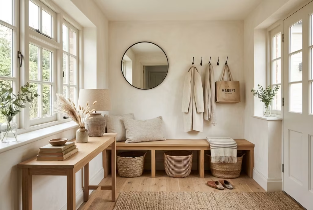
Not every welcoming entryway relies on bold colours, dramatic architectural features, or statement furniture. In fact, some of the most inviting spaces whisper rather than shout. They draw people in through subtle contrasts, tactile materials, and layers of texture that reveal themselves gradually, much like a good book that becomes richer with every chapter. This is where neutral layered textures truly come into their own.
A modern farmhouse entryway built around woven storage baskets, natural fibres, warm woods, and soft textiles proves that warmth does not come from colour alone. It comes from how materials interact with light, how surfaces feel under hand, and how a space supports everyday life without feeling overly staged.
I have found that homeowners often underestimate texture. They focus on paint colours and decorative accents while overlooking the elements that create emotional comfort. Yet texture is frequently the secret ingredient that transforms a house into a home.
Designing Warmth Through Texture Rather Than Colour
Many people assume neutral interiors risk feeling bland or uninspired. The reality is quite the opposite when texture becomes the primary design tool. A palette built around soft whites, warm taupes, muted greiges, oatmeal tones, and natural timber allows materials to take centre stage. Instead of competing for attention, every surface contributes to a layered visual experience. Interior designers often achieve depth in neutral schemes through contrasting textures rather than introducing stronger colours.
Think about the difference between a flat painted wall and one paired with woven seagrass baskets, a linen runner, aged oak flooring, and a textured ceramic lamp. The colours may be similar, but the room feels infinitely richer. This approach also creates longevity.
While colour trends tend to ebb and flow, natural materials rarely go out of style. They age gracefully, develop character over time, and continue to feel relevant long after trend-driven interiors begin to feel dated. The result is an entryway that feels calm yet interesting, simple yet layered, and sophisticated without trying too hard.
Natural Fibre Materials
The choice of woven basket material has a significant impact on both aesthetics and functionality. Each fibre brings its own personality to the space.
Rattan
Rattan remains one of my preferred choices for farmhouse entryways because it combines durability with visual lightness. Its natural honey tones introduce subtle warmth while maintaining an airy appearance. Designers frequently use rattan baskets in entryways because they provide practical storage while adding natural texture and warmth.
Best for:
- Daily shoe storage
- Umbrella baskets
- Entryway accessories
- Family drop zones
Seagrass
Seagrass offers a more textured and relaxed appearance. Its earthy colouring works beautifully alongside white oak, reclaimed timber, and limestone flooring.
Best for:
- Under-bench storage
- Seasonal accessories
- Pet supplies
- Children’s belongings
Jute
Jute introduces a slightly coarser texture that feels particularly authentic within farmhouse interiors. It is also considered one of the more environmentally conscious natural fibres used in home décor.
Best for:
- Decorative baskets
- Layering with rugs
- Soft accessory storage
Water Hyacinth
Water hyacinth features a chunkier weave that introduces substantial visual texture. In larger entryways, it helps anchor the space and create a stronger design presence.
Best for:
- Larger storage baskets
- Statement organisation pieces
- Family-focused entrances
In my own projects, I rarely rely on a single basket material. Mixing fibres often creates a more collected and organic appearance, avoiding the overly coordinated look that can sometimes feel artificial.
Basket Sizing Guide
A common mistake is selecting baskets purely for appearance without considering proportion. Just as furniture must suit the room, baskets should feel appropriately scaled to both the architecture and their intended function.
Small Baskets
Approximate size:
- 200 to 300 mm wide (8 to 12 inches)
Ideal for:
- Keys
- Sunglasses
- Small accessories
These work beautifully on console tables where organisation needs to remain discreet.
Medium Baskets
Approximate size:
- 350 to 500 mm wide (14 to 20 inches)
Ideal for:
- Scarves
- Gloves
- Dog leads
- Children’s accessories
These are often the workhorses of an entryway, quietly containing everyday clutter before it has a chance to spread.
Large Baskets
Approximate size:
- 500 to 700 mm wide (20 to 28 inches)
Ideal for:
- Shoes
- Sports equipment
- Blankets
- Reusable shopping bags
Positioned beneath benches or consoles, larger baskets create practical storage while maintaining visual cohesion. Open woven baskets are particularly effective for everyday entryway organisation because they conceal clutter while remaining easily accessible.
A useful guideline I often follow is ensuring baskets occupy approximately 70 to 80 percent of the shelf or cubby opening. This creates a tailored appearance while allowing easy removal.
Visual Softness in Hard-Working Spaces
Entryways endure a remarkable amount of wear. Shoes are kicked off. Bags are dropped. Deliveries arrive. Pets charge through after muddy walks. Family members come and go throughout the day. Without careful planning, these spaces can begin to feel purely utilitarian. Woven baskets help soften this reality.
Unlike plastic bins, metal lockers, or exposed shelving systems, woven materials introduce a sense of comfort and informality. Their irregular textures catch light differently, adding visual depth while making storage feel like an intentional part of the design. Natural woven baskets are valued because they combine organisation with warmth and decorative appeal.
I often use woven baskets beneath oak benches or console tables because they soften the harder architectural elements surrounding them. The contrast between smooth timber, painted walls, and tactile fibres creates the layered richness that defines many successful farmhouse interiors.
It is a little like adding cushions to a favourite armchair. The function remains the same, but the experience becomes far more inviting.
Pros
- Creates warmth without relying on strong colours
- Supports a timeless modern farmhouse aesthetic
- Introduces texture and visual depth
- Helps conceal everyday clutter
- Flexible and easy to update seasonally
- Works in both compact and spacious entryways
- Natural materials age beautifully
- Available across a wide range of budgets
- Encourages a calmer, more organised entrance
Cons
- Natural fibres can be sensitive to excessive moisture
- Lower-quality baskets may lose shape over time
- Open baskets can expose clutter if not maintained
- Certain materials require occasional cleaning to prevent dust buildup
- Heavily textured baskets may snag delicate fabrics
- Authentic handcrafted pieces often carry higher price points
White Oak Storage Bench with Hidden Compartments
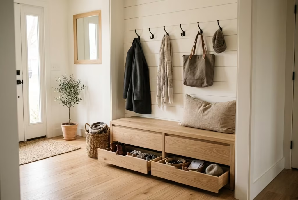
A beautiful entryway can capture attention, but a functional one earns its place in everyday life. Between school bags, seasonal footwear, pet accessories, shopping totes, sports equipment, and the endless collection of items that seem to gather by the front door, many households find themselves fighting a losing battle against clutter.
That is why a white oak storage bench with hidden compartments remains one of the smartest investments for a modern farmhouse entryway.
At first glance, it appears calm, understated, and elegantly crafted. Look a little closer, however, and it reveals its true strength. Beneath the clean lines and natural grain sits a hardworking storage system designed to absorb the realities of daily living. It is the design equivalent of a swan gliding across a lake. Everything appears effortless on the surface while a great deal of work happens quietly underneath.
In my experience, the most successful entryways are not necessarily the most decorative. They are the ones that make everyday routines easier without drawing attention to the solutions themselves.
Elegant Storage for Busy Households
The challenge with modern family life is not a lack of storage. More often, it is poorly planned storage. Many homeowners install cabinets that are too deep, shelves that are difficult to reach, or baskets that quickly become catch-all containers. The result is a system that looks organised initially but slowly unravels as daily habits take over.
A storage bench addresses this problem differently. It places storage exactly where it is needed while serving multiple functions at once. It provides seating for putting on shoes, creates visual structure within the entryway, and conceals items that would otherwise remain in plain sight.
White oak elevates the concept even further. Its warm undertones, subtle grain variation, and natural durability create a piece that feels refined rather than purely practical. Unlike heavily stained woods that can dominate a room, white oak introduces warmth with a lighter touch, making it especially suitable for modern farmhouse interiors where balance and restraint are valued. The result is a space that feels calm even when life around it is anything but.
Hidden Storage Solutions
Hidden storage succeeds because it reduces visual noise. When every item has a designated place behind a closed panel or beneath a lift-up seat, the entryway instantly feels more orderly. This can have a surprisingly positive effect on how a home feels as a whole.
I often tell clients that clutter rarely stays in one room. Once it begins accumulating near the entrance, it tends to spread throughout adjacent spaces like a ripple moving across water. Some of the most effective hidden storage solutions include:
Lift-Up Bench Seats
A hinged top reveals a generous storage cavity beneath.
Ideal for:
- Winter accessories
- Pet supplies
- Seasonal décor
- Reusable shopping bags
Recommended depth:
- 450 to 550 mm (18 to 22 inches)
Pull-Out Drawers
Drawers offer easier access and better organisation than a single large compartment.
Ideal for:
- Children’s shoes
- Sports accessories
- Everyday essentials
Recommended drawer depth:
- 400 to 500 mm (16 to 20 inches)
Integrated Cubbies Behind Doors
These provide the visual cleanliness of cabinetry while retaining the accessibility of open storage.
Ideal for:
- Family storage zones
- Backpacks
- School supplies
- Outdoor gear
Concealed Charging Stations
An increasingly popular addition in contemporary homes.
Ideal for:
- Phones
- Tablets
- Smart devices
- Portable chargers
One project involved a family whose entrance was constantly overwhelmed by electronic devices and charging cables. By integrating a concealed charging compartment into the bench design, we transformed a persistent source of clutter into an invisible solution. Sometimes the smallest details end up carrying the greatest impact.
Durable Timber Choices
White oak has become one of my most specified materials for entryway furniture, and for good reason. Entryways endure substantial wear. Muddy shoes, wet umbrellas, heavy bags, and fluctuating temperatures all place demands on materials. Choosing timber that can withstand these conditions is essential.
White oak offers several advantages:
- Dense and highly durable
- Excellent resistance to dents and scratches
- Attractive grain pattern
- Ages beautifully over time
- Complements both warm and cool colour palettes
- Suitable for natural or stained finishes
In many respects, white oak improves with age. Small signs of use often add character rather than detract from appearance. For homeowners seeking alternatives, several options deserve consideration.
Maple
Provides a clean, contemporary appearance with excellent durability.
Ash
Features prominent grain patterns and impressive strength.
Walnut
Introduces greater richness and depth but typically comes at a higher cost.
Engineered White Oak Veneer
Offers a more budget-conscious option while maintaining the appearance of solid timber. That said, solid white oak remains difficult to beat when longevity is the priority.
Family-Friendly Layouts
Good design should support how people actually live rather than how we imagine they live. This principle becomes particularly important in family homes. Storage benches perform best when tailored to household routines rather than generic storage needs. For smaller families, a simple bench with concealed compartments may be sufficient. Larger households often benefit from a more structured arrangement.
One layout I frequently recommend includes:
- Individual storage zones for each family member
- Dedicated shoe storage
- Seasonal storage compartments
- Accessible lower sections for children
- Upper storage for less frequently used items
Recommended dimensions include:
- Bench height: 430 to 480 mm (17 to 19 inches)
- Bench depth: 450 to 550 mm (18 to 22 inches)
- Bench length: 1.5 to 3 metres (5 to 10 feet)
- Minimum clearance in front: 900 mm (36 inches)
In one farmhouse renovation, we designed a three-metre-wide white oak bench with hidden storage compartments assigned to each family member. The change was remarkable.
The entryway no longer felt like a dumping ground at the end of the day. Children instinctively knew where belongings belonged. Morning departures became smoother. Visual clutter decreased dramatically. The space worked because it aligned with real habits rather than idealised expectations.
Pros
- Maximises vertiConceals clutter effectively
- Provides valuable seating for daily routines
- Enhances organisation without visual bulk
- White oak offers exceptional durability
- Complements modern farmhouse aesthetics beautifully
- Suitable for households of all sizes
- Increases functionality in compact entryways
- Can be customised to specific storage needs
- Ages gracefully with proper carecal space
Cons
- Solid white oak can be expensive
- Custom-built solutions require higher investment
- Lift-up lids may be less convenient than drawers for some users
- Hidden compartments can become disorganised without regular maintenance
- Larger benches require adequate floor space
- Natural timber surfaces may require periodic refinishing
You May also Like: 15 Stunning Minimalist Mudroom Ideas to Turn Your Entryway from Chaos to Chic
Black-Framed Glass Entry Door with Rustic Accents
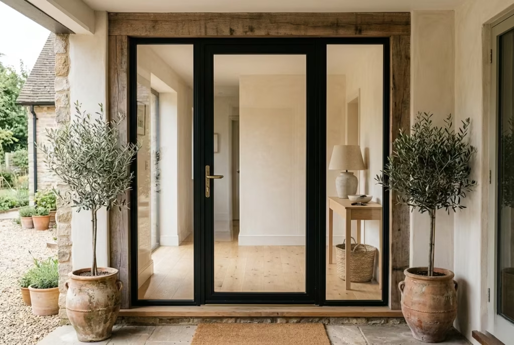
There is a particular kind of entryway that stops people in their tracks before they have even crossed the threshold. It feels composed, confident, and quietly memorable, the sort of space that suggests the home beyond has been considered with real intent. A black-framed glass entry door, softened with rustic accents, creates exactly that effect.
This combination works because it understands contrast. The black frame introduces definition, edge, and architectural clarity, while the glass keeps the entrance open, bright, and connected to the world outside. Rustic details then soften the composition, adding warmth, age, and a more human touch. It is a balancing act, but when handled well, it lands beautifully.
In modern farmhouse design, contrast is often the thread that keeps a room from feeling flat. Too much softness can make a scheme fade into the background. Too much sharpness can leave it feeling cold. This door style sits neatly between the two, giving a home a strong first impression without turning the entrance into a hard-edged statement piece.
Adding Architectural Contrast
A black-framed glass door brings instant structure to an entryway. The frame acts almost like a picture border, outlining the entrance and giving the eye a clear point of focus. That sharp outline is especially effective in farmhouse settings where painted timber, pale walls, natural stone, and weathered textures are already doing much of the visual work.
The beauty of this door lies in its restraint. It does not need ornate carving or elaborate detailing to feel special. The contrast alone does a great deal of the heavy lifting. In a home with softer materials around it, the crisp black frame becomes the anchor, grounding the entire composition.
I often use this approach when a front entrance feels visually loose or a little too safe. A black-framed door gives the façade a sense of backbone, while the glass prevents it from becoming too severe. It is the design equivalent of a strong handshake, firm, assured, and immediately memorable.
Rustic accents then come in to avoid a polished, city-chic look that can feel out of step with farmhouse character. These may include reclaimed wood surrounds, aged brass handles, wrought iron details, antique planters, a timber threshold, or a stone landing. Each element adds a layer of texture, helping the entrance feel lived-in rather than overly curated.
Natural Light Optimization
One of the greatest advantages of a glass entry door is the way it handles light. In many farmhouse homes, especially those with enclosed porches or narrow entrance halls, natural light can be hard to come by. A glazed door changes that almost immediately.
Even a modest amount of daylight can transform how an entryway feels. Light makes materials appear richer, spaces seem larger, and transitions between rooms feel smoother. A glass door allows the entrance to work harder during the day, reducing the need for artificial lighting and creating a more uplifting arrival experience.
There are several glazing options worth considering:
- Clear glass, for maximum brightness and visibility
- Reeded or fluted glass, for privacy with softened light
- Tinted glass, for glare reduction and added discretion
- Divided-lite designs, for a more traditional farmhouse expression
- Double-glazed panels, for improved insulation and comfort
If the entrance faces direct sun, a lightly textured or subtly tinted glass can prevent the space from feeling overheated while still keeping it bright. In homes where the front door sits opposite internal sightlines, decorative glazing can help maintain privacy without making the space feel closed off.
Natural light is one of those things that quietly changes everything. Once it is introduced properly, it is hard to imagine the space without it.
Metal Finishes
The hardware on a black-framed glass door deserves as much attention as the door itself. Poorly chosen finishes can undermine the entire look, while the right ones pull the design together with surprising ease.
For modern farmhouse interiors, the most successful metal finishes tend to feel understated, durable, and in conversation with the rest of the home.
Some strong options include:
- Matte black, for a seamless and contemporary look
- Aged brass, for warmth and subtle contrast
- Bronzed iron, for a more rustic, grounded character
- Satin nickel, for a cooler and slightly cleaner finish
A matte black handle against a black frame can create a highly composed, almost tailored appearance. Aged brass, on the other hand, introduces just enough warmth to soften the geometry. It is often the little details that prevent a design from feeling too stark. Like salt in a good recipe, the hardware may seem secondary at first, but it can make all the difference.
One thing I always advise is consistency. If the door furniture, lighting, hooks, and nearby fittings all speak the same language, the entryway feels calm and resolved. Mixed metals can absolutely work, but they need to be handled with a steady hand. Otherwise, the result can feel like a collection of good ideas that never quite found their rhythm.
Privacy Considerations
Glass in a front door raises an important question, especially in family homes: how much visibility is too much? This is where thoughtful specification becomes essential.
A clear-glazed door may work beautifully if the entrance is shielded by landscaping, set back from the street, or positioned away from direct sightlines. In many homes, however, some level of privacy is needed. The trick is to choose a glazing style that supports light without exposing too much of the interior.
Good privacy solutions include:
- Reeded glass, which distorts views while allowing brightness
- Frosted panels, for stronger visual screening
- Partial glazing, where only the upper section is glass
- Narrow sidelight windows, positioned to direct light without compromising privacy
- Layered window treatments inside the home for additional control
I often remind clients that privacy is not only about what can be seen from outside. It is also about how a space feels from within. If people entering the home feel immediately on display, the sense of comfort can vanish before they have had a chance to settle in. A good entryway should feel welcoming, not exposed.
Where possible, I like to balance transparency with a sense of shelter. The best doors provide enough openness to feel bright and generous while still preserving the home’s quiet dignity.
Pros
- Creates a striking first impression
- Maximises natural light in darker entrances
- Adds architectural contrast and definition
- Works beautifully with modern farmhouse materials
- Can make a small or enclosed entryway feel larger
- Pairs well with both rustic and contemporary finishes
- Offers flexibility through different glazing types
- Enhances curb appeal with relatively little visual clutter
Cons
- Requires careful privacy planning
- Clear glass may feel too exposed in some homes
- Black finishes can show dust, fingerprints, and weathering
- Higher-quality doors and glazing can be costly
- Rustic accents can look mismatched if overdone
- Poor hardware selection can weaken the overall composition
- Large glass panels may require more maintenance and cleaning
You May also Like: Best Warm Neutral Paint Colours That Never Feel Flat
Farmhouse Entryway with Brick Flooring
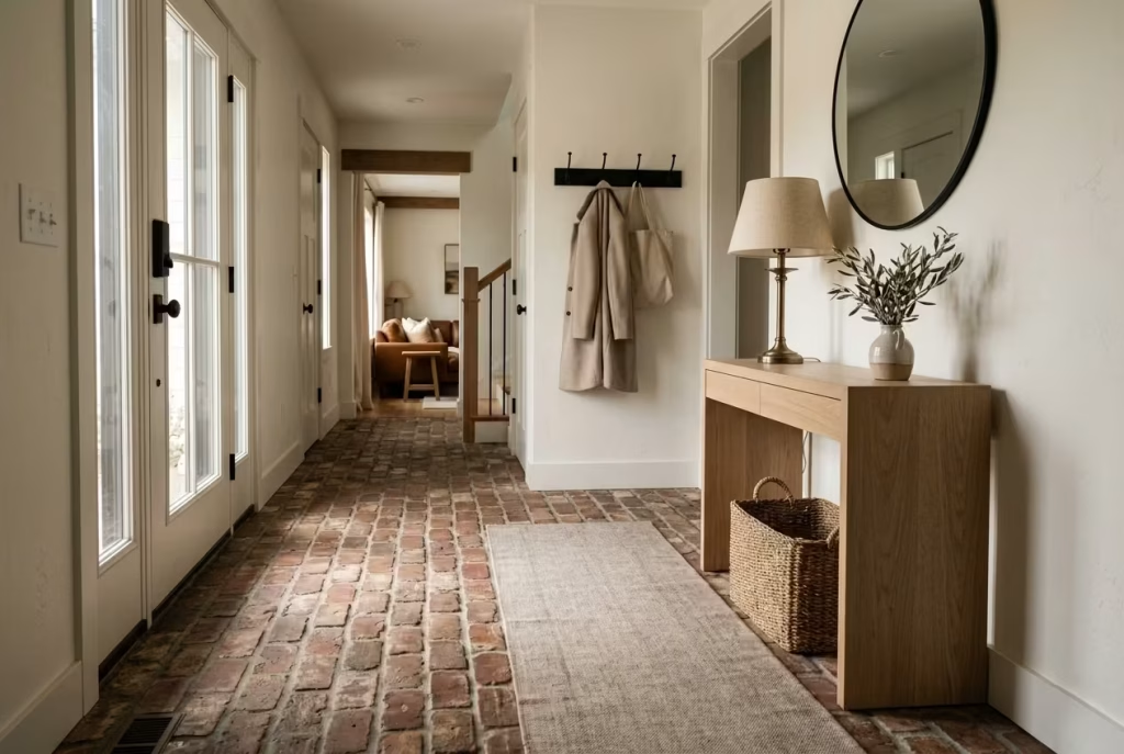
Brick flooring has a way of grounding a space, quite literally and visually. It brings instant authenticity to a farmhouse entryway, adding a sense of age, substance, and quiet confidence that few other materials can match. While painted walls, timber benches, and woven baskets may shape the atmosphere, it is the floor that often sets the tone underfoot. Brick does that job with remarkable ease.
There is something deeply reassuring about a surface that feels enduring from the moment you step onto it. Brick does not try to look pristine in the way polished stone sometimes does. Instead, it embraces variation, texture, and the subtle irregularities that make a home feel lived in rather than staged. In the right setting, that character becomes the making of the room.
Bringing Authentic Character Underfoot
In a modern farmhouse entryway, brick flooring introduces an old-world quality that feels rooted and genuine. It carries the visual language of agricultural buildings, carriage houses, and historic homes, yet it can be translated beautifully into contemporary interiors when paired with restrained furnishings and clean architectural lines.
What makes brick especially compelling is the way it handles scale and warmth at the same time. A floor can easily become background noise if it is too neutral or too uniform. Brick, by contrast, quietly steals the show. Its tonal variation, surface texture, and natural imperfections create a sense of movement that keeps the eye engaged without making the space feel busy.
I have often found that homeowners are surprised by how much a brick floor changes the emotional temperature of an entryway. A room that felt slightly bare suddenly has presence. A plain arrival zone becomes a place with memory and weight. It is the kind of detail that, once installed, feels as though it had always belonged there. When used in a farmhouse setting, brick pairs beautifully with:
- White or cream walls
- Natural oak or walnut furniture
- Aged brass hardware
- Linen upholstery
- Woven baskets and textured runners
- Simple, sculptural lighting
The material thrives in spaces where warmth and honesty matter more than perfection.
Brick Flooring Durability
Brick earns its place not only through appearance, but also through performance. It is one of the more hard-wearing flooring choices for an entryway, particularly in homes where the front door sees heavy daily use. Properly installed and sealed, brick can withstand:
- Foot traffic
- Muddy shoes
- Damp weather
- Pet claws
- Everyday knocks and scuffs
That said, durability depends heavily on the quality of installation. Brick flooring is only as good as its foundation, and this is where many homeowners underestimate the process. A level subfloor, appropriate underlayment, and professional laying technique are essential if the finished surface is to remain stable and comfortable over time.
Brick pavers used indoors are often slightly thinner than exterior bricks, which helps reduce floor height buildup. In some projects, reclaimed brick is selected for its aged appearance, though it may require more sorting and preparation to ensure consistency.
One practical detail worth noting is the grout joint. Wider joints can enhance the rustic feel, but they also influence maintenance and visual rhythm. Narrower joints create a slightly cleaner finish, which can work well in homes that lean toward a more refined version of farmhouse style.
A brick floor is a bit like a dependable old pair of boots. It may not be the flashiest feature in the room, but it delivers year after year without fuss.
Sealing and Maintenance
This is where the romance of brick meets the reality of daily life. Brick is porous, which means sealing is not optional if you want the floor to hold up well in an entryway. Without proper sealing, the surface can absorb moisture, stains, and dirt more readily than many homeowners expect.
A good-quality penetrating sealer helps protect the material while preserving its natural appearance. Depending on the desired finish, some sealers leave a matte look, while others add a gentle sheen that brings out the depth of the brick tones. In practical terms, maintenance usually includes:
- Sweeping or vacuuming regularly to remove grit
- Mopping with a pH-neutral cleaner
- Resealing at recommended intervals
- Wiping spills promptly to prevent staining
- Using entrance mats to reduce tracked-in debris
If the entryway is exposed to wet shoes or outdoor traffic, a textured brick finish can help reduce slipperiness. That slight grip underfoot is one of the reasons brick feels so reassuring in family homes. It has traction, character, and a no-nonsense practicality that works in the real world.
I would always advise homeowners to think about maintenance before falling in love with the look. Brick can be a brilliant choice, but like any natural material, it rewards proper care. Neglect it, and it will show. Respect it, and it becomes more handsome with age.
Suitable Home Styles
Brick flooring is wonderfully versatile, but it does not suit every home equally. It tends to feel most at home in:
- Modern farmhouse interiors
- Country houses
- Converted barns
- Period properties
- Rustic contemporary homes
- Mediterranean-inspired schemes
- Craftsman-style homes
It can also work in more modern settings, provided the surrounding design is disciplined and restrained. In those cases, brick becomes the warm counterpoint to cleaner surfaces, softening the architecture without overwhelming it.
Where it is less effective is in spaces that already contain a great deal of visual complexity. If the room has ornate mouldings, multiple competing finishes, or an overly decorative palette, brick can tip the balance too far toward heaviness. Like adding too many good ingredients to one dish, it can become a case of too much of a good thing.
The most successful applications are usually the ones where brick is allowed to breathe. Pair it with calm wall colours, simple furniture, and a strong sense of proportion, and it will do the heavy lifting beautifully.
Pros
- Adds immediate authenticity and character
- Extremely durable in high-traffic areas
- Ages gracefully and develops a natural patina
- Works beautifully with farmhouse and heritage interiors
- Provides a tactile, grounded feeling underfoot
- Offers strong visual texture without additional decoration
- Can improve the perceived value of an entryway
- Pairs well with wood, metal, linen, and natural fibre accents
Cons
- Requires sealing to resist stains and moisture
- Can feel visually heavy in small or dark spaces
- Installation may be more specialised than standard flooring
- Harder underfoot than timber or carpeted surfaces
- Reclaimed brick can vary in size, colour, and condition
- May feel too rustic for homes that lean strongly contemporary
Layered Rugs for Softness and Visual Interest
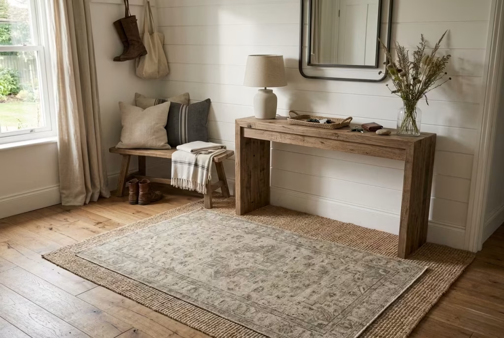
A farmhouse entryway can look beautifully composed and still feel slightly unfinished without the right grounding element. That is often where layered rugs step in, quietly doing the job that hard surfaces alone cannot. They soften the first point of contact, add a sense of welcome, and give the entrance a lived-in ease that feels instantly more human.
In many homes, the entryway is the place where outdoor grit meets indoor comfort. Shoes are kicked off, coats are shrugged aside, and the day tends to land there before it moves anywhere else. A layered rug arrangement helps manage that transition with far more grace than a single flat surface ever could. It is practical, yes, but it is also atmospheric, bringing depth, texture, and a sense of care to a space that can otherwise feel a little bare bones.
Creating a Welcoming Landing Zone
Layered rugs work especially well in modern farmhouse interiors because they create a gentle balance between order and softness. A larger base rug sets the tone, while a smaller top layer adds definition, contrast, or pattern. Together, they turn the floor into part of the design story rather than leaving it as an afterthought.
I often think of a layered rug composition as the opening chord in a room. It sets the mood straight away. A jute base with a faded wool topper, for example, can make an entryway feel grounded and approachable. A striped runner laid over a neutral natural-fibre rug can introduce movement without making the space feel busy. The result is a landing zone that feels thoughtful, warm, and just the right side of relaxed.
This approach is especially useful in entryways that open directly into living spaces. Layering helps define the threshold without needing a wall, a divider, or any heavy-handed intervention. It draws a subtle line in the sand, separating the outside world from the calm inside the home.
Rug Sizing Formulas
Sizing is where many people get caught out. A rug that is too small tends to look like it was simply placed there by chance, which is never the goal. The trick is to let the rugs relate properly to the architecture and the furniture.
A few useful guidelines:
- For narrow entryways: choose a runner that leaves about 100 to 150 mm (4 to 6 inches) of exposed flooring on either side.
- For larger foyers: the base rug should ideally extend beneath at least the front legs of nearby furniture, such as a console or bench.
- For layered compositions: the top rug should be noticeably smaller than the base layer, usually by 300 to 600 mm (12 to 24 inches) on each side.
- For bench-focused entries: allow the rug to project beyond the bench by at least 150 to 300 mm (6 to 12 inches) so the space feels complete rather than cramped.
As a rule, rugs should frame the furniture, not fight with it. When the proportions are right, the whole composition settles beautifully into place. It is a bit like getting a suit properly tailored. Nothing calls attention to itself, yet everything looks far more considered.
Durable Materials
An entryway rug has a tough life. It has to cope with grit, damp shoes, heavy use, and frequent cleaning, so material choice matters more than many homeowners realise. For the base layer, I often recommend hard-wearing natural fibres such as:
Jute
Jute offers an earthy, textured foundation that feels perfectly in tune with modern farmhouse style. It has an organic look, a relaxed weave, and a natural warmth that suits pale timber and painted walls particularly well.
Sisal
Sisal is slightly more structured and robust than jute, making it a strong choice for high-traffic entrances. It brings a more tailored feel while still preserving the natural aesthetic.
Seagrass
Seagrass has a smoother finish and a subtle sheen, which gives it a slightly more refined character. It is a sensible option in family homes where easy maintenance is a priority.
For the top layer, wool is often the standout choice. It is durable, soft underfoot, and naturally resilient, which makes it ideal for a rug that sees regular use. Cotton can also work well in lighter-use entryways, particularly when the goal is to introduce a washed, casual appearance.
If children, pets, or heavy foot traffic are part of daily life, performance fibres may be worth considering. They can mimic the look of natural materials while offering improved stain resistance and easier upkeep. In homes where practicality has to pull its weight, that can be money well spent.
Seasonal Styling
Layered rugs have another advantage. They allow the entryway to shift with the seasons without requiring a full redesign.
In warmer months, a lighter base rug paired with a breathable natural-fibre topper can keep the space feeling fresh and airy. Soft neutrals, washed stripes, and pale textures work especially well when sunlight is doing most of the heavy lifting.
As the weather turns cooler, the same setting can be warmed up with deeper tones, thicker weaves, or a more tactile top layer. A muted check, a faded vintage-style motif, or a low-pile wool rug can add just enough richness to feel seasonal without becoming overly thematic.
A few styling ideas I return to often:
- Swap the top rug rather than the entire arrangement
- Introduce a muted colour accent that echoes the front door or nearby upholstery
- Use tactile contrast, such as woven jute beneath soft wool
- Keep the palette coherent so the layers feel intentional, not accidental
The strength of this approach lies in its flexibility. It is easy to refresh without reinventing the space from scratch, which is exactly the sort of practical elegance many homeowners value once the novelty of a new scheme has worn off.
Pros
- Adds softness to hard flooring
- Helps define the entryway as a distinct zone
- Introduces warmth, pattern, and texture
- Easy to update seasonally
- Can make a large space feel more intimate
- Works well with benches, consoles, and open-plan layouts
- Protects flooring from wear in high-traffic areas
- Offers an accessible way to elevate the entrance without major renovation
Cons
- Poor sizing can make the arrangement look awkward
- Natural fibres may shed or wear unevenly over time
- Layered rugs can shift if not properly anchored
- Frequent vacuuming may be required in busy households
- Lower-quality materials can flatten quickly
- Too many patterns or colours can make the space feel restless
Mudroom-Inspired Farmhouse Entryway
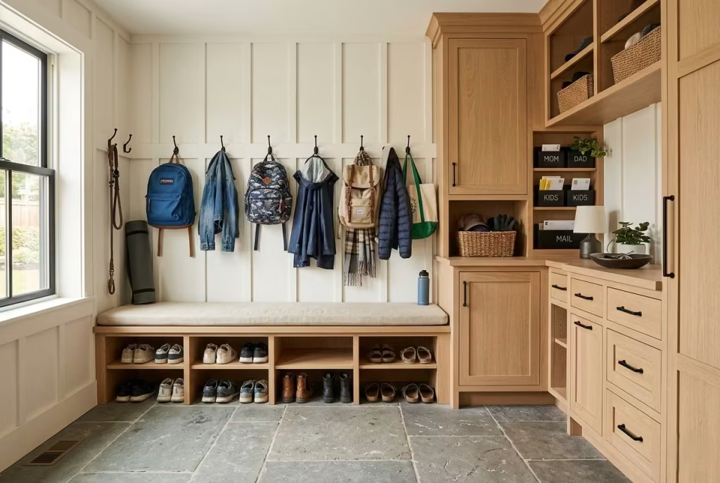
A mudroom-inspired farmhouse entryway is where style stops performing for the sake of appearance and starts pulling its weight. It is the sort of space that proves good design is not about looking immaculate at all times, but about making daily life run more smoothly, with less faff and far fewer piles of misplaced clutter. For busy households, that practical backbone is worth its weight in gold.
This approach works particularly well in homes where the front entrance has to absorb shoes, bags, coats, school items, pet gear, and whatever else arrives in the stream of everyday life. Instead of treating these objects as visual intruders, the design gives them a proper home. The result feels calm, orderly, and quietly capable.
Combining Beauty with Everyday Function
The strength of a mudroom-inspired entryway lies in its ability to look refined while staying hard-working. It does not rely on excess decoration. Instead, it uses clear zones, durable finishes, and thoughtful storage to keep the entrance under control.
I often find that the best solutions are the ones that make life easier without drawing attention to themselves. A bench here, a row of hooks there, a few closed cabinets below, and suddenly the entryway begins to work like clockwork. Nothing feels forced. Nothing is fighting for space. Everything has a place, which is half the battle won.
In modern farmhouse interiors, this approach feels especially natural because the style already values utility, warmth, and a sense of ease. The space can still look inviting, with painted timber, oak details, woven baskets, and soft neutral tones, but those softer notes sit on top of a very practical foundation.
Traffic Flow Planning
Good traffic flow is the make-or-break factor in a mudroom-style entryway. If people have to squeeze past open doors, step around shoes, or sidestep baskets just to get through, the design has missed the mark.
The aim is to create an arrival path that feels smooth and instinctive. Movement should be able to happen without friction, like water finding its own course.
A few practical rules help keep the space in check:
- Allow at least 900 mm (36 inches) of clear circulation space in front of benches or cabinets.
- In busier households, 1.1 to 1.2 metres (43 to 48 inches) feels far more comfortable.
- Avoid placing storage where it interrupts door swings or bottlenecks the natural path into the home.
- Keep daily-use items within easy reach so the space works with habits rather than against them.
When the layout is right, the entryway becomes a kind of pressure valve. It catches the chaos at the door before it has a chance to spill farther into the house.
Shoe Storage Solutions
Shoes are often the first thing to turn an entryway into a headache, especially in family homes. Left unchecked, they create a mess that seems to multiply overnight. That is why shoe storage deserves proper thought rather than a token basket in the corner. Some of the most effective solutions include:
Open Shelving
Simple and efficient, open shelves make it easy to see and grab footwear quickly. They work well in households where shoes are in constant circulation.
Pull-Out Trays
These offer a cleaner finish and help contain dirt and grit. They suit more polished interiors where visual neatness matters.
Closed Cabinets
Ideal for a tidier look, especially when shoes are not meant to be on display. Ventilation should still be considered to prevent trapped odours.
Bench-Integrated Cubbies
These are often the sweet spot. They combine seating and storage, keeping shoes off the floor while making the most of every inch.
A good shoe storage system should suit the household, not an idealised version of it. A family with children, for instance, usually benefits from low, open compartments that kids can use independently. Adults may prefer a more concealed system that keeps the entrance looking crisp and composed.
Family Organization Zones
The most successful mudroom-inspired entryways behave like miniature command centres. Each zone handles a different part of the daily routine, which prevents one area from becoming a dumping ground for everything.
A well-planned layout might include:
- A hook zone for coats, bags, and scarves
- A shoe zone for everyday footwear
- A bench for putting things on and taking them off
- A drawer or basket section for gloves, hats, and dog leads
- A mail or key drop area near the door
- A lower storage section for children’s items
This kind of zoning may sound straightforward, but it has a habit of changing how the whole household functions. When family members know exactly where things belong, the morning rush becomes less fraught. The entryway stops feeling like a battleground and starts behaving like a well-ordered hub.
In one family project I worked on, we created a wall of individual compartments, each assigned to a different person. It was a simple move, but it took the edge off daily chaos. Shoes were no longer scattered across the hallway. Backpacks stopped migrating into the living room. The whole house felt more settled, all because the first stop inside had been given a clear job to do.
Pros
- Handles daily clutter with ease
- Improves household organisation
- Works well for busy families
- Can be designed to look polished rather than purely practical
- Reduces mess from shoes, bags, and coats
- Supports smoother traffic flow through the home
- Makes the entryway more useful all year round
- Can be tailored to specific routines and storage needs
Cons
- Requires careful planning to avoid a cramped layout
- Built-in storage can increase renovation costs
- Poor zoning can lead to clutter returning quickly
- Open storage needs regular tidying to stay effective
- May take up more space than a purely decorative entryway
- Needs durable finishes to withstand heavy daily use
Exposed Ceiling Beams for Architectural Warmth
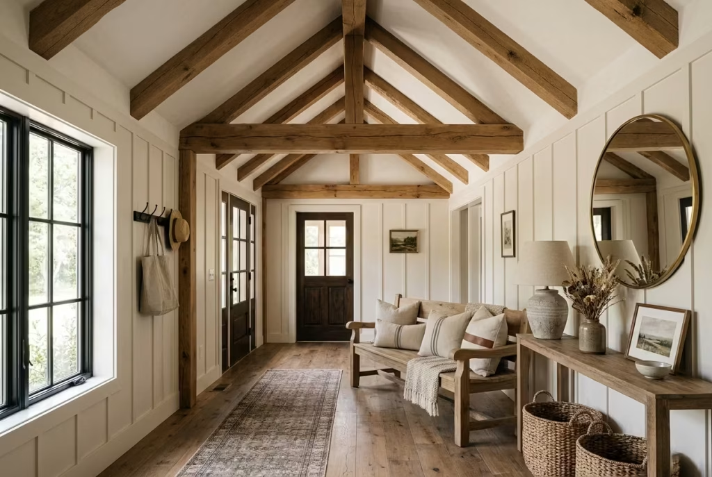
Exposed ceiling beams have a way of changing the atmosphere of an entryway almost before you notice what has happened. They do not sit there asking for attention in the obvious sense, yet they shape the room from above, giving it a sense of structure, permanence, and quiet warmth. In a modern farmhouse setting, that matters. The entryway is often the first space to carry a home’s character, and beams help it feel established rather than assembled.
What makes them so effective is the balance they strike. They add heritage and depth without crowding the room. They can make a ceiling feel more intentional, a plain corridor feel more considered, and a modest entrance feel as though it has a proper architectural backbone. It is a classic case of the whole being greater than the sum of its parts.
Introducing Character Above Eye Level
Many homeowners focus on flooring, furniture, and wall finishes, yet the ceiling is often the piece that quietly completes the picture. Exposed beams draw the eye upward, which can be especially valuable in entryways that feel flat or boxy. That upward movement creates a sense of generosity, almost as though the room has taken a deeper breath.
In farmhouse design, beams also help soften the transition between old and new. They sit comfortably alongside painted panelling, timber benches, woven baskets, and stone or brick flooring, tying the scheme together without making it feel overworked.
I have found that beams are particularly effective in homes where the entrance opens directly into the main living area. They establish an architectural pause, a moment of character that separates the threshold from the rest of the house without the need for a wall or divider. That small shift can make the home feel more composed from the start.
Beam Proportions
Proportion is where this idea succeeds or falls flat. Beams that are too heavy can overpower the space, while beams that are too delicate may look insubstantial, almost as though they were added as an afterthought.
A few useful guidelines:
- In lower ceilings, slimmer beams tend to work best, usually around 100 to 150 mm wide and kept visually light.
- For standard ceiling heights of around 2.4 to 2.7 metres (8 to 9 feet), medium beams generally feel most balanced.
- In taller entryways or vaulted spaces, deeper beams can create a stronger sense of architectural weight and rhythm.
- Spacing should always relate to the room’s width and the positions of doors, lighting, and adjoining openings.
If the beams are structural, their depth will be dictated by the build itself. If they are decorative, the freedom is greater, but so is the responsibility to get the scale right. This is one of those details where careful measuring pays off. A beam that looks elegant on paper can feel clumsy in reality if it has not been sized to suit the room. The best rule is simple enough: let the beams enhance the space, not dominate it.
Wood Species Recommendations
The wood species you choose changes the entire mood of the entrance. Some timbers feel rustic and earthy, while others lean cleaner and more refined.
Oak
Oak is one of the strongest choices for exposed beams. It offers durability, a beautiful grain pattern, and a sense of honesty that works naturally in farmhouse interiors. Left stained or lightly finished, it brings warmth without looking overstated.
Reclaimed Pine
Reclaimed pine has an older, more weathered personality. It carries marks of time that add authenticity, which can be especially appealing in homes aiming for a lived-in farmhouse feel. Its lighter tone also keeps the space from feeling too heavy.
Cedar
Cedar introduces softness and subtle aroma, although it is more commonly used where its natural properties are needed. It suits relaxed interiors that lean toward warmth and informality.
Whitewashed Timber
This option works beautifully when the goal is to keep the ceiling bright while still introducing texture. It is useful in smaller entryways where dark beams might otherwise feel too weighty.
I often advise homeowners to think beyond colour alone. The grain, finish, and surface texture all affect how the beams sit within the room. A rough-sawn beam tells a very different story from a smooth, refined one. Neither is better in the abstract. It depends on the atmosphere you want the home to carry.
Modern Interpretations
Exposed beams do not have to look rustic in a heavy-handed way. In fact, some of the best modern farmhouse spaces use them with a light touch.
A contemporary interpretation might include:
- Clean-lined painted beams in soft white or muted taupe
- Slim timber members with crisp detailing
- Reclaimed beams paired with minimalist lighting
- Beams used sparingly rather than across every ceiling
- A single central beam used to anchor a narrow entryway
This approach works well in homes that want warmth without slipping into theme territory. The goal is not to recreate an old barn. It is to borrow the sense of structure and age that beams naturally provide, then translate it for modern living.
Lighting also plays a role here. Recessed fittings, small lanterns, or understated pendants can keep the ceiling feeling open, while beams add the character. When both are handled well, the effect is seamless, not staged.
Pros
- Adds strong architectural warmth
- Draws the eye upward and improves spatial interest
- Works beautifully in farmhouse and transitional interiors
- Can make an entryway feel more substantial
- Helps tie together natural materials elsewhere in the space
- Suitable for both rustic and modern interpretations
- Offers long-term visual appeal
- Can mask awkward ceiling transitions in some renovations
Cons
- Incorrect proportions can overwhelm a small space
- Dark beams may make low ceilings feel lower
- Decorative beams add cost without structural function
- Installation can be complex in finished homes
- Poorly detailed beams can look artificial
- Requires careful coordination with lighting and trim work
You May also Like: Why Japanese Entryways are Never Messy: 25 Hidden Design Secrets
Antique Furniture Repurposed as Entry Storage
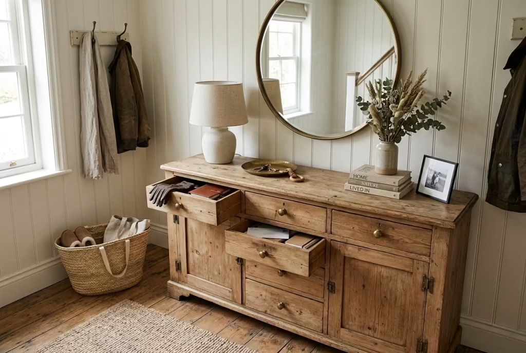
There is a quiet confidence to a home that looks collected over time rather than assembled in a rush. That sense of ease often begins in the entryway, where a single antique piece can set the tone with far more character than anything bought to match a catalogue spread. Repurposed furniture brings that layered, lived-in quality to a farmhouse entrance, giving it depth, usefulness, and a little bit of soul, all in one stroke.
What makes this approach so compelling is its refusal to feel overdesigned. An old cabinet, sideboard, commode, or writing desk, once thoughtfully adapted, can become the kind of hardworking feature that slips into daily life almost unnoticed, while quietly doing a great deal of heavy lifting. It is the design equivalent of having a few aces up your sleeve. On the surface, the piece feels relaxed and familiar. Look closer, and it reveals practical storage that earns its keep every day.
Creating a Collected Rather Than Decorated Look
A repurposed antique piece brings a sense of history that new furniture often struggles to fake. The worn edges, the softened finish, the slight irregularity of hand-finished joinery, all of it contributes to a room that feels gathered rather than staged. That distinction matters. A decorated entryway can look polished for a while, but a collected one has staying power because it feels as though it evolved naturally.
In a modern farmhouse setting, this idea works especially well because the style already values authenticity. Instead of leaning too heavily on themed décor, antique storage introduces a more subtle kind of charm. It suggests that the home has a past, a present, and a future, which is precisely the sort of layered feeling that keeps an entrance from falling flat.
A painted pine chest with original brass handles can soften a hallway. A narrow antique dresser can become a welcome surface for keys, a lamp, and a small bowl for everyday essentials. A vintage dry sink, reworked for entry storage, can offer all the character of old craftsmanship without feeling like a museum piece. The goal is not perfection. In fact, a little imperfection is often what gives the piece its gravity.
Vintage Sourcing Tips
Finding the right antique furniture is a bit like treasure hunting. The best pieces are not always the most obvious ones, and the most appealing find may need a little imagination to realise its full potential.
When sourcing, I usually look for the following qualities:
- Solid construction rather than surface prettiness alone
- Proportions that suit the scale of the entryway
- Enough internal depth to make storage genuinely useful
- A shape that allows easy movement around the piece
- Signs of age that add character without compromising stability
Salvage yards, estate sales, antique markets, and specialist vintage dealers are often the best places to look. Online marketplaces can also be useful, but they demand a sharper eye. Photographs can flatter a piece that is warped, unstable, or badly altered, so it pays to ask for dimensions, interior shots, and close-ups of joints, drawers, and finishes.
I would always advise measuring the entryway before falling in love with an antique piece. It is easy to be charmed by a handsome cabinet, only to discover it hogs the room like an unwelcome guest. A good rule is to leave enough clearance around the piece for the space to breathe. In a narrow entrance, even a beautiful item can become a hindrance if it is too deep or visually heavy.
Storage Functionality
Antique furniture can be highly practical, but only if it is chosen with a clear purpose. The most successful repurposed pieces are the ones that match the household’s habits rather than asking everyone to change how they live. Some of the most useful adaptations include:
Sideboards
These offer excellent drawer storage for gloves, scarves, batteries, candles, dog leads, and other small household items that tend to vanish when they are not properly contained.
Dressers
A dresser with a combination of drawers and lower cupboards works well for families who need both concealed storage and an open surface for display.
Writing Desks
Slim vintage desks can be ideal for compact entryways. The top surface handles keys and mail, while drawers keep clutter out of sight.
Cabinets with Shelves
These suit homes that need room for baskets, sports gear, or seasonal accessories, especially when the entrance doubles as a catch-all zone.
The beauty of repurposed furniture lies in its flexibility. A lower cabinet can store shoes behind closed doors. Deep drawers can hide the chaos that tends to collect near the front entrance. A flat top can become a tidy landing pad for the things that need to be grabbed in a hurry on the way out the door.
In homes where family life is busy and unpredictable, that kind of quiet order can feel like a small mercy.
Preservation Considerations
A good antique should be respected, not stripped of all its personality in the name of function. This is where preservation becomes just as important as adaptation.
Before repurposing, it is worth checking whether the piece has any structural issues, moisture damage, loose joints, or failing finishes. Some wear is part of the charm. Serious instability is another matter entirely. A few practical considerations matter here:
- Avoid over-sanding, which can erase the character that gives the piece its appeal
- Preserve original hardware where possible
- Use linings or inserts to protect the interior from scuffs and spills
- Apply a suitable sealant if the piece will face heavy daily use
- Retain signs of age that contribute to the furniture’s story
If a surface is too fragile for direct use, it can sometimes be protected with a tailored insert, tray, or fitted shelf liner. That way, the piece remains visually authentic while still being able to handle the demands of a real household.
I often think the best antique conversions are the ones that feel respectful rather than forced. The furniture should be allowed to keep its voice, even as it takes on a new job.
Pros
- Adds genuine character and depth
- Creates a collected, layered look
- Offers practical storage with visual warmth
- Can be more distinctive than custom built-ins
- Often more sustainable than buying new
- Works beautifully in modern farmhouse interiors
- Introduces texture, history, and personality
- Can be adapted to suit different storage needs
Cons
- LimitSourcing the right piece can take time
- Condition may require repair or restoration
- Dimensions are not always ideal for entryway use
- Antique finishes may be delicate or sensitive to wear
- Storage layout may be less efficient than purpose-built cabinetry
- Some pieces can feel too visually heavy in small spacesed sound privacy
Soft Sage Green Walls with Natural Oak Accents
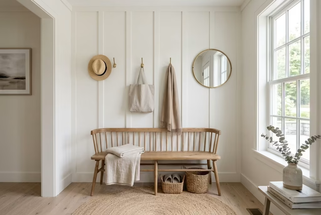
Some colour combinations feel instantly reassuring, as though they have been part of the home all along. Soft sage green with natural oak is one of those pairings. It brings freshness without chill, character without fuss, and a quiet sense of balance that suits a modern farmhouse entryway beautifully. The result is calm but never bland, warm but never heavy, and refined without appearing overworked.
This combination works so well because it understands restraint. Sage green introduces a gentle lift, while oak grounds the space with a material honesty that feels dependable underfoot and easy on the eye. Together, they create an entrance that feels composed, easy to live with, and just distinctive enough to stay memorable.
A Fresh Interpretation of Farmhouse Colour
Farmhouse colour schemes can sometimes slide into predictable territory if they rely too heavily on white, cream, and black. Those tones have their place, of course, but a little variation can go a long way. Sage green opens the door to a softer, more layered interpretation of the style, one that feels rooted in nature rather than fixed to a formula.
What makes sage so effective in an entryway is its ability to sit quietly in the background while still giving the room identity. It has enough pigment to feel intentional, yet enough softness to avoid becoming loud or prescriptive. It works especially well in spaces that receive limited natural light, where a harsh or overly cool colour could leave the entrance feeling flat.
I often find that homeowners are drawn to sage because it has a way of taking the edge off a room. It is the visual equivalent of a deep breath. It calms the space without draining it of interest.
Natural oak, meanwhile, introduces warmth and texture. The grain pattern, subtle colour variation, and organic surface movement all help the entryway feel more grounded. Where painted surfaces can sometimes feel a little detached, oak brings the kind of lived-in richness that makes a home feel settled.
Colour Psychology
Colour has a remarkable influence on the way a space is experienced, often before people can even explain why it feels the way it does. Sage green is associated with calm, renewal, and balance, which makes it particularly suited to a transitional space like an entryway.
That matters more than many people realise. The front door is where the pace of the outside world meets the slower rhythm of home life. A colour that feels soothing helps soften that transition. It tells the nervous system to ease off the gas. In practical terms, sage green tends to work well because it:
- Feels restful rather than stimulating
- Creates a sense of freshness without the sharpness of bright green
- Complements natural materials, especially oak, linen, and stone
- Helps a space feel connected to the outdoors
- Supports an atmosphere of ease and welcome
In one project, a family wanted their entryway to feel less like a pass-through and more like a gentle landing point. We used a muted sage on the walls, then layered in oak details and a simple bench. The result was immediate. The room felt calmer, more collected, and far more generous than its dimensions suggested.
Paint Finish Recommendations
Finish selection is just as important as the colour itself. In an entryway, walls need to look good but also stand up to everyday wear. Bags brush past them, shoes kick up dust, and fingerprints have a habit of appearing in the least convenient places. For that reason, I usually recommend finishes that strike a sensible balance between beauty and resilience.
Matte or Flat Matt
This finish gives sage green a soft, almost chalky quality. It is ideal if you want a gentle, understated look, although it is less forgiving in high-traffic areas unless it is a durable washable version.
Eggshell
A strong all-round choice for entryways. It offers a low-sheen surface that still feels refined while being easier to clean than flat matt.
Satin
Slightly more durable and more reflective, satin can work well in busy family homes. It also helps bring out the depth in sage green, particularly when daylight hits the wall.
For the most part, I would avoid anything too glossy. High sheen can make sage feel sharper and more contemporary than intended, which tends to chip away at the softness that gives the colour its appeal in the first place.
Pairing Wood Tones
Oak may be the natural partner here, but not all oak finishes behave in exactly the same way. The tone and treatment of the wood can shift the mood of the entryway considerably.
Light Natural Oak
This is the most effortless pairing with sage. It keeps the space feeling airy, fresh, and open. Ideal for compact entryways or homes with limited daylight.
Medium Oak
A little richer and more grounded, medium oak adds substance while still feeling warm and welcoming. It works well where the goal is to create a more settled, lived-in atmosphere.
Smoked or Darker Oak
These tones can create a stronger sense of contrast, which can be striking in larger entryways. Used sparingly, they bring depth and sophistication, though too much can make the space feel heavier than intended.
What matters most is not matching the wood perfectly, but letting the tones feel related. A room can become flat if every timber surface is identical. A little variation gives the scheme room to breathe.
I often think of this pairing as a good conversation rather than a uniform statement. The sage speaks softly, the oak answers with warmth, and together they create a rhythm that feels natural rather than forced.
Pros
- Creates a calm and welcoming first impression
- Softens the entryway without making it feel colourless
- Works beautifully with natural materials
- Adds freshness to traditional farmhouse interiors
- Helps smaller or darker entrances feel more inviting
- Pairs well with brass, bronze, and black accents
- Easy to carry through into adjoining rooms for visual flow
- Feels timeless rather than trend-led
Cons
- Pale sage can read differently in varying light conditions
- Poorly chosen wood tones can clash with the wall colour
- High-traffic walls need a durable finish to stay looking sharp
- Too many competing accents can dilute the effect
- Cool artificial lighting may flatten the warmth of the palette
- Overly grey sage shades can lose their softness
Farmhouse Gallery Wall with Family Heritage Pieces
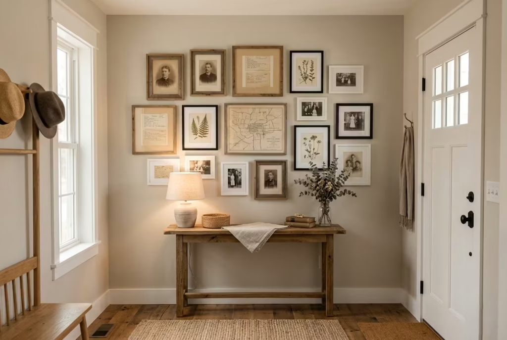
A farmhouse entryway becomes far more memorable when it tells a story, rather than simply looking finished. That is where a gallery wall with family heritage pieces comes into its own. It brings personality, memory, and a sense of continuity into a space that is often treated as little more than a pass-through. Done well, it gives the home a pulse. It hints at where the family has been, what it values, and how it lives now, all without saying a word.
This kind of display works because it feels collected over time, not assembled in a hurry. A grandmother’s portrait, a framed handwritten recipe, an old map, a sepia photograph, a pressed botanical print, or a piece of inherited artwork can sit comfortably alongside simple modern frames. The mix creates depth. It also prevents the entryway from slipping into that polished-but-perfunctory look that often leaves a room feeling a little cold around the edges.
Designing Personal Connection into the Space
What makes a heritage gallery wall so powerful is not decoration alone, but meaning. A well-curated wall can turn the entry into a quiet archive of family life, where the past and present meet under one roof. In a farmhouse setting, that sense of rootedness feels especially apt. The style already leans toward authenticity, craft, and lived-in warmth, so personal objects slot in naturally, like the missing piece of a puzzle.
I often encourage clients to think of the wall as a visual conversation rather than a neat arrangement of frames. Not everything needs to match. In fact, a little contrast usually gives the display more soul. A weathered timber frame beside a clean-lined black one. A faded photograph near a delicate sketch. A formal portrait softened by a more casual family snapshot. The result feels layered and human, which is exactly what a welcoming entryway should be.
This approach is especially valuable in homes where the entrance lacks architectural detail. A gallery wall can create focus, draw the eye upward, and make the space feel intentionally designed without requiring major structural work. It is one of those deceptively simple moves that can change the whole tenor of a room.
Frame Arrangements
The arrangement is where the story begins to take shape. A good gallery wall should feel balanced, but not rigid. Too much symmetry can make it look staged, while too little structure can leave it feeling untidy. The sweet spot sits somewhere in between. A few layouts work particularly well in farmhouse entryways:
Grid Arrangement
This suits homes that lean toward order and restraint. Frames are evenly spaced, usually with identical or closely related dimensions. It gives the wall a calm, disciplined presence.
Organic Cluster
This feels more collected and personal. Frames vary in size, but they are grouped closely enough to feel connected. It works beautifully when mixing heritage photographs, small artworks, and keepsakes.
Linear Arrangement
Ideal above a console or bench, this layout keeps the display visually grounded. It is especially effective in narrow entryways where vertical clutter would feel overwhelming.
Centered Anchor Piece
One larger heritage item sits at the heart of the composition, with smaller pieces arranged around it. This is an elegant way to give a family portrait, antique print, or sentimental document a little breathing room.
A useful rule of thumb is to keep the spacing between frames consistent. Around 50 to 75 mm (2 to 3 inches) usually feels balanced, though slightly wider gaps can work if the pieces are larger. The wall should feel curated, not crammed. When every inch is taken up, the eye has no place to rest.
Scale and Spacing
Scale is what separates a refined gallery wall from one that feels accidental. If the frames are too small for the wall, the display can appear lost. If they are too large, they may bully the surrounding architecture. The right proportions depend on the size of the entryway, the height of the ceiling, and the furniture below the wall, if there is any.
A few practical guidelines help keep things on track:
- Above a console, the gallery wall should usually extend to roughly two-thirds to three-quarters of the furniture width.
- Leave at least 150 to 200 mm (6 to 8 inches) between the top of a console and the lowest frame.
- For taller walls, allow the arrangement to breathe vertically rather than stretching it too wide and thin.
- In narrow entryways, build upward rather than outward to preserve circulation.
The relationship between furniture and frames matters. A wall display should feel like it belongs to the room, not like it was pasted on as an afterthought. I often say that a good gallery wall behaves like a well-set table. Nothing should feel stranded, and nothing should be fighting for attention.
Meaningful Storytelling Through Interiors
This is where the idea truly comes alive. A gallery wall filled with family heritage pieces does more than decorate. It anchors the home emotionally. It makes the entryway feel personal from the first step inside, which can be deeply grounding in a world that often moves too fast for its own good.
The most compelling displays usually include a blend of:
- Old family photographs
- Handwritten notes or letters
- Inherited artwork
- Framed recipe cards
- Small sketches or maps
- A child’s drawing, beautifully framed
- Antiques, such as miniature tools or heirloom prints
When these items are grouped thoughtfully, they create a layered narrative that feels intimate but not overly sentimental. That balance matters. The wall should invite curiosity, not demand explanation. It should feel like a house with stories in its walls, which is often far more powerful than any decorative trend.
I have found that the strongest heritage walls avoid turning into a museum. They include enough breathing room for each piece to be seen, which gives the collection dignity. Like a good conversation, the wall works best when there is rhythm, pause, and a sense that every object has something to say.
Pros
- Adds genuine personality to the entryway
- Creates an immediate sense of warmth and belonging
- Makes use of sentimental or inherited items
- Works well in spaces lacking architectural detail
- Easy to update over time as the family grows
- Can be tailored to suit both traditional and modern farmhouse interiors
- Helps the home feel collected rather than decorated
- Offers a meaningful focal point without major renovation
Cons
- Poor spacing can make the wall feel cluttered
- Too many similar frames can flatten the composition
- Sensitive heirlooms may need protective framing
- Overly personal items may feel too exposed in some homes
- The arrangement can become visually busy if not edited carefully
- Hanging requirements must be precise to avoid a messy finish
A farmhouse gallery wall with family heritage pieces has a way of making an entryway feel lived in from the outset. It introduces memory, texture, and emotional weight in a manner that feels natural rather than forced. When the right pieces are chosen and the arrangement is given room to breathe, the result is more than a decorative wall. It is a welcome home with roots, character, and a story worth pausing for.
You May also Like: 25 Moody Dark Green Mudroom Ideas for a Stylish, Cozy Entryway
Lantern Pendant Lighting with Layered Ambient Illumination
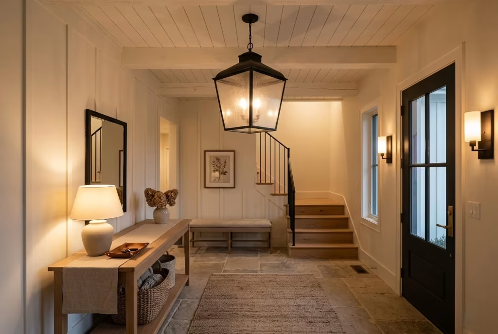
Lighting is often the detail that quietly separates an entryway that merely functions from one that truly feels welcoming. During the day, a well-planned farmhouse entrance may rely on daylight, pale finishes, and natural textures to carry the room. After sunset, however, the atmosphere rests almost entirely on lighting, and that is where a lantern pendant can do a great deal of heavy lifting.
A lantern pendant is not only a practical source of light. It also gives the entryway a clear point of focus, lending structure, warmth, and a sense of occasion the moment the front door opens. When combined with layered ambient illumination, the effect is far richer than a single overhead fitting ever could be. The space feels considered from the first glance, calm without being cold, and welcoming without trying too hard.
Creating Warmth After Sunset
Even the most attractive entryway can lose its charm if the lighting is flat or overly bright. Harsh white light tends to strip away softness, flatten textures, and make timber, textiles, and painted surfaces look a little lifeless. A lantern pendant changes that by introducing a gentler, more atmospheric glow that suits the farmhouse mood beautifully.
I often think of lighting as the final brushstroke in a room. The architecture may be in place, the furniture may be well chosen, and the palette may be balanced, but if the lighting is wrong, the whole thing can fall at the last hurdle. A lantern pendant helps the entryway settle into itself once the sun goes down. It creates a warm handoff between outside and inside, almost like the house is saying, come in, you are home now.
This is especially valuable in entryways that open directly into living spaces. The lighting needs to guide the eye, define the threshold, and create a feeling of ease without making the transition feel abrupt. A pendant with soft illumination and clear lines does that job neatly.
Lighting Temperatures
The colour temperature of the bulb matters more than many homeowners realise. It affects how the room feels, how materials read, and whether the entryway feels inviting or clinical.
For a modern farmhouse setting, I usually recommend warm white lighting, typically in the range of 2700K to 3000K. This range offers a soft golden quality that flatters wood, brass, linen, and painted finishes.
A few simple principles help here:
- Below 2700K can feel too yellow in some homes, especially if the room already has warm wall colours.
- Around 2700K to 3000K usually creates the most comfortable balance for entryways.
- Above 3000K starts to read cleaner and brighter, which can work in some contemporary homes but may lose the softness expected in a farmhouse scheme.
Dimmable bulbs are worth serious consideration. They allow the light to shift with the time of day and the mood of the home. Bright enough for arriving with shopping bags or finding keys, but softened later in the evening, when the house should feel more restful. That flexibility is worth its weight in gold.
The lantern itself also influences the quality of light. Clear glass produces a brighter, more direct effect, while seeded, frosted, or lightly textured glass gives a softer spread. In an entryway, I tend to favour glass that diffuses the bulb just enough to avoid glare, because a light that feels too exposed can quickly undermine the comfort of the space.
Layered Lighting Plans
One pendant alone is rarely enough for a truly successful entryway. A layered lighting plan gives the room depth, flexibility, and visual rhythm. It prevents the entrance from feeling like a spotlighted stage set and instead creates a gentle hierarchy of light, which is far more pleasing to live with.
A strong layered plan may include:
- Lantern pendant lighting for the main focal point
- Wall sconces to soften vertical surfaces
- Table or console lamps for a lower, ambient glow
- Recessed lights if additional task lighting is needed
- Accent lighting to highlight artwork, a bench, or architectural details
The real strength of layering lies in how the sources work together. The pendant defines the centre of the space. Sconces bring balance and warmth to the walls. A lamp on a console softens the composition and makes the room feel lived in rather than merely lit. It is a bit like a good orchestra. No single instrument should dominate the room, but each one should know its part.
In farmhouse entryways, I often use one or two secondary light sources to keep the space from feeling overly top-heavy. A pendant alone can look lovely, but when it is the only source of illumination, the corners may remain dull and the room can feel strangely incomplete. Layering fills in those gaps with quiet confidence.
Fixture Sizing Formulas
Size is one of the most common areas where lighting goes astray. A pendant that is too small gets lost. One that is too large can overpower the architecture and leave the entrance feeling top-heavy.
A few reliable guidelines can help:
- For small entryways: choose a lantern roughly 300 to 450 mm (12 to 18 inches) wide.
- For medium spaces: a fixture around 450 to 600 mm (18 to 24 inches) often feels balanced.
- For larger foyers or double-height spaces: consider something in the range of 600 to 900 mm (24 to 36 inches) or more, depending on ceiling height.
- Hang the pendant so the bottom sits roughly 2.1 metres (84 inches) from the floor in a standard entryway.
- In rooms with higher ceilings, the fixture can hang lower as long as it does not interfere with movement or sightlines.
A useful rule of thumb is to let the pendant relate to the scale of the door, console, or surrounding opening. It should feel like part of the architecture, not like it was dropped in at random. When the proportions are right, the light does its work quietly and confidently.
Pros
- Creates a strong focal point in the entryway
- Adds warmth and atmosphere after dark
- Works beautifully with modern farmhouse materials
- Can make the space feel more polished and complete
- Dimmable options offer flexibility for different times of day
- Layered lighting improves both function and mood
- Lantern styles suit a wide range of farmhouse interpretations
- Enhances first impressions without overwhelming the room
Cons
- Poor sizing can throw off the whole composition
- One pendant alone may not provide enough light
- Clear glass can create glare if the bulb is too exposed
- Higher ceilings may require more expensive or specialised fixtures
- Overly ornate lanterns can feel fussy in a restrained farmhouse scheme
- Installation must be carefully planned to avoid awkward hanging heights
Lantern pendant lighting with layered ambient illumination does more than brighten an entryway. It changes how the space behaves after sunset, softening the mood, defining the architecture, and helping the home feel composed from the moment the door opens. When the fixture is well sized and the surrounding layers are thoughtfully handled, the result is warm, balanced, and quietly assured. In a farmhouse entryway, that kind of lighting is not just decorative. It is the finishing note that ties the whole room together.
Stone Flooring Paired with Warm Timber Details
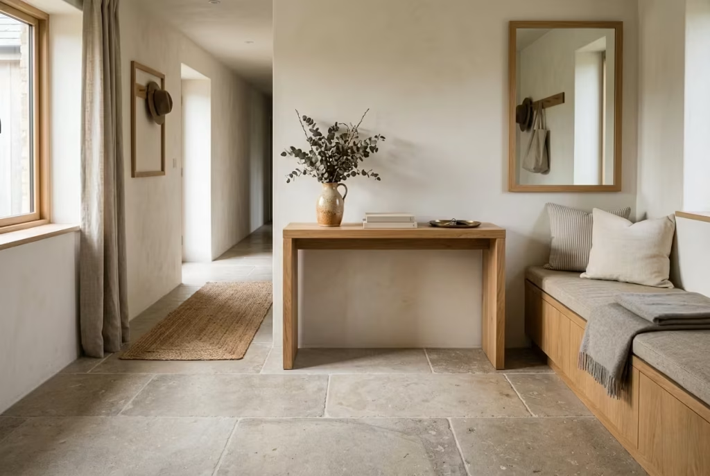
Some materials never seem to fall out of favour, not because they follow trends, but because they age with dignity. Stone flooring and warm timber belong firmly in that category. Together, they create an entryway that feels grounded, welcoming, and built to last.
In a modern farmhouse home, this combination delivers something many designs struggle to achieve: authenticity. The stone introduces permanence and texture underfoot, while timber softens the composition with warmth and natural character. The contrast feels effortless, creating an entrance that looks just as appealing years later as it did on day one.
Timeless Materials That Age Gracefully
The beauty of stone and timber lies in their ability to improve with time. Small scratches, subtle wear patterns, and natural patina become part of the story rather than flaws to hide.
I often recommend this pairing to homeowners seeking longevity because it avoids the cycle of constant updates. The materials feel honest and substantial, bringing a sense of permanence that instantly elevates the entryway.
A stone floor paired with an oak bench, timber console, or wood-framed mirror creates visual balance. One material provides strength, while the other introduces comfort. Like two sides of the same coin, each enhances the qualities of the other.
Limestone Versus Slate
Both limestone and slate work beautifully in farmhouse entryways, but they create very different moods.
Limestone
Limestone offers a softer, lighter appearance that feels bright and inviting.
Best suited for:
- Traditional farmhouse homes
- Neutral colour palettes
- Smaller entryways needing visual openness
- Spaces with limited natural light
Recommended tile sizes:
- 400 x 600 mm (16 x 24 inches)
- 600 x 900 mm (24 x 36 inches)
The subtle variation found in limestone creates depth without overwhelming the room. It feels relaxed, refined, and naturally elegant.
Slate
Slate introduces stronger texture and richer colour variation.
Best suited for:
- Rustic-modern farmhouse interiors
- High-traffic family homes
- Larger entrances
- Homes with strong architectural features
Recommended tile sizes:
- 300 x 600 mm (12 x 24 inches)
- 600 x 600 mm (24 x 24 inches)
Slate tends to feel more dramatic and robust. Its natural cleft texture adds visual interest, making the floor an architectural feature in its own right.
Durability Considerations
An entryway floor works harder than almost any other surface in the home. Muddy boots, wet umbrellas, pet traffic, shopping bags, and daily footfall all take their toll. This is where stone earns its reputation.
Quality natural stone can last for decades when properly installed and maintained. Unlike some manufactured flooring products that may show wear relatively quickly, stone develops character through use. For busy households, consider:
- Honed finishes for a softer appearance
- Textured finishes for improved slip resistance
- Professional sealing to reduce staining
- Larger tiles to minimise grout maintenance
Timber details should also be selected carefully. White oak remains one of my preferred choices because it offers excellent durability while maintaining a warm, natural appearance. Ash and walnut can also perform beautifully depending on the overall design direction.
The goal is not perfection. It is resilience. A well-designed farmhouse entryway should be able to handle real life without constantly demanding attention.
Long-Term Value
Few design decisions offer better long-term returns than investing in quality materials. Natural stone and timber rarely feel dated because they are rooted in craftsmanship rather than fashion. They also tend to appeal to future buyers, making them a strong choice from both a lifestyle and property-value perspective.
What I appreciate most about this combination is its flexibility. As furniture, décor, and colour schemes evolve over the years, stone and timber continue to provide a dependable foundation. They adapt easily, allowing the home to grow and change without requiring major renovation.
It is often said that quality remains long after price is forgotten. Few entryway materials demonstrate that principle better than stone and timber.
Pros
- Timeless appearance that rarely dates
- Extremely durable for high-traffic areas
- Adds genuine architectural character
- Complements modern farmhouse interiors beautifully
- Ages gracefully and develops natural patina
- Works with a wide variety of furniture styles
- Can increase perceived home value
- Suitable for both traditional and contemporary farmhouse designs
Cons
- Higher upfront material costs
- Natural stone requires periodic sealing
- Harder underfoot than timber flooring
- Installation requires skilled tradespeople
- Some stone varieties can feel cold without rugs or underfloor heating
- Heavy materials may increase structural requirements in certain renovations
Farmhouse Entryway with Open Shelving Displays
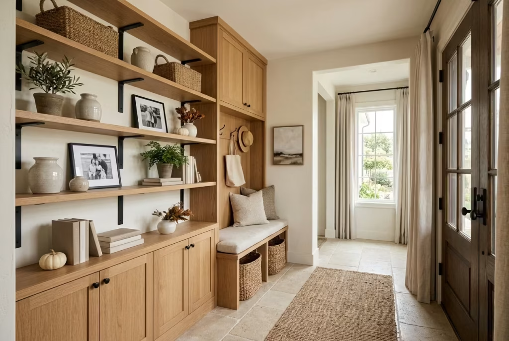
Open shelving can transform an ordinary entryway into a space that feels welcoming, personal, and highly functional. Unlike closed cabinets that hide everything behind doors, open shelves allow everyday essentials and decorative objects to work together, creating an entrance that feels lived-in rather than overly polished.
The challenge, however, lies in balance. Too little on the shelves and the space can feel unfinished. Too much and it quickly becomes visual noise. The most successful farmhouse entryways find the middle ground, creating displays that are useful, attractive, and easy to maintain.
Balancing Storage and Styling
Open shelving works because it combines practicality with personality. It provides a home for daily necessities while creating opportunities to introduce warmth through carefully chosen accessories.
In farmhouse interiors, shelves often become a backdrop for:
- Woven storage baskets
- Small potted greenery
- Framed family photographs
- Ceramic vessels
- Vintage finds
- Books and seasonal décor
I often encourage homeowners to think of open shelves as a curated collection rather than a storage dumping ground. Every item should either serve a purpose or contribute to the atmosphere. When shelves are intentional, the entryway feels relaxed and welcoming instead of cluttered.
A good rule is to leave some empty space. Not every shelf needs to be filled from end to end. Sometimes what you leave out matters just as much as what you put in.
Shelf Depths
Getting shelf dimensions right is crucial. Shelves that are too shallow limit functionality, while overly deep shelves can dominate the room and encourage clutter. Recommended shelf depths:
Decorative Shelving
- 150 to 200 mm (6 to 8 inches)
Ideal for:
- Picture frames
- Small plants
- Candles
- Decorative accessories
Mixed-Use Shelving
- 250 to 300 mm (10 to 12 inches)
Ideal for:
- Baskets
- Books
- Storage boxes
- Everyday essentials
Functional Storage Shelves
- 300 to 400 mm (12 to 16 inches)
Ideal for:
- Larger baskets
- Family storage
- Seasonal accessories
In narrower entryways, I usually lean toward shallower shelves. They provide storage without intruding into circulation space, helping the room feel open and comfortable.
Seasonal Styling Ideas
One of the advantages of open shelving is how easily it adapts throughout the year. Small seasonal updates can refresh the entire entryway without requiring a complete redesign.
Spring and Summer
Focus on lighter textures and natural elements:
- Fresh greenery
- Woven baskets
- Light ceramics
- Botanical prints
Autumn
Introduce warmth through layered materials:
- Dried branches
- Wooden accents
- Textured pottery
- Muted earthy tones
Winter
Add comfort and depth:
- Lanterns
- Seasonal greenery
- Soft textiles
- Vintage wooden accessories
The key is restraint. A few thoughtful additions often have more impact than an entire shelf full of decorations. When seasonal styling feels subtle, the entryway remains timeless rather than theme-driven.
Avoiding Visual Clutter
Open shelving succeeds only when organisation remains a priority. Without some discipline, shelves can quickly become a catch-all for random items. Before long, the display loses its charm and begins to feel chaotic.
A few strategies help maintain order:
- Use baskets to group smaller objects
- Limit decorative items to a select few favourites
- Repeat materials for visual consistency
- Maintain breathing room between objects
- Remove items that no longer serve a purpose
I often use the “one in, one out” approach. When a new decorative object arrives, another leaves. This keeps shelves feeling curated instead of crowded. Think of shelving like a well-edited story. Every element should contribute something meaningful. If it does not, it may be distracting from the bigger picture.
Pros
- Combines storage and display opportunities
- Makes the entryway feel more personal
- Easy to update seasonally
- Works well in both small and large spaces
- Creates visual interest without major renovation
- Encourages thoughtful organisation
- Complements modern farmhouse aesthetics naturally
Cons
- Requires regular tidying
- Can collect dust more quickly than closed storage
- Overstyling can create visual clutter
- Not ideal for hiding everyday mess
- Shelves must be securely installed for heavier items
- Poor organisation can make the space feel chaotic
A farmhouse entryway with open shelving displays works best when storage and styling support one another. The shelves should feel useful first and decorative second. When thoughtfully arranged, they create an entrance that feels welcoming, organised, and full of character without trying too hard. That balance is often what turns a good entryway into a memorable one.
Arched Doorways with Modern Farmhouse Character
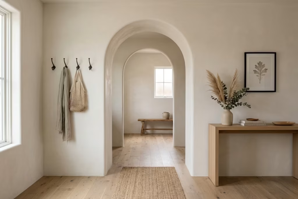
Straight lines and sharp corners have their place, but there is something undeniably inviting about an arch. It softens the journey from one space to another, creating a sense of flow that feels natural rather than abrupt. In a modern farmhouse entryway, an arched doorway introduces architectural character without relying on excessive decoration, proving that sometimes the smallest shifts can make the biggest difference.
What makes arches particularly appealing is their ability to add visual interest while maintaining simplicity. They break up rigid geometry, draw the eye upward, and create a subtle sense of craftsmanship that instantly elevates an entrance. Unlike trend-driven features that can quickly feel dated, arches have stood the test of time because they appeal to something fundamental in design: balance and harmony.
I have often found that entryways lacking architectural detail can feel somewhat forgettable, even when furnished beautifully. Introducing an arched opening changes that dynamic. Suddenly the transition between rooms feels intentional. The space gains depth, rhythm, and a touch of elegance that cannot be achieved through décor alone.
For modern farmhouse homes, arches work especially well when paired with natural materials such as oak, stone, limewash finishes, or board-and-batten wall treatments. The contrast between the gentle curve and the honest simplicity of farmhouse materials creates a look that feels both timeless and current.
Whether incorporated into a new build or introduced during a renovation, an arched doorway adds personality in a way that feels effortless. It does not demand attention, yet it quietly becomes one of the features people remember long after they leave. In many ways, it is a reminder that good design is often found in the details hiding in plain sight.
Cozy Farmhouse Corner Nook for Seasonal Styling
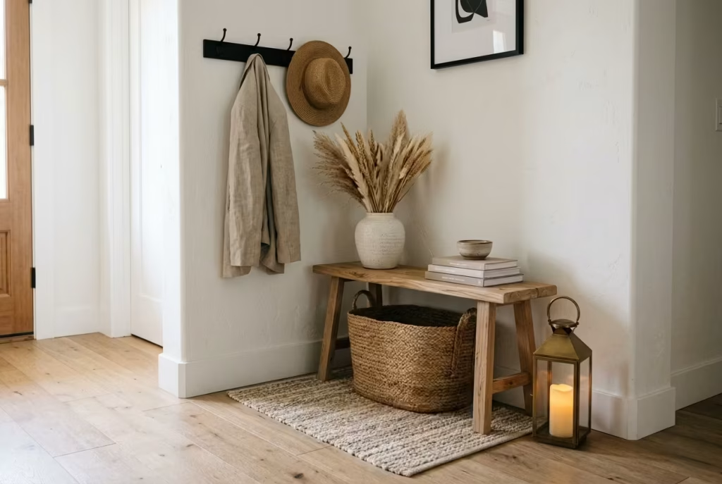
Every home has one. That awkward corner near the entryway that seems too small for furniture yet too visible to ignore. Left untouched, it often becomes dead space. Used thoughtfully, however, it can become one of the most charming features in the entire entrance.
A farmhouse corner nook transforms an overlooked area into a welcoming focal point. It does not need elaborate built-ins or expensive renovations. Often, a simple bench, a vintage stool, a lantern, or a carefully chosen arrangement of seasonal accents is enough to breathe life into a forgotten corner.
The beauty of this idea lies in its flexibility. Unlike permanent design features, a styling nook can evolve throughout the year, giving the entryway a fresh feel without requiring major changes.
Turning Unused Space into a Design Feature
The most memorable entryways often contain an element that feels personal rather than predictable. A corner nook provides exactly that.
Instead of allowing an empty corner to fade into the background, the space becomes an opportunity to add warmth, texture, and personality. It acts almost like a visual pause, giving the eye somewhere pleasant to land as people enter the home.
I often use corner nooks in farmhouse projects where the architecture feels straightforward but needs a touch of character. Even a compact area measuring 600 to 900 mm (24 to 36 inches) wide can become surprisingly impactful when styled with intention. The goal is not to fill every inch. It is to create a small moment of interest that feels effortless and inviting.
Styling Principles
Successful corner styling follows a simple principle: less clutter, more character. The strongest displays typically combine three layers:
Anchor Piece
This is the largest element that grounds the arrangement. Examples include:
- A wooden bench
- Vintage chair
- Antique milk can
- Large woven basket
- Rustic stool
Secondary Layer
This introduces variation in height and texture. Examples include:
- Lanterns
- Potted greenery
- Ceramic vessels
- Framed artwork
Finishing Detail
This is where personality emerges. Examples include:
- Seasonal stems
- Small books
- Handmade pottery
- Family heirlooms
I always remind homeowners that every item should earn its place. If an object adds neither function nor beauty, it may simply be adding noise. A well-styled nook should feel collected naturally, not assembled in a single afternoon.
Seasonal Décor Rotation
One reason corner nooks remain engaging year-round is their adaptability. Small seasonal updates can completely refresh the entryway without requiring significant investment.
Spring
Focus on freshness and renewal:
- Olive branches
- Fresh flowers
- Light ceramics
- Woven textures
Summer
Keep things relaxed and airy:
- Natural baskets
- Coastal-inspired accessories
- Greenery
- Light wood tones
Autumn
Introduce warmth and texture:
- Dried grasses
- Wooden accents
- Earth-toned pottery
- Lanterns
Winter
Create comfort and depth:
- Evergreen branches
- Candle lanterns
- Textured fabrics
- Vintage metal accents
The key is restraint. Seasonal styling should feel like a gentle nod to the time of year rather than a full theatrical production. Sometimes one thoughtfully chosen branch can have more impact than an entire collection of decorations.
Scale and Proportion
Scale is what keeps a nook feeling intentional rather than accidental. A common mistake is using accessories that are too small for the available space. Tiny objects often appear lost and disconnected. A better approach is to begin with one substantial piece and build around it.
Useful guidelines include:
- Keep the tallest item between 900 and 1500 mm (36 and 60 inches) high.
- Allow breathing room around each object.
- Use odd-number groupings where possible.
- Vary heights to create visual movement.
- Avoid filling more than 70% of the corner.
Think of the arrangement like a good conversation. Every piece should have a role, but none should talk over the others. When proportion is handled correctly, even a modest corner can feel remarkably polished.
Pros
- Makes use of otherwise wasted space
- Adds personality without major renovation
- Enhances the welcoming atmosphere of the entryway
- Works in both large and small homes
- Allows personal expression through styling
- Budget-friendly compared to larger design changes
Cons
- Can become cluttered if overstyled
- Requires occasional updating to stay fresh
- Small accessories may collect dust
- Poor scale choices can make the area feel awkward
- Seasonal décor purchases can accumulate over time
- May compete with nearby focal points if not carefully planned
You May also Like: 15 Victorian Mudroom Design Secrets for a Timeless, Elegant Entryway
Layered Wood Tones and Natural Textures Throughout
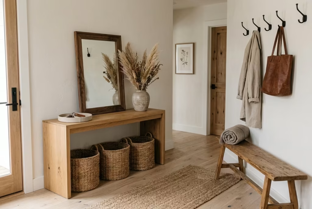
A truly welcoming farmhouse entryway rarely relies on a single material or a single tone. Instead, it builds character through layering, especially when it comes to wood and natural textures. When handled with care, this approach creates a space that feels grounded, tactile, and quietly lived-in, like it has evolved over time rather than been installed in one decisive moment.
The strength of layered timber lies in its subtle complexity. Oak, ash, walnut, reclaimed pine, woven fibres, linen accents, stone details, each element contributes its own voice. When they work together, the entryway stops feeling flat and starts feeling dimensional, almost as if the space has depth beyond what the eye can immediately see.
Creating a Home That Feels Instantly Welcoming
First impressions matter, but in design, they are rarely about a single feature. They are about atmosphere. A layered approach to wood tones and textures creates that atmosphere almost instinctively.
I often describe this effect as visual warmth. It is not just about temperature or colour, but about how the eye moves through a space and finds something familiar at every turn. A light oak bench beside a slightly darker console, a woven basket resting on a timber floor, a linen runner softening a stone surface, each layer quietly contributes to a sense of ease.
This is where many interiors fall short. When everything is too matched, the result can feel controlled but lacking in soul. Layering, on the other hand, introduces just enough variation to make the space feel authentic, like it has been gathered rather than staged.
Mixing Timber Finishes
Successful layering begins with understanding contrast, not conflict. The goal is not to randomly combine wood tones, but to build a composition where each finish has a role to play. A few effective combinations include:
Light and Mid Tones
- White oak paired with natural ash
- Birch accents alongside pale pine
- Soft timber floors with slightly richer furniture pieces
This combination keeps the space airy while adding gentle depth.
Warm and Rich Tones
- Oak with walnut accents
- Reclaimed wood paired with darker stained cabinetry
- Honey-toned finishes balanced with deeper browns
This creates a more grounded, heritage-inspired feel.
Weathered and Refined Mix
- Reclaimed timber against smooth, modern oak
- Rough-sawn textures paired with clean-lined furniture
- Matte finishes contrasted with lightly polished surfaces
This is where modern farmhouse character really comes alive. The key is moderation. When every surface competes for attention, the space loses clarity. But when tones are varied with intention, the eye moves comfortably through the room without confusion.
Texture Layering Techniques
Wood alone is only part of the story. Texture is what gives the entryway its depth. A layered approach might include:
- Woven baskets that soften hard edges
- Linen cushions or bench pads that introduce comfort
- Stone or ceramic accessories for contrast
- Metal accents that add structure
- Natural rugs to ground the space visually
Think of it as building in quiet stages. Hard surfaces form the structure, softer textures temper it, and natural fibres bring everything together. One useful technique is alternating smooth and tactile surfaces. A polished oak console feels more interesting when paired with a rough jute rug. A sleek bench gains warmth when placed beside a handwoven basket. It is this push and pull that keeps the space visually alive.
Avoiding Overly Matched Interiors
There is a fine line between cohesion and sameness. Over-matching often results in interiors that feel safe but uninspiring. Every wood tone is identical, every texture carefully coordinated, and yet something essential is missing. To avoid this, I usually follow a simple principle: coordination over uniformity.
A few practical approaches:
- Limit identical finishes across large surfaces
- Introduce at least one contrasting wood tone
- Mix matte and natural finishes
- Allow subtle imperfections to remain visible
- Use accessories to break up repetition
A home should not feel like it was bought in one go. It should feel like it has gathered character along the way. When done correctly, layering creates a space that feels easy to live with. Nothing is shouting for attention, yet nothing feels forgotten either. It is the kind of balance that often goes unnoticed at first, but becomes increasingly appreciated over time.
Pros
- Creates depth and visual interest without clutter
- Makes entryways feel warm and naturally lived-in
- Works with a wide range of farmhouse styles
- Allows flexibility in furniture and décor choices
- Helps avoid flat or overly staged interiors
- Enhances the tactile quality of the space
- Adapts easily over time as pieces are added or replaced
Cons
- Poor coordination can create visual confusion
- Too many wood tones may feel chaotic if not balanced
- Requires a considered eye to execute well
- Low-quality materials can disrupt overall harmony
- Over-layering can reduce clarity in small entryways
What Defines Modern Farmhouse Style Today?
Modern farmhouse style has moved far beyond its rustic origins. What once leaned heavily on barn-inspired finishes and purely rural references has evolved into a more refined, architectural language. Today, it is less about imitation and more about interpretation. The style succeeds when it feels grounded in tradition but edited for contemporary living, where comfort, clarity, and restraint sit in careful balance.
At its core, modern farmhouse is a study in contrast. It pairs softness with structure, heritage with minimalism, and tactile materials with clean spatial planning. The result is not a nostalgic recreation of the past, but a lived-in aesthetic that feels relevant, functional, and quietly sophisticated.
Evolution from Traditional Farmhouse Interiors
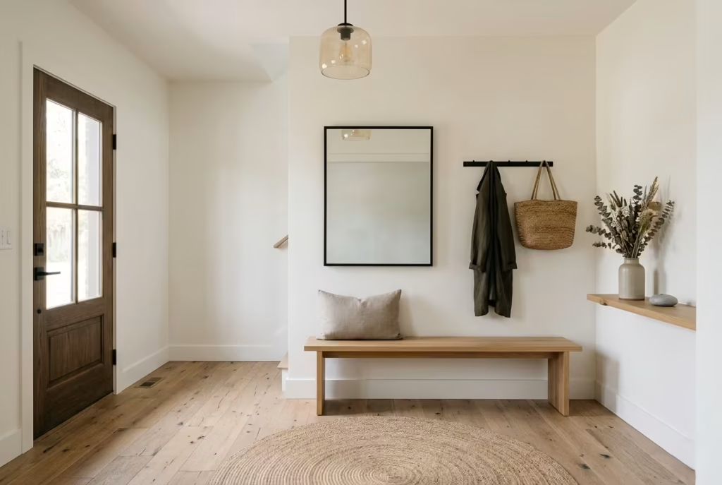
Traditional farmhouse interiors were shaped by necessity. Thick timber, utilitarian layouts, and handmade finishes were not design choices but practical responses to rural life. Over time, these elements became stylistic references rather than functional requirements.
Modern interpretations retain the spirit of those materials but refine their application. Heavy distressing is often replaced with subtle texture. Ornamental clutter gives way to thoughtful restraint. Instead of replicating old farmhouses, the focus is on capturing their warmth in a way that aligns with contemporary expectations of space and comfort.
The shift is subtle but significant. Where traditional farmhouse design leaned into abundance, modern farmhouse prefers editing. Every material earns its place.
Clean Lines Versus Rustic Detailing
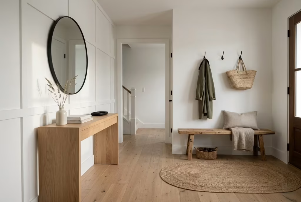
One of the defining tensions in modern farmhouse design lies between structure and softness. Clean lines provide order, while rustic detailing introduces character. When balanced correctly, the two do not compete. They reinforce each other.
A simple example is a streamlined oak console paired with a hand-finished timber bench. Or crisp white walls softened by board-and-batten detailing. The architecture remains clear and uncluttered, but the tactile elements prevent it from feeling sterile.
The key is moderation. Too much rustic detail can feel heavy-handed, while excessive minimalism can strip the space of personality. The most successful interiors sit comfortably between the two, like a conversation where neither voice dominates.
Layering Warmth Without Clutter
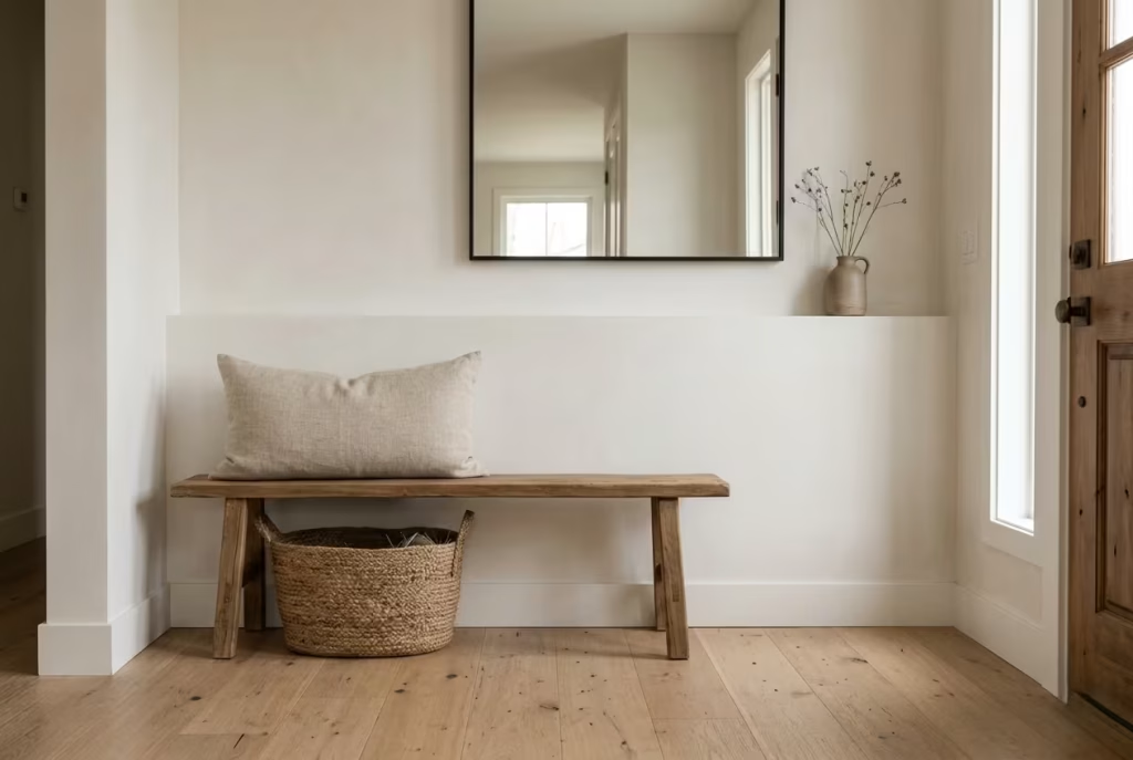
Warmth in modern farmhouse interiors is not achieved through accumulation but through layering with intention. Texture, tone, and material variation work together to build atmosphere without overwhelming the eye.
Instead of filling a space, designers focus on rhythm. A woven basket beside a timber bench. A soft linen cushion against a stone floor. A muted wall colour that allows natural materials to stand forward without distraction.
Clutter is avoided through editing. Every object must justify its presence either through function or contribution to the overall mood. When this discipline is maintained, the space feels calm yet expressive, never crowded or chaotic.
Balancing Old and New Elements
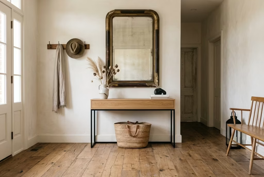
The most compelling modern farmhouse spaces are those that bridge time periods effortlessly. Old and new elements are not placed in opposition but in dialogue. An antique mirror might sit above a contemporary console. Reclaimed wood flooring may run beneath minimalist lighting. Traditional craftsmanship coexists with modern convenience without friction.
This balance creates depth. It prevents the interior from feeling locked in a single era and allows it to evolve naturally over time. The result is a home that feels both rooted and current, a space that respects its influences without becoming dependent on them.
Key Design Elements Found in Successful Farmhouse Entryways
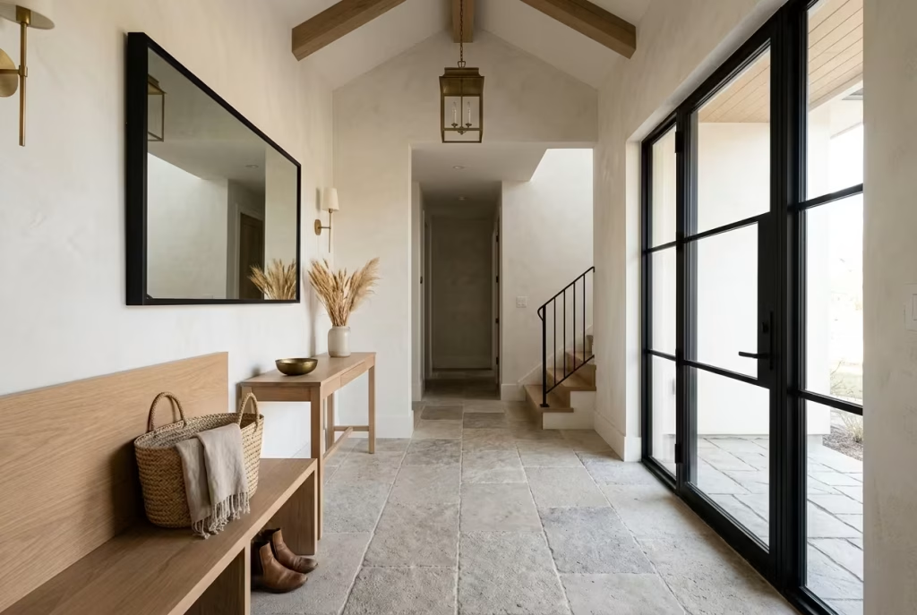
A successful farmhouse entryway is rarely defined by a single feature. It is the combination of materials, light, and layout that shapes the experience. When these elements work in harmony, the entrance becomes more than a transition space. It becomes a quiet introduction to the home’s character.
Wood Textures
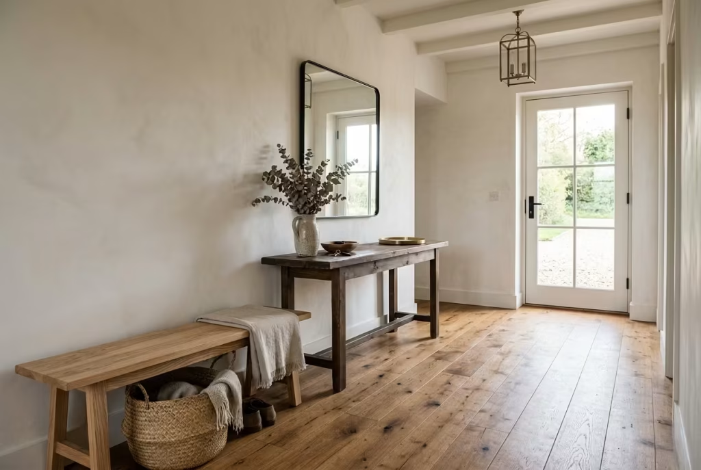
Wood remains the backbone of farmhouse design. Its presence introduces warmth, tactility, and visual grounding. Whether used in flooring, benches, consoles, or wall treatments, it brings anorganic quality that softens architectural edges.
The most effective schemes often mix tones rather than matching them exactly. This variation creates depth and prevents the space from feeling overly uniform.
Neutral Palettes
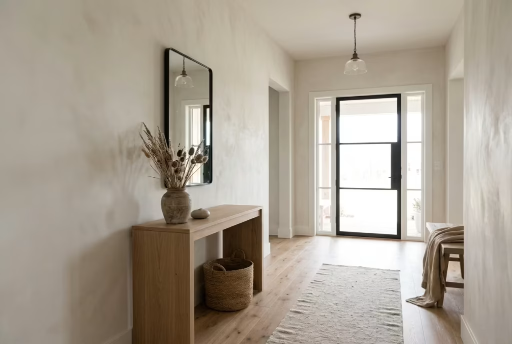
Neutral colours form the visual foundation of modern farmhouse entryways. Soft whites, warm greys, muted greens, and earthy taupes allow materials to speak without competition.
The strength of a neutral palette lies in its restraint. It does not demand attention, yet it enhances everything around it. When paired with natural textures, it creates a calm, cohesive backdrop that feels effortless rather than staged.
Architectural Details
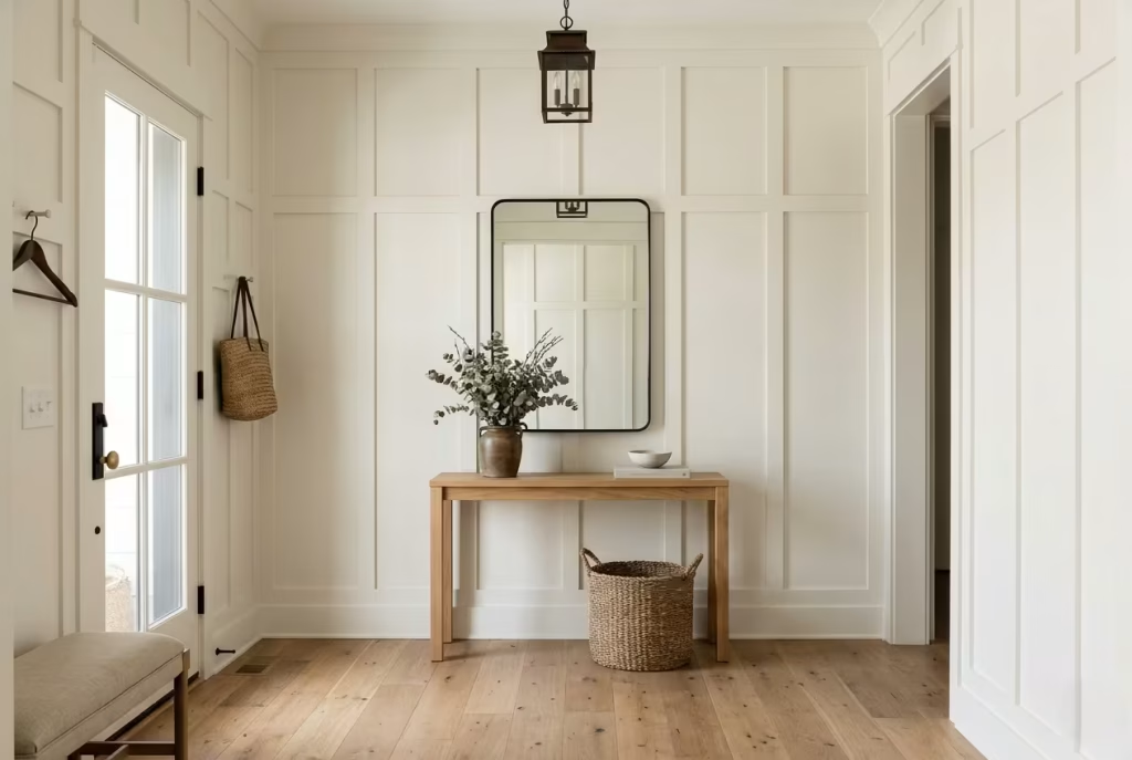
Subtle architectural features bring structure and identity to the entryway. Board-and-batten walls, arched doorways, exposed beams, and framed openings all contribute to a sense of permanence.
These details should feel integrated rather than applied. When they are thoughtfully proportioned, they elevate the space without overwhelming it, adding character in a way that feels built in rather than added on.
Practical Storage
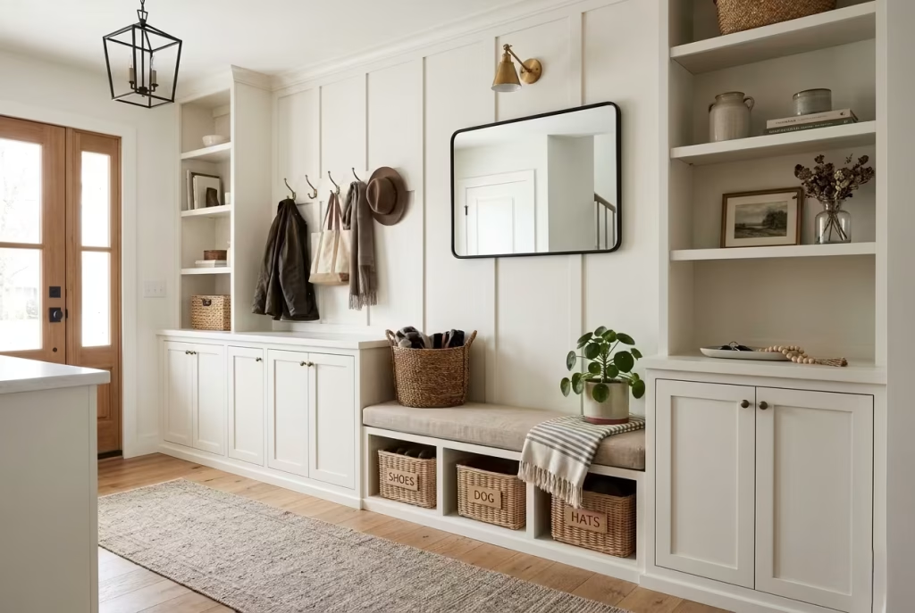
Function is central to any entryway. Storage must support daily routines while maintaining visual order. Built-in benches, concealed compartments, open shelving, and antique repurposed pieces all play a role.
The most successful solutions are those that anticipate real life. Shoes, bags, coats, and everyday essentials need a place that feels intuitive. When storage is well designed, the entryway remains calm even during the busiest moments.
Natural Light
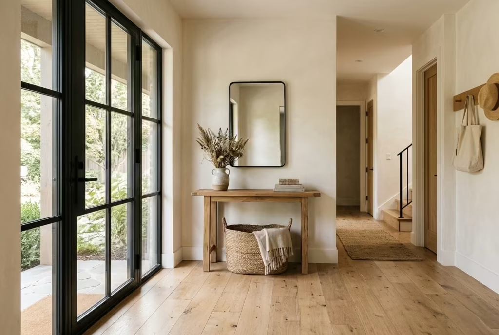
Light is the final element that ties everything together. Natural daylight enhances material textures and sets the tone for the space. Where daylight is limited, carefully planned artificial lighting becomes essential.
Lantern pendants, wall sconces, and layered ambient lighting help maintain warmth after sunset. The goal is consistency, ensuring the entryway feels welcoming at all hours, not just during the day.
A well-designed farmhouse entryway succeeds when these elements work in harmony. It is not about individual statements, but about how materials, light, and function come together to create a space that feels balanced, welcoming, and quietly confident.
Professional Design Lessons from Real Modern Farmhouse Projects
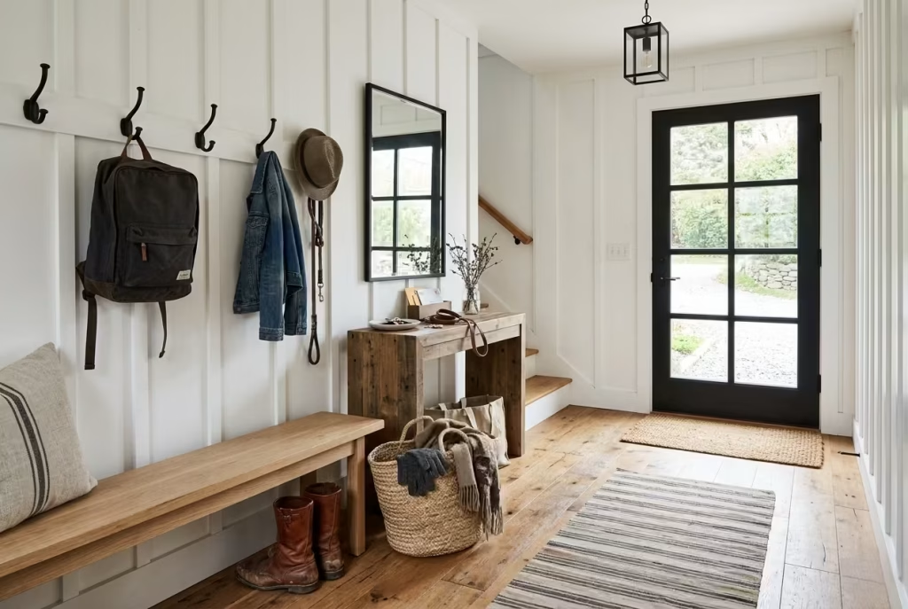
Designing modern farmhouse entryways for busy homes has taught me one consistent truth: beauty alone never carries a space for long. Entryways live under pressure. They absorb daily routines, seasonal change, clutter bursts, and constant movement. What looks polished in isolation often falls apart in real use if the fundamentals are not right.
Over time, patterns begin to emerge. Certain mistakes repeat across projects, regardless of budget or scale. The strongest entryways are rarely the most elaborate. They are the ones that anticipate real behaviour, not idealised living.
What I Have Learned Designing Entryways for Busy Homes
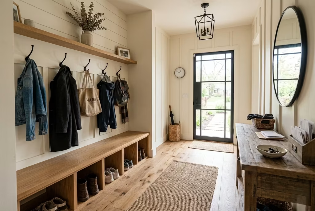
A successful entryway behaves like a well-organised threshold, not a decorative afterthought. It needs to absorb life quickly and reset just as fast. In practice, that means clarity of layout, disciplined storage, and materials that can take a knock without losing character.
I have seen beautifully styled entrances fail within weeks because they were not designed around movement. Bags end up on the floor, shoes drift into circulation paths, and surfaces become catch-alls. Once that happens, even the best styling loses impact.
The most effective projects share one trait: they make daily routines almost invisible. Everything has a place, and that place is easy to reach without thinking twice.
Common Layout Mistakes
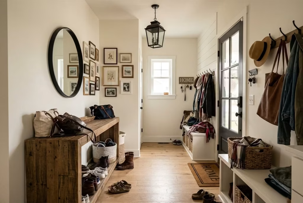
Layout issues are often subtle but highly disruptive. The most common problem is blocking natural circulation. Entryways that look impressive on paper can feel awkward in reality if movement is not prioritised. Frequent mistakes include:
- Furniture placed directly in walking paths
- Doors that open into storage zones
- Oversized consoles in narrow corridors
- Lack of clear landing space near the entrance
A well-designed entryway should allow movement to feel instinctive. If people have to adjust their path every time they enter, the layout is already working against itself.
Another overlooked issue is visual congestion. Too many focal points competing at the entrance creates confusion. The eye should settle naturally, not dart from one feature to another.
Storage Planning Failures
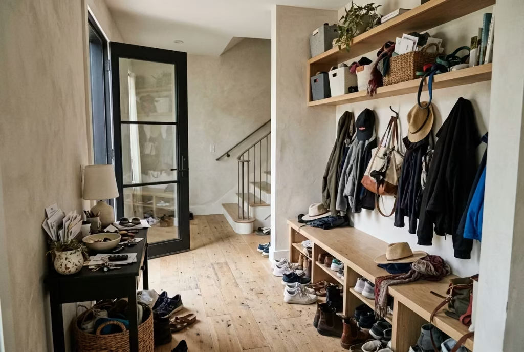
Storage is where many farmhouse entryways quietly fall short. On the surface, there may be benches, hooks, and cabinets, but without proper planning, they rarely function as intended.
The most common failures include:
- Storage that is too shallow for real items like shoes and bags
- Open shelving without organisation systems
- Lack of dedicated zones for each family member
- No hidden storage for visual clutter
In busy homes, storage must behave like infrastructure, not decoration. It should absorb chaos without drawing attention to itself. When storage is an afterthought, the entire entryway becomes harder to maintain.
I often find that one well-planned concealed storage zone is worth more than several decorative solutions that do not hold up under pressure.
Material Choices Homeowners Regret
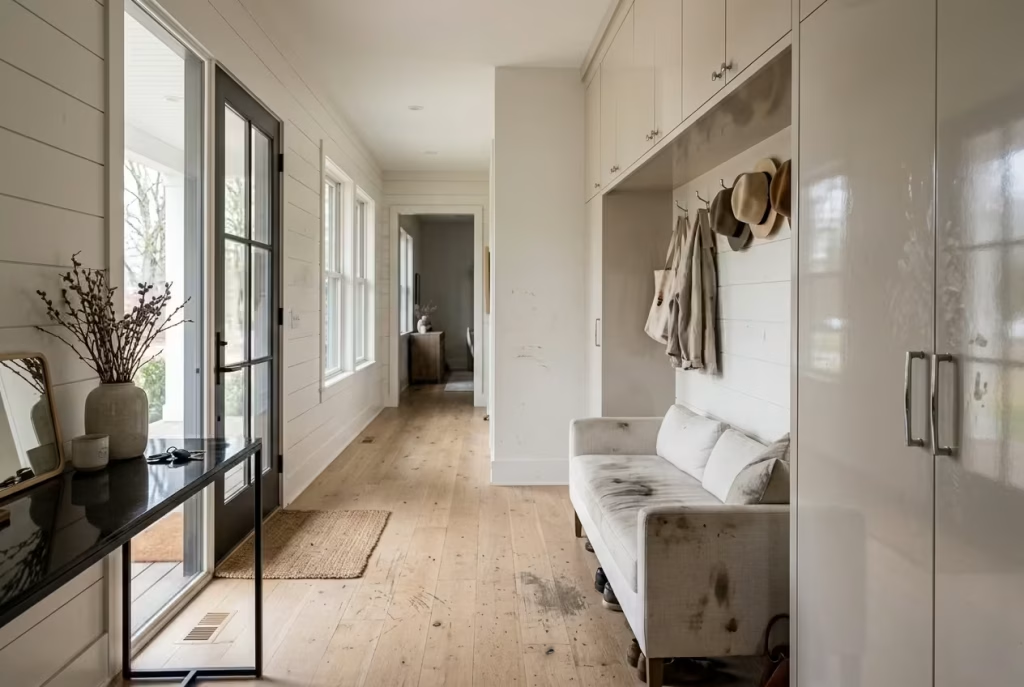
Material selection has long-term consequences, especially in high-traffic entryways. Some choices age beautifully. Others begin to show strain almost immediately. Common regrets include:
- High-gloss finishes that show every mark
- Soft timber floors without protective treatment
- Light-coloured fabrics in heavily used zones
- Decorative surfaces that are difficult to clean
Entryways demand materials that are forgiving. Natural stone, sealed timber, durable paint finishes, and textured surfaces tend to perform far better over time.
A recurring lesson is simple: what looks delicate in a showroom often struggles in real life. Durability is not a compromise in farmhouse design. It is the foundation.
Where Investment Delivers the Greatest Value
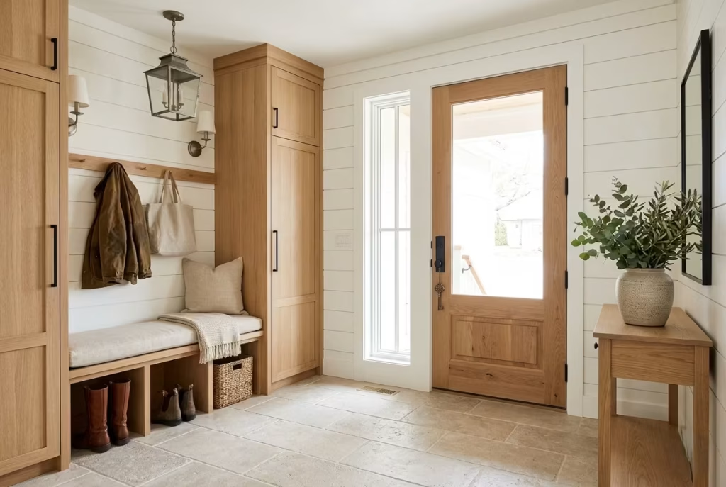
Not every element in an entryway needs equal investment. The strongest results come from prioritising the right areas. High-value investment zones include:
- Flooring, as it carries constant wear
- Built-in storage, which defines functionality
- Lighting, which shapes atmosphere at all times of day
- Door hardware, which affects daily interaction
These elements quietly determine how the space performs. Decorative items can be updated easily, but structural decisions remain for years.
When budget is focused on these key areas, the entire entryway feels more resolved, even if the styling remains minimal.
Designing for Longevity Rather Than Trends
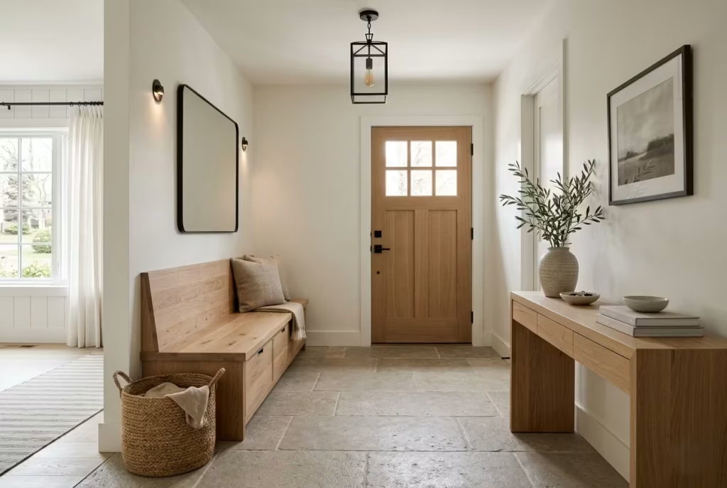
Trends move quickly, but entryways do not have the luxury of constant reinvention. A well-designed farmhouse entrance should feel relevant today and still make sense years from now.
Longevity comes from restraint. Neutral foundations, honest materials, and adaptable layouts tend to age gracefully. Trend-led features can still be included, but they should remain easy to update or replace.
The most enduring projects I have worked on share a quiet confidence. They are not trying to impress at first glance. Instead, they hold their value over time, becoming more settled with use rather than less relevant.
Good entryway design, in the end, is less about decoration and more about judgement. When decisions are grounded in function, proportion, and material honesty, the result does not just look right. It lives well.
Materials That Make Modern Farmhouse Entryways Feel Authentic
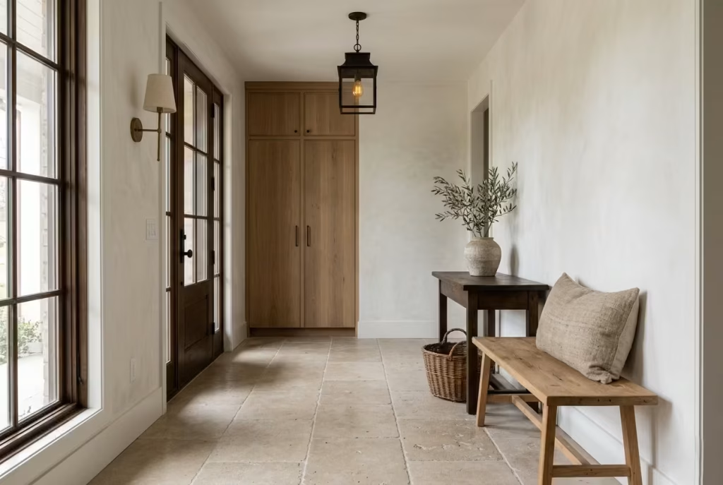
Authenticity in a modern farmhouse entryway is rarely achieved through styling alone. It comes from material honesty, from surfaces that age well, feel natural to touch, and quietly carry the weight of everyday use. When materials are chosen with intention, the entryway stops feeling like a designed space and starts feeling like a lived-in introduction to the home.
The strongest schemes are not built on abundance, but on restraint. A small group of well-chosen materials, layered thoughtfully, will always outperform a crowded mix that lacks direction.
White Oak
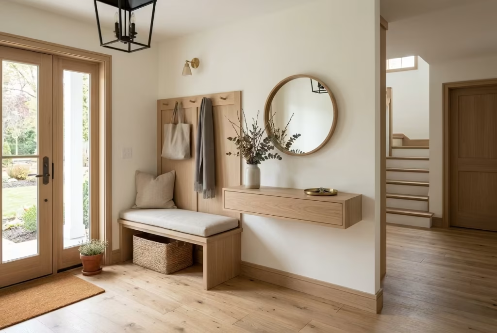
White oak is one of the most dependable materials in modern farmhouse design. It brings a calm, steady presence without demanding attention. Its grain is subtle, its tone is balanced, and it adapts well to both light and dark palettes.
In entryways, white oak works beautifully for benches, consoles, flooring, and wall detailing. It resists visual noise, which is crucial in high-traffic areas where too much variation can feel chaotic.
Key advantages:
- Ages with a soft, natural patina
- Works across warm and cool colour schemes
- Strong enough for daily wear
It is the kind of material that quietly does its job, year after year, without losing composure.
Reclaimed Timber
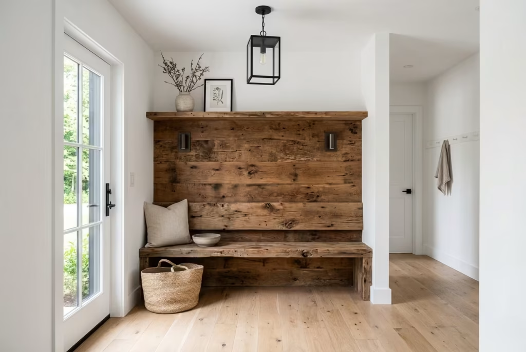
Reclaimed timber introduces history into a space. Every mark, knot, and variation carries a sense of time that new materials simply cannot replicate. In entryways, it creates instant depth and character.
It works particularly well for feature benches, shelving, and accent walls. However, it should be used with restraint. Too much reclaimed wood can overwhelm a small entryway and make it feel visually heavy.
Its strength lies in contrast, especially when paired with cleaner materials like white oak or plastered walls. That tension between old and new is where its charm really lives.
Natural Stone
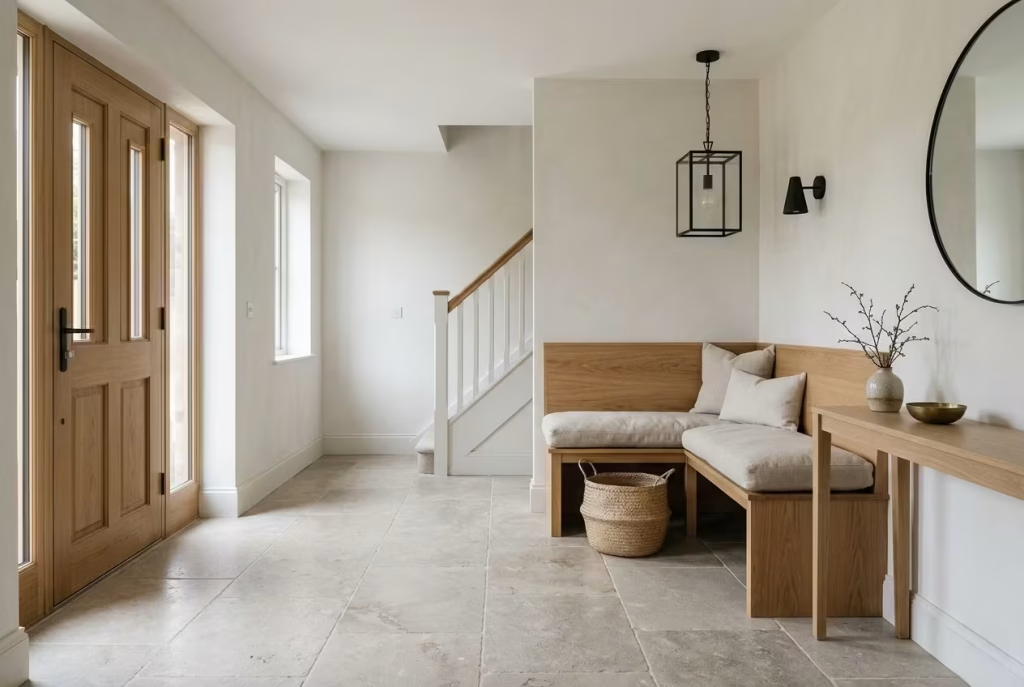
Natural stone grounds an entryway both visually and physically. It introduces permanence, texture, and a sense of stability underfoot. Limestone and slate are often used in modern farmhouse schemes, each offering a different mood.
Stone performs well in high-traffic zones because it is built to endure. It also develops character over time, softening slightly as it ages. What makes it effective:
- Strong resistance to wear
- Natural variation that avoids flatness
- Excellent pairing with timber and metal accents
Stone has a quiet authority. It does not shout for attention, yet it anchors the entire composition.
Limewash Finishes
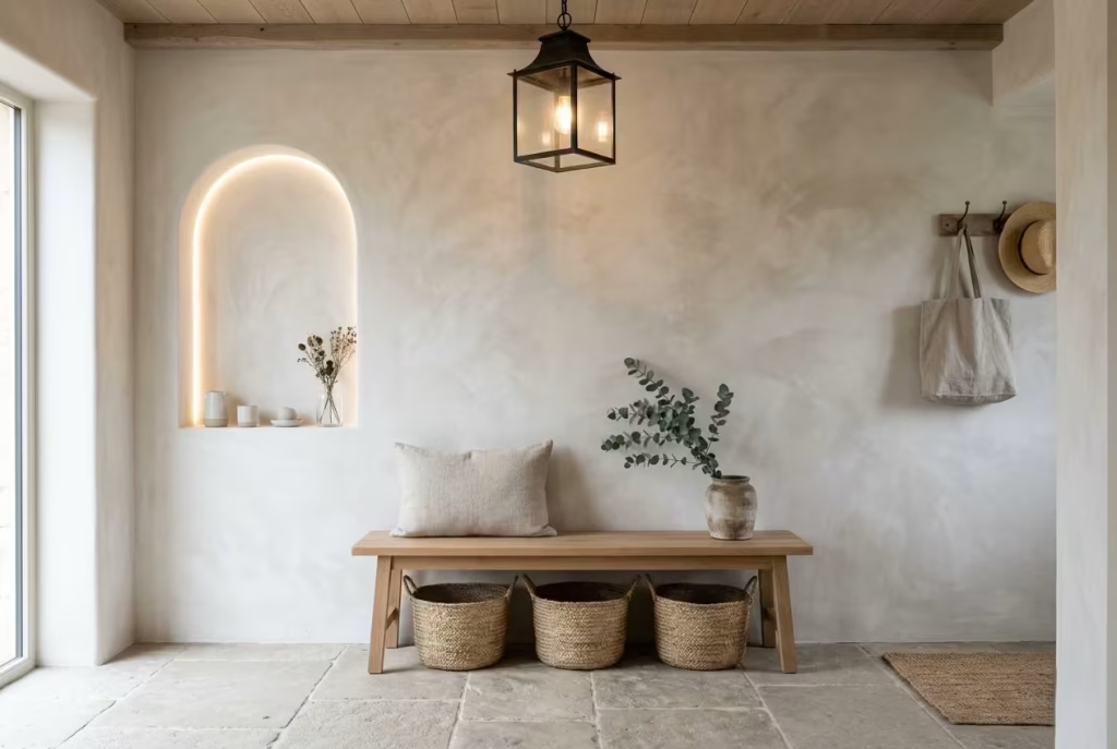
Limewash brings softness to architectural surfaces. Unlike standard paint, it carries a subtle movement in tone, almost like light shifting across a wall. This creates depth without clutter.
In entryways, limewash works particularly well on feature walls or arched recesses. It pairs naturally with timber and stone, reinforcing the organic quality of the space.
It is especially effective when the goal is to avoid harsh flat surfaces. Limewash keeps the palette grounded while still allowing variation that feels natural rather than manufactured.
Handmade Ceramics
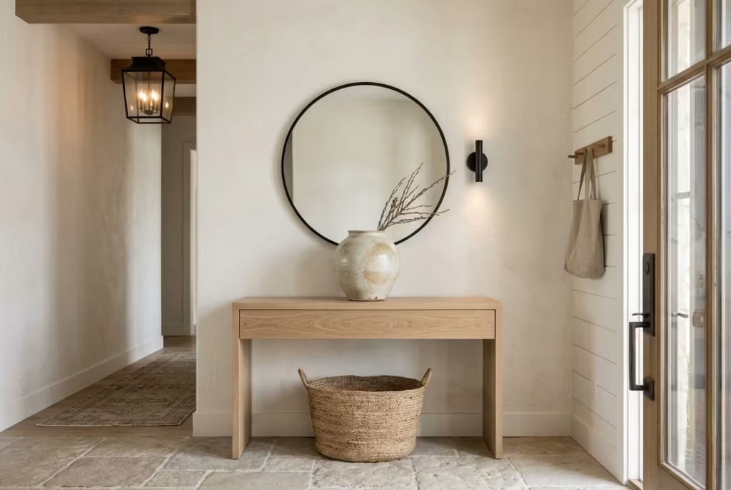
Handmade ceramics introduce human imperfection into the space, which is often exactly what a farmhouse entryway needs. Slight variations in glaze, shape, and texture create visual warmth.
Used on consoles or shelving, they soften harder architectural lines. A single ceramic piece can break up a rigid composition and make the space feel more considered. They work best when used sparingly. The goal is not collection, but selection.
Linen Textiles
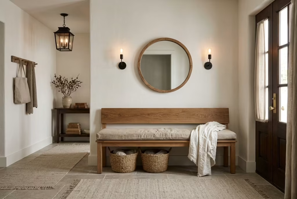
Linen brings softness without effort. Its slightly wrinkled texture prevents the entryway from feeling too rigid or over-styled. It works well for bench cushions, runners, and soft storage accents.
In practical terms, linen is breathable, durable, and easy to live with. It absorbs the informality of daily use, which suits busy entryways particularly well. When layered with timber and stone, it creates a gentle contrast that feels calm and approachable.
Wrought Iron Details
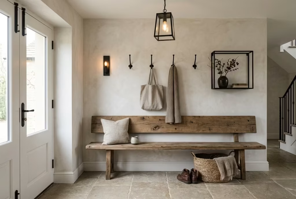
Wrought iron introduces structure and definition. It often appears in hooks, hardware, lighting frames, and shelving supports. Its strength lies in its simplicity.
Unlike decorative metals that aim for shine, wrought iron leans into restraint. It adds contrast against softer materials without overpowering them. It is particularly effective when paired with reclaimed timber or limewash finishes, where its darker tone helps ground lighter surfaces.
When these materials are combined thoughtfully, the entryway gains something beyond visual appeal. It gains character that feels earned rather than applied. The result is a space that does not rely on decoration to feel complete, but instead lets material honesty do the work quietly in the background, shaping a home that feels grounded, welcoming, and enduring from the very first step inside.
Common Modern Farmhouse Entryway Mistakes to Avoid
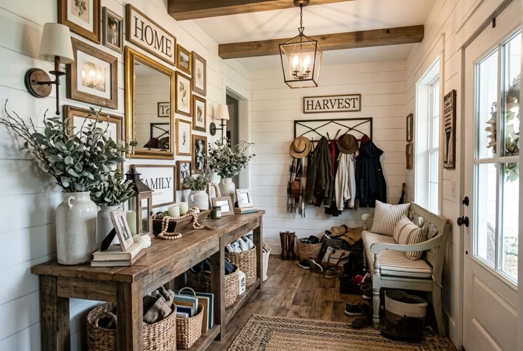
Modern farmhouse entryways often look effortless when done well, yet they are surprisingly easy to get wrong. The challenge is not in finding beautiful pieces, but in knowing when to stop, when to edit, and when function must take priority over aesthetics. Many entryways fail not because of poor taste, but because of imbalance. A few missteps, repeated often, can quietly undermine the entire space.
Overusing Farmhouse Décor
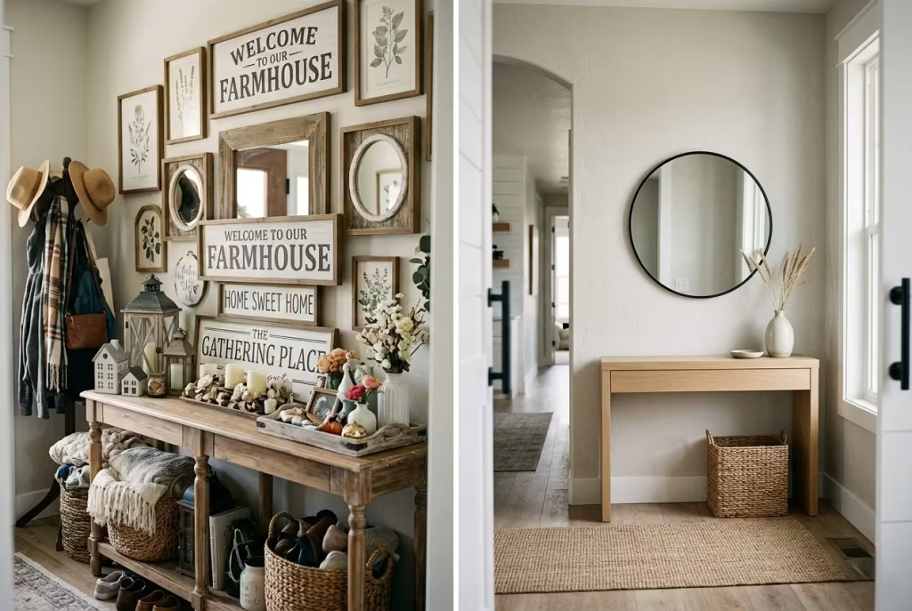
One of the most common pitfalls is leaning too heavily into themed styling. Signs, distressed finishes, and rustic accents can quickly tip a space from characterful to staged.
A farmhouse entryway should feel lived in, not like a set piece. When every surface carries a decorative object, the eye has nowhere to rest. The result is visual fatigue rather than warmth.
A more refined approach is restraint. A single well-chosen bench, a simple mirror, and one or two tactile elements often carry more weight than a crowded display. In design, less clutter usually means more presence.
Poor Lighting Design
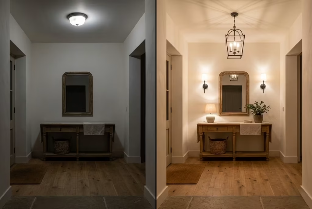
Lighting can make or break an entryway. Even the most thoughtfully designed space falls flat if it is not properly lit. A frequent mistake is relying on a single overhead fixture. This creates harsh shadows and leaves corners underlit, which strips away the warmth that defines farmhouse interiors.
Layered lighting is essential. A combination of pendant lighting, wall sconces, and subtle accent sources creates depth and softness. Warm white tones, ideally between 2700K and 3000K, help maintain an inviting atmosphere. Good lighting should feel invisible in function but noticeable in effect. If it draws attention to itself, it is often working too hard.
Insufficient Storage
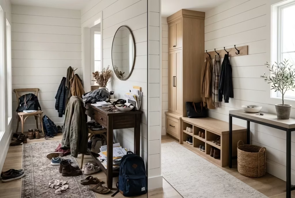
An entryway without adequate storage quickly loses its appeal. No matter how well styled it is on day one, clutter will eventually take over if there is no clear system in place. The most common issue is underestimating daily behaviour. Shoes, bags, keys, coats, and mail all need a defined home. Without it, surfaces become catch-all zones.
Built-in benches with hidden compartments, wall hooks, and closed cabinetry tend to perform best. The goal is simple: everything should have a place, and that place should be easy to reach without friction. A well-designed storage plan is what allows an entryway to stay composed long after the styling has been done.
Ignoring Scale and Proportion
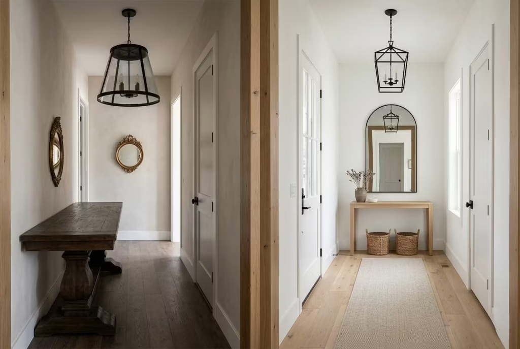
Scale is often overlooked, yet it determines whether a space feels balanced or awkward. Furniture that is too large can overwhelm a narrow entryway, while pieces that are too small can feel lost and disconnected. This issue often appears with consoles, mirrors, and lighting fixtures. Each element must relate to the size of the space and to one another.
A useful principle is visual anchoring. A mirror should not float without context. A bench should not dominate circulation. Lighting should feel proportionate to ceiling height rather than simply decorative. When scale is correct, the space feels naturally composed, even if the design itself is simple.
Choosing Impractical Finishes
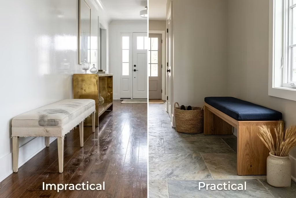
Farmhouse entryways are high-traffic zones, which means materials must be selected with real life in mind. A common mistake is prioritising appearance over durability.
Glossy floors, delicate fabrics, and unsealed surfaces may look appealing initially, but they often struggle under daily use. Marks, stains, and wear quickly become visible, turning maintenance into a constant battle.
More resilient choices such as sealed timber, natural stone, textured finishes, and washable paints tend to perform far better. The best materials are those that improve with age rather than deteriorate under pressure. A beautiful entryway that cannot handle daily life is, in truth, only half a design.
Following Trends Too Closely
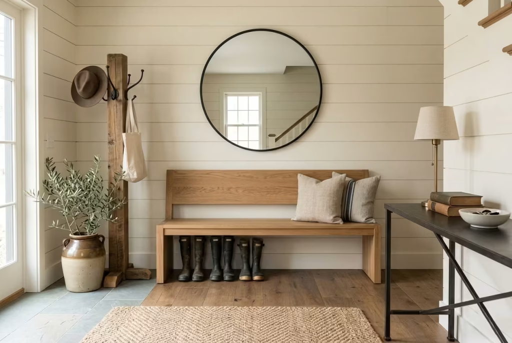
Trends can be useful for inspiration, but they are rarely a reliable foundation for long-term design. Entryways, in particular, benefit from stability rather than constant reinvention. When a space is built around fleeting aesthetics, it risks feeling dated far too quickly. What feels fresh today can feel overdone within a few seasons.
A more enduring approach is to focus on timeless principles: proportion, material honesty, and functional clarity. Trends can be layered in through accessories, but the core structure should remain steady. A strong entryway does not chase attention. It earns longevity through quiet consistency.
Modern farmhouse entryways work best when they feel grounded, not overworked. Avoiding these common mistakes is less about restriction and more about clarity. When function leads and decoration follows, the result is a space that feels natural, welcoming, and effortlessly composed from the very first step inside.
Creating a Welcoming Entryway That Works in Every Season
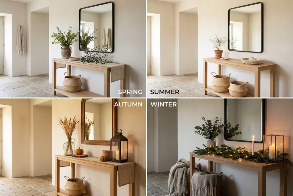
A truly successful farmhouse entryway is never static. It adapts quietly as the year shifts, responding to changes in light, temperature, and daily routines. The best designs do not rely on constant reinvention, but on a flexible foundation that can be refreshed with small, thoughtful adjustments. When the structure is right, seasonal styling becomes less of a task and more of a natural rhythm.
The aim is consistency with variation. The bones of the space remain steady, while textures, accents, and storage habits shift just enough to keep the entryway feeling alive.
Summer Styling
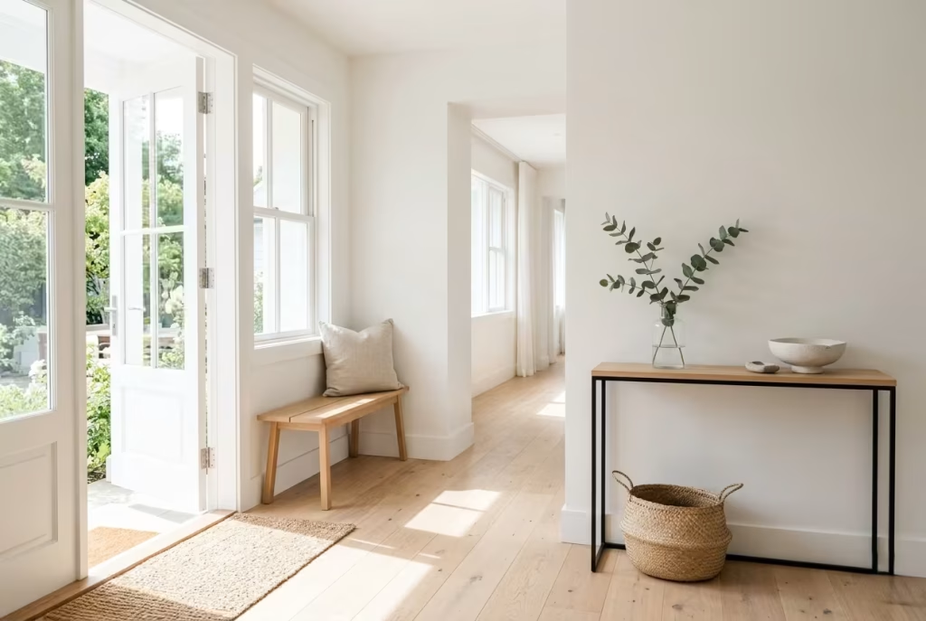
Summer entryways thrive on lightness and clarity. The goal is to keep the space visually open and uncluttered, almost as if it is breathing more freely. Natural materials take centre stage here. Linen cushions, woven baskets, and pale timber finishes help reflect daylight rather than absorb it. Greenery, whether real or preserved, adds a fresh touch without overwhelming the space.
I often find that summer styling works best when it feels almost incidental. A simple ceramic bowl, a lightly textured rug, or a single branch in a glass vase can be enough. When the light is doing most of the work, décor should step back and let it lead.
Autumn Layering
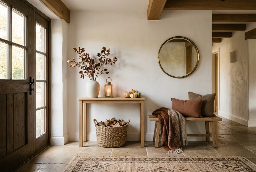
Autumn is where the entryway begins to gain depth again. As daylight softens, layering becomes more important to maintain warmth and atmosphere. This is the season for richer textures. Think wool throws draped over a bench, darker timber accents, and muted earth tones that echo the outdoors. Materials like aged brass and matte ceramics also come into their own.
The key is not to overfill the space, but to build gentle density. A well-placed lantern or deeper-toned cushion can shift the entire mood without requiring a full redesign. Autumn styling should feel like the home is settling in, preparing itself for slower days ahead.
Winter Comfort
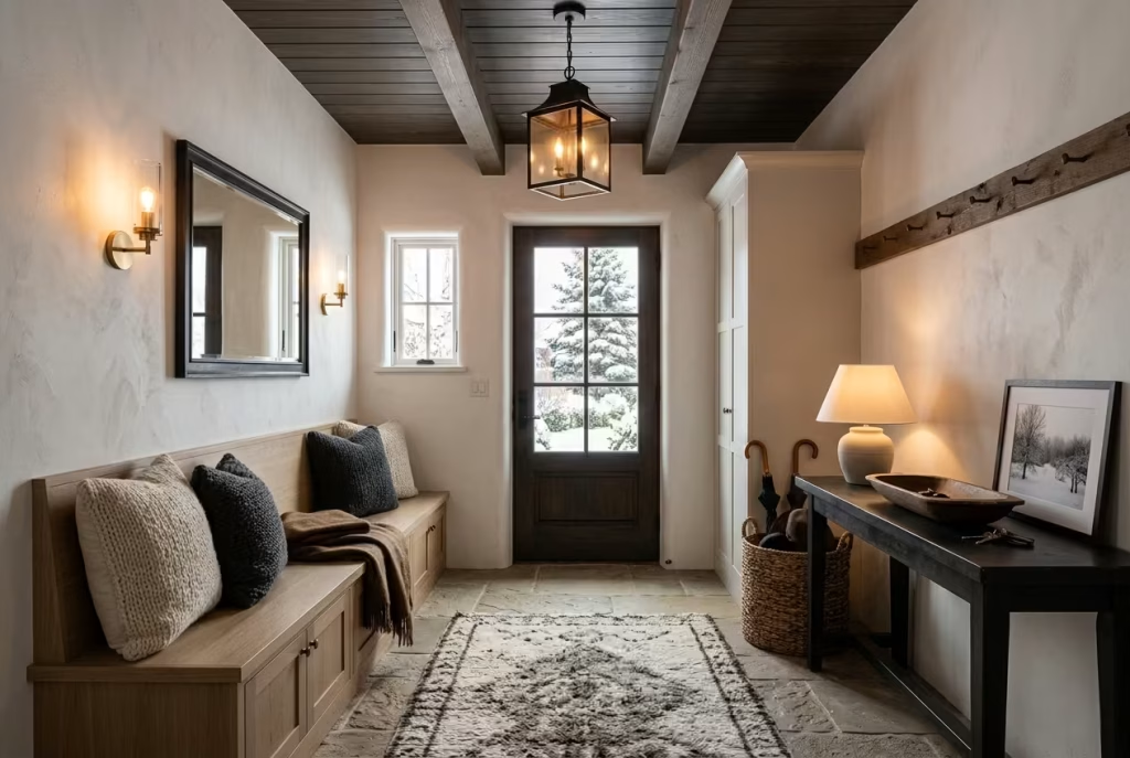
Winter entryways carry the heaviest emotional load. They are the threshold between cold outside air and the comfort of home, so warmth becomes the priority. Layered lighting is essential here. Soft pendant glow, wall sconces, and subtle accent lamps help prevent the space from feeling stark or clinical. Textiles also become more important, with thicker cushions, heavier rugs, and tactile materials taking centre stage.
Practicality matters just as much. Coats, boots, and wet-weather gear need to be accommodated without creating visual chaos. Closed storage becomes especially valuable during this season, keeping the entrance calm even when life is busy. Winter design is about making the first step inside feel like a release.
Spring Refresh Strategies
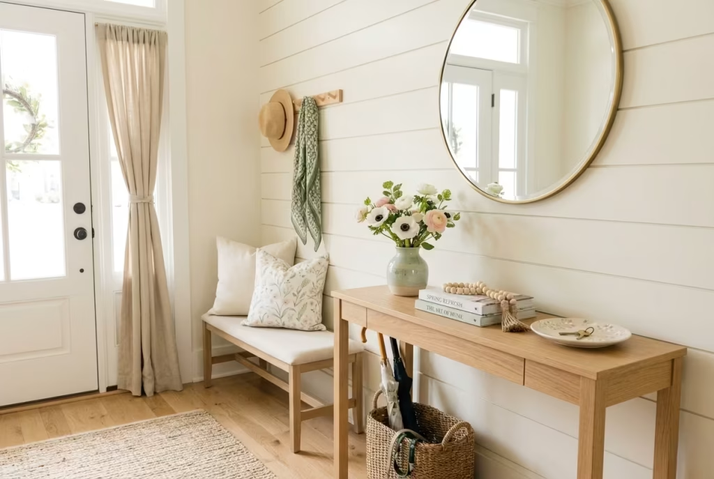
Spring is less about transformation and more about light recalibration. The entryway does not need a full reset, only a gentle lift. This is where subtle colour returns. Soft greens, pale florals, and lighter wood tones help reintroduce freshness. Cleaning and decluttering also play a major role, allowing the space to feel open again after the weight of winter.
I often recommend rotating accessories rather than replacing them. Swapping cushions, adjusting shelf styling, or changing a single decorative element can shift the tone without unnecessary effort. Spring styling should feel like the home is quietly waking up again.
Flexible Storage Solutions
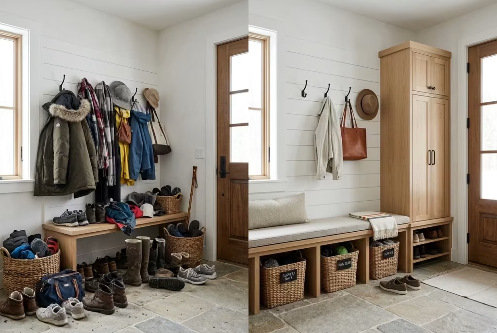
Seasonal change only works smoothly when storage is designed with flexibility in mind. Entryways that lack adaptable storage quickly become overwhelmed as coats, shoes, and accessories shift throughout the year.
The most effective solutions are layered rather than fixed. Open hooks for daily use, concealed cabinetry for seasonal items, and baskets for interchangeable storage all work together to create balance. A few principles consistently hold true:
- Storage should adapt to volume changes across seasons
- Frequently used items must remain easy to access
- Seasonal items should be rotated, not permanently displayed
- Hidden storage reduces visual pressure during high-use periods
When storage is well planned, seasonal styling becomes effortless rather than disruptive. The entryway simply adjusts, like a well-rehearsed system that never loses its rhythm.
A farmhouse entryway that works across all seasons is not built on constant change, but on quiet adaptability. When the foundation is strong, each season only refines the atmosphere rather than rebuilding it. The result is a space that feels consistent, comfortable, and naturally in tune with the life unfolding inside it.
Final Thoughts: Why the Best Modern Farmhouse Entryways Feel Effortless
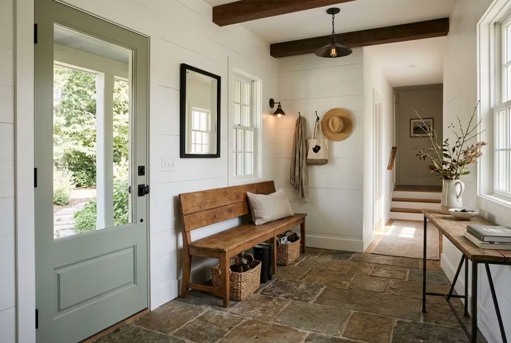
The most successful modern farmhouse entryways share a quiet quality that is easy to recognise but harder to define. They do not try to impress through excess or over-styling. Instead, they rely on clarity, proportion, and material honesty to create a sense of ease that settles in the moment you step inside. It is less about visual impact at first glance and more about how naturally the space supports everyday life.
Warmth in these spaces is never the result of decoration alone. It comes from considered decisions, where every surface, texture, and fixture has a role to play. A timber bench that actually gets used, a stone floor that withstands daily movement, lighting that adapts as the day fades, these are the elements that quietly build atmosphere without demanding attention.
Practicality, in well-designed entryways, is never an afterthought. It sits at the centre of the composition. When storage is properly planned and circulation is respected, the space stops working against the household and starts working with it. That shift is subtle, but it changes everything. Clutter loses its grip, routines feel smoother, and the entrance begins to function like a well-rehearsed system rather than a daily compromise.
Natural materials are what give the style its staying power. Wood, stone, linen, and metal do not rely on trends to remain relevant. They age, soften, and develop character over time. That gradual evolution is what keeps the entryway feeling authentic rather than static. It becomes a space that grows with the home instead of resisting it.
Ultimately, an entryway is more than a transitional zone. It is the first impression of how a home lives and breathes. When it is designed with restraint and intention, it sets the tone for everything that follows. The most memorable farmhouse entrances are not the most decorated, but the most grounded. They feel collected rather than curated, lived-in rather than staged, and above all, they feel like they belong.
Frequently Asked Questions Why the Best Modern Farmhouse Entryways Feel Effortless
What makes a modern farmhouse entryway feel truly effortless?
An effortless entryway is not accidental. It is the result of controlled design decisions where layout, storage, and materials work in sync. When circulation is clear, surfaces are uncluttered, and storage absorbs daily chaos without exposure, the space naturally feels calm. The visual simplicity you notice is usually the outcome of precise planning rather than minimal effort.
How important are natural materials in achieving this style?
Natural materials are fundamental. Wood, stone, linen, and metal introduce variation that manufactured finishes struggle to replicate. Their importance lies in how they age and respond to use. Instead of deteriorating, they develop patina and depth. This evolving character prevents the entryway from feeling static or overly staged, which is a key reason the style feels authentic over time.
Why do some farmhouse entryways feel cluttered instead of welcoming?
Clutter usually comes from a lack of hierarchy. When every surface carries equal visual weight, the eye has nowhere to settle. Another common issue is insufficient storage planning, where everyday items are not assigned a clear place. Without defined zones for shoes, coats, and accessories, even well-styled spaces quickly lose their sense of order.
What role does lighting play in making the space feel effortless?
Lighting determines how all other elements are perceived. Poor lighting flattens textures and creates visual tension, while layered lighting introduces depth and softness. A combination of warm ambient light, task lighting, and subtle accents ensures the entryway feels welcoming at all hours. The most effective schemes avoid harsh brightness and instead focus on balanced warmth.
How do professionals decide on the right materials for entryways?
Material selection is guided by durability, maintenance, and long-term appearance. Entryways are high-traffic zones, so finishes must withstand constant use without losing character. Natural stone, sealed timber, and textured surfaces are often preferred because they age gracefully. The decision is less about initial appearance and more about how the material performs over years of daily interaction.
Can a small entryway still achieve a modern farmhouse look?
Yes, scale does not limit style. In smaller entryways, success comes from restraint and proportion. Lighter tones, compact storage solutions, and carefully chosen focal points help prevent visual overload. Vertical space becomes especially important, with wall-mounted storage and mirrors creating a sense of openness without crowding the floor area.
What is the biggest mistake homeowners make with this style?
The most common mistake is over-styling. Adding too many decorative farmhouse elements can dilute the impact of the space and make it feel staged rather than lived-in. The strength of modern farmhouse design lies in editing. When unnecessary items are removed and only functional or meaningful pieces remain, the entryway naturally feels more refined and effortless.
How can an entryway stay functional throughout the year?
Seasonal adaptability is key. A well-designed entryway uses flexible storage systems that can handle changes in clothing, footwear, and accessories across different months. Lightweight textiles and greenery work in warmer seasons, while layered textures and enclosed storage become more important in colder months. The structure remains the same, but the styling subtly evolves.
Why do modern farmhouse entryways focus so much on balance?
Balance ensures the space feels neither overly rustic nor overly modern. It is the controlled tension between old and new, soft and structured, decorative and functional. Without this balance, the entryway risks feeling one-dimensional. When handled correctly, it creates a space that feels grounded, calm, and naturally composed without appearing forced.