16 Stunning Japandi Front Doors That Perfectly Blend Warmth and Minimalism
There’s a house near Guildford I still think about. The clients had spent close to fifty thousand pounds getting the inside right: limewashed walls, a kitchen in warm taupe joinery, the sort of quiet you could hear. And then you’d walk up the path and meet a composite front door in a faux oak woodgrain, glazed with a bevelled bullseye pane that belonged to an entirely different house, possibly an entirely different decade. The moment you stepped through it, all that carefully built calm simply drained back out onto the porch.
That’s the thing about a front door. It isn’t decoration tacked onto the facade at the end of a project; it’s the first five seconds of the house making its case for itself, and it either backs up everything you’ve done inside or quietly contradicts it.
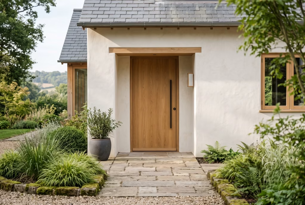
Japandi front doors succeed or fail on one point alone, and it has nothing to do with how many natural materials you can fit onto a single leaf. It’s restraint. A door with too much going on, too many textures fighting for attention, reads as busy no matter how “natural” every individual choice happens to be. The doors that actually earn the label do less, not more, and that discipline is precisely what lets them feel calm rather than merely sparse.
Rift-Sawn White Oak, Vertical Grain
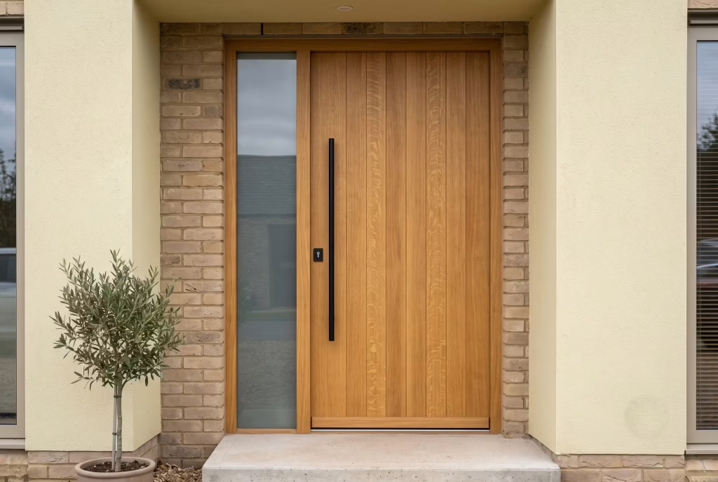
If you only take one lesson from this entire piece, let it be this: grain direction changes how a door reads far more than colour does. Rift-sawn white oak, cut so the growth rings run vertically through the plank, gives you a straight, almost architectural stripe rather than the cathedral swirls you get from plain-sawn timber. On a front door, that vertical line does something clever. It draws the eye up, making even a standard 2032mm opening feel a touch taller and considerably more composed.
I’ve specified this cut on a fair few projects now, and it’s usually the one detail joiners ask twice about, simply because it wastes more of the log and costs more to mill. Worth every penny of it, though. Where plain-sawn oak can look a bit “builder’s merchant” if you’re not careful, rift-sawn has a quiet formality to it that sits perfectly alongside the pared-back philosophy Japandi is built on.
Finish matters just as much as the cut. A hardwax oil in a warm honey or soft driftwood tone lets the timber breathe and ages gracefully, developing character rather than looking tired. Steer well clear of a high-gloss varnish here; it fights the whole point of the material, turning something meant to feel organic into something that looks faintly like a kitchen worktop bolted to your porch.
Where it earns its keep: period conversions and new-build alike, particularly where the rest of the facade leans toward render or brick in a warm neutral. Pair it with slim matte black hardware, and you’ve a door that looks equally at home on a converted Victorian terrace in Bristol as it does on a new-build in the Cotswolds, proof that this isn’t a fad confined to glossy new-builds with floor-to-ceiling glazing.
One practical note worth flagging honestly: oak moves with the seasons, expanding in damp months and contracting in a dry summer. A well-hung door accounts for this with proper tolerances, so if you’re commissioning bespoke, make sure whoever’s building it has actually hung solid oak externally before, not just internal doors. It’s a different beast entirely, and getting it wrong means a door that sticks every October like clockwork.
Weathered Teak with a Hand-Rubbed Oil Finish
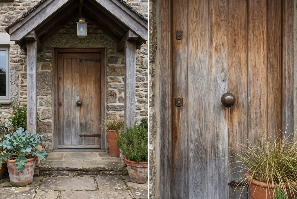
Teak is the material equivalent of a well-worn leather jacket. It only gets better with age, and that’s precisely why it belongs on this list. Where the rift-sawn oak we’ve just covered depends on that crisp vertical line for its character, teak plays a completely different game. It’s about surface, patina, and the slow, honest way it weathers when left to its own devices outdoors.
I’ll be upfront about something most design blogs gloss over: “weathered teak” isn’t a finish you buy off a shelf. It’s a look a door earns over several UK winters, as the wood’s natural oils rise to the surface and the colour mellows from that deep honey-brown you see on freshly milled boards toward a soft, silvered grey.
Some homeowners chase this ageing process deliberately with a weathering accelerant. Others, myself included on more than one project, prefer to simply let nature take its course and check back in eighteen months. Either route works. What doesn’t work is impatience, expecting a brand-new door to look sun-bleached and lived-in within a fortnight of installation.
The hand-rubbed oil finish is where the real craft sits. Unlike a sprayed lacquer, which sits on top of the timber like a shell, oil worked in by hand penetrates the grain and lets the wood keep breathing.
Practically speaking, that means no unsightly peeling or flaking down the line, just the occasional light re-oiling every year or two, a job you can genuinely do yourself on a dry Sunday afternoon with a lint-free cloth and a bit of elbow grease. It’s low-maintenance in the way that matters, not in the marketing sense.
Where I’d steer this: coastal properties and anywhere with generous overhead shelter, a porch roof or deep canopy, since teak’s natural oil content already gives it a leg up on rot resistance, but sustained direct rainfall on unprotected end grain will shorten its lifespan regardless of the finish.
Pair it with brushed brass or aged bronze hardware rather than anything cool-toned like chrome or matte black. The warmth of the metal needs to match the warmth building in the timber, or the whole door starts to feel like two separate decisions rather than one considered one.
If there’s a real-life lesson buried in this entry, it’s this: the doors people fall in love with years later are rarely the ones that looked flawless on day one. They’re the ones built to age well in the first place.
Charred Cedar (Shou Sugi Ban)
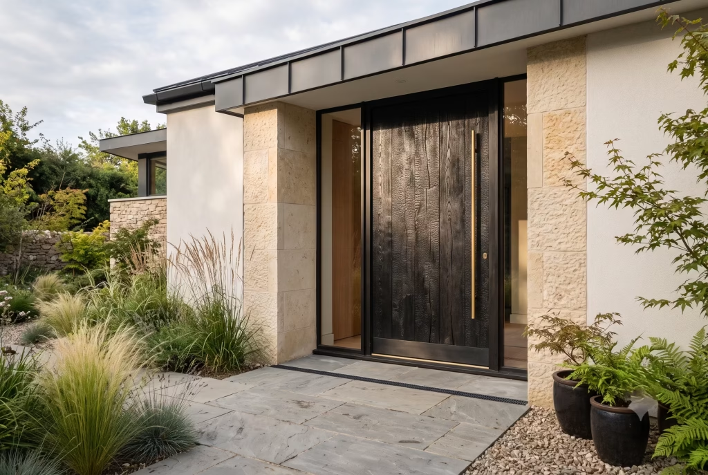
Right, let’s have an honest conversation about this one, because it’s the entry on this list that gets romanticised the most and explained the least.
Shou sugi ban is the Japanese technique of charring the surface of cedar boards with an open flame, then brushing away the loose ash to reveal a blackened, faintly reptilian texture underneath.
Done properly, it’s genuinely striking, the sort of finish that makes a front door look less like a door and more like a piece of sculpture someone happens to walk through twice a day. That deep, almost obsidian black also happens to be one of the few dark tones that reads as warm rather than severe, which is exactly the trick a good Japandi entrance needs to pull off.
Here’s the bit most inspiration boards leave out: charring the timber isn’t just an aesthetic flourish, it’s a genuine preservation method. The carbonised layer is naturally resistant to rot, insects, and UV degradation, which is why the technique has survived in Japan for centuries rather than fading into a design footnote.
That said, don’t mistake “traditionally weatherproof” for “maintenance-free.” Every few years, depending on your local exposure to rain and wind, that charred layer will need a fresh coat of natural oil to stop it drying out and shedding a fine black residue onto anything that brushes past it, a coat sleeve, a delivery parcel, a curious dog’s nose.
I’ll flag something else too, since it trips up a fair number of homeowners who fall for this look online and skip the small print. Genuine shou sugi ban on a front door needs a joiner who actually understands the technique, not simply a black-stained door dressed up with the name for marketing purposes.
There’s a world of difference between a hand-charred cedar plank with real texture underfoot your fingertips and a factory-stained board trying to fake it. Ask to see the grain up close before you commit; the real thing has a texture you can’t fully capture in a photograph.
Where it belongs: contemporary new-builds and bold renovations where the rest of the palette can afford one dramatic, dark anchor point, think pale render, warm stone, or timber cladding elsewhere on the facade.
Pair it with brass or warm bronze hardware to soften that charcoal intensity, and resist the urge to surround it with equally dark window frames. Give the eye somewhere to rest, or the whole facade tips from “considered” into “gothic,” and that’s a rather different brief altogether.
Light Ash with a Matte Espresso Frame
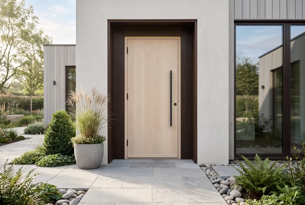
There’s a particular sleight of hand at play with this pairing, and it’s one worth understanding before you fall for it on Pinterest and end up disappointed with the real thing.
Light ash on its own can look a bit thin, a bit lightweight, especially against a heavier stone or brick facade that’s used to more visual gravity. What rescues it is the frame. A matte espresso surround, dark, almost black-brown, gives the pale timber somewhere to sit, the way a good mount does for a piece of art. Suddenly that same door that might’ve looked washed out on its own reads as deliberate, contained, and considerably more expensive than it actually is.
Ash itself deserves a word in its own right. It’s a close cousin to oak in terms of hardness, but the grain runs straighter and paler, with far less of that busy figuring you get in a plain-sawn oak board. That subtlety is exactly why it suits Japandi so well. The style thrives on quiet materials that don’t shout for attention, and ash, left in its natural pale tone rather than stained darker, gives you that hushed quality without veering into anything that looks unfinished or raw.
A quick word of honesty from site experience: ash is more prone to UV bleaching than oak or teak if it’s left unprotected on a south-facing elevation. Left untreated, that lovely pale tone can shift toward a slightly grey, tired look within a couple of summers, not ruined exactly, but not the crisp finish you paid for either. A UV-stable matte lacquer or a properly formulated exterior oil with UV inhibitors sorts this out entirely, and it’s a conversation worth having with your joiner before the door goes anywhere near the opening, not after you’ve noticed the fade.
Hardware-wise, this is one pairing where I’d actually recommend breaking from brass or bronze. A slim black or graphite handle, echoing the frame rather than contrasting against it, keeps the whole composition feeling like one cohesive thought rather than three separate decisions bolted together. Where it really sings is on newer builds with clean render facades in soft greys or off-whites, giving the entrance a crispness that feels contemporary without tipping into anything cold or clinical.
If you take one practical thing from this entry, let it be this: the frame is doing at least half the work here. Get the espresso tone wrong, too warm, too red, and it’ll clash with the ash rather than complementing it. Sample it against your actual door blank before committing to a full run, not just a paint chip under shop lighting.
Matte Black Steel-Look with Brass Hardware
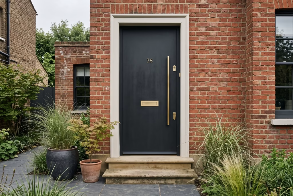
This is the entry that finally puts to bed the idea that Japandi is some pastel, all-beige affair where nobody’s allowed a strong opinion. It isn’t, and if anything, this pairing is proof that a bit of drama and a calm, grounded home are not mutually exclusive.
The steel-look finish, whether it’s genuine mild steel with a powder coat or a composite door engineered to mimic that industrial edge, gives you a flat, almost matte-black plane with none of the reflective shine you’d get from gloss paint.
That matters more than people expect. Gloss black on a front door can look a bit corporate, a bit “office block,” whereas a proper matte finish absorbs light rather than bouncing it back at you, and that’s what lets the colour feel warm and settled rather than stark.
Brass is doing the heavy lifting here, and it’s worth explaining why rather than just taking it on faith. Black on its own, however matte, can tip toward cold if you’re not careful, especially under grey British skies for half the year.
Warm brass hardware, a substantial pull handle, a letterbox with a bit of weight to it, pulls the whole composition back toward something inviting. It’s the same logic as adding a gold cushion to an otherwise moody, charcoal-toned living room; one warm note stops the whole scheme reading as austere.
A practical note from actual site experience, since this is where a lot of homeowners get caught out: not all “black steel-look” doors are created equal. Genuine steel needs proper anti-corrosion treatment before powder coating, particularly around the hinges and threshold, or you’ll be looking at rust bleed within a couple of winters, an unwelcome surprise that rather undermines the whole point of choosing a low-maintenance finish.
If budget doesn’t stretch to true steel, a well-made GRP composite door finished to mimic the same flat black works honestly well and sidesteps the corrosion question entirely. Ask your supplier directly which you’re getting; don’t assume.
Where this pairing earns its place: Victorian and Edwardian terraces looking to modernise without erasing their character entirely, new-builds wanting a bit of edge against an otherwise soft render facade, and anywhere the surrounding brickwork is warm enough in tone, red brick, London stock, to hold its own against that strong black anchor. Keep the surrounding trim pared back rather than ornate. This is a door that wants to make its statement quietly, not compete with a fussy porch canopy for attention.
You May also Like: 25 Outdoor Tiles for Floor Stylish Patio, Garden and Terrace Flooring Ideas
Deep Forest Green with Oak Surround
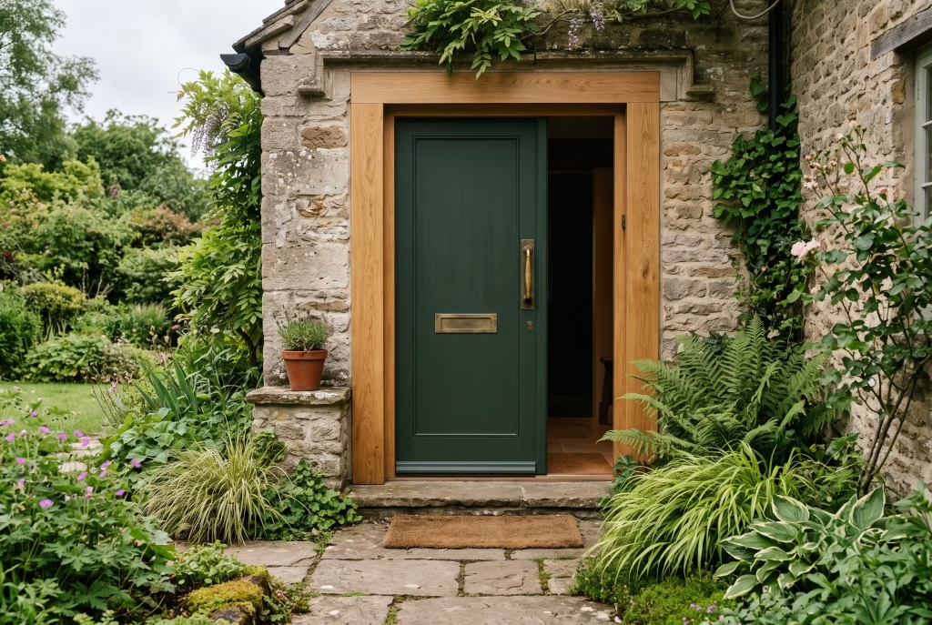
If black and brass is the pairing that proves Japandi has a bit of nerve to it, deep forest green is the one that proves it has roots, quite literally in this case.
Green sits in an odd spot on most colour wheels. Too bright and it looks almost nursery-adjacent; too muted and it disappears into the brickwork behind it. The trick with a proper Japandi-appropriate green is depth rather than brightness, think the colour of wet moss on a stone wall, or the underside of a fir branch after rain, rather than anything you’d find on a Farrow & Ball feature wall in a trendy café. That deep, almost blackened green reads as grounded and organic, which is precisely the emotional register this whole style is chasing.
The oak surround is doing more than framing the door; it’s translating the colour for the rest of the house. Green on its own, however well chosen, can read as a slightly odd, isolated decision if it’s sitting directly against pale render or grey brick with nothing to bridge the two.
A solid oak frame, left in its natural tone or given a light matte oil, gives the eye a warm, textured transition between that saturated colour and whatever’s surrounding it. It’s the same reasoning a good picture framer uses: the mount matters as much as the print.
Here’s something I’ve learned the hard way on site, and it’s worth saying plainly rather than dancing around it. Green paint on an exterior door fades faster than black or navy under strong UV exposure, particularly on a south or west-facing elevation that catches the afternoon sun. A cheap trade paint will bronze and dull within eighteen months, turning that lovely forest tone a bit khaki and tired.
Spend the extra on a proper exterior-grade paint system with UV-stable pigments, or better still, ask your joiner about a factory-applied finish rather than site-painted. It costs more upfront and saves you repainting during year three, which nobody enjoys doing on a ladder in October.
Where this pairing genuinely earns its place: stone cottages, brick Victorian terraces with warm red or buff brick, and anywhere surrounded by actual greenery, since the door then stops feeling like a colour choice and starts feeling like part of the garden’s logic.
Pair the hardware in aged brass or bronze rather than anything cool-toned. Chrome or brushed steel against forest green looks like two different design briefs arguing with each other, and a good front door should never look like it’s mid-disagreement with itself.
Charcoal Composite with Fluted Glass Panel
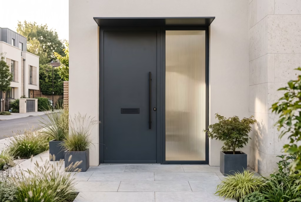
Right, we’ve already covered matte black steel-look with brass hardware a couple of entries back, so let’s talk about what makes this one genuinely different rather than a rehash of the same idea in a different coat.
Where that steel-look door was all flat, uninterrupted plane, this one introduces texture through light rather than surface. Fluted glass, sometimes called reeded glass, is cut with a series of fine vertical ridges that catch and scatter light as you move past it, so the panel never looks quite the same twice depending on the time of day.
It’s the same glass you’ll have seen cropping up in boutique hotel lobbies and high-end kitchen cabinetry over the last few years, and it’s finally found its way onto front doors, where it does something genuinely useful beyond looking rather lovely.
That fluting obscures the view through without blocking light entirely, which solves a real problem a lot of homeowners don’t think about until they’re stood in their new hallway feeling rather exposed. A fully glazed panel gives passersby a clear view straight into your hallway. Frosted glass solves the privacy issue but can look a bit clinical, a bit GP-surgery. Fluted glass sits in the sweet spot: privacy intact, but with a softness and movement that frosted glass simply can’t touch.
Charcoal composite as the base material is worth a word too. Unlike the true steel we discussed earlier, a composite door is built around a reinforced core, often foam-filled, wrapped in a durable outer skin, and it sidesteps the corrosion questions steel brings entirely. It won’t warp, rot, or rust, which makes it a genuinely sensible choice for anyone who wants the Japandi look without a maintenance schedule pinned to the fridge.
The trade-off, and I’ll be straight with you here, is that a cheaper composite can look a bit plasticky up close, especially around the woodgrain-effect mouldings some manufacturers still insist on adding. Steer toward a flat, unembellished panel design and let the fluted glass provide the only textural interest. Simplicity is the whole brief, after all.
Where this pairs beautifully: townhouses and new-builds with a narrower hallway just behind the door, since the diffused light the fluting lets through makes a tight entrance feel considerably less like a corridor and more like a considered space. Keep the surrounding hardware slim and dark, graphite or matte black rather than brass this time, letting the glass do the talking rather than competing with a second attention-grabbing material.
Ink-Black Pivot Door, Oversized Format
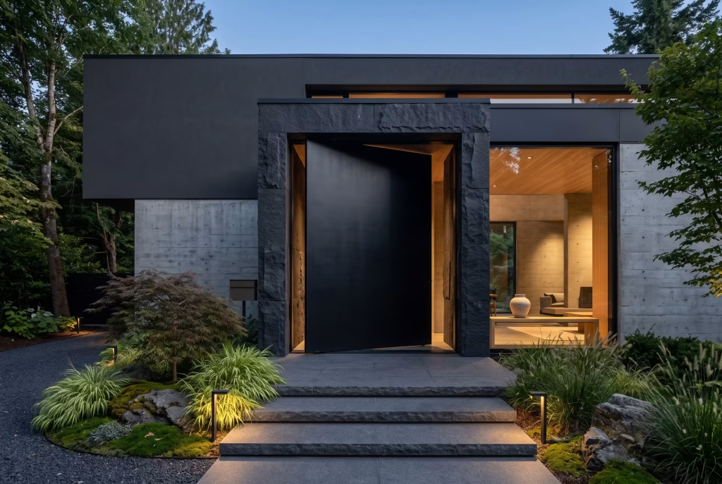
Every list like this needs one door that makes people stop scrolling entirely, and this is it. If matte black steel-look was Japandi’s confident, understated statement piece, an oversized ink-black pivot door is Japandi standing up and clearing its throat.
Let’s deal with the format first, since it genuinely changes how the whole entrance behaves. A pivot door doesn’t swing on side hinges like a conventional door. It rotates on a concealed pivot point set roughly a third of the way along its width, meaning the whole leaf turns almost like a revolving stage set rather than folding open at the edge.
Combine that mechanism with an oversized format, and I’ve seen genuine examples pushing past 3.6 metres tall and 2 metres wide, and you get an entrance that feels less like a door and rather more like a piece of moving architecture.
That scale matters enormously for the Japandi brief specifically. The whole style hinges on restraint reading as confidence rather than absence, and there’s no better proof of that principle than a single, vast, unbroken black plane with no glazing, no fussy panel divisions, nothing to distract from its sheer presence. It’s a door that says everything by saying almost nothing at all, which is precisely the paradox this style trades in.
Now, the honest bit, because oversized pivot doors are not a decision to make lightly. The engineering behind them is considerably more demanding than a standard hinged door. That pivot mechanism needs to bear serious weight, often well over 100kg for a solid timber or steel-faced leaf, and it needs setting into a structural opening that’s been properly specified for it, not retrofitted as an afterthought.
This isn’t a job for a general builder working from a catalogue measurement. You want a specialist joiner or door manufacturer who’s actually installed pivot mechanisms before, and you want that conversation happening at the architectural drawing stage, not after the opening’s already been built to standard door dimensions.
Where it belongs: contemporary new-builds with generous ceiling heights and a facade bold enough to carry it, think exposed concrete, dark brick, or render in a similarly deep tone, so the door reads as part of a considered whole rather than a lone dramatic gesture bolted onto an otherwise modest house.
It’s not, if I’m honest, a retrofit solution for a Victorian terrace with a standard-height opening. Some doors need to earn their scale from the building around them, and this is very much one of them.
You May also Like: 25 Modern Wooden Garden Fence Ideas for 2026: DIY Builds, Design Trends & Outdoor Decor Inspiration
Frosted Sidelight Pairing

We’ve spent the last two entries on doors that demand attention outright, so let’s shift gears entirely and talk about a detail that works by quiet association rather than a bold statement of its own.
A sidelight is the narrow strip of fixed glazing running alongside a front door, and frosted glass in that position solves a problem that plagues an awful lot of British hallways: how do you let daylight flood a dim entrance without turning the whole house into a display case for passing neighbours?
A solid door with no glazing at all keeps a hallway gloomy well past nine in the morning, particularly on a north-facing elevation where you barely see the sun from October through March. Frosted sidelights let that daylight pour in while scattering it enough that nobody’s peering straight through at your coat pegs and post pile.
What makes this pairing genuinely Japandi rather than simply “a door with some glass beside it” comes down to proportion. The temptation with sidelights is to go wide, treating them almost as a second window. Resist that urge.
A slim sidelight, roughly a quarter to a third the width of the main door, reads as considered and architectural. Go too generous and the whole composition starts to look like a porch that couldn’t decide whether it wanted to be a door or a window, and ends up being neither convincingly.
Frosted glass itself comes in more varieties than most people realise, and the choice between them matters more than the word “frosted” suggests. A sandblasted finish gives you an even, uniform matte texture throughout. An acid-etched finish tends to feel a touch softer underfoot the eye, with subtler variation across the pane.
Either works for this look, but steer well clear of anything with a printed pattern, florals, geometric borders, that sort of thing. The whole point here is calm, unbroken diffusion, not a decorative motif competing with the door for attention.
A practical note worth flagging, since it trips people up at the quoting stage: sidelights add genuinely meaningful cost to a door installation, both in materials and in the structural opening required to accommodate them properly. If budget’s tight, a single sidelight rather than a pair either side still delivers most of the daylight benefit at a fraction of the outlay, and it often looks more deliberate besides, an asymmetric gesture rather than a matched set.
Where it belongs: narrow Victorian and Edwardian hallways crying out for more natural light, and new-builds where the entrance sits on a north or east-facing wall. Pair it with a timber or matte black door frame rather than anything reflective, letting the glass provide the only shine in an otherwise matte, grounded composition.
Reeded/Fluted Glass Insert
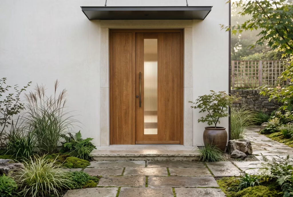
We touched on fluted glass a few entries back sitting inside a charcoal composite panel, so let’s go deeper this time and talk about the insert as its own decision, separate from whatever door it happens to sit within.
Reeded and fluted glass get used almost interchangeably, but there’s a subtle difference worth knowing before you’re stood in a showroom pointing at samples. Reeded glass has slightly rounder, softer ridges.
Fluted tends to be crisper and more defined, closer to a proper architectural column than a gentle wave. Neither is objectively better. It comes down to how much visual texture the rest of your door and facade can comfortably absorb.
A door with an otherwise busy grain, that rift-sawn oak we covered earlier, for instance, probably wants the softer reeded option so the two textures don’t start competing. A flat, quiet composite or painted panel can take the crisper fluted cut without the whole thing tipping into visual overload.
What earns this glass its place in a Japandi entrance, and it’s a point genuinely worth dwelling on, is the way it plays with shadow rather than simply blocking light. Stand behind a fluted panel as the sun moves across it during the day, and you’ll notice the ridges throw faint vertical shadow lines that shift subtly hour by hour.
That’s not a gimmick. It’s the same wabi-sabi principle that runs through the whole style: beauty found in the way natural light behaves rather than in anything static or fixed. A flat pane of clear or frosted glass simply can’t offer that same quiet choreography.
Here’s a genuinely practical point that gets skipped over far too often. Fluted glass shows fingerprints and water spots differently to flat glass, generally hiding light smudging rather well thanks to the texture, but collecting grime along the ridge lines over time in a way that needs an occasional proper clean rather than a quick wipe. Nothing arduous, mind, just worth knowing before you assume it’s entirely maintenance-free.
Where it belongs: almost anywhere within this style, frankly, since it pairs happily with oak, ash, charcoal composite, or a painted finish alike. Where I’d hold back is a door that already carries strong grain or heavy texture elsewhere. Let one material do the textural talking at a time, and the whole entrance stays coherent rather than becoming a competition nobody quite wins.
Smoked Glass Full-Height Panel
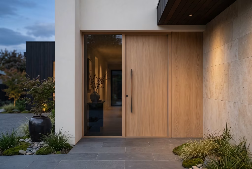
Right, we’ve spent several entries now discussing textured glass, fluted, reeded, frosted, so let’s talk about something altogether different in character. Smoked glass doesn’t scatter or diffuse light the way those finishes do. It simply darkens it, tinting everything behind the pane a deep, almost charcoal grey, and that changes the whole mood of an entrance rather considerably.
A full-height panel, running the entire length of the door rather than a smaller inset, is a genuinely bold move, and I won’t pretend otherwise. Where a fluted or frosted insert lets you dip a toe into a glazed front door, a full smoked panel commits properly.
The effect, done well, is closer to a piece of dark, still water than a conventional window. You get a sense of movement and shadow from inside without any of the clarity of a normal pane, which suits the Japandi brief perfectly, that constant tension between openness and privacy, neither fully closed off nor fully exposed.
There’s a genuine technical difference worth knowing before you fall for the look purely on appearance. Smoked glass gets its tint one of two ways: either through a tinted interlayer laminated between two sheets during manufacture, or through a surface film applied afterward.
The laminated route costs more but ages properly, holding its tone evenly for decades. The applied film is cheaper upfront but can bubble or discolour unevenly after years of UV exposure and weather cycling, particularly on a south-facing door catching full sun for half the day. Ask your supplier directly which method they’re using. It’s the sort of detail that separates a door you’ll love in ten years from one you’ll be replacing in five.
Practically speaking, a full-height smoked panel does reduce the daylight reaching your hallway more than clear or frosted glass would, simply by virtue of the tint absorbing light rather than passing it through untouched. Worth weighing up honestly if your hallway already runs a touch dim or faces north. It’s a striking look, but striking and practical aren’t always the same brief, and a good designer tells you that upfront rather than letting you discover it after the invoice.
Where it belongs: contemporary new-builds and bold renovations with generous natural light elsewhere in the house, so the entrance can afford to be the moodier note in the composition rather than the room’s only source of daylight. Pair it with a slim black or bronze frame and keep the surrounding hardware understated. This door has already said its piece through the glass alone.
You May also Like: 25 Low-Maintenance, Long-Lasting Minimalist Garden Ideas for Budget-Friendly Outdoor Spaces in 2026
Slim Clerestory Transom Above a Solid Door
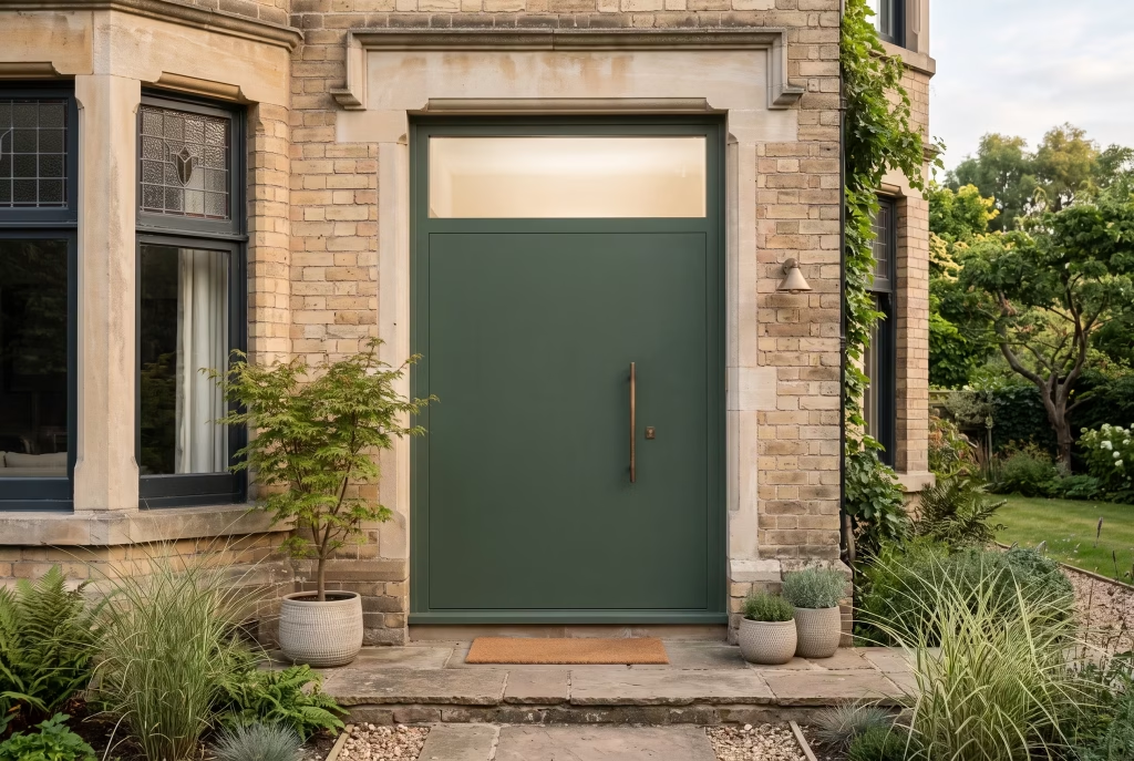
Every entrance on this list so far has dealt with glazing set into the door itself. This one takes a different approach entirely, lifting the glass right out of the door and setting it above instead, and it’s a detail that quietly solves a problem the others don’t.
A clerestory transom is a slim band of fixed glazing sitting just above the door frame, beneath the lintel, rather than within the door leaf. Keep it slender, no more than a few hundred millimetres deep, and it starts doing something rather clever architecturally. It draws the eye upward along the vertical line of the frame, making a standard door height feel a touch more generous than it actually is, while leaving the door itself entirely solid.
That solidity is the whole point here, and it’s worth explaining why rather than assuming it’s obvious. A fully solid door, no glazing anywhere on the leaf, offers privacy and security that a glazed panel simply can’t match, no small consideration if your hallway opens straight onto a busy pavement or you’d rather not broadcast the contents of your post pile to passersby.
But a solid door on its own can also feel a little heavy, a little closed off, particularly at the top of a narrow hallway where daylight already struggles to reach. The transom above solves that tension neatly. You keep the security and privacy of an unbroken door while still letting a wash of daylight spill down over the top, catching the wall behind the door in a soft, indirect glow rather than a direct beam.
A word from actual site experience worth passing on: getting the proportion right here takes real restraint. Too deep a transom and it starts competing with the door itself for visual weight, undermining the very solidity you were trying to preserve. Too shallow and it reads as an afterthought rather than a considered feature, a strip of glass someone forgot to remove rather than one deliberately placed.
Somewhere around a sixth to an eighth of the total door height tends to hit that sweet spot, though it’s worth mocking up on paper against your actual opening before committing, since proportions that work on a wide Georgian doorway can look entirely wrong squeezed above a narrower modern one.
Where it belongs: period properties wanting a contemporary update without losing the formality of a solid front door, and narrower hallways that need daylight without sacrificing privacy. Pair it with a door in a deep, matte tone, charcoal, forest green, ink black, so the transom’s glow reads as the entrance’s one quiet flourish rather than competing with a busier door design underneath it.
Raw Steel with Visible Patina
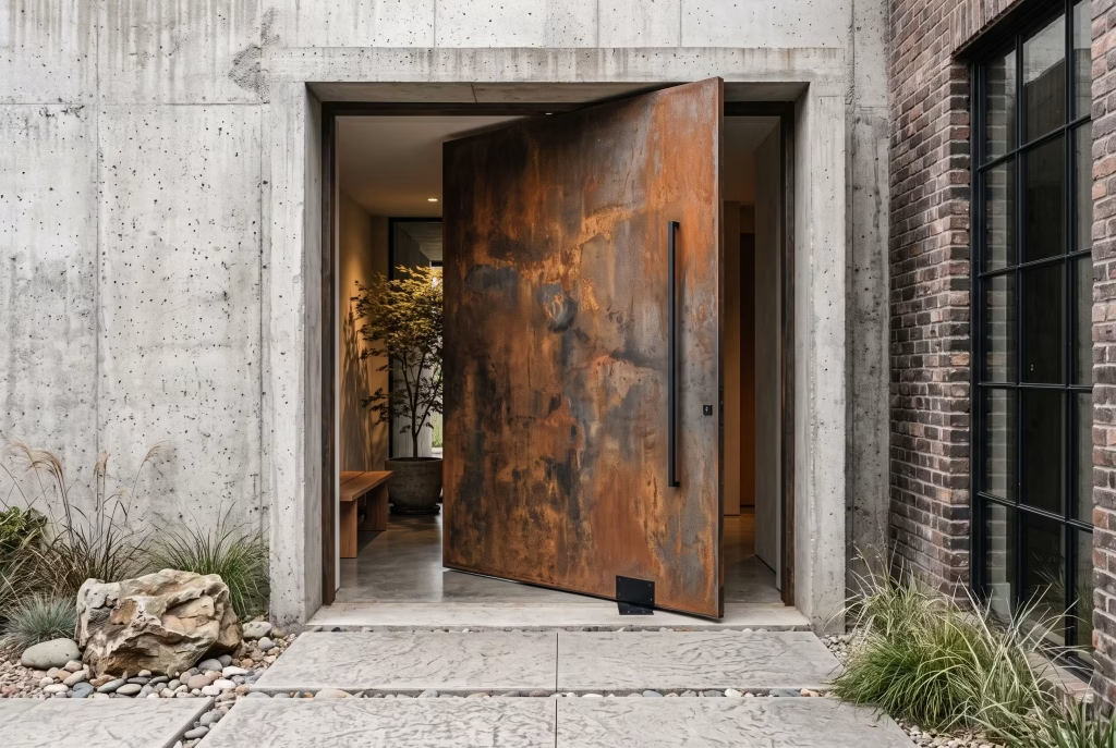
We’ve had matte black steel-look already, so let’s be precise about how this differs, because the distinction matters more than it might first appear. That earlier entry was steel dressed up with a consistent, factory-applied black finish. This one is the opposite instinct entirely: steel left to show its own age, rust and all, worn as a feature rather than hidden away.
Raw steel, sometimes sold as “hot-rolled” or given a deliberate rust patina finish, oxidises naturally over time, developing a mottled surface somewhere between rust orange, deep brown, and a soft grey-black. Left untreated, it would eventually corrode right through.
Sealed properly with a clear protective coat once that patina has developed to the desired depth, it stops right there, preserved in whatever state of weathering you like the look of most. It’s essentially controlled ageing, catching the material mid-story rather than at the beginning or the end.
This is about as wabi-sabi as a front door gets, if I’m honest, and it’s worth explaining why that matters rather than just asserting it. The whole philosophy behind wabi-sabi is finding beauty in imperfection, in the marks time leaves on a surface rather than in anything pristine or uniform.
A raw steel door with visible patina embodies that more literally than almost any other material on this list. No two doors will ever look quite the same, since no two sheets of steel oxidise in an identical pattern, and that variation is precisely the point rather than a flaw to correct.
Here’s the honest, practical bit that separates a design blog from someone who’s actually specified this on site. Getting the patina “caught” at the right moment and then properly sealed is a specialist job, not something a general decorator can eyeball convincingly. Do it too early and you’ve essentially just got a slightly dirty-looking steel door.
Do it without proper sealing afterward and the corrosion carries on regardless, eventually compromising the door’s structural integrity rather than merely its looks. This is a material that wants a supplier who’s genuinely done it before, ideally with photos of previous doors at both six months and five years, so you know what you’re actually signing up for long-term.
Where it belongs: industrial conversions, warehouse-style new-builds, and anywhere the surrounding materials, exposed brick, concrete, black steel-framed windows, already speak the same raw, honest language. It’s not, in my experience, the right choice for a soft render cottage or anywhere the rest of the palette leans gentle and pastel. Some materials need the right company around them to make sense, and raw steel is very much one of them.
Weathered Copper Hardware Detail
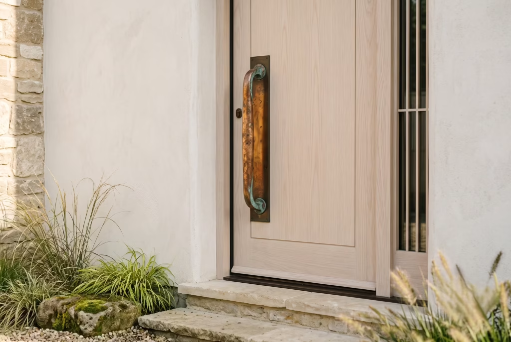
Every door on this list so far has been about the leaf itself, the timber, the steel, the glass. This entry is a deliberate change of scale. Sometimes the whole story of an entrance comes down to a single handle, and copper, left to weather rather than lacquered to stay bright, tells that story better than almost any other material going.
Fresh copper is a warm, almost pinkish orange, the sort of shine you see on a new penny. Left exposed to air and rain, it doesn’t stay that way for long. Within a year or two it darkens toward a rich brown, and given enough time and enough weather, it eventually develops that famous verdigris, a soft blue-green bloom that’s been the calling card of copper roofing and church spires for centuries.
On door hardware, you can chase whichever stage of that journey you like best. Some homeowners want the handle sealed at that early honeyed brown. Others are happy to let it run the full course toward green, treating the change as part of the design rather than something to arrest.
Here’s why this belongs on a Japandi list specifically, and it’s a point worth sitting with rather than rushing past. The whole style is built on the idea that a home shouldn’t look frozen in the showroom moment it was bought. Materials are meant to age, to gather a bit of history, to look better for having actually been lived with.
A brass handle lacquered to stay permanently gleaming fights that philosophy at every turn. A copper handle left to its own devices embodies it, quite literally changing colour in step with the seasons and the years, becoming more itself rather than less with every passing winter.
A genuinely practical note from site experience, since this trips people up more than you’d think: unlacquered copper will mark your hands slightly with a metallic scent after prolonged contact, and it can leave faint green staining on pale paintwork if it’s mounted directly against a light-coloured door without a backing plate.
Neither is a dealbreaker, but both are worth knowing before you commit, rather than discovering them the first damp October you touch the handle on your way out. A slim brass or bronze backing plate behind the copper handle solves the staining issue neatly, and it’s a detail any decent ironmonger will suggest without being asked.
Where it belongs: almost any door on this list, frankly, since weathered copper hardware pairs happily with oak, ash, charcoal composite, or a deep forest green alike. Where it particularly sings is against a paler, more neutral door, ash, driftwood oak, soft grey render, where that warming, darkening handle becomes the one point of colour the whole entrance quietly builds toward.
You May also Like: 20 Gorgeous White Stucco Townhouse Ideas for Timeless Curb Appeal
Rattan/Cane Inset Panel
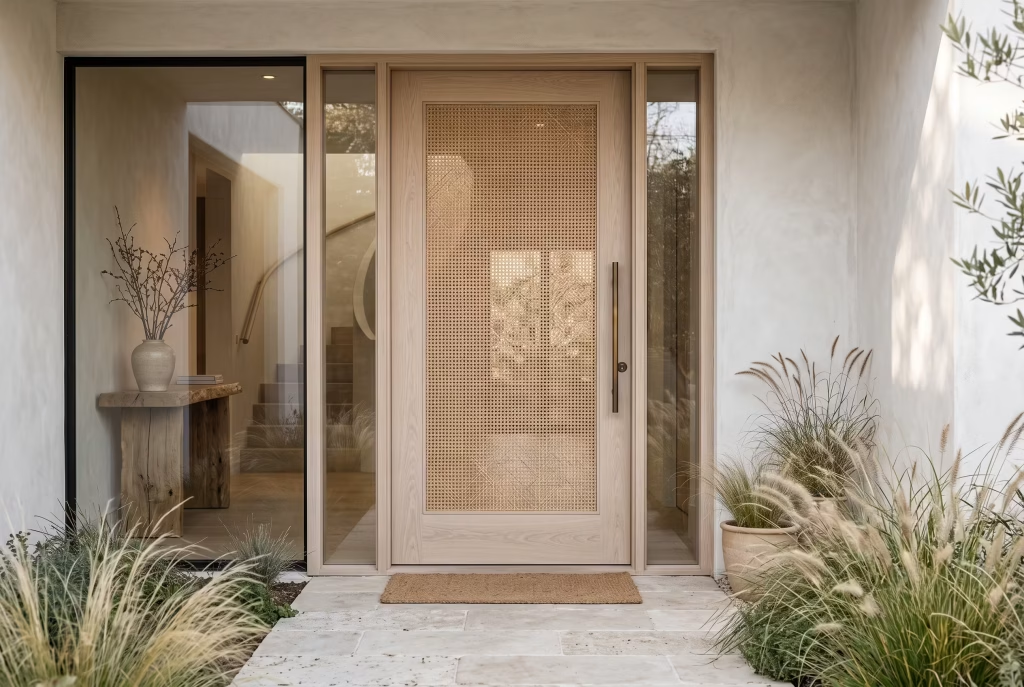
Right, this is the one I genuinely think gets slept on, so let’s give it the attention it deserves. Every material we’ve covered so far, oak, teak, steel, copper, has some presence on the wider design scene already. Rattan and cane on a front door, by contrast, is something you’ll rarely see done properly, and that’s precisely what makes it worth your attention.
Rattan is the material woven from the outer bark of the rattan palm, and cane comes from the inner core of that same plant, split and steamed into flexible strips. Both have lived comfortably indoors for decades, on chair backs, cabinet fronts, headboards, but bringing that same woven texture out to a front door, set behind a protective glazed panel to shield it from the weather, is still genuinely rare. Most joiners haven’t been asked for it. Most homeowners haven’t thought to ask.
Here’s why it earns its place on this list rather than just being included for novelty’s sake. Japandi draws heavily on a Japanese sensitivity to natural, handworked materials, and precious little on this list captures “handworked” quite as literally as a woven cane panel.
Every crossing strand carries the faint irregularity of having been made by hand rather than extruded by machine, and that texture, seen through glass, catching low winter light at an angle, does something no flat material on this list can quite manage. It moves. Shadows shift across the weave throughout the day in a way that turns even a five-second glance at your own front door into something worth pausing over.
I’ll be honest about the practical side, since this is where the idea tends to fall down if it isn’t handled properly. Rattan and cane are not naturally weatherproof materials, full stop, and setting them directly into an exterior door without protection is asking for trouble within a single wet winter.
The way round this, and the only way I’d recommend it, is setting the woven panel behind a sealed glazed unit, essentially treating it like artwork displayed in a case rather than a surface exposed to the elements directly. Done that way, it stays dry, stays intact, and ages gracefully rather than rotting within a season. Skip that step and you’re replacing the panel before the year’s out, no matter how beautifully it was woven to begin with.
Where it belongs: coastal properties and garden-facing entrances where a softer, more textural note suits the surrounding planting, and anywhere the rest of the house already leans toward natural, handworked materials rather than anything glossy or industrial. Pair it with a pale oak or ash frame rather than anything too dark. The weave wants light around it to do its job properly, not shadow competing with shadow.
Bronze-Handled Bouclé-Adjacent Matte Finish (Soft-Touch Powder Coat)
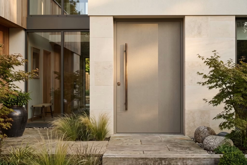
We close this list with a door built entirely on a single, rather clever piece of engineering, so let’s unpack it properly rather than treating it as a footnote.
Soft-touch powder coating is a finishing technology that’s crept out of the automotive and product design world over the last decade, and it’s now finding its way onto front doors with genuinely striking results.
Rather than the flat, hard sheen of standard powder coat, this finish carries a faint texture underneath your fingers, almost fabric-like, hence the bouclé comparison, that famous nubbly wool weave you’ll know from a good armchair or a Chanel-adjacent jacket. On a door, that texture does something quite unexpected.
It makes a hard, weatherproof material feel oddly tactile, almost inviting a touch rather than deflecting one, which is a peculiar trick for something bolted to the outside of a house and rained on regularly.
Colour-wise, this finish tends to suit softer, muted tones best, warm greige, driftwood grey, a deep muted taupe, rather than anything punchy or saturated. The texture itself already carries visual interest, so a loud colour on top tends to fight the finish rather than complement it.
Bronze hardware set against that soft matte surface is where the whole thing comes together properly. The slight sheen of aged bronze against the deliberately non-reflective powder coat creates a gentle contrast in both texture and shine, without ever tipping into anything showy.
Here’s the practical honesty this finish deserves, since it’s newer to the exterior door market than timber, steel, or glass, and worth a bit more scrutiny before you commit. Not every powder coating supplier has mastered the soft-touch texture for genuinely exterior-grade use, and a poorly applied version can feel slightly tacky to the touch in warm weather, picking up dust and fingerprints more readily than a standard finish would.
Ask to handle a physical sample outdoors, ideally in both cold and warm conditions, before signing off on a full door. What feels lovely in a heated showroom in January can behave rather differently on a humid August afternoon.
Where it belongs: contemporary new-builds and considered renovations where the rest of the material palette already leans soft and tactile, bouclé or linen upholstery inside, natural stone underfoot, so the door genuinely continues a conversation the house has already started rather than introducing a texture nobody else in the scheme is speaking. It’s a fitting note to end on, since it captures precisely what’s carried this entire list: restraint, done properly, is never plain. It’s simply confident enough not to need to shout.
Real-Life Application: Fitting This to an Actual UK House
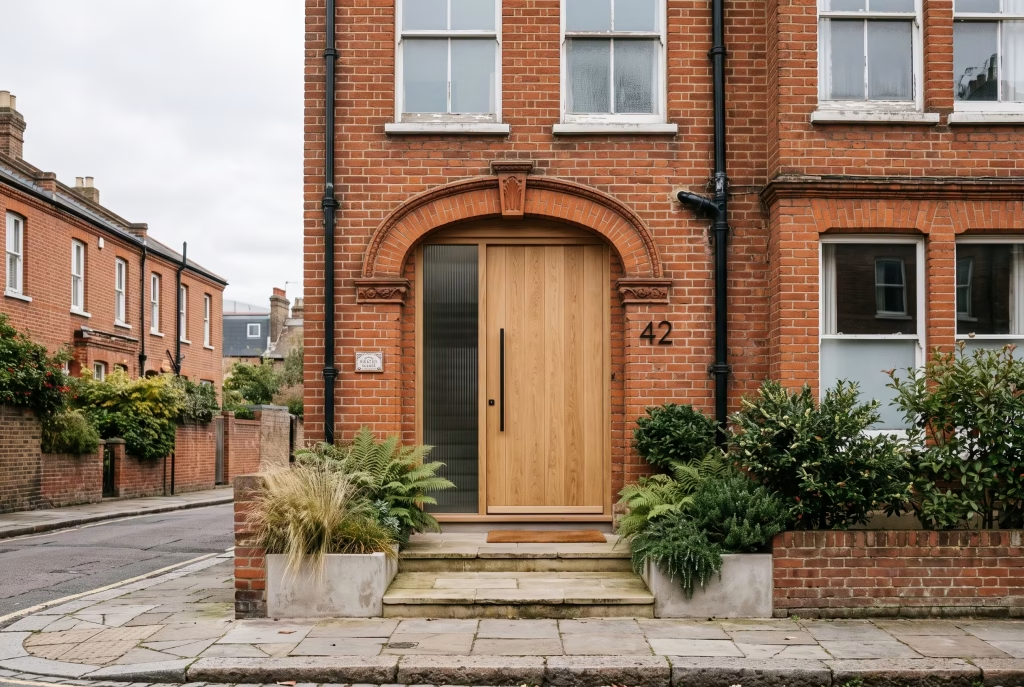
Every door we’ve covered so far has been about material and feeling. This section is about something rather less romantic and considerably more useful: what actually happens when you try to bring one of these doors home to a real UK property with real planning constraints and a real budget.
Start with the building itself, because it dictates far more than most homeowners expect. A Victorian or Edwardian terrace typically has a panelled recess and decorative surround baked into the original brickwork, so a flush, minimalist Japandi door needs a joiner who can either work sympathetically within that recess or address the surrounding trim as part of the same job, not as an afterthought once the new door’s already hung.
A 1930s semi tends to be more forgiving, with simpler proportions and less ornamentation to contend with, which is often why this style takes to interwar housing so comfortably. New-builds, unsurprisingly, are the blank canvas, no legacy proportions to negotiate, no existing brickwork dictating your options.
Planning permission is worth a genuinely honest word here, not a vague caveat. Most front door replacements fall under permitted development and need no formal consent at all. The exception is if your property sits within a conservation area or is listed, in which case the local authority may have a say over materials, colour, and even glazing pattern.
This isn’t legal advice, and every council’s stance differs, so a five-minute call to your local planning office before ordering anything bespoke will save considerably more hassle than it costs.
Then there’s Part L, the building regulation governing thermal performance, and it matters more for glazed Japandi doors than people assume. Any new external door, full stop, needs to meet a minimum U-value for heat loss, which is precisely why some of the more striking glazed panels we’ve covered, smoked glass, full-height fluted inserts, need proper double or triple glazing specified from the outset rather than a single pane chosen purely on looks.
Budget, finally, breaks down roughly into three honest tiers. Solid hardwood sits at the top, commanding a premium for material and skilled joinery. Veneered engineered core, a real timber face over an engineered substrate, typically comes in meaningfully cheaper while still delivering an authentic surface.
Composite or aluminium-clad doors sit at the accessible end, trading a touch of tactile authenticity for genuinely low maintenance and long-term value. None is wrong. The right tier simply depends on what you’re actually optimising for.
Where People Get It Wrong
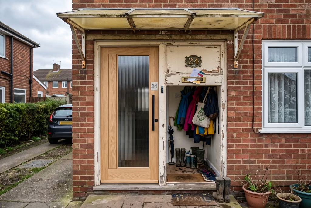
Right, let’s talk about the mistakes, because after fifteen doors’ worth of admiration, it’s only fair to spend a moment on where this whole thing tends to unravel.
The most common one, by some distance, is over-accessorising a door that hasn’t earned it yet. A homeowner falls for a photo of a rattan panel or a fluted glass insert, orders it, and then hangs it in a frame still painted the same tired magnolia as the rest of the porch, with a house number plaque left over from an entirely different decade.
The door and its surround end up arguing rather than agreeing, and no amount of styling on the day fixes a disagreement that was baked in from the start. Treat the door, the frame, and the trim as one continuous decision, not three separate purchases made months apart.
The second, closely related, is picking a door in total isolation from what sits either side of it. A stunning charcoal composite panel means rather little if the boot room behind it is cluttered with wellies and umbrellas in full view through frosted glass, or if the porch canopy above it is a builder’s-standard polycarbonate afterthought. The door is the opening line, not the whole sentence. It needs the rest of the entrance sequence to back it up.
And then there’s the assumption that catches out more people than any other: that natural wood alone equals Japandi. It doesn’t. Slap an oak door onto a facade with clumsy proportions, an oversized letterbox, mismatched hardware, and you’ve simply got a wooden door, not a considered one. Proportion, restraint, and material honesty are doing the actual work here. The timber is just along for the ride.
Closing: The Door That Sets the Tone
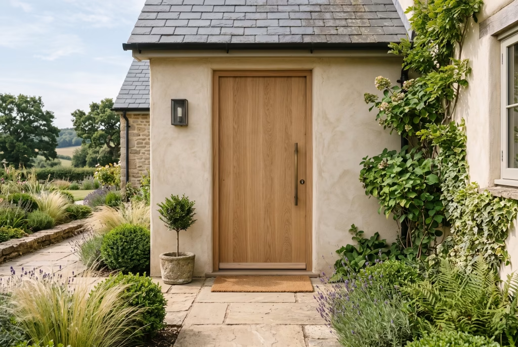
Back to that house near Guildford for a moment, because it’s worth returning to what it eventually became. The clients replaced that mismatched composite door with a simple, rift-sawn oak leaf, no glazing, no ornamentation, just proportion and grain worked out properly. Nothing else about the facade changed. Nobody would call it a renovation in any conventional sense.
And yet the whole house reads differently now. Walk up that path today and the door agrees with everything sitting behind it, rather than quietly contradicting it the way it once did. That’s really the whole argument of this piece, distilled down to one entrance. A good Japandi front door was never about ticking off natural materials on a checklist. It’s about restraint held with enough confidence that it doesn’t need to explain itself, and a house that finally sounds like one sentence rather than several arguing at once.
Frequently asked questions
What colour front door suits a Japandi home?
Deep, muted tones work best: charcoal, ink black, forest green, or soft driftwood shades of oak and ash. Avoid anything glossy or overly saturated. Warmth and depth matter more than brightness here, since the whole style leans on restraint rather than a bold pop of colour.
Is Japandi too minimalist for a period property?
Not at all. Victorian and Edwardian terraces actually suit the style well, provided the door respects the original proportions and recess rather than fighting them. The trick is working with the existing architecture, not stripping away every trace of period character.
What’s the most low-maintenance material for a Japandi-style front door?
Composite or aluminium-clad doors are the practical choice, resisting warping, rot, and rust with minimal upkeep. Solid timber offers more character but needs periodic oiling or resealing. Choose based on whether you’re optimising for authenticity or convenience.
Do Japandi front doors need to be oversized?
No. Oversized pivot doors make a dramatic statement, but a standard-height door executed with the right proportion, material, and restraint achieves the same calm, considered feel. Scale is a stylistic choice, not a requirement of the style itself.
Can I get the look without replacing my whole door?
Often, yes. Repainting in a deeper, more grounded tone, swapping hardware for warm brass or bronze, or updating a tired glazing pattern can shift a door considerably closer to Japandi without the cost of full replacement.
Is Japandi just a trend, or does it actually last?
It’s held steady for several years now precisely because it isn’t built on a passing colour or motif. It’s rooted in proportion, material honesty, and restraint, principles that don’t date the way a trend colour eventually does.
Does Japandi work with a small or narrow front door?
Yes, arguably better than an oversized one. A narrow door benefits from the same discipline: one considered material, quiet hardware, and no visual clutter competing for attention in a compact space.
What’s the biggest mistake people make trying to achieve this look?
Assuming natural materials alone are enough. A wooden door with poor proportions, mismatched hardware, or a cluttered surround isn’t Japandi, it’s simply a wooden door. Proportion and restraint are doing the real work, not the timber itself.