15 Stunning Spanish Home Offices That Blend Beauty and Productivity
Every design brief eventually arrives at the same tired standoff: do you want it to look good, or do you want to get anything done in it? I’ve sat across the table from enough clients, notebook open, coffee going cold, to know that question is the wrong one entirely.
The truth, learned the hard way on an Andalusian-inspired study outside Guildford that very nearly buckled under its own good intentions, is that beauty and output were never actually at odds. A desk that catches the morning light properly gets used more than one that doesn’t. A chair built to fit the body right keeps a person at their work past the point they’d otherwise have wandered off for tea.
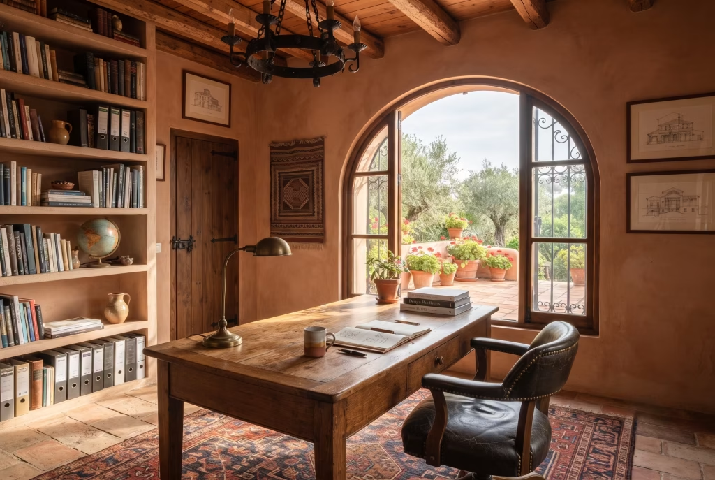
Spanish-style rooms, done with any real conviction, seem to understand this instinctively; the arches, the ironwork, the sun-warmed plaster, none of it sits there for decoration’s sake, it’s earning its keep. What follows isn’t a mood board. It’s fifteen rooms that work as hard as they look, and not one of them got there by accident.
Beyond the White Walls and a Terracotta Pot
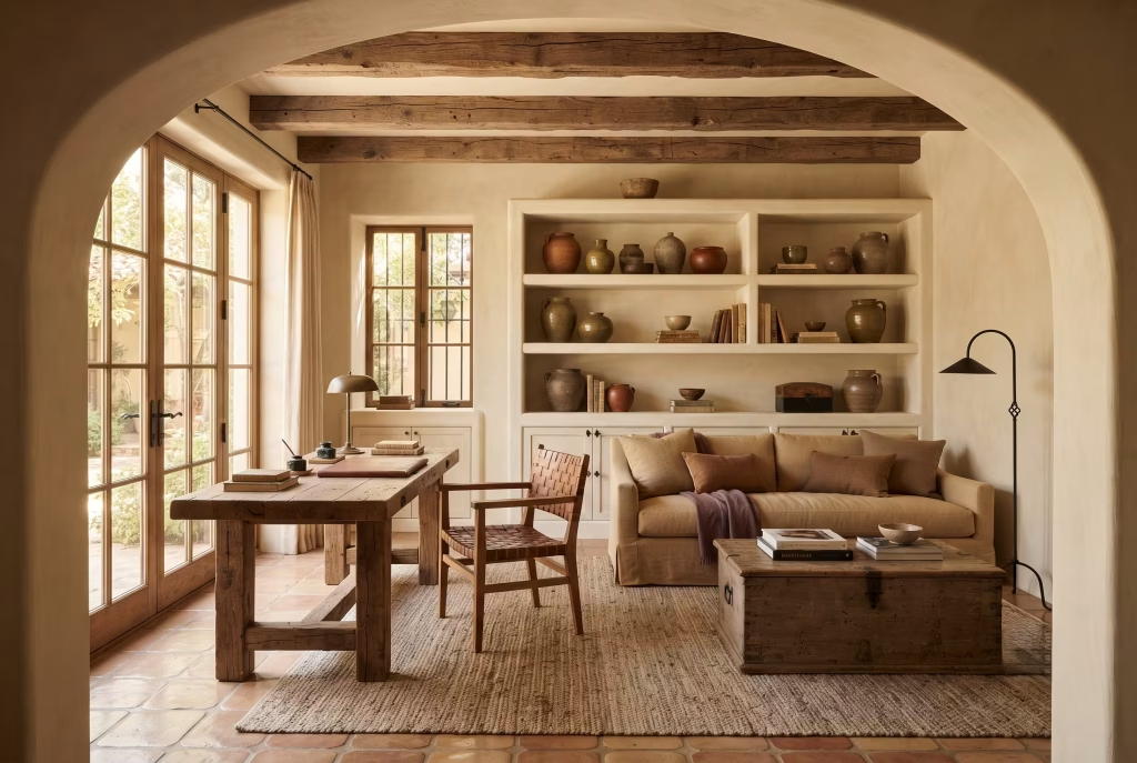
There’s a particular kind of room that gets called “Spanish style” and isn’t, not really. White walls, a terracotta pot, done. Job’s a good’un, or so the thinking goes.
The real thing works differently. It’s texture you can feel with your eyes before you’ve touched it, plaster with a bit of tooth to it, wood with grain left honest. It’s iron doing quiet, useful work, not just hanging about looking ornamental. It’s an arch, or the suggestion of one, giving the eye somewhere to land.
And underneath all of it, colour pulled straight from the ground rather than a paint chart, terracotta, olive, a whisper of aubergine in the right corner.
Get those four things pulling in the same direction and a room stops being themed. It starts being lived in.
The Book-Lined Study
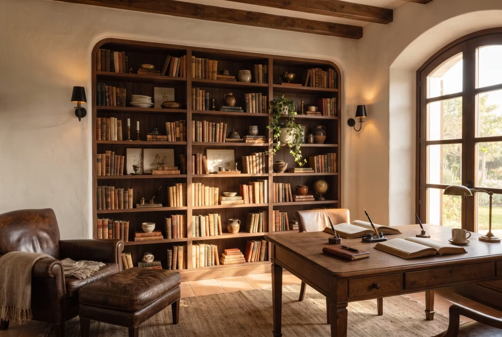
A room with nowhere to put a book has never once made anyone want to sit and think. That’s the philosophy, if you can call it that, and it’s older than any of us. Libraries anchor a space because they give the eye a job to do while the mind wanders off and does the real work.
This particular study sits in a converted farmhouse outside Bath, and the client’s brief was refreshingly short: “make it feel like I’ve always owned this many books.” Floor-to-ceiling walnut shelving does the heavy lifting, built into a genuine period alcove that some previous owner, mercifully, never thought to plaster over.
The desk sits low against the shelves rather than facing them, angled so natural light from the arched window falls across the pages, not the screen. A small thing, that, but it’s the sort of small thing that saves your eyes six hours into a working day.
Wrought-iron library sconces, the kind that clip onto shelf edges, mean the room never relies on one overhead light doing all the graft. Worth stealing, that idea, whatever your shelves are made of.
The Courtyard-Adjacent Office
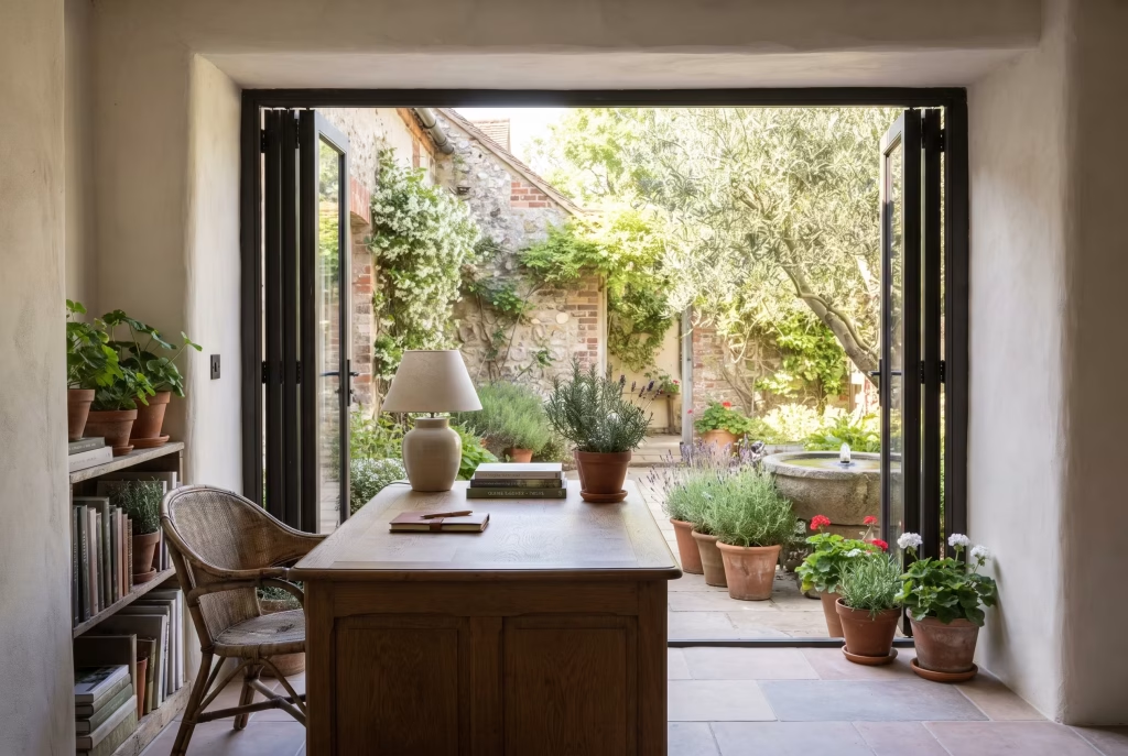
Sound reaches this room before sense does. Bifold doors, folded right back against the wall on anything approaching a decent day, let the courtyard walk straight in, tiles clicking under someone’s espadrilles outside, water working its way round a stone basin, a wood pigeon getting on with its business in next door’s olive tree.
Then the air itself does something. Cross the threshold from the main house and there’s a proper cool waiting for you, the kind thick plaster and deep-set walls were built to hold onto long before anyone had thought up a heat pump.
A garden designer in Chichester has this exact setup, doors open more months of the year than shut. Her desk faces the courtyard but sits well back from the opening, a decision she only arrived at after a June spent working through a headache brought on by too much direct glare.
Rosemary and lavender grow either side of the doors, close enough that a breeze carries them straight into the room. It’s a cheap trick, that, and a genuinely effective one, since a working space that smells faintly of a herb garden does more for a sluggish afternoon than a second coffee ever will.
What’s worth carrying into your own four walls, courtyard or not: a sightline out to something growing changes the pace a room seems to move at, quite apart from anything it does for the view.
You May also Like: 25 Beautiful Modern Farmhouse Home Office Ideas for a Stylish Workspace
The Loft Under the Eaves
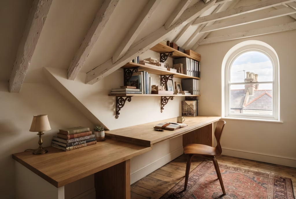
Every sloped ceiling tells you, sooner or later, exactly where it doesn’t want you standing. This one, in a converted attic above a terrace in Bristol, gave us precisely 1.4 metres of headroom at its lowest point and a client determined to fit a proper desk into it regardless.
The instinct with awkward angles is usually to fight them, cram in a standard desk and hope for the best, crack your head on a beam twice a week and call it character. We went the other way. The desk was built bespoke, following the pitch of the roof rather than sitting against it, so the low end tucks under the eave and holds nothing but a lamp and a stack of reference books, while the working end sits proudly under the tallest point of the room.
Wrought-iron brackets, salvaged from a reclamation yard in Devon, hold open shelving along the knee wall, the bit of a loft conversion most people write off as dead space. It isn’t dead at all, not once you’ve got something to put in it.
An arched dormer window, the room’s one genuine architectural flourish, does more work than its size suggests, pulling light down across the desk at exactly the angle you’d want it for most of the working day.
The takeaway here isn’t really about lofts specifically. It’s that an awkward room, worked with rather than against, tends to hand you a floor plan no rectangular box ever would have offered up in the first place.
The Corner-of-the-Kitchen Nook
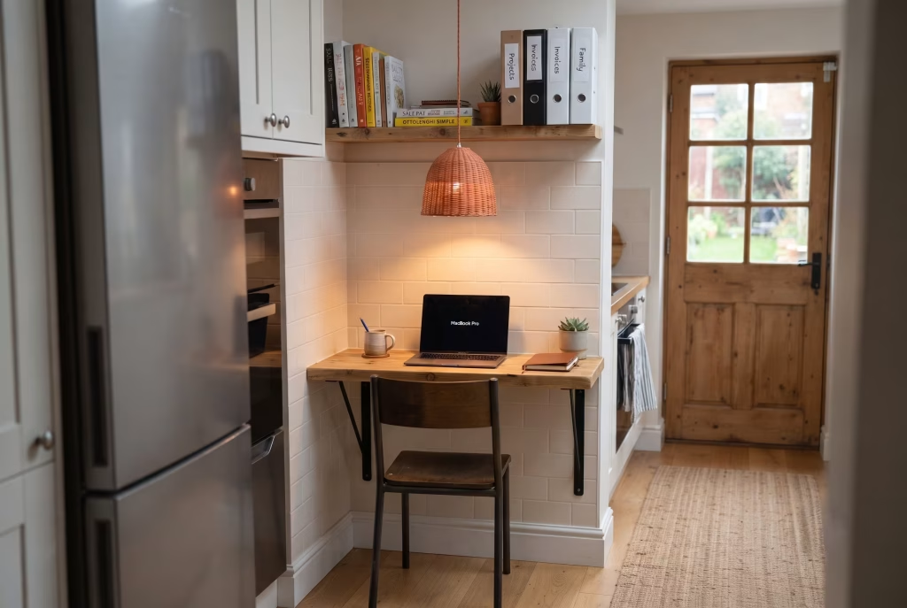
A client asked me to give her “a proper office” in a kitchen that had, by her own admission, no spare corner to speak of. Two kids, a dog with a habit of parking itself under the table, and roughly ninety centimetres of dead wall between the fridge and the back door. That was the lot.
We didn’t fight the size, there wasn’t much point. A narrow console desk, no wider than a bookshelf really, went in against that wall, topped with reclaimed pine and finished with iron bracket legs that take up almost no visual weight at all.
Above it, a single row of open shelving holds cookbooks on one end and work files on the other, the two lives of the room sitting side by side without either one crowding the other out. A woven pendant, terracotta-toned, hangs low enough to pool light exactly where the laptop sits and nowhere else, which matters more than it sounds when the rest of the kitchen’s lit for cooking, not concentrating.
The chair tucks fully under when it’s not in use, no exceptions, because a nook like this lives or dies on whether it disappears back into the kitchen the moment the working day’s done.
What this room proves, and it’s worth remembering whatever square footage you’ve got to play with, is that a genuine office doesn’t need four walls of its own. It needs a boundary, however slight, and a reason for the eye to know where the kitchen ends and the work begins.
The Garden-Level Studio
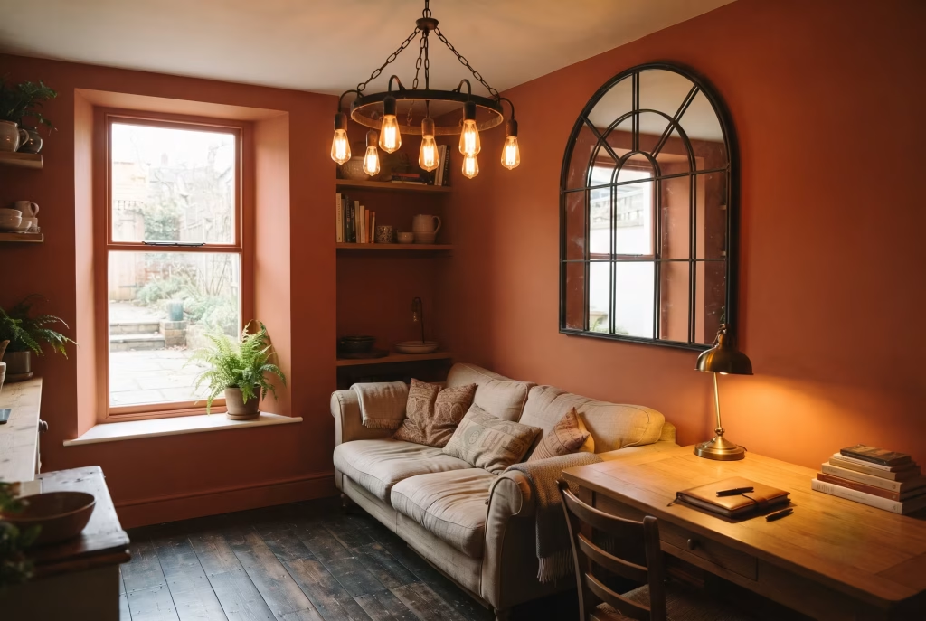
Light was never going to arrive on its own in this one, not with a semi-basement window sitting at pavement height and a wall on the opposite side blocking most of what little reached it. The fix here wasn’t more bulbs, though it’s tempting to reach for that first. It was a mirror, arched to echo the window it faced, hung directly opposite so what daylight did make it through got bounced straight back across the room rather than swallowed by the far wall.
That single decision doubled the usable light before a single lamp got switched on, which tells you something about how much of “good lighting” is actually just clever placement rather than wattage.
The bulbs that followed were chosen with a fair bit of care, warm white, low on the Kelvin scale, fitted into an iron chandelier hung low enough to feel like a proper light source rather than a distant glow doing its best from the ceiling. A brass desk lamp does the close work, angled so it never fights with the overhead light or throws two shadows where one would do.
Terracotta tones on the walls, deliberately warm rather than the cooler creams you’d reach for in a brighter room, keep the whole space from tipping into the grey, underground feel that basement rooms so often get lumbered with.
The principle worth taking away, garden level or not, is this: a room starved of natural light needs warmth doing double duty, in the colour on the walls and the temperature of every bulb you fit, or it’ll never feel like anywhere you’d choose to sit.
You May also Like: 25 Productive Japanese Home Office Designs for a Soulful Workspace
The Converted Outbuilding
There’s something the walk itself does, thirty-odd seconds across a garden path, that no internal commute ever quite manages. Out the back door, past a fig tree that’s never once produced anything worth eating, along a line of terracotta pavers laid slightly uneven on purpose, and into a studio that used to be a garage nobody could park a car in anyway.
Mission style suits an outbuilding better than almost anything else, and there’s a reason for that. The clean, square lines and restrained detailing that define it were never meant to compete with a main house, they were built to sit quietly alongside one, and this converted brick outbuilding in Winchester does exactly that. Simple whitewashed walls, a single exposed beam running the length of the ceiling, and none of the ornamentation you’d find in a grander Colonial Revival room.
The desk faces the door rather than a window, an unusual choice that the owner, a architect working from home four days a week, defends without hesitation. “I wanted the walk to mean something when I sat down,” he told me, and it’s hard to argue with a man who’s clearly thought about it more than most.
A leather chair with simple brass tacks, no more decoration than that, sits beneath a single wrought-iron wall light, the kind that does its job without asking for credit.
The lesson here has nothing to do with garages specifically. It’s that a short walk, deliberately built into the day, does more for the line between home and work than any amount of clever storage ever will, and it costs nothing but a bit of garden you were probably neglecting anyway.
The Formal Period Study
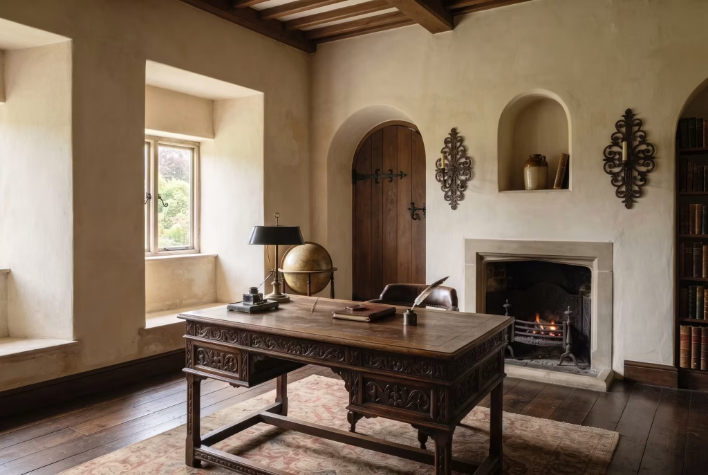
Spanish Colonial Revival didn’t arrive in Britain by any obvious route. It travelled first through California in the early 1900s, borrowed wholesale from churches and haciendas built centuries earlier by Spanish settlers, then found its way into pattern books and, eventually, into a handful of grand Edwardian houses whose owners fancied something with a bit more romance than the usual brick and sash windows. This study, in a listed property outside Cheltenham, is one of the more convincing examples I’ve worked on.
The room takes itself seriously, and rightly so. A carved walnut desk, genuinely old rather than aged to look it, anchors the space with the sort of presence flat-pack furniture never manages, however well it’s photographed.
Deep window reveals, a good half-metre thick, speak to walls built long before cavity insulation made that kind of mass unnecessary, and the arch above the door repeats, smaller, in a niche cut into the opposite wall, a quiet bit of symmetry most visitors never consciously clock.
Wrought-iron sconces, more ornate here than in almost any other room in this list, flank a fireplace that still draws properly, chosen deliberately over anything more restrained because a period room like this one earns its ornamentation rather than borrowing it.
What’s worth understanding, whether or not you’ve a listed building to your name, is that Colonial Revival at its best isn’t decoration bolted onto an old room. It’s a style that grew directly out of genuine architectural history, and rooms that honour that history, rather than skimming the surface of it, tend to feel settled in a way no amount of styling can fake.
The Rental Flat Office
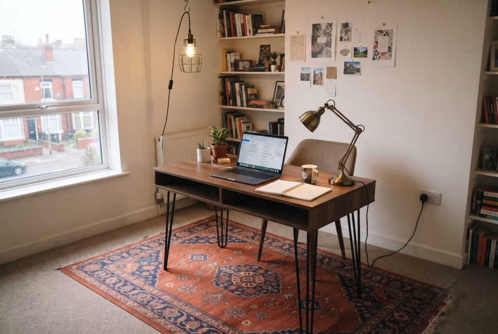
Here’s the tip, plain and simple: if you can’t touch the walls, touch everything else instead. That’s the whole strategy behind this one-bedroom rental in Manchester, and it turns out to be more than enough.
No paint went near the walls. No tile went near the floor. The landlord’s terms were strict, standard stuff really, and the tenant, a translator working three languages across a laptop most days, wasn’t about to lose her deposit over a design brief.
A rug did most of the heavy lifting, terracotta and indigo, big enough to define a working corner of the living room without needing so much as a stud wall to mark the boundary. A secondhand desk, walnut-veneered rather than solid, cost less than a weekend shop and looks, from three feet away, like it cost considerably more. Its legs got swapped for a pair of wrought-iron ones bought online, a twenty-minute job with an Allen key that changed the whole character of the piece.
The lighting did the rest. A plug-in pendant, iron-caged, hangs from a ceiling hook rather than any wiring, and a brass desk lamp picked up secondhand sits close enough to the laptop to do proper work. Both leave the moment she does, packed into a box under the bed if she ever moves on.
The wider point, and it applies well beyond rented flats, is that permanence was never really the thing doing the work in any of these rooms. Commitment was. A rug you’ve chosen properly does more for a space than a wall you’ve merely painted the “right” colour, and it goes with you when the lease runs out.
The Shared His-and-Hers Office
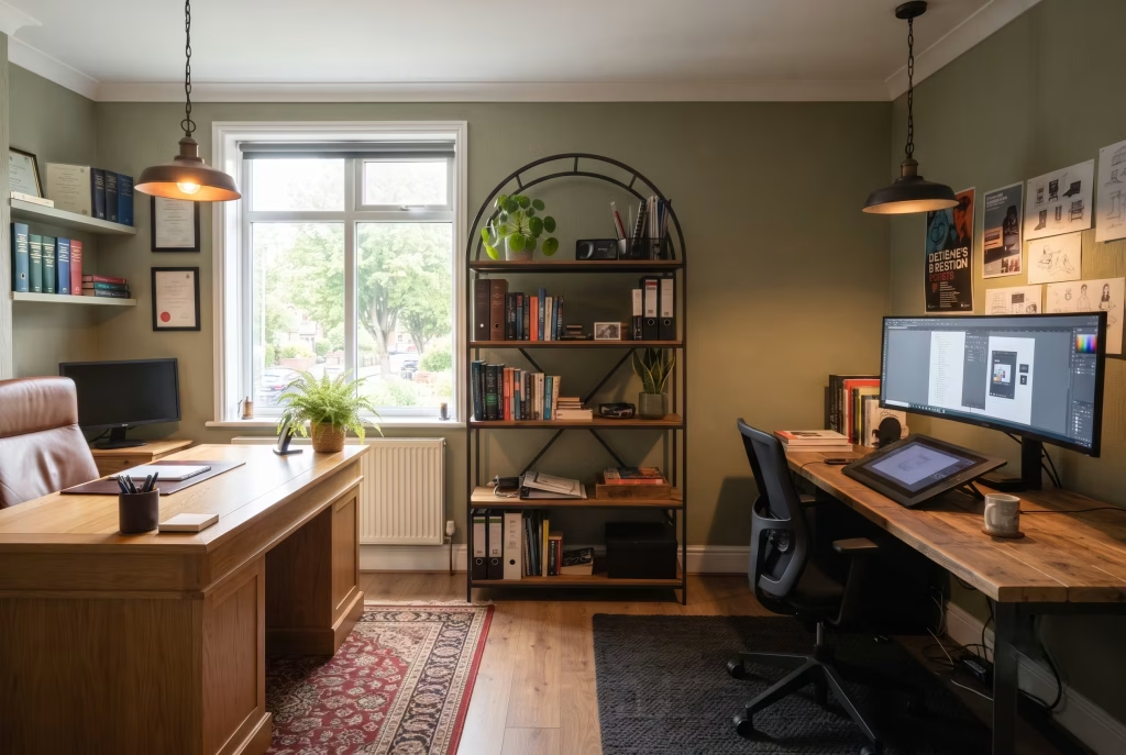
Two people, one room, and a video call schedule that overlapped more often than either of them cared to admit. That was the problem waiting for me in a converted double bedroom in Leeds, a solicitor and a graphic designer sharing four walls and getting on each other’s nerves by roughly Wednesday every week.
The instinct with a shared room is usually to split it straight down the middle, mirror image, fair’s fair. It rarely works, because two people almost never need the same things from a desk. Here, the solicitor got the window wall, a proper wood desk facing out, since her calls needed a decent backdrop and she’d complained, more than once, about staring at plaster all day. The designer went along the opposite wall instead, angled slightly away from the window rather than facing it, since screen glare mattered more to him than the view ever would.
An arched bookshelf, freestanding rather than built in, sits between the two desks without running the full height of the room. It breaks the sightline just enough that neither one watches the other work, but it doesn’t block the natural light travelling between them, which a full partition wall would have done without a second thought.
Wrought-iron pendants, one over each desk, mean the lighting zones as clearly as the furniture does, warm and low over hers, a touch cooler and more direct over his, since focused screen work and a client call want genuinely different things from a bulb.
The real lesson, whatever the headcount in your own spare room, is that zoning was never about symmetry. It’s about noticing what each person actually needs and letting the furniture say so, quietly, before anyone has to.
You May also Like: 25 Cozy White Interior Ideas That Prove White Can Feel Warm
The City Apartment Alcove
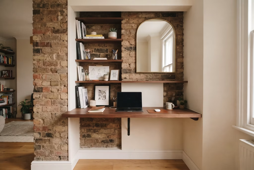
A room only ever feels as small as its least useful corner, and most people never stop to work out which corner that actually is. In a one-bed flat in Bethnal Green, it turned out to be a recessed alcove beside the chimney breast, sixty centimetres deep and largely ignored since the previous tenant had used it to store a hoover and not much else.
That depth, unpromising as it looked on paper, was exactly enough for a fitted desk built flush to both side walls, no legs at all beyond a single iron bracket taking the weight at the front edge. Losing the legs mattered more than it sounds, since a floating desk reads as considerably less bulky than one standing on four points, and in a room this size, every centimetre of visible floor does real work for how spacious the place feels.
Shelving climbed the chimney breast itself rather than spreading sideways, narrow walnut ledges stacked close enough together that even a small run of wall holds a proper amount of storage. A curved mirror, hung at the top of the alcove, catches light from the flat’s one decent window and throws it back into a corner that would otherwise sit in permanent shadow come November.
The tenant, a product designer working from home most of the week, admits she nearly gave up on the alcove entirely and pushed a desk into the middle of the living room instead. Glad she didn’t, by her own account, since the middle of the room stayed free for the one thing a small flat actually needs more of: somewhere to simply stand.
What this room teaches, whatever your own square footage happens to be, is that efficient isn’t the same as small. It’s knowing exactly where the dead space is hiding, and then having the nerve to build into it properly rather than working around it.
The Farmhouse Conversion Office
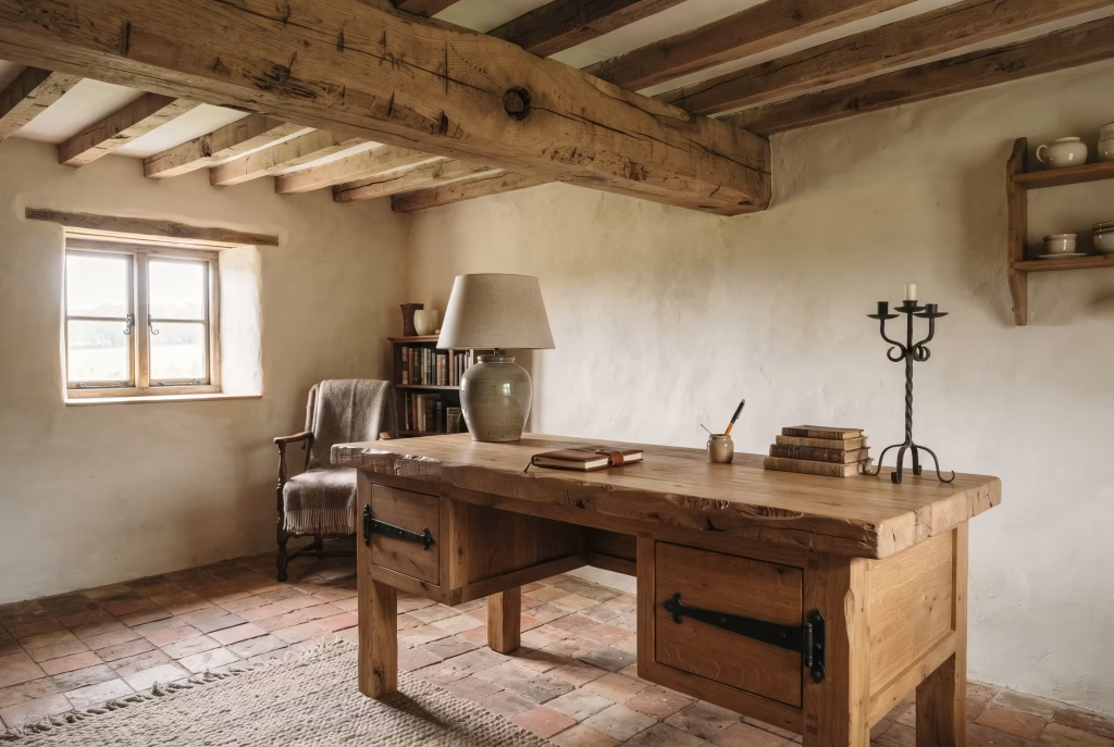
Run a hand along the beam that crosses this room and you’ll feel every year of it, the adze marks still faintly there under decades of wax, a knot the size of a fist where a branch once grew before someone felled the tree and squared it off for a roof that’s stood since the 1800s. Oak does that. It keeps its history close to the surface rather than sanding it away.
This one sits in a converted dairy barn in Herefordshire, and the owners were adamant, from the first conversation onward, that nothing about the conversion should make the beams feel like a feature wall someone had bought in. They didn’t need to worry. Original ceiling timbers, left rough where they’d always been rough, sit above a floor of reclaimed terracotta pammets, the small, thin tiles once used across working farm buildings precisely because they wore well under boots and hooves alike.
The desk, chunky oak to match the beams rather than fight them, carries the same tool marks along one edge, deliberately unfinished by the joiner who built it. Wrought-iron strap hinges, salvaged from the barn’s original doors, were repurposed as drawer handles, a small touch that cost almost nothing and ties the furniture straight back to the building’s own working past.
Limewashed walls, rough enough to catch the light unevenly across their surface, sit somewhere between white and the palest ochre, chosen specifically so the beams read as dark against them rather than disappearing into a room gone too uniformly pale.
The point worth taking from a room like this: material honesty, oak left to look like oak, tile left to feel like tile, does more for a space’s character than any amount of clever paint ever could. A farmhouse doesn’t need convincing to feel authentic. It just needs leaving alone, mostly.
The Coastal Office
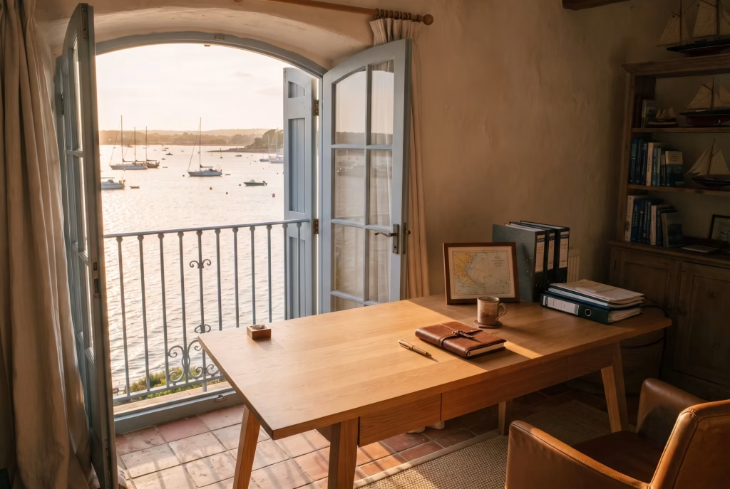
Half past four in late September, and the light in this room turns a colour that doesn’t have a proper name, somewhere between gold and rust, low enough off the water to slide clean under the blind and lie in a stripe across the desk for a good twenty minutes before it moves on. Anyone who’s spent a working life in offices lit by strip lighting will understand why the owner, a yacht broker in Poole, built his whole day around being at the desk for exactly that window.
Mediterranean and Spanish styling blur together here more than in any other room on this list, and that’s no accident given the coastal setting. The palette leans paler than the terracotta-heavy rooms further inland, sun-bleached blues sitting alongside the usual earth tones, plasterwork a shade lighter than you’d find on a rustic barn conversion, more suited to a house that catches sea light most of the day than one tucked under trees.
A pair of glazed doors, arched at the top, open onto a Juliet balcony rather than a full terrace, space being what it is this close to the water. Wrought iron does the safety work there, a simple railing, nothing showy, painted a soft grey-blue rather than the usual black to match the shutters either side.
The desk itself sits at an angle, never square to the window, a decision the broker credits to a designer friend who told him, correctly as it turned out, that facing a desk straight at open water is a guaranteed way to get nothing done past eleven in the morning.
The insight here travels well beyond the coast. Light quality changes character depending on what it’s bouncing off, water, stone, render, and a room built to catch a specific hour of it, rather than simply “getting plenty of sun,” tends to reward whoever works in it far more consistently than a room that’s merely bright.
The Statement-Wallpaper Office
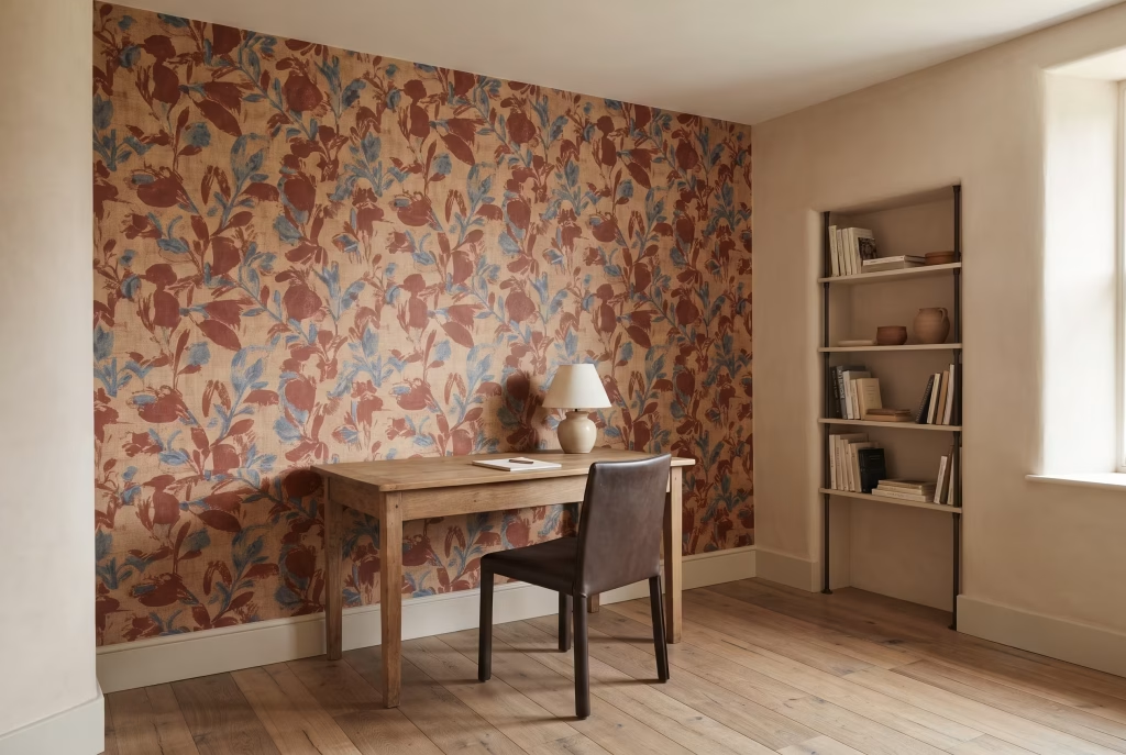
The roll very nearly went back in the van. That’s the honest version of events, told to me since by a client in Edinburgh who’d spent three weeks building a scheme entirely around plaster and restraint, only to fall for a hand-blocked wallpaper in a showroom she’d popped into for something else entirely, a deep terracotta ground scattered with a loose, almost botanical pattern that broke every rule the rest of the room had been quietly following.
Spanish styling leans hard on texture over pattern, as a rule, and there’s good reason for that bias, plaster and tile and wood grain doing the visual work so nothing needs to shout. Wallpaper this bold, on a single wall in a room otherwise built from restraint, shouldn’t have worked. It does, and it’s worth understanding why before you try the same trick yourself.
One wall took the paper, the one behind the desk that nobody sits facing directly, which matters more than it sounds since a pattern this busy would exhaust anyone made to stare at it for eight hours straight. The other three walls stayed plain, limewashed in a shade pulled straight from the wallpaper’s own background, so the loud wall and the quiet walls share a common thread rather than sitting in open competition.
Furniture, deliberately, went plainer than it might have in a less decorated room. A simple oak desk, an unadorned leather chair, iron fittings kept to the barest minimum, everything toned right down so the wallpaper had room to do its one job properly without a chorus of competing detail behind it.
The rule worth carrying forward, wallpaper or not, is this: a bold choice earns its place by being the only bold choice in the room. Break one rule properly, with everything else in quiet support, and it reads as confidence. Break three at once and it just reads as noise.
You May also Like: 25 Barndominium Office Ideas That Blend Rustic Charm with Modern Productivity
The Family Home Office
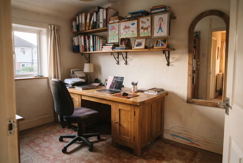
There’s a crayon mark on the skirting board in this room, low down, roughly where a three-year-old’s arm would reach, and the owners have never once got round to painting over it. That tells you most of what you need to know before we go any further.
This one sits in a semi-detached house in Nottingham, a family of four making do with a converted box room that does triple duty as an office, a homework station, and, most Saturday mornings, a den for two children who’ve decided the desk chair makes an excellent boat. The parents, both working from home three days a week, needed something that could survive actual family life rather than merely photograph well for an afternoon.
A solid oak desk, chosen deliberately over anything with a veneer, takes the scuffs and the occasional felt-tip incident without complaint, the sort of piece built to be handed down rather than replaced. Wrought-iron shelf brackets hold a mix of files and a fair few pieces of school artwork, framed with as much care as anything bought from a gallery, because a room a family actually lives in should look like one.
The rug, terracotta and cream, has been through the wash more times than its maker probably intended, and it shows, gently, in the way a rug is supposed to show wear rather than hide it. An arched mirror by the door catches the last of the evening light and, more usefully, lets a parent glance in from the hallway without having to open the door and disturb whoever’s mid-thought at the desk.
None of this room is precious, and that’s rather the point. A house that people genuinely live in will always, eventually, tell on itself, a scuff here, a crayon mark there, and the best Spanish-style rooms were never really about keeping that at bay. They were built from materials that age honestly in the first place, plaster that takes a knock well, wood that only improves with a bit of history behind it, iron that was never going to look pristine regardless.
Fifteen rooms, then, and not one of them chosen because it looked perfect. Chosen because each one, in its own particular way, earned its keep, and a room that does that will always outlast a room that merely photographs well on the day the shoot happens.
Steal a Decision, Not a Room
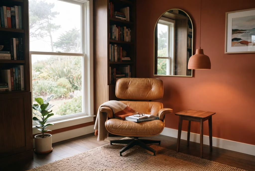
Copy one of these rooms wholesale and you’ll likely end up with something that feels borrowed rather than owned, a set built for someone else’s house rather than yours. I’ve watched it happen more than once: a client arrives with a photo of a scheme they love, we recreate it faithfully, and within a fortnight the room feels flat, technically correct and somehow lifeless all at once.
The rooms that work, in my experience, are the ones where a homeowner has taken a single decision from somewhere else and let it stand on its own. Just the terracotta from the coastal office. Just the arched mirror trick from the basement studio. Just the low-hung pendant from the kitchen nook, nothing more.
A whole scheme lifted straight from a photograph rarely accounts for your light, your habits, or the particular way you actually use a desk. One good decision, properly considered and placed where it belongs, does far more for a room than an entire mood board copied line for line.
Where People Go Wrong, and Why It’s Worth Knowing Before You Start
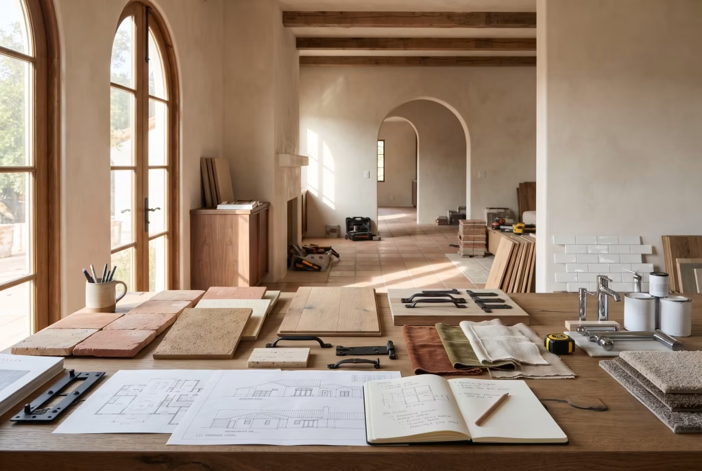
Every one of the fifteen rooms above got somewhere good, but I’d be doing you a disservice if I didn’t mention the rooms that didn’t, the projects that went sideways along the way and taught me something in the process. A few mistakes turn up again and again, and most of them are entirely avoidable once you know to look for them.
Painting the whole room one dark colour and calling it moody
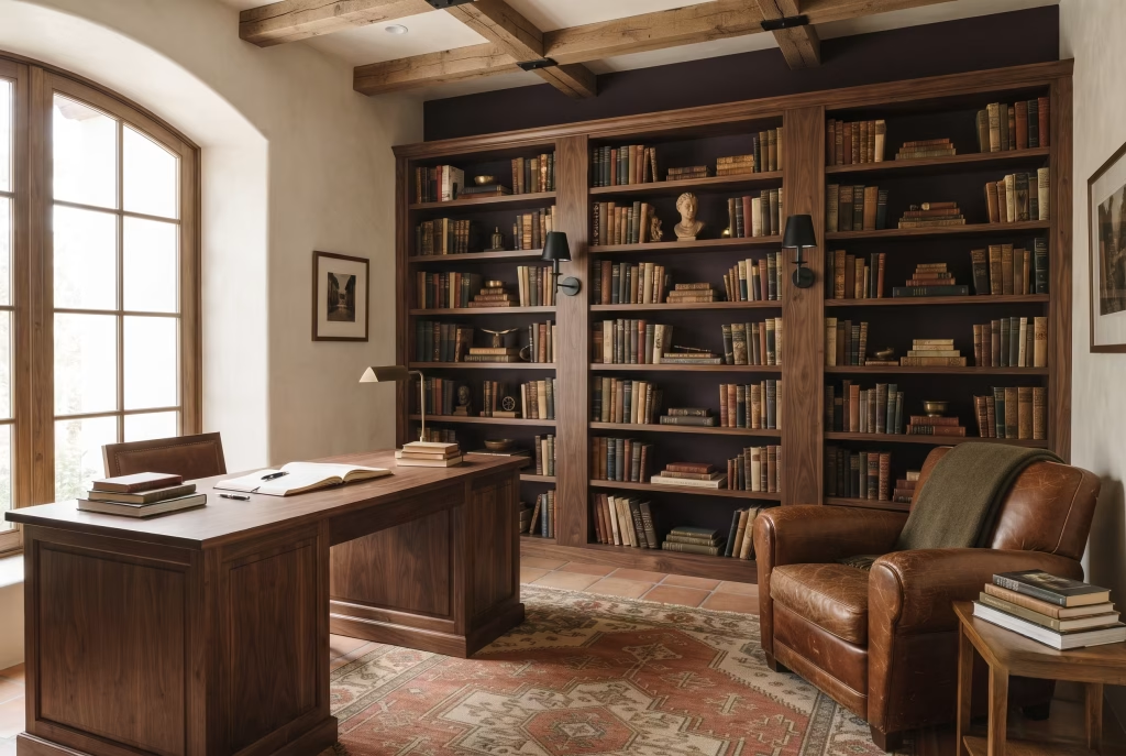
Aubergine, done properly, is a single wall doing a job, not four walls fighting each other for attention. I’ve walked into rooms painted floor to ceiling in the same deep tone, commissioned with the best intentions, that ended up feeling like a cupboard rather than a study. Contrast is the whole point. Lose it and the colour stops working the moment it’s applied everywhere at once.
Buying furniture for the photograph rather than the person sitting in it
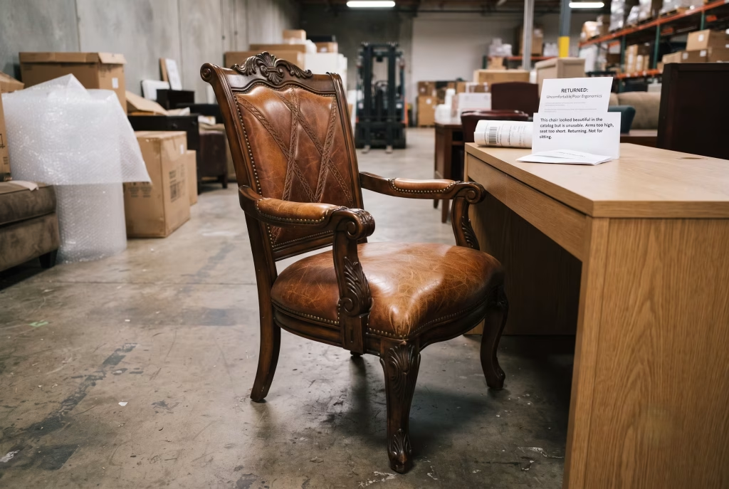
A carved chair with beautiful stitching means nothing if the arms sit too high for the desk or the seat’s too shallow for anyone over six foot. I’ve seen a genuinely lovely leather chair returned within a fortnight because nobody thought to actually sit in it before the delivery van arrived. Looks matter, plainly, but a chair earns its keep across eight hours a day, not across one good photo.
Bunging in an arch without thinking about proportion
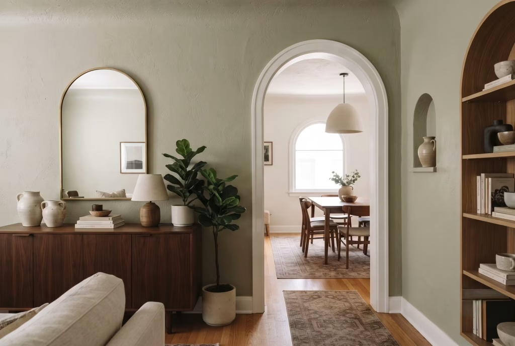
One arched mirror can do wonders. A doorway hacked into an arch shape, on its own, with nothing else in the room echoing it, tends to look bolted on rather than intentional, a bit like fancy dress rather than architecture. Arches want repeating, even faintly, in a mirror frame or a niche or a bookshelf top, or they read as a costume rather than a genuine feature.
Chasing daylight bulbs because they seem “brighter”
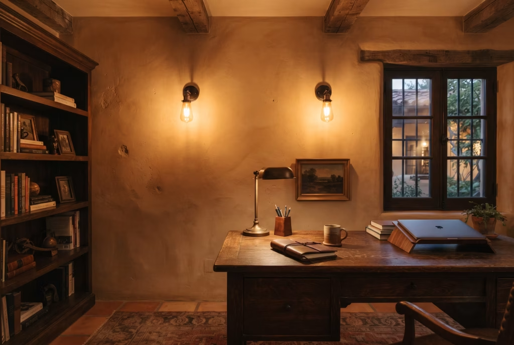
Cool white light against warm plaster and dark wood fights the whole material palette rather than supporting it. It’s a common enough mistake, reaching for whatever bulb promises the most lumens, without stopping to consider that a Spanish-style room lives or dies on warmth, in colour temperature just as much as paint colour.
Choosing terracotta tile purely for looks, then regretting it in January
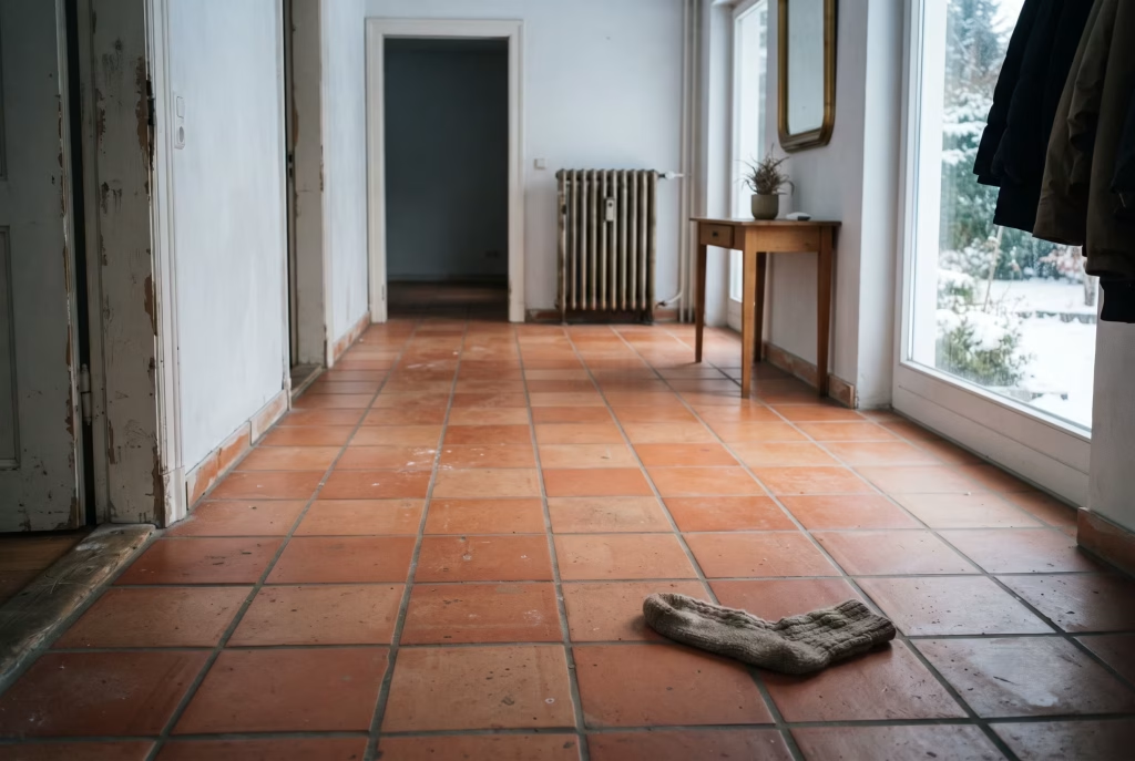
Beautiful underfoot in July, properly cold come winter without underfloor heating beneath it. More than one client has learned this the hard way, mid-renovation, when the budget for heating got cut to afford the tile itself. Get the sequencing right, and heating goes in before the flooring does, not the other way round.
Treating the whole thing as decoration rather than material honesty
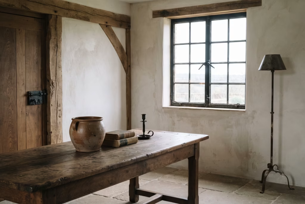
A terracotta pot and a white wall was never the style, not really, just a costume borrowed from it. The rooms that actually work, all fifteen of them above, earned their character from proper texture, proper iron, proper wood, put in for a reason rather than propped up for effect. Skip that groundwork and no amount of styling on top will make up the difference.
What Fifteen Rooms Actually Teach You, Once You Look Past the Surface
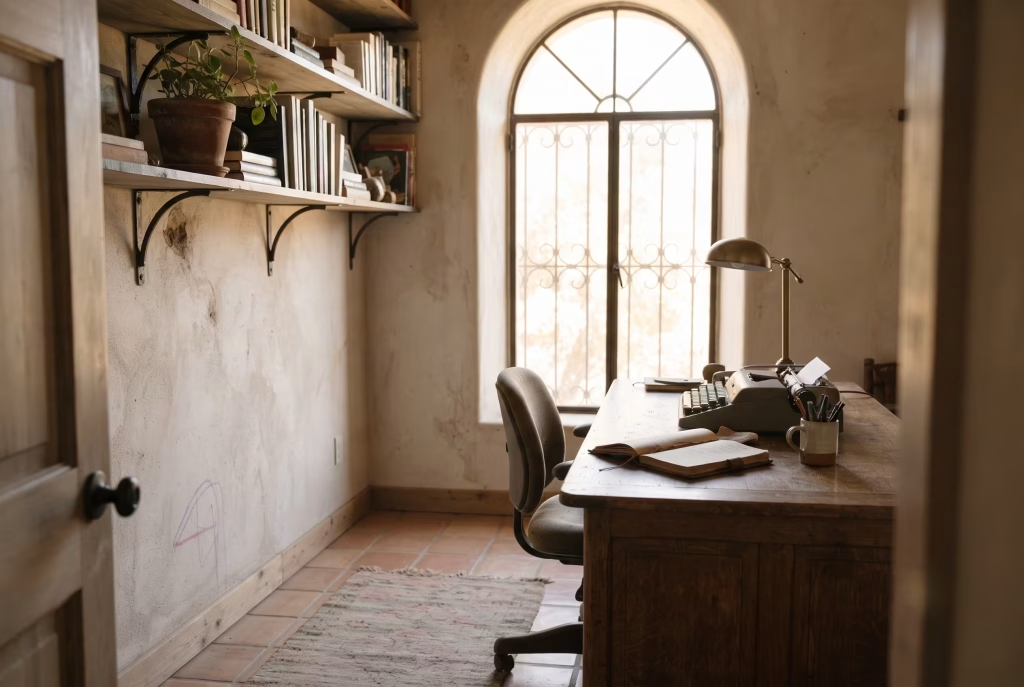
Strip away the terracotta and the ironwork, and something else entirely holds these fifteen rooms together. Not one of them was designed to be admired from the doorway.
Every single one was built around how a specific person actually spends their working hours, whether that’s a solicitor who needed a decent video call backdrop, a translator working three languages off a secondhand desk, or a family who never got round to painting over a crayon mark and quite rightly left it there.
That’s the thread. Beauty, in every one of these rooms, was never doing a separate job from function. The arch that frames a window also happens to bounce light exactly where it’s needed.
#The iron bracket holding open shelving in a loft conversion also solved a headroom problem nobody else had cracked. Material honesty, oak left looking like oak, plaster left with a bit of tooth to it, turned out to be the thing making these rooms feel settled rather than staged, whatever the budget behind them.
Copy the surface and you’ll get a room that looks the part for a fortnight. Understand what these fifteen actually have in common, and you’ll get a room that earns its keep for years, the kind of space you stop noticing as decorated and simply start calling home.
That’s really the whole argument, when you boil it down. A Spanish-style office was never about ticking off a checklist of terracotta and wrought iron. It’s about building a room around the person who’ll actually sit in it, and letting the materials do their honest work from there.
If you want the how-to behind any of this, the mechanics of getting your own room there, it’s here.
Frequently Asked Questions About Spanish Home Offices
Do all fifteen of these rooms use the same colour palette?
Not quite, and that’s rather the point of showing this many side by side. The farmhouse conversion leans into deep ochre and dark oak, the coastal office softens everything toward pale, sun-bleached blues, and the restrained modern take barely touches colour at all beyond a single terracotta cushion. What holds them together isn’t a shared palette. It’s the same four underlying decisions, texture, iron, arch, earth tone, interpreted differently depending on the light, the budget, and the person actually working there.
Can a Spanish-style office work in a room with no natural period features?
Genuinely, yes, and two entries on this list prove it outright. The rental flat and the restrained modern take both sit in buildings with nothing period about them, no arches, no exposed beams, nothing inherited from a previous century. Both lean on furniture, lighting, and one or two deliberate architectural gestures, an arched mirror, a plastered niche, rather than relying on the building to do the work for them.
Is this style expensive to get right?
Not necessarily, and the rental flat is the clearest proof going. A secondhand desk, a decent rug, and a plug-in pendant light got most of the way there for considerably less than the cost of a single item of bespoke furniture in the period study. Cost tends to track ambition rather than authenticity. A room can be entirely convincing without a single expensive piece in it.
How do I know if I’m designing a Spanish room or just a themed one?
Ask what would be left if you removed the decoration. A themed room, stripped of its terracotta pots and its wrought-iron accessories, usually goes back to being any ordinary room underneath. A properly Spanish one keeps its texture, its material honesty, its sense of proportion even with the styling gone, because the character was built into the bones of the room rather than propped up on top of it.
Do these rooms need constant upkeep to stay looking this good?
Less than you’d think, and in several cases the opposite is true. Limewash and reclaimed wood are meant to show a bit of wear, and a rug that’s been through the wash a hundred times generally looks better for it, not worse. The materials this style favours were chosen, historically, because they aged well under daily use, not because they demanded to be kept pristine.
Which room on this list is easiest to recreate on a modest budget?
The rental flat office, without much competition. A rug, a secondhand desk with swapped-out legs, and one plug-in light fitting delivered a genuinely convincing result without touching a single wall or floor. It’s the entry worth returning to if budget, rather than inspiration, is the thing holding you back.