




Burgundy and Chocolate Brown Living Room Ideas: How to Create a Warm, Cozy & Elegant Space for Winter
By four o’clock on a December afternoon, the daylight has already packed its bags. The curtains are drawn, the lamps come on, and the living room is asked to do something rather tricky: turn a long, dark evening into a reward instead of a sentence. Pale schemes struggle at this hour. Grey, in particular, has a habit of turning sullen the moment the sun goes down.
Burgundy and chocolate brown behave quite differently. Together they bring to mind red wine by the fire, a leather armchair worn soft by decades of use, a library glowing at dusk. They are also firmly in step with the moment. A 2026 survey of design professionals, reported by Homes & Gardens, named chocolate brown the top colour of the year, while a Benjamin Moore colour expert told Ideal Home that burgundy and berry reds are sweeping back in with confidence.
There is a catch, though, and it is the reason so many people stand at the paint chart with their arms folded. Handled carelessly, this pairing can slide from snug to stuffy, a velvet-lined cave where the lamp is fighting a losing battle. Even Homes & Gardens recently listed chocolate brown among the shades to think twice about beside burgundy. This guide meets that worry head on. You will find out why the combination can work beautifully, where it goes wrong, and exactly how to build a room that feels rich without feeling heavy.
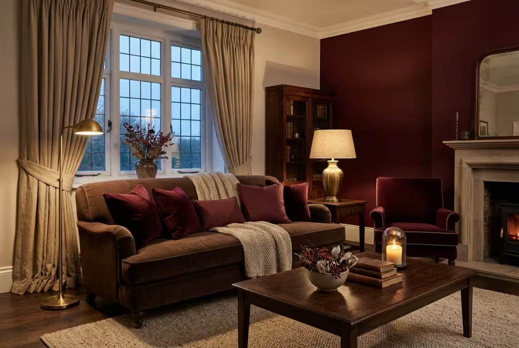
Quick answer: do burgundy and chocolate brown go together? Yes, as long as the two are not the same depth. Burgundy leans purple and cool, while chocolate leans warm and earthy, so they sit comfortably as neighbours. Side by side at equal darkness, however, they blur into one dense mass. Keep one of them lighter or differently textured, set a pale warm neutral such as oatmeal or cream between them, light the room at 2700 to 3000K, and follow a rough 60-30-10 split of colour.
Who this guide is for
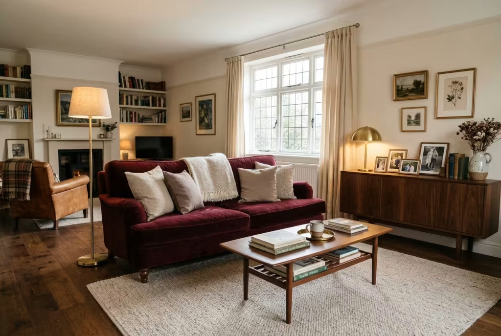
Before writing a word, we read through the questions real people have posted about exactly this combination. The same handful of situations kept turning up. See whether one of them sounds like your living room:
- You have inherited a burgundy sofa and no idea what should sit beside it. One poster described exactly this, with dark floors and a grey kitchen, and a longing for warmth.
- Your room is wall-to-wall brown and feels faintly wrong. One Reddit poster said they felt unsettled in their living room and could not say why. The answer from the crowd was reassuring: the trouble was not too much brown, but too little of everything else.
- You adore the look and fear the gloom. Another poster admitted to being scared to try burgundy at all, which is a sentiment shared by more people than you might guess.
- You rent, and the walls are off limits. Plenty of the advice below works with nothing more than a rug, curtains and a few lamps.
- You have small children and a limited timeline. A military family with a toddler and a baby on the way wanted furniture that would survive the move to a permanent home.
Whichever of these describes you, the plan is the same: understand how the two colours behave, balance their depth, light the room properly, and add layers slowly.
Why these two colours make sense when the nights draw in
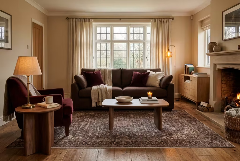
Dulux research, reported by Woman & Home, found that the living room is the most argued-over room when couples decorate together, with 28% of colour-related spats centred on it. That makes sense. The living room is where we eat, scroll, argue, nap and entertain, so the colour has to pull its weight on every shift.
Warm, deep shades suit that workload in winter for a few reasons:
- They flatter artificial light. Burgundy and brown glow under a warm lamp, whereas cool greys and blues can look flat once the daylight fades.
- They hide the wear. A dark rug and a leather sofa forgive spilled tea and muddy paws far better than cream bouclé does.
- They match the mood of the season. Designers quoted in Homes & Gardens describe a stronger appetite for comfort and emotional security at home, which is exactly why richer, cosier shades have crept back in.
A word of care before we go further. Estimates for seasonal affective disorder in the UK vary, from 2 to 5 people in 100 (Patient.info) to around one in five for the milder winter dip (reported by The Guardian). A paint colour is no medicine, and anyone whose mood sinks badly in winter should speak to their GP. What a well-judged room can do is make the hours spent indoors feel kinder, and that is no small thing when the sun sets before the school run is over.
What a deeper palette changes on an ordinary Tuesday
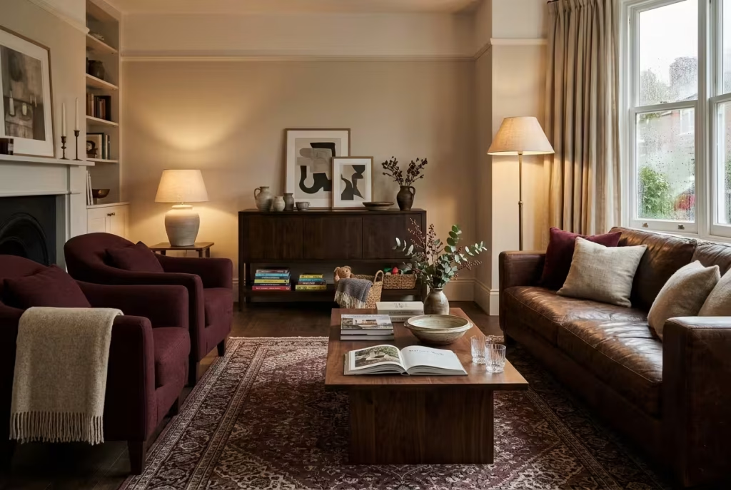
Design advice often sounds grand and feels remote, so here is what it can look like in a normal week.
Tuesday, 5pm. You close the front door on a drizzly evening. Instead of a flat white box with a cold overhead light, you walk into a room that glows. A lamp is already on, the curtains are drawn, and the velvet looks as though it is waiting for you.
Sunday afternoon. The rain is steady against the window. With a deep rug underfoot, a throw across your knees and a book in your hand, the world beyond the glass seems pleasantly irrelevant.
Friday night, with guests. Warm light and deep colour are famously flattering to faces, and conversation tends to settle more comfortably in a room that feels intimate than in one that feels like a showroom.
Monday morning, with children. A leather chair and a patterned rug forgive juice, crayons and muddy football boots in a way that cream bouclé never will.
None of this requires a big budget. It requires a plan, and the plan is what follows.
Burgundy, maroon, wine and oxblood know which red you are buying
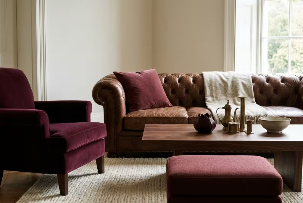
The paint aisle is awash with names for dark red, and they are not interchangeable. The difference lies in the undertone, and undertone decides how a red behaves next to brown.
| Shade | Undertone | Approximate hex | How it behaves beside chocolate brown |
| Burgundy | Purple, cool | #800020 | Contrasts gently, giving a refined, wine-cellar mood |
| Wine | Purple, a touch softer | #722F37 | Mellow and elegant, rarely shouts |
| Maroon | Brown, warm | #800000 | Very close to brown, so it needs more contrast from cream or tan |
| Oxblood | Brown, near black | #4A0000 | Dramatic and heavy, best used in small doses |
Hex values differ slightly from source to source, so treat them as a guide, not gospel. The practical lesson is this: the closer your red sits to brown, the more deliberately you must separate the two with a lighter shade or a different texture. A plummy burgundy has more built-in contrast with chocolate than a maroon does.
A two-minute undertone test you can do at home
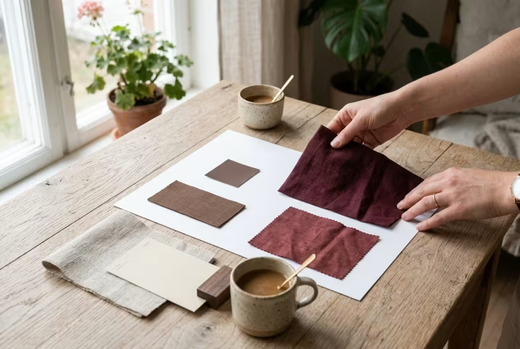
You do not need a trained eye to read a colour’s undertone. You need a sheet of plain white paper and a little patience.
- Hold the sheet of white paper beside the paint swatch, fabric or cushion in daylight.
- Ask yourself whether the red looks more like a ripe plum (purple, cool) or more like a rusty brick (brown, warm).
- Do the same with your brown. Does it lean towards red, towards yellow, or towards grey?
- Place the two side by side. If one reads plum and the other reads coffee, they will sit comfortably together. If both read the same, you will need to separate them with a lighter shade or a different texture.
- Repeat the test under your evening lamp, because artificial light changes everything.
Do they clash The honest answer
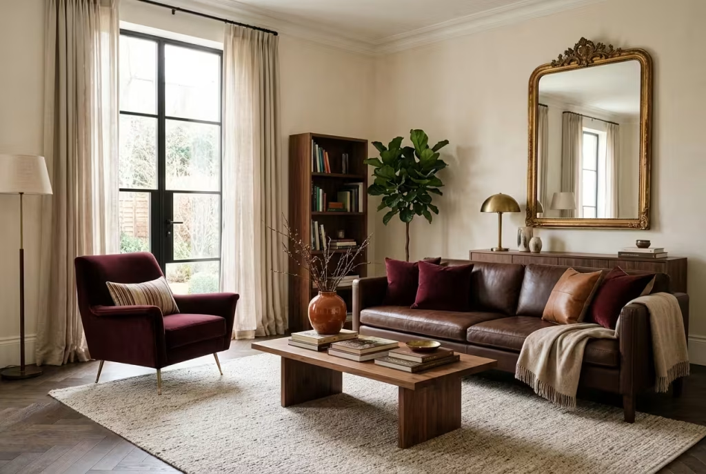
Here is the elephant in the room. In a March 2025 piece, Homes & Gardens quoted designers who warned that chocolate browns and burgundy can sit at such a similar depth that they muddle together, lacking the contrast a balanced palette needs. One suggested lighter tan or beige instead, while also noting that warm dark woods flatter burgundy, particularly in a snug or library.
Other publications take the opposite view. Livingetc pairs burgundy with caramel and toffee tones for an opulent yet earthy scheme, and Ideal Home’s autumn and winter 2026 rug trends name burgundy and chocolate brown together as the season’s cocooning palette. Homes & Gardens’ own 2027 living room trends highlight rich browns, soft caramels and warm creams.
So who is right? Both, in a sense. The designers are warning against the lazy version, where a dark brown sofa meets a dark red rug on a dark floor and nothing is allowed to breathe. The trend writers are describing the considered version. The fix is not to avoid the pairing, but to manage it:
| What goes wrong | Why it happens | The remedy |
| The two shades melt into one lump | Same depth, same sheen | Introduce a lighter bridge: oatmeal, cream, tan or stone |
| The room feels flat and lifeless | Everything is matte | Mix velvet, leather, wool and one glossy or metallic note |
| The room feels like a cave | Too little light for too much dark | Layer lamps, add mirrors, and lighten the floor or ceiling |
| The scheme looks dated or pub-like | Dark wood, red carpet and nothing else | Add fresh partners such as blush, ochre or a muted green |
| The scheme feels cold | Cool greys or icy blues creep in | Stay with warm neutrals; the same warmth should run through everything |
You May also Like: 41 Coastal Living Room Design Ideas That Feel Calm, Fresh, and Timelesss
A worked example rescuing a muddled room
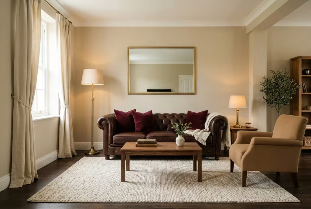
Imagine a living room with a chocolate leather sofa, a burgundy rug and dark laminate flooring. Everything is the right colour, and yet the whole thing feels like a cupboard. Here is how the table above turns into action, in order of effort:
- Break the floor line. Swap the rug for one with a cream or oatmeal field, or add a pale underlay border so the dark floor does not meet the dark rug.
- Lighten one big surface. Paint the walls a warm oatmeal, or at least the wall behind the sofa.
- Add a mid-tone. A camel or tan armchair or cushion bridges the gap between burgundy and chocolate.
- Introduce shine. One brass lamp and a mirror, placed to catch the light.
- Re-light it. Swap any cool or mismatched bulbs for a matched set at 2700 to 3000K and add a second lamp.
Five changes, none of them involving a new sofa.
The proportions that stop a dark room feeling heavy
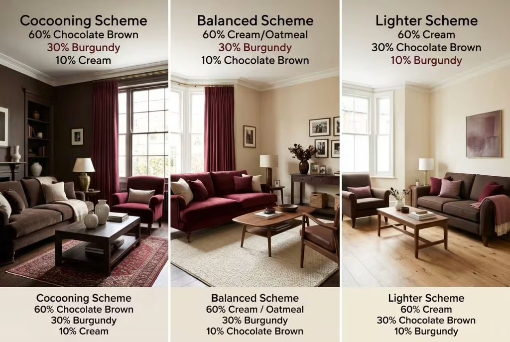
Professional designers lean on the 60-30-10 rule for a reason: it works. Roughly 60% of the room wears your dominant colour, 30% carries the secondary, and 10% is reserved for accents. With a pair of deep shades, deciding which one leads is the whole game. These are three recipes, each a sound starting point rather than a rigid formula.
| Mood | 60% (dominant) | 30% (secondary) | 10% (accent) | Best for |
| Cocooning | Chocolate: walls, sofa, wood | Burgundy: rug, curtains, armchair | Cream and brass | Large rooms, snugs, north-facing spaces you want to lean into |
| Balanced | Warm neutral: oatmeal or cream walls and rug | Burgundy: sofa and curtains | Chocolate: wood, leather, frames | Most family living rooms |
| Lighter | Warm cream | Chocolate: furniture and wood | Burgundy: cushions, throws, art | Small rooms and rentals |
Dulux offers a handy principle for the tonal approach: use the darkest shades on the features you want to draw the eye to, and the lightest in the areas where you want to maximise the feeling of space. A burgundy chair against pale walls becomes a statement. A burgundy wall behind a burgundy sofa becomes a fog.
Choosing the recipe that suits your room
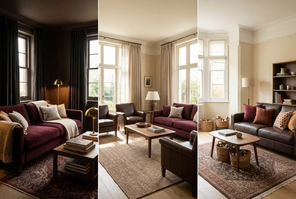
If you are torn between the three recipes above, let the room itself decide:
- North-facing or short on daylight? Either lean fully into the cocooning recipe, treating the room as an evening retreat, or go with the lighter version and rely on lamps. Avoid the middle ground, which can look timid.
- South-facing and sunny? The balanced recipe suits you best, but position sofas away from direct sun to protect the dye.
- Small room? Choose the lighter recipe and keep burgundy to accents.
- Busy family room? Favour chocolate leather and patterned rugs, which hide life’s little accidents.
- A room you mostly use after dark? Go as deep as you dare. Lamplight is where this pairing performs at its very best.
20 burgundy and chocolate brown living room ideas, zone by zone
Walls and woodwork: where the darkness lives
1. Drench the walls in chocolate and let burgundy arrive by stealth.
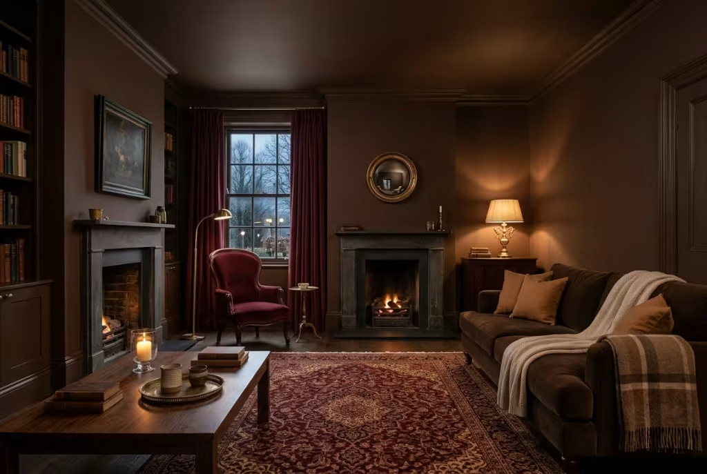
Picture stepping in from a sleety commute and feeling the room close around you like a hug. That is the promise of colour drenching: walls, skirting boards and often the ceiling share a single deep shade, so no stark white line interrupts the embrace. Chocolate is the sensible anchor because it behaves like a neutral, which frees burgundy to appear exactly where it matters, in the curtains, a rug or one generous armchair.
- Finish: a flat matt on the walls to soften reflections, with eggshell or satin on skirtings and doors so the joinery gets a quiet gleam.
- Small or north-facing rooms: step down to chestnut or hazelnut. One style publication notes that a very deep chocolate can swallow what little daylight there is.
- The ceiling: painted in the same tone, it makes the room feel wrapped rather than capped, a trick Dulux also credits with changing how a space reads.
2. Keep the walls pale and let the woodwork do the talking.
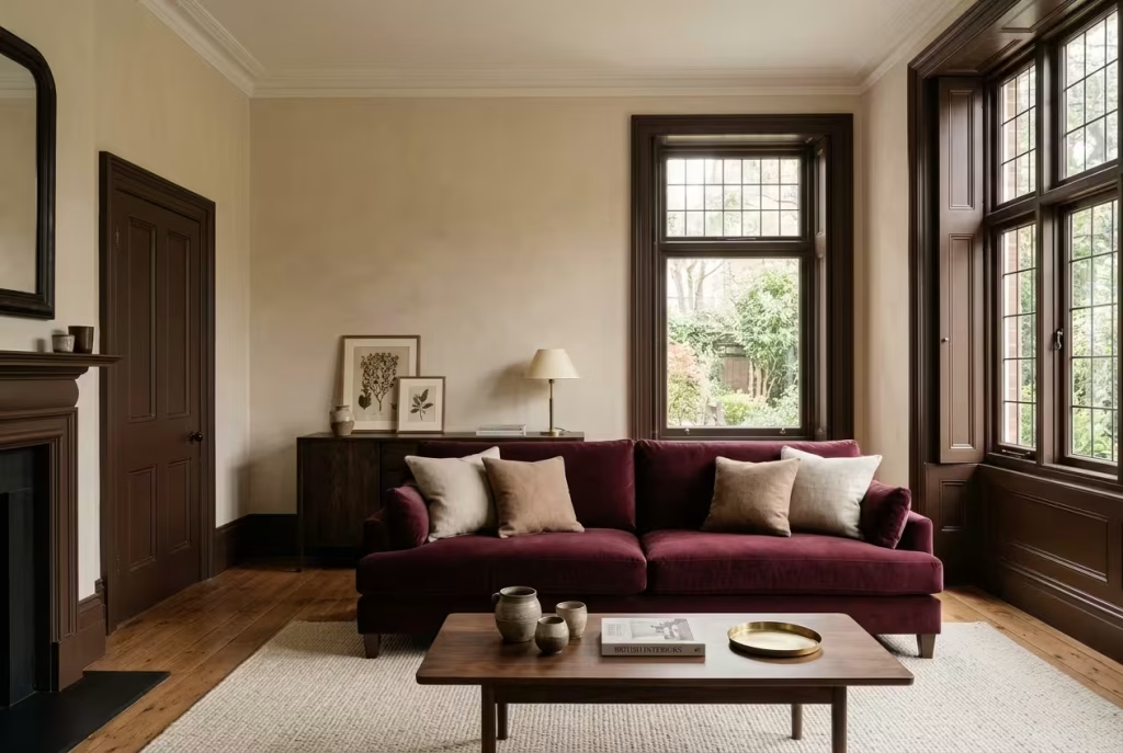
Nobody should feel pushed into living inside a chocolate bar. In this version the walls stay light, an oatmeal or buttermilk cream, while skirting boards, architraves and window frames are picked out in chocolate. It works the way a good frame flatters a painting: the dark outline gives the eye something to follow, and the pale field gives it somewhere to rest. Introduce a burgundy sofa and it reads as a deliberate focal point, which is precisely the contrast the designers warning about muddled shades say this pairing needs. It is also a forgiving first experiment. If you dislike the result, you have repainted a few metres of trim, not an entire room.
3. Paint the alcoves and leave the rest of the wall alone.
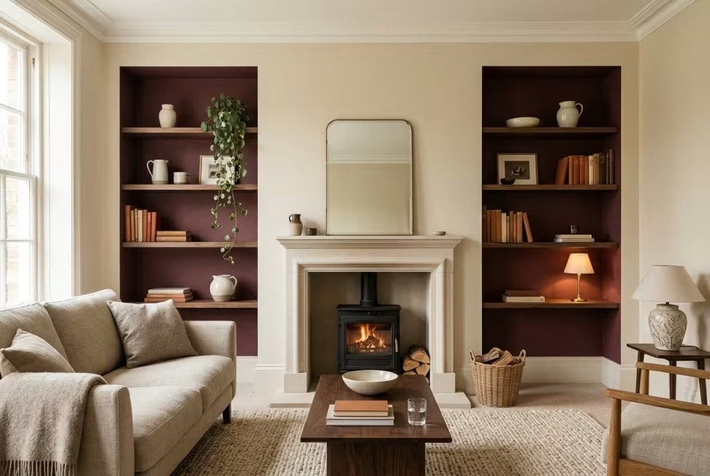
If your home has a chimney breast with a recess either side, you are sitting on a ready-made design opportunity. Burgundy inside the alcoves, with chocolate or walnut shelving fitted within, makes the recesses retreat, so books, ceramics and lamplight seem to float forward. It costs a fraction of repainting the whole room, and it changes the character of the space more than you would expect.
What earns its place on those shelves:
- Cream or stone ceramics, which glow against the deeper paint
- Books with warm spines, grouped by colour for calm
- One small lamp or a picture light, so the alcove glows after dark
- A single trailing plant to soften the geometry
4. Try chocolate panelling at dado height, with oatmeal above.
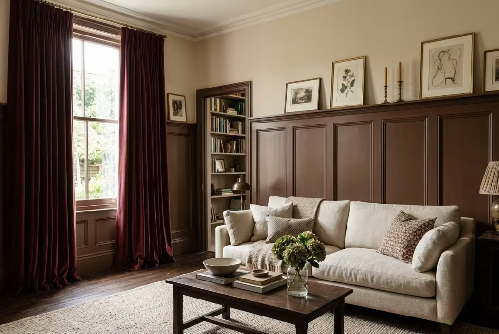
Two-tone walls have an old-fashioned logic that still holds. Panelling rising to roughly a third of the wall (around 90 to 100 cm in a room with a standard 2.4 m ceiling) grounds the seating zone, while the pale upper wall bounces light back into the room. Cap the panelling with a slim picture ledge and you gain a spot for small frames and a candle or two. Hang burgundy velvet curtains against that two-tone backdrop and the whole room takes on the poise of a well-cut suit.
Use an eggshell finish on the panelling, which wipes clean after muddy-boot season, and keep the upper wall in a flat matt.
Seating and wood: the big pieces
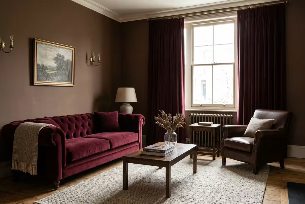
5. Set a burgundy velvet sofa opposite a chocolate leather armchair.
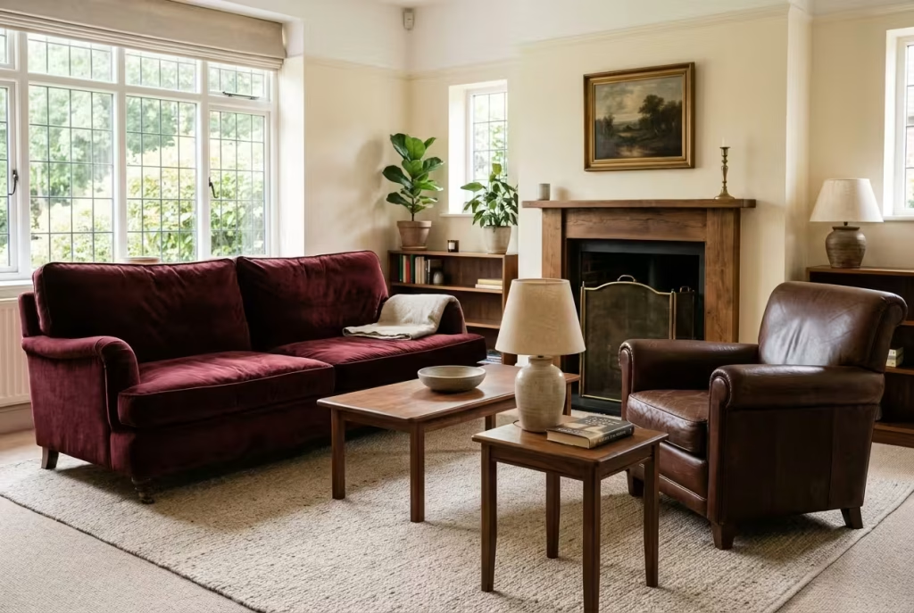
Two materials at two depths is the neatest cure for the muddle problem. Velvet is a shapeshifter: stroke the pile one way and the burgundy deepens, the other and it lightens, so the sofa changes mood from morning to midnight. Leather is the steady one, softening and darkening gently over the years. Angle the pair towards each other, add a walnut side table between them, and lay a cream or oatmeal rug underneath so both pieces have space to be themselves. Sitting in that arrangement, you have the makings of a proper conversation corner.
6. Dress the brown sofa you already own in burgundy.
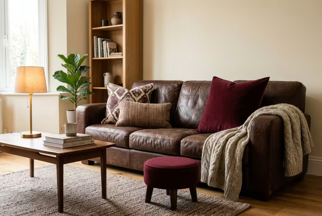
There is something rather freeing about not starting from scratch. If a chocolate leather suite is already bedded in, you can transform it with textiles alone. One Reddit commenter advising on an oppressive brown room suggested pulling accent colours out of the rug, and the same logic applies here.
A simple cushion recipe for a three-seater:
- One large burgundy velvet cushion (around 60 cm square) as the anchor
- One patterned cushion that carries cream and chocolate
- One smaller wool lumbar cushion for texture
- A chunky throw draped over one arm, never smoothed flat
A burgundy footstool in front of the sofa finishes the picture, and quietly protects the leather from the odd rogue sock.
You May also Like: Transform Your Space with These 25 Desert Living Room Inspirations
7. Let walnut and dark oak act as the diplomat.
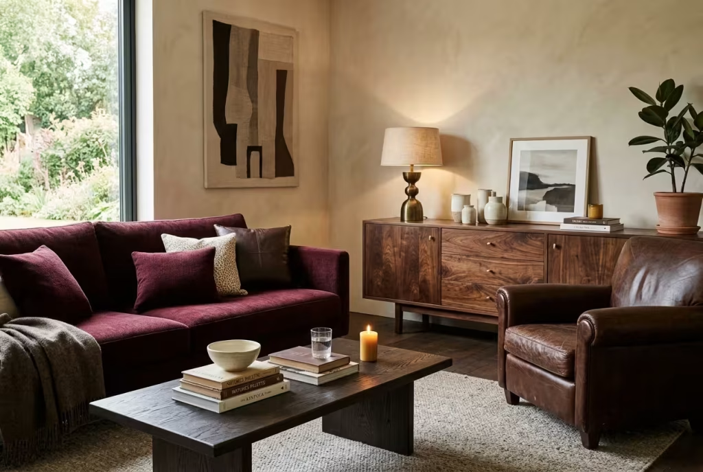
Warm, deep timbers sit between burgundy and brown the way a good mediator sits between two strong characters. Homes & Gardens designers note that dark, warm woods flatter burgundy, especially in a library or snug. A walnut sideboard, an oak coffee table, a pair of mahogany bookcases: each links the two colours without adding a third to the conversation.
A few guidelines keep wood from turning into a muddle of its own:
- Stay with warm undertones, and be wary of orange-toned pine, which squabbles with both colours.
- Two wood tones are usually enough. A third starts to look like a furniture warehouse.
- A satin or lightly polished finish catches lamplight and stops the room reading as flat.
8. Break up the set with a chair in a third shade.
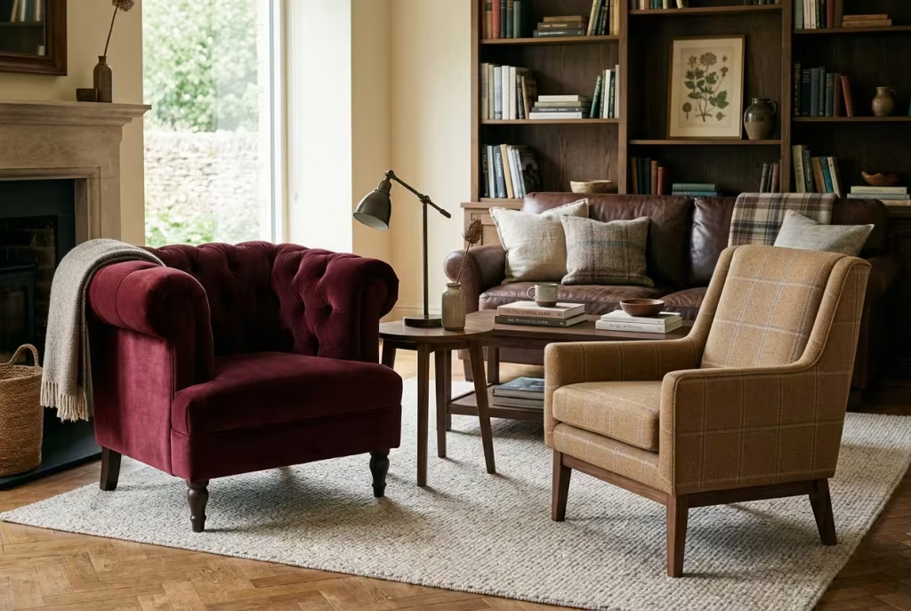
Two matching burgundy armchairs can look rather like a waiting room. Try one burgundy and one camel, tan or rust, and the slight mismatch gives the room the look of a place collected over years instead of ordered in a week. Keep the pair similar in scale and height so they feel like relatives, and let only one of them carry pattern. If the budget allows, a vintage find reupholstered in a velvet or textured wool brings a story with it, and stories are what make a living room feel lived in.
Underfoot and at the window
9. Choose the rug first, and let it write the rest of the script.
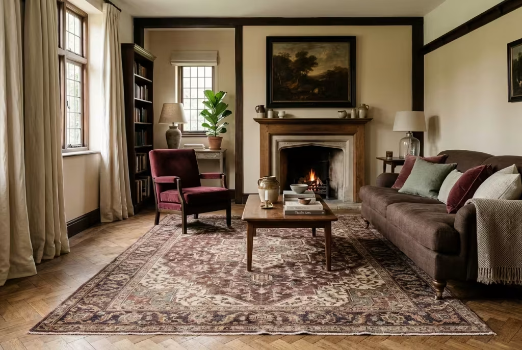
If one piece of advice cropped up again and again in the real conversations we studied, it was this. Posters worried about burgundy were told to begin with the rug. Those with a plain brown room were told the same, and so were people with a chocolate sofa and no idea what to add. The reasoning is sound: a rug carries several colours at once, so it gives you a ready-made shopping list for cushions, art and curtains.
Look for one that holds four things: burgundy, chocolate or tan, cream, and a small flicker of a fourth colour such as deep blue or soft green. A medallion design suits traditional rooms, a geometric weave looks fresher, and a faded vintage-style wool hides footprints beautifully. In an open-plan living and dining space, one commenter advised using a single rug to define the seating zone only, big enough for the front legs of every seat to rest on it.
10. Let a cream rug act as the room’s quiet lamp.
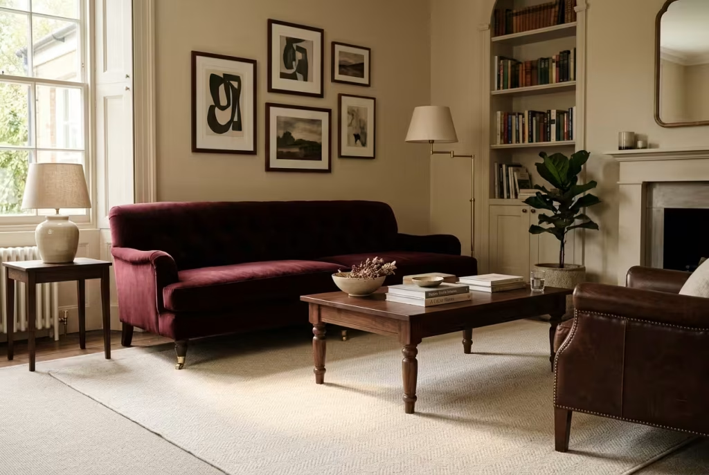
When the sofa and walls are doing the heavy lifting in deep tones, a cream or oatmeal rug works like a pool of daylight at floor level. It bounces light upwards, gives the eye a place to rest, and makes the darker pieces look as though they are floating on a cloud. Pale underfoot does demand some forethought, so choose a low pile or flatweave in wool or a wool blend, add a non-slip underlay, and keep a spot-cleaning routine to hand if you share the room with children or dogs. A rug that is slightly forgiving beats one that looks perfect for a week.
11. Hang burgundy velvet curtains, lined and generous.
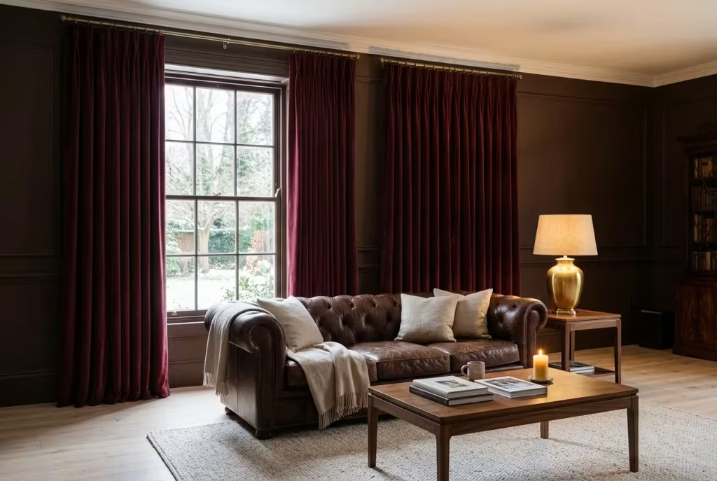
Of all the things you can buy for a living room, curtains deliver the most colour per pound, and in winter they pull double duty, because a heavy lining helps hold the heat in once the sun has gone. The difference between curtains that look expensive and curtains that look apologetic is almost entirely down to how they hang:
- Height: fix the pole a few inches above the window frame, or even closer to the ceiling, to lengthen the wall.
- Width: let the pole extend roughly 15 to 30 cm beyond each side of the frame, so the fabric stacks back clear of the glass and no daylight is lost.
- Fullness: a generous gather, around twice the width of the window, gives the velvet its folds.
- Length: graze the floor or pool very slightly. Anything that stops short looks like a mistake.
Against chocolate walls, choose a burgundy a notch lighter or redder so the curtains do not dissolve into the paint.
Light, shine and wall art
12. Bring in brass, gilt and one good mirror.
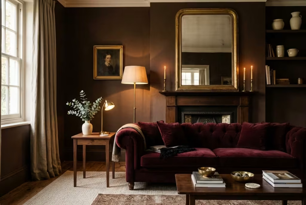
Homes & Gardens points out that burgundy makes a natural foil for burnished metallics, and chocolate is no different. The role of metal here is practical as much as pretty: in a deep-toned room, a flicker of brass catches the lamplight exactly where it is needed. Try an antique brass floor lamp, a gilt mirror above the mantel, or a pair of candlesticks on the shelf.
Placement matters more than quantity. Hang a mirror where it can catch lamplight or the glow from a window, not the television. Aim for a glint or two on each wall, and favour aged or brushed finishes over mirror-bright chrome, which can look hard against such soft colours.
13. Build the light in three tiers, and put it on a dimmer.
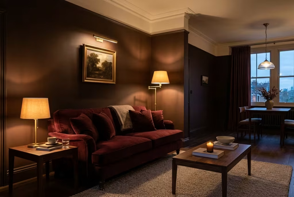
A single ceiling pendant makes a dark room feel like an interview suite. Think instead in tiers, with a source at each level:
- Low: a table lamp on a side table, level with your shoulder when seated.
- Mid: a floor lamp in the corner or behind the sofa, throwing light up and across the wall.
- High: a picture light or sconce grazing the art, or a dimmable ceiling light turned right down.
Fit dimmers to everything you can, and match every bulb at 2700 to 3000K. Many smart bulbs let you save a scene, so one tap at 5pm gives bright and clear, and another at 9pm gives low and amber. The full numbers are in the lighting section below.
14. Hang art that is bigger, lower and bolder than instinct suggests.
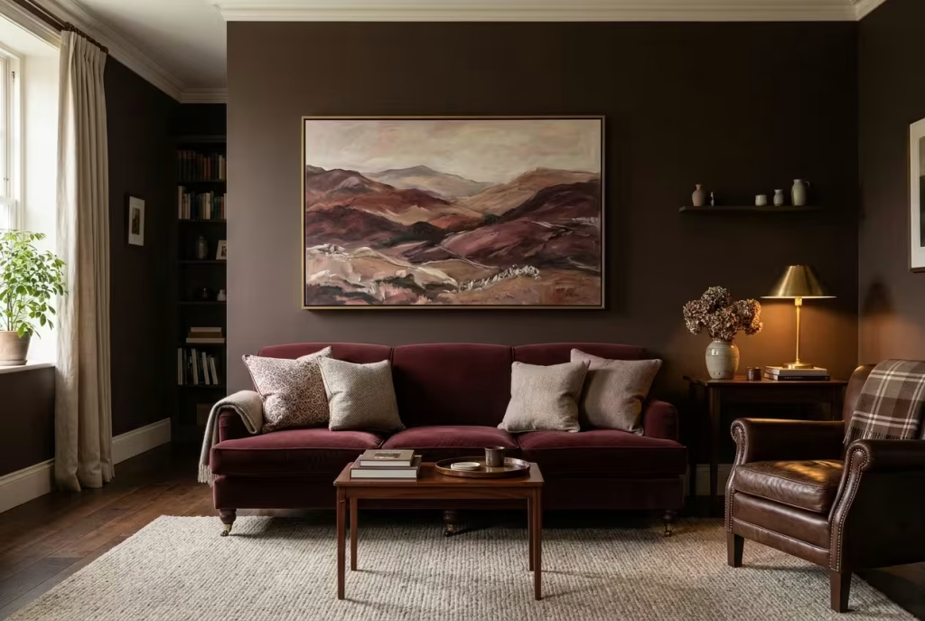
Several of the threads we reviewed turned up the same weakness: pictures that were too small and perched too high, leaving the wall looking like it had lost its nerve. Houzz designers advised hanging a piece about 5 to 6 inches above the sofa back, and a Reddit commenter suggested bright artwork to lift the eye upwards. As a rule of thumb, a single piece should span roughly two thirds of the sofa’s width, and the centre of the picture should sit near eye level, around 145 cm from the floor in the gallery convention.
For subject matter, think in terms of echoes: a landscape in russet, plum and stone, an abstract with a streak of cream, or a vintage botanical in a dark frame. Alternating gold and dark frames, as one renter was advised, stops the wall looking too matched.
Partner colours that earn their keep
15. Add a whisper of blush or dusty pink.
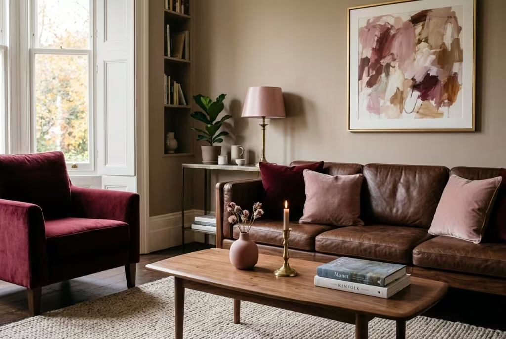
Pink and burgundy have been pals since the first rose was pressed in a book. Benjamin Moore suggests pairing burgundy with pink or charcoal for added luxury, and a soft blush does something equally useful for chocolate: it lifts it, the way cream lifts coffee. You need very little. A blush velvet cushion, a rose-tinted lampshade, a pale pink vase on the coffee table, or a plaster-pink print will do the job, and together the three colours have a pleasing echo of Neapolitan ice cream, grown-up and a touch sweeter.
16. Reach for ochre, mustard or antique gold.
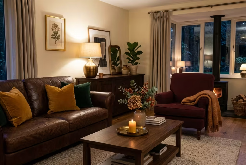
Burgundy has always had a sweet spot for golden partners, provided the yellow is buttery and not acidic. Homes & Gardens designers recommend golden, mustard and ochre over lemony tones, which tend to clash. One Reddit commenter, advising on a brown living room, suggested cushions in mustard, deep green and burgundy, and the combination stands up well. Think of it as borrowing a little autumn sunshine: a mustard cushion on a chocolate sofa, an ochre throw across a burgundy armchair, or a gold-toned lamp base catching the evening light.
You May also Like: 20 Italian Fireplace Ideas That Bring Timeless European Warmth to Your Home
17. Invite olive or sage in, but never in equal measure.
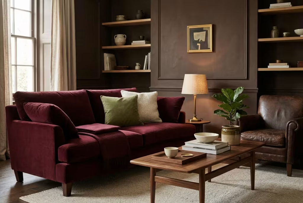
Green is the tricky friend in this friendship group. Bright greens fight burgundy, and a one-to-one swap of red and green tips the room into Christmas costume. A Houzz paint expert advised letting one colour dominate, and Homes & Gardens designers favour softer olive and sage in small accents. Keep green to something like a tenth of the room: a few leafy plants, an olive velvet cushion, a sage-toned lampshade. Done with a light hand, it provides a breath of fresh air in a heavy palette and keeps the room looking fresh long after the festive decorations have gone back in the loft.
The finishing layer
18. Layer textures until the room invites your hands.
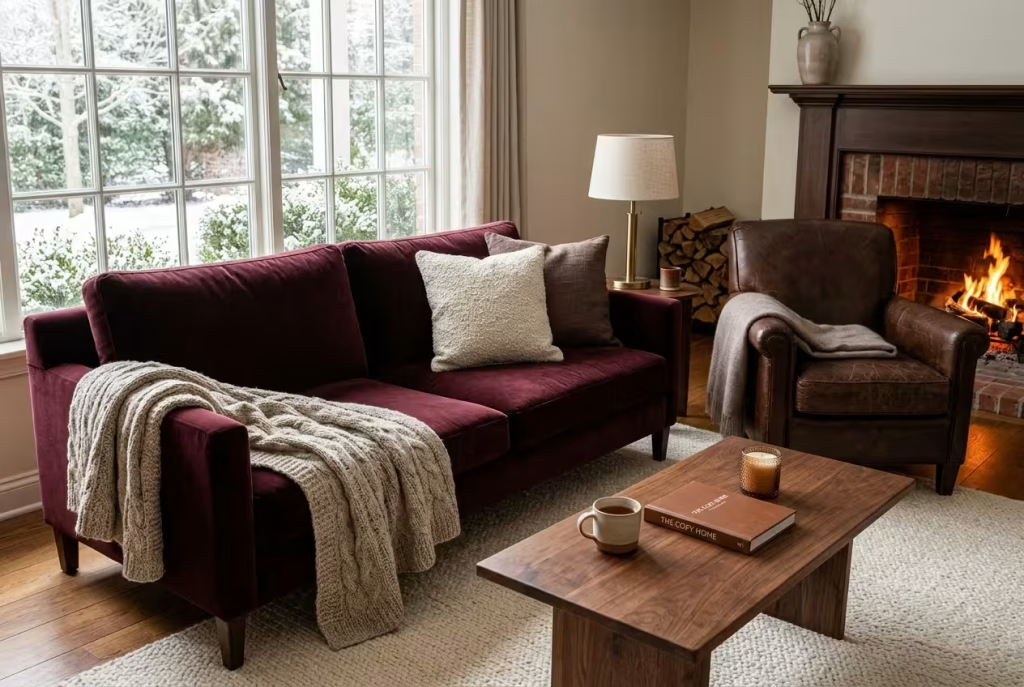
When every colour in a scheme is deep, interest has to come from the surface. Try the touch test: walk the room and run your hand across each piece. If two neighbours feel the same, swap one. A well-layered corner might hold:
- Velvet for a soft sheen on the sofa or curtains
- Leather for grounding weight and a patina that improves with age
- Chunky wool or knit for a throw that begs to be pulled over your knees
- Bouclé or linen for a matte, tactile contrast
- Cashmere or mohair, if you fancy a small luxury, for the winter evenings
One or two of these is plenty per seating spot. Five at once becomes a game of textile bingo.
19. Edit the shelves until they can breathe.
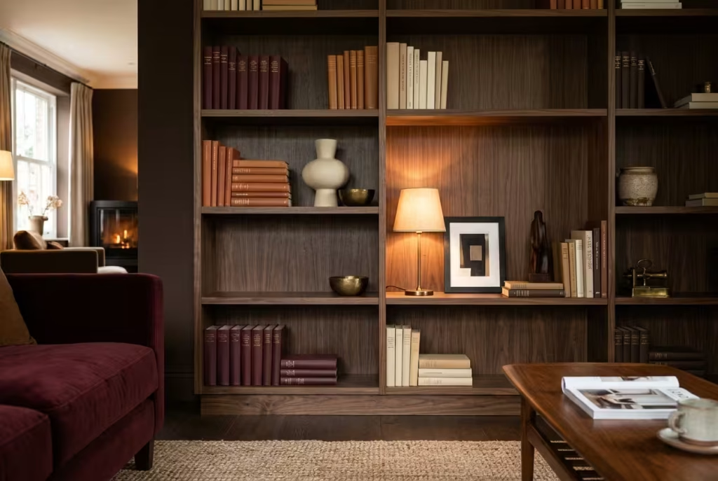
A Houzz designer offered a formula for crowded shelving that deserves wider fame: around one third books, one third decorative objects and one third empty space. In a deep-toned room the empty third matters more than any other, because it gives the eye a pause between objects. Here is how to apply it:
- Clear the shelf completely, then wipe it down.
- Return the books first, grouping some by colour and stacking a few horizontally.
- Add objects in odd numbers, varying height: a cream vase, a brass dish, a small framed print.
- Tuck a tiny lamp on one shelf so the arrangement glows after dark.
- Step back and remove one item. There is almost always one too many.
20. Shrink the scheme for a compact room.
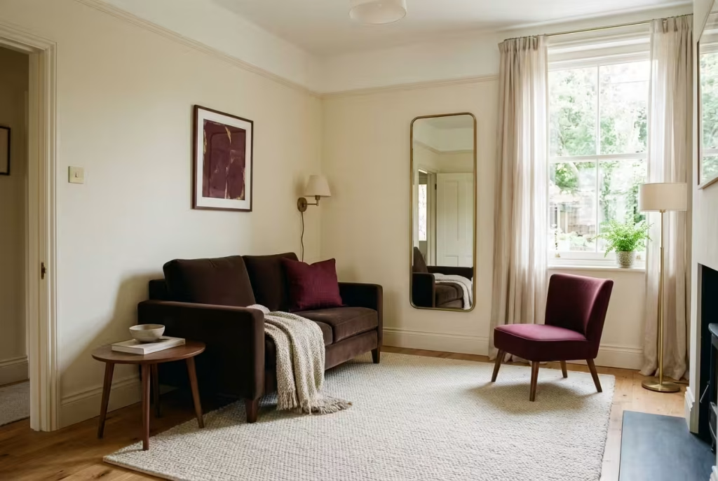
A small living room can carry this look beautifully, as long as you hold back on quantity. Let cream or oatmeal lead on the walls, keep chocolate for the sofa or one big chair, and reserve burgundy for cushions, a throw and one confident piece of art. Choose the largest rug the zone will allow, since a generous rug is one of the best tricks for making a snug room feel more complete. Place a mirror opposite the window to stretch the daylight, and use wall lights or a slim floor lamp in place of a bulky table lamp. The result is snug, not suffocating, which is the entire point.
Paint colours worth sampling before you commit
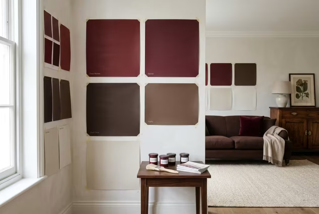
Names and numbers on a paint chart tell you very little until the colour is on your own wall, in your own light. Treat the shortlist below as a place to start, and order sample pots before you reach for the roller.
- Burgundy and deep red: Farrow & Ball Eating Room Red and Brinjal, Little Greene Theatre Red and Bronze Red, Benjamin Moore New London Burgundy, and Paint & Paper Library Grenache.
- Chocolate and warm brown: Little Greene Ganache, Affogato and Muscovado, plus Dulux Brave Ground and Soft Truffle.
- Pale bridges: a warm off-white, oatmeal or stone, chosen to sit between the two darker tones.
Paint a large sheet of lining paper, at least a metre square, and tape it to two different walls. Look at it at breakfast, at lunchtime and again under lamplight. A colour that sings at noon can turn muddy by seven, and the evening is when this scheme has to perform.
Lighting a dark scheme so it glows rather than broods
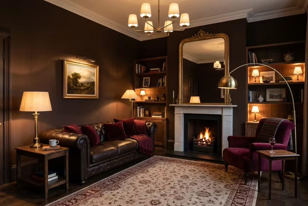
Dark walls drink light. That is part of their charm, and also the reason a burgundy and chocolate room can feel dreary if the lighting plan is an afterthought. Most of the winter hours in this room will be spent under artificial light, so it deserves the same care as the sofa.
The numbers worth knowing:
- Colour temperature: 2700 to 3000K is the living room standard across lighting specialists. Go much warmer than 2700K and bulbs turn orange, which can muddy the reds. Go cooler than 3000K and the glow turns clinical.
- One temperature only: mixing 2700K lamps with 4000K recessed spots creates a jarring contrast, so keep every bulb in the room matched.
- Colour accuracy: look for a CRI of 90 or above so burgundy reads as burgundy and not as brown.
- Brightness: lighting guides suggest 10 to 20 lumens per square foot for ambient living room light. In a 14 x 12 ft room (about 4.3 x 3.7 m, or 168 sq ft) that means roughly 1,700 to 3,400 lumens. Lighting calculators suggest nudging that up by around 1.5 times for very dark walls, which takes you to something like 2,500 to 5,000 lumens spread across several sources. Treat this as a rule of thumb, not a law.
- Lamps: a lower-output bulb of around 450 lumens in a table lamp gives a gentle, flattering pool without glare.
- Dimmers: worth their weight in gold, because the right brightness at 5pm is not the right brightness at 10pm.
One Reddit commenter, advising on a brown room that felt oppressive, noted that dim, yellowish bulbs exaggerate brown. Their fix was a brighter, cleaner warm white, not a colder one. That is the sweet spot: warm, but with enough lumens behind it.
| Layer | Where it goes | What to use | What it does |
| Ambient | Ceiling or wall sconces | Dimmable pendant or wall lights | Sets the overall level so the dark walls are not a void |
| Task | Beside the sofa and reading chair | Table lamp or arc floor lamp | Gives you light to read by without flooding the room |
| Accent | Mantel, shelves, art | Picture light, small shelf lamp | Lifts the walls and adds a glow at eye level |
| Reflective | Opposite or beside a window | Mirror, brass, glossy ceramics | Bounces what light you have around the room |
Three evenings, three light settings
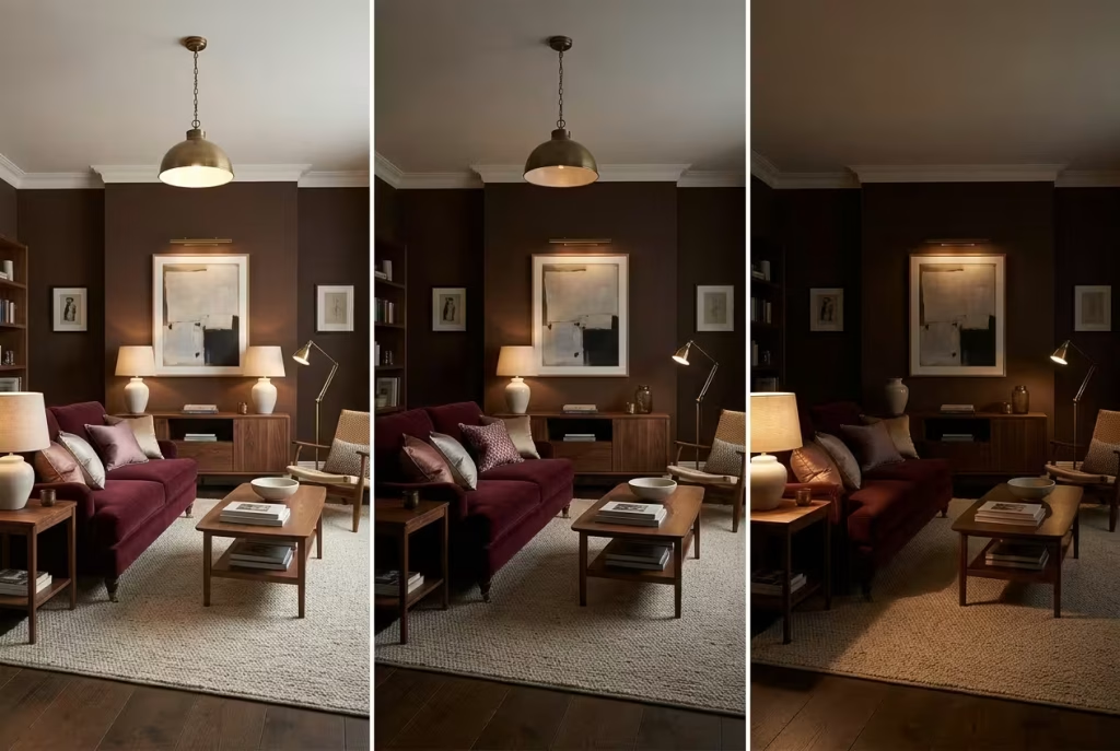
Once the layers are in place, the room can shift gear as the night wears on:
- 5pm to 7pm, for cooking, homework and chatter: all tiers on, the ceiling light at around 70% and lamps at full. The room feels lively and legible.
- 7pm to 9pm, for dinner and television: drop the ceiling light to a gentle glow, leave the lamps and picture light on. The deep walls begin to recede, and the metal catches the light.
- After 9pm, for reading and winding down: switch off the ceiling light altogether. A single lamp and the accent light are all you need.
You May also Like: 21 Earthy Cottage Home Decor Ideas for a Cozy, Soul-Calming Retreat
Bulb-shopping cheat sheet
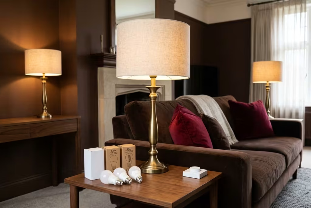
- Look for 2700K to 3000K on the box, written as “warm white”.
- Check CRI 90 or above so reds stay red.
- Choose dimmable bulbs, and make sure your dimmer is compatible with LED.
- Buy a matched set from the same range, so every lamp has the same tone.
- For table lamps, a bulb of around 450 lumens gives a flattering pool without glare.
Getting the rug size right
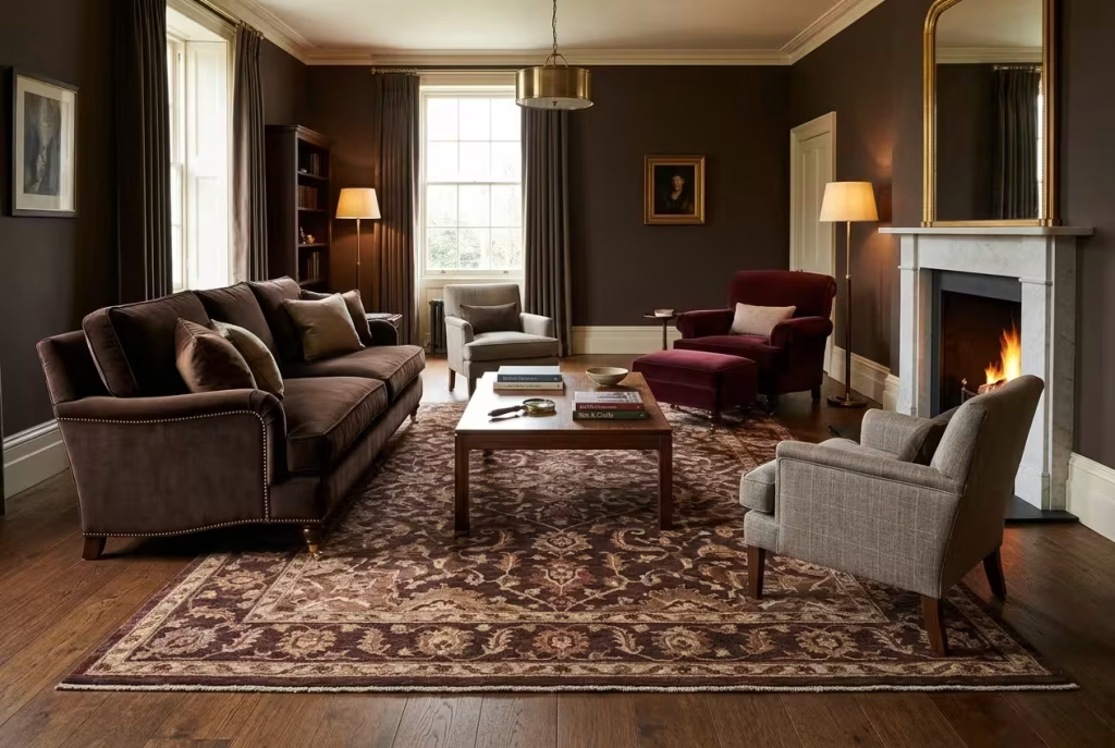
The rug is the most repeated piece of advice we found, and also the most commonly botched. A rug that is too small shrinks the whole scheme, no matter how lovely the colours are. The most widely used rule is that the front legs of every piece of main seating should rest on the rug, and that 8 to 12 inches of bare floor should remain around its edges.
| Your room or sofa | Rug size to try | Why |
| Room of 10 x 12 ft or smaller | 8 x 10 ft (about 240 x 300 cm) | A 9 x 12 would crowd the walls |
| Room of 12 x 14 to 12 x 16 ft | 8 x 10 ft or 9 x 12 ft (about 270 x 365 cm) | Sofa width should decide |
| Room of 14 x 18 ft or larger | 9 x 12 ft | An 8 x 10 would look like it is floating |
| Sofa 72 in (6 ft) wide | 8 x 10 ft | Leaves about 12 in each side |
| Sofa 84 in (7 ft) wide | 9 x 12 ft | An 8 x 10 leaves only 6 in each side, which looks stingy |
| Open-plan living and dining | 9 x 12 ft minimum for the living zone | One rug should define the seating area only |
If you are torn between two sizes, retailers and designers tend to agree on one point: go larger. A rug that is slightly generous looks intentional, whereas a rug that is slightly mean looks like a mistake.
Test the size before you buy
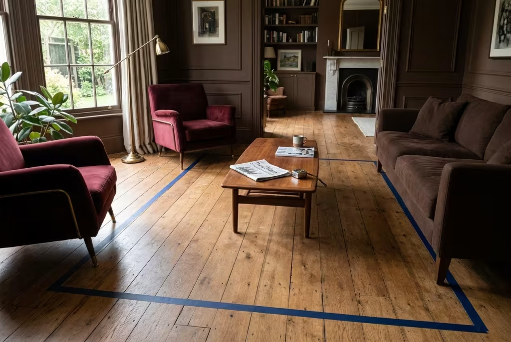
An easy way to avoid an expensive mistake is to mark out the rug on your floor before you order it:
- Tape out the dimensions with painter’s tape, or lay out sheets of newspaper.
- Place your sofa and chairs where they will live.
- Check that the front legs of every seat sit inside the tape, with 8 to 12 inches of floor showing at the walls.
- Walk through the room as you normally would. If your toes catch an edge, adjust the position.
- Live with it for a day. A rug that looks too big on the floor in paper form almost always looks right once it is in place.
Looking after velvet, leather and deep dyes
Dark red and brown fabrics have a reputation for being low maintenance, and that is mostly deserved. They do have two enemies, though, and both are easy to avoid:
- Sunlight. UV light breaks down fabric dyes, and leather exposed to strong sun can fade, dry out and eventually crack. Keep the sofa away from a south-facing window where you can, and draw the curtains on bright days.
- Radiators. Furniture experts suggest keeping upholstery at least 30 cm (about a foot) from a radiator. Livingetc reports that dark and vibrant fabrics are especially vulnerable to uneven dye degradation from heat, leaving patchy marks.
A few habits will protect your investment:
- Condition leather roughly twice a year with a product made for leather, and never use general household cleaners on it.
- Turn and plump loose cushions regularly so wear spreads evenly.
- Choose a performance velvet if you have children or pets. One Houzz poster praised their velvet sofa for being easy to clean, and modern performance weaves are designed with spills in mind.
- Never rest hot drinks or hot water bottles directly on leather, as they can leave dark marks.
Reading the care label
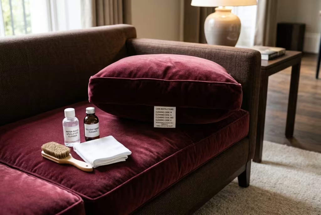
UK upholstery labels use a simple code, and it is worth knowing before an accident, not after:
- W: clean with water-based products.
- S: clean with solvent-based products only.
- WS: either method is suitable.
- X: vacuum or brush only, with no liquids at all.
Whatever the code, blot spills with a clean cloth and never rub, which pushes liquid deeper into the pile. Test any cleaner on a hidden patch first.
Rented rooms and tight budgets
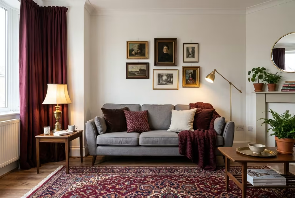
You do not need a free hand with the landlord, or a free hand with the bank, to pull this off. One Reddit poster, living in a rental with landlord-owned furniture and a grey, sterile feel, got the same practical advice repeatedly: a big burgundy rug, warmer curtains in place of white ones, plenty of lamps, and art in mixed gold and silver frames.
| Spend level | What to change | Impact on the room |
| Lowest | Cushion covers, a throw, lampshades, a few frames | Introduces the palette immediately and can move with you |
| Moderate | A large rug, lined curtains, a floor lamp, one big piece of art | Delivers most of the transformation |
| Highest | A new sofa, painted walls, built-in shelving | Locks the scheme in for years |
As always, prices vary widely by retailer and quality, so set your own ceiling before you start browsing. If you spend the first stretch on the rug and the lamps, you will be amazed at how far a modest budget goes.
A weekend plan to put it all into practice
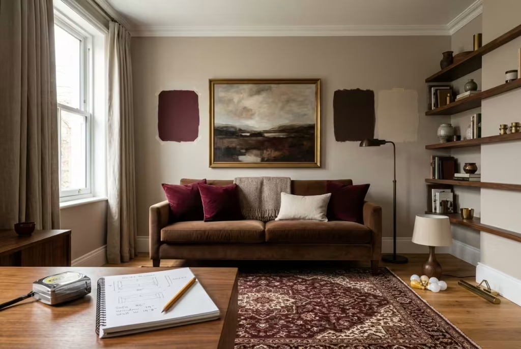
- Friday evening: measure your room, your sofa and your window. Note which wall gets the most daylight.
- Saturday morning: tape up paint samples and order any swatches. Decide which of the three proportion recipes suits your room.
- Saturday afternoon: choose the rug. Everything else follows from it.
- Sunday morning: swap bulbs to a matched 2700 to 3000K set and arrange your lamps at three heights.
- Sunday afternoon: add burgundy cushions or a throw, hang the art 5 to 6 inches above the sofa, and edit your shelves to roughly a third empty.
Small rituals that turn a dark evening into your favourite hour
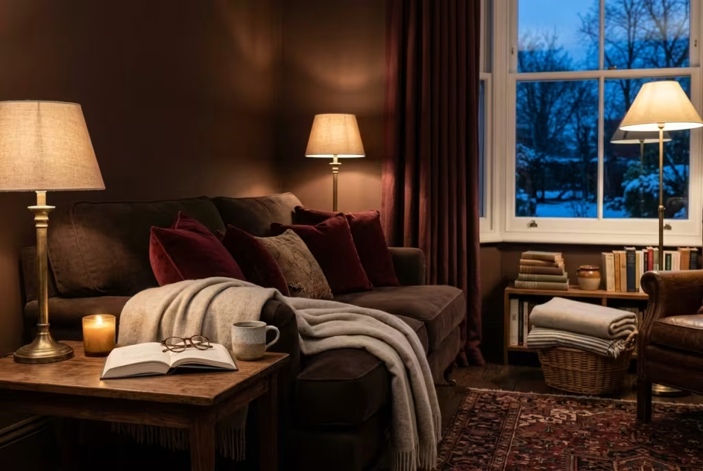
Colour and light set the stage, but it is the little habits that make a room feel like yours. A few that cost almost nothing:
- Light the lamps before you need them. Do it at four, when the dusk begins, and you will never experience the sudden gloom that creeps up on an unlit room.
- Give the sofa a corner that is only for you. A throw, a lamp and a small table within reach is enough to make it a refuge.
- Keep a basket of blankets and a stack of books nearby. A room that offers comfort invites you to use it.
- Choose one scent and stay with it, such as a simple beeswax or cedar candle. If you burn candles, use a stable holder, keep them well clear of curtains and cushions, and never leave a flame unattended.
- Put the phone in a drawer for the first hour after supper. The room will do the rest.
There is nothing frivolous about any of this. A home that feels welcoming in the darkest months is a home you actually want to be in, and that is reason enough.
Bringing it all together
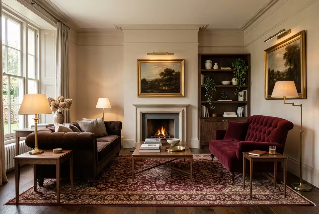
A burgundy and chocolate brown living room is not a gamble when you know where the pitfalls lie. Give the two colours room to breathe, add a pale bridge, vary the textures, and light the whole thing generously from several heights. Do that, and the room will repay you every evening from the first frost to the first crocus.
If you take only one thing away, let it be this: start with the rug, size it generously, and build outwards from there. Winter is long, but a room that welcomes you home makes it feel a great deal shorter.
Frequently asked questions
Do burgundy and chocolate brown go together?
Yes, with one condition: the two should not sit at the same depth. Burgundy has purple undertones and chocolate leans warm and earthy, so they harmonise naturally. Keep one lighter, vary the textures, and place a cream or oatmeal shade between them so each can be seen clearly.
Why does my brown living room feel too brown?
Usually the problem is not too much brown but too little other colour. Reddit commenters on this very question advised adding a patterned rug, colourful cushions, large art and plants. Pick one anchor piece, often the rug, and pull accent colours from it.
What is the difference between burgundy, maroon, wine and oxblood?
Undertone is the difference. Burgundy leans purple and cool, maroon leans brown and warm, wine sits close to burgundy with a softer feel, and oxblood is a very deep, near-black brownish red. The closer a red is to brown, the more contrast you need beside chocolate.
What colours go with a burgundy sofa?
Warm neutrals such as cream, oatmeal, tan and warm taupe work reliably. Dusty pink, ochre, mustard, olive and sage also pair well. Avoid neon or acidic shades, and use green sparingly so the room does not tip into Christmas.
What goes with a chocolate brown sofa?
A patterned rug is the usual first step, picking up one or two of its colours in cushions and art. Burgundy, cream, mustard, rust and soft blue all sit well with chocolate, and warm brass or gold adds a little polish.
How do I stop a dark burgundy and brown room feeling heavy?
Lighten the biggest surfaces, such as the rug or the walls, and keep the darkest colours for features. Layer your lamps at three heights, add a mirror, mix textures, and leave some shelf and surface space empty. Designers recommend chestnut or hazelnut brown in small or poorly lit rooms.
What colour and brightness of bulb suits a dark living room?
Choose 2700 to 3000K bulbs with a CRI of 90 or above, matched across the room. Aim for roughly 10 to 20 lumens per square foot, and a little more if the walls are very dark. Fit dimmers so you can adjust through the evening.
What size rug do I need?
For most living rooms, 8 x 10 ft (about 240 x 300 cm) is the workhorse size, with 9 x 12 ft (about 270 x 365 cm) better for larger rooms or sofas of 84 in and above. At the very least, the front legs of the sofa and chairs should sit on the rug.
Will a burgundy sofa fade, and how can I protect it?
Any dyed fabric or leather can fade in strong sunlight. Place the sofa away from direct sun, draw curtains on bright days, keep it about 30 cm from radiators, and condition leather about twice a year.
Can I get this look in a rental or on a budget?
Yes. Start with removable pieces: a large rug, lined curtains, lamps, cushion covers, a throw and framed art. These deliver the colour and the mood without touching the walls, and they come with you when you move.
Is burgundy still in style?
Yes. Ideal Home reports that Benjamin Moore’s colour team sees burgundy and berry reds returning, and Homes & Gardens lists burgundy among its recent key colour trends. Because it reads as a classic wine tone, it is also unlikely to date quickly.
What colour curtains work with burgundy and brown?
Lined burgundy velvet is the traditional choice. If your walls are chocolate, go for a slightly lighter or redder burgundy so the curtains stand out. Cream or oatmeal linen is a good alternative if you want to keep the room bri ghter.
Will burgundy make my living room feel smaller?
Not necessarily. Designer Kati Curtis told Homes & Gardens that dark colours like burgundy can create a sense of depth, making a space seem more intriguing and even larger. In practice, a dark colour on the walls can make the boundaries seem to recede, but only if the room is well lit. In a poorly lit room, the same colour can feel confining.
I already have a brown sofa and a burgundy rug and the room feels heavy. What is the quickest fix?
Add a lighter bridge and more light. Introduce a cream or oatmeal cushion and throw, swap in a second lamp, and place a mirror where it can catch the glow. If the floor is dark, consider a pale rug border or a lighter underlay so the burgundy and the floor do not merge.