25 Modern Wooden Garden Fence Ideas for 2026: DIY Builds, Design Trends & Outdoor Decor Inspiration
In contemporary garden design, fencing is no longer treated as a purely functional boundary. It is a defining architectural layer that shapes how a space is experienced from the moment you step outside. When handled with restraint, considered proportion, and the right material finish, a wooden fence does far more than enclose. It frames views, controls privacy, and quietly establishes the tone of the entire garden.
From my experience working across compact urban plots and larger residential landscapes, the impact of fencing on spatial perception is often underestimated. A solid, uninterrupted fence can create privacy, but if it is too heavy or poorly detailed, it compresses the space and blocks natural light. By contrast, a well-designed timber fence, whether through horizontal slats, subtle spacing, or softened edges, allows light to filter through and maintains a sense of openness while still offering seclusion. The balance between screening and permeability is what ultimately determines whether a garden feels enclosed or expansive.
There is also a material warmth to timber that is difficult to replicate with metal or composite systems. Modern wooden fencing, particularly in finishes such as cedar, larch, or carefully stained softwood, introduces a natural softness that complements planting, paving, and outdoor furniture. Where metal can feel stark and composite can appear uniform, timber carries variation in tone and texture, which helps a garden feel layered, grounded, and more connected to its surroundings. This becomes especially important in modern schemes, where clean lines risk feeling overly rigid without the counterbalance of organic material.
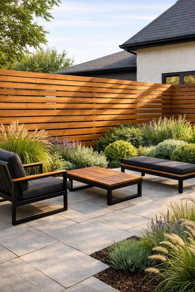
Choosing the right fence, however, is less about following a particular style and more about understanding context. The architecture of the house, the scale of the garden, and the intended use of the space should all inform the design. A low, horizontal slatted fence may suit a wide, open garden, visually extending its footprint, while a taller vertical arrangement might be more appropriate for a narrow plot where privacy is critical. In each case, the most successful solutions are those where the fence feels integrated rather than applied, aligned with the proportions and material language of the home itself.
Why Wooden Fencing Still Works in Modern Gardens
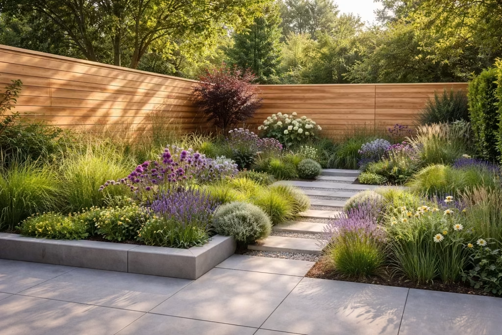
In modern garden design, where clean lines and hard materials often dominate, timber introduces a necessary counterbalance. Stone, porcelain, and concrete establish structure, but without a softer element, these surfaces can feel visually cold and overly controlled. Wooden fencing brings in natural texture, subtle tonal variation, and a sense of material honesty that grounds the entire scheme. It acts as a mediator between architecture and landscape, allowing both to sit more comfortably together.
From a spatial perspective, this contrast is critical. Hard landscaping defines planes and edges, while timber softens them. I have found that even in highly contemporary gardens, a well-proportioned wooden fence prevents the space from feeling sterile. The grain, slight imperfections, and variation in colour introduce depth that flat, manufactured materials struggle to achieve. This becomes particularly effective when paired with planting, as foliage reads more vividly against a natural timber backdrop than it does against stark metal or composite panels.
There is also the question of how a garden evolves over time. Unlike static materials, timber responds to its environment. Depending on the species and finish, it may deepen in tone, silver off, or develop a patina that reflects exposure to sun and rain. This weathering process, when anticipated and designed for, adds character rather than detracts from it. In several projects, I have deliberately specified untreated or lightly treated timber, knowing that its gradual ageing would soften the overall composition and make the garden feel more established within a few seasons.
It is important, however, to distinguish between decorative fencing and a considered boundary treatment. Decorative fencing often prioritises pattern or ornament, which can feel applied and disconnected from the architecture. A structural boundary, by contrast, is integrated into the design language of the house and garden. It aligns with proportions, responds to sightlines, and supports how the space is used, whether that is for privacy, screening, or framing views. This is where modern wooden fencing excels, as it can be detailed with precision while still retaining a sense of warmth.
In practice, the difference is often in the restraint of the design. A fence tends to read as more refined, and ultimately more expensive, when the detailing is simple, the spacing is consistent, and the finish is carefully aligned with the house rather than competing with it. This is not about reducing impact, but about achieving clarity. When the proportions are right and the material is allowed to speak for itself, timber fencing becomes a quiet but defining element of a well-resolved garden.
What Makes a Wooden Fence Feel Modern
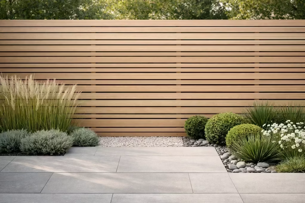
A modern wooden fence is not defined by trend or decoration. It is defined by discipline. Every line, gap, and finish is intentional, working together to create a boundary that feels calm, precise, and quietly confident. From my experience on residential projects, the difference between a fence that looks current and one that feels dated often comes down to proportion, restraint, and how well each detail is resolved.
Horizontal Lines That Expand the Space
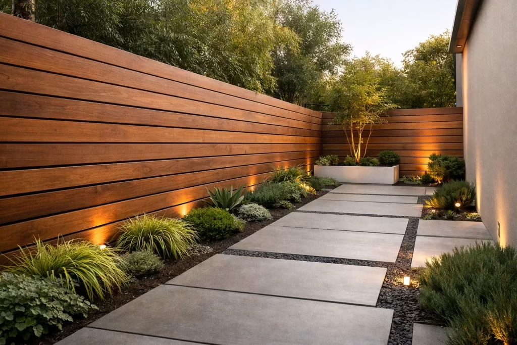
Horizontal fencing is one of the most effective ways to make a garden feel wider than it actually is. By drawing the eye laterally, it stretches the perceived boundaries, almost like pulling the space taut from side to side. I often use this approach in compact urban gardens where every visual trick matters.
In practical terms, boards typically range from 100–150 mm (4–6 inches) in height, with consistent alignment across the entire run. When the lines are uninterrupted and precisely level, the result feels architectural rather than decorative. Done well, it creates a sense of order that reads instantly, even at a glance.
Where it works best: Narrow plots, courtyard gardens, and contemporary homes with strong horizontal geometry.
What to avoid: Breaking the rhythm with uneven joins or misaligned boards, which can quickly undermine the effect.
Slim Slats That Feel Light, Not Heavy
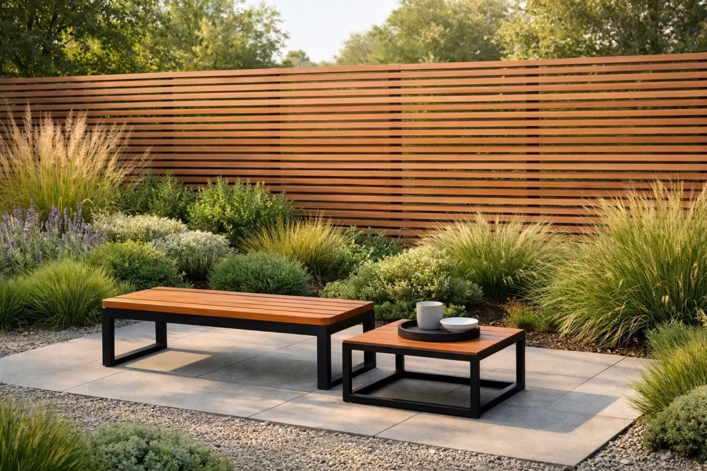
Thickness matters more than most people realise. Slimmer slats, usually around 20–25 mm (0.8–1 inch) thick, create a lighter visual profile, allowing the fence to sit comfortably in the background rather than dominate the space.
I have seen heavier, chunkier boards overwhelm smaller gardens, making the boundary feel closer than it actually is. Slim slats, by contrast, introduce a refined, almost tailored quality, like a well-cut piece of joinery rather than a standard off-the-shelf panel.
Real-life insight: When the slats are proportioned correctly, the fence feels effortless, as if it was always meant to be there, rather than added as an afterthought.
Even Spacing That Brings Visual Calm
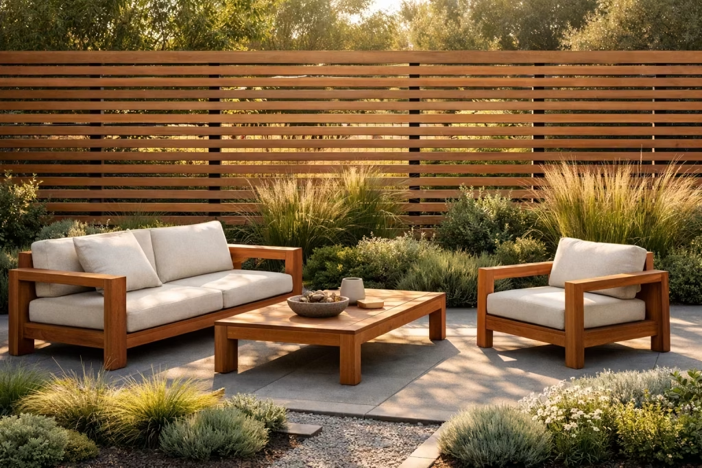
Consistency in spacing is where a design either holds together or quietly falls apart. Gaps between slats, typically between 10–20 mm (0.4–0.8 inches), should remain uniform across the entire fence. This creates a rhythm that feels measured and deliberate.
From a design perspective, spacing also controls privacy and light. Slight gaps allow glimpses of greenery beyond while letting daylight filter through, softening the boundary. It is a fine balance, but when it is right, the fence feels breathable rather than closed off.
Think of it this way: Good spacing is like good lighting. You do not always notice it when it is right, but you immediately feel it when it is wrong.
Dark Stains, Soft Neutrals, and Natural Tones
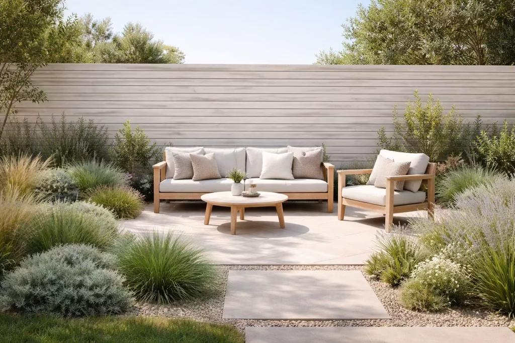
Colour is where modern fencing either elevates the garden or quietly clashes with it. Dark stains, such as charcoal or deep brown, tend to recede visually, allowing planting to take centre stage. Greens appear richer, flowers more vibrant, and the overall composition more grounded.
On the other end, soft neutrals and pale washes create a lighter, more open feel, particularly effective in sunlit gardens or coastal-inspired schemes. Natural tones, especially cedar or larch, sit somewhere in between, offering warmth without overpowering the palette.
In my projects, I often treat the fence as a backdrop rather than a feature. The finish should support the architecture and landscape, not compete with it.
Pro tip from experience: Test stain samples in natural light. What looks balanced in a showroom can feel completely different once it is exposed to sun and shadow.
Clean Edges and Concealed Fixings
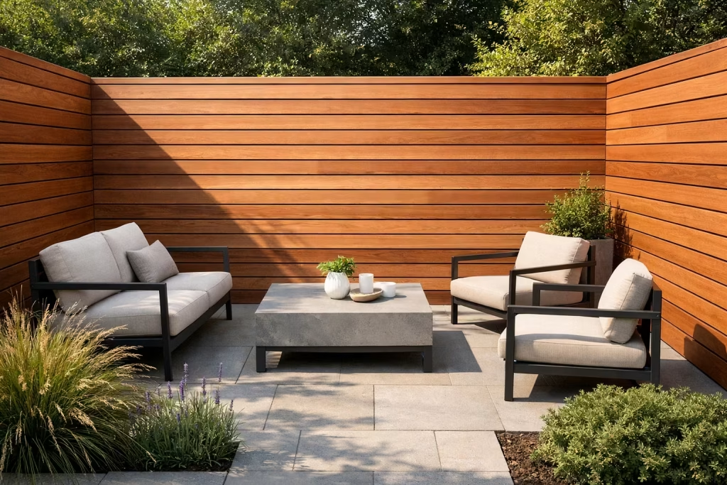
Detailing is where a modern fence earns its keep. Clean edges, sharp junctions, and concealed fixings create a seamless appearance that feels considered from every angle. Visible screws or uneven cuts, even if minor, can disrupt an otherwise refined design.
Where possible, I specify hidden fixings or rear-mounted systems to maintain uninterrupted surfaces. Posts are either aligned flush with the boards or recessed slightly to avoid visual clutter. These are small decisions, but they add up to a finish that feels crisp and deliberate.
The difference in feel: A fence with clean detailing reads as bespoke joinery. One with exposed fixings reads as basic construction.
Integration with Lighting and Planting
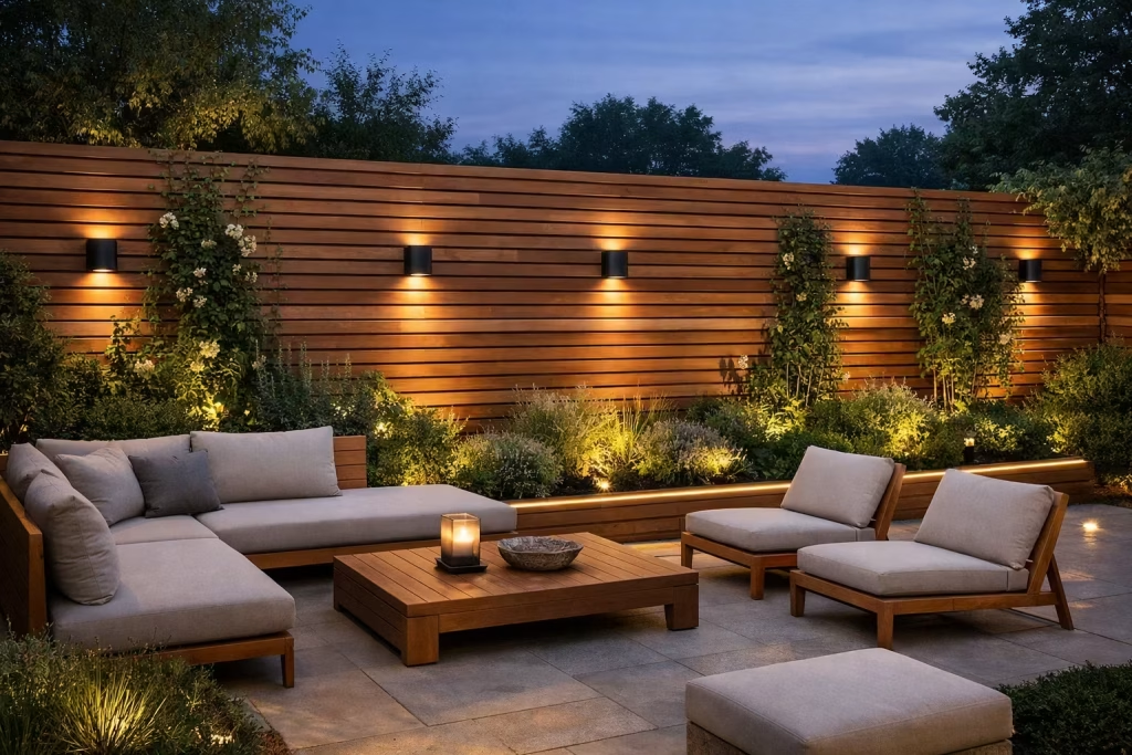
A modern fence does not stand alone. It works in tandem with lighting and planting to shape the overall atmosphere of the garden, particularly as the space transitions from day to evening.
Integrated lighting, such as low-level LED strips or recessed wall lights, can be subtly incorporated into the fence structure. This not only highlights the texture of the timber but also extends the usability of the garden after dark. I have found that even a simple wash of light along a timber surface can transform the space into something far more inviting.
Planting, meanwhile, softens the boundary and adds seasonal variation. Climbing plants, layered borders, or even structured greenery placed in front of the fence help break up linearity and introduce depth.
Real-life application: In one project, a simple horizontal slat fence became the anchor for the entire garden once we added soft uplighting and a row of structured planting. What started as a boundary quickly turned into a defining feature.
The Underlying Principle: Restraint with Precision
When all these elements come together, the result is not loud or attention-seeking. It is controlled, balanced, and quietly sophisticated. That is what makes a wooden fence feel modern. Not excess, not ornament, but clarity in every decision.
In the end, it is often the simplest fences, executed with precision, that leave the strongest impression and continue to feel relevant long after trends have moved on.
25 Modern Wooden Garden Fence Ideas
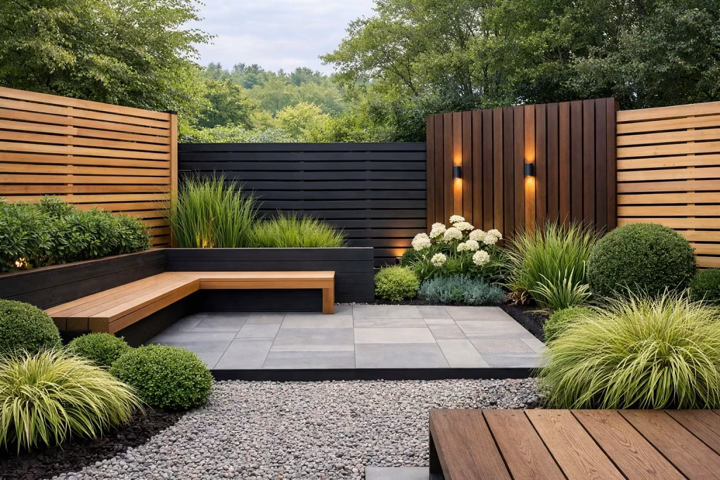
If you think a fence is just a boundary, you are leaving a lot on the table. The right timber design, thoughtfully detailed and quietly confident, can pull a whole garden together, framing views, softening edges, and setting the tone without shouting for attention.
From clean-lined slatted screens to richer, more textured compositions, these ideas are not just surface-level inspiration but grounded, real-world solutions, each one capable of transforming a garden from something ordinary into something that feels considered, cohesive, and built to last.
Horizontal Slat Fence for a Clean Architectural Look
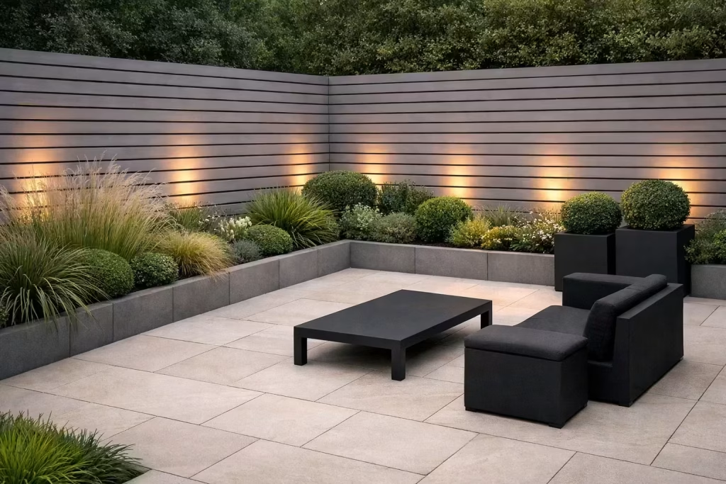
A horizontal slat fence is one of the sharpest ways to give a garden a modern edge. The long, linear boards create a calm visual rhythm, drawing the eye across the space rather than up and down. In a narrow garden especially, that side-to-side movement can make the boundary feel wider, less boxed in, and far more intentional. It is a simple idea, but when it is executed well, it punches well above its weight.
Design Insight
In real projects, I have found horizontal slats work best when the garden already has strong geometry, such as crisp paving, rectangular planting beds, or a contemporary rear elevation. They help everything click into place. I once used this approach on a compact terrace garden where the owner felt the plot was too tight and enclosed. By running the boards horizontally and keeping the spacing consistent, the whole space suddenly breathed. It stopped feeling like a corridor and started reading as a composed outdoor room.
The real trick is restraint. If the boards are too chunky, too busy, or badly spaced, the effect falls flat. But when the detailing is tight and the lines are clean, the fence becomes a quiet architectural backdrop rather than a noisy visual barrier.
Spatial + Measurement Guidance
For a modern look, slat widths of around 100 to 150 mm (4 to 6 inches) tend to work well. Narrower boards can feel more refined in smaller gardens, while wider boards give a bolder, more substantial finish. Spacing between slats usually sits around 10 to 20 mm (0.4 to 0.8 inches), depending on how much privacy and light you want to retain.
Height matters just as much. In a compact rear garden, a fence of around 1.8 to 2.1 m (6 to 7 feet) usually gives strong privacy without making the space feel oppressive. If the garden is particularly small or low-light, a slightly lighter treatment with partial gaps can stop the design from feeling like it has shut the door on daylight.
A good rule of thumb is this: the more limited the space, the more carefully the proportions need to be handled. Get that wrong and the fence can feel heavy-handed. Get it right and it quietly lifts the whole garden.
Material & Styling Notes
Cedar, larch, and pressure-treated softwood are all strong options, depending on budget and finish. Cedar has a lovely natural warmth and tends to age gracefully, while larch offers a slightly firmer grain and a more rugged character. Softwood is often the practical choice for larger runs, especially when stained in charcoal, walnut, or a soft weathered grey.
Styling-wise, horizontal slat fencing works beautifully with:
- slim black metal furniture
- pale stone or porcelain paving
- structured planting like grasses and clipped evergreens
- warm outdoor lighting
- matte finishes rather than shiny surfaces
I usually avoid pairing it with overly ornate garden elements. The design has a clean backbone, so it looks best when the rest of the garden follows suit. A case of less is more goes a long way here.
Pros
- Makes narrow gardens feel wider
- Creates a sleek, contemporary look
- Works well with modern architecture
- Provides a strong backdrop for planting
- Can feel premium even with a modest budget if detailing is good
Cons
- Requires accurate installation to avoid looking untidy
- Can feel visually busy if spacing is inconsistent
- May need careful staining or treatment over time
- Horizontal boards can emphasise any uneven ground levels if not handled properly
Timber Fence in Soft Charcoal Stain
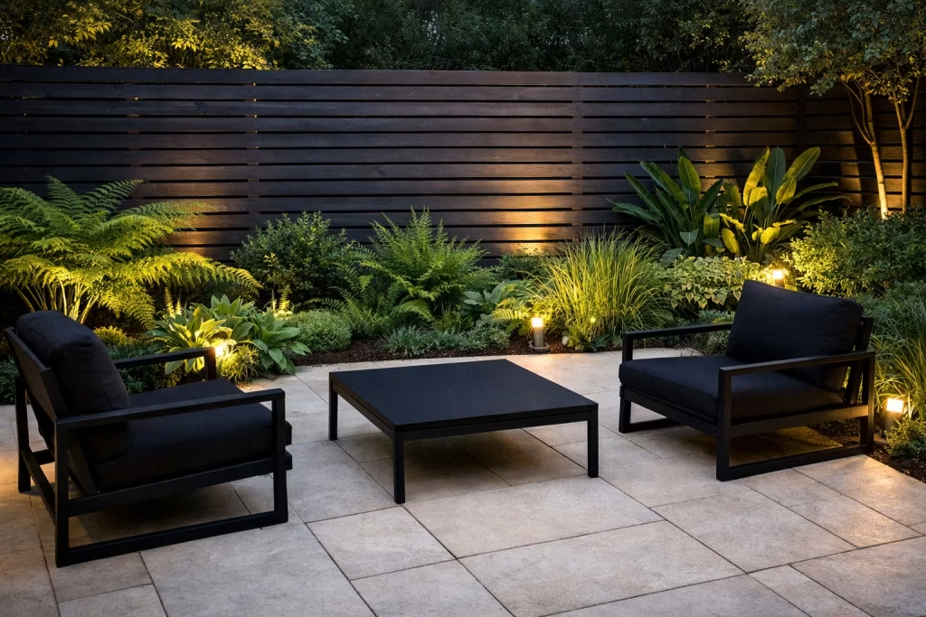
A soft charcoal-stained timber fence brings depth, contrast, and a quietly dramatic edge to a garden. Rather than competing for attention, it recedes into the background, allowing planting, furniture, and light to take centre stage. It is a subtle move, but one that can turn a flat garden into something visually layered and far more considered.
Design Insight
In practice, darker fencing acts almost like a gallery wall for the garden. I have used soft charcoal finishes in several residential projects where the planting felt underwhelming against lighter boundaries. The moment the fence shifted to a deeper tone, the greenery came alive. Leaves appeared richer, textures became more defined, and even simple planting schemes started to feel intentional.
There is also a psychological effect at play. Dark tones tend to blur edges, especially in the evening light, which helps the boundary feel less dominant. In one suburban garden, a previously pale fence made the space feel exposed and slightly unfinished. Once we introduced a charcoal stain, the perimeter visually fell away, creating a more intimate and composed outdoor room.
Spatial + Measurement Guidance
This approach works across both horizontal and vertical slat systems, but consistency is key. Board widths of 100–150 mm (4–6 inches) with tight, even spacing of 10–15 mm (0.4–0.6 inches) help maintain a crisp, modern rhythm.
For fence height, a standard 1.8 m (6 feet) boundary finished in charcoal tends to feel less imposing than the same height in a lighter tone, as the darker colour visually recedes. This makes it particularly effective in smaller gardens where height is necessary for privacy but needs to be handled with care.
If the garden is heavily shaded, I often soften the charcoal slightly toward a warm grey to avoid the space feeling too enclosed.
Material & Styling Notes
Cedar and larch both take charcoal stains exceptionally well, allowing the natural grain to remain visible beneath the darker finish. Pressure-treated softwood can also work, provided the stain is applied evenly and maintained over time.
From a styling perspective, charcoal fencing pairs especially well with:
- lush green planting, including ferns, grasses, and shrubs
- pale paving such as limestone or light porcelain
- black or powder-coated metal furniture
- warm-toned outdoor lighting, which creates a soft contrast against the dark surface
It is a balancing act. The fence sets a strong backdrop, so the rest of the palette should either complement or gently contrast, not compete.
Pros
- Enhances the colour and texture of planting
- Creates a refined, high-end look with minimal effort
- Helps boundaries visually recede, making spaces feel more composed
- Works well in both modern and transitional garden designs
Cons
- Can absorb more heat in direct sunlight
- May feel heavy in very small or low-light gardens if not balanced properly
- Requires periodic maintenance to keep the finish even
- Imperfections in timber can be more noticeable under darker stains if poorly prepared
Warm Natural Cedar for a Relaxed Premium Finish
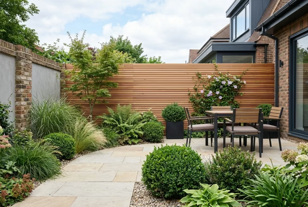
Warm natural cedar brings an immediate sense of ease to a garden. It has that rare quality of feeling both elevated and approachable, which is exactly why it works so well in modern outdoor schemes. The tone is soft, sunlit, and quietly luxurious, giving the fence a sense of depth without making it feel overdesigned. It is the sort of finish that does not need to shout to be noticed.
Design Insight
From experience, cedar is one of those materials that tends to get better with context. Against brick, stone, and pale render, it settles beautifully into the architecture, picking up warmth from masonry while softening the harder edges of the house. In one project, a pale rendered extension felt a little stark at the boundary. Once we introduced cedar fencing, the whole composition suddenly felt more grounded and far more coherent, as though the garden and the house were speaking the same language.
That is the real strength of cedar. It bridges old and new with very little effort. It is modern, yes, but not in a cold or clinical way. It has enough natural variation to keep the surface alive, which means it never feels flat or mechanical. In the right setting, it can make even a simple fence look polished and intentional, almost like bespoke joinery wrapped around the garden.
Spatial + Measurement Guidance
Cedar fencing works particularly well when the proportions are kept clean and restrained. Boards in the 100 to 125 mm (4 to 5 inch) range usually feel elegant and well balanced, while a slim gap of 10 to 15 mm (0.4 to 0.6 inches) can help preserve a light, breathable quality.
For a standard boundary, 1.8 m (6 feet) is often enough to provide privacy without overwhelming the space. In gardens with strong architectural lines or large glazing, cedar can also be used in lower sections of around 1.2 to 1.5 m (4 to 5 feet) to define areas without blocking views completely. That little bit of breathing room can make all the difference.
The key is to let the timber do its job without crowding it with too many competing elements. Cedar looks its best when there is space around it, both visually and physically.
Material & Styling Notes
Cedar has a naturally warm tone that ranges from honeyed amber to soft reddish brown, depending on the cut and finish. Left untreated, it will gradually silver over time, which can be very beautiful in the right setting. If the goal is to preserve the original warmth, a clear protective treatment or a light oil finish is usually the better route.
It pairs particularly well with:
- brick walls and boundary detailing
- natural stone paving
- pale render and crisp white facades
- soft planting with grasses, ferns, and structural evergreens
- muted furniture in taupe, black, or weathered timber tones
I often find cedar works best when the rest of the garden is kept quiet and composed. It has enough character to carry the scheme, so there is no need to layer in too much visual noise. Too many competing materials and the whole thing can lose its footing.
Pros
- Adds warmth and softness to modern gardens
- Complements brick, stone, and render beautifully
- Ages gracefully, often improving in character over time
- Feels premium without needing heavy ornament
- Works across both contemporary and transitional designs
Cons
- Typically more expensive than standard softwood
- Can fade or silver if left untreated
- Needs proper detailing to avoid unnecessary weathering
- May not suit schemes that call for a very sharp, industrial finish
You May also Like: What an English Country Entrance Is Actually Trying to Do
Shadow Gap Fence for Subtle Depth
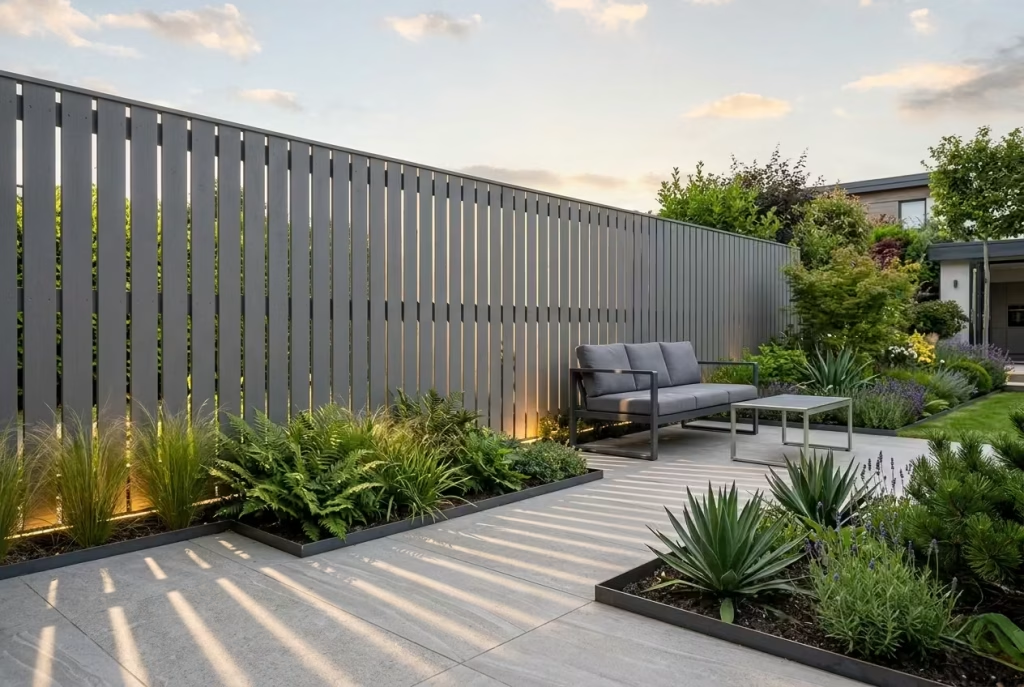
A shadow gap fence relies on small, deliberate spacing between the boards to create a lighter, more refined result. Rather than forming a solid visual block, the surface catches light and shadow in a way that gives the fence quiet depth. It is a subtle design move, but one that can stop a boundary from feeling heavy-handed. In the right setting, it has a beautifully understated presence, almost like a tailored suit rather than a stiff uniform.
Design Insight
I have found shadow gap fencing works especially well when a garden needs privacy but cannot afford to feel boxed in. The slight separation between boards introduces rhythm without disrupting the overall calm of the space. In one residential scheme, the garden felt too closed off with a fully solid fence, despite the proportions being correct. By introducing narrow gaps, we kept the screening intact but gave the surface enough breathing room to feel lighter, cleaner, and more sophisticated.
That is the real strength of this approach. It does not try too hard. It simply lets the eye move across the surface with a little more ease, and that small shift can make a big difference. When the boards are evenly spaced and the shadow lines are consistent, the fence gains a refined, almost bespoke quality that reads as quietly expensive.
Spatial + Measurement Guidance
Shadow gap fencing usually works best with board widths of around 100 to 120 mm (4 to 5 inches), paired with gaps of 8 to 15 mm (0.3 to 0.6 inches). Those proportions are small enough to preserve privacy while still allowing light to articulate the surface.
For a standard boundary height of 1.8 m (6 feet), the effect is particularly effective because the fence does not look like a solid wall. Instead, it has a lighter visual weight, which can help smaller gardens feel less compressed. If the plot is narrow or shaded, keeping the gaps slightly tighter is usually the safer bet. Too much spacing and the fence can start to lose its sense of purpose.
A useful rule of thumb is this: the narrower the garden, the more careful the spacing needs to be. A fence like this should feel crisp and composed, not flimsy or overly open.
Material & Styling Notes
Shadow gap fences suit timber species with a clean grain and a stable finish, such as cedar, larch, or quality pressure-treated softwood. Because the gaps become part of the design language, the surface finish needs to be neat from the outset. Rough cuts or uneven boards can undo the whole effect in a heartbeat.
This style works particularly well with:
- pale stone or porcelain paving
- structured planting in repeating forms
- minimalist outdoor furniture
- soft lighting that grazes the surface at dusk
- muted stain colours, such as weathered grey, soft brown, or charcoal
I often recommend this approach when the garden needs a sense of detail without visual clutter. It gives you texture, rhythm, and privacy all at once, which is no small feat.
Pros
- Creates a lighter, more refined boundary
- Adds subtle depth and shadow play
- Feels premium without being flashy
- Helps solid fencing avoid looking too heavy
- Works well in contemporary and design-led gardens
Cons
- Requires accurate installation for a clean finish
- Can offer slightly less privacy than solid boarding
- May not suit very exposed sites if stronger screening is needed
- Uneven spacing becomes noticeable quickly, so workmanship matters
Mixed-Width Timber Panels for Visual Interest
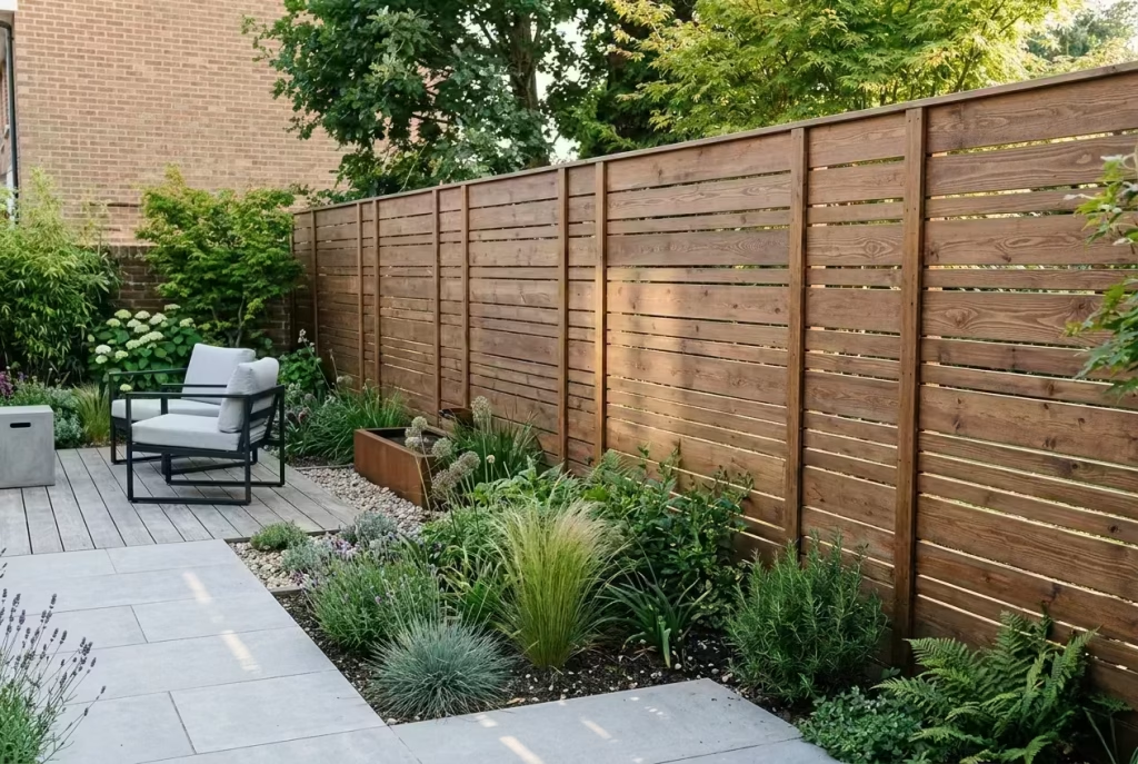
Using boards of varied widths is a clever way to introduce subtle texture without tipping into visual chaos. Unlike fences that rely on ornate detailing or colour contrasts, mixed-width timber panels achieve interest through proportion and rhythm. The result is a quiet, considered surface that feels layered, tactile, and undeniably modern. It is a restrained way of letting a boundary speak for itself without shouting.
Design Insight
In my experience, mixed-width panels work best when paired with minimal surrounding elements. I once applied this technique in a mid-sized suburban garden where the house had clean-lined architecture. By alternating 100 mm (4-inch) and 150 mm (6-inch) boards in a repeating, irregular rhythm, the fence gained a sculptural quality. Neighbours even commented on how it “felt bespoke” despite the simple material choice. The key is restraint: too many widths, or a chaotic pattern, and the fence suddenly competes with planting and paving instead of supporting them.
This approach also plays well with natural variation in timber grain and tone. Slight differences in colour and texture enhance the depth, making the fence feel intentional, tactile, and alive, rather than manufactured or flat.
Spatial + Measurement Guidance
- Board widths: Typically a mix of 100 mm and 150 mm (4–6 inches) works best. Some schemes incorporate a third narrower board (around 75 mm / 3 inches) for occasional rhythm, but sparingly.
- Spacing: Keep gaps minimal, around 10–15 mm (0.4–0.6 inches), to maintain privacy while highlighting the pattern.
- Height: Standard 1.8 m (6 feet) works for most rear boundaries, but taller fences can amplify the pattern vertically, particularly in long or narrow gardens.
Proportional thinking is critical here. The varied widths create texture, but the overall scale of the panels relative to the garden size must be considered. Otherwise, the pattern can feel cramped or overwhelming.
Material & Styling Notes
Cedar, larch, and treated softwood are ideal for this approach. The natural variations in colour and grain enhance the effect of the alternating widths, creating a sophisticated, tactile surface. A subtle stain in grey, charcoal, or warm brown unifies the panels without flattening the variation.
Styling cues:
- Pair with minimalist planting or structured hedges
- Works beautifully alongside stone, porcelain, or timber decking
- Ideal for modern or transitional homes where texture is the star, not colour
Pros
- Adds subtle texture and depth without ornament
- Creates a bespoke, high-end feel
- Works well in both small and large gardens
- Enhances natural timber character
Cons
- Requires careful planning and installation to avoid visual imbalance
- Overcomplicating the mix of widths can feel chaotic
- Gaps must be consistent or the pattern loses cohesion
- Slightly more labour-intensive than standard uniform panels
Slatted Fence with Built-In Planter Boxes
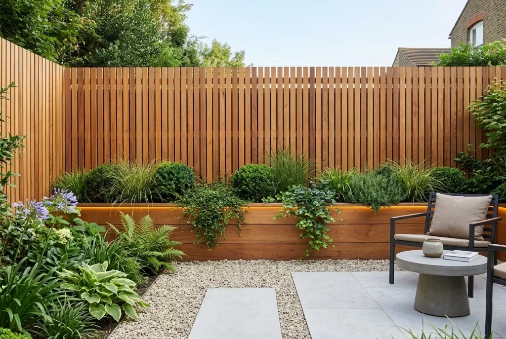
A slatted fence with built-in planter boxes is a smart way to stop a boundary from feeling like a hard stop. By combining vertical structure with living planting, the fence becomes part of the garden rather than a separate line drawn around it. The effect is softer, fuller, and far more layered, with the timber and greenery working hand in glove. It is one of those ideas that quietly earns its keep, because it adds beauty and function in the same breath.
Design Insight
I have always found that fences can feel a little too blunt on their own, especially in smaller residential gardens where every surface is visible at once. Adding planter boxes changes the whole read of the boundary. It breaks up the long run of timber, introduces depth at eye level, and gives the garden a more settled, designed feel. In one project, a plain slatted fence felt technically correct but visually flat. Once we added a series of integrated planters with clipped grasses and trailing planting, the fence stopped looking like a perimeter and started reading as part of the landscape. It was a classic case of a little goes a long way.
This approach also helps blur the handover between built form and planting. Instead of having a fence on one side and a border on the other, the two elements meet in the middle. That softens the whole composition and gives the garden a more lived-in, layered quality. It is the sort of detail that makes a space feel as though it has been thought through, not just assembled.
Spatial + Measurement Guidance
For the slatted section, board widths of around 100 to 125 mm (4 to 5 inches) work well, with consistent gaps of 10 to 15 mm (0.4 to 0.6 inches) for a balanced look. The planter boxes themselves should be proportioned carefully so they do not overwhelm the fence. A depth of around 300 to 450 mm (12 to 18 inches) is usually enough for most ornamental planting, while a height of 400 to 600 mm (16 to 24 inches) can give the planting enough presence without making the base of the fence feel bulky.
In tighter gardens, keeping the planters low and narrow is usually the safer move. Otherwise, the fence can start to feel bottom-heavy, which is a poor trade-off. The aim is to add softness, not visual weight. A well-judged planter should feel like it belongs there from the start, not like it was squeezed in after the fact.
Material & Styling Notes
This type of fence works best in cedar, larch, or high-quality pressure-treated timber, depending on the finish and maintenance expectations. Cedar tends to give the most refined look, especially if the planters are lined neatly and the planting is kept controlled. Larch offers a slightly more robust character, while treated softwood is a practical option for larger runs or more budget-conscious schemes.
For planting, I usually recommend a combination of:
- structured grasses for movement
- evergreen topiary or clipped shrubs for year-round form
- trailing plants to soften the edges of the boxes
- seasonal colour for moments of interest without clutter
Styling-wise, this idea sits beautifully alongside:
- pale paving or gravel
- slim outdoor furniture
- warm, understated lighting
- neutral pots and restrained finishes
The fence should remain the backbone, with the planting acting as the finishing touch. Too much variety and the whole thing loses its footing. Keep it composed and it will feel all the more elegant.
Pros
- Softens a hard boundary and makes the fence feel integrated
- Adds depth, texture, and planting at eye level
- Works especially well in compact gardens
- Helps create a more finished, bespoke appearance
- Combines structure and greenery in one design move
Cons
- Requires good drainage and proper construction
- Needs regular planting maintenance to stay tidy
- Can become visually heavy if the boxes are oversized
- More expensive and involved than a standard fence alone
You May also Like: 25 Outdoor Tiles for Floor Stylish Patio, Garden and Terrace Flooring Ideas
Fence with Integrated Bench Seating
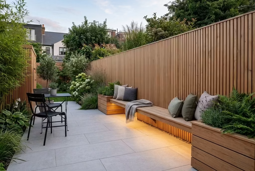
In compact gardens, every surface must pull double duty, and a fence with integrated bench seating is a prime example. It transforms a simple boundary into a functional feature, giving the garden a place to sit, pause, and enjoy the surroundings while keeping circulation clear. The combination of timber fence and seating creates a seamless flow, making the garden feel more considered and spatially efficient—like clever furniture that doubles as architecture.
Design Insight
From my real-world experience, integrated seating is one of the smartest ways to add usability without clutter. I once worked on a small city garden where space was tight, and standalone benches would have cramped circulation. By designing a continuous bench along a slatted timber fence, the owners gained a functional area for morning coffee or evening drinks, while the fence remained visually light and uncluttered. It was a subtle trick, but it completely changed how the garden was used, making it feel far larger and more purposeful.
The key to success lies in proportion. The bench must be comfortable to sit on without dominating the boundary or obstructing the planting. When well-detailed, it reads as an intentional part of the fence rather than an afterthought.
Spatial + Measurement Guidance
- Seat height: 430–460 mm (17–18 inches) is standard for comfortable seating.
- Seat depth: 400–450 mm (16–18 inches) works well for most adults without feeling cramped.
- Fence height: Maintain the standard 1.8 m (6 feet) for privacy, allowing the backrest to integrate naturally with the fence panels.
- Structure: Ensure support posts are strong enough to carry seating load without flexing. Reinforced timber or hidden steel brackets can provide stability.
For narrow gardens, continuous bench runs along one boundary are usually better than intermittent seating, as they maximize both circulation and usable area. Small adjustments to seat height or depth can make all the difference in creating a fence that feels like it belongs to the space rather than imposed on it.
Material & Styling Notes
Cedar and larch work beautifully for integrated seating thanks to their warmth and natural grain. Softwood can also be used, provided it is treated and maintained. I often pair this style with:
- Cushions in muted tones to soften timber edges
- Subtle planter boxes at either end to blend seating into planting beds
- Low-level lighting beneath the bench to create evening ambience
The aim is a composition that balances structure, comfort, and aesthetics without overcrowding the garden.
Pros
- Maximizes functionality in compact gardens
- Integrates seating seamlessly with the fence
- Creates a cohesive, design-led look
- Encourages more use of outdoor space
- Adds value and visual interest without extra clutter
Cons
- Requires careful structural detailing to ensure stability
- Slightly higher cost due to materials and labour
- Needs occasional maintenance if timber is exposed to weather
- Poor proportioning can make it uncomfortable or visually heavy
Vertical Timber Fencing for Taller, Narrower Spaces
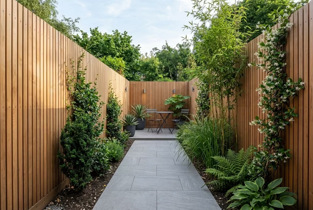
Vertical timber fencing is the natural counterpoint to the horizontal slat trend, and in the right setting it can be just the ticket. Where horizontal boards broaden a space, vertical boards draw the eye upward, helping a narrow garden feel taller, more enclosed, and more defined. It is a practical design move, but it also carries a certain quiet authority. In a slim plot, that vertical rhythm can make the boundary feel purposeful rather than awkward, turning a limitation into a design feature.
Design Insight
I often reach for vertical fencing when height matters more than width. In long, narrow gardens, the eye can sometimes skate straight to the end of the plot without ever settling. Vertical boards interrupt that horizontal pull and give the space a stronger sense of enclosure. I have used this approach on terraces where the brief was privacy first, atmosphere second, and it always helped the garden feel more composed. One project in particular had a modest width but a strong sense of depth, and the vertical lines gave the boundary a quiet lift, almost like raising the ceiling outdoors.
What I find especially useful is the way vertical fencing can feel both practical and refined. It offers the height required to shield a garden from neighbouring views, but it does so with a little more elegance than a heavy, flat screen. Done well, it feels crisp, tailored, and reassuringly solid without becoming overbearing.
Spatial + Measurement Guidance
Vertical boards tend to work best when the proportions are kept clean and disciplined. Board widths of around 75 to 125 mm (3 to 5 inches) usually feel well balanced, especially when paired with consistent gaps of 8 to 15 mm (0.3 to 0.6 inches). Narrower boards can make the fence feel more refined and less bulky, which is especially useful in tight spaces.
For height, vertical fencing often performs best at 1.8 to 2.4 m (6 to 8 feet), depending on the level of privacy required and local planning considerations. In narrow gardens, even a modest increase in height can significantly improve the sense of seclusion without eating into the usable footprint. The key is to avoid making the fence feel too dense. If the boards are too wide or too closely packed, the whole thing can start to feel heavy-handed.
A good rule of thumb is this: the more compact the garden, the more important it is to keep the vertical rhythm crisp and measured. When the proportions are right, the fence feels uplifting rather than oppressive.
Material & Styling Notes
Vertical fencing works well in cedar, larch, or treated softwood, with cedar giving the most naturally refined finish. A stain in soft charcoal, muted brown, or weathered grey can help the boards sit comfortably against planting and paving, while a natural finish keeps the surface warmer and more relaxed.
This style pairs particularly well with:
- tall, architectural planting
- climbing plants that reinforce the vertical movement
- slimline paving layouts
- rendered or brick garden walls
- simple, contemporary outdoor furniture
I tend to avoid overly busy surroundings with this type of fence. The vertical lines already carry plenty of visual energy, so the rest of the garden should give them space to breathe. Too many competing details and the effect can start to fray at the edges.
Pros
- Adds height and privacy without widening the visual footprint
- Works especially well in narrow or enclosed gardens
- Creates a strong architectural presence
- Can feel refined and tailored when detailed properly
- Complements tall planting and contemporary landscaping
Cons
- Can feel heavy if boards are too wide or too closely spaced
- May visually shorten very long gardens if not balanced carefully
- Needs precise installation to maintain a clean rhythm
- Less suited to schemes that want a wide, expansive feel
Stained Timber Fence with Black Metal Posts
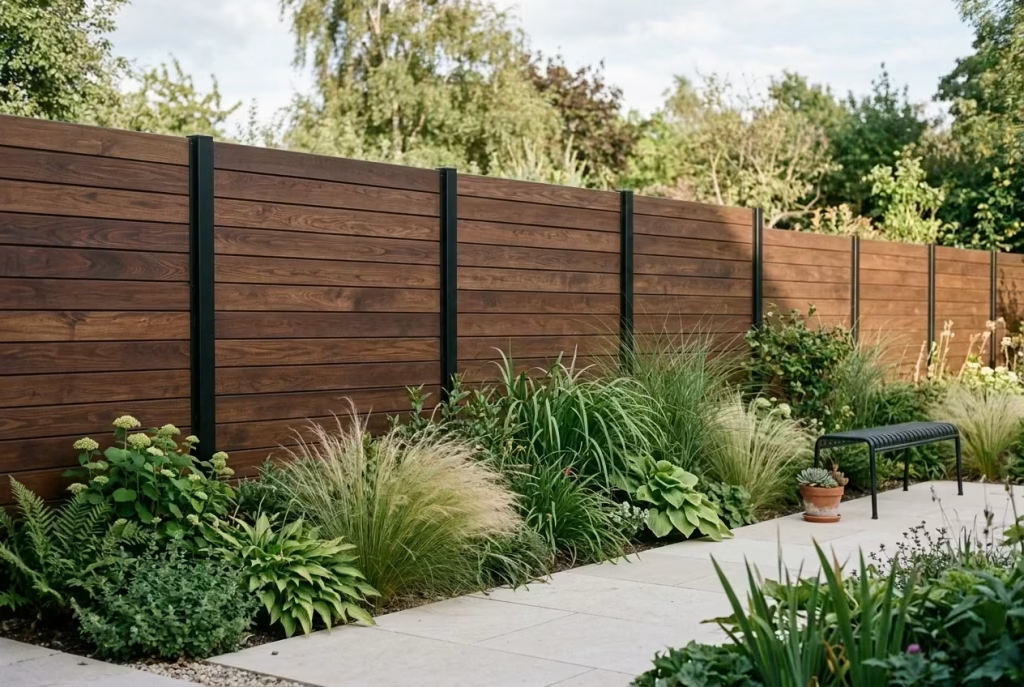
Marrying natural timber with sleek black metal posts creates a fence that feels both modern and architectural. The combination balances warmth with precision, giving the boundary a sculptural presence without overwhelming the garden. Timber softens the starkness of the metal, while the black posts introduce a rhythm and structure that reads like bespoke joinery. In short, it is a design that whispers sophistication rather than shouting it.
Design Insight
From real-world projects, I’ve found this hybrid approach works beautifully in transitional gardens, where homeowners want a contemporary feel without losing the human warmth of timber. One particular terrace garden springs to mind: the owner wanted a boundary that looked considered from both street and garden, but the plot was long and narrow. By introducing black metal posts at regular intervals, paired with deep walnut-stained timber boards, the fence gained a strong sense of order and architectural clarity. The metal punctuated the line, creating a visual beat, while the timber softened the overall impression, making the boundary feel inviting rather than industrial.
This is the sort of design that rewards patience and attention to proportion. In my experience, fences like this are quietly transformative. They give you the best of both worlds: timber’s natural texture and warmth, plus metal’s structural crispness. When executed correctly, the fence can anchor a garden scheme, frame planting beautifully, and add a subtle luxury that endures over time.
Spatial + Measurement Guidance
- Timber boards: Widths of 100–125 mm (4–5 inches) work well; thinner boards can feel more delicate, while wider boards give a bolder statement.
- Spacing: Keep gaps around 10–15 mm (0.4–0.6 inches) for a clean, modern feel while retaining some light and air.
- Metal posts: Place posts at 1.8–2.4 m (6–8 feet) intervals depending on fence length and board width, ensuring stability without interrupting the rhythm.
- Height: Standard 1.8 m (6 feet) is usually sufficient for privacy, but taller posts can be introduced for taller timber or when privacy is paramount.
The interplay between timber and metal is all about balance. Too many posts and the fence reads like scaffolding; too few, and the boards can sag or look unsupported. Proper spacing ensures a sleek line while keeping the timber perfectly anchored.
Material & Styling Notes
For the timber, cedar, larch, or treated softwood all take stains beautifully. Darker stains—charcoal, walnut, or deep brown—tend to harmonise best with black metal, accentuating the rhythm and sophistication. Black powder-coated steel posts give a subtle industrial edge without dominating the design.
Styling-wise, this approach complements:
- Minimalist paving or decking in pale stone or concrete
- Architectural planting such as ornamental grasses, clipped hedges, or vertical climbers
- Outdoor furniture in muted tones or black metal accents to echo the posts
- Subtle lighting that grazes the timber for texture in the evening
It is a style that looks intentionally curated rather than slapped together. The metal posts offer punctuation, the timber provides warmth, and the combination elevates even a simple backyard into a space that feels well-considered and premium.
Pros
- Architectural, modern, and crisp look
- Timber warmth balances metal precision
- Can frame planting and garden features beautifully
- Highly durable when materials are chosen and maintained correctly
- Offers a sense of rhythm and bespoke design
Cons
- Requires precise installation for a seamless appearance
- Metal posts add cost compared with timber-only solutions
- Stains and finishes need periodic maintenance to retain colour and prevent fading
- Can feel heavy-handed if spacing or timber-to-metal ratio is misjudged
You May also Like: 15 Overlooked ’70s Home Exterior Ideas Worth Rediscovering
Board-on-Board Fence for Privacy with Texture
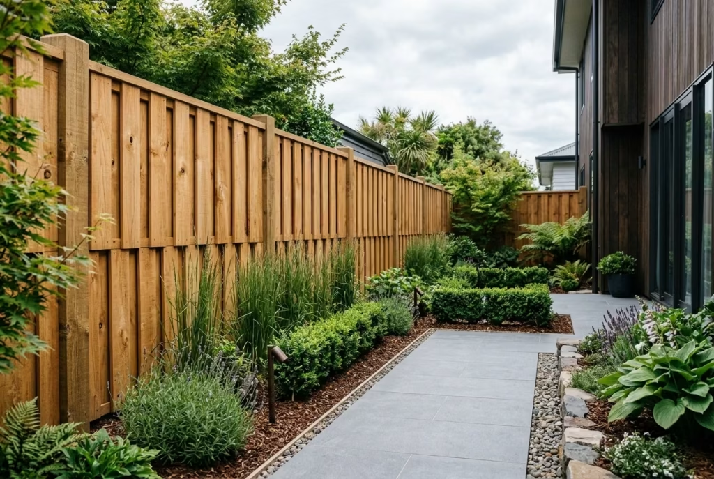
A board-on-board fence is the ultimate solution when privacy is non-negotiable, yet you want to avoid a flat, uninspiring boundary. By overlapping boards, this style creates a layered texture that reads as rich and considered rather than utilitarian. The subtle shadow lines formed by the staggered layers add depth and interest, giving a sense of craftsmanship even in a relatively straightforward design. In essence, it keeps prying eyes at bay while giving the fence a quietly sophisticated personality.
Design Insight
From my real-world projects, board-on-board fencing is a lifesaver in urban or semi-urban gardens where exposure can make a space feel vulnerable. One project immediately springs to mind: a long, narrow garden bounded by neighbouring terraces felt claustrophobic with a standard solid fence. By introducing a board-on-board solution with staggered widths and a muted oak stain, the boundary suddenly gained warmth and depth.
The fence no longer felt like a wall but rather a carefully composed backdrop that gave the garden its own private world.
This approach also plays beautifully with light. As the day moves, the overlapping boards catch shadows in a way that gives the surface life. Unlike flat fences, which can look static and dull, board-on-board fences evolve visually through the day, subtly reinforcing the perception of texture, rhythm, and quality.
Spatial + Measurement Guidance
- Board widths: Typically 100–125 mm (4–5 inches) works best; alternating slightly wider or narrower boards can increase visual rhythm.
- Overlap: Boards should overlap by 20–30 mm (0.8–1.2 inches) to ensure privacy while still allowing for natural expansion and contraction of timber.
- Spacing: Keep gaps minimal—around 5 mm (0.2 inches)—so that the fence screens effectively but does not feel heavy or boxy.
- Height: Standard 1.8 m (6 feet) is sufficient for most residential gardens, but taller fences up to 2.4 m (8 feet) can be used in highly exposed sites.
In narrow gardens, this approach is particularly effective because the layered design draws the eye along the vertical plane, helping the space feel enclosed yet sophisticated, rather than oppressive. Proportions matter: boards that are too wide or too closely spaced can flatten the effect, while too small an overlap can compromise privacy.
Material & Styling Notes
Cedar, larch, and treated softwood are ideal for board-on-board fences. Cedar provides a warmer, more premium aesthetic, while larch offers durability and a subtle variation in tone. A soft stain in natural or charcoal shades helps unify the boards and enhances the shadow effect, while still letting the timber’s grain breathe.
Styling recommendations include:
- Pair with architectural planting like structured hedges or upright grasses
- Minimal paving to let the texture of the fence shine
- Outdoor lighting that grazes the surface to emphasize shadows and depth
- Complementary neutral furniture and restrained planting palettes
The key is restraint: the fence itself carries enough visual interest, so the surrounding garden should support, rather than compete with, its layered texture.
Pros
- Offers complete privacy without appearing heavy-handed
- Adds texture and depth to the boundary
- Feels bespoke and considered without ornate detailing
- Works particularly well in exposed or urban gardens
- Creates a premium backdrop for planting and outdoor features
Cons
- More labour-intensive to install than a standard fence
- Requires careful detailing to prevent gaps that compromise privacy
- Timber expansion and contraction must be accounted for
- Slightly higher material cost due to overlapping boards
You May also Like: 16 Stunning Japandi Front Doors That Perfectly Blend Warmth and Minimalism
Louvered Wooden Fence for Controlled Privacy
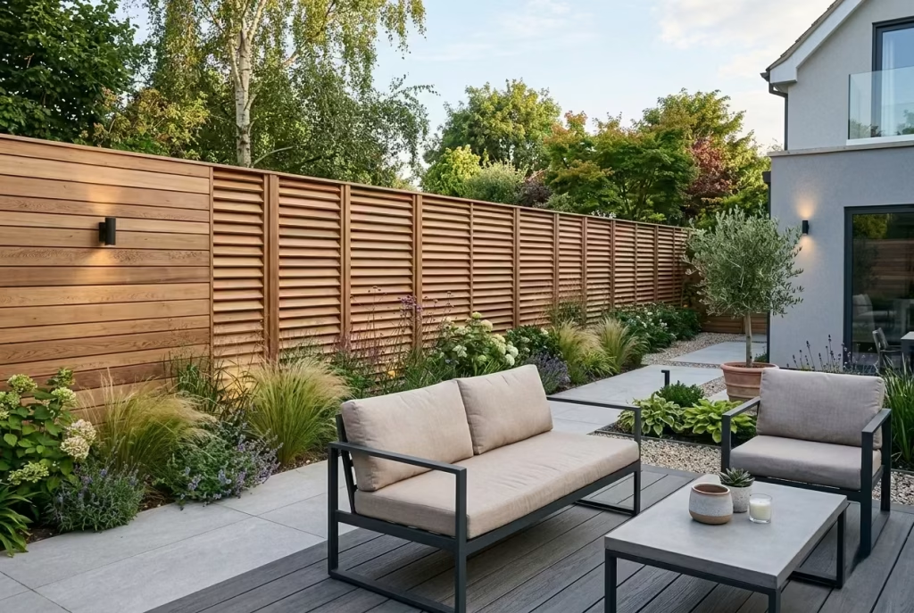
A louvered wooden fence is a smart choice when a garden needs to breathe as well as screen. The angled slats allow air to move through the boundary while still filtering views, creating a softer and more relaxed sense of privacy than a solid fence. It is particularly useful in gardens where complete enclosure would feel too heavy, or where a little visual openness helps the space feel less hemmed in. In design terms, it is a graceful compromise that gives you privacy without putting the shutters down completely.
Design Insight
In practice, I often find louvered fencing works best in gardens that feel exposed to neighbours but still benefit from daylight and airflow. I once used this approach on a side return garden where the owner wanted privacy from overlooking windows but did not want the space to feel boxed in. The angled boards gave the boundary a layered quality, almost like a veil rather than a wall. It softened the transition between private and public space, which made the whole garden feel more composed and less defensive.
What makes this solution so effective is its subtlety. It does not try to hide everything. Instead, it filters the view, which is often far more elegant. You get enough screening to feel comfortable, but the garden still has that sense of lift and openness that keeps it from becoming claustrophobic. That is the sweet spot, and when a fence hits it, the whole space tends to sing.
Spatial + Measurement Guidance
The angle of the louvers is what controls the balance between privacy and openness. Slats are commonly set at an angle of around 30 to 45 degrees, which tends to provide a good compromise between screening and airflow. Shallower angles allow more visibility through the fence, while steeper ones offer greater privacy but reduce light and movement.
Board widths of 75 to 125 mm (3 to 5 inches) usually work well, with consistent spacing so the rhythm feels calm rather than fussy. For height, 1.5 to 2.1 m (5 to 7 feet) is typical depending on how much enclosure is needed. In smaller gardens, I would usually avoid over-tall louvers unless there is a strong reason for full screening, because the angled surfaces can already add visual weight if not proportioned carefully.
A useful rule of thumb: the more the garden needs to breathe, the more restrained the louver angle should be. Push it too far and the fence can start to feel closed off, which defeats the purpose. Keep it measured and the result feels effortless.
Material & Styling Notes
Louvered fencing suits cedar, larch, and good-quality pressure-treated softwood. Cedar is often the most elegant option because its natural grain and warm tone complement the angled geometry beautifully. A soft stain in weathered grey, mid-brown, or charcoal can help the surface feel more refined and settle it into a contemporary palette.
This style works especially well with:
- light planting that moves in the breeze
- contemporary paving or decking
- slim outdoor furniture
- subtle lighting that picks up the slatted rhythm
- restrained, architectural borders rather than busy mixed planting
It is worth remembering that louvered fencing already brings a fair amount of visual detail, so the rest of the garden should not be overworked. Keep the setting clean and it will do the heavy lifting for you. Too many competing elements and the design can lose its thread.
Pros
- Offers privacy while allowing airflow
- Softens the feel of a boundary without making it transparent
- Works well in compact or overlooked gardens
- Adds a tailored, architectural quality
- Can feel lighter than a fully solid fence
Cons
- More complex to build than standard vertical or horizontal fencing
- Can be costlier due to precision detailing
- Privacy level depends heavily on angle and spacing
- May require careful maintenance to keep the slats aligned and visually tidy
Timber Fence Framed with Gravel or Sleeper Borders
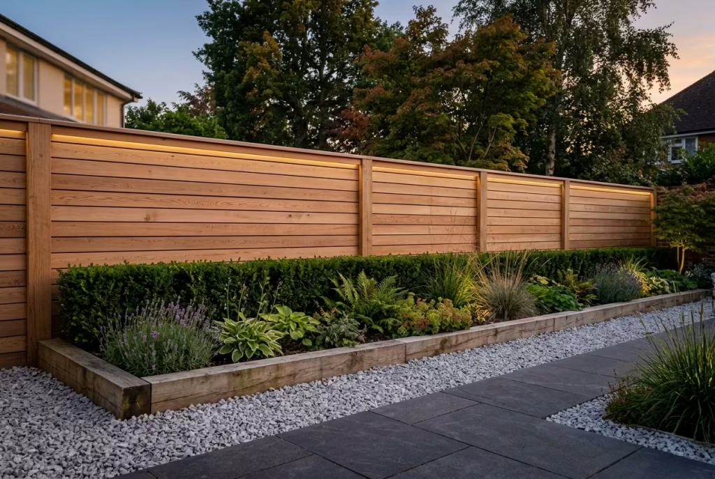
A fence does not exist in isolation—how it meets the ground and interacts with its surroundings can dramatically affect its overall impression. Framing a timber fence with gravel beds or timber sleeper borders transforms it from a plain boundary into a polished, considered feature. The edging acts like a picture frame: it grounds the fence, enhances its texture, and gives the garden a sense of finish. Small details like these are often the difference between a fence that feels tacked-on and one that reads as an integrated, high-end design.
Design Insight
From my experience, even a beautifully crafted timber fence can fall flat if the base is neglected. I recall a project where a homeowner had installed a horizontal cedar fence along a narrow suburban garden. Initially, the boundary looked good but slightly unmoored, like it was floating above the paving. By introducing a gravel bed along the base, edged with low timber sleepers, the fence suddenly felt anchored. The contrast of materials highlighted the warm cedar and provided a neat separation from planting. The visual rhythm was instantly improved, and the garden as a whole felt far more intentional.
Context matters: the edge treatment can subtly reinforce the style of the fence. Gravel beds create a light, contemporary feel, particularly in minimalist gardens, while timber sleepers bring a structured, tactile weight that complements naturalistic planting or rustic materials. This layering is a small detail, but it elevates the boundary from purely functional to design-led.
Spatial + Measurement Guidance
- Gravel bed depth: Typically 100–150 mm (4–6 inches) is sufficient for a neat visual border while preventing weed growth and ensuring proper drainage.
- Sleeper height: Low timber sleepers of 150–200 mm (6–8 inches) work well to define the base and anchor the fence visually.
- Width of border: A 300–450 mm (12–18 inch) border keeps the framing proportional to standard 1.8 m (6 ft) fence heights. Too wide, and it can feel bulky; too narrow, and it fails to make an impact.
- Spacing from planting: Keep a small gap (~50 mm / 2 inches) between border and planting to avoid overcrowding and allow maintenance access.
Proper proportions ensure the fence feels grounded without dominating the garden. It’s a case where minor adjustments in edging can make the whole boundary read as intentional and well-composed.
Material & Styling Notes
- Gravel: Fine, muted tones like pale grey, soft beige, or charcoal complement most timber finishes and create a modern, understated base.
- Timber sleepers: Match or contrast with the fence depending on the desired effect—matching for cohesion, contrasting for emphasis. Oak, cedar, or larch are ideal for durability and aesthetic quality.
- Planting integration: Low grasses, clipped hedges, or small ornamental shrubs can sit behind or beside the border for a layered, harmonious look.
Styling cues:
- Gravel emphasizes minimalism and lightness
- Timber sleepers add texture and weight, reinforcing architectural qualities
- Borders can be combined with subtle lighting to accentuate the fence line at night
The overall principle is that fences do not exist in a vacuum—the base treatment subtly communicates care, cohesion, and refinement.
Pros
- Visually anchors the fence, giving it presence
- Enhances the texture and material quality of timber
- Offers a neat, low-maintenance edge
- Can integrate planting or lighting seamlessly
- Adds a finishing touch that elevates the garden design
Cons
- Adds additional installation cost and effort
- Gravel requires occasional topping up, sleepers may weather over time
- Needs careful proportioning to avoid looking too bulky or narrow
- Can constrain planting immediately adjacent if not properly planned
Fence and Gate Match for a Seamless Boundary
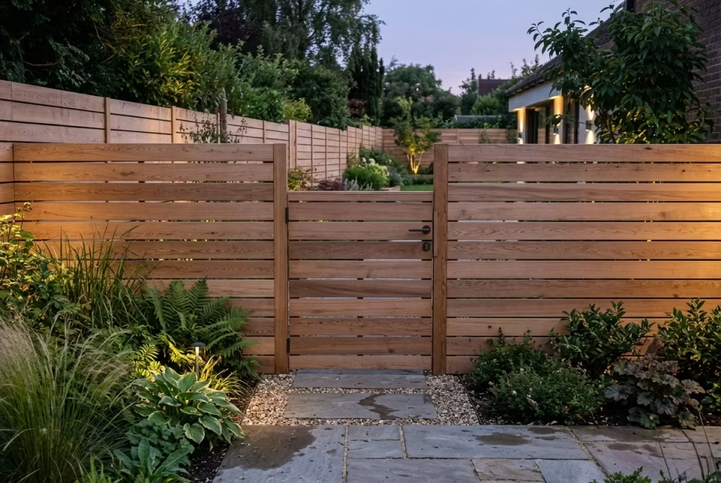
When the fence and gate are designed as one continuous visual language, the whole boundary feels more composed, more deliberate, and far less piecemeal. It is a simple move, but one that can quietly transform the way a garden reads. Matching the gate to the fence means the eye does not stop and start at different materials, colours, or proportions. Instead, the perimeter flows as a single, resolved composition. That kind of consistency often looks more expensive than anything overly decorative ever could.
Design Insight
In real projects, I have found that mismatched gates are one of the quickest ways to weaken an otherwise strong fence design. The fence may be beautifully detailed, but if the gate looks like an afterthought, the illusion is gone in a flash. I worked on a garden where the boundary had been built in warm timber slats, but the gate was a separate metal-framed unit with a different finish. It felt disjointed, almost like two different conversations happening at once. Once we replaced it with a gate that mirrored the fence detailing, the entire perimeter suddenly made sense. It was a classic case of the sum being greater than its parts.
A matching gate also helps a garden feel calmer. There is something reassuring about a boundary that holds together visually from end to end. It suggests care, precision, and a strong eye for detail. Those are the small but meaningful touches that often separate a decent garden from one that feels truly resolved.
Spatial + Measurement Guidance
The first rule is proportional consistency. If the fence uses boards around 100 to 125 mm (4 to 5 inches) wide, the gate should follow the same rhythm rather than introducing a new language. Gaps should also remain consistent, usually around 10 to 15 mm (0.4 to 0.6 inches), so the gate does not jar against the rest of the boundary.
For a standard pedestrian gate, widths of 900 to 1,200 mm (36 to 48 inches) are usually practical, depending on access needs. Height should generally align with the fence line, most often 1.8 m (6 feet), unless there is a deliberate reason to vary it. When the gate sits flush with the fence, the boundary reads as a single, continuous design rather than a patchwork of separate elements.
If the garden has level changes, the gate should still feel tied to the same visual order. Even a slight mismatch in line or height can throw the whole composition off balance. In design terms, this is one of those details that is easy to overlook but impossible to ignore once it is wrong.
Material & Styling Notes
The most successful gate-and-fence pairings usually share the same timber species, finish, and fixing detail. Cedar, larch, and pressure-treated softwood all work well, provided the stain or treatment is matched carefully. If the fence is charcoal-stained, the gate should carry the same tone. If the fence is left natural or lightly oiled, the gate should follow suit. It is all about keeping the thread unbroken.
Details to consider include:
- matching board orientation
- aligned post spacing
- concealed hinges or understated hardware
- consistent staining across both elements
- a handle or latch that feels integrated rather than bolt-on
Stylistically, a matching gate works best when paired with:
- planting that softens the approach
- gravel or paving that continues the same material tone
- subtle lighting to emphasise the entrance
- clean threshold detailing so the opening feels intentional
This is where restraint pays off. A gate does not need to announce itself loudly to be effective. In many gardens, the most elegant entrances are the ones that feel quietly inevitable, as though they were always meant to be there.
Pros
- Creates a seamless and cohesive boundary
- Makes the garden feel more considered and premium
- Prevents visual disruption at the entrance point
- Reinforces the overall design language of the garden
- Adds a sense of order and calm
Cons
- Requires careful coordination between fence and gate detailing
- Slightly less flexibility if later changes are needed
- Matching finishes may need more maintenance to age evenly
- Poor hardware choices can undermine even the best design
You May also Like: Coastal Garden Design: Creating Landscapes That Withstand Exposure and Age Gracefully
Pale-Washed Wood for a Lighter Coastal Feel
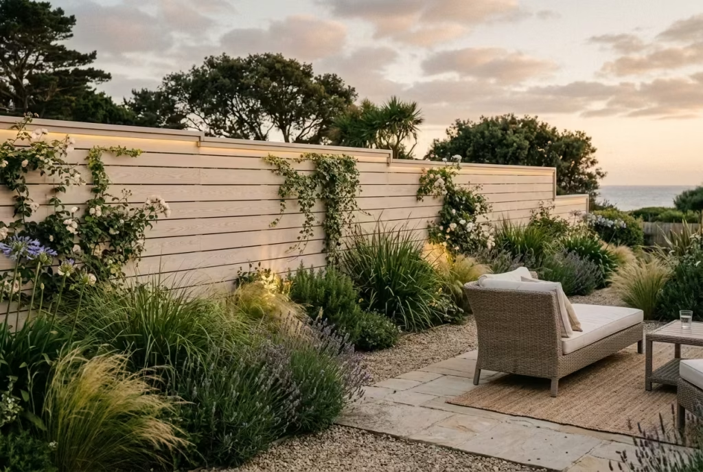
Pale-washed timber fences bring a sense of lightness and airiness to the garden, ideal for schemes that aim to feel relaxed, coastal, or subtly Mediterranean. The soft, muted tones reflect light, making spaces feel larger and more open, and they pair beautifully with natural planting, pale stone paving, and soft outdoor fabrics. In effect, the fence becomes a gentle backdrop rather than a dominant boundary, letting the garden breathe while still providing structure and enclosure.
Design Insight
From my own projects, I’ve found pale-washed wood transforms bright gardens in a way that darker fencing never can. In a sunny courtyard, we used soft white-oil cedar for the boundary, and the effect was transformative—the garden felt expansive and effortlessly calm, like a soft canvas for the plants and furniture to shine against. Unlike natural timber left untreated, pale washes provide a controlled, refined aesthetic while still retaining the grain and texture of the wood, giving a premium yet relaxed finish.
This approach works particularly well in gardens where the planting is soft and layered. Ornamental grasses, trailing vines, and delicate perennials read against the pale fence in a way that makes the greenery pop without harsh contrast. In essence, the fence acts as a gentle stage, highlighting the garden rather than competing with it.
Spatial + Measurement Guidance
- Board widths: Slim or mid-sized boards (75–100 mm / 3–4 inches) maintain a delicate, airy rhythm that complements the washed finish.
- Gaps: 5–10 mm (0.2–0.4 inches) spacing is usually sufficient to create subtle shadow lines while maintaining privacy.
- Height: Standard 1.5–1.8 m (5–6 feet) often works best in coastal or bright gardens, keeping the boundary light while still offering screening. Taller fences can feel heavier unless carefully proportioned.
- Orientation: Horizontal boards enhance the sense of breadth, while vertical boards emphasize height and structure—choose depending on the garden’s proportions.
The pale wash works like a visual exhale: it softens edges, lifts shadows, and gives the eye room to travel. In smaller gardens, it prevents the fence from closing in the space, while in larger gardens, it harmonizes with sunlight to create a serene, high-end look.
Material & Styling Notes
- Timber species: Cedar, larch, and softwood all take pale washes well. Cedar’s natural grain shows beautifully through a white or soft grey wash.
- Finish: A pale white or sandy oil enhances the timber grain while providing UV protection and soft colour longevity. Avoid thick paints that obscure texture.
- Pairing: Works beautifully with:
- Coastal-style planting (grasses, lavender, soft herbaceous borders)
- Light stone, limestone, or pale concrete paving
- Soft textiles, rattan furniture, and muted outdoor accents
- Subtle LED lighting to catch the timber’s texture in the evening
The key is restraint: the washed finish should whisper rather than shout. Overly stark or heavy staining can negate the lightness and make the garden feel colder rather than relaxed.
Pros
- Creates a light, airy, and relaxed feel in bright gardens
- Softly highlights planting and outdoor furniture
- Works well in contemporary, coastal, or naturalistic schemes
- Enhances the sense of space without compromising privacy
- Timeless, high-end aesthetic that ages gracefully
Cons
- Pale washes can require maintenance to prevent fading or weathering
- May show dirt more easily, particularly in exposed or high-traffic areas
- Needs careful pairing with surrounding materials to avoid feeling washed-out
- Overuse of light tones can reduce contrast if the garden lacks texture
Deep Brown Stain for a Grounded, Luxurious Finish
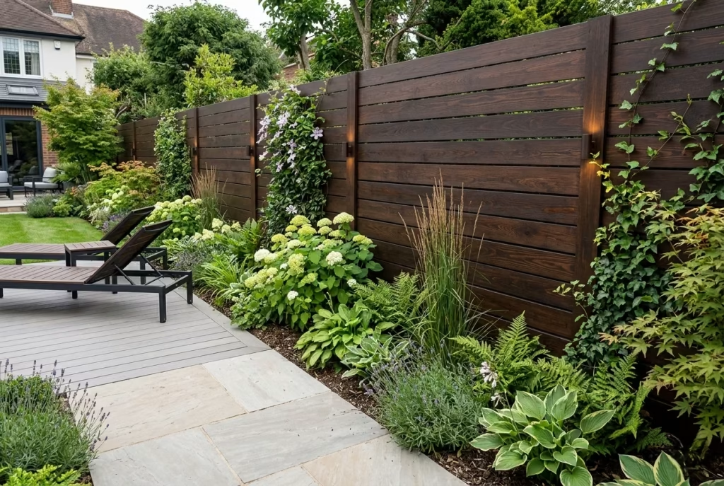
A deep brown-stained timber fence offers a sense of gravitas and richness, acting as a grounding element in the garden. It provides a warm, luxurious backdrop against which foliage, flowers, and outdoor furniture can truly pop. Unlike lighter or pale finishes, a rich brown conveys permanence and sophistication, making the boundary feel intentional, considered, and almost architectural in its presence. This is the type of fence that reads like a bespoke feature rather than a standard enclosure.
Design Insight
From my own projects, I’ve often turned to deep brown staining when a garden requires a strong, cohesive anchor. In one instance, a contemporary courtyard garden was surrounded by minimal, structured planting and pale paving. The introduction of a dark walnut-stained fence immediately elevated the space—it framed the greenery, emphasized the clean lines of the design, and allowed furniture in muted or natural tones to stand out. The richness of the stain didn’t overwhelm; instead, it provided depth, warmth, and a sense of permanence.
Deep brown finishes work especially well with timber decking, stone patios, or natural render walls, creating harmony across materials. In effect, the fence becomes a stabilizing layer in the visual composition, giving the garden a more considered, editorial feel.
Spatial + Measurement Guidance
- Board widths: Mid-to-wide boards, around 100–150 mm (4–6 inches), often feel balanced with darker stains, avoiding a visually fragmented effect.
- Spacing: Keep gaps minimal, around 5–10 mm (0.2–0.4 inches), to maintain the fence’s richness while still allowing some light and airflow.
- Height: Standard 1.8–2 m (6–6.5 feet) works well for privacy, but taller fences can accentuate drama in larger gardens.
- Orientation: Horizontal boards can make a space feel wider and contemporary, while vertical boards emphasize height and enclosure. The choice should reflect the garden’s proportions and the desired effect.
A deep brown finish provides a visual anchor, but proportion and spacing remain critical. Boards that are too narrow or unevenly spaced can undermine the sense of cohesion, while overly wide boards may feel heavy or bulky.
Material & Styling Notes
- Timber species: Cedar, larch, or treated softwood are ideal. Cedar shows grain beautifully even under a rich stain, lending depth and texture.
- Finish: Oil-based or semi-transparent stains in walnut, chestnut, or dark chocolate bring out the timber’s warmth while protecting it from weathering.
- Styling Pairings:
- Lush greenery or structural planting that contrasts with the deep tone
- Stone paving, pale decking, or neutral outdoor textiles to create balance
- Metal or dark timber outdoor furniture for a cohesive palette
- Subtle accent lighting to highlight timber grain and texture
The overall effect is one of understated luxury. A dark-stained fence may feel heavy initially, but when balanced with lighter paving, planting, or furniture, it reads as rich, refined, and grounded.
Pros
- Provides a rich, luxurious backdrop for planting and furniture
- Grounds the garden visually, adding cohesion
- Timeless, high-end aesthetic suitable for modern and traditional schemes
- Enhances the perception of depth and layering in the garden
- Works well with structured or naturalistic planting
Cons
- Dark stains can show dust, pollen, and fading more readily
- Overuse of deep tones in small gardens can feel heavy or enclosed
- Requires periodic maintenance to maintain vibrancy
- Must be paired carefully with lighter materials to avoid visual heaviness
Fence Combined with Trellis Extension
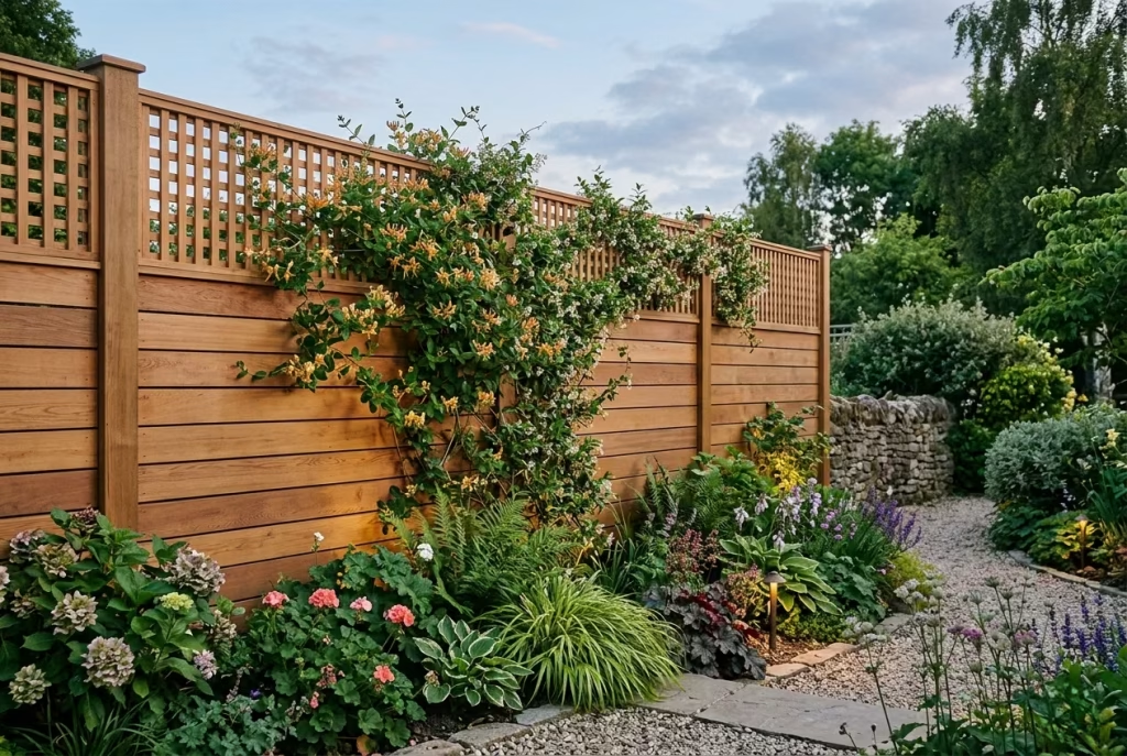
Pairing a timber fence with a trellis extension is a subtle but highly effective way to increase privacy while keeping the garden feeling open and airy. The lower solid fence provides structure and security, while the trellis above softens the boundary, allowing light and air to filter through. It’s the kind of thoughtful solution that elevates a simple garden fence into a layered, design-led feature, offering privacy without creating a sense of enclosure or heaviness.
Design Insight
In my experience, this approach works wonders in gardens where neighbours are close or where elevated privacy is needed without losing daylight. I once worked on a long, narrow city garden overlooked by flats above. A standard 1.8 m (6 ft) fence would have felt oppressive, cutting off light and creating a tunnel-like effect. By introducing a 0.6–0.9 m (2–3 ft) trellis extension above the main timber fence, we achieved privacy while letting light filter through and encouraging climbers like jasmine and honeysuckle to trail across it. The result was a boundary that felt intentional, layered, and soft rather than heavy or defensive.
The trellis also brings an opportunity for planting to become part of the fence. Climbers add texture, seasonal colour, and movement, making the boundary dynamic rather than static. The visual interplay between solid timber and latticework creates rhythm, shadow, and depth—small gestures that make a huge difference in how the garden is experienced.
Spatial + Measurement Guidance
- Fence height: Standard 1.8 m (6 ft) provides primary privacy and security.
- Trellis extension height: Typically 0.6–0.9 m (2–3 ft); higher can feel top-heavy, while lower may not deliver the desired screening.
- Board widths: 100–125 mm (4–5 inches) for timber boards works well for a balanced appearance.
- Trellis spacing: 50–75 mm (2–3 inches) allows light and air through while giving climbers something to grip.
- Integration with planting: Keep a 50 mm (2-inch) gap from the soil to avoid rot and allow for maintenance.
Proportions are key. The trellis should feel like a natural continuation of the fence, not an afterthought or oversized add-on. When scaled correctly, it enhances privacy without ever feeling like a barrier or an oppressive wall.
Material & Styling Notes
- Timber species: Cedar, larch, or treated softwood are all suitable; cedar pairs beautifully with climbing plants due to its warm, natural tone.
- Trellis material: Timber is most harmonious with the fence; powder-coated metal can be used for contrast if a more architectural effect is desired.
- Finish: Stains should match the lower fence for cohesion, or a soft complementary shade can highlight the extension subtly.
- Styling cues:
- Encourage climbers or espaliered plants to weave through the trellis for texture and seasonal interest
- Pair with contemporary or naturalistic planting at the fence base to soften the line
- Add low-level lighting to accentuate the interplay of solid and open panels in the evening
This combination allows the boundary to feel both protective and generous, a delicate balance that is often hard to achieve in compact or overlooked gardens.
Pros
- Adds height and privacy without enclosing the garden
- Creates a layered, dynamic boundary
- Encourages planting integration and seasonal interest
- Lets light and airflow through, keeping the garden feeling open
- Offers a premium, considered look without heavy construction
Cons
- Trellis adds complexity and cost to the installation
- Requires maintenance to keep climbers tidy and trellis secure
- Higher trellis can be top-heavy if not properly anchored
- Wood trellis may weather faster than the solid fence unless treated
Timber Fence with Climbing Plants
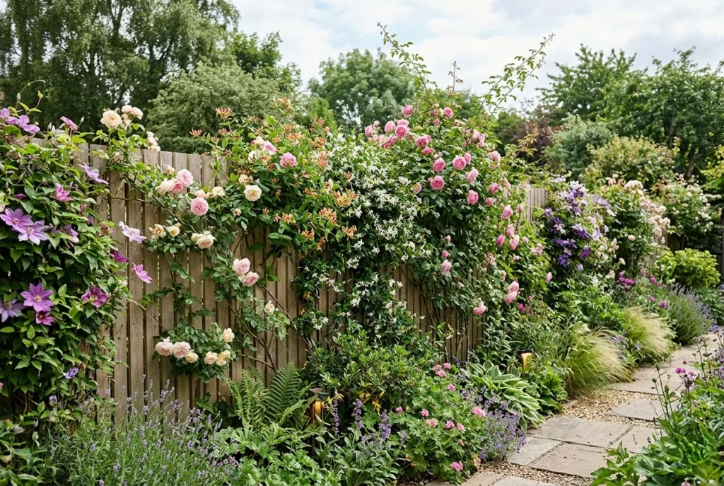
A timber fence entwined with climbing plants transforms a rigid boundary into a living, evolving backdrop. Over time, the fence softens, seasons shift, and the garden takes on a subtle, kinetic beauty that changes throughout the year. This approach combines functionality with poetry: the fence still defines the space, provides privacy, and offers structure, but it grows with the garden, creating rhythm, texture, and colour that shifts from spring to winter.
Design Insight
From my own projects, I’ve found that integrating climbers into a timber fence is one of the simplest ways to make a boundary feel both intentional and alive. On a suburban garden project, a plain horizontal cedar fence initially felt stark against the paving and planting. By encouraging climbing roses and honeysuckle to weave across the slats, the fence gradually acquired warmth, depth, and seasonal highlights. By mid-summer, the boundary bloomed with colour and scent, creating a sensory experience that a bare fence could never provide.
This is particularly effective in small gardens, where walls can feel oppressive. Climbers draw the eye upward, break up solid planes, and lend a sense of verticality without heavy construction. Additionally, foliage adds subtle movement in the breeze, shadow play across the boards, and seasonal interest that keeps the garden feeling alive and carefully curated.
Spatial + Measurement Guidance
- Fence height: Standard 1.8 m (6 ft) for privacy, but ensure trellis or support structures allow climbers to extend another 0.6–1 m (2–3 ft) above if desired.
- Board widths: 75–125 mm (3–5 inches) works well; consistent spacing provides good anchorage for climbing plants.
- Spacing: 5–10 mm (0.2–0.4 inches) between boards helps airflow and gives plants room to thread their way through without stagnation.
- Planting distance: Keep climbers at least 50 mm (2 inches) from the fence base to prevent rot and allow maintenance.
Choosing the right climber for the scale and orientation of the fence is essential. Fast-growing varieties can quickly cover a boundary, but slower-growing or seasonal bloomers provide a sense of rhythm and evolution, rewarding patience and care.
Material & Styling Notes
- Timber species: Cedar and larch are ideal due to natural rot resistance and the way their warm tones complement greenery. Treated softwood works if you plan to use vigorous climbers.
- Finish: Semi-transparent stains or pale oils allow the wood grain to remain visible, harmonising with the natural growth over time. Dark finishes can provide dramatic contrast but may heat up in full sun, affecting delicate plants.
- Planting suggestions:
- Honeysuckle for scent and vertical interest
- Climbing roses for seasonal flowers and structure
- Clematis for colourful, varied foliage
- Jasmine or ivy for year-round coverage and texture
Styling cues include allowing plants to drape naturally, avoiding over-pruning, and combining with understated lighting to highlight leaves, shadows, and seasonal blooms. The fence becomes a living tapestry, a subtle celebration of time passing in the garden.
Pros
- Softens rigid boundaries naturally over time
- Introduces seasonal interest, colour, and texture
- Enhances privacy while maintaining airiness
- Adds verticality and visual movement in small or large gardens
- Creates a sense of garden evolution and care
Cons
- Requires ongoing maintenance to guide and manage growth
- Climbers can affect timber durability if planted too close
- Some species may become invasive if not controlled
- May take several seasons to achieve full coverage and desired effect
You May also Like: 25 Low-Maintenance, Long-Lasting Minimalist Garden Ideas for Budget-Friendly Outdoor Spaces
Low Timber Boundary Fence for Front Gardens
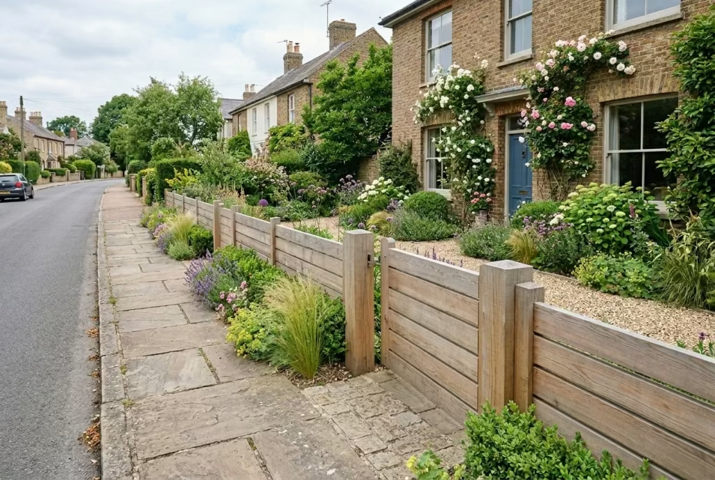
A low timber fence in a front garden is a subtle yet effective way to define boundaries without creating a sense of separation or heaviness. It marks the edge of the property, guides the eye, and gives the garden a contained, curated feel, all while allowing views in and out. This approach works particularly well for homes where openness and a welcoming character are key, striking a balance between definition and accessibility. A low fence acts like a gentle punctuation mark at the garden’s edge, framing planting and paving without shouting for attention.
Design Insight
From my experience, front gardens often benefit from restraint. I recall a mid-century property where the homeowners wanted to create a sense of arrival without blocking the street view or natural light. A low timber fence, around 600 mm (2 ft) high, provided just enough structure to delineate the garden while keeping it light and inviting. By selecting slim horizontal slats with a soft natural finish, the boundary read as modern and intentional, enhancing the sense of proportion and rhythm in the streetscape.
Low fencing also offers a canvas for layered planting. Groundcover, low shrubs, or seasonal flowers in front of the fence create depth and texture, making the garden appear lush without the fence competing visually. It can transform a simple front plot into a welcoming, editorially considered space that feels open yet contained.
Spatial + Measurement Guidance
- Fence height: 450–600 mm (18–24 inches) is generally ideal; it defines without enclosing.
- Board widths: 75–100 mm (3–4 inches) is proportionate for low fencing; keep spacing uniform for rhythm.
- Orientation: Horizontal boards help the garden feel wider, while vertical boards emphasize height, even at low scale.
- Setback: Position the fence 300–450 mm (12–18 inches) from the boundary or pavement edge to accommodate planting and maintenance.
Proportions are critical at this scale. Too tall, and the fence feels imposing; too short, and it lacks presence. Similarly, wide boards can dominate visually, while narrow boards may feel fussy. The goal is a confident, understated boundary that frames rather than overwhelms.
Material & Styling Notes
- Timber species: Cedar, larch, or treated softwood work best for low fencing, offering durability without looking heavy.
- Finish: Soft natural stains, pale oils, or muted greys maintain a light, welcoming character. Avoid dark tones, which can feel oppressive at low height.
- Styling cues:
- Combine with low hedges, grasses, or perennial flowers to enhance depth
- Subtle lighting along the edge can accentuate texture without overwhelming the garden
- Ensure posts are proportionate—slim posts work best to keep the design light
- Horizontal slats create a contemporary feel, while verticals read as more traditional and structured
The fence should whisper rather than announce itself. Its presence is subtle, but it frames the garden in a way that makes planting and paving feel curated, intentional, and cohesive.
Pros
- Defines the property boundary without blocking views
- Creates a welcoming, open character for the front garden
- Provides a framework for planting and styling
- Works well in both contemporary and traditional streetscapes
- Adds structure and rhythm without visual heaviness
Cons
- Offers minimal privacy
- Can require maintenance if plants are grown too closely
- Slim or low designs may be overlooked in busier streetscapes
- Not suitable where high screening is required
Contemporary Fence with Recessed Lighting
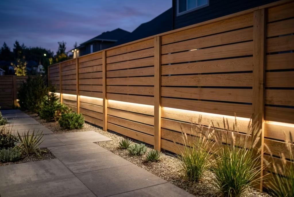
Incorporating recessed lighting into a contemporary timber fence transforms a garden boundary from a static backdrop into a living, atmospheric feature. Light subtly highlights texture, enhances colour, and draws attention to architectural details, creating a dynamic interplay between wood, shadow, and surrounding planting. Evening use—dinners, lounging, or quiet reflection—can redefine how a fence is experienced, turning it into a sensory layer rather than just a structural element. A well-lit fence whispers sophistication and invites the garden to come alive after sunset.
Design Insight
From my experience, lighting can elevate even the simplest fence to a design statement. On a modern terrace project, we integrated low-level LED strips into the horizontal slats of a cedar fence. By night, the soft glow traced the clean lines of the timber, creating depth and a gentle, ambient light across the paving. The result was a space that felt warmer, more inviting, and meticulously considered, without resorting to bulky fixtures or harsh illumination. Lighting in this way draws the eye to the fence’s texture and material quality, encouraging the garden to be enjoyed at all hours.
Lighting also encourages practical benefits. For instance, recessed lights in gates or perimeter fencing enhance visibility, improve safety, and subtly guide movement through the space, all while reinforcing the fence’s role as a design-led boundary rather than a mere divider.
Spatial + Measurement Guidance
- Fence height: Standard 1.8 m (6 ft) works well, with lighting positioned around 800–1,200 mm (31–47 inches) from the ground for optimal ambient effect.
- Board orientation: Horizontal boards with a small recess or channel accommodate LED strips neatly without disrupting the rhythm.
- Spacing: Maintain 5–10 mm (0.2–0.4 inches) gaps between slats for natural shadowing and ventilation, ensuring light does not overheat the timber.
- Cable management: Conceal wiring within posts or behind fence panels to maintain the clean, uninterrupted lines critical to contemporary design.
Proportions matter—light should enhance the fence subtly, not dominate it. Too many fixtures or uneven spacing can create visual clutter, breaking the calm, sophisticated rhythm of the boundary.
Material & Styling Notes
- Timber species: Cedar or larch responds beautifully to integrated lighting, their natural grain catching the glow subtly.
- Finish: Mid-tone stains or natural oils retain warmth and texture while complementing LED tones. Dark stains can absorb light too heavily; pale finishes may over-reflect.
- Lighting types:
- Warm white LED strips (2,700–3,000K) for a soft, inviting glow
- Small recessed spotlights or uplights to emphasize vertical posts or gates
- Low-voltage options for safety and efficiency
- Styling cues:
- Pair with minimal planting to avoid overgrowth obstructing the light
- Integrate furniture or seating in zones where lighting accentuates usable space
- Use dimmable systems to adjust mood, from gentle evening illumination to brighter task lighting
When designed thoughtfully, a lit fence becomes a silent choreographer of the evening garden, setting tone, framing experiences, and enhancing every social or private moment outdoors.
Pros
- Creates a warm, inviting ambiance for evening use
- Highlights timber texture and fence detailing
- Enhances safety and movement within the garden
- Encourages longer enjoyment of outdoor spaces
- Adds an editorial, considered quality to modern fencing
Cons
- Adds cost and complexity to installation
- Requires careful maintenance of electrical components
- Over-lighting can ruin subtle aesthetics and cause glare
- Poorly planned wiring or fixture placement can disrupt the fence’s clean lines
Timber Fence Around a Seating Nook
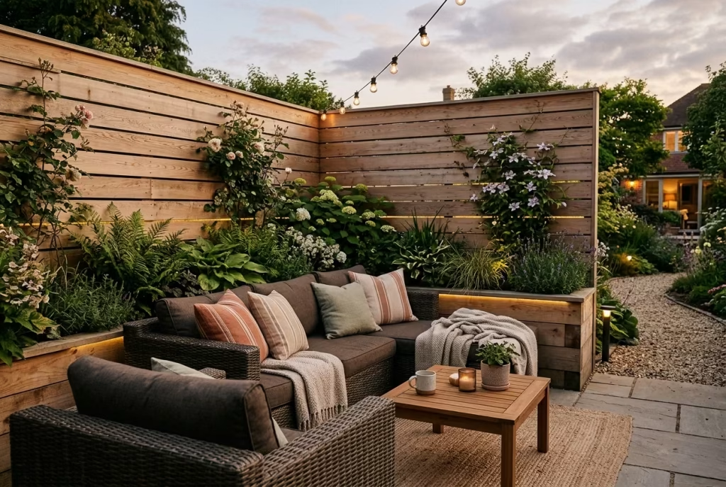
Framing a seating nook with timber fencing is a clever way to create intimacy and transform a previously overlooked corner into a purposeful, inviting destination. The fence defines space without confining it, offering a sense of enclosure that feels protective rather than oppressive. This approach turns a simple garden edge into a retreat where one can read, relax, or entertain, blending function with design-led elegance. Think of it as creating a “room outdoors” where timber acts as walls and a canvas for texture, planting, and lighting.
Design Insight
From my experience, even a modest garden can benefit from a tucked-away seating zone. On one project, a 3 × 2 m (10 × 6 ft) corner was initially underused and visually disconnected from the rest of the garden. By adding a low-to-mid-height horizontal timber fence on two sides, with integrated planting and subtle lighting, the corner instantly felt like a curated retreat. The warmth of the timber complemented cushions, rattan furniture, and soft paving, while the enclosure offered privacy without cutting the garden off from the wider space.
Adding texture through timber—whether by shadow-gap boards, mixed-width slats, or a soft stain—enhances the sense of calm, making the nook feel considered rather than an afterthought. The fence effectively choreographs the user’s experience, creating a space that encourages lingering and contemplation.
Spatial + Measurement Guidance
- Fence height: Typically 1.2–1.5 m (4–5 ft) works well to screen without feeling closed in. Taller fences can feel heavy unless offset by light slats or trellis above.
- Board widths: 75–125 mm (3–5 inches) depending on fence style; horizontal orientation often makes the space feel broader.
- Corner integration: Leave 300–450 mm (12–18 inches) clearance from hardscape for low planting or foot traffic.
- Seating size: Ensure the nook can accommodate a bench or small table comfortably; typically 1.2–1.8 m (4–6 ft) wide for 2–3 people.
Proportions are key: the fence should feel protective yet inviting, giving a sense of shelter without closing off light or sightlines. The interplay between solid timber, planting, and soft furnishings creates a layered, tactile experience that draws visitors in.
Material & Styling Notes
- Timber species: Cedar, larch, or treated softwood provide warmth, natural texture, and durability.
- Finish: Medium-toned stains or pale oils retain the timber’s natural warmth while complementing outdoor textiles and furniture. Avoid overly dark finishes in small nooks, as they can make the space feel claustrophobic.
- Styling cues:
- Integrate climbers, trailing plants, or low shrubs at the fence base to soften edges
- Use cushions, throws, and natural-fibre seating to enhance comfort and texture
- Consider subtle LED lighting or solar uplights along the fence to extend usability into the evening
- Position the fence to frame views or create a sense of hidden retreat while maintaining connectivity to the garden
The fence acts as a stage for the nook: it sets boundaries, guides the eye, and allows planting, light, and furniture to shine without visual competition. In doing so, even the smallest corner can feel like a premium, curated space.
Pros
- Creates a sense of intimacy and enclosure without feeling oppressive
- Turns underused corners into functional, inviting destinations
- Encourages layering of planting, texture, and lighting
- Adds architectural interest to a garden while maintaining openness
- Works well in gardens of all sizes, providing a design-led focal point
Cons
- Requires careful proportioning to avoid a cramped feel
- Maintenance of timber and integrated plantings is ongoing
- Furniture and fittings must be chosen to suit the confined space
- Over-fencing or overly tall boards can reduce daylight and openness
Fence Set Against Black Boundary Treatment
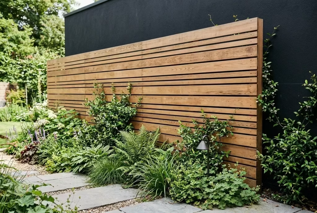
Positioning a timber fence against a black-painted or dark boundary surface is a clever way to make wood pop and assert its presence as a design feature. The dark backdrop acts as a foil, sharpening the timber’s texture, tone, and warmth, creating contrast that feels both sophisticated and contemporary. This technique elevates what might otherwise be a standard fence into a statement element, allowing the natural beauty of timber to shine in relief rather than blend into the surroundings.
Design Insight
In my own projects, I’ve often used black walls, brickwork, or composite panels as a canvas for wooden fencing. One urban garden with a narrow width and minimal planting risked feeling flat and uninspired. By installing a horizontal cedar fence in front of a matte black boundary, the timber’s warm honey tones immediately became the hero of the space. The contrast also enhanced the perception of depth, making the garden feel longer and more layered, while the black backdrop receded visually, allowing the fence to stand out as an intentional, editorial feature.
This approach works particularly well when paired with greenery. Foliage against a black boundary and timber foreground feels vivid and lush, as if the garden itself has been framed like a painting. It’s a subtle trick that designers often use to guide the eye and create focal points without adding unnecessary bulk or complexity.
Spatial + Measurement Guidance
- Fence height: Standard 1.8 m (6 ft) works well, but adjust according to garden scale and sightlines.
- Board widths: 100–150 mm (4–6 inches) horizontal boards emphasize warmth and texture; vertical boards also work but may appear more formal.
- Spacing: Small gaps (5–10 mm / 0.2–0.4 inches) retain shadow and depth, enhancing the interplay between wood and black backdrop.
- Setback: Maintain a 50–100 mm (2–4 inches) gap from the black surface for airflow and to prevent moisture build-up on timber.
Proportions and spacing are critical. Too close, and the timber may warp or fade unevenly; too far, and the visual connection is lost. The goal is a harmonious relationship between timber warmth and dark restraint, where each enhances the other.
Material & Styling Notes
- Timber species: Cedar, larch, or oak work beautifully; their natural grains are emphasized against a dark backdrop.
- Finish: Light or medium stains highlight the contrast. Dark timber can also be used but will need careful consideration to avoid disappearing into the black.
- Styling cues:
- Plant green or flowering climbers at the base to enhance contrast and depth
- Incorporate subtle lighting to pick out timber texture at night
- Use simple, clean furniture or paving to let the fence remain the star
- Avoid clutter or busy colours; the power lies in restrained contrasts
The effect is a subtle drama: the black background recedes while the warm timber comes forward, creating a garden boundary that reads as high-end, intentional, and visually layered.
Pros
- Dramatically highlights timber warmth and texture
- Adds depth and visual interest to the garden
- Works well in urban or compact gardens to create a layered effect
- Enhances greenery, making plants appear more vibrant
- Creates a considered, editorial aesthetic without heavy construction
Cons
- Black surfaces may require maintenance to prevent fading or chalking
- Timber must be protected against potential moisture build-up if set too close
- Careful proportioning is essential; imbalance can overwhelm the space
- Not suitable for gardens that need a softer, lighter visual character
Timber Panels Used in Sections, Not the Whole Boundary
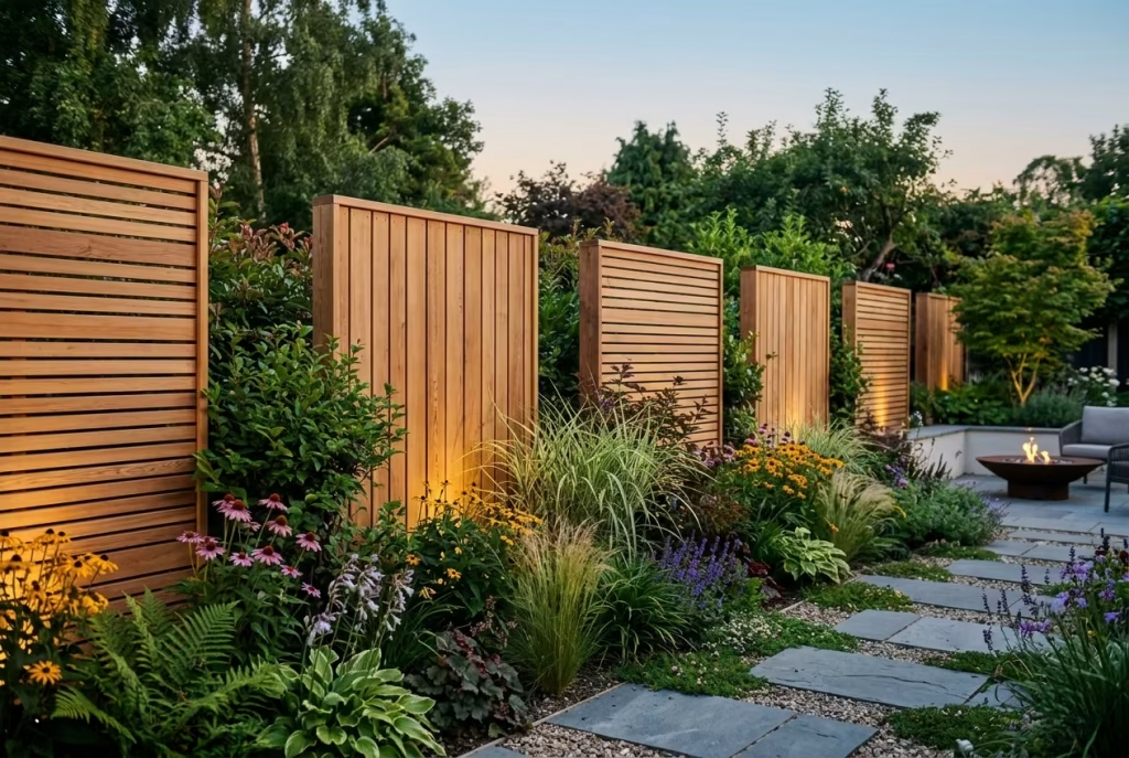
Using timber panels in sections rather than along the entire garden boundary is a subtle way to introduce rhythm, depth, and visual interest without overwhelming the space. This approach breaks up long edges, allowing glimpses of planting, paving, or other materials to peek through, creating a layered, editorially considered effect. It’s a refined strategy that makes the boundary feel deliberate and curated, rather than continuous and monotonous. Think of it as giving the garden a “breathable” rhythm, where solid timber sections act as punctuation marks across the landscape.
Design Insight
From my real-world experience, full-length fences can sometimes feel heavy, especially in longer gardens or linear plots. On one city terrace project, a continuous fence along a 20 m (65 ft) boundary created a tunnel-like effect that visually compressed the space. By dividing the boundary into 3–4 m (10–13 ft) timber panel sections, interspersed with planting or low walls, we introduced pauses that enhanced depth and perspective. The panels became intentional focal points rather than an uninterrupted line, giving the garden a more editorial, layered quality.
This sectional approach also encourages planting to integrate with the fence, rather than appearing tacked-on. Clusters of shrubs, ornamental grasses, or flowering perennials positioned between timber sections soften the edges, introduce seasonal interest, and create subtle vignettes for the eye to linger on. The result is a garden that feels dynamic, spatially intelligent, and easy on the senses.
Spatial + Measurement Guidance
- Panel width: 3–4 m (10–13 ft) is ideal; wider panels risk looking imposing, while narrower ones may appear fussy.
- Fence height: Standard 1.8 m (6 ft) for privacy; height can be varied slightly between panels to enhance rhythm.
- Spacing between sections: 0.5–1 m (20–40 inches) is typically sufficient to reveal planting or material contrast.
- Board widths: 75–125 mm (3–5 inches), consistent within each panel to maintain clean lines.
Sectioned panels work best when scaled proportionally to the garden length and width. The visual “pauses” they create allow long boundaries to breathe and reduce the sense of linear monotony, which can otherwise dominate the eye in contemporary gardens.
Material & Styling Notes
- Timber species: Cedar, larch, or treated softwood for durability, warmth, and grain texture.
- Finish: Natural oils or mid-tone stains that harmonize with both timber and surrounding planting. Avoid overly dark finishes, which can create a sense of visual heaviness in intermittent sections.
- Styling cues:
- Use planting or low hedges in the gaps to soften transitions and enhance depth
- Introduce subtle lighting within panels or in front to accentuate texture at night
- Combine with other boundary materials like stone, gravel, or low walls for contrast
- Consider horizontal slats for a modern feel or vertical boards for a more formal, linear aesthetic
This sectional fencing strategy allows a long garden to feel curated, layered, and human-scaled, making the boundary as much a feature as the planting or paving it frames.
Pros
- Breaks up long boundaries and prevents monotony
- Enhances depth and visual interest in linear gardens
- Encourages planting integration and layering
- Creates a sophisticated, editorially considered aesthetic
- Offers flexibility in styling and material combinations
Cons
- Requires careful planning to maintain rhythm and proportion
- Gaps between panels need thoughtful planting to avoid a disjointed look
- Slightly higher installation complexity than a continuous fence
- Maintenance may vary between sections depending on exposure and plant interaction
Fence with Built-In Storage or Utility Screening
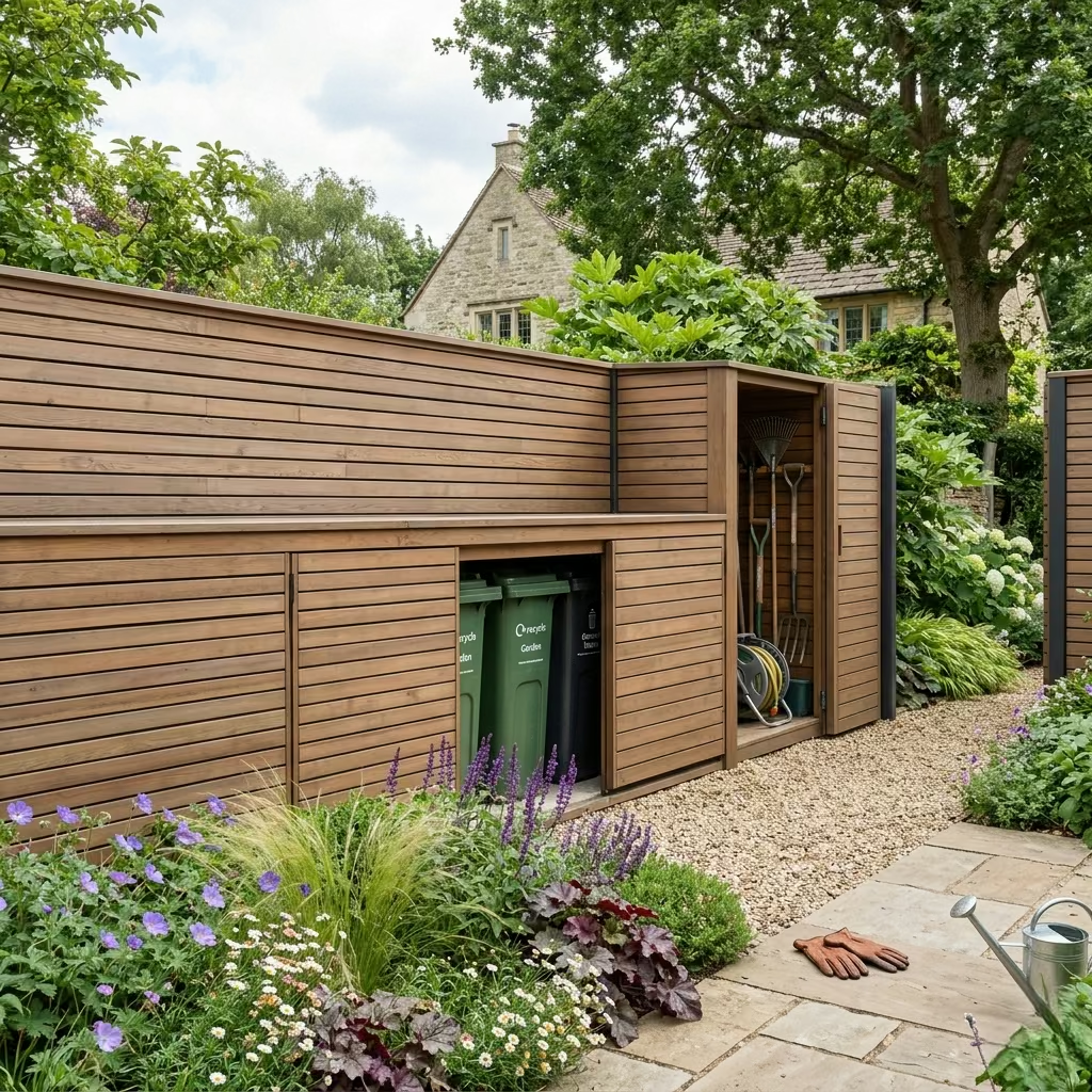
A timber fence with built-in storage or integrated utility screening is a clever way to combine form and function, keeping practical elements like bins, garden tools, or service areas out of sight while maintaining a cohesive, design-led boundary. Rather than letting necessary clutter disrupt the garden’s visual flow, this approach turns it into a seamless, editorial feature. In essence, the fence becomes more than a boundary—it becomes a silent workhorse, discreetly holding and organizing what would otherwise detract from the overall composition.
Design Insight
From my own projects, I’ve found that even high-end gardens can falter if everyday elements are left exposed. On a contemporary suburban garden, the refuse bins and compost areas threatened to visually fragment a carefully curated timber fence. By designing a section of the fence with hidden doors and shelving, the utility areas were entirely concealed, yet remained accessible. Finished in the same timber and stain as the rest of the fence, this integrated solution preserved rhythm and proportion, allowing the eye to glide along the boundary uninterrupted.
Utility screening is particularly useful in small gardens, where every metre counts. It creates the illusion of a more generous, uncluttered space and reinforces a sense of calm, order, and intention. The key is subtlety: the storage should blend naturally with the fence, using matching materials, concealed fixings, and careful detailing to avoid drawing attention to its functional purpose.
Spatial + Measurement Guidance
- Fence height: 1.8 m (6 ft) standard; utility panels can match or slightly exceed this for full screening.
- Storage depth: 400–600 mm (16–24 inches) is typically sufficient for bins, tools, or small garden equipment.
- Section width: 1–2 m (3–6 ft) per storage unit depending on needs and proportions of the fence.
- Access clearance: Ensure doors swing freely or slide smoothly; allow 100–150 mm (4–6 inches) clearance at base to prevent sticking.
The design should feel integrated rather than added on. Consistent slat widths, spacing, and stain tone are crucial for maintaining rhythm along the boundary.
Material & Styling Notes
- Timber species: Cedar, larch, or treated softwood for durability and a premium aesthetic. Durable hardware and hinges are essential for long-term use.
- Finish: Match the fence tone and grain to keep the storage discreet. Semi-transparent stains retain timber character while protecting against wear.
- Styling cues:
- Concealed handles or push-to-open mechanisms preserve clean lines
- Low planting or small shrubs in front can soften visual transitions
- Horizontal boards often feel more contemporary and blend better with modern gardens
- Incorporate subtle ventilation gaps if storing bins to prevent moisture build-up and odours
A well-executed storage fence can be almost invisible in the garden, allowing practical elements to coexist with style seamlessly. It transforms an everyday necessity into a design asset.
Pros
- Conceals bins, tools, and other garden clutter without disrupting aesthetics
- Maintains rhythm, proportion, and visual flow along the boundary
- Integrates seamlessly with modern garden design
- Enhances perceived space and calm in smaller gardens
- Adds functional value without compromising style
Cons
- Slightly higher design and installation complexity
- Requires precise detailing to ensure doors and access remain functional
- Timber in utility areas may need extra maintenance due to moisture or wear
- Poor integration can make storage sections stand out rather than blend
You May also Like: 25 Garden Pond Ideas That Add Beauty, Wildlife, and Tranquillity
Natural Timber Left to Weather
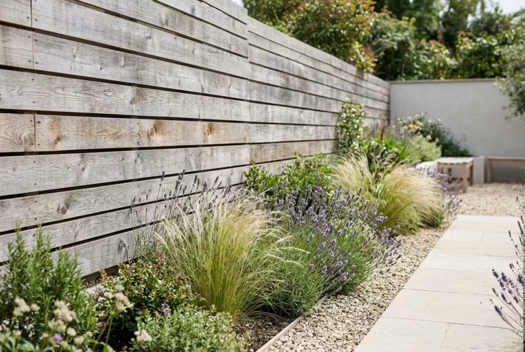
Allowing timber to age naturally and weather over time is a quietly confident approach that celebrates authenticity and material honesty. Instead of masking the wood with stains or paints, the timber’s natural greys, silvering, and textural shifts become a living part of the garden, blending seamlessly with planting and stonework. This style works especially well in design-led gardens that value subtlety, calm restraint, and seasonal change over forced perfection. A weathered fence carries personality, tells a story, and ages gracefully, providing a timeless backdrop for greenery and outdoor living.
Design Insight
From my experience, clients often worry that leaving timber untreated will feel careless. In reality, I’ve seen natural cedar or larch fences develop rich, nuanced colour variations within months, softening the garden edges while retaining a premium look. On one contemporary courtyard project, a cedar fence left to weather alongside pale paving and soft planting created a sense of understated sophistication. The garden felt calm and considered, as if the timber had been part of the landscape for years rather than newly installed.
Weathering is also forgiving: small imperfections, knots, and grain variations become part of the character rather than flaws to conceal. The key is careful selection of durable timber, consistent spacing, and proportioned heights so the fence reads as intentional rather than neglected.
Spatial + Measurement Guidance
- Fence height: 1.5–1.8 m (5–6 ft) for privacy, or lower for front boundaries to maintain openness.
- Board widths: 75–125 mm (3–5 inches) works well; narrower slats age more gracefully, while wider boards create bolder, more graphic lines.
- Spacing: Shadow gaps of 5–10 mm (0.2–0.4 inches) encourage airflow, prevent moisture retention, and add subtle rhythm.
- Setback: Leave 50–100 mm (2–4 inches) from soil or paving to avoid water splashing on boards and accelerate even weathering.
A fence left to weather requires proportionate placement: the visual balance with planting, paving, and garden structures ensures that the natural finish enhances rather than dominates the space.
Material & Styling Notes
- Timber species: Cedar, larch, oak, or Accoya are ideal for natural weathering due to their durability and texture.
- Finish: Leave untreated or use a clear, penetrating oil to protect from UV and moisture while allowing natural colour evolution. Avoid opaque stains if the goal is authentic ageing.
- Styling cues:
- Combine with soft planting such as ornamental grasses, lavender, or low shrubs to complement silvered tones
- Integrate stone, gravel, or pale render for contrast and to accentuate the timber’s patina
- Horizontal or vertical boards can both work; horizontal gives a modern feel, vertical feels more traditional yet still contemporary when cleanly detailed
- Minimal fixings and concealed screws enhance a refined, editorial appearance
Natural weathering allows the fence to evolve with the garden, creating a backdrop that changes with light, seasons, and growth. It’s a “set and forget” elegance that matures gracefully, giving the garden a quietly confident, enduring personality.
Pros
- Timeless, low-maintenance aesthetic that improves with age
- Adds authenticity, texture, and subtle colour variation
- Blends seamlessly with planting and hardscape
- Forgiving of minor imperfections in timber
- Reduces long-term maintenance costs compared to painted or stained fences
Cons
- Initial colour change may appear uneven and can take months to harmonize
- Weathering is dependent on timber species and exposure; softer woods may deteriorate faster
- Not suitable for homeowners seeking a uniform, polished appearance
- May require occasional oiling or treatment to prolong life in wetter climates
Custom Joinery Fence for a Bespoke Look
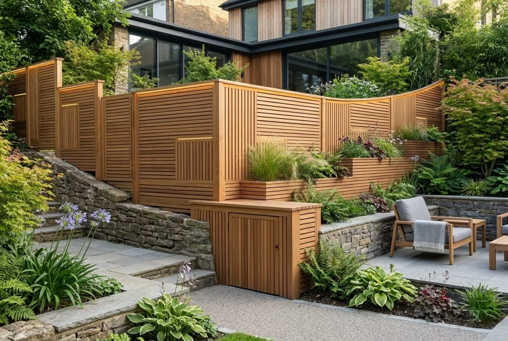
A custom joinery fence represents the pinnacle of design-led timber boundaries, turning what could be a standard perimeter into a carefully tailored, architectural statement. This approach is perfect for awkward plots, irregular boundaries, or high-spec renovations where off-the-shelf solutions fail to deliver proportion, rhythm, or elegance. Each joint, panel, and angle is meticulously considered, creating a fence that feels bespoke, editorial, and entirely integrated with the home and garden. Essentially, it’s a fence designed to fit like a glove rather than be forced into the space.
Design Insight
From my own experience, bespoke joinery transforms even modest gardens. On a hillside property with sloping and angled boundaries, a standard fence would have looked piecemeal and clumsy. By commissioning a custom fence with precisely cut panels, mitred corners, and concealed fixings, we achieved a seamless, flowing perimeter. The timber was selected to complement both the rendered house façade and natural stone terraces, creating a coherent, elevated feel. Each panel had slight variations in width and angle, subtly responding to the slope, yet the overall rhythm remained calm and deliberate a truly editorial outcome.
Custom joinery also allows for integration of features like lighting, seating, planters, or utility screening without disrupting visual harmony. It’s the ultimate way to ensure that every millimetre serves both form and function, transforming a fence from a boundary into a sculptural design element.
Spatial + Measurement Guidance
- Fence height: Fully adaptable to garden requirements, typically 1.8–2 m (6–6.5 ft) for privacy; heights can vary to respond to slope or architectural features.
- Panel widths: Fully bespoke; often between 500–1,500 mm (20–60 inches) depending on plot angles and visual balance.
- Joints & detailing: Mitred corners, shadow gaps, or recessed panels allow for a clean, contemporary look while accommodating irregular geometry.
- Integration: Lighting, planters, or storage units can be incorporated seamlessly during fabrication, avoiding post-installation retrofits.
Precision is critical: every panel, joint, and fixing must align perfectly with neighbouring panels, pathways, and garden features to maintain a cohesive, high-end look.
Material & Styling Notes
- Timber species: Cedar, oak, larch, or Accoya for durability, stability, and premium grain character.
- Finish: Custom oil or mid-tone stain to suit surrounding materials; concealed fixings and consistent shadow gaps reinforce a refined, editorial finish.
- Styling cues:
- Horizontal or vertical slats, mixed widths, or integrated trellis for visual variation
- Consider incorporating subtle contrast materials, e.g., metal posts or stone plinths, for a tailored look
- Integrate seating, planters, or storage within panels for multi-functional design
- Use lighting or shadowed recesses to accentuate joinery detail and material texture
A custom joinery fence is essentially a bespoke architectural feature—it elevates the entire garden, giving even irregular or constrained plots a premium, considered identity.
Pros
- Fully tailored to garden shape, slope, and design intention
- Seamless integration with features like seating, lighting, or planters
- Creates a high-end, editorially considered boundary
- Durable and long-lasting with appropriate timber selection
- Elevates overall property value and visual impact
Cons
- Higher cost and longer lead times than standard fencing
- Requires skilled fabrication and precise installation
- Design decisions need careful planning to avoid misalignment
- Less flexibility post-installation without costly modifications
How to Choose the Right Wooden Fence for Your Garden
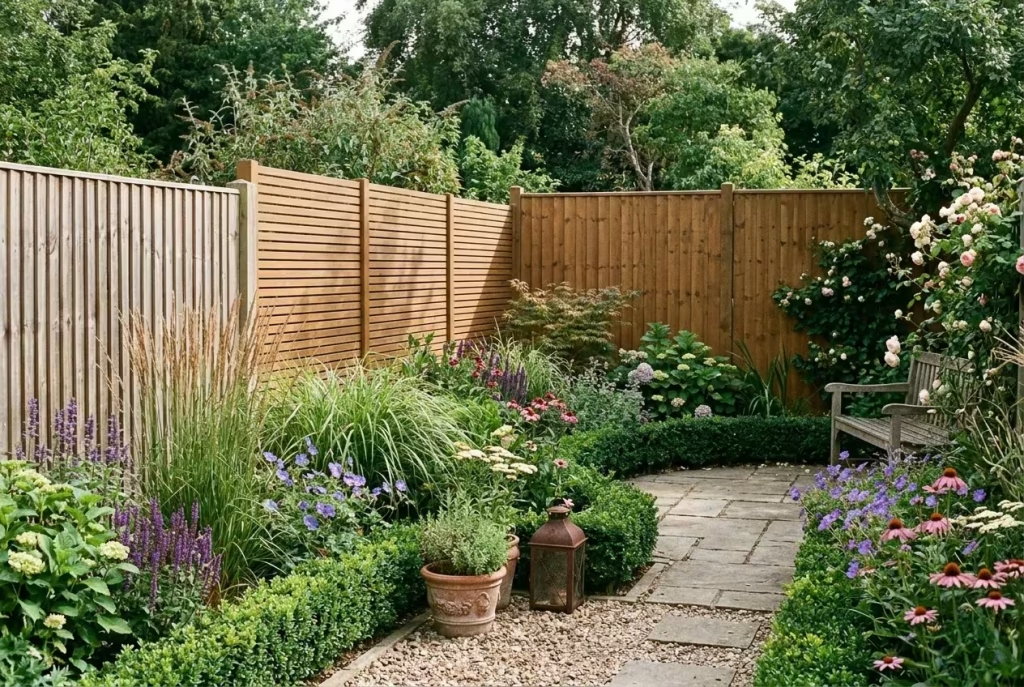
Choosing a wooden fence isn’t just about picking a style that looks good—it’s about balancing aesthetics, function, and the long-term relationship between your garden and home. A thoughtfully selected fence can transform a space, creating privacy, framing planting, and even influencing how light and airflow move through your garden. Here’s a detailed guide based on real-life experience to help you make a decision that’s calm, considered, and visually enduring.
Privacy Level
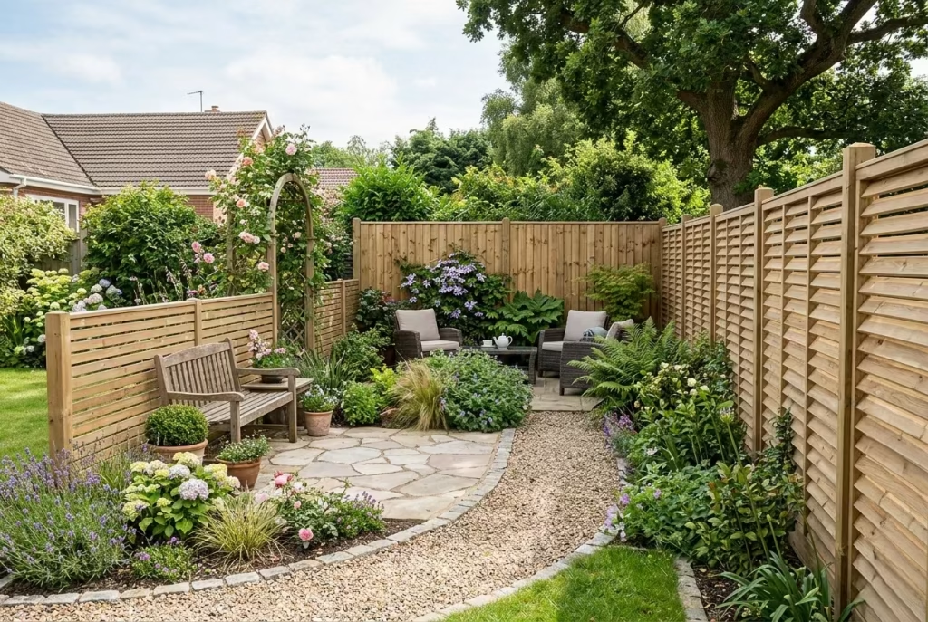
The first question to ask is how much screening you actually need. In smaller gardens, taller fences can feel imposing, visually cutting off light and making spaces feel claustrophobic. Often, a 1.2–1.5 m (4–5 ft) fence with carefully considered spacing between slats or panels provides a sense of seclusion without overbearing the space. For high-use areas, like patios or seating nooks, solid or board-on-board fences are ideal. Meanwhile, for boundaries that don’t require full screening, shadow-gap or louvered designs can offer partial privacy while maintaining airflow and connection with the surroundings. From my projects, restraint is frequently more luxurious than sheer height.
Wind Exposure
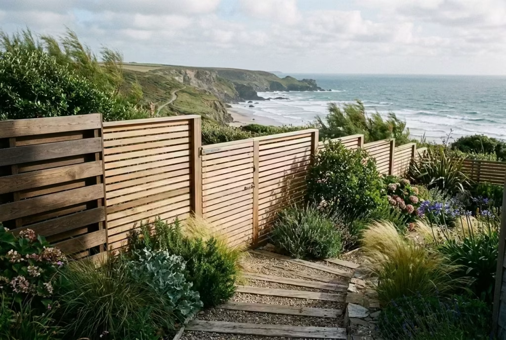
Gardens exposed to strong winds require fences that are both durable and forgiving. A solid, uninterrupted fence may act like a sail, risking structural strain or accelerated timber wear. In these situations, I recommend panelled sections, slatted designs, or shadow-gap fences, which allow wind to pass through, reducing pressure while maintaining protection. On one seaside property, a horizontal slat fence with 10 mm gaps absorbed the brunt of coastal winds without looking compromised or flimsy—a design that combined practicality with editorial elegance.
Garden Size
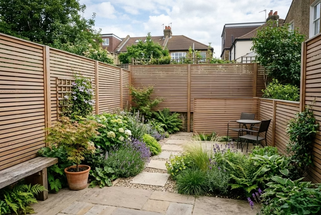
The scale of your garden should guide fence height, style, and visual weight. In compact city gardens, full-height fences can squash the feeling of space, whereas lower, horizontal slatted fences or sectioned panels visually expand the garden. Conversely, in long or wide gardens, taller fences can help define zones, creating areas for seating, planting, or play. Always think in proportion rather than maximum coverage: a fence that feels right in relation to the garden and house will always feel more considered and premium.
House Style
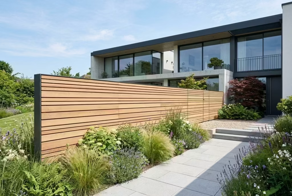
Your fence should converse with your home’s architecture rather than fight it. Clean-lined modern houses suit slim, horizontal boards or shadow-gap panels, while traditional brick or rendered homes pair beautifully with warm-toned vertical boards or mixed-width timber panels. From my experience, a fence that mirrors the scale, rhythm, and material palette of the house instantly elevates the property’s perceived value. Mismatched or overly trendy fences, no matter how attractive individually, often look like an afterthought.
Maintenance Tolerance
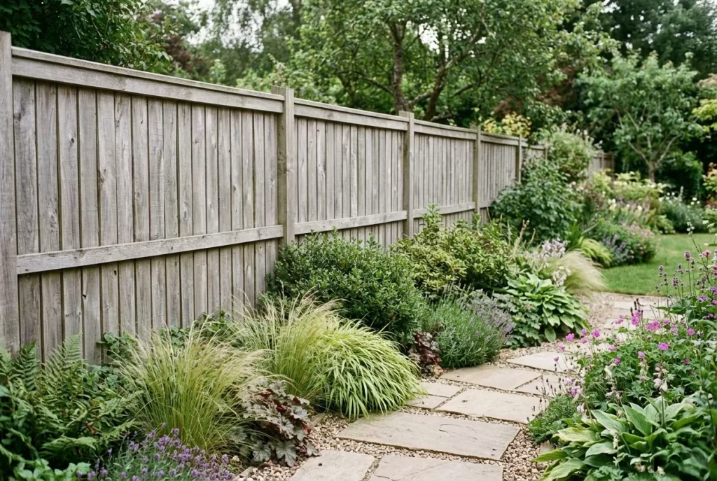
Consider the long-term care you’re willing to invest. Untreated timber left to weather provides a low-maintenance, natural look but will gradually silver and may require occasional checks for rot or splitting. Stained or oiled timber offers a more polished, consistent appearance but demands regular upkeep to maintain its richness and protection. I always advise clients to match timber finish with lifestyle: a high-traffic garden with pets or children may benefit from harder-wearing cedar or larch with a mid-tone oil, balancing longevity and visual appeal.
Budget Range
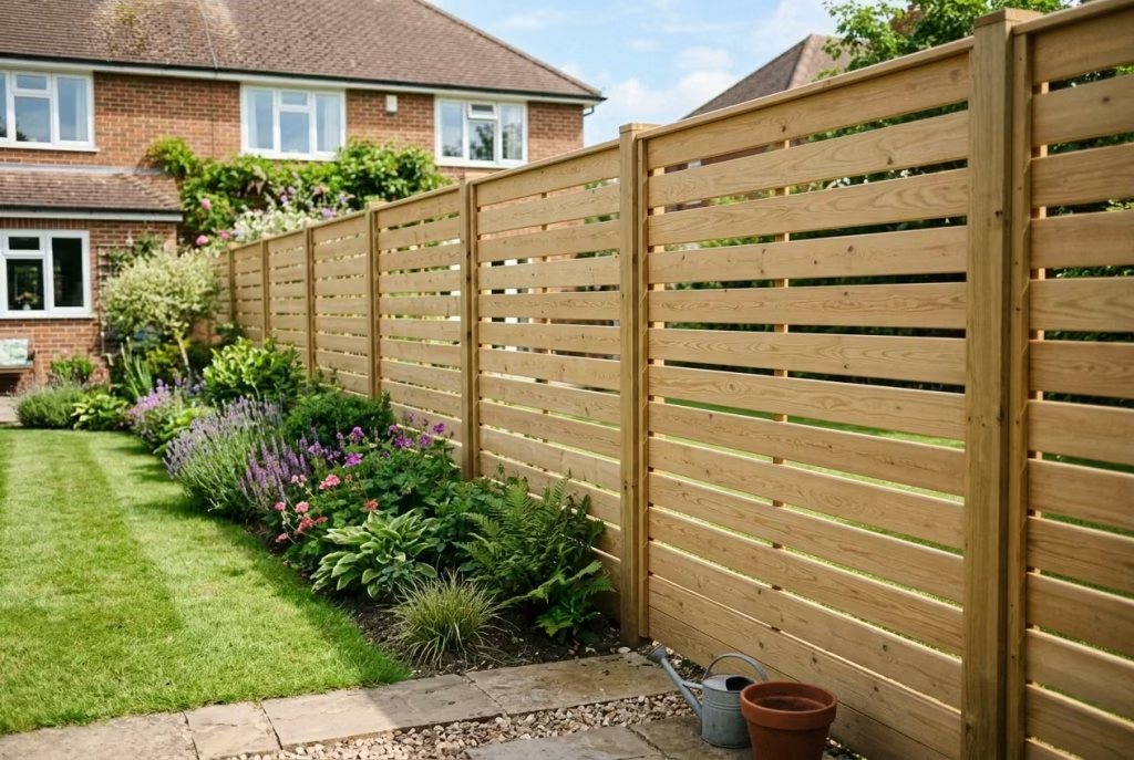
Finally, fence selection must align with your financial parameters. Standard softwood slatted fences are cost-effective and versatile, while premium timbers, custom joinery, or integrated features (lighting, seating, planters) increase investment. That said, simple design choices can often feel more expensive than they actually are. For instance, a horizontal cedar fence with clean shadow gaps and consistent staining can read as luxury without breaking the bank. It’s a reminder that proportion, finish, and detailing often trump sheer cost.
Real-Life Application Insight
From my own projects, the fences that age gracefully and feel effortlessly luxurious are rarely the tallest or most ornate. In smaller gardens, restraint in height and considered slat spacing often makes a space feel calmer, more expansive, and ultimately more expensive than any towering fence could achieve. In larger or complex gardens, sectional, hybrid, or custom fences respond to scale, wind, and architectural nuances, offering a design-led solution that balances beauty with practical living.
By combining these considerations—privacy, wind, scale, house style, maintenance, and budget—you ensure that your fence isn’t just a boundary, but a calm, intelligent, and lasting frame for your garden, giving every space a sense of purpose and premium character.
Materials and Finish Considerations
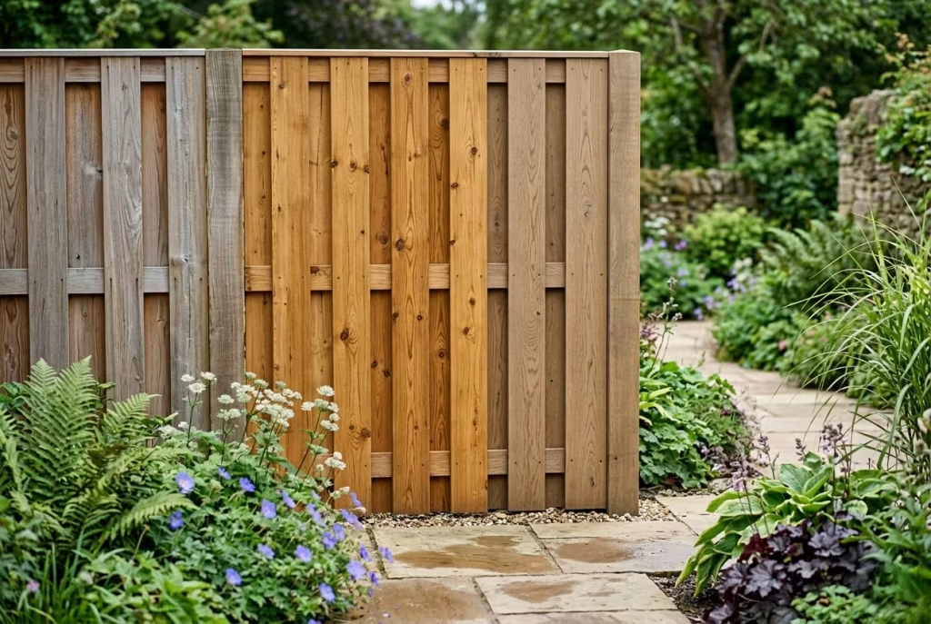
Choosing the right timber and finish is as much about material intelligence as style. The timber you select not only defines the visual tone of your fence but also dictates how it weathers, ages, and integrates with planting, paving, and architectural elements. From my experience, a fence that’s thoughtfully material-led will look effortless for years, while one chosen purely on trend or cost often feels out of place within a few seasons. Let’s break down the key options, finishes, and practical realities.
Timber Options
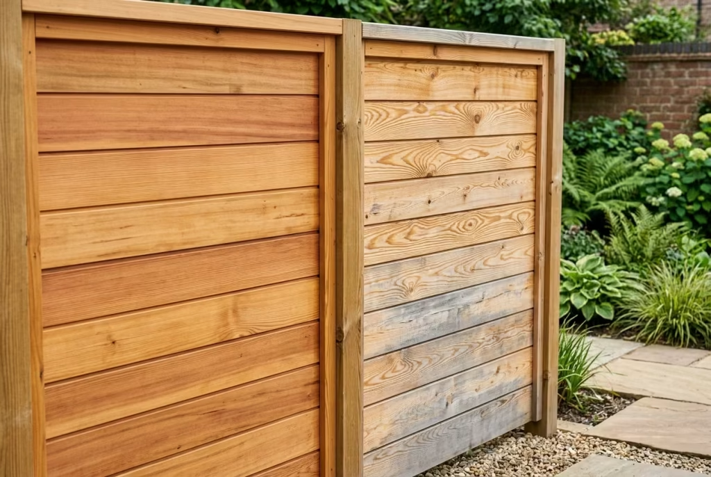
Cedar
- Appearance: Warm, reddish-golden tones with a tight, straight grain; ages to a soft silver over time.
- Durability: Naturally rot-resistant and stable; performs exceptionally in damp or coastal environments.
- Cost: Medium to high; often priced by board quality and thickness.
- Maintenance: Low; occasional oiling keeps tones vibrant, but weathered silvering is often desirable in modern gardens.
Insight: Cedar feels premium without appearing precious, particularly suited to soft or neutral palettes and modern or transitional architecture.
Larch
- Appearance: Honey-golden when fresh, fades to silver; more pronounced grain than cedar.
- Durability: Tough, dense, and naturally decay-resistant; stands up well to exposure.
- Cost: Medium; generally slightly lower than cedar but still a quality timber.
- Maintenance: Low to medium; can be oiled for warmth or left to weather naturally.
Insight: Larch works beautifully for structured, minimalist fences or shadow-gap panels where clean lines and grain texture are important.
Pressure-Treated Softwood
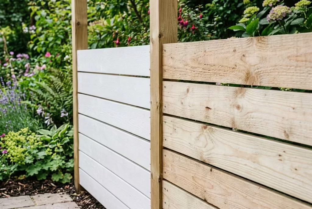
- Appearance: Light cream to pale brown; can be painted or stained.
- Durability: Highly durable due to chemical treatment; resistant to rot and insect attack.
- Cost: Low; cost-effective for long boundaries or high fences.
- Maintenance: Medium; needs periodic painting or staining to maintain appearance.
Insight: Ideal for budget-conscious projects or where practical durability is the priority, but less expressive than natural cedar or larch.
Hardwood (Oak, Accoya, Iroko)
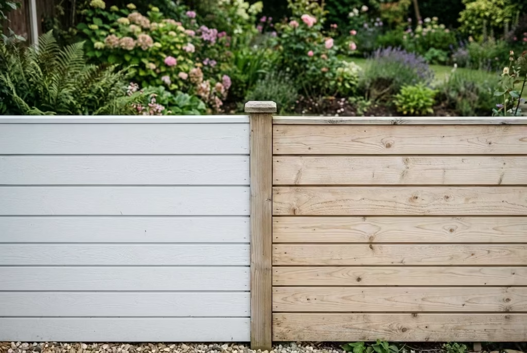
- Appearance: Rich, tight grain and deeper tones; ages to sophisticated greys or silvers.
- Durability: Extremely long-lasting; can last decades even in exposed conditions.
- Cost: High; premium choice for bespoke, custom, or architectural fencing.
- Maintenance: Low to medium; natural oils protect, but occasional care maintains aesthetics.
Insight: Hardwood is a long-term investment; perfect for design-led gardens where the fence doubles as a material feature.
Painted versus Stained Finishes
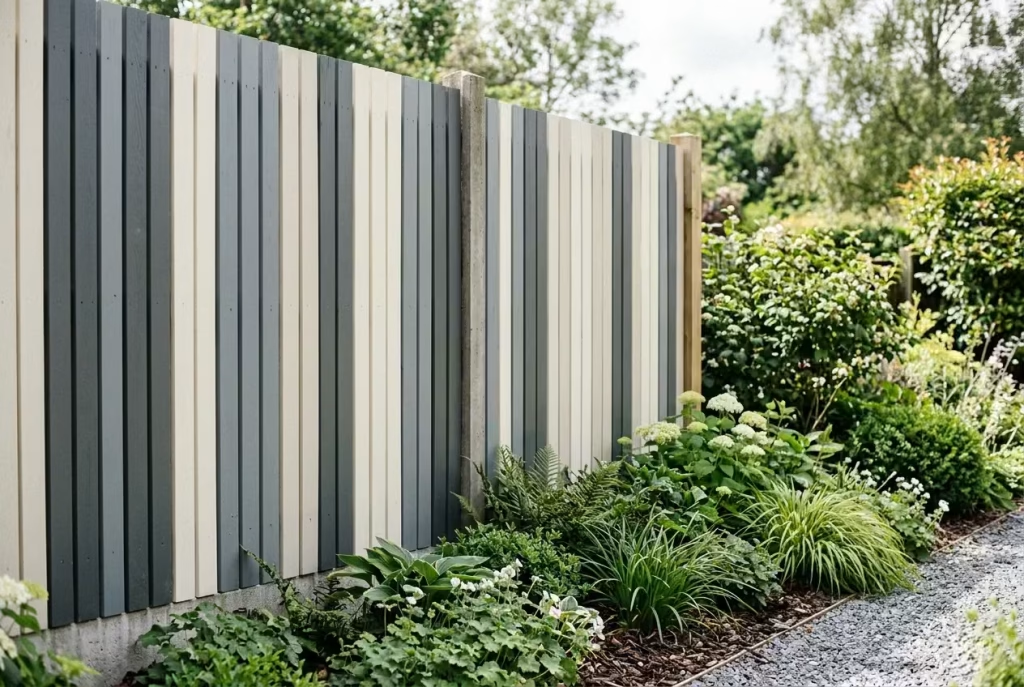
Painted Timber
- Effect: Smooth, opaque colour; can create a crisp, contemporary look.
- Pros: Full colour coverage, hides imperfections, consistent appearance.
- Cons: Requires more maintenance; may peel or chip over time, especially in exposed areas.
- Application Tip: Best for vertical boards or boundary fences that need uniformity; choose muted or soft shades to avoid visual heaviness.
Stained Timber
- Effect: Semi-transparent; enhances grain and natural texture.
- Pros: Retains timber character, feels warmer and more natural, ages gracefully.
- Cons: Requires periodic re-oiling or re-staining; lighter stains may fade faster in sun-exposed gardens.
- Application Tip: Horizontal slats and sectional panels benefit from mid-tone or soft natural stains, balancing modernity with organic warmth.
Smooth Planed Timber versus Rough-Sawn Timber
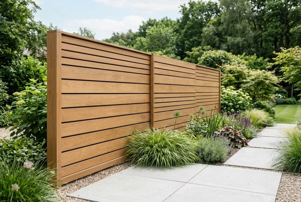
Smooth Planed
- Clean, refined, editorial appearance; ideal for modern or minimalist designs.
- Easier to stain or oil evenly, giving a more consistent finish.
- Works well for furniture-like elements or panels where a polished, architectural feel is desired.
Rough-Sawn
- Offers rustic texture and visual depth; ideal for naturalistic gardens or softer, organic compositions.
- Grain and knots are more pronounced, creating tactile interest.
- Can be left untreated to weather beautifully; slightly higher maintenance if aiming for uniform appearance.
Maintenance Expectations Over Time
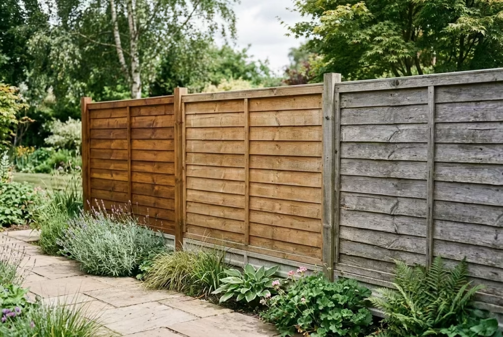
All timber will require some degree of care to maintain longevity and aesthetics. Key considerations include:
- Exposure: South-facing or coastal gardens accelerate fading and silvering.
- Moisture: Ensure adequate clearance from soil or paving to prevent moisture absorption.
- Treatment: Oil or stain every 2–3 years keeps tones vibrant; painted finishes require touch-ups more frequently.
- Cleaning: Occasional washing with mild detergent or soft brush keeps surfaces clean without damaging timber fibres.
Simple Comparison Table
| Timber / Finish | Appearance | Durability | Cost | Maintenance |
| Cedar | Warm, golden-red; silvers with age | High | Medium-High | Low |
| Larch | Honey-golden, pronounced grain | High | Medium | Low-Medium |
| Pressure-Treated Softwood | Pale, versatile; can be painted | High | Low | Medium |
| Hardwood (Oak/Accoya) | Rich, dense, deep tones; ages gracefully | Very High | High | Low-Medium |
| Painted Timber | Smooth, opaque, uniform | Medium-High | Varies | Medium-High |
| Stained Timber | Semi-transparent, natural texture | Medium-High | Varies | Medium |
Real-Life Insight: In my experience, the appearance and tactile quality of timber often have more impact on a garden’s perceived value than exact height or style. A fence that feels warm, textured, and considered—whether left to weather or oiled—can elevate a modest boundary into an editorially polished backdrop. Choosing materials with care ensures your fence ages gracefully, becomes part of the garden story, and keeps the space feeling effortlessly premium for years to come.
Common Mistakes to Avoid
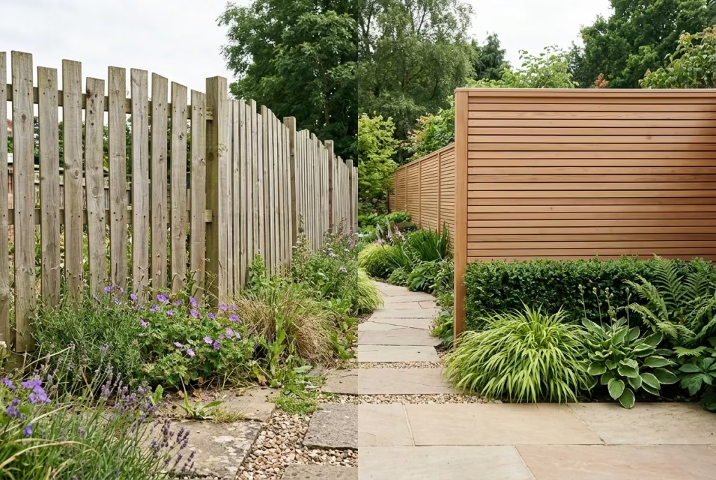
Even the most beautiful timber fences can falter if basic principles are overlooked. From my own experience working on residential gardens, the difference between a fence that feels effortlessly high-end and one that looks “tacked on” often comes down to attention to proportion, context, and practical details. Avoiding these common pitfalls ensures your fence not only looks premium but also performs well for years to come.
Choosing a Fence That Is Too Tall for the Space
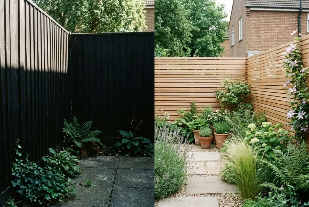
A towering fence may seem like a simple privacy fix, but in smaller gardens it can feel oppressive, cutting off light and creating a closed-in atmosphere. I’ve often seen clients assume taller equals better, only to regret losing visual flow and spatial calm. Tip: In compact spaces, a lower fence with considered spacing or a shadow-gap design can provide privacy without dominating the garden. Sometimes, less really is more, and restraint reads as sophistication rather than compromise.
Ignoring Neighbour Sightlines
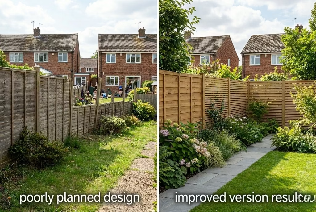
Failing to consider where neighbours can see or where views extend can lead to awkward blind spots or privacy issues. A fence might block sightlines at one angle but leave another exposed. From experience, mapping viewpoints from both your property and surrounding streets before finalising height and panel type saves headaches later. A strategically positioned fence can enhance privacy while maintaining openness and light—no need for a fortress when subtlety will suffice.
Using a Colour That Clashes with the House
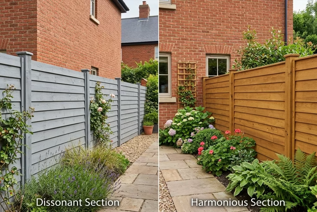
Timber stains or painted finishes that don’t harmonise with the property’s exterior can instantly undermine a fence’s elegance. I’ve seen warm brick houses paired with cool, grey-stained fences that feel disjointed, or sleek rendered facades with overly rustic, rough-sawn timber. Rule of thumb: Match undertones to the house and surroundings; if in doubt, neutral or natural tones age gracefully and feel inherently considered. A well-chosen colour enhances both the fence and the home, rather than competing with it.
Overcomplicating the Design
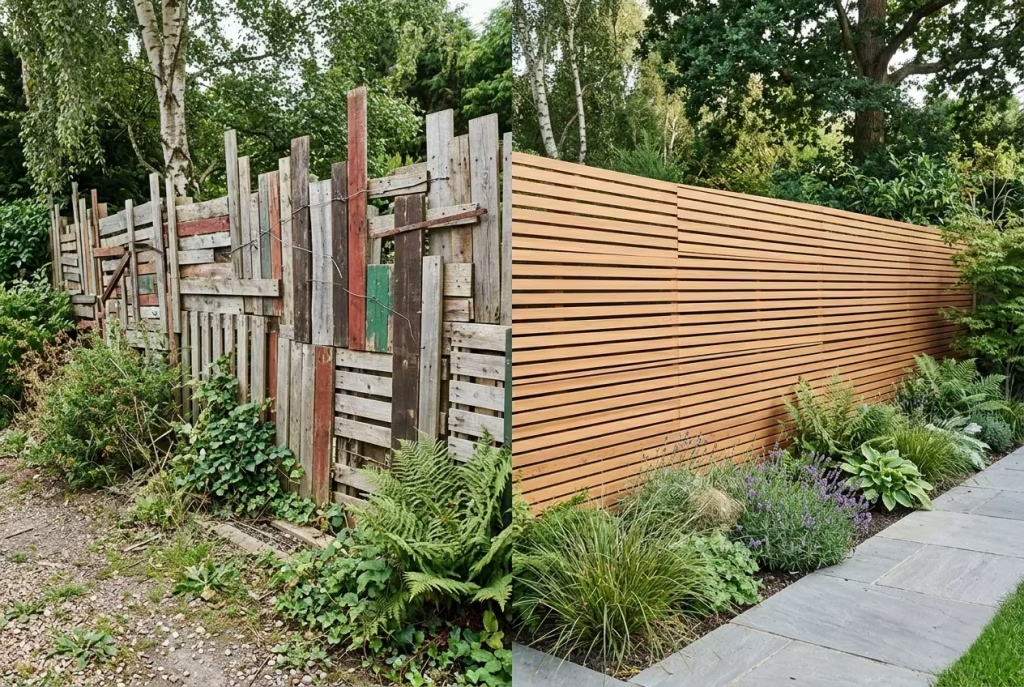
Too many textures, patterns, or mixed materials can overwhelm a garden, making it feel cluttered rather than refined. A fence doesn’t need to showcase every trend—simplicity and rhythm often read as more expensive and timeless. In one project, we reduced a complex, mixed-width, multi-coloured fence to a horizontal slat design with consistent spacing; the garden instantly felt calmer, more spacious, and far more editorially considered.
Forgetting About Gate Placement and Access
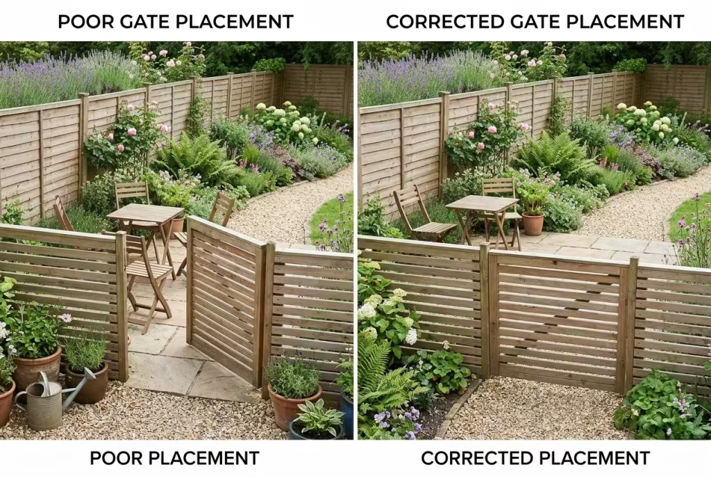
A boundary is only as functional as its points of access. Poorly placed gates can disrupt circulation, create awkward cut-throughs, or make utility access difficult. I always advise clients to consider flow, furniture placement, and service areas before choosing gate positions. Even a premium timber fence can feel clumsy if a gate swings into a seating nook or blocks a pathway.
Neglecting Drainage and Ground Levels
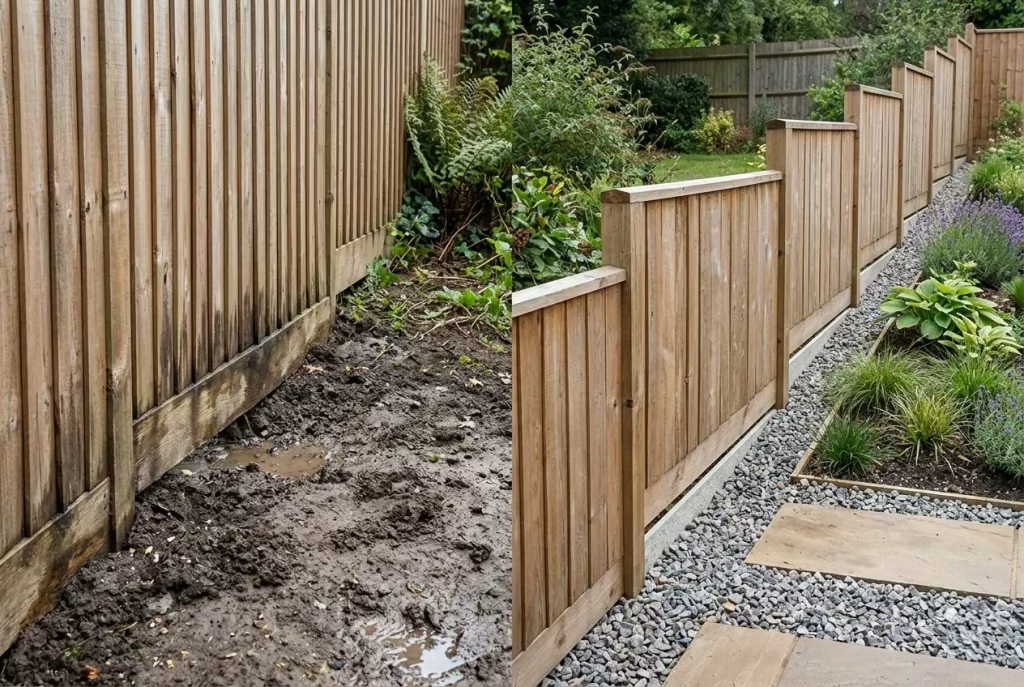
Timber meets the ground, and where moisture accumulates, problems often arise. Without proper clearance, boards can rot, warp, or stain from splashing rain. On sloped gardens, failing to step panels or adjust for levels can lead to uneven lines or gaps. Practical fix: Maintain 50–100 mm (2–4 inches) clearance from soil or paving and ensure water flows away from posts. This simple consideration preserves the fence’s integrity and long-term appearance, reinforcing a sense of quiet craftsmanship rather than neglect.
Real-Life Insight: Many fences fail not because of style but because they ignore context, proportion, and practical detail. In my experience, the fences that feel editorial, premium, and timeless are those designed with a calm, considered approach—measuring viewpoints, light, and flow carefully, choosing restrained materials and finishes, and respecting the space around them. Avoiding these common mistakes is often the difference between a fence that simply exists and one that elevates a garden.
Real-Life Design Lessons from Residential Projects
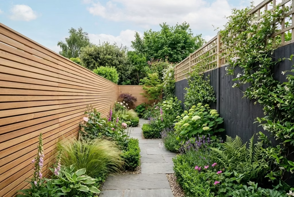
The most enduring fences I’ve designed are the ones that respond to the space, the architecture, and how a garden is actually used. Observing how timber interacts with light, planting, and circulation has taught me that even subtle choices can transform a garden from functional to effortlessly elegant. Here are a few lessons drawn from real projects, offering insight into how material, scale, and detail come together in practice.
Horizontal Timber Fence Broadens a Narrow Terrace Garden
On a tight, elongated terrace garden, clients often assume that privacy means full-height, vertical fencing. In one project, we installed a horizontal slat fence with evenly spaced boards, keeping the height at 1.5 m (5 ft). The effect was subtle but profound: the garden visually widened, creating a sense of openness while still providing screening. By keeping slats consistent and spacing deliberate, the fence read as architectural rather than utilitarian, proving that direction and rhythm in timber can manipulate perception of space.
Darker Staining Makes Planting Pop
In a suburban rear garden with lush borders, a natural cedar fence felt warm but slightly muted against vibrant planting. We opted for a soft charcoal stain, which created a high-contrast backdrop for greenery, flowering shrubs, and ornamental grasses. The effect was cinematic: leaves and blooms seemed to “pop” against the dark timber, giving the garden depth and drama. The lesson: stain choice isn’t just about the fence—it can amplify or soften the planting palette, creating a composition that feels considered, even in everyday suburban settings.
Combining Timber with Trellis for Balanced Privacy
Privacy doesn’t always mean solid, heavy panels. In one design for a family garden with limited sunlight, we combined timber fencing with a trellis extension above 1.5 m panels. This allowed light and air to flow while maintaining screening from neighbouring properties. Over time, climbers and roses softened the timber edges, producing a fence that felt integrated and almost “grown” into the garden. This project reinforced a principle I see repeatedly: privacy and light can coexist beautifully when structural restraint meets careful planting integration.
Observational Insights
- Proportion over height: Even small interventions can feel expansive when lines, scale, and spacing are considered.
- Tone as framing device: Darker or richer stains can elevate greenery, giving a garden a curated, gallery-like quality.
- Material dialogue: Combining timber with trellis, stone, or subtle lighting creates layers of texture and interest, turning a boundary into a feature.
- Subtle evolution: Allowing timber to weather, integrating planting, or designing sections rather than uniform panels often produces a fence that feels calm, intentional, and lived-in, rather than imposed.
From these projects, I’ve learned that a fence isn’t just a boundary—it’s a canvas. By observing how timber interacts with the garden’s light, planting, and circulation, every panel can be turned into a quietly commanding statement that enhances the overall space. It’s these nuanced, design-led choices that separate a fence that merely exists from one that feels editorial, considered, and enduring.
Style Pairings That Work Especially Well with Wooden Fencing
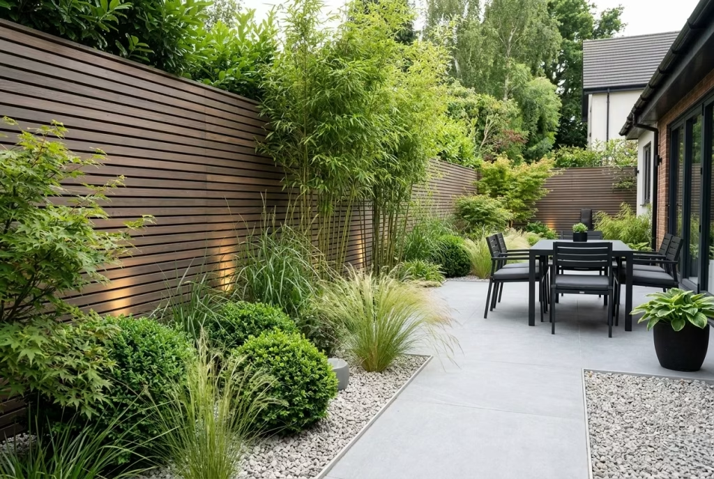
A wooden fence is far more than a boundary; it’s a foundational element that sets the tone for the entire garden. From my years of working on residential gardens, I’ve found that pairing the right materials, planting, and accessories transforms a fence from functional to editorial, giving the space cohesion, depth, and subtle drama. Here’s how to make timber work in harmony with other design elements.
Contemporary Planting
Modern fences come alive when paired with thoughtfully composed planting. Clean-edged borders, architectural grasses, and sculptural shrubs contrast beautifully against horizontal or shadow-gap timber. In one project, vertical bamboo against pale-stained cedar created a rhythmic backdrop, drawing the eye upward while softening the linearity of the fence. Tip from experience: Let the fence frame the planting rather than overpower it; restraint in spacing and height creates a calm, gallery-like effect that feels intentional rather than forced.
Slate or Porcelain Paving
Smooth, muted paving materials like slate or large-format porcelain tiles complement timber fencing effortlessly. The tactile contrast—hard, cool paving against warm, textured timber—anchors seating areas and pathways. I’ve often paired dark-stained horizontal fences with soft grey porcelain, and the combination instantly elevated the space, lending it a sense of quiet luxury. Pro insight: Choose neutral tones for paving to allow timber grain and planting to remain the stars of the composition.
Outdoor Lighting
Fences offer a perfect opportunity for integrated lighting. Subtle wall-wash lights, recessed uplighters, or concealed LED strips accentuate texture, highlight shadow gaps, and extend garden usability into the evening. In a narrow rear garden, we installed low-level LED uplighting along a horizontal cedar fence—it drew the eye along the length, visually expanding the space and adding an atmospheric glow. Lesson: Light doesn’t just illuminate; it sculpts, dramatizes, and enriches the timber’s material presence.
Gravel Gardens
Gravel provides both functional drainage and visual contrast to timber boundaries. In several low-maintenance designs, pale gravel against dark-stained timber created a crisp, editorial canvas for planting pockets, seating nooks, or sculptural elements. The subtle crunch underfoot also adds sensory depth, making the garden feel more immersive. Pro tip: Keep gravel beds consistent with fence height and panel rhythm to maintain cohesion and avoid visual clutter.
Black Outdoor Furniture
Timber fences paired with black metal or powder-coated furniture create a refined, contemporary dialogue. Dark furniture anchors outdoor rooms, emphasizing fence tones and textures without competing for attention. In a recent suburban courtyard, a charcoal fence and matte black seating became a backdrop for greenery and soft timber decking, reinforcing a sense of calm, deliberate contrast. Observation: Black is a surprisingly versatile foil that allows timber warmth to shine, creating a layered and sophisticated palette.
Brick, Render, and Stone Backdrops
A fence’s relationship with the house and surrounding hardscape is critical. Warm cedar or larch pairs beautifully with neutral render or soft brick, while darker-stained timber works elegantly against pale stone or pale masonry walls. In a project with a combination of pale stone terraces and rendered facades, a mid-tone horizontal cedar fence tied the garden and architecture together, acting as a subtle bridge between natural and built elements. Insight: Matching timber undertones with the surrounding materials creates a calm, cohesive feeling, rather than a jarring visual clash.
Final thoughts
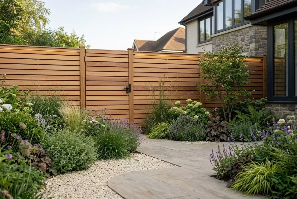
A wooden fence is far more than a functional boundary—it is a design statement, a backdrop, and an integral part of the garden’s narrative. From my experience, the fences that truly elevate outdoor spaces are rarely the tallest, flashiest, or most ornate. Instead, they are the ones that respond to architecture, respect scale, and harmonise with planting, paving, and light. Every detail—from slat spacing to stain tone, from panel alignment to gate placement—contributes to a sense of calm and considered elegance.
The best fences support rather than compete with the garden, creating a sense of enclosure without confinement and privacy without heaviness. They are subtle yet commanding, allowing greenery to flourish, materials to converse, and spaces to feel intentionally composed. In narrow terraces, restrained horizontal panels can make space feel expansive; in lush suburban gardens, a dark-stained backdrop can make planting glow; in compact corners, timber paired with trellis or seating can turn an overlooked edge into a destination.
Ultimately, the measure of a successful wooden fence is its ability to feel effortless, editorial, and timeless. It is a boundary that anchors the garden, enhances the architecture, and quietly commands attention without shouting. The fences that achieve this are those chosen with care, executed with precision, and allowed to evolve gracefully over time—a reflection of thoughtfulness and design intelligence that elevates every inch of the outdoor space.
By considering proportion, materiality, and context, homeowners can create a fence that feels less like a perimeter and more like a design-led extension of their home, one that will continue to enrich the garden experience for years to come.
Modern Wooden Garden Fence Ideas: Frequently Asked Questions
What height is best for a modern wooden garden fence?
The “right” height depends on privacy needs, garden size, and visual balance. In smaller gardens, 1.2–1.5 m (4–5 ft) often feels more spacious and calm, while larger properties can accommodate 1.8–2 m (6–6.5 ft) panels without overwhelming the space. Horizontal or shadow-gap designs can make even taller fences feel lighter and more considered.
Which timber is most durable for outdoor fencing?
Cedar, larch, and hardwoods like oak or Accoya are naturally rot-resistant and long-lasting. Pressure-treated softwoods are a budget-friendly option but may require more maintenance. The choice should balance durability, aesthetic warmth, and intended maintenance effort.
Should I paint or stain my wooden fence?
Both have merits. Staining enhances natural grain, warms the space, and ages gracefully. Painting offers a crisp, uniform finish and can complement modern or minimalist gardens. The key is to match the finish with the house exterior and planting palette to maintain cohesion.
How can I make a fence feel modern rather than traditional?
Opt for horizontal slats, slim boards, even spacing, concealed fixings, and natural or muted stain tones. Avoid overly ornate panels or vertical picket styles. Integration with planting, lighting, or built-in seating can elevate a fence from merely functional to editorial and design-led.
Can a fence improve a small garden’s sense of space?
Absolutely. Horizontal lines, careful spacing, and lighter finishes can visually widen narrow gardens, while vertical elements can enhance height where needed. Thoughtful proportion and restrained detailing often make a garden feel larger and more luxurious than it actually is.
How do I balance privacy and airflow?
Solutions like shadow-gap panels, louvered timber fences, or trellis extensions allow light and air to pass while maintaining screening. Planting climbers over these structures can further soften the boundary and add seasonal variation without creating a heavy, closed-in feel.
Can fences work as design features rather than just boundaries?
Yes. Integrated lighting, planters, seating, or mixed panel types transform a fence into an architectural element that anchors a garden and enhances spatial perception. The trick is subtlety—less is often more when aiming for an editorial, high-end effect.
How do I ensure my fence complements the house and garden?
Consider scale, proportion, and material dialogue. Match timber undertones with brick, render, or stone, choose finishes that harmonise with planting, and allow the fence to frame rather than dominate the space. Thoughtful integration ensures the fence feels intentional, calm, and timeless.