25 Cozy White Interior Ideas That Prove White Can Feel Warm
White, when approached with intent, is never neutral in the passive sense. It is precise. It reveals more than it conceals. In well-considered interiors, it becomes a medium through which light, proportion, and materiality are allowed to speak with clarity. That is where its real strength lies, not as a fallback choice, but as a deliberate design decision that demands control.
In practice, I treat white less as a colour and more as a responsive surface. It shifts throughout the day, picking up warmth in the morning, flattening under midday glare, then softening again as light recedes. In a south-facing room, for instance, a stark white can quickly feel overexposed, almost brittle. I tend to counter that with softer, warmer undertones and matte finishes that diffuse light rather than bounce it harshly. In contrast, north-facing spaces, where daylight arrives cooler and more subdued, benefit from whites that carry a subtle warmth, preventing the room from feeling withdrawn or clinical.
Spatial proportion plays an equally critical role. White has a way of amplifying both the strengths and the flaws of a room. In compact spaces, it can stretch boundaries, allowing walls to recede and circulation to feel less constrained. I have worked on narrow bedrooms, often around 2.7 metres wide (roughly 9 feet), where a layered white palette, combined with continuous flooring and minimal visual interruption, made the space feel noticeably broader. In larger rooms, however, white needs structure. Without it, volume can feel directionless. That is where elements like shadow gaps, panel detailing, or subtle tonal shifts come into play, quietly organising the space without breaking its calm.
Material texture is where white truly finds depth. Strip away colour, and every surface starts to matter more. A flat painted wall will behave very differently from a limewashed finish that catches light unevenly, or a plaster surface that carries a slight movement beneath it. I often layer materials deliberately, pairing something smooth with something tactile, like crisp painted joinery against a soft boucle chair or a honed stone surface beside linen drapery. These contrasts are subtle, but they prevent the space from feeling one-dimensional.
I have found that white interiors only fail when they are treated as empty. When approached as a layered composition, where light is managed, proportions are respected, and materials are chosen with care, they become some of the most complex and quietly confident spaces to live in.
Framework for Each Idea (Flexible, Not Formulaic)
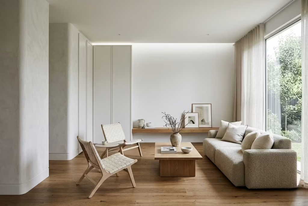
Each idea within this collection is written to stand on its own merit, shaped by real design thinking rather than a rigid template. In practice, no two spaces behave the same way, and the writing reflects that. Some ideas may lean more heavily on spatial planning, others on material layering or light control. What remains consistent is the depth behind each decision, ensuring the reader is not just inspired, but better equipped to make informed choices in their own home.
Below is the underlying structure guiding each idea, developed from how I approach projects on site and in conversation with clients.
Design Concept: The Core Idea, Clearly Resolved
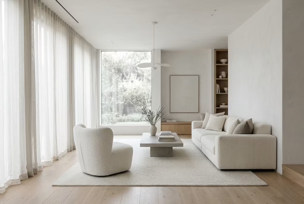
Every space begins with a central premise. Not a vague mood, but a clear design position. In white interiors, this often comes down to what is doing the heavy lifting. Is it light, texture, proportion, or contrast?
I approach this as the anchor point, the thing that holds the room together when everything else is stripped back. Without it, a white interior can drift, feeling neither here nor there.
For example, in a recent living room project, the concept was not simply “a white space,” but a room shaped by diffused light. That decision influenced everything that followed, from matte wall finishes to sheer drapery and low-contrast furnishings. The result was not decorative in the traditional sense, but it had presence, the kind that settles in slowly.
This is the level at which each idea operates. Not surface styling, but intent that carries through the entire space.
Real-Life Application: Where Design Meets Daily Living
This is where theory is tested against reality. It is easy to design a white interior that looks composed in photographs. It is far more demanding to create one that holds up to everyday use, where people move through it, live in it, and inevitably leave traces of life behind.
I draw directly from lived scenarios here. Rooms that had awkward proportions, clients who were wary of “too much white,” spaces that initially felt flat but gained depth through careful adjustment.
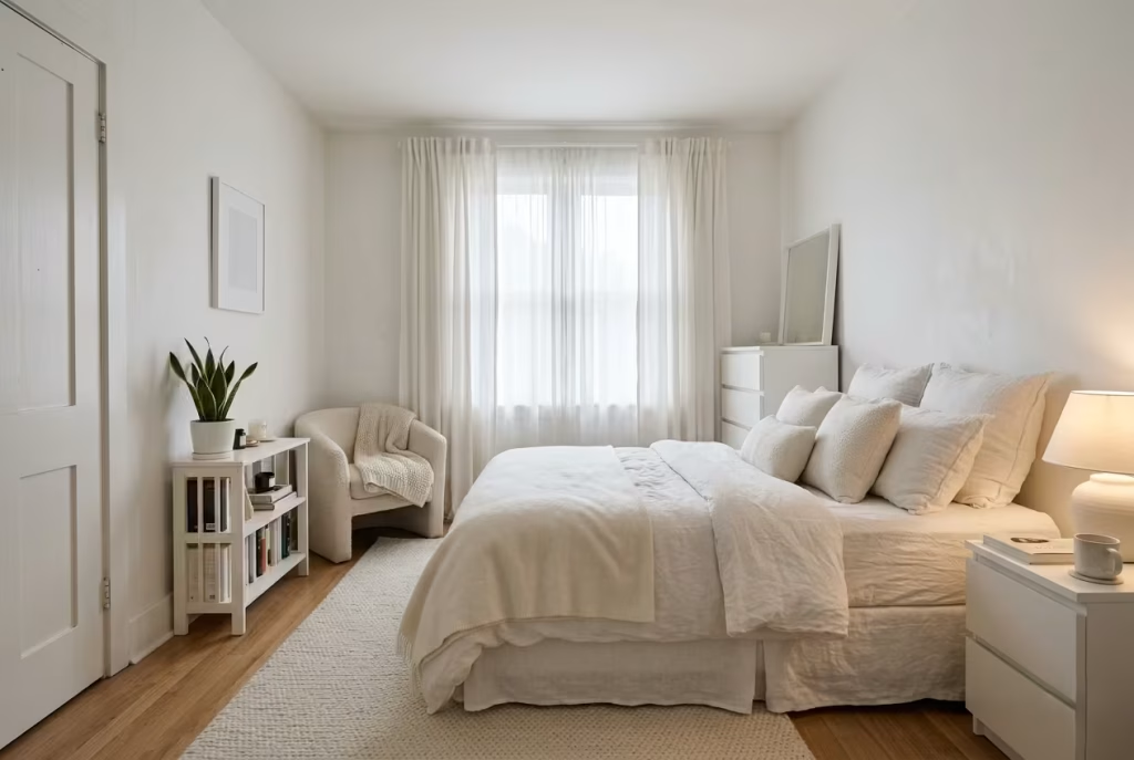
In one bedroom, measuring just under 3 metres by 3.5 metres (approximately 10 by 11.5 feet), the concern was that white would make the space feel stark. Instead of introducing colour, we worked with layered textiles, off-white tones, and soft lighting positioned just out of direct sightlines. The shift was immediate. The room felt calmer, more expansive, and crucially, more forgiving to live in.
These applications are grounded, not idealised. They acknowledge constraints, budgets, and the quiet compromises that shape real homes.
You May also Like: Walk-In Wardrobes Designs: A Complete Design-Led Guide for Long-Term Use
Measurements: Giving Ideas a Sense of Scale
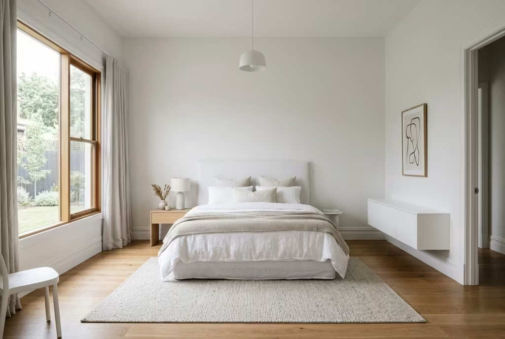
Good design lives and dies by proportion. What looks balanced in one room can feel completely off in another if scale is ignored.
Where it adds value, I include specific measurements, not as rigid rules, but as guiding thresholds. Clearances, heights, spacing, these are the invisible frameworks that allow a space to function without friction.
For instance, maintaining at least 600 to 750 mm (24 to 30 inches) of circulation space around a bed does more than improve movement. In a white interior, it also preserves visual clarity, preventing the room from feeling congested. Similarly, ceiling height, whether 2.4 metres or pushing towards 3 metres (8 to 10 feet), will dramatically affect how white behaves, either enclosing the space or allowing it to breathe.
These details may seem technical at first glance, but they are what separate a room that looks composed from one that quietly works.
Material and Lighting Insights: Where Depth Is Built
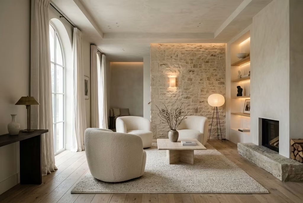
In white interiors, materials and lighting are not secondary considerations. They are the entire language of the space.
Without colour to rely on, surfaces begin to carry more weight. A flat emulsion wall will read differently from a limewashed finish that shifts with the light. A polished surface will reflect sharply, while a honed or brushed texture will soften the effect, catching light in a more restrained way.
Lighting, in particular, needs careful orchestration. I often think of it as layering rather than placing. Ambient light sets the tone, task lighting supports function, and accent lighting introduces depth, often in ways that are felt before they are consciously noticed.
There is a quiet tipping point here. Too much uniform light, and the room falls flat. Too many competing sources, and the calm is lost. The aim is to strike a balance where the space feels considered, not overworked.
Pros and Cons: A Balanced, Lived-In Perspective
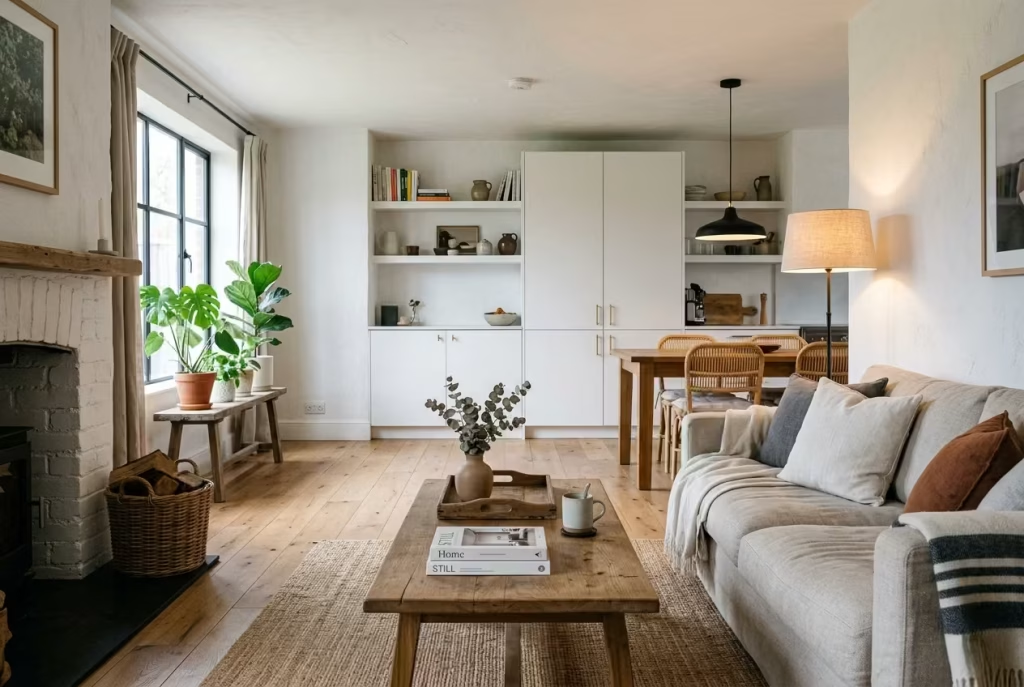
No design approach is without compromise, and white interiors are no exception. They can feel expansive and calm, but they also demand a certain level of discipline, both in execution and in how they are lived in over time.
I make a point of addressing both sides. Not to dilute the appeal, but to give a more honest picture.
For example, while white surfaces can enhance light and create a sense of openness, they also tend to reveal wear more readily. In high-traffic areas, this might mean opting for more durable finishes or slightly deeper tones that are still within the white spectrum but more forgiving.
On the other hand, when handled well, white interiors age gracefully. They do not date in the same way trend-driven palettes can. Instead, they evolve, taking on character as materials settle and light continues to shift through the space.
A Final Note on Approach
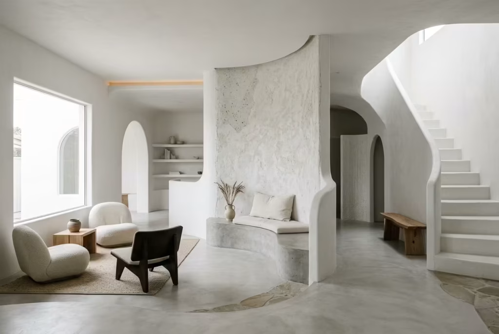
This framework is intentionally fluid. It provides direction without imposing repetition. Some ideas may unfold through a material story, others through a spatial challenge or a lighting solution that changed everything.
That variation is deliberate. Because in reality, design rarely follows a neat script. It moves in response to constraints, opportunities, and those moments where a small adjustment, almost incidental at first, ends up defining the entire room.
And that is ultimately the aim here. Not just to present ideas, but to offer a way of seeing white interiors differently, as layered, responsive environments that reward attention and hold their own over time.
25 White Interior Ideas
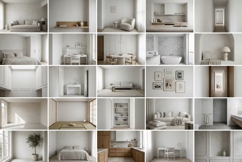
White interiors rarely reveal their full character at first glance. They tend to unfold slowly, almost quietly, where the nuance sits in how light moves, how materials respond, and how proportions are held together. What follows is not a catalogue of looks, but a series of considered approaches, each shaped by real spatial challenges and lived-in decisions, where white is used with intent rather than habit, and where restraint, more often than not, does the heavy lifting.
Layered Whites in a South-Facing Living Room
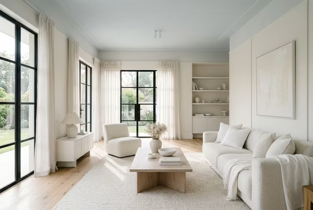
In a south-facing living room, white has a tendency to run ahead of itself. With daylight pouring in for most of the day, what should feel calm can quickly tip into something overexposed, almost washed out. This is where layering comes into its own, not as a decorative trick, but as a way of bringing the space back into balance.
The starting point is tonal variation. I rarely rely on a single white in these conditions. Instead, I work with a spectrum, a soft, warm white on the walls to absorb and temper the light, paired with a slightly cooler, chalkier white on ceilings or joinery to introduce a gentle contrast. It is a subtle shift, the kind you notice more out of the corner of your eye than head-on, but it gives the room a sense of depth that flat white alone simply cannot carry. Done well, it feels cohesive rather than contrived, like the space has settled into itself.
On site, glare is usually the first issue that needs resolving. South-facing rooms, especially those with large glazing, can bounce light around in a way that feels sharp rather than soft. I learned this the hard way on a project where a client insisted on a brilliant white with a slight sheen. By midday, the room felt almost clinical, every surface reflecting light back at you. We corrected it by moving to a fully matte finish across the walls and opting for lime-based paint in key areas. The difference was immediate. Light was still present, but it had somewhere to land. It stopped shouting and started to sit more comfortably within the room.
Proportion plays a quiet but decisive role here. In a standard-height room, around 2.4 metres (8 feet), layered whites can help lift the ceiling visually, especially if the ceiling is kept slightly lighter or cooler in tone. The eye reads it as height, even when the dimensions remain unchanged. In taller spaces, closer to 3 metres (10 feet), the approach shifts. Too much uniform white can make the volume feel a touch adrift, so I often introduce faint tonal breaks, through wall panelling, shadow gaps, or even a barely perceptible shift in paint tone, to anchor the space without interrupting its calm.
Material choice becomes the quiet backbone of the scheme. A matte-painted wall next to a softly textured fabric, linen, boucle, or brushed cotton, starts to build a layered narrative without introducing colour. I often bring in natural timber at a low level, flooring or occasional furniture, just to ground the composition. It is a bit like giving the room a place to stand, rather than letting it float.
Pros: When handled with care, layered whites create depth without relying on colour. The space feels light, expansive, and composed, with a kind of quiet confidence that does not date easily.
Cons: It is not as forgiving as it looks. The success of the scheme hinges on precise paint selection and finish. A white that is too cool or too reflective can undo the entire effect, leaving the room feeling flat or overly stark.
You May also Like: 25 Relaxing Coastal Home Office Ideas Inspired by Capri Living
White Bedrooms That Feel Cool, Not Cold (Summer-Focused)
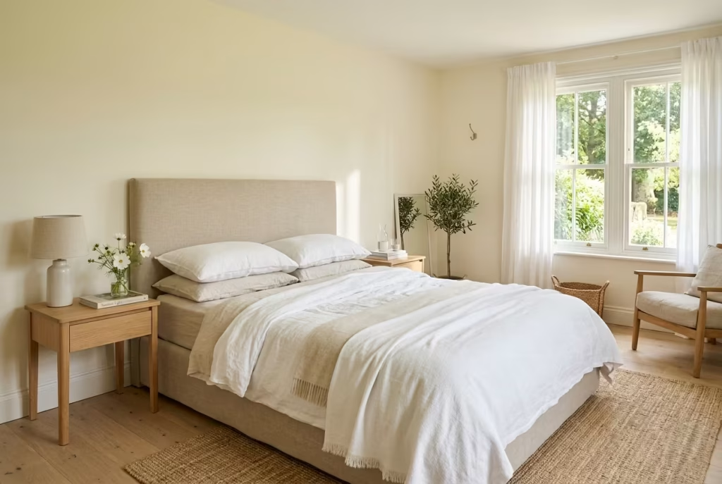
A white bedroom works beautifully in summer, but only when it is handled with a light touch and a bit of nerve. Too much starkness and the room starts to feel more like a showroom than a retreat. The trick is to create a space that feels crisp and breathable, yet still soft around the edges, so it cools the eye without draining the room of warmth.
Linen bedding is usually where I begin. It has that easy, unforced quality that suits summer bedrooms perfectly, and it brings just enough texture to stop the palette from feeling thin or overworked. I often lean into washed linen in off-white, oat, or bone tones because these shades sit comfortably in natural light without turning bluish or flat. They also age well. Linen does not pretend to be perfect, and that is part of its charm. It settles in, softens up, and gives the room that quietly lived-in look that feels far more convincing than anything too polished.
In practice, I tend to steer clients away from a pure bright white in bedrooms that get strong summer light. It can look lovely in a photograph, but in real life it often feels a touch severe, especially early in the morning or when the sun is high. Off-whites with yellow undertones tend to do the heavy lifting here. They bring a gentle warmth that keeps the room from feeling cold to the bone, while still preserving that airy, fresh quality people want in a summer bedroom. It is a small shift, but one that changes the whole mood of the space. The room stops feeling like it is bracing itself against the season and starts working with it.
I remember one bedroom project where the client loved the idea of an all-white scheme but worried it might feel too sterile in the long, bright evenings. The room had decent natural light, but it faced west, so the afternoon sun could make the walls feel a bit harsh. We resolved it by using a warm white on the walls, layered with pale flax bedding, a chalkier throw, and light oak bedside tables. Nothing flashy, nothing overblown, just a careful balancing act. The result had real staying power. It felt fresh without being chilly, and that is often the sweet spot in a summer bedroom.
Airflow and circulation matter just as much as colour. A bedroom that feels physically cramped will always undermine the sense of calm, no matter how well it is styled. I usually recommend keeping at least 600 to 750 mm, or 24 to 30 inches, clear around the sides of the bed where possible. That breathing room does more than improve movement. It allows the room to feel lighter and less hemmed in, which is especially important in a white scheme where every line is more visible. When space is tight, I would rather simplify the furniture layout than cram in extra pieces that muddy the effect. In a bedroom, less really can be more, and then some.
Material choice also has a huge part to play. White bedding only works if the textures are doing some of the lifting. I often pair linen with brushed cotton sheets, a lightweight wool throw for cooler nights, or a softly upholstered headboard in a muted neutral. These layers keep the room from falling flat. Without them, white can lose its edge and start to feel lifeless. With them, it becomes dimensional, tactile, and welcoming in a way that feels effortless rather than staged.
Pros: A white summer bedroom feels calm, clean, and restorative. It reflects daylight beautifully, helps the room feel cooler, and creates a peaceful backdrop that supports rest rather than distracts from it.
Cons: Without warmth in the undertone or enough texture in the materials, the room can become cold or washed out. It also exposes weak lighting and poor proportions very quickly, so the scheme needs a steady hand.
Sculptural White Kitchens with Soft Contrast
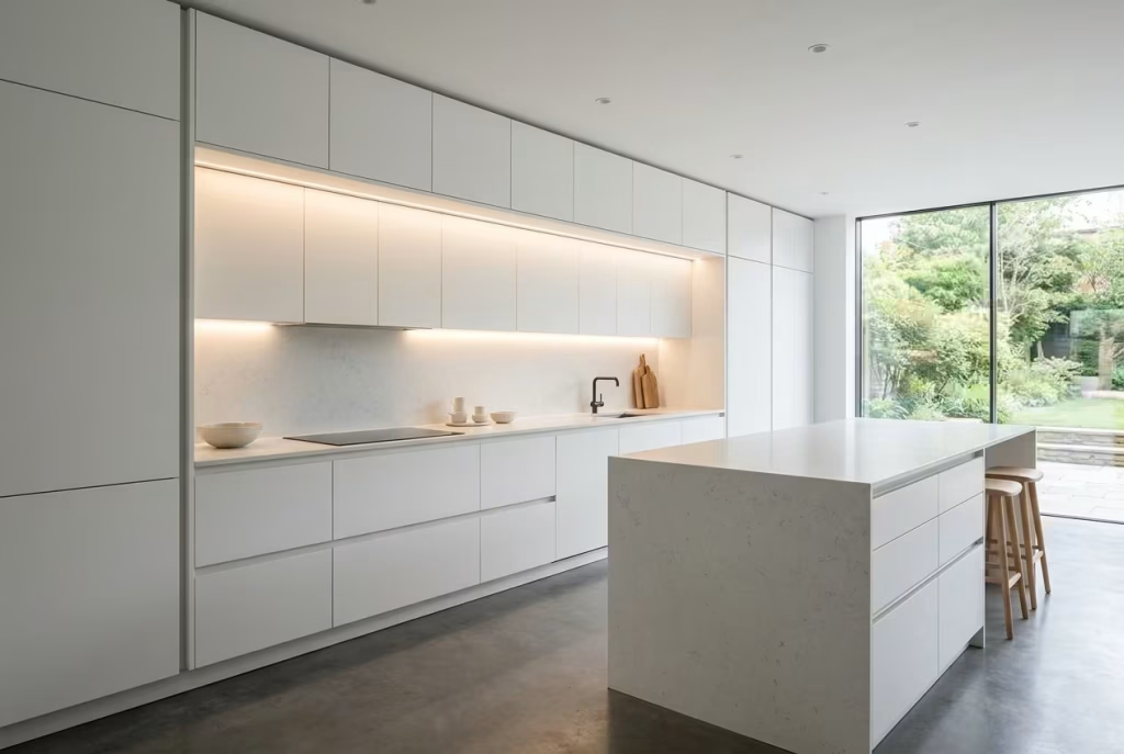
A white kitchen, when stripped back to its essentials, has the potential to feel almost architectural. Not decorative in the usual sense, but shaped, defined, and held together by line and proportion. This is where a sculptural approach comes in, where the interest is built into the form itself rather than applied on top. It is a quieter kind of design, but one that carries real weight when done properly.
White-on-white cabinetry is often misunderstood as flat or monotonous. In reality, it lives or dies by the detail. I tend to rely on subtle shadow gaps, recessed lines, and fine junctions between panels to introduce contrast without breaking the palette. These small moments of depth, barely a few millimetres, do more than you might expect. They catch light differently throughout the day, creating a rhythm across the cabinetry that feels composed rather than blank. It is a bit like tailoring. From a distance it looks simple, but up close the precision tells the real story.
On a recent project, we worked with a fully handleless kitchen, floor-to-ceiling cabinetry, all in a soft white with a low-sheen finish. On paper, it sounded straightforward. In practice, it required a level of precision that left no room for shortcuts. Handleless systems, especially those using integrated grip rails or push-to-open mechanisms, demand exact alignment. Even a few millimetres out, and the clean lines start to unravel. Doors sit unevenly, shadow gaps become inconsistent, and the whole composition loses its sharpness. We ended up reworking part of the installation because the initial tolerances were not tight enough. Once corrected, the difference was night and day. The kitchen finally read as a single, continuous form rather than a series of separate elements.
Material choice again plays a quiet but decisive role. I often avoid high-gloss finishes in these settings, particularly in bright kitchens, because they can reflect too much light and flatten the sculptural quality. Instead, I lean towards satin or matte lacquers, sometimes paired with a lightly textured worktop, something like honed quartz or a soft stone finish. This combination allows light to skim across surfaces rather than bounce aggressively, giving the kitchen a more grounded, considered feel.
Lighting needs to be handled with the same restraint. Integrated LED strips beneath cabinets or within shadow gaps can enhance the depth without drawing attention to themselves. The aim is not to spotlight the kitchen, but to let it reveal itself gradually. When the light is right, edges soften, planes separate, and the space feels layered without ever becoming busy.
Pros: A sculptural white kitchen has a timeless quality. It does not rely on colour trends or decorative features, so it tends to age well. When executed with precision, it feels calm, refined, and quietly confident, the kind of space that holds up year after year.
Cons: It is unforgiving in execution and in use. Fingerprints, smudges, and minor misalignments are more visible against white, particularly on flat, uninterrupted surfaces. Maintenance becomes part of the routine, and the initial installation demands a high level of craftsmanship to avoid the design falling short of its intent.
Textured White Walls That Replace Artwork
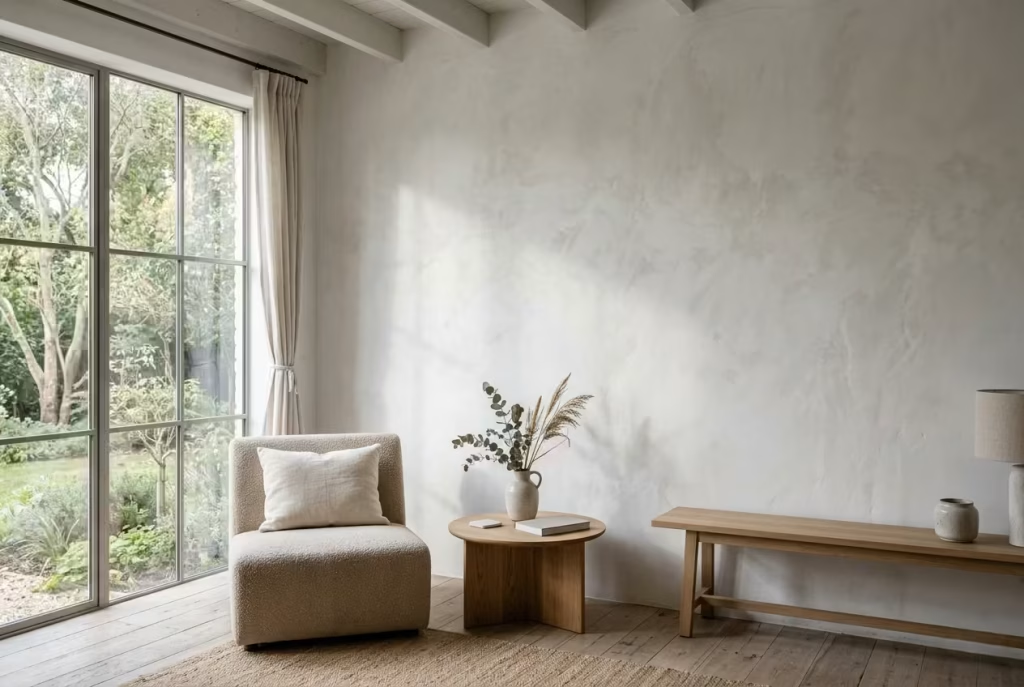
There is a particular kind of confidence in a white wall that does not need to be dressed up. When the surface itself has depth, movement, and a bit of hush to it, the room stops relying on framed art to create interest. The wall becomes the visual anchor. That is where textured white finishes, such as limewash, plaster, and microcement, earn their keep. They do not shout for attention, but they hold it all the same.
Limewash is often the most forgiving starting point because it brings a soft, clouded variation to the wall that shifts gently as the light moves. It has that beautifully imperfect quality that makes a space feel lived in rather than over-designed. I have used it in rooms where the client wanted something calm but not flat, and it has a way of doing exactly that. From one angle the wall reads as quiet and restrained, then as the day changes, subtle tonal movement appears, almost like the room is breathing. That understated change is the whole point. It adds atmosphere without clutter, which is worth its weight in gold in a room that already has strong architectural bones.
Plaster takes this one step further. A polished or hand-applied plaster wall has a richness that can feel almost stone-like, especially when the finish catches light at an angle. It is not a surface that simply sits there. It interacts. In one project I worked on, a living room with tall windows and very little wall space for artwork, we used a soft plaster finish instead of trying to force in decorative pieces that would have felt tacked on. The result was far more convincing. The wall had presence on its own, and because the surface was slightly varied, it never looked static. It gave the room a tactile, layered quality that a print or canvas would have struggled to match.
Microcement, by contrast, brings a more contemporary edge. It is smoother, more continuous, and slightly cooler in character, which makes it ideal for spaces that need restraint rather than softness. In the right setting, especially kitchens, bathrooms, or minimalist living spaces, it creates a clean architectural backdrop that still has depth when you look closely. It is the sort of finish that rewards a second glance. Up close, there is often a delicate variation in tone and texture that stops it from feeling industrial or cold. Used well, it lands somewhere between minimal and refined, which is a difficult balance to strike.
The real magic of these finishes lies in how they handle light. A standard painted wall reflects light in a fairly predictable way. A textured white wall does not. It catches it, softens it, and throws it back in fragments. That means the wall becomes part of the room’s atmosphere, not just its boundary. Morning light may skim across a plaster surface and bring out its movement, while evening light can make limewash feel almost velvety. It is this shifting quality that makes textured white walls such a strong alternative to artwork. They provide visual interest without adding noise, which is often exactly what a room needs when you want it to feel composed rather than overworked.
I often think of these finishes as the quiet overachievers of interior design. They do not announce themselves, but they change the whole reading of a room. If a space feels too empty, too rigid, or a little too polished, texture can loosen it up without compromising the palette. That is the sweet spot. It keeps the interior honest, layered, and just unpredictable enough to feel human.
Pros: Textured white walls add depth, atmosphere, and movement without relying on decorative accessories. They work especially well in rooms where light changes throughout the day, and they can make a space feel more architectural and considered.
Cons: They require a more careful hand than standard paint. Poor application can make the finish look messy rather than refined, and some surfaces, particularly limewash and plaster, may need more maintenance or specialist care over time.
White Bathrooms with Spa-Level Calm
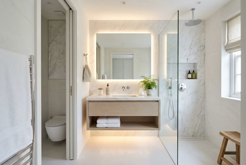
A white bathroom can either feel like a place you pass through or a place you retreat to. The difference, more often than not, comes down to how the materials are handled and how the light is allowed to settle. When it works, it has that quiet, unhurried quality, the kind that takes the edge off the day without trying too hard.
Stone is usually where I begin when aiming for that spa-like calm. Not the overly polished, high-gloss kind, but something more restrained, honed marble, limestone, or even a well-chosen porcelain that mimics natural stone without the maintenance overhead. These surfaces have a softness to them, a way of catching light without throwing it back too sharply. I have found that when you walk into a bathroom finished this way, the atmosphere shifts almost immediately. It feels grounded, as though the space has a bit of weight beneath it, rather than floating in a sea of bright white.
Porcelain, particularly in larger formats, can carry this idea further. Fewer grout lines mean fewer visual interruptions, which helps the room read as one continuous surface. In smaller bathrooms, this can make a noticeable difference. I worked on a compact space, just under 2 metres by 2.5 metres (roughly 6.5 by 8 feet), where switching to large-format porcelain tiles in a soft white tone completely changed the perception of scale. The room felt calmer, less fragmented, and easier on the eye. It is a small move on paper, but in reality, it pulls the whole space together.
Lighting, though, is where most bathrooms either come into their own or fall short. Bright overhead lighting alone tends to flatten everything, leaving the room feeling exposed rather than relaxing. I prefer to layer it, introducing diffused lighting around mirrors, beneath vanities, or tucked into ceiling recesses. It is a bit like turning down the noise. The light becomes softer, more considered, and the room starts to feel like it is working with you rather than against you. Early mornings feel less abrupt, and evenings take on a slower, more restorative pace.
Vanity height is one of those details that often goes unnoticed until it is wrong. I generally work within the range of 850 to 900 mm, or 33 to 35 inches, depending on the users. It sounds straightforward, but getting this right changes how the space is used every single day. Too low, and it feels awkward. Too high, and it becomes uncomfortable over time. In a white bathroom, where everything is more visible, these proportions matter even more. They quietly reinforce the sense that the space has been properly thought through.
I recall a project where the client initially wanted a crisp, all-white bathroom with polished finishes and strong lighting. On paper, it ticked all the boxes. In reality, it felt a touch too sharp, especially in the evenings. We softened the approach, introduced a honed stone surface, adjusted the lighting to be more diffused, and added a floating vanity with a gentle underlight. The shift was subtle but decisive. The room no longer felt like a functional space alone. It became somewhere you would actually want to spend time, which is, after all, the point.
Pros: A white bathroom built around natural or natural-look materials and soft lighting feels calm, cohesive, and timeless. It enhances light, creates a sense of cleanliness, and supports a more relaxed daily routine.
Cons: It requires careful detailing to avoid feeling clinical. Water marks, soap residue, and general wear can be more visible on white surfaces, and some materials, particularly natural stone, demand ongoing maintenance to keep them looking their best.
White Interiors Anchored by Natural Wood
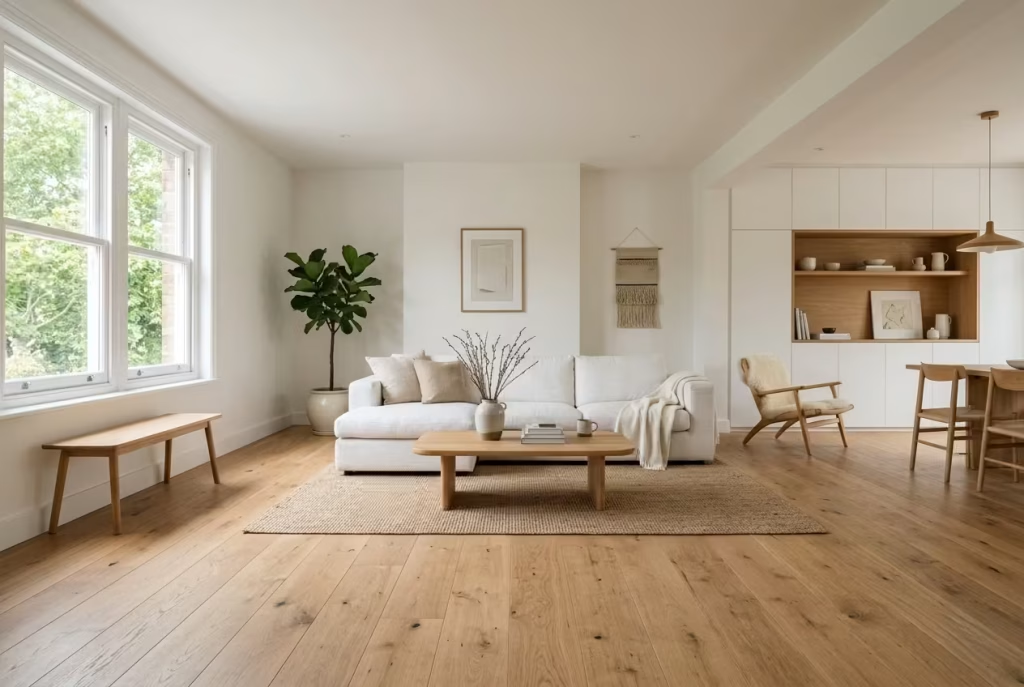
White, left entirely to its own devices, can sometimes feel like it is hovering, light, yes, but slightly untethered. That is often where things start to unravel. A room may look clean on the surface, yet something feels off, as though it has not quite landed. Introducing natural wood, particularly at the lower level of the space, is one of the most reliable ways I have found to bring that sense of grounding back in.
Flooring is usually the first move. I tend to favour oak, not because it is fashionable, but because it sits comfortably within a white palette without pulling too much attention. It has warmth, but not excess. In a living room washed in white, an oak floor acts almost like a visual anchor, holding the room in place while everything else remains light and open. Without it, or something similar, the space can start to feel a touch weightless, like it might drift if you are not careful.
I remember working on a project where the client had committed fully to white, walls, ceiling, cabinetry, even the larger furniture pieces. On paper, it was cohesive. In reality, the room felt strained, almost as if it was trying too hard to stay pristine. We introduced a wide-plank oak floor, boards around 180 mm wide (just over 7 inches), finished in a soft matte. Nothing overly treated, just enough to protect it while keeping the grain visible. The shift was immediate. The room exhaled. Suddenly, the white felt intentional rather than insistent, and the space had somewhere to settle.
This is where the idea of visual fatigue comes in. A fully white interior, particularly one without enough variation, can become tiring over time, even if it looks appealing at first glance. The eye searches for contrast, for something to hold onto. Natural wood provides that relief without breaking the calm. It introduces a different temperature, a different texture, and crucially, a different level of visual weight. The room becomes easier to live with, not just to look at.
It is not limited to flooring, of course. I often bring wood into joinery, shelving, or even subtle detailing within furniture. A white kitchen with an oak-lined niche, a living room with a low timber bench, or a bedroom where the bed frame carries a natural finish, these moments do not dominate the space, but they give it rhythm. They stop the interior from feeling like a single note played on repeat.
There is also a practical side to this approach that tends to get overlooked. Wood, particularly in mid-tones like oak, is far more forgiving than white when it comes to everyday wear. In high-traffic areas, it absorbs the knocks and marks that would otherwise stand out sharply against a pale surface. It earns its keep quietly, taking on character over time rather than deteriorating visually. In homes that are actually lived in, that matters more than people often expect.
Lighting plays a supporting role here as well. Natural wood responds to light differently than painted surfaces. It absorbs, softens, and reflects warmth back into the room. In the morning, it can feel fresh and gentle. By evening, under warmer artificial lighting, it deepens slightly, adding a sense of comfort that white alone can struggle to achieve. This subtle shift helps the space transition through the day without feeling static.
There is a balance to strike, though. Too much wood, and the clarity of the white palette begins to fade. Too little, and the space risks feeling incomplete. I tend to think of it as a measured intervention rather than a dominant feature, enough to ground the room, not so much that it takes over.
Pros: Natural wood prevents a white interior from feeling flat or fatiguing. It introduces warmth, texture, and visual stability, making the space more comfortable to live in over time.
Cons: It requires careful selection. The wrong tone, too red, too dark, or overly glossy, can disrupt the balance and pull the room away from its intended calm. Like most things in restrained interiors, it is less about adding more and more about adding just enough.
High-Ceiling White Rooms That Embrace Verticality
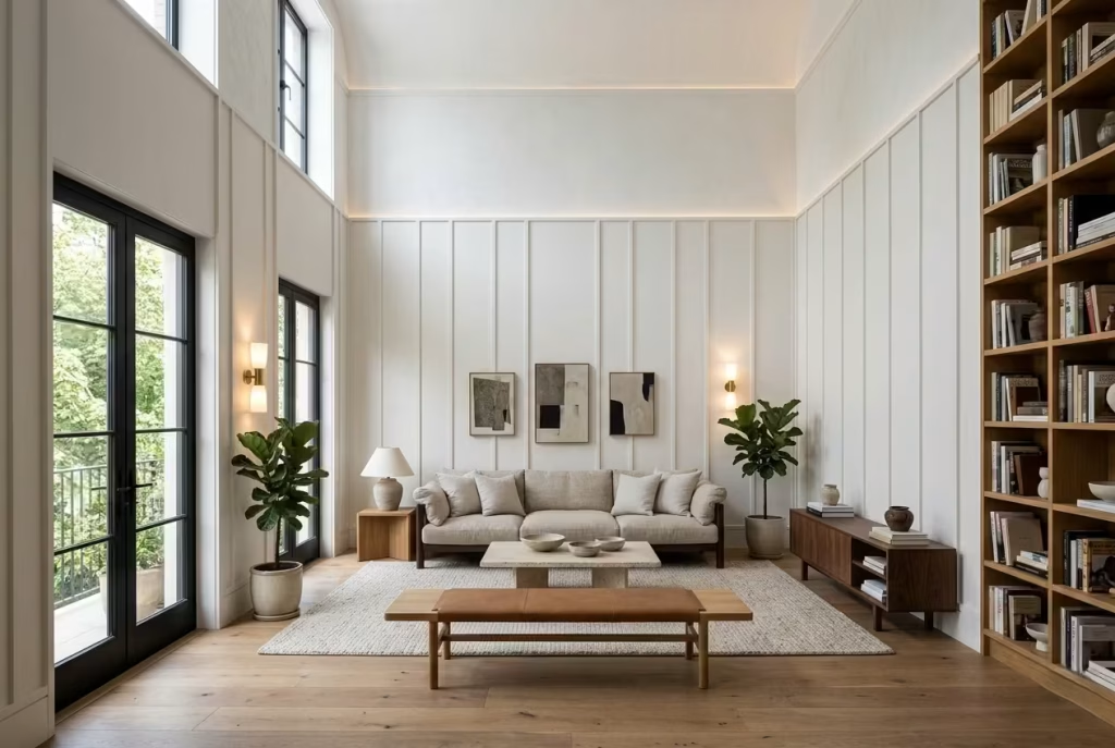
High ceilings in a white interior can feel like both a gift and a challenge. On the one hand, they offer an airy, expansive backdrop that many dream of. On the other, without careful consideration, they risk making the space feel cold, cavernous, or visually unanchored. The secret to success lies in embracing the verticality rather than ignoring it, and letting the room’s height become an asset rather than a liability.
One of the most effective techniques I’ve found is the use of wall panelling or subtle shadow lines. These are not decorative flourishes for decoration’s sake they are carefully measured interruptions that guide the eye upward, creating a sense of rhythm and scale. A series of vertical panels, or a repeated recess and reveal along the wall, gives the space definition.
It reads almost like a quiet echo: the room is tall, yes, but it feels intentional rather than intimidating. I recall a living room renovation where the ceiling soared over 3.5 metres (11.5 feet). The addition of soft, continuous vertical panelling made all the difference. The height was celebrated rather than exaggerated; it felt grand without shouting.
Lighting is equally critical in high-ceiling rooms. A single overhead fixture often leaves the space feeling cold, particularly against white walls that reflect light aggressively. I prefer to layer lighting in stages wall sconces, recessed uplighting, and subtle cove lights to bring warmth to the vertical surfaces and accentuate the panelling or shadow lines. The effect is subtle: as the day progresses, different parts of the wall catch the light, emphasizing texture and drawing the eye naturally upward. The ceiling stops being an empty expanse and becomes part of the choreography.
Furniture and spatial arrangement also play a quiet but vital role. In these rooms, the temptation is to fill every inch with large pieces, thinking they will ‘balance’ the height. Experience teaches otherwise. Oversized furniture can dwarf the space, while too little makes it feel sparse.
I aim for a middle ground: low, grounded elements sofas, benches, console tables that sit in proportion to the floor plane, letting the walls and ceiling breathe. A well-placed tall bookcase or a vertical artwork can punctuate the room without overloading it, guiding the eye upward in the same way a shadow line might.
Texture and material choices reinforce the feeling of verticality. Matte finishes, soft fabrics, and natural timbers at low levels anchor the room, while subtle variations in plaster, paint sheen, or woven wall coverings introduce a quiet complexity higher up. This layering keeps the eye moving, prevents the walls from feeling flat, and ensures the room reads as fully resolved rather than empty or unfinished.
The outcome is more than visual. Rooms treated this way feel structured and intentional. They invite the inhabitant to pause, look around, and appreciate the architecture, rather than simply passing through. The height becomes a character, not a problem, and the white palette no longer risks appearing stark or overwhelming.
Pros: Embracing verticality transforms high-ceiling white rooms into spaces that feel both expansive and composed. It enhances natural light, creates a sense of architectural sophistication, and celebrates the ceiling rather than hiding it.
Cons: It requires careful proportioning and attention to detail. Without panelling, shadow lines, or layered lighting, these spaces can feel cold, impersonal, or difficult to furnish in a way that feels harmonious. Mistakes in scale are far more obvious in tall, open white rooms.
Minimal White Interiors That Still Feel Lived-In
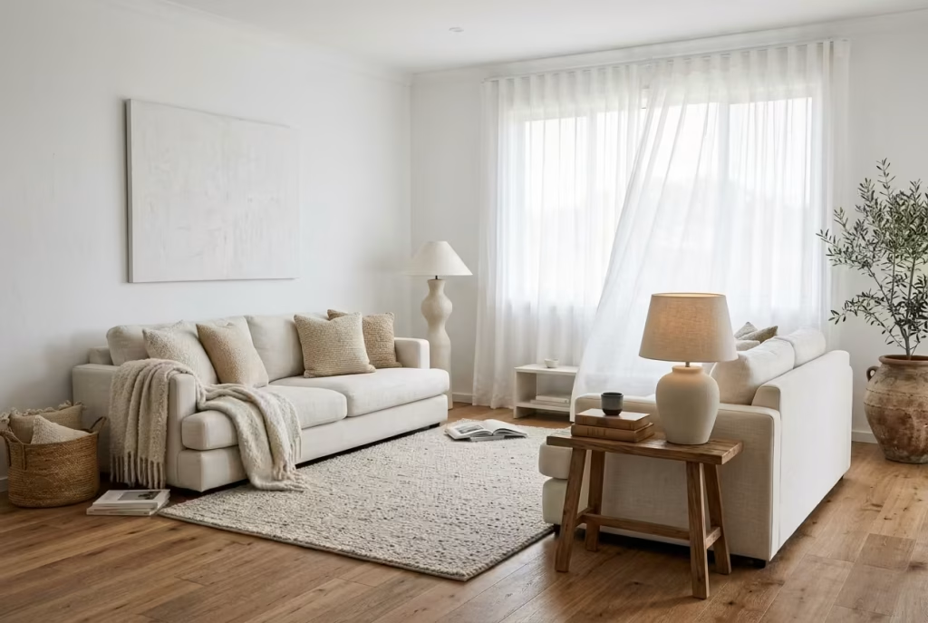
Minimalism in a white interior is a delicate balancing act. Push too far, and the room starts to feel airless, like nobody really lives there. Hold back too much, and the clarity gets lost. The rooms that get it right have a kind of easy confidence about them. They are pared back, yes, but never sterile. You can feel that real life is happening there, just not in a way that has been allowed to clutter the picture.
The key is negative space. In the right hands, empty space is not wasted space. It gives the eye somewhere to rest, and that breathing room is what stops a white interior from feeling overworked. I often think of it as the difference between a room that is trying hard and one that knows exactly what it is doing. A sofa with space around it, a table that is not jammed against a wall, a shelf left with a little room between objects, these small decisions create a sense of calm that feels earned rather than staged. The room does not need to prove itself at every turn. That is what makes it sing.
But negative space alone is not enough. Without tactile elements, minimal white rooms can lose their pulse. Texture is what keeps them human. A linen cushion tossed slightly off centre, a wool throw folded loosely over a chair, a ceramic lamp with a soft matte surface, these details may sound modest, but they do the heavy lifting. They break up the flatness and give the room a quieter kind of richness. I have seen white rooms transformed by nothing more than a shift from high-gloss finishes to brushed, woven, or hand-finished materials. Suddenly the space feels less like a display and more like a place with a heartbeat.
This approach suits people who want calm without coldness. It works especially well in homes where the architecture already has good bones, decent light, clean proportions, and a layout that does not need too much intervention. In those settings, restraint can be a gift. The trick is to choose fewer things, but better things. A slightly textured rug underfoot, a timber side table with visible grain, a softly upholstered chair in an off-white boucle, these are the kinds of pieces that give the room dimension without breaking its quiet.
Lighting matters too, and more than most people realise. In a minimal white room, light has nowhere to hide. It lands directly on every surface, so the quality of the lighting can make or break the mood. I tend to avoid harsh, uniform brightness. Instead, I prefer a softer layering approach, ambient light for the overall tone, task light where it is needed, and perhaps one small accent source to create a bit of shadow play. That balance keeps the room from feeling flat. It allows corners to soften and surfaces to shift gently through the day, which is exactly what gives a minimal interior its atmosphere.
I worked on a room not long ago where the client wanted almost nothing in it, just clean white walls, a low-profile sofa, and a few essential pieces. On paper, it sounded simple. In reality, the success of the room depended entirely on proportion and texture. We kept the palette tight, but introduced a brushed oak floor, a nubby wool rug, and sheer curtains that moved slightly with the air. The result was not busy, but it was never dull. That is the sweet spot. A room can be stripped back and still feel warm, layered, and quietly generous.
The danger, of course, is that minimalism can tip into severity if the mix is wrong. Too many smooth surfaces, and the room starts to feel hard. Too few objects, and it can feel like the furniture has not yet arrived. The best minimal white interiors avoid both extremes. They know where to stop. They let one strong material lead, then support it with softer, quieter notes. That is how the room ends up feeling settled rather than unfinished.
Pros: Minimal white interiors feel calm, spacious, and highly adaptable. With the right mix of texture and negative space, they can be deeply restful and surprisingly welcoming.
Cons: They are unforgiving. Without enough warmth in the materials or variation in surface finish, the room can feel stark, underfurnished, or emotionally flat.
You May also Like: 25 Beautiful Modern Farmhouse Home Office Ideas for a Stylish Workspace
White-on-White Layering Through Fabrics
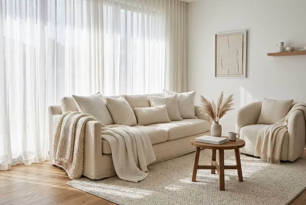
White interiors often flirt with minimalism, but the real magic emerges when you allow fabrics to do the talking. Layering whites through different textiles introduces a depth that walls and paint alone cannot achieve. It is subtle, understated, yet transformative—the kind of move that keeps a room from feeling flat while maintaining its calm sophistication.
Sheer curtains are usually my first stop. They soften natural light, filter it gently, and add movement to a room that might otherwise feel static. In one project, a south-facing living area had large white-painted windows and minimal furnishings. The addition of floor-to-ceiling sheers in a slightly off-white tone gave the space rhythm. As sunlight shifted through the day, shadows and folds created delicate variations, making the room feel alive rather than simply bright.
Textural fabrics such as boucle or wool blends take the layering further. A boucle armchair, a wool throw tossed casually over a sofa, or cushions in slightly different shades of white brings an almost tactile warmth that keeps the eye moving. In a bedroom I recently designed, I used a combination of ivory wool blankets, soft cotton sheets, and a lightly nubby boucle chair. Each element was white, yet the contrast of textures—smooth, soft, and subtly coarse—gave the space a complexity that made it feel inhabited, lived-in, and quietly luxurious.
I often recommend mixing scale alongside texture. A fine linen pillow paired with a chunky wool blanket, or a smooth cotton duvet under a thick boucle throw, allows subtle contrasts without introducing color. These shifts create a sense of layering that the room can grow into, accommodating new elements or seasonal updates without disrupting the calm palette.
Lighting plays a silent but critical role. White fabrics reflect light differently depending on their weave and weight. Sheer curtains bounce it softly, wool absorbs slightly, boucle scatters tiny highlights. Understanding how your light interacts with these layers allows you to manipulate mood across different times of day. Morning sunlight might make the fabric glow, while evening lamps produce cozy shadows that make the space intimate and approachable.
Pros: Layering white fabrics adds dimension, warmth, and visual interest without breaking the calm palette. It allows flexibility and seasonal adaptability, making the space feel comfortable and sophisticated.
Cons: Requires careful selection; fabrics that are too similar in texture or finish can flatten the room, while overly delicate fabrics may wear quickly or require more maintenance than expected. Balancing variety and durability is key.
You May also Like: 25 Dark Cottagecore Bathroom Ideas That Feel Moody, Warm, and Beautifully Lived In
White Hallways That Feel Wider and Brighter
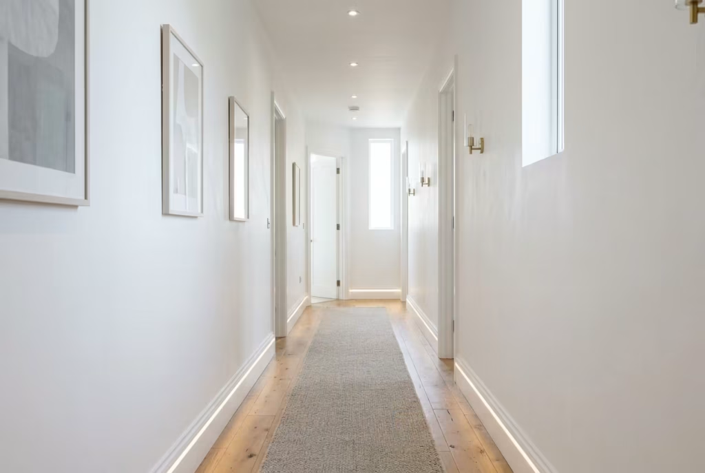
Hallways are often overlooked in home design, yet in a white interior they become critical corridors of light and perception. A well-considered white hallway can make a home feel instantly more spacious, airy, and connected—but done poorly, it risks appearing narrow, cold, or oppressive. The secret lies in the careful orchestration of light, reflective surfaces, and subtle detailing.
Strategic lighting is your first line of defense. Recessed ceiling lights spaced evenly, wall-mounted sconces, or a combination of both can eliminate shadows that accentuate narrowness. In one project, a hallway measuring just 1 metre wide (roughly 3 ft 3 in) felt cramped until we introduced low-level LED uplighting along the skirting and a series of slim wall sconces. The result was astonishing: the corridor appeared almost 30% wider, and the gentle illumination brought a soft rhythm to the walk from one room to the next.
Reflective finishes amplify the effect. Satin or eggshell paints, subtly polished floorboards, and even glass or mirrored surfaces can bounce natural light along the corridor. I once specified a matte lacquered wainscot with a slight sheen for a long, south-facing hallway. The panels caught light differently at every angle, giving a sense of depth without feeling shiny or clinical. In these tight spaces, every reflection counts—small, intentional surfaces can dramatically change the perception of width.
Corridor width is more than numbers; it dictates comfort and flow. I generally advise a range of 900–1200 mm (35–47 inches) for residential hallways. Below 900 mm, even the cleanest white and clever lighting can feel restrictive. Above 1200 mm, the corridor can feel underused unless furniture or artwork is introduced to create scale. In practice, these measurements allow people to pass comfortably, accommodate occasional furniture pieces like a console or bench, and still feel airy and open.
Texture and subtle contrast are the final touches. A light-toned runner or narrow carpet with a soft weave introduces tactility underfoot, breaking up the otherwise uninterrupted white floor. A carefully chosen wall-mounted artwork, even in muted tones, adds points of interest without disrupting the clarity of the white palette. These small elements encourage the eye to travel along the corridor rather than fixating on its width, reinforcing the illusion of openness.
Pros: White hallways with reflective surfaces and layered lighting enhance perception of space, increase natural light diffusion, and create a welcoming transition between rooms. They make narrow corridors feel intentional rather than cramped.
Cons: Mismanaged lighting, overly glossy surfaces, or poorly proportioned widths can backfire, making the corridor feel stark, cold, or visually uncomfortable. Achieving balance requires careful planning and attention to detail.
Soft White Kitchens with Warm Undertones
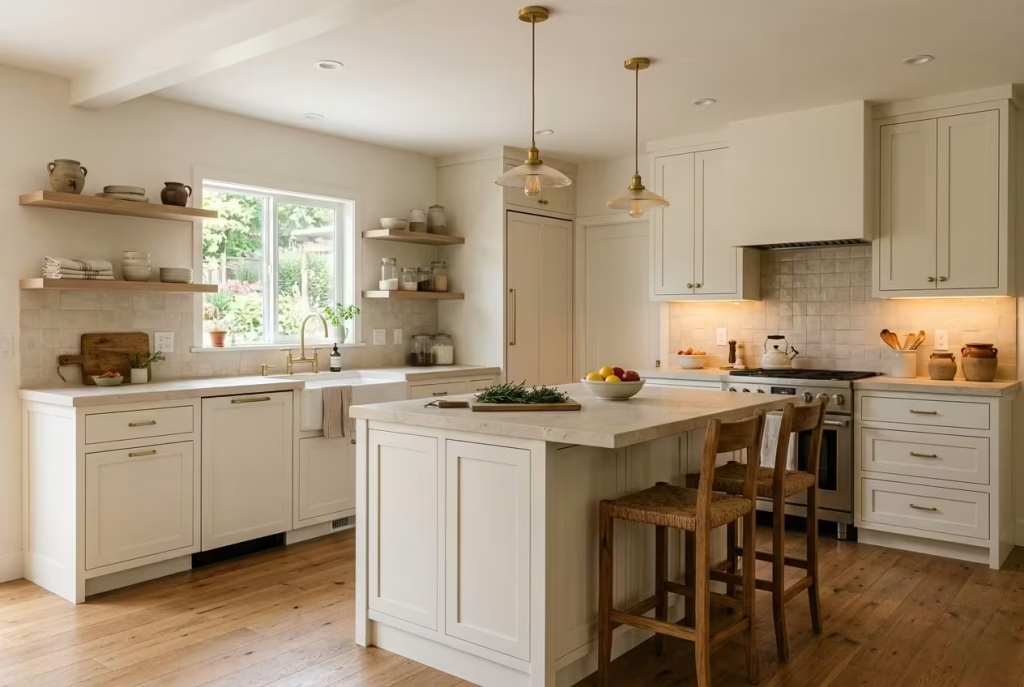
White kitchens are endlessly appealing, but without nuance, they can quickly tip into the clinical—a space that feels more like a lab than the heart of a home. The difference between stark and inviting often comes down to undertones and material choices. In my experience, even subtle hints of warmth in cabinetry, walls, or countertops can transform a white kitchen from cold to quietly comforting.
I often guide clients toward whites with yellow, cream, or soft beige undertones, especially in kitchens that see a lot of natural light. A south-facing kitchen painted in pure, icy white can feel glaring by midday, making the room visually tiring. By contrast, a gentle warm white, paired with brushed oak or soft travertine surfaces, diffuses light and creates a sense of calm cohesion. I recently completed a kitchen renovation where the cabinetry was a barely-there ivory with a matte finish. Against a natural stone countertop, the space felt inviting immediately, even before any furniture or décor was added.
Material choices reinforce this effect. Matte or satin finishes soften reflections, while subtly textured surfaces like honed stone, ceramic backsplash tiles, or timber shelving—provide tactility. These choices help the kitchen feel tangible, something you want to reach into and touch, rather than merely look at. In terms of layout, I often allow a minimum counter clearance of 900 mm (36 inches) between islands and cabinets, ensuring airflow and circulation that keeps the space functional without feeling cramped.
Lighting, as always, plays a quiet yet crucial role. Warm-toned under-cabinet lighting, pendants above islands, or soft recessed ceiling lights complement the undertones in cabinetry and walls. They prevent whites from reading as harsh and emphasize the depth created by varied textures. In one project, we combined ivory cabinetry with brushed brass pendant lights, and the effect was almost alchemical—the white shifted from a neutral backdrop into a space that felt layered, alive, and welcoming.
The charm of a soft white kitchen is that it can accommodate a range of furnishings and accessories over time. Wooden stools, woven baskets, or even a splash of greenery feels natural rather than jarring. It allows the homeowner to tweak or layer personal style without disturbing the balance of the room. The warmth in the white provides a forgiving canvas, where the space continues to feel elegant, practical, and, above all, lived-in.
Pros: Warm undertones prevent a white kitchen from feeling harsh or clinical. They complement natural materials, enhance comfort, and allow for a flexible, lived-in aesthetic.
Cons: Undertones must be selected carefully too yellow, and the white can feel dated; too beige, and it risks losing the crisp, airy quality that makes white kitchens timeless. Lighting and material coordination are essential to achieve the desired effect.
White Bedrooms with Statement Headboards
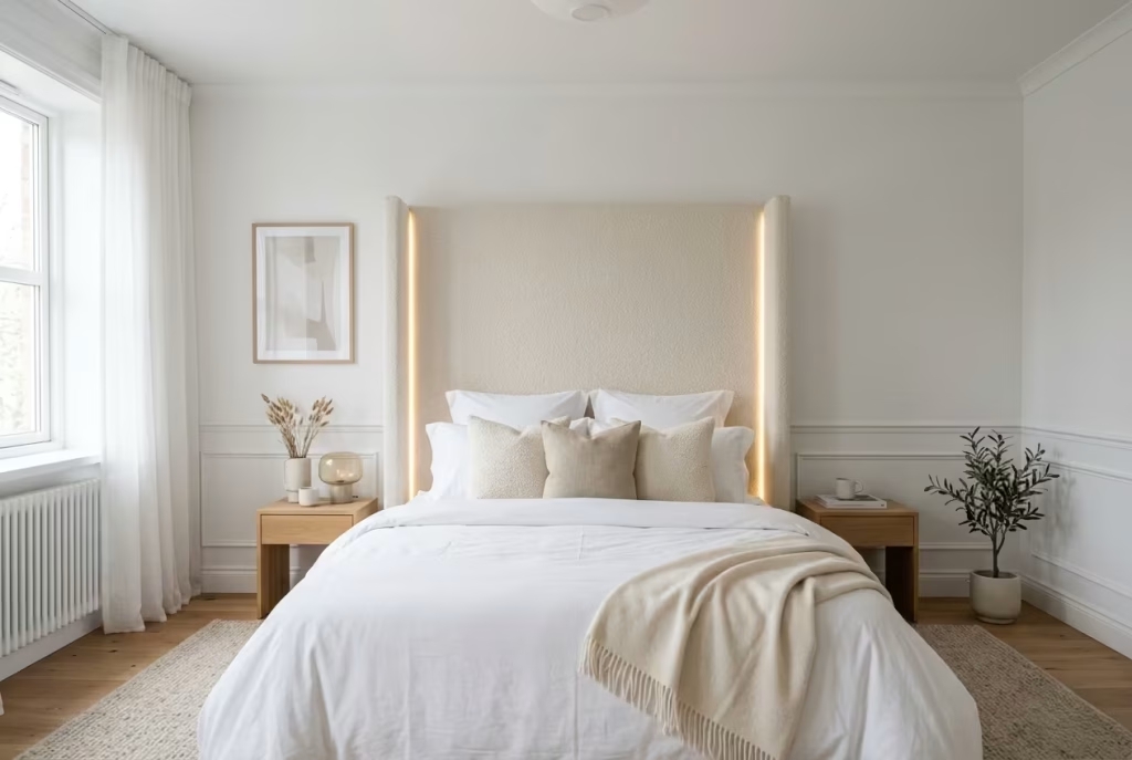
In a white bedroom, a statement headboard is more than just a decorative flourish—it is the anchor that gives the room structure and personality without disrupting the serenity of the palette. White walls, bedding, and furnishings create a tranquil canvas, but without a focal point, the space risks drifting into monotony. A headboard, sculptural or upholstered, gives the eye somewhere to rest and transforms the bed from a functional piece into the emotional heart of the room.
I often encourage clients to explore upholstered headboards in off-white linens, boucle, or velvet. These textures add depth and tactility while remaining in harmony with the overall white scheme. In one summer bedroom project, we designed a tall, winged headboard in soft cream boucle. The height drew the eye upward, emphasizing the ceiling’s generous proportions, while the tactile surface created a subtle contrast with smooth cotton bedding and matte-painted walls. The result was a space that felt luxurious yet approachable—a room that invited both rest and quiet admiration.
Sculptural headboards offer a different kind of drama. Carved timber, plaster relief panels, or low-relief geometric forms can add architectural interest without introducing color. I worked on a project where a hand-carved white plaster headboard wrapped around the wall behind the bed. During the day, sunlight played across its contours, creating soft shadows that changed with the light, making the room feel dynamic even in a single tone. At night, subtle wall sconces highlighted the relief, providing mood and intimacy.
Proportion and clearance are crucial. A headboard that is too small can feel lost in a spacious white room; too large, and it overwhelms the bed. I generally recommend a height of 1200–1500 mm (47–59 inches) for standard double beds, with a width slightly wider than the mattress to give a sense of generosity. This ensures the piece feels intentional, visually balanced, and proportionate to the room.
Lighting and accessories complement the statement without competing. Low bedside lamps or integrated LED strips emphasize the headboard’s texture and shape, while keeping the rest of the room calm and cohesive. Cushions, throws, and bedding in varying shades of white or soft neutrals can reinforce the layering, allowing the headboard to shine without creating visual clutter.
Pros: A statement headboard adds focal interest, anchors the room, and allows a white bedroom to feel sophisticated, textured, and purposeful. It creates a sense of luxury while remaining flexible for seasonal changes or décor updates.
Cons: Requires careful consideration of scale, proportion, and texture. A misjudged headboard can dominate or disappear, undermining the intended balance of serenity and elegance in a white bedroom.
Monochrome White Dining Spaces with Depth
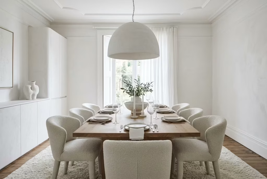
Dining rooms in all-white can feel pristine, but without careful layering, they risk reading as flat or uninviting. The trick lies in creating depth through texture rather than color, allowing a monochrome space to feel dynamic, tactile, and perfectly tailored to daily life. I’ve often found that texture alone, thoughtfully combined, can make a white dining area feel as rich and layered as a fully colored scheme—without ever straying from the serene palette.
Start with surfaces. A dining table in matte oak or brushed stone introduces subtle variance against crisp white walls. Chairs upholstered in boucle or soft linen provide a tactile counterpoint to smooth surfaces, encouraging a sense of touch and comfort. In a recent project, a 10-seater white oak table with off-white boucle chairs brought just enough contrast to keep the space grounded. Overhead, a plaster ceiling with gentle coving caught daylight in shifting patterns, adding an additional layer of visual interest.
Lighting plays a pivotal role. Pendant lights with matte, woven, or sculptural finishes create shadows and reflections that animate the room. In one project, we installed an oversized white ceramic pendant above the table. The light it cast was not just functional—it sculpted the space, highlighting the subtle folds in textiles and the texture of the wooden table, giving a monochrome room a sense of rhythm and motion.
Scale and proportion are essential. Table width, chair clearance, and pendant drop must be carefully measured to maintain a sense of intimacy. For example, a table 900–1000 mm (36–39 inches) wide allows for comfortable dining and circulation in a typical medium-sized dining room. Overhead lighting should sit roughly 750 mm (30 inches) above the tabletop for optimal ambiance without overwhelming the space. These small technical details ensure that a white dining room feels purposeful, not just minimal.
Accents, even in white, amplify depth. A high-pile rug, a subtle ceramic centerpiece, or linen napkins in off-white hues reinforce layers without introducing color. Each element contributes a soft variation in tone, weave, or sheen, guiding the eye and making the space feel composed yet approachable.
Pros: Monochrome white dining spaces feel serene, elegant, and adaptable. Texture-driven layering allows the room to feel luxurious and inviting without needing additional color.
Cons: Requires careful attention to materials and finishes. Without sufficient textural contrast, the space can feel sterile or flat, and lighting must be carefully calibrated to avoid a cold or clinical atmosphere.
You May also Like: 25 Bathroom Mirror Ideas That Balance Design, Light, and Everyday Use
White Interiors with Black Accents (Controlled Contrast)
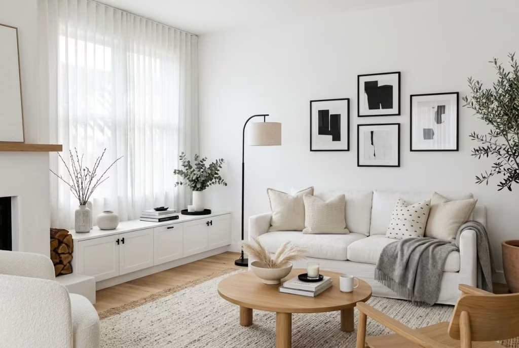
Black in a white interior is a bit like seasoning a very good dish. Use too little, and the room can feel unfinished, almost timid. Use too much, and it takes over the whole plate. The best white-and-black schemes understand that contrast is most powerful when it is restrained, precise, and placed with a steady hand. Done well, black does not darken the room in a heavy-handed way. It sharpens it. It gives the white somewhere to land.
I tend to use black as a punctuation mark rather than a dominant colour. A slim lamp base, a window frame, a chair leg, a picture frame, a tap, or a line of ironmongery can be enough. These smaller elements create definition without dragging the scheme into something severe. In a white interior, where every surface already feels light and open, black accents work almost like contour lines. They clarify edges, pull shapes into focus, and keep the room from floating away visually.
That said, the balance has to be handled with care. White and black together can easily veer into something hard-edged if the room lacks softness elsewhere. I have seen schemes where the contrast looked elegant in a mood board but felt too brittle in reality because there was nothing to absorb the tension. That is usually where texture comes in. A matte black frame reads very differently against a limewashed wall than it does against a flat, glossy white surface. Likewise, black furniture feels far less harsh when paired with linen, wool, timber, or stone. The softer the surrounding materials, the more measured the contrast feels.
In real projects, I often introduce black at the level of function first. Think door furniture, joinery handles, lighting details, or slim shelving brackets. These are the places where black can quietly do its job without shouting across the room. In a white kitchen, for example, a black tap or a dark stone worktop edge can bring welcome definition, especially if the cabinetry is pale and handleless. In a bedroom, a black bedside lamp or a charcoal-framed mirror can stop the space from becoming too washed out. It is the visual equivalent of drawing a line under the composition.
Proportion matters here as well. In a room of around 3 by 4 metres, or roughly 10 by 13 feet, a few black accents are usually enough. In larger rooms, you can afford slightly stronger moves, perhaps a black pendant, a coffee table with darker framing, or a bold artwork set within a white envelope. But even then, I would keep the black to a supporting role. The aim is to sharpen the white, not to split the room down the middle. Once the contrast becomes too evenly distributed, the interior loses its ease.
Lighting plays a major part in how black reads. Under warm light, black softens and becomes more textured. Under cool, bright light, it can sharpen quickly and feel stern. That is why I usually avoid placing black accents in areas already prone to heavy shadow, unless the goal is deliberate drama. In daylight, a single black line can look crisp and architectural. By evening, it may become much more pronounced, which is precisely why placement needs to be thought through rather than added on impulse.
What I like most about controlled contrast is that it gives a white interior a bit of backbone. Without it, some rooms feel too polite, too careful, like they are waiting for permission to speak. A trace of black changes that. It brings clarity, rhythm, and a sense of composure. The room suddenly has a point of view.
Pros: Black accents add definition, sharpen architectural lines, and prevent white interiors from feeling bland or one-note. Used sparingly, they create a polished, timeless sense of contrast.
Cons: Overdo it, and the room can turn harsh very quickly. Black is unforgiving in strong light and can dominate smaller spaces if it is not balanced by texture, warmth, and enough surrounding softness.
Coastal-Inspired White Interiors Without Cliché
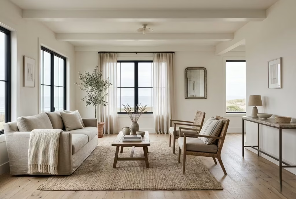
Coastal interiors often fall into predictable territory: rattan furniture, blue stripes, driftwood knick-knacks. But the real sophistication of a seaside-inspired space comes not from gimmicks or overt theming, but from material honesty and spatial calm. White becomes the canvas for air, light, and texture, and the result is a subtle, layered environment that whispers of the coast rather than shouting it.
I always start with the bones of the space. Walls and ceilings in warm, soft white form a luminous backdrop that allows natural materials to take centre stage. Timber floors in pale oak or limed ash, stone countertops, and linen upholstery introduce tactility, while letting the palette stay restrained. In one project, a white-washed living area overlooked a south-facing terrace. Instead of adding nautical decor, we layered washed linens, textured wool throws, and soft jute rugs. The room felt breezy, light, and rooted in the natural rhythm of its environment—the coast-inspired character came from materials, not clichés.
Light, both natural and artificial, is crucial. Expansive glazing, sheer curtains, and carefully considered ambient lighting bring the room to life, highlighting textures and creating subtle shadow play. A heavily sunlit corner can make linen and timber glow, whereas diffused evening lighting adds intimacy. The interplay of brightness and shadow gives white interiors a sense of depth, movement, and seasonal change, mimicking the coast’s shifting light without relying on kitsch or colour.
Function and comfort remain paramount. Coastal-inspired homes should feel lived-in, not like a stage set. In bedroom projects, I favour off-white linens and soft wool throws, allowing tactile richness to complement the clean palette. Furniture spacing is generous, typically allowing 750–900 mm (30–35 inches) circulation around beds and seating areas, so the rooms feel uncluttered and open. Even in kitchens or dining spaces, natural materials like honed stone or solid timber counters ensure the environment is practical, durable, and quietly sophisticated.
The subtle addition of contrast can elevate the aesthetic without betraying restraint. Pale grey or soft beige accents, a muted metal pendant, or a single dark-framed window adds just enough tension to keep the room visually engaging. It’s about suggesting the rhythm of a coastal environment—the shadows, textures, and horizon lines without introducing literal seaside motifs.
Pros: Coastal-inspired white interiors grounded in materials feel timeless, calming, and sophisticated. They balance visual serenity with tactile richness and offer flexibility for seasonal or lifestyle updates.
Cons: Over-reliance on theme-driven decor or overly pale, flat materials can make spaces feel cold, contrived, or ephemeral. Achieving the right balance requires careful attention to texture, proportion, and natural light.
This approach ensures that a coastal-inspired white interior reads as intentional, lived-in, and enduring rather than simply decorative. It’s the subtle layering, the honesty of materials, and the choreography of light that gives a room character, comfort, and a quiet sense of luxury.
White Living Rooms That Embrace Natural Light
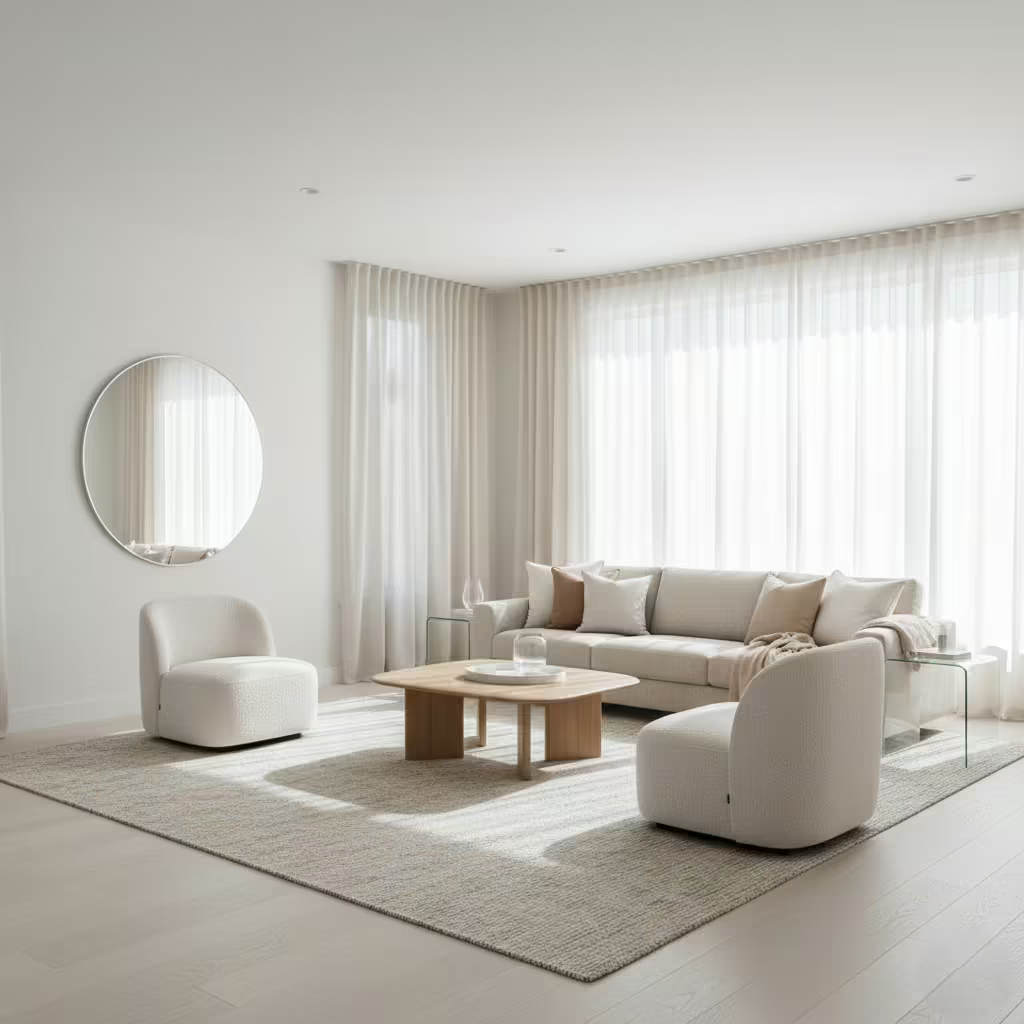
White living rooms have a unique capacity to amplify daylight, turning even modest spaces into luminous havens. But light alone does not make a room; the interplay between window placement, surface finish, and subtle layering is what transforms a white interior from sterile to sublime. In my experience, the way light moves across walls, floors, and furnishings dictates the atmosphere far more than paint colour ever could.
Window positioning is the first consideration. South- or west-facing windows bring abundant daylight, but without control, strong sun can produce glare and wash out subtle tonal variations in whites. Sheer layering think delicate linen or voile curtains softens the intensity while allowing light to scatter, giving the space a gentle, almost ethereal glow. I recall a project in which floor-to-ceiling windows were paired with off-white sheer panels; the effect was a living room that seemed to breathe, with light that shifted dynamically throughout the day, accentuating the textures of a wool rug, timber coffee table, and boucle armchairs.
Texture again plays a quiet, decisive role. Matte walls, soft upholstery, and tactile rugs prevent light from becoming harsh or flat, while reflective surfaces such as lightly polished stone or glass elements can be strategically positioned to bounce daylight deeper into the room. In a 5 by 6-metre living space (roughly 16 by 20 feet), I often position mirrors or high-gloss surfaces opposite windows to amplify natural light without overwhelming the senses. It’s a delicate choreography between illumination and softness.
Furniture layout should complement the light rather than obstruct it. Low-profile seating near windows maintains sightlines and maximises daylight penetration, while taller storage or display units are best positioned along walls perpendicular to natural light sources. Clearance around seating and pathways typically 800–900 mm (31–35 inches) ensures the space feels open and breathable, allowing both light and people to flow freely.
Finally, layering of fabrics and finishes softens the starkness of white without compromising brightness. Linen throws, textured cushions, and rugs in subtle off-whites or warm neutrals create depth and prevent a white living room from feeling clinical. Overhead lighting, when needed in the evenings, should mimic daylight with warm, diffused tones to maintain a seamless transition from day to night.
Pros: A white living room designed around natural light feels expansive, airy, and uplifting. Sheer layering and textured surfaces add depth, making the space warm and inviting rather than stark.
Cons: Requires careful consideration of window orientation, glare control, and material finishes. Poor layering or overly reflective surfaces can produce harsh light and flatten the subtle nuances of the white palette.
In essence, a white living room that embraces light is not about maximal brightness it’s about choreography: where light falls, how it interacts with surfaces, and how materials respond to it. Done well, it transforms a simple room into a serene, luminous retreat that feels effortlessly elegant and deeply lived-in.
White Interiors with Stone as a Feature Material
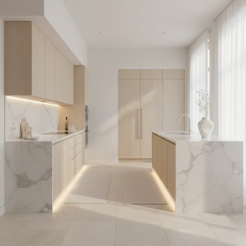
Stone has a quiet authority in a white interior. While white walls can provide a sense of serenity, they can sometimes verge on ethereal or insubstantial if left unsupported. Introducing stone—marble, travertine, or limestone—anchors the space, adding tactile depth, visual weight, and a sense of permanence that transforms a minimalist scheme into something enduring and layered. In my projects, stone is rarely a backdrop; it’s a feature that interacts with light, texture, and proportion to give the room personality without overwhelming the palette.
Marble, with its subtle veining, works beautifully as a statement surface in kitchens, bathrooms, or living areas. A white Carrara countertop, for instance, becomes more than a functional surface; it catches shadows, reflects daylight, and conveys a quiet elegance. In a recent project, a polished white marble fireplace with soft grey veining became the centrepiece of a south-facing living room. The combination of matte painted walls and the gentle sheen of the stone created a sophisticated contrast, adding depth without introducing colour.
Travertine and limestone offer a softer, warmer counterpoint. Their slightly porous textures and natural tonal variations bring an organic warmth to interiors dominated by white. Limestone flooring, for example, in 600 x 600 mm (24 x 24 inch) tiles, feels grounded underfoot while remaining visually light. In bedrooms or hallways, these materials harmonise with pale timber furniture, linen textiles, and subtle metallic accents, providing an understated richness that elevates everyday living.
Lighting is crucial when working with stone in white interiors. Matte, honed surfaces absorb light differently than polished finishes, creating shadows that emphasize texture. A limestone wall behind a console or a travertine backsplash in a kitchen becomes animated with daylight or soft, diffused artificial light. Positioning spotlights or LED strips to skim the stone surface can further highlight the natural variations, giving the material a sculptural presence without breaking the calm of the room.
Pros: Stone introduces texture, depth, and tactile richness to white interiors. It anchors spaces, feels luxurious yet timeless, and works across multiple areas—from bathrooms to kitchens to living rooms.
Cons: Requires thoughtful detailing; large expanses of polished marble can feel cold or overly formal if not balanced with softer materials. Maintenance varies by stone type, with travertine and limestone needing sealing to prevent staining, while marble can be sensitive to acidic substances.
In my experience, using stone as a deliberate feature in a white interior is about restraint and placement. A single wall, a floor plane, or a countertop can transform the space, creating an environment that feels serene, considered, and quietly sophisticated. Stone doesn’t compete with white; it completes it.
You May also Like: 15 Stunning Spanish Home Offices That Blend Beauty and Productivity
Warm White Palettes for North-Facing Rooms
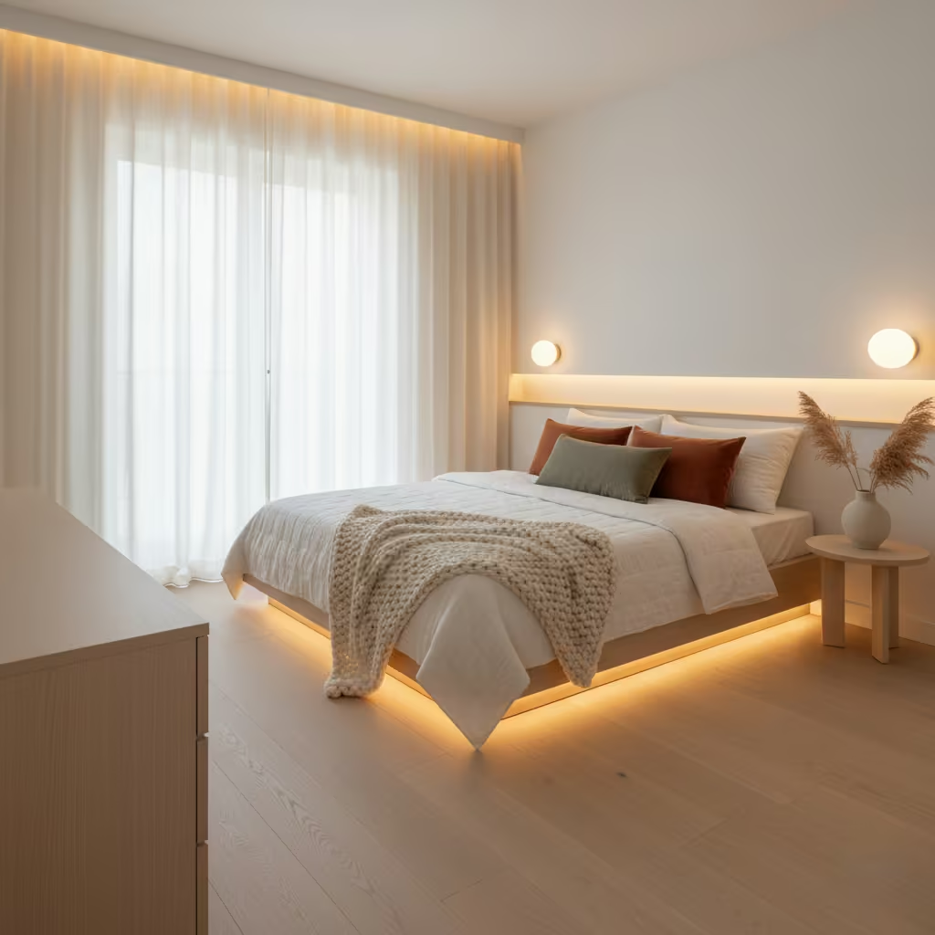
North-facing rooms are a subtle challenge in interior design. The light that filters through these windows is consistent but cool, often carrying a slight bluish cast that can make pale spaces feel subdued or even chilly. I’ve found that the key to lifting a north-facing interior is in choosing whites that carry warmth a whisper of yellow, cream, or soft beige that counteracts the cooler daylight without overwhelming the room.
In a recent project, a north-facing bedroom had pristine white walls that initially felt stark and uninviting. We shifted to a soft, warm white with gentle yellow undertones, paired with oak flooring and linen upholstery. The result was transformative: the room felt enveloping rather than cold, and the warmth of the palette created a soft, welcoming atmosphere all year round. When working in spaces around 3 by 4 metres (10 by 13 feet), this approach maintains brightness while adding a sense of intimacy.
Texture is equally important in these orientations. Matte or eggshell finishes on walls prevent glare while enhancing the depth of warm tones. Layered textiles wool throws, velvet cushions, or natural linen curtains absorb light and add tactile richness, creating a room that feels simultaneously expansive and cosy. In living areas or bedrooms, I often introduce pale timber furniture at floor and eye level to visually “anchor” the warmth and prevent the light from washing the space out.
Lighting strategies complement the warmth of the palette. Soft, diffused artificial lighting, such as wall sconces or concealed LED strips, can accentuate the subtle undertones of the paint and create an inviting evening ambiance. I recommend placing light sources where shadows naturally fall, so the room reads as layered rather than flat. Even small adjustments, like pairing warm-white bulbs with pale furnishings, can dramatically shift perception, making a north-facing space feel sunnier than it actually is.
Pros: Warm white palettes bring comfort and brightness to north-facing rooms, mitigating the inherent coolness of the light. They create inviting, timeless interiors that feel both elegant and lived-in.
Cons: Overly warm whites can shift towards beige or yellow if paired with certain artificial lighting, and cooler undertones in fabrics or flooring can undermine the effect. Careful material and light coordination is essential.
North-facing rooms thrive on balance: a soft, warm white provides the canvas, textures give depth, and light choreography ensures the space is both luminous and inviting. The result is a room that feels sun-kissed even when the sun isn’t shining directly through the windows.
You May also Like: 36 Bungalow Bathroom Ideas: Stylish, Cozy & Relaxed Designs for Your Home
White Interiors with Subtle Metallic Accents
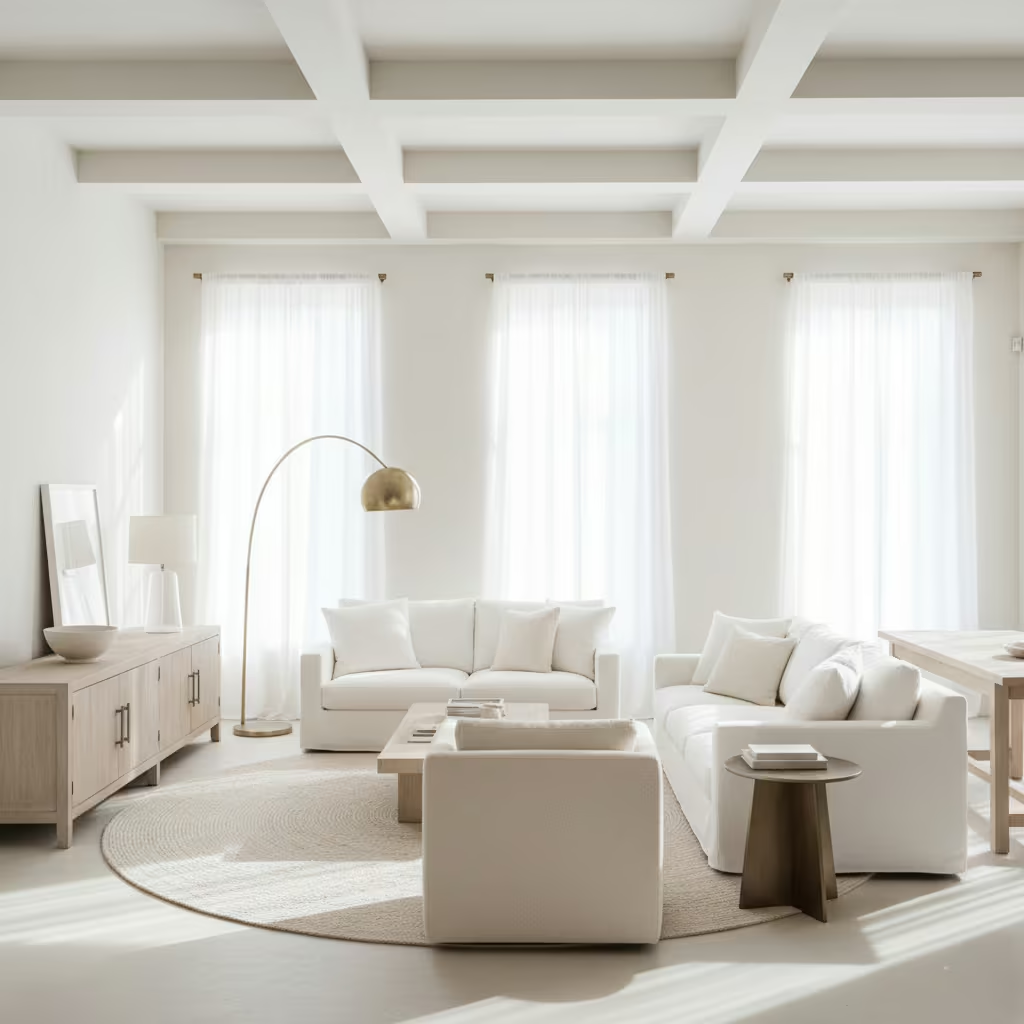
Introducing metallics into a white interior is a lesson in restraint. When handled thoughtfully, metals can elevate a neutral palette, adding warmth, shimmer, and sophistication without overwhelming the calm simplicity of white. In my experience, subtle, brushed finishes like soft brass, matte nickel, or aged bronze work far better than polished, reflective metals, which can appear harsh or overly decorative.
Take a living room where walls, ceilings, and upholstery are layered in tonal whites. A brushed brass floor lamp, a muted metallic side table, or understated cabinet handles instantly catch the eye without breaking the serenity of the palette. These small touches play with light, casting gentle reflections that animate the space and provide visual punctuation. In a 4 by 5-metre (13 by 16 feet) room, a single metallic accent can serve as an anchor or focal point, balancing the openness of white with a grounded, tactile element.
Materials and positioning matter. I often pair metallic accents with natural textures timber, stone, or linen to prevent the metals from feeling cold or out of place. A brushed brass frame against a soft, textured sofa or a pale timber console adds a sophisticated dialogue between surfaces. Lighting amplifies these effects: metals catch both natural and artificial light, creating subtle shadows and a quiet sparkle that adds depth and movement to the room.
Pros: Metallic accents bring warmth, visual interest, and a sense of luxury to white interiors without introducing colour clutter. They can subtly define zones, highlight features, and add a sculptural quality to furniture or fixtures.
Cons: Overuse or overly reflective metals can feel ostentatious or disrupt the calmness of a white scheme. Selecting finishes that harmonise with surrounding materials is essential, and careful maintenance is needed to prevent tarnishing or fingerprints.
In short, brushed metals are like punctuation in a sentence: they don’t dominate the narrative but subtly elevate it. In white interiors, they provide a sophisticated nod to texture, light, and refinement, ensuring the space feels considered, tactile, and quietly luxurious.
White Home Offices That Improve Focus
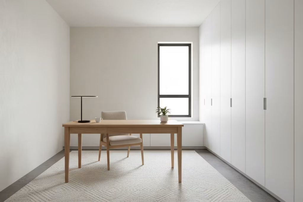
A white home office is more than an aesthetic choice it’s a tool for mental clarity. White walls, ceilings, and furniture create a calm, uncluttered backdrop that reduces visual noise, helping the mind to concentrate and workflow to flourish. But achieving focus in a white office isn’t about stripping everything away; it’s about thoughtful layering, deliberate materials, and spatial rhythm.
In my own projects, I’ve seen the difference that subtle tonal variation makes. Off-white cabinetry paired with slightly warmer walls prevents the space from feeling sterile, while matte finishes reduce glare from daylight streaming through north- or east-facing windows.
A desk positioned perpendicular to natural light ensures illumination without casting shadows on work surfaces, while low storage units maintain openness and sightlines, helping the room feel expansive rather than boxed-in. Typical clearances of 900–1000 mm (35–39 inches) around desks create freedom of movement without overcrowding the space.
Texture and materials also play a crucial role. A wool rug underfoot, a linen chair upholstery, or a lightly grained oak desk surface adds tactile interest that prevents the room from feeling flat, without introducing visual distraction. Lighting is equally important: a warm, diffused task lamp combined with indirect ceiling lighting maintains a consistent, comfortable ambience that supports sustained concentration.
Pros: White offices enhance focus, reduce stress, and encourage productivity. They feel spacious and adaptable, allowing for personal touches without compromising calm. Subtle textures and layered whites prevent visual fatigue while maintaining clarity.
Cons: Overly stark or poorly lit white offices can feel cold or uninspiring. Without careful material selection and tonal layering, glare and flatness can reduce comfort and focus.
A white home office is a delicate balancing act: enough minimalism to calm the mind, enough warmth and texture to make it inviting. When executed thoughtfully, it becomes a space where creativity flows, tasks are easier to manage, and the room itself quietly supports your day-to-day life.
White Interiors with Built-In Storage That Disappears
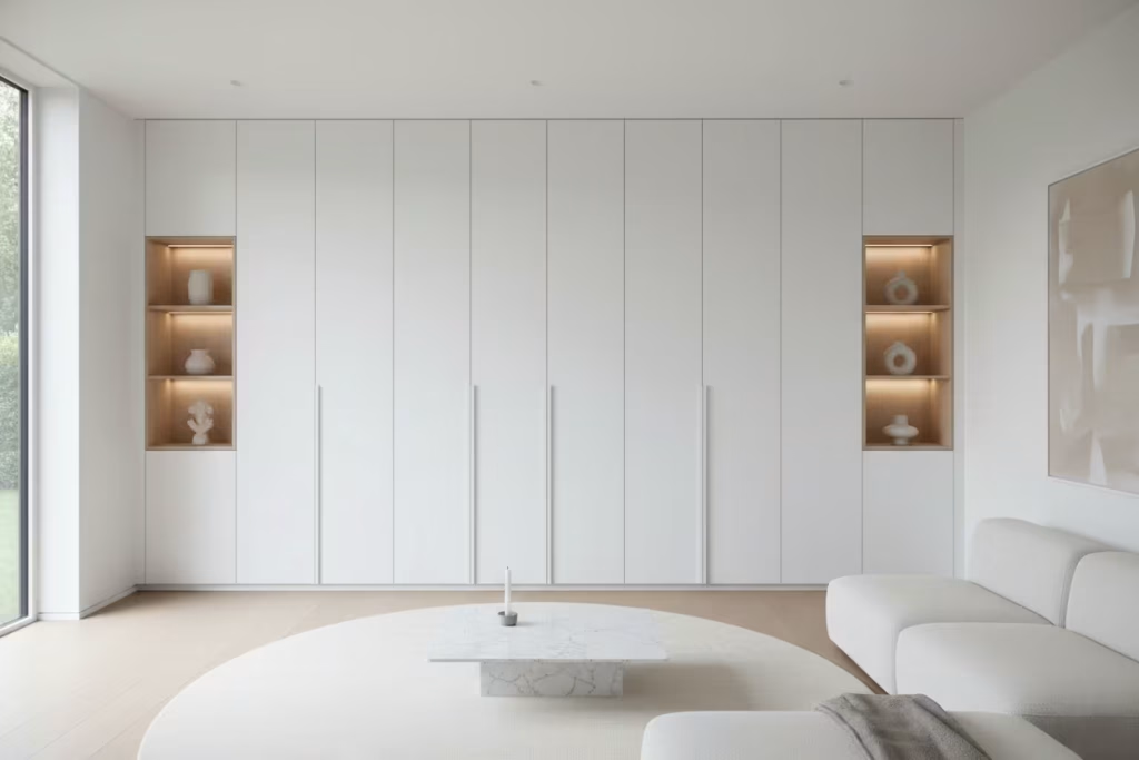
One of the hallmarks of a well-designed white interior is the ability to balance openness with functionality. White walls naturally expand space visually, but clutter can quickly erode that sense of calm. The solution? Built-in storage that blends seamlessly into the architecture, almost disappearing into the white canvas. When executed thoughtfully, it feels as though the room itself is tidy by design rather than by effort.
In my projects, I often integrate floor-to-ceiling cabinetry with flush doors, handleless systems, and hidden hardware. In a 3.5 by 4.5-metre (11.5 by 15 feet) living area, for instance, a continuous wall of white cabinets can house books, media, and household items without interrupting the flow of the room. Matte finishes prevent glare, while subtle shadow lines mark openings without drawing attention, maintaining the quiet elegance of the space.
Materials and detailing are critical. Laminates or lacquered surfaces work well for durability, while timber interiors or open shelving behind hidden doors can add warmth when accessed. Lighting inside the units LED strips or low-level spotlights illuminates contents without spilling light into the room, keeping the interior calm and uncluttered. Even small gaps for push-to-open mechanisms or recessed handles must be precise; any misalignment becomes immediately noticeable against a white backdrop.
Pros: Seamless storage maximises space, reduces visual clutter, and maintains the serenity of a white interior. It allows the room to feel open and sophisticated while remaining highly functional.
Cons: Precision is non-negotiable. Poor installation, uneven gaps, or the wrong finish can ruin the clean, minimalist effect. Built-in storage is also permanent, requiring foresight in planning for long-term household needs.
Ultimately, integrated white storage transforms a space from simply “pretty” to purposefully serene. It’s a subtle gesture that quietly declares: every object has a place, every surface breathes, and the room feels effortless yet meticulously curated.
White Interiors Layered Through Lighting
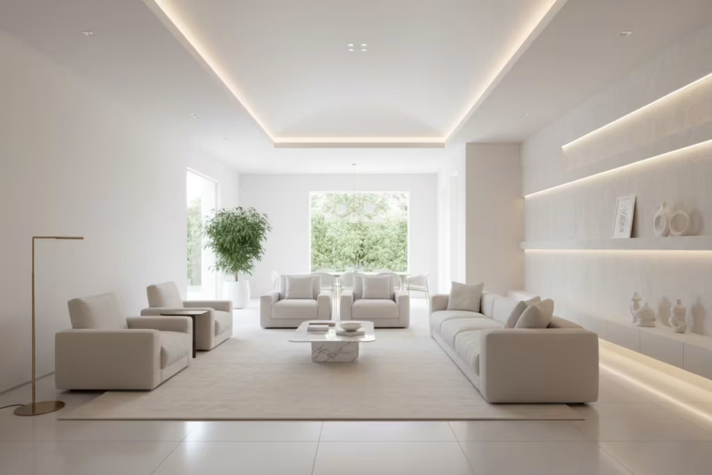
White interiors can feel ethereal and expansive, but without thoughtful lighting, they risk appearing flat or cold. In my experience, layering different types of light ambient, task, and accent is what transforms a plain white room into a space that breathes, shifts, and evolves throughout the day. Light becomes a design element in its own right, sculpting surfaces, emphasizing textures, and guiding the eye through the space.
Ambient lighting provides the foundation: concealed LED strips, cove lighting, or ceiling-mounted fixtures create an even, soft wash that prevents stark shadows on walls painted in soft whites or off-whites. Task lighting desk lamps, under-cabinet kitchen lights, or reading sconces ensures functionality while keeping the room feeling organised and purposeful.
Accent lighting highlights architectural features or focal points: a brushed brass floor lamp glinting against a white textured wall, or a spotlight skimming a polished stone countertop, adds depth and interest without cluttering the visual field.
Measurements and scale are important. For example, in a 4 by 5-metre (13 by 16 feet) living room, I typically position accent lighting 1.5–2 metres (5–6.5 feet) above the floor to catch textures without glare, while under-cabinet LEDs in kitchens are mounted 150–200 mm (6–8 inches) beneath cabinets for optimal countertop illumination. Combining these layers ensures the room feels luminous yet comfortable, even when natural light is minimal.
Pros: Layered lighting enhances depth, creates mood, and allows white interiors to feel dynamic rather than static. It accentuates materials and textures while providing practical illumination for daily life.
Cons: Misjudged placement or overly harsh light can flatten the space or produce glare. Balancing warm and cool tones is essential to maintain the serenity of a white palette.
When executed with care, layered lighting in a white interior doesn’t just illuminate it choreographs the room. Shadows play, textures emerge, and the space evolves from morning brightness to evening warmth, ensuring every corner feels intentionally composed and quietly captivating.
You May also Like: 20 Pink and White Dining Room Ideas That Make Your Table the Star of the Show
White Bedrooms Designed for Summer Ventilation
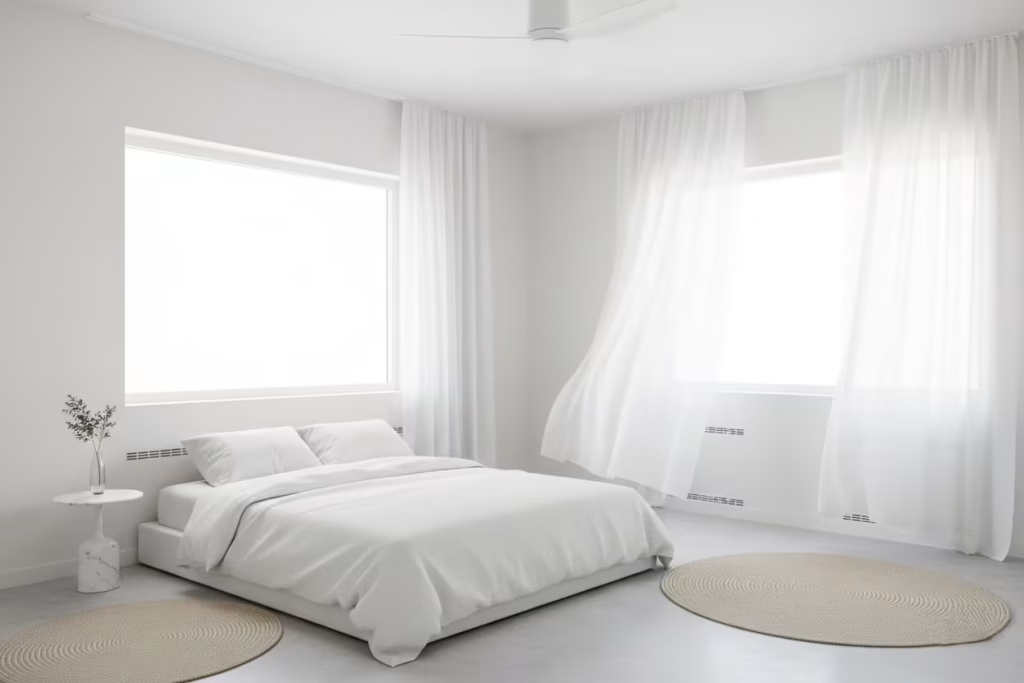
A white bedroom can feel crisp and serene, but in the height of summer, its design must do more than look good it must breathe. White reflects heat, amplifies light, and creates a sense of spaciousness, yet without careful planning, it can also trap warmth. In my experience, the key to a summer-ready white bedroom is intelligent airflow and strategic placement, creating a sanctuary that feels cool, airy, and effortlessly restful.
Cross-ventilation is the backbone of this approach. Positioning windows on opposite walls allows air to move naturally through the room, carrying warmth away and refreshing the space. Even modestly sized windows benefit from this principle, particularly when combined with lightweight, sheer curtains that diffuse sunlight without blocking the breeze. For a typical bedroom around 3 by 4 metres (10 by 13 feet), I ensure that furniture layout doesn’t obstruct airflow: the bed is often positioned perpendicular to the main window, leaving at least 600–750 mm (24–30 inches) clearance on each side for circulation.
Material selection reinforces the cool effect. Linen bedding, breathable cotton sheets, and natural-fibre rugs help regulate temperature and wick moisture. I also favour pale, matte paints for walls; glossy surfaces can trap heat or create glare under strong summer light. Subtle architectural tweaks, like a recessed ceiling fan or low-level trickle vents, add invisible functionality that complements the room’s aesthetic without detracting from its calm, white palette.
Pros: Proper ventilation and thoughtful layout make the bedroom genuinely comfortable in warm months. White surfaces reflect light and heat, enhancing perceived spaciousness and brightness. Combined with breathable textiles, the room maintains a refreshing, tranquil atmosphere.
Cons: Poorly positioned furniture or blocked airflow can negate the benefits. Oversized or dark window treatments can trap heat, while unbalanced materials may make the room feel sterile rather than serene.
In essence, a summer-ready white bedroom is a study in harmony: light, air, and materials working together. With careful planning, the space remains luminous and airy, inviting restful sleep even during the hottest days, while the white palette amplifies a sense of calm that is both aesthetic and functional.
White Interiors That Age Gracefully
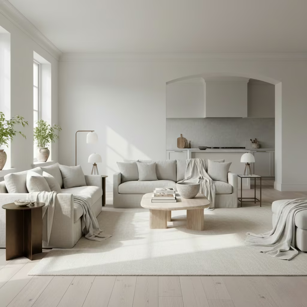
White interiors have a reputation for being delicate or high-maintenance, but with thoughtful material choices and planning, they can age with poise rather than showing wear prematurely. In my experience, designing a white space that matures gracefully is less about obsessing over perfect surfaces and more about understanding the natural patina of materials and how light interacts with them over time.
Durable materials are key. For floors, I often specify pale oak or honed limestone, both of which develop a subtle character without compromising the clean aesthetic. Walls benefit from high-quality washable paints with a soft matte finish that hides minor scuffs, while plaster or limewash can add texture that deepens with age. In kitchens or bathrooms, quartz countertops, porcelain tiles, and solid-surface cabinetry endure repeated use while maintaining a crisp look. In a 4 by 5-metre (13 by 16 feet) living area, choosing materials that can tolerate traffic and sunlight makes a practical difference over years, avoiding the visual fatigue that can plague high-contrast white schemes.
Lighting and layering also play a role. As natural light shifts throughout the day, the textures and finishes in a white room reveal gentle shadows, highlighting the room’s evolving character. Accessories like linen throws, wool rugs, or subtly aged metallic accents can complement this progression, allowing the space to feel intentionally lived-in rather than sterile.
Pros: Carefully chosen materials ensure longevity, visual warmth, and sophistication. A white interior can feel timeless, adapting to the family’s life and the changing qualities of light. It creates a backdrop that evolves rather than stagnates.
Cons: Cutting corners on materials or finishes can accelerate wear, yellowing, or staining. Without layered textures or natural patina, a white interior risks feeling clinical rather than cultivated.
Ultimately, a white interior that ages gracefully is an investment in both beauty and resilience. It’s about creating a space that doesn’t demand perfection but instead earns character over time, remaining calm, elegant, and welcoming for years to come.
You May also Like: 25 Walk-In Pantry Ideas for Beautifully Organised Homes
White Spaces That Rely on Proportion Over Decoration
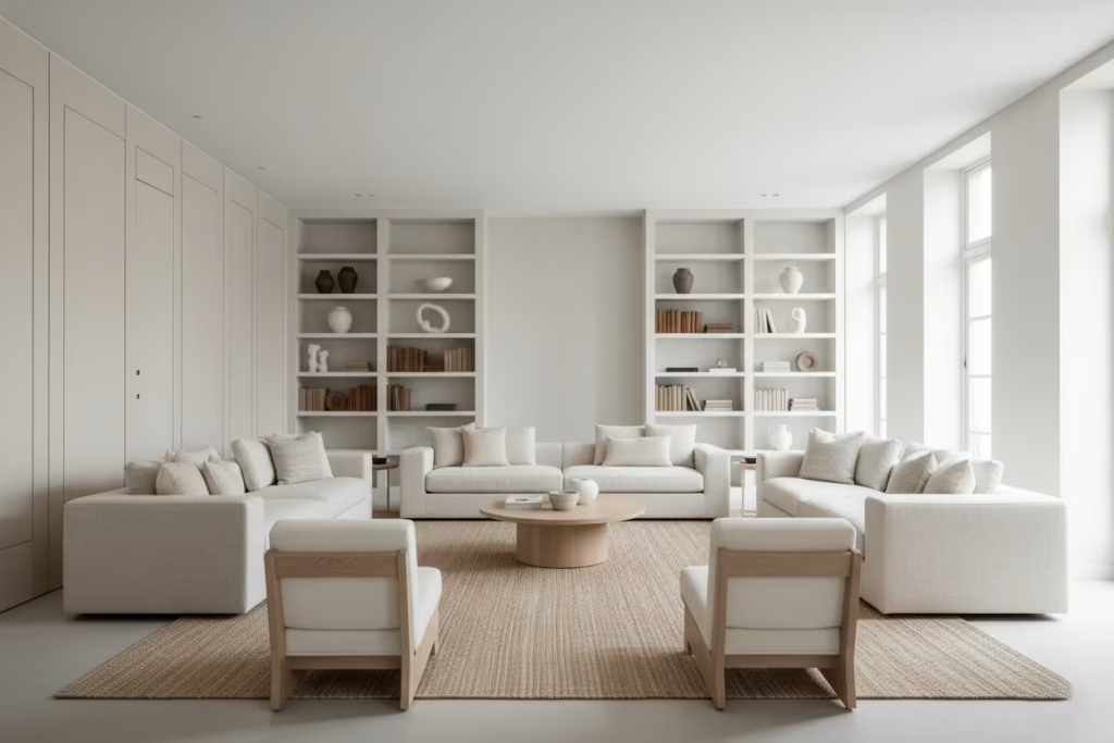
In a white interior, every element speaks louder because colour takes a backseat. This is where proportion becomes the true language of design. I’ve always found that a room carefully measured and thoughtfully scaled can command presence without a single decorative flourish. In spaces painted entirely in white, the interplay of height, width, and furniture scale carries all the weight of expression, creating harmony and rhythm that the eye naturally appreciates.
Take a living room measuring 5 by 6 metres (16 by 20 feet) with a ceiling height of 3.2 metres (10.5 feet). By selecting sofas, armchairs, and shelving that respect these dimensions, the room immediately feels balanced. Low seating paired with a central rug of appropriate scale anchors the space, while taller architectural features like panelling, architraves, or built-in shelving draw the eye upward without needing ornamentation. Even subtle details, such as the width of a console table or the clearance around a sideboard (ideally 900–1000 mm / 35–39 inches for circulation), reinforce proportion and ensure the space feels generous rather than sparse.
Materials and textures complement this approach. Matte walls, tactile fabrics, and natural woods provide subtle contrast that underscores scale, while indirect lighting emphasizes depth and shadow without clutter. By relying on proportion rather than decorative elements, the white palette remains serene, timeless, and elegant.
Pros: Rooms feel expansive, calm, and purposeful. Proportion creates innate harmony, reducing reliance on furniture or décor trends. The space becomes adaptable over time and maintains a high-end, editorial quality.
Cons: Misjudged scale can make a space feel empty, unbalanced, or awkward. Without careful planning, the room risks appearing cold or austere.
White spaces governed by proportion reward patience, observation, and subtlety. They teach that design is often less about what you add and more about how you measure, place, and respect the rhythm of space itself turning simplicity into quiet sophistication that endures.
Why White Interiors Require More Discipline Than Colour
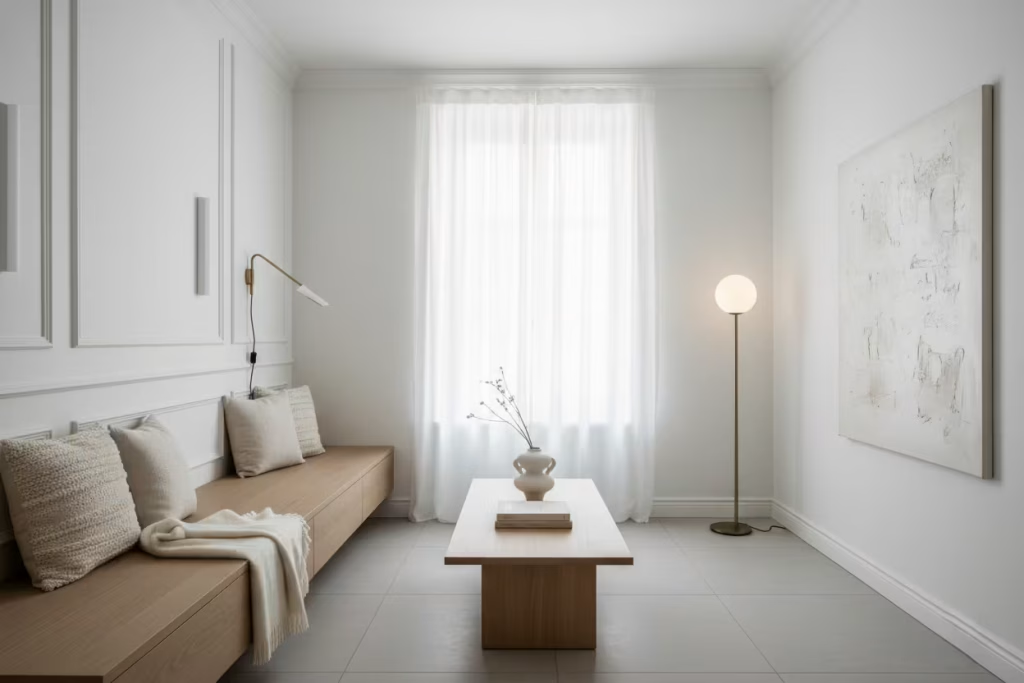
White has a deceptively simple reputation. At first glance, it seems effortless a neutral canvas ready to receive any furniture, artwork, or accent. Yet in my years of practice, I’ve learned that white is anything but the easy option. It is unforgiving, exposing every imperfection, from sloppy finishes to awkward proportions. A poorly executed white room can feel cold, sterile, or unintentional in a heartbeat, revealing weaknesses that colour often hides.
The beauty of white lies in its discipline. Each surface, each joinery detail, and every light fixture must be considered with care. Wall heights, ceiling lines, and furniture scale take on heightened importance because there is nothing to distract the eye. A misjudged sofa depth, a slightly off-kilter window frame, or even a subtle difference in paint sheen becomes immediately noticeable. I often tell clients that working with white is like walking a tightrope: one wrong step and the illusion of calm is broken.
Yet when executed with intention, white interiors achieve a quiet mastery that colour rarely matches. The palette becomes a study in subtlety: the soft interplay of warm and cool whites, the texture of linen against plaster, the gentle glow of light bouncing off matte or satin surfaces. Proportion, rhythm, and material speak more loudly than decorative flourishes ever could. In practice, a well-designed white room feels purposeful, serene, and enduring. It invites the inhabitant to pause, breathe, and appreciate the architecture and materiality rather than being distracted by colour or pattern.
Practical Insight: I always advise layering white with texture, tonal shifts, and natural materials. Even in a compact 3 by 4-metre (10 by 13 feet) bedroom, using subtle variations in white and tactile surfaces linen bedding, wool rugs, matte-painted skirtings creates depth without overwhelming the senses. Lighting must also be carefully choreographed: ambient, task, and accent lighting combine to sculpt the space subtly, ensuring that shadows and highlights animate the surfaces throughout the day.
Ultimately, white asks for clarity, restraint, and a willingness to let space, light, and material do the talking. It is a challenge that rewards precision, patience, and discernment. Done right, it feels calm, intentional, and enduring, transforming a room into a sanctuary where simplicity becomes sophistication and quiet confidence is felt in every corner.
Common Mistakes in White Interiors
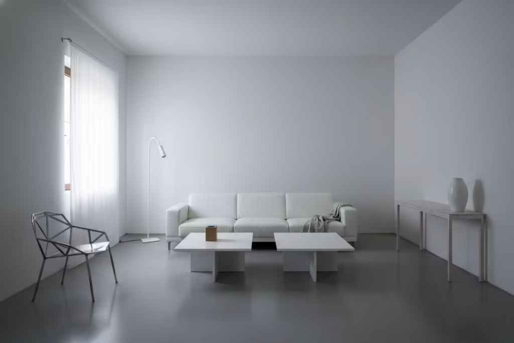
White interiors can be elegant, but they are not forgiving. That is the part people often miss. A white room does not give you much room to hide, so the smallest misjudgement can throw the whole space off balance. When it works, it feels calm, layered, and quietly assured. When it does not, it can look flat, cold, and unfinished, like the room never quite got past the starting line.
Overdoing pure white without tonal variation
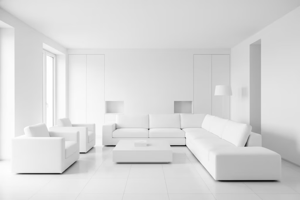
This is one of the fastest ways to drain life from a room. Pure white, used everywhere without pause or contrast, can feel sharp and clinical, especially in daylight. On paper, it sounds clean. In reality, it often reads as stripped bare. A room needs some tonal breathing room, even if the palette stays within the white family. Soft ivory, chalk, bone, warm white, and broken white all help the eye move through the space more comfortably. That slight variation is what gives the room depth without making a fuss about it.
Ignoring natural light
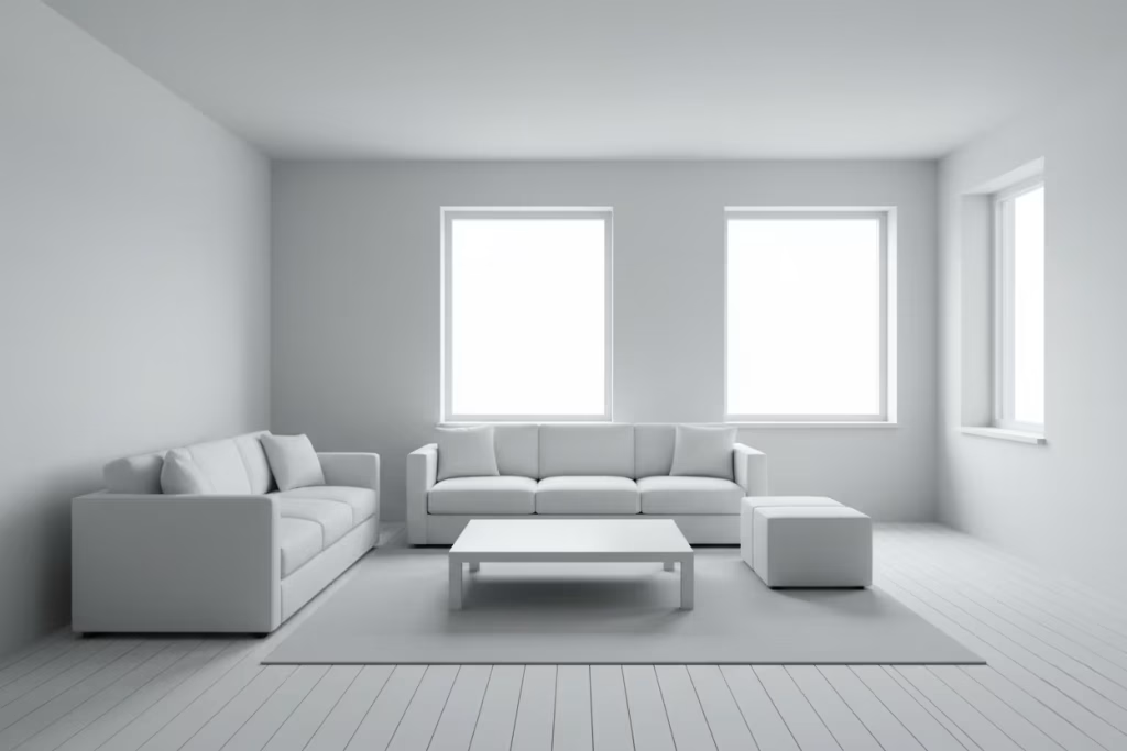
White is entirely at the mercy of light, which means the orientation of the room matters more than people expect. A white scheme that looks lovely in a bright showroom can fall completely flat in a north-facing room or under weak artificial lighting. Without enough daylight, white can turn greyish and lifeless. With too much hard sun, it can glare like mad. I always look at how light enters a room before recommending any white palette. It is not just about brightness, it is about the quality of that brightness and how it changes through the day.
Choosing the wrong finish for walls, flooring, or cabinetry
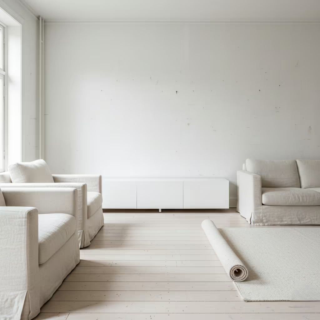
Finish is where many white interiors unravel. A glossy paint may seem like a good idea until the reflections become too aggressive and the room starts to feel overexposed. Matte finishes can be beautiful, but if they are too flat or too delicate, they may mark easily and lose their polish over time. Flooring and cabinetry need the same level of thought. A high-sheen cabinet in a sunny kitchen can feel harsh. A pale floor with the wrong surface treatment can show every footprint. The finish has to suit both the light and the lifestyle, otherwise the room ends up working against itself.
Underestimating material and texture layering
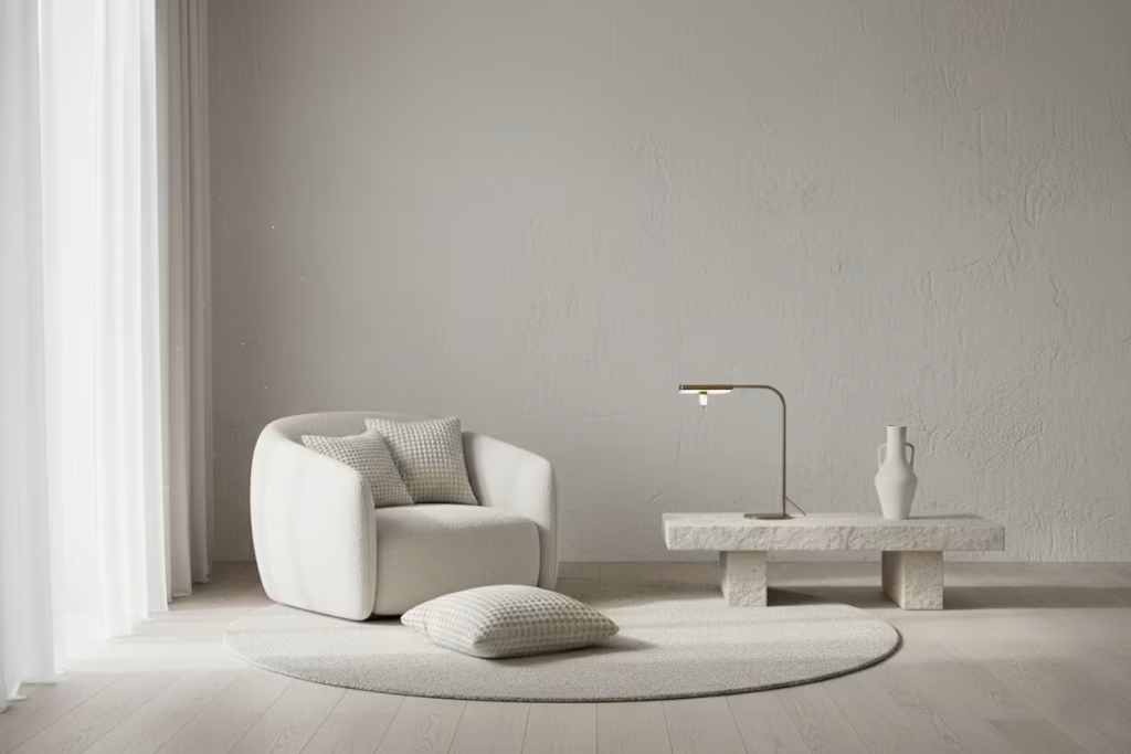
A white room without texture is like a sentence without rhythm. Everything begins to blur together. Texture is what gives white its staying power. Linen, wool, timber, plaster, stone, boucle, and brushed metals each catch and hold light differently, which keeps the room from becoming one-note. Even subtle contrasts, such as a smooth wall against a nubby textile or a matte surface beside a softly honed stone, can make all the difference. Without that layering, white quickly loses its charm and starts to feel thin.
Forgetting practical lifestyle needs
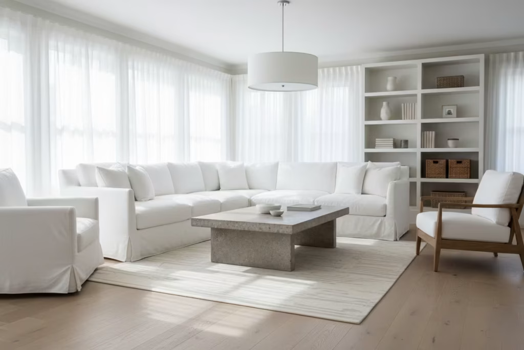
This is where design and real life often part ways. White surfaces may look immaculate on day one, but daily living tells a different story. Finger marks, scuffs, muddy shoes, pets, children, cooking, cleaning, all of it leaves a mark somewhere. The best white interiors take that into account from the start. Durable finishes, washable fabrics, and materials that age well are not optional extras. They are what allow the room to stay beautiful after the novelty has worn off. A white interior only feels effortless when the practical side has been carefully planned.
A real lesson from the spaces I have walked into
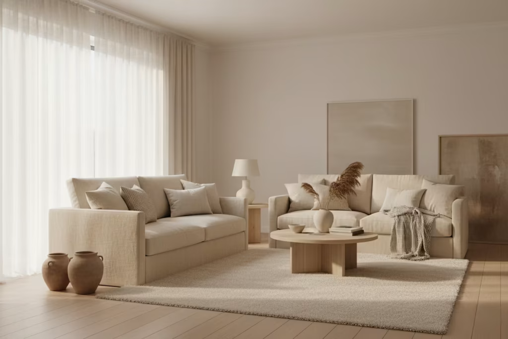
I have walked into homes that were all-white and cold, where every surface looked neat but nothing felt settled. In more than one case, a subtle beige or warm undertone would have brought the whole space to life. That is often the missing piece. Not a dramatic change, just a quieter, warmer note that softens the edges and makes the room feel more human. White does not need to be icy to be elegant. In fact, the best white interiors usually are not.
The truth is, white interiors ask for more judgement, not less. They depend on light, scale, surface, and restraint all working together. Get those things right, and white becomes one of the most rewarding palettes there is. Get them wrong, and there is nowhere for the mistakes to hide.
Conclusion: The Discipline and Reward of White
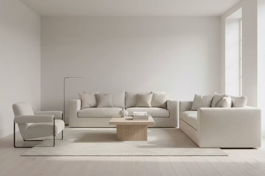
White is a truth-teller in interior design. It exposes every choice, laying bare proportion, finish, texture, and light like a mirror. There is no hiding behind colour, no room for careless detailing. That is why working with white demands focus, patience, and deliberate decision-making. Every element must earn its place, from the subtle tonal shifts in paint to the interplay of natural light with material surfaces.
When approached with care, white interiors deliver something few other palettes can: calm, intention, and timeless elegance. They invite the eye to wander, to appreciate space and texture, to notice shadows and highlights that might otherwise go unnoticed. I often remind clients, “White isn’t about what you add it’s about what you let shine.” The furniture, the finishes, the textures they all have to contribute to the story without overwhelming it.
Designing in white is a challenge, yes, but it is also deeply rewarding. It teaches restraint and precision, encouraging a mindset that prioritises quality over quantity and deliberation over impulse. For anyone considering a white interior, I would frame it as an opportunity rather than a default choice: a chance to craft a space where every surface, every shadow, and every layer is intentional, and where the resulting calm and clarity feel both rare and deeply satisfying. In essence, white is not easy but done well, it is unforgettable.
Frequently Asked Questions About Designing a White Interior for Homes
Is white a good choice for every room?
Not always, but it can work beautifully in almost any room if it is handled with care. The real question is not whether white suits the room, but whether the room suits the right kind of white. A north-facing space usually needs a warmer white, while a sun-filled room may call for a softer, more muted tone to avoid glare. White is at its best when it responds to the architecture, light, and daily use of the room rather than being applied as a one-size-fits-all solution.
How do I stop a white interior from feeling cold?
Texture is usually the missing ingredient. White on its own can feel stark, but when you introduce linen, wool, timber, stone, plaster, or boucle, the whole mood shifts. I often think of texture as the thing that gives white its heartbeat. A room with layered materials feels lived-in and reassuring, while a flat white scheme can feel like it is waiting for someone to arrive.
What is the best white paint for interiors?
There is no single best white. The right choice depends on the room’s light, size, and purpose. A bright, open living room may suit a cooler white, while a bedroom or hallway often benefits from something warmer and softer. I always look at undertone first, because that is where the room’s character really lives. A white with the wrong undertone can throw the whole space off, even if it looks perfect on the paint card.
How do I make a white room feel stylish, not plain?
The answer is not more stuff. It is better judgment. A white room feels stylish when the proportions are right, the materials are well chosen, and there is enough variation to keep the eye moving. That might mean a sculptural chair, a textured wall finish, a timber floor, or a beautifully made curtain that softens the light. White rooms rarely need loud gestures. They need detail that quietly earns its place.
Are white interiors difficult to maintain?
They can be, but only if the wrong finishes are chosen. Pure white on high-traffic surfaces will show wear more quickly, especially in homes with children, pets, or busy routines. That is why finish matters so much. Matte or washable paints, durable fabrics, and practical surfaces like quartz, porcelain, or sealed timber can make a huge difference. A good white interior is not precious. It is designed with real life in mind.
What works best in a white kitchen or bathroom?
In these spaces, I tend to look for warmth, softness, and material honesty. A white kitchen feels far more inviting when it includes natural wood, stone, or brushed metal rather than glossy, clinical finishes. In bathrooms, soft lighting and textured surfaces prevent the room from feeling sterile. White works best in wet or functional spaces when it feels considered rather than overly polished.
Can I mix different whites in the same room?
Yes, and in many cases, you should. Mixing whites adds depth and keeps the space from feeling flat. A slightly warmer wall colour, a cooler ceiling tone, and softer off-white textiles can work together beautifully. The key is to keep the undertones compatible. Done well, the room feels layered and elegant. Done badly, it can start to look muddled, which is where careful sampling becomes essential.
What are the biggest mistakes to avoid in a white interior?
The most common mistake is treating white as a shortcut. It is not. White needs as much thought as colour, sometimes more. The biggest issues I see are overusing pure white, ignoring natural light, choosing the wrong finish, and forgetting that texture is what gives the room depth. Another common misstep is forgetting that a white room still has to function day to day. If the scheme looks beautiful but cannot survive real life, it is only half a design.
Does white make a small room look bigger?
Usually, yes, but only if the proportions and lighting are working with it. White can help walls recede and make a compact room feel less boxed in, but if the room lacks texture or proper lighting, it can still feel flat rather than spacious. In small rooms, I often use white as part of a broader strategy that includes reflective light, clean sightlines, and carefully scaled furniture. White helps, but it does not do all the work on its own.
How do I know if a white interior is right for my home?
I always ask clients how they want the room to feel, not just how they want it to look. If they want calm, clarity, and a timeless backdrop that lets light and material take the lead, white can be an excellent choice. If they prefer high contrast, strong pattern, or a more layered colour story, white may need to be used more selectively. The best white interiors are not chosen because they are safe. They are chosen because they suit the way a home is meant to live and breathe.