25 Beautiful Modern Farmhouse Home Office Ideas for a Stylish Workspace
There is a reason modern farmhouse home offices continue to appear in some of the most enduring and liveable interiors. Long after countless design trends have come and gone, this aesthetic still manages to feel both familiar and fresh, offering a rare balance between comfort and sophistication that many contemporary workspaces struggle to achieve.
As working from home becomes a permanent part of daily life for many households, the home office has evolved far beyond a spare desk tucked into an unused corner. It now needs to support concentration, video meetings, creativity, organisation, and wellbeing, often all within the same room. That shift demands more thoughtful planning than ever before.
What makes modern farmhouse design particularly suited to this challenge is its emphasis on natural materials, practical functionality, and visual warmth. White oak, aged brass, linen, painted cabinetry, and handcrafted textures bring a sense of character that softens the technical demands of modern work. At the same time, clean-lined furniture, considered storage, and carefully layered lighting ensure the space remains efficient and highly functional.
From projects I have designed, the most successful farmhouse offices are never overly rustic. The magic happens when warm textures meet clean lines, creating spaces that feel collected rather than themed. A reclaimed wood desk paired with contemporary lighting, or traditional cabinetry balanced by streamlined seating, often produces a far more timeless result than leaning too heavily into farmhouse clichés.
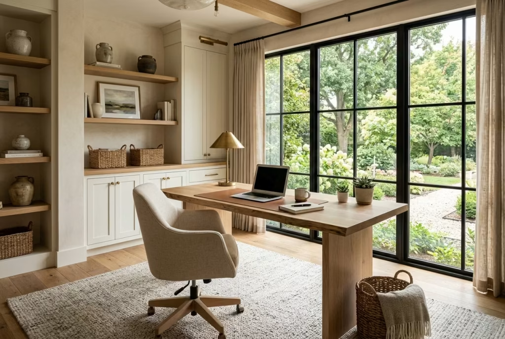
The following ideas explore how modern farmhouse principles can create workspaces that are not only beautiful to look at but genuinely enjoyable to use, combining thoughtful design, practical comfort, and a sense of calm that supports productivity throughout the day.
Modern Farmhouse Office Design Specifications
Beautiful home offices rarely happen by accident. Behind every workspace that feels comfortable, balanced, and visually effortless is a series of practical design decisions that quietly support how the room functions. While furniture styles and decorative details often receive the most attention, dimensions, clearances, and proportions are what determine whether a space genuinely works day after day.
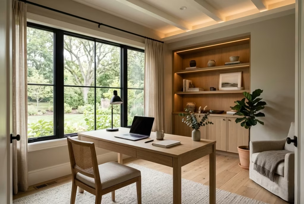
The following specifications provide a reliable foundation for planning a modern farmhouse home office that feels both inviting and highly functional.
| Element | Recommended Specification | Why It Works |
| Desk Width | 150-210cm (60-84 inches) | Provides adequate workspace for computers, documents, and accessories without feeling cramped. |
| Walkway Clearance | 90-120cm (36-48 inches) | Allows comfortable movement around furniture and prevents the room from feeling restricted. |
| Task Lighting | 3000K-3500K | Delivers a warm, residential atmosphere while maintaining sufficient clarity for focused work. |
| Bookshelf Depth | 30-40cm (12-16 inches) | Accommodates books, storage boxes, and decorative pieces without overwhelming the room. |
| Rug Size | Minimum front legs on rug | Creates visual cohesion and helps anchor furniture arrangements. |
| Ceiling Height Ideal | 2.7m+ (9ft+) | Enhances the sense of openness and allows architectural details to stand out. |
| Window Treatment | Linen drapery or woven shades | Softens natural light while preserving warmth and texture. |
| Storage Height | Up to 210cm (84 inches) | Maximises vertical storage without making the room feel top-heavy. |
Why These Measurements Matter
Many homeowners focus on finishes before considering proportion, yet proportion often has the greatest impact on daily comfort. A desk that is too small quickly becomes cluttered. Shelving that is too deep collects unused items and can visually dominate a room. Even something as simple as inadequate circulation space can make a well-decorated office feel awkward to use.
In my own projects, I often find that a desk around 180cm (72 inches) wide strikes the sweet spot for most dedicated home offices. It provides enough room for dual monitors, paperwork, and decorative accessories while still maintaining visual balance within the space.
Similarly, maintaining at least 90cm (36 inches) of clearance around major furniture pieces allows movement to feel natural and unforced. It is one of those details that goes unnoticed when done correctly but becomes immediately obvious when ignored.
Practical Designer Notes
- Position desks perpendicular to windows whenever possible to reduce screen glare.
- Allow at least 15-20cm (6-8 inches) of breathing room between furniture and walls for a more relaxed layout.
- Choose rugs large enough to extend beyond the desk and seating area rather than floating awkwardly beneath a single piece.
- Install layered lighting, combining overhead fixtures, task lamps, and accent lighting for flexibility throughout the day.
- Utilise vertical wall space for storage before expanding furniture footprints into valuable floor area.
Like the foundations beneath a well-built home, these measurements may not be the most visible design elements, but they are often the reason a workspace feels comfortable, efficient, and enjoyable long after the decorating is complete.
25 Beautiful Modern Farmhouse Home Office Ideas
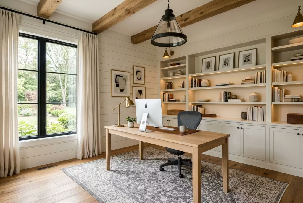
The best modern farmhouse home offices do far more than look attractive in photographs. They create environments that support concentration, encourage creativity, and make long working hours feel noticeably more comfortable. From custom oak cabinetry and light-filled workstations to textured finishes and thoughtfully layered lighting, each idea in this collection explores a different way to blend rustic warmth with contemporary refinement.
Whether you are planning a complete renovation or simply refreshing an existing workspace, these design concepts offer practical inspiration, real-world functionality, and timeless character that can help transform an ordinary office into a room where productivity and style work hand in hand.
White Oak Built-In Office Wall
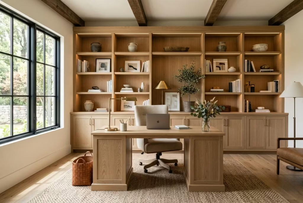
A full wall of white oak cabinetry has a way of transforming a home office from a temporary workspace into something that feels deeply integrated with the architecture itself. Unlike freestanding bookcases or modular storage units that can appear disconnected, built-in joinery creates a sense of permanence, giving the room the quiet confidence of a space designed with intention from the very beginning.
White oak remains one of the most versatile materials in modern farmhouse interiors because of its subtle grain pattern and warm undertones. It introduces natural character without overwhelming the room, making it particularly effective in offices where technology, screens, and equipment can otherwise dominate the visual experience. The timber acts almost like a balancing force, softening the harder edges of modern work life while maintaining a polished, professional atmosphere.
Design Notes
One of the greatest strengths of a white oak office wall is its ability to make storage feel elegant rather than purely functional. When cabinetry stretches across an entire elevation, it establishes a strong architectural feature that immediately anchors the room.
Key benefits include:
- Warm wood grain helps counterbalance computer screens, printers, and office equipment.
- Full-height joinery creates visual continuity and reduces clutter.
- Integrated storage keeps everyday necessities close at hand while maintaining a calm environment.
- Natural oak complements farmhouse, transitional, Scandinavian, and contemporary interiors alike.
This approach works especially well in offices measuring at least 3.5m x 4m (11.5ft x 13ft) or larger, where the cabinetry has enough wall space to make a meaningful impact without overwhelming the room.
Why It Works So Well
There is an old saying that everything should have a place, and in a hardworking office that principle becomes worth its weight in gold. Built-in storage allows paperwork, electronics, cables, reference books, and personal items to disappear behind beautifully crafted doors, creating a workspace that feels composed rather than chaotic.
The visual effect is equally important. Because the cabinetry is integrated into the architecture, the room appears larger and more organised. Instead of several individual pieces competing for attention, the eye reads the entire wall as a cohesive feature.
Real Project Insight
In a recent renovation, I designed a white oak storage wall spanning approximately 4.2m (14ft) across a dedicated home office. We incorporated cabinetry with a depth of 35cm (14 inches), which proved ideal for storing files, books, and technology without projecting too far into the room.
The lower section concealed filing drawers, printers, and office equipment, while open shelving at eye level displayed books and carefully selected decorative objects. What surprised the homeowners most was how much calmer the space felt once everyday clutter had a designated home. The office immediately gained the tailored appearance often associated with high-end private libraries and executive workspaces.
Material and Finish Recommendations
For the most sophisticated result, consider:
- Rift-sawn or quarter-sawn white oak for consistent grain patterns.
- Matte or low-sheen finishes that highlight the timber’s natural character.
- Integrated LED shelf lighting at 2700K to 3000K for a warm glow.
- Blackened steel or aged brass hardware for subtle contrast.
- Flush cabinet fronts to maintain a clean architectural appearance.
Pros
- Exceptional storage capacity without sacrificing aesthetics.
- Creates a bespoke, high-end appearance that elevates the entire room.
- Adds perceived value and desirability to the property.
- Keeps visual clutter hidden, supporting concentration and productivity.
- Ages beautifully, developing character over time rather than looking dated.
Cons
- Higher upfront investment than freestanding furniture.
- Requires skilled design, fabrication, and installation.
- Less flexibility if room layouts change in the future.
- Custom joinery often involves longer lead times during renovation projects.
Designer’s Note
If budget allows for only one major investment in a modern farmhouse office, I often recommend prioritising custom storage. Decorative accessories come and go, but beautifully crafted cabinetry forms the backbone of the room. Like the steady hand behind a successful project, it quietly supports everything around it while making the entire space feel more thoughtful, organised, and enduring.
Vaulted Ceiling Farmhouse Workspace
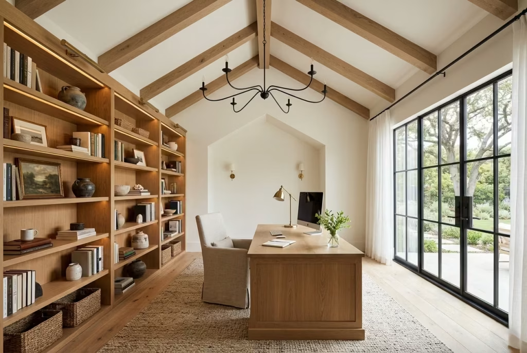
Few design features can transform a home office quite like a vaulted ceiling. The moment you enter a room with increased ceiling height, the atmosphere changes. The space feels lighter, more expansive, and noticeably more inspiring. In a modern farmhouse setting, vaulted ceilings introduce architectural character while creating an environment that encourages clear thinking and creativity.
What makes this approach particularly appealing is the sense of breathing room it provides. During long workdays, physical surroundings have a subtle but powerful influence on concentration and mood. A room that feels open and airy often supports focus more naturally than one that feels confined. When paired with warm materials and thoughtful furnishings, a vaulted office can feel both impressive and comfortable, striking that sweet spot many homeowners seek but rarely achieve.
Exposed Beam Selection
Exposed beams are often the defining feature of a vaulted farmhouse office. They bring visual structure to large ceiling expanses while adding texture and authenticity that plain drywall ceilings simply cannot replicate.
The key lies in selecting beams that suit the scale of the room rather than choosing the largest option available.
Popular choices include:
- White oak beams for a refined contemporary farmhouse look.
- Reclaimed timber beams for added history and character.
- Box beams for achieving substantial visual impact without excessive weight.
- Light-stained oak for brighter, airier interiors.
- Medium walnut tones for a richer, more grounded atmosphere.
In rooms with ceilings between 3.6m and 4.5m (12ft to 15ft), beams measuring approximately 15cm x 25cm (6in x 10in) often provide enough presence without dominating the architecture.
One lesson I have learned over the years is that beams should complement a room, not steal the show. When they become too oversized, they can feel heavy-handed, drawing attention away from the workspace itself.
Lighting Placement Strategies
Tall ceilings create wonderful opportunities for natural light, but they also introduce unique lighting challenges. Without careful planning, work surfaces can end up darker than expected despite the room’s overall brightness.
A layered lighting approach delivers the best results.
Consider incorporating:
- Central statement pendants suspended above the workspace.
- Adjustable wall sconces for ambient illumination.
- Desk lamps positioned for task-specific lighting.
- Integrated shelf lighting within cabinetry.
- Accent lighting to highlight architectural features.
For productive work environments, task lighting between 3000K and 3500K generally provides an ideal balance between warmth and clarity.
Pendant placement deserves particular attention. In most offices, fixtures should hang approximately 75 to 90cm (30 to 36 inches) above the desk surface when centred over a workstation. This creates intimacy within the larger volume of the room while preventing the lighting from feeling disconnected.
Like a conductor leading an orchestra, effective lighting ensures every element works together harmoniously rather than competing for attention.
Managing Scale in Tall Rooms
One of the most common mistakes in vaulted offices is under-furnishing the space. High ceilings naturally draw the eye upward, making standard-sized furniture appear smaller than it would in a conventional room.
The solution is not necessarily larger furniture, but rather a more thoughtful distribution of visual weight throughout the room.
Strategies that work particularly well include:
- Floor-to-ceiling bookshelves that visually connect lower and upper portions of the room.
- Large-scale artwork measuring at least 100 to 150cm (40 to 60 inches) in height.
- Generously proportioned desks between 180 and 210cm (72 to 84 inches) wide.
- Oversized pendant fixtures that occupy vertical space.
- Tall indoor trees reaching 2m to 2.5m (6.5ft to 8ft) in height.
In one recent project, the office featured a ceiling peak reaching nearly 5m (16ft). Initially, the room felt somewhat disconnected despite its impressive architecture. By introducing full-height shelving, larger lighting fixtures, and a substantial oak desk, the space gained balance and warmth without sacrificing its openness.
Creating Comfort Within Grandeur
While vaulted ceilings naturally create drama, successful farmhouse offices never rely solely on scale. Comfort remains equally important.
Soft furnishings help bridge the gap between expansive architecture and everyday usability.
Consider layering:
- Wool rugs beneath workstations.
- Linen drapery extending from ceiling height.
- Upholstered seating with textured fabrics.
- Natural wood finishes that temper hard surfaces.
- Decorative objects that introduce personality and warmth.
These elements prevent the room from feeling cavernous and instead create a welcoming environment that encourages long periods of focused work.
Pros
- Creates an exceptional sense of openness and freedom.
- Enhances natural light distribution throughout the room.
- Increases perceived property value and visual appeal.
- Provides strong architectural character without excessive decoration.
- Supports a more inspiring and uplifting working environment.
Cons
- Heating and cooling costs may be higher in some climates.
- Lighting design requires greater planning.
- Construction and renovation costs can be significantly higher.
Designer’s Note
A vaulted farmhouse office succeeds when grandeur meets comfort. The soaring ceiling may capture attention at first glance, but it is the balance of scale, texture, and thoughtful detailing that keeps the room feeling inviting day after day. When designed carefully, these spaces become far more than work environments. They become places where ideas have room to grow, quite literally, beneath a ceiling that encourages you to look up and think a little bigger.
You May also Like: 25 Relaxing Coastal Home Office Ideas Inspired by Capri Living
Linen-Draped Corner Office
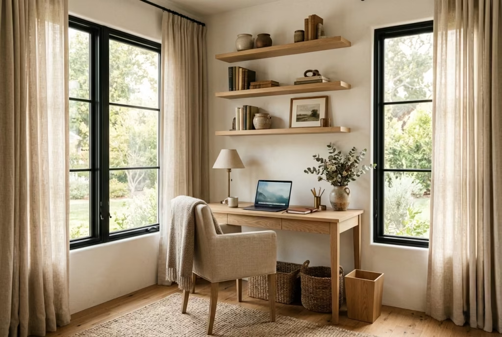
Not every remarkable home office requires a large footprint or a dedicated room. Some of the most inviting workspaces emerge from underused corners, transformed through thoughtful design and careful attention to atmosphere. A linen-draped corner office embodies this idea beautifully, creating a workspace that feels calm, intimate, and connected to the rhythms of natural light.
What makes this approach particularly appealing is its ability to turn an ordinary corner into a retreat-like setting. Instead of treating windows as purely functional features, linen drapery allows them to become part of the design narrative, shaping how light enters the room and influencing the overall mood throughout the day. The result is a workspace that feels softer, quieter, and far more welcoming than many conventional home offices.
Light Filtering Techniques
Natural light remains one of the most valuable assets in any office, yet direct sunlight can quickly become a source of discomfort. Screen glare, harsh shadows, and overheating are common challenges, especially in rooms with large windows.
Linen offers an elegant solution because it diffuses sunlight rather than blocking it entirely. The fabric acts like a gentle filter, softening brightness while preserving the connection to the outdoors.
Effective strategies include:
- Sheer linen panels for north-facing windows where maximum daylight is desired.
- Medium-weight linen for east and west-facing rooms with stronger sunlight.
- Double-layer treatments combining sheer and lined curtains for greater flexibility.
- Light-toned fabrics that reflect rather than absorb daylight.
In practice, linen creates a beautifully nuanced quality of light. As the sun shifts throughout the day, the fabric catches and softens its intensity, producing subtle variations that bring life to the room without becoming distracting.
There is something quietly comforting about working in a space where the light feels measured rather than harsh. It allows the room to breathe while keeping visual fatigue at bay.
Window Treatment Proportions
The success of linen drapery often comes down to proportion. Curtains that are too short or too narrow can unintentionally make a room feel smaller and less considered.
For a more tailored appearance:
- Install curtain rods 15 to 30cm (6 to 12 inches) above the window frame whenever possible.
- Extend rods 20 to 30cm (8 to 12 inches) beyond each side of the window.
- Allow curtains to lightly kiss the floor or break slightly for a relaxed farmhouse aesthetic.
- Select panels that are approximately two to two-and-a-half times the width of the window for generous fullness.
These adjustments may seem minor, yet they can dramatically alter how spacious a room feels. By drawing the eye upward and outward, properly scaled drapery creates the illusion of larger windows and higher ceilings.
In one renovation project, a modest office measuring just 2.8m x 3.2m (9ft x 10.5ft) felt noticeably more expansive after floor-to-ceiling linen curtains were installed. The architecture itself had not changed, but the room suddenly carried itself with far greater confidence.
Softening Hard Architectural Lines
Home offices often contain numerous rigid elements. Desks, shelving, cabinetry, monitors, and storage systems naturally introduce straight lines and angular forms. While these features are necessary for functionality, too many can leave a space feeling overly formal or visually cold.
Linen provides a valuable counterbalance.
Its gentle folds and organic texture introduce movement and softness, helping the room feel more relaxed and approachable.
This effect becomes particularly important in spaces featuring:
- Black-framed windows
- Built-in cabinetry
- Exposed steel details
- Geometric furniture
- Modern architectural features
The contrast between structured elements and flowing textiles creates visual harmony. Much like a well-composed piece of music that balances rhythm with melody, the room gains depth through the interplay of opposites.
Additional ways to enhance softness include:
- Layering wool rugs beneath workstations.
- Introducing upholstered seating.
- Adding woven baskets for storage.
- Incorporating handcrafted ceramics and natural materials.
Together, these elements create a workspace that feels thoughtfully layered rather than rigidly designed.
Creating a More Comfortable Work Environment
A linen-draped office offers benefits that extend beyond aesthetics. The fabric contributes to the overall comfort of the space by reducing glare, softening acoustics, and creating a more relaxed visual environment.
Homeowners often underestimate the impact of these subtle improvements until they experience them firsthand. A room that feels calmer tends to support longer periods of focused work, making daily tasks feel less draining and more enjoyable.
The atmosphere becomes especially appealing during early mornings and late afternoons, when filtered sunlight moves across natural materials and textured surfaces, creating a sense of warmth that artificial lighting rarely achieves.
Pros
- Enhances natural light without sacrificing privacy.
- Adds softness and texture to structured workspaces.
- Makes small offices feel more spacious and inviting.
- Complements a wide variety of farmhouse and transitional styles.
- Relatively simple to update compared to major renovations.
Cons
- Linen may require occasional steaming to maintain a polished appearance.
- Lighter fabrics can offer limited privacy at night without additional lining.
- Fabric exposed to strong sunlight may gradually fade over time.
- Premium linen treatments often come at a higher cost than synthetic alternatives.
Designer’s Note
A linen-draped corner office proves that impactful design does not always require dramatic architectural changes. Sometimes the smallest interventions create the greatest difference. By controlling light, softening edges, and introducing natural texture, linen helps transform an overlooked corner into a workspace that feels calm, personal, and quietly inspiring. Like a gentle breeze moving through an open window, its influence is subtle, yet once experienced, it becomes difficult to imagine the room without it.
Black-Framed Glass Office Nook
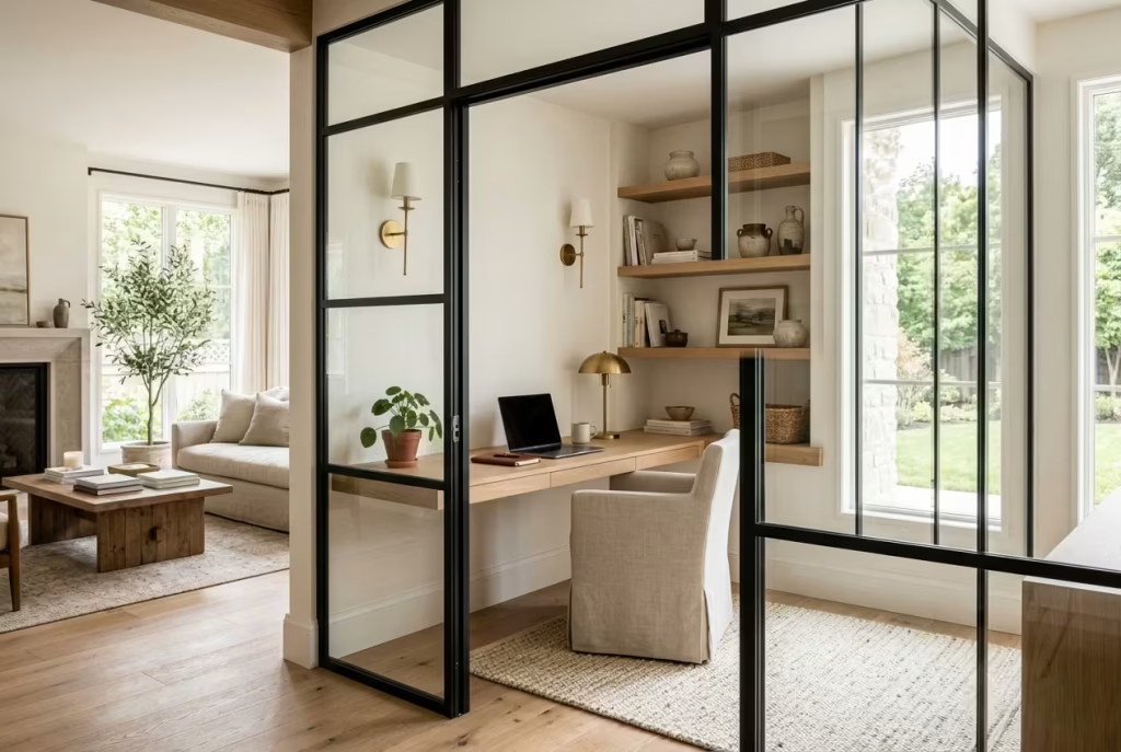
A black-framed glass office nook is one of the smartest ways to carve out a dedicated workspace without making a home feel smaller or more closed off. It solves a challenge many homeowners face: creating separation from the rest of the house while still maintaining an open, connected atmosphere. In modern farmhouse interiors, this approach brings together traditional materials and industrial detailing in a way that feels current without becoming trend-driven.
Whether positioned beneath a staircase, at the end of a hallway, or within an open-plan living area, a glass-enclosed office can establish clear boundaries between work and home life while allowing daylight to travel freely throughout the space.
Modern Farmhouse Meets Industrial
The appeal of black-framed glazing lies in its ability to bridge two design languages that might seem worlds apart at first glance. Farmhouse interiors often lean towards natural textures, painted woodwork, and warm finishes, while industrial influences introduce steel, glass, and stronger lines.
When these elements are balanced carefully, the result feels layered rather than predictable. A successful combination might include:
- White oak cabinetry paired with black steel frames
- Limewashed or painted walls alongside industrial-style glazing
- Linen upholstery contrasted with metal detailing
- Rustic timber flooring softened by woven rugs
The black framework acts like an outline around a drawing, giving definition and structure to softer materials throughout the room. It adds enough contrast to prevent the space from feeling overly rustic while allowing natural materials to remain the main attraction.
Space Division Without Losing Light
One of the biggest advantages of glass partitions is their ability to create privacy without sacrificing daylight. Traditional stud walls perform the task of separation well enough, but they often interrupt sightlines and block natural illumination from reaching adjacent spaces.
Glass offers a more elegant solution. For homes with limited square footage, this can make a remarkable difference.
Benefits include:
- Maintaining visual openness throughout the home
- Allowing natural light to flow between rooms
- Creating a dedicated work zone without a full extension
- Preserving views towards gardens or exterior landscapes
- Making compact spaces feel larger than their actual dimensions
In one project, I transformed an unused dining alcove measuring approximately 2.4m x 2.7m (8ft x 9ft) into a glass-enclosed office. Had we installed solid walls, the surrounding living area would have felt noticeably darker. Instead, the glazed partition created a distinct workspace while keeping the entire floor plan bright and connected.
It was a classic case of having your cake and eating it too. The homeowners gained privacy without losing the openness they loved about the house.
Choosing the Right Glass Configuration
Not all glass office enclosures need to be fully enclosed boxes. Several layouts work particularly well:
- Fixed glass panels with a single hinged door
- Steel-framed sliding glass doors
- Partial-height glazing combined with timber panelling
- Corner installations using two glazed walls
- Interior windows connecting office and living spaces
The best solution often depends on available space, traffic flow, and how frequently the office is used throughout the day.
Acoustic Considerations
Glass partitions excel at visual separation, but sound management requires additional planning. Many homeowners assume glass automatically creates a quiet workspace. In reality, standard glazing offers only moderate sound reduction. Conversations, televisions, and household activity can still travel through the partition if acoustic performance is overlooked.
Several upgrades can improve comfort significantly:
- Laminated acoustic glass panels
- Solid-core doors instead of hollow alternatives
- Perimeter seals around doors
- Area rugs to absorb reflected sound
- Upholstered furniture and fabric window treatments
For households with children, multiple occupants working remotely, or open-plan layouts, these additions can make a substantial difference.
In practice, acoustic laminated glass often provides noticeably better performance than standard single glazing, especially when paired with proper door seals.
Materials That Strengthen the Look
To prevent the office from feeling overly industrial, balance the steel and glass with materials that introduce texture and warmth.
Effective pairings include:
- White oak desks and shelving
- Antique brass lighting
- Natural stone accessories
- Linen drapery
- Leather seating with a matte finish
- Wool rugs beneath the workspace
These layers help the office feel integrated with the rest of the home rather than appearing as a commercial insertion within a residential setting.
Pros
- Creates a dedicated workspace while maintaining openness.
- Maximises daylight penetration.
- Adds architectural character without extensive construction.
- Works well in both large and compact homes.
- Blends farmhouse and industrial influences naturally.
Cons
- Acoustic privacy may require additional investment.
- Glass surfaces need regular cleaning.
- Not ideal for confidential or high-noise workCustom steel-framed installations can be expensive.
- Limited visual concealment when the office is untidy.
Designer’s Note
A black-framed glass office nook succeeds because it addresses a very modern challenge. Many homeowners need separation, yet they do not want to sacrifice openness. Glass allows both needs to coexist. Combined with natural timber, textured fabrics, and well-considered furnishings, it creates a workspace that feels integrated into the home rather than isolated from it, offering the best of both worlds without forcing a compromise.
Reclaimed Wood Statement Desk
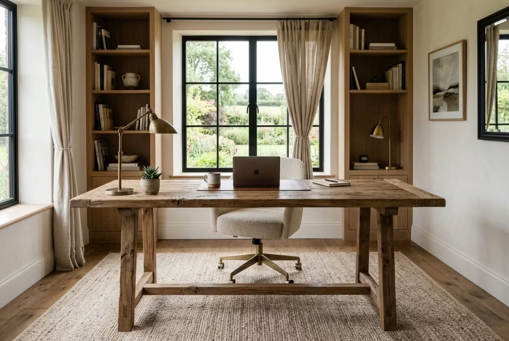
Every memorable home office tends to have one feature that immediately catches the eye. In a modern farmhouse workspace, that role is often played by a reclaimed wood desk. Rich with texture, character marks, and natural variation, reclaimed timber introduces a sense of history that newly manufactured furniture rarely achieves. Scratches, saw marks, nail holes, and weathered grain patterns tell a story, giving the office a lived-in authenticity that feels genuine rather than staged.
Unlike mass-produced desks that can blend into the background, a reclaimed wood piece naturally becomes the focal point of the room. It anchors the workspace and often requires surprisingly little additional decoration to make an impact.
Timber Species Comparison
Not all reclaimed wood performs the same way. The species used will influence appearance, durability, and long-term maintenance.
| Timber Species | Appearance | Durability | Best For |
| White Oak | Subtle grain, lighter tones | Excellent | Refined farmhouse offices |
| Pine | Knots, rustic texture | Moderate | Casual farmhouse spaces |
| Elm | Distinctive grain movement | Good | Character-rich interiors |
| Walnut | Deep brown colouring | Excellent | Executive-style offices |
| Douglas Fir | Warm reddish undertones | Good | Larger statement desks |
In many projects, reclaimed oak remains the safest long-term investment. It offers enough character to feel interesting while maintaining a refined appearance that works comfortably alongside modern furnishings.
Pine, while charming, tends to develop dents more easily. For homeowners who spend many hours at their desks or frequently move equipment around, harder species often prove more practical.
Why Reclaimed Wood Feels Different
Part of the appeal comes from the imperfections. Modern manufacturing often strives for complete uniformity, yet perfectly matched surfaces can sometimes feel sterile. Reclaimed timber takes the opposite approach. Variations in colour, texture, and grain create depth that becomes more noticeable the longer you live with the piece.
A reclaimed desk measuring around 180cm x 80cm (72in x 32in) provides generous working space while showcasing the timber’s natural character. Larger slabs can be particularly effective in offices with higher ceilings or more generous floor plans.
There is an old saying that age before beauty. In the case of reclaimed timber, the two often arrive together.
Maintenance Requirements
One of the most common questions homeowners ask is whether reclaimed wood requires extensive upkeep. The reality is reassuringly straightforward.
Basic care includes:
- Wiping spills promptly to prevent staining.
- Using desk pads beneath heavy equipment.
- Dusting regularly with a soft cloth.
- Reapplying protective oil or wax finishes when recommended by the manufacturer.
- Avoiding prolonged exposure to direct sunlight, which can cause uneven fading.
Unlike highly polished surfaces that reveal every scratch, reclaimed timber often becomes more attractive as it acquires additional signs of use. Small marks tend to blend into the existing patina rather than standing out as flaws. For busy households, this can be a significant advantage.
Pairing With Contemporary Seating
One of the easiest ways to keep a reclaimed wood desk from feeling overly rustic is through the choice of seating.
A heavily distressed desk paired with an equally rustic chair can sometimes tip the room too far in one direction. Introducing a more contemporary chair creates balance and prevents the office from feeling themed. Successful combinations include:
- Black leather task chairs with clean silhouettes.
- Upholstered swivel chairs in boucle or textured fabrics.
- Matte black ergonomic seating.
- Low-profile executive chairs with slim metal frames.
- Contemporary wooden chairs featuring curved forms.
The contrast between aged timber and modern seating creates visual interest without demanding attention. Each element strengthens the other.
In a recent project, a reclaimed oak desktop was paired with a sculptural cream-upholstered task chair featuring concealed casters. The combination felt fresh and current while preserving the farmhouse character the homeowners wanted.
Additional Styling Ideas
To build around a reclaimed desk without overwhelming it:
- Use simple ceramic table lamps.
- Introduce natural linen window treatments.
- Add a single oversized artwork rather than multiple smaller pieces.
- Choose understated storage solutions.
- Limit decorative accessories to a carefully edited selection.
The desk should remain the star of the show rather than competing with surrounding elements.
Pros
- Brings genuine character and individuality to the office.
- Makes a strong focal point without relying on decorative trends.
- Durable when constructed from quality reclaimed hardwoods.
- Small imperfections tend to blend naturally over time.
- Sustainable choice that repurposes existing materials.
Cons
- Premium reclaimed timber can be expensive.
- Surface irregularities may not suit every homeowner.
- Some pieces require periodic refinishing.
- Availability of specific sizes and species can be limited.
Designer’s Note
A reclaimed wood desk works best when it is allowed to speak for itself. The grain patterns, weathered markings, and subtle imperfections already provide plenty of personality. Surround it with cleaner lines, simpler forms, and carefully selected materials, and it becomes far more than a workstation. It becomes a piece that adds depth, history, and a sense of permanence to the room, qualities that only grow stronger with time.
You May also Like: 25 Productive Japanese Home Office Designs for a Soulful Workspace
Moody Farmhouse Office in Deep Taupe
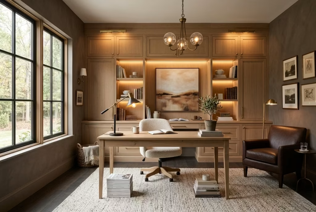
Not every farmhouse office needs bright white walls and sun-bleached finishes. Some of the most memorable workspaces embrace a richer palette, creating an atmosphere that feels cocooning, sophisticated, and deeply personal. Deep taupe is particularly effective because it occupies that elusive middle ground between grey and brown, offering depth without the heaviness often associated with charcoal or black.
In the right setting, a taupe office can feel like stepping into a well-appointed private study, the kind of room where distractions seem to fade into the background and every element feels deliberate. It is a colour choice that rewards patience, revealing different undertones as daylight shifts from morning through evening.
Colour Psychology for Productivity
Colour influences how a room feels far more than many homeowners realise. While bright shades tend to energise a space, deeper hues often create a greater sense of enclosure and focus.
Taupe works particularly well because it avoids the extremes.
Unlike stark white, which can sometimes feel clinical, or dark charcoal, which can appear severe, taupe introduces a softer depth that encourages a slower visual pace. The room feels settled rather than busy.
Many people working from home spend eight or more hours in their office each day. A carefully selected darker palette can reduce visual overstimulation, especially in households where the rest of the home is filled with activity.
Deep taupe performs especially well in:
- Reading-focused offices
- Creative studios
- Writing spaces
- Executive home offices
- Rooms with abundant natural light
There is a reason traditional libraries and studies have historically embraced richer colours. They create an environment that feels grounded, encouraging longer periods of engagement without constantly pulling the eye from one surface to another.
Layering Dark Tones Successfully
The biggest mistake homeowners make with darker interiors is relying on a single colour throughout the room. Without variation, the space can feel flat and one-dimensional.
The secret lies in building layers of related tones and textures.
A successful scheme might combine:
- Deep taupe walls
- Medium-toned oak furniture
- Chocolate brown leather seating
- Cream linen drapery
- Stone accessories with natural variation
- Aged brass details
These subtle shifts prevent the room from becoming visually stagnant. Texture becomes especially important when colour contrast is reduced. A matte painted wall behaves differently from brushed timber, woven textiles, or leather upholstery. Together, these materials create interest that unfolds gradually rather than revealing everything at first glance.
In one renovation, I specified a taupe wall colour paired with a lightly textured plaster finish. During daylight hours, the surface appeared soft and understated. By evening, under carefully positioned lighting, the texture became far more pronounced, giving the room an entirely different character.
Choosing the Right Taupe Shade
Not all taupes are created equal. Some lean heavily towards grey, while others contain stronger brown undertones. The amount of natural light entering the room should heavily influence the selection.
Generally:
- North-facing rooms benefit from warmer taupes with brown undertones.
- South-facing spaces can handle cooler taupe shades.
- East-facing rooms often suit balanced neutrals.
- West-facing offices work well with earthy taupes that soften afternoon sunlight.
Testing large paint samples on multiple walls remains one of the most valuable steps in the design process. A colour that appears perfect on a paint card can behave very differently once applied across an entire room.
Lighting Adjustments for Darker Schemes
A darker office requires more deliberate lighting planning than a lighter one. Dark surfaces absorb significantly more light, which means illumination must be layered carefully.
Relying on a single ceiling fixture is rarely enough.
Instead, combine:
- Decorative ceiling lighting
- Adjustable task lamps
- Cabinet or bookshelf lighting
- Wall sconces
- Accent lighting for artwork
For most farmhouse offices, light temperatures between 2700K and 3000K help maintain a welcoming atmosphere without appearing overly yellow.
Desk lighting deserves particular attention. Position task lights to illuminate work surfaces directly rather than relying on ambient light alone.
A useful rule of thumb is to think of lighting as creating pools of illumination throughout the room. Instead of flooding every corner with brightness, focus on highlighting the areas where activity takes place.
Materials That Complement Deep Taupe
Certain materials pair exceptionally well with darker wall colours.
Consider incorporating:
- White oak for contrast
- Antique brass hardware
- Natural limestone accessories
- Cream bouclé seating
- Handwoven wool rugs
- Bronze-framed artwork
These additions prevent the palette from becoming monotonous while maintaining the room’s refined atmosphere.
The contrast does not need to be dramatic. Often, the most successful spaces rely on subtle shifts in tone rather than bold colour clashes.
Pros
- Creates a sophisticated, library-like atmosphere.
- Hides minor wall imperfections more effectively than lighter colours.
- Adds depth and character to standard architectural spaces.
- Works beautifully with natural wood and stone finishes.
- Feels timeless rather than trend-focused.
Cons
- Requires stronger lighting strategies.
- Can feel heavy in rooms with limited daylight.
- Paint colour selection becomes more critical.
- Smaller offices may feel enclosed if the palette is not balanced properly.
Designer’s Note
A deep taupe office is not about making a dramatic statement. Its appeal lies in the way it slowly reveals itself through texture, material contrast, and changing light. While brighter rooms often capture attention immediately, darker interiors tend to reward the people who spend time in them. Day after day, they offer a sense of depth and atmosphere that feels increasingly rich the longer you live and work within their walls.
Double Workstation for Shared Productivity
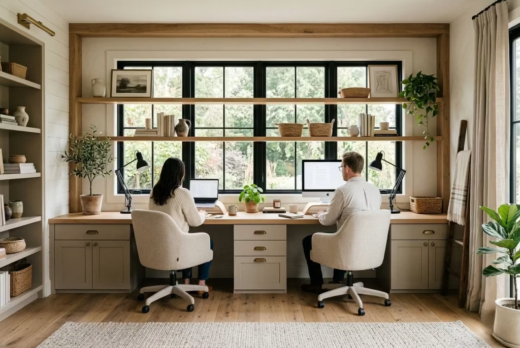
A shared home office can be a blessing or a bottleneck, depending on how well it is planned. When two people need to work in the same room, the layout has to do more than simply fit two desks side by side. It needs to prevent small daily frictions from building up, because nothing wears a room down faster than elbow-to-elbow working, tangled cables, and storage that never quite belongs to either person. The best double workstation layouts feel orderly from the outset, with each user given enough room to work comfortably without the space feeling chopped up or crowded.
Desk Spacing Requirements
The first rule is simple enough: give each person enough breathing room to work without constantly crossing paths. A double workstation should ideally allow at least 120cm to 150cm (48 to 60 inches) per person, with a minimum of 75cm to 90cm (30 to 36 inches) between seating positions where possible. That little bit of extra space makes a world of difference once laptops, notebooks, mugs, and monitor arms start appearing on the surface.
For side-by-side layouts, a shared desk between 240cm and 300cm wide (96 to 120 inches) often works best in a dedicated office. If the room is tighter, two separate desks of 120cm to 150cm each (48 to 60 inches) can feel more generous because they create clearer boundaries. That separation matters. It gives each person a defined zone, which helps the room feel less like a negotiation and more like a place where work can happen properly.
A good shared office should also preserve circulation behind the chairs. Allow at least 90cm (36 inches) for movement, and 100cm to 120cm (40 to 48 inches) is even better if the room allows it. It is one of those invisible details that people notice most when it is missing.
Cable Management Solutions
A double workstation can look polished for about five minutes if cables are left to fend for themselves. After that, the whole arrangement starts to unravel visually. In a shared office, cable management is not a nice-to-have. It is the thing that keeps the room from descending into chaos.
Practical solutions include:
- Desks with built-in cable ports or grommets
- Under-desk trays to keep power strips off the floor
- Wall-mounted power points positioned behind each workstation
- Cable sleeves or clips to group cords neatly
- Monitor arms that reduce clutter on the desktop
- Charging drawers for smaller devices
If the room is being renovated, it is worth planning power access before furniture is ordered. In a recent project, I saw how transformative this could be. Two well-placed outlets behind each desk and a concealed floor box removed the need for visible extension leads entirely. The room felt calmer almost immediately, not because it was decorative, but because it was organised in a way that made daily use easier.
Storage Zoning
Shared workspaces work best when storage is divided with intention. Without zoning, papers migrate from one surface to another and personal items start to blur together. Before long, nobody quite knows where anything lives.
The cleanest approach is to assign storage according to use:
- Shared storage for printers, stationery, and reference files
- Personal drawers for each user’s everyday essentials
- Upper shelving for books, display pieces, and less-used items
- Closed cabinetry for bulkier equipment and visual tidiness
- Labelled file zones if the office handles paperwork regularly
This kind of zoning keeps the room from feeling territorial while still giving each person a sense of ownership. It also reduces the need for constant reshuffling, which is often what makes shared spaces feel tiring rather than useful.
A practical rule of thumb is to keep the most frequently used items within arm’s reach and push the less essential pieces higher or further away. In other words, put the bread and butter where you can reach it, and store the seasonal extras out of the way.
Making the Room Feel Balanced
Shared offices can quickly become visually lopsided if one side is loaded with storage while the other is left sparse. Balance matters. Matching desks, symmetrical lighting, and a unified colour palette help the room feel settled, even when the work happening within it is very different.
You might use:
- Identical task lamps for consistency
- Matching desk chairs with different upholstery shades
- A central rug to unify both work zones
- Wall art arranged as one composition rather than two separate displays
- Storage cabinetry spanning the whole room rather than splitting the wall awkwardly
When done well, a double workstation stops feeling like a compromise and starts feeling like a smart use of space. It gives both users room to get on with the day without treading on each other’s toes, and that, in a busy household, is worth its weight in gold.
Pros
- Supports two users without requiring two separate rooms.
- Makes efficient use of available floor space.
- Encourages a more organised and deliberate layout.
- Can be highly functional when storage and wiring are planned properly.
- Works well for couples, siblings, or flexible family workspaces.
Cons
- Requires more careful planning than a single workstation.
- Shared surfaces can become cluttered if storage is not clearly divided.
- Cable management becomes more complex with two setups.
- Privacy may be limited in open or compact rooms.
Designer’s Note
The best double workstation is not simply a larger desk. It is a room strategy. When spacing, storage, and cabling are handled with care, two people can work comfortably side by side without the arrangement feeling cramped or makeshift. Done properly, the space has the easy rhythm of a well-run kitchen, where everything has its place and nothing gets in the way.
Farmhouse Office with Floor-to-Ceiling Bookshelves
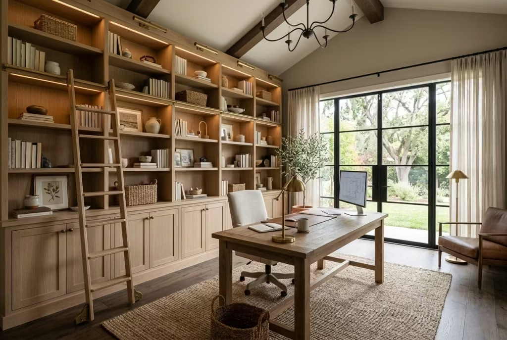
Some home office features never lose their appeal, and floor-to-ceiling bookshelves sit firmly in that category. They bring a sense of permanence to a room, transforming an ordinary workspace into something that feels richer, more established, and deeply personal. Whether filled with books collected over decades, treasured objects gathered during travels, or carefully organised reference materials, full-height shelving adds a layer of character that few furniture pieces can rival.
In a modern farmhouse office, these shelves do far more than provide storage. They shape the architecture of the room, draw the eye upward, and create an environment that feels immersed in knowledge, creativity, and lived experience. Unlike decorative trends that come and go, a well-designed library wall tends to age gracefully, becoming more interesting as its contents evolve over time.
Shelf Styling Principles
The difference between an impressive library wall and a cluttered one often comes down to editing.
Many homeowners feel tempted to fill every available inch, yet shelves packed from edge to edge can quickly feel chaotic. The most inviting arrangements leave room for the eye to rest.
A practical approach is to think in layers rather than individual objects.
Consider incorporating:
- Stacks of books arranged both vertically and horizontally
- Framed artwork leaning against the back of shelves
- Sculptural ceramics
- Small boxes for concealed storage
- Natural elements such as stone or timber objects
- Personal mementoes that carry meaning
A useful rule I often follow is the two-thirds principle. Roughly two-thirds of shelf space can be occupied while the remaining third is left open. This creates rhythm and prevents the shelving from appearing overloaded.
Just because a shelf can hold twenty objects does not mean it should. Sometimes what is left out becomes just as important as what remains.
Choosing the Right Shelf Dimensions
Proportion matters enormously with floor-to-ceiling shelving.
Common recommendations include:
- Shelf depth of 30 to 35cm (12 to 14 inches) for books and display items
- Adjustable shelf spacing to accommodate changing collections
- Vertical divisions every 90 to 120cm (36 to 48 inches) for structural stability
- Cabinet storage below for less attractive office necessities
In larger offices, built-ins reaching heights of 2.7m to 3m (9ft to 10ft) create a striking architectural feature while making full use of available wall space.
The inclusion of lower cabinetry is often overlooked but proves invaluable. Printers, paperwork, chargers, and office equipment can disappear behind closed doors, allowing the shelving above to remain visually composed.
Library Ladder Practicality
There is no denying the romance of a rolling library ladder. It instantly evokes images of historic studies, grand country homes, and private collections accumulated over generations.
Yet before installing one, practicality deserves equal consideration.
Library ladders work best when:
- Shelving exceeds 2.4m (8ft) in height
- Frequently used items occupy upper levels
- Wall lengths exceed approximately 3.5m (11.5ft)
- Adequate floor clearance is available
For most residential offices, ladders serve both a functional and decorative role. They provide access to upper shelves while introducing an additional layer of craftsmanship and visual interest.
Materials commonly used include:
- White oak
- Walnut
- Blackened steel
- Powder-coated metal finishes
In one farmhouse office renovation, we installed a rolling oak ladder across a 5m (16ft) shelving wall. While the homeowners initially viewed it as a design feature, they quickly discovered how useful it became for accessing reference books stored on the highest shelves.
That said, if the upper shelves are reserved primarily for display items, a ladder may be more of a luxury than a necessity.
Display Versus Storage Balance
Perhaps the most challenging aspect of designing a library wall is finding the right balance between display and utility.
Too much decoration can make the shelves feel staged. Too many books can create visual heaviness. The strongest arrangements typically combine both.
A practical formula often looks like this:
- 60 percent books and functional storage
- 25 percent decorative objects
- 15 percent open space
This ratio creates variety while preserving the primary purpose of the shelving.
Consider dedicating different sections to specific functions:
- Professional reference materials
- Personal reading collections
- Family photographs
- Decorative accessories
- Office supplies hidden within baskets or cabinets
This organisation makes the shelving easier to maintain while helping the office feel genuinely lived in rather than meticulously curated for a photograph.
Materials That Complement Full-Height Shelving
The shelving itself should contribute to the overall atmosphere of the office.
Popular options include:
- White oak for a lighter farmhouse interpretation
- Walnut for a richer, more traditional appearance
- Painted cabinetry in soft taupe, greige, or warm white
- Mixed materials combining timber and metal accents
Integrated lighting can further enhance the display.
LED strips concealed beneath shelves, typically between 2700K and 3000K, add subtle illumination and highlight books, artwork, and decorative pieces during evening hours.
Pros
- Maximises vertical storage capacity.
- Creates a strong architectural focal point.
- Adds personality and individuality to the office.
- Can combine open display with concealed storage.
- Increases functionality without expanding the room footprint.
Cons
- Custom shelving can represent a significant investment.
- Requires regular editing to avoid clutter.
- Poorly styled shelves can feel visually overwhelming.
Designer’s Note
A floor-to-ceiling bookshelf wall is not merely a storage solution. It becomes a reflection of the people who use the room. Books, objects, photographs, and collected pieces gradually build a story that no catalogue display could ever replicate. Over time, the shelves evolve alongside their owners, gaining depth, meaning, and personality with every addition. In many ways, that is what makes them so enduringly appealing. They are never truly finished, and that is precisely the point.
You May also Like: 15 Stunning Spanish Home Offices That Blend Beauty and Productivity
Stone Fireplace Focal Point Office
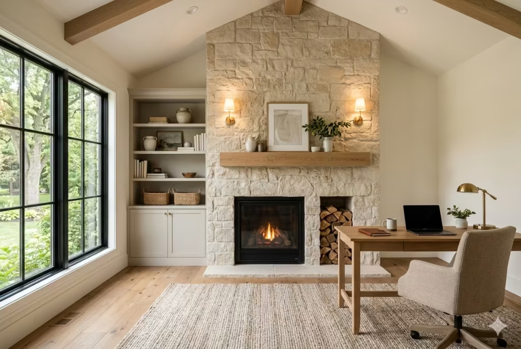
A stone fireplace can change the entire temperament of a home office. It gives the room a natural centre of gravity, something sturdy and grounded, which is especially valuable in a workspace where screens, paperwork, and devices can easily make the atmosphere feel restless. In a modern farmhouse setting, the fireplace brings in texture, age, and presence without needing much embellishment. It does the heavy lifting, so to speak, quietly anchoring the room while everything else falls into place around it.
The beauty of this idea lies in its range. A stone fireplace can feel rustic and heritage-led, or crisp and contemporary, depending on the finish, scale, and surrounding materials. Done well, it becomes the sort of feature that never asks for attention but always receives it.
Natural Stone Options
The stone itself sets the tone for the whole room. Some finishes feel softly weathered, while others have a cleaner, more refined edge. Choosing the right type means thinking about both appearance and the way the material behaves in everyday use.
Popular options include:
- Limestone, which offers a pale, restrained look with gentle movement in the surface
- Travertine, which brings subtle texture and a more classical feel
- Slate, ideal for deeper colour and a slightly more grounded presence
- Fieldstone, which works well in homes leaning toward a more authentic farmhouse character
- Stacked stone, useful when you want texture without the bulk of oversized masonry
Limestone is often the most adaptable choice for modern farmhouse interiors. It feels honest and natural, yet it never tips too far into rustic territory. Slate, by contrast, carries a moodier edge and can work beautifully in offices where you want the fireplace to read as a strong visual anchor rather than a soft backdrop.
The finish matters just as much as the stone type. Honed stone usually feels calmer and more tailored, while rougher surfaces bring more movement and shadow. In a room with limited natural light, I would lean toward a lighter, smoother stone so the fireplace does not swallow the space whole.
Furniture Placement Around Fireplaces
Arranging furniture around a fireplace is a balancing act. Put everything too close and the room feels cramped. Push it too far away and the fireplace loses its role as the heart of the composition.
A practical layout usually begins with the desk. In many offices, the desk works best at a slight angle to the fireplace or on an adjacent wall rather than directly facing it. That keeps the fireplace in peripheral view, which helps the room feel connected without making the desk arrangement overly formal.
Useful spacing guidelines include:
- Leave at least 90cm to 120cm between seating and the fireplace zone where possible
- Keep furniture clear of direct heat exposure
- Use a rug large enough to define the working area without crowding the hearth
- Place lower pieces, such as benches or compact storage, near the fireplace if the room needs grounding
If the room is generous in size, a pair of armchairs beside the hearth can create a secondary reading or meeting area, giving the office more than one mode of use. That layered arrangement often makes the room feel far more complete.
In smaller spaces, restraint pays off. A single well-proportioned desk, one comfortable chair, and a low console or cabinet nearby can be enough. Overfurnishing around a fireplace is one of those mistakes that looks harmless in theory but quickly turns into a muddle in practice.
Visual Hierarchy
A fireplace naturally draws the eye, which means it should be treated as part of the room’s visual hierarchy from the start. The goal is not to make every element compete for attention. It is to decide what should lead, what should support, and what should quietly sit in the background.
In most cases, the fireplace becomes the lead feature. That means the surrounding furniture, artwork, shelving, and lighting should be chosen to complement it rather than battle it.
Ways to strengthen visual hierarchy include:
- Keeping the mantel styling edited and restrained
- Using one substantial artwork above the fireplace rather than a busy grouping
- Letting furniture lines echo the shape or tone of the stone
- Repeating one or two materials elsewhere in the room, such as oak, brass, or linen
- Avoiding overly large decorative objects that pull focus away from the hearth
A fireplace wall often works best when it has breathing room. If everything in the room is loud, nothing feels special. By contrast, when the stone is allowed to remain the star, the office gains a sense of order that feels composed rather than forced.
How to Make the Fireplace Feel Integrated
The strongest offices do not treat the fireplace as an isolated feature. They fold it into the wider language of the room.
A few useful strategies:
- Pair pale stone with white oak cabinetry for a soft, coherent palette
- Add a timber mantel to warm up more neutral stone
- Repeat the fireplace tone in a rug, artwork frame, or desk accessory
- Use lighting to skim the surface and bring out the natural variation in the stone
This approach allows the fireplace to feel like part of the architecture rather than a decorative add-on. It becomes one of those details that makes the room feel settled, much like a well-chosen sentence that quietly carries the entire paragraph.
Practical Considerations
Before committing to a stone fireplace in a home office, there are a few things worth weighing carefully:
- Heat management if the fireplace is functional
- Maintenance, since some stones need sealing to resist staining
- Scale, especially in compact rooms where a heavy surround can overwhelm
- Budget, as natural stone and custom masonry can be a meaningful investment
- Cleaning, particularly for textured or porous finishes
If the fireplace is decorative rather than active, you gain more freedom with material selection. That can open the door to lighter, more porous stones without the same level of concern about soot or wear.
Pros
- Creates an instant focal point with real architectural presence.
- Adds texture, depth, and material character to the office.
- Works beautifully with both rustic and refined farmhouse schemes.
- Helps the room feel grounded and memorable.
- Can elevate even a fairly simple furniture arrangement.
Cons
- Can dominate a smaller room if the scale is not handled carefully.
- Natural stone often carries a higher installation cost.
- Some finishes need sealing and regular upkeep.
- Fireplace placement can limit furniture flexibility.
Designer’s Note
A stone fireplace has a way of giving a room a centre of gravity that cannot be faked. It brings age, texture, and a sense of permanence, which is exactly why it suits a modern farmhouse office so well. When the surrounding furniture is kept measured and the visual hierarchy is allowed to breathe, the room gains a grounded elegance that feels lived-in rather than staged. It is the kind of feature that quietly earns its place, day after day, without ever needing to shout about it.
You May also Like: 25 Clean & Modern Minimalist Basement Designs That Feel So Spacious, They Don’t Even Feel Like Basements
Soft Sage Green Farmhouse Workspace
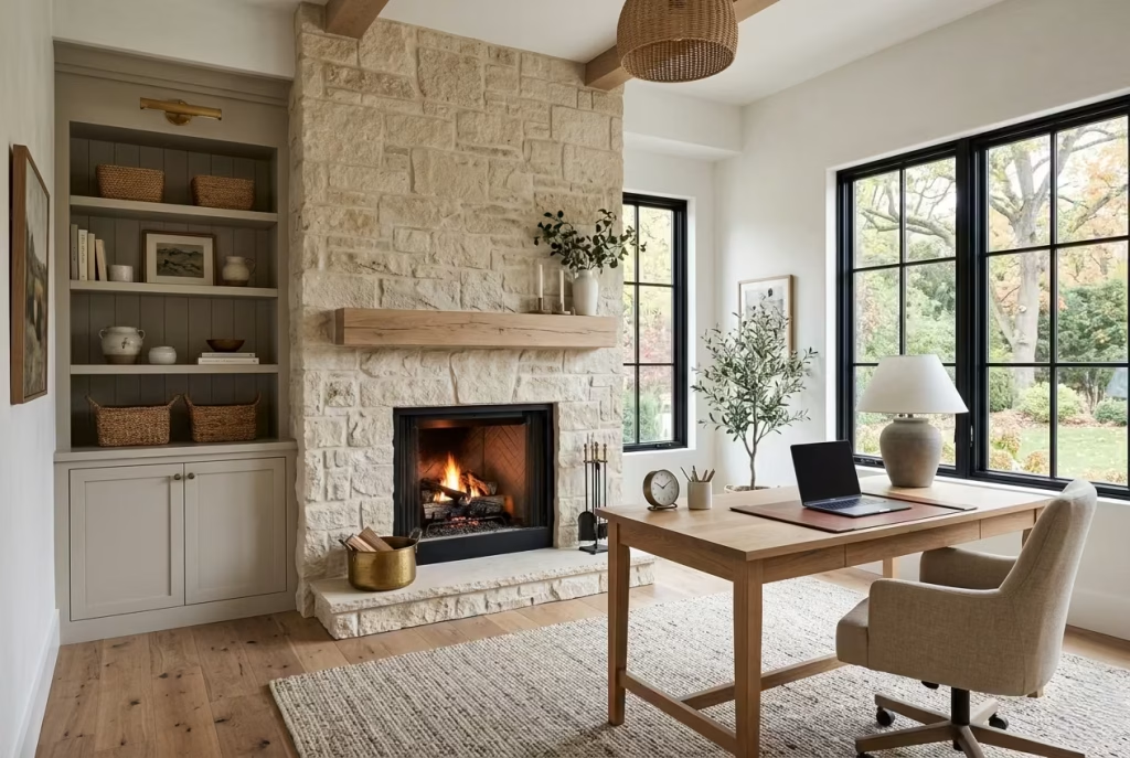
Some colours make an immediate statement. Others work their way into a room more gradually, revealing their strengths over time. Soft sage green belongs firmly in the second category. It carries a natural ease that feels at home in a modern farmhouse office, bringing a connection to the landscape without becoming overly rustic or overly decorative.
Part of sage green’s enduring appeal comes from its versatility. It sits comfortably between green, grey, and earth tones, allowing it to adapt to changing light conditions and a wide range of materials. In a workspace, that flexibility can be invaluable. Rather than dominating the room, sage acts as a backdrop that allows furnishings, architectural details, and natural textures to take on greater depth.
Unlike trend-driven colours that often feel tied to a particular moment, sage tends to age gracefully. It feels just as relevant in a renovated country home as it does in a newly built farmhouse-inspired property.
Paint Finish Recommendations
Choosing the right finish is every bit as important as selecting the colour itself. The same shade of sage can appear dramatically different depending on the sheen level and surface texture. For home offices, these finishes generally perform best:
| Finish Type | Best Use | Benefits |
| Matte | Walls with minimal imperfections | Soft appearance and reduced glare |
| Eggshell | Most office walls | Durable with subtle light reflection |
| Satin | Trim, doors, and built-ins | Easier cleaning and greater durability |
| Limewash | Feature walls | Organic texture and tonal variation |
Eggshell remains one of the most practical choices for everyday use. It offers enough durability for a working environment while maintaining a relaxed appearance that suits farmhouse interiors.
In one renovation project, we specified a soft sage eggshell finish across all walls while painting the built-in cabinetry in a slightly deeper shade from the same colour family. The subtle variation created depth without making the room feel overly coordinated.
A common mistake is choosing highly glossy finishes. Sage tends to look its best when the surface absorbs rather than reflects excessive light, allowing the colour’s complexity to emerge naturally throughout the day.
Pairing Sage with Natural Wood
One reason sage green continues to appear in successful farmhouse interiors is its compatibility with timber. The two materials seem to speak the same language, creating combinations that feel balanced and grounded.
Different wood species can alter the mood considerably. Popular pairings include:
- White oak for a fresh, contemporary farmhouse look
- Walnut for greater richness and contrast
- Reclaimed pine for a more relaxed, casual atmosphere
- Ash for a lighter, Scandinavian-inspired interpretation
- Medium oak tones for a classic farmhouse palette
White oak and sage remain one of the strongest combinations because they share similar undertones. Neither competes for attention, allowing the room to feel cohesive without becoming monotonous. Furniture pieces that work particularly well include:
- Oak desks with simple profiles
- Open shelving systems
- Built-in cabinetry
- Window benches
- Framed artwork featuring timber details
The beauty of this pairing lies in its restraint. Neither element tries to steal the spotlight. Instead, they work together to create an environment that feels settled and inviting.
Seasonal Adaptability
One of the greatest challenges in interior design is creating spaces that feel appealing throughout the year rather than only during a particular season. This is where sage green excels.
During spring and summer, the colour feels connected to gardens, foliage, and natural daylight. Rooms often appear brighter and fresher as sunlight enhances the green undertones.
In autumn and winter, sage takes on an entirely different character. Paired with deeper woods, textured fabrics, and warmer lighting, it becomes richer and more enveloping.
This adaptability makes it easier to refresh the room without repainting. Seasonal updates might include:
Spring and Summer
- Linen curtains
- Woven baskets
- Fresh greenery
- Light-toned ceramics
- Natural fibre rugs
Autumn and Winter
- Wool throws
- Leather accessories
- Darker wood accents
- Antique brass details
- Textured table lamps
The walls remain constant while the supporting elements shift around them. It is a little like having a wardrobe built around a dependable neutral jacket. The foundation stays the same, yet the overall look evolves with changing circumstances.
Creating Depth Without Excessive Decoration
One of sage green’s less obvious strengths is its ability to provide visual interest without relying on bold patterns or dramatic colour contrasts.
This makes it particularly useful in offices where too much visual stimulation can become distracting.
Ways to add depth include:
- Layering different shades of green within artwork and textiles
- Introducing natural stone accessories
- Mixing woven and upholstered textures
- Incorporating aged brass hardware
- Adding indoor plants that echo the wall colour
These layers create complexity while preserving a cohesive appearance.
Pros
- Works with a wide range of natural materials
- Feels appropriate throughout all seasons.
- Complements both traditional and contemporary furniture.
- Ages well compared to more trend-driven colours.
- Provides character without overwhelming the room.
Cons
- Incorrect undertones can appear muddy in low light.
- Colour selection requires testing under different lighting conditions.
- Strong green hues may not suit every architectural style.
- Poor-quality paint can diminish the colour’s subtle variations.
Designer’s Note
Soft sage green succeeds because it rarely tries too hard. It has enough personality to shape the atmosphere of a room, yet enough restraint to allow architecture, furniture, and materials to play their part. In a farmhouse office, it offers a welcome alternative to predictable neutrals while remaining remarkably versatile. Long after more fashionable colours have faded from view, sage often continues to feel right at home, adapting effortlessly to changing seasons, evolving tastes, and the rhythms of everyday life.
Rustic Beam and Modern Furniture Combination
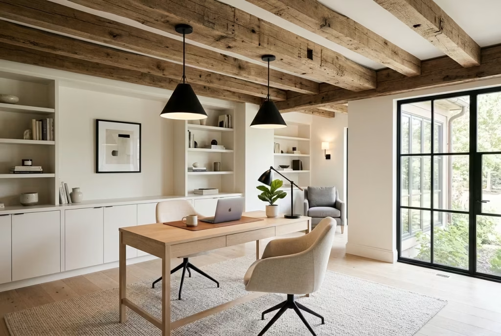
One of the most effective ways to create a modern farmhouse office is to embrace contrast rather than consistency. While it may seem logical to fill a room with furniture that matches the age and character of exposed beams, doing so often produces an interior that feels predictable. The most compelling spaces usually emerge when old and new are allowed to share the same room, each highlighting qualities in the other that might otherwise go unnoticed.
Rustic beams, marked by grain variation, age, and craftsmanship, bring a sense of history overhead. Modern furniture, with its cleaner profiles and simplified forms, introduces clarity and structure below. Together, they create a layered environment that feels collected over time rather than purchased all at once.
This approach works particularly well in home offices because it balances comfort and professionalism. The architectural character adds personality, while contemporary furnishings keep the workspace practical for modern life.
Mixing Architectural Ages
Many homeowners assume that period features require period furniture. In reality, some of the most successful interiors deliberately bridge different eras.
A centuries-old timber beam can look remarkably fresh when paired with a streamlined desk or sculptural task chair. The contrast allows each element to stand out more clearly.
Examples that work particularly well include:
- Hand-hewn oak beams above a minimalist white oak desk
- Reclaimed ceiling timbers paired with contemporary cabinetry
- Historic farmhouse architecture combined with sleek task lighting
- Traditional wall panelling balanced by modern seating
The principle is surprisingly simple. When everything comes from the same design language, the room can feel one-note. Introducing elements from different periods creates a richer composition, much like combining different instruments in an orchestra rather than relying on a single sound.
In one renovation project, we retained original ceiling beams dating back several decades while introducing custom cabinetry with flush-front doors and concealed hardware. The contrast immediately made both features more interesting. The beams felt more authentic, and the cabinetry appeared sharper and more refined.
Understanding the Role of Contrast
Contrast is not limited to age. It can also involve texture, colour, scale, and material.
Within a farmhouse office, useful contrasts might include:
- Rough timber against smooth painted surfaces
- Aged wood paired with steel detailing
- Textured beams above streamlined furniture
- Natural materials alongside contemporary technology
These differences prevent the room from feeling static.
Without contrast, rustic features can sometimes blend into the background. With contrast, they become more noticeable because the eye has something to compare them against.
This is often where farmhouse offices either succeed or fall short. The strongest spaces recognise that tension between opposites can be a valuable design tool.
Preventing a Themed Appearance
One of the biggest risks in farmhouse design is crossing the line into imitation rather than interpretation.
When every element leans heavily into rustic styling, the room can begin to feel like a set rather than a lived-in space. Barn-inspired accessories, distressed finishes, antique signs, and excessive reclaimed wood may seem appropriate individually, but together they can quickly become too much of a good thing.
To avoid this:
- Limit heavily distressed finishes.
- Choose a few authentic rustic elements rather than many decorative ones.
- Introduce contemporary lighting and furniture.
- Keep colour palettes relatively restrained.
- Focus on material quality rather than novelty.
There is an old saying about not putting all your eggs in one basket. The same principle applies here. If every item in the room reinforces the same theme, the space loses nuance and depth.
Instead, allow the architecture to carry much of the farmhouse character while furniture and accessories provide balance.
Furniture That Works Particularly Well
Modern furniture does not have to feel cold or corporate.
Some of the most effective pairings include:
- Upholstered swivel chairs with curved silhouettes
- White oak desks featuring simple joinery
- Low-profile storage units
- Contemporary pendant lighting
- Minimalist shelving systems
- Leather seating with clean lines
These pieces provide enough visual simplicity to offset the complexity of older architectural details. When selecting furniture, I often encourage homeowners to focus on form before decoration. Strong proportions tend to age far better than trendy styling.
Material Pairings Worth Considering
A successful office often relies on a carefully selected material palette. Combinations that work particularly well include:
| Rustic Element | Contemporary Counterpart |
| Reclaimed oak beams | Matte black metal |
| Handcrafted stone | Smooth cabinetry |
| Aged timber flooring | Sculptural office chair |
| Traditional panelling | Minimalist lighting |
| Exposed joinery | Frameless artwork |
The goal is not to create stark opposition but to establish enough variety that the room feels layered and interesting.
Managing Scale and Proportion
Exposed beams naturally draw attention upward. Modern furniture can help balance this by keeping the lower half of the room visually grounded. Useful strategies include:
- Selecting desks with substantial proportions
- Incorporating larger area rugs
- Using statement lighting to connect floor and ceiling
- Avoiding furniture that feels undersized beneath prominent beams
In rooms with ceilings exceeding 3m (10ft), furniture that appears appropriately scaled becomes particularly important. Small pieces can feel lost beneath substantial architectural features.
Pros
- Creates a more layered and sophisticated interior.
- Prevents farmhouse design from feeling overly traditional.
- Allows original architectural details to stand out.
- Balances character with everyday functionality.
- Adapts well to changing furniture trends over time.
Cons
- Limited sound privacy
- Poor material choices can create a disconnected appearance.
- Authentic beams may require restoration or maintenance.
- Achieving balance often takes more planning than a single-style approach.
Designer’s Note
The most memorable farmhouse offices rarely rely on historical accuracy alone. Instead, they acknowledge the past while embracing the realities of contemporary living. Exposed beams provide texture, craftsmanship, and a sense of permanence. Modern furniture introduces practicality and simplicity. Together, they create a dialogue between generations, allowing the room to feel established without feeling stuck in time. That balance is often what separates a farmhouse office that merely looks good from one that continues to feel relevant year after year.
Farmhouse Office with Antique Accents
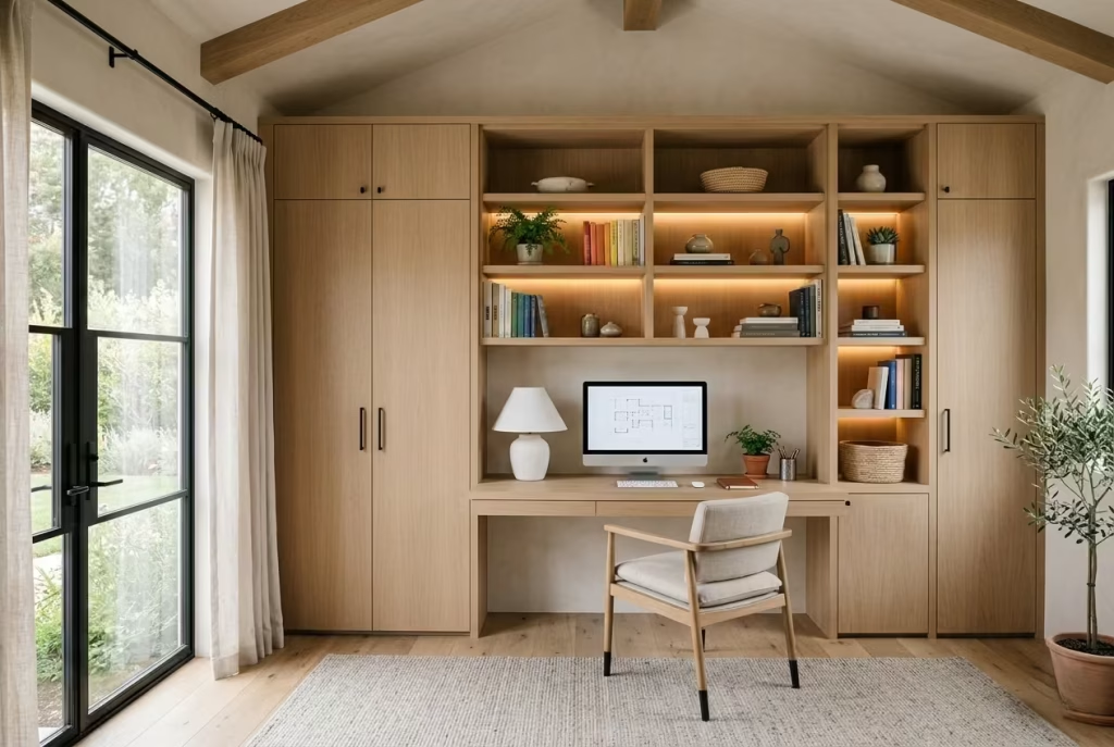
Antique accents have a way of shifting a home office from something newly assembled into a space that feels layered, lived in, and quietly storied. In a modern farmhouse setting, these older pieces act as counterpoints to newer architecture and furniture, introducing depth without requiring dramatic intervention. A well-placed vintage desk lamp, an aged oak cabinet, or a timeworn writing chair can change the entire rhythm of a room, giving it a sense of continuity that new materials alone rarely achieve.
What makes this approach particularly effective is restraint. It is not about filling the room with antiques, but rather allowing a few carefully chosen pieces to carry the weight of history. When used sparingly, they feel intentional. When overused, the room can quickly drift into a pastiche.
Incorporating Vintage Pieces
The key to working with antique elements lies in selection. Each piece should feel like it has earned its place rather than simply filling a gap.
Strong candidates include:
- A restored writing desk with visible grain and patina
- Brass or bronze desk lamps with softened finishes
- Mid-century wooden chairs with sculptural lines
- Vintage filing cabinets repurposed for modern storage
- Old architectural fragments such as corbels or mouldings used as decorative features
Scale matters just as much as style. A single substantial antique piece often has more impact than several smaller items scattered throughout the room. For example, a large oak partner’s desk can anchor the entire office, while smaller accessories simply echo its presence.
In one project, a client sourced a 1930s oak cabinet that had originally been used in a library. Once restored and paired with modern shelving, it became the quiet centrepiece of the room. It did not dominate the space, yet it anchored everything around it in a way that felt natural and unforced.
Blending Old and New Successfully
The most successful farmhouse offices avoid leaning too heavily in either direction. If everything is antique, the space can feel like a museum. If everything is new, the room risks losing character altogether.
The balance comes from contrast handled with care.
Effective combinations include:
- Antique wooden desks paired with contemporary ergonomic chairs
- Vintage cabinets alongside minimalist built-in shelving
- Old brass hardware set against clean-lined cabinetry
- Weathered timber surfaces combined with smooth plaster walls
- Traditional table lamps used alongside modern task lighting
The tension between these elements is what makes the room visually interesting. Each style highlights something in the other. The modern pieces prevent the antiques from feeling dated, while the antiques stop the modern elements from becoming too sterile.
There is a practical rhythm to this approach as well. New furniture typically handles the demands of daily use, while antique pieces introduce character and narrative. It is a division of roles that keeps the space both functional and expressive.
Creating Cohesion Through Material Language
Without a unifying thread, mixing old and new can quickly feel disjointed. Cohesion often comes through material repetition rather than stylistic matching.
Helpful strategies include:
- Repeating wood tones across old and new furniture
- Using consistent metal finishes such as aged brass or matte black
- Echoing shapes, such as rounded chair backs or curved desk edges
- Keeping upholstery fabrics within a similar tonal family
Even when pieces come from different decades, shared materials help them feel part of the same conversation. It is less about matching and more about dialogue.
Avoiding Over-Styling
One of the most common pitfalls is over-curation. When every surface is styled and every object feels intentionally placed, the room can lose its ease.
To avoid this:
- Leave some shelves partially empty
- Allow surfaces to show a bit of wear
- Mix refined pieces with more utilitarian items
- Resist the urge to theme every corner of the room
A well-designed office should feel as though it has evolved rather than been staged in a single moment.
Pros
- Introduces character that cannot be replicated with new furniture
- Helps create a sense of depth and history in the room
- Works well with both traditional and contemporary farmhouse elements
- Encourages more thoughtful curation of the workspace
- Allows existing antique pieces to be repurposed meaningfully
Cons
- Quality antiques can be difficult to source consistently
- Mismatched pieces may feel visually disconnected if not carefully balanced
- Restoration or repair may be required before use
- Overuse can make the space feel more decorative than functional
Designer’s Note
Antique accents work best when they feel like they have always been part of the room rather than recently introduced. The aim is not to recreate a period interior, but to borrow fragments of the past and let them sit comfortably within a modern structure. When old and new are allowed to coexist without competing, the office gains a layered character that feels grounded, unforced, and quietly expressive over time.
Bright Office with Shiplap Detailing
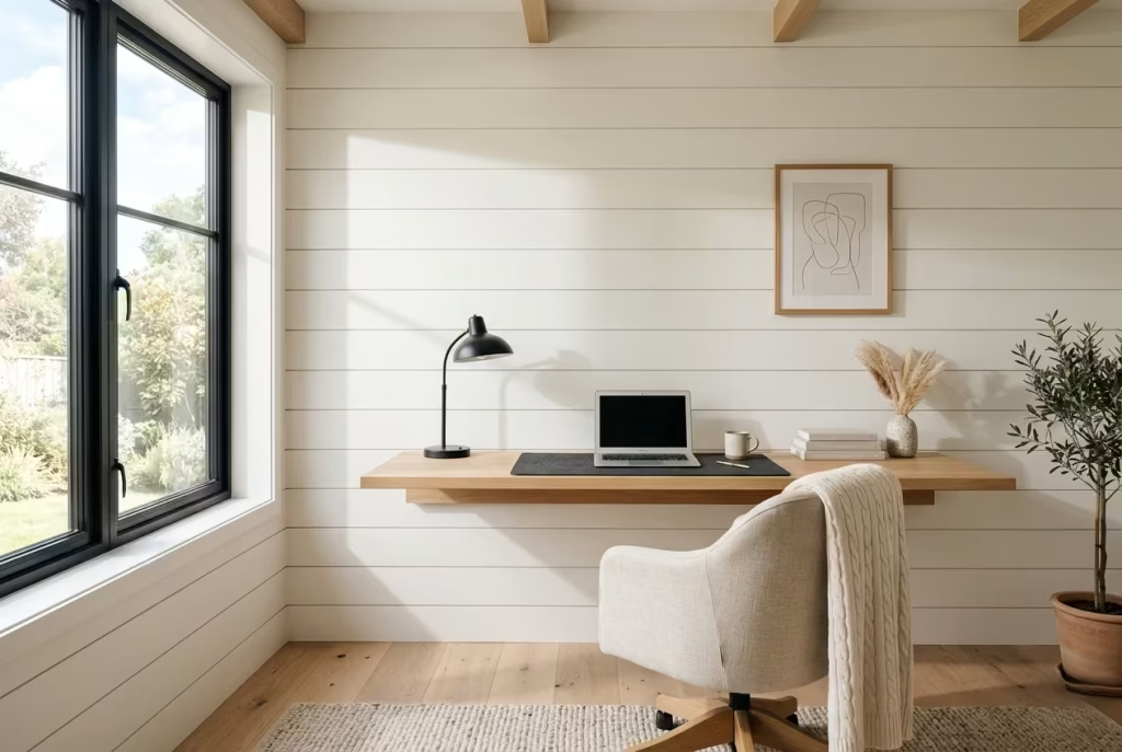
Shiplap has become one of those design elements that carries strong associations, often linked to coastal cottages or traditional farmhouse interiors. Yet when used with restraint and clarity, it can feel surprisingly modern, especially in a bright home office where natural light already plays a dominant role. The key is not in treating shiplap as a decorative theme, but as a subtle architectural layer that adds rhythm and structure to otherwise plain surfaces.
In a well-designed workspace, shiplap does something quite interesting. It introduces texture without weight. The linear pattern quietly guides the eye across the room, giving white or neutral walls a sense of movement that painted drywall alone cannot achieve.
Modern Applications of Shiplap
Contemporary interiors use shiplap far more selectively than traditional farmhouse settings. Instead of wrapping every wall, it is often applied to specific zones where it can enhance architecture without overwhelming the space.
Effective modern uses include:
- Feature walls behind the desk to define the work zone
- Partial-height panelling paired with painted upper walls
- Ceiling applications to draw the eye upward
- Built-in shelving back panels for subtle texture
- Entry walls within office nooks or alcoves
One of the most effective applications I have used in a recent project involved installing painted white shiplap behind a floating oak desk. The goal was not to create a rustic effect, but to add a gentle backdrop that would interact with daylight throughout the day. As the light shifted, the grooves created soft shadow lines that gave the wall a sense of depth without requiring additional decoration.
Shiplap works best when it behaves like a supporting character rather than the lead role. It should enhance the room quietly, rather than define it completely.
Vertical Versus Horizontal Installation
The direction of shiplap installation has a surprisingly strong influence on how a room feels.
Horizontal installation is the more traditional approach. It emphasises width and creates a sense of calm continuity across the wall. In smaller offices, this can make the space feel slightly broader and more grounded. However, if overused, horizontal lines can sometimes make a room feel visually compressed, especially in spaces with lower ceilings.
Vertical installation offers a different effect entirely. It draws the eye upward, encouraging a perception of height and openness. In rooms where ceilings are under 2.7m (9ft), this can be particularly effective in making the space feel less confined.
Practical considerations include:
- Horizontal shiplap suits wider rooms and classic farmhouse layouts
- Vertical shiplap works well in compact offices or areas with limited ceiling height
- Diagonal applications are rarely used but can add a subtle contemporary twist in bespoke designs
In one renovation, we used vertical shiplap in a narrow garden-facing office measuring roughly 2.5m x 3m (8ft x 10ft). The effect was immediate. The room felt taller and more open, without any structural changes being required.
Choosing the Right Finish
Shiplap can easily shift from refined to overly rustic depending on the finish. For a modern farmhouse office, the most effective approaches include:
- Matte or eggshell painted finishes in warm whites or soft neutrals
- Tonal colours such as sage, greige, or muted taupe for feature walls
- Fine sanding between coats to soften visible brush marks
- Consistent spacing to avoid overly heavy shadow lines
High-gloss finishes tend to work against the material, exaggerating imperfections and reducing the subtle texture that makes shiplap appealing in the first place.
Pairing Shiplap with Contemporary Elements
To prevent the room from feeling overly themed, shiplap should be balanced with more modern materials.Strong pairings include:
- White oak desks with simple profiles
- Black metal lighting fixtures
- Upholstered seating in linen or wool
- Stone or ceramic accessories
- Minimalist shelving systems
This contrast is what keeps the design current. Without it, shiplap can easily lean too heavily into nostalgia.
Light Interaction and Atmosphere
One of shiplap’s most understated qualities is how it responds to light. The shallow grooves create natural shadow lines that shift throughout the day, adding subtle variation to the wall surface.
In bright offices, this effect becomes particularly noticeable. Morning light tends to emphasise softness, while afternoon sun creates sharper definition. Even artificial lighting in the evening brings out a different character altogether.
It is this responsiveness that gives shiplap its enduring appeal. The wall never looks exactly the same twice, yet it never feels distracting.
Pros
- Adds architectural texture without heavy visual weight.
- Enhances natural light through subtle shadow play.
- Works in both small and large office layouts.
- Can be adapted to modern or traditional interpretations.
- Relatively cost-effective compared to full wall panelling systems.
Cons
- Can feel overly rustic if overused or poorly finished.
- Requires careful spacing and alignment for a clean result.
- May collect dust in grooves over time.
- Not suitable for every architectural style without adaptation.
Designer’s Note
Shiplap works best when it is treated as a quiet structural detail rather than a decorative statement. In a bright farmhouse office, it brings order to plain surfaces and adds a sense of rhythm that changes gently with the light. When paired with contemporary furniture and restrained styling, it avoids feeling nostalgic and instead becomes part of a more current architectural language, one that feels fresh without trying too hard.
You May also Like: 25 Cozy White Interior Ideas That Prove White Can Feel Warm
Warm Greige Farmhouse Study
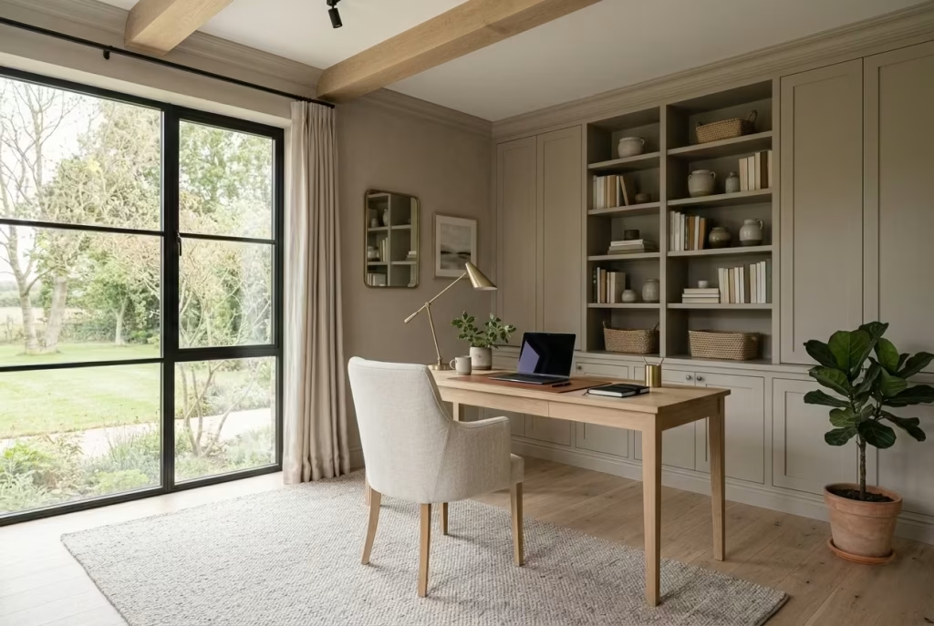
Greige has become one of those colours that quietly earns its place in interior design without ever needing to announce itself. Sitting between grey and beige, it offers a measured neutrality that avoids the sterility of cool greys and the heaviness of stronger earth tones. In a farmhouse study, this balance becomes particularly useful, especially in rooms that need to shift easily between focused work and relaxed reading.
What makes greige so dependable is its adaptability. It does not fight with natural light, nor does it flatten it. Instead, it adjusts subtly throughout the day, picking up warmer undertones in the morning and cooler notes as evening approaches. This responsiveness gives the room a sense of movement, even when the palette itself remains restrained.
Why Greige Remains Versatile
The strength of greige lies in its refusal to dominate a space. Rather than acting as a feature, it behaves more like a foundation, allowing furniture, textures, and architectural details to carry visual interest. It works particularly well in farmhouse studies because it bridges two design directions at once:
- The softness of traditional country interiors
- The clarity of more modern, pared-back schemes
This duality makes it suitable for a wide range of homes, from renovated cottages to newer builds with farmhouse-inspired detailing. Greige also responds well to different lighting conditions:
- In north-facing rooms, warmer greige prevents the space from feeling too cold or flat.
- In south-facing rooms, cooler greige helps balance stronger sunlight.
- Under artificial lighting, it maintains a steady, grounded tone without shifting too dramatically.
In one project, I used a warm greige with a slight taupe undertone in a compact study measuring around 3m x 3.2m (10ft x 10.5ft). The colour softened the edges of the room without reducing its clarity, which allowed the furniture and built-in shelving to stand out more naturally.
Layering Neutral Palettes
A greige study works best when the palette is layered rather than left flat. Relying on a single tone across all surfaces can make the room feel one-dimensional, even if the colour itself is beautifully chosen.
Instead, variation should come through texture and subtle shifts in tone.
Effective layering approaches include:
- Walls in warm greige paired with slightly lighter ceilings
- Natural oak furniture to introduce soft contrast
- Linen upholstery in off-white or stone tones
- Wool rugs in muted beige or oatmeal shades
- Stone accessories with natural variation in colour
These combinations create depth without introducing visual noise. The result is a room that feels composed but never static.
Material Pairings That Strengthen Greige
Greige works quietly in the background, which means surrounding materials carry more responsibility for shaping the character of the room.
Strong pairings include:
- White oak for a clean, grounded farmhouse feel
- Walnut for added depth and contrast
- Brushed brass for subtle warmth
- Matte black accents for definition
- Natural linen for softness and movement
Each material brings its own personality, but none overpower the palette. This is where greige proves its value. It allows other elements to speak without competing for attention.
Creating Depth Without Colour Contrast
Not every space needs bold colour contrast to feel complete. In fact, some of the most refined farmhouse studies rely almost entirely on tonal variation.
Ways to build depth include:
- Mixing matte and textured finishes on walls and furniture
- Introducing layered textiles such as throws and cushions
- Combining smooth stone surfaces with raw timber details
- Using shadow created by lighting rather than colour shifts
These subtle differences prevent the room from feeling flat while maintaining a cohesive visual language.
Practical Considerations
Greige is often chosen for its ease, but it still requires careful selection to avoid unintended results.
Points to consider:
- Undertones can shift significantly depending on lighting
- Samples should always be tested on multiple walls
- Finish selection affects perceived warmth and depth
- Pairing with overly cool whites can create imbalance
A small adjustment in tone can make the difference between a room that feels inviting and one that feels slightly off-balance.
Pros
- Highly adaptable across different lighting conditions
- Works well with both traditional and modern farmhouse furniture
- Provides a neutral foundation without feeling flat
- Easy to update with seasonal accessories
- Pairs naturally with wood, stone, and metal finishes
Cons
- Poor undertone selection can result in a dull appearance
- Requires layering to avoid a one-dimensional look
- Can feel too safe if not balanced with texture
- Lighting plays a major role in final outcome
Designer’s Note
Greige succeeds because it does not insist on being the centre of attention. Instead, it gives structure to a room while allowing materials, light, and form to take the lead. In a farmhouse study, this makes it an especially reliable choice. It holds the space together quietly, adapting to its surroundings rather than competing with them, which is often exactly what a working room needs over the long run.
Large Window Workspace with Garden Views
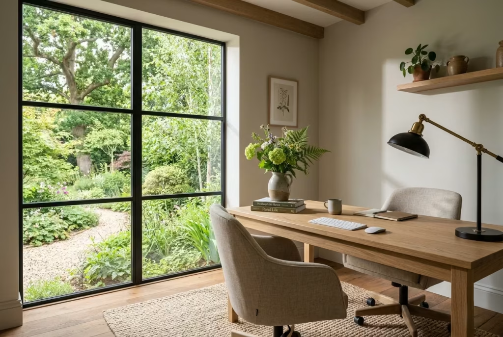
A home office that opens onto a garden changes the entire rhythm of how a space is experienced. Instead of sitting within four enclosed walls, the eye is constantly drawn outward to movement, shifting light, and seasonal change. In a modern farmhouse setting, this connection between interior and exterior feels especially natural, almost as if the room is borrowing scenery from the landscape beyond.
Large windows do more than bring in daylight. They introduce depth. Even a modestly sized room can feel expanded when the view carries beyond the glass. Trees, planting beds, and open sky all become part of the visual composition, subtly altering how the space is perceived throughout the day.
Biophilic Design Principles
At its core, biophilic design is about restoring a sense of connection to natural systems within built environments. In a workspace, this is not about filling the room with decorative plants alone, but about structuring the layout so that nature becomes part of the daily experience.
In practice, this can be achieved through:
- Direct sightlines to greenery from the primary seating position
- Use of natural materials such as oak, stone, and linen
- Maximising daylight penetration without harsh glare
- Allowing seasonal changes outside to become part of the interior experience
- Introducing organic shapes in furniture and accessories
In one project overlooking a mature garden, we positioned the desk so that the primary view framed a single large tree. Over the course of the year, the workspace subtly shifted in character as the foliage changed. Spring brought soft greens, summer created dense shade, and autumn introduced warm, layered tones that reflected directly into the room.
This constant variation prevents the office from feeling visually static. It is a reminder that the most effective design decisions often involve what happens outside the room as much as what is placed inside it.
Desk Placement Relative to Windows
Where the desk sits in relation to a large window has a significant impact on both comfort and usability. While the temptation is often to face the view directly, this is not always the most practical solution.
There are three primary placement approaches, each with distinct advantages:
1. Facing the Window
This layout places the desk directly toward the view.
Benefits include:
- Constant visual connection to the outdoors
- Strong sense of openness
- Ideal for reading or creative work
However, it can also introduce challenges:
- Screen glare during certain times of day
- Distraction from movement outside
- Potential difficulty controlling brightness
2. Side-On Positioning
Here, the desk runs parallel to the window.
Benefits include:
- Balanced natural light across the workspace
- Reduced screen reflection issues
- Partial view of the garden without full exposure
This is often the most practical solution for long working hours, particularly in south-facing rooms where sunlight can become intense.
3. Back-to-Window Layout
In this arrangement, the window sits behind the user.
Benefits include:
- Clear screen visibility without glare
- Uninterrupted focus on desk tasks
- Strong architectural framing of the workspace
Drawback:
- The view is not directly accessible while working
In one farmhouse renovation, we tested all three configurations before settling on a side-on layout. The room measured approximately 3.5m x 4m (11.5ft x 13ft), and this positioning struck the best balance between daylight control and connection to the garden beyond.
Managing Light Across the Day
Large windows introduce constant variation in lighting conditions, which can either enhance or disrupt a workspace depending on how it is handled.
Effective strategies include:
- Linen or sheer curtains to diffuse strong midday light
- Adjustable blinds for more precise control
- Matte screen finishes to reduce reflection
- Positioning task lighting to complement, not compete with daylight
Morning light tends to feel soft and even, making it ideal for focused tasks. By midday, however, direct sunlight can become sharper, requiring layered light control. Evening light often brings a warmer tone that works well with natural materials like wood and stone.
Integrating the View into the Design
A garden view should not feel like an accidental backdrop. When treated as part of the design, it can influence material choices, colour palettes, and furniture placement.
Helpful approaches include:
- Echoing garden colours in upholstery and accessories
- Using natural wood tones that reflect outdoor textures
- Keeping window frames visually light to avoid heavy framing
- Avoiding tall furniture that blocks sightlines
The aim is not to replicate the outdoors inside the room, but to allow the two to sit in conversation with each other.
Pros
- Strong connection to outdoor environment and seasonal change.
- Enhances perception of space through extended sightlines.
- Improves daylight availability throughout the day.
- Works well with natural farmhouse materials and finishes.
- Creates variation in atmosphere without interior changes.
Cons
- Requires careful planning to manage glare and reflections.
- Furniture placement becomes more restricted.
- Not ideal for confidential or high-noise worPrivacy considerations may need additional treatments.
- Performance can vary significantly depending on orientation.
Designer’s Note
A large window workspace is less about the glass itself and more about how the room responds to what lies beyond it. When positioned thoughtfully, the desk becomes part of a wider landscape rather than a self-contained setup. Over time, the shifting light and garden movement become part of the daily rhythm of the room, subtly changing its character without any physical alteration. That ongoing relationship between interior and exterior is what gives these spaces their lasting appeal.
Executive Modern Farmhouse Office
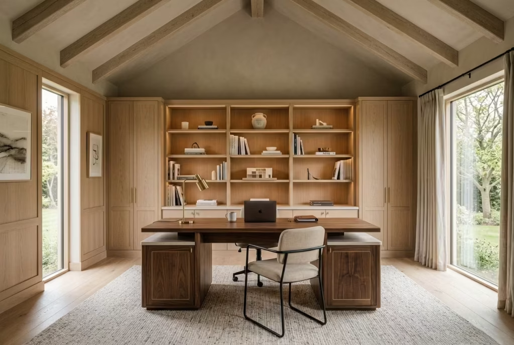
An executive modern farmhouse office sits at the intersection of restraint and refinement. It is not about filling a room with expensive objects, nor is it about leaning too far into rustic charm. Instead, it is a carefully measured balance where material quality, spatial clarity, and proportion do most of the work. The result is a workspace that feels composed without becoming overly formal, grounded without slipping into nostalgia.
In practice, this kind of office often belongs to larger homes or dedicated study rooms where scale allows for more considered detailing. Every decision carries more weight because the room is expected to function as both a daily workspace and a representation of how the home is presented.
Luxury Farmhouse Styling
Luxury in a farmhouse context is rarely about ornamentation. It shows up in the way materials are selected, how edges are finished, and how the room behaves under changing light.
Rather than decorative excess, the emphasis shifts to refinement in execution:
- Joinery that feels precise and tailored rather than bulky or overbuilt
- Consistent material palettes that avoid unnecessary contrast
- Furniture with strong proportions but reduced visual clutter
- Lighting that integrates into the architecture instead of sitting on top of it
White oak, walnut, natural stone, and brushed metals tend to form the backbone of this approach. Each material is allowed to show its natural character, but it is handled with a level of control that prevents the room from drifting into rustic territory.
In one project, a full-height oak-clad office wall was paired with a slim-profile walnut desk and integrated bronze detailing. The combination did not rely on decoration to feel complete. It was the precision of the materials and their alignment within the space that carried the design.
Premium Materials and Finishes
Material selection defines the difference between a standard farmhouse office and a more elevated interpretation. The focus is not on quantity, but on quality and how each surface interacts with light, touch, and daily use.
Key materials include:
- White oak veneer or solid oak joinery
Offers a clean grain pattern that reads well in both natural and artificial light. - Walnut furniture pieces
Adds depth and contrast without overpowering the palette. - Natural stone surfaces
Limestone or honed travertine used for desktops, shelving accents, or hearth surrounds. - Brushed brass or aged bronze hardware
Introduces subtle warmth without appearing decorative. - Linen and wool textiles
Used in seating or soft furnishings to soften the architectural structure of the room.
Finishes matter just as much as materials. Matte or satin surfaces tend to perform better than high gloss in executive farmhouse offices, as they reduce glare and allow the grain and texture to remain visible under changing light conditions.
Spatial Planning and Proportion
Executive offices rely heavily on proportion. Furniture that is too small can feel lost, while oversized elements can overwhelm the architecture.
Typical considerations include:
- Desk widths between 180cm and 240cm (72 to 94 inches) for generous working surface
- Minimum circulation space of 100cm (40 inches) around primary furniture
- Ceiling heights ideally above 2.7m (9ft) to support larger built-in features
- Balanced wall coverage, avoiding overbuilt cabinetry on every surface
In larger rooms, zoning becomes more important. A working area, a reading corner, and a secondary seating zone can coexist without the room feeling fragmented, provided the materials remain consistent.
Lighting as Architectural Support
Lighting in an executive farmhouse office is rarely about brightness alone. It is about layering and control.
A typical arrangement includes:
- Architectural ceiling lighting integrated into beams or recesses
- Task lighting with adjustable arms for desk use
- Wall sconces that add depth to shelving or stone surfaces
- Subtle accent lighting within cabinetry or display areas
Warm light temperatures around 2700K to 3000K tend to suit the material palette, particularly when paired with oak and stone. Cooler lighting can feel too clinical in this context, especially in rooms designed for longer working hours.
Pros
- Strong material presence without relying on decorative excess.
- Works well in larger rooms with generous proportions.
- Combines professional functionality with residential comfort.
- Highly durable when built with quality materials and joinery.
Cons
- Requires higher investment in materials and craftsmanship.
- Poor detailing can quickly undermine the intended finish level.
- Not well suited to very small or constrained spaces.
Designer’s Note
An executive modern farmhouse office succeeds when restraint is treated as a design decision rather than a limitation. Every surface, junction, and material choice contributes to a larger sense of order. When handled correctly, the room does not rely on decoration to communicate its purpose. Instead, it is the clarity of proportion, the discipline of materials, and the quiet structure of the space itself that define the experience of working within it.
You May also Like: 25 Boho Office Ideas to Inspire a Creative Workspace
Farmhouse Office with Hidden Storage
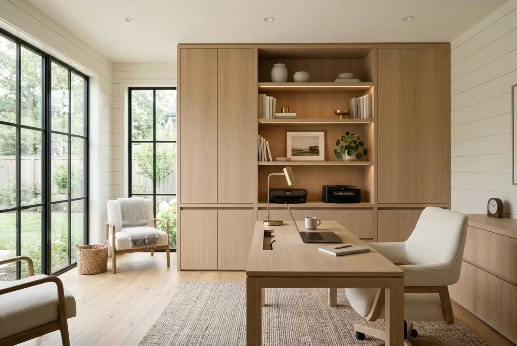
Hidden storage is one of those design decisions that quietly determines whether a home office feels composed or constantly on edge. In a farmhouse setting, where natural materials and open shelving are often part of the aesthetic language, the introduction of concealed storage brings a necessary counterbalance. It allows the room to keep its character without being visually overloaded by everyday clutter.
The strength of this approach lies in what is not immediately visible. Paperwork, cables, printers, and the general accumulation of working life are still present, but they are absorbed into the architecture rather than left exposed. The result is a workspace that feels more structured without losing its warmth or personality.
Cabinetry Solutions
Well-planned cabinetry is the backbone of effective hidden storage. It is less about filling a wall with cupboards and more about designing systems that respond to how the room is actually used.
Some of the most effective solutions include:
- Full-height built-in cabinets that blend into wall panelling
- Flush handleless doors that reduce visual interruption
- Integrated desk units with concealed drawers and cable routing
- Sliding or pocket-door storage sections for flexible access
- Floor-to-ceiling shelving with lower closed cabinetry
In a recent farmhouse office project, we designed a continuous oak wall unit that combined open shelving at eye level with concealed base storage below. The upper sections held books and display objects, while the lower cabinetry absorbed printers, filing, and less visually appealing equipment. The shift between open and closed zones kept the wall visually balanced while still performing heavy functional work.
Material consistency plays a major role here. When cabinetry matches or complements wall finishes, storage disappears into the architecture rather than standing apart as furniture.
Clutter-Free Workspace Design
A clutter-free office is rarely achieved by surface cleaning alone. It is the result of designing systems that prevent visual noise from building up in the first place. Hidden storage supports this by giving everything a defined place, even if that place is out of sight.
Key strategies include:
- Assigning dedicated storage zones for different types of use, such as documents, technology, and stationery
- Using deep drawers rather than open baskets for frequently handled items
- Incorporating vertical storage to keep desks clear
- Designing cable management channels within furniture rather than adding them later
- Limiting desktop storage to a few essential objects only
A useful approach is to treat the desk surface as a working plane rather than a storage area. When the surface stays clear, the room immediately feels more controlled, even if the rest of the storage is doing significant behind-the-scenes work.
In one compact office installation measuring around 3m x 3.5m (10ft x 11.5ft), shifting printers and filing systems into concealed cabinetry freed up nearly the entire floor area. The visual change was immediate. What had previously felt congested began to read as a calm, functional workspace without any alteration to the room’s footprint.
Designing Storage That Blends In
The most successful hidden storage does not announce itself. It follows the same material language as the rest of the room, which allows it to recede visually. Approaches that work particularly well in farmhouse offices include:
- Matching cabinet fronts to wall colour for seamless integration
- Using natural oak grain to echo flooring or desk surfaces
- Minimising hardware or using recessed pulls
- Aligning cabinet lines with architectural features such as windows or beams
- Keeping proportions simple and uninterrupted
When storage is designed with this level of integration, the room feels less like a collection of furniture pieces and more like a unified architectural environment.
Practical Considerations
Hidden storage is highly effective, but it requires careful planning early in the design process. Retrofitting solutions often leads to compromises in proportion or accessibility. Important factors to consider:
- Accessibility of frequently used items
- Ventilation for electronics stored in closed units
- Depth requirements for printers or office equipment
- Weight distribution for full-height cabinetry
- Ease of maintenance over time
Without proper planning, even the most visually refined storage system can become inconvenient in daily use.
Pros
- Keeps work surfaces visually clear and organised.
- Allows farmhouse interiors to remain clean without losing character.
- Integrates seamlessly into built-in architectural design.
- Reduces everyday visual distractions caused by clutter.
- Can significantly improve spatial efficiency in smaller offices.
Cons
- Requires detailed planning during early design stages.
- Higher initial cost compared to freestanding storage.
- Poor access design can reduce usability over time.
Designer’s Note
Hidden storage works best when it feels invisible rather than simply closed off. In a farmhouse office, it plays a quiet but essential role, holding the functional weight of the room while allowing the more expressive materials to take centre stage. When executed properly, the space gains a sense of order that is felt more than seen, and the office begins to function with far less friction in everyday use.
Leather and Oak Workspace
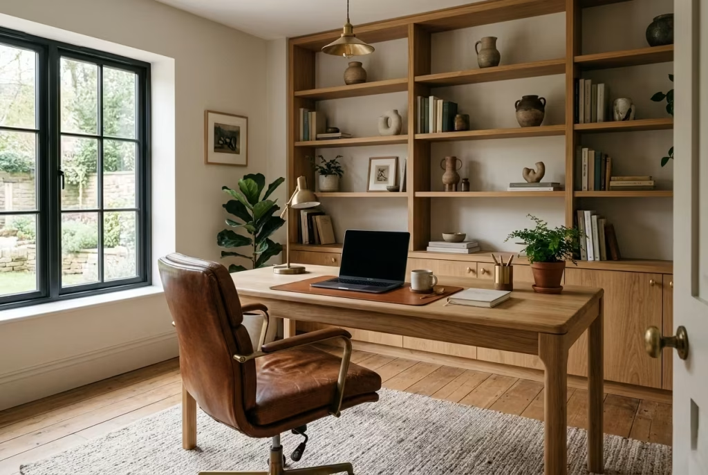
There is something enduring about the combination of leather and oak. It does not try to look clever, and that is precisely why it works so well in a modern farmhouse office. Oak brings grain, structure, and a sense of permanence, while leather adds depth, tactility, and a slightly timeworn quality that improves rather than fades with use. Together, they create a workspace that feels grounded, tailored, and built to age with dignity.
This pairing suits offices where the homeowner wants the room to feel settled rather than overly styled. It has enough character to avoid looking flat, yet it never feels theatrical. The material story is simple but effective, much like a well-cut coat that looks better the longer it is worn.
Material Aging Characteristics
One of the strongest arguments for leather and oak is the way both materials change over time. They do not just tolerate age, they participate in it.
Oak develops a deeper tone and a richer surface character, especially when finished with oil or a low-sheen sealant. Grain patterns become more apparent, and small marks tend to blend naturally into the surface rather than standing out harshly. This makes oak especially suitable for desks, shelving, and cabinetry that will see daily use.
Leather behaves differently. It softens, develops patina, and takes on a more individual appearance with wear. A high-quality leather chair or drawer pull can move from looking crisp on installation day to beautifully lived in after a few years. That ageing process is part of the charm.
Useful material pairings include:
- White oak desk with cognac leather chair
- Walnut-stained oak with deep brown leather upholstery
- Pale oak shelving with saddle leather accessories
- Oak cabinetry with leather desk blotters or drawer fronts
In one office project, I used a solid oak desk paired with a tobacco leather task chair. Over time, the leather softened slightly at the seat and armrests, while the oak surface picked up a few honest marks from everyday use. Rather than looking tired, the room gained character. It felt more like a study that had been used properly, which is often the point.
Durability Considerations
Although leather and oak are both durable, they perform differently, so the right finish and construction matter more than many homeowners realise.
For oak furniture, consider:
- Hardwearing finishes such as matte oil or durable lacquer
- Solid timber or high-quality veneer in high-use areas
- Rounded edges to reduce visible wear over time
- Desk depths of at least 75cm (30 inches) for comfortable daily use
For leather, consider:
- Full-grain or top-grain options for longevity
- Cushioned support if the chair will be used for long work sessions
- Darker tones for better ageing and easier maintenance
- Regular conditioning to prevent drying and cracking
A leather chair may be the more expensive component upfront, but it often earns its keep over time if the frame and upholstery are well made. Cheap leather, on the other hand, can peel, crack, and lose its appeal surprisingly quickly. As with most things, you get what you pay for.
Balancing Texture and Tone
The reason this pairing works so reliably is that the materials speak in the same register. Oak has natural warmth, while leather offers depth and softness. Neither needs embellishment.
To keep the space from feeling too heavy, add:
- Linen window treatments
- Brass or blackened metal hardware
- Neutral rugs in wool or jute
- Simple task lighting with clean lines
- Matte wall colours that let the materials stand out
This keeps the room from drifting into a masculine cliché or a leather-heavy executive look that feels more boardroom than farmhouse.
Pros
- Ages beautifully and develops more character over time.
- Durable when quality materials are chosen.
- Feels rich without relying on ornament or excess.
- Works across rustic, transitional, and modern farmhouse schemes.
- Offers a strong tactile quality that makes the room feel grounded.
Cons
- High-quality leather and oak can be costly.
- Both materials require some maintenance to stay at their best.
- Poorly matched tones can make the room feel heavy.
- Darker leather may show dust and marks more easily.
Designer’s Note
Leather and oak have an almost easygoing honesty about them. They do not shout for attention, but they hold a room together with real substance. In a farmhouse office, that matters. The combination feels calm without becoming bland, refined without losing its human touch. Over time, the materials only improve, which is why they remain such a dependable choice for homeowners who want a workspace that will still feel right years down the line.
Compact Modern Farmhouse Office for Small Spaces
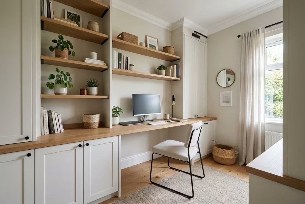
A dedicated home office is a luxury not every home can accommodate. More often, workspaces must be carved from spare bedrooms, unused landings, alcoves, dining room corners, or even sections of wider hallways. Yet limited square footage does not automatically mean limited potential. In fact, some of the most impressive farmhouse offices emerge from compact spaces where every centimetre has been carefully considered.
The secret lies in making the room work harder, not making it feel busier. When space is at a premium, every piece of furniture, every storage decision, and every wall surface must earn its place. Get that balance right, and even a modest office can feel surprisingly capable.
Multi-Functional Furniture
In smaller offices, furniture that performs more than one role often becomes the difference between a room that feels efficient and one that feels overcrowded.
The strongest pieces combine practicality with a relatively light visual footprint.
Options worth considering include:
- Desks with integrated filing drawers
- Storage benches positioned beneath windows
- Wall-mounted desks with shelving above
- Cabinet systems that conceal printers and technology
- Bookshelves that incorporate a compact work surface
A particularly effective solution for smaller farmhouse offices is a built-in desk spanning one wall. Rather than introducing several separate furniture pieces, a single integrated unit can combine workspace, storage, and display functions in one continuous composition.
In a project involving a room measuring just 2.4m x 2.7m (8ft x 9ft), we installed a custom desk approximately 60cm (24 inches) deep with full-height storage at one end. By consolidating multiple functions into one structure, the room felt significantly more open than it would have with freestanding furniture.
There is an old saying about making every inch count. Small offices demand precisely that mindset.
Selecting Furniture with the Right Proportions
Oversized furniture is one of the fastest ways to make a compact office feel constrained.
Instead, focus on pieces that balance function with scale:
- Desk widths between 120cm and 150cm (48 to 60 inches)
- Slim-profile shelving systems
- Chairs with open or exposed frames
- Narrow storage units between 30cm and 40cm (12 to 16 inches) deep
- Floating furniture where possible
The goal is not to shrink everything. Rather, it is to avoid introducing unnecessary bulk.
Furniture with visible legs often feels lighter than fully enclosed pieces because more floor area remains visible. That simple trick can subtly influence how spacious a room appears.
Maximising Vertical Storage
When floor space is limited, the walls become valuable real estate.
Many homeowners focus on horizontal storage while overlooking the full height of the room. Yet vertical storage often unlocks significant capacity without increasing the footprint.
Practical strategies include:
- Shelving extending close to ceiling level
- Built-in cabinetry above desks
- Wall-mounted organisers
- Floating shelves positioned over doorways
- Tall bookcases integrated into alcoves
For ceilings around 2.7m (9ft) high, storage can comfortably extend to approximately 210cm (84 inches) while remaining accessible for most users.
Items used daily should remain at eye level or below. Less frequently accessed materials can occupy higher shelves.
This arrangement keeps the room functioning smoothly while making full use of available wall space.
Creating a Sense of Openness
Storage alone is not enough. Compact offices also need visual breathing room.
Helpful approaches include:
- Limiting the number of furniture finishes
- Maintaining consistent colours across storage systems
- Using lighter wall colours where natural light is limited
- Introducing mirrors to reflect daylight
- Keeping window treatments simple and unobtrusive
When too many materials or colours compete within a small footprint, the room can feel fragmented. Simplicity often creates a greater sense of spaciousness than elaborate styling.
Small-Space Farmhouse Materials
Certain materials perform particularly well in compact offices because they add character without excessive visual weight.
Consider:
- White oak shelving
- Painted cabinetry in soft neutrals
- Linen window treatments
- Woven storage baskets
- Light-toned wool rugs
- Simple black metal accents
These materials contribute texture and interest while preserving a sense of openness.
Common Mistakes to Avoid
Even well-intentioned designs can run into trouble when space is limited.
Common pitfalls include:
- Using desks that are too deep
- Installing oversized chairs
- Filling every wall with shelving
- Relying on numerous small storage pieces instead of integrated solutions
- Ignoring cable management
In compact offices, clutter tends to reveal itself more quickly. The fewer visual interruptions present, the more generous the room will feel.
Pros
- Makes productive use of underutilised areas of the home.
- Requires less furnishing investment than larger offices.
- Easier to maintain and organise.
- Encourages efficient storage planning.
- Can feel surprisingly spacious when designed correctly.
Cons
- Limited flexibility for future expansion.
- Storage must be planned carefully.
- Furniture selection becomes more critical.
- Large equipment may be difficult to accommodate.
Designer’s Note
A compact farmhouse office is often an exercise in discipline. Every element needs a purpose, and every square foot must contribute to the room’s overall performance. Yet those constraints frequently produce the most inventive solutions. When furniture serves multiple roles and storage rises vertically rather than spreading outward, a small office can achieve far more than its dimensions suggest. The result is a workspace that feels efficient, welcoming, and remarkably capable despite its modest footprint.
Farmhouse Office with Natural Stone Flooring
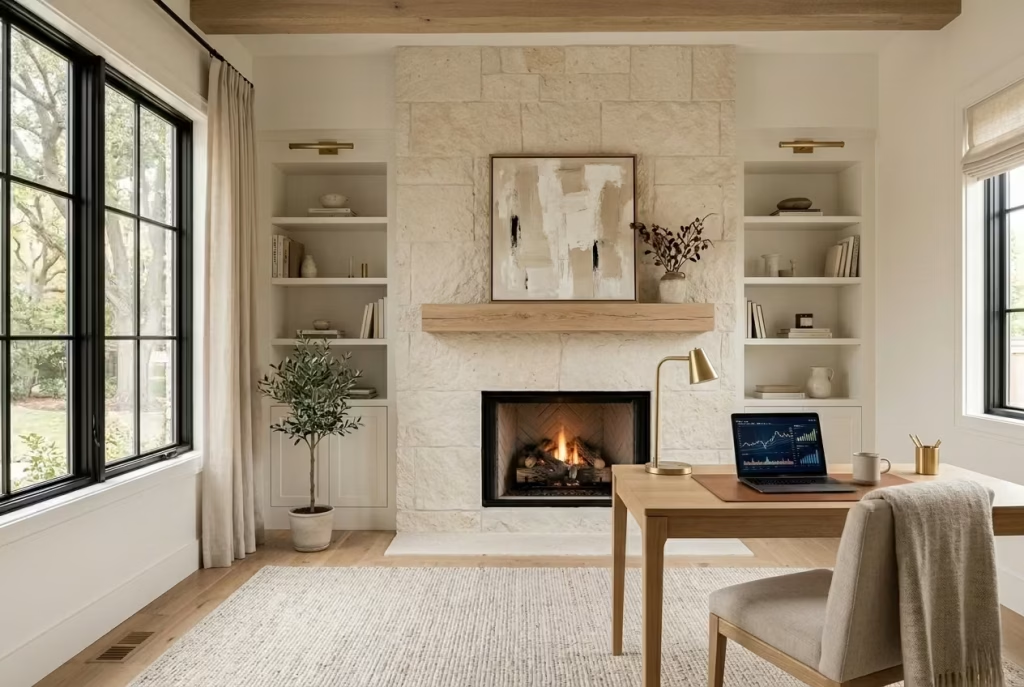
Flooring rarely receives the same attention as cabinetry, lighting, or furniture, yet it influences a room more than many homeowners realise. It affects acoustics, temperature, maintenance, and even how the space feels when crossed several times a day. In a modern farmhouse office, natural stone flooring introduces a sense of permanence that few other materials can match. It brings substance to the room, anchoring lighter elements such as painted walls, timber furniture, and linen textiles.
Unlike trend-driven finishes that come and go, stone tends to age gracefully. Small marks, subtle colour shifts, and surface wear often contribute to its character rather than diminish it. This makes it particularly appealing for offices designed with longevity in mind.
Limestone vs Travertine
Limestone and travertine are often discussed together because they share similar earthy tones and natural origins. However, they perform differently and create distinct visual impressions.
Limestone
Limestone is generally more uniform in appearance, offering a cleaner and more understated surface.
Benefits include:
- Softer, more consistent colour variation
- Contemporary appearance that suits modern farmhouse interiors
- Easier integration with oak cabinetry and neutral palettes
- Broad range of finishes from honed to lightly textured
Limestone works especially well in offices where the architecture itself already carries significant visual interest. Its quieter appearance allows other materials to take centre stage.
Travertine
Travertine tends to have more movement and visible character. Natural voids, veining, and tonal shifts give it a richer and often more historic appearance.
Advantages include:
- Greater texture and visual depth
- Strong connection to traditional European architecture
- Excellent pairing with reclaimed timber and antique furniture
- Distinctive surface patterns that create individuality
In a recent project, I specified filled and honed travertine for a farmhouse office overlooking a landscaped garden. Throughout the day, sunlight caught the subtle variations within the stone, creating a surface that felt almost alive. The floor became more than a backdrop. It contributed actively to the atmosphere of the room.
Choosing the Right Stone Finish
The finish can influence performance just as much as the stone itself. Popular options include:
| Finish Type | Appearance | Practical Consideration |
| Honed | Smooth, matte surface | Excellent for offices and daily use |
| Brushed | Slightly textured | Adds grip and tactile interest |
| Tumbled | Aged appearance | Better suited to traditional interpretations |
| Polished | Reflective surface | Can highlight scratches and glare |
For most farmhouse offices, honed finishes strike the best balance between practicality and aesthetics. They showcase the material naturally without creating excessive reflection from screens or task lighting.
Comfort Underfoot Considerations
Stone flooring offers durability, but comfort should never be overlooked, especially in rooms used for long working hours.
Unlike timber or carpet, stone has very little natural give. That can become noticeable after prolonged standing or frequent movement throughout the day.
Ways to improve comfort include:
- Adding a large wool area rug beneath the desk zone
- Using ergonomic anti-fatigue mats where standing desks are installed
- Incorporating underfloor heating systems
- Selecting upholstered seating that balances the firmness of the floor
Underfloor heating is particularly effective. Stone acts as a thermal mass, holding warmth exceptionally well once heated. In cooler climates, this transforms the experience entirely, turning what might otherwise feel cold into one of the most comfortable flooring options available.
As a rule of thumb, stone flooring combined with underfloor heating often feels significantly more pleasant than carpet paired with inconsistent radiator heating.
Material Pairings That Enhance Stone Floors
Natural stone thrives when surrounded by materials that complement rather than compete with it.
Particularly successful combinations include:
- White oak desks and shelving
- Linen window treatments
- Aged brass hardware
- Handwoven wool rugs
- Soft greige or warm white wall colours
The contrast between hard and soft surfaces creates a richer environment. Without those softer elements, the room can occasionally feel too austere.
Long-Term Performance
One reason many designers continue specifying stone is its longevity. Properly maintained stone flooring can last for decades while retaining much of its original appeal.
Important considerations include:
- Periodic sealing depending on stone type
- Immediate cleaning of spills to prevent staining
- Use of furniture pads beneath chairs and desks
- Avoiding harsh acidic cleaning products
Unlike many synthetic flooring options, stone often becomes more attractive as it ages, developing a subtle patina that reflects years of use.
Pros
- Exceptional durability and longevity.
- Adds architectural character and material richness.
- Works beautifully with farmhouse materials such as oak and linen.
- Compatible with underfloor heating systems.
- Ages gracefully over time.
Cons
- Higher installation costs than many flooring alternatives.
- Harder surface can feel less forgiving underfoot.
- Requires sealing and periodic maintenance.
- Heavier material may not suit every structural condition.
Designer’s Note
Natural stone flooring brings a sense of permanence that few materials can replicate. In a farmhouse office, it creates a strong foundation from which the rest of the design can unfold. Whether choosing the refined consistency of limestone or the expressive character of travertine, the appeal lies not only in how the floor looks today but in how it will continue to evolve over the years ahead. Like a well-worn leather chair or an oak desk marked by use, stone tells a richer story with time, and that quality is increasingly difficult to find in modern interiors.
You May also Like: 25 Barndominium Office Ideas That Blend Rustic Charm with Modern Productivity
Textured Neutral Office Retreat
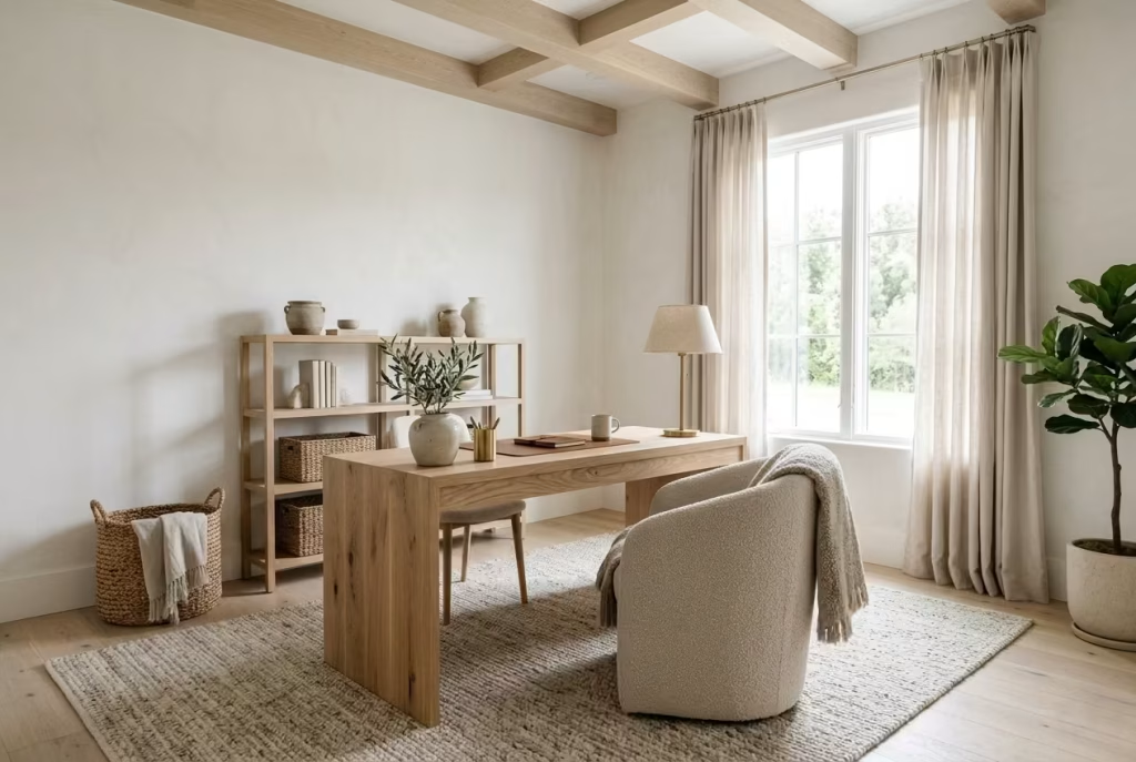
A neutral office does not have to feel flat, lifeless, or overly safe. When handled properly, a palette built from texture rather than colour can feel remarkably layered, with enough depth to keep the eye engaged long after the first glance. That is the real strength of a textured neutral retreat. It relies on surface, grain, weave, and finish to do the heavy lifting, creating a workspace that feels settled, tactile, and quietly distinguished without leaning on bold paint or decorative excess.
This approach suits modern farmhouse interiors particularly well because the style already values honest materials and a more relaxed relationship with surface variation. Instead of chasing contrast through colour, the room builds interest through touchable layers. The result is a space that feels considered from floor to ceiling, yet never overly orchestrated.
Bouclé, Linen, Wool, and Oak
These four materials work beautifully together because each brings a different kind of softness or structure to the room.
Bouclé introduces a nubby, irregular surface that catches light in subtle ways. It works especially well on an accent chair, stool, or occasional seat, where its tactile quality becomes part of the room’s character. In moderation, it brings a hint of softness without making the office feel overly cushioned or domestic.
Linen offers a looser, more relaxed texture. On curtains, roman blinds, or upholstery, it filters light in a way that feels easy and unfussy. Linen also has a natural movement to it, which helps stop a neutral room from feeling too static.
Wool is invaluable for adding depth underfoot. A wool rug, particularly one with a looped or flatwoven finish, grounds the room and absorbs some of the sharper edges created by desks, shelving, and technology. It is a workhorse material in disguise, durable enough for daily use while still feeling refined.
Oak provides the anchor. Its grain gives the room structure and keeps the softer materials from drifting into sameness. A white oak desk, shelving unit, or cabinetry run supplies enough visual definition to make the textures around it feel intentional.
Used together, these materials create a room that feels layered rather than decorated. It is the design equivalent of a well-composed outfit where nothing is flashy, yet everything is doing its job. The effect is understated, but by no means dull.
Creating Depth Without Colour
A room can feel rich even when the palette stays firmly within the neutral family. In fact, limiting colour often sharpens attention to the more important details, such as how fabric moves, how timber grain shifts under light, and how different finishes sit beside one another.
To create depth without colour, it helps to vary:
- Texture, through upholstery, rugs, curtains, and timber surfaces
- Sheen level, by mixing matte walls with softly finished cabinetry and low-sheen accents
- Material weight, combining heavier oak furniture with lighter linen and bouclé
- Pattern scale, using subtle weaves or natural irregularities rather than obvious prints
A monochrome room only feels sparse when every surface behaves the same way. The moment textures begin to differ, the eye starts reading layers instead of plain colour blocks. That is where a neutral office starts to come into its own.
In one project, I used a palette of warm white walls, pale oak joinery, a stone-toned wool rug, and boucle seating in a soft oatmeal shade. Nothing shouted for attention, yet the room had real presence. Daylight moved across the surfaces differently throughout the day, which gave the office a shifting character without disturbing its calm.
Why Texture Matters More Than It First Appears
Texture does more than make a room look interesting. It changes how a space feels to live and work in. Hard surfaces bounce light, soften acoustics poorly, and can create a slightly cold atmosphere if they are left unbalanced. Adding texture helps the room behave better, not just look better.
A textured neutral office often feels more forgiving. It hides minor marks more easily, wears in gracefully, and tends to look better with age. That matters in a working room, where perfection is rarely the point. A little patina, a softened edge, or a gently worn rug can make the space feel used in the best possible sense.
Practical Material Pairings
The combinations below work especially well in farmhouse-inspired offices:
| Main Material | Best Supporting Partners | Effect |
| White Oak | Linen, wool, brushed brass | Light, composed, and balanced |
| Bouclé | Walnut, stone, matte black accents | Soft but structured |
| Linen | Oak, ceramic, woven fibre | Relaxed and breathable |
| Wool | Timber, leather, neutral paint | Grounded and durable |
These pairings avoid visual monotony while keeping the room cohesive. There is no need to force drama into the scheme. Texture does the talking, and it usually says plenty.
Pros
- Creates depth without relying on strong colour.
- Feels timeless and easy to adapt over time.
- Works naturally with farmhouse materials and furniture.
- Can make a room feel calmer and more settled.
- Ages well and often improves with use.
Cons
- Requires careful material selection to avoid blandness.
- Poor lighting can flatten subtle textures.
- Too many soft finishes can make the room feel shapeless.
- Quality materials are important, otherwise the look can fall apart quickly.
Designer’s Note
A textured neutral office has a certain maturity to it. It does not need to make a loud entrance, because the interest is built into the surfaces themselves. When bouclé, linen, wool, and oak are layered with care, the room gains depth, comfort, and a sense of ease that does not rely on colour for effect. It is a strong reminder that restraint, when handled well, can carry more style than any amount of visual noise.
Barn Door Home Office Entrance
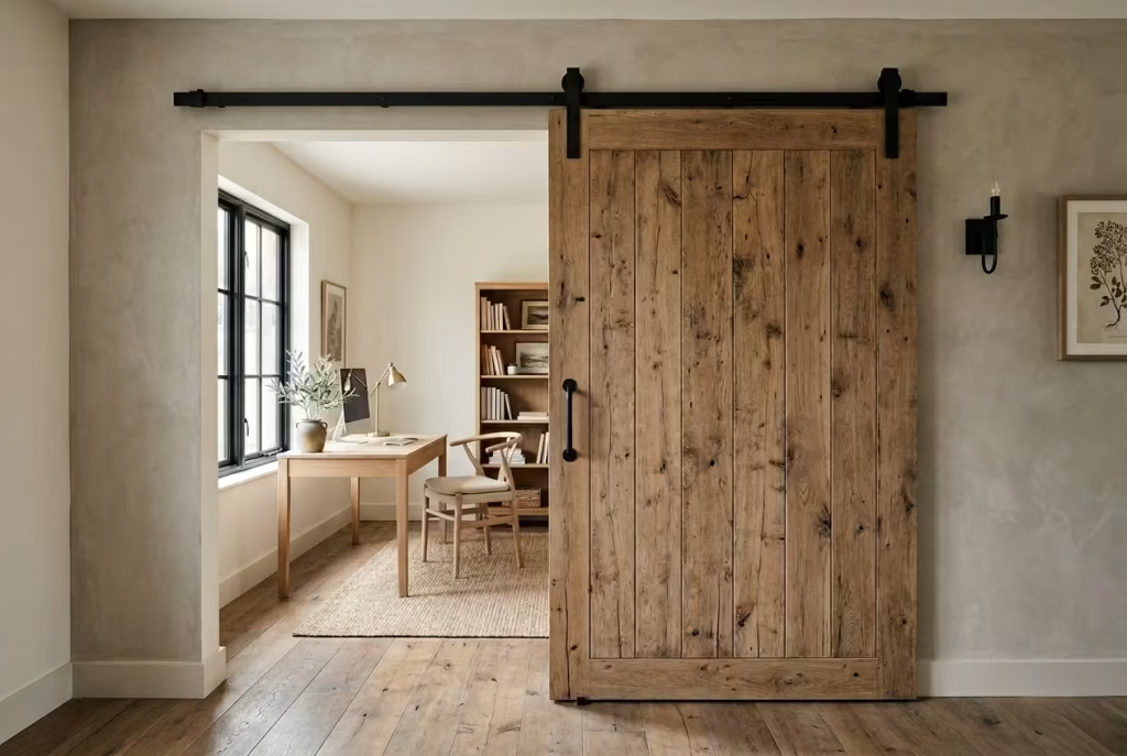
A barn door entrance has a certain visual pull that is hard to deny. It brings instant character, especially in a modern farmhouse interior where the aim is often to blend practicality with a touch of rustic texture. When used well, it can make a home office feel distinct from the rest of the house without requiring major structural changes. That said, this is one of those features that looks simple on the surface but deserves a hard, honest look before it is specified. In the wrong room, it can become more show than substance.
What makes barn doors appealing is their ability to solve a spatial problem elegantly. They slide rather than swing, which can be useful in narrow corridors, awkward room layouts, or compact offices where every centimetre counts. But the very thing that makes them useful can also become their weak point. They are excellent at saving floor space, yet not always brilliant at sealing a room off from sound, light, or smell.
When Barn Doors Work
Barn doors work best when the office entrance sits in a place where a conventional hinged door would feel intrusive or impossible.
They tend to perform well in situations such as:
- Narrow hallways where a swing door would block circulation
- Small offices tucked beside living areas or bedrooms
- Open-plan homes that need a light-touch divider
- Laundry-adjacent studies or secondary workspaces
- Renovated cottages or farmhouse-style homes where a more relaxed entrance suits the architecture
A barn door can also be visually useful when the office itself needs a sense of arrival. Rather than disappearing into the background, the entrance becomes part of the room’s identity. A timber door with well-chosen hardware can act almost like a framed piece of joinery, giving the office a finished edge.
Material choice makes a significant difference here. A reclaimed oak door, for instance, feels warmer and more authentic than a lightweight painted panel. In a modern farmhouse setting, it can carry enough texture to feel grounded without tipping into kitsch.
A practical rule of thumb is to allow the door to extend at least 5 to 8cm (2 to 3 inches) beyond the opening on each side so it sits proportionally well and covers the doorway properly when closed.
Acoustic Limitations
Here is where barn doors often fall short. They can look excellent, but acoustically they are rarely the strongest solution.
Because they usually hang with some clearance from the wall, and because they do not seal tightly around the frame, they allow sound to travel far more easily than a solid-core hinged door. That may not matter much if the office is only used occasionally, but it becomes a real issue if the room is used for video calls, confidential work, or deep-focus tasks.
Common acoustic drawbacks include:
- Gaps at the top, bottom, and sides
- Limited privacy during calls
- Reduced control over household noise
- Less effective containment of footsteps, television, or conversation
If the office is near a busy family zone, the shortcomings become obvious pretty quickly. What seemed like a neat design choice can turn into a bit of a headache once daily life kicks in. It is one thing to admire the look, another to hear the dishwasher and the children in the next room.
There are a few ways to improve performance, but none will make it equal to a properly fitted hinged door:
- Choose a solid-core door slab rather than a hollow one
- Add a soft-close track system to reduce movement noise
- Use perimeter brush seals or discreet acoustic strips
- Install heavy curtains inside the office to absorb some sound
- Pair the barn door with a secondary internal screen if needed
Even with these measures, a barn door should be considered a partial solution rather than a fully soundproof one.
Alternative Solutions
If the idea of a barn-style entrance is appealing but the practical limitations feel too steep, there are several alternatives that deliver a more balanced result.
Pocket Doors
Pocket doors slide into the wall cavity, which means they preserve floor space while offering a cleaner seal than a typical barn door. They are especially effective in new builds or major renovations where wall structure can be adjusted.
Sliding Panel Doors
These can offer a more refined look than a traditional barn door, particularly when finished in oak, painted millwork, or fluted timber. They still save space but often feel more integrated into the architecture.
Crittall-Style Glazed Doors
For offices that need separation without losing light, glazed internal doors with slim metal frames are a strong option. They feel lighter visually and provide better acoustic performance than open-track barn doors.
Hinged Doors with Clever Swing Clearance
Sometimes the simplest answer is still the best one. A well-proportioned hinged door, especially if it opens outward or uses a compact swing configuration, can offer better privacy and a more timeless look.
Choosing the Right Look
If you do decide to use a barn door, the design should feel considered rather than overly themed.
A strong approach might include:
- Simple vertical timber planks
- Matte black or aged iron hardware
- Natural oak, walnut, or painted finishes
- Unfussy profiles without decorative excess
- Proportions that align with the wall height and surrounding millwork
The more restrained the design, the easier it is to keep the door from dominating the room. A barn door should complement the office, not steal the show.
Pros
- Saves valuable floor space in compact layouts.
- Adds strong farmhouse character and a clear sense of arrival.
- Can work well in casual or secondary offices.
- Offers a straightforward retrofit option in many homes.
Cons
- Limited acoustic privacy.
- Less effective at blocking light than a conventional door.
- Needs clear wall space for the track and door slide.
- Can feel overly decorative if the rest of the room is too polished.
Designer’s Note
Barn doors can be a useful design move, but only when the room’s practical demands are properly understood. They are at their best when space-saving matters more than acoustic isolation and when their visual character strengthens the architecture rather than competing with it. In a farmhouse office, they can still work beautifully, but they need to be chosen with open eyes. A good-looking door that causes daily frustration is not much of a win. In design, as in life, the neatest trick is often the one that holds up after the novelty wears off.
Farmhouse Office with Oversized Pendant Lighting
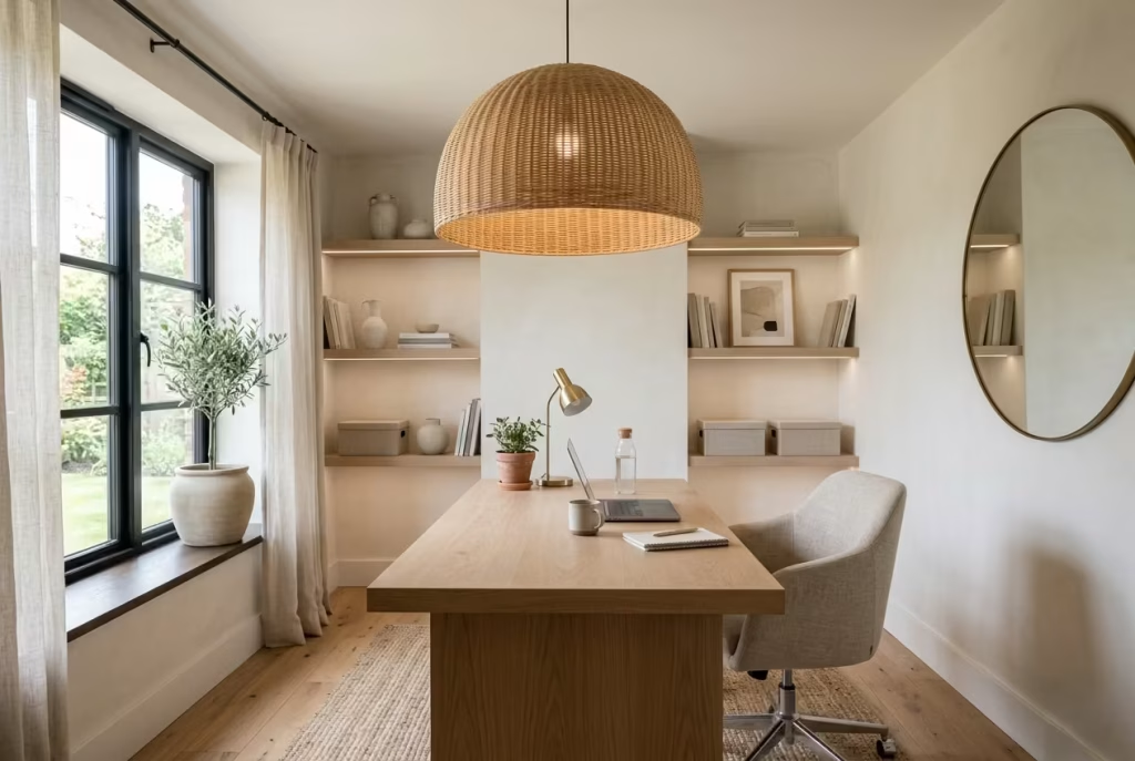
Oversized pendant lighting can do more than illuminate a home office. It can change the room’s whole bearing, giving the space a point of focus that feels intentional, grounded, and just a touch dramatic. In a modern farmhouse office, where the palette is often calm and the materials lean natural, a well-scaled pendant becomes the item that keeps the room from drifting into plainness. It adds presence overhead, helps define the working zone, and introduces a layer of architecture without requiring a single wall to be moved.
The trick, as ever, is proportion. A pendant that is too small disappears into the room and loses its purpose. One that is too large can dominate the scene and make the ceiling feel lower than it really is. Get the sizing right, though, and the whole composition suddenly clicks into place.
Fixture Sizing Formulas
When selecting a pendant for a farmhouse office, scale should be determined by the room rather than by instinct alone. There are a few practical formulas that help keep things on the right side of balanced.
A useful starting point is to add the room’s length and width in feet, then convert that number into inches for an approximate pendant diameter. For example, a room measuring 12ft by 14ft gives a total of 26, suggesting a fixture around 26 inches wide, which is about 66cm. It is not a rigid rule, but it gives a sensible baseline.
Other useful guides include:
- For desks up to 150cm wide, pendants between 45cm and 60cm usually feel proportionate.
- For larger desks or central office islands, fixtures between 60cm and 90cm can hold their own more confidently.
- In rooms with ceilings of 2.7m to 3m, allow roughly 75cm to 90cm from the tabletop to the bottom of the pendant.
- In taller spaces, the fixture can hang lower, provided circulation beneath it remains comfortable.
Pendant size should also be read in relation to surrounding furniture. A substantial oak desk, for instance, can take a much bolder light than a compact writing table. Likewise, a room with high ceilings and built-in cabinetry can comfortably support a more generous form overhead.
In practice, pendant lighting often works best when it feels like a deliberate counterweight to the desk below. If the furniture is low and streamlined, a larger pendant can restore vertical balance. If the room already has strong architectural features such as beams or shelving walls, the pendant should complement them rather than compete.
Layered Lighting Design
A single pendant may look lovely, but it should never be expected to do all the heavy lifting. Home offices need layered lighting if they are going to work throughout the day and into the evening.
The most successful schemes usually combine three levels of light:
Ambient Light
This is the general illumination that keeps the room feeling open and usable. The pendant often plays this role, especially when centred over the main desk or seating zone. In a farmhouse office, a pendant with a soft matte finish, woven texture, or milky glass shade usually works better than anything too shiny or overly contemporary.
Task Light
This is the practical layer. Desk lamps, adjustable sconces, or directional spots should provide direct light where work is actually happening. A pendant alone rarely gives enough precision for long reading sessions or screen-based tasks. Task lighting between 3000K and 3500K tends to strike the best balance, offering clarity without making the room feel stark.
Accent Light
This is where a room starts to feel composed rather than merely functional. Shelf lighting, wall washers, and small uplights can bring out timber grain, books, artwork, or textured plaster finishes. In a farmhouse office, these quieter touches often make the room feel more finished than the pendant itself.
The real magic happens when all three layers work together. The pendant establishes mood and structure, the task lighting handles function, and the accent lighting adds depth. Miss one of those layers, and the room can feel lopsided.
Choosing the Right Pendant Style
Oversized does not have to mean heavy. In fact, some of the best farmhouse office pendants are visually generous but relatively light in material.
Strong options include:
- Woven pendants that add texture without bulk
- Large linen or fabric shades for a softer look
- Globe pendants in frosted glass for a cleaner modern farmhouse feel
- Metal pendants with a matte or aged finish for stronger contrast
- Overscaled lantern forms for offices with taller ceilings
The style should reflect the rest of the room. A woven pendant may suit a relaxed, textural workspace, while a more sculptural metal form can suit an office with sharper lines and darker joinery.
Practical Considerations
Beautiful lighting still needs to earn its keep. Before settling on a pendant, consider:
- Whether it blocks sightlines to windows or shelving
- Whether the light falls evenly across the desk surface
- Whether the fixture can be cleaned easily
- Whether the scale suits both the room and the furniture beneath it
- Whether ceiling height allows enough clearance for movement
A pendant should feel like a finishing touch, not an obstacle. If you have to duck under it every time you walk across the room, the charm wears thin rather quickly.
Pros
- Adds a strong focal point and immediate visual presence.
- Helps define the office zone within larger rooms.
- Works especially well in farmhouse interiors with natural materials.
- Can elevate a simple room without requiring major renovation.
Cons
- Poor sizing can throw the whole room off balance.
- One pendant is not enough for proper task lighting.
- Oversized fixtures can overwhelm low ceilings.
- Installation may require careful planning around wiring and ceiling structure.
Designer’s Note
Oversized pendant lighting works best when it behaves like a sentence with good punctuation. It gives the room rhythm, marks the centre of the composition, and helps the eye understand where to land. In a farmhouse office, that matters more than many people expect. With the right scale and a layered lighting plan beneath it, the pendant does more than light the room. It gives the space shape, character, and a sense of finish that ties everything together beautifully.
You May also Like: 21 Cottage Office Design Ideas to Create a Cozy and Productive Workspace
Modern Farmhouse Office with Indoor Greenery
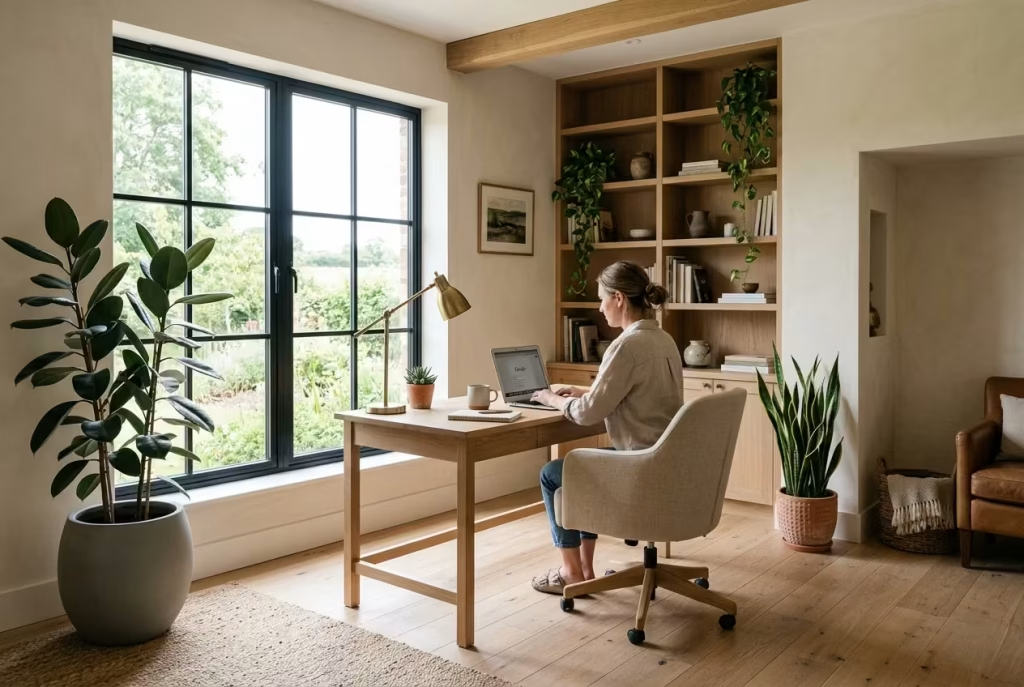
Indoor greenery can change the mood of a home office in a way that few decorative additions manage. It brings movement, texture, and a sense of life into a room that can otherwise become dominated by screens, paper, and hard-edged furniture. In a modern farmhouse office, plants feel especially at home because the style already leans towards natural materials, softer finishes, and a more grounded, lived-in atmosphere.
The right planting scheme should never feel like decoration for decoration’s sake. It should feel settled, as though the room would be incomplete without it. A single well-placed plant near a window, a line of smaller pots on shelving, or a larger specimen in an unused corner can make the office feel more connected to the rest of the home and less like a purely transactional workspace.
Best Plants for Office Environments
Not every plant performs equally well in a working room. The strongest choices are usually the ones that tolerate lower light, irregular watering, and the slightly dry atmosphere that comes from heating or air conditioning.
Reliable options include:
- Snake plant for its upright form and low maintenance
- ZZ plant for a glossy, structured look with minimal fuss
- Pothos for trailing greenery that softens shelving and cabinet edges
- Peace lily for a more refined, elegant leaf shape
- Rubber plant for a bolder presence in larger offices
- Boston fern for softer texture, provided humidity is adequate
For farmhouse offices, plants with strong but simple forms tend to work best. A snake plant in a ceramic pot, for instance, feels architectural rather than fussy. A rubber plant beside a desk can add height and weight without cluttering the room. Trailing pothos on a shelf can break up hard lines in a very natural way, almost like a soft brushstroke across a clean composition.
The pot matters just as much as the plant. Terracotta, stone, ceramic, and woven containers usually fit the farmhouse palette more comfortably than glossy plastic. They give the greenery a proper footing and stop it from feeling like an afterthought.
Natural Wellness Benefits
The appeal of indoor plants goes well beyond appearances. In a home office, greenery can subtly influence how the room is experienced across the day. It offers a visual pause between tasks, introduces variation into the field of view, and softens the hard angles created by desks, storage, and equipment.
There is also something quietly restorative about working around living materials. A plant reacts to light, shifts over time, and needs care in return. That small exchange can make a workspace feel less mechanical and more human. For people who spend long stretches at a desk, even a modest amount of greenery can help the room feel less sterile and more habitable.
A well-placed plant near the desk or beside a window can also help balance a room visually. If the office contains a lot of oak, stone, metal, or cabinetry, greenery provides contrast without shouting for attention. It introduces a softer note into the overall composition, which often makes the room easier to spend time in.
Placement That Feels Intentional
Plants should be placed where they contribute to the room rather than crowd it.
Useful positions include:
- A tall plant in an empty corner to fill vertical space
- Small potted plants on floating shelves or built-ins
- A trailing plant above eye level to soften storage walls
- A medium-sized plant near a window to link the interior with the garden outside
- A pair of matching plants flanking a desk or sideboard for symmetry
The trick is to avoid turning the office into a greenhouse. Too many plants can start to feel chaotic, particularly in smaller rooms. A few well-chosen specimens usually create far more impact than a crowded collection.
Maintenance Requirements
A successful indoor planting scheme depends on realism. If the plants require more care than the homeowner is willing to give, the arrangement will not last long.
A few practical considerations help keep things manageable:
- Match the plant to the available light rather than forcing a style choice
- Choose pots with proper drainage to avoid root problems
- Water based on actual need, not on a fixed schedule alone
- Dust leaves occasionally so they continue to catch light well
- Rotate plants from time to time so growth stays even
Low-maintenance plants are usually the safest route in a working environment. The point is not to add another job to the day, but to introduce something living that quietly improves the room without demanding constant attention.
Pros
- Brings life and softness into a room that can otherwise feel hard-edged.
- Complements the natural materials already common in farmhouse interiors.
- Works in both small and large offices with minimal disruption.
- Can improve the room’s atmosphere without major renovation.
Cons
- Requires light, watering, and occasional care.
- Too many plants can make a small office feel crowded.
- Some varieties are not ideal for low-light rooms.
- Poor pot choice can make the scheme feel less refined.
Designer’s Note
Indoor greenery works so well in a modern farmhouse office because it brings the room back to something basic and grounding. It introduces a living layer that changes with the seasons, catches the light in a different way each day, and softens the harder edges of work life. Used sparingly and with care, plants do more than decorate the space. They give it breath, balance, and a more generous feel that makes the office easier to inhabit over time.
Modern Farmhouse Home Office Planning Guide
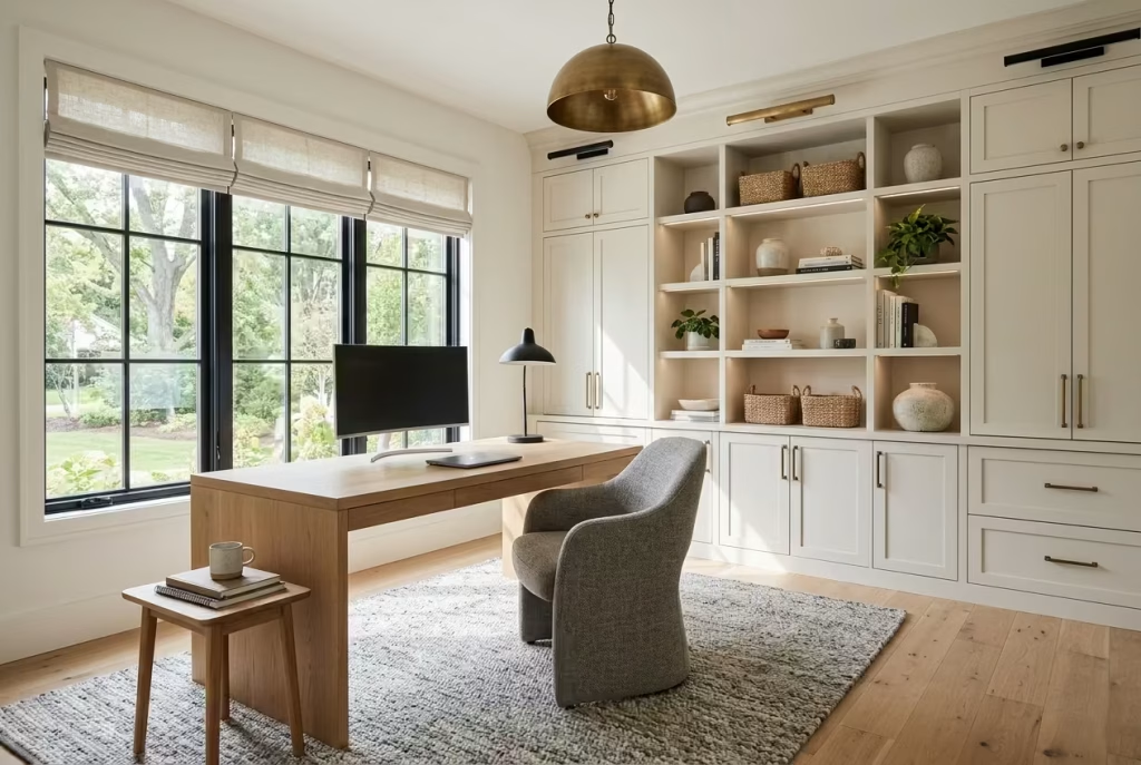
Designing a modern farmhouse home office begins with finding the right balance between warmth and functionality. While the aesthetic is known for its natural materials, neutral palettes, and timeless character, successful spaces are planned around how they are used every day. Thoughtful furniture placement, adequate storage, layered lighting, and comfortable circulation paths are just as important as the visual details.
When these practical foundations are combined with authentic textures such as wood, linen, and metal, the result is a workspace that feels calm, productive, and effortlessly welcoming.
What Defines a Modern Farmhouse Home Office?
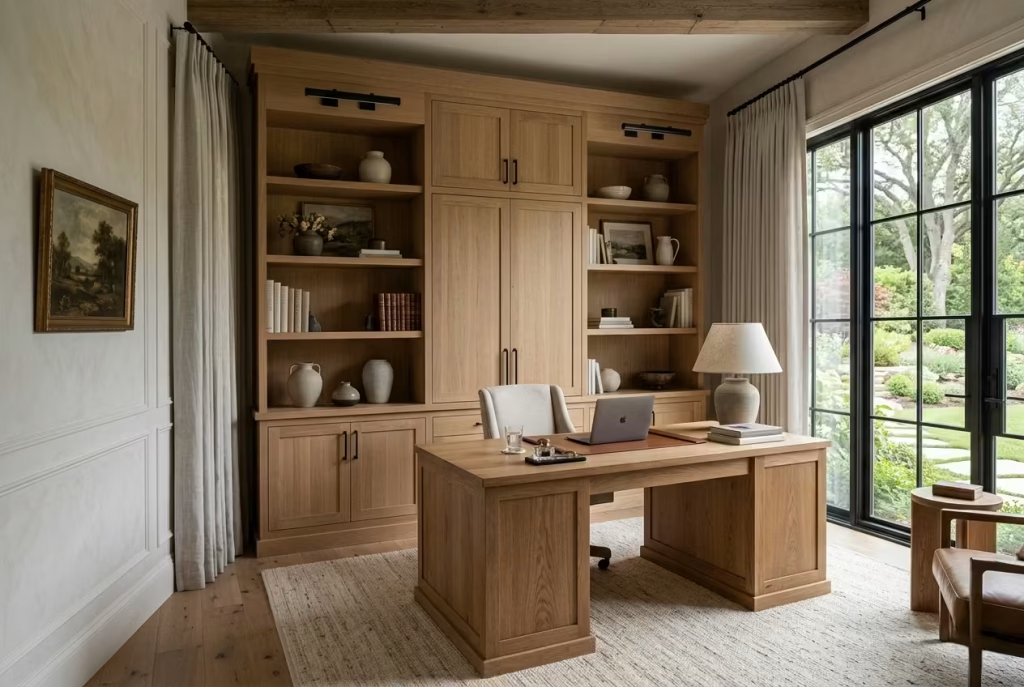
A modern farmhouse home office is often misunderstood as a room filled with reclaimed timber, sliding barn doors, and vintage accessories. In reality, the most successful examples are far more nuanced. They combine the warmth and authenticity of traditional farmhouse design with the clarity and restraint of contemporary interiors. The result is a workspace that feels inviting without appearing overly decorative, practical without feeling clinical.
What gives this style lasting appeal is its ability to create an environment that supports both focus and comfort. Rather than chasing trends, it relies on enduring materials, thoughtful proportions, and a layered approach to design that matures gracefully over time. Every element has a purpose, from the texture underfoot to the quality of light falling across the desk throughout the day.
Natural Wood Finishes
Wood sits at the heart of modern farmhouse design because it introduces warmth that manufactured materials often struggle to replicate. White oak, walnut, ash, and character-grade oak are among the most popular choices, each bringing its own grain pattern and personality.
In many projects I have worked on, white oak remains a favourite because it feels relaxed yet refined. Whether used for built-in cabinetry, shelving, ceiling beams, or desk surfaces, it develops a richness over time that adds depth to the room.
Practical applications include:
- White oak desks for everyday durability
- Timber shelving between 30 and 35 cm (12 to 14 inches) deep for books and decorative objects
- Wood wall panelling to add architectural character
- Exposed beams in rooms with ceilings above 2.7 m (9 ft)
The beauty of natural timber lies in its imperfections. Knots, grain variation, and subtle colour shifts tell a story, giving the room a sense of authenticity that cannot be manufactured.
Neutral Colour Palettes
Neutral colours provide the quiet backdrop that allows materials and craftsmanship to take centre stage. Modern farmhouse offices rarely rely on dramatic colour schemes. Instead, they build atmosphere through layers of warm whites, soft greiges, muted taupes, clay tones, and earthy greens.
These colours perform particularly well in home offices because they create visual calm. A softer palette reduces distraction and allows the mind to settle into focused work more easily.
Popular combinations include:
- Warm white walls with natural oak furniture
- Greige cabinetry paired with aged brass hardware
- Soft sage accents against creamy architectural detailing
- Taupe walls layered with linen and wool textures
Like a well-tailored jacket that never falls out of fashion, a thoughtfully selected neutral palette creates a timeless foundation that remains relevant year after year.
Layered Textures
Texture is often the secret ingredient that separates a beautiful office from one that feels flat and forgettable. In modern farmhouse interiors, texture creates visual richness without relying on excessive ornamentation.
A room may include:
- Linen curtains filtering natural light
- Wool area rugs adding softness underfoot
- Handcrafted ceramics displayed on shelving
- Leather seating that develops character with age
- Textured plaster or limewash wall finishes
When these elements are layered thoughtfully, the room gains depth and dimension. It becomes a space that invites you to stay longer, much like a favourite reading nook that somehow makes time pass unnoticed.
Black Metal Accents
Black metal details provide structure and definition within the softer farmhouse palette. They act as visual punctuation marks, introducing contrast without overwhelming the room.
Common applications include:
- Window frames
- Cabinet hardware
- Task lighting
- Furniture bases
- Glass partition systems
The contrast created by black metal prevents the space from becoming overly soft or overly rustic. Even small additions can sharpen the overall composition and bring a sense of modernity to traditional materials.
Functional Storage
A stylish office quickly loses its appeal when paperwork, cables, and equipment begin taking over every available surface. Functional storage is therefore one of the defining characteristics of a successful farmhouse workspace.
Storage should feel integrated rather than added as an afterthought.
Effective solutions include:
- Built-in cabinetry extending to ceiling height
- Closed storage for technology and documents
- Open shelving for books and curated displays
- File drawers concealed within desk units
- Integrated charging stations
In practice, I often recommend allocating at least 30 to 40 percent of office wall space to storage. This simple planning principle helps maintain visual order while supporting daily functionality.
Timeless Furniture Profiles
Furniture in a modern farmhouse office tends to favour simplicity over trend-driven shapes. Pieces are chosen for longevity, comfort, and proportion rather than novelty.
Characteristics often include:
- Clean-lined desks with subtle detailing
- Upholstered task chairs in natural fabrics
- Traditional bookcases with contemporary proportions
- Well-crafted joinery and solid materials
- Balanced silhouettes that feel substantial without appearing heavy
The goal is not to create a showroom but a room that feels settled, purposeful, and capable of evolving with changing needs.
Design Balance: Rustic vs Modern
The true success of a modern farmhouse office lies in the balance it achieves. Too much rustic influence can feel theatrical. Too much modern minimalism can leave a room feeling cold and impersonal. The strongest interiors sit comfortably between these extremes.
Material Contrast
Material contrast creates tension in the best possible way. Smooth surfaces paired with tactile finishes make each element feel more interesting.
Examples include:
- White oak against black steel
- Linen upholstery beside polished stone
- Handcrafted ceramics displayed on sleek shelving
- Textured plaster walls combined with glass partitions
Without contrast, rooms often feel one-dimensional. With it, they gain complexity and visual energy.
Visual Weight
Every object contributes visual weight to a room. Large timber desks, built-in shelving, substantial lighting fixtures, and upholstered seating all influence how balanced the space feels.
One common mistake is concentrating too many heavy elements on a single side of the room. Successful offices distribute visual weight evenly, creating a sense of harmony that feels effortless rather than forced.
As a rule, larger furniture pieces should be balanced by lighter elements such as open shelving, generous glazing, or softer textiles.
Architectural Detailing
Architectural details often distinguish a thoughtfully designed office from one that relies solely on furniture and accessories.
Details worth considering include:
- Shiplap or panelled walls
- Coffered ceilings
- Custom built-in cabinetry
- Arched shelving niches
- Decorative trim work
- Exposed ceiling beams
These features create a framework for the room, adding character that feels rooted in the architecture rather than applied superficially.
Maintaining Sophistication
Sophistication in modern farmhouse design comes from restraint. It is tempting to keep adding decorative pieces, but often the strongest spaces know when to stop.
A sophisticated office typically prioritises:
- Quality over quantity
- Authentic materials over imitations
- Cohesive colour relationships
- Comfortable proportions
- Purposeful styling
The old saying “less is more” can sometimes feel overused, yet in farmhouse design it remains surprisingly accurate. A handful of carefully selected elements almost always creates a stronger impression than a room crowded with decorative features competing for attention.
When natural materials, balanced proportions, thoughtful detailing, and functional planning work together, the modern farmhouse office becomes far more than a design style. It becomes a workspace that supports concentration, reflects personal taste, and continues to feel relevant long after fleeting trends have faded from view.
Designing a Farmhouse Office That Supports Daily Productivity
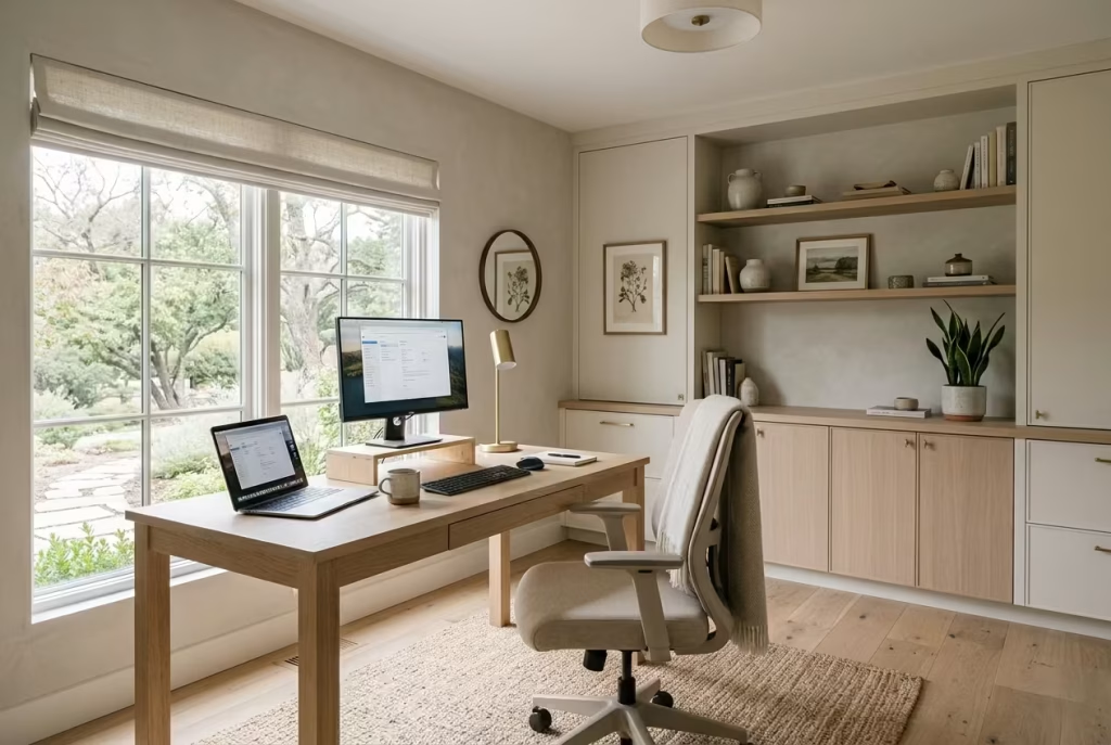
A farmhouse office works best when it is built around the realities of everyday use rather than surface styling alone. The room may look finished at first glance, but if the desk sits too high, the lighting is patchy, or storage is left until the end, the whole space can start to feel clumsy very quickly. Productivity depends on the basics being right first, then the atmosphere being layered in around them.
Prioritise Ergonomics First
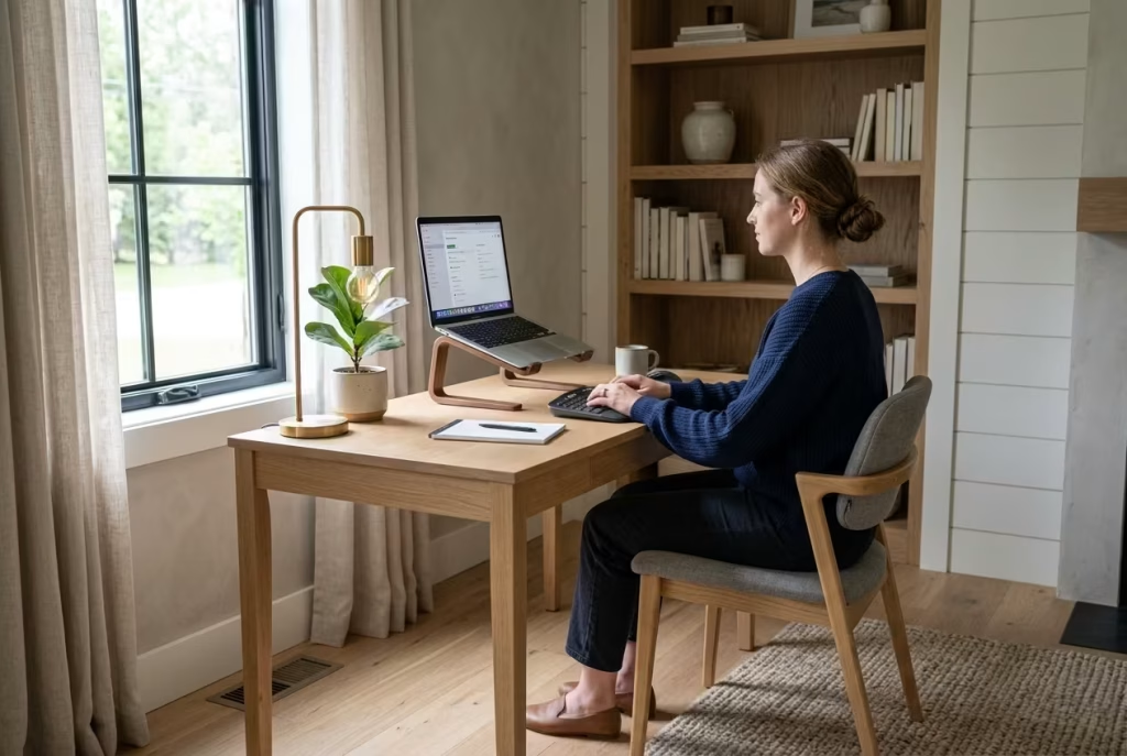
Ergonomics is the part of office design that quietly carries the whole room. A desk should usually sit at about 72 to 76cm high (28.5 to 30 inches) for most adults, though chair height and monitor setup matter just as much as the desk itself. The screen should ideally sit roughly an arm’s length away, with the top of the monitor close to eye level so the neck is not constantly craning forward or tilting down.
For chairs, the best choice is the one that supports the lower back properly, allows the feet to rest flat, and keeps the shoulders relaxed rather than lifted. It is a simple equation, really. If the body is fighting the furniture, the room has already lost half the battle. Long-term comfort comes from avoiding those small daily frustrations that build up over time, the sort that do not seem dramatic on day one but become impossible to ignore after a few months.
Layer Lighting Properly
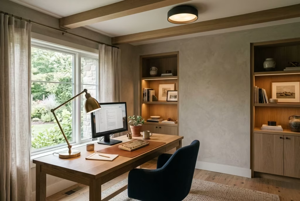
t as a single bright blast from the ceiling. Ambient lighting provides the overall glow that keeps the room feeling open and usable. Task lighting does the precision work, giving the desk clear illumination for reading, writing, and screen time.
Accent lighting adds the final polish, bringing depth to shelving, wall features, or artwork without making the room feel theatrical. In practical terms, a warm-white scheme around 2700K to 3000K usually suits farmhouse interiors well, especially when paired with timber, linen, or stone. A desk lamp is not just an accessory here.
It is the difference between a room that merely looks pleasant and one that actually functions without eye strain. The best lighting plans feel almost invisible in daily life because they have been thought through properly. Nothing is left guessing, and nothing has to be corrected later with a last-minute lamp or two.
Invest in Storage Early
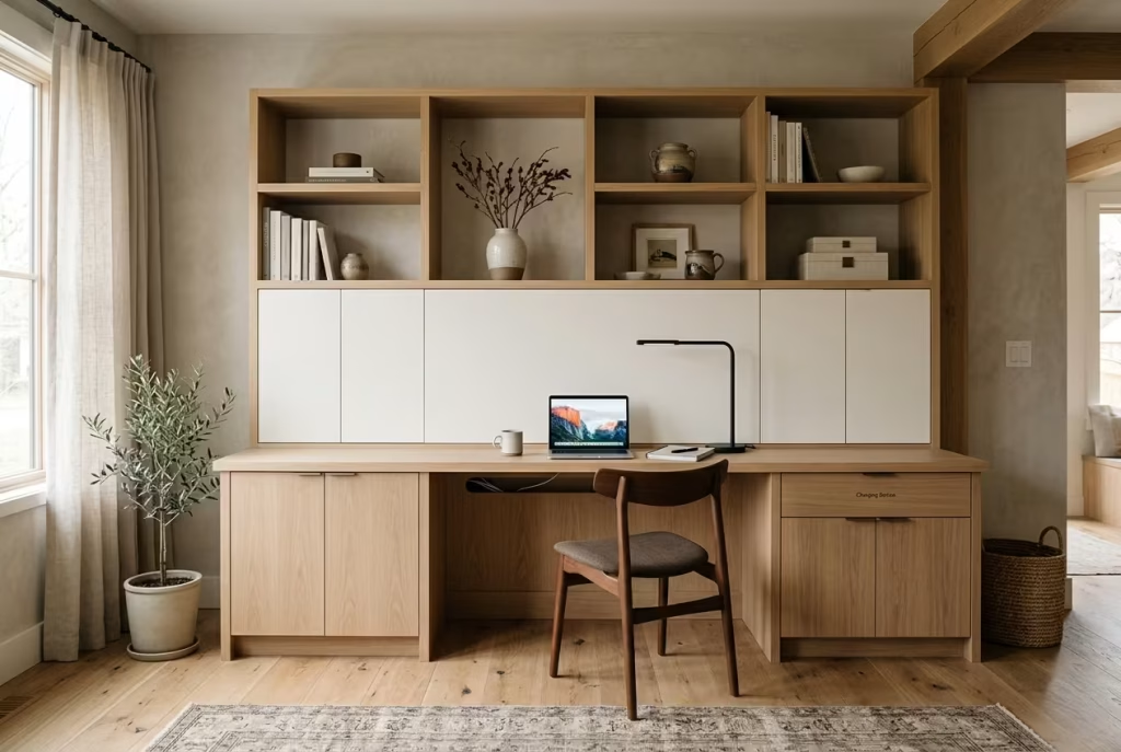
Storage is one of those things that is far easier to plan early than to fix later, and that old saying about a stitch in time is well worth remembering. Open storage and closed storage each earn their place, but they serve different purposes. Open shelves are useful for books, reference materials, or a few well-chosen objects that give the office personality.
Closed storage is where the less photogenic essentials disappear, including paperwork, chargers, printer supplies, and all the bits and pieces that tend to multiply when no one is paying attention. File management should be built into the room from the outset, not left to desktop trays and a hopeful attitude.
If the office is likely to house technology, make room for cable routing, charging drawers, and ventilation for equipment. It is far easier to design these into cabinetry than to battle tangled wires later. The strongest farmhouse offices tend to have a calm upper visual field and a highly organised lower one, with clutter kept out of sight but still easy to reach.
That balance keeps the room feeling composed without becoming fussy.
Practical Designer Note
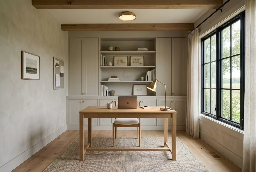
A productive farmhouse office is not created by styling alone. It comes from good proportions, careful lighting, and storage that has been properly thought through. Once those foundations are in place, the natural materials, softer finishes, and farmhouse character can do what they do best, which is make the room feel welcoming enough to use every day without losing its sense of order.
Most Durable Materials for Modern Farmhouse Home Offices
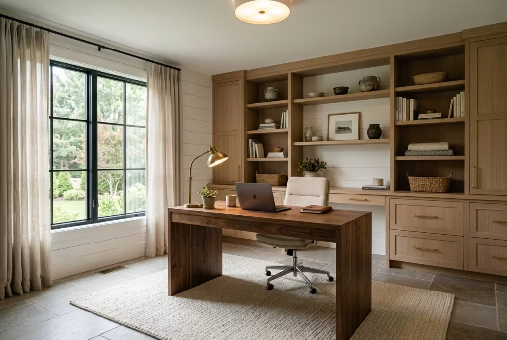
Durability matters more in a home office than many people first realise. This is a room that gets used daily, often for hours at a stretch, and every surface has to cope with constant movement, rolling chairs, spilled coffee, sunlight, and the general wear that comes with real life. In a modern farmhouse office, the best materials are the ones that look beautiful on day one but still hold their own after years of use. That is where natural timber, stone, wool, and carefully chosen textiles really earn their keep.
Material Comparison Table
| Material | Durability | Maintenance | Cost Level | Best Use |
| White Oak | Excellent | Low | $$$ | Cabinetry |
| Walnut | Excellent | Medium | $$$$ | Desks |
| Reclaimed Pine | Moderate | Medium | $$ | Accent furniture |
| Limestone | Excellent | Medium | $$$$ | Flooring |
| Wool | Excellent | Low | $$$ | Rugs |
| Linen | Moderate | Medium | $$ | Window treatments |
White Oak
White oak remains one of the strongest all-round choices for farmhouse office cabinetry because it combines hardness with a grain pattern that still feels relaxed and natural. It handles daily use well, resists wear better than softer woods, and ages in a way that usually improves the room rather than spoiling it. For built-ins, shelves, and desk fronts, it is hard to beat.
Walnut
Walnut brings a richer tone and a more elevated finish, which is why it works so well for statement desks. It is durable, but because it is usually more expensive and can show surface marks more readily than oak, it often makes sense as a focal material rather than a room-wide solution.
Reclaimed Pine
Reclaimed pine has charm in spades, but it is softer and more prone to dents. That makes it best for accent furniture, occasional tables, or decorative pieces rather than high-contact work surfaces. Its appeal lies in character, not invincibility.
Limestone
Limestone is a strong flooring option for a farmhouse office because it feels grounded, timeless, and substantial underfoot. It does need sensible maintenance, especially sealing and regular cleaning, but it rewards that care with a surface that feels far more considered than most synthetic alternatives.
Wool
Wool rugs are a practical luxury. They stand up well to daily use, hold their shape, and help soften the acoustics of a room. In a working space, that matters. A wool rug under a desk or seating area adds comfort without becoming high-maintenance.
Linen
Linen is less durable than the harder materials on this list, but it still deserves its place because it performs beautifully in the right role. On window treatments, it filters light with a softness that suits farmhouse interiors perfectly. It is not the material for heavy wear, but for curtains and blinds it is often spot on.
Practical Designer Note
The smartest farmhouse offices usually combine these materials rather than relying on just one. A white oak cabinet wall, a walnut desk, a wool rug, and linen window coverings create a layered interior that feels robust without losing its ease. The trick is to let each material do what it does best, so the room looks good and keeps working properly long after the novelty has worn off.
Common Modern Farmhouse Office Mistakes to Avoid
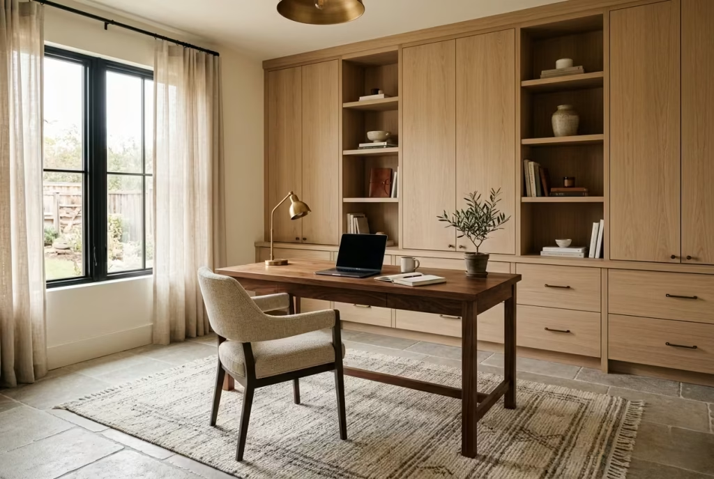
A modern farmhouse office can look effortless when it is well judged, yet the design can unravel quickly when style gets ahead of function. The most successful rooms are usually the ones that know what to leave out. They rely on balance, proportion, and restraint rather than piling on every rustic cue in sight. When that balance slips, the office can start to feel oddly staged, impractical, or just plain difficult to use day after day.
Overusing Rustic Elements
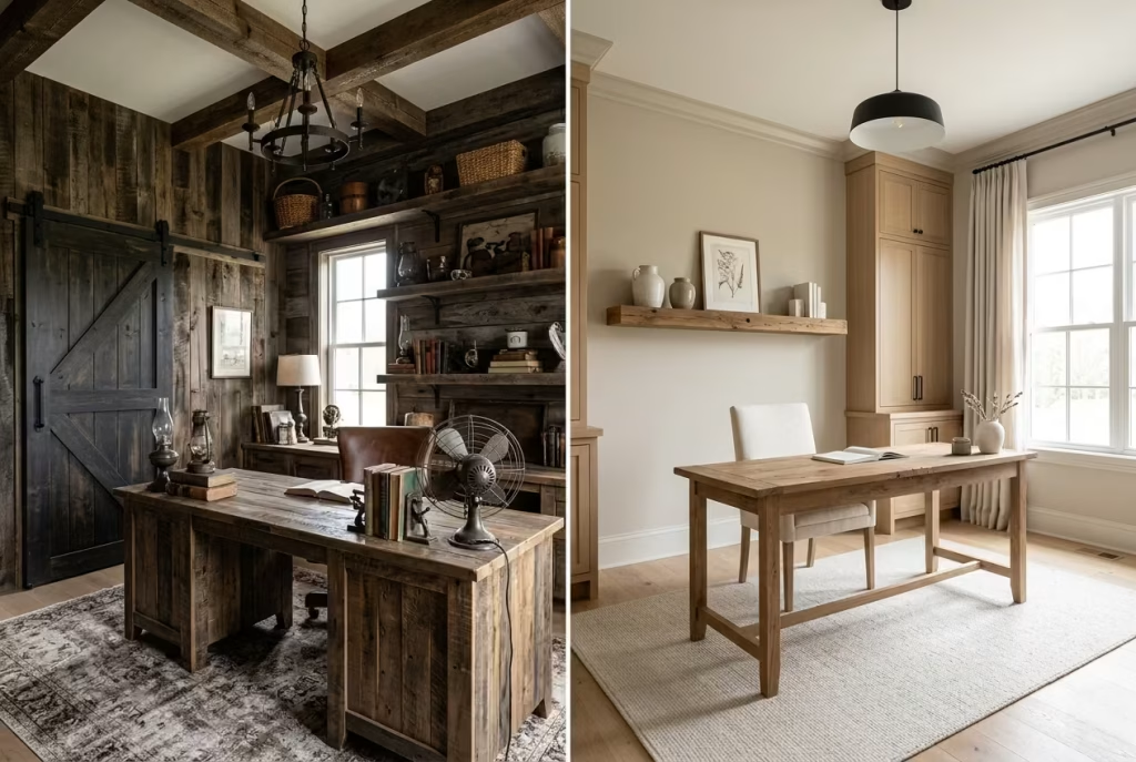
One of the quickest ways to blunt the appeal of a farmhouse office is to lean too heavily into rustic detail. Reclaimed wood, barn-style hardware, distressed finishes, and vintage accents all have their place, but when they are used in excess the room can begin to feel like a theme rather than a lived-in interior. A little goes a long way. One strong timber element, properly placed, often carries more weight than several competing rustic gestures fighting for attention.
A better approach is to let rustic materials appear in measured doses. Pair weathered texture with cleaner cabinetry, simpler upholstery, or sharper lighting so the room keeps its footing. The contrast is where the interest lives.
Ignoring Technology Integration
A home office is not a decorative vignette. It has to hold cables, chargers, screens, printers, routers, and all the practical clutter that comes with modern work. When technology is left as an afterthought, the room very quickly looks untidy, no matter how good the finishes may be.
Plan for power points, cable routes, and device storage early. Built-in charging drawers, hidden cable channels, and discreet ventilation for equipment can save a great deal of frustration later. If a desk looks lovely but has nowhere sensible for wires to disappear, it is already half a failure.
Poor Lighting Placement
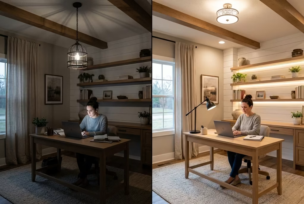
Lighting is another area where beautiful rooms often fall short. A single pendant or ceiling fitting may seem sufficient, but in practice it often leaves the desk too dark or creates glare on screens. A farmhouse office needs light in layers. General illumination, direct task lighting, and softer accent lighting each have a role to play.
Placement matters just as much as fixture choice. A lamp positioned badly can cast shadows across paperwork. A pendant hung too low can feel intrusive. Good lighting should make the room easier to use without drawing constant attention to itself.
Oversized Furniture in Small Rooms
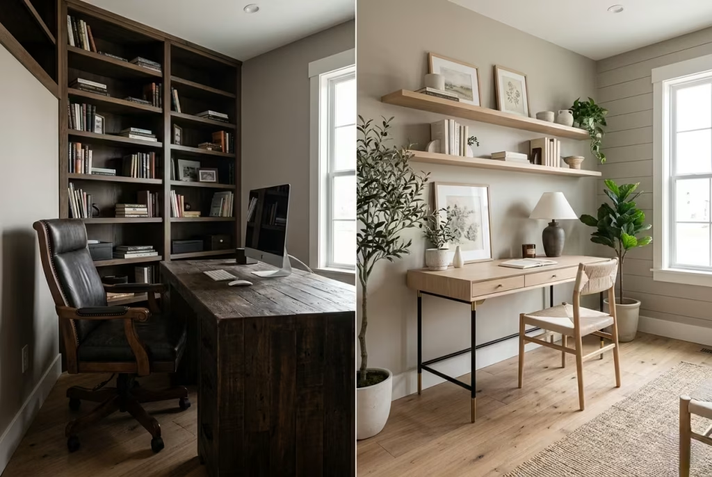
This is a classic mistake. A desk that is too deep, a chair that is too bulky, or shelving that stretches beyond the scale of the room can make a compact office feel boxed in before the day has even begun. Small rooms need furniture with a lighter visual touch, not pieces that dominate every surface.
In tighter spaces, slimmer profiles, wall-mounted storage, and furniture with exposed legs usually work better. They allow the floor to remain visible, which helps the room breathe. It is a small adjustment with a surprisingly large effect.
Lack of Storage Planning
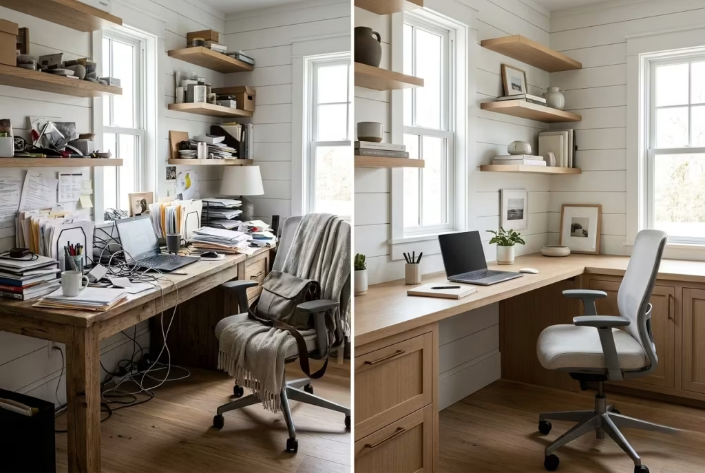
A beautiful office with nowhere to put things will not stay beautiful for long. Paperwork migrates across the desk. Files end up in piles. Chargers, notebooks, and stationery start colonising every available surface. Before long, the room is doing far more visual shouting than it should.
Storage should be part of the design from the start. Open shelves can hold books and a few display pieces, but closed storage is what keeps the everyday mess under control. A good farmhouse office usually needs both. If storage is not designed in early, it tends to appear later in awkward, piecemeal forms that never quite feel right.
Excessive Decorative Styling
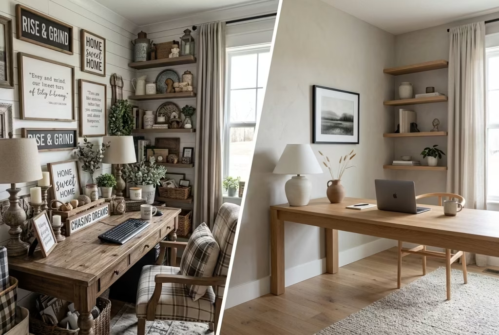
Styling can easily tip from polished to overdone. Too many signs, baskets, framed quotes, and decorative props can weigh the room down and make it feel performative. A farmhouse office should feel collected, not crowded.
The better route is to edit carefully. A few meaningful objects, some well-chosen textures, and one or two standout pieces are usually enough. When every surface is dressed up, none of it feels special. As the saying goes, less is more, and in this case it is not just a slogan, it is sound advice.
Practical Designer Note
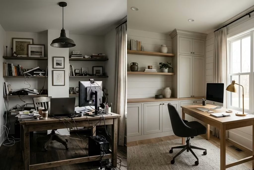
The strongest modern farmhouse offices are rarely the ones with the most features. They are the ones where the practical decisions were handled with care before the styling began. Once the lighting, storage, scale, and technology have been properly resolved, the room can relax into its farmhouse character without losing its sense of order. That is where the real design work pays off.
Quick Designer Checklist Before Finalising Your Office
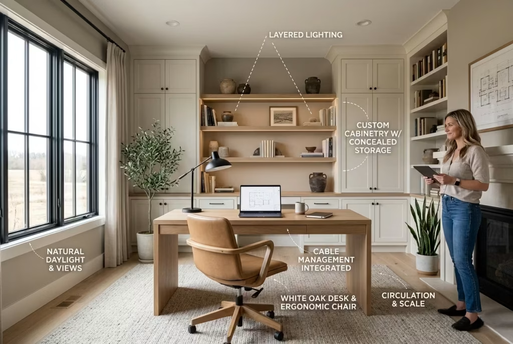
Before signing off on a modern farmhouse office design, it is worth taking one final walk through the space. The most successful offices are rarely defined by a single feature. Instead, they are the result of dozens of small decisions working together to create a room that feels comfortable, functional, and visually balanced.
Final Design Checklist
- Desk positioned to benefit from natural daylight without causing screen glare
- Ambient, task, and accent lighting all included
- Closed storage incorporated for paperwork and office essentials
- Ergonomic chair selected for long-term daily use
- Natural textures layered through wood, fabric, and flooring
- Cables, chargers, and technology concealed where possible
- Colour palette kept cohesive and limited to a few complementary tones
- Furniture scaled appropriately to room dimensions
- Acoustics considered through rugs, curtains, or upholstered elements
- Personal touches added through artwork, books, or meaningful objects
- Walkways maintained at a minimum of 90cm (36 inches) where possible
- Storage solutions planned for future needs, not just current requirements
- Window treatments selected for both privacy and light control
- Materials chosen with durability and maintenance in mind
- Overall styling edited carefully to avoid visual clutter
Designer’s Note
If every box on this checklist is ticked, the office is far more likely to remain functional, comfortable, and visually appealing long after the initial excitement of the renovation has passed.
Final thoughts: The Most Successful Farmhouse Offices Feel Effortless
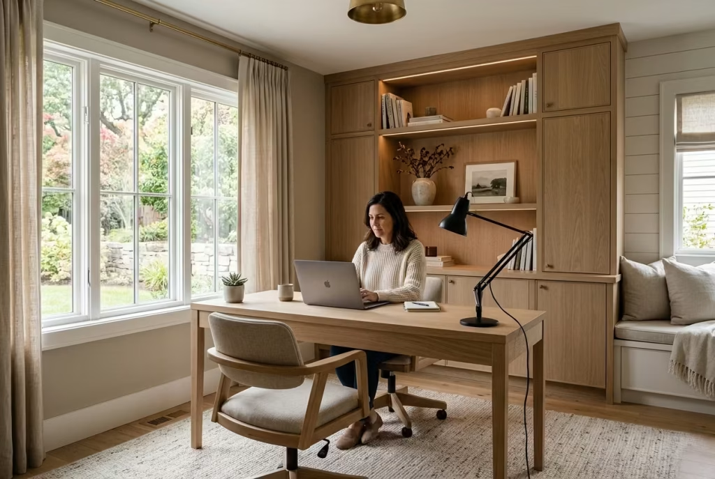
The enduring appeal of a modern farmhouse office has never been about a single design feature. It is not the shiplap wall, the reclaimed timber beam, or the vintage-inspired lighting fixture that makes the space successful. Those elements can certainly add character, but they are only part of a much larger picture.
What truly separates a well-designed farmhouse office from a merely attractive one is how naturally it supports everyday life. The most rewarding spaces balance comfort with practicality, allowing work, creativity, and focus to coexist without the room feeling overly formal or overly relaxed. They understand that good design is rarely about adding more. More often, it is about making better decisions.
Throughout this article, one principle appears time and again. Materials matter, but so do proportions. Storage matters, but so does atmosphere. Natural light, furniture scale, acoustics, lighting layers, and circulation all play equally important roles in shaping how a room performs from morning through evening.
From my own experience designing residential workspaces, the offices that continue to feel successful years later are not necessarily the largest or most expensive. They are the ones where every element has a purpose. A desk positioned to capture daylight. Cabinetry that keeps clutter out of sight. Materials that age gracefully rather than date quickly. These seemingly small decisions add up, creating rooms that feel easy to use and enjoyable to spend time in.
When warmth is balanced with discipline, character is paired with restraint, and functionality sits at the heart of every choice, a farmhouse office becomes far more than a workspace. It becomes a room people genuinely want to inhabit, day after day, long after trends have come and gone. In many homes, it quietly becomes one of the most valuable spaces of all.
Frequently Asked Questions
What colours work best in a modern farmhouse home office?
The most successful modern farmhouse offices typically rely on warm neutrals rather than stark contrasts. Soft whites, warm greige, taupe, sage green, muted clay, and gentle beige tones create a backdrop that feels relaxed and timeless. These colours work particularly well alongside natural materials such as oak, limestone, linen, and wool. If you want additional depth, introduce darker accents through lighting, hardware, or furniture rather than overwhelming the room with strong wall colours.
How large should a home office desk be?
For comfortable daily use, a desk should generally be between 150 and 210cm (60 to 84 inches) wide and at least 75cm (30 inches) deep. Smaller rooms can accommodate desks around 120cm (48 inches) wide, provided storage is planned elsewhere. If multiple monitors, paperwork, or creative projects are part of your routine, investing in a larger work surface often pays dividends over time.
Is modern farmhouse still in style?
Yes, but it has evolved considerably. Today’s modern farmhouse interiors focus less on decorative rustic elements and more on natural materials, clean architectural lines, and functional design. The strongest examples feel refined and contemporary rather than overtly themed. This shift is one reason the style continues to remain relevant while many trend-led interiors quickly date.
What flooring works best for a farmhouse office?
Several flooring materials work well depending on the home’s architecture and budget:
- White oak flooring for warmth and durability
- Limestone for a timeless, architectural feel
- Engineered oak for stability and practicality
- Wool rugs layered over timber floors for added comfort
- Travertine in larger, more luxurious spaces
The best choice balances aesthetics, maintenance requirements, and long-term comfort.
How do you make a farmhouse office look more luxurious?
Luxury often comes from material quality and proportion rather than decoration. Consider:
- Custom built-in cabinetry
- Natural stone surfaces
- White oak or walnut furniture
- Tailored linen window treatments
- Layered lighting schemes
- High-quality rugs and upholstery
- Architectural details such as arches or panelled walls
A well-edited room usually feels more luxurious than one filled with decorative accessories.
What lighting is best for a home office workspace?
A layered lighting scheme provides the best results. This typically includes:
- Ambient lighting for overall illumination
- Task lighting for desk work
- Accent lighting for shelving and architectural features
For productivity and comfort, task lighting between 3000K and 3500K generally offers an ideal balance between warmth and clarity. Relying solely on a ceiling fixture often leaves important work areas underlit.
How can I create a farmhouse office in a small room?
Small farmhouse offices benefit from efficient planning rather than additional decoration. Focus on:
- Built-in or wall-mounted desks
- Vertical storage solutions
- Furniture scaled to the room
- Light, cohesive colour palettes
- Multi-functional cabinetry
- Minimal visual clutter
Even a room measuring 2.4m x 2.7m (8ft x 9ft) can become a highly effective workspace when every element serves a clear purpose.
What materials are most durable for a farmhouse office?
For long-term performance, few materials outperform:
- White oak for cabinetry and shelving
- Walnut for desks and statement furniture
- Limestone for flooring
- Wool for rugs
- Solid brass hardware
- High-quality linen for window treatments
These materials not only withstand daily use but also tend to develop character as they age, making them particularly well suited to modern farmhouse interiors designed for longevity.