25 Stylish Neutral Kitchen Ideas That Add a Unique Designer Touch
For years, bold kitchen trends have arrived with great fanfare, only to fade as quickly as they appeared. Neutral kitchens, meanwhile, have quietly held their ground. Their enduring appeal has little to do with playing it safe and everything to do with their remarkable ability to evolve alongside the homes and families they serve.
Yet one misconception continues to follow neutral design: the belief that neutral automatically means plain. In reality, the most memorable kitchens I have encountered during residential renovation projects are often built around restrained palettes. What sets them apart is not colour but composition. Layers of natural stone, richly grained timber, textured plaster, warm metals, and carefully balanced proportions work together to create spaces that feel sophisticated, inviting, and deeply personal.
A truly successful neutral kitchen is never defined by a single shade of white, beige, or greige. Instead, it relies on depth created through materiality, light, and craftsmanship. Morning sunlight grazing a limestone backsplash, the subtle texture of fluted oak cabinetry, or the gentle contrast between creamy walls and taupe joinery can transform an otherwise simple palette into something far more compelling. As the saying goes, the devil is in the details, and nowhere is that more evident than in a thoughtfully designed neutral kitchen.
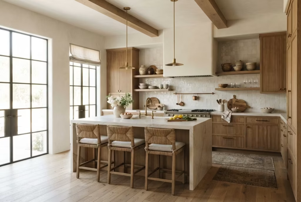
In this collection, you will discover 25 stylish neutral kitchen ideas that demonstrate how understated design can still make a lasting impression. From statement stone islands and architectural lighting to layered textures and bespoke finishes, these ideas reveal how designers create kitchens that feel timeless, distinctive, and effortlessly refined without relying on fleeting trends.
Why Neutral Kitchens Remain a Designer Favorite
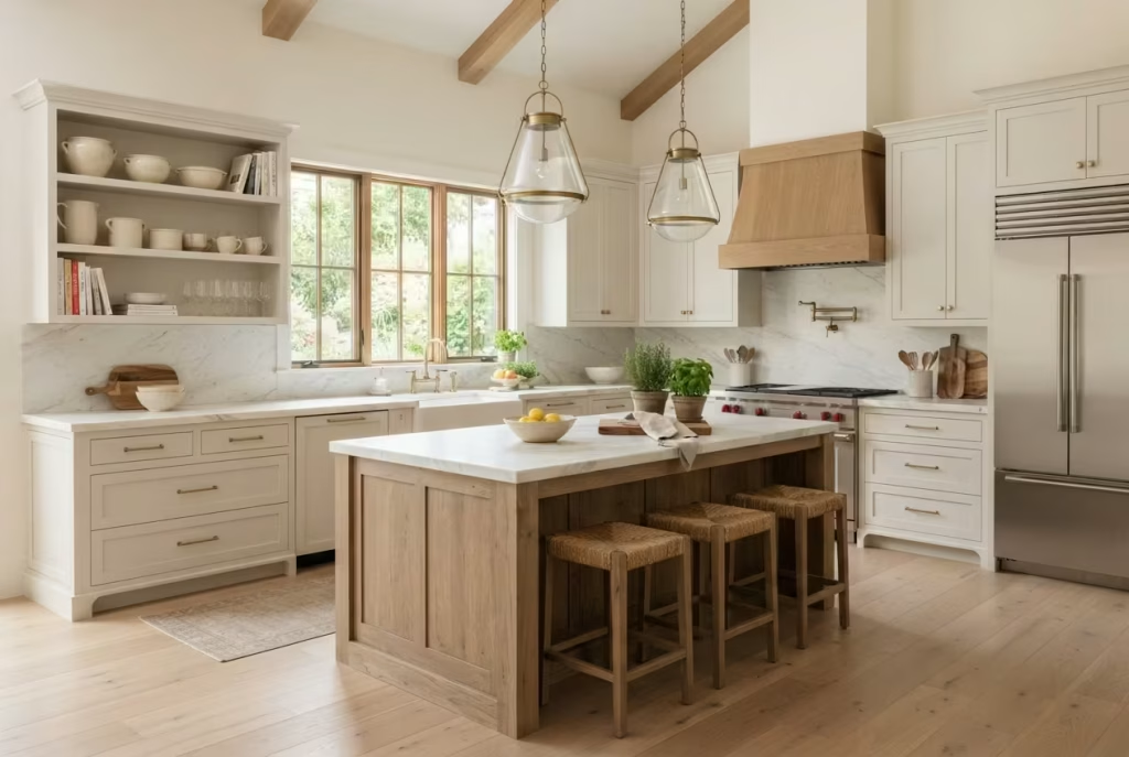
Walk into enough beautifully designed homes and a pattern begins to emerge. While colour trends come and go, neutral kitchens continue to hold their place at the heart of exceptional residential design. Their popularity is not the result of playing it safe. Rather, it stems from an ability to balance practicality, beauty, and longevity in a way few other design approaches can achieve.
In my experience working on kitchen renovations, the spaces homeowners appreciate most five or ten years after completion are rarely the ones built around the trend of the moment. More often, they are kitchens grounded in carefully selected neutral tones, natural materials, and thoughtful architectural details. These rooms age gracefully, adapting to changing tastes and lifestyles without feeling outdated.
Longevity Matters More Than Trends
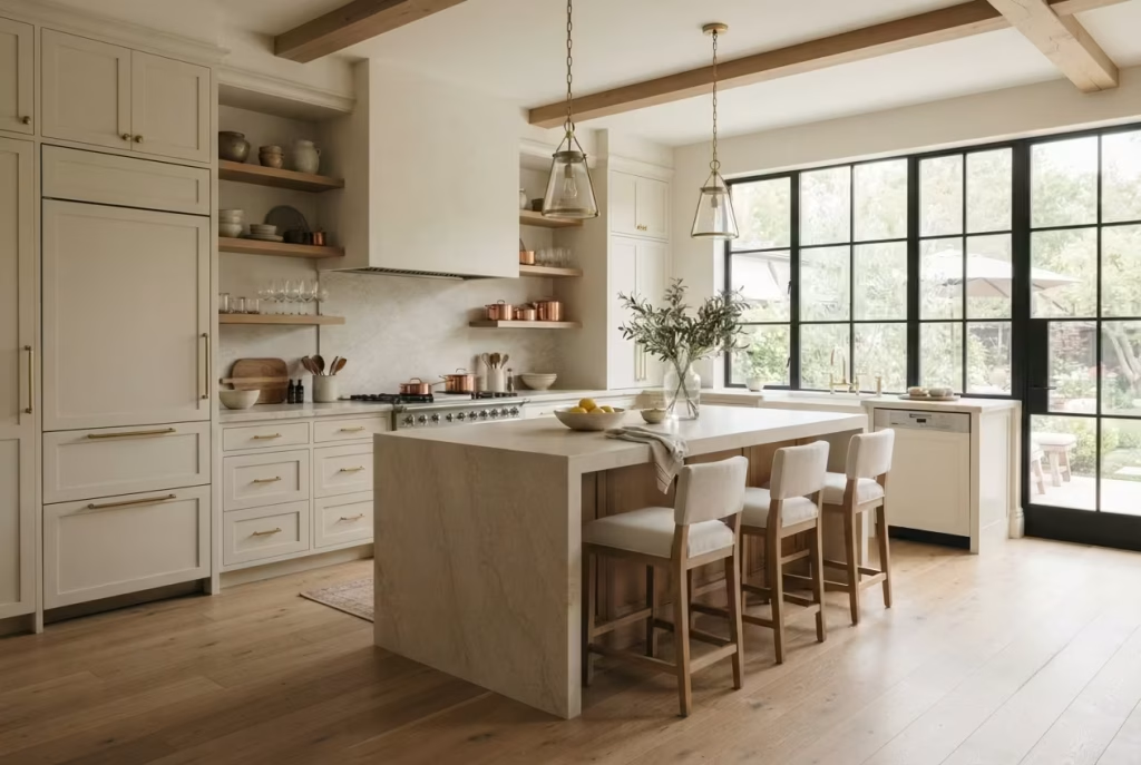
Design trends often arrive with a burst of excitement. Deep green cabinetry, dramatic colour blocking, or highly specific finishes can feel fresh and exciting today. Yet what looks fashionable now may feel tired a few years down the road.
Neutral kitchens occupy a different lane altogether. They provide a timeless foundation that can evolve naturally through changing décor, furniture, lighting, and accessories. Like a well-tailored suit that never falls out of favour, a thoughtfully designed neutral kitchen remains relevant regardless of shifting design movements.
This does not mean neutral spaces lack personality. Quite the opposite. Their strength lies in creating a backdrop that allows craftsmanship, architecture, and material quality to take centre stage.
Creating a Sense of Calm in Everyday Life
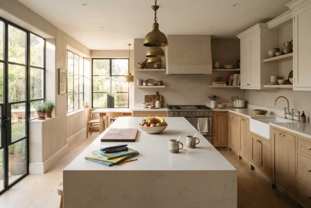
Modern kitchens work harder than ever before. They are no longer simply places to prepare meals. They function as family gathering spaces, homework stations, home offices, entertaining hubs, and social centres.
With so much activity concentrated in one area, visual calm becomes increasingly valuable. Neutral palettes help reduce visual noise, creating an atmosphere that feels composed rather than chaotic. Soft whites, warm taupes, muted mushroom tones, and natural timber finishes have a grounding effect, helping busy households feel more organised even during the rush of everyday life.
In one recent family renovation project, we replaced a collection of competing colours with layered warm neutrals and oak cabinetry. The footprint of the room remained unchanged, yet the kitchen immediately felt larger, brighter, and considerably more relaxing. Sometimes the greatest transformation comes not from adding more but from removing unnecessary distractions.
Natural Light Becomes the Star of the Show
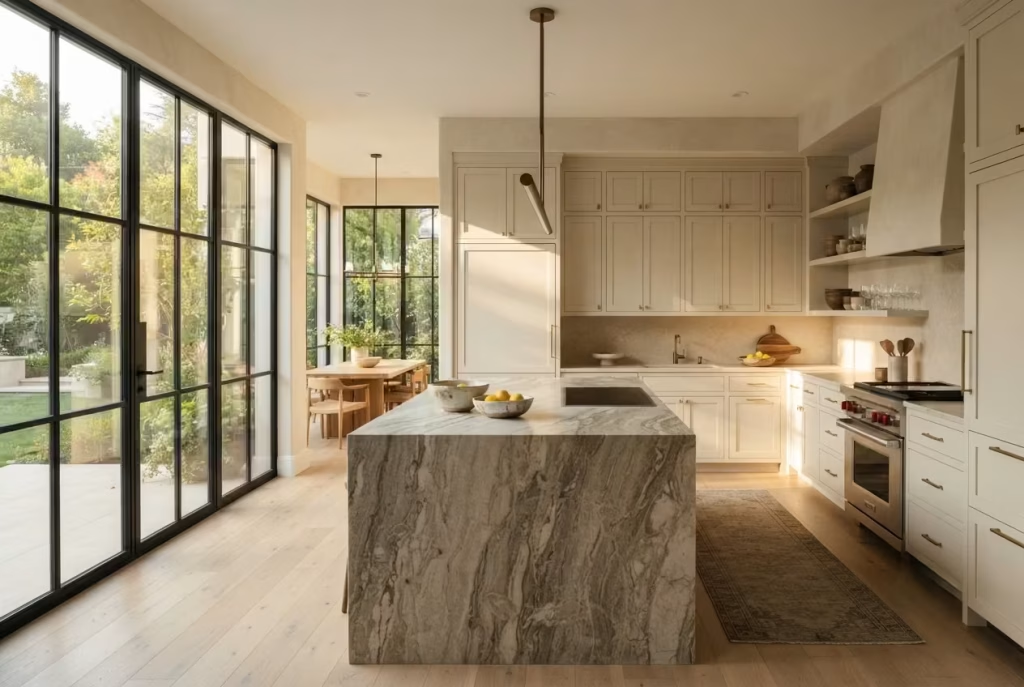
One of the most overlooked advantages of neutral kitchens is how beautifully they respond to changing light conditions throughout the day.
Bold colours often dominate a room regardless of lighting conditions. Neutral surfaces behave differently. They reflect, soften, and amplify natural light, creating subtle shifts in mood from morning until evening.
A limestone-inspired backsplash may appear crisp and bright in early sunlight, then reveal warmer undertones as afternoon light filters through the windows. Painted cabinetry that feels creamy during the day can take on a cocooning warmth after sunset.
This constant interaction between light and material creates a richness that photographs rarely capture. It is one reason why many luxury kitchens feel so inviting in person. Their beauty unfolds gradually, revealing new layers as conditions change.
A Wise Investment for Future Resale
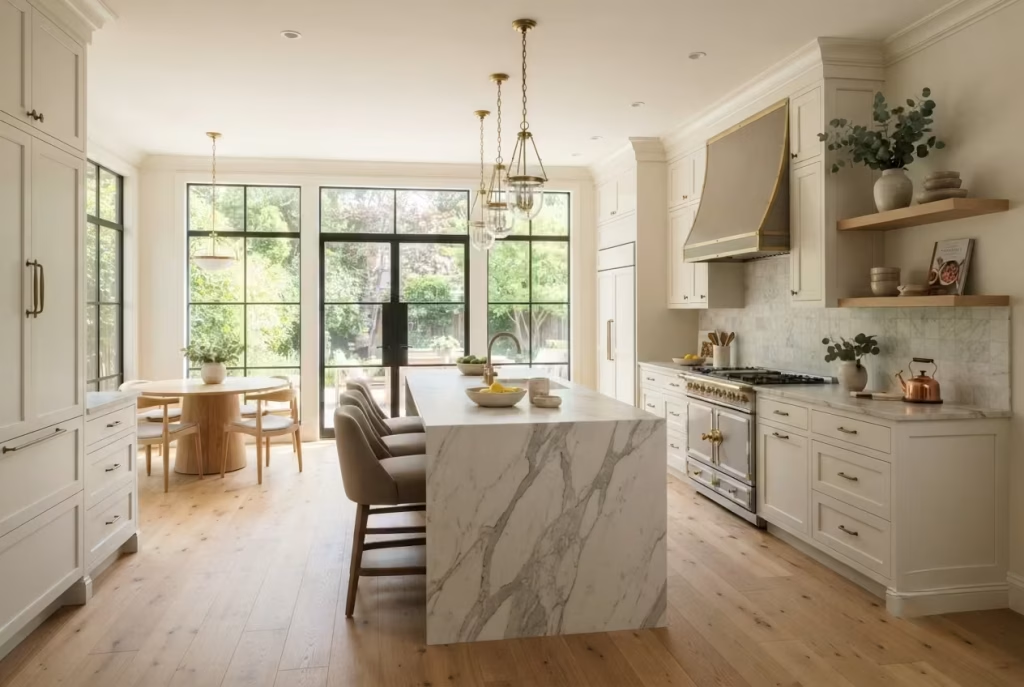
While every homeowner should design for their own lifestyle first, resale considerations inevitably enter the conversation during major renovations.
Neutral kitchens consistently appeal to a wider range of buyers because they offer flexibility. Prospective homeowners can easily imagine their own furnishings, artwork, and personal style within the space.
This broad appeal often helps properties maintain stronger marketability when the time comes to sell.
That does not mean creating a bland environment designed solely for future buyers. Rather, it involves selecting materials and finishes that possess enduring appeal. Natural stone, timber cabinetry, quality hardware, and carefully balanced neutral palettes tend to remain desirable long after trend-driven alternatives have faded from fashion.
Materials Create Interest Where Colour Steps Back
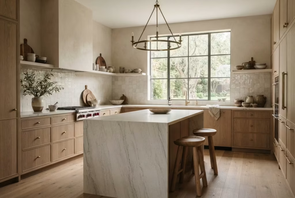
A common misconception is that neutral kitchens depend entirely on paint colours. Experienced designers understand the opposite is true. When colour takes a quieter role, materials become the primary storytellers.
The smooth surface of honed quartzite, the tactile quality of handmade zellige tiles, the subtle grain of rift-cut oak, and the aged character of antique brass all contribute layers of visual richness. Each element adds depth, allowing the room to feel collected and sophisticated rather than flat or predictable.
As the old saying goes, still waters run deep. The same principle applies to exceptional neutral kitchens. Their beauty often reveals itself gradually through texture, craftsmanship, and detail rather than immediate visual drama.
What Real Renovation Projects Have Taught Me
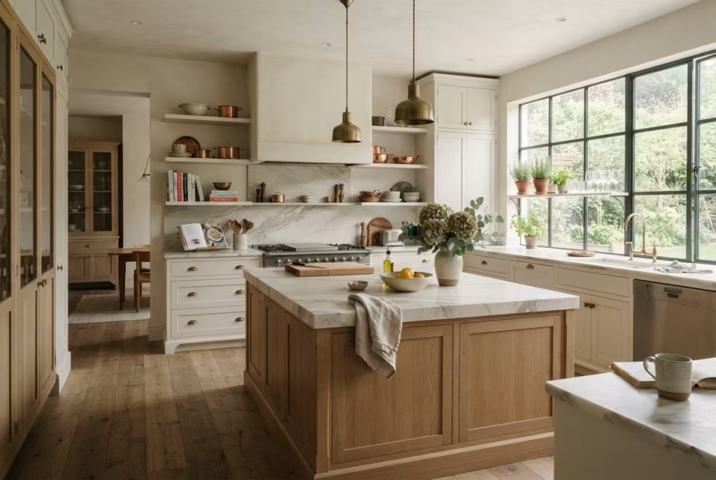
After years of working on residential projects, one lesson appears again and again: homeowners rarely regret investing in timeless materials, but they often regret chasing trends that quickly lose their appeal.
I have seen neutral kitchens completed a decade ago that still feel fresh and relevant today because their design was built around proportion, quality, and material integrity rather than fashionable colours. Meanwhile, kitchens designed around highly specific trends often require updates much sooner than expected.
The most successful projects share a common thread. They embrace restraint without sacrificing character. They use natural light thoughtfully, combine textures with intention, and create balance through careful layering. Piece by piece, detail by detail, these kitchens become spaces that not only look beautiful but continue serving their owners exceptionally well for years to come.
That enduring quality is precisely why neutral kitchens remain a designer favourite. They prove that timeless design is not about doing less. It is about choosing every element with greater purpose.
Layer Warm Whites with Natural Oak Cabinetry
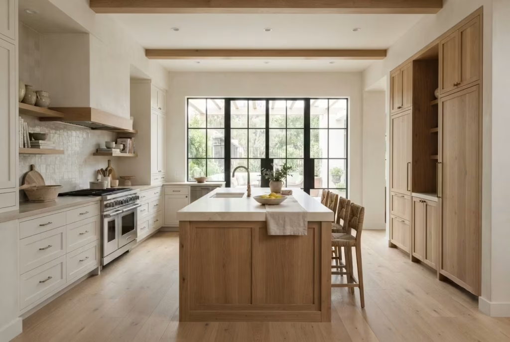
Among the countless kitchen combinations available today, few pairings have demonstrated the staying power of warm white surfaces and natural oak cabinetry. It is a partnership that feels effortless on the surface, yet when executed thoughtfully, it creates a level of depth and sophistication that many bolder designs struggle to achieve.
At first glance, the palette may appear simple. Look closer, however, and the subtle interplay between timber grain, changing daylight, and softly layered neutrals begins to reveal itself. This is where exceptional kitchen design often separates itself from ordinary renovations. Rather than relying on dramatic contrasts to create visual interest, it uses carefully balanced materials that quietly work together, producing a space that feels welcoming, refined, and remarkably timeless.
Creating Depth Without Relying on Strong Contrast
Many homeowners assume depth comes from pairing light cabinetry with dark countertops or introducing dramatic colour differences. In reality, some of the most luxurious kitchens achieve richness through subtle tonal variation.
Warm white cabinetry provides a clean foundation while natural oak introduces texture, movement, and organic warmth. Because the two materials sit relatively close on the visual spectrum, the eye experiences the room as cohesive rather than fragmented.
Think of it as a well-composed piece of music where every note supports the next. Nothing shouts for attention, yet the overall composition feels complete.
In practical terms, this approach can make kitchens appear larger and more harmonious. The absence of harsh visual interruptions allows the eye to move naturally throughout the room, creating an atmosphere that feels both calm and considered.
This becomes particularly valuable in homes where the kitchen serves as the social heart of everyday life.
Choosing the Right Oak Tone Makes All the Difference
Not all oak delivers the same effect. One of the most common mistakes I encounter during renovation consultations is selecting an oak finish that clashes with surrounding materials. Some oak varieties lean heavily yellow, while others reveal grey, beige, honey, or even slightly pink undertones.
For contemporary neutral kitchens, I often favour lighter European oak finishes with soft beige undertones. These tones feel fresh without appearing stark and complement warm whites exceptionally well.
Medium-toned oak can also work beautifully, especially in larger kitchens where additional warmth is needed. The goal is to create a relationship between the timber and surrounding finishes rather than forcing them to compete for attention.
As a general guideline:
- Pale oak creates an airy, Scandinavian-inspired atmosphere.
- Mid-tone oak introduces warmth and visual grounding.
- Smoked oak adds greater richness while maintaining a neutral character.
The most successful selections often echo undertones already present within flooring, stone surfaces, or wall finishes, creating a layered palette that feels naturally connected.
Understanding Grain Direction and Visual Rhythm
One detail frequently overlooked by homeowners is grain direction. Yet this seemingly minor decision can significantly influence how a kitchen feels and functions visually.
Vertical grain patterns tend to draw the eye upward, subtly enhancing ceiling height and reinforcing a sense of architectural elegance. Horizontal grain orientations encourage the eye to travel across the room, emphasising width and creating a more relaxed, contemporary appearance.
In several recent projects, I specified rift-cut oak with consistent vertical grain patterns across tall pantry units. The result was surprisingly impactful. What could have been a simple wall of storage instead became an architectural feature that added structure and rhythm to the entire room.
Like stepping stones leading through a garden path, repeating grain patterns help guide movement through a space while introducing visual order. This level of detail may not immediately register with visitors, yet it contributes to the overall sense of harmony that people instinctively respond to.
Why This Combination Excels in Open-Plan Living Spaces
Open-plan homes present unique design challenges. Because kitchens remain visible from living and dining areas, they must work harder to feel integrated with the wider interior rather than functioning as isolated work zones.
Warm whites and oak perform exceptionally well in these environments because they bridge the gap between kitchen functionality and residential comfort. The timber introduces a furniture-like quality that helps cabinetry feel more connected to surrounding living spaces. Meanwhile, warm white finishes maintain brightness without dominating the overall design.
In larger open-plan layouts, I often use oak strategically on islands, shelving, or tall cabinetry while reserving warm whites for perimeter units. This balance creates focal points without overwhelming the room.
The effect is subtle but powerful. Instead of feeling like a collection of separate zones, the entire space begins to feel cohesive and thoughtfully composed.
Lessons from Real Renovation Projects
One project that remains particularly memorable involved a newly extended family home where the owners initially wanted dark cabinetry throughout the kitchen.
While the concept looked striking in showroom displays, the reality of their north-facing space told a different story. Natural light was limited for much of the day, and darker finishes risked making the room feel heavy.
After reviewing samples within the actual space, we shifted toward warm white cabinetry paired with natural European oak on the island and tall storage units. The transformation was immediate.
Light bounced more effectively throughout the room, the oak introduced warmth where it was needed most, and the overall atmosphere became far more inviting. Several months after completion, the homeowners shared that guests consistently commented on how comfortable and welcoming the kitchen felt, despite being unable to pinpoint exactly why.
That response highlights an important truth about great design. The most successful interiors are often greater than the sum of their individual parts. Every material, finish, and detail works quietly behind the scenes, creating an experience that feels effortless.
Warm whites layered with natural oak achieve precisely that balance. They bring together comfort, sophistication, and longevity in a way that few kitchen combinations can match, proving that sometimes the most understated choices leave the strongest impression.
Introduce Limestone-Inspired Surfaces for Quiet Luxury
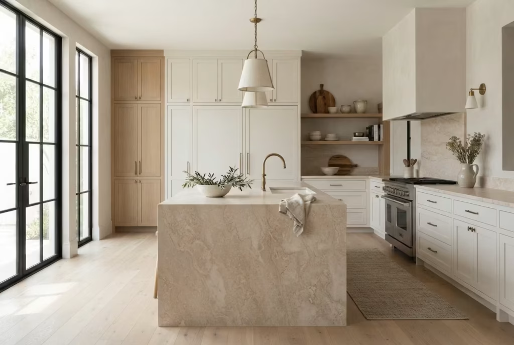
Some kitchens capture attention the moment you walk into the room. Others reveal their beauty slowly, layer by layer, encouraging you to linger a little longer each time. Limestone-inspired surfaces belong firmly in the second category. They do not rely on bold veining, dramatic colour shifts, or eye-catching patterns to make an impression. Instead, they create a sense of understated elegance that feels calm, grounded, and remarkably sophisticated.
In many of the most successful kitchen projects I have worked on, limestone or limestone-inspired finishes have acted as the thread that quietly ties the entire design together. Whether used on countertops, backsplashes, waterfall islands, or feature walls, these surfaces introduce texture and visual softness that many manufactured finishes struggle to replicate.
As the saying goes, still waters run deep. Limestone-inspired materials embody that philosophy perfectly. Their beauty often lies not in what they shout, but in what they whisper.
Understanding the Difference Between Natural Limestone and Limestone-Look Materials
Before selecting a surface, it is important to understand the distinction between genuine limestone and the growing range of limestone-inspired alternatives available today.
Natural limestone has been used in architecture for centuries, valued for its subtle movement, earthy character, and timeless appeal. Every slab possesses unique mineral markings, tonal variations, and textural qualities that contribute to its authenticity. However, natural limestone is not always the right choice for every household.
Because it is a relatively soft and porous stone, it can be vulnerable to staining and etching, particularly in kitchens where acidic foods, oils, and daily use place significant demands on work surfaces. This is where modern alternatives have transformed the market.
Porcelain slabs, engineered quartz, sintered stone, and high-performance composite materials now replicate the appearance of limestone with remarkable accuracy. Many homeowners are surprised to discover that today’s premium limestone-look products capture the gentle movement and organic depth of natural stone while offering greater durability. The choice often comes down to lifestyle.
Homeowners who appreciate authentic ageing and natural patina may gravitate toward genuine limestone. Families seeking easier upkeep frequently find that high-quality limestone-inspired surfaces deliver the best of both worlds.
Why Soft Movement Creates a More Relaxed and Timeless Kitchen
One reason limestone-inspired finishes remain so popular among designers is their ability to introduce visual interest without overwhelming a space.
Many contemporary stones feature dramatic veining that immediately commands attention. While striking, these materials can sometimes dominate a room and limit future design flexibility. Limestone-inspired surfaces take a gentler approach.
Subtle mineral variations, faint cloud-like patterns, and delicate tonal shifts create movement that feels natural rather than forced. The eye continues to discover new details over time, much like watching sunlight move across a textured wall throughout the day. This restrained character often contributes to a more relaxing environment.
In busy family kitchens where appliances, seating areas, and daily activities already compete for attention, softer stone patterns help maintain visual balance. They create interest while allowing other elements within the room to breathe. The result is a kitchen that feels composed rather than crowded.
Pairing Limestone-Inspired Surfaces with Neutral Cabinetry
Few material combinations feel as effortlessly refined as limestone-inspired stone paired with neutral cabinetry. The secret lies in their shared connection to nature.
Warm whites, mushroom tones, soft greiges, muted taupes, and natural timber finishes all complement limestone’s earthy character. Together they create a layered palette that feels cohesive without appearing overly coordinated.
In many luxury kitchens, I often pair limestone-inspired worktops with:
- Warm white shaker cabinetry for a timeless and welcoming atmosphere.
- Light oak cabinetry for a contemporary organic aesthetic.
- Greige painted units for subtle tonal depth.
- Mushroom-toned cabinetry for a sophisticated European influence.
- Natural walnut accents to introduce richness and contrast.
What makes these combinations so successful is the absence of visual tension. Each element supports the others rather than competing for attention. Like pieces of a carefully assembled puzzle, every material contributes to the overall composition.
This approach becomes especially effective in open-plan homes where kitchens need to connect seamlessly with surrounding living spaces. Limestone-inspired finishes provide a versatile foundation that transitions naturally between functional and social areas.
The Role of Light in Enhancing Limestone-Inspired Finishes
One characteristic that photographs rarely capture is how beautifully limestone-inspired surfaces respond to changing light conditions.
Morning sunlight often highlights subtle mineral textures that remain hidden during other parts of the day. Afternoon light can reveal warmer undertones, while evening illumination creates a softer, more intimate atmosphere.
I frequently encourage clients to view stone samples in multiple lighting conditions before making a final decision. A surface that appears cool and understated in a showroom may reveal entirely different qualities when exposed to natural daylight within the home.
This interaction between material and light creates a sense of depth that helps kitchens feel more dynamic and engaging over time. Rather than looking exactly the same every hour of the day, the room develops a quiet rhythm that evolves naturally with its surroundings.
Maintenance Considerations Worth Understanding
Every beautiful material comes with practical realities, and limestone-inspired surfaces are no exception. If selecting genuine limestone, homeowners should understand that regular sealing is usually required to protect against staining and moisture absorption. Over time, minor etching and surface marks may develop, particularly in heavily used kitchens.
For some homeowners, this ageing process becomes part of the stone’s charm. The surface tells a story, gathering character through years of daily use. Others prefer a finish that remains more consistent.
Porcelain and sintered stone alternatives typically require minimal maintenance, resist staining, and perform exceptionally well in busy households. Engineered quartz also offers strong durability, though heat resistance varies by product.
When advising clients, I often suggest evaluating not only how a surface looks on installation day but also how it will perform five or ten years later.
A kitchen should support everyday life, not create unnecessary maintenance burdens. The most successful choices balance beauty with practicality, ensuring the space remains enjoyable long after the renovation is complete.
Why Limestone-Inspired Surfaces Continue to Define Quiet Luxury
Luxury kitchen design has gradually shifted away from excess and toward authenticity. Homeowners increasingly seek spaces that feel welcoming, tactile, and enduring rather than overtly extravagant.
Limestone-inspired surfaces align perfectly with this evolution. Their appeal lies in their ability to introduce richness without visual noise, texture without clutter, and elegance without ostentation. They create kitchens that feel calm yet layered, sophisticated yet approachable.
Time and again, I have found that these are the interiors people remember most. Not because they demand attention, but because they create an atmosphere that feels effortlessly right. Long after dramatic trends have faded into the background, limestone-inspired surfaces continue to prove that true luxury often speaks in a quieter voice.
Here is a fuller version of that section, written to feel more layered and engaging:
You May also Like: 25 White Kitchen Designs That Blend Style and Function
Create Contrast with Taupe and Off-White Layers
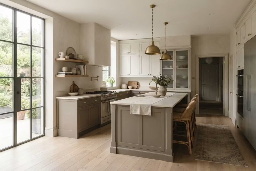
Taupe and off-white may sound restrained on paper, but in a kitchen they can create a composition with far more presence than many louder colour schemes ever manage. The pairing has a way of feeling polished without being precious, soft without slipping into sameness, and warm without turning muddy. Done well, it gives a kitchen that lived-in elegance people respond to almost instinctively.
The key is tonal contrast, not sharp opposition. Taupe sits in that sweet spot between grey and brown, which gives it enough complexity to carry depth while still remaining easy on the eye. Off-white, meanwhile, brings lift and clarity. Together, they create a layered effect that feels considered from top to bottom, much like a well-built outfit where every piece has a reason for being there.
Understanding tonal contrast
A strong neutral kitchen does not depend on black-and-white drama. In fact, many of the most inviting interiors are built on subtler shifts in tone. Taupe and off-white work because they let the eye travel gently across the room while still defining different zones.
Off-white cabinetry can keep the upper portion of the kitchen feeling open and light, especially in rooms where ceiling height is modest or daylight is limited. Taupe can then anchor the lower units, island, or built-in storage, bringing visual weight where it is needed most. This balance helps the room feel steady rather than top-heavy, which is a detail that often separates an average scheme from one that feels genuinely composed.
In practical terms, tonal contrast also helps avoid the dreaded flatness that can creep into all-neutral kitchens. Without variation, a space can begin to feel one-note, almost like a song stuck on repeat. By introducing a deeper tone beneath a lighter one, the kitchen gains rhythm, dimension, and a more graceful sense of movement.
Where taupe works best
Taupe is one of those colours that earns its keep in different ways depending on where it is used. On base cabinetry, it can add a grounded, tailored feel that makes the kitchen seem more substantial. On a central island, it creates a quiet focal point without stealing the show. On pantry joinery or tall units, it can introduce a furniture-like presence that feels bespoke and thoughtfully resolved.
It is especially effective in kitchens that receive strong natural light, where the colour shifts throughout the day. In morning light, taupe may read soft and sandy. By late afternoon, it can become deeper and more cocooning. That changing character gives the room a sense of life, which is often exactly what a neutral kitchen needs to feel memorable rather than merely safe.
Taupe also plays beautifully with natural materials. It sits comfortably beside limestone, oak, brushed brass, and textured plaster, making it an excellent choice for kitchens that aim to feel warm, layered, and quietly luxurious. In family homes, it can be a practical middle ground too, hiding everyday wear better than pale finishes while still keeping the room bright and elegant.
Avoiding flat colour schemes
One of the most common missteps in neutral kitchen design is assuming that two or three similar colours automatically create harmony. In reality, too many tones of the same intensity can flatten the room and drain it of character. The trick is to think in layers rather than in labels.
Off-white should not feel sterile. Taupe should not feel heavy. The materials around them need to do some of the work. A matt lacquered cabinet front will behave differently from a lightly grained timber veneer. A honed stone worktop will reflect light differently from a polished one. Even the texture of a splashback, grout line, or floor finish can alter how these colours read in the room.
This is where the design really starts to sing. A taupe island paired with off-white perimeter cabinetry can be lifted by a pale stone surface and then grounded by oak shelving or bronze hardware. Suddenly the scheme has texture, pace, and a sense of intention. Without those supporting layers, the same palette can feel uninspired, even if the colours themselves are attractive.
As the old saying goes, the whole is greater than the sum of its parts. That is especially true here. Tone alone will not carry the room. It is the relationship between finishes, proportions, and light that gives the kitchen its edge.
Creating visual hierarchy
A well-designed kitchen should guide the eye naturally. It should have a clear lead, a supporting cast, and enough breathing room that no single element feels forced. Taupe and off-white are particularly useful because they allow that hierarchy to emerge without shouting for attention.
If the room needs a stronger centre of gravity, taupe works well on the island or lower joinery, where it can visually anchor the scheme. If the goal is to make a smaller kitchen feel more expansive, off-white can dominate the uppers and surrounding walls, while taupe is used sparingly to define key moments. This creates structure without clutter, which is often what homeowners are really after when they say they want a kitchen to feel expensive.
I have seen this approach work especially well in kitchens that connect to dining or living areas. By keeping the larger surrounding surfaces lighter and using taupe to mark the working core, the kitchen feels integrated yet distinct. It gives the room a sense of order, almost as if every element has been placed with a steady hand and a clear eye.
Why this pairing feels so enduring
Taupe and off-white succeed because they offer flexibility without losing personality. They suit both traditional and contemporary spaces, and they can lean more refined, more rustic, or more modern depending on the materials used alongside them. That versatility makes them a smart choice for homeowners who want a kitchen that will age with dignity.
More than that, the combination brings a kind of everyday calm that people often underestimate until they live with it. It does not compete for attention. It settles into the background, allowing the architecture, the light, and the craftsmanship to do the talking. And in a world full of design noise, that kind of quiet confidence is worth its weight in gold.
Design a Statement Island Using Natural Stone
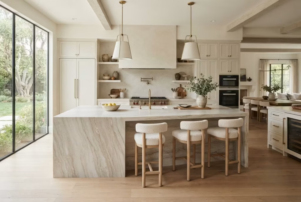
Few features influence a kitchen as profoundly as the island. It is where morning routines begin, where guests naturally gather during celebrations, where children spread out homework after school, and where everyday conversations unfold almost without invitation. In many modern homes, the island has evolved far beyond a functional work surface. It has become the centre of gravity for the entire room.
Because of this, the materials chosen for the island deserve careful consideration. Among all available options, natural stone remains one of the most effective ways to create a focal point that feels both timeless and distinctive. A beautifully detailed stone island introduces texture, permanence, and craftsmanship in a manner that manufactured alternatives often struggle to replicate.
What makes natural stone particularly compelling is its ability to command attention without overwhelming its surroundings. Rather than relying on excessive ornamentation, it allows the inherent beauty of the material to take the lead. Like a fine piece of architecture standing quietly within a landscape, it possesses a presence that feels confident without trying too hard.
Why Kitchen Islands Naturally Anchor the Room
Every successful room benefits from a clear focal point. Without one, the eye wanders aimlessly, and the space can feel disjointed regardless of how expensive the finishes may be. The kitchen island often fulfils this role naturally.
Positioned at the centre of activity, it provides visual structure while helping organise circulation around the room. Whether family members are preparing meals, entertaining friends, or simply passing through, the island becomes a reference point that brings order to daily life.
In larger open-plan homes, this function becomes even more important. The island helps define the kitchen zone without requiring physical walls, creating subtle separation while preserving openness.
I often compare it to the hearth in historic homes. While modern lifestyles have changed dramatically, people still gravitate toward a central gathering place. The island has inherited that responsibility, becoming the social and functional heart of contemporary living.
A thoughtfully designed stone island reinforces this role by giving the space a sense of permanence and purpose.
The Lasting Appeal of Waterfall Edges and Full Slab Detailing
When homeowners think about a stone island, attention often focuses exclusively on the countertop surface. Yet some of the most striking designs extend the material far beyond the horizontal plane. Waterfall edges remain popular for good reason.
By allowing the stone to flow seamlessly down the sides of the island, the material becomes more architectural. The eye follows the continuous surface from top to floor, creating a sculptural quality that feels substantial and elegant.
The effect is particularly powerful with stones that feature subtle movement or directional veining. When carefully fabricated, the pattern appears to wrap naturally around the corners, showcasing the craftsmanship involved in the installation.
Beyond waterfall edges, full slab applications can also be used on island end panels, seating areas, and supporting structures. These details transform what could be a simple cabinet into a genuine design feature.
In one recently completed project, we used bookmatched quartzite slabs across a large island measuring approximately 3.6 metres by 1.2 metres, or 12 feet by 4 feet. The stone introduced enough visual interest to establish a focal point, yet the overall effect remained sophisticated because the surrounding cabinetry was intentionally restrained.
The lesson was simple. Sometimes one exceptional element can accomplish more than a dozen competing features.
Choosing Stone with Subtle Character Rather Than Excessive Drama
One of the most common misconceptions surrounding statement islands is the belief that a dramatic focal point requires dramatic stone. In reality, many of the most enduring kitchens rely on materials with quieter personalities.
Highly veined marble and bold stone patterns certainly have their place, but they can sometimes dominate the room and limit flexibility as design preferences evolve. More restrained stones often offer greater longevity because they remain visually engaging without becoming overwhelming.
Materials worth considering include:
- Limestone-inspired quartzites with gentle mineral variation.
- Softly veined Taj Mahal quartzite.
- Honed travertine-inspired surfaces.
- Light sand-toned natural stones.
- Warm cream marbles with subtle movement.
- Quartz surfaces designed to mimic aged limestone.
These materials create depth through texture and tonal variation rather than visual intensity.
As the saying goes, good things come to those who wait. The beauty of these stones often reveals itself gradually, rewarding closer observation rather than demanding immediate attention. This slower, more refined form of luxury tends to age exceptionally well.
Understanding the Importance of Visual Weight
Natural stone introduces substantial visual presence. While this can elevate a kitchen dramatically, it also requires balance.
A common design mistake occurs when homeowners select a large island with a heavy stone surface and then surround it with equally dominant materials. The result can feel crowded and visually exhausting. The strongest kitchens understand the value of contrast in weight rather than colour alone.
If the island carries significant visual mass, surrounding cabinetry may benefit from simpler detailing. If the stone features noticeable movement, wall finishes and backsplashes often work best when kept understated.
Think of it like a carefully composed orchestra. Every instrument contributes to the performance, but not every section can play at maximum volume simultaneously.
For example, in kitchens where islands exceed 3 metres (10 feet) in length, I frequently recommend balancing the stone with lighter upper cabinetry, open shelving, or softly textured walls. This prevents the centrepiece from feeling overly dominant while maintaining its importance within the overall composition. The result is a room that feels balanced, comfortable, and easy to inhabit.
How Natural Stone Adds Everyday Value Beyond Aesthetics
While much attention is given to appearance, the practical benefits of a stone island should not be overlooked. Quality stone surfaces provide generous preparation areas, excellent durability, and long-term resilience when properly maintained. They become workhorses capable of handling everything from casual breakfasts to holiday entertaining. More importantly, they create a destination within the home.
Over the years, I have noticed that families rarely gather around standard countertops in the same way they gather around a beautifully designed island. There is something inherently inviting about a substantial stone surface positioned at the centre of the room. It encourages interaction, conversation, and shared experiences. Long after cabinet colours and decorative trends have changed, those daily moments remain.
Why a Stone Island Continues to Define Luxury Kitchen Design
Luxury is often misunderstood as excess. The most memorable kitchens teach a different lesson. True sophistication comes from selecting fewer elements and executing them exceptionally well.
A natural stone island embodies this principle beautifully. It introduces authenticity, craftsmanship, and permanence while serving as both a functional workspace and a visual anchor. It creates a focal point without resorting to gimmicks and adds richness without cluttering the room.
Years after a renovation is complete, homeowners may forget the specific paint colours or hardware selections. What they tend to remember is how the space felt. A thoughtfully designed stone island contributes enormously to that feeling, grounding the kitchen with a quiet confidence that never seems to go out of style.
Use Fluted Timber Details for Architectural Interest
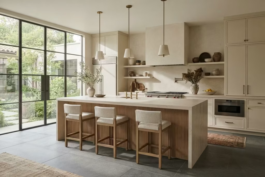
One of the biggest misconceptions in kitchen design is that visual impact must come from colour. In reality, some of the most sophisticated kitchens achieve their character through texture, craftsmanship, and subtle surface variation rather than bold palettes. This is precisely why fluted timber has become such a powerful design tool in contemporary neutral kitchens.
Unlike flat cabinet fronts that present a uniform appearance, fluted timber introduces rhythm, shadow, and depth. The repeated vertical grooves catch light differently throughout the day, creating movement that feels organic and ever-changing. Even within a restrained palette of warm whites, soft taupes, and natural stone, fluted detailing can transform an otherwise simple kitchen into a space with genuine architectural presence.
What makes the feature particularly appealing is its versatility. It can feel quietly modern, classically elegant, or softly organic depending on how it is specified and where it is applied. Like a well-chosen piece of tailoring that elevates an entire outfit, a carefully integrated fluted element often changes the perception of the whole room.
Why Texture Becomes Essential in Neutral Kitchens
When colour takes a supporting role, texture naturally becomes one of the primary ways a room communicates personality. This is where many neutral kitchens either succeed beautifully or fall short.
A space filled entirely with smooth surfaces can sometimes feel sterile, regardless of how expensive the materials may be. The eye needs variation. It needs moments of discovery. It needs surfaces that reveal something new as daylight shifts across the room. Fluted timber provides exactly that.
The grooves create subtle shadows that introduce visual complexity without overwhelming the space. From one angle, the timber may appear soft and understated. From another, the ridges become more pronounced, producing a dynamic quality that flat finishes simply cannot replicate.
In practical terms, texture also helps make larger kitchens feel warmer and more inviting. It softens the precision of modern cabinetry and introduces a handcrafted quality that resonates on a human level. As the old saying goes, variety is the spice of life. In design, texture often plays that role.
Transforming Kitchen Islands with Fluted Cladding
One of the most effective applications for fluted timber is island cladding. Kitchen islands naturally draw attention because they occupy a central position within the room. Applying fluted detailing to the island creates a focal point that feels architectural rather than decorative. Instead of relying on contrasting colours to define the feature, the texture itself does the work.
In many projects, I use fluted oak panels across the seating side of the island while keeping surrounding cabinetry relatively restrained. This creates a layered composition where the island commands attention through craftsmanship rather than visual noise.
The approach works particularly well on larger islands measuring between 2.7 and 4 metres, or approximately 9 to 13 feet, in length. At this scale, the repeating vertical pattern becomes more noticeable and contributes to the overall structure of the room.
Fluted cladding also pairs beautifully with natural stone worktops. The contrast between smooth stone and textured timber introduces balance while reinforcing the relationship between natural materials. Guests may not immediately identify why the island feels special, but they often sense the added richness the detail provides.
Adding Sophistication Through Tall Cabinetry Accents
Beyond islands, fluted timber can dramatically improve the appearance of tall cabinetry. Large pantry walls and integrated appliance banks often occupy significant visual real estate within a kitchen. While highly functional, these areas can sometimes appear monolithic or overly dominant if left untreated. Strategically introducing fluted sections helps break up large expanses while maintaining cohesion.
For example, a pantry run measuring 2.4 to 3 metres tall, or approximately 8 to 10 feet, can feel much more refined when selected doors feature fluted detailing. The vertical lines naturally draw the eye upward, reinforcing ceiling height and enhancing the room’s architectural character.
In one renovation project involving a contemporary extension, we incorporated fluted oak panels across a series of integrated pantry doors. What had initially felt like a large storage wall became one of the kitchen’s most admired features.
The beauty of the solution was that it introduced visual interest without adding unnecessary decoration. The cabinetry remained highly functional, yet it contributed far more to the overall design narrative.
Contemporary Approaches to Fluted Timber
Modern interpretations of fluted timber tend to favour simplicity and restraint. The grooves are often narrower, cleaner, and more precisely detailed than their traditional counterparts. Natural finishes are typically preferred, allowing the grain of the wood to remain visible and become part of the overall texture.
Light oak, white oak, rift-cut oak, and even smoked timber finishes are common choices in contemporary kitchens.
When paired with limestone-inspired surfaces, integrated appliances, and minimalist hardware, fluted timber introduces warmth without compromising the clean lines many homeowners desire.
This approach works particularly well in open-plan homes where kitchens must feel connected to living spaces. The texture helps bridge the gap between functional cabinetry and residential furniture, creating a more welcoming atmosphere. The result is sophisticated yet approachable, polished yet comfortable.
Traditional Interpretations That Still Feel Relevant
Although fluted detailing has become closely associated with contemporary design, its roots stretch much further back.
Classical architecture has long used fluting on columns, millwork, and decorative elements to introduce rhythm and refinement. When interpreted thoughtfully, these influences can bring remarkable character to traditional kitchens.
Wider fluting profiles, painted finishes, and more detailed joinery can create a softer, heritage-inspired appearance. Combined with shaker cabinetry, natural stone, and aged brass hardware, the texture adds depth while respecting traditional architectural language. What makes these applications successful is moderation.
A little texture often goes a long way. Applying fluting selectively ensures the detail feels intentional rather than overwhelming. Like seasoning in a favourite recipe, the right amount enhances everything around it.
Lessons from Real Renovation Projects
One lesson I have learned repeatedly is that homeowners often underestimate the impact of texture until they see it installed.
In a recent kitchen renovation, the original design relied heavily on painted cabinetry and stone surfaces. The material palette was attractive, yet the room lacked a sense of distinction.
Introducing fluted oak detailing to the island and a section of tall storage completely altered the atmosphere. The palette remained neutral. The layout remained unchanged. Yet the room immediately felt richer, more bespoke, and significantly more architectural.
Visitors frequently commented on the kitchen’s character, even though they struggled to identify exactly what made it feel different. That is often the hallmark of successful design. The strongest details work quietly in the background, improving the experience of a space without demanding constant attention.
Why Fluted Timber Continues to Elevate Neutral Kitchens
Fluted timber succeeds because it addresses one of the biggest challenges in neutral design: creating depth without clutter. Through nothing more than carefully crafted grooves and natural materiality, it introduces movement, shadow, and visual richness. It allows designers to create interest without relying on excessive colour, ornate detailing, or trend-driven features.
In a world where many kitchens compete for attention through bold statements, fluted timber takes a more thoughtful route. It proves that architectural beauty often resides in the finer details, those carefully considered elements that reveal themselves gradually and continue rewarding the eye long after the excitement of a renovation has passed.
You May also Like: 25 Desert Kitchen Designs That Beat the Heat and Look Incredible
Embrace Soft Greige Cabinetry
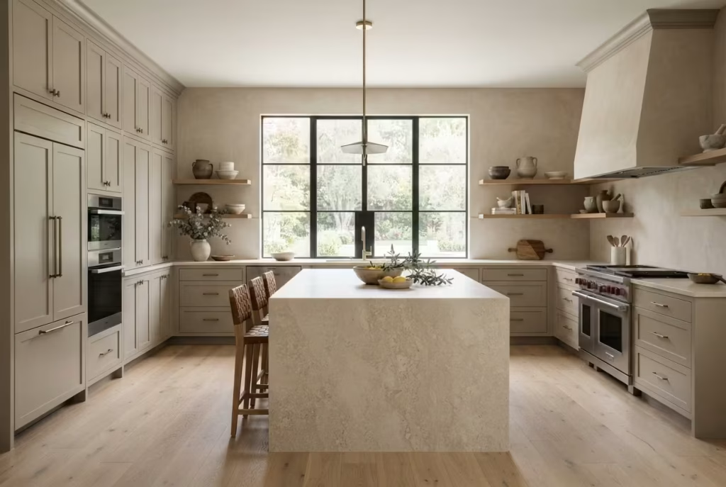
If there is one colour family that has quietly reshaped kitchen design over the past decade, it is greige. Sitting comfortably between grey and beige, greige combines the sophistication of cooler neutrals with the warmth and approachability of earthier tones. The result is a colour that feels balanced, adaptable, and remarkably easy to live with.
What makes soft greige cabinetry particularly compelling is its ability to bridge design styles that might otherwise feel worlds apart. It can complement a contemporary extension filled with glass and stone just as comfortably as it can enhance a character-filled period property. In many ways, greige acts as a mediator, bringing together materials, textures, and architectural features into a cohesive whole.
Yet despite its popularity, greige is often misunderstood. Homeowners frequently view it as a simple compromise between grey and beige when, in reality, its success depends on a far more nuanced relationship between undertones, light, and surrounding finishes. Get it right, and the kitchen feels effortlessly elegant. Get it wrong, and the room can feel cold, muddy, or disconnected.
Understanding Greige Undertones Is the Secret to Success
Not all greiges are created equal. This is perhaps the most important lesson I share during kitchen consultations. While two paint samples may appear nearly identical in a showroom, their undertones can behave very differently once installed throughout an entire room.
Some greiges lean toward warm taupe. Others reveal subtle green undertones. Certain shades contain hints of violet, while some carry a distinctly sandy quality that feels closer to natural stone than traditional paint colours.
These hidden undertones influence everything around them. For example, a greige with green undertones may complement limestone-inspired worktops beautifully while clashing with warmer oak cabinetry. A warmer greige, meanwhile, may create a seamless relationship with timber flooring but feel slightly heavy when paired with cool-toned quartz surfaces.
The safest approach is to evaluate large samples alongside all major materials before making a final decision. Cabinet colours never exist in isolation. They are constantly interacting with stone, flooring, walls, hardware, and changing daylight. As the old saying goes, the proof of the pudding is in the eating. Paint colours reveal their true character only when viewed within the environment where they will ultimately live.
Why Greige Creates a More Flexible Foundation Than Many Other Neutrals
One reason greige continues to resonate with designers is its remarkable versatility. Unlike stark grey, which can sometimes feel clinical, or beige, which occasionally risks appearing dated when poorly executed, greige occupies a middle ground that feels both current and enduring.
It provides enough warmth to create comfort while maintaining the crispness needed for contemporary spaces. This flexibility allows homeowners greater freedom when selecting other materials. Natural stone, aged brass, black metal accents, oak timber, walnut cabinetry, linen textiles, and textured plaster finishes all sit comfortably alongside soft greige.
As lifestyles evolve and decorative preferences change, greige cabinetry continues to support new additions rather than competing against them. This adaptability becomes especially valuable during long-term ownership. While accessories, lighting, and furniture may change over the years, the kitchen remains a stable backdrop capable of accommodating those shifts with ease.
Matching Flooring Materials for a Cohesive Design
Flooring and cabinetry often occupy the largest visual surfaces within a kitchen, which makes their relationship particularly important. When paired thoughtfully, flooring can enhance greige cabinetry and strengthen the overall sense of harmony throughout the room.
Natural oak remains one of the most reliable partners. Light to medium-toned oak introduces warmth while highlighting the subtle complexity within greige finishes. Together, the two materials create a layered palette that feels welcoming without becoming overly rustic. Stone flooring can be equally successful.
Limestone, travertine-inspired porcelain, and soft concrete-effect surfaces often complement greige cabinetry exceptionally well because they share similar earthy undertones. This creates continuity that allows the room to feel larger and more unified.
In open-plan homes, I often encourage clients to consider flooring beyond the kitchen itself. When materials flow seamlessly into adjoining dining and living spaces, the home feels more cohesive and visually expansive.
The strongest interiors rarely treat individual rooms as separate islands. Instead, they create connections that guide the eye naturally from one area to the next.
How Natural Light Changes Greige Throughout the Day
One of greige’s most fascinating qualities is its responsiveness to light. Unlike more straightforward colours, greige rarely looks exactly the same from morning to evening. Its appearance shifts as natural light conditions evolve, giving the kitchen a dynamic quality that many homeowners find deeply appealing.
In east-facing kitchens, morning sunlight may reveal warmer beige undertones, creating a soft and inviting atmosphere at the start of the day. As the sun moves, the cabinetry may appear slightly cooler and more refined. South-facing spaces often bring out the full richness of greige, highlighting its complexity while maintaining warmth throughout the day.
North-facing kitchens require additional care. Cooler light can exaggerate grey undertones, potentially making certain greiges feel flatter than intended. In these situations, selecting warmer formulations often produces better results.
I always recommend viewing large cabinet samples in place for several days before finalising a colour. What appears perfect under showroom lighting may tell a completely different story within the home itself. Patience at this stage can prevent costly disappointments later.
Why Greige Excels in Open-Plan Living Environments
As kitchens increasingly merge with living and dining spaces, colour selection becomes more complex. Cabinetry must not only function within the kitchen but also contribute positively to the wider interior environment.
Soft greige performs exceptionally well in this role. Because it sits between warm and cool tones, it transitions naturally into surrounding spaces. It can complement upholstered furniture, timber flooring, stone fireplaces, decorative lighting, and artwork without feeling disconnected.
In many open-plan projects, greige acts as the visual thread that ties together diverse materials and functions. Rather than dominating the design, it provides a calm framework that allows other elements to shine. This quality is one reason many designers return to greige repeatedly. It delivers versatility without sacrificing sophistication.
Lessons from Real Renovation Projects
One renovation project stands out as a perfect example of greige’s strengths. The homeowners initially planned to install dark charcoal cabinetry throughout a large family kitchen. While the colour looked dramatic in design renderings, the room’s limited natural light raised concerns about how the space would feel during everyday use. After extensive sample testing, we shifted toward a warm greige with subtle taupe undertones.
The transformation was remarkable. The cabinetry retained a sense of depth and elegance, yet the room immediately felt brighter and more welcoming. Natural oak flooring added warmth, while limestone-inspired surfaces reinforced the neutral palette.
Several months after completion, the clients shared that the kitchen felt different throughout the day, responding beautifully to changing light conditions and seasonal shifts. That observation highlights one of greige’s greatest strengths. It is not a static colour. It evolves with its surroundings, creating a space that feels alive rather than fixed.
Why Soft Greige Continues to Define Modern Neutral Kitchens
Great kitchen design often comes down to balance. Too much warmth can feel heavy. Too much coolness can feel impersonal. Too much contrast can create visual tension. Too little can leave a room lacking character. Soft greige cabinetry succeeds because it navigates these challenges with remarkable ease.
It introduces warmth without sacrificing sophistication. It works alongside natural materials rather than competing with them. It adapts gracefully to changing light and evolving design preferences. Most importantly, it creates kitchens that feel comfortable to inhabit day after day, year after year.
Trends may continue to rise and fall, but greige’s enduring appeal lies in its ability to sit quietly at the centre of a room, bringing together every surrounding element with a sense of effortless harmony. Like many of the best design decisions, its impact is often felt more deeply than it is immediately seen.
You May also Like: California Coastal Interior Design: The Complete Guide to Getting the Look Right
Incorporate Handmade Zellige Tiles
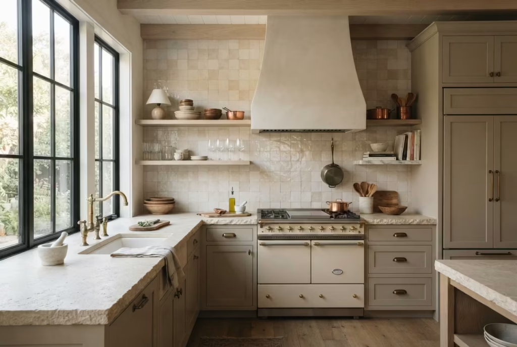
In an age where many kitchens are defined by precision, symmetry, and factory-perfect finishes, handmade zellige tiles offer something increasingly rare: character. They bring an unmistakable sense of craftsmanship into a space, introducing subtle variations that make a kitchen feel collected rather than manufactured.
Originating from Morocco and shaped using centuries-old techniques, zellige tiles possess an authenticity that is difficult to replicate. No two pieces are exactly alike. Slight differences in colour, texture, edge profile, and glaze create a richness that reveals itself gradually. At first glance, a zellige backsplash may appear simple. Spend more time with it, however, and its layered beauty begins to unfold, much like a well-worn leather chair or a natural stone floor that becomes more captivating with age.
For homeowners designing a neutral kitchen, zellige offers an opportunity to introduce depth without relying on bold colours or dramatic patterns. It adds soul to a room while maintaining the calm, understated atmosphere that makes neutral interiors so enduring.
Why Imperfection Is Often the Secret Ingredient
For decades, many homeowners equated luxury with flawless uniformity. Every surface needed to match perfectly. Every edge had to align precisely. While there is certainly a place for precision in design, kitchens can sometimes feel sterile when every material is too controlled. This is where handmade zellige changes the conversation.
Its slight irregularities create a human connection that machine-made products often lack. Small variations in glaze thickness, subtle shifts in tone, and gently uneven edges give the surface a sense of life. These imperfections are not defects. They are part of the material’s story.
I often find that clients initially hesitate when they see sample boards. They notice colour variation or uneven edges and wonder whether the material will appear unfinished. Yet once installed across a larger surface, those same qualities become its greatest strength.
As the saying goes, beauty is in the eye of the beholder. With zellige, beauty often emerges from the very characteristics that conventional manufacturing seeks to eliminate. The result is a kitchen that feels more authentic, more tactile, and ultimately more memorable.
How Zellige Tiles Interact Beautifully with Natural Light
One of the most captivating qualities of zellige lies in the way it responds to light. Unlike flat ceramic tiles that reflect light uniformly, handmade zellige creates subtle shifts in brightness across its surface. Each tile catches light slightly differently due to its irregular glaze and handmade form. Throughout the day, this creates a gentle play of highlights and shadows.
Morning sunlight may reveal glossy reflections that dance across the backsplash. During the afternoon, softer illumination can highlight tonal variation and texture. In the evening, under carefully positioned task lighting, the tiles often take on a warm glow that adds intimacy to the room.
This constant interaction with light gives the kitchen a dynamic quality. The backsplash never appears completely static because it is continually responding to its environment.
In several renovation projects, I have watched homeowners fall in love with their kitchens not because of a dramatic focal point but because of these subtle moments. The way sunlight catches a handcrafted tile surface often creates a sense of warmth and atmosphere that photographs struggle to capture.
The Best Ways to Use Zellige as a Kitchen Backsplash
While zellige can be used in various applications, backsplashes remain one of the most effective. This location allows the material to become visible without overwhelming the room. It acts as a bridge between cabinetry and worktops, introducing texture where the eye naturally pauses.
Several approaches work particularly well:
Full-Height Backsplashes
Extending zellige from the countertop to the underside of upper cabinetry creates a clean and cohesive appearance. This approach works beautifully in both traditional and contemporary kitchens.
Countertop-to-Ceiling Installations
For homeowners seeking greater impact, continuing the tile all the way to the ceiling can transform a simple wall into an architectural feature. This is especially effective behind range cookers and custom ventilation hoods.
Niche and Feature Wall Applications
In larger kitchens, zellige can be concentrated within specific zones, such as coffee stations, open shelving backdrops, or recessed storage niches.
Around Architectural Elements
Tiles used behind floating shelves, custom plaster hoods, or built-in cabinetry often create a layered, designer-led aesthetic.
In my experience, the most successful installations allow the material room to breathe. When every surface is tiled, the beauty can become diluted. Strategic placement often produces a stronger result. Sometimes less really is more.
Pairing Zellige with Natural Stone for a Layered Look
One reason designers frequently specify zellige in neutral kitchens is its remarkable compatibility with natural stone. The two materials share several important qualities. Both possess variation. Both reveal depth through texture. Both become more interesting the closer you look. When combined thoughtfully, they create a layered palette that feels sophisticated and deeply connected to nature. Some particularly successful pairings include:
- Cream zellige with limestone-inspired countertops.
- Soft ivory zellige paired with honed marble.
- Warm white zellige alongside Taj Mahal quartzite.
- Sand-toned zellige combined with travertine-inspired surfaces.
- Mushroom-toned zellige paired with natural oak and pale stone.
The goal is not perfect matching. Instead, successful combinations rely on subtle tonal relationships that feel organic and effortless. Like pieces gathered over time rather than selected from a single catalogue, the materials should complement one another while maintaining their individual identities. This approach creates visual richness without introducing clutter.
Practical Considerations Before Choosing Zellige
Although zellige offers considerable aesthetic benefits, homeowners should understand a few practical realities before making a final decision. Because the tiles are handmade, installation requires an experienced tile professional familiar with the material. Uniform grout lines are rarely the goal. Slight variation is expected and contributes to the finished appearance.
Glazed zellige generally performs well as a backsplash because it is relatively easy to clean. However, surface irregularities mean the finish may not feel perfectly smooth compared to machine-produced ceramics.
Sample viewing is also essential. The appearance of zellige can vary significantly depending on the manufacturer, glaze colour, lighting conditions, and installation pattern. Reviewing multiple samples under actual project lighting often helps homeowners make more confident decisions.
Why Handmade Zellige Continues to Capture Designers’ Attention
The most successful neutral kitchens rarely rely on a single dramatic feature. Instead, they build interest through layers of carefully chosen materials that reveal their qualities over time.
Handmade zellige fits perfectly within this philosophy. It introduces craftsmanship where flat surfaces might otherwise feel predictable. It reflects light in ways that create atmosphere. It brings texture without visual heaviness and authenticity without feeling rustic.
Most importantly, it helps a kitchen feel genuinely lived in rather than merely designed. Long after the excitement of a renovation fades, homeowners tend to appreciate materials that continue to surprise and delight them in small ways. The shifting reflections, subtle tonal variations, and handcrafted character of zellige offer precisely that kind of enduring appeal.
Like a favourite book that reveals something new with every reading, handmade zellige rewards attention. The longer you live with it, the more its quiet beauty comes into focus.
Add Character Through Antique Brass Accents
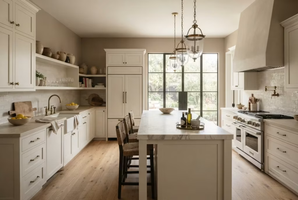
A beautifully designed neutral kitchen often succeeds because of the details that are easy to overlook at first glance. While cabinetry, stone surfaces, and lighting typically receive most of the attention, smaller finishing touches frequently determine whether a kitchen feels ordinary or truly memorable. Among these details, antique brass remains one of the most effective ways to introduce warmth, depth, and personality.
Unlike highly polished metals that demand immediate attention, antique brass possesses a quieter confidence. It brings a sense of history and craftsmanship that feels collected rather than manufactured. In a room dominated by soft whites, greiges, natural stone, and timber finishes, brass acts like a thread running through a finely tailored garment, subtly connecting individual elements into a cohesive whole.
What makes antique brass particularly appealing is its ability to soften modern kitchens while elevating traditional ones. It bridges old and new effortlessly, creating spaces that feel welcoming from the moment you step inside.
Why Hardware Selection Matters More Than Many Homeowners Realise
Cabinet hardware may seem like a small decision in the context of a full kitchen renovation, yet its impact can be surprisingly significant. Handles and knobs are among the few elements people physically interact with every single day. They influence not only how cabinetry looks but also how it feels to use.
In many projects, I encourage homeowners to think of hardware as jewellery for the kitchen. Just as a carefully chosen watch or necklace can transform an outfit, the right hardware can elevate cabinetry from functional storage to a considered design feature.
Antique brass works especially well because it introduces contrast without harshness. Against warm white cabinetry, it provides definition. Against greige or taupe finishes, it contributes richness. Paired with natural timber, it reinforces the sense of warmth that many homeowners seek in contemporary kitchens.
Several hardware styles consistently perform well:
- Slim linear pulls for contemporary cabinetry.
- Rounded knobs for traditional shaker kitchens.
- Appliance pulls that create continuity across larger surfaces.
- Backplates for added depth and heritage character.
- Mixed handle sizes that respond to cabinet scale.
The most successful kitchens rarely treat hardware as an afterthought. Instead, these details are specified with the same care given to stone, flooring, and lighting.
The Beauty of Brass That Ages Naturally
One of the reasons antique brass remains so enduring is that it does not stay exactly the same over time. Many modern materials are designed to resist change. Brass takes a different path. As years pass, exposure to air, moisture, and daily handling gradually alters the finish. Subtle darkening, soft variations in tone, and areas of natural wear begin to develop. Rather than diminishing its appeal, this evolution often enhances it.
The process is similar to the way quality leather develops patina through use. The material gathers character, reflecting the life that unfolds around it. I often explain to clients that antique brass should not be viewed as a static finish. It is a living material that matures alongside the home.
In family kitchens especially, this quality can be incredibly rewarding. Small signs of ageing become part of the room’s story rather than imperfections that need to be hidden. As the saying goes, fine wine improves with age. Antique brass follows a remarkably similar principle.
Creating Warmth in Neutral Kitchens
One challenge that occasionally arises in neutral kitchens is maintaining warmth while preserving sophistication. Stone surfaces, painted cabinetry, and contemporary architectural details can sometimes feel slightly cool if not balanced carefully. Antique brass offers a simple yet highly effective solution.
Its golden undertones introduce visual warmth without resorting to stronger colours. Even relatively small applications can have a noticeable effect on the overall atmosphere. Brass works beautifully on:
- Cabinet handles and knobs.
- Bridge and pull-down faucets.
- Pendant lighting details.
- Open shelving brackets.
- Glass-front cabinet frames.
- Furniture-style island accents.
These additions create moments of warmth throughout the room, helping the kitchen feel layered and inviting. The effect is subtle but important. Instead of feeling overly polished or clinical, the space gains a sense of comfort that encourages people to linger.
How to Mix Brass with Other Finishes Successfully
Many homeowners assume every metal finish within a kitchen must match perfectly. While this approach can work, it is not always the most sophisticated solution.
Some of the most compelling kitchens use multiple finishes in a carefully balanced manner. The key is establishing a dominant finish and allowing supporting materials to complement rather than compete.
For example:
- Antique brass paired with black steel lighting creates contrast and depth.
- Brass and aged bronze work together to create a layered, collected appearance.
- Brass accents alongside stainless steel appliances help soften the utilitarian nature of larger appliances.
- Brass paired with natural timber reinforces warmth and texture.
What matters most is consistency in tone and intent. A room filled with too many unrelated finishes can quickly feel chaotic. However, two thoughtfully selected materials often create a richer and more nuanced result than a perfectly matched scheme.
Like instruments in a well-rehearsed ensemble, each finish should contribute to the overall composition without trying to dominate the performance.
Avoiding the Trap of Overusing Brass
Despite its many strengths, antique brass delivers its greatest impact when used selectively. One mistake I occasionally encounter is treating brass as a decorative theme rather than a supporting material. When every light fixture, appliance trim, shelf bracket, tap, handle, and accessory features the same finish, the effect can begin to feel heavy-handed.
The strongest kitchens understand the value of restraint. Brass works best when it appears in strategic locations that naturally draw attention. A beautiful faucet, carefully selected cabinet hardware, and a pair of statement pendants often achieve far more than filling the room with metallic accents.
In design, knowing when to stop is every bit as important as knowing where to begin. By allowing moments of brass to punctuate the space rather than dominate it, the finish retains its sense of specialness and sophistication.
Lessons from Real Renovation Projects
A few years ago, I worked on the renovation of a large open-plan kitchen where the homeowners initially planned to use matte black hardware throughout. While the choice aligned with contemporary trends at the time, the overall material palette felt slightly cold. The kitchen featured pale stone, painted cabinetry, and expansive glazing that introduced significant natural light. After reviewing multiple samples, we shifted toward antique brass.
The transformation was immediate. The cabinetry gained definition, the stone appeared warmer, and the entire room felt more welcoming. Importantly, the brass did not become the focal point. Instead, it enhanced everything around it.
Several months after completion, the homeowners remarked that the kitchen felt more comfortable and timeless than they had originally imagined. That experience reinforced a lesson I have seen repeated countless times: sometimes the smallest decisions produce the most meaningful improvements.
Why Antique Brass Continues to Endure
Design trends inevitably evolve, yet certain materials remain relevant because they satisfy something deeper than fashion. Antique brass belongs firmly in that category. It introduces warmth without overwhelming a neutral palette. It develops character through use rather than deteriorating with age. It complements natural materials beautifully and brings a sense of craftsmanship that many contemporary finishes struggle to match. Most importantly, it helps kitchens feel personal.
Long after cabinet colours and decorative trends have shifted, thoughtfully chosen brass accents continue to contribute richness, comfort, and visual depth. They remind us that exceptional design is often found not in the grand gestures but in the details carefully considered and quietly executed. In a neutral kitchen, those details can make all the difference.
Design Around a Neutral Stone Range Hood
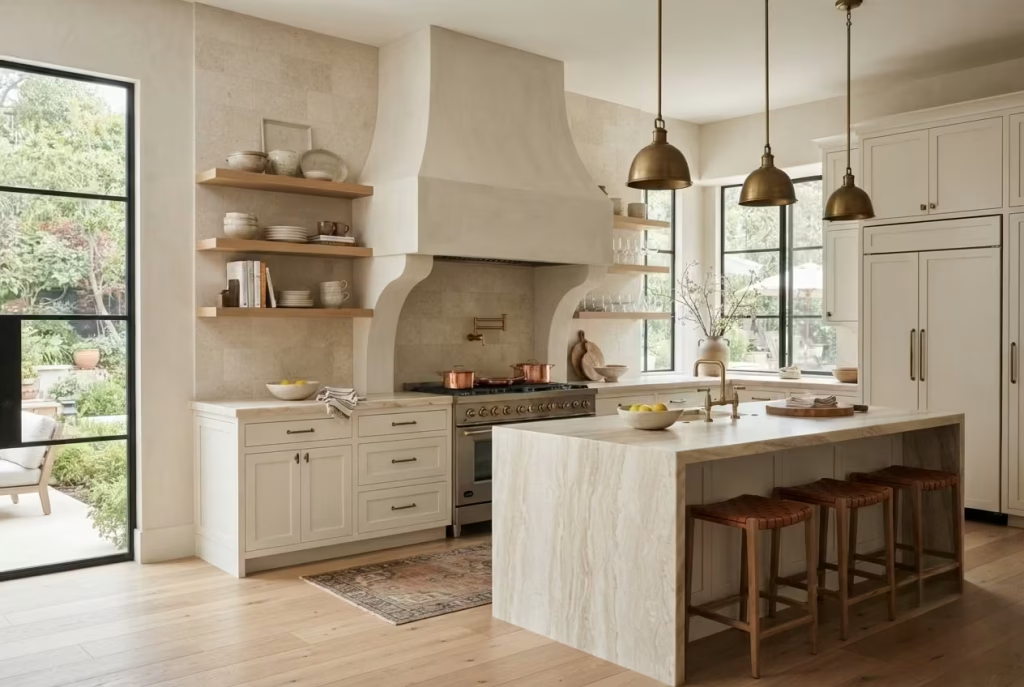
In many kitchens, ventilation is treated as a necessity to hide rather than an opportunity to elevate the entire design. Yet some of the most memorable kitchens I have worked on achieve their strongest visual impact through a feature that is often overlooked: the range hood.
A thoughtfully designed neutral stone range hood has the power to transform an ordinary cooking zone into an architectural focal point. It introduces scale, material richness, and a sense of permanence that instantly grounds the room. More importantly, it creates a natural centrepiece without relying on bold colours or trend-driven features.
When designed carefully, a stone-clad hood becomes far more than a practical appliance enclosure. It acts as a bridge between cabinetry, worktops, and surrounding architecture, helping the kitchen feel cohesive and intentional from every angle. In open-plan homes especially, where the kitchen is constantly on display, this type of focal point can become the element that quietly holds everything together.
As the saying goes, every cloud has a silver lining. In kitchen design, even a functional requirement like extraction can become an opportunity to create something beautiful.
Turning Ventilation into a Design Feature
For years, many kitchens approached ventilation with a purely practical mindset. Stainless steel hoods dominated the market, often appearing as isolated technical elements disconnected from the rest of the room.
Today, designers increasingly take a different approach. Rather than drawing attention to the appliance itself, the goal is to integrate extraction into the wider architectural story of the kitchen. A custom hood allows ventilation to blend seamlessly into the design while simultaneously contributing visual interest.
This shift has had a profound effect on kitchen aesthetics. Instead of a metal box interrupting an otherwise refined material palette, homeowners can create a feature that feels tailored specifically to the space. The hood becomes part sculpture, part architectural element, and part functional necessity.
The result is a kitchen that feels more curated and less dependent on exposed technology.
Why Neutral Stone Creates Lasting Appeal
Natural stone possesses an inherent sense of permanence that few materials can rival. Whether crafted from limestone, travertine, marble, quartzite, or stone-look alternatives, a neutral range hood introduces texture and substance that immediately elevate the room.
Unlike heavily patterned materials that may dominate the visual composition, neutral stone allows the focus to remain on form, craftsmanship, and proportion. The beauty often lies in subtle variation.
Gentle veining, soft mineral movement, and natural tonal shifts create depth without overwhelming surrounding elements. This restraint is precisely what makes stone hoods so successful in luxury kitchens. They command attention through quality rather than excess.
I often find that homeowners initially worry a neutral feature might lack impact. In reality, the opposite is usually true. A well-proportioned stone hood often feels more sophisticated than highly decorative alternatives because it allows the material itself to tell the story.
Like a perfectly cut piece of tailoring, its strength lies in execution rather than embellishment.
Exploring Custom Plaster and Stone Finishes
One of the most exciting aspects of custom range hood design is the variety of finishes available.
Stone is an obvious choice, but many designers now combine stone and plaster techniques to create unique, highly personalised results. Some of the most effective options include:
Limestone-Inspired Stone Cladding
Soft limestone tones pair beautifully with neutral cabinetry and natural timber, creating a calm and timeless atmosphere.
Travertine-Wrapped Hoods
Travertine introduces texture and subtle movement while maintaining a warm, organic character.
Venetian Plaster Finishes
Hand-applied plaster creates a soft, sculptural appearance that works particularly well in Mediterranean, organic modern, and contemporary kitchens.
Limewash and Mineral-Based Finishes
These finishes provide depth and variation while allowing the hood to feel integrated with surrounding walls.
Mixed Material Compositions
Combining plaster with stone trim or stone shelves often produces a layered appearance that feels custom and highly architectural. In several recent projects, I have specified plaster-clad hoods framed by natural stone shelving. The combination provided visual interest while maintaining the restrained palette homeowners desired.
The beauty of these materials is that they age gracefully, developing character over time rather than looking dated.
Creating a Natural Focal Point Without Forcing It
Every kitchen benefits from a visual anchor. Without one, even expensive materials can feel scattered or lacking direction. The range hood naturally occupies a prominent position within the room, making it an ideal candidate for this role.
A carefully designed hood draws the eye toward the cooking area while helping establish hierarchy within the overall composition. The key is balance. A focal point should feel intentional, not theatrical.
In kitchens featuring large islands and extensive cabinetry, a stone hood often provides exactly the right amount of visual weight. It creates a centre of interest without overwhelming neighbouring elements.
I frequently recommend allowing the hood to carry much of the room’s architectural expression while keeping surrounding finishes relatively restrained. This strategy prevents visual competition and allows each component to contribute meaningfully to the overall design.
As the old saying goes, too many cooks spoil the broth. The same principle applies to kitchen focal points. One strong feature often achieves more than several competing statements.
Architectural Integration Creates Cohesion
Perhaps the greatest strength of a custom stone range hood is its ability to strengthen the architecture of the room. Rather than appearing as a separate object attached to a wall, the hood can become part of the kitchen’s structural language. This integration may involve:
- Aligning hood proportions with cabinetry below.
- Connecting stone materials to nearby worktops.
- Repeating architectural curves found elsewhere in the home.
- Extending stone details into shelving or backsplash treatments.
- Echoing ceiling lines and room geometry.
These connections create a sense of continuity that people often notice subconsciously. One project involved a newly built home with vaulted ceilings and large oak beams. Rather than installing a standard extractor surround, we designed a limestone-clad hood that echoed the proportions of the architectural framework above. The finished result felt as though the feature had always belonged there.
That sense of belonging is often what distinguishes exceptional kitchens from merely attractive ones.
Scale and Proportion Matter More Than Decoration
A common mistake is assuming a focal point must be highly ornate. In reality, proportion frequently has a greater impact than decoration. A hood that is too small can feel insignificant. One that is oversized may dominate the room unnecessarily. Finding the right balance requires considering ceiling height, cabinetry dimensions, island size, and the overall footprint of the space.
As a general guide:
- Higher ceilings often benefit from taller hood forms.
- Wider cooktops typically require broader hood proportions.
- Large open-plan kitchens can accommodate more substantial architectural features.
- Smaller kitchens often benefit from cleaner, more restrained silhouettes.
These decisions may seem technical, yet they dramatically influence how the finished room feels. The strongest designs rarely shout for attention. They simply feel right.
Why Neutral Stone Range Hoods Continue to Define Luxury Kitchens
Luxury kitchen design has increasingly moved toward authenticity, craftsmanship, and architectural integrity. Neutral stone range hoods embody all three. They transform a purely functional necessity into a meaningful design feature. They introduce texture and permanence without overwhelming the room. They create focal points that feel timeless rather than trend-driven.
Most importantly, they help kitchens feel complete. Long after decorative accessories have changed and design trends have come and gone, a beautifully executed stone hood continues to provide structure, character, and visual balance. It becomes part of the architecture itself, quietly anchoring the room and proving that some of the most powerful design decisions are also the most practical.
When ventilation is treated as an opportunity rather than a compromise, the entire kitchen benefits.
Pair Walnut and Cream for Richer Warmth
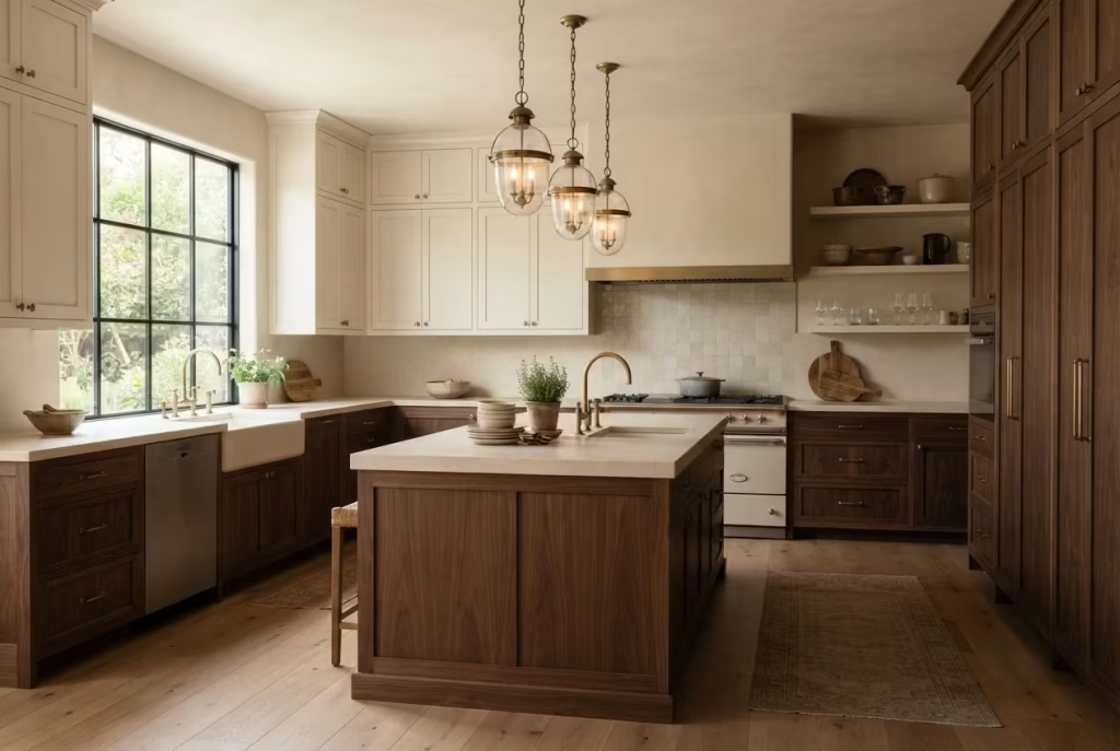
There is something undeniably reassuring about walnut and cream used together in a kitchen. The combination feels grounded, elegant, and quietly luxurious, like a room that knows exactly what it is doing without needing to make a song and dance about it. In neutral kitchen design, where the goal is often to create calm rather than spectacle, this pairing brings depth and richness in a way that feels both composed and deeply livable.
Walnut introduces natural darkness, warmth, and grain movement, while cream softens the overall composition and prevents the scheme from feeling too heavy. Together, they create a layered balance that is full of character yet still easy on the eye. For homeowners who find oak slightly too relaxed or too familiar, walnut offers a more polished alternative with a bit more gravitas.
What makes this combination so compelling is its ability to feel both current and enduring. It does not lean too far into trend territory, and it avoids the sterile quality that sometimes creeps into all-white or grey-heavy kitchens. Instead, it delivers a sense of richness that builds gradually, detail by detail, until the room feels complete.
When Oak Feels Too Casual
Oak remains a favourite in neutral kitchen design for good reason, but it does not suit every project. In some homes, particularly those with more formal architecture or a desire for a slightly more elevated mood, oak can read as too familiar or too relaxed. It may bring warmth, but not always the level of sophistication a space calls for.
That is where walnut steps in. Walnut has a deeper tone and a more refined grain, which gives cabinetry a richer, more tailored appearance. It feels considered from the outset, almost as if it has a built-in sense of occasion. When paired with cream, it avoids becoming overly dark or imposing, which is especially important in kitchens with modest natural light.
I have seen this combination work beautifully in homes where the owners wanted a kitchen that felt welcoming but not rustic, elegant but not precious. Walnut gives the room its backbone. Cream keeps it from going off the rails. It is a case of the whole being greater than the sum of its parts.
Luxury Material Combinations That Feel Intentional
The most successful walnut and cream kitchens tend to rely on a carefully layered material palette rather than on colour alone. Walnut cabinetry becomes the anchor, but the surrounding surfaces do much of the heavy lifting.
Some especially effective combinations include:
- Walnut lower cabinetry with cream wall units and honed stone worktops.
- Cream perimeter cabinetry paired with a walnut island and brass hardware.
- Walnut veneered tall cabinetry set against cream plastered walls.
- Cream painted shaker fronts balanced by walnut open shelving and timber detailing.
- Walnut and cream framed by limestone, travertine, or soft quartz surfaces.
What ties these combinations together is restraint. Each element plays its own part without stealing the scene. The walnut brings depth, while the cream opens the room up visually, allowing light to move more freely. Add in a natural stone surface with subtle movement, and the result feels polished rather than overworked.
As the saying goes, less is more. That principle is nowhere more evident than in a well-balanced neutral kitchen, where material quality matters far more than flashy decoration.
Balancing Darker Timber Tones Without Losing Light
Walnut can be a blessing in a kitchen, but it needs handling with care. Its darker tone gives a room a sense of luxury, yet too much of it can tip the balance and make the space feel closed in. The trick is to use it where it has the most impact, then let cream carry the lighter load.
In practical terms, walnut often works best on the island, on lower cabinetry, on shelving, or on a feature section of joinery. These are the areas where its richness can be appreciated without overwhelming the room. Cream, meanwhile, can be used for the upper cabinetry, walls, or larger surface areas that need visual breathing room.
This division helps establish hierarchy. The walnut grounds the kitchen, while the cream lifts it. The eye moves naturally between the two, and the room gains rhythm rather than monotony.
Lighting also plays a major role. Warm white task lighting, under-cabinet illumination, and natural daylight all help walnut feel rich rather than heavy. In one project I worked on, a north-facing kitchen initially felt slightly sombre when viewed under showroom lighting. Once we brought in cream cabinetry, lighter stone, and layered lighting, the walnut suddenly came alive. It no longer felt dark. It felt anchored.
That is often the difference between a scheme that works on paper and one that works in real life.
Which Architectural Styles Suit Walnut and Cream Best
Walnut and cream have a remarkable ability to adapt to different architectural settings, which is one reason they remain such a dependable choice. They are versatile without becoming generic, which is no small achievement in kitchen design. They work especially well in:
Contemporary Homes
In modern spaces, walnut can soften crisp lines and glass-heavy structures. Paired with flat-front cream cabinetry, it introduces warmth and texture without compromising clean geometry. The result is sleek but not cold.
Transitional Interiors
For homes that sit between traditional and modern, walnut and cream provide exactly the right amount of balance. Shaker cabinetry, curved island edges, and natural stone finishes all sit comfortably within this language.
Period Properties
In older homes, walnut can bring a sense of depth that complements original features such as cornicing, panelling, or timber beams. Cream cabinetry helps preserve a lighter, more classical feel while allowing the wood to add richness.
Open-Plan Extensions
Large, light-filled extensions often benefit from walnut because it prevents the space from feeling too airy or unfinished. The darker timber gives the room an anchor point, while cream keeps the whole scheme approachable and elegant.
The beauty of the combination lies in its flexibility. It can lean heritage-inspired, quietly modern, or somewhere in between, depending on the surrounding architecture and the detailing chosen.
Why Walnut and Cream Feel So Livable
A kitchen is not a showroom. It is a room that has to work day in, day out, often under pressure, often with people moving through it from morning to night. That is why walnut and cream continue to resonate. They create a setting that feels calm, usable, and comfortable without sacrificing style.
Walnut adds a sense of permanence, almost like a piece of fine furniture built to last. Cream keeps the atmosphere open and inviting. Together, they create a kitchen that feels rooted in real life, not just in design theory.
The best interiors often do this quietly. They do not try too hard. They simply get the balance right. Walnut and cream, when paired with care, have that rare quality. They look beautiful on day one, but they also settle into the home gracefully, getting better as the room begins to tell its own story.
You May also Like: 25 Dark Cottagecore Kitchen Ideas That Feel Warm, Rich, and Full of Character
Use Large-Format Stone Slabs for Seamless Elegance
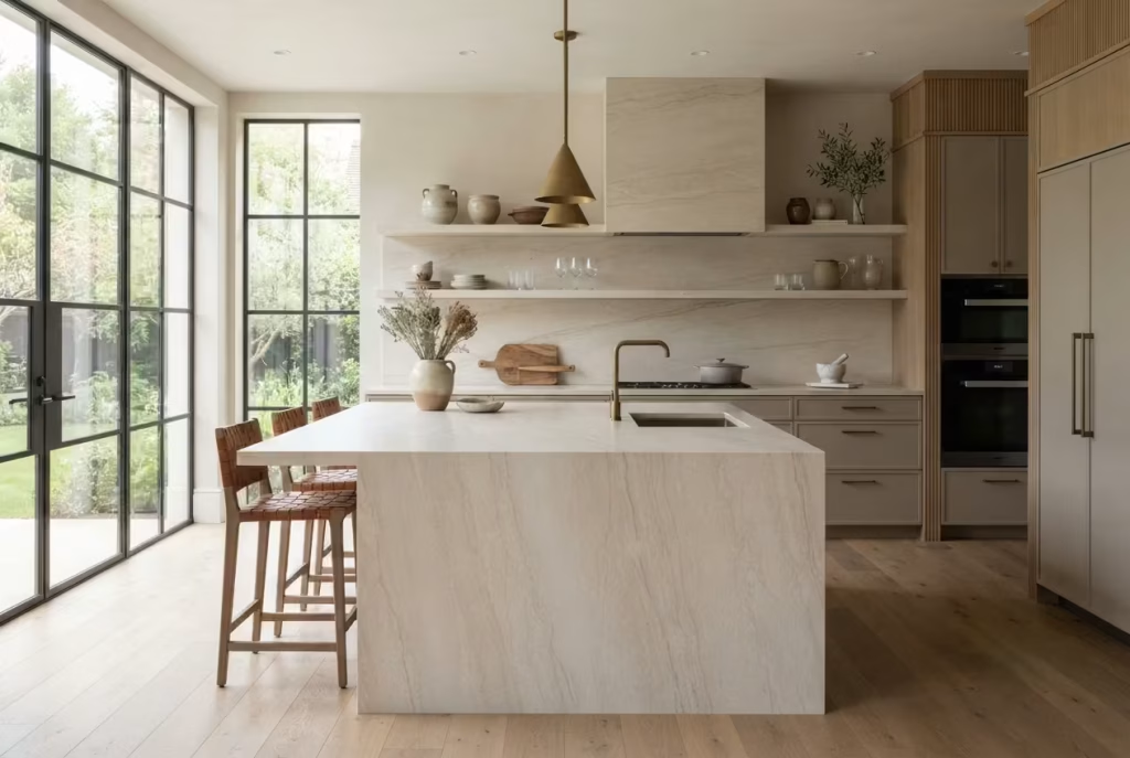
Some design decisions make an immediate impression. Others work quietly behind the scenes, shaping how a kitchen feels without drawing attention to themselves. Large-format stone slabs belong firmly in the second category. Their impact is often subtle at first, yet once experienced in person, it becomes difficult to imagine the space any other way.
In luxury kitchen design, visual clutter is often the enemy of sophistication. Every unnecessary joint, interruption, or competing surface can fragment the room and dilute the overall experience. Large-format slabs solve this problem beautifully. By covering expansive areas with uninterrupted stone, they create a sense of calm, continuity, and permanence that smaller materials struggle to achieve.
Whether used on countertops, islands, backsplashes, feature walls, or even integrated shelving, these oversized surfaces allow the natural beauty of stone to take centre stage. Rather than breaking the material into smaller pieces, the slab is allowed to tell its story in a single uninterrupted sweep. The result is a kitchen that feels more architectural, more refined, and ultimately more timeless.
Why Fewer Grout Lines Create a More Sophisticated Kitchen
One of the most obvious advantages of large-format slabs is the dramatic reduction in grout lines and visible seams.
While grout serves an important practical purpose in tiled installations, every line introduces another visual interruption. Individually, these interruptions may seem insignificant. Collectively, they can create a sense of busyness that prevents a kitchen from feeling truly cohesive.
Large stone slabs remove much of that visual noise. The eye can travel across the surface uninterrupted, appreciating the natural movement, texture, and subtle colour variation within the material itself. This uninterrupted experience often makes kitchens feel larger and more serene.
Think about standing beside a calm lake on a windless morning. The uninterrupted surface creates a feeling of tranquillity that is difficult to replicate. Large-format stone achieves something remarkably similar within an interior setting.
This quality becomes particularly valuable in neutral kitchens where simplicity and material integrity are central to the overall design.
Creating Visual Continuity Throughout the Space
One hallmark of exceptional kitchen design is continuity. Rather than feeling like a collection of separate components, the room reads as a unified whole. Large-format slabs play a significant role in achieving this effect because they allow materials to flow naturally from one surface to another.
For example, a stone countertop can continue seamlessly into a backsplash, wrap around a waterfall island, or extend into floating shelves and feature walls.
This continuity creates a powerful sense of cohesion. Instead of the eye stopping and starting at every transition, it moves effortlessly through the space. The kitchen feels calmer, more expansive, and more intentionally designed.
In open-plan homes, this effect becomes even more valuable. Kitchens often share visual space with dining and living areas, making material consistency particularly important. Large-format slabs help establish order within these multifunctional environments.
I have seen relatively modest kitchens appear significantly larger simply because the material palette was simplified and allowed to flow uninterrupted across key surfaces.
Sometimes the path to greater impact involves removing elements rather than adding them.
Choosing the Right Stone for Long-Term Appeal
Not every stone performs equally well in large-format applications. Because slabs occupy substantial visual territory, the character of the stone becomes even more important. Patterns that seem attractive on a small sample can feel overwhelming when expanded across several metres of surface area.
For this reason, I often encourage homeowners to view full slab images before making a final selection. Some particularly successful options for neutral kitchens include:
Taj Mahal Quartzite
Soft cream undertones and gentle movement create a luxurious appearance without excessive visual drama.
Limestone-Inspired Quartz
Provides warmth and subtle texture while offering excellent durability for everyday use.
Travertine-Look Porcelain Slabs
Captures the beauty of natural travertine with minimal maintenance requirements.
Honed Marble
Offers timeless elegance, particularly in kitchens where a softer and more organic aesthetic is desired.
Light Quartzite Varieties
Deliver natural variation and impressive durability while maintaining a calm visual presence. The most successful selections often share one characteristic: restraint.
Rather than relying on dramatic veining or highly contrasting patterns, they introduce interest gradually. This allows the stone to remain relevant long after more trend-driven materials have fallen out of favour.
As the saying goes, slow and steady wins the race. In kitchen design, subtle materials frequently enjoy the longest lifespan.
The Relationship Between Scale and Proportion
Large-format slabs excel because they align beautifully with contemporary kitchen proportions. Today’s kitchens often feature expansive islands, generous ceiling heights, and open-plan layouts. Smaller materials can sometimes appear fragmented within these larger spaces, whereas oversized stone surfaces feel appropriately scaled.
A kitchen island measuring 3 metres (10 feet) or more becomes particularly impactful when wrapped in a continuous slab. The uninterrupted stone reinforces the island’s importance while highlighting the craftsmanship involved in its construction.
Similarly, full-height stone backsplashes extending from countertop to ceiling can transform an ordinary wall into an architectural feature. Scale matters. When materials are proportioned correctly relative to the room, everything feels more intentional and harmonious.
Installation Considerations Worth Understanding
While large-format slabs offer significant design benefits, they also require careful planning.
Their size and weight demand skilled fabrication, transportation, and installation. Precision becomes critical because mistakes are far more difficult to conceal on large continuous surfaces. Several practical considerations should be addressed early in the project:
- Confirm structural support requirements for oversized islands.
- Ensure accurate site measurements before fabrication.
- Review slab layouts to understand how veining and movement will appear.
- Consider access routes for transporting large pieces into the property.
- Work with experienced stone fabricators familiar with large-format installations.
In my experience, investing in skilled craftsmanship at this stage pays dividends for years to come.
A beautifully fabricated slab installation often appears effortless, but achieving that result requires significant expertise behind the scenes. Like an elegant theatre production, the best performances usually conceal the complexity involved in creating them.
Practical Benefits Beyond Appearance
While aesthetics often drive the decision to use large-format slabs, practical advantages should not be overlooked. Fewer grout lines mean fewer areas where dirt, grease, and moisture can accumulate. Cleaning becomes simpler, particularly around cooking and preparation zones.
Continuous surfaces also create a more hygienic environment for food preparation while reducing maintenance demands compared to heavily tiled installations. For busy households, these benefits can be just as valuable as the visual improvements.
A kitchen should not only look beautiful on installation day. It should continue supporting everyday life with minimal frustration. Large-format slabs help achieve both objectives simultaneously.
Why Seamless Stone Continues to Define Luxury Kitchens
Luxury is often associated with expensive materials, but true sophistication usually comes from something deeper: clarity. A room feels luxurious when every element works together harmoniously, when distractions are minimised, and when materials are allowed to express their natural beauty. Large-format stone slabs embody this philosophy perfectly.
They eliminate unnecessary visual interruptions. They create continuity across the room. They highlight craftsmanship while simplifying the overall composition. Most importantly, they allow the kitchen to feel calm and purposeful rather than cluttered or overdesigned.
Years after a renovation is complete, homeowners rarely wish they had introduced more seams, more joints, or more visual complexity. More often, they appreciate the decisions that brought clarity and cohesion to the space.
Large-format stone slabs deliver exactly that. They prove that sometimes the most powerful statement a material can make is simply getting out of its own way and allowing beauty to unfold uninterrupted.
Introduce Open Shelving in Natural Materials
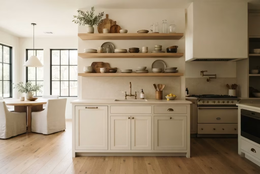
Open shelving has experienced countless waves of popularity over the years, yet when executed thoughtfully, it remains one of the most effective ways to bring personality and warmth into a neutral kitchen. The secret lies not in treating shelves as decorative stages, but in viewing them as opportunities to create a more lived-in, layered environment.
In many kitchens, particularly those filled with extensive cabinetry, there is a risk that the room begins to feel overly enclosed. Wall after wall of doors and panels can sometimes create a sense of visual heaviness, even when the colour palette remains light. Open shelving offers relief from that repetition. It introduces breathing room, breaks up large expanses of cabinetry, and allows natural materials to become part of the design story.
What makes open shelving especially appealing in neutral kitchens is its ability to showcase texture, craftsmanship, and everyday objects without relying on bold colour. A stack of handmade ceramics, a collection of wooden boards, or a few carefully chosen glass vessels can contribute more character than an entire wall filled with decorative accessories.
As the saying goes, actions speak louder than words. In a well-designed kitchen, the objects people genuinely use often tell a richer story than purely decorative pieces ever could.
Why Open Shelving Brings Balance to a Kitchen
A successful kitchen needs variation. Without moments of visual relief, even beautiful cabinetry can begin to feel repetitive. Open shelving introduces contrast by creating areas where the eye can pause and explore. Instead of presenting a continuous wall of doors, shelves reveal glimpses of everyday life. They make a kitchen feel inhabited rather than staged.
This balance becomes particularly important in larger kitchens. Tall cabinetry provides valuable storage, but too much of it can create an imposing atmosphere. Introducing open shelving softens the composition and allows the room to feel more approachable.
In several renovation projects, I have found that replacing just one section of upper cabinetry with natural shelving dramatically changes how the kitchen feels. The overall storage capacity remains largely intact, yet the room immediately gains a greater sense of openness. Sometimes the smallest adjustment shifts the entire mood of a space.
Styling Shelves Without Creating Visual Clutter
Open shelving often receives criticism because poorly styled shelves can quickly appear messy. The issue, however, is rarely the shelving itself. It is usually the result of trying to display too much. The most successful shelves embrace restraint.
Rather than filling every inch with decorative objects, they focus on a carefully edited collection of items that serve either a functional or meaningful purpose. Several principles consistently produce better results:
- Group objects in odd numbers where possible.
- Mix heights and shapes to create visual rhythm.
- Leave empty space between items.
- Use materials that complement the overall kitchen palette.
- Prioritise quality over quantity.
One approach I frequently recommend is treating shelves like a well-composed photograph. Every item should earn its place within the composition. A few handmade bowls, a stack of everyday plates, and a ceramic vase may create more impact than dozens of unrelated accessories. When shelves become overcrowded, the eye struggles to focus. When curated thoughtfully, they contribute texture, warmth, and personality without overwhelming the room.
Displaying Functional Objects That Enhance Everyday Life
One reason open shelving continues to resonate with homeowners is its practicality. Unlike purely decorative features, shelves can improve how a kitchen functions when used strategically. Items accessed regularly often benefit from being stored in plain sight. Everyday plates, drinking glasses, serving bowls, coffee mugs, and cooking essentials become easier to reach while simultaneously contributing to the visual character of the room.
In family kitchens especially, this convenience can streamline daily routines. For example:
- Frequently used dishes can sit near the dishwasher for easy unloading.
- Coffee cups can be positioned beside a dedicated coffee station.
- Serving boards can lean against the wall for quick access.
- Favourite cookbooks can remain within arm’s reach.
These practical arrangements reduce unnecessary movement while creating displays that feel authentic rather than contrived. I often tell clients that the most beautiful shelves are usually the ones that reflect real life. Objects with purpose naturally create a stronger connection than items chosen solely for decoration.
Choosing Timber Shelves for Warmth and Character
Timber remains one of the most popular choices for open shelving, and for good reason. Its natural grain introduces texture and warmth that pair beautifully with neutral kitchens. Whether the surrounding palette includes warm whites, greiges, mushroom tones, or natural stone, timber shelves help soften the overall composition.
Several species work particularly well:
White Oak
Offers a clean and contemporary appearance with subtle grain variation.
European Oak
Provides warmth while maintaining versatility across different design styles.
Walnut
Introduces richness and depth, particularly effective in kitchens seeking a more luxurious atmosphere.
Reclaimed Timber
Brings history, texture, and a sense of authenticity to both traditional and modern spaces. Shelf thickness also matters. In many high-end kitchens, timber shelves between 40 and 60 millimetres thick, approximately 1.5 to 2.5 inches, create a substantial appearance that feels architectural rather than decorative.
The goal is to make the shelving feel integrated into the design rather than simply attached to the wall.
Exploring Stone Shelves for a More Sculptural Look
While timber remains the most common option, stone shelving offers a different kind of elegance. Natural stone introduces durability, texture, and visual continuity, particularly when matching countertop or backsplash materials. Stone shelves work exceptionally well in kitchens featuring:
- Limestone-inspired surfaces.
- Travertine details.
- Marble backsplashes.
- Quartzite worktops.
- Plaster-clad architectural features.
Because stone carries greater visual weight, it often performs best when used selectively. A single floating shelf above a backsplash can create a refined focal point while maintaining the clean lines many homeowners desire. The combination of stone and neutral cabinetry frequently produces a gallery-like quality that feels sophisticated without becoming sterile.
Long-Term Practicality and Maintenance Considerations
Before committing to open shelving, homeowners should consider how the feature will function over time. Open shelves require occasional maintenance because exposed items naturally collect dust more quickly than objects stored behind cabinet doors. That said, the reality is often less demanding than many people imagine.
Items used regularly rarely accumulate significant dust because they are constantly being handled and cleaned through everyday use.
To maximise practicality:
- Reserve shelves for frequently used items.
- Avoid displaying excessive small accessories.
- Maintain a simple and organised arrangement.
- Select durable materials that age gracefully.
- Combine open shelving with sufficient concealed storage elsewhere.
This balanced approach provides the best of both worlds. Everyday essentials remain accessible and visually appealing, while less attractive or infrequently used items stay hidden behind cabinetry.
In my experience, homeowners are most satisfied when open shelving complements traditional storage rather than attempting to replace it entirely.
Lessons from Real Kitchen Renovations
One renovation project involved a large neutral kitchen where extensive upper cabinetry dominated the room. Although the materials were beautiful, the space felt slightly formal and enclosed. We removed two upper cabinets and replaced them with thick oak floating shelves spanning approximately 1.8 metres, or 6 feet. The transformation was remarkable.
The kitchen immediately felt lighter and more welcoming. Everyday ceramics, wooden serving boards, and a handful of carefully chosen accessories introduced texture and personality without disrupting the overall palette.
Months later, the homeowners shared that the shelves had become one of their favourite features. Not because they were decorative, but because they made the kitchen feel more connected to everyday life. That distinction matters. The best design decisions improve both appearance and experience.
Why Natural Open Shelving Continues to Endure
Truly successful kitchens strike a balance between beauty and function. They feel thoughtfully designed without becoming overly rigid. They support daily routines while still offering moments of visual delight. Open shelving in natural materials achieves this balance exceptionally well.
It introduces warmth where cabinetry can feel repetitive. It creates opportunities to display meaningful objects rather than hiding everything behind closed doors. It allows texture, craftsmanship, and personality to become part of the room’s identity. Most importantly, it encourages a more human approach to kitchen design.
Long after trends have come and gone, homeowners tend to value spaces that feel authentic, comfortable, and genuinely lived in. Natural open shelving contributes exactly that quality, proving that sometimes the most effective design features are those that celebrate everyday life rather than conceal it.
Create Depth with Layered Neutral Paint Tones
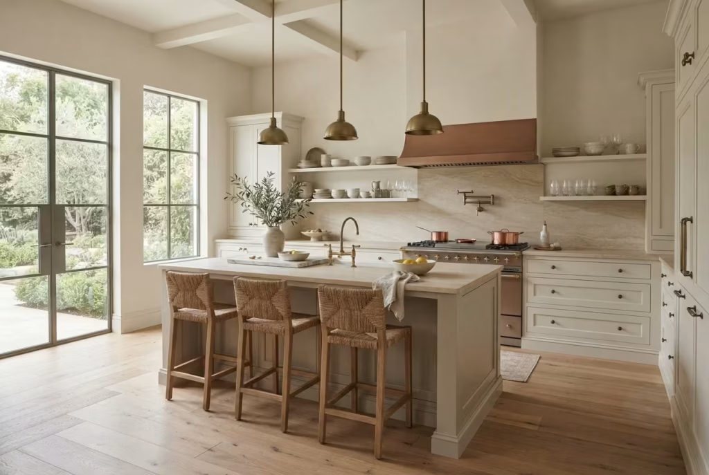
When a kitchen is built around a neutral palette, paint becomes far more important than many homeowners first realise. On paper, choosing a few shades of white, cream, taupe, or greige may sound straightforward. In practice, however, the magic lies in how those tones are layered, balanced, and allowed to work with the room’s light. Get that balance right and the kitchen feels quietly luxurious, full of depth and atmosphere. Get it wrong and the space can fall flat, like a tune with all the right notes but no rhythm.
Layered neutral paint tones are one of the most effective ways to avoid that problem. Rather than using a single colour across every surface, this approach introduces subtle shifts that give the room movement and softness. The result is a kitchen that feels composed, dimensional, and lived in, rather than overly matched or showroom perfect.
Why Monochromatic Layering Works So Well
A monochromatic kitchen is not one that uses one colour and stops there. It is one that explores the full character of a colour family, allowing slight tonal differences to create interest without breaking the calm. This is where layered neutrals really earn their keep.
A warm white on the walls might sit beside a creamier shade on the cabinetry, while a slightly deeper mushroom or taupe is introduced on the island or tall joinery. None of these colours needs to shout for attention. Their strength lies in the way they support one another, creating a room that feels gentle yet far from dull.
I often find that the most successful monochromatic schemes are the ones that feel almost invisible in their complexity. They do not announce themselves all at once. Instead, they unfold gradually, like a good conversation that gets better the longer you stay with it.
This approach also helps neutral kitchens avoid the one-note effect that can happen when every surface is painted the same colour. Even the finest architecture can lose its shape if too much is flattened into a single tone. Layering prevents that. It gives the eye places to rest while still offering enough variation to keep the room alive.
The Relationship Between Cabinets, Walls, and Ceilings
One of the most overlooked aspects of kitchen colour planning is the way cabinets, walls, and ceilings interact with one another. These surfaces may seem secondary to stone or timber, but they set the tone for the entire room.
Cabinetry often carries the most visual weight, which means its colour should be selected with the surrounding surfaces in mind. A kitchen with warm oak flooring and plenty of daylight may benefit from a slightly cooler wall colour to stop the room from feeling too soft or washed out. In contrast, a north-facing room with limited sun might call for warmer paint tones that counterbalance the cooler light.
Ceilings, too, deserve more attention than they usually receive. Painting a ceiling in the same family as the walls can create a cocooning effect that makes the room feel more intentional and architecturally grounded. A ceiling that is too starkly white, by contrast, can sometimes feel disconnected from the rest of the scheme, almost as if it belongs to a different room altogether.
In many projects I have worked on, the most elegant kitchens were not the ones with the boldest colours, but the ones where each surface had been considered as part of a larger composition. The cabinetry, walls, and ceiling worked like a trio rather than three soloists competing for the spotlight.
That kind of harmony does not happen by accident. It comes from understanding how each surface behaves in relation to the others, especially once daylight starts shifting across the room.
Why Light Reflectance Values Matter More Than Most People Think
Light reflectance value, often shortened to LRV, is one of those technical details that can completely change how a paint colour performs in real life. It describes how much light a colour reflects, and in a kitchen, that matters a great deal.
A colour with a high LRV will bounce more light around the room, helping a space feel brighter and more open. This can be especially useful in smaller kitchens or those that lack generous natural light. However, too much reflectance can make a room feel flat or overexposed if every surface is highly reflective.
A lower LRV, on the other hand, absorbs more light and can introduce softness and depth. Used well, this can make a kitchen feel richer and more grounded. Used poorly, it can make the space feel heavy.
The sweet spot usually lies somewhere in the middle, where the colours are light enough to keep the room feeling airy but deep enough to create distinction between surfaces. This is particularly important in kitchens where cabinetry, walls, and trim all sit close together. Without subtle changes in LRV, the room can end up looking blurred rather than layered.
A useful rule of thumb is to sample paint in large sections and view it at different times of day. Morning light, afternoon light, and evening artificial lighting can each reveal a different side of the colour. What looks crisp and elegant at noon may feel warmer and more subdued after sunset. That shift is not a flaw. It is part of the material’s character, and it can be used to great effect when planned carefully.
Designer Colour Strategies for Neutral Kitchens
Designers rarely approach neutral kitchens by simply choosing a white and hoping for the best. Instead, they build the palette with intent, almost like composing a layered outfit where every piece has a role to play.
One common strategy is tonal stacking. This means using a range of closely related shades across the room, such as off-white, ivory, putty, and soft taupe. The transitions are gentle, but they create enough variation to keep the room from feeling bland. This approach works especially well in kitchens that aim for a soft, timeless atmosphere.
Another strategy is contrast through temperature rather than colour. A warm neutral can be paired with a cooler one to create subtle tension. For example, a creamy cabinet colour may sit beautifully against a pale stone wall finish with a slightly cooler undertone. The difference is understated, but it prevents the kitchen from becoming too sugary or too beige.
A third strategy involves anchoring the palette with a deeper neutral. This might be a mushroom-toned island, a greige pantry wall, or a slightly darker trim colour. These heavier notes help define the room’s structure and stop everything from floating away visually. It is a bit like adding ballast to a boat. Without it, the design can drift.
In real projects, I often recommend limiting the palette to three or four closely related shades. That keeps the kitchen coherent while still allowing each area to have its own identity. Too many competing neutrals can muddy the waters and create confusion, especially when undertones begin to clash.
How Layered Paint Tones Add Real Value to a Kitchen
Layered paint tones are not just about aesthetics. They influence how a kitchen feels to live in every day.
A room with well-considered tonal layering tends to feel calmer and more settled. It can make a kitchen seem larger, softer, and more tailored without the need for expensive decorative features. It also allows the materials around it to shine. Natural stone looks richer beside a carefully selected wall colour. Timber cabinetry feels warmer when set against a soft painted backdrop. Even simple brass hardware gains more presence when the surrounding tones have been thought through properly.
This kind of detail may not be the first thing a guest notices, but it is often what makes a kitchen memorable. The room feels finished, not because it is filled with extras, but because every surface has been given its due.
And that, in the end, is the quiet power of layered neutral paint tones. They do not demand attention. They earn it, little by little, through balance, depth, and the kind of understated confidence that never goes out of style.
Incorporate Textured Plaster Walls
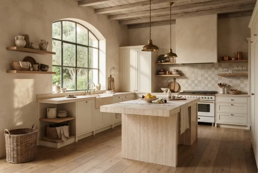
In many neutral kitchens, colour is intentionally restrained. The palette may consist of warm whites, limestone tones, soft greiges, muted taupes, and natural timber finishes. While this approach creates a calm and timeless atmosphere, it also places greater responsibility on texture. Without texture, even the most carefully selected palette can feel one-dimensional. With it, the room gains richness, depth, and a sense of craftsmanship that draws people in.
This is precisely why textured plaster walls have become one of the most influential elements in contemporary kitchen design. They introduce movement without pattern, character without clutter, and visual interest without relying on bold colour contrasts. Rather than competing with cabinetry, stone, or lighting, plaster acts as a supporting layer that quietly enriches everything around it.
What makes plaster particularly compelling is that its beauty is never entirely fixed. Light shifts across its surface throughout the day, revealing subtle shadows, tonal variations, and handcrafted details that create an ever-changing backdrop. The wall becomes more than a painted surface. It becomes part of the architecture itself.
In a world increasingly dominated by machine-perfect finishes, textured plaster reminds us that the human touch still carries enormous value.
Why Tactile Surfaces Are Reshaping Kitchen Design
For many years, kitchen design focused heavily on sleekness. Gloss finishes, perfectly smooth surfaces, and highly polished materials dominated both showrooms and magazines. While those finishes created a sense of modernity, they occasionally lacked warmth. Today’s homeowners are seeking something different.
People increasingly want interiors that feel connected to nature, craftsmanship, and authentic materials. They want rooms that feel inviting rather than overly controlled. This shift has led to a growing appreciation for tactile surfaces that engage more than just the eye.
Textured plaster fits beautifully within this movement. Its appeal comes from the way it introduces subtle imperfection and depth. Running a hand across a plaster wall reveals slight variations in texture that make the space feel more human. Visually, these surfaces create shadows and highlights that add complexity even within a limited colour palette.
I often explain to clients that texture is what gives neutral interiors their heartbeat. Without it, the room may look attractive but struggle to feel emotionally engaging. Plaster helps bridge that gap by creating layers that are felt as much as they are seen.
As the saying goes, variety is the spice of life. In neutral kitchens, texture often provides that variety without disturbing the overall sense of calm.
The Enduring Influence of Venetian Plaster
Among the many plaster finishes available today, Venetian plaster remains one of the most admired. Dating back centuries, this traditional finish combines natural materials with specialised application techniques to create surfaces that possess remarkable depth and movement. Rather than appearing flat, Venetian plaster seems to glow softly from within, creating a richness that standard paint struggles to replicate. Its appeal lies in subtlety.
The finish can range from highly polished and refined to softly matte and organic, depending on the desired aesthetic. In neutral kitchens, I often favour finishes that lean toward a gentle sheen rather than a mirror-like surface. This allows the texture to remain visible while maintaining a relaxed and approachable atmosphere.
Colours inspired by limestone, chalk, clay, sand, and weathered stone work particularly well. These tones reinforce the natural quality of the material while complementing other kitchen elements such as oak cabinetry, travertine surfaces, and aged brass hardware.
One of the most fascinating aspects of Venetian plaster is its ability to create depth without introducing visual noise. The wall remains quiet, yet never boring. The closer you look, the more detail reveals itself. That layered complexity is one reason the material continues to appear in many of the world’s most sophisticated residential interiors.
Creating Warmth Through Modern Rustic Applications
Textured plaster is often associated with Mediterranean villas or historic European homes, but its versatility extends far beyond those traditional settings.
Many contemporary kitchens now use plaster to soften modern architecture and create a stronger connection to natural materials. This approach is particularly effective within modern rustic design. Imagine a kitchen featuring:
- Warm oak cabinetry.
- Honed limestone countertops.
- A sculptural plaster range hood.
- Aged brass fixtures.
- Wide-plank timber flooring.
In such spaces, plaster acts as the thread that ties everything together. It softens hard edges, introduces visual warmth, and helps the room feel rooted rather than overly polished.
I recently worked on a renovation where the homeowners wanted a contemporary extension to feel connected to the character of the original house. Traditional paint finishes felt too flat against the natural materials we had selected.
By introducing a soft mineral plaster across the kitchen walls, the entire atmosphere changed. Light interacted differently with the surfaces, the oak felt richer, and the stone details appeared more integrated.
The finished room felt layered and authentic rather than newly manufactured. That quality is often what homeowners are really searching for, even if they struggle to articulate it initially. They want a kitchen that feels collected over time rather than assembled all at once.
Why Plaster Excels in Neutral Colour Schemes
Neutral kitchens rely heavily on subtle distinctions. When bold colours are removed from the equation, materials must work harder to create visual interest. Textured plaster excels because it introduces variation without disrupting the palette.
A warm white plaster wall may contain dozens of subtle tonal shifts that become visible as daylight moves across the room. These shifts create depth that ordinary paint cannot easily replicate. This makes plaster particularly effective alongside:
- Cream cabinetry.
- Greige-painted joinery.
- Limestone-inspired surfaces.
- Travertine details.
- Walnut and oak timber elements.
- Handmade ceramic accents.
Because plaster possesses a naturally organic quality, it helps prevent neutral schemes from feeling sterile or overly engineered. The room gains complexity while maintaining the calm atmosphere that makes neutral kitchens so appealing in the first place.
Understanding the Maintenance Realities
Although textured plaster offers considerable aesthetic benefits, it is important to understand its practical characteristics before committing to the material.
One common misconception is that plaster walls require excessive maintenance. In reality, many modern plaster systems are surprisingly durable when installed correctly. That said, they are not entirely maintenance-free. Factors worth considering include:
Surface Protection
Certain plaster finishes benefit from protective sealers, particularly in areas exposed to moisture or cooking activity.
Cleaning Requirements
Gentle cleaning methods are generally recommended. Harsh chemicals can damage delicate finishes or alter the appearance of the surface.
Repair Considerations
Minor repairs may require specialised techniques to maintain consistency across the wall.
Installation Quality
Perhaps most importantly, the finished appearance depends heavily on the skill of the applicator. Plaster is a craft-based material, and experience makes a significant difference.
In my experience, homeowners who understand these realities from the beginning are typically delighted with the long-term results. The material rewards thoughtful care with years of visual interest and character.
Lessons from Real Renovation Projects
One project involved a newly built kitchen that featured beautiful stone surfaces, bespoke cabinetry, and carefully selected lighting. Despite the quality of the materials, something felt missing.
The room looked impressive, but it lacked warmth. We eventually introduced a mineral-based plaster finish across the main kitchen walls and the custom range hood. The transformation was immediate.
The space felt softer, more inviting, and far more connected to the natural materials already present. Visitors often commented on the atmosphere of the room without immediately identifying why it felt different.
That reaction highlights one of plaster’s greatest strengths. Its influence is often subtle yet powerful. People may not always notice the finish directly, but they certainly notice how the room feels because of it.
Why Textured Plaster Continues to Define Sophisticated Neutral Kitchens
Exceptional kitchens are rarely defined by colour alone. They succeed because every layer contributes to the overall experience. Textured plaster walls bring something uniquely valuable to that equation. They add depth without clutter, craftsmanship without ornamentation, and warmth without relying on trends.
Their tactile quality creates a stronger connection between people and the spaces they inhabit. Their interaction with light introduces constant visual interest. Their natural appearance complements the growing desire for authentic materials and thoughtful design. Most importantly, plaster helps neutral kitchens feel complete.
Long after paint trends have changed and decorative accessories have come and gone, textured plaster continues to provide richness, character, and architectural presence. It proves that sometimes the most memorable design features are not the loudest ones. They are the elements that quietly improve every experience within the room, day after day, year after year.
Add a Furniture-Style Kitchen Island
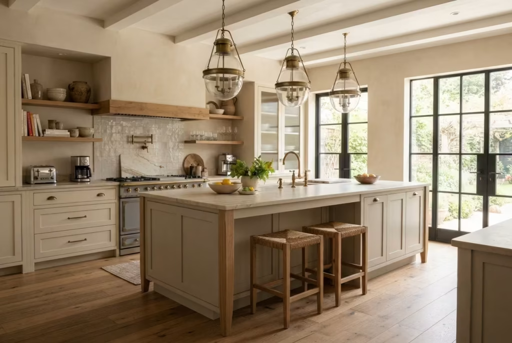
A kitchen island can either blend quietly into the background or step forward as one of the room’s most defining features. In many neutral kitchens, the most memorable islands are not the ones that look overly built-in or rigid, but the ones that carry the relaxed elegance of a beautifully made piece of furniture. That subtle shift in approach can completely change the atmosphere of the room.
Furniture-style islands bring a sense of ease, warmth, and individuality into a space that might otherwise feel too fitted, too uniform, or a little boxed in. They soften the hard lines of cabinetry, introduce visual variety, and help the kitchen feel less like a showroom and more like a thoughtfully lived-in home. Like a well-chosen heirloom placed in a modern setting, they add character without making a fuss.
For homeowners aiming for a neutral palette with depth and distinction, this is one of the smartest design moves available. The island becomes more than a working surface. It becomes a centrepiece with presence, personality, and a quietly confident sense of style.
Why Furniture-Style Islands Break Up Fitted Cabinetry So Well
Fully integrated kitchens can look incredibly polished, but there is a tipping point where too much uniformity starts to feel flat. A run of continuous cabinetry, even when finished in beautiful materials, can sometimes lose its sense of rhythm. A furniture-style island interrupts that sameness in the best possible way.
By introducing a piece that feels separate from the surrounding joinery, the kitchen gains contrast and breathing room. The eye can recognise the island as a distinct object rather than simply another section of cabinetry. That distinction gives the room more depth and keeps the design from feeling overly engineered.
This approach is especially useful in large kitchens or open-plan layouts where the island occupies a central position. Instead of disappearing into the background, it helps anchor the room with a stronger sense of identity. The result is a kitchen that feels more layered, more personal, and far less cookie-cutter.
I have found in renovation work that this small shift often has a surprisingly big effect. Once the island stops looking like part of a continuous wall of cabinetry, the entire space begins to feel more relaxed and more considered.
What Makes a Freestanding-Inspired Design Feel So Special
A true freestanding look is not about creating something flimsy or impractical. It is about borrowing the proportions and detailing of a carefully made piece of furniture, then adapting it for kitchen use.
This might mean a recessed plinth, slender end panels, visible legs, or a slightly lifted appearance that allows the island to feel less rooted to the floor. It might also involve panelled sides, exposed joinery details, or a more refined silhouette that echoes classic sideboards, work tables, or console pieces.
The appeal lies in the character. Furniture-style islands often feel gathered, as if they have arrived in the room over time rather than being delivered all at once on installation day. That sense of history and quiet informality can be incredibly effective in a neutral kitchen, where the challenge is often how to create warmth without clutter.
There is a lovely balance to be struck here. The island should still be robust, functional, and completely suited to daily life, but it should also carry a gentler visual language. When done well, it feels like the best of both worlds, practical on the inside and elegant on the outside.
Decorative Leg Details Change the Whole Mood
One of the easiest ways to shift an island from built-in to furniture-like is through the legs. These details might seem minor, but they can be the deciding factor between a kitchen that feels standard and one that feels distinctive.
Square legs introduce a more contemporary, architectural feel. Tapered legs can soften the profile and create a lighter impression. Turned legs nod toward traditional craftsmanship and are particularly effective in kitchens that lean heritage or transitional. Even a simple shadow gap or inset plinth can help the island read less like a cabinet run and more like a standalone piece.
The important thing is proportion. Legs that are too delicate can look decorative without substance, while legs that are too heavy can defeat the purpose entirely. The best solutions feel balanced, as if they have been chosen with a steady hand rather than tossed in for effect.
In one project I worked on, we used slightly tapered timber legs beneath a painted island topped with honed stone. The effect was immediate. The island felt lighter, more elegant, and more like a piece of bespoke furniture than a block of joinery. It brought the whole kitchen up a notch, without shouting about it. That is the sweet spot. The detail should earn its place, not demand applause.
How to Create a Collected Aesthetic That Feels Authentic
A furniture-style island works best when the rest of the kitchen supports that sense of intentional layering. It should feel like part of a home that has been thoughtfully assembled, not overly matched from one supplier catalogue.
That does not mean the kitchen needs to look eclectic or mismatched. Far from it. The trick is to combine materials that feel natural together, then allow the island to stand out as a slightly more expressive element.
A painted island in soft greige or muted cream can pair beautifully with oak shelving, brass hardware, stone worktops, and plaster walls. A darker timber island can introduce depth within a room full of light neutrals. Even a simple panelled finish, when combined with the right countertop and leg detail, can create a sense of quiet richness.
Accessories also matter. A few well-chosen stools, a sculptural pendant, or a small arrangement of everyday objects can help the island feel inhabited rather than staged. The goal is a room that feels gathered over time, like pieces collected with care rather than selected in haste.
That sense of layering is what gives a kitchen soul. Without it, even a beautifully designed island can feel a little too neat for its own good.
Why This Approach Works So Well in Neutral Kitchens
Neutral kitchens rely heavily on subtle variation. Since colour is not doing all the heavy lifting, the design depends on form, material, and texture to carry the story. A furniture-style island adds all three.
It brings contrast without drama, softness without sentimentality, and detail without excess. It also helps the kitchen feel more human. Instead of reading as a fully fitted machine, the room gains a piece that feels approachable and gracious, almost like it has a memory attached to it.
That is why this approach resonates so strongly in real homes. People do not live in display spaces. They live in kitchens where life gets messy, where coffee mugs gather in the morning, where dinner is dropped on the counter after a long day, and where conversations often happen around the island more than anywhere else. A furniture-style island acknowledges that reality while still looking beautifully composed.
And in the end, that is what good design should do. It should make life feel easier, richer, and more comfortable, all while looking as though every detail was chosen with a clear eye and a steady hand.
You May also Like: 25 Best Beige Kitchen Cabinet Ideas for Your Next Remodel
Introduce Natural Linen Window Treatments
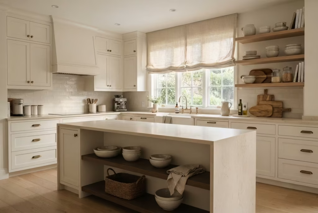
When homeowners think about kitchen design, their attention usually gravitates toward cabinetry, countertops, flooring, lighting, and appliances. Window treatments often enter the conversation much later, sometimes as one of the final decisions. Yet after working on countless kitchen renovations, I have learned that overlooking windows is a bit like baking a cake and forgetting the finishing touch. The room may function perfectly well, but something essential feels missing.
In neutral kitchens especially, natural linen window treatments can have a transformative effect. They soften the architectural lines that dominate most kitchens, introduce movement into a space filled with fixed surfaces, and help establish a more welcoming atmosphere. More importantly, they contribute a layer of texture that many neutral schemes desperately need.
Stone, timber, metal, and painted cabinetry all bring their own qualities to a kitchen, but they are largely rigid materials. Linen introduces something different. It moves gently with air currents, interacts beautifully with daylight, and develops character over time. It creates a sense of comfort that is difficult to achieve through hard finishes alone. The result is a kitchen that feels less engineered and more inviting, balancing practicality with warmth in a way that never feels forced.
Why Kitchens Benefit from Softer Elements
A typical kitchen contains an extraordinary number of hard surfaces. Stone countertops, tiled backsplashes, timber floors, painted cabinetry, glass, steel appliances, and metal fixtures all contribute to the overall composition. While these materials are essential for durability and function, they can sometimes create an environment that feels visually rigid. Natural linen helps restore balance.
Its texture introduces softness without relying on decorative excess. Instead of adding another hard finish to the room, linen contributes a more relaxed layer that offsets the crisp edges and clean lines found elsewhere. This becomes particularly important in contemporary kitchens where minimalism often dominates the design language.
I frequently find that clients cannot immediately identify why a completed kitchen feels more comfortable after linen treatments are installed. They simply notice that the room feels warmer and more welcoming. That reaction is no accident.
Human beings naturally respond to variation in texture. Spaces that combine hard and soft materials tend to feel more comfortable than those built entirely from rigid surfaces. As the saying goes, it takes two to tango. The most successful interiors rely on balance between contrasting elements, and linen provides precisely that counterpoint.
The Unique Beauty of Light Filtered Through Linen
One of linen’s greatest strengths is the way it interacts with natural light. Unlike heavier fabrics that block daylight or synthetic materials that can appear overly uniform, linen filters light in a remarkably gentle and organic manner. Sunlight passing through the fabric creates a soft glow that enhances the atmosphere of the entire room. This quality becomes particularly valuable in neutral kitchens.
Because the palette often relies on subtle tonal differences, the quality of light significantly influences how colours and materials are perceived. Linen helps diffuse harsh sunlight, reducing glare while preserving brightness. The effect changes throughout the day.
Morning light may create a fresh and airy atmosphere. Afternoon sunlight can reveal the fabric’s natural texture, while evening illumination often produces a warm, intimate glow.
In one kitchen renovation overlooking a garden, we installed simple linen Roman shades. The homeowners later remarked that the room felt different throughout the day, almost as though the lighting had been carefully choreographed. In reality, the linen was doing much of the work. These subtle interactions with daylight often become some of the most appreciated aspects of a completed design.
Why Linen Complements Neutral Colour Palettes So Well
Neutral kitchens depend heavily on material variation. Without strong colour contrasts, every surface contributes to the room’s overall depth and character. Linen excels in this environment because it introduces visual complexity while remaining understated.
Natural linen tones pair beautifully with:
- Warm white cabinetry.
- Greige-painted kitchens.
- Limestone-inspired countertops.
- Travertine details.
- Oak and walnut timber finishes.
- Antique brass hardware.
- Handmade ceramic accessories.
Rather than competing with these materials, linen supports them. Its slightly irregular weave and natural texture create subtle variation that enriches the overall composition. The fabric adds interest without disrupting the calm atmosphere that makes neutral kitchens so enduringly appealing.
This quality explains why linen continues to appear in many of the world’s most admired interiors. It possesses enough character to feel interesting, yet enough restraint to remain timeless.
Roman Shades Versus Curtains: Which Works Best?
One question homeowners frequently ask is whether linen is better suited to Roman shades or curtains. The answer depends largely on the architecture of the room and the desired aesthetic.
Linen Roman Shades
Roman shades create a tailored appearance that works particularly well in kitchens where space is limited. Their clean lines complement contemporary and transitional interiors while still providing softness through the fabric itself. Benefits include:
- Compact appearance.
- Excellent light control.
- Minimal visual clutter.
- Strong architectural presence.
- Practical operation above sinks and worktops.
Roman shades often work beautifully above kitchen sinks where full-length curtains would be impractical.
Linen Curtains
Curtains introduce a more relaxed and decorative quality. They can soften large expanses of glazing, add vertical emphasis to the room, and create a slightly more traditional atmosphere. Benefits include:
- Enhanced softness and movement.
- Stronger visual texture.
- Better acoustic absorption.
- Greater opportunity for layering.
- Elegant framing of windows and doors.
In larger kitchens, especially those with French doors or garden-facing glazing, linen curtains often create a welcoming and luxurious atmosphere. Neither solution is inherently better. The most successful choice is usually the one that responds thoughtfully to the room’s architecture and daily use patterns.
Practical Considerations Before Choosing Linen
While linen offers considerable aesthetic advantages, practical realities should also be considered. Fortunately, modern linen products have become increasingly user-friendly. Several factors are worth evaluating:
Maintenance Expectations
Natural linen may wrinkle slightly, but many homeowners view this relaxed appearance as part of its charm. Those seeking a crisper look can choose linen blends that maintain structure more effectively.
Sun Exposure
High-quality linen performs well in naturally lit spaces, though prolonged direct sunlight may gradually soften certain colours over many years.
Moisture Considerations
In kitchens, selecting washable or professionally cleanable fabrics simplifies long-term care.
Privacy Requirements
Depending on window orientation, homeowners may wish to combine linen with secondary privacy solutions such as blinds or layered treatments. In my experience, clients who embrace linen’s natural character tend to appreciate it most. The fabric’s slight imperfections contribute to its authenticity rather than detracting from its appeal.
Lessons from Real Kitchen Projects
One renovation involved a newly extended kitchen featuring limestone-inspired flooring, pale oak cabinetry, and expansive steel-framed glazing overlooking the garden.
The materials were beautiful, but the room initially felt slightly stark. We introduced floor-to-ceiling linen curtains in a soft oatmeal tone along the garden-facing elevation. The difference was immediate.
The curtains softened the architecture, reduced visual harshness from direct sunlight, and introduced a sense of comfort that had previously been missing. The homeowners later described the space as feeling calmer and more complete.
That experience reinforced an important lesson. Sometimes the most significant improvements come not from adding another expensive material, but from introducing a softer element that helps existing materials shine.
Why Natural Linen Remains a Timeless Choice
Trends in kitchen design will continue to evolve, but natural linen possesses qualities that transcend fashion. It softens hard surfaces without overwhelming them. It filters light beautifully. It introduces texture, movement, and warmth while maintaining the simplicity that defines great neutral design.
Most importantly, linen helps kitchens feel more human. A well-designed kitchen should support everyday life while providing moments of comfort and beauty. Linen contributes to both. Its presence may be subtle, yet its impact is profound.
Long after cabinet colours, hardware styles, and decorative trends have changed, natural linen window treatments continue to offer the qualities homeowners value most: comfort, elegance, practicality, and a sense of effortless refinement that only improves with time. In a neutral kitchen, those qualities are worth their weight in gold.
Use Integrated Appliances for Visual Simplicity
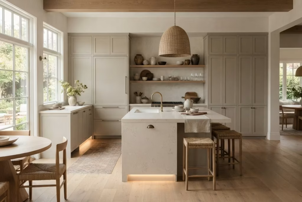
In a neutral kitchen, restraint often does more heavy lifting than decoration ever could. Integrated appliances are a perfect example of that principle in action. By allowing refrigeration, dishwashing, cooking support, and even smaller essentials to sit behind cabinetry fronts, the kitchen gains a calmer, more coherent appearance that feels deliberate rather than cluttered.
This is not about hiding technology for the sake of it. It is about giving the room a cleaner visual rhythm, so the materials, proportions, and craftsmanship can breathe. In kitchens where every surface has been carefully considered, exposed appliances can sometimes feel like notes played slightly off-key. Integration helps everything land in the same register.
The result is a space that feels quietly luxurious, deeply ordered, and far less prone to visual noise.
The Quiet Power of Restraint
There is a particular elegance in a kitchen that does not need to announce every function at once. Integrated appliances support that feeling beautifully. They allow the eye to move across the room without interruption, which is especially valuable in neutral schemes where harmony depends on subtle transitions.
A fridge panel that matches the surrounding joinery, a dishwasher concealed behind a cabinet front, or a boiling water tap chosen with care rather than excess can make the whole kitchen feel more composed. These details may seem small in isolation, yet together they create the sense that the room has been edited with a steady hand.
That kind of restraint tends to age well too. The more visually serene a kitchen feels, the less likely it is to date quickly. Trends come and go, but calm proportion and clean composition rarely lose their appeal.
As the saying goes, silence speaks volumes. In kitchen design, integrated appliances often make the strongest statement by blending in.
How Clean Sightlines Change the Whole Room
One of the greatest benefits of integrated appliances is the way they preserve sightlines. In open-plan homes, this matters enormously. The kitchen is rarely viewed on its own. It is seen from the dining area, the living room, a hallway, or even the garden doors. Every visible appliance becomes part of the wider interior composition whether you like it or not.
By concealing the bulk of these elements, the room feels more like fitted architecture and less like a collection of machines. Tall runs of cabinetry read as a unified plane. Islands look more like furniture pieces. Wall elevations feel lighter, tidier, and more intentional.
I have worked on kitchens where a single exposed fridge or dishwasher completely changed the mood of the room, not because it was unattractive, but because it disrupted the flow. Once integrated, the same space felt suddenly more relaxed, more elegant, and much easier on the eye.
The difference can be surprisingly dramatic. Like smoothing out a folded sheet, it brings the whole composition into better alignment.
Appliance Planning Needs to Happen Early
Integrated appliances deliver the best results when they are considered from the beginning rather than added late in the process. This is where many kitchen projects either succeed quietly or become awkwardly compromised.
Cabinet dimensions, ventilation requirements, door swing clearances, electrical locations, plumbing routes, and panel specifications all need to be coordinated well before installation. If this planning is rushed, the result can be mismatched front heights, awkward gaps, or units that feel out of proportion.
A well-planned integrated kitchen tends to include the following:
- Cabinetry designed around exact appliance dimensions.
- Consistent reveal lines across doors and panels.
- Careful alignment between tall units and worktop runs.
- Ventilation solutions that remain discreet but effective.
- Adequate access for servicing without disrupting the design.
This stage often determines whether the finished kitchen feels bespoke or merely assembled. In my experience, the most polished rooms are almost always the ones where appliance planning was treated as a design issue, not just a technical one.
That level of foresight may not be visible at first glance, but it is absolutely felt in the finished space.
Which Appliances Benefit Most from Integration
Not every appliance needs to disappear behind cabinetry, and that is worth saying clearly. Integration works best when applied selectively and thoughtfully.
The most common candidates include:
Refrigerators and Freezers
Large appliances often benefit most from integration because their size can dominate a room if left exposed. Panelled fronts help them recede into the joinery.
Dishwashers
Disguising the dishwasher behind cabinetry preserves the rhythm of the lower run and keeps the kitchen looking refined, even when the appliance is in daily use.
Wine Coolers
In neutral kitchens, a panelled wine cooler can feel much calmer than a glass-fronted version, especially when the goal is visual simplicity.
Washer-Dryers or Utility Appliances
In kitchens that include utility functions, concealing these items helps keep the social heart of the room looking composed.
Extractor Solutions
While some hoods are designed to be statement pieces, others work best when discreetly integrated into cabinetry or plaster detailing.
The trick is not to hide everything, but to decide where visual quiet will have the greatest impact.
Why This Approach Feels So Luxurious
Luxury is often mistaken for abundance. In reality, some of the most luxurious interiors are defined by what they leave out.
Integrated appliances support that principle by reducing clutter and allowing the surrounding materials to take centre stage. Warm timber, stone worktops, painted cabinetry, brass hardware, and textured plaster all read more clearly when they are not competing with stainless steel or large appliance faces.
This makes the kitchen feel more architectural and less utilitarian. The room begins to behave like a well-designed living space rather than a service area with a few decorative touches added on top.
That distinction matters. People may not consciously notice the lack of exposed appliances, but they usually feel the difference immediately. The room settles. The eye relaxes. The whole space feels more complete, almost as if the final piece of the puzzle has quietly slipped into place.
Investment Value and Long-Term Appeal
Integrated appliances also carry strong long-term value. From a resale perspective, they often help a kitchen appear more polished, more premium, and more aligned with contemporary expectations of high-end residential design.
This is not to say every buyer will prioritise concealed appliances above all else. However, a cohesive kitchen that looks well considered generally holds broader appeal than one where appliances interrupt the design flow. Buyers tend to notice quality, even if they cannot always explain why a room feels more desirable.
There is also a practical value to consider. A kitchen that looks calm and well planned is often easier to live with day after day. It feels less busy, less vulnerable to visual fatigue, and more resilient over time.
In that sense, integrated appliances are not just an aesthetic choice. They are a design decision that supports daily life while strengthening the overall value of the home.
What Real Projects Have Taught Me
In one renovation I worked on, the homeowners initially wanted a highly visible, professional-style appliance layout. After reviewing the kitchen in context, we realised that the room’s open-plan setting and pale material palette would benefit more from a gentler approach.
We replaced several exposed appliances with fully integrated alternatives and adjusted the cabinetry layout to maintain clean lines across the back wall.
The transformation was remarkable. The room felt larger, calmer, and far more tailored. The stone, oak, and brass details finally had space to breathe. What had once felt slightly busy became beautifully composed.
That experience reaffirmed something I have seen many times over. Integration is not about making the kitchen invisible. It is about making the overall design stronger by removing distractions that do not need to be seen.
Why Integrated Appliances Continue to Matter
In a well-designed neutral kitchen, visual simplicity is not a shortcut. It is a discipline. Integrated appliances support that discipline by preserving harmony, protecting sightlines, and allowing the room’s best materials to do the talking.
They create a kitchen that feels calm without being empty, refined without being fussy, and practical without advertising every function at once. In the long run, that is often what homeowners value most.
A kitchen like that does not try to impress in every direction. It simply feels right, which is usually the best sign that the design has been handled with real care.
Combine Stone and Timber in Equal Measure
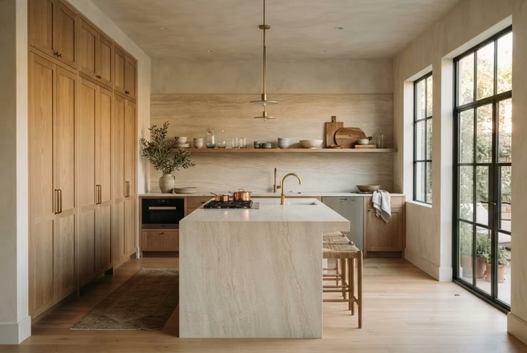
One of the most effective ways to create a neutral kitchen that feels both luxurious and welcoming is by balancing stone and timber. These two materials bring fundamentally different qualities to a space. Stone contributes permanence, durability, and refinement, while timber introduces warmth, texture, and a sense of comfort. When used in equal measure, they create a kitchen that feels complete rather than leaning too heavily in one direction.
Many homeowners unintentionally overuse one material at the expense of the other. Too much stone can leave a kitchen feeling cold and overly formal. Too much timber can reduce visual contrast and make the space feel less refined. The goal is not necessarily a perfect fifty-fifty split, but a thoughtful balance where each material complements and strengthens the other.
Material Balance Principles
Successful kitchens rarely rely on a single dominant material. Instead, they layer materials strategically to create depth and visual interest. Stone typically appears on countertops, backsplashes, waterfall islands, and occasionally feature walls. Timber often appears in cabinetry, shelving, ceiling beams, island detailing, and flooring. The key is distributing visual weight evenly throughout the room. For example:
- A large stone island may be balanced by oak cabinetry.
- Extensive timber cabinetry can be offset with a full-height stone backsplash.
- Stone countertops paired with timber shelving create contrast without overwhelming either material.
- Timber ceiling details can soften kitchens with significant stone surfaces.
When both materials are visible from multiple viewpoints, the room feels more harmonious and intentionally designed.
Preventing Cold Interiors
One of the most common challenges in neutral kitchen design is avoiding a cold or sterile atmosphere. Natural stone is beautiful, but extensive use of marble, quartz, porcelain, or limestone-inspired surfaces can sometimes make a room feel visually hard, particularly when combined with pale cabinetry and large expanses of glazing.
Timber helps solve this problem. Its grain variation, natural colour shifts, and tactile qualities introduce warmth that stone alone cannot provide. Even relatively small timber elements can have a significant impact.
Effective solutions include:
- Oak floating shelves above stone backsplashes.
- Timber-clad islands paired with stone worktops.
- Walnut pantry cabinetry within predominantly stone-focused kitchens.
- Exposed ceiling beams that visually soften hard finishes.
These additions create balance and help the kitchen feel more comfortable for everyday living.
Warmth Versus Sophistication
Many homeowners mistakenly assume they must choose between a warm kitchen and a sophisticated one. In reality, the strongest neutral kitchens achieve both simultaneously. Stone contributes sophistication through its durability, natural variation, and architectural presence. Timber contributes warmth through texture and organic character. Without stone, a kitchen may lack visual weight and refinement. Without timber, the room can feel overly formal and less inviting.
I often advise clients to think of these materials as complementary rather than competing elements. Stone provides structure. Timber provides softness. Together they create an environment that feels polished yet approachable. This balance becomes particularly important in open-plan homes where kitchens must function as both practical workspaces and social gathering areas.
Successful Pairings
Certain stone and timber combinations consistently perform well because their undertones naturally complement one another. Some of the most successful pairings include:
White Oak and Limestone
Light oak cabinetry paired with limestone or limestone-look surfaces creates a calm, timeless palette that works beautifully in contemporary and transitional kitchens.
Walnut and Cream Quartzite
Walnut introduces richness and depth, while cream quartzite provides elegance and subtle movement without overwhelming the space.
European Oak and Travertine
The warmth of oak complements travertine’s earthy character, creating a kitchen that feels relaxed yet refined.
Rift-Sawn Oak and Marble
Clean grain patterns paired with softly veined marble create a sophisticated balance between modern simplicity and natural beauty.
Smoked Oak and Honed Quartz
Smoked oak provides depth and texture, while honed quartz introduces durability and visual softness.
The most successful combinations focus on tonal harmony rather than strong contrast. Materials should feel connected, allowing the kitchen to appear layered and cohesive rather than fragmented. When stone and timber are balanced thoughtfully, the result is a neutral kitchen that feels both grounded and elegant, offering warmth, sophistication, and lasting visual appeal.
Highlight Architectural Ceiling Features
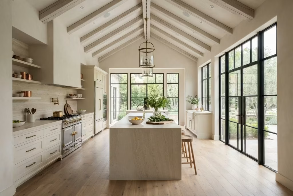
Architectural ceiling features can significantly influence how a kitchen feels and functions. While most design attention is focused on cabinetry, countertops, and flooring, the ceiling represents a substantial visual surface that can add character, depth, and architectural presence. In neutral kitchens, where colour is often restrained, ceiling details help create visual interest through form, scale, and structure rather than decoration.
Beams and Coffered Ceilings
Exposed beams and coffered ceilings introduce architectural definition that immediately elevates a kitchen’s design. Timber beams add warmth and texture while helping large spaces feel more grounded. They work particularly well in farmhouse, transitional, rustic, and European-inspired kitchens where natural materials play an important role.
Coffered ceilings create a more formal and structured appearance. By dividing the ceiling into recessed panels, they add depth and visual rhythm without introducing additional colours or finishes. This approach works especially well in larger kitchens where expansive flat ceilings may feel empty or lack architectural interest. Both options create shadows and dimension that enrich neutral colour palettes while reinforcing the room’s overall design language.
Vaulted Kitchen Design
Vaulted ceilings can dramatically change the perception of space within a kitchen. By increasing ceiling height and opening up the room vertically, vaulted designs create a greater sense of volume and airiness. This is particularly beneficial in kitchens connected to dining and living areas where openness is a key design objective.
A vaulted ceiling also allows more natural light to circulate throughout the space, especially when combined with clerestory windows, skylights, or large glazed openings. In neutral kitchens, vaulted ceilings help prevent the room from feeling visually compressed. The additional height creates a stronger connection between architecture and interior design, allowing materials such as timber, stone, and plaster to be appreciated on a larger scale.
Drawing the Eye Upward
One of the most important functions of ceiling features is their ability to guide visual movement. Without architectural details above eye level, attention tends to remain focused on cabinetry and furnishings. Ceiling features encourage the eye to travel upward, creating a more dynamic and balanced experience of the room. This can be achieved through:
- Exposed timber beams.
- Coffered ceiling grids.
- Vaulted forms.
- Tongue-and-groove ceiling cladding.
- Decorative ceiling paneling.
- Architectural lighting integrated into ceiling structures.
Directing attention upward makes the entire room feel more considered and visually complete. It also helps emphasise vertical space, which can make kitchens appear larger than their actual footprint.
Scale and Proportion
Ceiling features must be designed in proportion to the room. Oversized beams in a small kitchen can feel heavy and overwhelming, while undersized details may disappear within a large open-plan space. Successful ceiling design relies on matching the scale of architectural elements to the room’s dimensions.
For example:
- Large kitchens with ceilings over 3 metres (10 feet) can accommodate deeper beams and more substantial ceiling detailing.
- Medium-sized kitchens often benefit from simplified beam layouts or modest coffered patterns.
- Smaller kitchens typically require lighter detailing that adds character without reducing the perceived height of the room.
Proportion is equally important when introducing vaulted ceilings. The pitch, span, and overall volume should feel balanced relative to the kitchen’s footprint. When scale and proportion are handled correctly, ceiling features strengthen the architecture and create a more cohesive, visually balanced kitchen.
Create a Soft Contemporary Look with Mushroom Tones
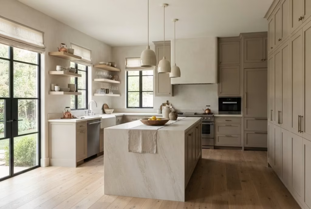
Mushroom tones have become increasingly popular in kitchen design because they offer a balanced alternative to stark whites and cooler greys. Sitting somewhere between taupe, greige, beige, and soft brown, mushroom shades bring warmth and sophistication without dominating the space. Their versatility allows them to work across a wide range of architectural styles, from contemporary homes to more traditional interiors.
Why Mushroom Shades Are Gaining Popularity
Many homeowners are moving away from cooler grey palettes in favour of colours that feel warmer and more natural. Mushroom tones respond to this shift by providing subtle depth while maintaining a neutral appearance.
Unlike pure beige, which can sometimes feel dated, or grey, which can appear cold under certain lighting conditions, mushroom tones offer a more balanced solution. They create visual warmth while remaining understated and timeless.
These shades also work well as a backdrop for other materials, making them particularly suitable for kitchens where texture and craftsmanship are intended to take centre stage.
Pairing with Natural Materials
One of the strengths of mushroom tones is their compatibility with natural materials. They pair particularly well with:
- White oak cabinetry.
- Walnut accents.
- Limestone and limestone-look surfaces.
- Travertine details.
- Natural linen textiles.
- Antique brass hardware.
- Handmade ceramic accessories.
The soft earthy undertones found in mushroom colours help unify these materials, creating a kitchen that feels cohesive rather than overly contrasted. For example, mushroom-painted cabinetry combined with oak shelving and limestone-inspired worktops creates a layered palette that feels warm, calm, and visually balanced.
Lighting Considerations
Lighting plays a significant role in how mushroom tones appear within a kitchen. Because these colours contain a mixture of warm and cool undertones, they can shift noticeably throughout the day. Natural daylight may highlight their softer grey characteristics, while evening lighting often brings forward warmer brown and taupe notes.
For this reason, paint samples should always be tested in the actual room before making a final decision. Several factors influence performance:
- Window orientation.
- Amount of natural light.
- Artificial lighting temperature.
- Surrounding materials and finishes.
- Ceiling height and room proportions.
In north-facing kitchens, warmer mushroom shades often help counteract cooler daylight. In brighter south-facing spaces, slightly cooler mushroom tones can prevent the room from feeling overly warm.
Designer Applications
Designers frequently use mushroom tones in areas where they want softness without sacrificing sophistication. Common applications include:
- Full kitchen cabinetry.
- Kitchen islands.
- Pantry walls.
- Built-in storage units.
- Trim and architectural details.
Mushroom tones are also effective when layered with other neutrals. A mushroom island paired with warm white perimeter cabinetry, for example, creates subtle contrast while maintaining a cohesive palette.
In contemporary kitchens, these shades are often combined with clean-lined cabinetry and natural stone. In more traditional settings, they work well alongside panelled joinery, timber details, and classic architectural elements.
Their flexibility makes them one of the most adaptable neutral colours available, capable of creating kitchens that feel current while retaining long-term appeal.
Add a Neutral Kitchen Banquette
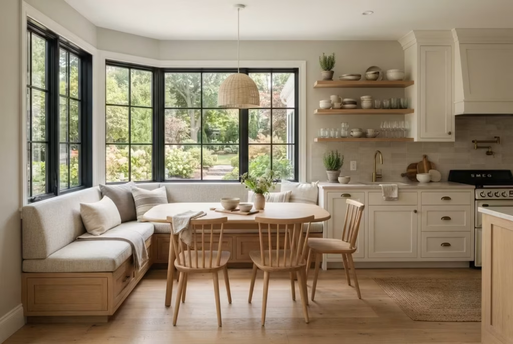
A banquette can transform a kitchen from a purely functional workspace into a more versatile living environment. By incorporating built-in seating into the kitchen layout, homeowners can increase seating capacity, improve space efficiency, and create a dedicated area for everyday dining, conversation, and family activities. In neutral kitchens, a banquette also introduces softness and comfort that balances the harder materials typically found throughout the space.
Enhancing Functionality
One of the primary advantages of a kitchen banquette is its ability to maximise usable space. Unlike traditional dining chairs, which require clearance on all sides, a banquette can be positioned against a wall, within a corner, or beneath a window. This allows seating to be integrated into areas that may otherwise remain underutilised. Banquettes are particularly effective in:
- Breakfast nooks.
- Corner dining areas.
- Open-plan kitchens.
- Window seating zones.
- Compact kitchen layouts.
Many designs also incorporate concealed storage beneath the seat, providing additional space for seasonal items, tableware, linens, or household essentials. This combination of seating and storage makes a banquette one of the most efficient additions to a kitchen layout.
Creating Informal Gathering Spaces
Modern kitchens often serve multiple purposes beyond cooking and dining. They function as places for conversation, homework, remote work, and casual socialising.
A banquette naturally supports these activities by creating a more relaxed seating environment than a formal dining table arrangement. The built-in nature of the seating encourages people to linger longer. Family members can gather comfortably for breakfast, children can complete schoolwork nearby, and guests can remain engaged in conversation while meals are being prepared.
Because the seating feels integrated into the architecture of the room, it often creates a stronger sense of intimacy and connection than freestanding furniture. This makes the banquette particularly valuable in open-plan homes where the kitchen acts as a central gathering space.
Upholstery Choices
Upholstery selection plays a significant role in both the appearance and durability of a kitchen banquette. In neutral kitchens, fabrics are typically chosen to complement the broader material palette while providing comfort and texture.
Popular options include:
- Linen blends.
- Performance fabrics.
- Textured woven fabrics.
- Bouclé upholstery.
- Cotton-linen combinations.
- Durable synthetic blends.
Colour selections often include:
- Warm ivory.
- Soft oatmeal.
- Mushroom tones.
- Light taupe.
- Greige.
- Muted beige.
Texture is often more important than colour in neutral schemes. Subtle woven fabrics can add visual interest while maintaining a calm and cohesive appearance. For households with children or frequent entertaining, stain-resistant performance fabrics generally provide the best balance between practicality and aesthetics.
Family-Friendly Design
A well-designed banquette can significantly improve day-to-day family life. Built-in seating accommodates multiple people comfortably and often allows children to sit more securely than on individual dining chairs. Rounded corners, durable upholstery, and easy-to-clean materials can further improve usability in busy households.
Family-friendly banquette designs often include:
- Washable fabric selections.
- Rounded seating edges.
- Hidden storage compartments.
- Durable seat cushions.
- Easy-access dining tables.
- Integrated charging or lighting solutions where appropriate.
The layout should also allow comfortable movement around the seating area while maintaining sufficient table clearance for daily use. When designed thoughtfully, a neutral kitchen banquette provides a practical, comfortable, and visually cohesive seating solution that supports both everyday routines and informal social gatherings.
Feature Mixed Stone Finishes
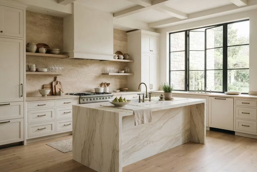
Using more than one stone finish in a kitchen can add depth, material variation, and visual interest without relying on strong colour contrasts. In neutral kitchens, mixed stone finishes allow designers to create distinction between different zones while maintaining a cohesive overall palette. The key is selecting materials that share compatible undertones and visual characteristics so the space feels layered rather than fragmented.
Combining Complementary Stones
Successful mixed-stone kitchens rely on compatibility rather than contrast. The most effective combinations typically share similar undertones, levels of movement, or surface textures. This creates a natural relationship between materials while still allowing each stone to contribute its own character. Common pairings include:
- Limestone with quartzite.
- Travertine with honed marble.
- Cream quartzite with limestone-look porcelain.
- Light marble with textured natural stone.
- Honed and leathered finishes of the same stone family.
When selecting multiple stones, it is important to evaluate them together under the same lighting conditions. Materials that appear compatible in a showroom can behave differently once installed in a home.
Countertops and Backsplashes
One of the most practical applications for mixed stone finishes is the combination of countertops and backsplashes.
Rather than using the same material throughout, homeowners can introduce a secondary stone to define specific areas while maintaining overall harmony. Examples include:
- Limestone-inspired countertops paired with a marble backsplash.
- Quartzite worktops combined with a textured stone feature wall.
- Honed stone countertops paired with a subtly patterned backsplash.
- Travertine backsplashes used alongside lighter stone surfaces.
This approach allows each material to perform a specific design role. The countertop may provide durability and visual consistency, while the backsplash introduces texture, movement, or architectural interest.
Creating Subtle Contrast
The goal of mixed stone finishes is often to create distinction rather than dramatic contrast. Subtle differences in colour, texture, finish, or pattern can help define individual kitchen elements without disrupting the neutral palette. Effective methods include:
- Pairing smooth surfaces with textured stone.
- Combining honed and brushed finishes.
- Using stones with similar colours but different movement patterns.
- Introducing slightly lighter or darker tones within the same colour family.
These variations help create visual depth while preserving the calm atmosphere that neutral kitchens are known for. The contrast should feel intentional but restrained, allowing materials to complement one another rather than compete for attention.
Avoiding Visual Competition
One of the most common mistakes when mixing stone finishes is selecting materials that are both highly dominant. For example, combining two heavily veined stones or two dramatically patterned surfaces can create visual tension and make the kitchen feel busy. A successful approach is to establish one primary stone and one supporting stone.
The primary stone typically occupies the largest visual area, such as the island or countertops. The supporting stone introduces variation through backsplashes, shelving details, feature walls, or secondary surfaces. To avoid competition:
- Limit highly patterned stones to one focal area.
- Keep undertones consistent across materials.
- Balance textured surfaces with calmer finishes.
- Consider scale and visibility from key viewpoints.
- Use repetition of colours elsewhere in the room to create cohesion.
When handled carefully, mixed stone finishes can add sophistication, depth, and material richness while preserving the balanced and timeless character of a neutral kitchen.
Introduce Sculptural Pendant Lighting
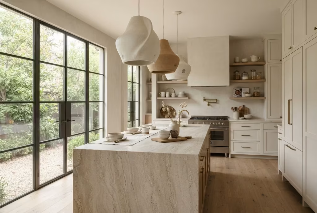
Sculptural pendant lighting serves both practical and visual purposes within a kitchen. Beyond providing task and ambient illumination, well-chosen pendants can introduce form, texture, and architectural presence. In neutral kitchens, where the material palette is often restrained, pendant lighting becomes an opportunity to add character without disrupting the overall sense of balance and cohesion.
Lighting as Functional Art
Pendant lighting occupies a unique position within kitchen design because it performs a necessary function while also acting as a visual focal point. Unlike decorative accessories that serve only an aesthetic role, pendants contribute directly to the usability of the space by illuminating islands, preparation areas, and dining zones.
Sculptural fixtures can help define key areas within an open-plan layout while introducing shape and visual interest. Their form remains visible throughout the day, even when switched off, making them an important part of the overall composition. Common sculptural forms include:
- Organic curved silhouettes.
- Dome-shaped pendants.
- Handcrafted ceramic fixtures.
- Geometric metal designs.
- Stone-inspired lighting forms.
- Woven natural-fibre pendants.
When selected carefully, pendant lighting functions as a design feature without compromising practicality.
Material Selection
The material of a pendant light influences both its appearance and the quality of light it produces. In neutral kitchens, materials are often chosen to complement existing finishes rather than introduce strong colour contrasts. Popular options include:
- Aged brass.
- Handcrafted ceramic.
- Natural stone.
- Opal glass.
- Smoked glass.
- Linen shades.
- Woven rattan.
- Patinated metal finishes.
Ceramic and stone pendants often introduce texture and craftsmanship, while glass fixtures can help maintain a lighter visual presence. Brass finishes pair particularly well with natural timber, limestone-inspired surfaces, and neutral cabinetry. Material consistency with other kitchen elements helps create a more cohesive design.
Scale Considerations
Scale is one of the most important factors when selecting pendant lighting. Fixtures that are too small can feel insignificant within a large kitchen, while oversized pendants may dominate the room and disrupt visual balance. Several factors should be considered:
- Island length and width.
- Ceiling height.
- Overall kitchen size.
- Viewing angles from adjacent spaces.
- Number of pendants being installed.
For larger islands, designers often choose either multiple medium-sized pendants or fewer oversized fixtures. In kitchens with higher ceilings, larger forms can help maintain proportion and ensure the lighting remains visually connected to the workspace below.
The goal is to create a relationship between the fixture and the surrounding architecture that feels intentional and balanced.
Creating Atmosphere
Beyond illumination, pendant lighting plays a significant role in shaping the mood of a kitchen. The quality, direction, and intensity of light affect how materials, colours, and textures are perceived throughout the day.
Warm lighting temperatures generally complement neutral kitchens by enhancing natural stone, timber, and textured finishes. Pendant placement can also influence atmosphere by creating pools of light that make gathering areas feel more intimate and inviting. Layered lighting strategies often combine pendants with:
- Recessed ceiling lighting.
- Under-cabinet lighting.
- Wall sconces.
- Architectural accent lighting.
This approach allows the kitchen to adapt to different activities while maintaining a comfortable and balanced environment. When chosen with careful attention to form, material, scale, and light quality, sculptural pendant lighting contributes both functionality and visual character to a neutral kitchen.
Embrace Floor-to-Ceiling Cabinetry
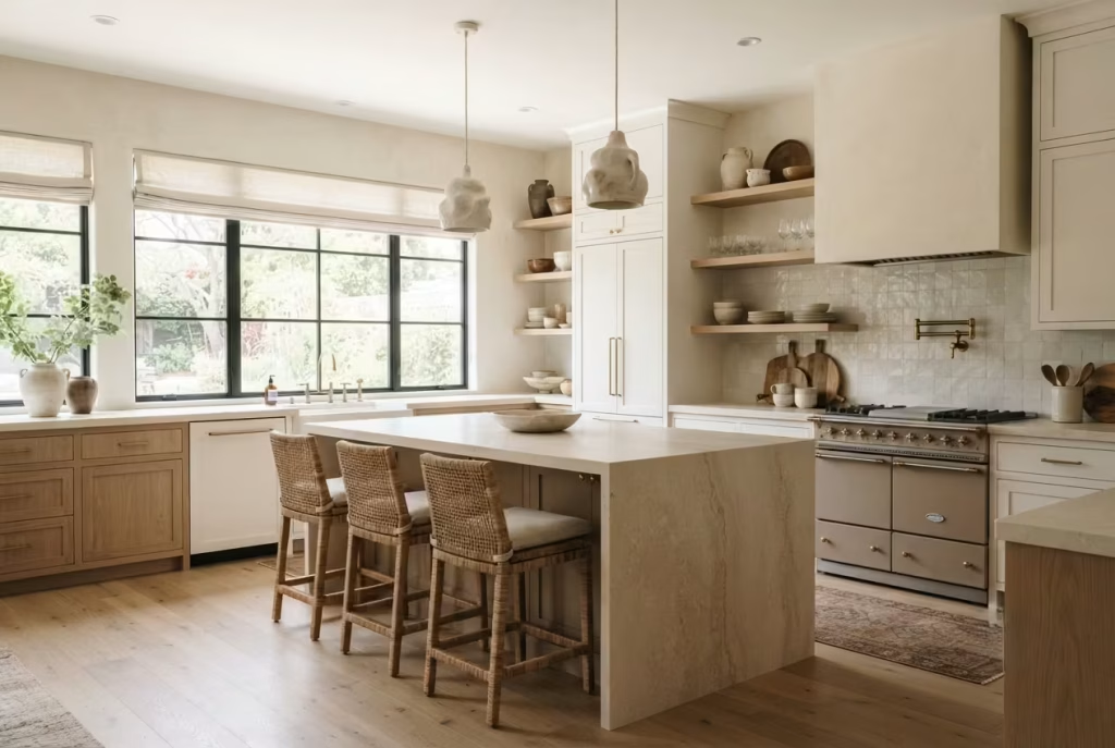
Floor-to-ceiling cabinetry is one of the most effective ways to maximise both storage and visual organisation within a kitchen. By extending cabinetry to the full height of the room, homeowners can reduce unused wall space, create a more integrated appearance, and strengthen the architectural character of the kitchen. This approach is particularly effective in neutral kitchens, where clean lines and material continuity play a significant role in the overall design.
Storage Efficiency
One of the primary advantages of floor-to-ceiling cabinetry is the substantial increase in storage capacity. Traditional upper cabinets often leave a gap between the cabinet top and ceiling, creating an area that is difficult to access and frequently collects dust. Extending cabinetry to the ceiling eliminates this wasted space and provides additional storage for items that are not needed daily.
Common uses for upper storage areas include:
- Seasonal serving pieces.
- Special occasion cookware.
- Small appliances.
- Bulk pantry items.
- Entertaining accessories.
- Household storage essentials.
This approach allows frequently used items to remain easily accessible while less frequently used possessions can be stored out of sight.
Visual Cohesion
Full-height cabinetry creates stronger visual continuity throughout the kitchen. Rather than breaking the wall into separate horizontal sections, floor-to-ceiling units establish a consistent vertical plane that feels clean and organised. This is especially valuable in neutral kitchens where simplicity and restraint are key design principles. Benefits of visual cohesion include:
- Reduced visual clutter.
- Cleaner sightlines.
- Greater sense of order.
- Improved integration of appliances.
- Stronger connection between cabinetry and architecture.
When cabinetry, appliance panels, and pantry storage are aligned within a continuous elevation, the kitchen often feels more intentional and refined.
Custom Versus Semi-Custom Solutions
Both custom and semi-custom cabinetry can be used to achieve a floor-to-ceiling appearance, although each approach offers different advantages.
Custom Cabinetry
Custom cabinetry is designed specifically for the dimensions of the room, allowing precise alignment with ceiling heights, architectural features, and appliance requirements. Advantages include:
- Exact sizing.
- Greater design flexibility.
- Seamless integration.
- Bespoke storage solutions.
- Ability to accommodate unusual room dimensions.
Semi-Custom Cabinetry
Semi-custom systems use standard cabinet sizes combined with filler panels, crown details, or stacked units to create a similar full-height appearance. Advantages include:
- Lower cost.
- Shorter lead times.
- Wider product availability.
- Simplified installation.
The appropriate choice depends on budget, project scope, and the level of customisation required.
Enhancing Architectural Presence
Floor-to-ceiling cabinetry can significantly strengthen the architectural character of a kitchen. The vertical emphasis naturally draws attention upward, making ceilings appear taller and helping the room feel more substantial. This effect is particularly noticeable in kitchens with higher ceilings or open-plan layouts. Architectural benefits include:
- Stronger room proportions.
- Enhanced verticality.
- More defined wall elevations.
- Better integration of storage and appliances.
- Increased sense of permanence.
When paired with carefully selected materials, such as painted cabinetry, natural timber finishes, or integrated appliance panels, full-height cabinetry can make the kitchen feel less like a collection of individual components and more like a cohesive architectural feature within the home.
By combining efficient storage, visual continuity, and strong architectural presence, floor-to-ceiling cabinetry remains one of the most practical and impactful design strategies for a neutral kitchen.
Design Around Natural Light as the Main Feature
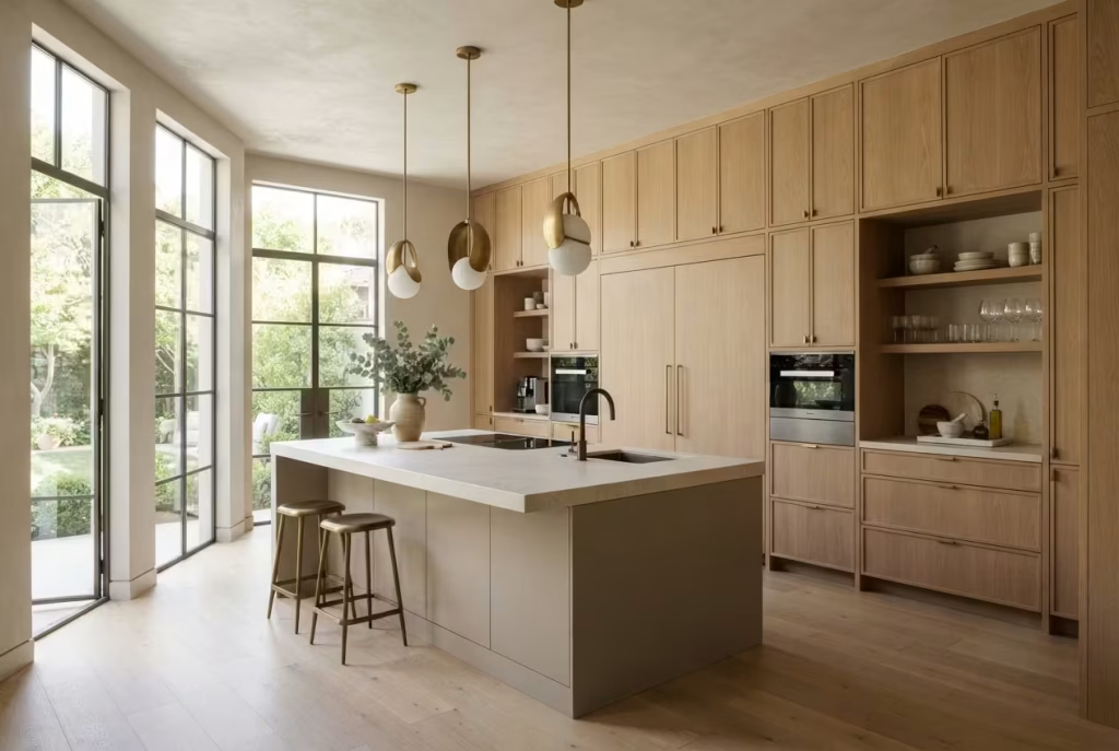
Natural light has a profound impact on how a kitchen looks, feels, and functions. It influences colour perception, material appearance, spatial comfort, and the overall atmosphere of the room. While finishes and furnishings can be changed over time, access to natural light is a fundamental architectural asset. For this reason, many successful kitchen designs begin with an understanding of how daylight enters and moves through the space.
Why Light Remains the Ultimate Luxury
Natural light enhances nearly every aspect of a kitchen environment. Well-lit kitchens often feel larger, more welcoming, and more connected to the outdoors. Daylight also improves the appearance of natural materials by revealing texture, grain, and tonal variation that artificial lighting cannot fully replicate. Benefits of abundant natural light include:
- Improved visual comfort.
- Reduced reliance on artificial lighting during the day.
- Better appreciation of material finishes.
- Enhanced sense of space.
- Stronger connection to gardens and outdoor areas.
Unlike decorative features that may follow changing trends, natural light contributes long-term value and usability.
Window Placement Considerations
The location, size, and orientation of windows significantly influence the quality of light within a kitchen. Effective window placement should respond to both the layout of the room and the path of the sun throughout the day. Important considerations include:
- Positioning windows near preparation areas where daylight is most beneficial.
- Maximising views toward outdoor spaces.
- Balancing privacy requirements with daylight access.
- Considering seasonal sun angles.
- Coordinating windows with cabinetry and storage layouts.
Large glazed openings, clerestory windows, corner windows, and skylights can all help increase daylight penetration when used appropriately. The objective is not necessarily to maximise glass area, but to introduce light where it will have the greatest impact on daily use and spatial experience.
Reflective Materials
Material selection can help distribute natural light more effectively throughout a kitchen. Surfaces with moderate reflectivity help bounce daylight deeper into the room while maintaining visual comfort. Materials commonly used for this purpose include:
- Light-toned stone countertops.
- Satin-finish cabinetry.
- Glass splashbacks.
- Pale timber finishes.
- Soft white painted surfaces.
- Light-coloured flooring.
Excessively glossy surfaces can sometimes create glare, particularly in kitchens with strong direct sunlight. Many designers therefore favour honed, matte, or low-sheen finishes that reflect light more softly and evenly. Combining reflective materials with thoughtful window placement often improves the overall brightness of a kitchen without requiring additional glazing.
Seasonal Light Changes
Natural light is not constant throughout the year. Its intensity, angle, duration, and colour temperature change from season to season, affecting how a kitchen is experienced over time. Examples include:
- Lower winter sun creating deeper shadows.
- Longer summer daylight hours increasing brightness.
- Seasonal changes in surrounding vegetation affecting light levels.
- Variations in colour temperature throughout the year.
Understanding these patterns can influence decisions about window sizing, shading systems, material selection, and artificial lighting strategies. A kitchen that performs well across different seasons generally feels more comfortable and adaptable throughout the year.
Real Project Insights
In one residential renovation project, the original kitchen was positioned at the rear of the property with limited natural light entering from a single window. Although the cabinetry and finishes were in good condition, the room felt darker and smaller than its actual dimensions.
Rather than focusing exclusively on cosmetic updates, the renovation prioritised daylight access. A larger glazed opening overlooking the garden was introduced, along with a rooflight positioned above the island.
The increased daylight transformed the space. Natural stone surfaces became more visually expressive, timber cabinetry appeared warmer, and the room felt significantly more open during daytime hours. Artificial lighting requirements were also reduced throughout much of the day.
The project reinforced an important design principle: improvements to natural light often have a greater impact on the overall experience of a kitchen than changes to finishes alone. By treating daylight as a primary design element rather than a secondary consideration, kitchens can achieve greater comfort, functionality, and long-term visual appeal.
Common Neutral Kitchen Design Mistakes to Avoid
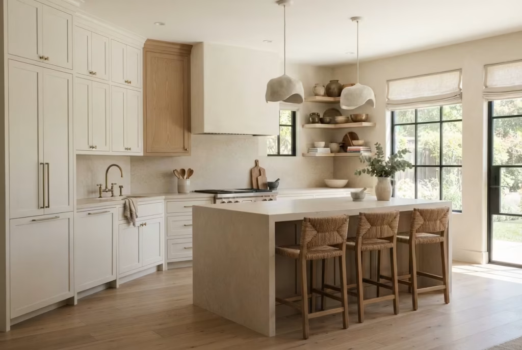
A neutral kitchen may appear effortless when viewed in a beautifully photographed home, but achieving that sense of balance is rarely accidental. Behind every successful neutral kitchen is a series of carefully considered decisions involving light, materials, texture, proportion, and functionality. When any one of these elements is overlooked, the room can quickly lose the warmth, depth, and timeless appeal that make neutral palettes so desirable.
Over the years, I have visited and worked on kitchens where significant budgets were invested into premium materials, yet the final result still felt disappointing. In almost every case, the problem was not the quality of the products. It was a design decision that seemed minor at the time but ultimately affected how the entire room was experienced.
Understanding these common mistakes can help homeowners avoid costly regrets and create a kitchen that remains beautiful and enjoyable for years to come.
Relying on One Neutral Shade Throughout
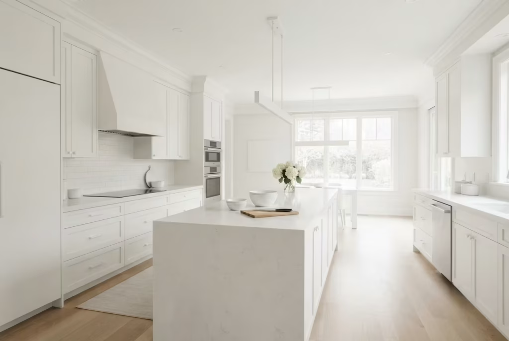
One of the most frequent mistakes in neutral kitchen design is assuming that a single colour can carry the entire room. At first glance, using one shade across cabinetry, walls, ceilings, and trim may seem like a safe choice. In reality, it often creates a flat environment where individual features struggle to stand out. Without tonal variation, the room can feel visually stagnant, lacking the subtle layers that give a space character.
Neutral kitchens thrive on nuance. A warm white cabinet may sit beautifully beside a slightly deeper cream wall. A mushroom-toned island can introduce depth within an otherwise light palette. Soft shifts in tone help define different surfaces while preserving the calm atmosphere that homeowners are seeking.
I often compare this to a landscape covered entirely in one colour. Even the most beautiful scenery would lose much of its interest if every element shared exactly the same tone. What makes a landscape compelling is the variation between foreground, middle ground, and background. Kitchens work in much the same way.
The most successful neutral schemes use multiple shades from the same family, allowing the room to feel cohesive without becoming monotonous.
Ignoring Texture and Material Variation
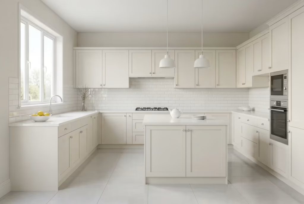
A neutral palette naturally places greater emphasis on texture. When bold colours are absent, materials become responsible for creating visual interest. This is where many kitchens fall short. Homeowners may select beautiful colours, only to discover that the room feels lifeless because every surface has a similar texture and finish.
Imagine a kitchen with smooth painted cabinetry, polished stone countertops, glossy tiles, and minimal detailing. While individually attractive, these elements can create a space that feels overly uniform. Texture introduces contrast and depth. Some of the most effective ways to layer texture include:
- Fluted timber detailing.
- Handmade ceramic tiles.
- Textured plaster walls.
- Natural linen window treatments.
- Honed stone surfaces.
- Visible wood grain cabinetry.
- Woven seating materials.
These elements create subtle points of interest that reveal themselves gradually over time. In one renovation project, the introduction of textured plaster and oak shelving completely transformed a kitchen that had previously felt sterile. The colour palette remained almost identical, yet the room suddenly felt richer and more inviting. That experience reinforced an important lesson. Texture often has a greater impact than colour itself.
Choosing Finishes Without Testing Natural Light
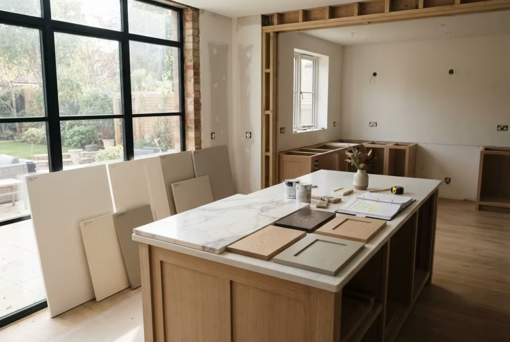
Few factors influence a kitchen more than natural light. Yet many homeowners select paint colours, cabinetry finishes, and stone surfaces based solely on showroom samples or online images. This approach can lead to unexpected results once materials are installed in the home. Light changes everything.
A warm white that appears soft and welcoming in a showroom may look yellow in a south-facing kitchen. A greige cabinet colour that feels balanced under artificial lighting might appear noticeably cooler beneath northern daylight.
Natural stone is particularly sensitive to changing light conditions. Veining, texture, and undertones can shift dramatically throughout the day. Before committing to finishes, I always recommend:
- Viewing samples in the actual room.
- Assessing colours during morning, afternoon, and evening hours.
- Comparing materials alongside one another.
- Evaluating finishes under both natural and artificial lighting.
This process may seem time-consuming, but it often prevents expensive mistakes. As the old saying goes, measure twice, cut once. The same principle applies to selecting finishes. Taking time to understand how materials behave in real conditions usually leads to far better outcomes.
Overusing Trend-Led Details
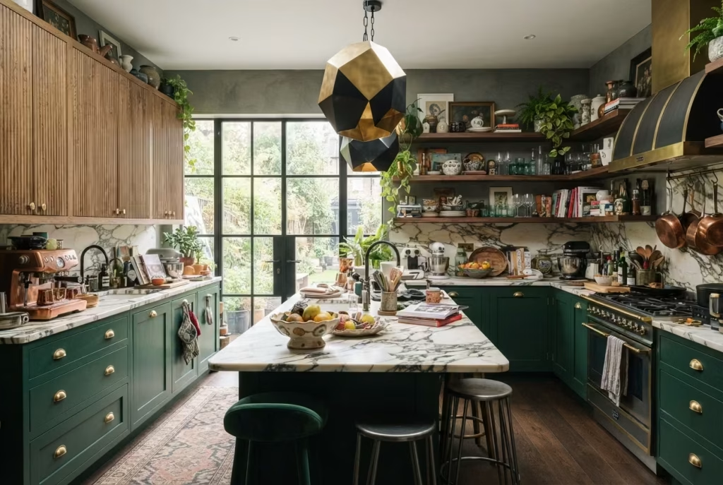
Trends can be inspiring, but they can also become a double-edged sword when used without restraint. Every year introduces new materials, colours, hardware styles, and decorative features that dominate social media feeds and design publications. While some trends evolve into lasting classics, many lose their appeal surprisingly quickly.
One common mistake is incorporating too many trend-driven elements within a single kitchen. Examples may include:
- Highly specific hardware finishes.
- Overly decorative lighting.
- Strongly patterned stone.
- Fashion-led cabinet colours.
- Novelty shelving arrangements.
Individually, these features may appear exciting. Collectively, they can make a kitchen feel tied to a very specific moment in time. The strongest neutral kitchens usually build their foundation around timeless elements such as natural stone, quality timber, thoughtful proportions, and durable craftsmanship. Trends, if used at all, are often introduced through accessories, textiles, or easily replaceable details.
I often advise clients to invest heavily in the elements that are difficult to change and be more adventurous with the components that can evolve over time. This approach creates a kitchen that feels current today while remaining relevant years from now.
Neglecting Warmth and Human Comfort
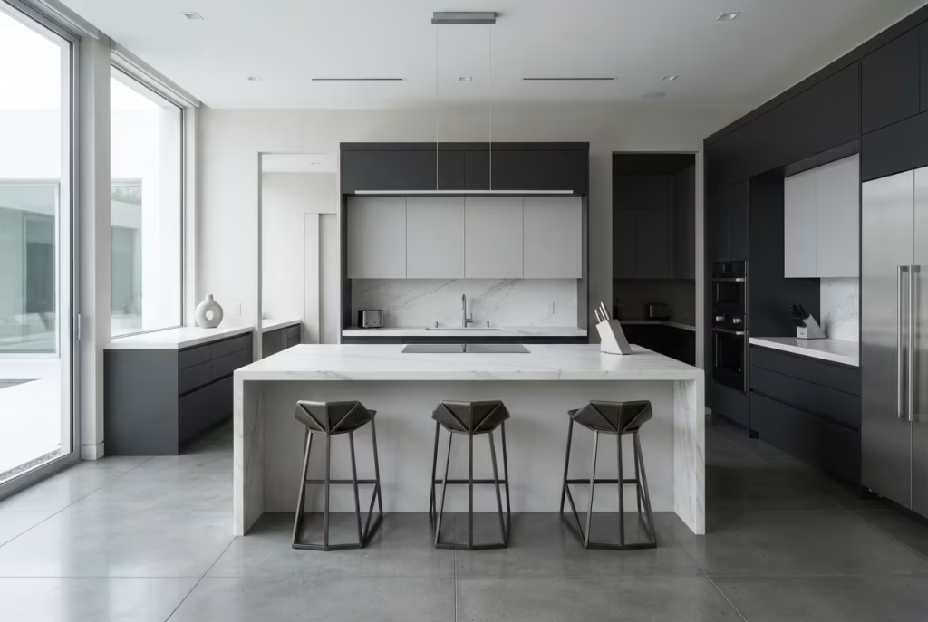
Perhaps the most significant mistake of all is focusing exclusively on appearance while overlooking how the kitchen actually feels to live in. A kitchen can be visually impressive and still fail as a living space.
This often happens when homeowners prioritise aesthetics over comfort. The room may feature flawless materials and immaculate detailing, yet feel cold, uninviting, or disconnected from everyday life. Warmth comes from many sources:
- Natural timber.
- Soft textiles.
- Comfortable seating.
- Layered lighting.
- Tactile materials.
- Thoughtful storage.
- Human-scale proportions.
These elements contribute to an environment that supports real living rather than simply looking attractive in photographs. One of the most successful kitchens I have worked on was not the largest or the most expensive. What made it memorable was the way it welcomed people. Natural materials, comfortable seating, filtered daylight, and carefully layered textures created a space where family members genuinely wanted to spend time.
That quality cannot be measured solely by finishes or budgets. At the end of the day, the purpose of a kitchen extends beyond cooking. It serves as a gathering place, a workspace, a social hub, and often the emotional centre of the home.
When comfort is neglected, the room loses much of its value regardless of how beautiful it appears.
The Importance of Balance
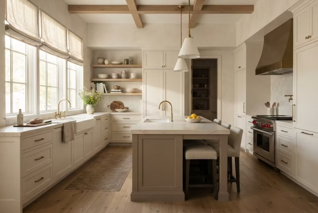
Most neutral kitchen mistakes share a common theme: imbalance. Too much of one colour. Too little texture. Excessive focus on trends. Insufficient attention to comfort. Each issue stems from overlooking the relationship between different design elements.
The most successful kitchens avoid these pitfalls by embracing balance. They combine light and shadow, warmth and sophistication, simplicity and character. They recognise that great design is rarely about one standout feature. It is about how every component works together to support daily life.
When those relationships are handled thoughtfully, a neutral kitchen becomes far more than a collection of attractive finishes. It becomes a space that feels timeless, comfortable, and genuinely rewarding to live in for years to come.
How Designers Make Neutral Kitchens Feel Distinctive
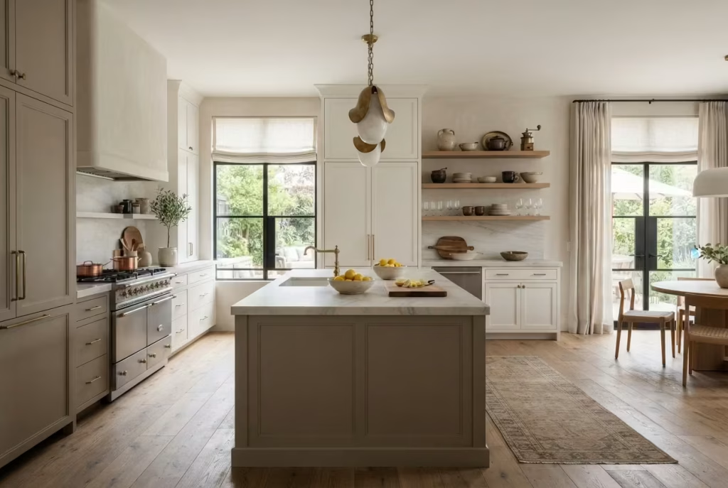
Neutral kitchens become memorable when the design is built with intention rather than left to chance. The strongest schemes are rarely the loudest. They rely on subtle distinctions, careful material choices, and a clear understanding of how surfaces, proportions, and craftsmanship work together. In practice, that means the kitchen feels composed, layered, and quietly confident rather than flat or overdecorated.
Material Storytelling
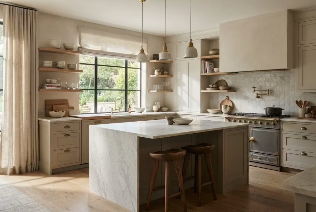
A distinctive neutral kitchen often begins with materials that have something to say. Natural stone, timber, plaster, linen, brass, and handmade tile each bring their own character, and when they are chosen thoughtfully, they tell a story about how the space should feel.
Stone can suggest permanence and refinement. Timber brings warmth and a sense of lived-in ease. Plaster softens the architecture. Brass adds quiet richness. Handmade finishes introduce variation that feels human rather than machine-perfect.
The key is not to use every material available, but to select a handful that work together with clear intent. When the materials share compatible undertones and textures, the kitchen feels cohesive. When they are chosen carelessly, the room can lose its rhythm and start to feel disjointed.
Layering Instead of Decorating
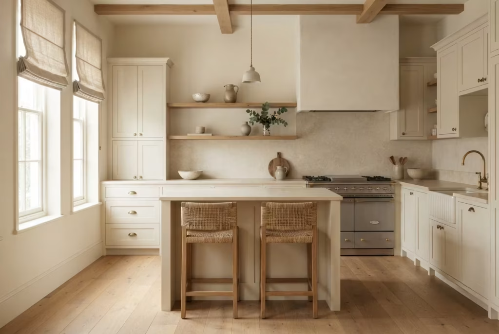
Many designers avoid overdecorating neutral kitchens and instead rely on layering. This approach creates depth without clutter and interest without visual noise.
Layering can happen through tone, texture, finish, and form. A warm white cabinet may sit beside a slightly deeper wall colour. A honed stone countertop may be paired with a textured backsplash. Open shelving, timber accents, and soft textiles can then add another level of visual variation.
This method works because it allows the eye to move through the room gradually. Nothing fights for attention. Instead, each element supports the next, and the space begins to feel settled rather than forced. It is a quieter approach, but often a far more effective one.
The Role of Craftsmanship
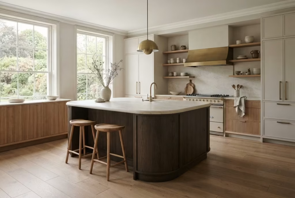
Craftsmanship is often what separates a standard neutral kitchen from one that feels genuinely distinctive.
Well-made joinery, precise shadow gaps, carefully aligned seams, and thoughtful detailing all contribute to a sense of quality that is felt immediately, even if it is not always consciously noticed. These are the kinds of details that quietly raise the tone of a room.
In luxury residential projects, craftsmanship is rarely about showing off. It is about precision, proportion, and restraint. A perfectly executed curved island, a finely detailed pantry wall, or a seamless integrated handle can transform the overall impression of the kitchen without making a scene.
When craftsmanship is strong, even the simplest materials feel more elevated.
Custom Details That Elevate a Kitchen
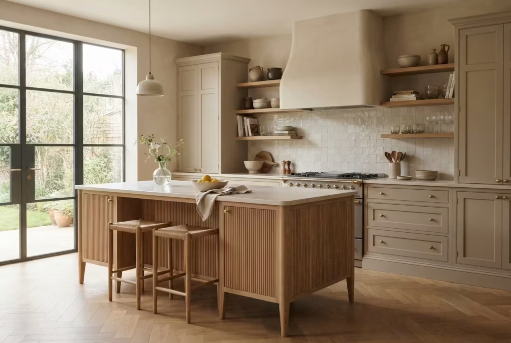
Custom details give neutral kitchens their individuality. Without them, even the best materials can feel generic.
These details might include a furniture-style island, integrated shelving, fluted timber fronts, a bespoke range hood, panelled cabinetry, or tailored hardware placement. They may also appear in less obvious ways, such as the alignment of cabinet lines, the thickness of worktop edges, or the way natural light lands on a feature wall.
Custom elements are especially valuable because they respond to the specific room rather than following a preset formula. That makes the kitchen feel more considered and less assembled from standard parts.
The most effective custom details are often the most restrained. They do not announce themselves immediately. They simply make the room feel more finished, more balanced, and more memorable.
Lessons from Luxury Residential Projects
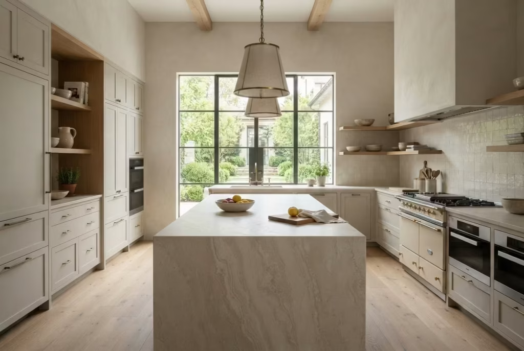
Luxury residential projects tend to reveal one important truth: neutral kitchens become distinctive through restraint, not excess.
In many high-end homes, the most successful kitchens are the ones that avoid trying too hard. Instead of relying on dramatic colour or trend-led features, they focus on proportion, light, material balance, and subtle architectural detail.
One recurring lesson from these projects is that people respond strongly to spaces that feel calm and coherent. They notice the way materials relate to one another. They notice how the light shifts across textured surfaces. They notice when the room feels grounded and easy to live in.
That is why the strongest kitchens often look simple at first glance but reveal greater depth the longer you spend in them.
Why Subtle Decisions Often Create the Strongest Results
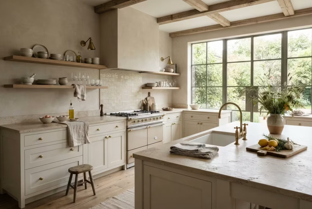
The most memorable neutral kitchens are usually shaped by decisions that seem small on paper but have a major impact in practice.
A slightly warmer cabinet tone. A softer stone finish. Better hardware proportions. A more tactile wall surface. A carefully placed shelf. A ceiling detail that draws the eye upward. None of these choices needs to dominate the room, but each one helps the whole composition feel more complete.
This is where neutral design shows its strength. It leaves room for nuance. It rewards close attention. It allows the designer to work with feeling, proportion, and texture rather than relying on obvious statements.
In the end, it is often the subtle decisions that carry the most weight. They are the difference between a kitchen that simply looks neutral and one that feels quietly distinctive, lived in, and beautifully resolved.
Final Thoughts: The Beauty of a Neutral Kitchen Lies in the Details
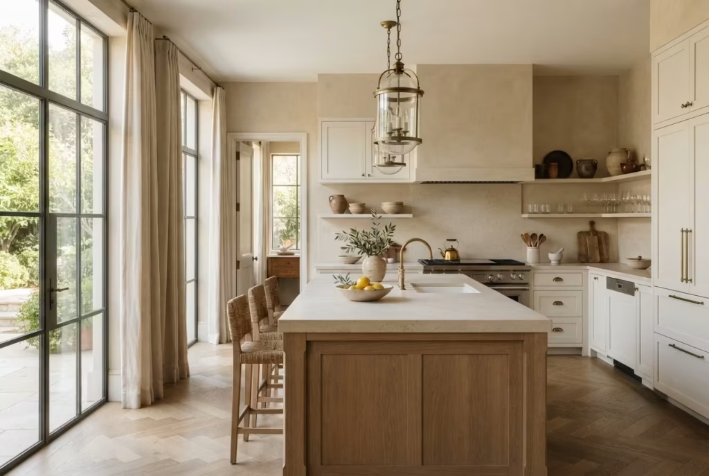
A truly successful neutral kitchen is never defined by a single paint colour or material choice. Its beauty comes from the careful balance of elements working together. Neutral design is often misunderstood as simple, but in reality, it requires greater restraint and attention to detail than many bold interiors. Every texture, finish, proportion, and material selection plays a role in shaping the overall experience of the space.
The kitchens that stand the test of time are usually those built around quality materials rather than passing trends. Natural stone, timber, plaster, linen, and well-crafted cabinetry continue to age gracefully because they offer authenticity and character that fashionable features often struggle to maintain.
Texture, proportion, and natural light are equally important. They create depth, highlight craftsmanship, and bring warmth to a neutral palette. Without them, even expensive kitchens can feel flat or uninspiring.
Perhaps that is why the most memorable kitchens rarely depend on bold colour to make an impression. Instead, they draw people in through subtle layers, thoughtful detailing, and a sense of effortless balance that reveals itself over time.
As you plan your own kitchen, think beyond paint colours and individual finishes. Focus on how materials interact, how light moves through the room, and how each element contributes to the overall composition. When approached this way, a neutral kitchen becomes far more than a design choice. It becomes a timeless backdrop for everyday life while quietly showcasing exceptional design.
Frequently Asked Questions
Are neutral kitchens going out of style?
No, neutral kitchens continue to be one of the most enduring choices in residential design. While colour trends change regularly, neutral palettes remain popular because they provide flexibility, longevity, and broad appeal. Designers often favour neutral kitchens because they allow natural materials, architectural details, and craftsmanship to take centre stage. A well-designed neutral kitchen can feel just as relevant in ten years as it does today.
What colours work best in a neutral kitchen?
The most successful neutral kitchens typically combine several complementary shades rather than relying on a single colour. Warm whites, soft creams, greige, taupe, mushroom tones, stone-inspired hues, and muted earth colours all work exceptionally well. The ideal palette depends on the home’s architecture, natural light conditions, and material selections. Layering different neutral tones usually creates greater depth and visual interest than using one colour throughout.
How do I make a neutral kitchen look expensive?
An expensive-looking neutral kitchen is usually defined by material quality and thoughtful detailing rather than colour. Natural stone surfaces, high-quality timber cabinetry, integrated appliances, custom joinery, layered lighting, and carefully selected hardware can all elevate the overall design. Texture also plays a crucial role. Elements such as fluted wood, handmade tiles, textured plaster, and honed stone finishes often create a more luxurious appearance than decorative accessories alone.
What is the difference between beige, greige, taupe, and mushroom tones?
Although these colours are often grouped together, they have distinct characteristics:
- Beige contains warm yellow or cream undertones.
- Greige combines grey and beige, creating a balanced neutral that can appear warm or cool depending on lighting.
- Taupe generally includes brown and grey undertones, offering greater depth than beige.
- Mushroom tones sit between taupe, greige, and soft brown, creating an earthy, sophisticated appearance with subtle warmth.
Testing samples in your kitchen is important because natural light can significantly affect how these colours appear.
Which countertop materials work best in a neutral kitchen?
Several countertop materials work exceptionally well within neutral kitchen schemes. Popular options include:
- Quartzite for natural beauty and durability.
- Marble for timeless elegance.
- Limestone-inspired surfaces for soft, organic character.
- Quartz for low-maintenance practicality.
- Travertine-inspired materials for warmth and texture.
- Porcelain slabs for durability and design flexibility.
The best choice depends on lifestyle requirements, maintenance expectations, and the overall design direction of the kitchen.
How can I add personality to a neutral kitchen without using bold colours?
Personality can be introduced through texture, craftsmanship, materials, and architectural details rather than strong colour contrasts. Fluted cabinetry, handmade zellige tiles, natural timber, statement stone, open shelving, antique brass hardware, textured plaster walls, and sculptural lighting all add character while preserving a calm palette. These elements create visual interest through depth and detail rather than colour intensity.
Do neutral kitchens increase home value?
While no design choice can guarantee a specific increase in value, neutral kitchens generally appeal to a wider range of buyers. Their timeless appearance allows potential homeowners to imagine themselves living in the space more easily. Neutral palettes also tend to age more gracefully than highly trend-driven colour schemes, making them a safer long-term investment in many residential markets.
What lighting works best in a neutral kitchen?
The most effective neutral kitchens use layered lighting rather than relying on a single source. A combination of natural daylight, recessed ceiling lights, under-cabinet lighting, decorative pendants, and accent lighting creates flexibility and atmosphere throughout the day.
Warm white lighting is often preferred because it enhances natural materials such as timber, stone, and textured finishes. Sculptural pendant lights, concealed LED lighting, and well-positioned task lighting can help a neutral kitchen feel inviting, functional, and visually balanced at all times.