Dark Minimalist Interior Design: Moody, Uncluttered Spaces That Feel Like an Exhale
There’s a particular kind of quiet that only a dark room can hold. Walk into a well-executed Dark Minimalist Interior and the first thing you notice isn’t the colour at all. It’s the stillness. No clutter competing for attention, no jarring transitions between materials, just deep tone, clean geometry, and light doing exactly what it’s told to do.
Dark minimalism has spent the last few years shaking off its reputation as a style reserved for windowless basements and moody bachelor pads. Done properly, it’s one of the most sophisticated directions in contemporary interiors, and one of the most forgiving of imperfect architecture. Painting a room dark doesn’t shrink it. It edits it. And that distinction is the whole game.
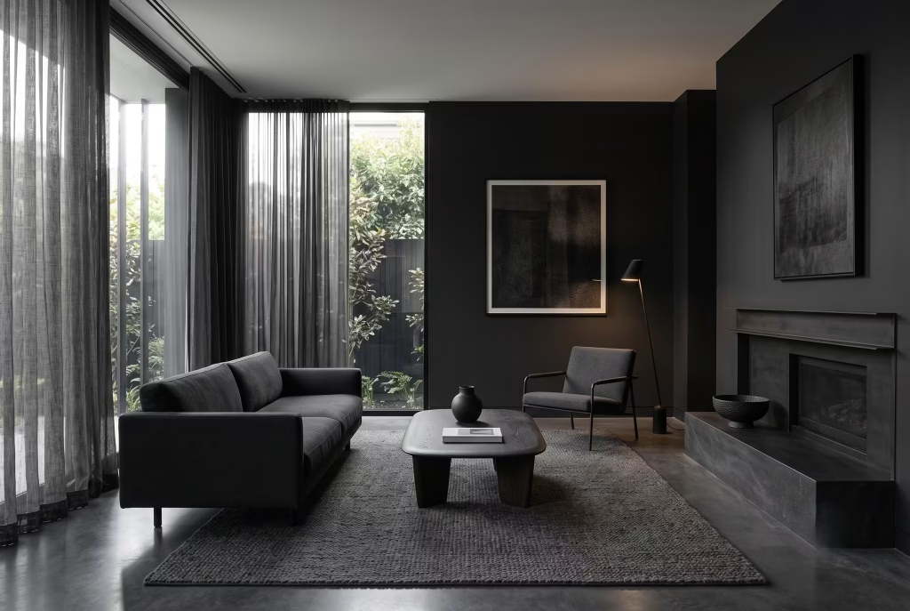
This guide walks through every room in the house, the science behind why dark colours behave the way they do, the specific paint and lighting specs that separate a considered scheme from a gloomy one, and the mistakes that trip up almost everyone on their first attempt.
The Short Answer
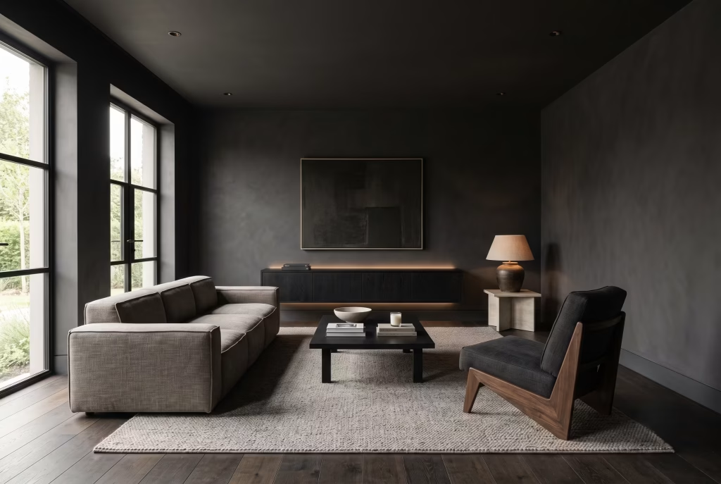
Dark minimalist interior design pairs a restrained, near-black or charcoal colour palette with clean-lined, low-clutter furniture, layered warm lighting, and a small number of high-quality natural materials. The goal isn’t darkness for its own sake. It’s using deep tone to create depth, calm, and a strong sense of intention in a space, while layered lighting and material contrast stop the room from feeling flat or enclosed.
Does Dark Paint Actually Make a Room Feel Smaller?
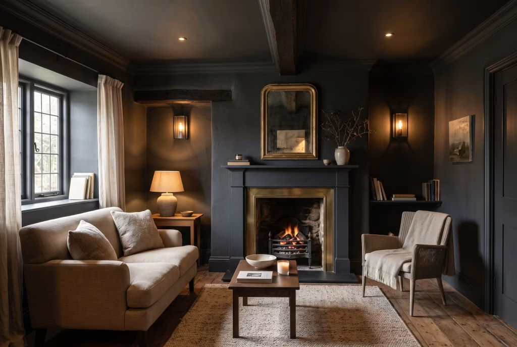
Not if you do it with any care. This is the single biggest hesitation people have before committing to the style, and it’s worth addressing head-on before we get into the details.
A room painted a mid-tone grey with poor lighting will always read smaller than a room painted near-black with generous, layered lighting and a bit of reflective material worked in. Darkness recedes visually when there’s enough contrast and light bouncing around it to define the edges of the space.
What actually makes a room feel small is flat, even, shadowless lighting on a dark wall, because there’s nothing for the eye to read as depth. Get the lighting layered correctly, as we’ll cover below, and a dark room in a period cottage with a low ceiling can feel more expansive than the same room in white.
Understanding Colour: Why LRV Matters More Than the Paint Name on the Tin
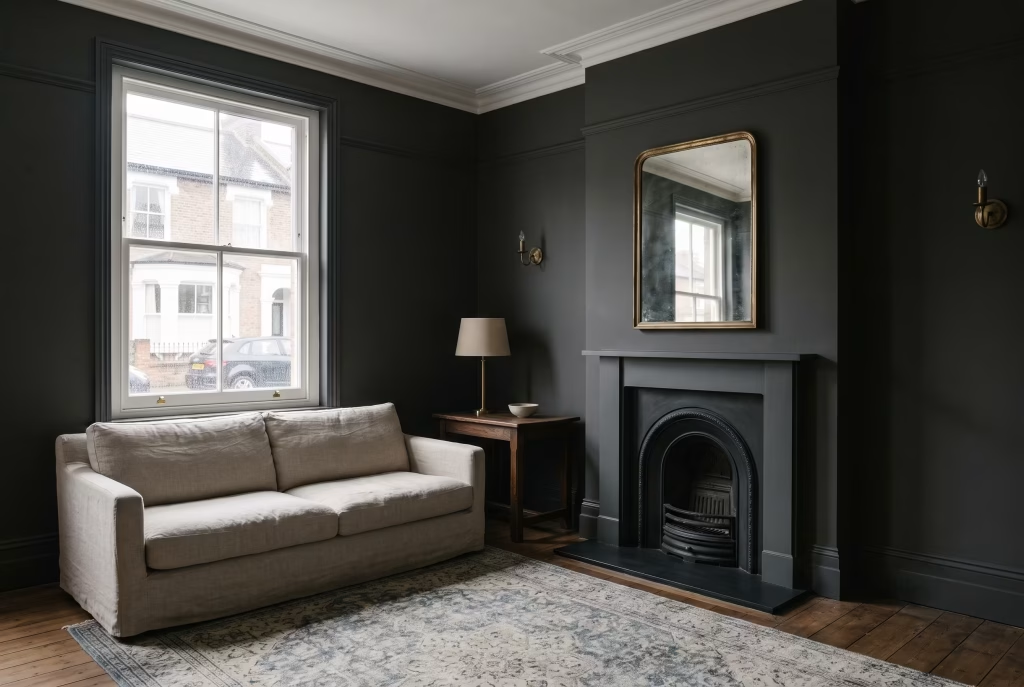
Every paint colour has a Light Reflectance Value, or LRV, a number between 0 and 100 that tells you how much light a colour bounces back into the room. Zero is theoretical absolute black. One hundred is pure white. This number matters more than the colour’s name because two paints can look almost identical on a swatch and behave completely differently on a wall depending on their LRV and the light hitting them.
As a rule of thumb for dark minimalist schemes:
| LRV Range | Effect | Best Used For |
|---|---|---|
| 1–5 | Near-black, absorbs almost all light | Feature walls, joinery, low-traffic snugs with strong artificial light |
| 6–12 | Soft charcoal, still reads as “dark” but softer edges | Living rooms, main bedroom walls, kitchen cabinetry |
| 13–20 | Deep but liveable, plays well with daylight | North-facing rooms, smaller rooms that still need to feel dark |
| 21–30 | Moody mid-tone, the safest entry point | First-timers, rented properties, rooms with limited natural light |
If a room gets genuinely poor natural light, and by that I mean a single small window or a north-facing aspect that never sees direct sun, sitting somewhere in the 15–25 LRV range rather than chasing true black tends to give you the drama without tipping the room into looking neglected rather than designed.
For UK-based projects, a handful of paints come up again and again on site because they behave consistently and hold their depth without turning muddy in low light:
| Paint | Brand | Approx. LRV | Where It Works Best |
|---|---|---|---|
| Off-Black | Farrow & Ball | 3 | Woodwork, doors, joinery |
| Railings | Farrow & Ball | 12 | Kitchens, living room walls |
| Obsidian Green | Little Greene | 6 | Studies, snugs, powder rooms |
| Basalt | Farrow & Ball | 8 | Bedrooms wanting warmth over blue-black |
| Feather Grass | Little Greene | 20 | Softer entry point, north-facing rooms |
| Bitter Chocolate | Farrow & Ball | 6 | Warm, brown-black alternative to true black |
A tin of matte or estate emulsion behaves very differently from a satin or eggshell finish in the same colour. Matte absorbs light and gives you that velvety, almost fabric-like depth that reads as expensive.
Anything with sheen bounces light unpredictably and, on an imperfect wall, will show every roller mark and plaster flaw under raking light. For walls, matte nearly always wins. Save the eggshell or satin finishes for woodwork and skirting, where a slightly harder-wearing surface earns its keep.
Lighting: The Part Everyone Underestimates
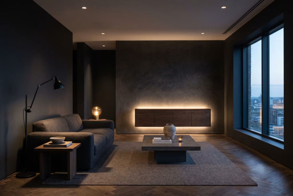
Dark surfaces absorb light rather than reflecting it, so a dark room needs more thoughtfully placed light sources, not necessarily more of them, and not brighter ones. This is where most first attempts at dark minimalism fall down. People paint the walls, hang one central pendant, and wonder why the room feels heavy rather than atmospheric.
Aim for a colour temperature between 2700K and 3000K across your fixtures. Anything cooler than that starts to feel clinical against a dark charcoal or black wall, working against the warmth you’re trying to build. Look for bulbs with a Colour Rendering Index, or CRI, of 80 or above, ideally closer to 90, so that wood grain, leather, and textiles keep their true colour under artificial light rather than looking washed out or grey.
Structure the room across three layers rather than relying on one:
- Ambient light sets the base level for the room, usually from a ceiling fixture or recessed downlights on a dimmer.
- Task light does the actual work, a reading lamp beside a chair, under-cabinet strips in a kitchen, a desk lamp in a study.
- Accent light is the layer that makes the room feel designed rather than just lit. Wall washers grazing a textured plaster wall, uplighters behind a sideboard, LED strips concealed under a floating vanity.
Every layer should sit on its own dimmer or smart control where the budget allows. A dark room that can shift from a bright, functional state during the day to a low, warm glow in the evening is doing far more work than a room stuck on one setting.
You May also Like: Best Warm Neutral Paint Colours That Never Feel Flat
Materials and Texture: Where the Warmth Comes From
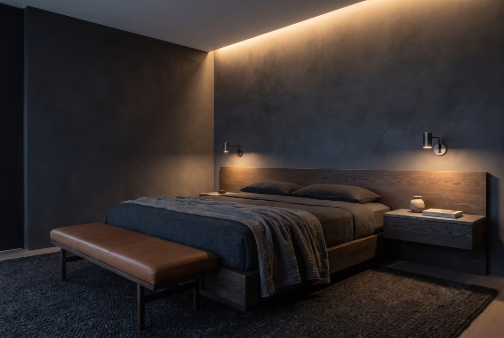
A flat black wall with no texture reads as a mistake. A flat black wall with texture reads as intentional. This is the single most important lesson in dark minimalist design, and it’s the reason the style works so much better with natural materials than with anything glossy or synthetic.
Build your material palette from a short list, ideally no more than four or five materials repeated consistently through a space:
- Timber, in a mid to dark tone such as walnut or smoked oak, for warmth and grain
- Leather, full grain rather than bonded, for tactile richness on seating
- Stone or honed concrete, for a grounding, mineral counterweight
- Blackened or brushed metal, used sparingly on hardware, legs, or lighting
- Boucle, wool, or heavy linen, to soften the hard edges everything else creates
Deliberately avoid mixing high-contrast textures like raw wood grain against polished stone in the same sightline unless you want that specific tension. Consistency in how materials are finished, matte against matte, textured against textured, does more to create a cohesive room than colour matching ever will.
Furniture and Spatial Planning: The Numbers That Matter
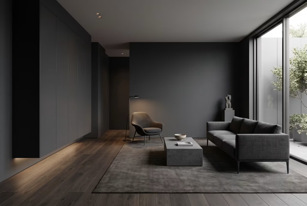
Minimalism only works when the furniture that remains earns its place through proportion as much as function. In a dark room, oversized or overly ornate pieces read as heavy and closed-in, while low-profile, simply-shaped furniture keeps sightlines open across the space.
A few measurements worth pinning to the wall while you plan:
- Leave 35–45cm between a sofa and coffee table so the space feels used rather than cramped
- Keep primary walkways clear to at least 75–90cm, particularly through a dark hallway where depth perception is already reduced
- Choose seating with legs rather than a skirted base wherever you can. The visible floor beneath a sofa or armchair reads as breathing room and stops a dark room feeling like it’s sitting directly on the ground
- For fitted storage, a depth of around 40cm on wardrobes and 35cm on shallower hallway or living room units keeps the profile slim without sacrificing capacity
Storage itself should disappear into the architecture rather than announce itself. Handleless, push-to-open cabinetry in a matte dark finish reads as part of the wall rather than as furniture, which is exactly the effect that keeps a minimalist room feeling calm rather than busy.
Room by Room
The Living Room
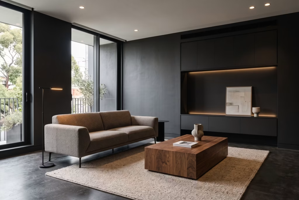
This is usually where people start, and it’s the most forgiving room for a first attempt because it typically has the most natural light and the most opportunity for layered lighting. Anchor the scheme with one dominant dark tone across the largest surfaces, whether that’s a feature wall behind the sofa or full wall coverage, then bring in a single warm material like walnut for the coffee table or media unit to stop the room reading as cold.
A low, angular sofa in a tactile fabric such as boucle or heavy linen does more visual work than several smaller pieces of furniture ever could.
The Bedroom
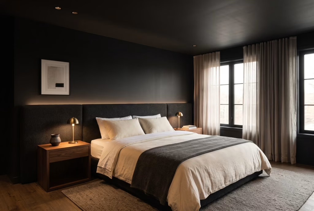
Bedrooms tolerate the deepest, most saturated tones better than almost any other room because the goal there is calm rather than sociability. A true near-black wall behind the headboard, paired with warm bedside lighting on dimmers and a mix of white or cream bedding, creates the kind of contrast that makes the whole room feel considered rather than austere.
If the room gets strong morning light, painting the ceiling the same dark tone as the walls, rather than leaving it white, removes the visual seam where wall meets ceiling and makes the whole room feel enveloping rather than boxed in.
The Kitchen
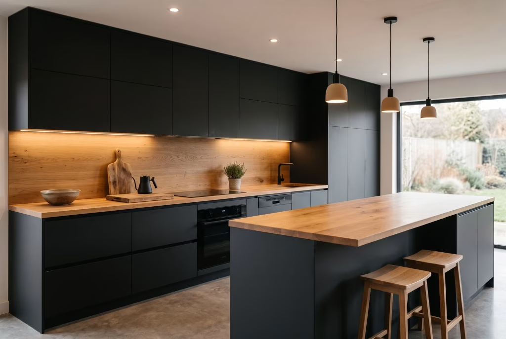
Dark cabinetry has become one of the defining features of the modern minimalist kitchen, and for good reason. Matte black or charcoal cabinet fronts hide fingerprints and daily wear far better than gloss finishes, particularly in a shade like Farrow & Ball’s Railings which sits at a forgiving mid-depth.
Balance the cabinetry with a lighter worktop, whether that’s a pale stone or a warm timber, so the eye has somewhere to rest, and keep splashback and worktop materials to a single continuous surface where the budget allows to avoid visual clutter around the hob.
The Bathroom
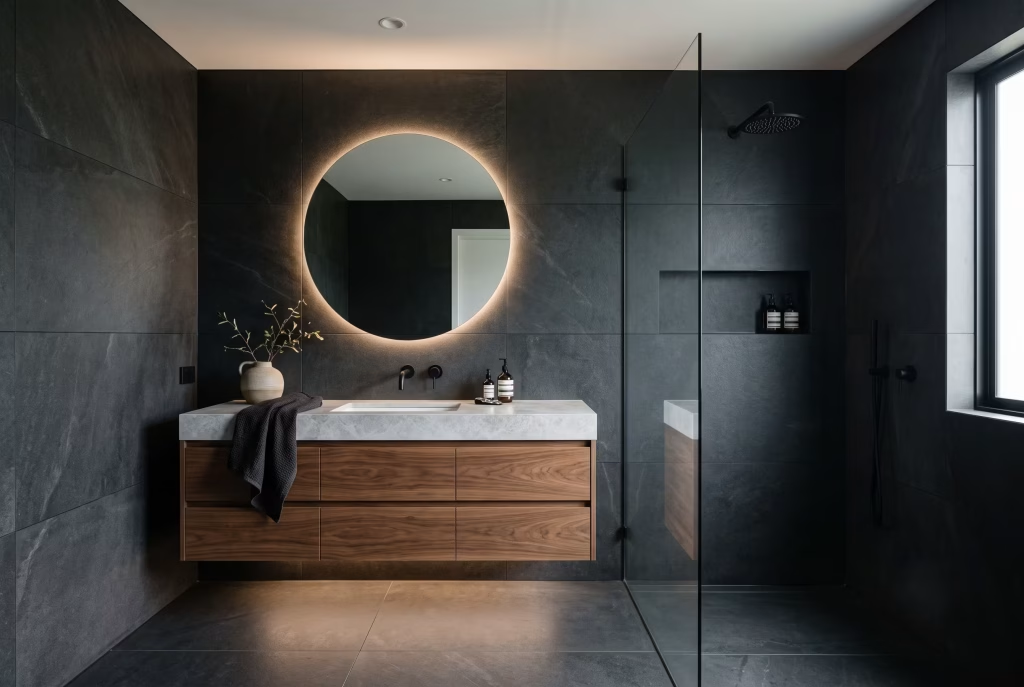
This is the room where texture contrast earns its keep the most. Pairing rough, honed stone with the warmth of timber joinery, such as a floating vanity unit, stops a dark bathroom feeling cold or clinical. Large-format tiles reduce the number of visible grout lines, which matters more in a dark scheme than a light one because grout lines are far more visible against a deep tone.
If you’re using timber in a wet area, seal it properly with a marine-grade oil worked into the end grain, and never leave a gap between a timber vanity and a stone wall where standing moisture can collect and cause rot over time.
You May also Like: 25 Clean & Modern Minimalist Basement Designs That Feel So Spacious, They Don’t Even Feel Like Basements
The Home Office or Study
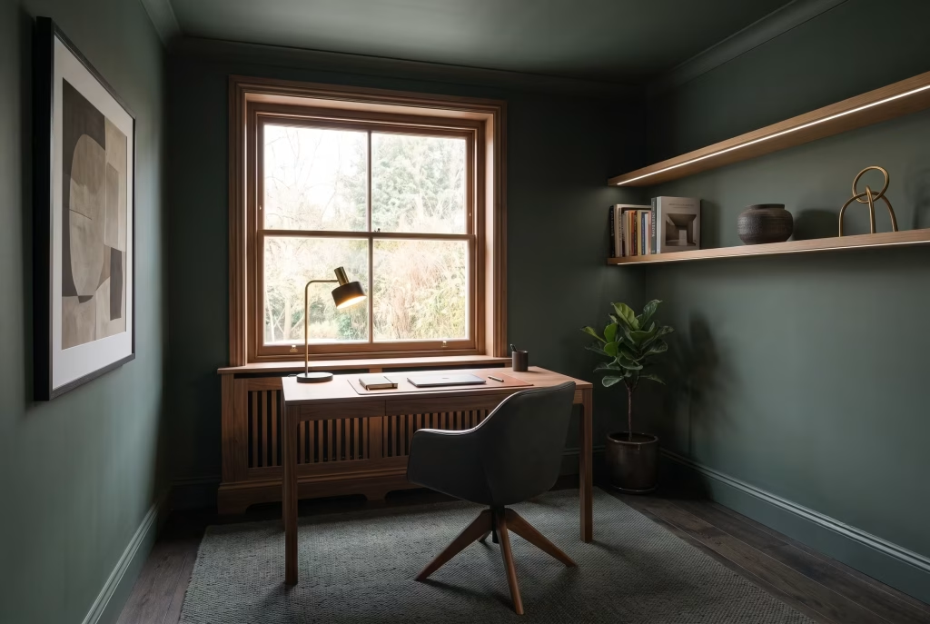
A dark study is one of the easiest wins in the whole house because the room’s function, focus, benefits directly from reduced visual stimulation. Deep green or near-black walls paired with a single warm task lamp and open shelving for books create what’s often called the scholarly, dark academia-adjacent look, though true dark minimalism keeps the shelving edited rather than densely styled.
Keep cables and technology entirely out of sight where possible; nothing undermines a considered dark room faster than a tangle of visible wires under warm lighting.
The Hallway or Entryway
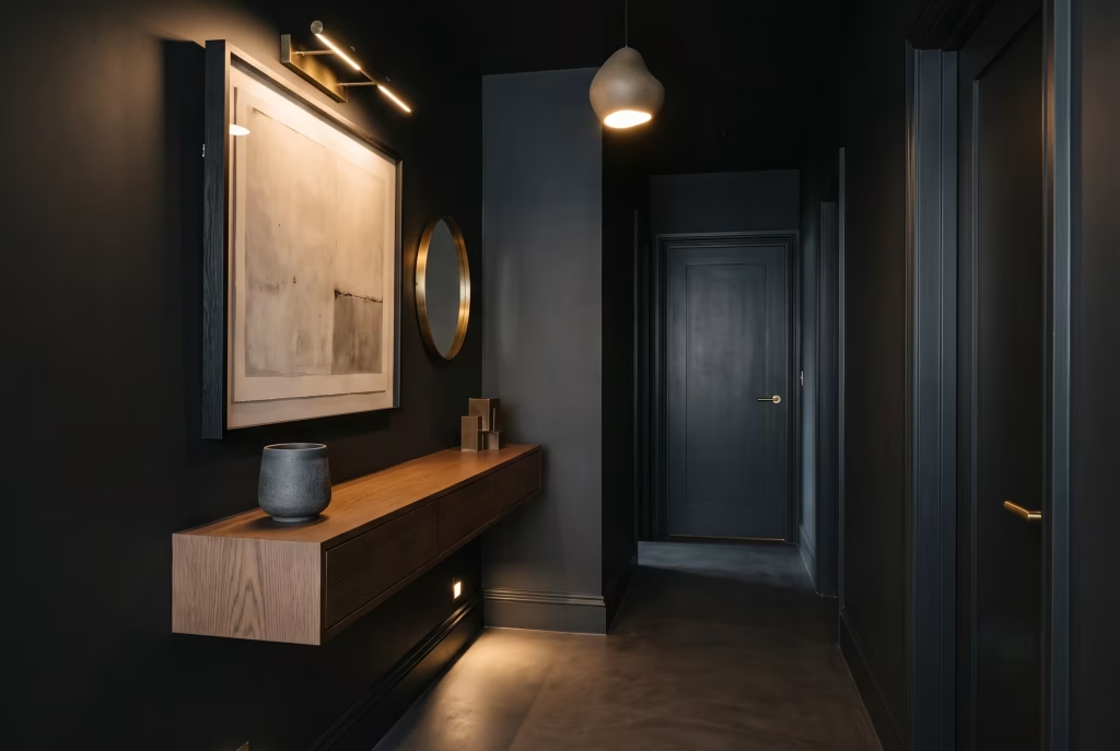
Hallways are usually the darkest space in a home by nature, with the least natural light of any room, so treat this as an opportunity rather than a constraint.
A dark hallway with strong accent lighting, whether that’s wall-mounted picture lights or a single sculptural pendant, creates genuine drama the moment someone steps through the front door. Floating consoles and wall-mounted storage keep the floor visible, which matters enormously in a narrow space where every centimetre of visual openness counts.
Making a Small Room Work in Dark Tones
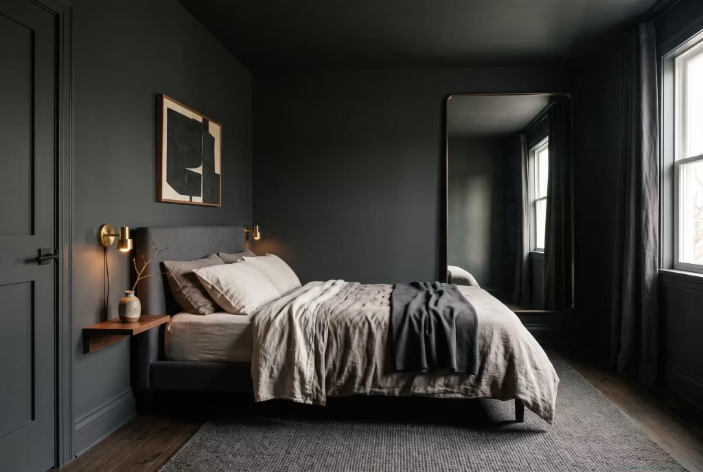
Small rooms are where most of the anxiety around this style lives, and it’s largely unfounded if you follow a few specific rules rather than the general ones above.
Keep the ceiling and walls the same dark tone rather than introducing a white ceiling, which otherwise creates a visual cap that makes a low or small room feel more compressed, not less. Use one reflective surface deliberately, whether that’s a mirror, a glass-fronted cabinet, or a polished metal light fixture, to bounce what natural light there is around the room without breaking the palette.
And resist the temptation to add a second accent colour. A small dark room in a single, consistent tone reads as intentional and expansive; the same room split between two competing colours reads as cluttered no matter how little furniture is in it.
Dark Minimalism for Renters
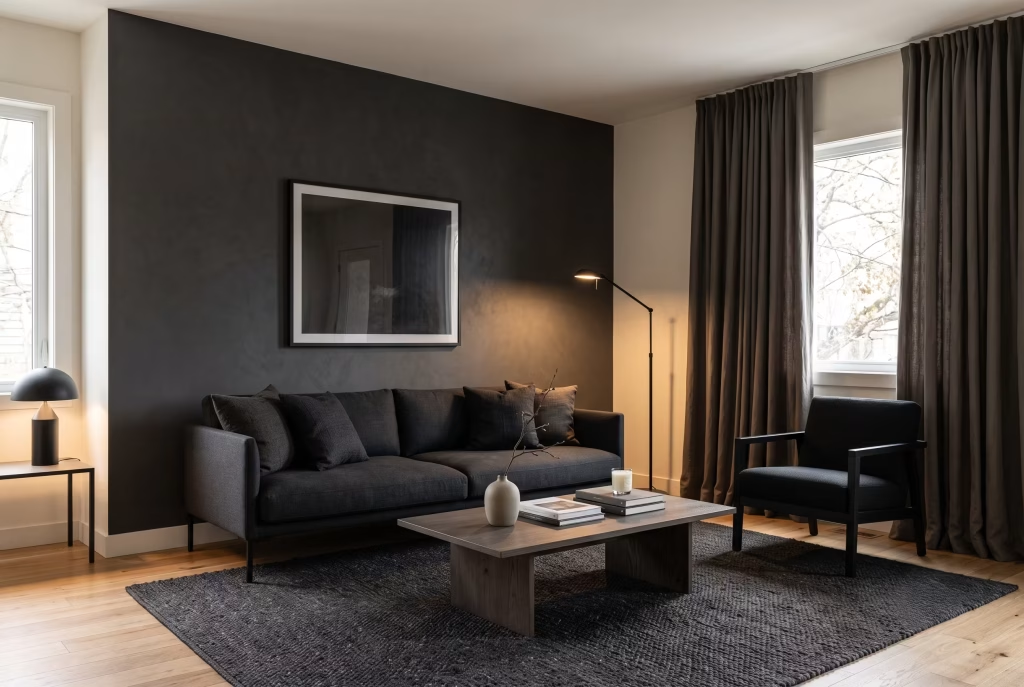
You don’t need to repaint a wall to get most of the effect, and this is genuinely underserved territory in most guides on this topic. Peel-and-stick wallpaper in a matte charcoal or black finish now exists in quality good enough to pass for paint from a normal viewing distance, and it removes cleanly at the end of a tenancy.
Beyond that, lean on the layers you can control without touching the walls at all: a dark, low-profile sofa or armchair, blackout curtains in a heavy linen rather than a cheap synthetic, warm freestanding lamps rather than relying on a landlord’s overhead fixture, and a dark wool rug to anchor the seating area. Layering three or four of these together gets you 80 percent of the mood with none of the deposit risk.
Common Mistakes to Avoid
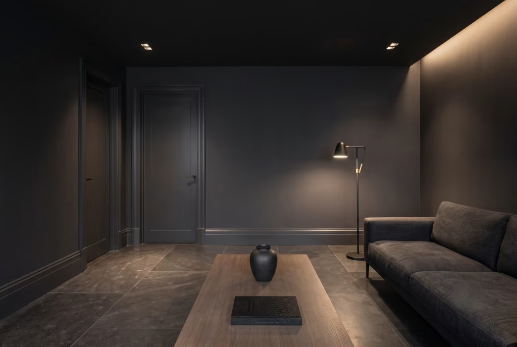
Painting everything the same flat sheen. A room with no texture variation, even if every material is technically different, reads as visually flat under artificial light. Mix matte walls with a satin skirting board, or a honed stone floor with a brushed metal fixture, so the light has something to catch.
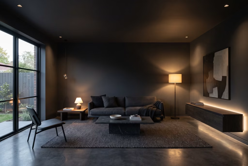
Relying on a single central light. One overhead pendant on a dark ceiling creates a pool of light in the middle of the room and deep shadow everywhere else, which is the fastest route to a space feeling like a cave rather than a considered interior.
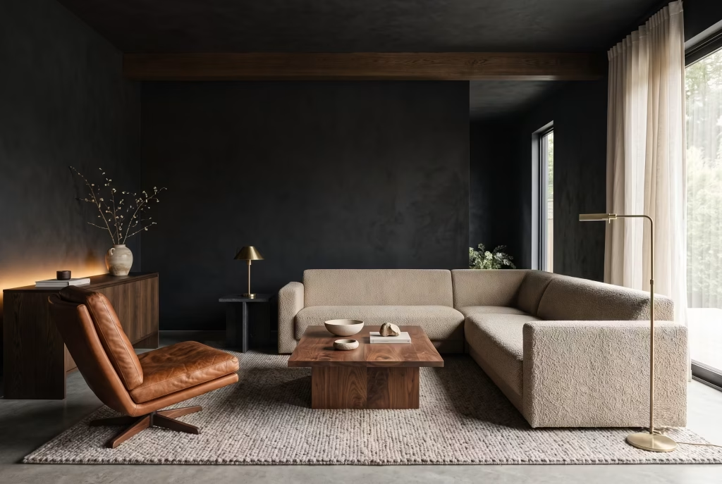
Skipping the warm material entirely. An all-black, all-hard-surface room with no timber, leather, or textile softness will read as cold and showroom-like rather than lived-in, regardless of how good the paint colour is.
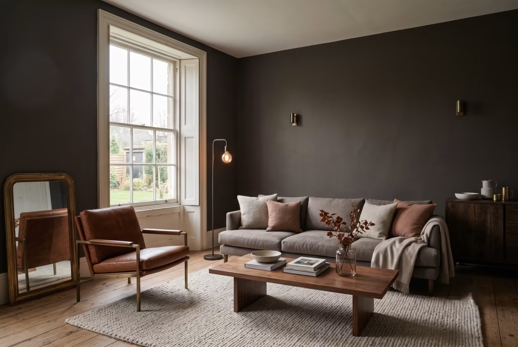
Choosing a true cool black in a north-facing room. Cool, blue-based blacks amplify the lack of warm daylight in a north-facing space. A warmer, slightly brown-based black or deep charcoal almost always performs better in rooms that don’t get direct sun.
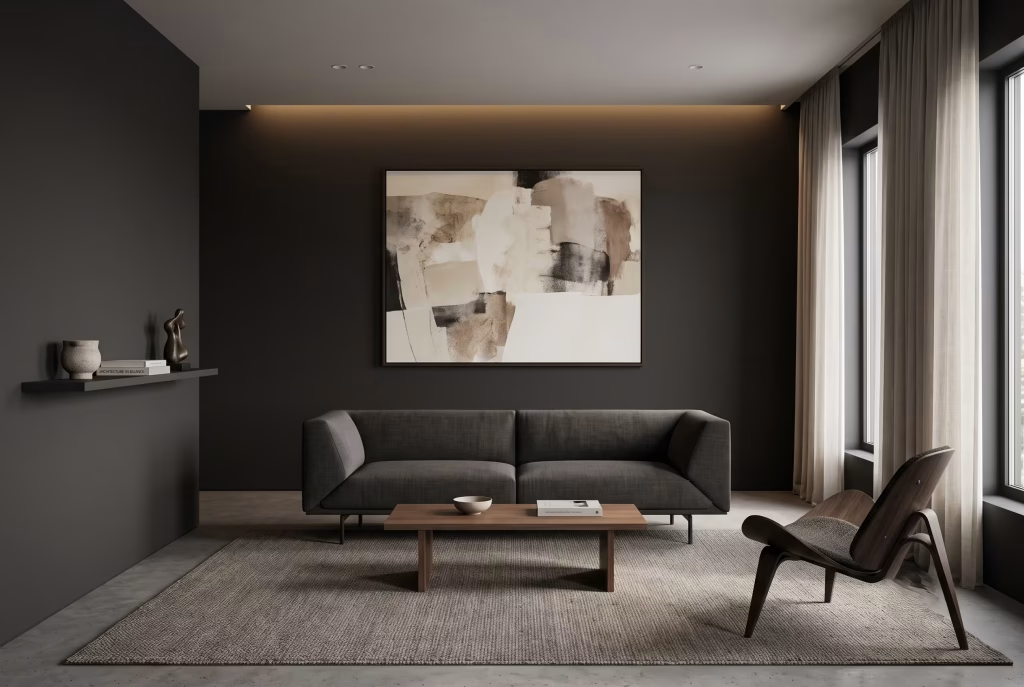
Overcrowding the walls. Dark minimalism relies on negative space to do as much work as the furniture. A single large piece of art or one considered shelf of objects will always outperform several smaller decorative items competing for attention.
You May also Like: 25 Japanese Mid-Century Modern Design Ideas You’ve Probably Never Seen (and Will Obsess Over)
Dark Minimalist vs Dark Academia vs Dark Japandi
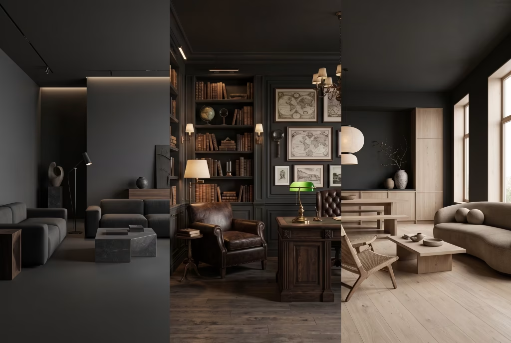
These three get conflated constantly in search results, and they’re genuinely different styles with different rules.
Dark minimalism is defined by restraint above everything else. Few materials, few objects, clean geometry, and a tightly edited colour palette with no ornamentation for its own sake.
Dark academia borrows the same dark, warm palette but layers in curated collections, vintage furniture, leather-bound books, and a sense of accumulated history. It’s intentionally more decorated and narrative-driven than true minimalism.
Dark Japandi blends Japanese restraint with Scandinavian warmth, using dark tones alongside pale, unfinished timber and a slightly softer, rounder furniture language than the sharper geometry typical of dark minimalism on its own.
If your search brought you here looking for the busier, book-lined version of this look, dark academia is the term you actually want. If you’re after the calmer, blonder-wood version, look to dark Japandi. True dark minimalism sits between the two: warm enough not to feel clinical, but far more edited than either of its cousins.
The Last Word
Dark minimalism rewards patience more than almost any other interior style. It’s not a scheme you can fully judge from a paint swatch under a shop’s fluorescent lighting, and it’s not one where you can skip the lighting plan and hope the colour does all the work on its own. Get the layering right, keep the material palette tight, and let the negative space do as much as the furniture, and you end up with a home that feels considered in a way that’s genuinely difficult to fake.
Frequently asked questions
Does dark paint make a room feel smaller?
Not when it’s lit properly. A dark room only shrinks visually when the lighting is flat and single-source, because there’s nothing to define depth against the colour. Layer ambient, task, and accent lighting, add one reflective surface such as a mirror or glass-fronted cabinet, and a dark room will read as deep and enveloping rather than cramped.
Does painting a room dark hurt resale value?
Generally, no, and the data actually points the other way for a specific shade. A Zillow paint colour study found charcoal grey kitchens sold for an estimated $2,512 more than comparable white kitchens, with charcoal living rooms commanding roughly $1,755 more. Where dark paint does become a liability is a single, loud accent wall that clashes with the rest of the home, since that’s the scenario homeowners and painters most often cite as a regret. A cohesive, whole-room scheme in a considered charcoal or near-black reads as intentional to a buyer; one jarring dark wall reads as a phase.
Is dark minimalist design expensive to achieve?
Not inherently. Paint is one of the most affordable ways to transform a room, and the style leans on restraint and material consistency rather than a long shopping list. Spend concentrates in a handful of investment pieces, a well-made sofa, proper layered lighting, quality cabinet hardware, rather than spreading thinly across many smaller purchases.
What is the best paint finish for a dark minimalist wall?
Matte or estate emulsion for the main wall surfaces, rather than satin or eggshell. Matte absorbs light instead of reflecting it unpredictably, which is what gives the style its velvety, shadow-rich depth. Save higher-sheen finishes for woodwork, skirting, and doors, where durability matters more than light absorption.
Can I do dark minimalism if I rent my home?
Yes, mostly through removable layers rather than paint. Peel-and-stick wallpaper in a matte charcoal or black finish, dark furniture and heavy linen textiles, warm freestanding lamps, and a dark wool rug can achieve most of the effect without touching the walls, and all of it comes off cleanly at the end of a tenancy.
How do I stop a dark room feeling like a cave rather than a considered space?
Build the lighting across three layers, ambient, task, and accent, rather than relying on one central pendant. Keep colour temperature between 2700K and 3000K throughout, and bring in at least one warm natural material, such as walnut or leather, so the room has something for the eye to land on besides flat colour.
Should the ceiling be painted the same dark colour as the walls?
In a small or low-ceilinged room, yes, usually. Leaving the ceiling white creates a visible seam where wall meets ceiling, which draws the eye to the room’s actual height and makes it feel more boxed in, not less. Carrying the same dark tone up and over removes that seam and lets the room read as one continuous, enveloping volume rather than a box with a lid.
How many colours and materials should a dark minimalist room use?
Keep it tight. One dominant dark tone, one or two warm materials such as timber and leather, and no more than a single accent colour if you use one at all. The style’s calm comes from repetition and restraint; a third or fourth competing tone is usually what tips a considered scheme into looking cluttered, even in an otherwise sparse room.
What plants work well in a dark minimalist room?
Shade-tolerant, architectural species do the most work with the least fuss. Snake plants and ZZ plants both hold their shape without needing bright light, and their upright, sculptural form fits the style’s clean lines far better than a bushy, sprawling plant would. One well-placed plant is usually enough; scattering several across a room starts to work against the minimalist brief.
How do I know if a dark paint colour will actually work before I commit to painting the whole room?
Sample a large piece of card or board, at least A2 size, painted with two coats, and move it around the room across a full day. Check it in flat morning light, direct afternoon sun if the room gets any, and again under your evening lamps, since a colour that looks perfect under a shop’s fluorescent lighting can shift completely once it’s on your own wall. This single step is what separates a scheme that holds up from one that ends up needing a repaint within the year.
What colours pair well with a dark minimalist palette?
Warm neutrals such as cream, oatmeal, and stone act as a soft counterpoint to near-black walls. Deep forest green and navy both sit comfortably alongside true black as accent tones. Avoid pure white in large doses, since the contrast can feel stark rather than considered; an off-white or warm cream bridges the two tones far more gently.
What’s the difference between dark minimalism, dark academia, and dark Japandi?
Dark minimalism is defined by restraint above everything else, a tight palette with almost no ornamentation. Dark academia uses the same warm, dark base but layers in curated collections, vintage furniture, and a sense of accumulated history. Dark Japandi blends the same dark tones with pale, unfinished timber and softer, rounder furniture shapes than the sharper geometry typical of pure dark minimalism.