15 Gray and Green Living Room Ideas: How to Pair Gray and Green for a Stylish Space
There’s a particular kind of quiet disappointment that comes with an all-grey living room. It looked so calm on the paint chart. So grown-up, so easy to live with, so impossible to get wrong. And then the sofa went in, the curtains went up, and you stood in the doorway one wet Tuesday evening wondering why a room built entirely on “safe” choices felt less like a sanctuary and more like a waiting room.
You’re not imagining that flatness, and you’re not alone in feeling it. Grey didn’t fail you. It just needed a partner, and green is the one that finally makes the whole scheme breathe.
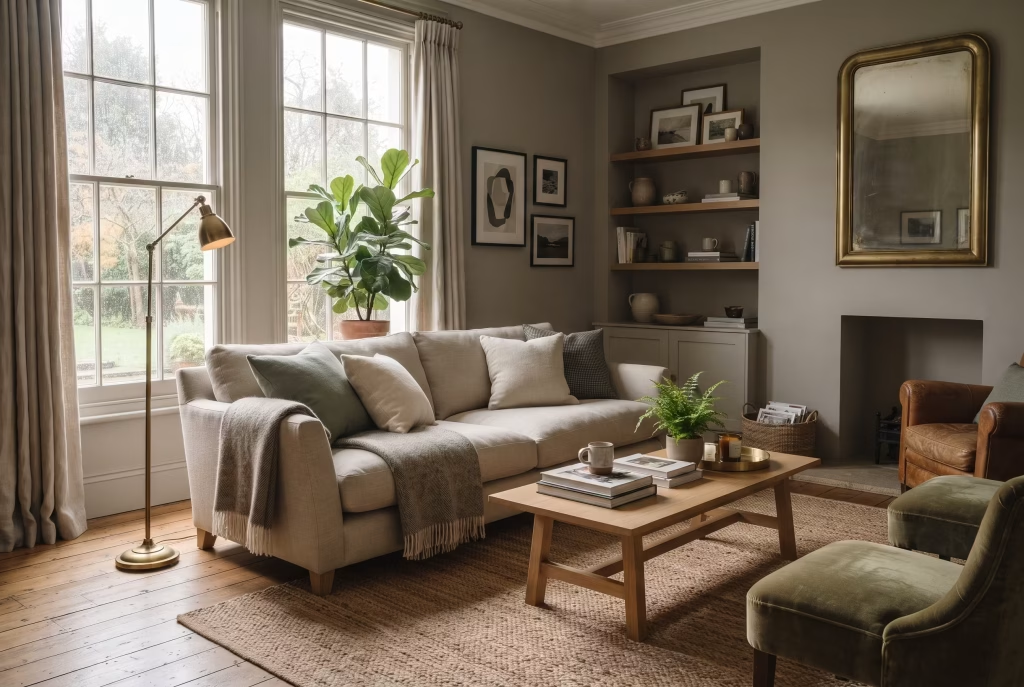
Quick answer: Grey and green work because they sit close together on the colour wheel, but green carries the warmth, texture and emotional pull that grey lacks alone.
The single biggest factor in whether the pairing looks sophisticated or muddy is undertone matching, warm greys with warm greens (sage, olive, moss), cool greys with cool greens (emerald, forest, teal-green). Get that right, follow a rough 60-30-10 colour split, and layer in warm materials like wood and brass, and the combination works in almost any room, any light, any budget.
Why grey and green work together (and where it goes wrong)
Grey is a mediator, not a wallflower. It doesn’t compete with colour the way white can look stark or beige can look sluggish. It simply steps back and lets whatever sits beside it do the talking. Green, meanwhile, is the one colour the human eye is genuinely wired to find restful, a holdover from millennia spent scanning the natural world for safety, water, and shelter.
Put the two together properly and you’re combining architectural calm with a biological, almost involuntary sense of comfort. That’s a powerful foundation for the one room in the house where people are actually meant to switch off.
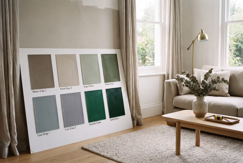
The failure mode almost everyone runs into is undertone mismatch. Grey isn’t one colour, it’s a family, and every grey carries a hidden undertone of blue, green, purple, or brown beneath the surface. Cool, blue-based greys fight with warm, yellow-based greens like olive and sage, and the result reads muddy rather than sophisticated.
It’s one of the most repeated regrets among people who’ve tried this combination themselves: choosing a grey and a green that seemed fine separately, only to watch them curdle together on the wall, sometimes not discovering the clash until the whole room was repainted. Warm greys, by contrast, make those same greens sing.
How to test your undertone before you buy a single tin:
- Hold your grey paint sample against a plain sheet of white paper, in daylight, not lamp light.
- If it leans faintly blue or purple against the white, it’s a cool grey.
- If it leans faintly green or brown against the white, it’s a warm grey.
- Cool greys pair best with cooler, more saturated greens: emerald, teal-green, bottle green.
- Warm greys pair best with warm, muted greens: sage, olive, moss, fern.
This one five-minute check prevents more redecorating regret than almost anything else in this guide.
The psychology behind why this palette feels so good to live in

There’s real substance behind the calm this colour combination produces, not just decorating folklore. Environmental psychologists describe green as one of the few colours associated with parasympathetic nervous system activity, the “rest and digest” state, rather than the alertness that brighter, warmer colours like red and orange tend to trigger.
It’s why hospital recovery rooms, waiting areas, and increasingly, therapy and consultation spaces lean on muted greens: the colour doesn’t ask anything of the eye. Grey, for its part, reduces visual competition. In a home where the day already involves screens, notifications, and decision fatigue, a living room that doesn’t demand more processing from your brain the moment you walk in is doing real emotional work, even if you never consciously register it.
There’s also something quietly reparative about bringing a colour associated with the outdoors into the room where you spend your evenings. This is the basis of biophilic design theory: humans recover faster from stress, and report measurably lower cortisol, in spaces that reference nature, even abstractly, than in spaces that don’t.
A grey and green living room isn’t simply following a trend. It’s a legitimate, research-backed way to build a room that helps you come down from the day rather than keeping you keyed up in it. That’s worth remembering on the days when a colour choice feels indulgent. It isn’t. It’s function dressed as style.
Grey and green undertone matching, at a glance
| Your grey’s undertone | How to spot it | Greens that flatter it | Greens to avoid |
| Cool (blue/purple base) | Looks slightly blue-tinged next to white paper | Emerald, teal-green, bottle green, forest green | Olive, mustard-green, warm sage |
| Warm (green/brown base) | Looks slightly green or taupe-tinged next to white paper | Sage, olive, moss, fern, eucalyptus | Emerald, cool teal |
| True neutral (rare) | Reads identically grey in daylight and lamp light | Most mid-tone greens, sage and moss are safest | Very saturated, cool-toned greens |
15 Gray and Green Living Room Ideas
1. Soft sage walls with a warm grey sofa
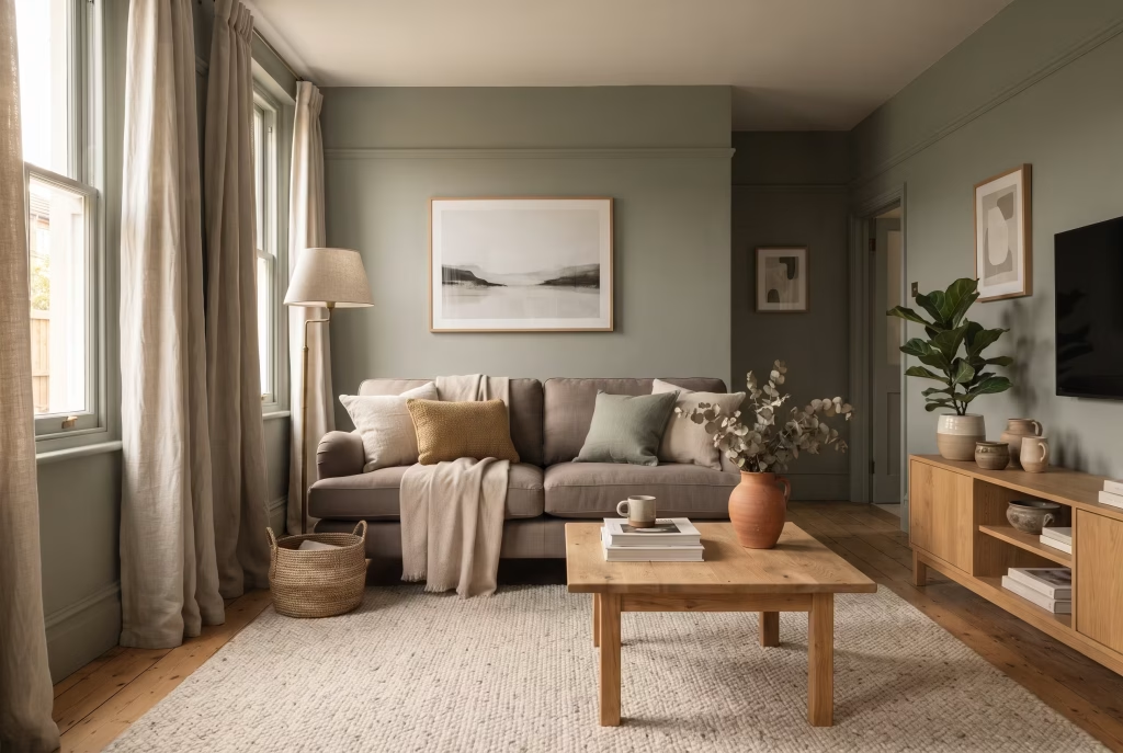
This is the gentlest way into the combination, and the one to start with if you’ve never worked with colour beyond magnolia. Sage green, a muted, slightly grey-toned green, behaves almost like a neutral itself, which is why it sits so easily beside a warm grey sofa rather than fighting it.
There’s a reason this pairing turns up in so many “first colour I ever chose and never regretted” stories: it asks very little of you emotionally while giving the room real depth. Farrow & Ball’s Cromarty or Benjamin Moore’s Sage Bark both read as sophisticated rather than nursery-soft. Keep the sofa in a warm, taupe-leaning grey (Sherwin-Williams’ Repose Gray is a dependable choice) rather than a cool charcoal, and the whole room stays coherent instead of competing.
Why it feels good to come home to: sage is close enough to neutral that it never shouts, which means the room never asks you to perform enthusiasm for it on a tired evening. It’s the decorating equivalent of a friend who doesn’t need you to be “on.”
- Best for: first-timers with colour, rental-friendly (if you’re allowed to paint), any room orientation
- Pros: forgiving of mismatched furniture, ages well, low risk of buyer’s remorse
- Cons: can feel a little safe without one bolder accent layered in
- Real-world fix: add one item in a genuinely bold colour (terracotta lamp, mustard cushion) so the room doesn’t flatten into beige-adjacent
2. Emerald green feature wall against light grey
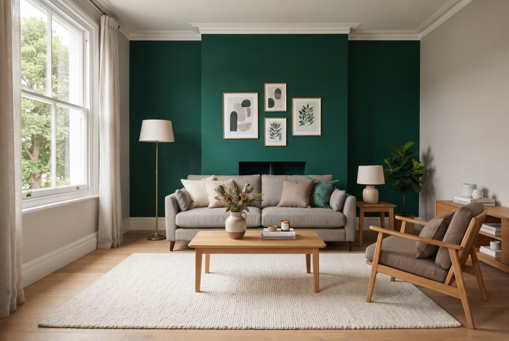
If sage is the whisper, emerald is the sentence spoken with real conviction. A single feature wall in a true jewel-toned emerald, Farrow & Ball’s Emerald Green or Little Greene’s Bancha, paired with the remaining walls in a soft light grey, gives you drama without asking the whole room to commit. This works especially well behind a chimney breast or the wall the sofa backs onto, where it becomes a backdrop rather than something you’re confronted by every time you sit down.
- Measurement that matters: keep the feature wall to one wall only; in rooms under roughly 12 square metres, choose the shortest wall, not the longest, so the colour doesn’t visually shrink the space
- Balance with: warm wood furniture, at least one brass or unlacquered brass fixture, and a neutral rug to stop the room reading as two disconnected halves
- Pros: high visual impact for relatively low cost and effort (one wall, one tin)
- Cons: commits the room to a fairly bold statement; harder to “undo” emotionally once you’ve lived with it, even though it’s cheap to repaint
3. Grey walls, olive green sofa
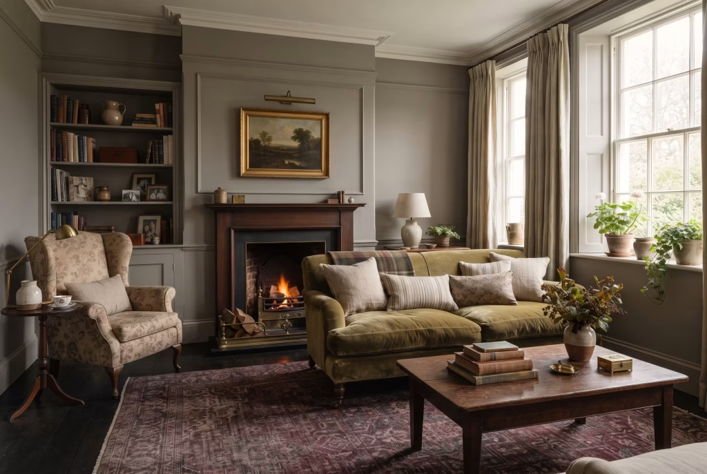
Flip the usual formula and let furniture carry the colour instead of the walls. Olive, a green with a distinct yellow-brown undercurrent, has a heritage, slightly worn-in quality that suits a traditional or English country living room particularly well, the kind of room that wants to feel collected over years rather than styled in a weekend. Paint the walls in a warm mid-grey (Dulux’s Chic Shadow or Farrow & Ball’s Ammonite both work), then bring in an olive velvet or bouclé sofa as the anchor.
- Best for: renters, or anyone nervous about committing to a painted wall
- Investment logic: the money sits in furniture you keep and can take with you, not a wall finish you’ll need to redo when you move
- Style it with: dark wood, a burgundy or red accent rug, brass picture lights
- Emotional note: this is the choice for people who want a living room to feel inherited rather than purchased, even when everything in it is new
You May also Like: Living Room Furniture Essentials: Designing for Comfort, Character, and Everyday Living
4. Moody forest green and charcoal for a cocoon effect
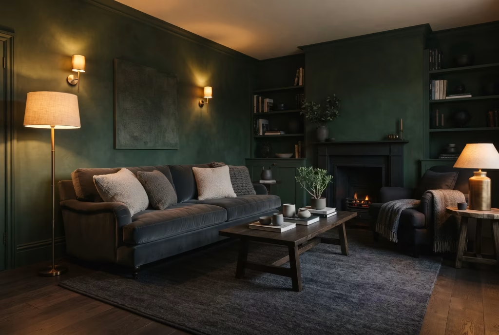
For a north-facing room, or one used mainly after dark, leaning into darkness rather than fighting it is often the more comfortable choice, not the riskier one. Deep forest green walls (Little Greene’s Bronze Green or Benjamin Moore’s Forest Green) against charcoal grey upholstery and flooring create an enveloping, almost cinema-room atmosphere. It photographs beautifully, but more importantly, it feels genuinely calming to sit in once the sun’s gone down, the visual equivalent of pulling a blanket over your shoulders.
- The trick: texture, not colour variation, is what stops dark-on-dark schemes reading flat. Velvet, bouclé, heavy wool rugs, and warm brass or aged gold lighting all add depth
- Avoid: glossy or hard-surfaced materials, they read cold and slightly clinical against this palette
- Best time of day it earns its keep: evening, artificial light, exactly when most people actually use their living rooms
5. Light grey base with a sculptural olive or sage accent chair
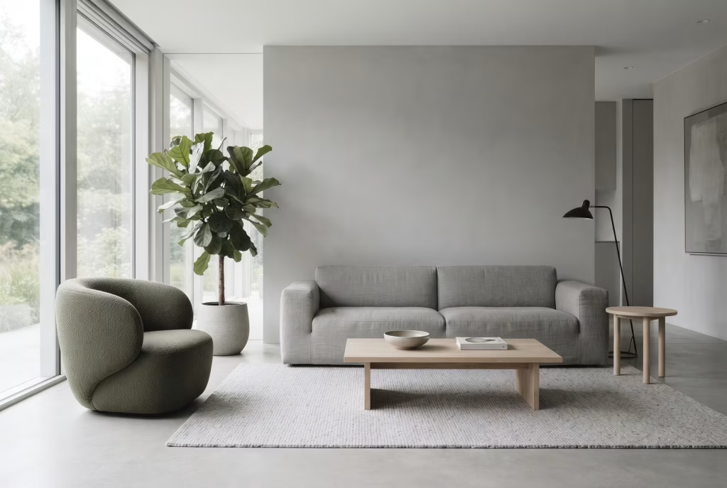
Sometimes the boldest move available to you is restraint. A predominantly light grey room, walls, sofa, and flooring all in variations of soft dove grey, gets its personality from a single sculptural accent chair in olive or sage bouclé or velvet. This is the gallery-like, architectural end of the palette, and it suits open-plan or minimalist spaces particularly well, where too much colour competition would fight the room’s clean lines.
- Choose a chair with: a genuinely interesting silhouette, a curved barrel back or an organic moulded shape, since it’s doing all the personality work in the room
- Finish with: one large houseplant nearby to complete the effect without adding visual noise
- Pros: effortlessly elegant, photographs like a design magazine spread, easy to change your mind about later (it’s one chair)
- Cons: the rest of the room needs genuine discipline to stay this restrained; clutter undoes the effect fast
6. Grey and green geometric or striped accent wall
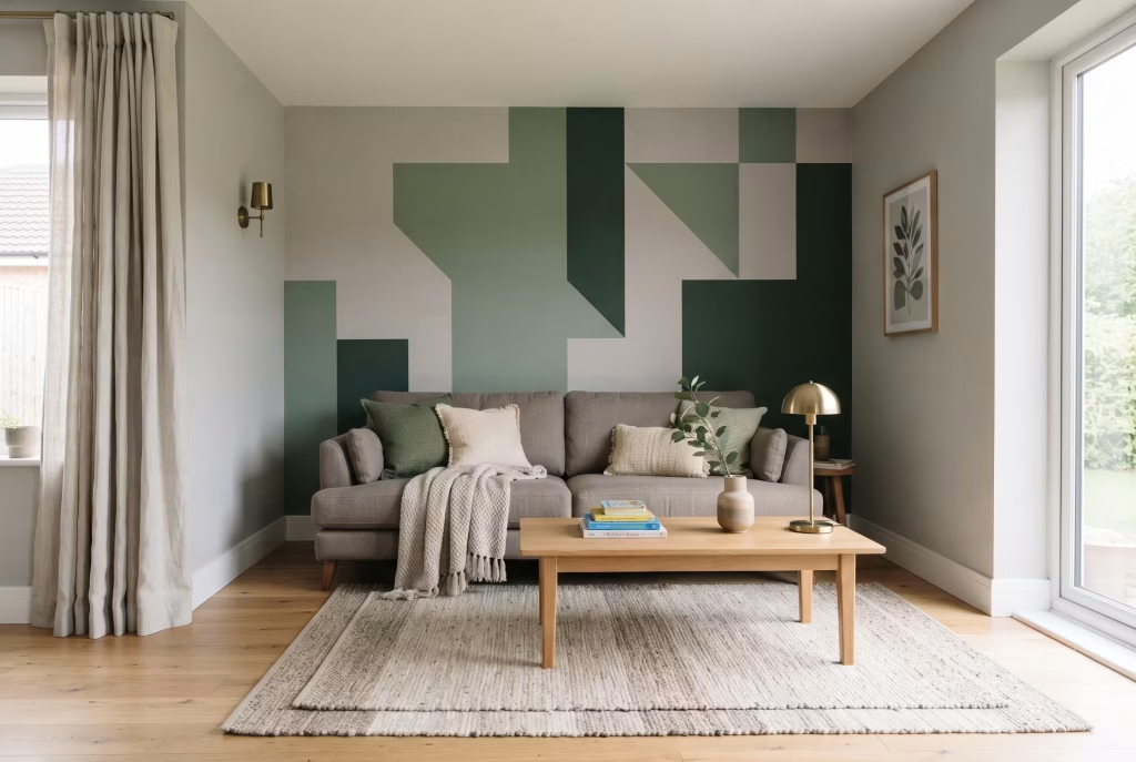
For a living room that wants pattern as well as colour, a hand-painted or wallpapered geometric wall in coordinating grey and green tones adds real visual interest to one wall while the rest of the room stays calm. This suits a family living room particularly well, somewhere that wants a genuine talking point without the maintenance risk of committing an entire room to a bold finish.
- How to do it yourself: use painter’s tape, work from the centre of the wall outward for symmetry
- Keep it to: no more than three tones (one grey, one mid-green, one deep green) so the pattern doesn’t overwhelm
- Best for: families, playful spaces, homes where the living room doubles as a place children spend real time
7. Warm greige walls with layered green textiles
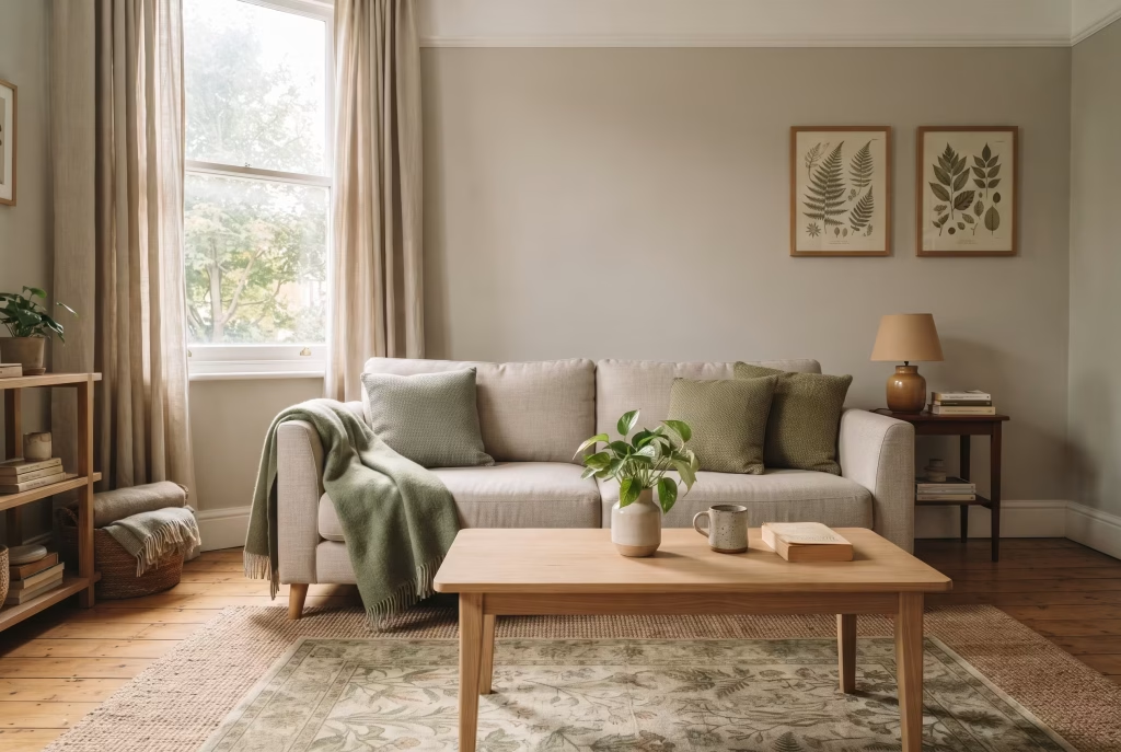
Greige, the warm hybrid of grey and beige, is a gentler starting point than true grey for anyone worried the combination might feel cold. Against greige walls, introduce green through textiles alone: a botanical-print rug, sage cushions, a moss-green throw, a couple of framed botanical prints. Nothing here is permanent or expensive, which makes this the idea to try first if you’re renting, or simply not ready to commit.
- Pros: fully reversible, low financial risk, genuinely low-stakes way to “test drive” the palette before painting anything
- Cons: slower to build real depth; a textile-only scheme can look a little thin until you’ve collected several pieces
- Seasonal bonus: swap green textiles for deeper, richer tones in autumn and lighter, fresher greens in spring, all without touching a wall
You May also Like: Living Room Furniture Essentials: Designing for Comfort, Character, and Everyday Living
8. Grey panelling with a green painted interior
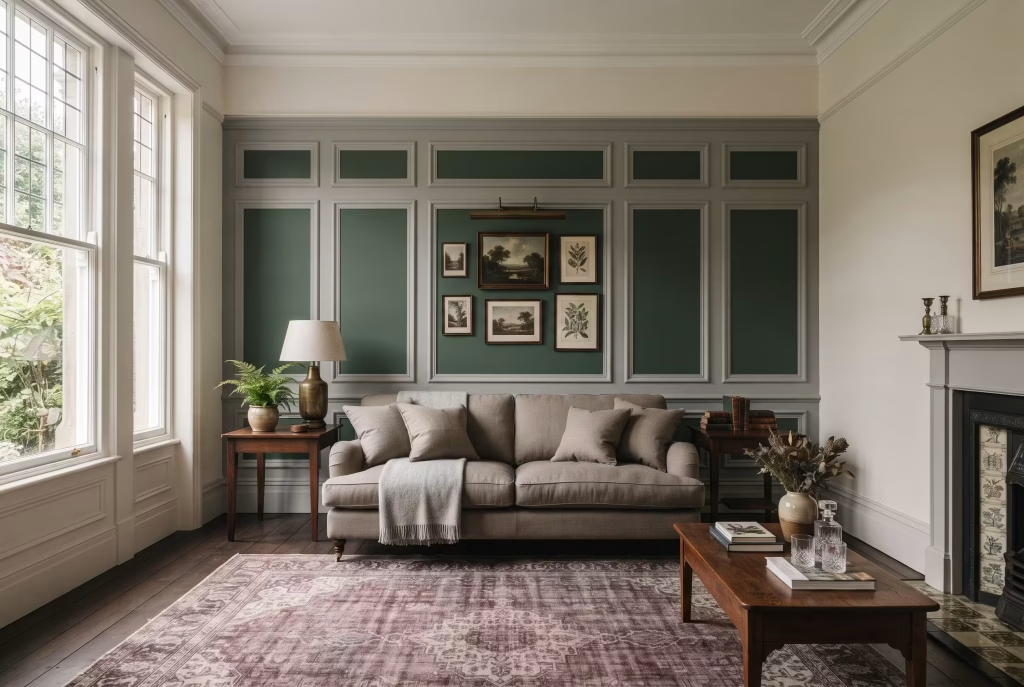
Wall panelling, whether traditional tongue-and-groove or simple MDF battens, adds architectural depth to a living room. Painting the panelling frame in grey while leaving the recessed interior panels in a contrasting green is a way to get real colour depth without a flat wall of paint. This period-appropriate detail suits Victorian or Edwardian terraces with existing picture rails especially well, and it’s a genuinely achievable weekend DIY project.
| Detail | Specification |
| Typical feature wall width | 3 to 4 metres |
| Recommended frame colour | Mid-grey (e.g. Farrow & Ball Ammonite) |
| Recommended panel colour | Deep green (e.g. Farrow & Ball Studio Green) |
| Finishing touch | Match skirting board to the grey frame colour |
| Approx. weekend project | Yes, achievable in 2 days including drying time |
9. Scandinavian-style pale grey with sage accents
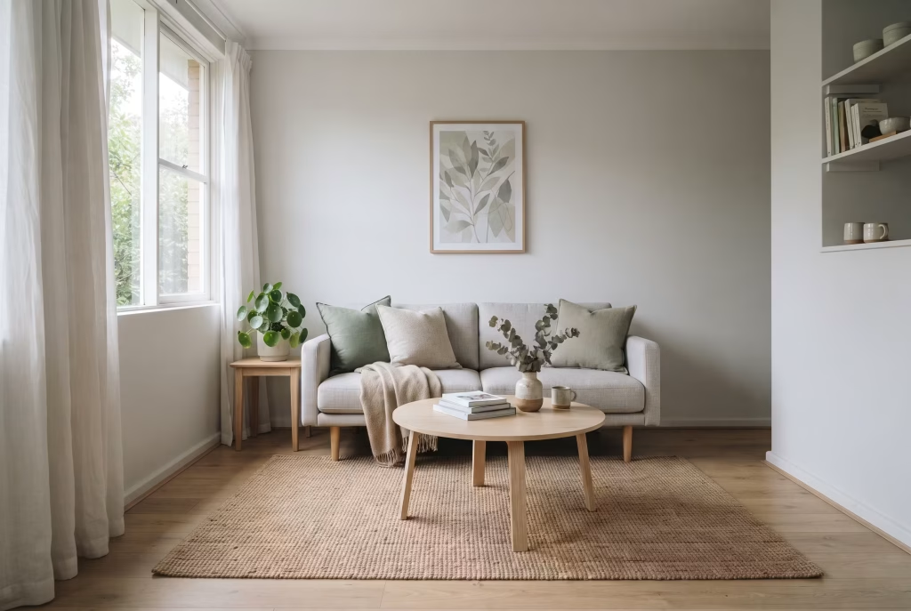
The Scandinavian approach strips everything back to its calmest form: pale, almost-white grey walls, light oak or ash furniture, sage green introduced only through cushions, a single artwork, and genuine houseplants. This suits smaller living rooms and flats particularly well, since the light palette keeps the space feeling open rather than boxed in.
- Small detail that matters: keep furniture legs visible rather than boxy and upholstered to the floor; it makes a modest room feel measurably larger
- Rug choice: natural fibre (jute or sisal) rather than shag or heavy pile, to keep the whole look breathable
- Emotional register: unhurried, quiet, the kind of room that doesn’t ask you to tidy up before you can relax in it
10. Industrial grey with deep green botanical layering
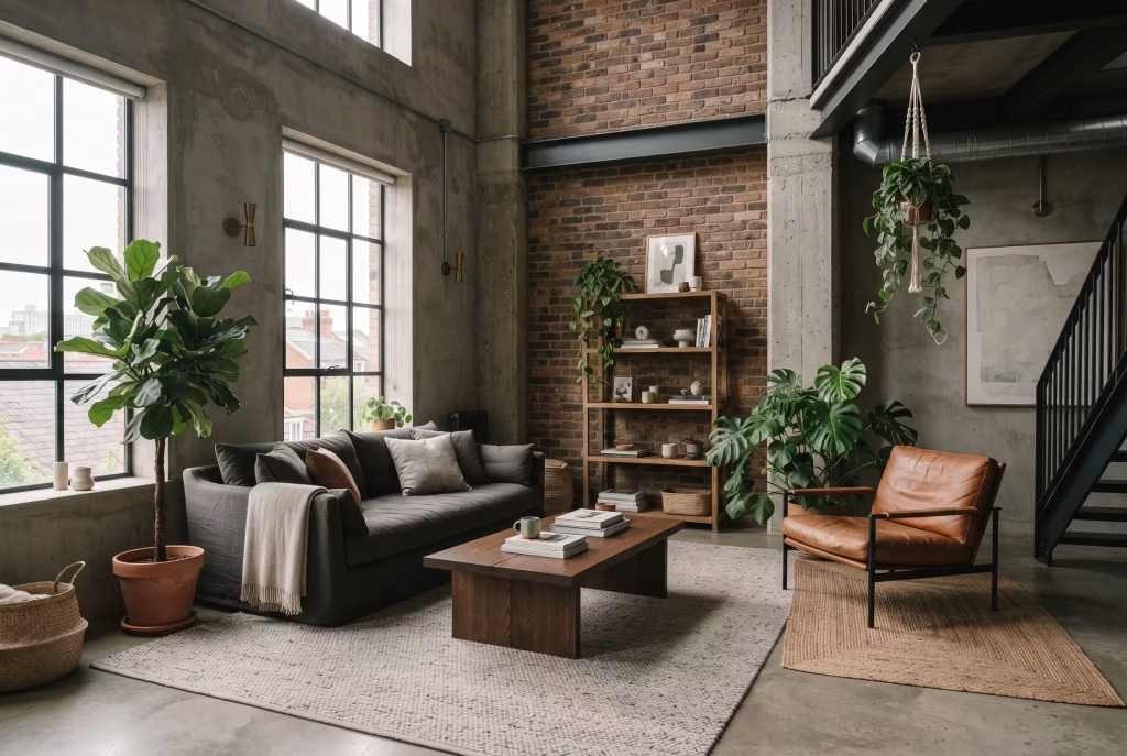
Exposed brick, concrete, or simply grey-painted walls paired with abundant deep green planting bridges the gap between an urban, industrial aesthetic and something genuinely liveable. This works particularly well in converted warehouses, loft conversions, or any room with exposed structural elements that would otherwise feel stark and a little cold.
- Layer plants at varying heights: floor, shelf, and hanging, rather than clustering everything at one level
- Choose: one or two statement specimens (a fiddle-leaf fig or a monstera) rather than many small plants, which can read as clutter against a bold architectural backdrop
- Why it works psychologically: the greenery softens hard architectural edges the way it would in nature, moss on stone, ivy on brick, so the room feels less like an office and more like a space that’s been allowed to grow into itself
11. Grey sofa, green rug as the anchor
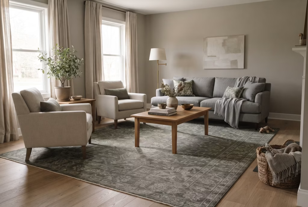
If painting feels like too big a commitment, let a rug carry the colour instead. A grey sofa and neutral walls, paired with a large green or green-and-grey patterned rug, grounds the room and introduces colour at floor level, where it’s easiest to change your mind about later.
| Living room size | Recommended rug size | Placement rule |
| Small (under 12 sqm) | 160cm x 230cm | Front legs of all seating on the rug |
| Medium (12 to 20 sqm) | 200cm x 290cm | All furniture legs on the rug |
| Large (over 20 sqm) | 240cm x 340cm or larger | Rug extends at least 15cm beyond seating on all sides |
This is the lowest-commitment idea on this entire list, and the one to try first if you genuinely aren’t sure the palette is for you yet.
12. Two-tone wall: green below picture rail, grey above
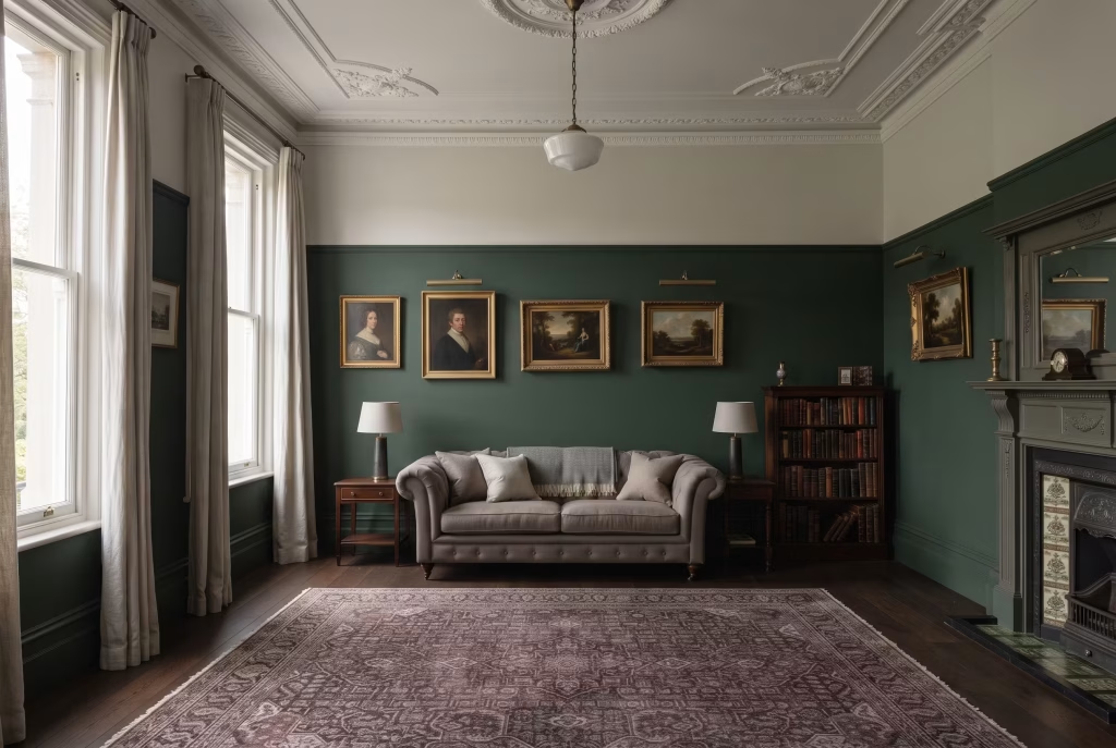
A period-appropriate way to introduce both colours to the same wall is to paint below the picture rail (or roughly 1.2 metres up from the skirting, if there’s no rail) in a deep green, and above that line, including the ceiling, in a soft grey or grey-white. This visually lowers a high ceiling, making a room with generous proportions feel cosier and more intimate. It’s a genuine Georgian and Victorian decorating convention rather than a modern trend, which gives it real staying power against fashion cycles.
- Best for: period properties with high ceilings, rooms that feel a little cavernous or echoey
- Effect: grounds the room at seating height, where you actually spend your time, while keeping the upper space light and airy
13. Grey built-ins with a green-painted backdrop
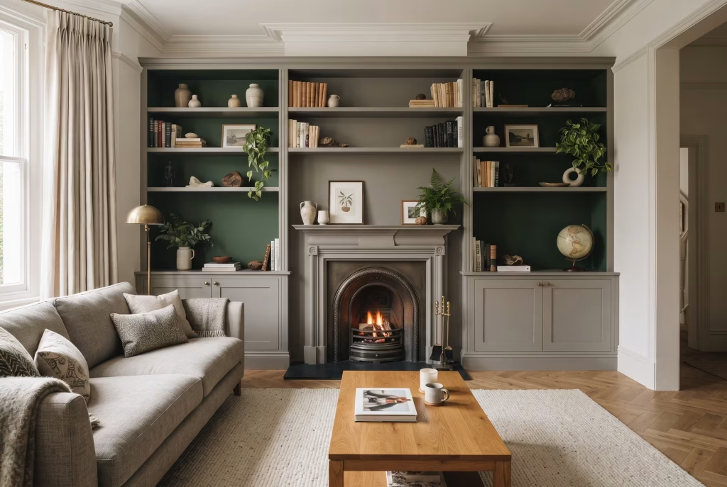
If your living room has, or will have, fitted shelving or an alcove unit, painting the exterior frame in grey and the interior back panel of open shelving in a deep green creates real depth and makes displayed books and objects pop forward visually rather than disappearing into a flat wall of colour. This is worth specifying at the joinery stage if you’re having units built, since it costs nothing extra beyond the paint itself but transforms a flat run of shelving into something with genuine dimension.
- Pros: essentially free upgrade if you’re already having shelving fitted; makes even a modest book collection look curated
- Cons: needs planning ahead; hard to retrofit onto existing white-painted shelving without a full repaint
14. Warm neutral base with a single bold green statement piece
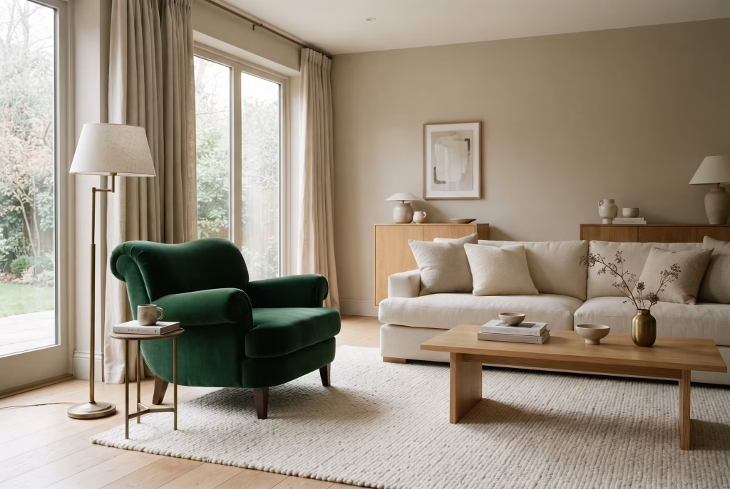
For anyone nervous about colour overall, keep the entire room in warm neutrals, greige walls, cream or oatmeal upholstery, natural wood, and let one single item carry all the green: a velvet armchair, a substantial pendant light, or a large piece of art. This is the most flexible entry point on the list, since that one item can be swapped out entirely if your taste changes, without any redecorating at all.
- Why this suits indecisive households: nobody has to agree on a wall colour forever; the commitment is small, contained, and reversible
- Best statement pieces: a velvet armchair (highest impact, still functional), a large abstract artwork (zero furniture risk), or a pendant light (impact without taking up floor space)
15. Grey and green with a warm accent colour layered in
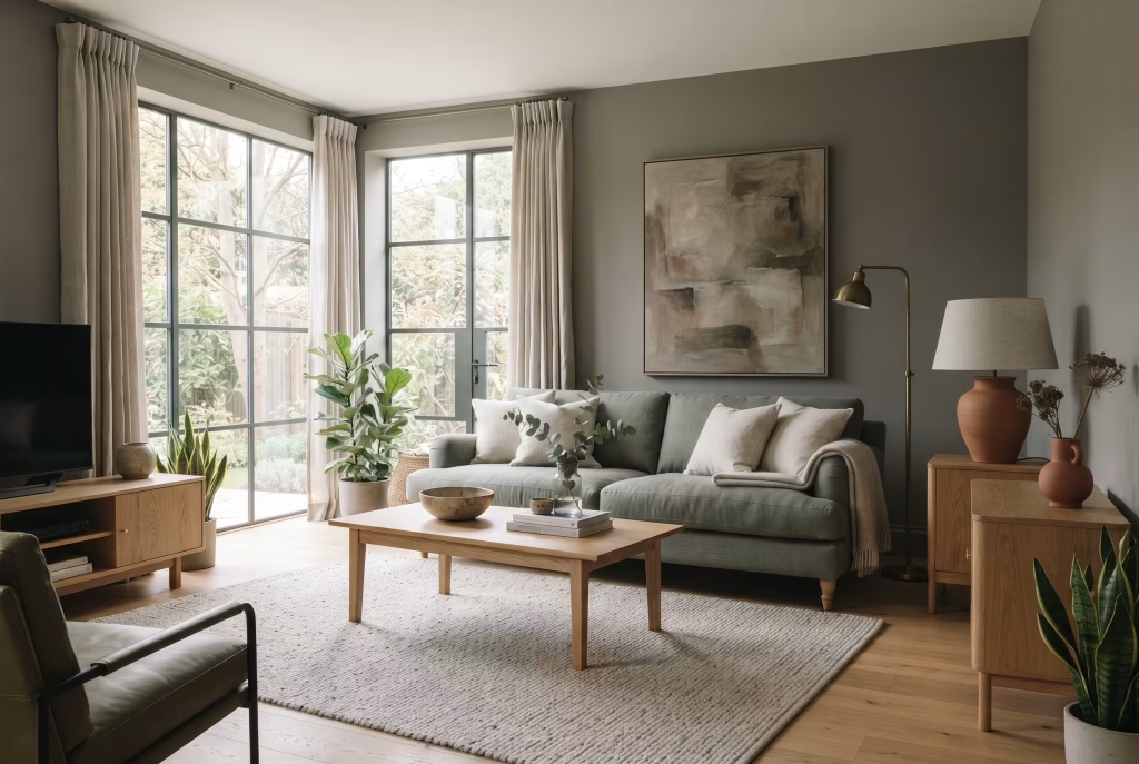
The palette rarely wants to stay just two colours once you’ve lived with it a while, and the most common request from people who’ve already committed to grey and green is a third tone to stop the room feeling one-note. Mustard, terracotta, dusty pink, and brass all work exceptionally well as the third layer, since each is warm enough to counteract any coolness in the base palette.
| Third accent colour | Mood it adds | Best used as |
| Mustard | Warm, cheerful, slightly retro | A single cushion or throw |
| Terracotta | Earthy, grounded, sun-warmed | A ceramic lamp base or vase |
| Dusty pink | Soft, romantic, gentle contrast | Cushions or a small accent chair |
| Brass / unlacquered gold | Warm, glowing, elevates the whole room | Lighting fixtures, picture lights, hardware |
| Deep navy or teal | Moody, rich, sits naturally beside green | A single accent cushion, never large upholstery |
A single mustard cushion, a terracotta ceramic lamp base, or brass picture lights are enough. This is a scheme where restraint with the third colour matters more than commitment to it, one wrong move here (a whole navy accent chair, say) can tip a considered room back into visual competition.
You May also Like: Nancy Meyers Style: The Ultimate Guide to Getting the Look in Every Room
All 15 ideas, at a glance
| # | Idea | Best for | Commitment level |
| 1 | Sage walls, warm grey sofa | First-timers, any orientation | Medium (paint) |
| 2 | Emerald feature wall | Statement-seekers | Medium (one wall) |
| 3 | Grey walls, olive sofa | Renters, traditional style | Low (furniture only) |
| 4 | Forest green + charcoal | North-facing, evening use | High (full room) |
| 5 | Light grey + sculptural accent chair | Minimalists, open-plan | Low (one chair) |
| 6 | Geometric grey/green wall | Families, playful spaces | Medium (DIY project) |
| 7 | Greige walls, green textiles | Renters, seasonal updaters | Very low (textiles) |
| 8 | Grey panelling, green interior | Period properties | Medium (DIY weekend) |
| 9 | Pale grey, Scandinavian sage | Small flats, calm seekers | Medium (paint + furniture) |
| 10 | Industrial grey, deep planting | Lofts, exposed brick | Low to medium (plants) |
| 11 | Grey sofa, green rug | Undecided, low-risk testers | Very low (one rug) |
| 12 | Two-tone picture rail wall | Period homes, high ceilings | Medium (paint) |
| 13 | Grey built-ins, green backdrop | New joinery projects | Low (paint only) |
| 14 | Neutral base, one green piece | Indecisive households | Very low (one item) |
| 15 | Grey/green plus warm accent | Anyone feeling one-note | Very low (accessories) |
How to choose your green and grey combination: a decision guide
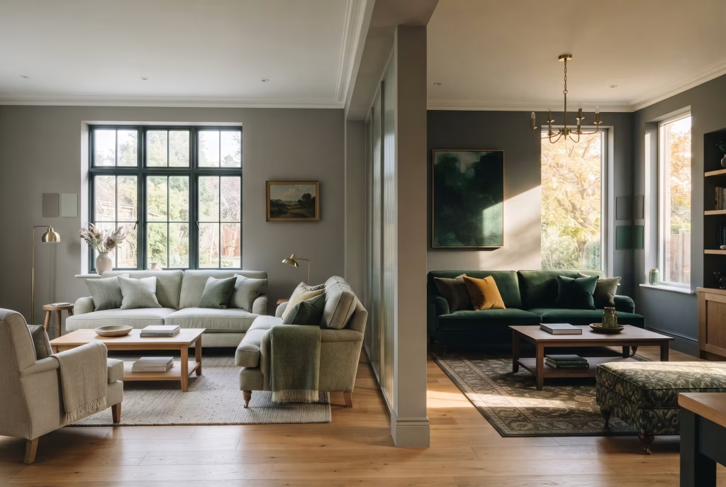
Start with the room’s light direction, since it decides more than personal taste does.
- North-facing rooms: want warm, lighter greens (sage, moss) and warm mid-greys; cooler, darker combinations can feel flat and heavy by mid-afternoon
- South or west-facing rooms: can carry darker, cooler greens (emerald, forest, bottle) against cooler charcoal greys without feeling oppressive, since the light is warm enough to balance them
Next, decide which colour is dominant and which is the accent, using a rough 60-30-10 split as your starting point:
- 60 percent: your main neutral, walls and large furniture
- 30 percent: the secondary colour, a sofa, a rug, or an accent wall
- 10 percent: accents, cushions, art, accessories
A common mistake is splitting the two colours closer to 50-50, which tends to make a room feel busy and undecided rather than considered, since neither colour gets to lead. Finally, test both paints in the room itself, not just on a chip in the shop, and live with samples on the wall for at least three days across different times of day before committing to a full tin. Colour genuinely changes character between 8am and 8pm, and the sample that looked perfect at lunchtime can read completely differently under lamp light.
Final thoughts about Gray and Green Living Room
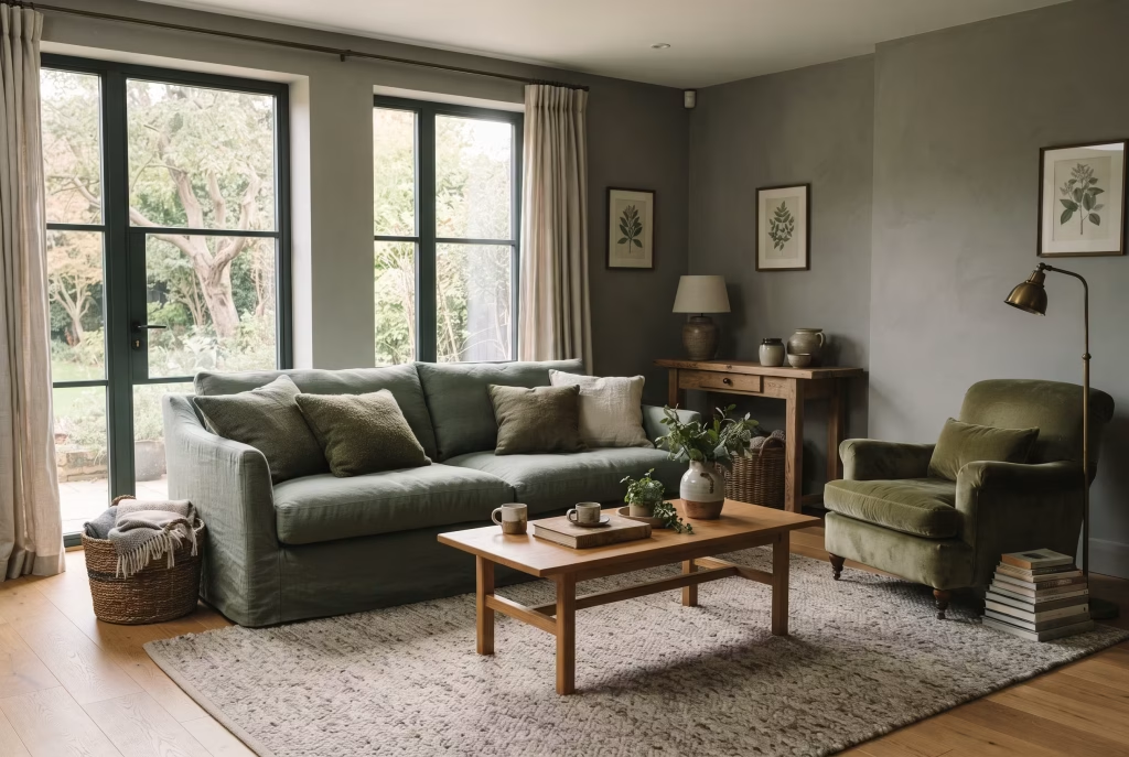
A living room is one of the few spaces in a home that has to do two jobs at once. It needs to look like something you chose on purpose, and it needs to feel like somewhere you can actually exhale. Grey and green, done with any real care, is one of the rare palettes that manages both without asking you to sacrifice one for the other. Grey gives the room its composure. Green gives it its pulse.
None of the fifteen ideas above need to be followed to the letter. The undertone-matching rule matters more than any single idea on this list, because it’s the thing that decides whether your version of this palette looks intentional or accidental. Beyond that, the right entry point is whichever one matches how much risk you’re actually comfortable with this month, a rug is not a lesser decision than a fully painted room, it’s simply a different pace of getting there.
Start small if you need to. Live with a sample for longer than feels necessary. And remember that the goal was never a room that photographs well. It was a room you’re genuinely glad to walk into at the end of a long day, one that meets you exactly where you are, cool and grounded when you need calm, warm and alive when you need reminding that the world outside those walls is still green too.
Frequently asked questions
Does grey and green actually work together in a living room, or is it just a passing trend?
Yes, and it works because the two colours are close relatives on the colour wheel rather than opposites forced together. The pairing has genuine staying power precisely because it isn’t a fleeting trend combination; grey-green schemes have appeared in interiors for centuries, from Georgian panelled rooms to mid-century modern living spaces. The key to it not feeling generic is choosing your specific shades deliberately rather than defaulting to whatever grey and green happen to be in the sample pots at the DIY shop.
How do I stop grey and green looking muddy together?
This almost always comes down to undertone mismatch. Cool, blue-based greys clash with warm, yellow-based greens like sage and olive, producing a flat, dull effect. Check your grey’s undertone by holding the sample against plain white paper in daylight; if it leans blue or purple, pair it with cooler greens (emerald, teal-green); if it leans green or brown, pair it with warm greens (sage, olive, moss). Getting this match right is the single biggest factor in whether the combination reads sophisticated or muddy.
Which goes on the walls, grey or green?
Either can lead, and it depends on how bold you want the room to feel. Green walls with a grey sofa create a warmer, more immersive room and suit those who want colour to be the first thing they notice. Grey walls with a green sofa or accent chair create a calmer backdrop where green reads as a considered highlight rather than a full commitment, and this route is easier to update later since furniture is simpler to change than paint.
Will a grey and green living room feel cold, especially in a north-facing room?
It can, if the palette is left too cool and too flat, but this is straightforward to avoid. Choose warm-leaning greys and greens for any room that gets limited or north-facing light, and layer in warm materials regardless of which shades you choose: natural wood, brass or unlacquered brass fixtures, linen and wool textiles, and warm-toned lighting around 2700K rather than cool white bulbs. Texture matters as much as colour temperature here; a flat, smooth grey sofa with no textural interest will always read colder than the same shade in a bouclé or wool weave.
What’s the best way to introduce grey and green into a small living room without it feeling cramped?
Keep the dominant colour, whichever one covers the most surface area, light and soft, and reserve deeper, richer tones for accents only: a single chair, cushions, or a rug rather than full walls. A pale grey base with sage or moss accents, rather than the reverse, tends to keep small rooms feeling open, since light colours recede visually while dark, saturated colours advance and can make walls feel closer than they are. If you do want a feature wall in a small room, choose the shortest wall rather than the one behind the sofa, since this avoids visually shortening the room’s longest sightline.
What other colours pair well with a grey and green living room scheme?
Mustard, terracotta, dusty pink, rust, and brass all work well as a third accent colour, since each brings warmth that balances any coolness in the grey-green base. Navy or a deep teal blue can also work as a fourth layer in a more maximalist scheme, since blue and green are close neighbours on the colour wheel and rarely clash. Keep any third or fourth colour to accent quantities only, cushions, a lamp base, artwork, rather than large upholstered pieces, so the core grey and green relationship stays the visual anchor of the room.
Is grey and green a good choice if I want my living room to feel calming rather than just stylish?
Yes, and this is arguably the strongest practical reason to choose it over other on-trend palettes. Green is one of the few colours consistently linked to lower stress response and a calmer nervous system state, largely because of its association with the natural world, while grey reduces visual competition and mental clutter compared to brighter or busier colour schemes. Together, they create a room that asks very little of you the moment you walk in, which matters more than most decorating advice admits, especially in a home where the rest of the day has already asked plenty.
Do I need to repaint the whole room, or can I try grey and green without committing?
You don’t need to repaint anything to start. A grey sofa with a green rug, or neutral greige walls with green cushions and a throw, lets you live with the palette for weeks or months before deciding whether to commit to paint. This lower-stakes approach also means you can build up your green shade preference over time; many people discover they prefer a slightly different tone once they’ve actually lived with the colour rather than just seen it on a chip.