15 Stunning Minimalist Mudroom Ideas to Turn Your Entryway from Chaos to Chic
There’s a common misreading of minimalism that needs putting right before we go any further: it isn’t about having less. It’s about making what stays behind work twice as hard as it used to. A well-run boot room, the sort that greets you with calm rather than chaos, earns its keep through restraint, not absence. Every hook, every shelf, every inch of floor has a job to do, and nothing is there simply because it looked nice on a moodboard.
For readers dropping in from across the Atlantic, this is what you’d call a Minimalist Mudroom, and the two words describe roughly the same instinct: a buffer zone between the wild outdoors and the civilised indoors. But “boot room” is the term with the history behind it
Born out of country houses that needed somewhere for wet dogs, muddy wellies and discarded coats to be dealt with before they got anywhere near the good rugs. What follows isn’t a showroom fantasy. These are fifteen ideas that hold up in a real home, with real washing loads and real Tuesday mornings.
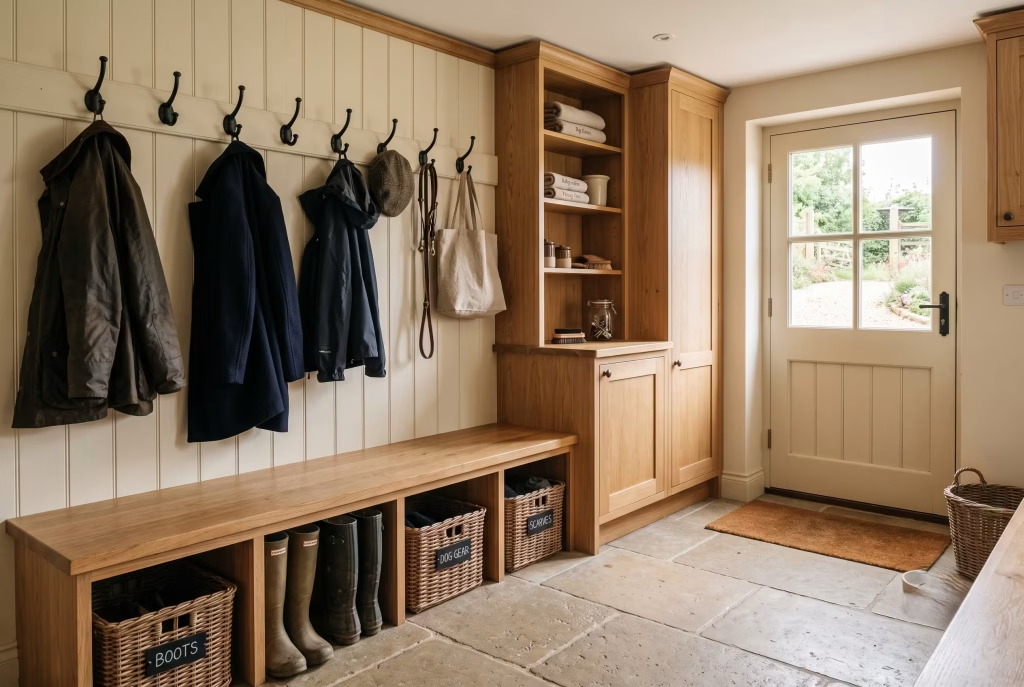
The single bench that earns its keep three times over
Ask any joiner who’s fitted more than a handful of boot rooms and they’ll tell you the bench is where most projects quietly go wrong. Not because anyone gets the style wrong, but because the depth gets treated as an afterthought, squeezed in at whatever measurement leaves enough room for the shelving above it to look generous.
That’s back to front. The bench is the piece of furniture doing the most physical work in the entire room, and it needs to be sized for a body, not for a photograph.
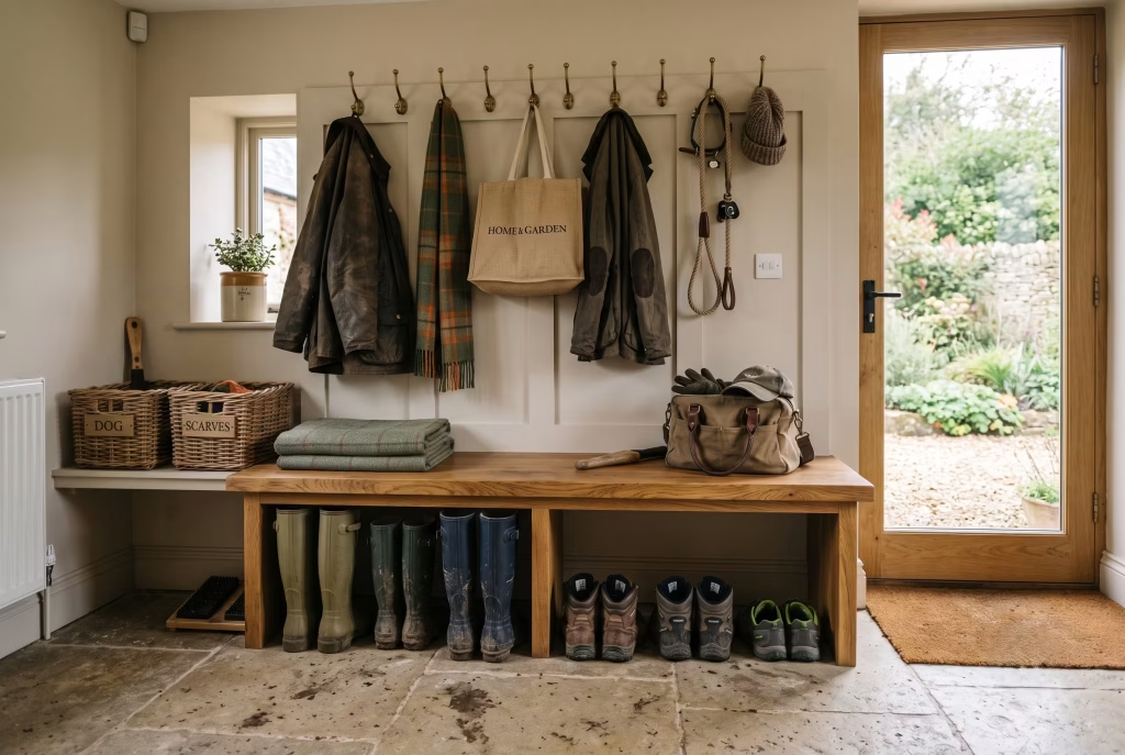
Here’s the number that actually matters: 400mm. Anything shallower than that and you’ll find, within a fortnight, that nobody sits on it properly. People perch on the edge, boots half on, coats slipping off their arm, and the whole point of the bench, to slow the chaos down and give the household a proper spot to pause, gets lost. Go to 400mm or beyond and something shifts.
There’s room to sit square, plant both feet, and actually deal with laces rather than fight them one-handed while balancing on one leg like you’re catching a bus.
The real value, though, comes from what a bench like this is asked to do underneath and around itself. A good boot room bench isn’t just seating. It’s storage for the boots that live under it, a landing spot for bags dropped on the way through, and a boundary line, in a practical sense, between the muddy outside world and the rest of the house.
Get that triple duty right and you’ve solved three problems most homeowners try to fix separately, with a shoe rack here, a stool there, a basket wedged into whatever gap is left.
One well-proportioned bench, built with real depth and a purpose behind every inch, tends to outperform three smaller pieces bought in a hurry. It’s not a glamorous detail. But it’s the one that decides whether the room gets used the way it was designed to be, or slowly turns into another spot where things just get dumped on the way past.
You May also Like: 25 Entryway Renovation Ideas That Transform Your Home from the Moment You Walk In
Floating shelving, and the art of the invisible bracket
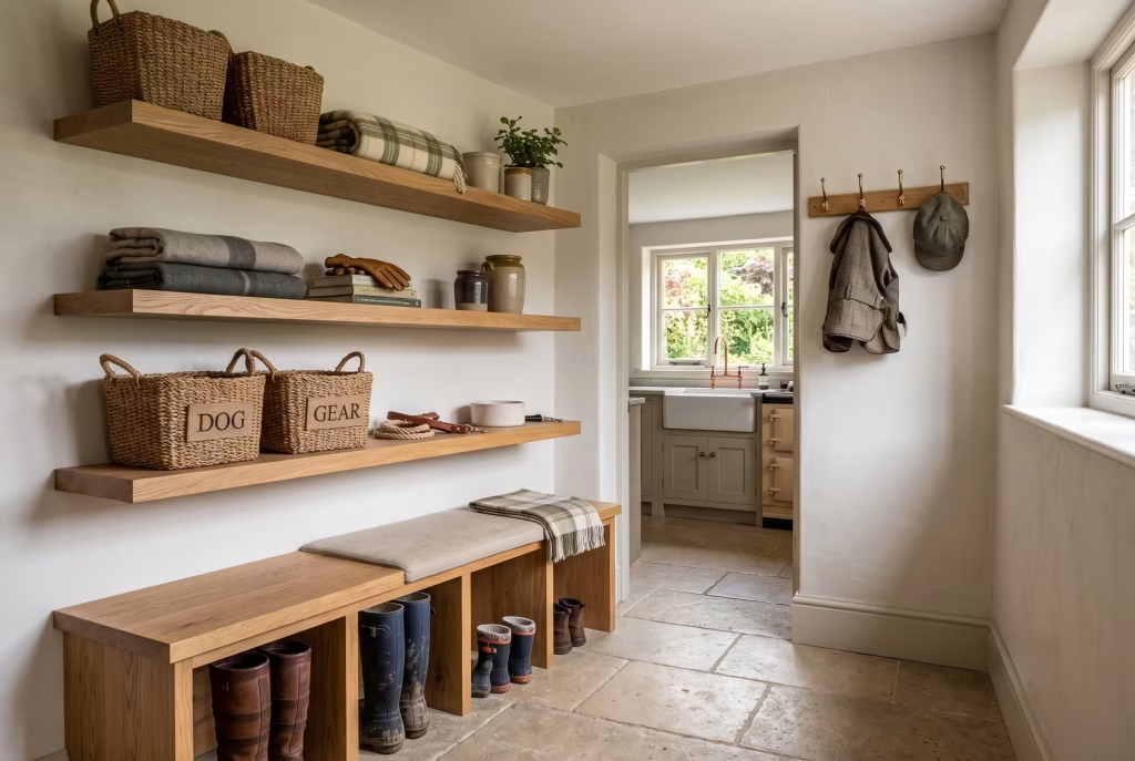
Wall cupboards do a perfectly good job of hiding mess, but they come at a cost most people don’t clock until the units are already up: they box the room in.
A boot room is often small to begin with, tucked behind the kitchen or squeezed off a side return, and a run of chunky wall cabinets can turn a modest space into something that feels boxed in from all sides, however well the doors are painted. Floating shelving solves this without asking you to sacrifice a scrap of storage.
The reason it reads as lighter isn’t just that there’s less visible carcass. It’s that the eye travels straight through the gaps beneath each shelf, out to the wall, the window, the skirting, wherever the sightline naturally wants to go. Nothing interrupts it.
A cupboard, by contrast, stops the eye dead at its front face, and in a tight room that dead stop is exactly what makes four walls feel like they’re closing in.
Now, the detail that separates a shelf that looks deliberate from one that looks like a shop fitting: the bracket has to disappear. Concealed steel rod brackets, recessed into the wall and the underside of the shelf, do this properly, giving the impression that the timber or stone is simply floating there, held up by nothing more than good manners. Visible L-brackets, however tidy, give the game away immediately and drag the whole look back towards utilitarian storage rather than considered design.
It costs more to fit this way, there’s no getting around that, since it usually means chasing cable or rod fixings into the wall before plastering rather than screwing brackets on afterwards. But it’s one of those details that, once seen, can’t be unseen, and it’s usually the first thing a visitor’s eye catches without quite knowing why the room feels so calm.
There’s a practical upside too, beyond the visual trick. Open shelving forces a bit of honesty about what actually lives in a boot room. Baskets, folded throws, the odd jar of dog treats, all sit in full view, which means clutter has nowhere to hide behind a closed door. For some households that’s a step too far. For most, it’s the nudge that keeps the room tidy without anyone having to be told to tidy it.
One material, chosen properly, and left well alone
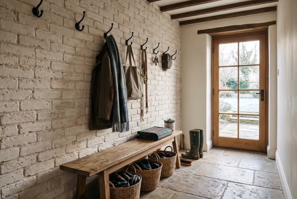
There’s a mistake that catches out even confident decorators, and it’s worth naming plainly: minimalism gets confused with blandness. People strip a boot room back to white paint and pale timber and wonder why the finished room feels like a waiting room rather than somewhere warm and welcoming. The missing ingredient almost every time is texture, and specifically, the courage to commit to just one.
Take limewashed brick. Left exposed, or given a thin limewash rather than a heavy coat of paint, brick keeps its imperfections on show, the slight variation from one course to the next, the odd rougher patch where the mortar’s been struck differently.
That’s not a flaw to be sanded away. That’s the whole point. A single wall of it, running the length of a boot room, does more to give a space character than any amount of accessorising with baskets and signage ever will. It photographs beautifully in low winter light, and it wears its age well, which matters in a room that’s going to see a fair share of wet coats and dog leads over the years.
Unfinished oak works on the same principle from a different angle. Left raw, or with only an oil finish rather than a lacquer, the grain stays visible and the wood is allowed to darken naturally over time, picking up a bit of colour from handling and sunlight. It’s the sort of material that gets better with age rather than tired, which is more than can be said for painted MDF once the first few scuffs appear.
The discipline, and it is a discipline, lies in stopping there. One material, chosen with intent, given the room to be the star of the show, rather than diluted by three or four competing finishes all vying for attention.
That’s the real difference between minimalist and merely empty. A boot room with one honest material, brick, oak, limestone, whatever suits the house, has depth and warmth built into its bones. A boot room with nothing but flat white walls has neither, and no amount of clever lighting will talk it out of feeling cold.
Flush panelling, and the storage nobody clocks is even there
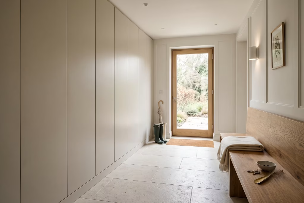
There’s a particular pleasure in a wall that doesn’t give away its secrets. Flush, handle-free panelling, the kind that reads as a single continuous surface rather than a bank of cupboards, has become the calling card of a boot room done properly rather than done in a hurry.
No shaker grooves catching the light, no visible hinges, no handles breaking up the line. Just a wall that happens to open, push-catch mechanisms doing the quiet work that a handle usually announces to the whole room.
The appeal isn’t purely aesthetic, though it does photograph beautifully in the way a shaker door, however smart, rarely manages. A flush wall lets a boot room borrow a trick usually reserved for high-end joinery in kitchens: it makes the storage disappear into the architecture itself, so the room reads as considered space rather than a row of cupboards someone’s bolted on.
For anyone who’s stood in a boot room stuffed with school bags and dog leads and wished the whole lot could simply vanish behind a wall, this is exactly that fantasy, made real with careful setting-out and a decent joiner.
Now, the honest bit, because no idea worth its salt comes without a catch. This look struggles in genuinely small boot rooms, and it’s worth knowing why before you fall in love with the photographs. Push-catch doors need clearance to swing, and in a tight space, that clearance eats into a room that can’t afford to lose it.
Worse, without a handle to grab, anyone with wet or gloved hands, which is most people, most of the time, in a boot room, ends up shoving at a panel that doesn’t want to budge, and the mechanism wears out faster than a simple hinge and knob ever would. In a generous boot room, flush panelling is close to unbeatable.
In a narrow one, squeezed under the stairs or off a side return, it can quietly become the reason the room feels like harder work than it should, and a recessed handle or a simple shaker front will often serve the household better than the sleeker option ever could.
Fewer hooks, and the odd bit of psychology that comes with them
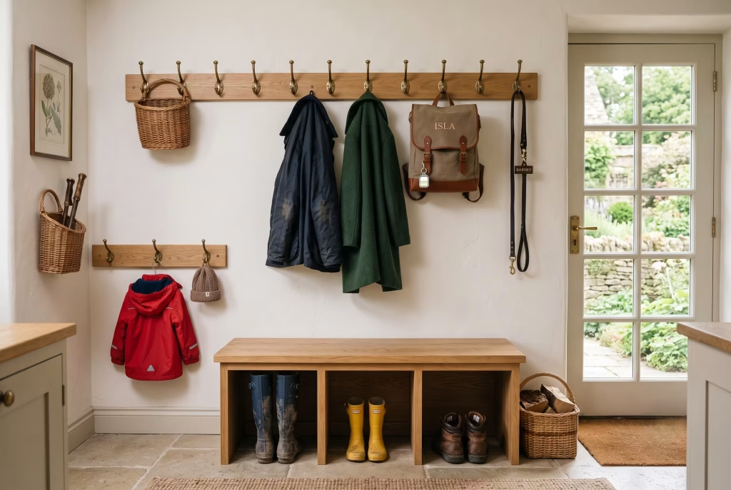
There’s a peculiar law of human nature that plays out in almost every boot room I’ve ever fitted out, and it’s this: give a household twenty hooks, and they’ll find a way to fill all twenty, half of them with coats nobody’s worn since spring.
Give that same household six, well placed and properly sized, and something changes. People start making small decisions on the way through the door, does this actually need hanging up, or does it belong upstairs, and the room polices itself without anyone standing over it with a clipboard.
This is the quiet argument for a single, generous hook rail over the wall-of-pegs approach that’s become so common in catalogues and showrooms. A wall bristling with twelve or fifteen individual pegs looks abundant in a photograph, but abundance is exactly the problem. It invites everything to stay, permanently, in full view, until the room stops looking like a boot room and starts looking like a cloakroom that’s lost the plot.
A single rail, by contrast, sets a limit, and limits, awkward as they sound, are what keep a small space from turning into an overflow wardrobe.
For a real family of four, the sizing that tends to work in practice sits around 1.2 to 1.5 metres of rail, with hooks spaced roughly 150mm apart. That gives each person genuine elbow room, two hooks each if you’re generous, one if you’re strict, without the coats piling up three deep and swallowing each other whole.
Go shorter than that and you’re back to the daily scrum of someone’s school coat getting buried under a parent’s larger jacket. Go much longer and you’ve quietly recreated the wall of pegs you were trying to avoid, just dressed up as a single fitting instead of several.
The other detail worth getting right is height. A rail pitched at average adult shoulder height works for the grown-ups but leaves children stretching or, more likely, giving up and dropping their coat on the bench instead.
A second, lower rail, sized for a child’s reach, solves this properly rather than papering over it, and it’s a detail that costs almost nothing to add at the design stage but is a genuine headache to retrofit once the plastering’s done. Small choice. Big difference to how the room actually gets lived in, day in, day out.
You May also Like: Why Japanese Entryways are Never Messy: 25 Hidden Design Secrets
A tonal palette that stays warm rather than turning clinical
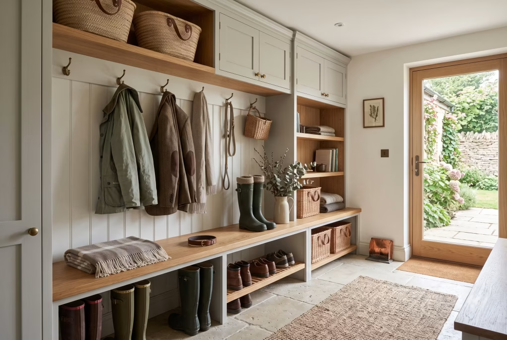
There’s a fine line between calm and cold, and a surprising number of boot rooms end up on the wrong side of it without anyone quite meaning them to. The palette in question, off-white walls, stone-grey joinery, a whisper of taupe on the skirting, is genuinely one of the most flattering colour stories available for this kind of space.
It’s forgiving of mud, it doesn’t date the way a bolder colour might within a few years, and it lets whatever’s actually stored in the room, coats, boots, the dog’s lead, sit quietly rather than fighting the walls for attention.
The trouble starts when every single surface is drawn from the same narrow band of the colour chart, with nothing to break it up. Off-white walls, pale stone flooring, taupe cabinetry, a white ceiling above, and suddenly the room has all the warmth of a hospital corridor, however good the individual choices looked on their own on a paint chart.
It’s a bit like ordering a meal where every course arrives beige. Nothing’s wrong with any one dish, but the whole plate ends up flat, and the same is true of a room built entirely from tones that never quite commit to being warm or cool.
The fix, and it’s a genuinely simple one, is to bring in exactly one material that carries actual warmth, rather than trying to rescue the scheme with paint alone. Aged brass hardware does this well, as does a run of oiled oak on the bench top or shelving, or even a woven jute runner underfoot in place of a flat stone-coloured mat.
The point isn’t to add colour in the conventional sense. It’s to add a material with warmth baked into its nature, so the eye has somewhere to land that isn’t another shade of grey.
I’ve seen this play out on a real job where the boot room, finished exactly as specified, off-white, stone, taupe throughout, felt oddly uninviting the moment the client walked in, despite every individual choice being sound.
Swapping the flat-fronted cabinetry for the same colour but with a single run of oak shelving above solved it within a week, no repaint required. Sometimes the difference between a room that feels considered and one that feels sterile isn’t a colour decision at all. It’s a material decision, hiding in plain sight the whole time.
Flooring that earns its keep long after the mud’s dried
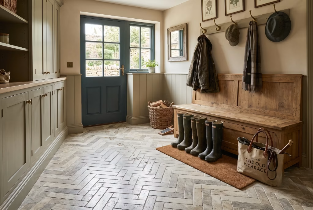
Of every decision in a boot room, flooring is the one where style and substance genuinely have to shake hands, because this is the surface that takes the daily punishment the rest of the house never sees. Wet wellies, muddy paws, the odd dropped bag of shopping, it all lands here first.
Choose on looks alone and you’ll be re-laying the floor within a handful of years. Choose purely on durability and you risk something that performs brilliantly but feels about as inviting as a garage.
The two patterns that consistently strike the right balance are herringbone and large-format tile, though they earn their place for quite different reasons. Herringbone, laid in a genuinely honest material like limestone or a dense porcelain that mimics stone convincingly, brings a sense of craft to a room that’s otherwise entirely functional.
The broken, zigzagging joints do a quietly clever job of disguising scuffs and grit in a way a single flat expanse simply can’t, which matters enormously in a room where grit is more or less guaranteed.
Large-format tile, by contrast, takes the opposite approach and wins on fewer joints altogether, which means less grout to scrub and fewer lines for mud to settle into. Both are honest choices. Neither is trying to be something it’s not.
The material itself matters just as much as the pattern. Porcelain, properly specified with a slip rating suited to a wet, muddy room rather than a showroom finish, is close to bombproof, shrugging off scratches and staining that would mark natural stone within a season.
Limestone and slate bring more soul and a bit more warmth underfoot, but they need sealing, and that’s a maintenance conversation worth having honestly with a client rather than glossing over at the point of sale.
Underfloor heating deserves its own mention here, because it’s where a lot of boot room plans quietly come unstuck. Porcelain and natural stone both conduct heat exceptionally well, which makes them close to ideal for underfloor systems, warming through evenly and holding that warmth for hours after the heating’s switched off, useful in a room that’s often the coldest in the house simply by virtue of being nearest the door.
Engineered wood, tempting as it looks against a stone-toned scheme, is a different story. It can work with underfloor heating, but only within tightly controlled temperature limits, and in a room that regularly gets wet, the moisture risk alone tends to rule it out for anyone thinking clearly rather than romantically.
Get the material and the heating conversation right at the same time, ideally before a single tile’s ordered, and the floor becomes the hardest-working, least-noticed detail in the entire room.
The boot tray that’s sunk, not simply sat there
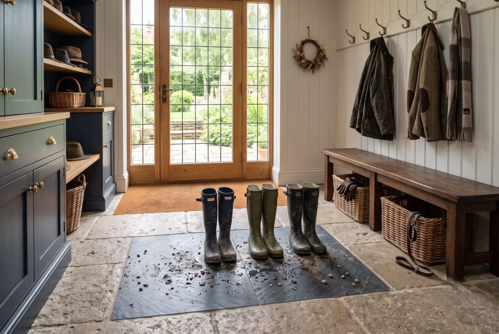
There’s a small detail that, more than almost anything else on this list, tells you within seconds whether a boot room was designed properly or bodged together from a converted cupboard. It’s the boot tray, and specifically, whether it’s recessed into the floor or joinery, or whether it’s just a plastic liner plonked on top of the finish and left to fend for itself.
A tray that sits proud, however smart the material around it, always looks and behaves like an addition. It creates a lip that catches toes in a hurry, a visible line where the mud collects at the edges rather than staying contained, and a jarring change of material that no amount of styling quite disguises.
Sink that same tray, whether it’s slate, resin, or a simple purpose-built steel liner, flush into the floor or the base of the joinery, and the whole room changes character. It reads as though the mess was planned for from the very beginning, rather than dealt with after the fact with a trip to a hardware shop.
The practical case for going to this trouble is just as strong as the visual one. A sunk tray sits at the natural low point of the floor, so water and grit actually collect where they’re meant to rather than migrating across the boards to wherever gravity happens to take them. It’s far easier to lift out, hose down, and slot straight back in, since there’s no lip to catch a mop or a cloth mid-clean.
And because it sits flush, there’s no trip hazard for anyone coming through the door in a rush, wellies half off, arms full of shopping, which happens in every household with more regularity than anyone plans for.
It does cost more to specify at the outset, since it usually needs building into the floor or the joinery at the construction stage rather than added afterwards, but it’s precisely the sort of detail that separates a boot room a client is genuinely proud of from one that merely does the job. Anyone who’s compared the two side by side, one sunk, one simply sat on top, tends not to go back.
You May also Like: 25 Revitalizing Scandinavian Mudroom Ideas for a Cozy, Minimalist Entryway
The vertical slot, quietly solving the problem minimalism likes to ignore
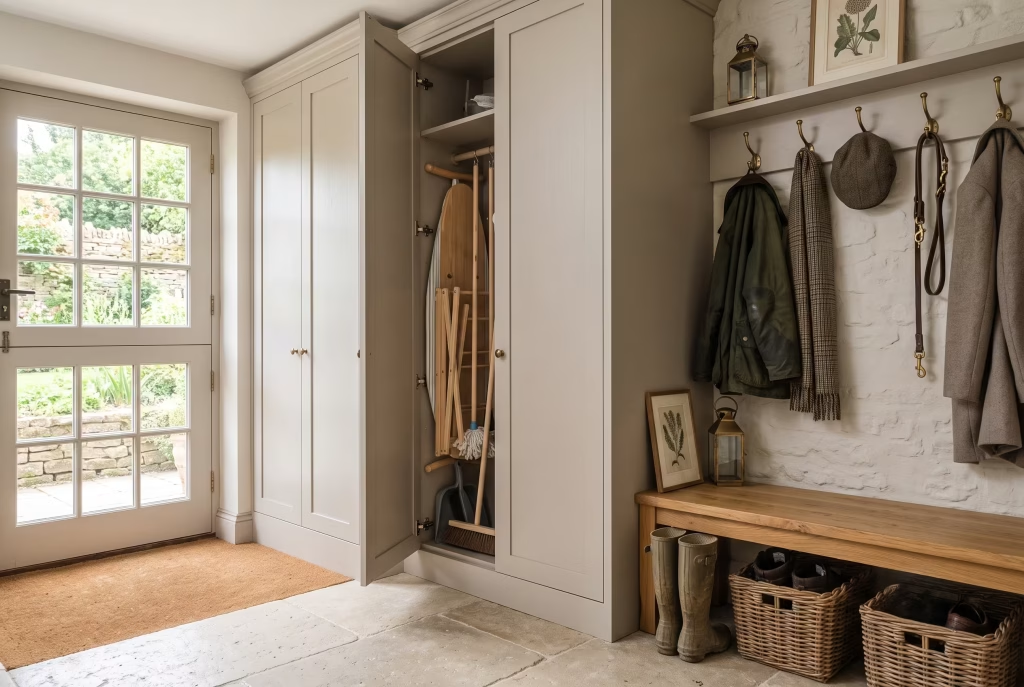
Every boot room, however beautifully finished, has to answer an unglamorous question sooner or later: where does the ironing board go. Or the broom. Or a pair of skis that only come out twice a year but still need somewhere to live for the other fifty weeks.
This is the bit of the brief that rarely makes it into the moodboard, and it’s exactly the sort of practical demand that separates a boot room designed by someone who’s actually lived with one from a room styled purely for the camera.
The answer, more often than not, is a tall, narrow vertical slot, built into the joinery rather than left as an afterthought propped against a wall. Think of it as a filing cabinet for the household’s awkward, long, flat objects, ironing boards, folding clothes airers, brooms and mops, the occasional garden cane or fishing rod that’s found its way indoors.
A slot roughly 150 to 250mm wide, running the full height of a cupboard, holds all of this upright and out of sight, without demanding the sort of deep floor space a chest or basket would need.
What makes this detail genuinely clever, rather than just tidy, is how invisible it stays once it’s built in. A single tall door, flush with the rest of the panelling and carrying no handle or hardware to give the game away, opens to reveal a space that’s doing real, unglamorous work, while contributing nothing but a clean line to the room from the outside.
This is minimalism solving a problem rather than pretending the problem doesn’t exist, which is the distinction that matters most. A room with nowhere for the ironing board isn’t minimalist. It’s just a room where the ironing board ends up behind the sofa instead, which solves nothing and simply moves the clutter one room over.
I’d always push a client to measure their actual awkward items before finalising this detail, rather than guessing. A standard broom and a folding airer need less width than most people assume, but a full-size ironing board wants a genuine 200mm at least to sit without forcing the door.
Get the measurement right at the joinery stage and this becomes the storage nobody notices, precisely because it’s doing exactly what it should.
One mirror, placed with real intent
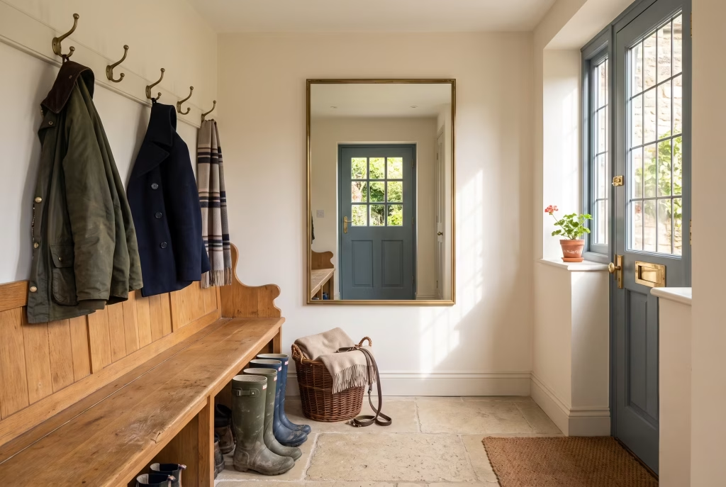
Boot rooms, more than almost any other space in a house, tend to be windowless or close to it, tucked behind the kitchen or squeezed into what used to be an outside coal store before someone had the good sense to bring it indoors.
That means natural light is often in short supply from the outset, and it’s here that a single, well-placed mirror does more heavy lifting than almost any other single object on this list.
The spatial trick is straightforward enough once you’ve seen it done properly. A mirror hung opposite, or at an angle to, whatever light source exists, even something as modest as a glazed door or a borrowed sliver of light from the hallway, bounces that light back into the room rather than letting it die at the first wall it meets.
In a genuinely dark boot room, this single move can be the difference between a space that feels like a corridor and one that feels like a proper room in its own right. It costs a fraction of what a rooflight or a window enlargement would, and it can go in on a Saturday afternoon rather than requiring planning permission and a fortnight of building work.
But the practical case matters just as much, and it’s the one people tend to forget until they’ve lived without it. A boot room is, by its very nature, the last stop before the outside world, and a mirror placed at roughly eye height by the door earns its keep every single morning, catching the school-run scramble, the missed button, the hat that’s gone on backwards
Before any of it makes it out the front door. It’s a small ritual, glancing at yourself on the way out, but it’s one that people genuinely miss when it isn’t there, and its absence is felt far more than its presence is ever noticed.
The placement is worth thinking through properly rather than simply hanging whatever mirror’s spare in the loft. Too low and it only catches the top half of a coat. Too high and it becomes decorative rather than useful, admired but never actually consulted.
Somewhere around 150 to 160cm from the floor, positioned close to the door rather than buried at the back of the room, tends to hit the mark for most households, catching the light and catching the last glance in more or less the same breath.
The lighting decision that outweighs every material choice put together
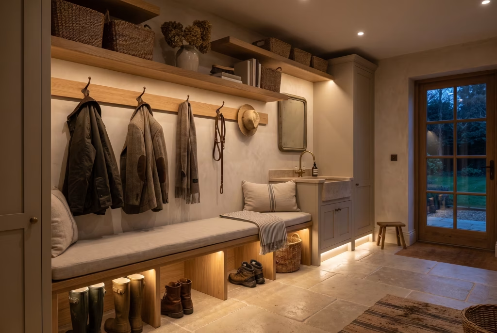
If there’s one idea on this list that clients consistently underrate at the planning stage, it’s lighting, and specifically, the difference between a single overhead pendant and a scheme built from recessed, low-level fittings placed with genuine thought.
It’s a strange thing to admit as someone who spends most of a project agonising over stone versus porcelain or brass versus black steel, but lighting placement will make or break the finished feel of a boot room more decisively than any of those material choices ever could.
A single pendant in the middle of the ceiling is the default most builders reach for, largely because it’s cheap and requires no real planning beyond finding the centre of the room. The trouble is what it does to everything beneath it.
One bright source overhead flattens texture, casts hard shadows under shelving and cupboard fronts, and lights the room the way a stockroom gets lit rather than a space anyone’s meant to enjoy standing in. It’s functional, in the barest sense of the word, and functional is exactly the ceiling it deserves to be judged against.
Recessed, low-level lighting takes a different view of the same problem entirely. A run of small downlights set into the underside of floating shelves, or a discreet LED strip tucked behind a kick board at floor level, does something a pendant simply can’t:
it lights the room from where the eye actually lands, along the bench, across the flooring, up the texture of a limewashed wall, rather than from a single point thirty degrees above everyone’s head.
The effect is closer to how a good hotel lobby is lit than how a utility cupboard is lit, warm pools of light rather than one flat wash, and it’s this layering that gives a boot room the “designed” feel people struggle to put their finger on when they walk into one done well.
There’s a genuine practical case here too, beyond the atmosphere. Low-level lighting, placed near the floor and along worktop edges, actually illuminates the tasks that happen in a boot room, finding a dropped glove, checking a boot for mud before it goes back in the rack, in a way an overhead pendant, thirty degrees off to one side of whatever you’re looking at, rarely manages without casting your own shadow across the job.
Get a qualified electrician involved early enough to chase the cabling in before the plastering goes on, and this becomes one of the cheapest, most transformative decisions in the entire build, cheaper than the stone floor, cheaper than the joinery, and arguably doing more to make the room feel considered than either.
You May also Like: 20 Cozy Modern Farmhouse Entryway Designs for a Welcoming Home
The washing machine problem minimalist boot rooms can’t wish away
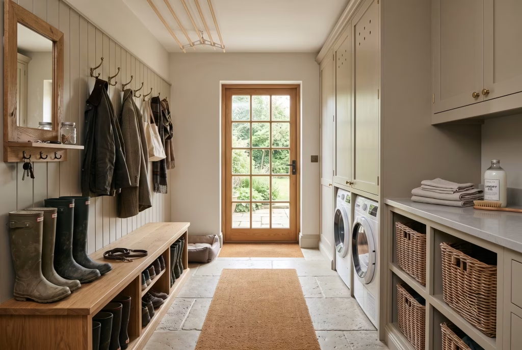
There’s an honesty check worth doing before any boot room design goes to tender, and it’s this: in the vast majority of British homes, this room isn’t a standalone boot room at all. It’s a boot room and utility space sharing the same square footage, whether the brief admits it or not.
The washing machine, the tumble dryer, the ironing basket that never quite empties, they all end up here, because there’s rarely a separate utility room generous enough to take them, and pretending otherwise at the design stage is how projects end up with a beautiful boot room that’s quietly useless within a month.
This is where minimalist design earns its stripes, because hiding a washing machine is a genuinely different challenge from hiding a coat. A appliance has plumbing, ventilation, and a door that needs clearance to open, and none of that disappears just because the brief says “minimalist.”
The households that get this right don’t pretend the machine isn’t there. They design around it properly, housing it behind the same flush, handle-free panelling used elsewhere in the room, with ventilation gaps built discreetly into the joinery rather than left as an ugly grille bolted on as an afterthought. From the outside, it reads as another cupboard in the run. Open it, and it’s doing the unglamorous work the rest of the house depends on.
The detail that trips people up most often is worktop height and depth. A washing machine and dryer stacked, or sat side by side under a counter, need a genuinely deep run of joinery, usually 600mm at minimum, and that’s considerably deeper than the 400mm bench discussed earlier for boot storage.
Try to force both functions into the same shallow run and you end up with a machine that juts out awkwardly or a bench too deep to sit on comfortably.
The better solution, where the room allows it, is to treat the utility function as its own zone within the same footprint, a deeper run along one wall for the appliances, a shallower run along another for boots and bench seating, unified by the same material and colour palette so the eye reads it as one considered room rather than two functions bolted together.
The real-life insight worth taking from every job I’ve done where this was ignored at the outset is simple: the utility function always wins in the end, whether it’s planned for or not. Better to give it a proper home from the start than to watch a beautifully finished boot room slowly fill with a laundry basket nobody planned a place for.
The door that separates without shutting the conversation down
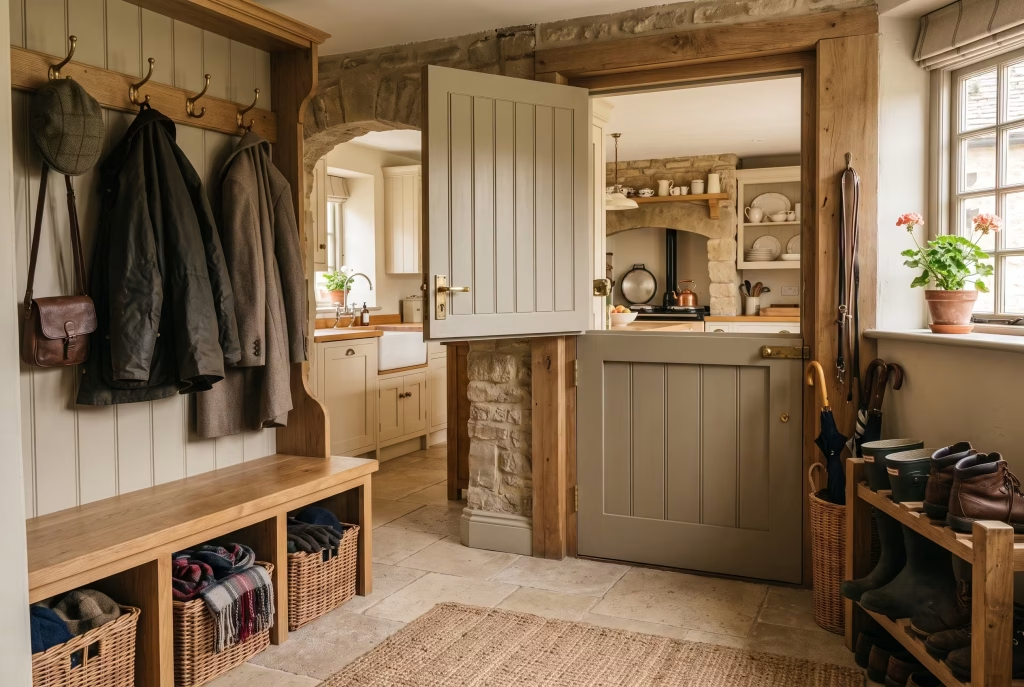
There’s a genuine dilemma at the heart of most boot room layouts, and it’s one that a full, solid door solves rather too bluntly. Close the room off entirely and you lose the sense of flow between the back of the house and the hallway, that easy glance-through that lets a parent hear the front door without leaving the kitchen.
Leave it fully open, with no door at all, and every muddy boot, damp coat and half-open laundry basket is on permanent display to anyone walking past. Neither extreme serves a household particularly well, and this is exactly the gap a muted Dutch door, or a simple glazed internal door, is built to fill.
A Dutch door, split horizontally so the top half can stand open while the bottom stays shut, does something genuinely clever here. It lets sound and a sliver of sightline through, so the room never feels sealed off or forgotten, while the lower half quietly does the job of keeping the worst of the mess, and the family dog, contained to where it belongs.
Painted in a muted, tonal colour rather than a stark white or a bold contrast, it reads as part of the architecture rather than a statement piece competing for attention, which matters in a room that’s meant to support the rest of the house rather than upstage it.
A glazed internal door takes a different route to the same result. Full height, with either reeded, fluted or simple clear glazing set into a slim frame, it keeps the boot room visually connected to the hallway even with the door fully shut. Light passes through in both directions, which matters enormously in the windowless boot rooms discussed earlier, and there’s a real sense of borrowed space that a solid door simply can’t offer.
The trick, and it’s one worth getting right, is choosing a glazing pattern with enough texture to soften what’s actually visible on the other side. Reeded or fluted glass blurs the detail nicely, showing shape and colour without showing every dropped glove and half-hung coat in sharp focus, while plain clear glass, unless the room behind it is kept immaculately tidy, tends to show rather more than most households want on display.
Either choice, done with a bit of restraint on colour and finish, gives a boot room what it actually needs from its threshold: a sense of separation without a sense of exile, allowing the room to feel like part of the house’s rhythm rather than a cupboard that’s been closed off and forgotten about.
The one place minimalism is allowed to let its hair down
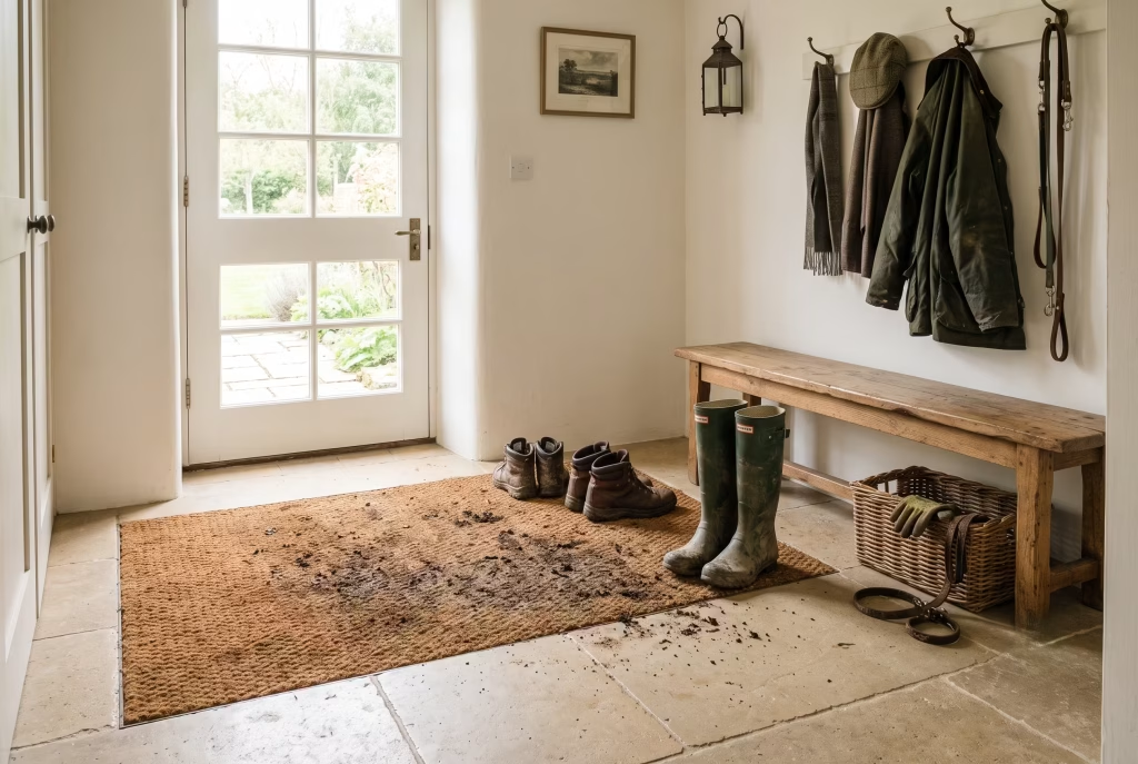
Every rule benefits from a single, deliberate exception, and in a minimalist boot room, that exception is the matting underfoot. Everywhere else in this list, the argument has been for restraint, one material, one tone, one hook rail rather than a dozen pegs.
But at floor level, right by the door where the outside world first makes contact with the inside, a bit of pattern and texture isn’t just permissible. It’s genuinely useful, and pretending otherwise in the name of consistency does the room a disservice.
Woven or coir matting earns its place here for reasons that go well beyond decoration. Coir, made from coconut husk fibre, is coarse enough to scrape the worst of the mud and grit from a boot sole before it ever reaches the flooring proper, doing the job a doormat is meant to do rather than merely gesturing at it from a thin rubber-backed mat that slides about underfoot.
Woven natural fibres, sisal or jute laid as a runner rather than a single mat, bring a similar practicality while softening the transition between a hard stone or porcelain floor and whatever’s underfoot beyond the boot room itself.
The pattern argument matters just as much as the practical one. A flat, single-tone floor, however handsome the material, can tip into feeling stark once it’s the only surface in the room without any variation at all.
A woven mat or runner, with its natural herringbone or basket-weave texture, introduces just enough visual interest to stop the eye reading the floor as one unbroken slab, without introducing colour or pattern loud enough to disrupt the calm the rest of the room has worked hard to achieve. It’s the difference between a room that feels considered down to the smallest detail and one that’s simply been left blank in the name of restraint.
There’s forgiveness built into the choice too, and this is worth saying plainly to any client nervous about mud and mess. Coir and sisal hide dirt considerably better than a pale stone floor ever will, their natural fibres breaking up light and shadow in a way that disguises the odd bit of grit rather than showing every mark like a spotlight.
For a household with children, dogs, or both, this single detail buys back a fair bit of peace of mind, letting the floor look presentable on a Tuesday morning without anyone needing to have swept it an hour before.
You May also Like: 15 Spanish Revival Mudrooms That Perfectly Blend Beauty and Practicality
Letting the outside walk in, deliberately
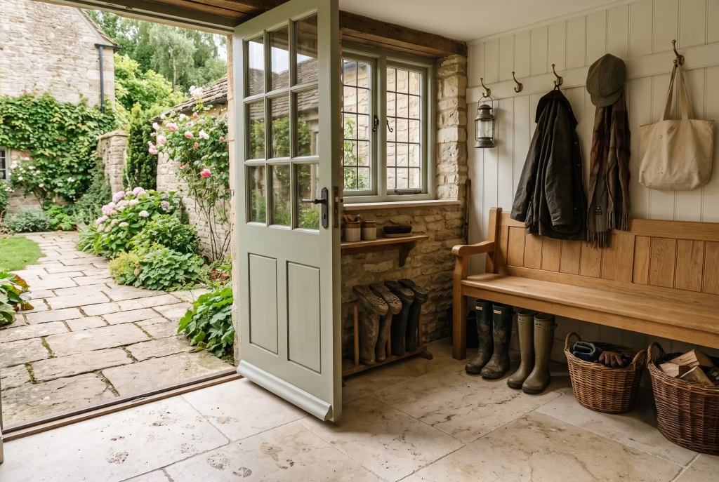
There’s a habit in a lot of renovations of treating the boot room as a room apart, designed on its own terms, with its own material palette, as though the front step and the space just beyond the door belong to two entirely different conversations.
It’s an understandable instinct, but it’s usually the wrong one, and the fix is one of the simplest, most effective ideas on this entire list: carry the same stone or brick from the exterior entrance straight through the threshold and into the boot room itself.
The logic behind this is more than decorative, though the visual payoff is considerable. A house with a stone-flagged front path or a brick-paved entrance already has a material story being told before anyone’s even through the door.
Stop that story dead at the threshold, swap to a different tile or a paler stone the moment you cross into the boot room, and the transition reads as exactly what it is: two separate decisions, made at two separate times, by two people who weren’t necessarily talking to each other.
Continue the same material through, even for just the first metre or two beyond the door, and the house suddenly reads as one coherent idea rather than a series of rooms bolted on in sequence.
There’s a practical case here too, and it’s one worth putting to any client hesitant about the extra coordination this takes at the planning stage. The flooring nearest an entrance takes the heaviest punishment in the entire house, grit, standing water, the odd stone tracked in on a boot sole, and a material that’s already proven itself outdoors, weathered stone, a dense clay brick, is by definition suited to exactly that kind of abuse.
Rather than specifying a separate, softer material for the boot room and hoping it holds up, continuing the exterior material solves the durability question and the design question in a single move.
The detail that makes this work in practice, rather than merely in theory, is a slight change in finish rather than a change in material altogether. A honed or lightly sealed version of the same stone used outside, laid at the same module or brick bond, keeps the visual thread intact while giving the indoor section a touch more refinement underfoot than the raw, weathered finish outside would offer.
It’s a small adjustment, but it’s the one that stops the continuity looking like an oversight and makes it look, instead, like exactly the decision it is: a house designed to feel like one considered whole, from the front step to the boot room and every muddy morning in between.
What Actually Makes a Boot Room Read as Minimalist
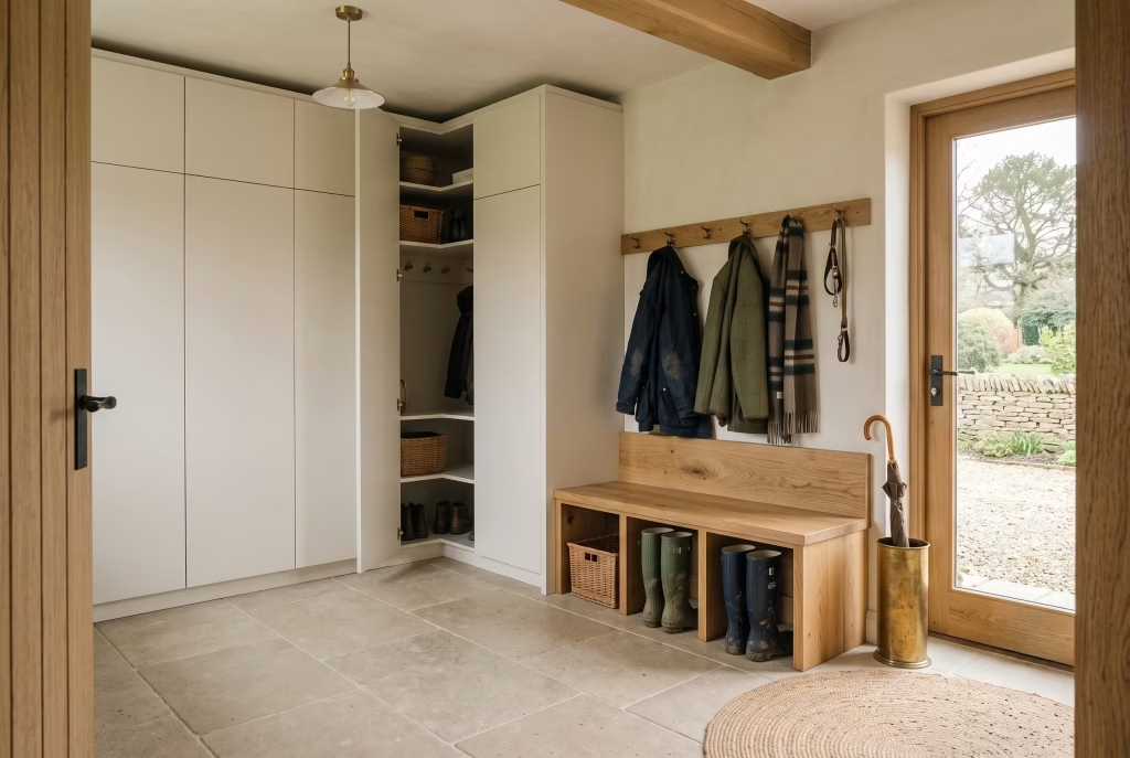
Minimalism in any room is subtractive, not decorative. You’re not adding a “minimalist style” on top of the room, you’re removing everything that doesn’t earn its place, then making sure what remains is worth looking at.
In a living room that might mean one good armchair instead of three mismatched ones. In a boot room, it means something more specific: every object either has a home behind a door, or it’s one of the two or three things you’ve deliberately chosen to leave on show.
That’s the bit most “minimalist mudroom” round-ups skip past. They’ll show you a beautiful photo of a boot room with three coats on brass hooks and a jute doormat, and never mention that behind the wall to the left, there’s a cupboard holding eleven other coats, four sets of muddy trainers, two golf umbrellas, and a box of spare lightbulbs. Minimalism at the front, storage discipline behind it. Both halves matter equally.
The pieces doing the real work in a genuinely minimalist boot room are:
- Full-height concealed storage (cupboards, not open shelving)
- A single run of hooks, kept spare rather than packed
- One bench, doing double duty as seating and shoe storage
- A floor that can be mopped, not swept and fretted over
Everything else, the artwork, the plant, the little tray for keys, is decoration layered on top once the function is sorted. Get the order backwards, decoration first, and you end up with a pretty room that stops working within a fortnight.
The Palette: Keeping It Calm Without Making It Cold
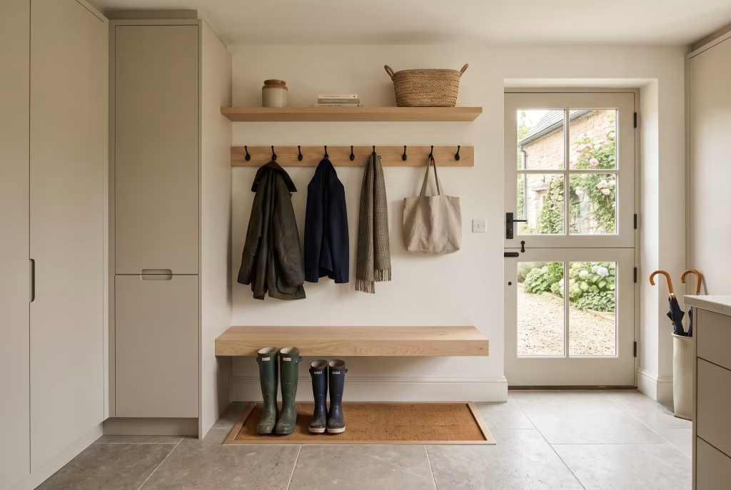
Minimalist doesn’t have to mean stark. The palette that reads as calm and considered, rather than clinical, tends to sit in a tight, warm-neutral range: chalky white or off-white walls, soft warm grey or greige joinery, a pale or mid-toned natural wood for any exposed timber (bench top, a shelf edge, a peg rail), and one deeper anchor tone, often a near-black or a warm charcoal, used sparingly on hardware or a door.
Where people go wrong is treating “neutral” as “identical.” If the walls, the cupboard fronts, the floor and the hooks are all exactly the same shade of white, the room can feel flat and slightly clinical under artificial light, especially in a boot room with no natural daylight, which is most of them.
A little tonal variation, a warm white wall against a slightly greyer cupboard front, or matte black hardware against a pale door, gives the eye something to register without breaking the calm.
On materials: micro-cement or large-format porcelain tile for the floor, a durable eggshell or satin paint (never flat matt, it marks and won’t wipe clean) on the walls, and handleless or simple recessed-handle joinery for the cupboards.
Timber floors are one of the most common regrets people mention after the fact; they swell, stain, and scratch far faster than a boot room’s daily traffic allows for.
Layout and Clearances That Actually Work
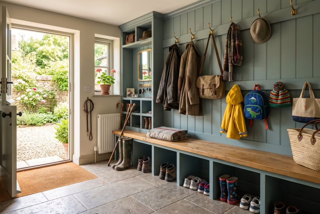
Style never overrides geometry. However good the palette looks in a photo, if the bench is too shallow or the hooks are too close together, the room will fight you every single day. These are the numbers that hold up in practice, in either metric or imperial depending on which trade you’re talking to:
- Bench width: allow roughly 45cm (18in) of bench per person who regularly uses the space. For a family of four, that’s a bench at least 1.8m long if everyone’s meant to sit at once, though in practice most households manage with slightly less since people rarely all sit down together.
- Bench depth: 38–45cm (15–18in) is the sweet spot. Much shallower and it’s uncomfortable to actually sit on; much deeper and it eats floor space you don’t have.
- Hooks: set adult hooks at around 150cm (60in) and children’s hooks at 100cm (40in). This single detail solves more clutter than any storage cupboard, because it means the people actually using the room can hang things themselves without asking for help, which is the whole point.
- Shoe storage: work out roughly two to three pairs of everyday shoes per household member, plus a smaller allowance for seasonal or occasional footwear that can live further away, in a hall cupboard or under the stairs. Trying to store every pair anyone owns in the boot room itself is usually what tips a small space over the edge.
- Flooring: anything that tolerates standing water without complaint. Tile, sheet vinyl, polished concrete, or micro-cement. Never solid or engineered timber here, whatever it looks like elsewhere in the house.
None of this is glamorous, but it’s the difference between a boot room that photographs well once and one that still works after two winters of school runs and dog walks.
The Storage Rule That Solves Most of the Clutter Problem
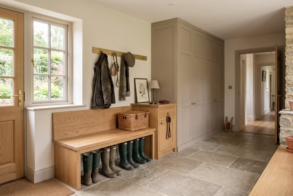
If there’s one piece of advice that comes up again and again from people who’ve actually lived with a boot room, rather than just designed one, it’s this: open shelving looks tidy in a showroom and messy within a week at home.
Full-height cupboards with doors, even simple flat-panel ones, keep the visual clutter contained no matter what’s happening behind them. You’re not hiding mess out of shame, you’re managing the fact that a family’s daily items don’t arrange themselves as neatly as a stylist’s props.
Pair that with a strict “one season, one shelf” habit: only the coats and shoes actually in use this month live on view. Everything else, summer sandals in December, ski gear in July, goes into a labelled bin or a higher cupboard shelf that gets rotated twice a year. It sounds like a small thing, but it’s the single biggest lever for keeping a boot room minimal without constant tidying.
For the bits that genuinely need to be grabbed in seconds, keys, dog lead, sunglasses, a torch for the bins, a shallow drawer or a small lidded basket by the door works far better than an open dish. It stays out of sight until you need it, and it stops becoming the spot where every stray object in the house ends up parked “just for now.”
Lighting: The Detail Almost Everyone Underestimates
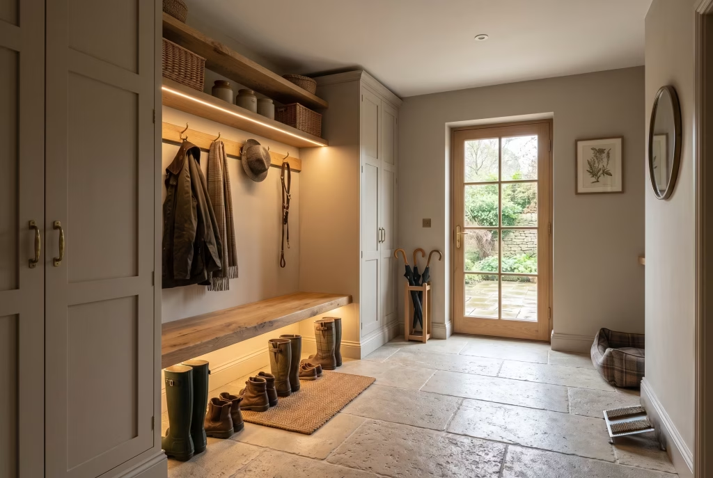
Most boot rooms have little to no natural light, tucked as they are between a garage or side door and the rest of the house.
That makes lighting a functional problem before it’s a design one. Concealed sources work best: a single flush ceiling fixture for general light, plus a strip or two of warm LED tape under a shelf or along a kickboard if the space feels particularly dim.
Avoid multiple decorative pendants here; this is one room where a single, well-placed, practical fitting beats atmosphere every time. If you’re lucky enough to have a window or a glazed door, don’t block it with storage. Even a small amount of daylight does more for how the room feels than an extra cupboard ever will.
Small Boot Room Ideas What to Do With Almost No Space
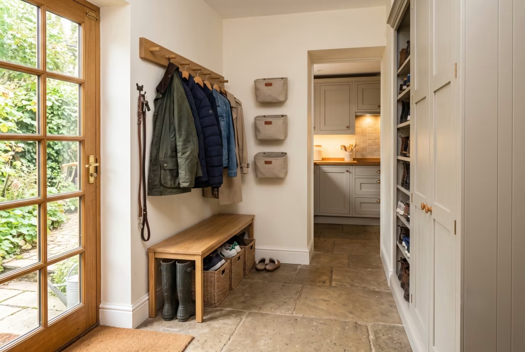
Plenty of British homes don’t have room for a proper boot room at all, just a metre or so of hallway between the back door and the kitchen. Minimalism actually suits this situation better than most other styles, because the whole discipline is about doing more with less.
A single run of hooks over a narrow shoe bench, even one only 25–30cm deep, gives a family somewhere to land coats and shoes without needing a full room. Wall-mounted baskets in place of a cupboard save depth while still concealing clutter, since a lidded or fabric-covered basket reads as tidy even when it’s not perfectly organised inside. A tall, narrow cupboard, the kind more usually sold as a hallway or shoe cabinet, can do the job of a full boot room wall in a third of the width.
The one thing that can’t be skipped, whatever the size, is somewhere closed to put things away. A minimalist look with nowhere to hide the mess isn’t minimalism, it’s just a room that looks bad by the second week.
Boot Rooms for Busy Families Staying Minimal With More People
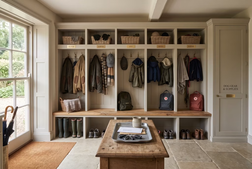
The hardest version of this brief is a family of four, five, or six trying to keep a boot room calm. More people means more coats, more shoes, more bags, more sports kit, and it’s tempting to assume minimalism simply isn’t realistic at that scale. It is, but it needs a slightly different approach: individual zones rather than shared storage.
Give each person their own labelled cubby, hook, or drawer, sized for what they actually need day to day, rather than one large shared space everyone dumps into. It sounds like a small distinction, but a shared bin fills up chaotically because no one feels ownership of tidying it; an individual zone means each person is only ever managing their own small patch. Add a single shared drop zone, a tray or shallow dish, for the household items that don’t belong to one person: post, keys for the car, the odd charity bag waiting to go out.
For dog owners, a small closed cupboard or drawer for leads, towels, and treats keeps that entire category out of view rather than hanging loose on a hook where it tends to spread.
Final thoughts about Minimalist Mudroom Design
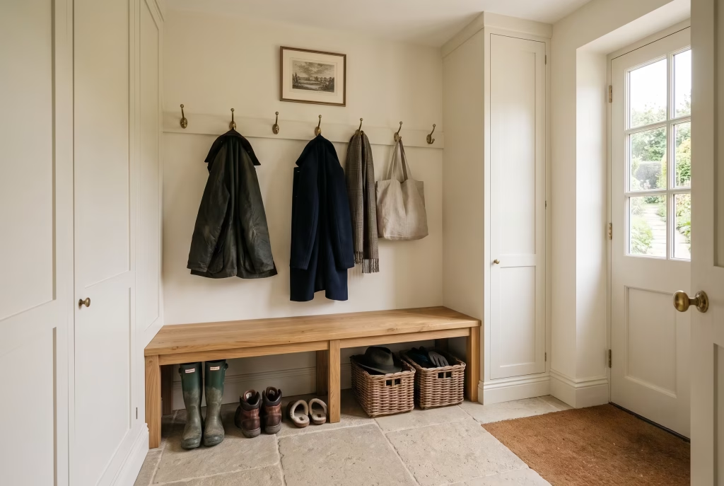
None of these fifteen ideas hinge on a bigger budget. That’s the point worth carrying away from the whole piece. A boot room done well isn’t the one with the most expensive stone or the biggest joinery bill, it’s the one where every decision was made on purpose, from bench depth to hook spacing to where the mud actually gets stopped in its tracks. Restraint, thought through properly at the planning stage, will always outperform money thrown at a problem after the fact.
If a project’s still at the early stages and the brief hasn’t been settled yet, it’s worth stepping back to the wider category before committing to any single idea here. Our full guide to minimalist mudroom design walks through the bigger decisions, layout, materials, budget planning, in more depth, and it’s the better starting point for anyone building from scratch rather than refining a room that already exists.
Frequently Asked Questions
Is a boot room still in style?
Yes, and if anything it’s become more of an expectation than a trend in recent new-builds and renovations. The appeal isn’t fashion, it’s function: a boot room protects the rest of the house from mud, wet, and daily clutter, which matters regardless of which decorating trend is current.
Does a boot room add value to a home?
It’s generally seen as a desirable feature by buyers, particularly families and anyone in a rural or semi-rural area, because it solves a genuine daily problem. It’s unlikely to add value in the way a bathroom or kitchen renovation would, but it does tend to make a home show better and feel more considered, which matters at viewing stage.
What are the must-haves in a boot room?
At minimum: somewhere to hang coats at a height everyone can reach, a place to sit while removing shoes, closed storage for anything not in daily use, and flooring that tolerates water and mud without complaint. Everything beyond that, the bench cushion, the artwork, the specific hardware finish, is preference rather than necessity.
What is the best layout for a boot room?
It depends entirely on the shape of the space, but the consistent principle is bench and hooks along one wall, with the shoe storage built into or directly beneath the bench rather than scattered elsewhere. In a narrow space, a single wall does the job. In a larger room, an L-shaped layout lets you separate the “coming in” zone from the “going out” zone, which is particularly useful for larger families.
Will minimalist work in a genuinely small boot room?
Yes, arguably better than most other styles, since a small space can’t absorb much decoration anyway. A short run of hooks over a narrow bench, with wall-mounted baskets instead of full cupboards, is enough to make a compact boot room both functional and calm.
What breaks a minimalist boot room scheme fastest?
Not enough hooks and not enough closed storage. Both lead directly to the same outcome: things end up on the floor or on visible surfaces because there’s nowhere else for them to go, which unravels the look within days rather than months.