25 Fall Garden Tricks to Make Your Yard Look Like a Magazine Cover
Here’s the bit nobody tells you: that garden almost never cost a fortune to achieve. What separates a magazine-worthy autumn plot from a bog-standard one isn’t budget, it’s restraint, repetition and a handful of decisions made with real intention rather than grabbed off a garden centre shelf in a hurry, five minutes before closing time, with half an eye on the weather forecast. Landscape designers talk about this constantly, though rarely in plain English. Strip away the jargon and it comes down to composition, scale, and knowing when to stop, three things that cost precisely nothing and that most of us simply never pause to think about.
There’s also a quieter, more practical reason to get this right beyond simply enjoying your own front step. Research into curb appeal, most notably a peer-reviewed study out of the University of Texas at Arlington published in the Journal of Real Estate Finance and Economics, found that homes with genuinely strong curb appeal sold for an average of 7% more than comparable properties nearby, and a widely cited Virginia Tech study puts the perceived value uplift from quality landscaping as high as 5.5% to 12.7%.
Whether or not selling is anywhere on your mind, that figure tells you something worth sitting with: the way your garden looks isn’t a frivolous concern tacked onto the “real” business of homeownership, it’s woven into how the whole property is read, valued and felt, by you as much as by anyone glancing in from the pavement.
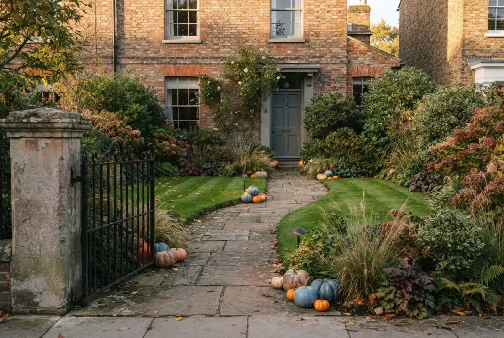
Quick answer: The fastest way to make a fall garden look professionally styled is to repeat one or two plant varieties in bulk rather than buying a bit of everything, keep your colour palette to three or four muted, complementary tones instead of every shade of orange going, and edge your beds neatly, since bare or ragged edging is the single biggest tell that a garden was thrown together rather than planned. Layer in warm, low lighting, choose a handful of quality props over a pile of cheap ones, and leave some space empty on purpose. That’s the whole trick, distilled.
Below are 25 tricks that actually do the heavy lifting, organised by the part of the garden they transform. Along the way you’ll find real cost ranges, safety notes worth heeding before you plug anything in outdoors, the plant-longevity data that stops your carefully staged display wilting by the second week of half term, and a fair amount of the psychology behind why these particular choices work rather than simply a list of things to buy.
Why Some Gardens Look Expensive and Others Look Like a Jumble Sale
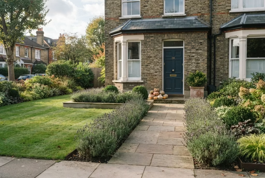
Before the list itself, it’s worth understanding the psychology at play, because once you see it, you genuinely can’t unsee it. It changes how you look at every garden you walk past for the rest of your life, your neighbour’s, the one on the telly, your own.
Garden designers who work on high-end projects tend to describe their approach as composition first, planting second. Marlene Lento, a landscape designer whose work regularly features in interiors press, frames the whole garden as a single visual arrangement rather than a collection of separate purchases, in much the same way a photographer thinks about a frame before pressing the shutter.
That reframing matters more than any individual product you might buy. A £15 terracotta pot arranged with intention beats a £150 one dropped in as an afterthought, every single time, and there’s something almost freeing about realising that the constraint was never really your budget.
There’s a second, quieter principle at work too: repetition reads as planning. Buy one striking plant and its impact fades into the background within a week. Buy a dozen of the same variety and line them along a path or patio edge, and the eye reads it as a deliberate, professionally conceived scheme rather than a random assortment gathered on a whim.
English lavender is the classic example florists and garden designers reach for because it’s hardy across a wide range of British gardens, holds a consistent shape, and looks tailored rather than thrown together when planted in a run. There’s a reason hotel grounds and stately gardens almost never mix twenty different flowering plants in one bed: the eye can only process so much variety before it stops reading as a garden and starts reading as clutter.
Colour plays its own quiet role here too. Warm hues, orange, rust, amber, genuinely do register in the brain as energising and inviting, which is exactly why they’ve become fall’s signature palette in the first place.
But warmth used everywhere, at full saturation, stops feeling inviting and starts feeling loud, rather like a room where every light is turned up to maximum. The most photogenic autumn gardens tend to pair that warmth with something cooler and more muted, sage, cream, weathered grey, so the eye has somewhere restful to land between the richer notes.
Then there’s the flip side: the mistakes that quietly announce “budget effort” even when real money was spent. Interior and landscape professionals quoted in trade press repeatedly flag the same handful of culprits. Overgrown shrubs crowding a doorway or window, blocking light and making the whole frontage feel neglected rather than lived-in.
Beds with no defined edge, so the lawn and the border bleed into one another with nothing to tell the eye where one thing stops and the next begins. Hardscaping in a cheap pigment that fades unevenly with weather, leaving patios looking patchy and tired rather than gracefully aged. None of these are expensive fixes. They’re attention fixes, and attention, it turns out, is the one resource that actually separates a considered garden from an unconsidered one.
Fall decorating specifically has its own version of this trap: clutter dressed up as festivity. Designers interviewed on the subject of porch and garden styling for autumn consistently name the same failure mode, which is piling on every pumpkin, gourd and fake cobweb owned rather than curating a handful of well-placed pieces. One porch styling specialist, Rosa Eichman of Porchscape Concierge, puts it down to intention: every object in a well-styled display should look like it belongs there naturally, not like it was unloaded from a supermarket trolley in one go. Restraint, in other words, is doing far more visual work than most people give it credit for, and it’s also, conveniently, the cheapest trick in the entire book.
Keep that framework in mind as you read through the tricks below. Nearly all of them are really the same three or four principles wearing different outfits, dressed up as lighting one moment and hardscaping the next, but underneath it’s always composition, repetition, restraint and scale.
Lighting Tricks That Turn Dusk Into the Best Part of the Day
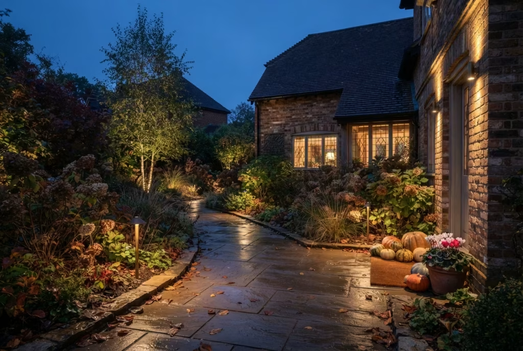
There’s something almost ceremonial about the moment a garden’s lights come on at dusk in October. The light drops fast this time of year, and a garden that’s dark by half past six feels abandoned rather than simply unlit. Get the lighting right and you extend the useful, enjoyable life of your outdoor space by hours every single evening, right through the darkest months.
1. String Lights Strung With a Plan, Not a Panic
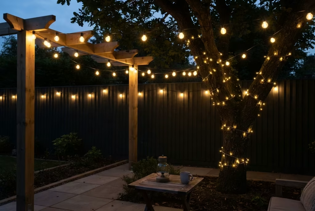
Fairy lights and festoon lights are the fastest route to instant atmosphere, but there’s a right and wrong way to hang them, and most gardens get it wrong through sheer haste rather than lack of taste. A zigzag pattern overhead between two fixed points, or a single run wound loosely around a mature tree trunk, reads as considered.
Lights bunched at random or draped over whatever’s nearest, the fence panel, the wheelie bin store, whatever was in arm’s reach, reads as an afterthought no matter how many bulbs you use. Aim for warm white bulbs in the 2700K to 3300K range rather than cool white, since anything bluer than that reads clinical outdoors rather than cosy, more hospital corridor than harvest evening.
A genuinely important safety note belongs here, and it’s one that every single one of your competitors’ articles skips entirely: even LED lights, which run far cooler than old incandescent bulbs, can still build up enough heat to ignite dry autumn leaves or brittle foliage if left switched on unattended for long stretches.
Keep lights clear of dried leaf piles underneath, and switch them off (a smart plug or timer does this without you having to remember at eleven o’clock at night) rather than leaving them lit overnight. It’s a small habit that costs nothing and quietly removes the one genuine hazard hiding inside an otherwise harmless bit of styling, the sort of thing that never crosses your mind until you read it somewhere, and then you can’t quite believe you never thought of it before.
You May also Like: 25 Ranch Garden Ideas Where Authentic Western Charm Comes to Life
2. Lanterns With Flameless Candles
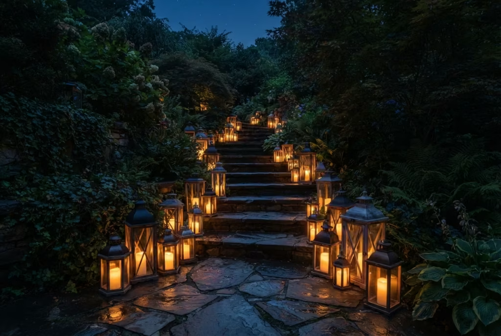
A cluster of lanterns along a path or steps gives you the flicker and warmth of candlelight without the fire risk of open flame near dry foliage, timber decking or fabric cushions, and there’s something about that soft, uneven glow that a hard LED spotlight simply can’t fake. Battery-operated flameless candles have improved enormously in recent years and now genuinely mimic a real flame’s movement rather than pulsing in that unmistakably artificial way older versions did. Group lanterns in odd numbers, three or five, at varying heights for the same “planned rather than plonked” effect that works so well with planting, and you’ll notice guests instinctively gravitate towards that corner of the garden come evening, drawn in the way moths are drawn to a porch light, except considerably more welcome.
Battery life is worth checking before you commit to a whole run of them along a long path, since nothing undoes the atmosphere faster than half the lanterns going dark by nine o’clock. Most decent flameless candles will run for six to eight hours on a fresh set of batteries, which comfortably covers a whole evening’s entertaining, but it’s worth keeping a spare set in a kitchen drawer so the display never lets you down halfway through.
3. Uplighting a Single Statement Tree
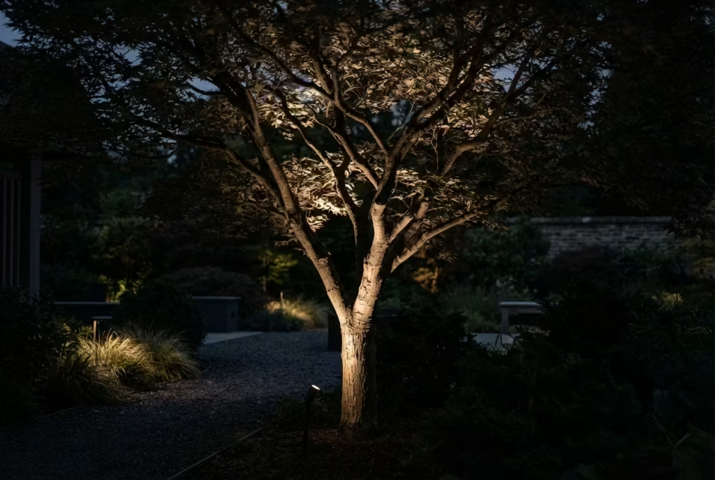
One well-placed spike light angled up into the canopy of a Japanese maple or mature shrub does more for the “magazine cover” feel than a dozen scattered fairy lights ever could, throwing dramatic shadows through the branches and turning an ordinary tree into the evening’s focal point, the sort of thing that makes people stop halfway down the garden and simply look up. The trick is restraint again, a word you’ll see repeated throughout this whole list because it genuinely is the golden thread running through every professional garden: one or two uplit trees look deliberate and dramatic, while uplighting everything in sight looks like a car showroom forecourt rather than a considered evening scene.
Position matters more than power here. A single spike placed close to the trunk, angled up through the branches rather than straight at the foliage face-on, creates far more depth and shadow-play than a stronger light placed further away. If you’ve a tree with particularly good bark texture, silver birch, for instance, angling the light to graze up the trunk rather than flooding the canopy will show off that texture in a way daylight simply doesn’t.
4. Low Path and Step Lighting for Depth
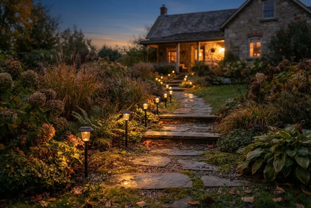
Solar-powered stake lights along a path edge cost very little and solve a genuine practical problem, visibility on darkening evenings when everyone’s stumbling about with a phone torch, while adding the kind of layered lighting that professional outdoor photography relies on. Photographers and stylists talk about “layers of light” rather than one bright source, and a garden lit only by a single porch bulb will always look flatter, and frankly a bit stark, than one with light at multiple heights guiding the eye gently through the space.
Spacing these evenly, roughly every metre to a metre and a half along a path, gives a rhythm to the walk that a single bright light at the door simply can’t replicate. Solar options need a genuinely sunny spot to charge through the shorter autumn days, so if your path runs mostly in shade, it’s worth checking whether a low-voltage mains-powered alternative might serve you better through the darker months ahead.
Extension cord safety worth knowing before you plug in: outdoor sockets need to be rated for wet conditions, not just “damp”, if they’re exposed directly to rain rather than sheltered under a porch roof. A 15-amp household circuit supports roughly 1,800 watts and a 20-amp circuit around 2,400 watts, so tot up the wattage of your combined lighting before you daisy-chain several extension leads together. Running one extension cord outdoors for the entire season, rather than checking it periodically for wear, is one of the more common (and preventable) causes of outdoor electrical fires each autumn. It takes two minutes to run your fingers along the length of a cord checking for nicks or cracked insulation, and that two minutes is genuinely cheap insurance against a problem you’d rather never encounter.
Container and Planter Tricks That Do the Heaviest Lifting
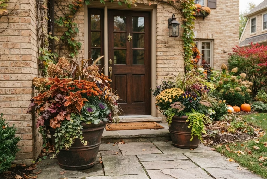
Containers are where most people spend their fall decorating budget, and understandably so, since a well-planted pot by the front door is the first thing anyone sees. But there’s a real gap between a container that looks like it happened by accident and one that looks like it was considered, and closing that gap costs very little.
5. Weathered Copper and Aged Metal Planters
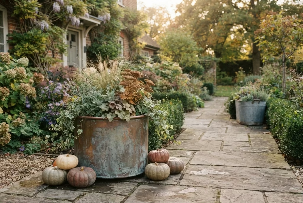
Copper develops a natural patina over time, shifting from bright penny-orange through to a soft, dusty green-grey, that reads as heritage rather than trend, and it catches low autumn light in a way that plastic or painted plant pots simply can’t replicate. You don’t need to buy expensive hammered copper new: a copper-effect finish, or genuinely aged secondhand metal containers from a reclamation yard, will do the same visual job for a fraction of the outlay. There’s a particular satisfaction in a container that looks like it’s been there for decades even if it arrived last weekend, the same appeal as a well-worn pair of boots that somehow look better broken in than new.
If you’re buying new copper and want that aged look sooner rather than waiting years for weather to do the work, a light application of vinegar and salt speeds up natural patination considerably, though it’s worth testing on the base of the pot first since the effect can be uneven if applied heavy-handed.
6. Mums Layered by Height, Not Scattered by Chance
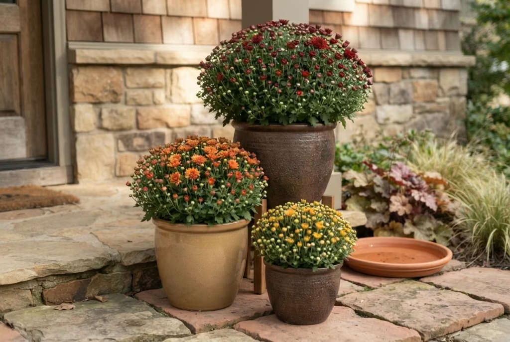
Chrysanthemums (mums) are fall’s signature flower for good reason, but the way most people place them, a single pot dumped by the front step, wastes their potential entirely. Arrange three or more containers in graduated heights, tallest at the back, shortest at the front, so each layer catches the light and the whole grouping reads as a single composed feature rather than three separate purchases sitting awkwardly next to one another.
A genuinely useful bit of longevity data here, since it’s the single most common complaint about mums: they typically bloom for four to eight weeks, and the buying decision you make at the garden centre determines which end of that range you land on. Horticulturists including Andrew King, an ornamental specialist at Texas A&M AgriLife, consistently advise choosing plants with tight, unopened buds over ones already in full flower, since the tighter the bud count, the longer your colour will last once it’s home. It takes a bit of patience, standing in the garden centre resisting the fully-blooming plant that looks instantly gratifying, but that patience is precisely what buys you weeks of extra colour later on. Give mums four to six hours of sunlight rather than a full day of blazing sun, since too much heat stresses the plant and shortens the display considerably, and garden educator Jenny Rose Carey specifically notes that mums positioned near a front door under a roof overhang dry out faster than those elsewhere in the garden, simply because they miss out on natural rainfall that would otherwise top them up.
7. Plant Repetition Instead of One of Everything
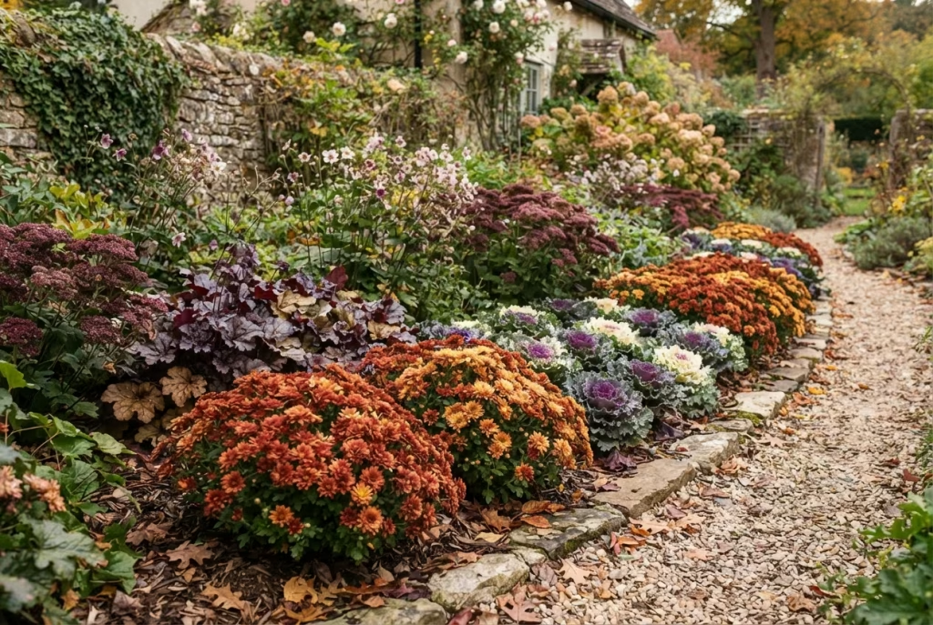
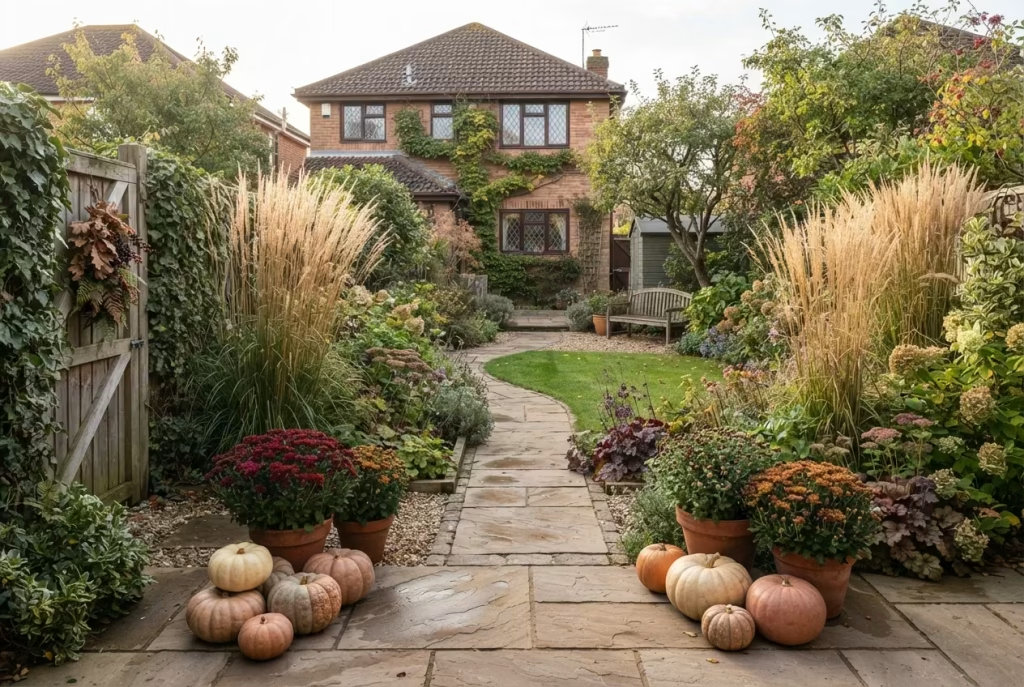
This is worth its own entry because it’s genuinely the single highest-impact trick on this entire list, and it’s also the one people find hardest to resist ignoring, since garden centres are practically engineered to tempt you into a bit of everything. Buying one of every appealing plant creates visual noise: the eye darts from one thing to the next without ever settling, which is exactly the opposite of the calm, considered feeling a good autumn garden should give off. Buying six or eight of the same variety, whether that’s ornamental kale, dwarf chrysanthemums or heuchera, and repeating it along a border or across a run of containers creates the kind of cohesive, planned-looking scheme that designers charge good money to achieve. It’s also usually cheaper in practice, since garden centres frequently discount multiples of the same plant, meaning the more disciplined choice is often the more affordable one too, a rare case of restraint and thrift pointing in exactly the same direction.
There’s an emotional payoff here that’s easy to underrate: a repeated planting scheme gives a garden a settled, established feeling almost immediately, the sense that it’s always looked this way, even on the very first afternoon you plant it. A mismatched assortment, however lovely each individual plant, never quite loses that slightly provisional, thrown-together air.
8. Oversized Containers for Genuine Drama
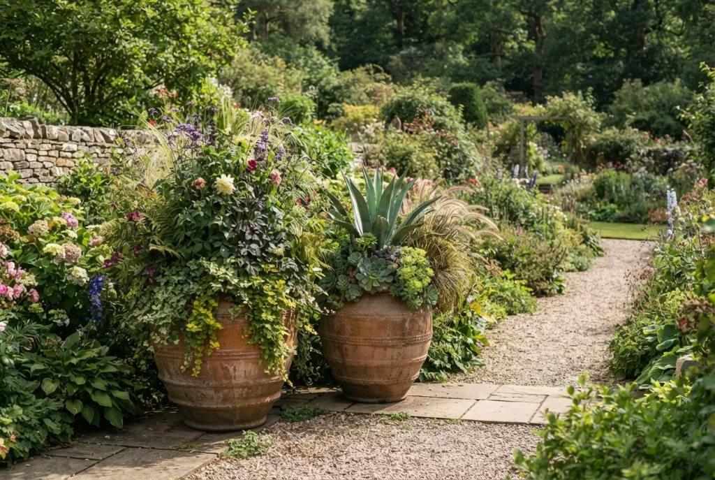
Scale is where a lot of gardens quietly go wrong. A small pot in a large space simply disappears, no matter how nicely it’s planted, rather the way a modest painting gets lost on a vast wall. Landscape professionals note that outdoor elements need to be sized up compared with how you’d furnish an equivalent indoor space, since gardens swallow scale in a way rooms don’t. One or two genuinely oversized planters, filled generously rather than sparsely, will outperform six modest ones scattered about, and they also mean less watering and fussing overall, since a larger soil volume holds moisture for considerably longer between waterings than a small pot does.
9. Texture-Layered Container Planting
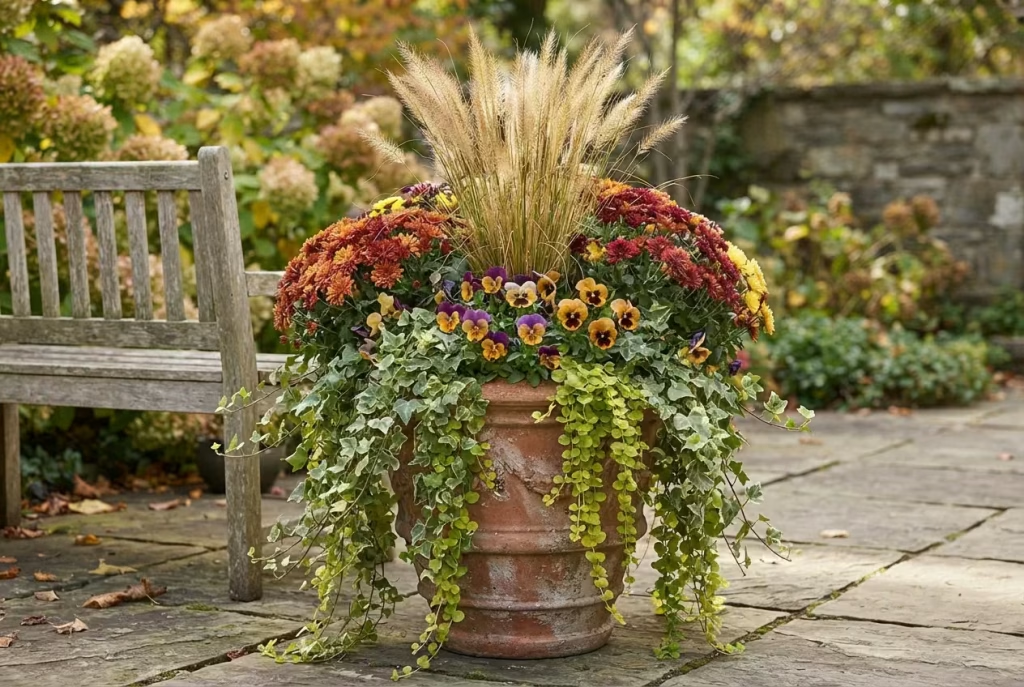
The most photogenic autumn containers combine at least three textures: something upright and structural (ornamental grass or a dwarf shrub), something with volume and colour (mums or pansies), and something trailing over the container’s edge (ivy or creeping jenny). A pot with only one texture, however pretty the flower, reads as flat next to one built with height, volume and drape all working together, in the same way a meal built entirely of soft foods, however delicious each mouthful, leaves you craving a bit of crunch. Florists call this the thriller, filler, spiller approach, and it works outdoors exactly as well as it does in a vase.
Colour and Foliage Tricks That Photograph Beautifully
10. Ornamental Grasses for Movement
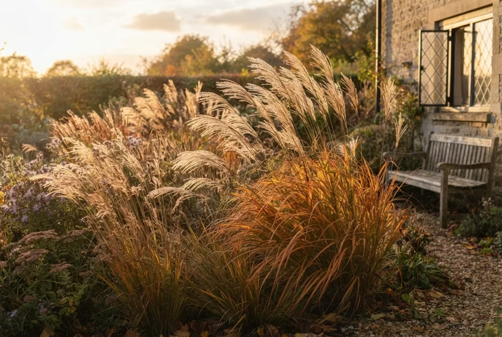
Grasses do something static planting never can: they move, and that movement catches low autumn light beautifully, especially backlit at golden hour when the light passes through the seed heads and sets the whole plant glowing from within. Varieties like feathery Miscanthus or copper-toned Carex hold their structure right through into winter, giving you far longer value than a bedding plant that’s finished by the first hard frost. They’re also genuinely low-maintenance once established, needing significantly less water and feeding than flowering perennials, which makes them one of the rare garden choices that looks better and demands less of you at the same time.
There’s a genuine sensory pleasure to grasses too, beyond the visual: the dry rustle of a mature clump moving in an autumn breeze is a sound most fall gardens simply don’t have, and it’s worth planting at least one clump somewhere you’ll actually hear it, near a bench or a window left ajar, rather than tucked away at the back of a border where its best feature goes entirely unnoticed.
11. Burgundy and Copper Foliage as Your Backbone
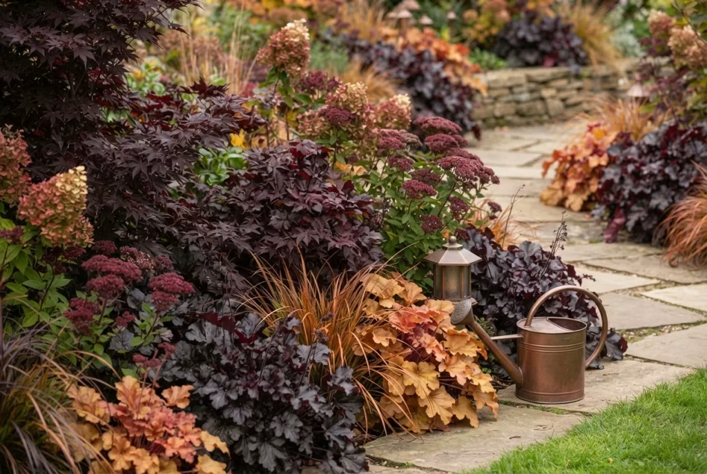
Rather than reaching straight for bright orange, which the most tasteful fall styling advice consistently warns against overusing, build your palette around deep burgundy (Japanese maple, heuchera, dark-leaved coral bells) with copper and amber as accent tones. This combination photographs far better than pure orange, which tends to read as harsh or slightly dated in daylight photography, and it pairs naturally with the copper and bronze metal accents covered elsewhere in this list. There’s also something quietly more sophisticated about burgundy as a base note, the sort of colour that reads as considered rather than seasonal, meaning a garden built around it doesn’t suddenly look dated the moment November turns to December.
You May also Like: Coastal Garden Design: Creating Landscapes That Withstand Exposure and Age Gracefully
12. A Restricted, Muted Palette Over a Rainbow of Everything
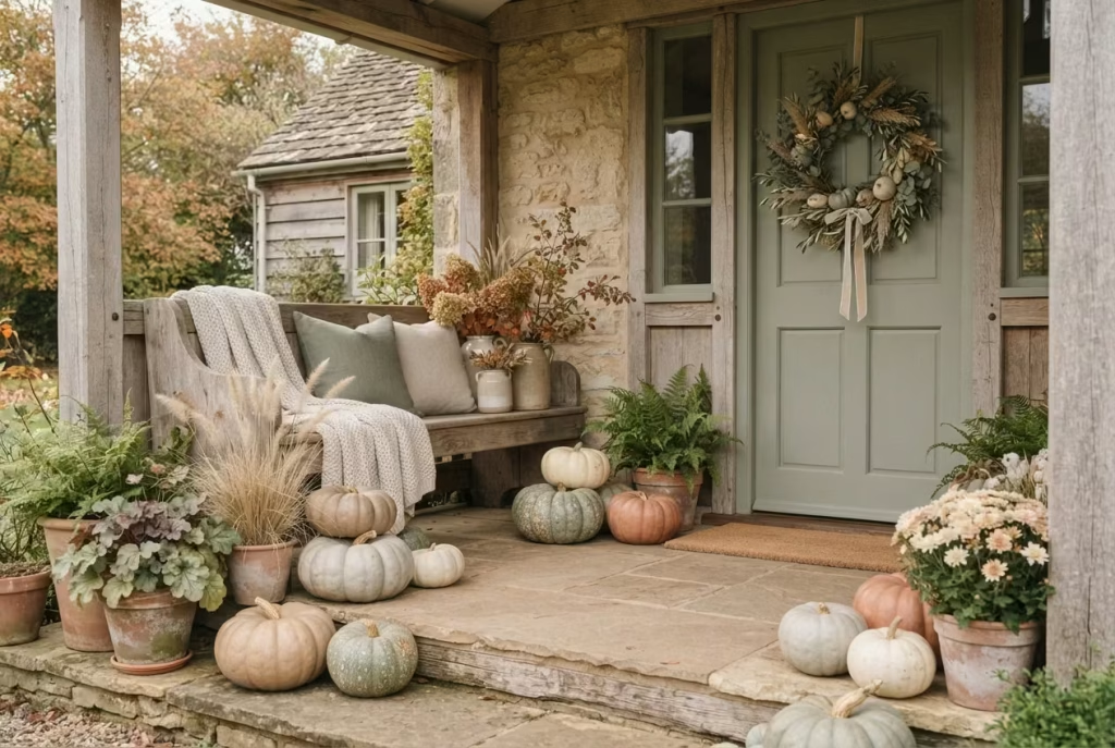
Porch and garden styling specialists are unanimous on this one: the most elegant autumn displays lean on soft, natural tones, think terracotta, cream, sage green and weathered neutral, rather than every bright pumpkin-shade going. Pick three or four colours maximum for the whole scheme and repeat them across planting, containers and props. A garden trying to showcase every autumn colour at once ends up looking like a jumble rather than a curated scene, the visual equivalent of a wardrobe where every single item is a different, competing pattern.
Choosing your palette before you shop, rather than while wandering the garden centre aisles picking up whatever catches your eye, is the single most effective way to actually stick to this. Write your three or four colours on your phone before you leave the house, and hold every purchase up against that mental list.
13. Evergreens as Your Structural Anchor
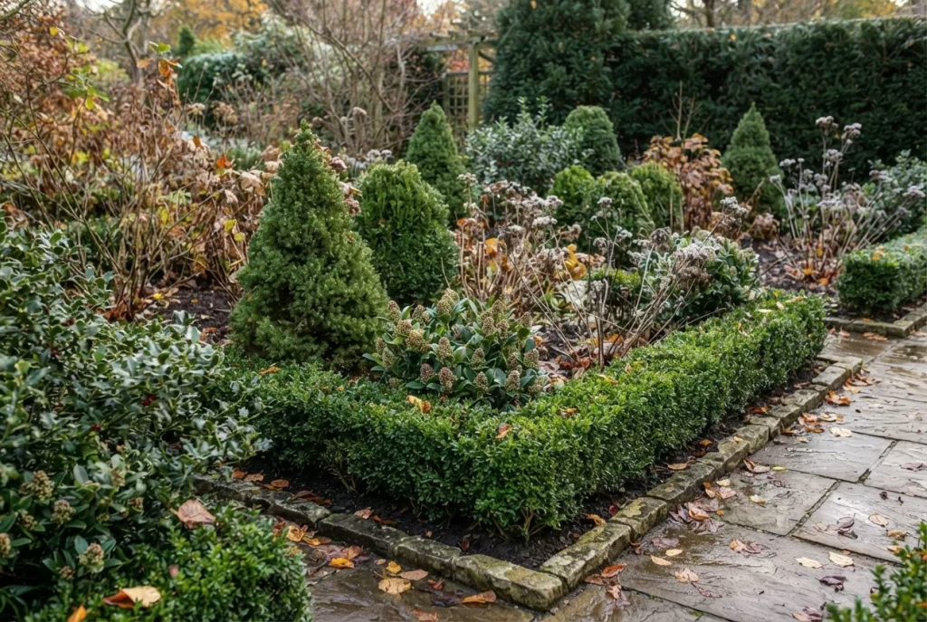
The gardens that still look composed in the depths of winter, after every mum has faded and every pumpkin has gone soft, are the ones with evergreen structure underneath the seasonal dressing. Boxwood, dwarf conifers, holly and skimmia all hold colour and shape year-round, meaning your “magazine cover” look doesn’t collapse the moment the seasonal props come down. Garden experts frequently point to evergreens such as daphne and privet specifically because they prevent a garden reading as bare once deciduous colour drops, and there’s real peace of mind in knowing your garden has good bones underneath the seasonal styling, the way a well-cut coat still looks smart even once the scarf and gloves come off.
14. One Accent Hue, Used Sparingly
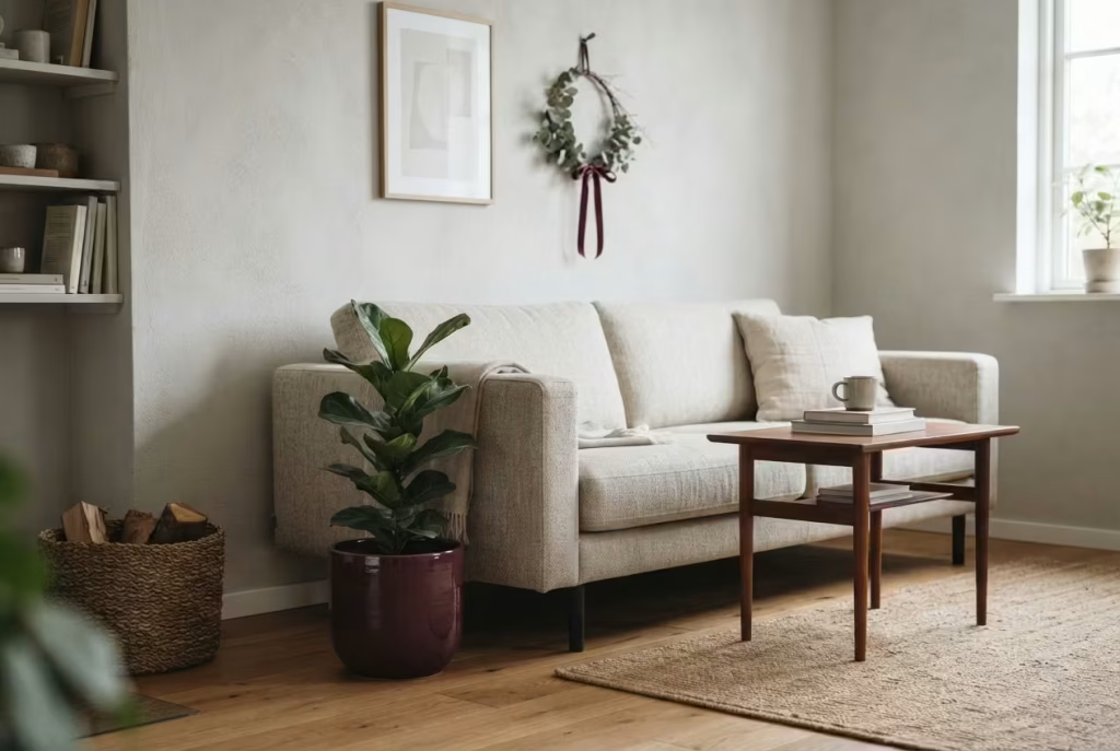
Pick a single unexpected accent colour, deep plum, mustard yellow, or dusty blue, and use it in exactly one or two spots: a single planter, a cushion, a ribbon on a wreath. Used sparingly, an accent colour reads as sophisticated and intentional, the kind of detail a visitor notices and comments on. Sprinkled everywhere, it just becomes part of the background noise and loses its punch entirely, rather like a good joke that’s funny told once and increasingly less so with every repetition.
Hardscape Tricks That Separate the Amateurs From the Pros
15. Neat Edging Around Every Bed
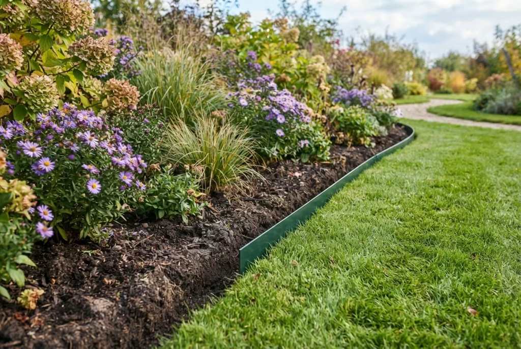
If there’s one landscaping detail that professional designers point to more than any other as the difference between a garden that looks cared for and one that looks neglected, it’s edging. A border with a crisp, defined line, whether that’s simple spade-cut edging or a metal strip, reads as intentional even if the planting inside is fairly modest. A border with no clear boundary, where lawn and bed blur into one another, undermines even the most expensive planting scheme sitting inside it, a bit like wearing an excellent suit with scuffed shoes: the eye goes straight to the flaw and the good work elsewhere barely registers.
Metal edging is the lowest-maintenance option since it never needs recutting, while spade-cut edging costs nothing beyond your own time but does need refreshing every few months as grass creeps back in. Either choice beats no edging at all by a considerable margin, and it’s genuinely one of the highest-value afternoons you can spend in the whole garden this autumn.
You May also Like: 25 Low-Maintenance, Long-Lasting Minimalist Garden Ideas for Budget-Friendly Outdoor Spaces in 2026
16. Large-Format Paving Over Small, Busy Pavers
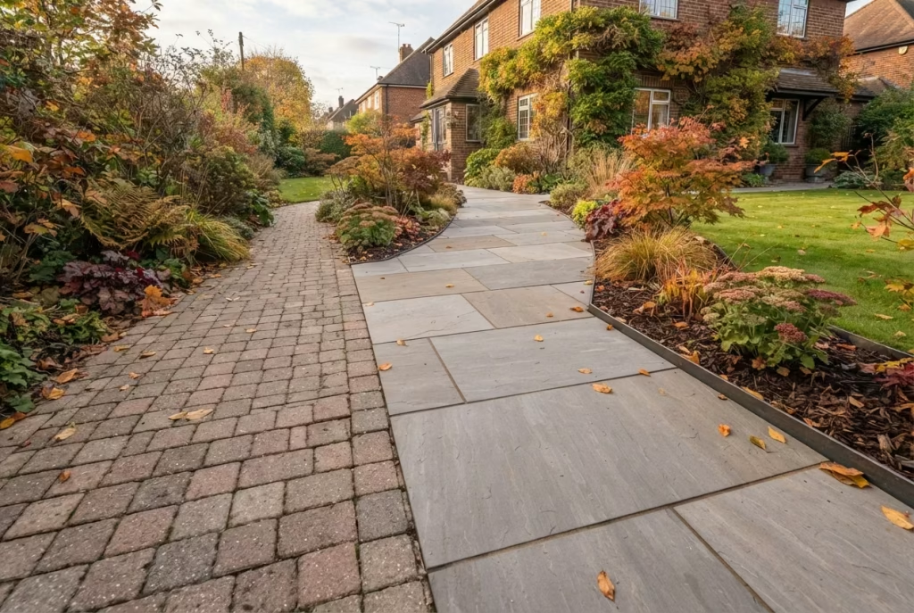
Bigger paving slabs read as more grand and considerably less “off the shelf” than the small, uniform pavers sold in bulk at most DIY chains. If you’re planning any hardscape work this autumn, a smaller number of larger, more generously proportioned stones will do more for the finished look than a larger number of small ones, and often works out similar in cost per square metre, since fewer joints and less cutting can offset the higher per-slab price. There’s a reason grand old properties tend to use fewer, larger stones rather than a patchwork of small ones, and it’s exactly the same principle at play in a modest suburban garden.
17. A Generous Layer of Dark Mulch
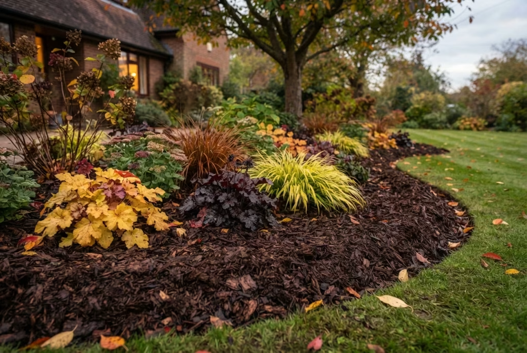
A three to four inch layer of good-quality, dark organic mulch does two jobs at once: it protects root systems through the coming cold snaps, and it creates visual depth by making beds appear larger and richer than they actually are. The contrast between deep, chocolate-brown mulch and golden or burgundy foliage is exactly the kind of high-contrast styling that photographs well in low autumn light, and it’s one of those improvements, like a freshly mown lawn, that transforms a space almost the moment it’s done. Extend the mulched area slightly beyond where the bed technically ends for a subtle optical trick that makes the whole border look more generous than it is, a trick borrowed straight from professional pre-sale staging, where a fresh coat of mulch is consistently named as one of the best-value, lowest-cost improvements available before a house goes on the market.
18. Sculptural Metal Accents, Used as Punctuation
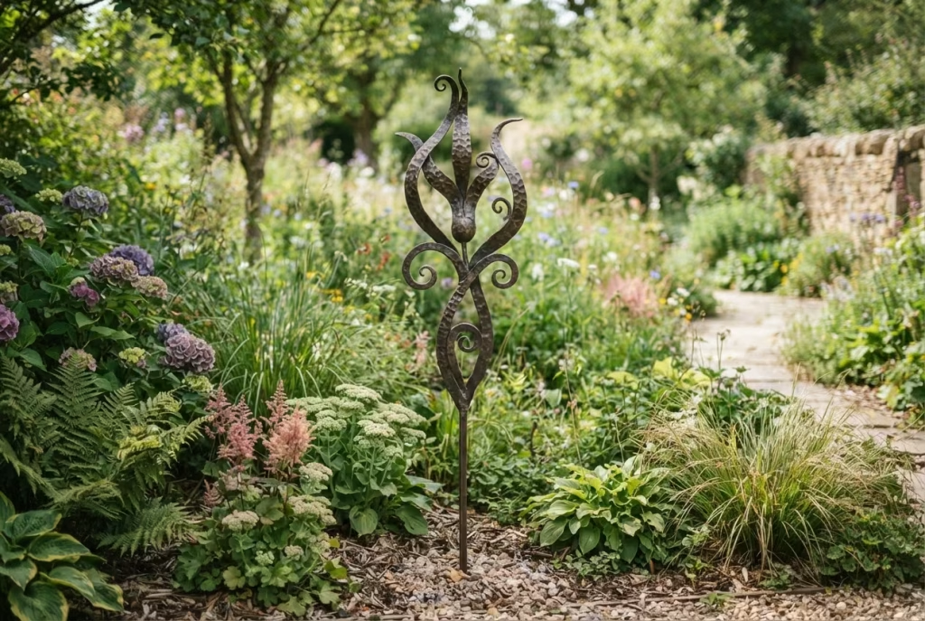
A single hand-forged or aged bronze garden stake, obelisk or trellis piece does for hardscaping what an accent colour does for your palette: it draws the eye to one spot rather than competing for attention everywhere. The key word again is singular, or at most a small cluster. A garden littered with ornaments starts to look, in the words of more than one interiors expert, like a “hodge podge” rather than a considered scheme, the horticultural equivalent of a mantelpiece so crowded with trinkets that none of them can actually be appreciated on its own terms.
Seasonal Prop Tricks That Avoid the Pumpkin-Patch Look
19. Mixing Real and Faux Pumpkins Deliberately
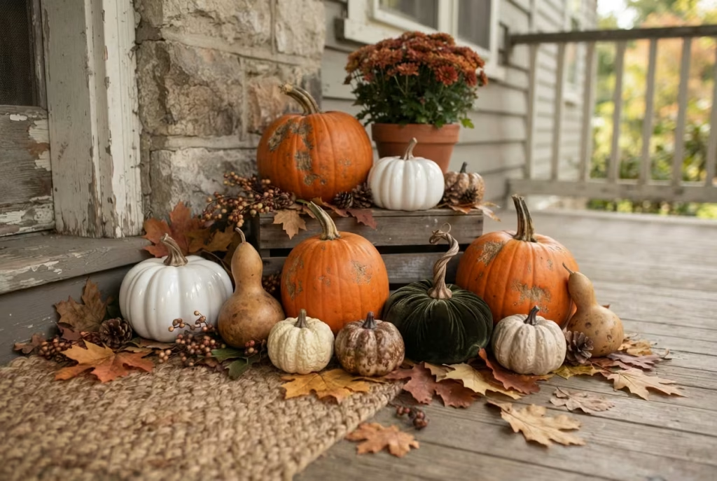
This is one of the most repeated pieces of advice from professional porch stylists, and for good reason: an entirely faux display can look uncannily perfect in a way that reads as a shop display rather than a home, all matching curves and identical stems, while an entirely real display eventually rots, slumps, and starts attracting the wrong sort of wildlife attention. The solution designers reach for is a genuine mix: real pumpkins for texture and imperfection, irregular stems, natural bumps, honest colour variation, supplemented with faux pieces in varied materials such as wood, ceramic or velvet to extend the display and add visual interest without the whole thing looking uniform. It’s the horticultural equivalent of pairing a well-worn leather jacket with something new: the contrast is what makes it feel authentic rather than staged.
The maintenance side of this matters more than most articles admit. A whole, uncarved pumpkin will typically last around a month at room temperature, stretching to two or three months if kept somewhere cool and out of direct sun. Once carved, that window collapses dramatically to three to five days in mild weather, or one to two weeks if the temperature drops. Rinsing carved pumpkins with a diluted bleach solution or vinegar can extend that a little, and bringing them indoors overnight (annoying as that sounds when you’d rather just leave them be) is genuinely the most effective deterrent against squirrels, who treat an unprotected porch pumpkin as an open buffet laid out especially for them, and will happily undo an entire evening’s careful styling before breakfast.
20. The Rule of Odd Numbers
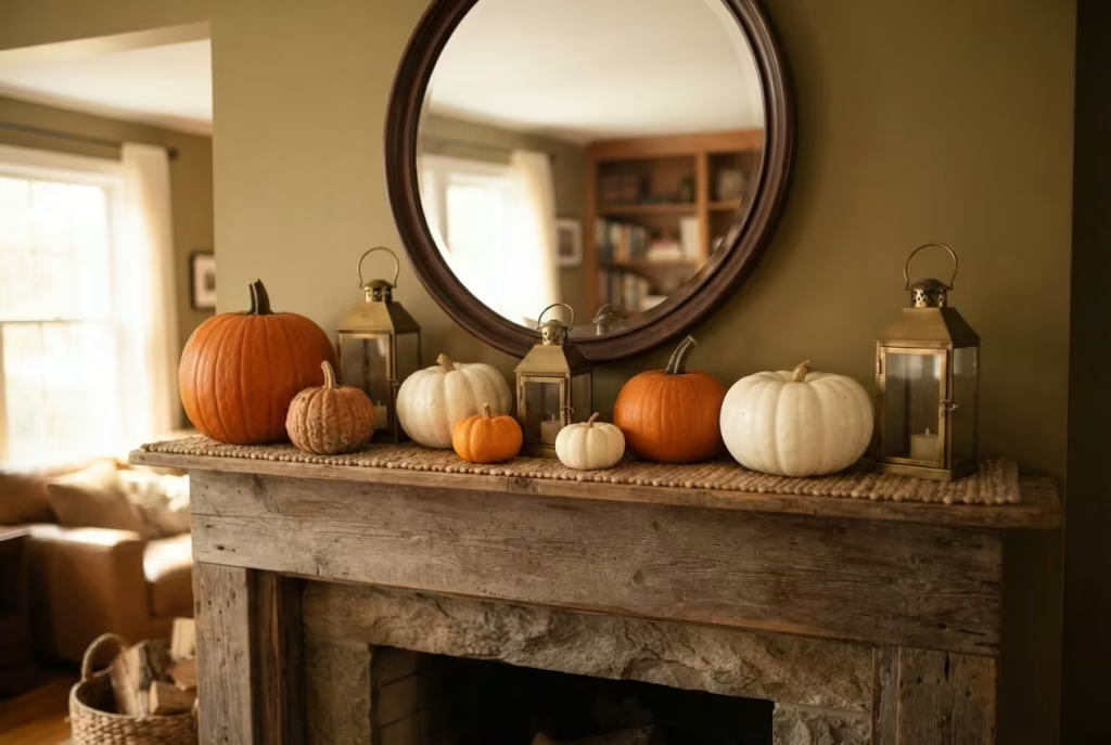
Groupings of three, five or seven objects read as more visually satisfying and more “designed” than even numbers, which the eye tends to process as pairs rather than a single arrangement. This applies to pumpkins, lanterns, planters, pretty much any repeated object in your display. It costs nothing and takes seconds to apply, which makes it one of the best value tricks on this entire list, and once you know it, you’ll find yourself instinctively rearranging things on windowsills and mantelpieces indoors too, for months after reading this.
21. Textured Pumpkins Over Painted Ones
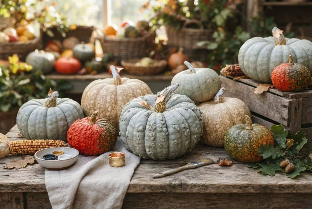
Rather than the bright orange, high-gloss pumpkin, look for varieties with genuine natural texture: warty skin, deep ribbing, unusual colouring like the pale blue-grey of a Jarrahdale or the mottled cream of a Cinderella pumpkin. A light wash of chalk paint or a touch of metallic leaf on the stem enhances rather than masks that natural texture, giving a far more sophisticated result than a solid coat of craft paint, and there’s a genuine pleasure in choosing pumpkins the way you’d choose vegetables at a good greengrocer’s, by feel and character, rather than grabbing the first uniform orange one to hand.
22. Hay Bales, Used With a Light Touch
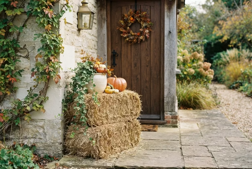
A stack of two or three hay bales near a doorway or path adds genuine seasonal texture, but the mistake most people make is over-committing: scarecrows, corn stalks, hay bales and a dozen pumpkins all fighting for attention in the same three square feet. One hay bale grouping, styled with restraint (a couple of pumpkins and a trailing plant rather than everything you own), does more work than an overloaded display, and it also means the display still looks intentional a fortnight later, rather than tired and picked-over the way an overloaded one inevitably starts to look once the first pumpkin softens.
23. Dried Foliage Swags and Garlands, Chosen for Durability
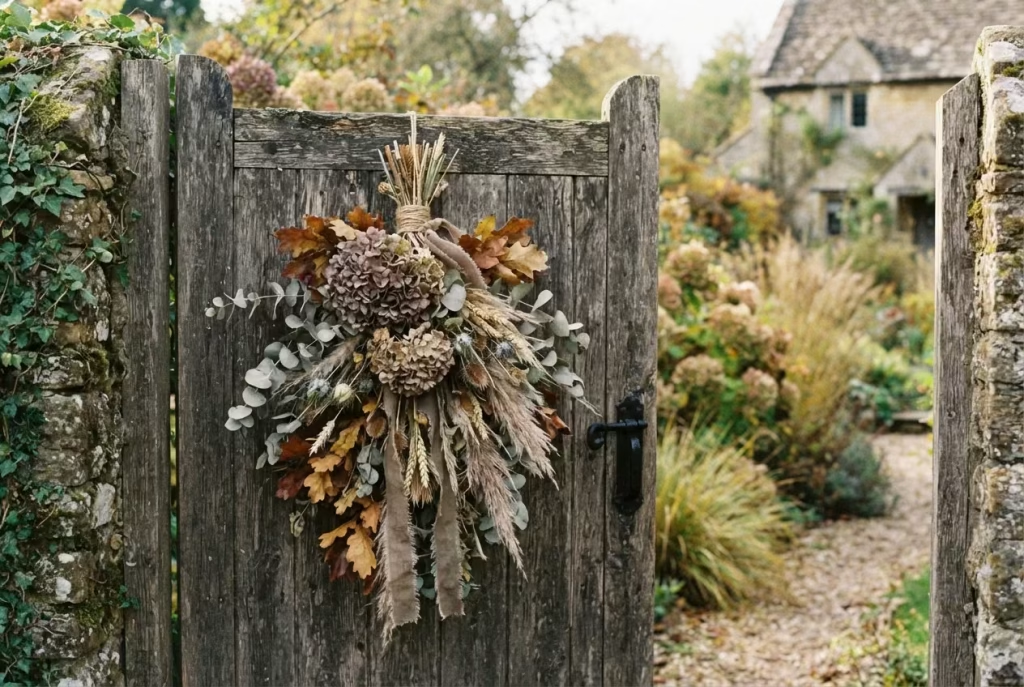
Dried hydrangea, eucalyptus and pampas grass hold up far better outdoors than fresh-cut foliage, which wilts within days once exposed to autumn’s damp, cooler air. A single asymmetrical swag tied slightly off-centre on a gate or door reads as considerably more current than the perfectly symmetrical wreath everyone else is hanging, and it’s genuinely more weather-resistant into the bargain, meaning you get weeks rather than days of good looks for the same effort.
Finishing Touches That Pull the Whole Look Together
24. Negative Space, Used on Purpose
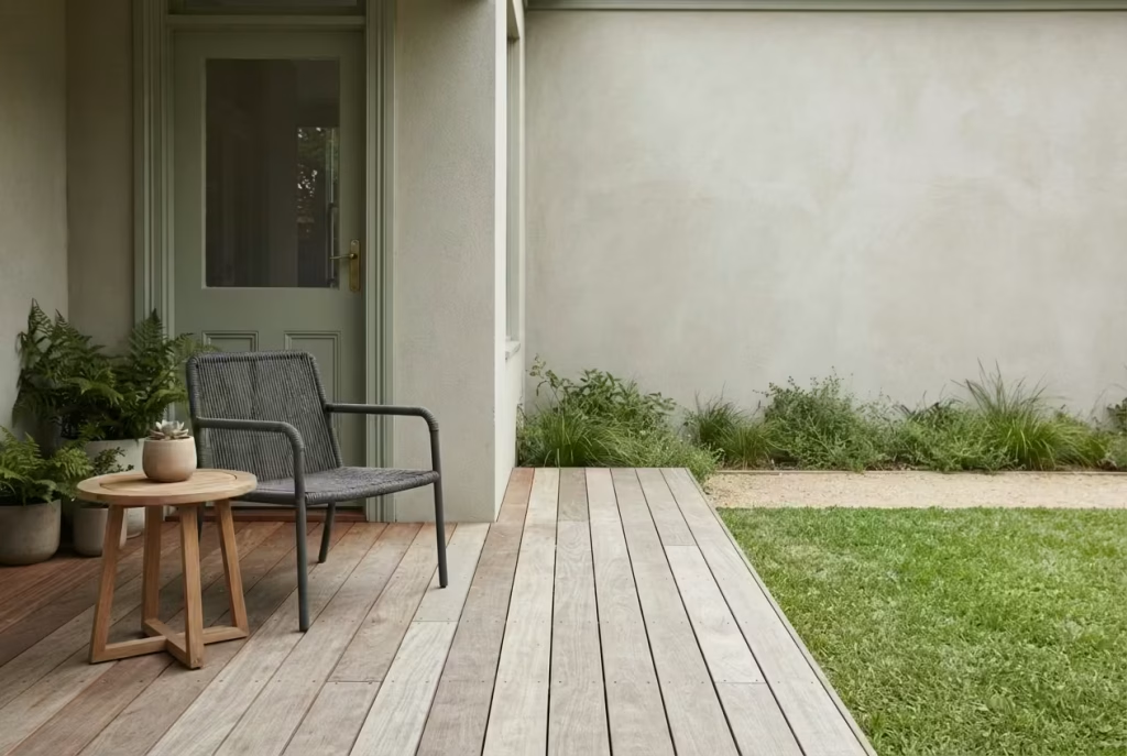
Here’s a trick that costs nothing and is almost never mentioned in competitor content: leaving part of your display genuinely empty. A bare corner of decking, one side of a doorway left undecorated, or a patch of clean, freshly edged lawn all give the eye somewhere to rest, which in turn makes the decorated areas stand out far more sharply. A display with zero breathing room, however lovely each individual element is, ends up feeling relentless rather than restful, the visual equivalent of a conversation where nobody ever pauses to let a point land.
25. Weatherproof Textiles for a Lived-In Feel
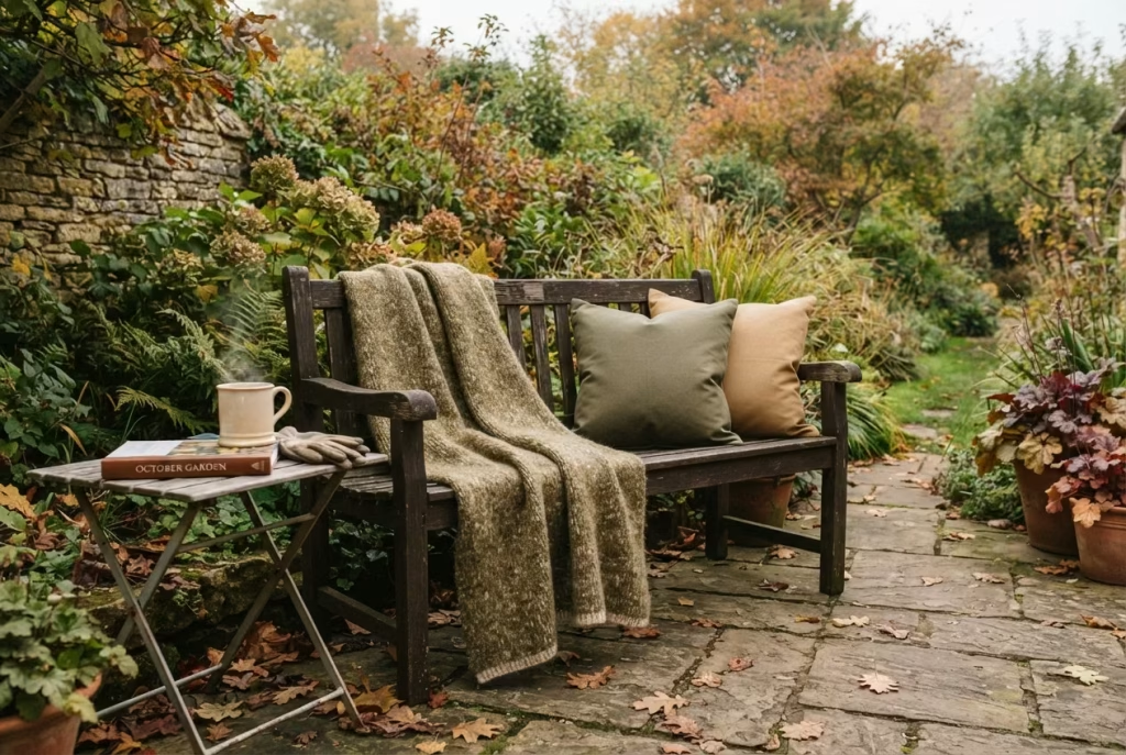
A wool or faux-fur throw over an outdoor bench, or a couple of weather-resistant cushions on a set of chairs, does more to make a garden feel genuinely inhabited (rather than merely decorated) than almost any other single addition. Choose materials rated for outdoor use so they don’t need bringing in every time rain threatens, and stick to your restricted colour palette from earlier in this list rather than introducing a new clashing pattern at the final hurdle. There’s something quietly hopeful about a throw draped over a garden chair in October, a small signal that you still intend to sit out there, cup of something warm in hand, even as the days shorten around you.
Choosing the Right Plants for Your Climate
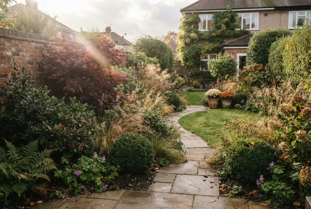
None of this styling matters much if the plants underpinning it give up the ghost at the first proper frost, so it’s worth matching your choices to what your garden can actually sustain rather than what looked lovely in a display outside a garden centre in a milder part of the country.
- Ornamental grasses (Miscanthus, Carex, feather reed grass) are forgiving across most of the UK, tolerating everything from heavy clay to fairly poor, free-draining soil, and hold their structure right through winter in nearly every region.
- Japanese maples, prized for that deep burgundy foliage, prefer a sheltered spot out of harsh, drying winds, since exposed coastal or hilltop gardens can scorch the leaf edges before the colour has a chance to peak.
- Mums, sold as annuals in most garden centres, aren’t reliably hardy through a proper British winter unless specifically labelled as garden or hardy mums, so treat store-bought pot mums as a seasonal display rather than an investment, and bring any you want to keep indoors or into a sheltered cold frame before the first hard freeze.
- Evergreen anchors like boxwood, holly and skimmia are about as forgiving as planting gets, thriving in everything from a sun-baked south-facing border to a shadier north-facing corner, which is exactly why they’re the backbone recommendation running through this whole guide.
If you’re unsure what your particular garden can handle, a quick look at your local frost dates, most of the UK sees its first hard frost sometime between mid-October and mid-November depending on region, will tell you roughly how long any tender annual display has left before it needs either protecting or accepting its fate.
Cost Tiers What These Tricks Actually Cost to Pull Off

| Budget tier | What it typically covers | Approximate spend |
| Low-cost | Odd-number grouping, restricted colour palette, negative space styling, one accent hue, texture layering with existing pots | £0 to £20 |
| Mid-range | Solar path lights, a set of flameless lanterns, mulch for a medium bed, a run of repeated bedding plants | £25 to £90 |
| Higher investment | Weathered copper planters, large-format paving, an uplighting spike for a statement tree, a genuine bronze garden stake or sculptural piece | £80 to £250+ |
Most gardens land somewhere between the first two tiers for a full seasonal refresh, since the highest-impact tricks on this list (edging, repetition, restraint, layered lighting) are also among the cheapest. Worth remembering too, in light of the curb appeal research mentioned earlier: basic tidying and fresh mulch alone have been named by real estate professionals as among the very best-value improvements available, often outperforming far more expensive additions pound for pound.
A Note on Plant Longevity, So Your Display Doesn’t Fade by November
| Element | Realistic lifespan | What extends it |
| Whole pumpkin | 1 to 3 months | Cool, shaded storage; keep dry; avoid bruising |
| Carved pumpkin | 3 days to 2 weeks | Bleach or vinegar rinse; cooler weather |
| Store-bought mums | 4 to 8 weeks | Buy tight-budded plants; 4 to 6 hours partial sun; consistent moisture |
| Dried foliage swags | Full season | Keep dry and out of direct rain where possible |
| Ornamental grasses | Through winter | Minimal care once established; cut back in early spring |
Bringing It All Together
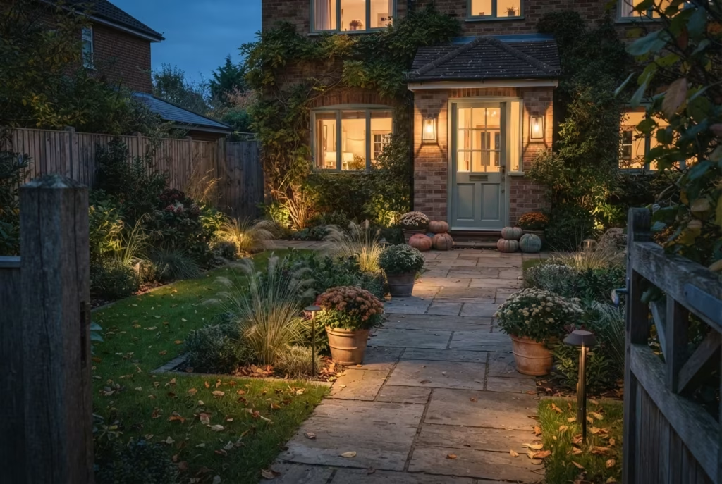
None of these 25 tricks require a landscaping budget or a design degree. What they require is a shift in thinking: from “buy more stuff” to “arrange what you’ve got with intention.” Repeat your plants instead of scattering variety. Edge your beds properly. Group your props in odds, not evens. Choose three colours and stick to them. Leave a little space empty. Layer your lighting instead of relying on one source.
Do even half of these well, and consistently, and the whole garden starts to read as considered rather than assembled in a rush on a Saturday afternoon in October. There’s a genuine, quiet satisfaction in stepping outside on a cold evening, seeing the lanterns glowing along the path and the mums holding their colour in the dusk, and knowing you built that feeling on purpose rather than stumbling into it. That’s really the entire secret behind every magazine-worthy autumn plot you’ve ever admired: not more money, just more intention, and a willingness to leave a little well alone.
Frequently Asked Questions
How do I stop my fall garden looking cluttered or like a pumpkin patch?
Restrict yourself to a maximum of three or four colours, group props in odd numbers rather than scattering them, and leave at least one visible area of the display genuinely empty. Professional porch stylists repeatedly name overcrowding as the single most common mistake homeowners make each autumn.
What’s the single cheapest trick that makes the biggest visual difference?
Neat bed edging. It costs little more than an afternoon’s work with a spade or a length of inexpensive metal edging, yet designers consistently name it as the detail that separates a “planned” garden from a neglected one.
How long do mums actually last outside?
Typically four to eight weeks, though this depends heavily on which plants you buy. Choosing mums with mostly closed buds rather than plants already in full bloom, and keeping them in four to six hours of partial sun rather than blazing full sun all day, will land you at the longer end of that range.
Should I use real pumpkins, faux pumpkins, or both?
Both, ideally. An all-faux display can look uncannily perfect in a way that reads as a shop window rather than a home. Mixing in real pumpkins, with their natural imperfections, alongside faux pieces in varied materials gives you the best of both: longevity plus authenticity.
Are outdoor string lights actually a fire risk?
Genuinely, yes, if used carelessly. Even LED lights generate enough heat over long unattended periods to ignite dry leaves or brittle dried foliage nearby. Keep lights clear of leaf litter, use a timer so they’re never left on overnight, and make sure any extension cords used outdoors are rated for wet (not just damp) conditions if they’re exposed directly to rain.
How much power can I safely run through outdoor lighting and extension cords?
A standard 15-amp household circuit supports roughly 1,800 watts, and a 20-amp circuit around 2,400 watts. Add up the wattage of everything you’re plugging in before daisy-chaining several extension cords together, and avoid running one cord outdoors unchecked for the entire season, since worn insulation is a genuine and common fire cause.
What colours should I avoid for a tasteful autumn garden?
Bright, uniform orange used across the entire display tends to read as harsh or slightly dated in daylight. Muted, natural tones (terracotta, cream, sage, weathered neutral, with burgundy and copper as richer accents) photograph and age considerably better.
Do I need expensive plants to get a “designer” look?
No. The highest-impact trick, buying multiples of a single plant variety rather than one of everything and repeating it along a border, is often cheaper than buying a wide, mismatched assortment, since garden centres regularly discount multiples of the same plant.
What’s the best way to arrange containers for a polished look?
Vary the height (tallest at the back, shortest at the front), group in odd numbers, and combine at least three textures in each pot: something upright, something with volume, and something trailing over the edge.
How do I keep my display looking good once the seasonal props start fading?
Build your scheme around evergreen structure, boxwood, dwarf conifers, holly, skimmia, so the underlying garden still holds shape and colour once the mums have finished and the pumpkins have softened. The seasonal dressing then becomes a bonus layer rather than the entire display.
Is it worth spending more on hardscaping like paving or edging?
Generally yes, since these elements are visible year-round rather than seasonally, and cheap paving in a pigment that fades unevenly is one of the most common reasons a garden starts to look tired within a couple of years. Larger-format paving and properly installed edging both tend to age far more gracefully than budget alternatives.
Does a well-styled fall garden actually add value to a home, or is it just a nice-to-have?
There’s real research behind this beyond simple aesthetics. Studies cited by real estate professionals, including a University of Texas at Arlington study published in the Journal of Real Estate Finance and Economics, found homes with strong curb appeal sold for around 7% more than comparable properties, while a widely referenced Virginia Tech study puts the value uplift from quality landscaping as high as 5.5% to 12.7%. Whether or not you’re planning to sell, that’s a fair indication of how much a considered, well-kept garden genuinely shapes the way a home is perceived.
How do I make my garden look good in photographs specifically, not just in person?
Prioritise layered lighting (multiple sources at different heights rather than one bright bulb), and lean on texture and colour contrast, dark mulch against golden foliage, burgundy planting against pale stone, since high-contrast combinations translate far better through a camera lens than they do to the naked eye standing in the garden itself.