25 Front Yard Landscaping Ideas That Elevate Curb Appeal with Architectural Intention
A front yard is not simply a patch of land between pavement and façade. It is an architectural threshold. It prepares the eye for what lies beyond the door. When designed with clarity and proportion, it quietly frames the home, guiding movement and shaping perception before a visitor even reaches the entry.
Too often, front yards are treated as decorative afterthoughts. A few ornamental shrubs, seasonal flowers, perhaps a widened driveway. The result may feel momentarily refreshed, but it rarely feels composed. Landscaping should operate as spatial design, not surface embellishment. It should establish hierarchy, define circulation, and create visual rhythm that aligns with the architecture itself.
From a property value perspective, first impressions carry measurable weight. In both UK and US markets, curb appeal directly influences buyer perception within the first 30 seconds of arrival. Structured planting, well-scaled pathways, and defined boundaries signal maintenance, quality, and long-term investment. Disorganised beds and fragmented paving, even if recently installed, can subconsciously suggest neglect or inconsistency.
The distinction between trend-driven gardens and composition-led landscapes is fundamental. Trend-driven approaches chase colour palettes, statement pots, or viral planting schemes. Composition-led design begins with structure: axis lines, focal points, proportion, and depth layering. It asks how the eye travels from pavement to porch. It considers how materials weather over ten or twenty years. It prioritises evergreen framework before seasonal variation.
These 25 front yard landscaping ideas are not about decoration. They are rooted in proportion, structure, circulation clarity, and longevity. Each idea considers spatial logic first and aesthetic refinement second. The objective is not simply to beautify the frontage, but to elevate it into a coherent architectural introduction.
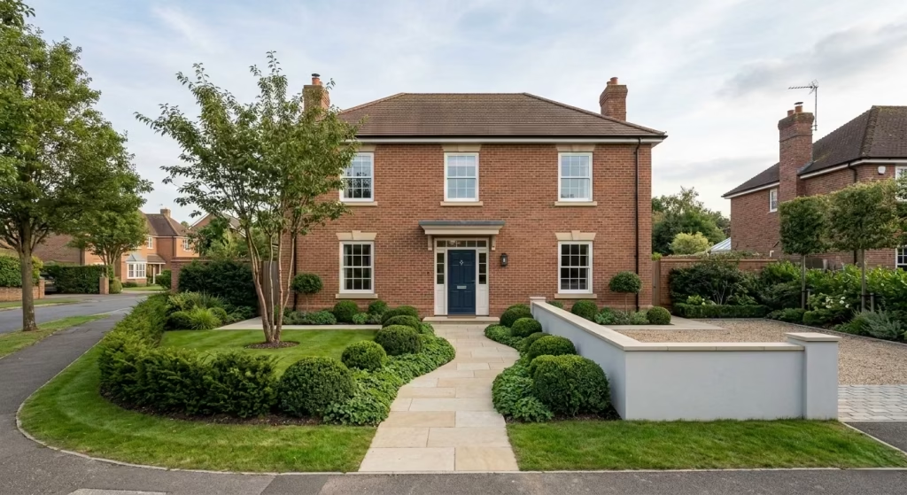
Real-Life Application Insight
On a recent renovation of a detached property with a 14 m (46 ft) wide frontage, the client initially requested more planting to soften what they described as a “flat” appearance. The lawn extended uninterrupted from pavement to entrance, with a narrow 80 cm (31 in) straight concrete path cutting directly to the door.
Instead of increasing planting density, I restructured circulation.
We widened the pathway to 1.4 m (4.6 ft), introduced a subtle offset approach rather than a rigid straight line, and framed it with 60 cm (24 in) deep structured evergreen beds. A low rendered wall at 55 cm (22 in) high anchored the right boundary, giving the façade a grounded base.
Planting was deliberately restrained. Structural shrubs were spaced at 75 cm (30 in) centres, with a single multi-stem ornamental tree positioned 4.5 m (15 ft) from the façade to establish vertical balance.
The transformation in curb presence came not from adding colour, but from clarifying movement and proportion. The house immediately felt wider, more intentional, and architecturally resolved.
That project reinforced a principle I return to repeatedly: structure creates presence. Planting refines it.
Structural landscaping ideas

Before exploring each idea in detail, it is important to understand that front yard landscaping works best when approached as a cohesive system rather than a collection of individual features. Pathways, planting, lighting, and boundaries must operate together to create hierarchy and clarity. When proportion, circulation, and materiality are resolved first, every additional layer, whether greenery or hardscape, strengthens the architectural narrative instead of competing with it.
Framed Entry Pathways with Defined Edging
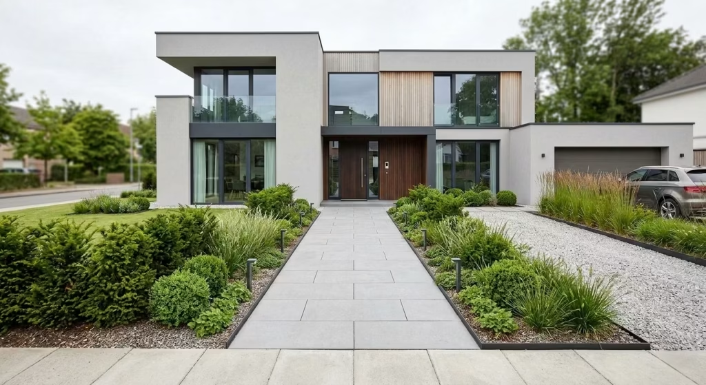
An entry pathway is not merely a functional strip connecting pavement to door. It is a spatial directive. It establishes axis, proportion, and hierarchy. When properly scaled and framed, it immediately elevates the perceived stature of the home and clarifies how visitors should approach it.
In residential front yards, I typically recommend a pathway width of:
- 1.2 m–1.5 m (4–5 ft) for primary entry routes
- Below 1 m (3.3 ft) often feels compressed and secondary
- Above 1.5 m (5 ft) works best for larger façades or symmetrical formal layouts
This width allows two people to walk comfortably side by side, reinforcing generosity and architectural confidence.
Why Defined Edging Matters
Without defined edges, pathways visually dissolve into adjacent planting or lawn. Framing with brick soldier courses, steel edging, or low stone borders:
- Strengthens visual alignment
- Prevents gravel or soil migration
- Enhances long-term durability
- Creates a deliberate architectural threshold
In formal properties, symmetrical edging reinforces order. In contemporary settings, minimalist metal edging provides restraint without visual heaviness.
Material Comparison: Limestone vs Concrete Pavers
Material choice significantly influences tone and longevity.
Limestone
Characteristics: Natural stone with tonal variation and subtle texture.
Pros
- Timeless, architectural appearance
- Ages gracefully with natural patina
- Excellent for traditional and transitional homes
- Strong resale perception due to premium material association
Cons
- Higher initial cost
- Requires proper sealing in colder climates
- Can show weather staining if poorly maintained
Best Use:
Georgian, Colonial, and heritage-style properties where material authenticity enhances façade symmetry.
Concrete Pavers
Characteristics: Manufactured modular units available in multiple finishes and tones.
Pros
- More cost-effective
- Uniform sizing simplifies installation
- Wide design flexibility
- Easier sectional repair if damaged
Cons
- May appear visually flat if poorly selected
- Colour fading possible in high UV areas
- Requires high-quality sub-base to avoid settlement
Best Use:
Contemporary and modern homes requiring clean geometry and budget-conscious planning.
Real-Life Application Insight
On a renovation project involving a detached home with a 12 m (39 ft) frontage, the original pathway measured just 80 cm (31 in) wide. It created a constricted approach that visually narrowed the façade. The lawn dominated the frontage, yet circulation felt secondary and underwhelming.
Rather than increasing planting density, I rebalanced proportion.
We expanded the path to 1.4 m (4.6 ft) using large-format limestone slabs laid in a staggered bond pattern. Defined brick edging was introduced on both sides, with planting beds set at 60 cm (24 in) depth.
Key structural adjustments included:
- Sub-base excavation to 200 mm (8 in) for stability
- 1.5% slope for water runoff
- Integrated low-level lighting spaced at 2.5 m (8 ft) intervals
The impact was immediate. The wider path created generosity and clarity. The façade felt broader, more grounded, and intentionally composed. Importantly, we did not increase overall planting volume. We simply corrected circulation proportion.
Design Takeaway
A framed entry pathway is one of the highest-impact front yard interventions. It improves:
- Visual balance
- Property value perception
- Functional comfort
- Long-term durability
When circulation is resolved first, every surrounding element begins to align naturally. Structure creates authority. Planting enhances it.
Layered Planting with Depth Composition
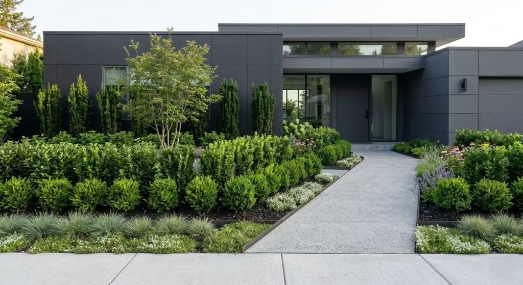
Flat planting beds are one of the most common reasons front yards feel underdeveloped. A single row of shrubs placed against the façade rarely delivers architectural presence. Layered planting, by contrast, introduces depth, rhythm, and scale, allowing the garden to feel intentional rather than incidental.
In professional landscape planning, I approach planting composition much like interior spatial layering. Every layer must serve a role: foreground softening, mid-layer volume, and backdrop structure.
The Foreground, Mid-Layer, Backdrop Technique
1. Foreground Layer
Height range: 20–60 cm (8–24 in)
Placement: Closest to pathway or lawn edge
This layer softens hard edges and guides the eye along circulation routes. It should never overpower the entry path.
Typical uses include:
- Low evergreen mounds
- Textural grasses
- Groundcover species
Purpose:
- Creates transition between hardscape and planting
- Defines bed boundaries
- Adds movement and detail at pedestrian level
2. Mid-Layer
Height range: 60 cm–1.2 m (2–4 ft)
Placement: Central depth of planting bed
This is the visual anchor layer. It carries the primary mass and volume of the composition.
Functions:
- Establishes proportion relative to façade
- Provides structural repetition
- Creates rhythm through spacing
Spacing typically ranges between:
- 60–90 cm (2–3 ft) centres depending on mature spread
This layer must be planned based on mature size, not nursery size. Overcrowding is one of the most common long-term failures I see in residential front yards.
3. Backdrop Layer
Height range: 1.5–3 m (5–10 ft) depending on façade scale
Placement: Closest to the building or boundary wall
This layer anchors the composition vertically.
It may include:
- Upright evergreen shrubs
- Multi-stem small trees
- Architectural hedging
The backdrop creates architectural grounding. Without it, planting feels temporary and visually disconnected from the house.
Depth Planning: 1 m–2.5 m (3–8 ft) Layering
For effective layering, planting beds should ideally provide:
- Minimum depth: 1 m (3 ft) for basic two-layer structure
- Optimal depth: 1.5–2 m (5–6.5 ft) for three-layer composition
- Generous depth: Up to 2.5 m (8 ft) for large properties
Anything shallower than 1 m limits composition and often results in single-row planting, which reads flat.
On wider frontages, I often design beds that taper slightly, deeper near focal points and shallower near circulation transitions. This subtle variation prevents visual monotony.
Evergreen Structure vs Seasonal Variation
One of the most critical strategic decisions is the ratio between evergreen framework and seasonal planting.
I generally recommend:
- 60–70% evergreen structural planting
- 30–40% seasonal or flowering elements
Evergreen Structure Provides:
- Year-round visual stability
- Consistent mass during winter
- Reduced replanting costs
- Stronger architectural alignment
Seasonal Variation Adds:
- Colour accents
- Biodiversity
- Textural contrast
- Dynamic change through seasons
Without evergreen framework, winter months can leave the front yard visually hollow. Structure should never disappear when flowers fade.
Long-Term Maintenance Considerations
Layered planting is visually powerful, but it must be planned with future maintenance in mind.
Key considerations include:
- Allowing full mature spread to avoid overcrowding
- Ensuring airflow between shrubs to prevent disease
- Planning irrigation lines during initial installation
- Selecting species appropriate to local climate zones
- Avoiding high-pruning species directly along pathways
Maintenance reality:
- Structural pruning typically once or twice annually
- Seasonal cutback for perennials in late winter
- Mulching layer of 50–75 mm (2–3 in) to suppress weeds
In one recent front yard renovation with a 10 m (33 ft) wide frontage, we increased bed depth from 80 cm (31 in) to 1.8 m (6 ft). Instead of adding more species, we reduced variety and increased repetition. The result was calmer, stronger, and significantly easier to maintain over time.
Design Takeaway
Layered planting transforms a front yard from decorative to dimensional. It introduces:
- Depth
- Hierarchy
- Architectural grounding
- Year-round presence
When foreground, mid-layer, and backdrop work together within properly scaled depth zones, the landscape feels composed rather than crowded. Structure carries the design. Seasonal colour simply enhances it.
Low Architectural Garden Walls
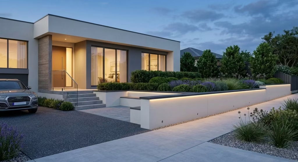
A low garden wall is one of the most effective architectural devices in a front yard. It establishes boundary without creating defensiveness. It frames planting, strengthens alignment, and visually anchors the house to the ground plane. Where open lawns can feel exposed or undefined, a low wall introduces proportion and permanence.
In most residential settings, I recommend a wall height between:
- 45–60 cm (18–24 in) for subtle definition
- 60–75 cm (24–30 in) when stronger visual grounding is required
Anything below 45 cm tends to disappear visually. Above 75 cm begins to feel defensive unless the property scale justifies it.
Brick vs Rendered Masonry vs Stone
Material selection should respond directly to the architecture of the house, not compete with it.
Brick
Best suited for: Traditional, Georgian, Victorian, Colonial properties
Pros
- Strong architectural continuity when matching the façade
- Durable and low maintenance
- Creates rhythm through bond patterns
- Excellent longevity in freeze-thaw climates
Cons
- Limited tonal flexibility if matching existing brickwork
- Requires skilled bricklaying for clean detailing
- Can appear heavy if proportions are incorrect
Brick works particularly well when capped with a stone or precast coping to introduce a visual shadow line.
Rendered Masonry
Best suited for: Contemporary and transitional homes
Pros
- Clean, minimalist appearance
- Flexible colour options
- Can visually widen a frontage
- Works well with concealed lighting integration
Cons
- Requires high-quality waterproof detailing
- Hairline cracking possible over time
- May require repainting every 7–10 years
In modern projects, I often integrate recessed LED strips beneath coping stones to create subtle night-time definition.
Natural Stone
Best suited for: Country homes, luxury properties, or rustic-modern architecture
Pros
- Premium aesthetic
- Ages beautifully
- Textural richness enhances planting
- High resale perception
Cons
- Higher installation cost
- Requires skilled stonemasonry
- Material sourcing consistency can vary
Stone introduces depth and shadow that flat materials cannot replicate. It pairs particularly well with layered planting compositions.
When Retaining Walls Double as Seating
Where there is even minor level change across the front yard, retaining walls can serve dual purposes.
A wall at 45–50 cm (18–20 in) naturally aligns with comfortable bench seating height. This transforms a structural element into a functional feature.
Applications include:
- Framing entry steps
- Defining raised planting beds
- Creating informal seating near a front courtyard
- Softening transitions between driveway and garden
For seating functionality, consider:
- Smooth stone or timber coping for comfort
- Minimum wall thickness of 225 mm (9 in) for stability
- Proper drainage behind retaining walls
- Structural footing depth below frost line in colder regions
In a recent renovation involving a gently sloped 9 m (30 ft) frontage, we introduced a 60 cm (24 in) high rendered retaining wall along one boundary. Rather than perceiving it as a barrier, it functioned as both seating and a visual base. The home immediately felt more grounded, and the previously sloping lawn gained architectural structure.
Design Takeaway
Low architectural garden walls:
- Introduce proportion and permanence
- Strengthen façade alignment
- Improve curb appeal perception
- Provide opportunity for integrated seating
- Enhance planting composition
When designed at the correct height and executed with material discipline, they elevate a front yard from decorative to architectural. Structure establishes presence. Planting then refines it.
Symmetrical Layout for Formal Homes
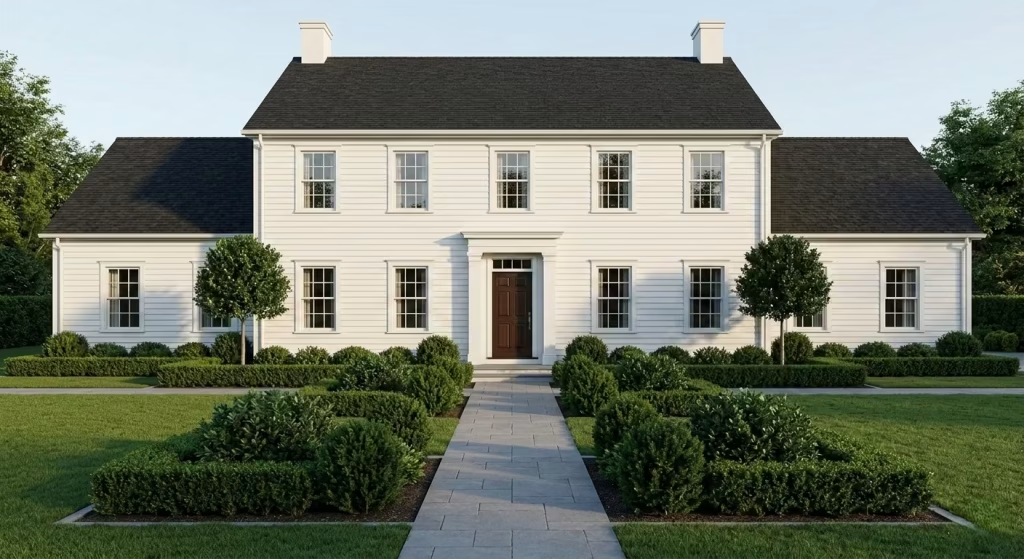
Symmetry is most powerful when it reflects the character of the house rather than forcing order onto the landscape. In formal residential architecture, especially classical or heritage-inspired homes, a symmetrical front yard composition communicates stability, refinement, and timeless presence.
I often associate symmetrical landscaping with traditional architectural language. Homes influenced by Georgian, Colonial, or other classical design traditions naturally respond well to balanced spatial framing. The objective is not decorative repetition but quiet proportional harmony between left and right visual fields.
Suitable Architecture Types
Symmetrical layout design works best when the façade itself carries formal geometry.
Typical property styles that benefit include:
- Classical or heritage-inspired residences
- Houses with centralised entrance doors
- Buildings with evenly spaced windows and structural rhythm
- Properties where the main axis aligns directly with the entry point
If the architecture is already asymmetrical, forcing symmetry into the garden can feel visually uncomfortable. In such cases, I prefer controlled balance rather than mirror duplication.
Balanced Shrub Placement
In symmetrical front yard design, planting should mirror structural anchors rather than replicate botanical variety.
Practical guidelines I use in real projects:
- Select 3 to 5 plant species maximum for formal compositions
- Mirror plant groups rather than individual plants
- Maintain consistent pruning height across both sides
- Allow mature canopy spread to remain visually equal
Spacing considerations:
- Medium shrubs: 70–90 cm (28–36 in) centres
- Low structural hedging: 40–60 cm (16–24 in) centres
- Distance from pathway edge: minimum 50 cm (20 in)
Overcrowding destroys symmetry more quickly than poor plant selection. The goal is calm repetition, not botanical density.
Evergreen species are particularly useful here because they maintain structural balance throughout winter. Seasonal flowering plants should be used sparingly as accent details rather than primary mass.
When Symmetry Enhances Property Architecture
Symmetry becomes most valuable when the home already communicates order through its structure.
I typically recommend symmetrical landscaping when:
- The entrance is centrally positioned
- The frontage width exceeds approximately 10 m (33 ft)
- The building façade has formal architectural detailing
- The homeowner prefers a composed, low-variation landscape
Symmetry is less suitable when:
- The property sits on irregular terrain
- The house follows contemporary organic architecture
- Naturalistic garden philosophy is desired
In my experience, one of the strongest applications of symmetry was on a 13 m (43 ft) wide classical-style frontage where we placed matching evergreen columns at 4 m (13 ft) from the entrance axis. The planting was simple, almost restrained. Yet the property immediately read as authoritative and well-proportioned from the street.
Design Takeaway
Symmetrical landscaping is not about duplication. It is about architectural balance. When plant masses, pathway alignment, and façade geometry reflect each other, the front yard feels settled rather than staged.
True symmetry is quiet confidence expressed through proportion. It should frame the home, not call attention to itself.
Asymmetrical Naturalistic Design for Contemporary Homes
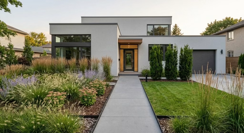
Asymmetrical landscaping is often misunderstood as “wild” or spontaneous design. In professional residential work, naturalistic composition is not about randomness. It is about orchestrated irregularity. The goal is to capture the softness of nature while maintaining architectural discipline.
For contemporary homes, I approach asymmetry as a visual breathing strategy. Straight lines and rigid mirroring are softened, but structure never disappears. The garden should feel organic yet intentional, as though it evolved thoughtfully rather than accidentally.
Controlled Informality
The key distinction in naturalistic front yard design is control beneath apparent freedom.
Practical guidelines I follow:
- Maintain a dominant circulation axis even when planting is irregular
- Repeat at least one structural plant species across the composition
- Limit plant species diversity to approximately 4–7 types
- Allow negative space to remain visible
Negative space is extremely important. Without it, naturalistic gardens quickly turn visually chaotic.
Asymmetry works best when massing is balanced rather than mirrored. For example, a larger planting cluster on one side can be offset by vertical structure or architectural wall elements on the opposite side.
Grasses and Structural Perennials
Ornamental grasses are central to contemporary naturalistic landscaping because they introduce movement without density.
I typically use grasses with mature heights of:
- 60–120 cm (2–4 ft) for foreground and mid-layer zones
- Taller species up to 1.8 m (6 ft) as backdrop accents where scale allows
Grasses respond beautifully to wind and light, creating subtle motion that prevents the frontage from appearing static.
Structural perennials should provide seasonal interest but also maintain skeletal presence during dormancy.
Recommended characteristics include:
- Upright growth habit
- Medium foliage density
- Predictable spread pattern
Spacing is usually set between 70–100 cm (28–39 in) depending on species mature width.
Avoiding Visual Chaos
Naturalistic design fails when planting volume exceeds spatial clarity. The biggest mistake I see is overlayering species without considering viewing distance from the street.
To maintain visual order:
- Group plants in repeating clusters rather than scattering them
- Keep pathway edges clearly readable
- Maintain a visible transition zone between lawn, bed, and architecture
- Use one dominant texture and two supporting textures
In one residential project with a 9 m (30 ft) contemporary frontage, we replaced a mixed flower bed containing nine species with a structured arrangement of three grasses and two evergreen shrubs. Plant count decreased by nearly 40%, but visual quality improved dramatically because the composition became legible.
Design Takeaway
Asymmetrical naturalistic landscaping is about emotional softness with intellectual control. The garden should appear relaxed, almost effortless, yet every plant cluster must have deliberate placement.
Nature-inspired design does not mean uncontrolled growth. It means guiding natural forms into architectural harmony. The most successful contemporary front yards feel alive, but never noisy.
You May also Like: 15 Modern Outdoor Sofa Ideas to Transform Your Patio Into an Outdoor Oasis
Greenery & plant-focused ideas
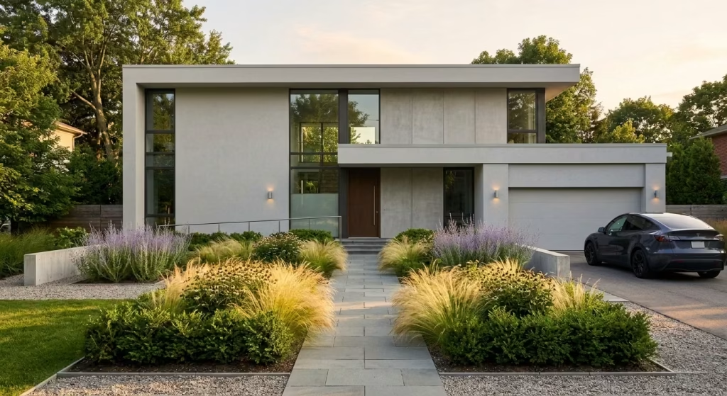
Planting is where a front yard begins to feel alive. After circulation, proportion, and structural framing are resolved, greenery introduces softness, movement, and seasonal rhythm. I approach planting not as decoration, but as a living architectural material that evolves slowly over time. The best front gardens feel settled rather than busy, where foliage provides presence without competing with the house itself.
Statement Tree Placement for Vertical Emphasis
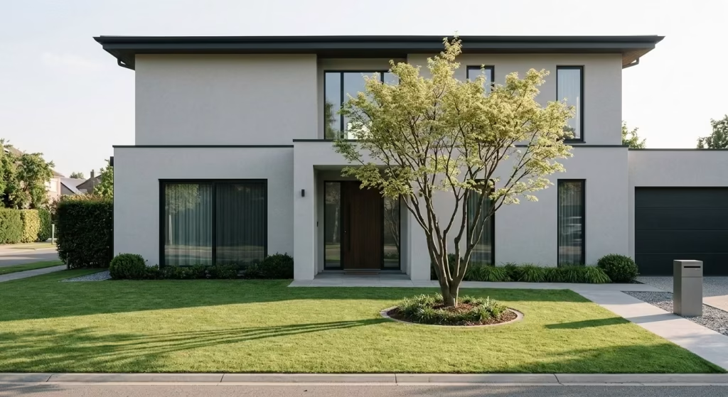
A statement tree is not simply a planting choice. It is a spatial decision that influences how the entire frontage is perceived from the street. In professional landscape composition, I treat a specimen tree as a living column that balances the horizontal spread of the façade.
The goal is maturity of presence rather than density of planting. One carefully selected tree with proper scale and placement often delivers stronger architectural authority than several smaller ornamental trees scattered across the lawn.
Minimum Setback from Foundation
I generally recommend positioning a statement tree:
- 3–6 m (10–20 ft) from the building foundation
- Further if the species has aggressive root expansion
This distance protects structural integrity while allowing canopy development.
Root behaviour varies by species. Shallow root systems are generally safer near buildings, but all trees should be planted with long-term growth projection in mind.
Key precautions:
- Avoid planting directly over drainage pipes or utility lines
- Allow soil volume sufficient for mature root respiration
- Install root barrier membranes if necessary in constrained sites
The objective is harmony between building and natural growth, not competition.
Root System Considerations
Understanding root morphology is critical. Trees with dominant taproot structures are often more suitable near residential façades because lateral spread is slower during early maturity. However, many urban landscape species develop fibrous root networks that expand horizontally.
Practical planning notes:
- Use planting pits at least 1.2 m (4 ft) diameter for medium trees
- Depth should typically be 60–90 cm (24–36 in) depending on soil type
- Incorporate organic soil conditioning during installation
Proper root establishment during the first three years determines long-term structural stability.
Scale Proportion Relative to Façade
Tree height at maturity should visually relate to building height.
As a general design rule I follow:
- Tree mature height ≈ 50–80% of façade wall height
For example:
- If façade height is 6 m (20 ft), select species reaching roughly 3–5 m (10–16 ft) canopy height unless vertical emphasis is desired.
Multi-stem ornamental trees work exceptionally well for contemporary homes because they provide vertical rhythm without overwhelming the entrance view.
Placement should also respect sight lines from the street. The trunk should frame, not block, the primary architectural view.
Real Project Insight
On a residential renovation project with a 14 m (46 ft) wide frontage, the client initially requested three young ornamental trees spaced evenly across the lawn.
During design review, I recommended replacing them with one structured multi-stem specimen tree positioned slightly offset from the entry axis at approximately 4.5 m (15 ft) from the façade.
The previous layout fragmented the visual field. Multiple small trees created competing vertical signals that diluted architectural clarity.
After installation, the single specimen tree established a dominant vertical presence. The lawn regained spatial calm, and the house façade became the primary focal element. The landscape felt more mature despite having fewer plants.
This change also simplified long-term maintenance and reduced pruning complexity.
Pros and Cons
Pros
- Strong architectural focal point
- Improves perceived property maturity
- Simplifies planting composition
- Enhances vertical balance
Cons
- Requires careful species selection
- Growth is slow in early years
- Poor placement is difficult to correct later
Design Takeaway
A statement tree should behave like a structural element of the house rather than a decorative addition to the garden. The most successful specimen trees are those that feel inevitable in their placement, as though the frontage was always meant to grow around them.
When scale, setback, and species selection are aligned, a single tree can carry the visual weight of an entire planting scheme.
Native Plant Landscaping for Climate Efficiency
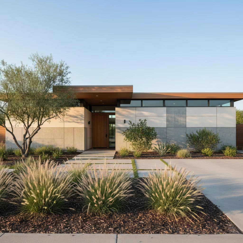
Native planting is one of the most rational long-term strategies in residential landscape design. I approach it from a performance perspective rather than an aesthetic trend perspective. The strongest front yards are not necessarily the most colourful, but the most ecologically stable across seasons.
Native species are plants naturally adapted to local rainfall patterns, soil composition, and seasonal temperature cycles. This reduces landscape stress and allows the frontage to mature with less intervention.
Reduced Irrigation
One of the greatest advantages of native landscaping is water efficiency.
In United Kingdom style climates, native plants are typically adapted to moderate rainfall distribution, reducing artificial irrigation demand once establishment is complete.
In United States landscapes, native planting is more regionally segmented. For example, desert-adapted species perform differently from temperate coastal species.
Practical design guidance:
- Initial establishment watering: 12–24 months after planting
- Mature landscape irrigation reduction: often 40–70% compared to exotic ornamental gardens
- Mulching depth: 50–75 mm (2–3 in) to retain moisture
From my project experience, once native beds mature beyond the third year, irrigation frequency can often be reduced significantly without visual decline.
Lower Maintenance Landscape
Native planting simplifies long-term garden management.
Benefits include:
- Natural pest resistance
- Predictable seasonal growth cycles
- Reduced fertiliser dependency
- Better soil microbiome stability
However, maintenance is not eliminated. Native landscapes still require:
- Annual structural pruning
- Weed suppression during early establishment
- Monitoring for invasive species competition
The misconception that native gardens are “no maintenance” is one I often correct with clients. They are lower maintenance, not maintenance free.
UK vs US Regional Differences
Plant selection must follow climate ecology rather than cultural preference.
In the United Kingdom, native planting often emphasises:
- Hardy perennial structure
- Moisture-tolerant species
- Wind-resistant foliage
- Seasonal subtle colour variation
In the United States, native landscape design varies widely by region:
- Coastal zones prioritise salt tolerance
- Inland continental zones require drought resilience
- Southern regions often emphasise heat-resistant species
This regional variation means native landscaping must always be site-specific rather than nationally generalized.
Pros and Cons Discussion
Pros
- Long-term ecological stability
- Reduced watering cost
- Better seasonal adaptation
- Supports local biodiversity
- Landscape ages gracefully
Cons
- Initial visual impact may feel restrained
- Flower colour diversity may be limited during certain seasons
- Species availability may depend on local nurseries
- Requires thoughtful species grouping to avoid monotony
Native plant gardens often develop a quiet maturity that highly ornamental landscapes struggle to achieve.
Design Takeaway
Native landscaping is ultimately a philosophy of restraint. The goal is not to showcase botanical variety but to create a frontage that belongs naturally to its environment.
The most successful front yards are those where planting does not fight climate or soil behaviour. Instead, the garden becomes a continuation of the surrounding landscape ecology. Over time, native plant compositions often age better than high-maintenance ornamental schemes.
Evergreen Framework for Year-Round Structure
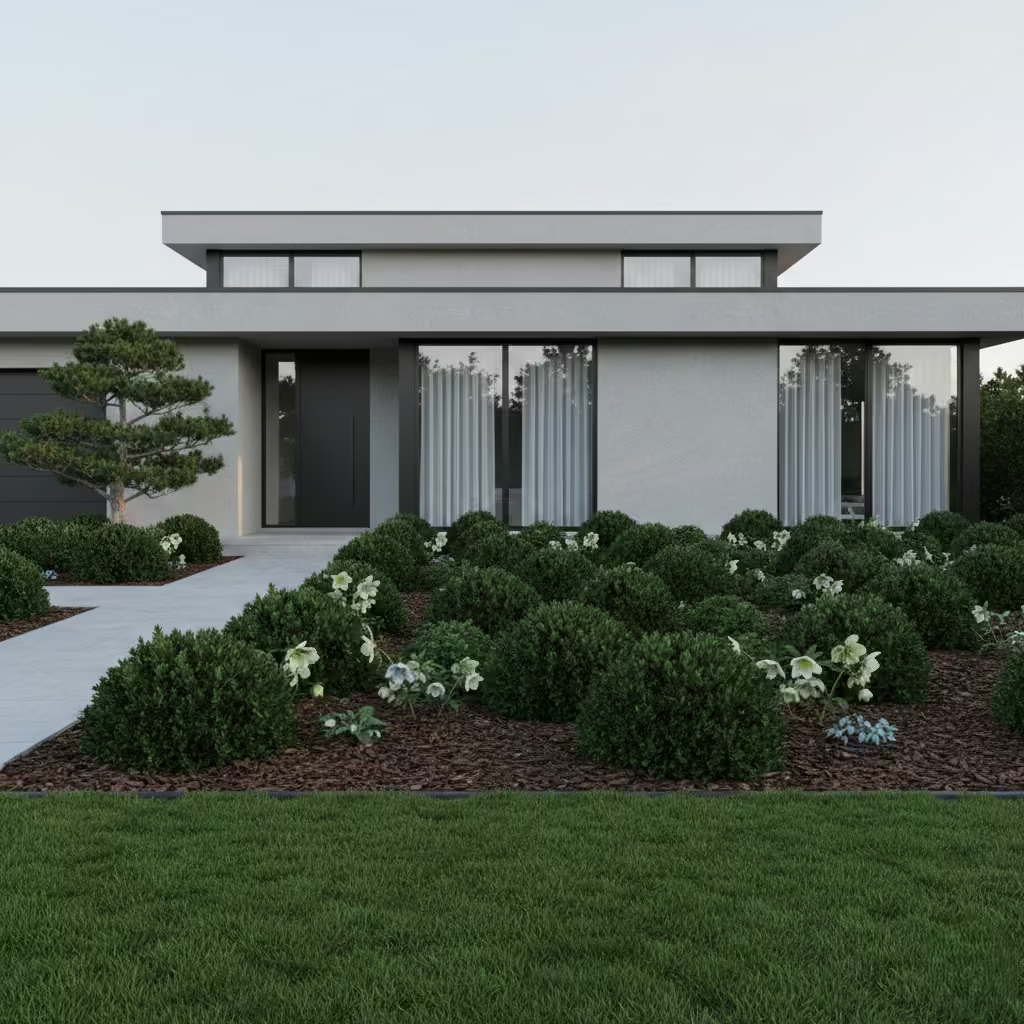
An evergreen framework is the backbone of reliable front yard composition. While flowers and seasonal foliage provide character, evergreen planting provides continuity. I treat evergreen massing as the garden’s skeletal system, supporting visual structure when other plants enter dormancy.
The greatest weakness of many residential front yards is seasonal fragmentation. In winter or dry months, beds can appear empty if structural greenery is not prioritised.
Structural Shrub Spacing
Correct spacing is essential for long-term canopy development and airflow.
Recommended spacing for evergreen shrubs:
- 60–90 cm (2–3 ft) centre-to-centre for medium structural species
- Larger species may require up to 1.2 m (4 ft) depending on mature spread
The planning principle is simple: plant for mature size, not nursery size.
Overcrowding is one of the most common landscape failures I encounter in residential projects. When shrubs are planted too tightly, pruning becomes constant, airflow decreases, and disease risk increases.
Allowing plants to reach their natural mature width preserves shape and reduces long-term maintenance burden.
Avoiding Seasonal Emptiness
Evergreen structure ensures that the frontage retains definition during leafless or low-growth periods.
Key strategies include:
- Using evergreen shrubs as bed anchors near pathways and façades
- Combining evergreen mass with limited seasonal flowering accents
- Maintaining at least 60–70% evergreen composition in structural zones
Seasonal plants should behave like decorative highlights rather than primary composition drivers.
In one residential frontage renovation measuring approximately 11 m (36 ft) wide, we removed an excessive mixed flower scheme and replaced it with three evergreen shrub species arranged in repeating clusters. Although plant variety decreased, spatial clarity increased significantly, and the garden retained presence even in winter.
Maintenance Reality
Evergreen frameworks are not maintenance-free, but they reduce visual volatility.
Typical care requirements include:
- Light structural pruning 1–2 times per year
- Mulching renewal annually
- Monitoring inner canopy density for airflow
Pruning should aim to preserve natural form rather than sculpting excessive geometric shapes unless the design is formally architectural.
Pros and Cons
Pros
- Year-round frontage stability
- Strong curb appeal in dormant seasons
- Lower replanting frequency
- Supports layered planting compositions
Cons
- Initial establishment period may feel slow visually
- Requires species selection aligned with climate zone
- Some evergreen species grow slowly in early years
You May also Like: 25 Outdoor Patio Ideas That Elevate Everyday Living
Design Takeaway
Evergreen frameworks give the front yard its long-term voice. Flowers may change, colours may shift, but structural greenery provides continuity.
The most refined landscapes are not those that change dramatically with every season, but those that remain visually coherent throughout the year. Structure should never disappear when nature rests.
Mixed Texture Beds
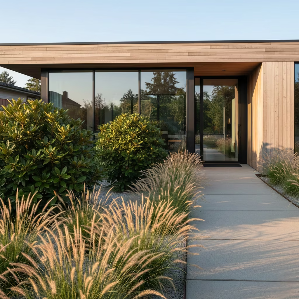
Texture is often more important than flower colour in high-quality front yard composition. While vibrant blooms attract immediate attention, it is the interplay of leaf structure, density, and movement that gives a garden architectural maturity.
I design mixed texture beds to feel quietly dynamic. The eye should move naturally across the planting zone without encountering visual noise. The objective is not botanical complexity but controlled contrast.
Contrast: Fine vs Bold Foliage
Successful mixed beds typically combine two primary foliage characters.
Fine Texture Plants
These introduce softness and visual transition.
Typical examples include:
- Ornamental grasses
- Small-leaf shrubs
- Feathered or linear foliage species
Recommended proportion: about 40–50% of bed volume
Fine texture plants work best in foreground and mid-layer zones because they reduce visual hardness near pathways.
Bold Texture Plants
These provide structural weight and presence.
Characteristics include:
- Large leaf surfaces
- Dense branching structure
- Strong silhouette definition
Recommended proportion: about 50–60% of bed volume
Bold foliage usually anchors the backdrop or mid-layer composition.
The contrast between fine and bold foliage creates architectural tension that prevents the bed from appearing flat.
Visual Rhythm in Planting Design
Rhythm in landscaping is similar to rhythm in architecture or music. Repetition with slight variation creates calmness.
Practical rhythm techniques I use:
- Repeat one dominant species at intervals of 1.5–2.5 m (5–8 ft) depending on frontage scale
- Avoid random species scattering
- Group plants in clusters rather than mixing individually
Mixed texture beds should feel structured even when plant placement appears natural.
Layering Within Texture Composition
A typical mixed texture front bed may follow this simplified hierarchy:
- Foreground: soft grasses or low groundcover
- Mid-layer: medium density shrubs
- Backdrop: structural evergreen or architectural planting
Bed depth should ideally be between 1–2 m (3–6.5 ft) to allow proper layering.
Shallow beds tend to compress texture differences, making contrast ineffective.
Real Project Insight
On a contemporary residential frontage of approximately 10 m (33 ft), I replaced a highly mixed flower bed containing eight species with a composition of three plant types.
The new design used:
- One fine-texture ornamental grass species
- Two bold evergreen shrub species
- Repeating cluster placement at 2 m (6.5 ft) intervals
Plant diversity decreased, but visual quality improved because the bed became readable from the street. The frontage felt calmer, more mature, and architecturally resolved.
Pros and Cons
Pros
- Adds sophistication through subtle contrast
- Reduces visual monotony
- Improves spatial rhythm
- Supports long-term landscape aging
Cons
- Requires careful species selection
- Overmixing destroys clarity
- Poor spacing can create cluttered appearance
Design Takeaway
Mixed texture beds succeed when contrast is deliberate and repetition is controlled. The most refined front yards do not depend on botanical variety alone. Instead, they rely on the relationship between foliage forms.
When fine and bold textures work together within measured rhythm, the planting reads as composed architecture rather than random horticulture.
Sculpted Topiary for Controlled Elegance
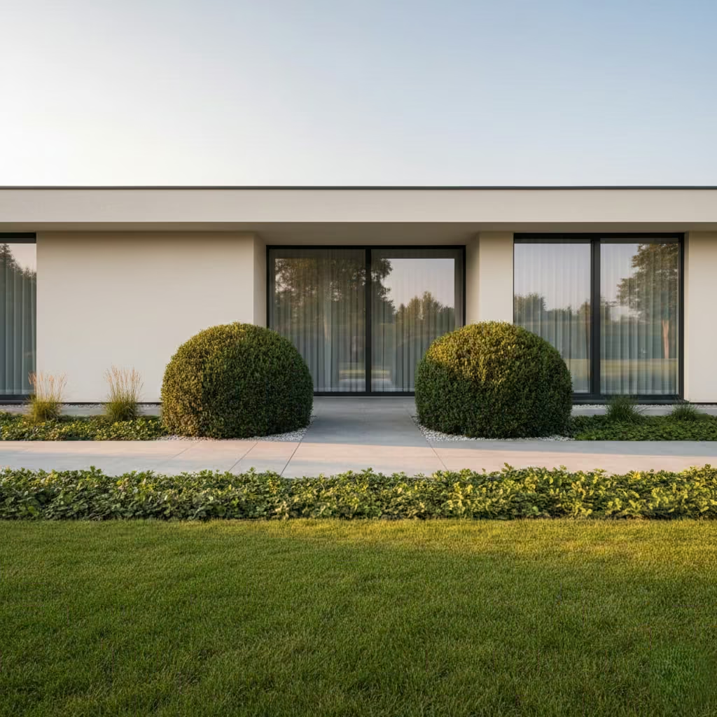
Topiary planting belongs to formal landscape language. It expresses control, permanence, and architectural clarity. I use sculpted greenery when the house itself carries structured geometry or classical detailing.
Topiary is not meant to imitate natural growth. It is intentionally shaped vegetation functioning almost like living sculpture.
The best results occur when topiary acts as punctuation rather than mass planting.
Best Architectural Contexts
Topiary works exceptionally well with:
- Classical or heritage-inspired homes
- Symmetrical frontage compositions
- Properties with masonry or formal façade detailing
- Entryway framing zones
In contemporary architecture, I use topiary sparingly, often as accent elements near doorways, steps, or boundary transitions.
Species selection is critical. Plants must respond well to repeated trimming and maintain dense internal foliage structure.
Maintenance Frequency Expectations
Topiary design must be planned with long-term care reality.
Typical trimming schedule:
- Light shaping: every 6–8 weeks during active growing seasons
- Structural pruning: 2 times per year for form correction
- Detailed refinement: before major seasonal transitions
Ignoring pruning rhythm causes topiary shapes to lose definition quickly.
From experience, maintenance commitment is the primary factor clients underestimate. Topiary rewards consistency but punishes neglect.
Spatial Placement Guidelines
Recommended positioning:
- Entry framing pairs: 60–100 cm (2–3.3 ft) from pathway edge
- Height proportion: mature topiary height should typically be 40–70% of nearby façade window height
Too tall topiary near entrances can create visual compression.
Allow airflow around sculpted plants to reduce fungal risk and improve foliage density.
Pros and Cons
Pros
- Highly refined, premium visual character
- Strong architectural symmetry support
- Excellent for formal property styling
- Enhances perceived property value
Cons
- Labour-intensive maintenance
- Requires skilled pruning technique
- Shape degradation occurs if pruning is inconsistent
- Not suitable for very naturalistic garden philosophy
Design Takeaway
Sculpted topiary represents the intersection of horticulture and architecture. It is the language of control expressed through living material.
The most successful topiary installations are those where form appears inevitable, not forced. Geometry should feel settled into the landscape, supporting the building rather than competing with it.
Hard landscape features
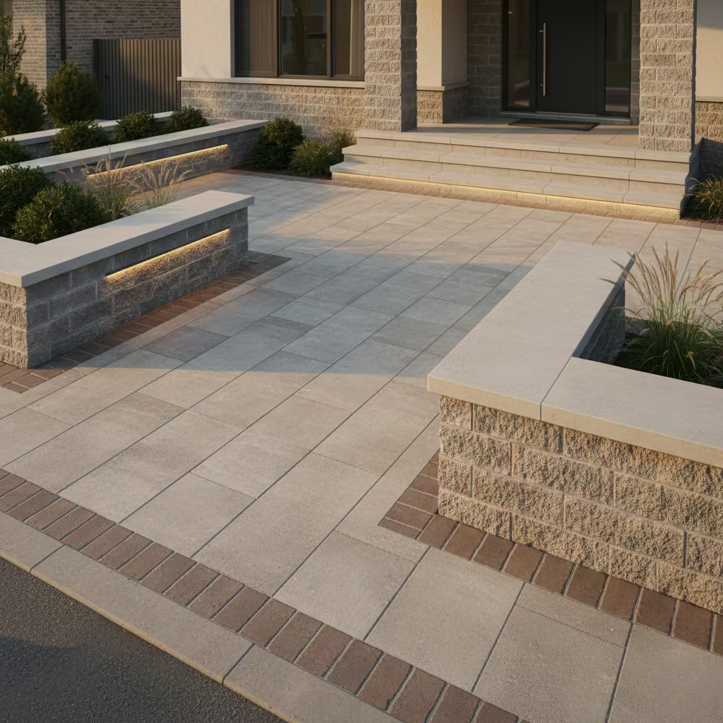
Hard landscape features provide the structural foundation of a front yard, shaping how space is experienced before planting is introduced. Pathways, walls, steps, paving, and water or lighting elements establish circulation logic, durability, and architectural rhythm. I approach hardscape design as permanent landscape furniture; it should age gracefully, require reasonable maintenance, and maintain proportional harmony with the façade. When executed with restraint and material consistency, hard landscaping gives the frontage quiet strength while allowing greenery to provide softness and life.
Modern Concrete Driveway with Soft Borders
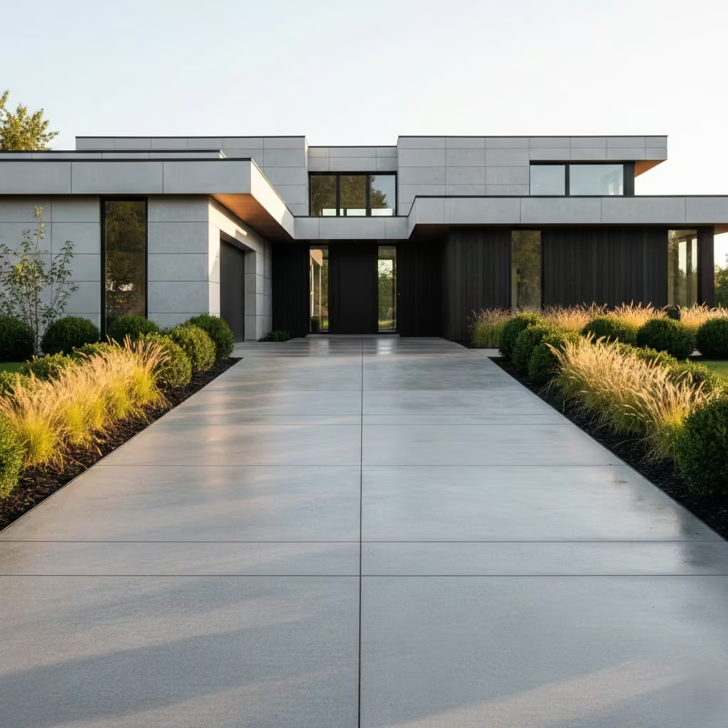
A modern concrete driveway works best when it balances architectural precision with landscape gentleness. The driveway is not simply a vehicle surface; it is a transitional platform between street and home. I design concrete driveways to feel solid and reliable while allowing planting or edging to soften the visual hardness of the material.
Driveway Width Planning
For residential frontage, I typically recommend:
- Single-car driveway width: 2.7–3 m (9–10 ft)
- Additional margin may be required for vehicle door clearance or pedestrian movement.
Widths below 2.5 m (8 ft) often feel restrictive during parking manoeuvres. Wider driveways, while convenient, can sometimes weaken frontage greenery unless balanced with border planting.
The visual goal is not maximal paving coverage but functional circulation with landscape breathing space.
Expansion Joints in Concrete Surfacing
Concrete naturally expands and contracts due to temperature variation. Expansion joints are essential for crack control.
Practical guidance:
- Joint spacing: typically 3–4 m (10–13 ft) depending on slab size
- Depth should reach the sub-base layer
- Joint material should remain flexible to accommodate movement
In projects I have supervised, ignoring joint planning usually leads to surface cracking within several seasonal cycles.
Drainage Slope Requirement
Proper surface drainage protects both structure and usability.
Recommended slope:
- 1–2% gradient away from the house façade
- This equals approximately 10–20 mm fall per metre (0.4–0.8 in per 3.3 ft)
The slope should be visually imperceptible but technically effective.
Standing water on driveways reduces material lifespan and creates staining risk, particularly in colder or high humidity climates.
Soft Border Integration
Concrete driveways benefit significantly from soft landscape edges.
Soft borders can include:
- Narrow evergreen hedging strips (40–60 cm / 16–24 in width)
- Low ornamental grasses
- Stone or steel edging profiles
The purpose is to prevent the driveway from visually dominating the frontage.
In one residential renovation project with a 12 m (39 ft) wide frontage, replacing hard curb edging with a 50 cm (20 in) planting border transformed the driveway from a dominant feature into a supporting circulation element.
Pros and Cons
Pros
- High structural durability
- Clean contemporary aesthetic
- Low surface deformation risk
- Easy vehicle movement
Cons
- Requires precise installation base preparation
- Can appear visually heavy without soft borders
- Surface colour may weather over time
- Thermal heat retention in summer climates
Design Takeaway
A modern concrete driveway should behave like architectural ground plane rather than parking infrastructure. When slope, jointing, and soft landscape borders are carefully calibrated, the driveway becomes part of the frontage composition rather than a separate functional strip. The best driveways are felt more than they are noticed.
You May also Like: 15 Stunning Modern Barndominium Exterior Ideas to Inspire Your Dream Home
Gravel Courtyard-Style Front Garden
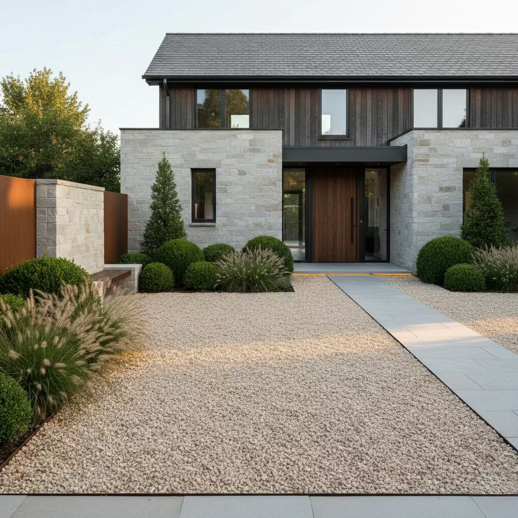
A gravel courtyard front garden works best when it is treated as a spatial composition rather than loose surfacing. Gravel introduces quiet texture, excellent drainage performance, and a subtle informal elegance that suits contemporary and country-modern homes alike. I often use gravel courtyards when the design objective is to reduce visual heaviness while maintaining structural definition.
Ideal Depth Planning
For meaningful courtyard character, the planting or circulation zone should have:
- Minimum frontage depth: 5 m (16 ft) from boundary to façade where site size allows
- Narrower sites can still use gravel, but visual impact becomes limited below this threshold.
This depth allows space for:
- Pathway circulation
- Small seating or entry transition zones
- Structural planting clusters
- Lighting integration
Shallow gravel zones often look like surface decoration rather than architectural landscape.
Pros: Permeability and Environmental Performance
Gravel is highly valued for water management.
Key advantages include:
- Excellent surface drainage
- Reduced standing water risk
- Ground infiltration support
- Lower runoff pressure on stormwater systems
- Natural acoustic softness when walked on
Permeable surfaces are particularly useful in climates with frequent rainfall or rapid temperature variation.
From experience, gravel courtyards age gracefully when sub-base preparation is correct. The surface develops a mature, settled character after the first year.
Cons: Migration Control
Gravel movement is the primary technical challenge.
Without containment strategy, gravel will slowly spread into lawns, pathways, and drainage zones.
Control methods I recommend:
- Install steel or stone edging buried at least 75–100 mm (3–4 in) below surface level
- Use angular gravel rather than rounded pebble types to reduce rolling movement
- Select particle size between 8–16 mm (0.3–0.6 in) for residential courtyards
- Compact sub-base layers before gravel placement
Maintenance reality:
- Light raking may be required every few months
- Seasonal top-up gravel may be needed after heavy weather or foot traffic
Design Insight
A gravel courtyard frontage is strongest when it feels deliberately restrained. The objective is not decorative ground coverage but spatial calmness. Gravel performs best when paired with evergreen structural planting, low architectural walls, or controlled lighting.
In one residential frontage renovation measuring roughly 9 m (30 ft) wide, replacing mixed paving with a 6 m (20 ft) gravel courtyard softened the approach sequence. The home felt less rigid and more welcoming, while drainage performance improved during winter rainfall periods.
Design Takeaway
Gravel courtyard gardens express architectural humility. They allow the house façade, planting structure, and circulation rhythm to remain dominant while the ground plane quietly supports movement and climate performance. The success of this feature depends more on containment precision and sub-base preparation than on the gravel itself.
Raised Planters with Integrated Lighting
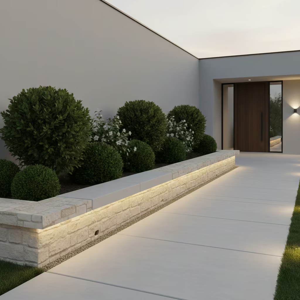
Raised planters are one of the most practical ways to give a front yard visual weight without increasing planting density. I often use them as landscape furniture elements that frame circulation, anchor entry zones, and provide a platform for controlled greenery. When combined with concealed lighting, they transform from daytime structure into night-time spatial definition.
Height Planning
The most comfortable and visually balanced planter height is:
- 45–60 cm (18–24 in) above ground level
This range works well because it allows:
- Easy maintenance access
- Potential informal seating function in some designs
- Strong visual boundary definition without creating a barrier
Planters below 40 cm tend to lose architectural presence, while those above 70 cm can begin to feel defensive unless site scale supports it.
Material and Structural Considerations
Raised planters should be built as long-term landscape elements.
Preferred construction approaches include:
- Reinforced masonry or concrete block core
- Moisture-proof internal lining
- Proper drainage outlet at the base
Drainage is critical. I typically include:
- Gravel drainage layer of 75–100 mm (3–4 in)
- Geotextile separation layer
- Weep holes or drainage pipe exit points
Poor drainage design is the most common cause of planter wall deterioration.
Concealed LED Strip Integration
Lighting transforms raised planters into architectural boundary lines after sunset.
Recommended lighting strategy:
- Install LED strips beneath coping stones or recessed lip channels
- Use warm white lighting around 2700K–3000K for residential frontage
- Avoid high-intensity cool blue lighting which can feel commercial
LED strips should be waterproof-rated (IP65 or higher for outdoor exposure).
Cable routing should be planned during construction, not retrofitted later. I have seen many projects suffer aesthetic damage when wiring was added after wall completion.
Planting Strategy for Raised Beds
Raised planters work best with structural greenery rather than chaotic species mixing.
I usually recommend:
- Evergreen shrubs for primary massing
- Limited flowering accents for seasonal interest
- Spacing based on mature canopy spread
Soil depth inside planter walls should be at least:
- 40–50 cm (16–20 in) for shrubs
- Deeper zones for small tree species if required
Pros and Cons
Pros
- Strong frontage definition
- Supports night-time landscape architecture
- Improves planting visibility
- Can function as informal seating edge
- Enhances modern and formal home styling
Cons
- Construction cost is higher than simple beds
- Requires electrical planning for lighting
- Drainage failure can damage structure
- Maintenance access must be considered
Design Takeaway
Raised illuminated planters are most successful when they behave like architectural base lines for the home. The goal is not to spotlight plants aggressively but to allow greenery and structure to emerge gently from controlled light and form. When height, drainage, and lighting integration are resolved early, the planter becomes a permanent landscape feature rather than a decorative addition.
You May also Like: 25 Outdoor Bar Ideas That Turn Backyards Into Social Hotspots
Stepping Stone Transitional Path
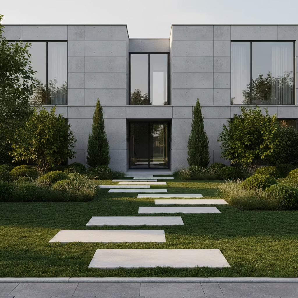
A stepping stone path introduces softness into circulation design. Unlike continuous paving, stepping stones preserve the visual continuity of the lawn while still guiding movement from street edge to entrance. I use this approach when the frontage is wide enough to allow landscape breathing space.
This feature works best when the path feels naturally embedded into the ground plane rather than placed on top of it. Stones should appear settled into the lawn as if they were always part of the terrain.
Spacing Guidelines
The most comfortable walking rhythm is achieved when stepping stones are placed:
- 60–65 cm (24–26 in) centre-to-centre
This spacing corresponds roughly to average adult stride length, allowing natural movement without conscious stepping adjustment.
Installation notes:
- Stones should sit slightly above soil level (about 10–20 mm / 0.4–0.8 in) to prevent water pooling
- Sub-base preparation is essential to avoid long-term sinking
- Each stone must be levelled individually during installation
Irregular height variation is one of the main reasons stepping paths become uncomfortable after the first winter season.
Lawn Width Suitability
Stepping stone paths perform best when the lawn frontage allows spatial framing.
I generally recommend this design when:
- Lawn depth exceeds 4 m (13 ft)
- Pathway is not the primary entry circulation route
- The garden composition includes structural planting on either side
In narrow front yards, stepping stones can appear fragmented or visually crowded.
Material Selection
Preferred materials include:
- Natural stone slabs
- Textured concrete pavers with matte finish
- Sandstone or limestone for premium residential frontage
Stone thickness should typically be 40–60 mm (1.5–2.5 in) for stability.
Avoid highly polished surfaces because they become slippery during rain.
Pros and Cons
Pros
- Maintains lawn continuity
- Creates relaxed, naturalistic circulation
- Reduces hardscape dominance
- Supports contemporary or countryside design language
Cons
- Lawn mowing requires careful trimming around stones
- Uneven settlement may occur if base preparation is weak
- Not ideal for high foot-traffic primary entrances
Design Takeaway
Stepping stone pathways should feel intuitive rather than constructed. The best installations do not attract attention to the path itself but guide movement quietly across the landscape. When spacing, elevation, and material texture are balanced, the stones become part of the lawn’s natural rhythm rather than a separate architectural element.
Statement Entry Steps with Side Planting
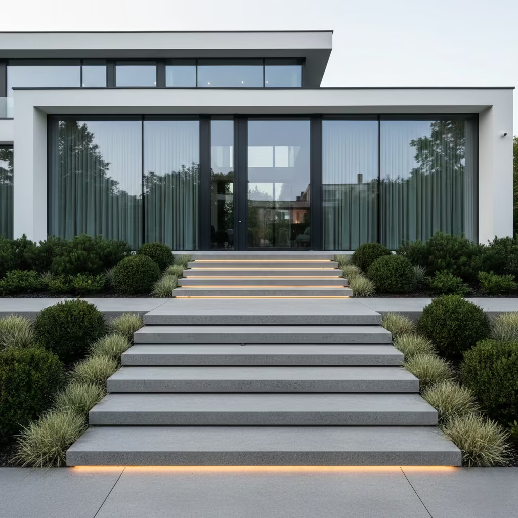
Entry steps are more than functional circulation. They are a spatial threshold where ground plane meets façade. In front yard design, I treat entry steps as quiet ceremonial elements that announce arrival. When proportioned correctly, they add dignity and visual weight to the entrance without excessive ornamentation.
Side planting softens the geometry of steps and prevents the staircase from feeling rigid or isolated.
Step Geometry: Rise and Tread Proportion
Comfort and safety depend on correct dimensional rhythm.
Recommended measurements:
- Rise: 15–18 cm (6–7 in)
- Tread: 28–30 cm (11–12 in)
This ratio follows natural human stride biomechanics, reducing climbing effort and improving long-term usability.
Key technical notes:
- Maintain consistent rise height across all steps
- Tread depth should allow full foot placement without overhang
- Surface material must provide slip resistance, especially in wet climates
In residential renovation work, I have found that inconsistent step height is one of the most noticeable quality defects even in otherwise well-designed frontages.
Side Planting Integration
Planting beside entry steps creates visual enclosure and spatial warmth.
Recommended planting strategy:
- Use low evergreen shrubs or fine texture grasses
- Maintain 40–60 cm (16–24 in) planting bed width along step sides
- Avoid plants that spread aggressively toward walking surfaces
The purpose is to frame movement rather than obstruct it.
In a 10 m (33 ft) frontage project, we installed step-side planting beds filled with compact evergreen shrubs at 50 cm (20 in) spacing. The result was a gradual visual transition from lawn to doorway, making the entrance feel naturally embraced rather than exposed.
Material Considerations
Popular step materials include:
- Natural stone for premium residential homes
- Textured concrete for contemporary architecture
- Limestone or sandstone for classic frontage design
Step thickness should be sufficient to prevent cracking under repeated load.
I strongly recommend integrating subtle lighting along step edges. Low-level warm lighting improves night navigation and enhances architectural depth.
Pros and Cons
Pros
- Creates strong entrance focal hierarchy
- Improves approach experience
- Supports high-quality curb appeal perception
- Works across modern and traditional architecture
Cons
- Requires precise construction tolerance
- Drainage must be carefully planned
- Side planting needs regular trimming
- Material selection affects long-term weathering
Design Takeaway
Statement entry steps should feel inevitable in their placement and proportion. The best designs do not draw attention to technical construction but make arrival feel natural and dignified. When rise, tread, and side planting are harmonised, the entrance becomes a calm architectural introduction rather than a purely functional stair.
Curb appeal enhancements
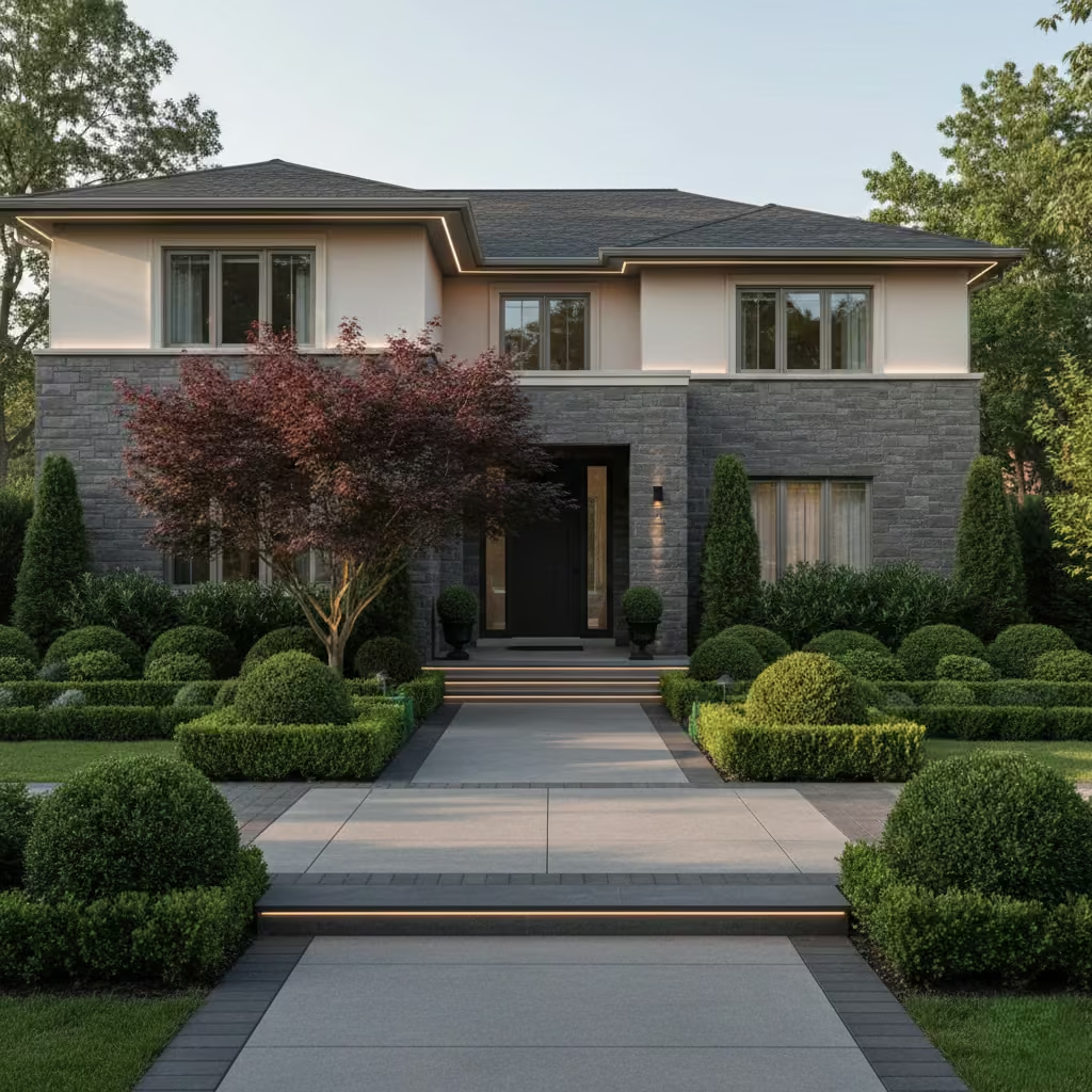
Curb appeal is the emotional first language of a home. It is not about adding decorative elements but about refining how architecture, landscape, and light communicate from the street. I approach curb appeal as a hierarchy of visual experience: structure first, greenery second, and detail accents last. The most successful frontage designs feel composed rather than embellished, where every enhancement supports the character of the house while maintaining long-term relevance.
Layered Exterior Lighting Strategy
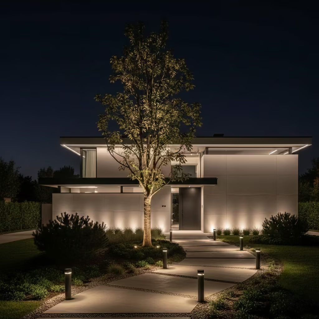
Exterior lighting is not about brightness. It is about controlled visibility and spatial hierarchy. I approach frontage lighting as a three-layer system: vertical emphasis, circulation guidance, and façade definition. When executed with restraint, lighting extends the usability and elegance of the front yard into evening hours without turning the home into a visual spectacle.
Uplighting Trees
Tree uplighting is one of the most effective ways to create vertical landscape drama at night.
Design guidance:
- Position fixtures at the base of the tree trunk, angled upward toward canopy structure
- Distance from trunk: typically 30–60 cm (12–24 in) depending on tree size
- Use shielded fixtures to prevent glare
The purpose is to reveal branching silhouette and foliage texture rather than flood the tree with light.
Multi-stem specimen trees respond particularly well to soft uplighting because shadows naturally emphasise structural form.
Path Lighting Spacing
Circulation lighting should guide movement rather than dominate visual perception.
Recommended spacing:
- Install path lights every 2–3 m (6–10 ft) along walking routes
- Fixture height: typically 40–60 cm (16–24 in) above ground level
Lighting should create a rhythmic sequence rather than continuous illumination.
In one frontage project with a 12 m (39 ft) entry path, I used four low bollard lights spaced at roughly 2.5 m (8 ft). The result was safe navigation without visual clutter.
Colour Temperature: 2700K Warm Lighting
Residential frontage landscapes benefit most from warm spectrum lighting.
Recommended specification:
- 2700K is ideal for comfort and architectural warmth
- Avoid cool white lighting above 4000K in residential gardens
Warm lighting complements natural materials such as stone, brick, and timber while reducing harsh contrast against greenery.
High-intensity blue spectrum light often makes plant foliage appear unnatural at night.
Technical Installation Notes
Professional installation should consider:
- Underground cable protection conduits
- Weatherproof rating of fixtures (IP65 or higher)
- Transformer placement in accessible service zone
- Future maintenance access
Lighting should be integrated during construction planning rather than added later.
Pros and Cons
Pros
- Extends landscape usability into evening
- Enhances architectural silhouette
- Improves safety along circulation paths
- Adds premium visual perception
Cons
- Requires electrical planning and installation cost
- Poor angle placement can create glare
- Overlighting destroys design subtlety
You May also Like: 25 Outdoor Lighting Ideas That Transform Gardens After Dark
Design Takeaway
Layered lighting should feel invisible during the day and quietly transformative after sunset. The most refined front yards are not brightly illuminated but thoughtfully revealed. Light should sculpt the house and landscape rather than compete with them.
When vertical uplighting, path rhythm, and warm colour temperature work together, the frontage gains a gentle night-time identity that feels both safe and architecturally considered.
Decorative Metal or Timber Privacy Screens
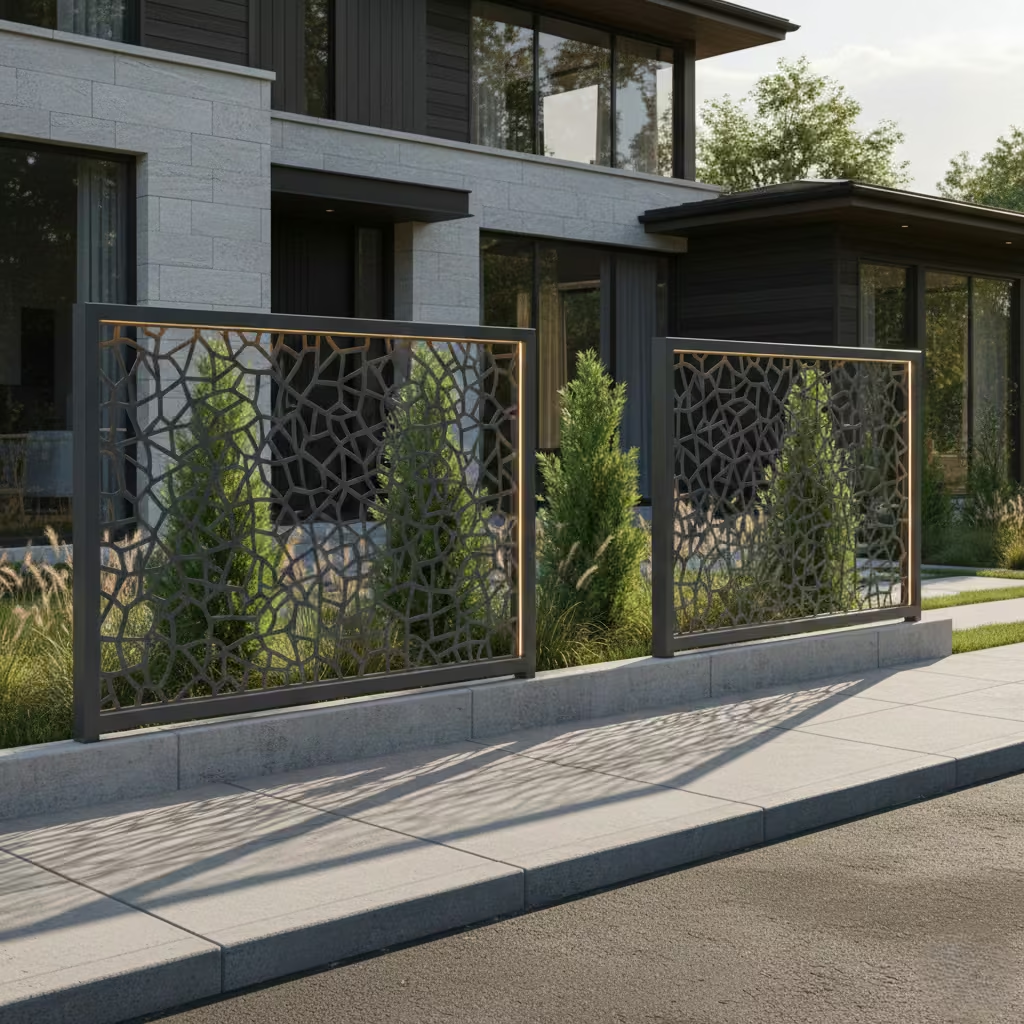
Privacy screening in front yard design is not about separation; it is about selective visibility. I use decorative screens to soften street exposure without creating visual enclosure. The best privacy solutions allow light, air, and partial sight lines while establishing psychological comfort.
Frontage screens work most effectively when treated as architectural panels rather than garden barriers.
Height Planning
Recommended screen height:
- 1.5–1.8 m (5–6 ft)
This range provides comfortable visual privacy for seated or standing eye level while maintaining proportion with residential façade height.
Screens below 1.4 m often fail to provide meaningful privacy. Above 2 m can feel defensive unless the property scale supports it.
Balancing Openness with Screening
The key design principle is permeability.
Instead of solid walls, I prefer patterns that allow:
- Light penetration
- Air circulation
- Partial street visibility
- Shadow movement during daylight
Popular design patterns include vertical slats, geometric cut-outs, or spaced panel modules.
Spacing between slats typically ranges from 20–50 mm (0.8–2 in) depending on privacy requirements.
Material Choices
Powder-Coated Metal Screens
Best suited for modern and contemporary homes.
Advantages:
- High durability
- Minimal maintenance
- Precise geometric detailing
- Works well with LED integration
Consider UV-resistant powder coating for long-term colour stability.
Timber Screens
Best suited for country-modern or transitional architecture.
Advantages:
- Natural warmth and texture
- Ages gracefully with weather exposure
- Harmonises with greenery
Maintenance reality:
- Requires sealing or treatment every 2–3 years depending on climate exposure.
Hardwoods or treated exterior-grade timber perform better than softwood species.
Installation Considerations
Professional installation should include:
- Structural anchoring into concrete or masonry base
- Ground clearance of at least 50 mm (2 in) to prevent moisture wicking
- Corrosion-resistant fasteners for metal screens
- Allowance for thermal expansion in metal panels
Screens should never be installed directly in soil contact.
Pros and Cons
Pros
- Enhances frontage privacy without closing space
- Supports modern architectural expression
- Works as background structure for planting
- Improves street view composition
Cons
- Requires precision fabrication
- Timber options need periodic maintenance
- Improper pattern density can block airflow
Design Takeaway
Decorative privacy screens should behave like architectural veils rather than solid boundaries. The most successful installations feel protective yet open, allowing the frontage to breathe visually while maintaining personal comfort.
When height, pattern permeability, and material quality are carefully balanced, privacy becomes a subtle design feature rather than a physical barrier.
Modern Mailbox and House Number Integration

Mailbox and house number design may appear minor, yet they strongly influence how a frontage is perceived at street level. I treat these elements as navigational markers rather than decorative accessories. The objective is immediate legibility from the road while keeping visual expression restrained and consistent with the home’s architectural language.
Proportion Scaling
Correct scaling is essential.
Recommended design principles:
- House numbers should be readable from approximately 15 m (50 ft) distance.
- Character height should generally be 75–150 mm (3–6 in) depending on frontage scale.
- Background contrast is more important than decorative typography.
Simple, high-contrast numbering often performs better than ornate styles.
Placement should align with either:
- Entry axis line
- Boundary wall panel
- Mailbox integration surface
Avoid positioning numbers behind planting or lighting glare zones.
Mailbox Integration Strategy
Modern frontage design benefits from combining mailbox and house number into a single architectural module.
Preferred installation heights:
- 120–150 cm (4–5 ft) from ground level for visibility
- Slightly lower if pedestrian approach is primary
Design options include:
- Recessed wall-mounted mailbox panels
- Freestanding metal or stone modules
- Backlit number plates
Backlighting is particularly useful for evening readability.
Recommended lighting colour temperature follows residential landscape standards:
- Around 2700K–3000K warm white spectrum.
Material Selection
Mailbox materials should harmonise with façade finishes.
Common premium combinations include:
- Powder-coated aluminium with masonry walls
- Stainless steel with contemporary concrete frontage
- Timber panel backing for country-modern homes
Corrosion resistance is critical for outdoor durability.
Letter slots and doors should close firmly to prevent moisture ingress during rain.
Real Project Insight
On a renovation frontage measuring approximately 11 m (36 ft), I replaced a traditional decorative mailbox with a recessed wall-integrated module.
The design included:
- Brushed metal house number plate
- Subtle LED strip backlighting
- Flush-mounted mailbox compartment
The change simplified the visual front door approach. Instead of competing details, the entry zone gained clarity and calmness.
Pros and Cons
Pros
- Improves visitor navigation
- Enhances premium architectural perception
- Reduces frontage visual clutter
- Works well with modern lighting systems
Cons
- Requires precise installation planning
- Backlit systems need electrical maintenance
- Typography selection must remain timeless
Design Takeaway
Modern mailbox and house number integration should prioritise readability and architectural harmony over ornamentation. The best solutions are those that visitors notice immediately when needed but otherwise blend quietly into the frontage composition. When proportion, contrast, and placement are carefully controlled, these small elements contribute significantly to overall curb appeal quality.
Water Feature as a Focal Anchor
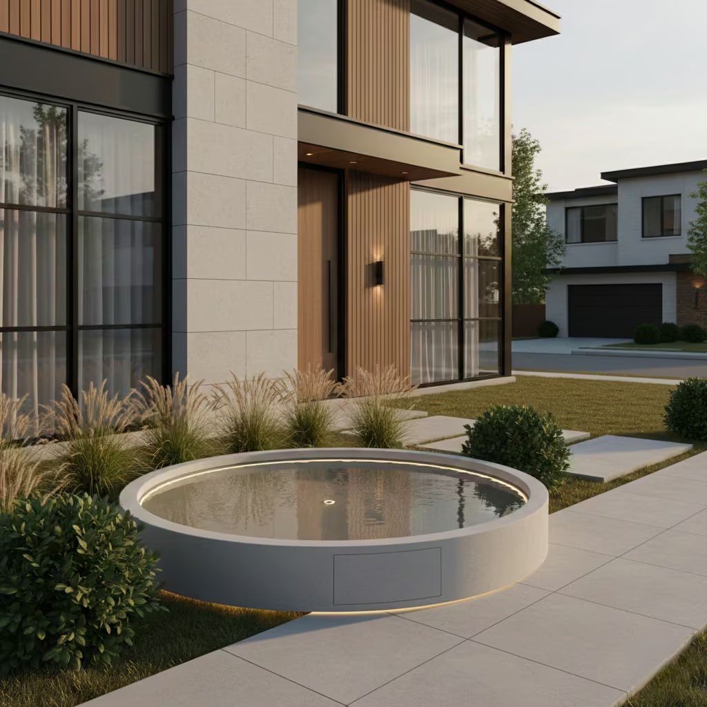
A water feature works best when it behaves as a compositional anchor rather than a decorative object. I use water elements to stabilise visual focus near entry zones, soften hard materials, and add subtle environmental sound. In front yard design, the strongest water features are those that feel still and controlled rather than theatrical.
The psychological effect of reflective water is particularly valuable in residential frontage landscapes. It visually expands space and adds calmness to the approach sequence.
Basin Diameter Planning
For typical residential frontage scale:
- Recommended basin diameter: 90–150 cm (3–5 ft)
This range maintains focal presence without dominating the landscape.
Smaller basins often lose visual weight when viewed from the street. Larger basins are possible for wider properties but require proportional site depth and structural planning.
Ideal placement is usually along the entry axis or slightly offset to create visual interest without blocking circulation.
Maintenance Implications
Water features require long-term care planning before installation.
Key maintenance considerations include:
Water Quality Management
- Install filtration or circulation pumps
- Clean debris weekly in high foliage areas
- Monitor algae growth, especially in warm climates
Stagnant water quickly reduces aesthetic quality.
Mechanical System Access
Design the feature so maintenance technicians can access:
- Pump housing
- Filter units
- Electrical connections
Concealed but serviceable installation is best practice.
Pump failure is the most common operational issue in residential water features.
Seasonal Care
- In colder climates, water may need partial or full drainage during freezing periods
- Leaf fall seasons require more frequent cleaning
- Check seal integrity annually
Material and Construction Notes
Preferred basin materials include:
- Natural stone lining
- Smooth concrete casting with waterproof coating
- Ceramic or composite inserts for modern designs
Basin depth should usually be shallow:
- 20–40 cm (8–16 in) is sufficient for reflective pools.
Deep ornamental ponds are less common in formal frontage design.
Pros and Cons
Pros
- Creates strong focal hierarchy
- Enhances acoustic comfort
- Improves perceived property quality
- Supports reflective architectural lighting
Cons
- Requires continuous maintenance
- Pump systems consume energy
- Algae and debris accumulation risk
- Installation cost is relatively high
Design Takeaway
Water features should feel settled into the landscape rather than placed on top of it. The most refined frontage water anchors do not draw attention through movement alone but through stillness, reflection, and controlled geometry. When basin proportion, water clarity, and surrounding structure are balanced, the feature becomes a quiet centre of architectural gravity.
Seasonal Flower Rotation Strategy
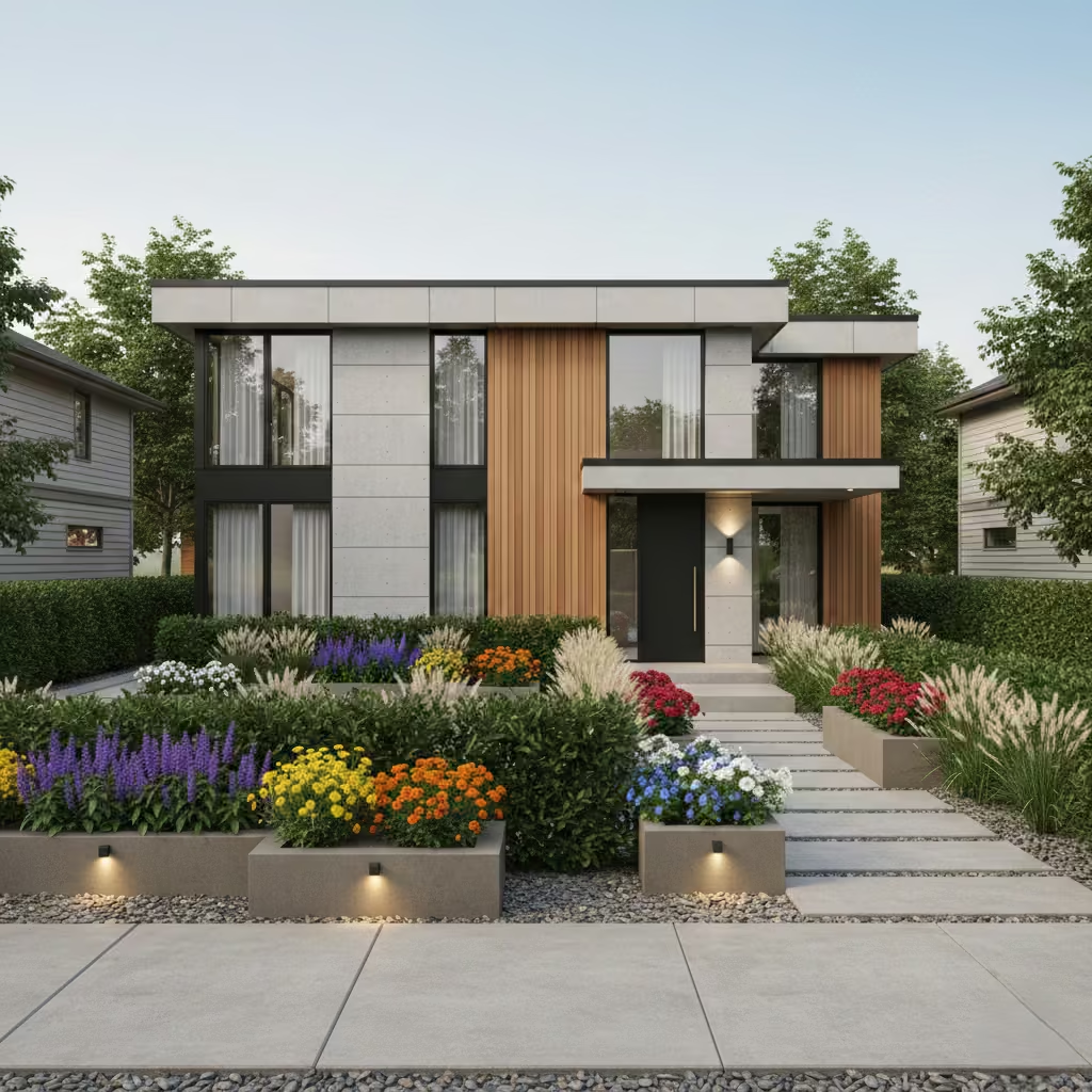
Seasonal flowers should behave like accent layers rather than primary landscape mass. I prefer container-based rotation because it preserves soil stability, reduces installation disruption, and allows flexible colour storytelling across the year. Front yard design should not rely on constant replanting; instead, it should maintain a structural backbone while allowing seasonal character to shift gently.
The philosophy here is simple: structure stays, expression changes.
Container-Based Rotation
Using planters rather than full-bed replanting offers operational and aesthetic advantages.
Recommended approach:
- Place 2–4 dedicated flower zones near entry steps, pathways, or seating edges
- Use removable planter inserts or modular containers
- Rotate flowering species 2–3 times per year depending on climate
Container planting allows quick seasonal transformation without disturbing evergreen framework or soil microbiology.
From practical experience, this method reduces labour cost and landscape stress during transition periods.
Avoid Full-Bed Replanting
Replanting entire frontage beds every season is rarely sustainable in long-term residential landscaping.
Problems with full-bed rotation include:
- Soil structure disturbance
- Root network disruption
- Increased irrigation demand during establishment phase
- Higher maintenance cost
- Risk of visual fragmentation
Instead, maintain:
- 60–70% structural planting (evergreen framework)
- 30–40% seasonal flowering accents
This balance keeps the frontage visually stable while allowing colour variation.
Plant Selection Considerations
Seasonal flowers should be chosen based on:
- Local climate adaptability
- Growth cycle length
- Sun exposure pattern of the frontage
Avoid mixing species with drastically different water or nutrient needs inside the same container.
Recommended container soil depth:
- Minimum 30–40 cm (12–16 in) for flowering plants.
Maintenance Reality
Seasonal rotation usually requires:
- Flower replacement every 8–16 weeks depending on species
- Regular deadheading to prolong bloom life
- Fertilisation adjustment during growth phases
In colder climates, containers can be moved or protected during frost periods.
Pros and Cons
Pros
- Flexible colour design
- Lower long-term landscape disturbance
- Faster seasonal updates
- Better control of soil quality
Cons
- Requires periodic labour for rotation
- Container irrigation must be monitored
- Plants may dry faster than ground beds
Design Takeaway
Seasonal flowers should act like changing accents on a well-composed architectural canvas. The most enduring front yard landscapes are not those that change dramatically each season, but those where structure remains constant while colour evolves quietly. Beauty in frontage design comes from stability first, expression second.
Small front yard solutions
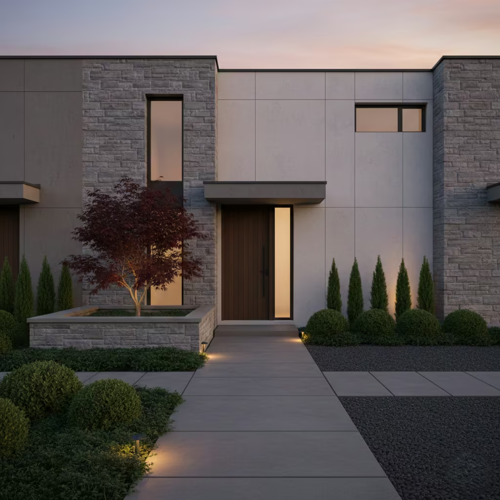
Small front yards require design discipline more than decorative abundance. When space is limited, every element must earn its position through proportion, function, and long-term visual clarity. I approach compact frontage design as an exercise in spatial compression rather than feature accumulation. The objective is to create depth perception, architectural presence, and movement without overcrowding the ground plane.
The most successful small front yards feel larger than their physical measurement because circulation, planting, and material transitions are carefully controlled.
Vertical Green Walls
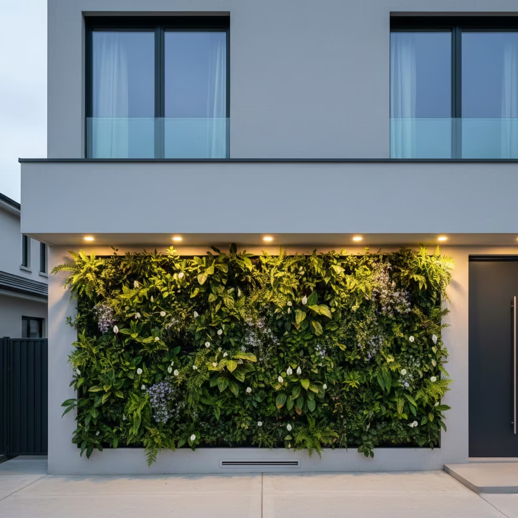
Vertical green walls are one of the most efficient solutions for compact front yards. I use them when the design goal is to preserve circulation width while still achieving a strong vegetative presence. A well-designed vertical wall should feel like a natural extension of the architecture rather than an attached garden panel.
The success of vertical planting depends more on technical installation quality than plant quantity.
Structural Depth Allowance
Recommended construction depth:
- 20–30 cm (8–12 in) from wall surface
This space is necessary for:
- Root substrate accommodation
- Air circulation behind planting layers
- Irrigation channel installation
- Maintenance access
Walls shall never be planted directly without protective moisture barriers.
Moisture penetration is the primary risk for façade damage if backing layers are not properly engineered.
Irrigation Considerations
Vertical walls require controlled watering systems because natural rainfall distribution is often insufficient.
Automated Irrigation Systems
I strongly recommend drip or micro-spray irrigation integration.
Key points:
- Install water distribution tubing before planting panels are mounted
- Use programmable timers adjusted to seasonal evaporation rates
- Ensure overflow drainage exists at the base structure
Water pressure must be stable; uneven distribution causes patchy plant growth.Drainage Management
Proper drainage prevents root rot and structural dampness.
Technical guidelines:
- Include geotextile separation layers
- Provide vertical runoff channels inside the wall system
- Maintain slight outward wall moisture resistance slope if possible
Plant Selection Strategy
Vertical wall plants should have:
- Low invasive root behaviour
- High foliage density
- Good humidity tolerance
- Moderate growth rate
Avoid aggressive climbing species that may damage structural frames.
Recommended maintenance frequency:
- Light trimming every 6–8 weeks during growing season
- Inspection of irrigation emitters monthly
Pros and Cons
Pros
- Excellent space efficiency
- Modern architectural appearance
- Improves frontage microclimate
- Enhances property value perception
Cons
- Installation cost is relatively high
- Mechanical irrigation dependency
- Maintenance discipline is required
- System failure can quickly affect plant health
Design Takeaway
Vertical green walls are most successful when they behave as living architectural cladding rather than decorative vegetation. The aim is to merge structure and plant life into a single frontage element.
When depth control, irrigation precision, and species selection are carefully managed, vertical greenery can transform a small front yard into a spatially mature and visually calm entrance landscape.
Compact Courtyard Seating Niche
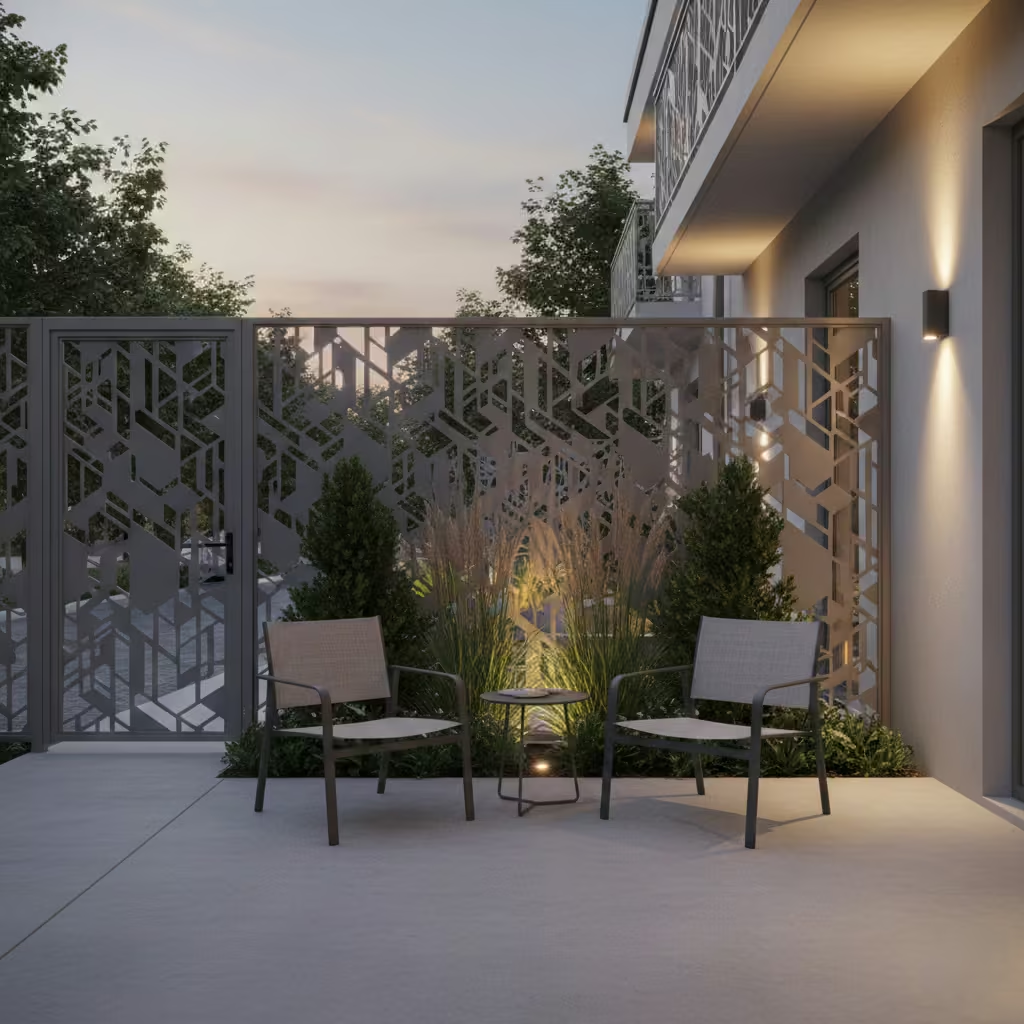
A compact courtyard seating niche is one of the most emotionally rewarding solutions for urban frontage design. Even when the front yard is small, people still benefit from having a quiet transitional space between street life and private interior living. I approach this feature as a micro-architectural room rather than a decorative corner.
The goal is not to maximise furniture quantity but to create psychological breathing space near the entrance.
Minimum Usable Width
- Recommended width: 1.8 m (6 ft) minimum
- Preferred comfortable width: 2–2.5 m (6.5–8 ft) when site allows
This dimension allows:
- One small bench or two lightweight chairs
- Natural walking clearance around seating
- Planting or wall framing behind seating zone
Spaces narrower than 1.8 m tend to feel compressed, making furniture placement awkward.
Works Best in Urban Townhouses
This design is particularly valuable in dense residential environments such as city terraces or narrow frontage homes.
Benefits include:
- Creating a semi-public arrival buffer zone
- Providing outdoor relaxation without needing a backyard
- Improving social usability of small plots
- Increasing perceived property depth
In urban settings, I often use courtyard niches as quiet morning coffee spaces or waiting zones for visitors.
Spatial Composition Strategy
A successful seating niche follows three-layer zoning:
1. Boundary Layer
- Decorative metal or timber screen
- Low architectural wall
- Vertical greenery panel
Purpose: Provide visual enclosure without closing airflow.
2. Activity Layer
- Seating bench depth around 40–55 cm (16–22 in)
- Backrest height around 80–100 cm (32–40 in)
- Allow 60 cm (24 in) walking clearance in front of seating
Choose lightweight furniture to maintain visual openness.
3. Landscape Layer
- Evergreen shrubs or fine texture grasses
- Soft lighting for evening usability
- Avoid aggressive flowering clutter
Lighting for Courtyard Niches
Warm residential lighting improves comfort.
- Target colour temperature: 2700K–3000K
- Install wall-mounted or low-level indirect lighting
- Avoid direct glare toward seating eye level
Soft shadow transition enhances relaxation feeling.
Real Design Insight
On a compact townhouse frontage renovation, I converted a 2 m (6.5 ft) wide unused corner zone into a seating niche by installing a low rendered wall bench with integrated planter back support.
The client initially worried the space would feel tight. After completion, the niche became the most used outdoor area in the house for morning coffee and evening rest. The key was not increasing space, but clarifying its purpose.
Pros and Cons
Pros
- Adds lifestyle function to small frontage
- Improves social usability
- Enhances architectural warmth
- Increases perceived property quality
Cons
- Requires careful proportion control
- Overfurnishing reduces elegance
- Privacy screening must be balanced with openness
Design Takeaway
A compact courtyard seating niche proves that meaningful outdoor living does not depend on land size. When enclosure, circulation, and human scale are carefully balanced, even the smallest front yard can feel mature and intentionally designed.
The best urban frontage spaces are not large. They are simply comfortable enough to invite you to pause.
Minimalist Lawn with Strong Borders
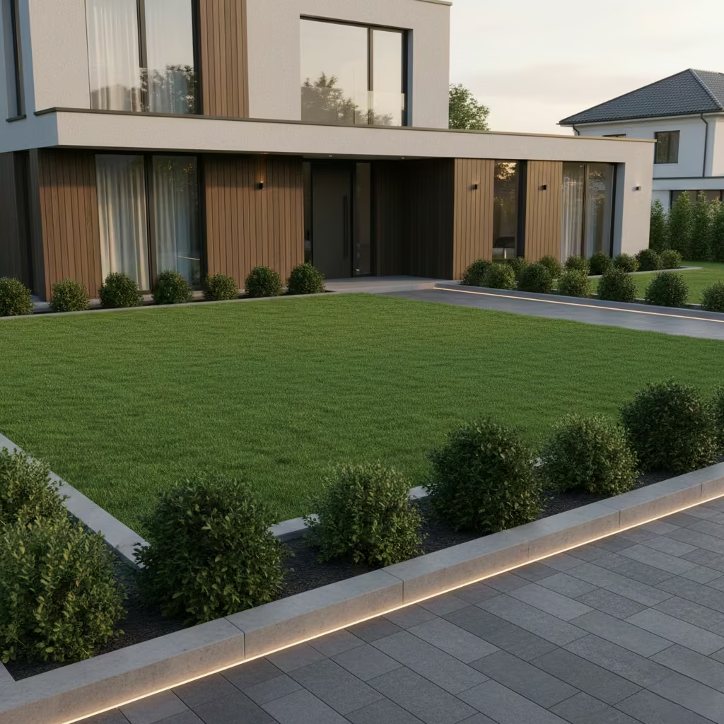
A minimalist lawn works on the principle of reduction rather than addition. In small and medium frontage gardens, excessive planting often fragments visual perception and makes the space feel smaller than it actually is. I prefer using a simple, open lawn core surrounded by disciplined structural borders.
The strength of this design lies in clarity. The lawn becomes the architectural canvas, while borders provide quiet framing without overwhelming the ground plane.
Perimeter Planting Strategy
- Recommended border width: 60–90 cm (2–3 ft)
- Maintain consistent planting depth around lawn edges
- Use 1–3 structural plant species only
This narrow perimeter zone serves as a transition layer between circulation surfaces and open grass.
Benefits of this approach include:
- Preserving lawn visibility
- Reducing maintenance complexity
- Improving frontage proportion perception
- Supporting long-term landscape stability
Plant Selection Philosophy
Choose plants that support structural calmness rather than seasonal distraction.
Recommended characteristics:
- Evergreen foliage dominance
- Moderate growth rate
- Predictable mature spread
- High pruning tolerance
Good border candidates include compact shrubs and fine-texture grasses.
Avoid:
- Fast-spreading invasive species
- Highly seasonal flowering masses
- Plants with irregular canopy structure
Lawn Core Design
The central lawn should behave as a spatial breathing zone.
Key guidance:
- Keep lawn surface uninterrupted where possible
- Maintain clean pathway separation
- Use edging materials such as stone, metal, or concrete strips
Ideal lawn size depends on frontage width, but even small properties benefit from a visible green core.
In one residential frontage renovation measuring approximately 8 m (26 ft) width, I removed mixed flower beds and replaced them with a 70 cm (28 in) evergreen perimeter strip. The lawn became the dominant visual element, and the house façade appeared more structured.
Maintenance Considerations
- Mow lawn regularly to maintain uniform texture
- Trim perimeter shrubs to prevent pathway intrusion
- Renew edging lines annually if necessary
Mulching the border planting zone helps control weeds and retains soil moisture.
Pros and Cons
Pros
- Creates clean, premium architectural look
- Simplifies long-term maintenance
- Enhances spatial perception of frontage size
- Works across modern and traditional homes
Cons
- Initial design may feel too restrained for some preferences
- Requires disciplined pruning schedule
- Colour variety is limited
Design Takeaway
Minimalist lawn frontage design is about confidence through simplicity. The strongest front yards are not those filled with features, but those where the eye can rest without distraction. When borders are controlled and the central lawn remains open, the home appears more spacious, mature, and architecturally intentional.
Dual-Purpose Driveway and Garden Design
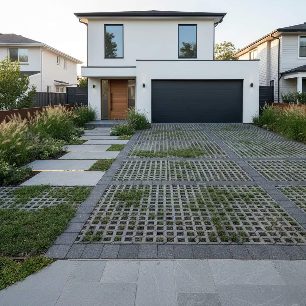
Dual-purpose driveway and garden design reflects a contemporary architectural philosophy where circulation infrastructure and greenery coexist rather than compete. In dense residential plots, this approach is particularly valuable because it preserves ecological permeability while maintaining vehicle access.
The underlying theory is that frontage ground planes should behave as living structural surfaces, not purely mechanical parking zones.
Permeable Grid Systems
Permeable driveway construction supports sustainable water management.
- Grid paving or reinforced grass systems allow rainwater infiltration
- Surface runoff pressure is reduced during heavy rainfall
- Soil moisture ecology beneath the driveway is partially preserved
This method works best when the visual grid rhythm aligns with architectural façade lines.
I often avoid visually dense grid patterns because excessive repetition can create optical clutter. Moderate module sizing maintains clarity while supporting function.
Structural Load Planning
Load distribution is the most critical technical factor in dual-purpose driveways.
Key design considerations:
- Sub-base compaction must be properly engineered
- Materials must support vehicle weight without long-term deformation
- Edge transitions between planted zones and paved zones should be structurally reinforced
In residential design, I usually recommend planning driveway load capacity based on the heaviest vehicle expected, not the average one.
Design Theory: Landscape as Infrastructure
The philosophy behind dual-purpose driveways is that outdoor ground surfaces should behave like architectural flooring that is exposed to weather.
Important conceptual points:
- Hardscape should support movement efficiency
- Greenery should soften mechanical geometry
- Spatial continuity should be maintained between street, driveway, and garden
I favour layouts where planting strips are integrated into paving modules rather than added as afterthought borders.
Maintenance Reality
- Grass or groundcover within grid systems requires trimming around modules
- Soil compaction must be monitored over time
- Drainage channels should be inspected seasonally
Permeable surfaces may require occasional sand or aggregate replenishment.
Pros and Cons
Pros
- Supports sustainable water management
- Reduces visual hardness of parking surfaces
- Improves ecological performance
- Adds modern architectural character
Cons
- Higher installation complexity
- Requires careful sub-base engineering
- Vegetation survival depends on irrigation management
Design Takeaway
Dual-purpose driveway and garden systems represent a shift from rigid land use separation toward integrated landscape architecture. When structural load planning, permeability, and spatial rhythm are balanced, the driveway becomes part of the living frontage rather than a purely technical parking surface. The most successful designs feel naturally functional without revealing their engineering complexity.
Monochromatic Plant Palette for Visual Calm
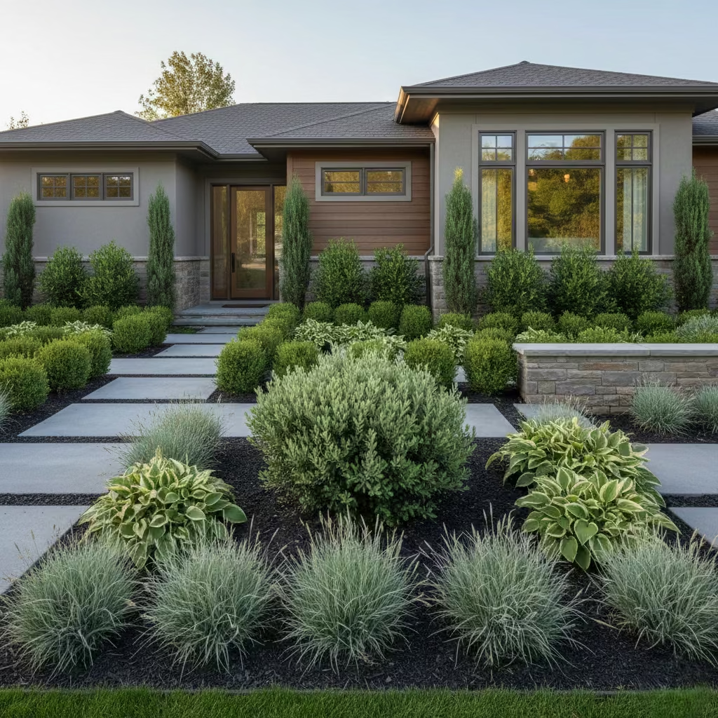
A monochromatic plant palette is one of the most refined strategies in frontage landscape design. Instead of relying on colour diversity, this approach builds beauty through repetition, texture hierarchy, and controlled botanical variation. I often use it when the goal is to make the home feel mature, composed, and quietly sophisticated from the street.
The philosophy behind monochromatic planting is that visual calmness increases perceived quality. When the eye encounters fewer competing signals, the frontage reads as intentional architecture rather than decorative gardening.
Species Limitation Strategy
- Recommended plant count: 3–5 species maximum
- Focus on foliage texture variation rather than colour variety
This limitation prevents fragmentation of the planting composition.
From practical experience, front yards with more than five dominant plant species tend to lose visual clarity at street distance.
Species should be chosen based on:
- Similar growth rhythm
- Compatible watering needs
- Harmonised mature height range
- Complementary leaf structure
Reducing Visual Clutter
Clutter usually occurs when planting diversity exceeds spatial capacity.
Key control methods include:
- Repetition of plant clusters rather than random distribution
- Maintaining consistent pruning height across beds
- Preserving negative space between planting zones
Negative space is not empty land; it is architectural breathing volume.
I often advise clients to think of planting as landscape typography. Just as a well-designed page uses limited fonts, a high-quality frontage uses limited botanical “characters”.
Texture Over Colour
In monochromatic design, texture replaces colour contrast as the primary visual interest.
Combine:
- Fine foliage species
- Medium structural shrubs
- One dominant evergreen framework plant
Avoid mixing plants with radically different leaf density unless they serve a focal purpose.
Maintenance Considerations
- Structural pruning 1–2 times per year
- Regular trimming during active growth seasons
- Mulch renewal annually to maintain soil quality
Monochromatic planting generally requires less replanting because structure is prioritised over seasonal colour display.
Pros and Cons
Pros
- Creates premium architectural frontage feel
- Reduces long-term maintenance complexity
- Supports timeless landscape aesthetics
- Improves visual calmness
Cons
- May appear restrained during early establishment
- Requires careful species selection
- Colour vibrancy is limited by design intent
Design Takeaway
Monochromatic planting represents confidence through restraint. The most sophisticated front yards are rarely the most colourful; they are the most coherent. When species selection, texture layering, and repetition are controlled, the landscape communicates maturity and permanence.
True elegance in frontage design is not about botanical abundance. It is about allowing space, light, and structure to speak quietly.
Conclusion: Landscaping That Feels Composed, Not Decorated
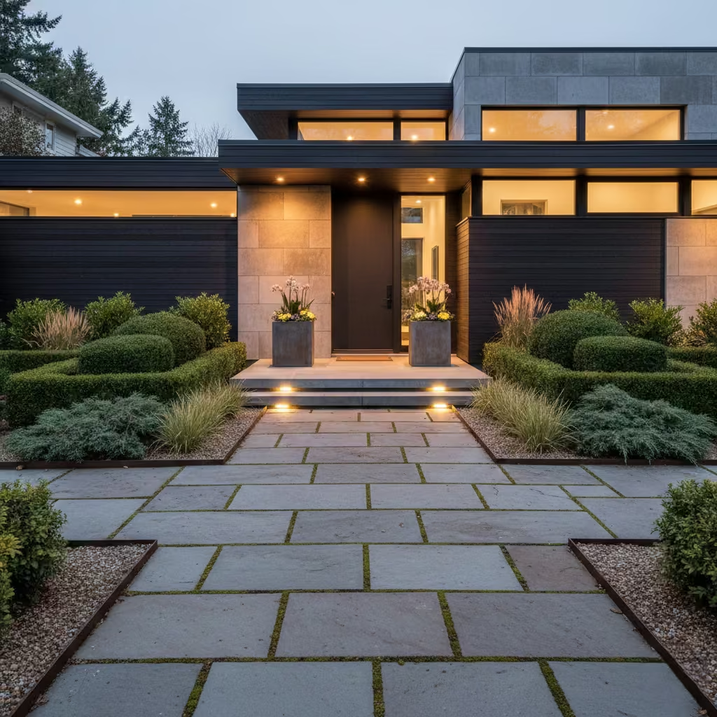
The most successful front yard landscapes are not those that demand attention, but those that quietly support the architecture they surround. Good frontage design begins with intention. Ornament should never lead the composition; it should respond to it. When landscaping is driven by structure rather than decoration, the garden retains relevance across seasons, lifestyle changes, and design trends.
I encourage phased implementation when renovating or creating front yard landscapes. Large residential frontage transformations rarely achieve their best form in a single installation cycle. Installing structural elements first allows the space to settle visually and functionally before introducing finer botanical details. Hardscape geometry, circulation paths, and evergreen framework planting should form the foundation. Colour accents, seasonal flowers, and texture variations can evolve gradually over time.
Structure always outlasts trends. Landscape fashion changes quickly, but proportion, material integrity, and spatial rhythm remain timeless. Instead of chasing seasonal gardening styles, focus on creating a frontage that will still feel considered ten or twenty years later. The best designs age slowly and gracefully, developing character as plants mature and materials acquire natural patina.
Front yard landscaping should always remain aligned with the architecture of the house. The garden is not an independent decoration but a supporting spatial layer. Pathways should reinforce entry hierarchy, planting should frame rather than dominate, and lighting should reveal structure rather than overpower it. When landscape and building speak the same design language, the property feels naturally resolved.
Real-Life Closing Insight
In one residential renovation project, I worked on a frontage transformation over approximately 18 months. The design was implemented in phases. During the first phase, we installed structural elements: pathway geometry, low architectural walls, and evergreen framework planting.
For the next six months, the landscape remained visually simple while plants established root systems and adjusted to soil conditions. Only after structural stability was confirmed did we introduce secondary texture planting and seasonal flower containers.
By the end of the 18-month period, the garden did not look newly constructed. Instead, it appeared mature, settled, and naturally integrated into the house frontage. The key success factor was patience. Structure was installed first. Planting was allowed to evolve.
This approach reflects the central philosophy of high-quality frontage design: landscaping should feel composed, not decorated. When intention guides every layer, the front yard becomes a long-term architectural statement rather than a temporary visual improvement.
Frequently asked questions about designing front yard
What is the most important principle in front yard design?
The most important principle is spatial intention. A front yard should guide the eye naturally from street to entrance while balancing structure, planting, and circulation. Good frontage design prioritises proportion and architectural harmony over decorative abundance.
What is the best landscaping style for long-term value?
Timeless architectural landscaping tends to outperform trend-led styles. Designs that emphasise evergreen structure, simple material palettes, and controlled planting diversity usually age more gracefully and require less renovation.
water features suitable for small front yards?
Yes, but scale is critical. For residential frontage, reflective basins with diameters of 90–150 cm (3–5 ft) usually work best. Shallow water surfaces are often more practical than complex fountains because they require less mechanical maintenance.
How long does a well-designed front yard take to mature?
High-quality residential landscapes are usually planned with a 3–5 year maturation horizon. Structural elements are installed first, while planting density and canopy fullness develop gradually.
When is the best time to redesign a front yard?
Redesign is best planned during periods of moderate climate when planting establishment is easier. However, structural work such as hardscape construction can be done year-round if drainage and soil stability are managed.
Should front yard landscaping be symmetrical?
Symmetry is not mandatory. It works best for formal architectural styles such as classical or heritage-inspired homes. For contemporary properties, I often prefer controlled balance rather than perfect mirror symmetry. This allows natural movement and reduces visual rigidity.
How many plant species should be used in a front yard?
High-quality frontage landscapes usually perform better with 3–7 dominant plant species. Excessive species variety can create visual fragmentation and increase maintenance complexity. Repetition of a few well-chosen plants produces stronger architectural rhythm.