25 Japanese Mid-Century Modern Design Ideas You’ve Probably Never Seen (and Will Obsess Over)
Japanese mid-century modern design is often reduced to an aesthetic shorthand, a look defined by low furniture, warm timber, and pared-back palettes. In practice, it runs deeper than that. At its core, it operates as a philosophy of balance, one that negotiates between stillness and warmth, restraint and expression. It is not about stripping a space back for the sake of minimalism, nor about layering mid-century elements until the room feels curated to excess. It is about knowing where to stop, and more importantly, why.
What makes this intersection so compelling is the quiet alignment between two seemingly different design languages. Japanese spatial thinking prioritises clarity, negative space, and an almost architectural sense of calm. Mid-century modernism, on the other hand, introduces warmth through proportion, material richness, and human-centred forms. When these two approaches are brought together with intention, the result is neither stark nor nostalgic. It settles somewhere in between, creating interiors that feel grounded, tactile, and quietly resolved.
In my own work, the spaces that have stayed with me longest were never the ones that demanded attention at first glance. They revealed themselves gradually. A softened edge here, a perfectly judged sightline there, materials that caught light differently as the day moved on. Nothing felt accidental, yet nothing felt overstated. Those interiors had a kind of composure to them, as if every element had been edited, reconsidered, and then allowed to remain. That sense of quiet layering is often what people respond to, even if they cannot immediately articulate why.
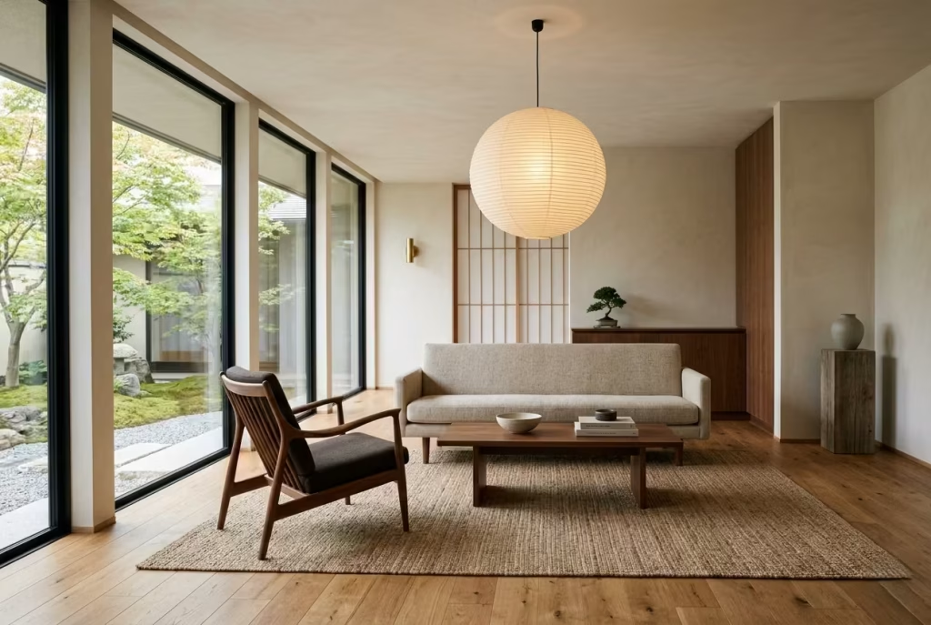
This is precisely what makes the ideas in this collection feel unfamiliar. They are not radical departures from what already exists. In fact, most of them rely on principles that are widely known but rarely executed with discipline. The difference lies in precision. In how proportions are handled, how materials meet, how space is allowed to breathe. It is the subtle calibration of these decisions that shifts a room from simply styled to deeply considered. And once you begin to notice it, it becomes difficult to accept anything less.
Understanding the Design Language Before Applying It
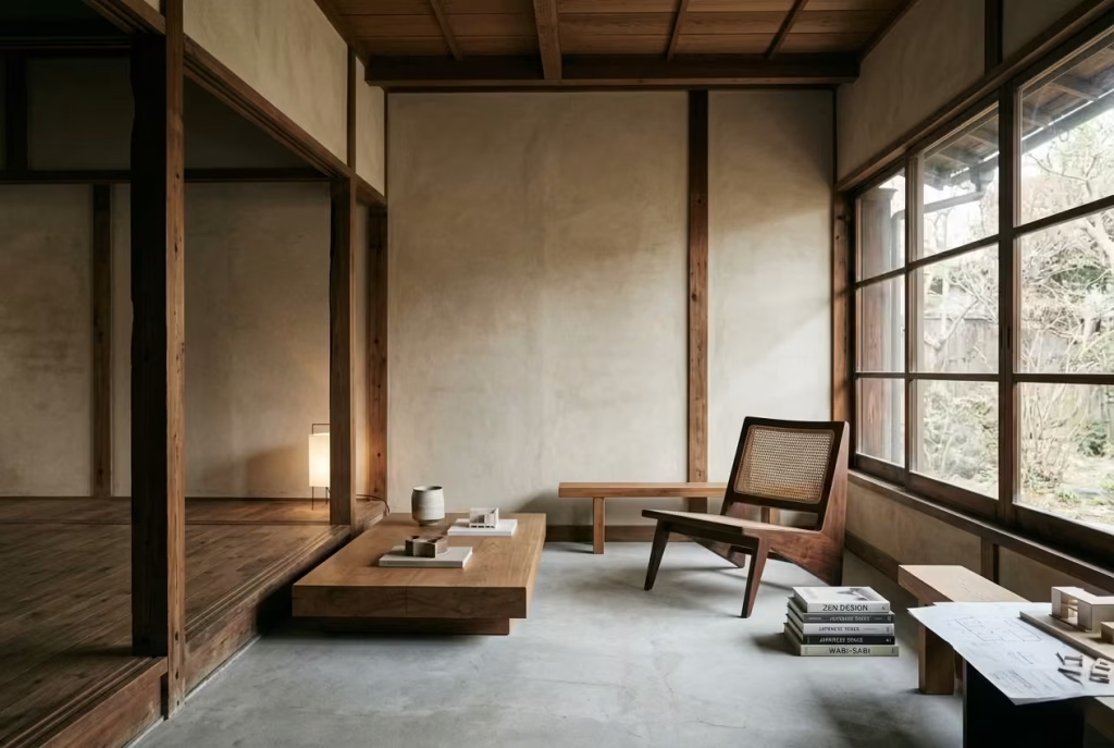
Before any material is selected or layout refined, this style demands a level of clarity that sits beneath the surface of the room. It is not something you assemble piece by piece; it is something you understand, then translate. Japanese mid-century modern design relies on proportion, restraint, and the relationship between objects rather than the objects themselves.
I have seen projects where every “right” element was present, yet the space still felt unresolved, simply because the underlying logic had not been considered. When the design language is properly understood, decisions become quieter, more precise, and far more intentional. Without that foundation, even the most beautiful materials struggle to hold the space together.
The Shared Principles That Actually Matter
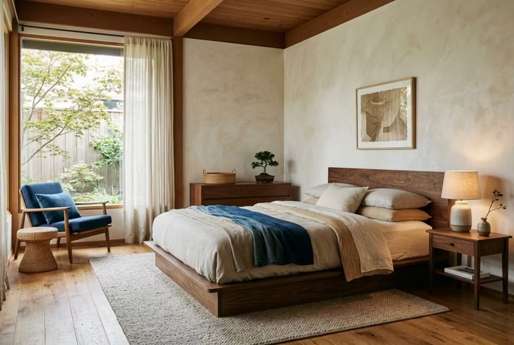
Simplicity in this context is often misunderstood as reduction for its own sake, a kind of visual quiet that can quickly slip into lifelessness if handled carelessly. What I have learned, working across a range of residential projects, is that simplicity only works when it still carries warmth. A room can be stripped back, yet it should never feel stripped of life. That difference usually comes down to material choice and proportion.
For instance, I once worked on a bedroom where the client wanted a minimal scheme, almost monastic in tone. The initial instinct was to keep everything pale and uniform, but the space felt flat, almost hesitant, as if it did not quite know what it stood for. We introduced a low walnut platform bed, softened the palette with warm off-whites, and allowed the grain of the timber to take centre stage, quietly but confidently. The room did not become busier, yet it gained depth, like a conversation that finally found its rhythm.
Simplicity, when done well, feels deliberate rather than empty. It allows the eye to rest without leaving the mind wandering. The trick is to edit with intention, not to remove blindly. Otherwise, you risk throwing the baby out with the bathwater, ending up with a space that feels more like a placeholder than a home.
Craft Over Decoration
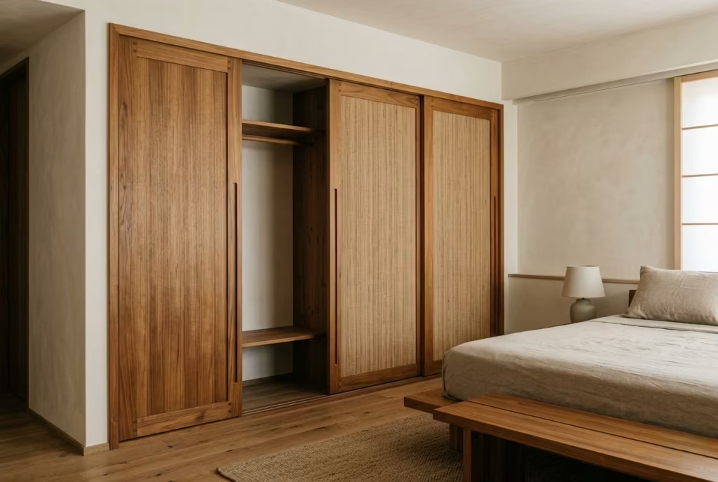
Decoration is easy to add, but craft takes patience, and that difference shows over time. In Japanese mid-century modern interiors, the focus leans heavily towards how things are made rather than how many things are present. You begin to notice the joinery lines, the way timber meets at a corner, the subtle precision of a sliding panel gliding into place. These are not elements that shout for attention, yet they hold the entire space together behind the scenes.
In one project, we replaced standard wardrobe shutters with custom sliding panels, framed in solid teak with a soft matte finish. On paper, it seemed like a minor adjustment. In reality, it shifted the entire experience of the room. The movement became quieter, the visual lines cleaner, and the space felt more composed, almost as if it had exhaled. Clients often underestimate these decisions because they are not immediately eye-catching, but they are the very things that age well, the details that quietly earn their keep over the years.
When craft leads the design, decoration becomes almost unnecessary. You are not layering objects to create interest; you are allowing the quality of what is already there to do the heavy lifting. It is a slower approach, no doubt, but one that pays dividends, especially in spaces meant to be lived in rather than simply looked at.
Light as a Material, Not an Afterthought
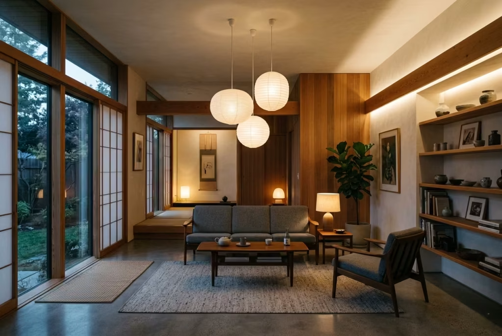
Light, in this design language, is treated with the same respect as timber or stone. It is shaped, filtered, and guided, rather than simply switched on. Too often, lighting is left until the final stages, added as a functional layer rather than an integral part of the composition. That is usually where things begin to unravel.
I remember working on a space with generous proportions but poor lighting decisions made early on. Harsh ceiling fixtures flattened everything, leaving no room for shadow or subtlety. We reworked the scheme entirely, introducing diffused paper lanterns, concealed joinery lighting, and low-level lamps placed deliberately, almost like punctuation marks within the room. The transformation was immediate. Surfaces gained texture, corners softened, and the atmosphere shifted from stark to quietly immersive.
Good lighting does not just illuminate a space, it reveals it gradually. It allows materials to change character throughout the day, catching grain, casting shadows, and creating moments that feel almost accidental, yet carefully considered. When treated properly, light stops being a background element and becomes part of the architecture itself, shaping how the room is experienced from morning through to evening.
Where Most Homes Go Wrong
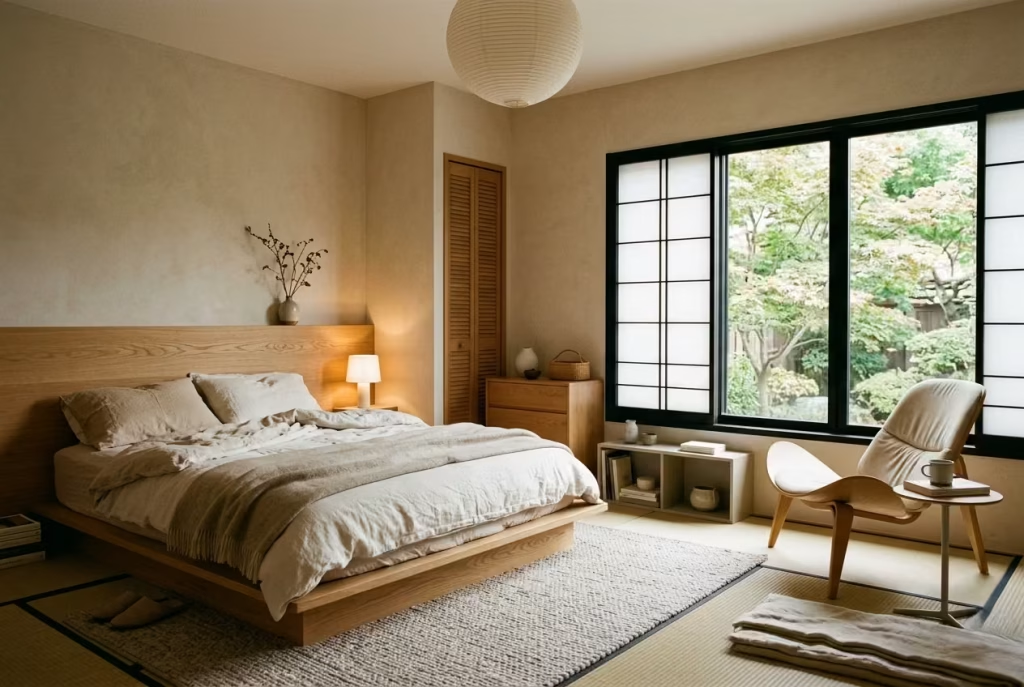
Minimalism has a habit of being taken too far, almost like turning the volume down until the room goes silent. What begins as a pursuit of calm can quickly tip into something that feels unwelcoming, even clinical. I have walked into spaces where every surface was cleared, every colour muted, every detail reduced to the point where the room felt hesitant, as if it was holding back rather than settling in.
In one project, the client had embraced minimalism with good intentions, removing anything that felt remotely decorative. The result looked clean on paper, but in reality, it lacked a sense of grounding. We reintroduced warmth through material rather than objects, bringing in a softly grained oak wall band at bed height, layering in textured linen, and allowing a single sculptural chair to hold presence near the window. The shift was subtle, yet it changed everything. The room began to feel lived in, not just styled.
The lesson here is simple but often overlooked. Minimalism should create space to breathe, not leave the room gasping for character. When warmth is stripped out along with clutter, the design loses its footing. It is a bit like setting the table but forgetting the meal.
Mid-Century Overload Without Restraint
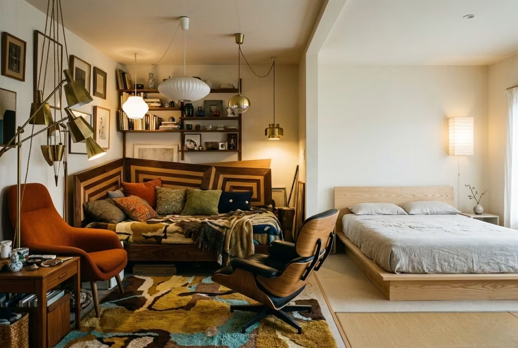
Mid-century design carries a certain charm, rich timbers, sculptural silhouettes, and a confident sense of form. The trouble begins when too many of these elements are brought into one space without a clear hierarchy. Instead of harmony, you end up with competition. Every piece tries to take the lead, and the room, caught in the middle, struggles to settle.
I recall a bedroom filled with iconic mid-century references, a statement bed, bold armchairs, intricate lighting, and layered wood tones all vying for attention. Individually, each piece had merit. Together, they felt like a crowded conversation where no one was listening. We pared things back, keeping only what truly mattered, allowing one or two elements to take centre stage while the rest stepped quietly into the background. Almost immediately, the room found its rhythm again.
Restraint, in this case, is not about denying character but about giving it room to breathe. When everything is special, nothing really is. A more measured approach allows the eye to settle, moving naturally from one point to another without feeling overwhelmed.
Ignoring Proportion and Negative Space
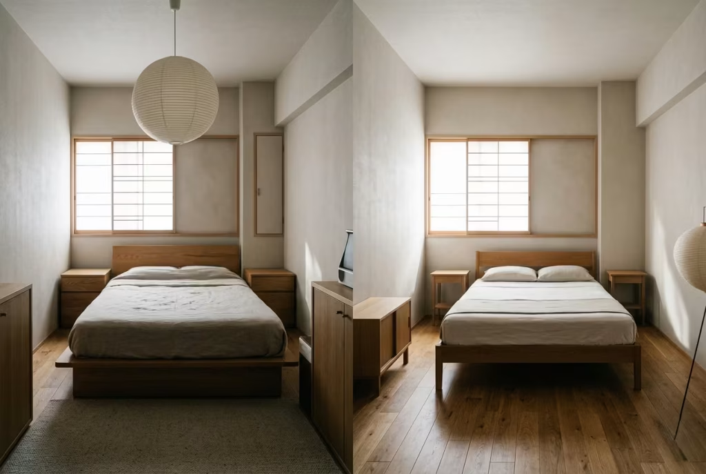
Proportion is often the silent factor that determines whether a room feels composed or slightly off balance. It rarely announces itself, yet when it is wrong, you feel it instantly, even if you cannot quite put your finger on it. Negative space plays an equally important role, acting as a pause between elements, giving the eye a moment to rest.
In smaller bedrooms especially, I have seen furniture pushed in edge to edge, walls filled from corner to corner, leaving no breathing room. The intention is usually to maximise function, but the effect is the opposite. The space begins to feel tighter, heavier, almost as if the walls are closing in. In contrast, when furniture is scaled appropriately and space is left intentionally unoccupied, the room opens up, both visually and psychologically.
There was a project where simply reducing the width of bedside tables by 10 cm on each side and pulling them slightly away from the bed transformed the entire layout. It sounds minor, almost insignificant, but those small adjustments created a sense of ease that had been missing. The room no longer felt cramped; it felt considered.
Getting proportion right is not about following strict rules. It is about reading the room, understanding how each element relates to the next, and knowing when to hold back. Negative space, when used well, is not empty at all. It is what allows everything else to make sense.
A Real Project Insight
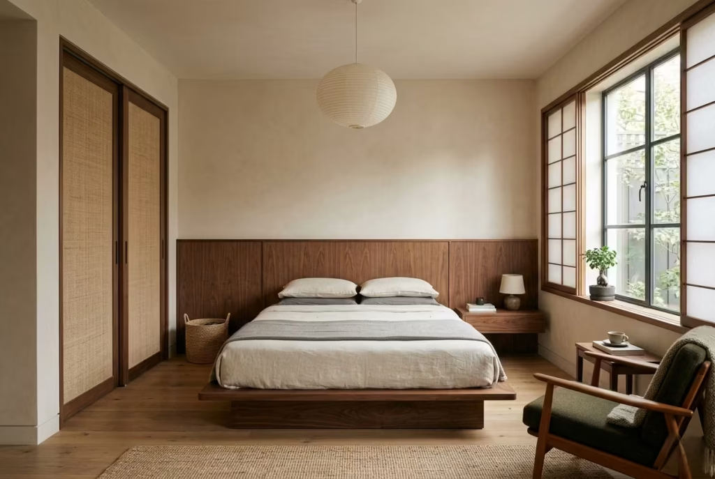
One project that has stayed with me involved a compact primary bedroom, roughly 3.4 by 4.2 metres, set within a renovated home where every centimetre had to earn its place. The client was drawn to Japanese minimalism for its calm, yet equally attached to the warmth and familiarity of mid-century interiors. At first, those preferences seemed to pull in different directions, one leaning toward restraint, the other toward expression. The challenge was not to choose between them, but to let them meet somewhere in the middle, on common ground.
We began by lowering the visual weight of the room. A custom platform bed, set at just under 28 cm high, anchored the space without dominating it. Instead of adding a conventional headboard, we introduced a continuous timber wall band in walnut, running horizontally at around 95 cm. It was a quiet move, almost under the radar, yet it stitched the room together in a way that felt effortless. The grain caught the morning light, shifting gently as the day moved on, giving the wall a kind of life that no applied decoration could replicate.
Storage was where the real balancing act came into play. Rather than installing standard wardrobes, we designed sliding panels with a slim mid-century frame profile, finished in a soft matte veneer. They opened smoothly, almost silently, which changed the rhythm of how the room was used. There was no abrupt interruption, no doors swinging into the space. It felt calmer, more controlled, like everything had found its natural pace.
What made the difference, though, was not any single element. It was how the space was edited. We resisted the urge to fill corners or layer accessories just to make the room feel complete. A single lounge chair, positioned slightly off-centre near the window, carried more presence than a cluster ever could. Lighting was kept low and diffused, with paper-based fixtures and concealed joinery strips creating a soft, ambient glow by evening. The room did not try to impress at first glance. It unfolded slowly, revealing its character in layers, almost like a story told in a measured tone.
Months after completion, the client mentioned something that stuck with me. They said the room felt better over time, not because anything had changed, but because they had begun to notice more within it. That is usually the sign that a space has been resolved properly. It is not chasing attention. It is holding it, quietly but confidently, day after day.
25 Japanese Mid-Century Modern Design Ideas That Feel Unexpected Yet Timeless
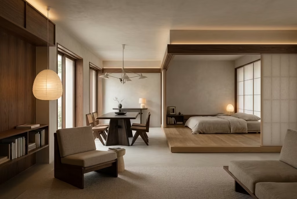
What follows is not a collection of surface-level styling moves, but a set of spatial strategies drawn from lived projects, where decisions had to hold up not just visually, but over time. Each idea sits at the intersection of restraint and warmth, shaped by proportion, material behaviour, and how a room is actually used day to day.
I have approached these as working principles rather than decorative gestures, grounding them in real dimensions, material choices, and the small adjustments that tend to make the biggest difference.
Some may seem understated at first glance, almost easy to overlook, yet they are often the ones that quietly carry the space, doing the heavy lifting without making a song and dance about it.
Low-Slung Platform Beds Anchored to the Architecture
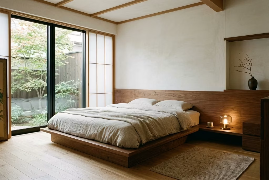
There is something quietly transformative about lowering the centre of gravity in a bedroom. A platform bed set between 20 to 30 cm high, roughly 8 to 12 inches, does more than change how the bed looks. It recalibrates the entire perception of the room. Ceilings feel taller, walls appear less imposing, and the space begins to settle into itself with a kind of calm that is hard to achieve through decoration alone.
What matters here is not just the height, but how the bed relates to the architecture around it. When I design these, I rarely treat them as standalone furniture pieces. Instead, I align them with wall bands, window sills, or joinery lines so everything feels connected, almost as if the bed has grown out of the room rather than been placed into it. That sense of continuity is what gives the space its composure, holding everything together without drawing attention to any single element.
Material choice plays its part as well. I tend to favour warm, tactile timbers like oak, ash, or walnut, finished in a matte or lightly oiled texture so the grain can quietly do the talking. Overly polished finishes can tip the balance, making the bed feel more like a statement piece than a grounding element. Paired with soft, neutral bedding, the overall effect is understated but deeply considered, the kind of detail that does not shout yet never goes unnoticed.
Real-Life Application Insight
I worked on a compact bedroom where the original bed sat at a conventional height, visually cutting the room in half. It felt tight, almost boxed in, despite having decent proportions on paper. Lowering the bed to just under 25 cm changed the reading of the space almost overnight. The ceiling seemed to lift, sightlines became clearer, and the room took on a more relaxed, open character. It was a small adjustment in measurement, but one that shifted the entire experience, proof that sometimes the simplest moves carry the most weight.
Pros
- Enhances the perception of height, making even modest rooms feel more open
- Creates a grounded, calming aesthetic that aligns naturally with both Japanese and mid-century principles
- Encourages a cleaner visual line across the room, especially when paired with horizontal elements
- Reduces visual clutter by eliminating bulky bed frames or oversized headboards
Cons
- May feel less practical for those who prefer higher beds for ease of sitting or getting up
- Requires careful detailing to avoid looking too minimal or unfinished
- Storage underneath is limited unless intentionally integrated
- Needs thoughtful coordination with surrounding elements to avoid feeling isolated or out of place
When handled with care, this approach does not just change how a bed sits in a room. It changes how the room holds you, quietly, almost without you noticing at first, until one day it simply feels right.
You May also Like: Mid-Century Modern Living Room: The Complete Guide to Getting the Look Right
Integrated Timber Wall Bands Instead of Headboards
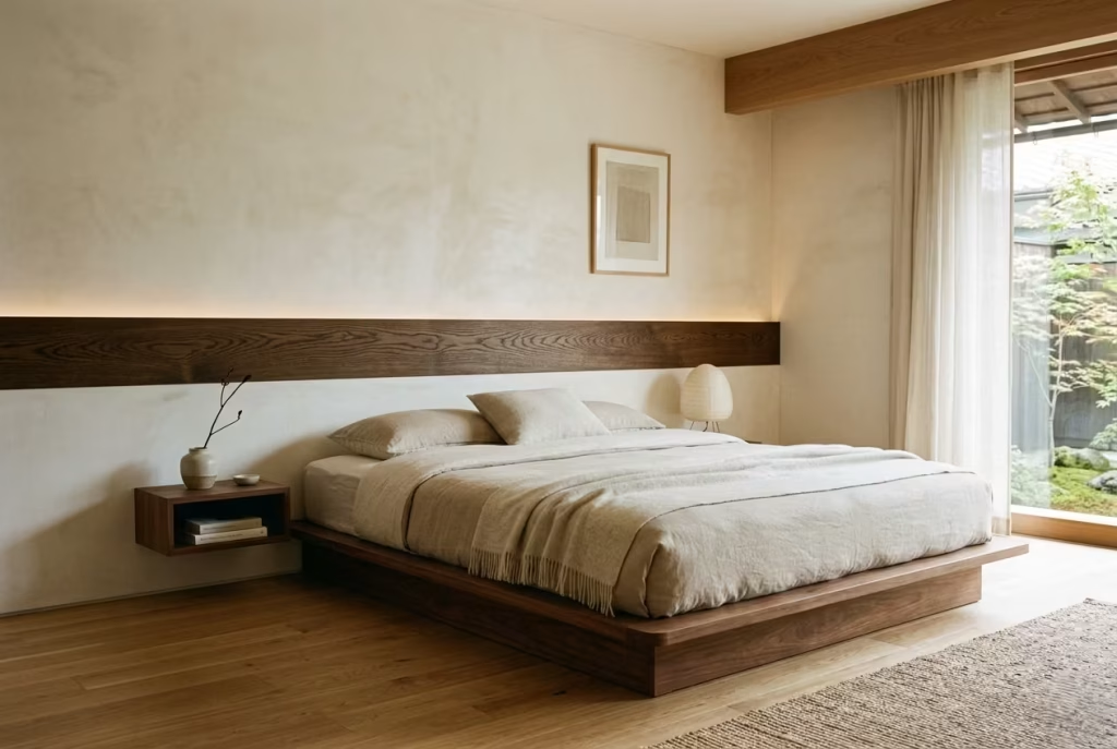
A timber wall band placed horizontally at roughly 90 to 120 cm, or 35 to 47 inches, does something far more refined than a conventional headboard ever could. It stops behaving like an object and starts behaving like part of the room itself. When handled correctly, it draws a quiet line through the architecture, subtly organising the wall without interrupting it. The effect is understated at first glance, yet it tends to linger in the mind, like a detail you only fully appreciate after living with it for a while.
In practice, I often use these bands as a way to stabilise a bedroom visually. They act as a resting point for the eye, especially in spaces where everything else is intentionally restrained. The key is proportion. Too high, and it feels disconnected from the bed. Too low, and it loses presence altogether. When set at the right height, it frames the sleeping zone without enclosing it, almost like a soft architectural underline that gives the room a sense of order without turning rigid.
Material choice is where the character really comes through. I tend to lean towards walnut or smoked oak, finished in a low-sheen texture so the grain can respond gently to changing light. There is a subtle shift that happens throughout the day, especially when natural light grazes across the surface. It is not dramatic, but it is enough to give the wall a living quality, as if it is quietly participating in the rhythm of the room.
Real-Life Application Insight
I once worked on a bedroom that felt visually fragmented, largely because the walls had no clear hierarchy. The bed sat against a plain painted surface, which made the entire setup feel temporary, almost unfinished. Introducing a continuous timber band across the headboard wall changed that immediately. It did not add bulk or visual noise, yet it grounded the entire composition. The client later mentioned that the room felt “settled,” which is often the best compliment you can get in design terms. Nothing had become louder, but everything had found its place.
Pros
- Creates a strong horizontal anchor that visually stabilises the room
- Replaces bulky headboards with a more architectural, integrated solution
- Adds warmth through natural timber grain without overwhelming the space
- Works exceptionally well in minimalist and mid-century inspired schemes where restraint is key
- Responds beautifully to natural light, adding subtle movement throughout the day
Cons
- Requires precise installation to maintain clean alignment across the wall
- Can feel visually heavy if the timber tone is too dark for the room’s lighting conditions
- Less flexible than standalone furniture, as it becomes part of the architecture
- Needs careful coordination with wall finishes and bedside elements to avoid visual imbalance
When done well, this approach does not just replace a headboard. It shifts the entire reading of the wall, turning it from a background surface into a quiet structural feature that holds the room together without ever demanding attention.
Floating Joinery That Appears Weightless
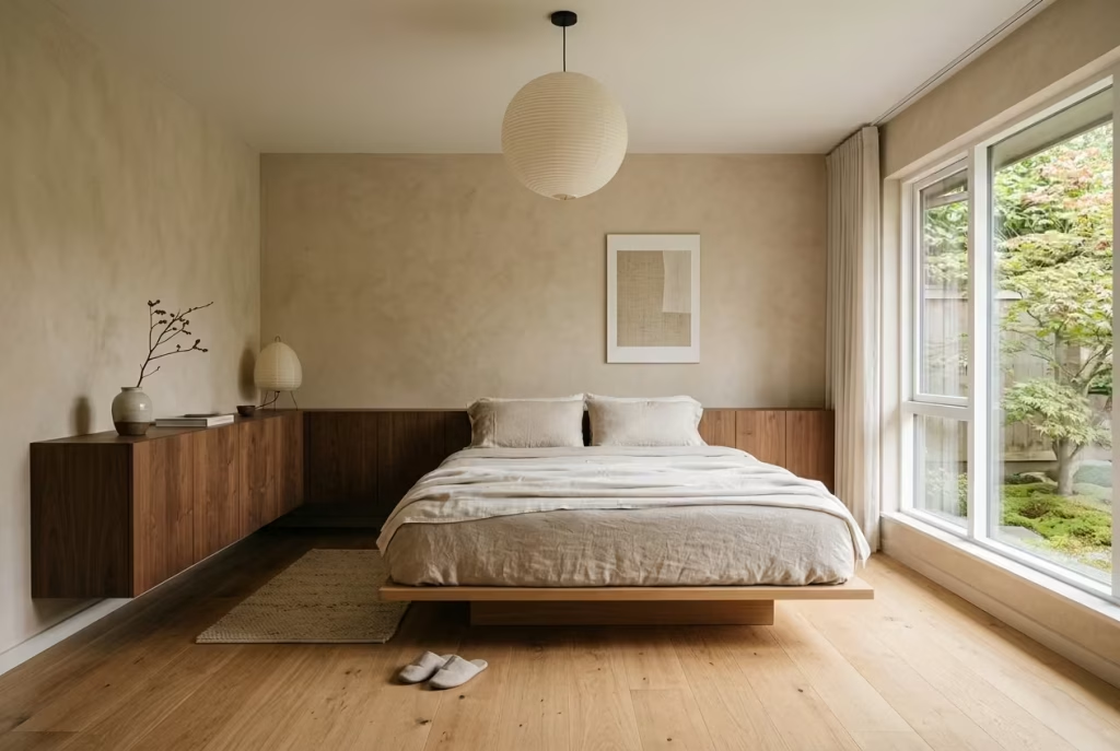
Wall-mounted joinery lifted roughly 15 to 25 cm, or 6 to 10 inches, above the floor does something deceptively simple yet visually powerful. It removes the sense of heaviness that conventional cabinetry tends to bring into a room. Instead of sitting solidly on the ground, the storage appears to hover, almost as if it has been gently suspended in place. That small gap beneath it changes everything, allowing the flooring to run uninterrupted, which in turn makes the room feel longer, lighter, and far more composed than its actual dimensions suggest.
From a design perspective, this is less about storage and more about visual breathing room. When I introduce floating joinery in residential projects, I often notice how quickly the space starts to feel less congested. Even in compact bedrooms, the eye begins to travel more freely, sliding across the floor plane without interruption. It is a subtle shift, but one that quietly lifts the entire spatial experience, almost like clearing clutter from a window so the view finally makes sense.
Material selection and detailing are crucial here. I usually favour slim-profile carcasses with concealed fixings, finished in timber veneers or matte lacquers that align with the rest of the room’s palette. The underside shadow gap is not an afterthought; it is part of the design language. When lit naturally or with soft ambient lighting, it creates a delicate line of shadow that adds depth without adding weight. Done well, it feels effortless, though in reality it relies on precise execution and careful proportioning.
Real-Life Application Insight
I once worked on a bedroom where the client had opted for traditional floor-standing wardrobes. The result was functional but visually heavy, almost like the room was anchored down in all the wrong ways. We reworked the storage into floating joinery running along one wall, lifted just over 20 cm from the floor. The transformation was immediate. The flooring suddenly became part of the composition rather than something hidden beneath it. The room felt wider, calmer, and far less encumbered, as if it had finally taken a full breath after being held back for too long.
Pros
- Enhances the perception of space by revealing continuous flooring beneath
- Reduces visual bulk, making storage feel lighter and more architectural
- Improves room flow, especially in smaller or narrow bedrooms
- Allows subtle underlighting effects that add depth and atmosphere
- Works seamlessly with both Japanese restraint and mid-century warmth
Cons
- Requires precise installation and structural support to ensure long-term stability
- Reduces potential storage volume compared to floor-to-ceiling joinery
- Can feel visually unresolved if the shadow gap is poorly proportioned
- Needs careful coordination with flooring finishes to avoid visual disconnection
When executed with care, floating joinery does more than store belongings. It quietly reshapes how a room sits on its own ground, removing weight where it is not needed and letting the architecture feel, quite literally, a little more elevated.
Shoji-Inspired Sliding Panels with Mid-Century Framing
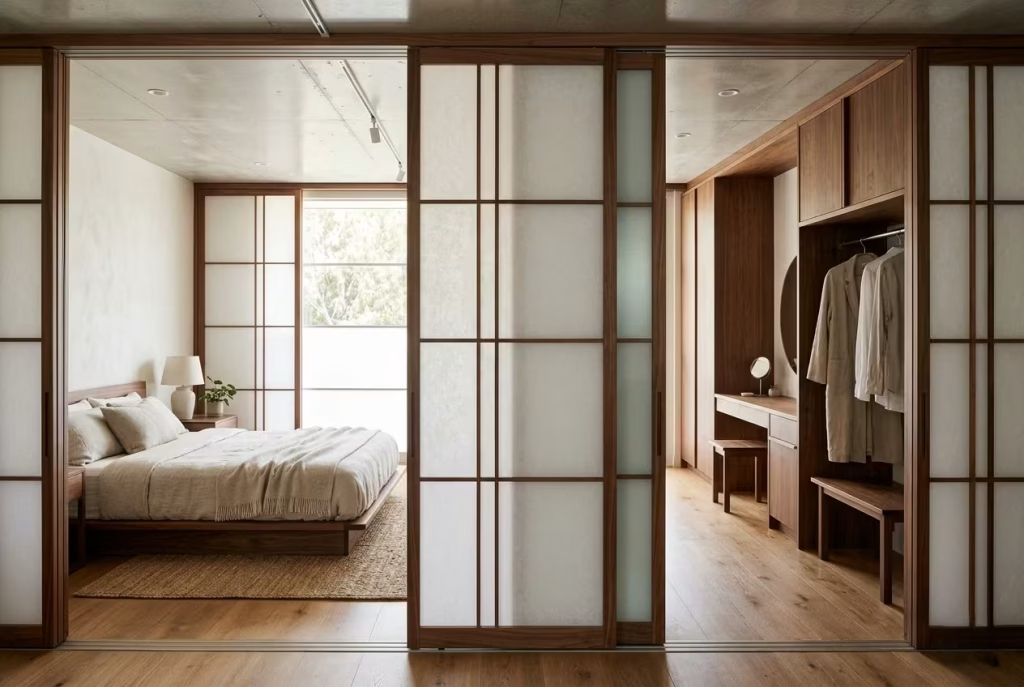
Sliding panels inspired by traditional shoji screens, reinterpreted through a mid-century lens using walnut or teak framing, bring a quiet sophistication to spatial planning that hinged doors simply cannot match. Instead of opening into a room and demanding clearance, they glide across the architecture with a kind of calm inevitability, almost like the space has been edited rather than physically altered. That movement alone changes the rhythm of how a home is used day to day, especially in tighter layouts where every centimetre counts.
What makes this approach particularly compelling is the material shift. Traditional softwood framing is replaced with richer, more grounded timbers like walnut or teak, which immediately changes the emotional temperature of the panel. The result feels less fragile, more architectural, yet still retains that delicate translucency when paired with rice paper or textured glass. I often find that this balance between strength and softness is where the real magic happens, where the structure holds its own without overpowering the space it divides.
In practical terms, these panels work best when they are integrated into a broader spatial logic rather than treated as decorative partitions. I tend to align them with joinery lines, ceiling beams, or flooring transitions so they feel like part of the original architecture rather than an afterthought. When they are set correctly within the plan, they can shift the entire reading of a room, allowing spaces to expand or contract depending on how they are used, almost like the house is quietly adapting itself to daily life.
Real-Life Application Insight
In one residential project, a bedroom and dressing area were originally separated by a solid partition that made both spaces feel boxed in. We replaced it with walnut-framed sliding panels, fitted with a softly diffused translucent insert. The change was immediate and surprisingly emotional for the client. Suddenly, light began to pass through in a controlled, almost poetic way. The dressing area no longer felt isolated, and the bedroom gained depth without losing privacy. It was one of those rare interventions where nothing felt added, yet everything felt improved, as if the space had finally learned how to breathe properly.
Pros
- Creates flexible spatial separation without visually closing off rooms
- Allows natural light to filter between zones in a controlled, softened way
- Enhances flow in compact layouts where hinged doors feel intrusive
- Introduces a refined material language when using walnut or teak framing
- Aligns naturally with both Japanese spatial philosophy and mid-century warmth
Cons
- Requires precise track installation to ensure smooth, silent operation
- Offers less acoustic insulation compared to solid partitions
- Demands regular maintenance to preserve sliding performance over time
- Can feel visually dominant if framing proportions are too heavy or overly dark
- Needs careful integration into the architectural layout to avoid appearing disconnected
When done well, these sliding panels do not simply divide space. They choreograph it, allowing rooms to shift between openness and privacy with an ease that feels almost second nature, like the house is quietly adapting itself around the way you live.
You May also Like: Dark Minimalist Interior Design: Moody, Uncluttered Spaces That Feel Like an Exhale
Asymmetrical Furniture Layouts That Still Feel Balanced
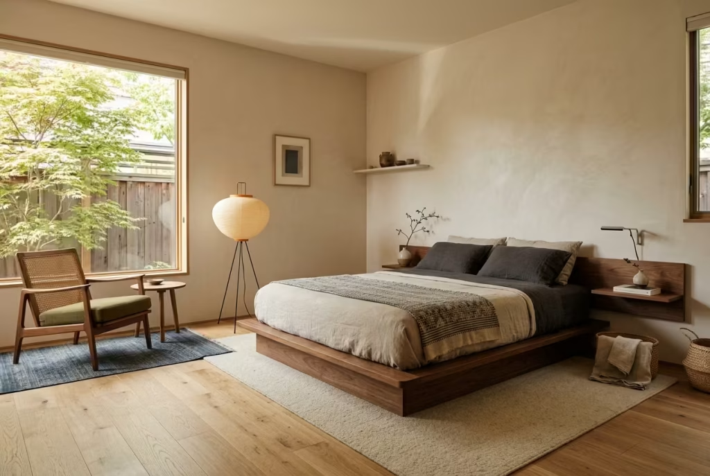
Asymmetry in interior planning often gets misunderstood as disorder, when in reality it is closer to controlled equilibrium. Instead of mirroring elements on either side of a room, the focus shifts to visual weight, how objects hold presence, how they relate to one another, and how the eye travels across the space without feeling pulled into rigidity. When handled well, the result feels more natural, almost like the room has evolved rather than been arranged.
In practice, I often find rigid symmetry can make a bedroom feel overly composed, almost staged in a way that lacks ease. Asymmetry, on the other hand, introduces a softer rhythm. For example, pairing a substantial timber bed with a lighter side table on one side and a floor lamp on the other creates imbalance on paper, yet harmony in experience. The eye does not demand repetition; it follows balance through contrast, which is far more interesting over time. It is a bit like a well-composed conversation where not every voice speaks equally, yet everything still makes sense.
The key lies in understanding proportion and negative space. A heavier object on one side must be counterbalanced, not mirrored, but offset through scale, texture, or height elsewhere in the room. I often step back and read the space from multiple angles during design development, almost like sketching with the eye, adjusting until nothing feels forced. Once that balance is achieved, the room begins to feel less constructed and more intuitive, as if each piece has simply found its natural place.
Real-Life Application Insight
I once worked on a bedroom where everything had been arranged symmetrically, bed centred, identical bedside tables, matching lamps, yet the space felt oddly static. It lacked energy, almost like it was frozen in time. We broke that symmetry deliberately, replacing one bedside table with a built-in timber ledge and introducing a sculptural chair in the opposite corner. The change was subtle but transformative. The room suddenly felt more relaxed, more human, as if it had shed a layer of formality it did not need. The client described it perfectly later, saying it no longer felt like a showroom, but like somewhere they could actually live.
Pros
- Creates a more natural, lived-in spatial rhythm rather than rigid composition
- Allows greater flexibility in furniture selection and placement
- Enhances visual interest by introducing contrast in scale and form
- Prevents interiors from feeling overly staged or predictable
- Encourages a more intuitive way of reading and experiencing the space
Cons
- Requires a trained eye to achieve balance without visual chaos
- Can feel unresolved if visual weight is not carefully managed
- More difficult to plan using standard furniture sets or matching pieces
- May initially feel unfamiliar to clients accustomed to symmetrical layouts
- Needs careful spatial testing to ensure flow is not disrupted
When done thoughtfully, asymmetry stops feeling like a design choice and starts feeling like natural order. Nothing is forced into repetition, yet everything still belongs, held together by a quiet sense of balance that reveals itself slowly rather than all at once.
You May also Like: Why Japanese Entryways are Never Messy: 25 Hidden Design Secrets
Sunken Seating Zones in Open Bedrooms
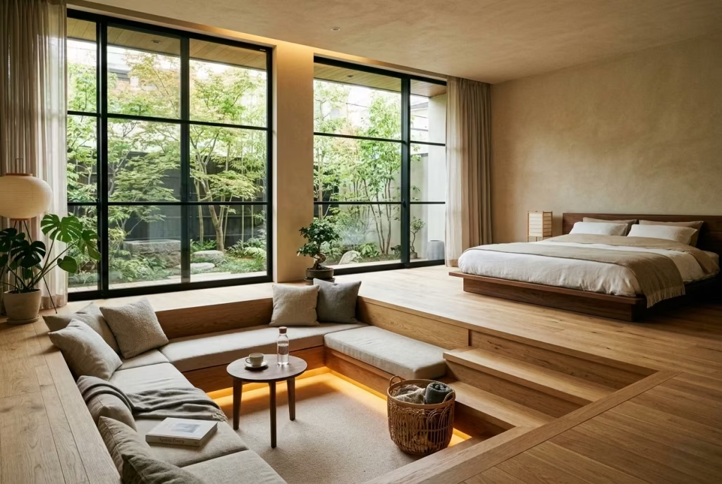
Sunken seating zones, typically recessed around 30 to 45 cm or 12 to 18 inches, introduce a subtle shift in spatial hierarchy that immediately changes how a bedroom is experienced. Instead of relying on walls or partitions to define intimacy, the floor plane itself does the work. The result is a space that feels gently carved out of the architecture, almost like a quiet pause embedded within the larger room. It creates a sense of retreat without ever closing anything off, which is where its real strength lies.
In many open-plan bedroom layouts, the challenge is not size but definition. Everything exists on the same level, which can make the space feel visually flat, even when it is generously proportioned. By stepping down into a sunken zone, you introduce a shift in perspective that the body instinctively responds to. It feels more grounded, more contained, yet still part of the wider space. I have often seen this work particularly well near windows or transitional areas, where the change in level naturally draws the eye and invites pause.
Materiality plays a crucial role here. I tend to keep the finishes consistent with the surrounding flooring but slightly warmer or more textural, so the sunken area feels intentional rather than disconnected. Upholstered seating, low timber platforms, or built-in benching can all work, provided the proportions are carefully controlled. If the depth is too aggressive, the space can feel overly recessed, almost like a pit. If it is too shallow, the effect is lost entirely. It is a fine line, but when you get it right, the room gains a sense of quiet intimacy that is hard to replicate through furniture alone.
Real-Life Application Insight
In one residential project, we introduced a sunken seating zone adjacent to the bedroom’s glazing line, originally a standard flat layout that felt slightly directionless despite its size. Once the floor was lowered by around 35 cm and a continuous timber bench was integrated along the perimeter, the entire mood of the room shifted. It became a place to sit with a book in the morning light or unwind at the end of the day, without feeling separated from the rest of the space. The client described it as “a room within a room,” which is exactly the intention, a subtle retreat that does not break the flow, but deepens it.
Pros
- Creates a natural sense of intimacy without requiring walls or partitions
- Enhances spatial drama through level change rather than visual clutter
- Works beautifully in open-plan bedrooms where zoning is needed
- Encourages relaxed, grounded use of space for reading or quiet retreat
- Adds architectural interest that feels integrated rather than applied
Cons
- Requires structural planning and careful coordination during renovation
- Reduces flexibility for future layout changes
- Can feel impractical if depth is not precisely calibrated
- May pose accessibility concerns for some users
- Needs strong lighting design to avoid feeling overly recessed or dim
When executed with restraint and clarity, sunken seating does not simply add another feature to a room. It reshapes how the space is inhabited, introducing a quiet moment of pause that feels both intentional and effortless, like the architecture itself has learned when to step back and let you settle in.
Layered Neutral Palettes with Warm Undertones
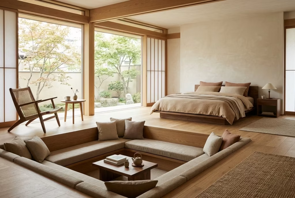
Neutral palettes are often mistaken for simplicity in the most literal sense, yet when handled with care, they become anything but plain. The real nuance lies in layering off-whites, sand tones, muted browns, and soft clay-like hues so that the room never settles into a single flat reading. Instead, it shifts subtly as light moves through it, revealing depth that is felt more than immediately seen. It is a bit like listening to a quiet piece of music where every note matters, even the ones that sit in the background.
In practice, I rarely treat neutrals as a single colour decision. They are a composition, carefully built across surfaces, textures, and finishes. A warm off-white on the walls might sit beside a slightly deeper linen tone on upholstery, while timber introduces a grounded contrast that never feels sharp. The goal is to avoid anything that feels visually abrupt. Stark contrast can break the flow of a space, whereas layered neutrals allow the eye to move gently, almost instinctively, from one surface to the next without interruption.
What makes this approach particularly effective in Japanese mid-century inspired interiors is its relationship with light. Warm undertones respond beautifully to natural daylight, especially in the early morning or late afternoon when shadows are softer and more forgiving. I have seen rooms completely change character throughout the day simply because the palette was tuned correctly. Nothing needed to be altered, yet everything felt alive, almost as if the walls were quietly breathing with the space.
Real-Life Application Insight
I once worked on a bedroom where the initial palette leaned too stark, cool whites paired with pale grey timber that, while clean, felt emotionally distant. It lacked that sense of ease you expect in a private space. By shifting the palette towards warmer neutrals, introducing sand-toned plaster finishes and soft beige textiles, the room began to soften almost immediately. It stopped feeling like a display space and started feeling like a lived environment. The transformation was not dramatic in a visual sense, yet the emotional shift was unmistakable. The client described it as feeling “warmer without being louder,” which is exactly the balance this approach aims to achieve.
Pros
- Creates a calm, cohesive atmosphere that feels effortless over time
- Enhances natural light by reflecting it softly rather than harshly
- Works seamlessly with both timber-rich and minimalist interiors
- Reduces visual fatigue by avoiding sharp contrast transitions
- Allows materials and textures to become the main source of depth
Cons
- Can feel flat if tonal variation is not carefully layered
- Requires precise coordination between paint, textiles, and finishes
- May appear too subdued in poorly lit spaces without proper lighting design
- Demands careful material selection to avoid monotony
- Less effective if introduced without consideration for natural light conditions
When done well, a layered neutral palette does not announce itself. It settles in quietly, like it has always belonged there, and over time it becomes less about colour and more about atmosphere, shaping the way a room feels rather than how it looks at first glance.
Paper and Fabric Lighting Instead of Statement Fixtures
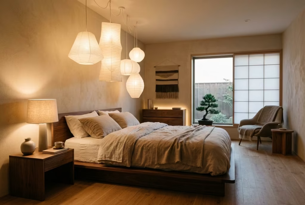
Lighting in Japanese mid-century inspired interiors is rarely about making a statement. More often than not, it is about diffusion, softness, and control of atmosphere. Paper and fabric-based lighting, whether in the form of rice paper pendants or linen-shaded lamps, introduces a quality of light that feels less like illumination and more like a gentle unfolding of space. Instead of a single harsh source dictating the room, light is distributed across multiple heights, creating a layered calm that settles in gradually.
In practice, I rarely rely on lighting as a focal point in these interiors. Statement fixtures tend to interrupt the visual rhythm, pulling attention upward in a way that can feel slightly theatrical if not carefully balanced. Paper and fabric elements do the opposite. They soften edges, reduce glare, and allow shadows to exist in a controlled, almost poetic way.
I often place them at varying levels, low table lamps, mid-height wall sconces, and suspended paper pendants, so the room feels lit rather than simply brightened. It is a subtle distinction, but one that changes everything about how a space is experienced after sunset.
What makes this approach particularly powerful is how it interacts with material surfaces. Timber warms under diffused light, textiles gain depth, and even neutral walls begin to show quiet tonal variation. Nothing feels flat or overly exposed. Instead, the room develops a sense of atmosphere that feels earned rather than imposed.
I have often found that clients only fully appreciate this shift once they live with it for a while, when they realise the space no longer feels like it is being “lit,” but rather gently held in light.
Real-Life Application Insight
In one residential project, the original lighting plan relied heavily on recessed downlights paired with a bold central pendant. While functional, the space felt slightly harsh in the evenings, almost like it was locked into a single brightness level. We reworked the scheme entirely, introducing rice paper pendants, linen-shaded bedside lamps, and concealed joinery lighting.
The transformation was immediate but also subtle in a way that is hard to describe on paper. The room began to feel warmer, more layered, and far more adaptable to different moods throughout the day. The client later described it as feeling “softer at night, without losing clarity,” which captures the essence of this approach perfectly.
Pros
- Creates a soft, diffused lighting atmosphere that reduces harsh contrasts
- Enhances the texture and warmth of natural materials like timber and linen
- Works across multiple heights, improving spatial depth and layering
- Encourages a calm, evening-friendly environment ideal for bedrooms and living spaces
- Reduces visual dominance of fixtures, allowing architecture and materials to lead
Cons
- May lack dramatic impact if a bold focal point is desired
- Requires careful planning to avoid under-lighting in functional zones
- Paper and fabric materials can be less durable in high-humidity environments
- Needs layering with task lighting for practical use in certain areas
- Can feel too subdued if not balanced with subtle contrast in materials or form
When thoughtfully composed, paper and fabric lighting does not compete for attention. It dissolves into the architecture, quietly shaping how a space feels after dark, and in many ways, that is where its real strength lies.
You May also Like: 25 Japanese Reading Nook Secrets for a Perfectly Calm Home
Built-In Window Seating Framed in Timber
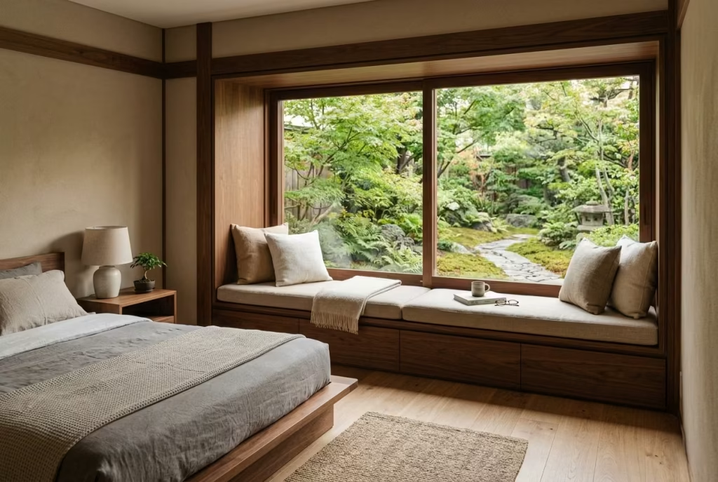
A built-in window seat, typically between 45 and 60 cm deep, or 18 to 24 inches, introduces a kind of quiet magnetism into a room that freestanding furniture rarely achieves. It does not compete for attention, yet it almost always becomes the place people gravitate towards without thinking. Framed in timber, it gains a sense of permanence and warmth, as if it has always belonged to the architecture rather than being added later.
What makes this element so effective in Japanese mid-century inspired interiors is its ability to blur the line between structure and comfort. The timber framing gives it definition, anchoring it visually, while the recessed seating creates a gentle pause within the room. I often position these along windows that receive shifting daylight, because the seat becomes less of a feature and more of an experience that changes throughout the day. Morning light softens it, afternoon light defines it, and evening light turns it into a quiet retreat.
In practice, proportion is everything. A shallow seat feels like an afterthought, while anything too deep risks losing intimacy. When the depth is right, the body naturally settles into it without effort, almost as if the architecture is making space for pause. I tend to pair these with concealed storage beneath, which keeps the visual language clean while adding practical value. The timber frame, when detailed correctly, should feel continuous with surrounding joinery, so the seat reads as part of the wall rather than a separate object placed against it.
Real-Life Application Insight
In one residential project, a bedroom overlooked a small garden that the client rarely engaged with, despite its potential. We introduced a timber-framed window seat running the full width of the glazing, set at around 50 cm deep. Once completed, it quietly changed how the room was used. What was once a passing view became a place to sit, read, or simply pause with a morning coffee. Nothing about the room became louder or more decorative, yet its emotional value increased significantly. The client later described it as the “most used corner of the house,” which says everything about how subtle interventions can reshape daily behaviour.
Pros
- Creates a naturally inviting focal point without visual dominance
- Enhances connection to outdoor views and natural light
- Adds functional seating without occupying floor space
- Can incorporate discreet storage beneath for added practicality
- Strengthens architectural continuity when integrated with timber framing
Cons
- Requires precise measurement to ensure comfortable seating depth
- Reduces flexibility in window access or future layout changes
- Can feel underutilised if placed in poorly lit or inactive areas
- Needs careful detailing to avoid heat loss or insulation issues near glazing
- May require custom joinery, increasing build complexity and cost
When well considered, a built-in window seat does not behave like furniture at all. It becomes part of the architecture, a place where the room quietly pauses, and life, almost without permission, tends to slow down for a moment or two.
Exposed Ceiling Beams Softened with Minimal Detailing
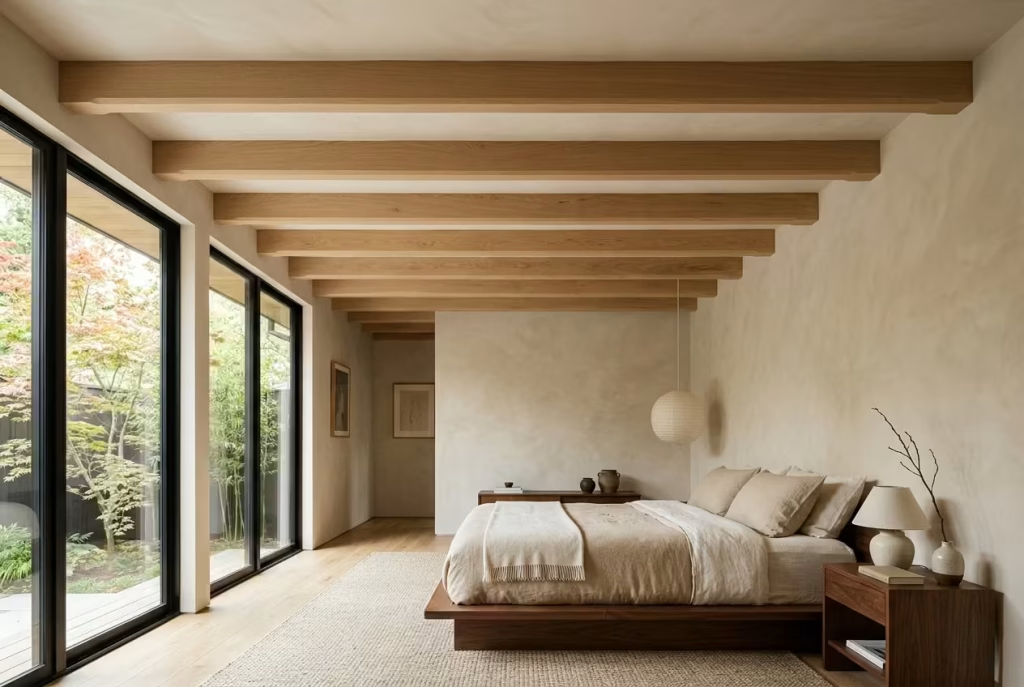
Exposed ceiling beams carry a certain honesty to them, revealing the structure of a space in a way that feels grounded and architectural. Yet in many interiors, that honesty can quickly tip into heaviness if the detailing is not handled with restraint. The key is not to conceal the beams, but to soften their visual impact so they sit within the room rather than dominate it. When treated with a lighter hand, they become part of the spatial rhythm instead of an overpowering feature overhead.
In practice, I often find that ceiling beams can either anchor a room beautifully or weigh it down, depending on proportion and finish. Retaining them in their raw structural position preserves authenticity, but the real transformation comes through subtle refinement. Slightly chamfered edges, muted natural finishes, or even a soft limewash can take the edge off their visual density. It is less about altering their presence and more about allowing them to breathe within the composition of the ceiling plane.
What works particularly well in Japanese mid-century inspired spaces is the balance between structure and softness. Beams are not polished into statement pieces, nor are they hidden away. Instead, they are integrated quietly, almost like background rhythm in music. I have seen rooms where simply reducing the contrast between beam and ceiling colour shifted the entire atmosphere. The space felt taller, lighter, and far less visually segmented, even though nothing structurally changed.
Real-Life Application Insight
In one renovation project, a bedroom had heavy timber beams that initially felt overwhelming, almost pressing down on the space despite the room’s generous proportions. Rather than removing them, we softened their presence by toning them down to a near-neutral timber stain and aligning the ceiling finish closer in colour temperature. The effect was immediate but not dramatic in a showy sense. The beams still existed, but they no longer shouted for attention. Instead, they began to quietly frame the room, guiding the eye without interrupting it. The client described it as “the room finally feeling lifted without losing its character,” which is often the most balanced outcome you can hope for in situations like this.
Pros
- Retains architectural authenticity while improving spatial harmony
- Adds depth and character without relying on decorative elements
- Works well in both minimalist and mid-century inspired interiors
- Can visually guide the eye across the room when proportioned correctly
- Enhances the sense of craftsmanship and structural clarity
Cons
- Can feel visually heavy if left in overly dark or untreated finishes
- Requires careful coordination with ceiling height and lighting design
- Poor detailing can make beams appear intrusive rather than integrated
- Limited flexibility once structural elements are exposed
- May amplify visual complexity in already busy interiors
When handled with restraint, exposed beams stop behaving like structural interruptions and start acting like quiet architectural rhythm, present but never overpowering, grounding the space without ever weighing it down.
Open Shelving with Intentional Negative Space
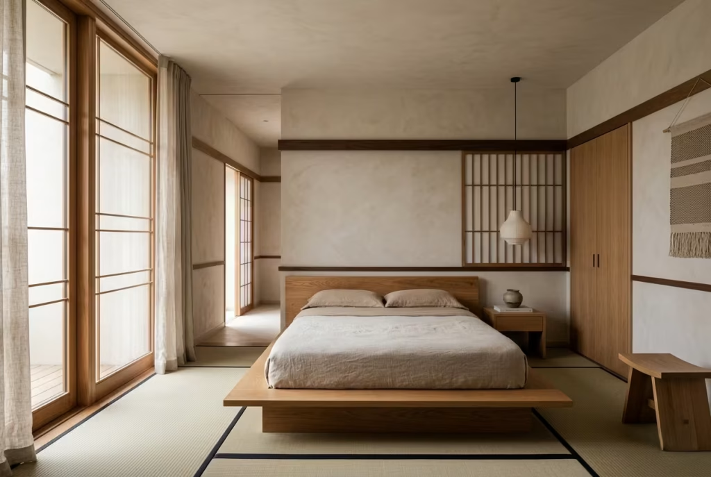
Open shelving is often misunderstood as a chance to display everything at once, yet in practice, its strength lies in restraint. When around 30 to 40 percent of the shelving is deliberately left empty, the entire composition changes character. What could easily become visual clutter instead turns into a carefully paced rhythm, where objects have room to breathe and the eye is given space to rest. That pause, that deliberate emptiness, is what elevates it from storage to something far more considered.
In many residential projects, I have seen shelving fail not because of what was placed on it, but because of what was missing in its composition, negative space. Without it, every item competes for attention, and the result feels hurried, almost like a shelf trying too hard to perform. When negative space is introduced with intention, the dynamic shifts completely. Objects begin to read like a curated sequence rather than a crowded collection. It is a subtle discipline, but one that quietly transforms the way a room feels day to day.
Material choice and placement play an equally important role. I often favour timber or matte-finished shelving that blends into the surrounding architecture, allowing the objects themselves to take precedence without visual interference. Items are spaced with care, not symmetry, but balance, ensuring that no single section feels overworked. It is a bit like composing a sentence where silence between words matters just as much as the words themselves. When done correctly, the shelving becomes part display, part pause, and entirely intentional.
Real-Life Application Insight
In one project, a kitchen extension featured full-height open shelving that initially felt chaotic once styled, despite the quality of the materials. Everything was visually present, yet nothing had room to settle. We stepped back and removed nearly a third of the displayed items, leaving deliberate gaps between groupings. The change was immediate. Suddenly, the ceramics, glassware, and everyday objects began to feel more curated, almost gallery-like in their presence. The client later remarked that they had not realised how much visual noise had been affecting the room until it was gone. Sometimes, what you remove carries just as much weight as what you leave behind.
Pros
- Creates a visually lighter and more breathable storage solution
- Allows curated objects to stand out with greater clarity and intention
- Encourages disciplined styling rather than cluttered display habits
- Integrates seamlessly into minimalist and mid-century inspired interiors
- Enhances architectural rhythm through the use of negative space
Cons
- Requires consistent maintenance to avoid visual clutter over time
- Not suitable for hiding everyday items or less visually appealing objects
- Demands strong styling discipline to maintain balance
- Can feel sparse if not carefully curated with enough variation
- Less forgiving in high-traffic or heavily used storage areas
When approached with intention, open shelving stops being a storage solution and becomes a composition, where what is not there is just as important as what is, and that quiet balance is what gives it lasting visual strength.
You May also Like: 25 Productive Japanese Home Office Designs for a Soulful Workspace
Indoor-Outdoor Continuity Through Flooring
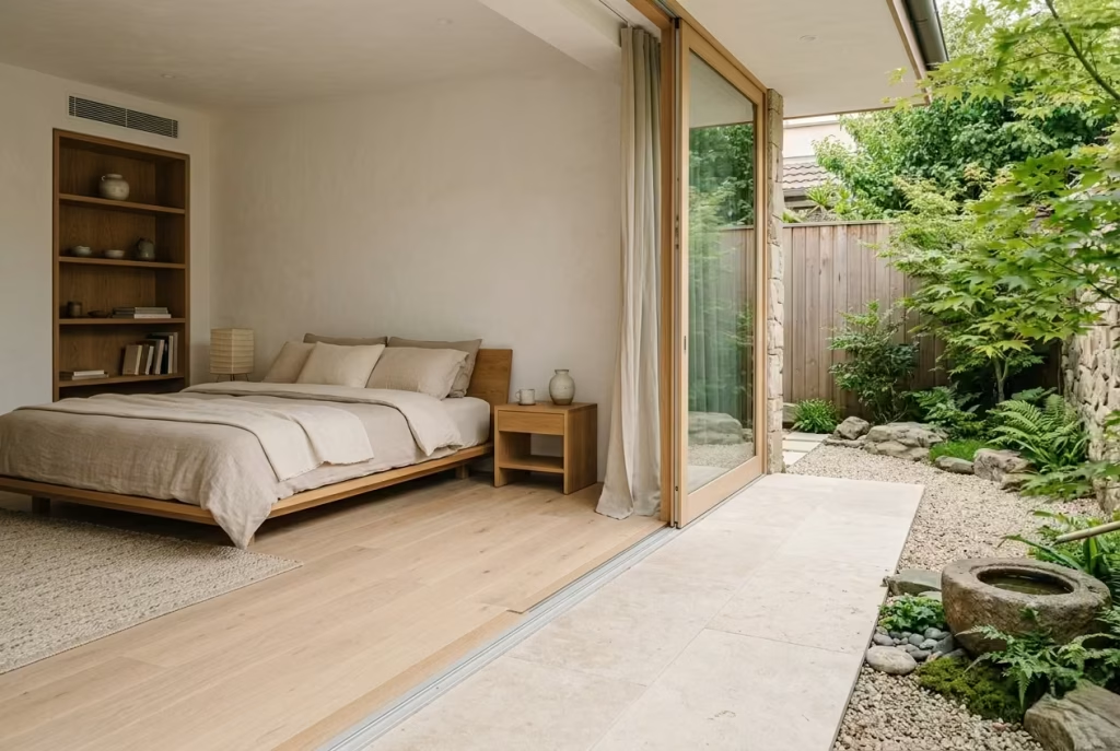
Few design moves make a room feel larger, calmer, and more resolved than extending the same flooring material from the interior to the exterior threshold. Whether it is timber carried through to a terrace or stone flowing out to a garden edge, the effect is immediate but never loud. The space stops feeling chopped up by boundaries and starts reading as one continuous composition, which is exactly where Japanese mid-century thinking and good spatial planning begin to overlap beautifully.
What makes this idea so effective is the way it softens the moment of transition. Instead of the eye hitting a hard stop at the door, it keeps moving, almost without noticing the shift. That continuity can make even modest homes feel more generous, because the boundary between inside and out becomes less like a wall and more like a pause. I have seen compact bedrooms, conservatories, and garden-facing lounges feel twice as composed simply because the flooring was allowed to do the heavy lifting. It is one of those quiet design tricks that slips under the radar at first, then proves its worth day after day.
Material selection is where the details matter most. Timber offers warmth and a sense of domestic ease, but it needs careful treatment if it is to perform near exterior thresholds. Stone, on the other hand, brings a cooler, more grounded quality and tends to handle the transition with greater durability, particularly in wetter climates. Either way, the key is consistency in tone, size, and finish. Too much variation, and the magic is lost. Keep the palette restrained and the transitions precise, and the room begins to feel as though it has always belonged to its surroundings.
Real-Life Application Insight
In one residential project, a bedroom opened directly onto a small courtyard, but the original flooring changed abruptly at the threshold, which fractured the experience and made both spaces feel smaller than they were. We replaced the interior floor with a pale engineered timber that continued visually toward the outdoor edge, where it gave way to a matching stone terrace in a closely related tone. The result was subtle but powerful.
The room no longer felt shut in by its own perimeter. Instead, it breathed outward, almost as if the garden had been gently pulled into the architecture. That kind of shift is hard to overstate when you are trying to create a home that feels spacious without relying on size alone.
Pros
- Makes interiors feel larger by extending the visual field beyond the room
- Creates a smooth, elegant transition between inside and outside spaces
- Strengthens the sense of architectural unity across a home
- Works especially well in rooms with garden views or patio access
- Can increase the feeling of calm by reducing visual interruption
Cons
- Requires careful material specification to handle different environmental conditions
- Timber may need more maintenance if used near exterior openings
- Stone can feel cold underfoot if not balanced with softer interior finishes
- Poorly aligned thresholds can break the continuity and weaken the effect
- More expensive to execute well, especially when precision detailing is involved
When this approach is handled properly, the floor becomes more than a surface. It becomes the thread that ties the whole experience together, quietly stitching inside to outside in a way that feels effortless, natural, and deeply considered.
Sculptural Mid-Century Chairs Paired with Minimal Backdrops
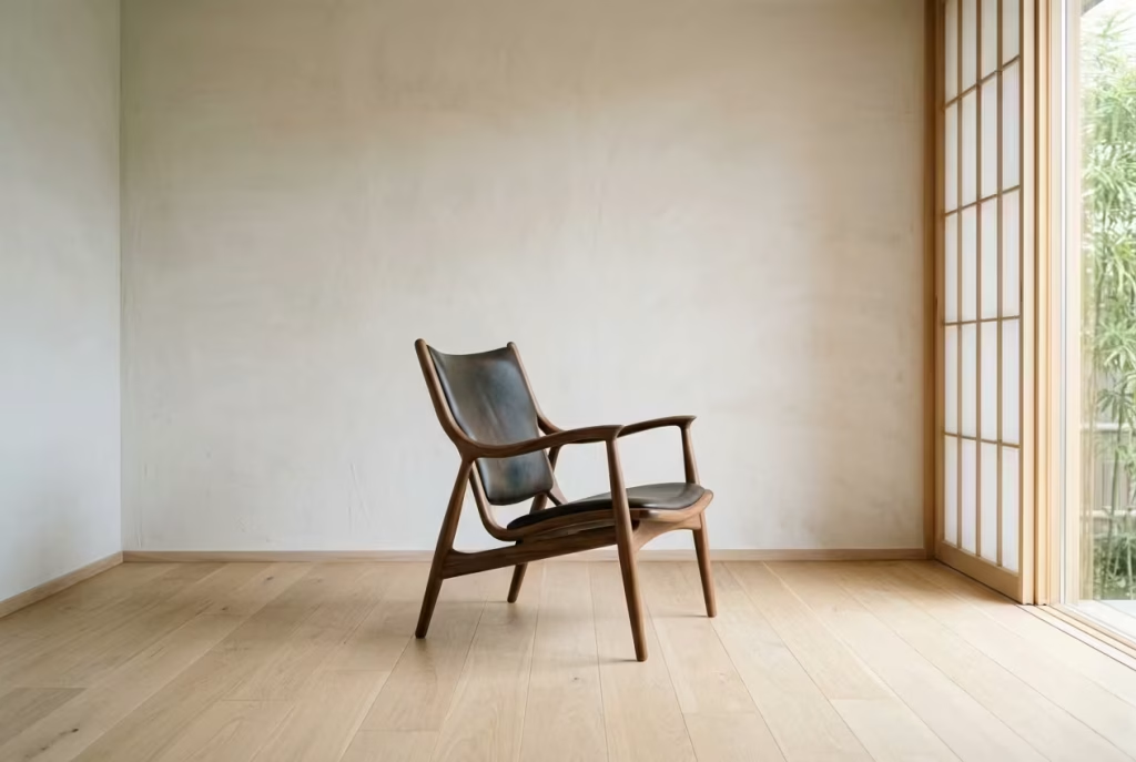
There is a particular discipline in knowing when to let an object speak for itself. Sculptural mid-century chairs, with their sweeping lines, tapered legs, and considered proportions, already carry enough presence to hold a space without needing visual reinforcement. When placed against a minimal backdrop, their form is allowed to take centre stage in a way that feels intentional rather than decorative. It is less about styling a corner and more about giving an object the quiet conditions it needs to be fully understood.
In practice, I often find that these chairs lose impact when surrounded by too many competing elements. Patterned walls, heavy shelving, or overly detailed surroundings can dilute their character, almost like trying to listen to a single voice in a crowded room. By contrast, when the backdrop is restrained, off-white plaster, soft neutral tones, or lightly textured surfaces, the chair begins to read almost like a piece of functional sculpture. The eye is no longer distracted; it is guided, almost inevitably, towards form, proportion, and craftsmanship.
What makes this approach so effective in Japanese mid-century inspired interiors is the respect for negative space. The chair is not forced to justify its presence through repetition or supporting decor. Instead, it is given room to exist fully on its own terms. I have often placed a single lounge chair in an otherwise quiet corner of a bedroom or landing space, and watched how it slowly becomes a visual anchor without any additional styling. It is a reminder that restraint, when applied correctly, does not diminish impact, it amplifies it.
Real-Life Application Insight
In one residential project, a beautifully crafted walnut lounge chair initially sat within a visually busy environment, surrounded by shelving, layered textiles, and competing tones. Despite its quality, it felt strangely overlooked. We stripped back the surrounding elements, softened the wall finish to a muted clay-white, and removed all unnecessary visual noise from that corner. The change was immediate in its clarity. The chair no longer felt like part of a composition; it became the composition. The client described it as “finally noticing the chair they had chosen months ago,” which perfectly captures how context can either suppress or elevate design intent.
Pros
- Allows iconic furniture pieces to stand out with clarity and intention
- Strengthens appreciation of craftsmanship, proportion, and form
- Creates calm visual focal points without relying on decorative clutter
- Works seamlessly in minimalist and Japanese mid-century inspired interiors
- Encourages a more curated, gallery-like reading of residential spaces
Cons
- Requires disciplined restraint in surrounding styling to maintain impact
- Can feel underwhelming if the backdrop is too plain or lacks texture
- Not suitable for spaces that rely on layered visual storytelling
- Demands careful placement to avoid looking isolated or disconnected
- Limited flexibility if the surrounding layout needs frequent change
When handled with a light but confident touch, sculptural chairs stop behaving like furniture alone. They become quiet statements of form and proportion, standing their ground without ever needing to raise their voice, which is often where their true strength lies.
Tatami-Inspired Zones Without Traditional Execution
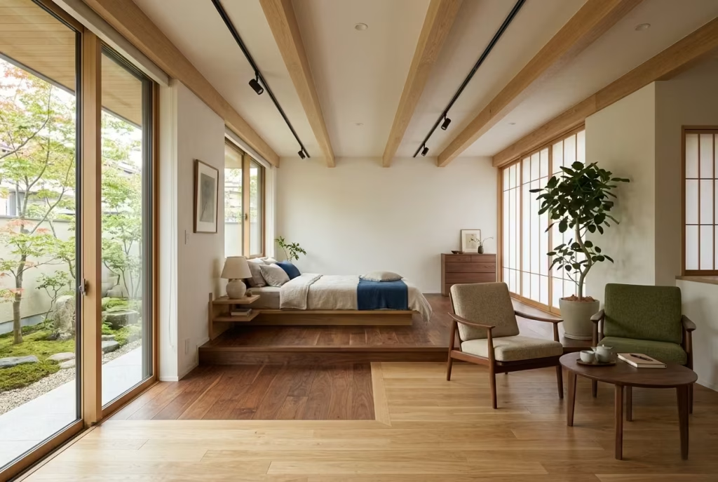
Tatami-inspired zoning is often misunderstood as a material choice, when in reality it is far more about proportion, rhythm, and spatial discipline. You do not need woven mats or literal Japanese flooring to capture the essence of it. What matters is how a space is measured, how it is contained, and how the body intuitively understands where to pause. When translated correctly, it becomes less about imitation and more about spatial behaviour, almost like the room itself has learned how to slow down in certain areas.
In practice, I approach this through subtle shifts in scale rather than obvious visual markers. A recessed seating platform, a change in ceiling height, or even a carefully defined rectangle of flooring can establish a tatami-like zone without relying on traditional materials. The key is consistency in proportion. Once the geometry is set, the space begins to organise itself around it. I have often seen open-plan bedrooms and studio spaces feel far more grounded simply by introducing these measured zones, almost like the architecture has been gently partitioned without putting up walls.
What makes this idea so powerful in Japanese mid-century inspired interiors is its quiet discipline. There is no need to over-explain the space or fill it with decorative cues. Instead, the room is allowed to breathe in structured intervals, much like a well-composed piece of writing where pauses carry as much weight as the words themselves. I find that when clients begin to live with these zones, they naturally adjust their behaviour around them, sitting, reading, or resting in these defined pockets without consciously thinking about why it feels right.
Real-Life Application Insight
In one residential project, an open bedroom layout felt slightly directionless despite its generous size. Rather than introducing partitions, we worked with proportional zoning inspired by tatami principles. A low platform defined the sleeping area, while a subtle shift in flooring tone marked a secondary resting zone near the window. No physical barriers were added, yet the room began to function as if it had distinct rooms within it. The client later described it as “feeling structured without feeling closed in,” which is precisely the quiet balance this approach aims to achieve.
Pros
- Creates natural spatial organisation without physical partitions
- Encourages calm, intentional use of different zones within a room
- Works through proportion rather than decorative intervention
- Enhances flow in open-plan layouts without visual fragmentation
- Supports a more mindful and grounded way of inhabiting space
Cons
- Requires careful planning of proportions to avoid confusion in layout
- Can feel subtle or unclear if not executed with precision
- Less effective in very small spaces where zoning becomes constrained
- Needs strong architectural discipline to maintain clarity over time
- May not be immediately understood without lived experience of the space
When applied with restraint and clarity, tatami-inspired zoning stops being a reference to tradition and becomes a quiet spatial language in its own right, one that shapes how a room is experienced rather than how it is seen at first glance.
You May also Like: Japanese Apartment Ideas: A Complete Guide to Calm, Compact, and Clever Living
Sliding Storage Instead of Hinged Wardrobes
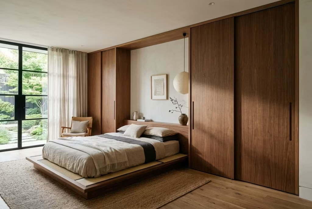
Sliding storage changes the rhythm of a room in a way that is often underestimated until you actually live with it. Unlike hinged wardrobes that demand physical clearance and interrupt circulation every time they are opened, sliding systems move laterally along the architectural plane, keeping the space intact and uninterrupted. The result is a quieter spatial experience, where movement feels smoother and more considered, almost like the room is no longer fighting for its own space.
In practice, I often introduce sliding wardrobes in rooms where flow is compromised, particularly in tighter bedrooms or layouts where furniture sits close to circulation paths. Hinged doors tend to create a kind of visual and physical stop-start effect, whereas sliding panels maintain continuity. When finished in timber veneers or soft matte surfaces that align with the surrounding joinery, they begin to dissolve into the architecture rather than standing out as separate furniture pieces. It is this integration that makes the difference between something that feels placed and something that feels built in.
What I find particularly effective in Japanese mid-century inspired interiors is the restraint in detailing. Handles are often recessed, tracks are concealed, and the movement is almost silent when properly engineered. This subtlety matters. It removes unnecessary visual noise and allows the architecture to take precedence. I have seen rooms feel instantly more composed simply by replacing hinged doors with sliding systems, even when nothing else in the layout has changed. It is a reminder that sometimes spatial calm comes not from adding, but from removing friction.
Real-Life Application Insight
In one residential project, a bedroom layout was constantly disrupted by wardrobe doors swinging into the circulation path, making the room feel tighter than its actual dimensions suggested. We replaced the entire system with full-height sliding panels in a warm walnut finish, aligned flush with the surrounding wall joinery.
The transformation was immediate in use, not just appearance. Movement through the room became smoother, dressing routines felt less constrained, and the overall atmosphere shifted from slightly cluttered to quietly efficient. The client described it as “finally feeling like the room stopped getting in the way,” which captures the essence of what sliding storage achieves when done properly.
Pros
- Eliminates the spatial interruption caused by swinging wardrobe doors
- Improves circulation in compact or tightly planned bedrooms
- Creates a cleaner, more continuous architectural reading of the wall
- Works seamlessly with minimalist and mid-century inspired interiors
- Allows for large storage capacity without visual heaviness
Cons
- Requires precise installation to ensure smooth, long-term operation
- Provides limited full access compared to hinged systems
- Tracks and mechanisms need maintenance to avoid wear over time
- Can feel less tactile or immediate in daily use for some users
- Demands careful design integration to avoid looking like a separate add-on
When executed with care, sliding storage does more than solve a functional problem. It refines how a room behaves, removing unnecessary interruptions and allowing the space to move with a quiet, uninterrupted rhythm that feels almost second nature once you live with it.
Muted Earth-Tone Upholstery with Textural Depth
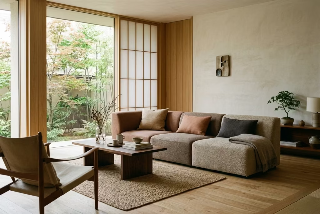
Muted earth-tone upholstery sits at the quiet intersection of comfort and restraint, where colour is not used to impress but to ground the room with subtle confidence. Think clay, taupe, ochre, warm greys, and softened browns, all slightly desaturated so they never overpower the space. When layered correctly, these tones do not compete for attention. Instead, they settle into the architecture, almost like they were always meant to be there, quietly doing their job in the background while the room unfolds around them.
In practice, I rarely treat upholstery as a single flat colour decision. The real depth comes from texture, woven linen, brushed cotton, soft bouclé, or lightly napped wool, each one reacting differently to light and touch. This variation is what prevents earth tones from feeling dull or overly safe. I have seen rooms completely shift character simply by moving from smooth synthetic fabrics to more tactile natural weaves. Suddenly, the furniture does not just sit in the space, it participates in it, catching light, softening edges, and adding a layer of quiet movement throughout the day.
What makes this approach particularly effective in Japanese mid-century inspired interiors is its ability to hold warmth without visual noise. There is no need for bold contrast when the palette itself carries enough variation in tone and texture. I often find that these upholstered pieces act as stabilisers within a room, balancing timber, stone, and architectural surfaces without ever trying to dominate them. It is a bit like good background music, present enough to shape the mood, but never loud enough to interrupt the conversation.
Real-Life Application Insight
In one residential project, a living space initially relied on sharp greys and cool-toned fabrics, which made the room feel slightly detached despite its strong architectural bones. We introduced seating upholstered in muted clay and sand-toned textiles, layered with subtly textured cushions in related earth hues. The change was not dramatic in a visual sense, but the emotional shift was immediate. The room began to feel warmer, more grounded, and far more inviting. The client later said it felt like the space had “softened its edges,” which is exactly what well-considered earth-tone upholstery tends to do when it is allowed to work quietly in the background.
Pros
- Introduces warmth without relying on bold or distracting colour choices
- Enhances the tactile quality of furniture through layered textures
- Works seamlessly with timber, stone, and neutral architectural palettes
- Creates a calm, grounded atmosphere that feels lived-in rather than staged
- Ages gracefully when natural fabrics and quality materials are used
Cons
- Can feel visually flat if texture variation is not carefully layered
- Requires thoughtful lighting to reveal material depth effectively
- Limited impact in overly bright or stark environments without balance
- May appear too subdued for those seeking high-contrast interiors
- Needs careful coordination to avoid blending too much into surrounding finishes
When handled with intention, muted earth-tone upholstery does not try to stand out. Instead, it anchors the room quietly, letting texture do the speaking while colour takes a step back, allowing the entire space to feel more cohesive, grounded, and naturally at ease.
Minimal Artwork with Strong Negative Space
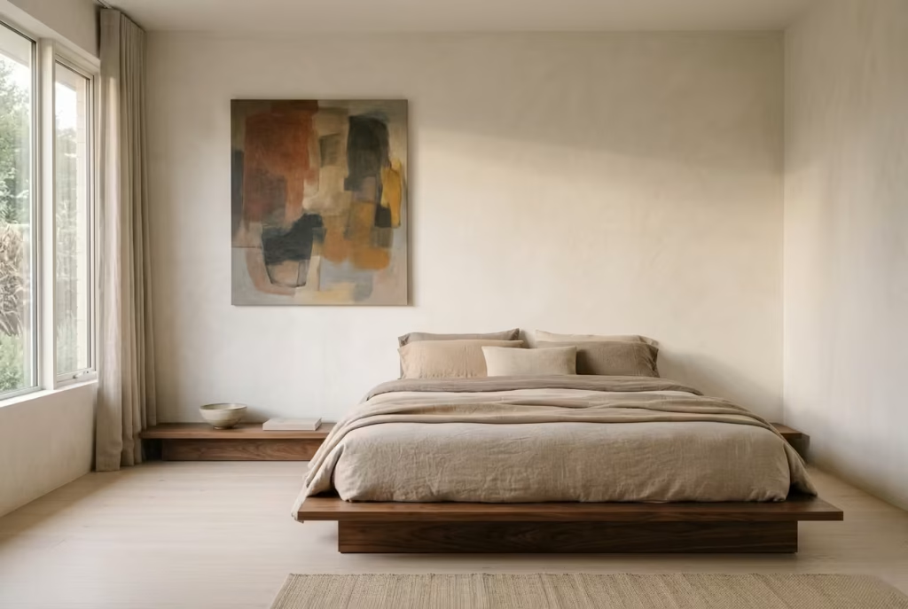
Minimal artwork relies less on visual density and more on what is deliberately left unsaid. In interiors influenced by Japanese mid-century thinking, a single framed piece, or even a restrained series of works, can carry far more presence than an entire gallery wall. The key lies in negative space, the quiet surrounding area that allows the artwork to breathe, sit, and register fully without competition. When that space is respected, the artwork stops behaving like decoration and starts acting like a pause within the room’s rhythm.
In practice, I often see artwork lose its impact when it is surrounded by too many competing elements, shelves, furniture, or layered wall treatments that crowd its visual field. Minimal placement changes everything. A single piece positioned with generous spacing around it, aligned carefully with architectural lines, can quietly anchor an entire wall.
I tend to favour off-centre positioning in some cases, particularly in mid-century inspired layouts, where balance is achieved through tension rather than symmetry. It is a subtle shift, but one that often makes the room feel more composed and intentional.
What makes this approach so effective is its ability to slow the eye down. Instead of scanning a wall full of imagery, the viewer is invited to pause, almost instinctively, and take in the work as a complete moment rather than part of a collection. I have seen this work particularly well in bedrooms and quiet living spaces, where overstimulation is the last thing you want. The artwork becomes less about filling space and more about shaping it, like a carefully placed breath within the architecture.
Real-Life Application Insight
In one residential project, a client initially planned a large gallery wall above a bed, filled with mixed frames and varied artwork. While visually rich, it overwhelmed the room and disrupted the calm we were trying to achieve.
We stripped it back to a single large-scale abstract piece with ample negative space around it, aligned precisely with the bed’s central axis. The effect was immediate. The wall stopped feeling busy and started feeling intentional.
The client later noted that the room felt “quieter to look at,” which is often the clearest indicator that negative space is doing its job properly.
Pros
- Creates strong visual impact through restraint rather than abundance
- Enhances calm and focus by reducing visual noise on walls
- Allows individual artworks to be fully appreciated without distraction
- Works seamlessly with minimalist and Japanese mid-century interiors
- Strengthens architectural alignment when positioned thoughtfully
Cons
- Requires confidence in leaving large areas of wall space empty
- Can feel overly sparse if artwork selection is not strong enough
- Less suitable for expressive or highly decorative interior styles
- Demands careful positioning to avoid looking unfinished or accidental
- Limited flexibility for frequent rotation of multiple pieces
When approached with restraint and clarity, minimal artwork does not feel empty. It feels deliberate, almost like the room is taking a quiet pause, allowing space, form, and meaning to settle without interruption.
Low Horizontal Lines That Guide the Eye
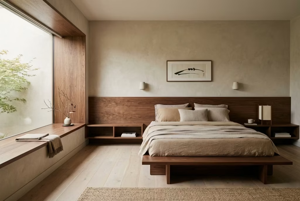
Low horizontal lines have a quiet authority in a room. They do not announce themselves, yet they subtly organise how the space is read from the moment you walk in. Whether expressed through joinery bands, low shelving, bed platforms, or extended window ledges, these lines pull the eye across the room rather than upward, which immediately creates a sense of calm and visual stability. It is a gentle redirection, almost like guiding someone by the hand rather than pointing the way.
In practice, I use horizontal lines to counterbalance vertical pressure, particularly in rooms where ceiling height feels either too dominant or slightly constrained. By introducing a continuous line at a lower level, often around 60 to 90 cm from the floor, the space begins to feel more grounded. The eye travels laterally, pausing and moving again, instead of jumping abruptly between elements. This creates a rhythm that feels measured and intentional, rather than scattered or top-heavy.
What makes this approach especially effective in Japanese mid-century inspired interiors is its alignment with both philosophies. Japanese design often emphasises low, grounded compositions, while mid-century modernism celebrates clean, elongated lines. When the two meet, horizontal elements become more than visual devices, they act as anchors, quietly holding the room together. I have seen spaces that felt slightly unsettled transform simply by introducing a single continuous line, whether through timber detailing or furniture alignment. It is one of those moves that flies under the radar but earns its keep over time.
Real-Life Application Insight
In one residential project, a bedroom with relatively high ceilings felt oddly disconnected, as though the upper and lower halves of the room were not in conversation. We introduced a continuous timber band running along the wall at bedside height, extending into low floating shelves on either side. The effect was immediate in its subtlety. The room felt more cohesive, the proportions more balanced, and the overall atmosphere more grounded. The client later mentioned that the space felt “easier on the eye,” which is often the clearest sign that the visual flow has been resolved properly.
Pros
- Creates a sense of visual calm by guiding the eye smoothly across the room
- Helps balance proportions, especially in spaces with challenging ceiling heights
- Strengthens architectural cohesion when aligned with furniture and joinery
- Works seamlessly with minimalist and mid-century design principles
- Enhances the perception of width, making rooms feel more expansive
Cons
- Can feel overly linear if not balanced with vertical or varied elements
- Requires precise alignment to maintain a clean and intentional look
- May reduce visual interest if overused without variation
- Needs careful integration with existing architectural features
- Can appear subtle to the point of being overlooked if not executed thoughtfully
When used with intention, low horizontal lines do not demand attention. They shape it, guiding the eye in a way that feels natural and unforced, allowing the room to settle into a rhythm that reveals itself gradually rather than all at once.
Hidden Lighting Integrated into Joinery
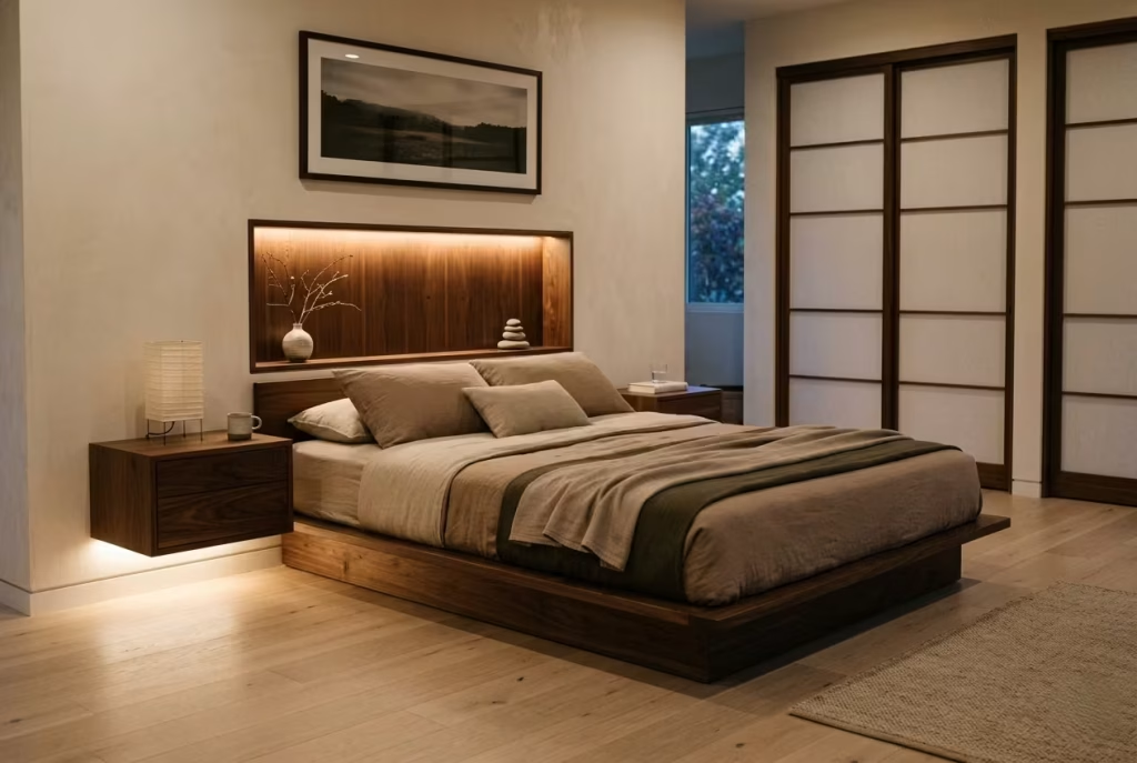
Hidden lighting, carefully integrated into joinery, has a way of transforming a room without ever stepping into the spotlight. It is not about illumination in the conventional sense. It is about shaping atmosphere, revealing materials, and introducing depth where none seemed to exist before. When light is tucked into shelves, beneath cabinets, or along recessed edges, it stops behaving like a fixture and starts acting like part of the architecture itself, quietly doing its work behind the scenes.
In practice, I often treat concealed lighting as a tool for softening transitions within a space. A shadow gap beneath floating joinery, gently lit from within, can lift the entire composition, making heavy elements feel almost weightless. Similarly, a thin strip of light running along the back of open shelving can highlight texture and create subtle contrast without overwhelming the eye. It is a delicate balance, too much brightness and the effect becomes harsh, too little and it disappears entirely. When calibrated correctly, it feels effortless, as if the room is glowing rather than being lit.
What makes this approach particularly effective in Japanese mid-century inspired interiors is its restraint. There is no visible source demanding attention, no decorative fixture interrupting the visual flow. Instead, light is woven into the structure, revealing timber grain, softening edges, and guiding the eye in a way that feels almost instinctive. I often find that this type of lighting is only truly appreciated once the space is lived in, especially in the evening, when it begins to shape mood rather than simply provide function.
Real-Life Application Insight
In one residential project, a bedroom initially relied on overhead lighting that flattened the space and left corners feeling disconnected. We introduced concealed LED strips within the joinery, beneath floating bedside units, and along a recessed wall niche. The transformation was immediate but subtle in the best possible way. The room gained depth, shadows became softer, and the overall atmosphere shifted from functional to quietly immersive. The client later mentioned that they rarely used the main ceiling light anymore, which speaks volumes about how effective hidden lighting can be when it is thoughtfully integrated.
Pros
- Creates a soft, layered lighting effect without visible fixtures
- Enhances material texture and architectural detail
- Reduces visual clutter, supporting a clean and minimal aesthetic
- Improves spatial depth by introducing controlled shadow and highlight
- Works seamlessly with both Japanese and mid-century design principles
Cons
- Requires precise planning and early integration into joinery design
- Can be difficult to retrofit in existing spaces without major adjustments
- Needs careful calibration to avoid overly harsh or insufficient lighting
- Maintenance and replacement can be more complex than standard fixtures
- May require additional lighting layers for task-specific functionality
When handled with care, hidden lighting does not try to impress at first glance. It settles into the background, quietly shaping how the room feels, revealing its layers slowly, almost like a space that chooses to show itself only when the time is right.
Natural Materials Left Slightly Imperfect
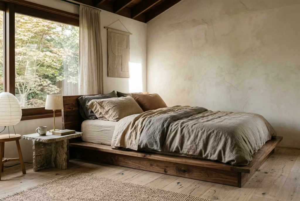
There is a quiet honesty in materials that are allowed to show their true character, knots in timber, subtle tonal shifts in stone, the faint irregularity of hand-finished plaster. These are not flaws to be corrected but qualities to be understood.
In Japanese mid-century inspired interiors, perfection often lies in imperfection, where surfaces feel lived-in from the outset rather than waiting years to develop character. It is a subtle shift in mindset, moving away from polished uniformity towards something more grounded and human.
In practice, I have found that overly refined finishes can sometimes feel disconnected, almost too pristine to belong to everyday life. When materials are softened just slightly, left with a natural grain, a gentle variation, or a matte, tactile finish, they begin to hold the room differently.
They catch light unevenly, respond to touch, and age with a quiet dignity that more artificial surfaces struggle to replicate. It is a bit like a well-worn leather chair that becomes more comfortable with time, not despite its imperfections, but because of them.
What makes this approach particularly effective is how it reduces the pressure for a space to remain untouched. When materials already carry a sense of variation, small marks, shifts, and wear become part of the story rather than something to be hidden.
I often encourage clients to lean into this from the beginning, choosing finishes that will evolve gracefully rather than degrade visibly. Over time, the room gains depth not through added decoration, but through lived experience etched subtly into its surfaces.
Real-Life Application Insight
In one residential project, a client initially opted for highly polished stone surfaces and perfectly uniform timber finishes, aiming for a clean, controlled look. While visually impressive at first, the space felt slightly rigid, almost as if it needed to be preserved rather than lived in. We reintroduced materials with more natural variation, lightly brushed oak, softly honed stone, and hand-applied plaster with a gentle texture.
The transformation was immediate in its warmth. The room no longer felt fragile or overly precious. Instead, it settled into itself, inviting use rather than resisting it. The client later remarked that the space felt “easier to live with,” which is often the most telling measure of success.
Pros
- Adds depth and authenticity through natural variation
- Ages gracefully, developing character over time
- Reduces visual rigidity, creating a more relaxed and liveable environment
- Enhances tactile experience through texture and material honesty
- Aligns closely with both Japanese and mid-century design philosophies
Cons
- May feel less controlled or uniform for those preferring highly polished finishes
- Requires careful selection to avoid excessive irregularity
- Some materials may need more maintenance depending on finish
- Can be misunderstood as unfinished if not thoughtfully integrated
When approached with intention, imperfect materials do not detract from a space. They enrich it, allowing the room to evolve naturally over time, carrying small traces of life within its surfaces rather than hiding them away.
You May also Like: 21 Japandi Guest Room Ideas That Feel Calm, Thoughtful, and Effortlessly Stylish
Compact Reading Corners with Layered Lighting
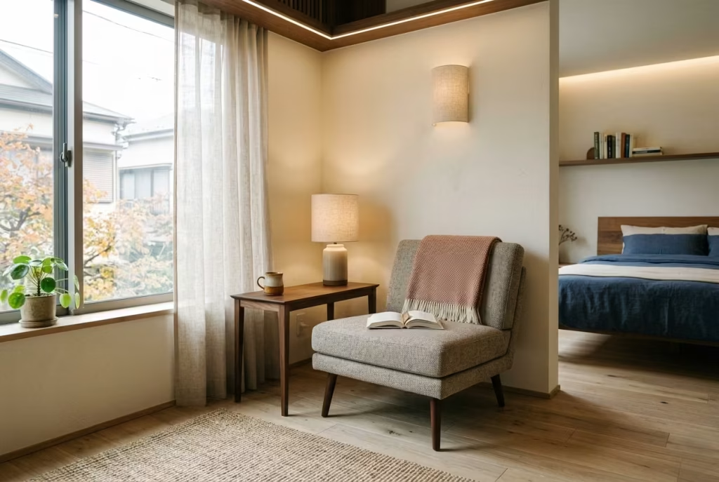
A well-composed reading corner does not need generous square footage to feel meaningful. In fact, some of the most successful ones I have designed have been carved out of overlooked pockets, a quiet corner by a window, a recessed niche, or even a softened edge of a bedroom. What matters is not size but intention. When the space is defined carefully and paired with layered lighting, it begins to feel like a retreat within the room, a place that draws you in almost without asking.
In Japanese mid-century inspired interiors, this idea sits naturally within the broader language of calm and restraint. The furniture remains low and considered, often a single chair or a built-in bench, accompanied by textures that invite pause rather than demand attention. Lighting, however, does the real heavy lifting. A combination of soft ambient light and focused task lighting creates depth, allowing the corner to shift from functional during the day to quietly atmospheric in the evening. It is a bit like setting the stage for a moment of stillness, where everything is in place without feeling arranged.
I often approach these corners by layering light at different heights. A low table lamp with a fabric shade can soften the immediate area, while a discreet wall-mounted light or concealed strip behind joinery adds a gentle glow that expands the space visually. The key is to avoid a single harsh source. Instead, the light should feel distributed, almost like it has settled into the space naturally. When done well, the corner becomes more than just a reading spot. It becomes a place where the pace of the room slows down, even if only for a few minutes at a time.
Real-Life Application Insight
In one project, a bedroom had an awkward corner near a window that was largely unused, too small for conventional furniture, yet too prominent to ignore. We introduced a compact upholstered chair with a seat depth of around 50 cm, paired with a slim timber side table and layered lighting that included a linen-shaded lamp and a subtle wall-mounted fixture above. The transformation was immediate in its quietness. What had once been dead space became a daily ritual point, a place for morning reading or evening unwinding. The client later mentioned that it had become their favourite part of the room, which is often how these small, well-considered interventions prove their worth.
Pros
- Creates a dedicated space for relaxation without requiring large floor area
- Enhances the functionality of underused corners
- Adds depth and layering through thoughtful lighting design
- Encourages slower, more intentional use of space
- Works seamlessly within calm, minimalist interiors
Cons
- Requires careful lighting planning to avoid under or over-illumination
- Limited seating capacity due to compact scale
- Can feel disconnected if not visually tied to the rest of the room
- Needs precise furniture selection to maintain proportion
- May become underused if not positioned in a naturally inviting area
When handled with care, a compact reading corner does not feel like an addition. It feels like a discovery, a small, quiet pocket within the room that offers just enough separation to pause, without ever stepping away from the space entirely.
Frameless Transitions Between Spaces
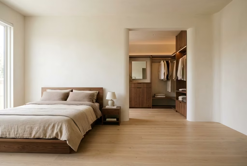
Frameless transitions have a way of dissolving boundaries without making a show of it. By removing door casings, trims, and visual interruptions at thresholds, the eye is allowed to move freely from one space to the next. The result feels quieter, more continuous, almost as if the rooms are in conversation rather than standing apart. It is a subtle move, but one that can shift the entire reading of a home, especially in layouts where flow matters more than separation.
In practice, I approach frameless openings as part of the architecture rather than an absence of detail. Clean plaster returns, flush junctions, and carefully aligned finishes ensure that the transition feels intentional rather than unfinished. When flooring, wall tones, or ceiling lines carry through uninterrupted, the space begins to feel more expansive without physically increasing its size. It is a bit like joining two sentences without a full stop, the pause is still there, but it feels softer, more fluid, and easier to follow.
What makes this approach particularly effective in Japanese mid-century inspired interiors is its alignment with restraint. There is no need to outline every edge or define every boundary. Instead, the space is allowed to unfold gradually, with transitions that feel natural rather than forced. I often find that this works especially well between bedrooms and adjoining areas such as dressing spaces or reading zones, where a sense of connection is more valuable than strict separation.
Real-Life Application Insight
In one residential project, a bedroom and adjacent dressing area were originally divided by a standard framed opening, which created a clear but somewhat abrupt boundary. By removing the frame and refining the opening with clean plaster edges, we allowed the two spaces to flow into one another more naturally. The change was immediate in its subtlety. The bedroom felt larger, the dressing area more integrated, and the overall experience more cohesive. The client later remarked that it felt like “the spaces finally belonged to each other,” which is often the quiet success of this approach.
Pros
- Creates a seamless visual flow between connected spaces
- Enhances the perception of openness without structural expansion
- Supports a calm, uninterrupted architectural language
- Works particularly well in minimalist and open-plan layouts
- Reduces visual clutter by eliminating unnecessary detailing
Cons
- Requires precise construction to achieve clean, flush finishes
- Offers less defined separation between spaces when privacy is needed
- Can feel too subtle if surrounding materials lack variation
- Demands careful alignment of finishes across adjoining areas
- Less forgiving of imperfections compared to framed openings
When handled with care, frameless transitions do not draw attention to themselves. They quietly guide the experience of moving through a home, allowing spaces to connect in a way that feels natural, almost inevitable, as if the boundaries were never meant to be there in the first place.
Softly Divided Zones Instead of Solid Walls
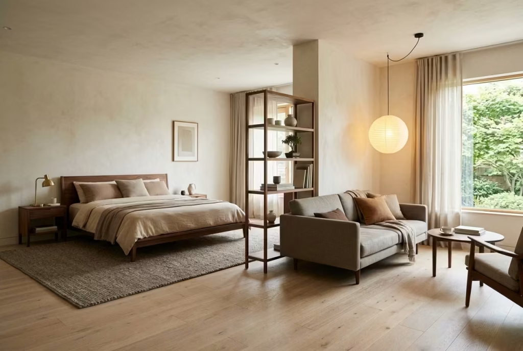
Soft division is less about drawing a hard line and more about suggesting where one activity ends and another begins. Instead of enclosing space with solid walls, the room is gently organised through changes in level, material, lighting, or furniture placement.
The effect feels lighter on its feet, almost as if the layout has been guided rather than dictated. You still understand where to sit, sleep, or dress, yet nothing feels boxed in or overly prescribed.
In practice, I often use a combination of cues rather than a single gesture. A low timber screen, open shelving, or a shift in flooring tone can be enough to define a boundary without closing it off. Lighting plays its part too.
A slightly warmer pool of light over a seating area, contrasted with softer ambient light in the sleeping zone, can create separation without a single wall in sight. It is a bit like reading a well-paced paragraph where the pauses tell you just as much as the words.
What makes this approach particularly effective in Japanese mid-century inspired interiors is its respect for flow. Spaces are allowed to connect visually while still holding their own purpose. I have seen bedrooms that double as reading or dressing areas feel far more composed when softly divided, simply because each function has been given its own quiet territory. The room begins to breathe, expanding and contracting in subtle ways depending on how it is used throughout the day.
Real-Life Application Insight
In one residential project, a large bedroom needed to accommodate both sleeping and a small lounge area, yet introducing a full partition would have made the space feel unnecessarily segmented.
We defined the lounge zone using a low-backed sofa, a change in rug texture, and a slightly lowered pendant light that created a more intimate ceiling plane.
No walls were added, yet the room began to function as two distinct spaces. The client later described it as “feeling organised without feeling divided,” which is often the sweet spot when soft zoning is done well.
Pros
- Maintains visual openness while still defining functional areas
- Enhances flexibility, allowing spaces to adapt over time
- Reduces the need for structural changes or permanent partitions
- Supports a calm, flowing layout aligned with minimalist principles
- Encourages a more intuitive and relaxed use of space
Cons
- Offers less acoustic and visual privacy compared to solid walls
- Requires careful planning to ensure zones feel intentional rather than vague
- Can feel unresolved if boundaries are too subtle
- Needs coordination across materials, lighting, and furniture to be effective
- May not suit layouts where strict separation is required
When handled with a steady hand, softly divided zones do not feel like a compromise. They feel considered, allowing the room to hold multiple functions without losing its sense of calm, almost like the space knows exactly where to pause and where to flow.
Balanced Contrast Between Light and Dark Timber
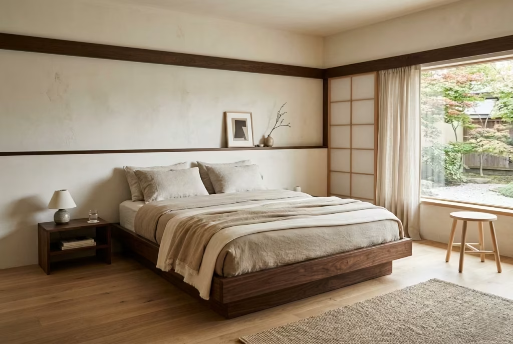
Timber brings warmth almost by default, but the real depth emerges when light and dark tones are used together with restraint. It is not about setting up a dramatic contrast that steals the show. It is about creating a quiet dialogue between surfaces, where each tone supports the other without pulling the room in different directions. When balanced well, lighter timbers such as ash or pale oak lift the space, while deeper tones like walnut or smoked oak ground it, forming a composition that feels steady underfoot and easy on the eye.
In practice, I treat this contrast as a matter of proportion rather than preference. Too much dark timber and the room can feel weighed down, especially in smaller spaces or those with limited natural light. Too much light timber, and the space risks feeling washed out, lacking the depth needed to hold attention over time. The balance often sits somewhere in between, where one tone leads and the other supports. I might anchor a room with a darker bed frame or joinery band, then allow lighter flooring or wall finishes to soften the overall reading. It is a bit like seasoning a dish, where just enough contrast brings out the flavour, but too much can overwhelm it entirely.
Grain and finish also play a quiet but important role. A heavily patterned timber in both light and dark tones can feel visually restless, so I tend to simplify one if the other carries more character. Matte or lightly oiled finishes help maintain cohesion, allowing the materials to sit comfortably together rather than compete. When done correctly, the contrast feels measured, almost instinctive, as if the room has found its own internal balance without trying too hard.
Real-Life Application Insight
In one residential project, the initial scheme relied entirely on pale timber finishes, which made the room feel open but slightly lacking in definition. We introduced darker walnut elements through the bed base and a continuous wall band, keeping the rest of the palette light and restrained. The effect was immediate yet understated. The darker tones anchored the space, giving it a sense of weight and structure, while the lighter surfaces kept it feeling airy. The client later mentioned that the room felt “more complete,” which is often what balanced contrast achieves when it is handled with care.
Pros
- Adds depth and visual interest without relying on bold colour contrasts
- Helps define zones and anchor key elements within a room
- Enhances the natural character of timber through tonal variation
- Works seamlessly within Japanese and mid-century design principles
- Creates a balanced composition that feels both warm and grounded
Cons
- Requires careful proportioning to avoid visual imbalance
- Can feel heavy if darker tones dominate in smaller or poorly lit spaces
- Demands consistency in undertones to prevent clashing materials
- Overuse of contrasting grains can create visual noise
- Needs thoughtful integration to maintain a cohesive overall palette
When approached with a steady hand, the interplay between light and dark timber does not feel like contrast for its own sake. It feels like balance, quietly reinforcing the structure of the room while allowing warmth to carry through in a way that feels natural and enduring.
You May also Like: 25 Japandi Balcony Design: Calm Minimalism and Cozy Natural Textures
Quiet Focal Points That Don’t Announce Themselves
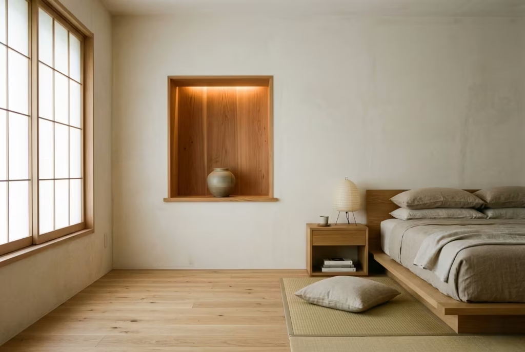
Not every focal point in a room needs to raise its voice. In fact, the most enduring interiors often rely on elements that guide attention rather than demand it. A quiet focal point works in a more restrained register, drawing the eye in gradually, almost without permission, and then holding it there long enough for the space to be properly understood. It might be a low bench aligned with a window, a single sculptural object placed off-centre, or a carefully lit corner that reveals itself slowly as the light shifts throughout the day.
In practice, I tend to think of these focal points as moments of pause within a composition rather than features to be showcased. They work best when they are embedded within the architecture or gently supported by it, rather than isolated as standalone statements. A timber niche, a recessed reading alcove, or even a subtle change in material texture can become a focal point if the surrounding space is quiet enough to let it breathe. The key is restraint, allowing one element to carry meaning without competing against a dozen others trying to do the same. It is a bit like a well-told story where one line stays with you long after everything else has faded.
What makes this approach so effective in Japanese mid-century inspired interiors is its refusal to overstate importance. Nothing shouts, yet everything has presence. I have often found that when a room is composed with this mindset, the focal points reveal themselves over time rather than immediately. Clients might not notice them at first glance, but they begin to gravitate towards them naturally, almost instinctively, as they live in the space. That gradual discovery is what gives these moments their quiet strength.
Real-Life Application Insight
In one residential project, a bedroom initially lacked any clear visual anchor, which made the space feel slightly directionless despite its strong proportions. Instead of introducing a bold feature wall or statement furniture piece, we created a subtle focal point using a recessed timber-lined niche with soft integrated lighting and a single handcrafted ceramic object placed within it. Nothing about it was loud or attention-seeking. Yet over time, it became the most visually referenced point in the room. The client later described it as “something you notice more the longer you live with it,” which is exactly how quiet focal points are meant to function.
Pros
- Creates subtle visual anchors without overwhelming the space
- Encourages a more relaxed and thoughtful reading of interiors
- Works seamlessly within minimalist and Japanese mid-century design language
- Allows the architecture to guide attention rather than decorative excess
- Becomes more meaningful over time as the space is lived in
Cons
- May feel underwhelming if strong visual impact is expected immediately
- Requires careful restraint to avoid losing definition entirely
- Depends heavily on lighting and spatial context to be effective
- Can be overlooked if surrounding design lacks clarity or structure
- Needs confident editing to avoid competing subtle elements
When executed with intention, quiet focal points do not compete for attention. They earn it slowly, becoming part of the room’s rhythm in a way that feels natural, almost inevitable, as if the space has always known exactly where to guide the eye.
How These Ideas Translate Into Real Homes
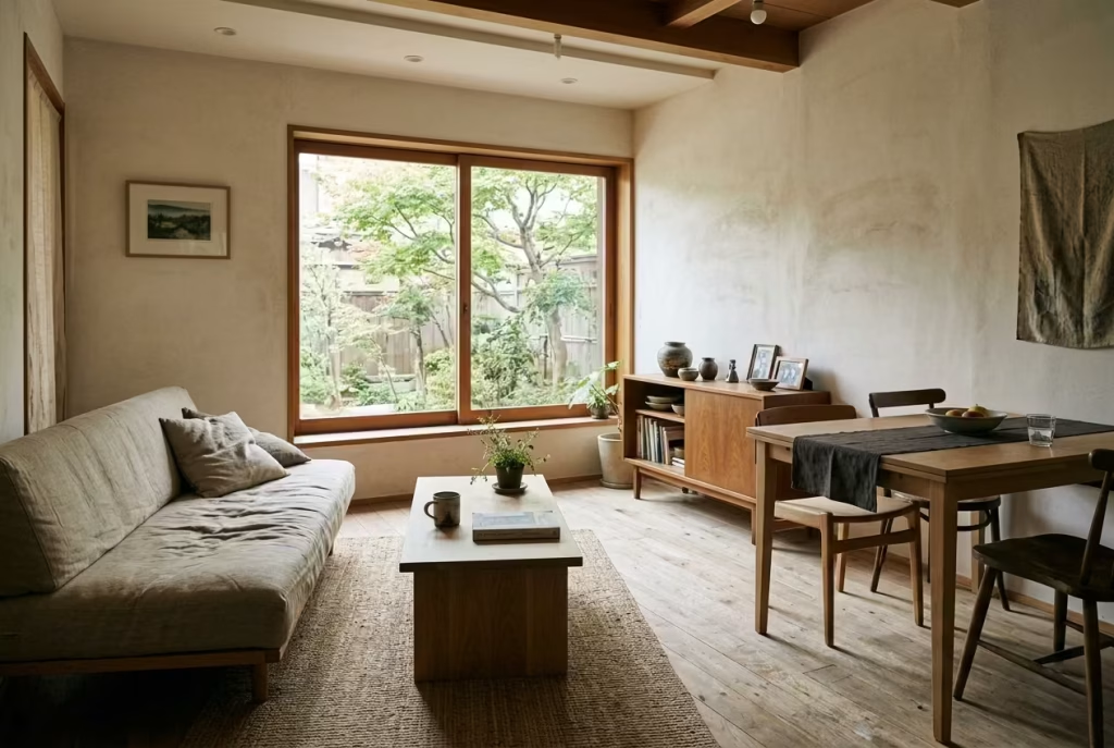
When these Japanese mid-century inspired ideas move from concept into lived-in spaces, their value is revealed in a far more grounded way than any visual reference can fully capture. What begins as proportion, material restraint, or subtle spatial zoning gradually becomes a daily rhythm that shapes how people move, pause, and inhabit their homes. It is rarely about dramatic transformation on day one.
Instead, it is about accumulation, small decisions working together over time until the space feels naturally composed, almost as if it always knew how to function this way. In real homes, these principles stop being design ideas and start becoming behaviour, quietly guiding how a room is used without ever drawing attention to themselves.
Adapting for Small Bedrooms
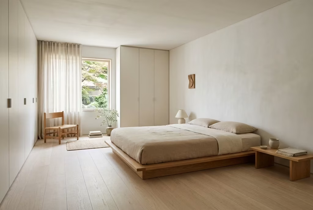
Small bedrooms tend to reveal design decisions more honestly than generous spaces, which is why restraint becomes less of an aesthetic choice and more of a necessity. The most effective approach is to work with low furniture profiles and uninterrupted visual lines, allowing the room to feel longer, calmer, and less visually fragmented.
When beds sit closer to the floor and storage is integrated rather than imposed, the ceiling suddenly feels less pressured, almost as if it has been lifted without physically changing anything.
In practice, I often focus on continuity as the main strategy for compact rooms. Flooring that runs uninterrupted beneath furniture, soft neutral palettes that do not break the eye, and minimal variation in material height all help the space read as one cohesive volume. It is a bit like smoothing out creases in fabric.
Nothing is removed, yet everything feels more composed. Even small adjustments, such as aligning headboards with wall bands or keeping side tables at consistent low proportions, can dramatically shift perception.
What matters most is avoiding visual noise. In smaller bedrooms, every object carries more weight, so each decision needs to earn its place. I have seen rooms feel significantly larger simply by reducing contrast and keeping furniture grounded, allowing the architecture rather than the contents to lead the conversation.
Pros
- Enhances perceived space without structural changes
- Encourages calm, uncluttered spatial reading
- Improves flow and reduces visual fragmentation
- Works especially well with Japanese and mid-century principles
- Makes small rooms feel more intentional and composed
Cons
- Requires disciplined editing of furniture and accessories
- Limited tolerance for oversized or bulky pieces
- Can feel sparse if not balanced with texture or warmth
- Demands careful planning to avoid underutilised corners
- Less flexibility for frequent layout changes
Working Within Renovation Constraints
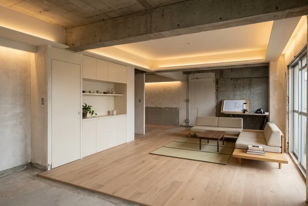
Renovation work often feels like a negotiation between ambition and reality, where structural limitations set the boundaries and design decisions fill in the gaps. The key is understanding what can genuinely be changed versus what should be refined.
Structural interventions, such as altering wall positions or ceiling heights, carry cost and complexity, while cosmetic changes like finishes, lighting, and joinery offer more immediate impact with far less disruption.
In practice, I always advise prioritising changes that influence perception first. Lighting, material transitions, and spatial flow can transform a room far more effectively than aggressive structural work in many cases. It is a bit like adjusting the framing of a photograph rather than retaking the entire shot. Small shifts in tone, alignment, or proportion can completely change how a space is experienced.
Where budgets or permissions are limited, simplification becomes a strength rather than a compromise. Instead of trying to do everything, focus on the elements that will carry the most long-term visual and functional weight. Built-in joinery, flooring continuity, and lighting strategy often deliver the highest return in terms of spatial clarity.
Pros
- Allows meaningful transformation without major structural work
- Helps prioritise budget toward high-impact design elements
- Encourages more thoughtful, selective decision-making
- Reduces renovation complexity and disruption
- Makes phased improvements more achievable
Cons
- Structural limitations may restrict layout ambitions
- Cosmetic changes alone may not solve all spatial issues
- Requires clear prioritisation to avoid fragmented outcomes
- Can feel restrictive if expectations are not aligned early
- Some compromises may be unavoidable in older properties
Material Sourcing and Practical Considerations
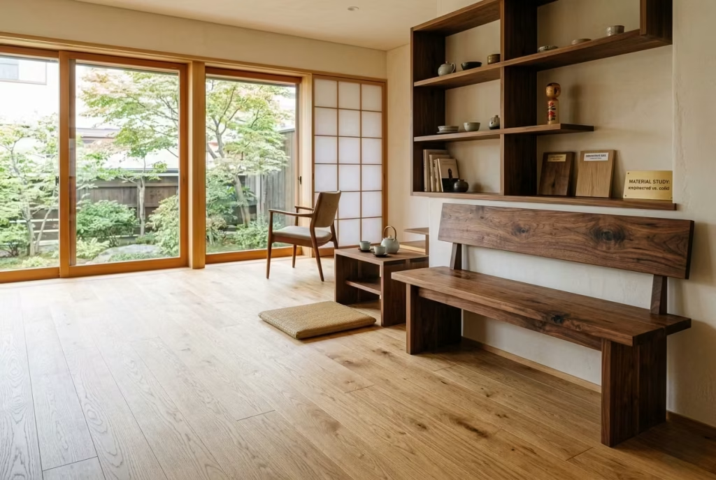
Material choice is where design intention meets long-term reality. Timber, in particular, plays a defining role in Japanese mid-century inspired interiors, but the decision between engineered and solid options is not purely aesthetic.
Engineered timber offers stability and consistency, making it well suited to modern renovations where movement and humidity fluctuations are a concern. Solid timber, on the other hand, carries depth and character that develops over time, though it demands more careful maintenance and environmental consideration.
In practice, I often weigh material selection against how a space will actually be lived in, not just how it looks on installation day. Engineered options are often the pragmatic choice for flooring or large surface areas, while solid timber can be reserved for focal elements such as joinery fronts or furniture pieces where tactile richness matters most. It is a bit like choosing where to invest detail versus where to prioritise durability.
Longevity is another key factor that is often overlooked. Materials that age gracefully tend to outperform those that rely on perfection at the outset. Surface finishes, maintenance cycles, and exposure to light all play a role in how a material evolves.
I have seen well-chosen timber soften beautifully over time, gaining character rather than simply wearing out, which is exactly the kind of long-term thinking that separates temporary design from enduring interiors.
Pros
- Engineered timber offers stability and reduced movement over time
- Solid timber provides richer texture and natural ageing qualities
- Allows flexibility in balancing cost, durability, and aesthetics
- Supports long-term design consistency when chosen carefully
- Enhances authenticity in material-led interiors
Cons
- Solid timber requires more maintenance and environmental control
- Engineered options may lack the depth of natural variation
- Incorrect selection can lead to premature wear or visual mismatch
- Higher quality materials can significantly increase project cost
- Requires informed sourcing to avoid inconsistent finishes
When approached with clarity, material decisions stop being purely technical choices. They become part of the story a home tells over time, shaping how it looks, feels, and quietly evolves long after the renovation is complete.
Common Mistakes That Disrupt the Balance
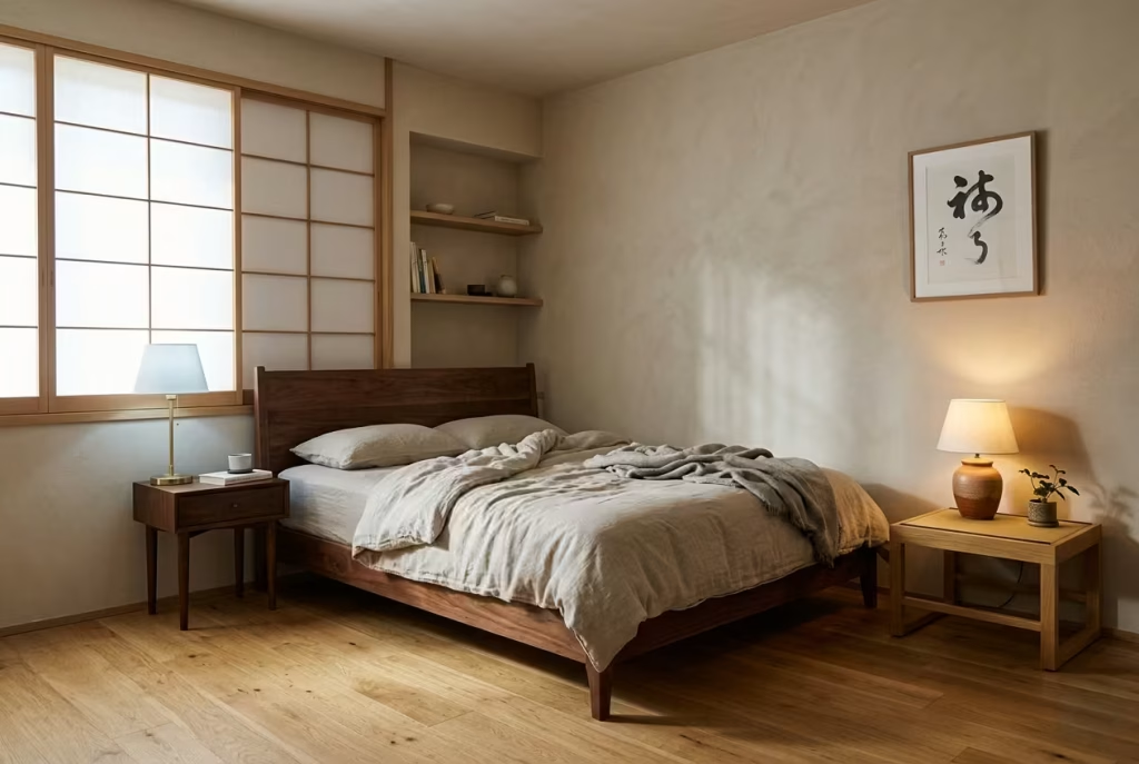
In interiors shaped by Japanese mid-century principles, balance is rarely disrupted by one dramatic error. More often, it is a slow accumulation of small misjudgements that gradually dilute clarity. A space can have strong materials, considered furniture, and even good proportions, yet still feel unsettled if a few key principles are misunderstood. The result is usually not chaos, but a quiet sense that something is slightly off, like a composition that never quite resolves itself.
Over-layering textures without restraint
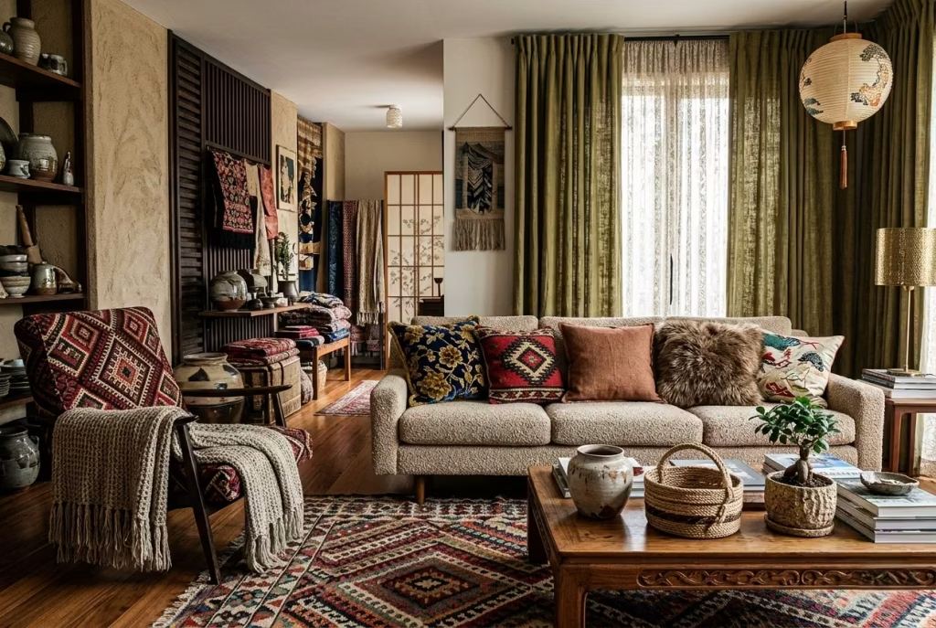
Texture brings life to an interior, but when it is applied without control, it begins to compete rather than contribute. I often see rooms where timber grain, heavy textiles, patterned upholstery, and tactile wall finishes are all introduced with good intention, yet none of them are given enough breathing room. The eye starts to work too hard, moving from surface to surface without ever settling.
In practice, restraint is what gives texture its impact. A single well-chosen material can speak more clearly than five trying to be noticed at once. It is a bit like layering too many instruments in a piece of music where every sound has merit, but nothing has space to lead. When texture is edited with discipline, the room gains clarity, and each material begins to carry its own weight rather than fighting for attention.
Mixing eras without understanding proportion
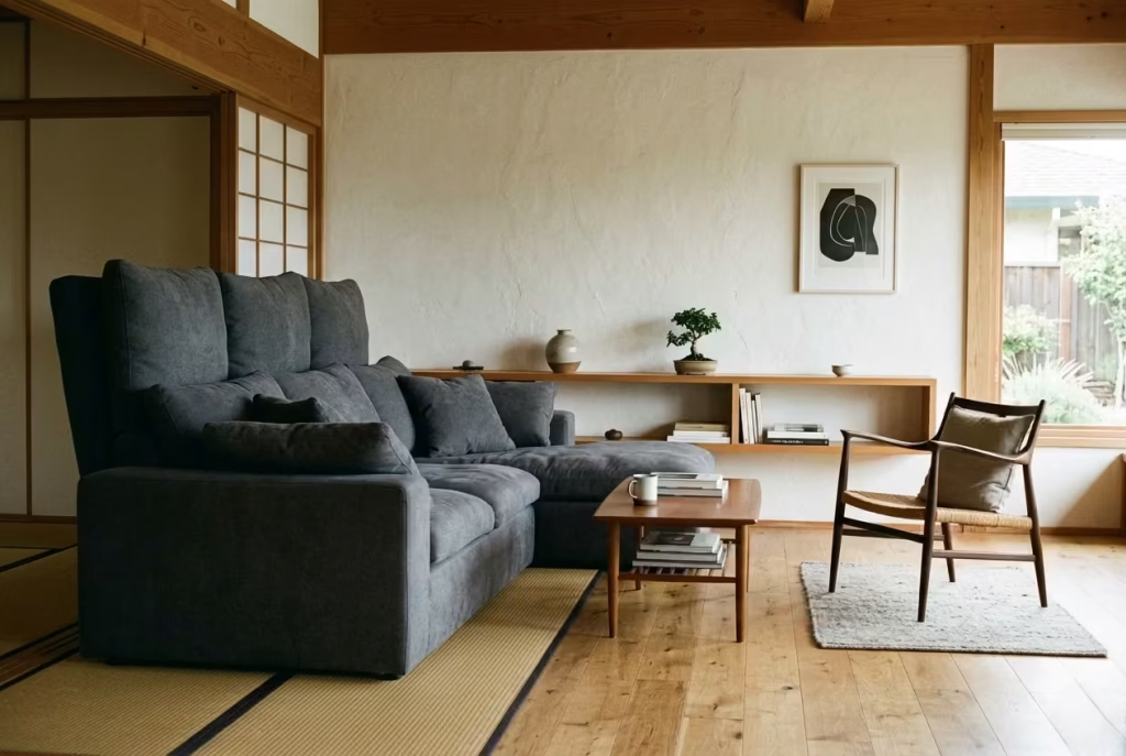
Combining mid-century forms with Japanese spatial principles can be incredibly effective, but only when proportion is respected. The mistake often happens when furniture from different eras is placed together without considering scale, visual weight, or rhythm. A sculptural mid-century chair next to a heavy contemporary sofa, for example, can feel disconnected if their proportions do not speak the same language.
What I have learned through real projects is that cohesion does not come from matching styles, but from aligning proportions. A low-profile sofa can sit comfortably alongside Japanese-inspired built-ins if both share a similar visual grounding. Without that alignment, the room starts to feel like separate ideas occupying the same space rather than a unified composition. It is a subtle difference, but one that determines whether a room feels curated or simply collected.
Ignoring lighting temperature and diffusion
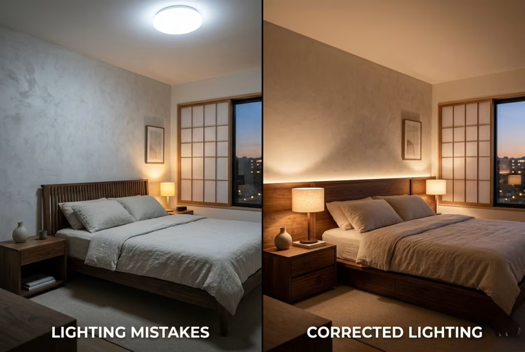
Lighting is often treated as an afterthought, yet it has one of the most profound effects on how a space is perceived. A common mistake is mixing lighting temperatures or relying too heavily on harsh, undiffused sources that flatten materials and distort atmosphere. Cool white light in one corner and warm light in another can fracture the visual harmony of a room almost instantly.
In practice, consistency in temperature and softness in diffusion are what allow materials to behave naturally. Timber feels warmer, textiles feel richer, and architectural lines become more legible when light is even and considered. I often find that when lighting is corrected, nothing else in the room needs to change. It is a bit like adjusting the tone of a conversation so everything suddenly makes more sense without altering the words themselves.
Treating minimalism as emptiness rather than composition
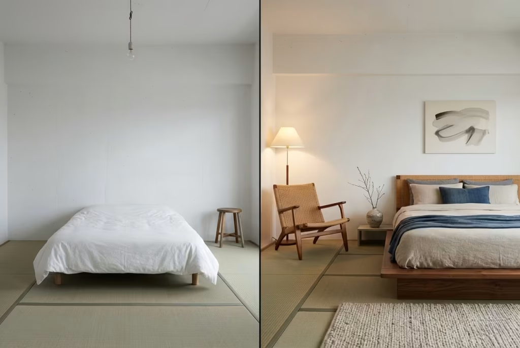
Perhaps the most common misunderstanding is equating minimalism with absence. Empty space is not the same as considered space. When minimalism is treated as a way to remove rather than compose, rooms can feel unfinished, cold, or emotionally detached. What is missing is not furniture or objects, but intention behind placement.
In real design work, minimalism functions more like editing than erasing. Every element must justify its presence, and just as importantly, the space around it must be equally intentional. Negative space, alignment, and rhythm become just as important as the objects themselves. I have seen rooms transform not by adding anything new, but by adjusting what remains so it sits with greater clarity. When minimalism is understood as composition, the space stops feeling empty and starts feeling deliberate, almost inevitable in its arrangement.
Final Thoughts: The Art of Holding Back
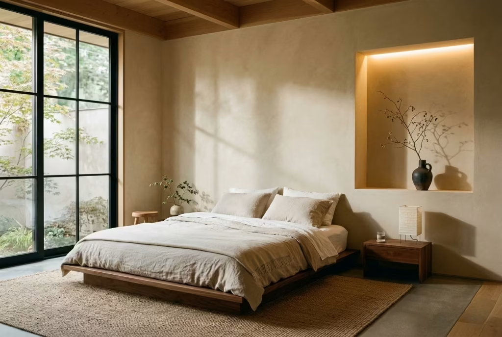
In many of the projects I have worked on, the real turning point was never about what was added. It was about what was removed, resisted, or simply never introduced in the first place. Japanese mid-century inspired interiors, at their core, rely on this discipline of holding back. Not as an act of absence, but as a deliberate shaping of clarity. When everything is allowed to compete for attention, nothing truly settles. But when restraint is applied with confidence, the space begins to speak in a far more coherent voice.
There is a tendency, especially early in a design process, to want immediate impact. A room that looks “finished” the moment you walk in. Yet the most successful interiors I have seen or created rarely work that way. They do not announce themselves loudly or rely on instant recognition. Instead, they unfold gradually, almost quietly persuading you to notice them over time. A timber detail that feels more balanced after a week. A lighting scheme that reveals its depth only after a few evenings. A spatial rhythm that begins to feel natural only after living with it.
I often think of one residential project where nothing in the space was particularly dramatic on its own, yet the overall result felt unusually composed. There were no dominant gestures, no overpowering features, just a careful calibration of proportion, material, and light. The client later mentioned that the space “didn’t try to impress, but kept revealing itself.” That observation stayed with me, because it captures something fundamental about this approach. Good design does not always demand attention at first glance. Sometimes it earns it slowly, without asking for it.
Ultimately, restraint is not about doing less for its own sake. It is about making room for everything that remains to actually matter. When visual noise is reduced, proportion becomes clearer, materials feel more honest, and light begins to shape atmosphere rather than just illuminate it. The result is a kind of quiet confidence, where nothing feels forced, yet nothing feels accidental either.
And perhaps that is the real lesson in all of this. The most enduring spaces are rarely the ones that try to impress immediately. They are the ones that trust time, resist excess, and allow themselves to be understood gradually, almost subconsciously, until you realise you are no longer just looking at the room, but living comfortably within it.
FAQs: Japanese Mid-Century Modern Design Ideas
What defines Japanese Mid-Century Modern interior design?
It is a hybrid design language that blends Japanese spatial restraint with mid-century modern warmth and proportion. The result is a calm, structured aesthetic where low furniture, natural materials, and clean architectural lines work together. Unlike trend-driven interiors, it focuses on balance, negative space, and long-term livability rather than visual excess.
Can this style work in small homes or apartments?
Yes, it often works best in smaller spaces when handled correctly. The emphasis on low furniture, visual continuity, and reduced clutter helps compact rooms feel more open than they actually are. In practice, I often see small bedrooms feel noticeably larger simply by lowering visual weight and simplifying material transitions. The key is discipline, not size.
What materials are most commonly used in this design approach?
Natural materials dominate, particularly timber, stone, linen, and plaster. Timber is usually the backbone, often in warm or muted tones, while stone and textiles add subtle variation. The important detail is not just the material itself, but how it is finished. Matte, lightly textured, or naturally imperfect surfaces tend to work far better than high-gloss or overly polished finishes.
How important is lighting in Japanese Mid-Century Modern interiors?
Lighting is essential, not decorative. It is used to shape mood rather than simply illuminate space. Diffused lighting, layered at different heights, is far more effective than a single central fixture. In real projects, I often find that when lighting is corrected, the entire room immediately feels more balanced, even if nothing else changes.
Is this style expensive to achieve?
Not necessarily. While custom joinery or quality timber can increase costs, the philosophy itself is more about restraint than expenditure. Many of the most effective results come from simplifying layouts, reducing unnecessary elements, and improving proportion rather than adding expensive finishes. Thoughtful editing often matters more than budget size.
What is the most common mistake when trying this style?
The most common mistake is treating minimalism as emptiness rather than composition. Removing too much without considering balance can make a space feel cold or incomplete. Another frequent issue is mixing too many textures or eras without understanding proportion, which disrupts the calm visual rhythm this style relies on.
Can this style include bold or decorative pieces?
Yes, but selectively. One sculptural chair, a single artwork, or a carefully chosen lighting feature can work beautifully when surrounded by restraint. The key is contrast through isolation rather than accumulation. In well-executed spaces, one strong element often carries more impact than several competing ones.
Does this style suit modern family living?
It does, provided it is adapted thoughtfully. Built-in storage, durable materials, and flexible zoning are essential. Soft divisions rather than solid walls, for example, allow spaces to remain open while still functional. When done properly, the result is not restrictive but highly practical and easy to live in over time.