25 Sage Green Living Room Ideas: Timeless Designs for a Calm and Stylish Space
Sage green rarely behaves like a statement colour, and that is precisely where its strength lies. It doesn’t compete for attention or try to define a space in a single glance. Instead, it operates more like a stabilising layer, something that quietly regulates the atmosphere of a room, softening contrasts, grounding materials, and allowing other elements to sit more comfortably within the composition. In well-resolved interiors, colour is not there to decorate. It is there to organise.
What makes sage particularly compelling is its ability to move across architectural contexts without friction. In period homes, it has a way of settling into ornate detailing, easing the transition between mouldings, panelling, and aged materials without flattening their character. In more contemporary settings, where lines are cleaner and surfaces more restrained, it introduces just enough tonal complexity to prevent the space from feeling sterile. It bridges that gap between old and new with a kind of quiet fluency, never forcing the issue, always adapting.
In several projects, I’ve noticed sage doesn’t announce itself immediately. It settles in slowly, then starts shaping how everything else behaves around it. Timber appears warmer, stone feels softer, even light seems to diffuse differently across the surfaces. It is less about the colour itself and more about the environment it creates around it. That shift tends to reveal itself over time rather than at first glance, which is why it often outlasts more assertive palettes.
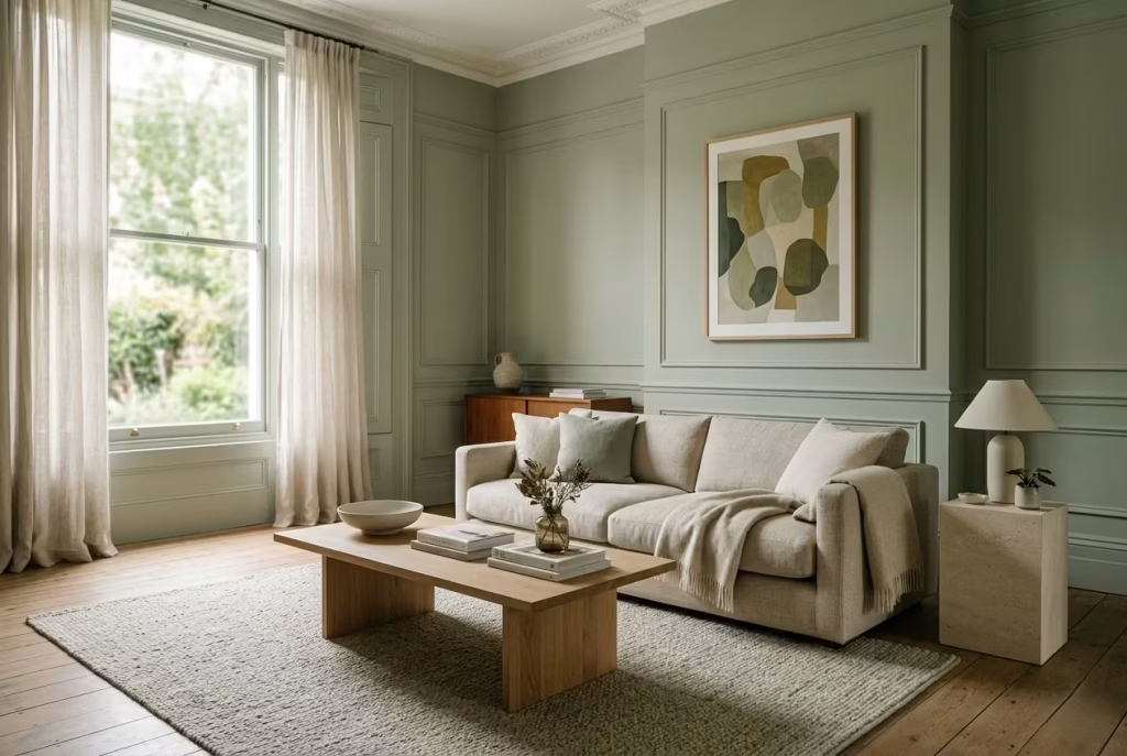
The ideas that follow are not intended as quick visual upgrades or surface-level styling tricks. They are considered design moves, each one grounded in how space is experienced rather than how it photographs. When sage green is used with intent, it does not simply change how a room looks. It changes how it holds together.
Understanding Sage Green in Interior Design
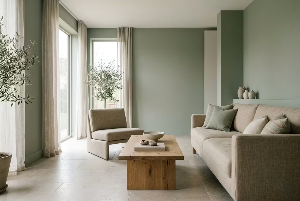
Sage green sits in a nuanced position within interior palettes, neither fully warm nor overtly cool, which allows it to operate with a level of flexibility that few colours achieve. Its muted, slightly greyed base gives it a composure that reads as calm rather than decorative, making it particularly effective in spaces where balance and continuity matter more than contrast. In practice,
it behaves less like a feature and more like a mediator, easing transitions between materials, softening architectural lines, and quietly influencing how light is absorbed and reflected throughout the room. When understood properly, it becomes a tool for shaping atmosphere rather than simply adding colour, which is why it consistently performs well across a wide range of interior styles.
Why Sage Green Feels Instinctively Calm
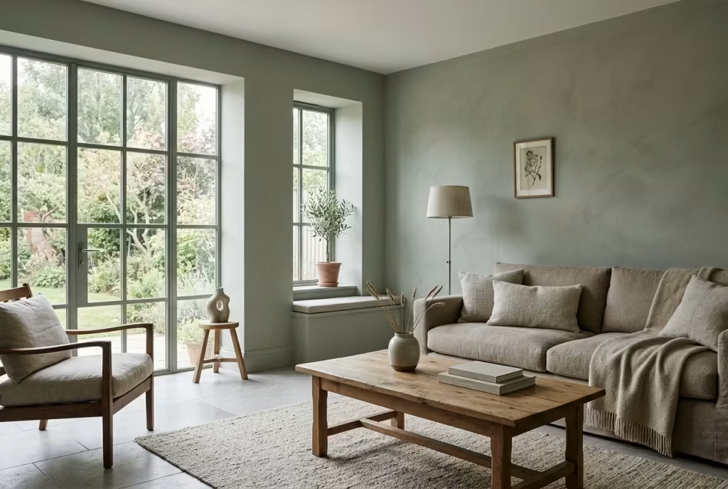
There is a reason sage green tends to settle into a room so naturally, and it has less to do with trends and more to do with how we register colour on a sensory level. While it is often loosely tied to nature, the real value lies in how *muted* that connection is. This is not the sharp, saturated green of fresh foliage or painted feature walls that demand attention. Sage arrives softened, slightly dusted with grey, which takes the edge off its vibrancy and allows it to sit back rather than push forward. It feels familiar without being obvious, like something you have seen a hundred times but never consciously noticed.
From a visual standpoint, the eye tends to work harder when processing extremes. Cooler greys, particularly those with blue undertones, can feel crisp at first but often tip into something slightly austere over time, especially in low or northern light. Warmer beiges, on the other hand, wrap the room in comfort but can drift into heaviness if not carefully balanced. Sage green finds a middle ground that avoids both pitfalls. It carries enough warmth to feel inviting, yet enough neutrality to remain composed. That balance allows the eye to rest, rather than constantly adjust, which is where that sense of calm begins to take hold.
In real spaces, this becomes noticeable quite quickly. I have worked on living rooms where replacing a flat grey with a muted sage shifted the entire atmosphere without altering the layout or furniture. The room stopped feeling like it was holding its breath. Light softened as it moved across the walls, materials began to read more honestly, and the overall composition felt less forced. It is the kind of change that does not shout for attention but quietly improves everything around it, almost like turning down background noise you did not realise was there.
There is also a subtle psychological layer at play. Sage does not impose a strong emotional direction, which gives the room space to evolve with how it is used. It supports both quiet moments and social settings without feeling out of place, which is not something every colour can manage. In that sense, it behaves more like a steady presence than a design statement, holding the space together without ever trying to steal the spotlight.
Light Behaviour and Time of Day
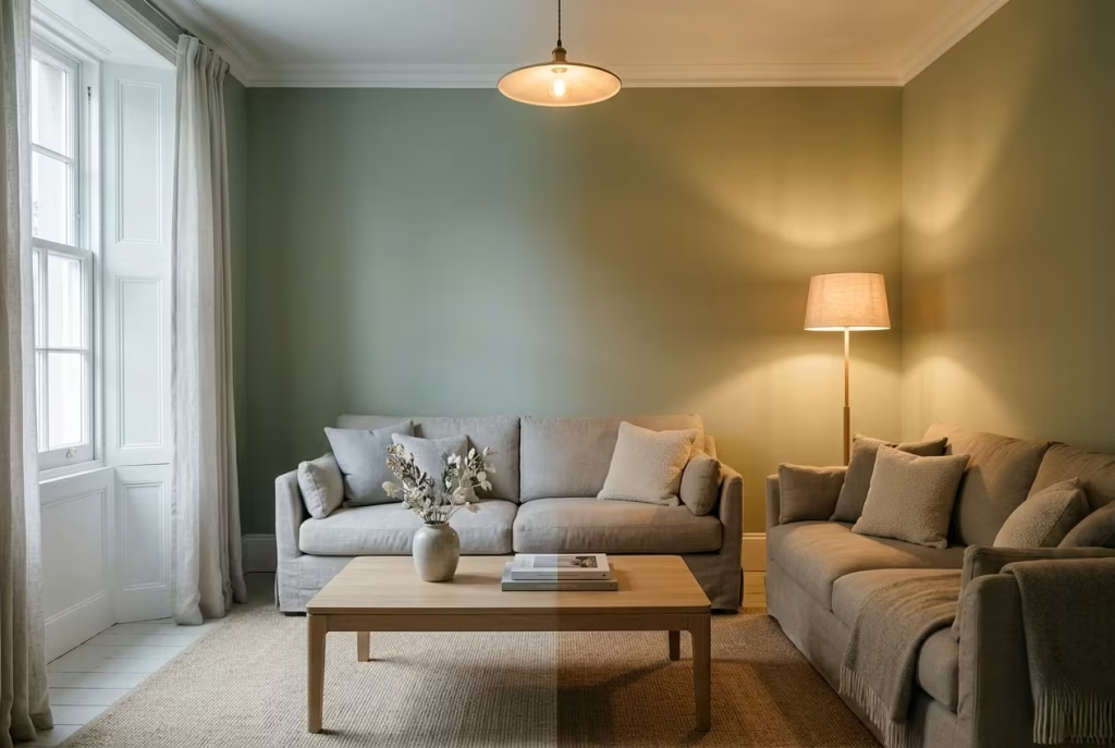
Sage green is not a fixed colour in the way many expect. It shifts, subtly but consistently, depending on how light moves through the room. That is where many decisions either come together beautifully or quietly fall apart. What looks balanced on a sample card can feel entirely different once it is stretched across full walls and exposed to real daylight. With sage, timing and orientation are not minor details. They shape the entire experience of the space.
Morning vs Evening Tone Shifts
In the morning, especially when the light is soft and slightly cool, sage tends to reveal its grey undertones more clearly. It feels fresh, composed, almost crisp at the edges, yet never sharp. This is often when the colour feels at its most restrained, setting a calm tone for the room without asking for attention. In spaces used early in the day, that quality can be a quiet advantage, creating a sense of clarity without slipping into coldness.
As the day moves on and the light warms, the same walls begin to soften. By late afternoon and into the evening, sage leans gently into its warmer side, picking up subtle yellow undertones that were barely noticeable earlier. Under artificial lighting, particularly warmer lamps, it can feel deeper and more enveloping, almost cocoon-like without becoming heavy. I have seen rooms transform in this way, where the daytime atmosphere feels open and steady, then gradually shifts into something more intimate by evening. It is not a dramatic change, more like a slow recalibration that makes the space feel alive rather than static.
North-Facing vs South-Facing Rooms
Orientation adds another layer that cannot be ignored. In north-facing rooms, where daylight is cooler and more diffused, sage can appear slightly subdued. The green recedes, and the grey undertone steps forward, which can be beautiful if handled well but can also feel a touch flat if the rest of the palette does not support it. This is where material choice becomes critical. Introducing warmer elements such as oak, brushed brass, or textured fabrics can bring the balance back, preventing the room from feeling like it is stuck in neutral.
South-facing rooms tell a different story. With stronger, warmer light throughout the day, sage becomes more expressive. The green feels fuller, the warmth more noticeable, and the overall atmosphere more relaxed. In these conditions, the colour has a tendency to open up, almost stretching into the space rather than sitting quietly within it. That can be incredibly effective, though it requires a degree of restraint elsewhere. Too many warm tones layered on top can tip the room into something overly soft or slightly washed out.
In practice, I have found that understanding this behaviour upfront saves a great deal of second-guessing later. A colour that feels perfect under showroom lighting can behave quite differently once it is living with your walls, your windows, and your routines. Sage rewards patience in that sense. Give it the right conditions, and it will carry the room from morning clarity to evening calm without missing a step.
When Sage Green Works and When It Falls Flat
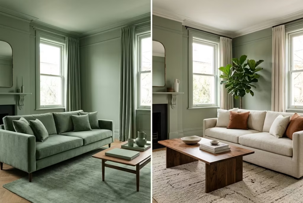
Sage green is remarkably forgiving, but it is not immune to missteps. When handled with intent, it brings a room together almost effortlessly. When handled without contrast or awareness of undertones, it can quietly drain the space of clarity. The difference is rarely dramatic. It tends to show up in how a room feels after you have lived with it for a while, when something seems slightly off but is difficult to pinpoint.
Overuse Without Contrast
One of the most common issues is over-committing to sage across every surface. Walls, upholstery, curtains, accessories all landing in a similar tonal range can leave the room feeling one-note, as if everything is speaking at the same volume. At first glance, it may read as cohesive. Spend a little time in the space, though, and it begins to feel flat, almost airless, like the room is holding back rather than opening up.
In practice, sage needs tension to come into its own. That does not mean introducing loud or competing colours, but rather layering in contrast through material and depth. In one project, I worked with a client who had embraced sage across walls and soft furnishings, yet the space felt oddly unfinished. The shift came not from changing the colour, but from introducing a deeper anchor. A walnut coffee table, a linen sofa in a warm neutral, and a softly textured rug created just enough variation for the sage to breathe. Suddenly, the room had rhythm. It felt composed rather than subdued.
The takeaway is simple but often overlooked. Sage performs best when it is allowed to sit alongside other tones that give it context. Without that, it risks blending into itself, losing the very calm it is meant to create.
Pairing with the Wrong Undertones
The second issue is more subtle but equally impactful. Not all sage greens are created equal. Some lean slightly yellow, others drift towards grey or even blue. When these undertones clash with adjacent materials, the room can feel unsettled, even if everything appears coordinated on paper.
A common example is pairing a cool, grey-based sage with warm, yellow-toned woods or creamy finishes. Instead of complementing each other, the elements begin to pull in different directions. The sage looks dull, the wood appears overly warm, and the overall palette loses cohesion. The opposite can happen as well. A warmer sage paired with cooler greys or stark whites can feel slightly muddy, as if the room cannot decide where it wants to land.
I have seen this play out in otherwise well-designed spaces where the issue was not the colour itself, but how it interacted with everything around it. The solution was rarely drastic. Adjusting the wall tone slightly, or swapping out a finish for something with a more aligned undertone, often brought the room back into balance.
Sage green has a quiet intelligence to it, but it expects the same level of thought in return. When the undertones are aligned and contrast is handled with care, it settles into the space with ease. When those elements are overlooked, it does not fail loudly. It simply never quite lands, leaving the room feeling as though it is missing a final note.
25 Sage Green Living Room Ideas (Design-Led Concepts)
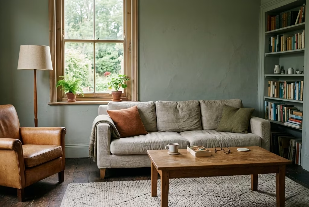
What follows is not a collection of surface-level styling tricks or quick visual fixes. Each idea is a considered design move, shaped by how sage green behaves in real spaces, alongside light, proportion, and material. In practice, the difference between a room that feels quietly resolved and one that feels slightly off often comes down to these underlying decisions, the kind that are easy to overlook but hard to ignore once you notice them.
I have drawn from projects where sage green was not treated as a feature to showcase, but as a framework to build around. Some of these approaches are subtle, almost under the radar, while others carry more presence, but all of them are grounded in how a space is actually lived in, day in, day out, rather than how it appears in a single photograph.
Full-Wall Sage Green for Architectural Calm
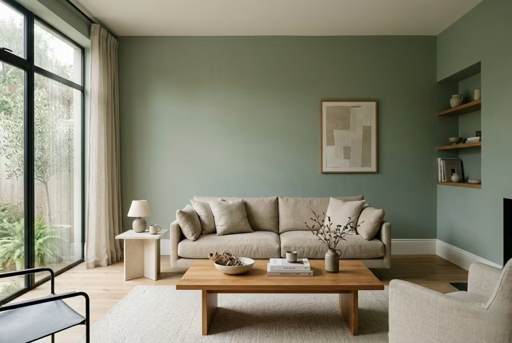
Covering all primary walls in sage green is less about making a statement and more about establishing a steady visual baseline. When applied wall to wall, the colour begins to read as part of the architecture rather than a finish applied on top of it.
It softens edges, reduces visual noise, and allows proportions to come forward naturally. In rooms that already have good structure, balanced ceiling height, clean openings, it can feel like everything finally clicks into place, almost as if the room has found its footing.
Real-life application insight
I have used this approach in spaces where clients were initially hesitant, worried the room might feel too enclosed. Interestingly, the opposite often happens when the tone is right. In one Sage Green living room with a ceiling height just under 2.7 m (around 9 ft), applying a muted sage across all walls actually made the space feel more composed and expansive.
The boundaries became less abrupt, and the eye stopped jumping between contrasts. It is a bit like lowering the volume in a room that was slightly too loud, everything becomes easier to sit with.
Measurements and spatial considerations
This approach performs best in rooms with wall heights between 2.4 and 3 metres (8 to 10 feet). Below that, the colour can feel slightly compressive unless balanced with lighter ceilings and flooring.
Above that height, it works particularly well when broken up with panel detailing or shadow gaps at intervals of around 900 to 1200 mm (35 to 47 inches), which helps maintain rhythm across larger vertical surfaces. Skirting boards around 100 to 150 mm (4 to 6 inches) in a slightly deeper or lighter tone can also subtly anchor the walls without creating harsh lines.
Material pairing
To keep the space from feeling one-dimensional, material contrast becomes essential. Sage walls tend to work beautifully with natural oak or walnut, where the grain introduces movement.
Linen upholstery, slightly off-white or warm neutral, helps lift the palette, while matte stone surfaces like limestone or travertine add a quiet depth. Metal finishes should lean warm and aged, brushed brass or soft bronze tends to sit comfortably without disrupting the calm.
Pros
- Creates a cohesive, grounded atmosphere that feels intentional rather than decorated
- Softens architectural transitions, allowing the room to feel more unified
- Works across both traditional and contemporary settings with minimal adjustment
Cons
- Can feel flat if texture and material variation are not introduced
- Requires careful lighting, especially in cooler or north-facing rooms
- Limited contrast may not suit those looking for a more dynamic or layered visual effect
Used well, full-wall sage green does not try to impress at first glance. It builds its presence slowly, settling into the background while quietly shaping how the entire room is experienced.
Sage Green as a Backdrop for Natural Wood
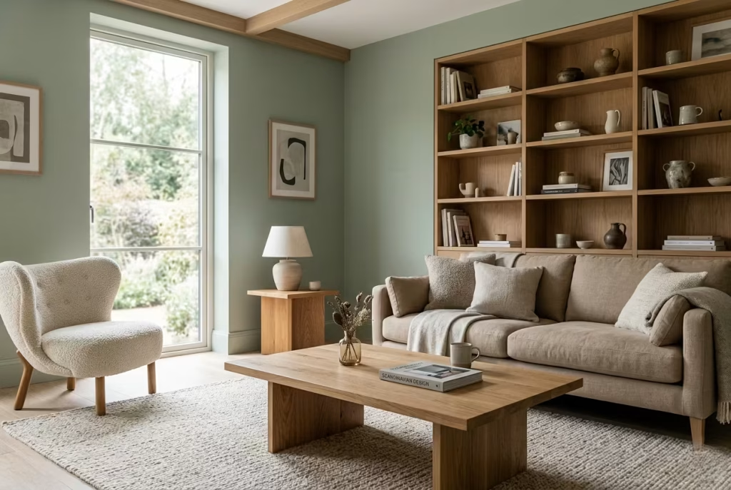
Sage green and natural wood have a way of understanding each other without trying too hard, which is often why the combination feels so resolved. Sage provides a quiet, muted field that allows timber to read with greater warmth, grain, and depth, while the wood stops the green from drifting into something too cool or abstract.
It is a pairing that works because neither element is shouting over the other. Instead, they sit in easy conversation, each one making the other look more considered. In a Sage Green living room, that balance can be worth its weight in gold.
The space feels lived in, grounded, and distinctly human, which is often exactly what a modern interior is missing when it leans too hard into clean lines and hard surfaces.
Real-life application insight
I have used this combination several times to take the edge off overly modern layouts, particularly in homes where the architecture was a little too sharp, the flooring too pale, or the furniture too rigid. In one project, a room with crisp joinery, a low-profile sofa, and polished finishes felt almost too controlled, like it had been ironed flat.
Introducing sage green on the walls and bringing in oak through shelving, a coffee table, and side details changed the mood immediately. The room stopped feeling so buttoned up. It gained a softness that was never sentimental, just quietly assured. That is the real strength of this pairing. It does not overcompensate. It simply rounds off the hard corners and lets the room breathe.
Measurements and spatial considerations
The relationship between sage and wood works best when the timber has enough visual presence to register properly. As a rule of thumb, larger wood elements such as a coffee table, console, or open shelving should have a visible surface width of around 400 to 800 mm (16 to 31 inches) so the grain can actually be seen and appreciated rather than lost in the background.
For built-in joinery, depths of 300 to 450 mm (12 to 18 inches) are usually enough to create a grounded presence without overpowering the room. If using wood flooring, wider boards around 140 to 180 mm (5.5 to 7 inches) tend to sit especially well beside sage, because the broader planks bring a calmer, less busy rhythm across the floor. Narrow, highly striped flooring can sometimes fight against the softness of the palette.
Material pairing
Oak is the safest and most adaptable choice, especially if you are after warmth without heaviness. It brings a gentle, almost sunlit quality that complements sage beautifully. Walnut creates more contrast and feels richer, deeper, and a little more grounded, which can be very effective in larger Sage Green living rooms or spaces that need a stronger architectural anchor.
Ash sits somewhere lighter and airier, making it useful when you want the room to feel clean and open, but not stripped bare. The finish matters just as much as the species. A matte or oiled finish usually works best, since high gloss can make the pairing feel over-processed.
Pairing these woods with linen upholstery, soft wool rugs, or stone-topped tables gives the room enough texture to feel complete rather than curated within an inch of its life.
Pros
- Softens rigid or overly contemporary layouts without diluting their structure
- Creates warmth and depth without relying on strong colour contrast
- Works across a wide range of room sizes and architectural styles
- Ages well, especially when natural finishes are allowed to develop patina over time
Cons
- Can feel overly restrained if every finish is too similar in tone
- Pale woods and pale sage can blur together unless there is enough contrast in texture
- Walnut, if overused, may make smaller rooms feel heavier than intended
- Requires careful lighting so the wood does not flatten and the sage does not lose its character
This is one of those combinations that rewards a light touch. When handled well, it feels effortless, almost as if the room has always been waiting for those two materials to meet.
You May also Like: 25 Designer Secrets for Styling a Neutral Living Room That Feels Warm and Inviting
Layering Sage Through Upholstery Instead of Walls
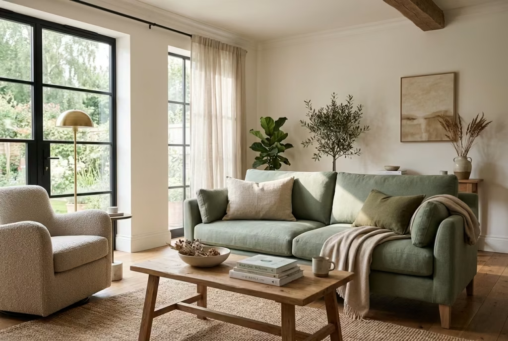
Introducing sage green through upholstery is often the most measured way to bring the colour into a Sage Green living room, particularly when commitment to painted surfaces feels like a step too far. Rather than setting the tone of the entire architecture, the colour is allowed to sit within the furniture, which keeps the walls neutral and the overall scheme more flexible.
In practice, this approach lets sage act more like a supporting character rather than the lead, quietly influencing the atmosphere without locking the room into a single direction. It is a subtle entry point, but one that often proves to be the most enduring, especially when homeowners are still testing how far they want to take a colour story.
Real-life application insight
I have often recommended this approach in projects where clients are living with existing finishes they are not ready to change, particularly in rental properties or recently renovated homes that feel slightly too stark. In one case, a Sage Green living room with crisp white walls and cool flooring felt almost clinical. Instead of altering the architecture, we introduced a sage-toned sofa and layered in matching accent chairs.
The transformation was immediate, but not in a loud way. The room stopped feeling like a show space and started to feel lived in, as if it had quietly exhaled. That is the advantage of using upholstery as the carrier of colour. It allows the mood to shift without disrupting the structural decisions already in place.
Measurements and spatial considerations
Scale plays a critical role here, because upholstery carries visual weight even when it is not physically dominant. A sofa depth of around 90 to 100 cm (35 to 39 inches) tends to work well, offering enough presence for the sage tone to register without overwhelming the room. In smaller living spaces, keeping the sofa height around 80 to 90 cm (31 to 35 inches) helps maintain sightlines, especially if natural light is limited.
Armchairs should ideally sit within a width of 70 to 85 cm (28 to 33 inches) so they remain supportive elements rather than bulky interruptions. When these proportions are balanced correctly, the sage fabric becomes part of the room’s rhythm rather than a visual interruption.
Material pairing
Upholstered sage works best when it is not isolated. Surrounding materials need to support it without competing for attention. Soft neutrals such as warm ivory, stone, or muted taupe create a stable backdrop, while textured fabrics like linen, bouclé, or brushed cotton introduce depth that prevents the palette from feeling flat. Wooden elements, particularly oak or ash, help bridge the gap between upholstery and architecture, tying the room together in a way that feels natural rather than staged. For accent materials, aged brass or matte black metal can be used sparingly to add definition, but the key is restraint. Too much contrast and the softness of sage begins to lose its quiet authority.
Pros
- Low-commitment way to introduce colour without altering architectural finishes
- Easier to update or replace over time compared to painted surfaces
- Works well in both rental and owned properties
- Adds warmth and personality without overwhelming the space
Cons
- Can feel disconnected if not supported by complementary tones in the room
- Risks looking isolated if the rest of the palette is too neutral or cool
- Fabric choice becomes critical, as texture and tone variation directly affect the final result
- Less impactful in very large spaces unless paired with additional sage elements
When handled with care, layering sage through upholstery feels like easing into the palette rather than diving straight in. It is a considered starting point, and more often than not, it becomes the foundation for a broader, more confident design direction later on.
Two-Tone Walls with Sage Lower Panels
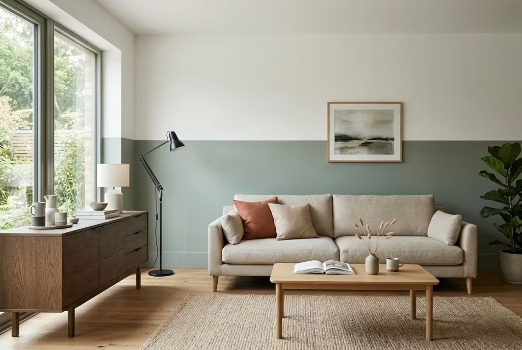
Two-tone walls with sage used on the lower section introduce a subtle architectural logic to a room, rather than relying on colour alone. By grounding the lower half of the wall in sage, the space gains a sense of weight and stability, while the upper portion, typically kept in a lighter neutral, preserves openness and vertical breathing room.
It is a quiet design strategy, but one that has a noticeable impact on how a room is perceived. The eye naturally reads the division as intentional, almost like a built-in datum line, which brings a sense of order without feeling overly designed or forced.
Real-life application insight
In practice, this approach has been particularly effective in Sage Green living rooms where furniture tends to sit lower in the visual field, sofas, sideboards, and coffee tables all competing for attention at the same height.
I worked on a space where the room felt slightly top-heavy, with tall ceilings and minimal architectural detailing. Introducing sage on the lower wall section immediately rebalanced the composition.
The room stopped feeling like it was stretching upwards without grounding. Instead, it settled into itself. There was a sense that the furniture finally belonged to the space rather than floating within it. It is one of those changes that does not announce itself loudly, but you feel it every time you walk in.
Measurements and spatial considerations
The effectiveness of this treatment relies heavily on proportion. A panel height between 900 and 1100 mm (35 to 43 inches) generally works well in most residential settings, as it aligns closely with the visual height of typical seating arrangements. If the panel is too low, it can feel like a skirting extension rather than a deliberate design move.
If it is too high, the room risks feeling compressed, especially in smaller spaces. In rooms with ceiling heights above 2.7 m (9 ft), leaning towards the upper end of the range helps maintain balance, while lower ceilings benefit from staying closer to 900 mm (35 inches) to avoid visually shortening the walls.
Material pairing
This treatment works best when the transition between sage and the upper wall is treated with restraint. A slim shadow gap or a finely detailed dado rail can help define the break without feeling overly traditional or decorative. On the lower section, a matte or eggshell finish in sage keeps the surface grounded, while the upper wall in a warm off-white or soft ivory prevents the scheme from becoming too heavy. Wood elements, particularly in flooring or furniture, should ideally sit in a mid-tone range such as oak or smoked ash, so they neither compete with the sage nor disappear into the lighter upper walls. Textiles can then be used to bridge the two zones, pulling tones from both levels to maintain cohesion.
Pros
- Creates natural visual grounding, especially in rooms with taller ceilings
- Adds architectural structure without major renovation work
- Helps anchor furniture and define spatial hierarchy
- Offers a more dynamic alternative to full-wall colour application
Cons
- Requires careful proportioning to avoid looking mismatched or accidental
- Can feel traditional if detailing is too heavy or overly decorative
- Needs consistent alignment with furniture height and layout to work effectively
- Poor colour pairing between upper and lower walls can disrupt the balance rather than enhance it
When executed with restraint, two-tone sage walls feel less like a decorative choice and more like an architectural correction. It is the kind of adjustment that quietly steadies a room, giving it a sense of order that feels entirely natural, as if it had always been there waiting to be revealed.
You May also Like: Why Modern Organic Living Rooms Feel So Warm, Calm, and Inviting
Sage Green and Limestone or Travertine Pairing
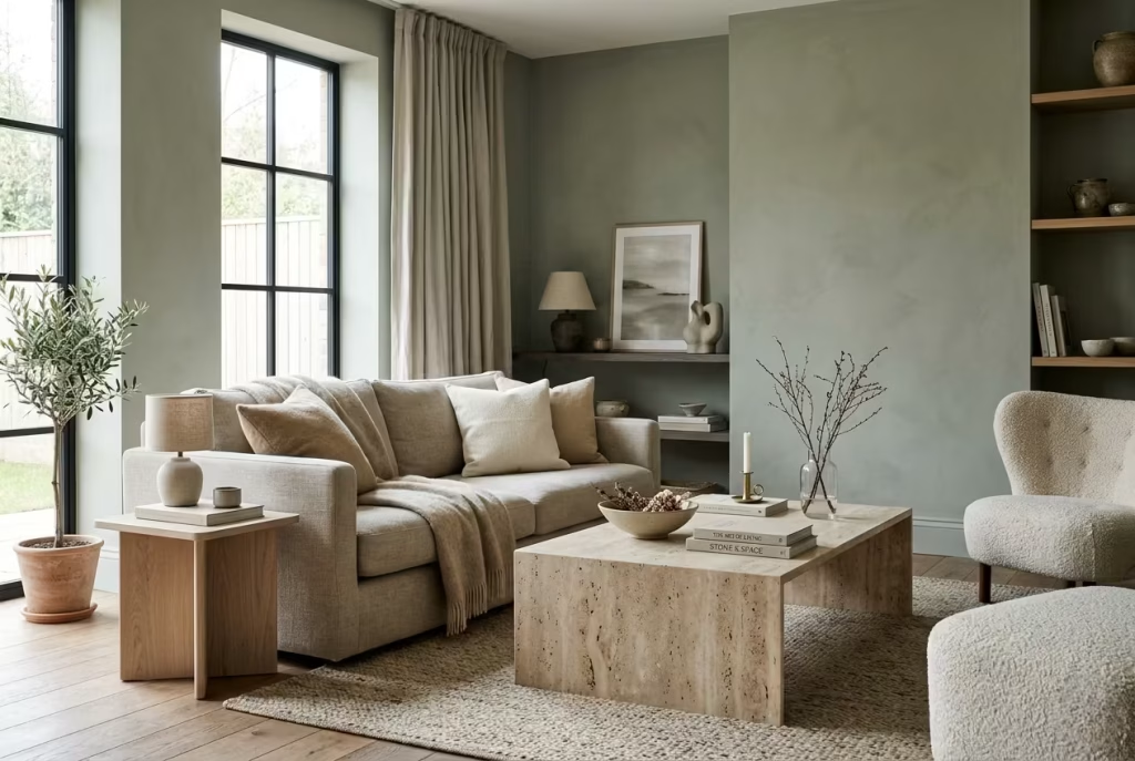
This pairing works so well because it relies on texture, tone, and surface behaviour rather than obvious colour contrast. Sage green has a soft, muted quality that naturally complements the quiet irregularity of limestone and travertine, both of which bring a sense of depth that polished materials often struggle to deliver.
Together, they create a room that feels layered and composed, never overworked, never trying too hard. It is a combination with real staying power, because it does not depend on visual tricks or fashionable contrasts. Instead, it feels rooted, almost elemental, like the kind of pairing that has always belonged together.
Real-life application insight
In real projects, this combination has often proved especially useful when a room needs warmth without slipping into heaviness. I have seen sage walls paired with a travertine coffee table or limestone hearth transform a space that previously felt too crisp and monochrome.
The stone introduces variation in tone, tiny veining, natural pores, and surface movement, all of which keep the sage from appearing too flat.
In one living room, a pale travertine console beneath sage-toned walls changed the entire mood of the room. It stopped feeling polished to the point of sterility and started to feel lived in, but in that quietly luxurious way that never shouts for attention. That is the real strength of this pairing. It brings a room back to earth, quite literally.
Measurements and spatial considerations
The scale of the stone matters just as much as the material itself. A limestone coffee table typically works best at around 1100 to 1300 mm long (43 to 51 inches) in a standard living room, so the surface feels substantial enough to hold its own against the softness of sage without overwhelming the seating area. For side tables or plinths, heights of 450 to 600 mm (18 to 24 inches) tend to feel balanced beside sofas and armchairs.
If using stone on larger surfaces such as fireplace surrounds or wall cladding, keeping the finish honed rather than polished helps the material stay visually quiet and in step with the muted character of the green. In rooms where daylight is limited, lighter-toned travertine can be especially effective, as it reflects just enough light to prevent the palette from feeling too subdued.
Material pairing
Limestone and travertine both thrive when paired with sage because they share a similar emotional register: calm, understated, and naturally textural. Limestone usually feels a little more solid and architectural, making it ideal for spaces that need structure.
Travertine, with its warmer undertones and more visibly open grain, leans softer and more relaxed. Either way, the key is to avoid overly polished finishes, which can flatten the relationship and make the room feel over-designed.
These stones work best alongside natural fabrics such as linen, wool, and cotton, all of which echo the material honesty of the palette. Timber, especially pale oak or smoked ash, can help bridge the gap between the organic softness of sage and the grounded presence of stone, keeping the room from feeling too cool or too sparse.
Pros
- Creates a refined, timeless palette that feels quietly luxurious
- Adds natural texture and depth without needing strong colour contrast
- Works especially well in rooms where softness and structure need to coexist
- Ages beautifully, with both materials developing character over time
Cons
- Can feel too subdued if all surrounding elements are equally muted
- Stone surfaces may require more care and maintenance than softer finishes
- Poor lighting can make the pairing feel flat or overly restrained
- Without timber or textile warmth, the room may lack enough emotional lift
This is the kind of pairing that rewards a steady hand. Done well, it feels like the room has settled into its own skin, with sage and stone working quietly side by side, each one making the other look more at ease.
Soft Sage with Textured Plaster Finishes
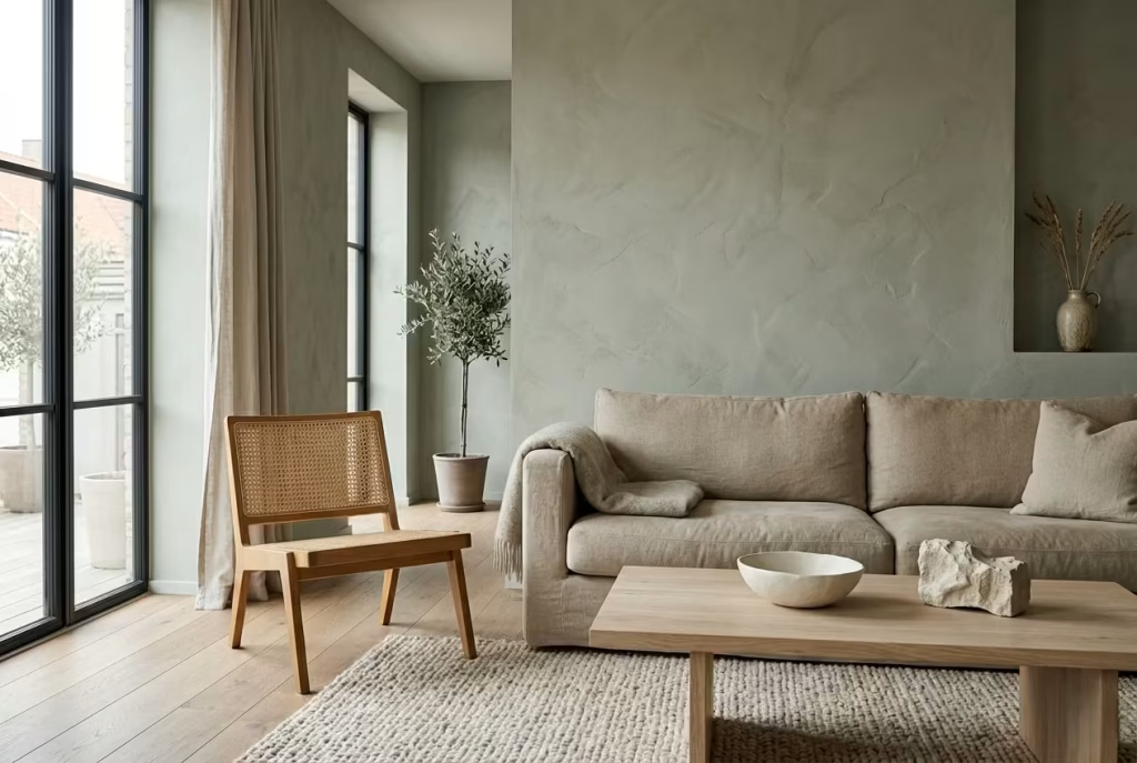
Soft sage paired with textured plaster is less about colour addition and more about surface dialogue. The strength of this approach lies in restraint, where variation is introduced through material depth rather than tonal complexity.
Plaster, with its irregular hand-finished character, naturally disrupts flatness, while sage provides a muted backdrop that absorbs and softens those surface shifts. Together, they create a finish that feels almost atmospheric, like the walls have a quiet presence rather than a painted identity.
It is the kind of combination that does not demand attention upfront, but gradually reveals its richness as light moves across it.
Real-life application insight
In practice, I have found this pairing particularly effective in rooms that risk feeling too clean or architecturally rigid. I worked on a living space where the client initially chose smooth painted walls in a pale neutral, but the result felt somewhat lifeless, almost like everything had been ironed out of the room. Introducing a soft sage tone over a lightly textured plaster finish changed the entire perception of the space.
The walls stopped behaving like static surfaces and started interacting with light in a more fluid way. Morning light picked up subtle ridges and shadows, while evening lighting softened them into a warm, cohesive glow. It is one of those changes that does not alter the layout or furniture, yet the emotional temperature of the room shifts entirely.
Measurements and spatial considerations
Textured plaster works best when the application is controlled rather than overly expressive. In most residential living rooms, a subtle relief depth of around 1 to 3 mm (0.04 to 0.12 inches) is usually enough to create visual movement without making the surface feel overly rustic.
In spaces with ceiling heights between 2.4 and 3 metres (8 to 10 feet), this level of texture reads clearly without overwhelming the architecture.
For larger rooms, slightly deeper variations can be introduced, but the key is consistency across surfaces so the texture feels intentional rather than patchy. Lighting placement also becomes critical here, with wall washers or angled uplighting helping to gently articulate the surface rather than flattening it.
Material pairing
Soft sage and plaster form a naturally harmonious base, but the surrounding materials determine whether the space feels refined or unfinished. Timber elements, particularly in oak or ash, help anchor the softness of the walls and introduce a sense of warmth and structure.
Linen upholstery, slightly relaxed in weave, reinforces the handcrafted quality of the plaster, while stone accents in limestone or travertine can be used sparingly to introduce contrast without disrupting calm.
Metals should remain understated, brushed brass or aged bronze tends to sit comfortably, whereas anything overly polished can feel out of step with the tactile nature of the finish.
Pros
- Introduces depth and movement without relying on additional colours
- Enhances natural and artificial light in a subtle, dynamic way
- Creates a handcrafted, architectural feel that elevates simple spaces
- Works well in both modern and transitional interiors
Cons
- Requires skilled application to avoid uneven or inconsistent results
- Can be difficult to repair or patch once installed
- Poor lighting can flatten the texture and reduce its impact
- May feel too subdued in spaces that need stronger visual contrast
When done well, this combination feels less like a decorative decision and more like an architectural layer that has always belonged. The sage does not compete with the plaster; it simply allows its character to surface quietly, as if the room is revealing itself slowly over time.
Sage Green Built-In Cabinetry
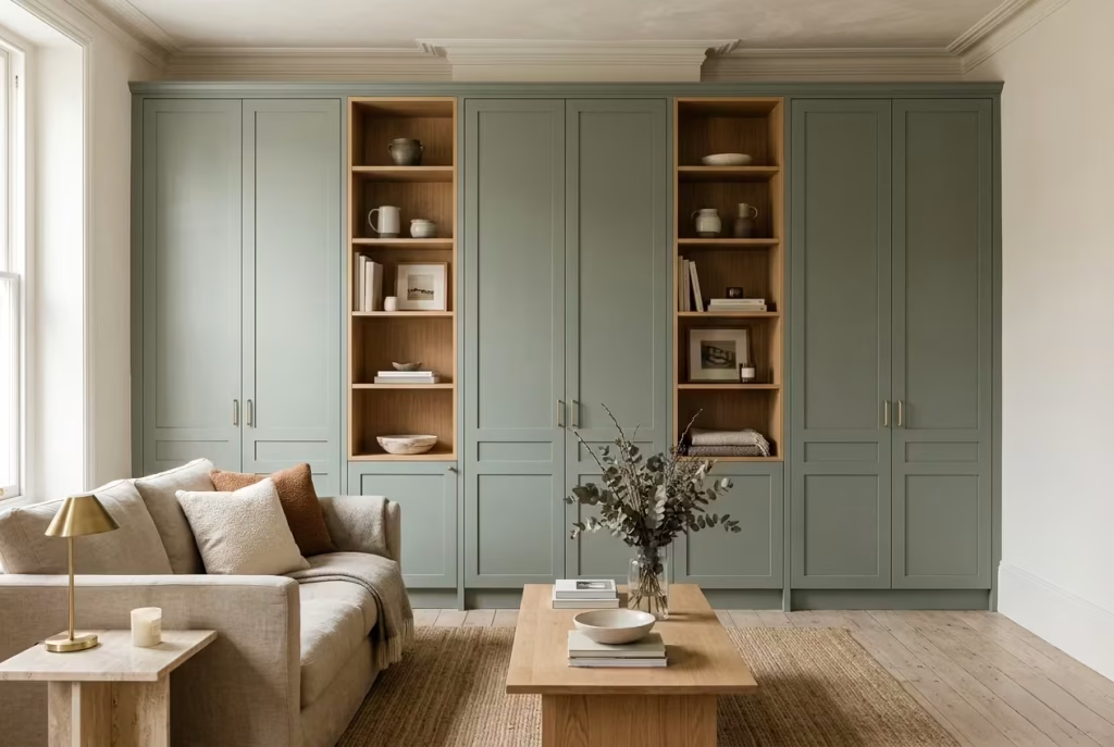
Sage green built-in cabinetry is where colour moves from surface treatment into architectural integration. Rather than sitting on the walls as a decorative layer, it becomes part of the room’s structure, shaping how space is read and used.
When applied to joinery, sage stops behaving like a finish and starts acting like a framework, quietly organising the visual field. It has a way of dissolving the boundary between furniture and architecture, which, when done well, makes a room feel more resolved and less fragmented.
Everything begins to feel intentional, as if it was always meant to be there.
Real-life application insight
In real projects, this approach has often been the difference between a room that feels furnished and one that feels designed. I worked on a living space where the client had multiple freestanding storage pieces that never quite settled into the room. The layout felt fragmented, like the furniture was just placed rather than considered.
Replacing those pieces with sage-toned built-in cabinetry along one wall immediately changed the spatial logic. The room stopped feeling like a collection of objects and started feeling like a single, coherent composition.
What stood out most was not the colour itself, but the way the cabinetry allowed the rest of the room to relax into place, almost like everything finally exhaled after being slightly out of sync.
Measurements and spatial considerations
Depth plays a crucial role in how built-in cabinetry performs visually and practically. A depth of around 300 to 450 mm (12 to 18 inches) is generally sufficient for living room storage, allowing enough capacity for books, objects, and concealed items without projecting too far into the space.
Anything deeper than this can begin to encroach on circulation zones, particularly in narrower rooms where clear walking paths of at least 800 to 900 mm (31 to 35 inches) are needed to maintain comfort.
Height should ideally align with architectural features where possible, often running to ceiling height in modern schemes or stopping just below cornice level in more traditional spaces. This alignment helps the cabinetry feel embedded rather than added on, which is where the real value lies.
Material pairing
Sage cabinetry works best when treated as part of a broader material language rather than an isolated feature. Matte or satin finishes tend to perform better than high gloss, as they preserve the softness of the colour and avoid unwanted reflections.
Handle detailing should remain restrained, with recessed pulls or slimline metal profiles in brushed brass or blackened steel, depending on the wider scheme. Pairing the cabinetry with natural wood shelving inserts, particularly oak or walnut, introduces warmth and breaks up larger painted surfaces.
Stone surfaces nearby, such as a travertine coffee table or limestone hearth, help anchor the cabinetry visually, ensuring it does not dominate the room but instead feels integrated into it.
Pros
- Creates strong architectural cohesion, making the room feel purposefully designed
- Maximises storage without visually cluttering the space
- Helps unify furniture, colour, and structure into a single language
- Adds long-term value through built-in functionality and permanence
Cons
- Requires careful planning, as changes are not easily reversible
- Poor proportioning can overwhelm smaller rooms
- Can feel heavy if not balanced with open shelving or lighter materials
- Higher installation cost compared to freestanding furniture
When sage is introduced through cabinetry, it stops being just a colour choice and becomes part of the room’s architecture. Done thoughtfully, it does not ask for attention, yet it quietly holds everything together in a way that feels effortless, almost as if the space was always waiting for that final layer to complete it.
You May also Like: 21 Minimalist Living Room Ideas That Make Your Home Feel Calm and Chic
Pairing Sage with Warm Neutrals
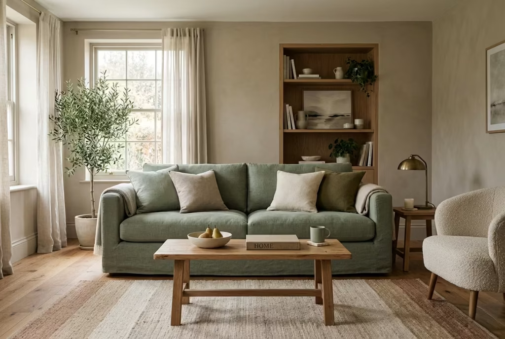
Sage green finds its most natural rhythm when it is paired with warm neutrals, tones like beige, taupe, and soft clay that sit comfortably within the same muted spectrum. Rather than creating contrast for the sake of visual impact, this combination builds atmosphere through subtle alignment.
The result is a palette that feels cohesive without becoming monotonous, where each colour supports the other instead of competing for attention. Sage brings quiet depth, while warm neutrals introduce softness and approachability, creating a balance that feels easy on the eye and even easier to live with over time.
Real-life application insight
In practice, this pairing often becomes the backbone of rooms that are meant to feel lived in rather than staged. I have worked on living spaces where clients initially leaned toward stark white walls, expecting a clean, modern finish.
However, once sage and warm neutrals were introduced instead, the entire atmosphere shifted in a far more natural direction. In one particular project, replacing a cold white backdrop with a muted taupe allowed the sage elements in upholstery and soft furnishings to finally make sense within the room.
It was not a dramatic transformation, but it changed the emotional register completely. The space stopped feeling like a showroom and started feeling like somewhere you could actually settle into, cup of tea in hand, without noticing how much time had passed.
Measurements and spatial considerations
The success of this combination often depends on how the tonal values are distributed across the room. Warm neutrals tend to work best when used as the dominant backdrop on larger surfaces such as walls or flooring, with sage introduced through furniture, textiles, or accent elements.
In typical living rooms with ceiling heights around 2.4 to 2.7 metres (8 to 9 feet), keeping wall colours in a soft beige or light taupe helps maintain openness without losing warmth.
Floor tones in the range of medium oak or warm stone finishes between 100 and 180 mm (4 to 7 inches) plank width can help ground the palette without introducing visual heaviness. The key is to avoid overly sharp transitions between elements, allowing tones to drift into one another rather than collide.
Material pairing
This palette comes into its own when supported by tactile, natural materials. Linen, wool, and brushed cotton all sit comfortably alongside both sage and warm neutrals, reinforcing the sense of softness without becoming visually repetitive. Timber, especially in honey oak or lightly smoked finishes, helps bridge the two tonal families, ensuring the space feels unified rather than segmented.
Stone elements such as limestone or lightly textured travertine can be introduced sparingly to add structure, but they work best when their tones lean warm rather than cool. Metals should remain understated, with aged brass or soft bronze offering just enough presence to add definition without breaking the calm.
Pros
- Creates a naturally cohesive and calming atmosphere that feels easy to live with
- Reduces reliance on high contrast, which often ages interiors more quickly
- Works across a wide range of architectural styles and room sizes
- Supports layered, textural interiors without visual clutter
Cons
- Can feel visually flat if no tonal variation or texture is introduced
- Overuse of similar mid-tones may reduce spatial definition
- Requires careful lighting to prevent the palette from feeling dull
- Stark white accents, if introduced, can disrupt the warmth and break cohesion
When handled with restraint, sage and warm neutrals form a palette that does not try to impress at first glance. Instead, it unfolds gradually, settling into the background while quietly shaping the mood of the room, like a well-rehearsed conversation that never feels forced.
Sage Green and Black Accents for Definition
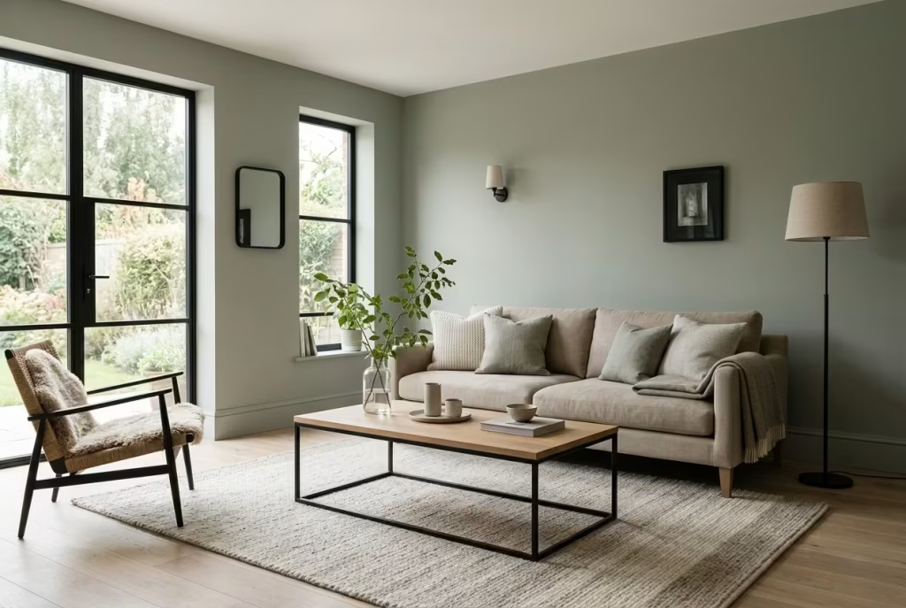
Sage green has a naturally soft and forgiving presence, which can sometimes lean too gentle if left entirely unanchored. Introducing black accents into this palette is less about contrast for drama and more about giving the room a sense of definition and structure.
Black, when used sparingly, acts almost like punctuation within a sentence, it sharpens edges, clarifies form, and prevents the softness of sage from drifting into something overly diffuse. The key is control. Too much black and the calm is disrupted, too little and the space can feel visually ungrounded.
Real-life application insight
In real projects, I have often turned to this combination when a space feels visually uncertain, particularly in rooms where sage walls or upholstery have been introduced but lack a strong counterpoint.
In one living room, the palette felt beautifully soft but slightly unresolved, like a melody without a final note. Introducing black through slim window frames, a low-profile coffee table base, and restrained lighting fixtures changed the entire reading of the space.
Nothing became louder, yet everything became clearer. The room gained a quiet sense of order, almost like it had been gently tightened without losing its ease. It is a subtle shift, but one that makes a space feel intentionally composed rather than loosely assembled.
Measurements and spatial considerations
With this pairing, scale and proportion matter more than quantity. Black elements should remain visually light even if they are structurally solid. For example, coffee table bases or metal frames in matte black often work best when kept within a visual height range of 300 to 450 mm (12 to 18 inches), ensuring they sit low and grounded without dominating the sightline.
Window or door frames in black should be slim, ideally no more than 20 to 40 mm (0.8 to 1.6 inches) in profile width, so they provide definition without overwhelming the softness of sage walls. In lighting, black fixtures work best when used as focused accents rather than repeated throughout the room, maintaining a rhythm rather than a pattern.
Material pairing
This combination thrives when surrounded by materials that soften its edges. Sage walls or upholstery provide the primary calm layer, while black introduces structure. To bridge the two, natural materials like oak, ash, or walnut help prevent the contrast from feeling too stark. Textiles in linen or wool soften transitions further, allowing black to feel integrated rather than imposed.
Stone surfaces, particularly in lighter limestone or muted travertine, help balance the visual weight of black elements, ensuring the room does not tip into a high-contrast scheme that feels visually heavy. Finishes also matter greatly, with matte or satin black performing far better than glossy alternatives, which can feel overly sharp in a calm palette.
Pros
- Adds clarity and definition to otherwise soft or muted interiors
- Helps structure the visual hierarchy of a room without adding colour complexity
- Works well in both modern and transitional design schemes
- Prevents sage green from feeling overly flat or one-dimensional
Cons
- Easy to overuse, which can quickly overpower the softness of sage
- Glossy black finishes can feel too harsh and visually disruptive
- Poor placement may create visual fragmentation rather than cohesion
- Requires careful balancing with warm materials to avoid a cold or rigid feel
When used with restraint, black accents do not compete with sage green, they refine it. They act as quiet anchors within a soft composition, giving the room just enough edge to feel complete, like a sketch that has finally been given its final, deliberate line.
Using Sage in Open-Plan Living Spaces
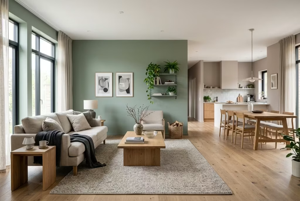
In open-plan living, sage green works less as a decorative choice and more as a spatial organiser. Without walls to define function, large spaces can easily feel like everything is happening at once, which is where colour becomes a quiet but powerful tool for zoning.
Sage, with its muted and steady character, helps to gently separate living, dining, and transitional areas without introducing physical barriers. It creates distinction without division, allowing each zone to feel individual yet still part of a coherent whole.
The effect is subtle, but when done well, the space feels intuitively structured rather than visually segmented.
Real-life application insight
I have often used sage in open-plan layouts where clients initially struggled with a sense of “floating space”, where furniture groups felt disconnected from one another. In one project, a combined kitchen and living area felt particularly unresolved, with each zone visually competing for attention.
Introducing sage on the living room wall plane, while keeping the kitchen in a softer neutral, immediately created a natural shift in perception. Nothing structural changed, yet the eye began to understand the space differently.
The living area felt anchored, almost like it had been gently pinned into place, while the dining and kitchen zones retained their openness. It is one of those changes that does not rely on dramatic intervention, but rather on quiet visual cues that guide how a space is read and experienced.
Measurements and spatial considerations
In open-plan layouts, proportion becomes even more critical because colour has to work across longer sightlines. Sage works best when applied to full wall sections that define a zone, typically spanning between 3 to 6 metres (10 to 20 feet) in length, depending on the scale of the room.
Ceiling heights of 2.4 to 3 metres (8 to 10 feet) are ideal, as they allow the colour to establish presence without overwhelming the volume. Furniture placement should reinforce the zoning effect, with sofa groupings ideally allowing 900 to 1200 mm (35 to 47 inches) of circulation space around them to maintain flow.
Rugs become particularly important here, with sizes such as 200 x 300 cm (6.5 x 10 ft) helping to visually anchor living zones without physical separation.
Material pairing
The success of sage in open-plan spaces depends heavily on how materials are distributed across zones. In living areas, softer textures like linen, wool, and bouclé reinforce the calmness of sage, while dining areas can introduce slightly more structured materials such as timber tables or stone tops to define function.
Consistency in undertones is key, warm oak or ash helps maintain continuity across zones without flattening them into a single visual field. Lighting also plays a crucial role, with layered lighting strategies helping to reinforce zoning after dark.
Warm ambient lighting in living areas paired with more focused task lighting in dining or kitchen spaces ensures each zone retains its identity even when natural light fades.
Pros
- Creates natural zoning without the need for physical partitions
- Maintains openness while improving spatial clarity and flow
- Allows different functional areas to feel connected yet distinct
- Works especially well in modern open-plan homes where structure is minimal
Cons
- Requires careful planning to avoid visual imbalance across large spaces
- Poor lighting can weaken zoning effect and flatten the design
- Overuse of sage across all zones may reduce spatial definition
- Needs consistent material coordination to avoid fragmented appearance
When applied thoughtfully, sage in open-plan spaces acts less like a colour choice and more like a spatial guide. It quietly organises the room without drawing attention to itself, allowing everyday living to unfold with a sense of ease and clarity, almost as if the space naturally knows where each moment belongs.
Sage Green Curtains to Soften Light
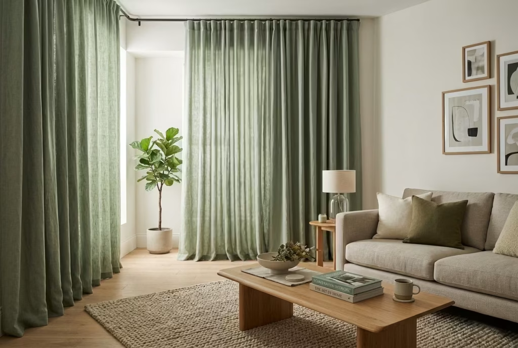
Sage green curtains do more than frame a window. They act like a soft filter over the room, gently tempering daylight and giving the interior a more settled, composed feel. Where hard blinds or stark white drapes can sometimes look a little too crisp, sage brings the light down a notch without making the space feel heavy or shut in.
That matters more than people often realise, because light is rarely neutral in a living room. It shapes mood, softens edges, and changes how every other surface reads. Sage curtains work beautifully in that middle ground, where the room still feels open, but the light arrives with a quieter voice.
Real-life application insight
I have used sage curtains in rooms that were technically well-proportioned but emotionally a bit harsh, usually because the windows were letting in too much direct brightness or the rest of the palette was leaning cold.
Once the curtains went in, the entire atmosphere changed. The room did not become darker, just kinder. That is the best way I can describe it. In one south-facing living room, the afternoon sun was bouncing off pale flooring and making the whole space feel slightly exposed.
Floor-length sage drapery softened that glare instantly, and suddenly the room had a better sense of rhythm. It felt less like a pass-through and more like somewhere people would naturally linger. That is the real value of a curtain treatment done properly. It does not just finish the window, it changes how the room is lived in.
Measurements and spatial considerations
For curtains to do their job well, height matters just as much as colour. Full-length curtains should ideally run from ceiling to floor, typically around 240 to 300 cm (8 to 10 ft) depending on the room height. That vertical stretch helps draw the eye upward and gives the room a more polished, tailored look.
If the ceiling sits below this range, the curtain track should still be mounted as high as possible to preserve that sense of lift. In terms of fullness, panels should usually allow for around 1.5 to 2.5 times the width of the window opening, so the fabric has enough body to fall properly rather than hanging flat and lifeless.
When the drape is too skimpy, it can look like an afterthought. When it is properly proportioned, it feels quietly luxurious, almost effortless.
Material pairing
The fabric choice can make or break this idea. Sage green performs best in materials with a little movement and softness, such as linen blends, brushed cotton, or a linen-wool mix.
These fabrics allow the colour to shift gently with daylight instead of sitting rigid and static. In more refined interiors, a heavier drape with a soft lining can add a sense of presence, especially in larger rooms where the windows need a bit more visual weight.
Pairing the curtains with warm timber, muted upholstery, and textured rugs helps keep the window treatment from feeling isolated. If the room is already layered with stone or plaster, the curtain fabric becomes the balancing note, the thing that pulls the whole scheme back into alignment.
Pros
- Softens natural light without shutting the room down
- Adds vertical elegance and helps the room feel more considered
- Works especially well in bright or south-facing spaces
- Introduces colour in a calm, low-commitment way
Cons
- Poor fabric choice can make the colour look flat or overly dense
- Curtains that are too short or too narrow can spoil the effect entirely
- May feel too subdued in rooms that need stronger visual contrast
- Requires careful mounting and measuring to avoid looking awkward or unbalanced
Sage curtains often feel like the finishing touch that was missing all along. They do not clamor for attention, yet once they are in place, the room has a softer pulse, a little more grace, and a much better sense of ease.
Combining Sage with Aged Brass or Bronze
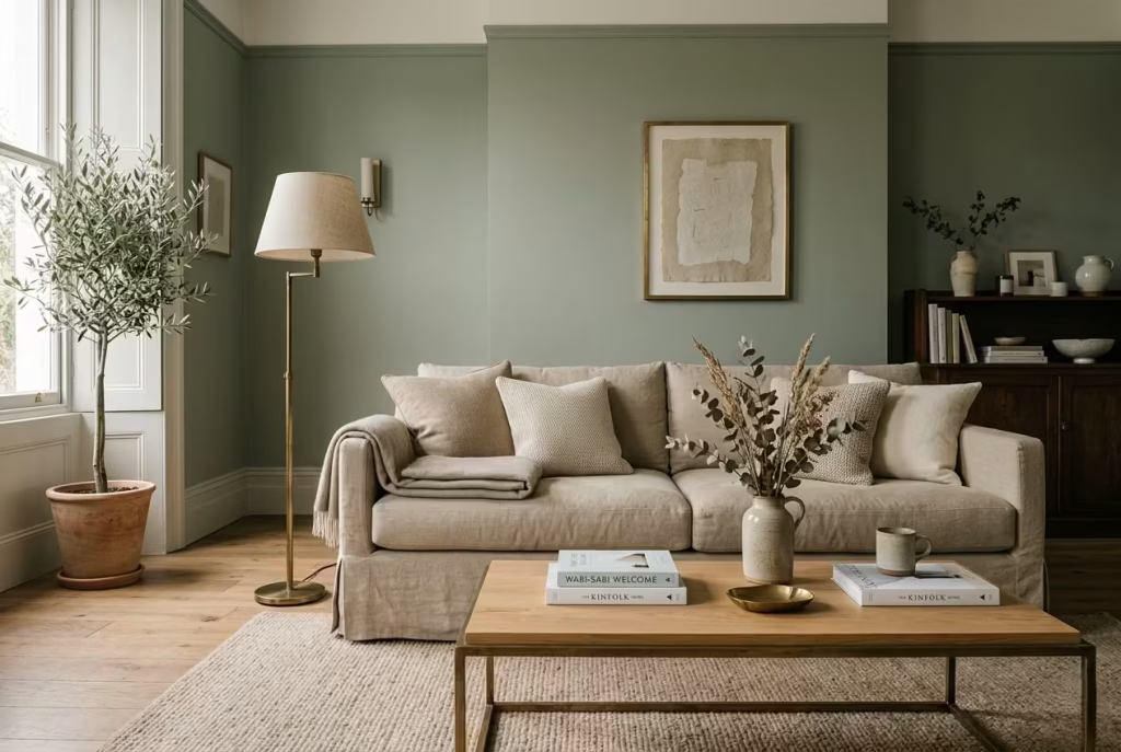
Pairing sage green with aged brass or bronze is less about contrast and more about temperature balancing. Sage carries a naturally cool, muted softness, while aged metals introduce a quiet warmth that prevents the palette from drifting into something too subdued or flat.
The result is not a high-contrast pairing, but a layered one, where each material subtly adjusts the perception of the other. Brass and bronze do not shout in this context. They glow gently, almost like embers in a steady fire, bringing depth and a lived-in richness that makes sage feel more grounded and complete.
Real-life application insight
In real projects, I have often relied on this combination when a room feels visually correct but emotionally incomplete. There was one living room where everything was beautifully resolved in terms of layout and colour, yet the atmosphere felt slightly cautious, almost as if the space was holding itself back.
Introducing aged brass through lighting fixtures, a coffee table frame, and small detailing on joinery changed the entire reading of the room. Nothing became louder, but everything felt warmer and more intentional.
The sage stopped feeling purely soft and started feeling more dimensional, like it had gained an inner warmth that was previously missing. It is a subtle shift, but one that quietly elevates the entire experience of the space.
Measurements and spatial considerations
With metallic accents, proportion and placement matter more than quantity. In most living rooms, aged brass or bronze elements should be used sparingly and strategically rather than distributed evenly. Pendant lighting or wall sconces should typically sit at around 1500 to 1700 mm (59 to 67 inches) from floor level to ensure they align comfortably with eye line without dominating the space.
Coffee table frames or side tables in metal should remain visually light, with heights generally between 400 and 500 mm (16 to 20 inches) so they sit in proportion with surrounding upholstery. Overuse of metal finishes can quickly shift the balance from warm and refined to overly decorative, so restraint is key to maintaining the calm character of sage.
Material pairing
This combination thrives when supported by natural, tactile materials that soften the transition between colour and metal. Timber, especially in oak or walnut, plays a crucial role in grounding the scheme and preventing the brass or bronze from feeling too dominant.
Linen upholstery, wool rugs, and textured plaster walls all help absorb the reflective quality of metal, allowing it to sit quietly within the composition rather than stand apart.
Sage green acts as the stabilising layer, while aged brass or bronze introduces warmth and subtle luminosity. When these elements are balanced correctly, the room takes on a layered, almost time-worn quality, as if it has evolved gradually rather than been designed all at once.
Pros
- Introduces warmth without disrupting the calmness of sage
- Adds subtle depth and visual richness through reflective detail
- Works well across both traditional and contemporary interiors
- Enhances lighting elements, making them feel more integrated into the design
Cons
- Easy to overuse, which can lead to a visually cluttered or overly decorative feel
- Poor-quality finishes may look brassy rather than refined or aged
- Requires careful balance with softer materials to avoid visual sharpness
- Can feel out of place if not repeated subtly across the room
When used with a light touch, aged brass or bronze does not compete with sage green. Instead, it quietly lifts it, adding just enough warmth to make the palette feel complete, like a room that has finally found its equilibrium after everything falls naturally into place.
Sage Green Rugs as a Subtle Anchor
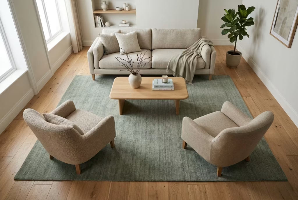
A sage green rug works as a quiet grounding device within a living room, subtly pulling together furniture, colour, and circulation into a single visual field. Unlike walls or upholstery, which tend to define height and volume, a rug defines belonging. It tells the eye where the room settles, almost like drawing a soft boundary that everything else can comfortably rest within.
When sage is introduced at floor level, it does not dominate the space. Instead, it creates a foundation that gently absorbs surrounding tones, allowing the rest of the room to feel more intentional and less visually adrift.
Real-life application insight
In practice, rugs are often underestimated, yet they are one of the most effective tools for correcting spatial imbalance. I have worked on living rooms where furniture felt like it was floating, disconnected from the architecture of the room. Introducing a sage rug changed that dynamic almost immediately.
In one case, a neutral sofa and timber coffee table arrangement suddenly felt cohesive once a muted sage rug was layered underneath. The space stopped feeling like separate pieces placed on a floor and started reading as a unified setting. It is one of those changes that is deceptively simple, yet profoundly effective in how it reshapes spatial perception.
Measurements and spatial considerations
Scale is critical here, because a rug that is too small can unintentionally fragment the room rather than ground it. As a general guideline, the rug should extend at least 20 to 30 cm (8 to 12 inches) beyond the edges of the sofa on all visible sides. In larger living rooms, allowing for 40 to 60 cm (16 to 24 inches) of extra margin can help create a more generous and anchored feel.
Standard rug sizes such as 160 x 230 cm (5.2 x 7.5 ft) work for compact layouts, while 200 x 300 cm (6.5 x 10 ft) or larger is often more appropriate for full seating arrangements. The goal is to ensure that at least the front legs of all major furniture pieces sit on the rug, so the composition feels visually tied together rather than loosely assembled.
Material pairing
The texture of a sage rug plays a significant role in how the colour is perceived. Low-pile wool rugs tend to offer a more refined and structured appearance, making them suitable for contemporary interiors where clarity and order are important.
In contrast, high-pile or handwoven textures introduce softness and a more relaxed character, which works well in rooms designed for comfort and ease.
Sage pairs particularly well with natural fibres such as wool, jute blends, or cotton weaves, all of which enhance its muted quality without overpowering it. Surrounding materials like timber flooring, linen upholstery, and stone surfaces help reinforce the rug’s grounding effect, ensuring it feels integrated rather than isolated within the scheme.
Pros
- Grounds furniture and defines seating areas without physical barriers
- Introduces colour at floor level in a subtle, low-risk way
- Helps unify mixed materials and tones within a living space
- Softens acoustics and improves the overall sense of comfort in the room
Cons
- Incorrect sizing can disrupt balance and make the space feel fragmented
- Light-coloured sage rugs may require more maintenance in high-traffic areas
- Can lose visual impact if surrounded by overly similar tones without contrast
- Poor-quality materials may flatten the colour and reduce depth over time
When used with care, a sage rug does not simply sit under the furniture. It anchors the entire room, quietly holding everything in place, like the final brushstroke that brings the composition into focus without drawing attention to itself.
You May also Like: Living Room Furniture Essentials: Designing for Comfort, Character, and Everyday Living
Minimalist Spaces with Sage as the Only Colour
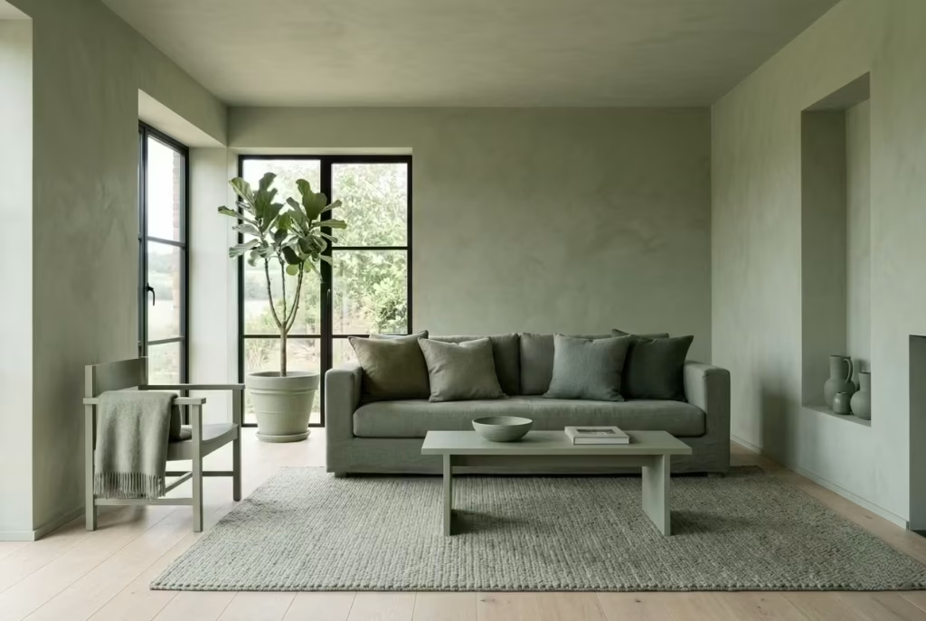
Using sage green as the sole colour in a minimalist living room is an exercise in controlled restraint, where the entire spatial experience relies on subtle variation rather than visual diversity. Instead of layering multiple hues, the design leans into tone, texture, and proportion, allowing sage to carry the emotional weight of the room.
In this context, the colour becomes less of a decorative choice and more of a stabilising atmosphere that quietly holds everything together. The simplicity is intentional, not empty, and that distinction is what separates a considered space from one that feels unfinished.
Real-life application insight
I have worked on interiors where clients initially assumed minimalism meant stripping everything back until only the essentials remained. What often gets overlooked is that restraint still needs depth, otherwise the space quickly slips into something sterile.
In one project, a small living room was redesigned using sage as the only tonal anchor, with all other surfaces kept within soft, warm neutrals. At first, the room felt almost too quiet, but once texture was introduced through linen upholstery, a subtly woven rug, and softly plastered walls, the space began to breathe.
The sage stopped feeling like a single colour and started acting like a continuous thread running through the entire composition. It is a delicate balance, but when it lands, the result feels remarkably composed, almost as if the room has been distilled to its most essential form without losing warmth.
Measurements and spatial considerations
In minimalist schemes, proportion does more of the heavy lifting because colour variation is intentionally limited. Wall-to-furniture ratios become particularly important, with seating typically occupying no more than 60 to 70 percent of the main visual field, allowing negative space to remain an active design element rather than empty void.
Ceiling heights of 2.4 to 3 metres (8 to 10 feet) work well, as they give enough vertical breathing room for sage to settle without enclosing the space. Furniture should remain visually light, with sofa depths around 85 to 95 cm (33 to 37 inches) and coffee tables kept low, ideally between 350 and 450 mm (14 to 18 inches) in height, ensuring the composition feels grounded but never heavy.
Material pairing
When sage is the only colour in a space, material variation becomes essential to prevent monotony. Natural fibres such as linen, wool, and cotton introduce subtle shifts in texture that allow the eye to move across the room without distraction.
Timber, particularly pale oak or ash, helps warm the palette and prevents the green from drifting too cool under certain lighting conditions. Plaster or limewash finishes can add depth through surface irregularity, while stone elements like limestone or lightly honed travertine introduce quiet structural contrast.
The key is to work within a tightly controlled material family, where each element supports the others rather than competing for attention.
Pros
- Creates a highly cohesive and calming environment with strong visual unity
- Allows architecture, light, and proportion to take centre stage
- Reduces visual noise, making the space feel more open and intentional
- Works particularly well in modern, well-lit interiors
Cons
- Can feel overly restrained if texture and material variation are not carefully introduced
- Requires precise lighting design to avoid a flat or one-dimensional appearance
- Limited colour contrast may not suit those who prefer more expressive interiors
- Small mistakes in proportion or finish are more noticeable due to the simplicity of the scheme
When sage is used as the only colour, the success of the space depends entirely on discipline. There is nowhere for imbalance to hide, yet when everything is aligned, the result feels quietly powerful, like a room that has been pared back to its essence and, in doing so, found its most honest form.
Sage Green with Soft Grey Undertones Transitional palette for modern homes
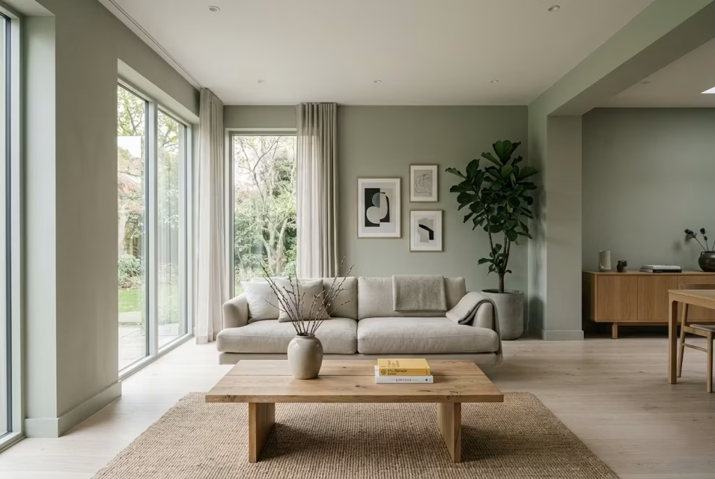
Sage green with soft grey undertones sits in that quiet in-between space where colour and neutrality blur into each other. It is not quite green in the traditional sense, and not fully grey either, which is exactly where its strength lies in contemporary interiors.
This version of sage behaves like a stabilised neutral with just enough botanical memory to avoid feeling sterile. In modern homes, where materials are often reduced to clean lines and pared-back finishes, this palette works like a soft filter, tempering rigidity without diluting architectural intent.
It is the kind of colour that does not demand attention, yet subtly changes how every surrounding surface is perceived.
Real-life application insight
In practice, I have found this variation of sage particularly effective in newer builds where the architecture is strong but emotionally restrained. One living room I worked on had excellent proportions, large glazing, and well-resolved layout logic, yet it felt slightly detached, almost like it had been designed to be viewed rather than lived in. Introducing a grey-leaning sage shifted that perception almost immediately.
The colour did not overpower the architecture; instead, it softened its edges just enough to make the space feel more human. What stood out was how materials like concrete-look flooring and pale timber suddenly felt less stark, more integrated. It was not a dramatic transformation, but more of a quiet recalibration, like the room finally finding its emotional register.
Measurements and spatial considerations
This palette performs particularly well in spaces with clean architectural geometry, where proportions are already well defined. Ceiling heights between 2.4 and 3 metres (8 to 10 feet) allow the grey undertones to sit comfortably without making the space feel compressed.
In rooms with extensive glazing, especially those exceeding 2.5 metres (8.2 feet) in window height, the colour tends to respond dynamically throughout the day, shifting between cooler and warmer interpretations depending on light exposure.
For wall applications, keeping finishes in a matte or low-sheen paint helps preserve the softness of the undertone, while avoiding any reflective qualities that might exaggerate the grey component in lower light conditions.
Material pairing
The success of grey-leaning sage depends heavily on how it interacts with surrounding materials. Light oak, ash, and pale walnut all work well, particularly when used in consistent grain direction to maintain visual calm.
Stone surfaces such as honed limestone or lightly textured concrete introduce structure without disrupting the muted palette. Fabrics should remain tactile but understated, linen, brushed cotton, and fine wool blends help reinforce the transitional nature of the scheme.
Metals, if used at all, should be restrained, with brushed nickel or muted black finishes offering definition without pulling focus. The key is to avoid overly warm or overly cold companions, as either direction can disrupt the delicate balance this palette relies on.
Pros
- Works as a highly adaptable neutral for contemporary and minimalist interiors
- Softens modern architectural finishes without undermining their clarity
- Responds well to changing light conditions throughout the day
- Creates a balanced, transitional base that supports a wide range of materials
Cons
- Can feel visually subdued if not supported by texture or contrast in materials
- Poor lighting design may push the colour too far into flat grey territory
- Requires careful calibration of undertones to avoid clashing with existing finishes
- May lack impact in spaces that call for stronger visual hierarchy or contrast
When handled with precision, sage with soft grey undertones becomes less of a colour choice and more of a stabilising presence within the home. It does not seek to define the space outright, but rather to hold it together quietly, allowing architecture, light, and material to do most of the talking while it remains, almost imperceptibly, at the centre of balance.
Layering Different Shades of Green
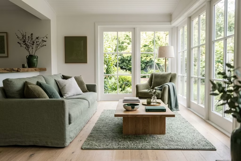
Working with multiple shades of green is less about creating variety for its own sake and more about building depth through tonal progression.
When sage is layered with deeper olives, softer celadons, or muted eucalyptus tones, the space begins to feel more dimensional, as if the colour itself has been stretched across different levels of intensity.
Instead of reading as a single flat surface, the room develops a quiet rhythm, where each shade subtly supports the next. It is a technique that, when handled with restraint, avoids monotony while still preserving a unified visual language.
Real-life application insight
In practice, I have often used this approach in living rooms that felt slightly too resolved, where everything was technically correct but emotionally static. In one project, a sage base palette was paired with deeper olive accents in upholstery and a softer, dusted green introduced through textiles.
Nothing about the layout changed, yet the room suddenly felt more alive. The effect was not immediate in a dramatic sense, but it revealed itself gradually, like the space had gained layers of atmosphere it previously lacked.
The deeper tones anchored the composition, while the lighter greens kept it from becoming too heavy. It was a reminder that colour does not always need contrast to create interest, sometimes variation within the same family is enough to shift the entire mood of a room.
Measurements and spatial considerations
When layering greens, proportion determines whether the result feels cohesive or fragmented. As a general approach, the dominant sage tone should typically occupy around 60 to 70 percent of the visual field, with secondary greens taking up roughly 20 to 30 percent, and deeper accent greens used sparingly at around 10 percent or less.
This ensures hierarchy remains clear while still allowing tonal variation to register. In furniture terms, larger upholstered pieces such as sofas (typically 200 to 240 cm / 79 to 94 inches in width) work best in the base sage tone, while smaller elements like armchairs, cushions, or rugs can introduce the deeper or lighter variations.
This controlled distribution prevents the palette from becoming visually chaotic while still allowing movement within the scheme.
Material pairing
The success of layered greens depends heavily on material restraint. Natural textures such as linen, wool, and brushed cotton help soften transitions between tones, preventing any one shade from feeling overly dominant.
Timber, particularly in neutral oak or muted ash, acts as a stabilising bridge between colour variations, keeping the palette grounded. Stone surfaces like limestone or travertine can also be introduced to provide a neutral pause within the layering, giving the eye a place to rest.
Metals should remain minimal and understated, as too much reflective contrast can interrupt the subtle tonal flow. The goal is to let texture, not gloss or shine, carry the variation between shades.
Pros
- Creates depth and visual interest without relying on strong colour contrast
- Maintains a cohesive, nature-inspired palette that feels calm and unified
- Allows for subtle personalisation through tonal variation
- Works well in both modern and transitional interior schemes
Cons
- Poor tonal balance can lead to a muddy or indistinct colour palette
- Requires careful lighting to ensure each shade remains distinguishable
- Overuse of similar tones without hierarchy may reduce visual clarity
- Needs thoughtful material pairing to avoid a flat or repetitive appearance
When executed with a steady hand, layering greens feels less like decorating and more like building atmosphere. Each shade plays its part quietly, and together they create a room that feels naturally resolved, as if it has grown into its own sense of balance over time rather than being designed all at once.
Sage Green Feature Wall with Art Integration
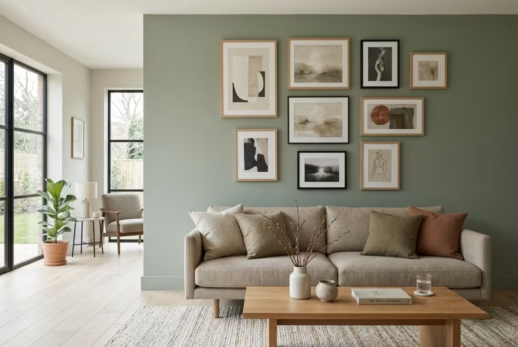
A sage green feature wall can work beautifully as a backdrop for art, but only when it is treated as a quiet stage rather than a decorative accent. The wall should do the heavy lifting in the background, allowing the artwork to carry the emotional focus without competing for attention.
Sage is especially effective here because it has enough depth to hold contrast, yet enough softness to keep the room from feeling overly theatrical.
It gives paintings, prints, and mixed media pieces a grounded setting, one that lets colour, line, and texture breathe properly. In the right room, the wall does not simply support the art. It elevates it, almost like a well-cut frame around a carefully chosen image.
Real-life application insight
I have often found that homeowners are drawn to feature walls but worry they might feel dated or too obvious. Sage changes that equation.
In one living room, a single sage wall behind a grouped art arrangement transformed what had been an empty, slightly unresolved area into the natural focal point of the space. The art did not need to be oversized or overly dramatic. The colour did the quiet groundwork, helping each piece feel more intentional and more connected to the room.
What made the difference was the restraint in the arrangement. Nothing was crowded, nothing was fighting for the spotlight, and that gave the whole wall a sense of calm confidence. It is one of those decisions that looks simple on the surface but carries a great deal of spatial intelligence underneath.
Measurements and spatial considerations
The spacing between artworks matters more than many people realise. A gap of around 150 to 200 mm (6 to 8 inches) between pieces usually gives the eye enough room to register each work individually while still reading the arrangement as a unified composition.
If the pieces are too tightly packed, the wall starts to feel busy and loses its sense of ease. If they are too far apart, the grouping can fragment and lose momentum. In terms of scale, the art should generally occupy about two-thirds to three-quarters of the wall width when used as a grouped feature, especially above a sofa or console.
For a standard sofa around 200 to 240 cm (79 to 94 inches) wide, the artwork grouping often works best when centred and proportioned to sit comfortably within that width rather than sprawling too far beyond it.
Material pairing
Sage green works particularly well with art that contains natural, muted, or earth-based tones, but it can also support stronger work when the surrounding materials stay calm. Timber frames in oak or walnut bring warmth and make the arrangement feel more collected.
Slim black frames can add definition, though they should be used sparingly so the wall does not become overly graphic. If the room includes stone, linen, or textured plaster, the art wall tends to feel more integrated, almost as if it belongs to the architecture rather than being hung onto it. Lighting is equally important.
A softly directed picture light or a pair of wall washers can help the sage backdrop and the artwork work in tandem, rather than leaving the wall to carry the whole composition unaided.
Pros
- Creates a strong focal point without relying on bold colour or heavy contrast
- Helps artwork feel more deliberate and visually grounded
- Works across a wide range of art styles, from contemporary prints to framed painting
- Adds depth to a living room without overwhelming the rest of the scheme
Cons
- Poor spacing can make the arrangement feel cluttered or unresolved
- The wrong artwork colours may clash with the undertones of the sage
- Can lose impact if the wall is underlit or treated too casually
- Needs careful proportioning to avoid looking overly staged or decorative
When done properly, a sage feature wall with art feels less like an accent and more like a composition with purpose. It gives the room a point of focus that feels composed, measured, and quietly assured, the kind of detail that lingers in the mind long after the first glance.
Sage and Textured Fabrics (Linen, Bouclé)
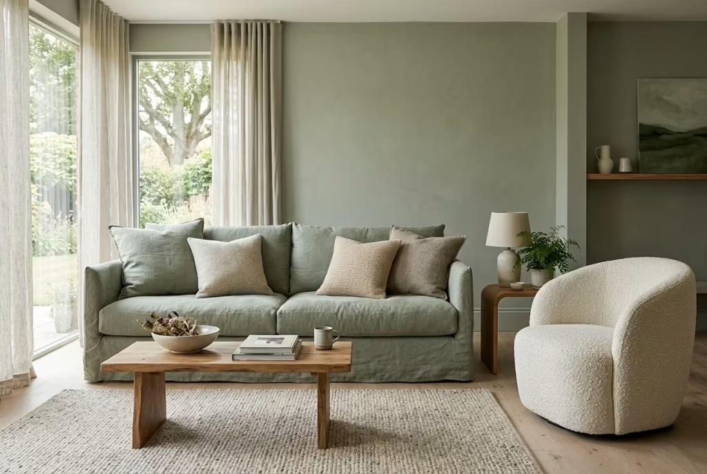
Sage green becomes significantly more expressive when it is paired with textured fabrics, particularly linen and bouclé, because the relationship shifts from purely visual to sensorial. On its own, sage can feel controlled and visually soft, but when layered with tactile materials, it gains a physical presence that changes how a room is experienced rather than just how it is seen.
Linen brings a relaxed, slightly irregular surface that catches light in uneven, natural ways, while bouclé introduces a denser, more sculptural texture that adds depth and quiet richness. Together, they prevent sage from slipping into flatness, allowing it to feel more dimensional and lived-in, almost like the room has been gently worn into comfort rather than newly styled.
Real-life application insight
In practice, I have often relied on this pairing in spaces where the colour palette is intentionally restrained, but the atmosphere risks becoming too visually still. I remember one living room where sage walls and neutral flooring created a beautiful base, yet the space initially felt slightly polished and emotionally distant.
The shift came when we introduced a linen-upholstered sofa and a bouclé armchair in muted, complementary tones. Nothing about the architecture changed, yet the room suddenly felt more grounded in human use.
The fabrics absorbed light differently throughout the day, breaking up the uniformity of the sage and introducing a gentle sense of movement. It was not about adding more colour, but about adding life through texture, which is often where a room quietly finds its character.
Measurements and spatial considerations
Texture layering works best when scale is considered alongside fabric choice. A linen sofa typically sits comfortably within a width of 200 to 240 cm (79 to 94 inches) in standard living rooms, allowing enough surface area for the fabric’s natural drape and movement to be appreciated.
Bouclé pieces, often used in accent chairs or ottomans, perform well when kept within more compact proportions, usually around 70 to 90 cm (28 to 35 inches) in width, so they remain textural highlights rather than dominant forms.
Cushion layering also plays a role, with varying sizes such as 45 x 45 cm (18 x 18 inches) and 50 x 70 cm (20 x 28 inches) helping to build subtle depth without overcrowding the seating area. The key is to avoid overfilling the space, allowing each texture to register clearly rather than competing for attention.
Material pairing
Linen and bouclé work particularly well alongside sage because they both sit comfortably within a natural, muted material language. Linen, with its slightly creased and breathable quality, complements the softness of sage walls or upholstery, reinforcing a relaxed but intentional aesthetic.
Bouclé, on the other hand, introduces a sculptural density that contrasts gently with smoother surfaces, preventing the room from feeling too uniform. These fabrics pair especially well with warm timber tones like oak or ash, which add structural balance, and with stone elements such as limestone or travertine, which reinforce the natural, grounded feel of the palette.
Metals should remain secondary, with brushed or aged finishes used sparingly so they do not interrupt the tactile continuity of the scheme.
Pros
- Adds depth and sensory richness without introducing additional colours
- Softens the visual impact of sage, making interiors feel more inviting and lived-in
- Works across both contemporary and relaxed, transitional interiors
- Enhances light interaction through varied surface textures
Cons
- Requires careful maintenance, as textured fabrics can show wear differently over time
- Overuse of similar textures can reduce visual contrast and make the scheme feel too uniform
- Poor fabric quality can flatten the intended effect and reduce tactile richness
- Needs balanced material pairing to avoid a soft-heavy or overly muted atmosphere
When linen and bouclé are introduced thoughtfully, sage stops being just a colour and becomes part of a wider sensory experience. The room begins to feel less designed and more composed through touch, light, and texture working quietly together, like a space that understands how it is meant to be lived in.
Sage Green in Small Living Rooms
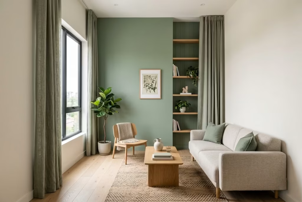
In smaller living rooms, sage green needs to be handled with a degree of spatial sensitivity, because the wrong application can easily make a compact space feel more enclosed than it actually is.
The strength of sage in these settings lies in its ability to soften boundaries rather than define them too aggressively. When used thoughtfully, it can actually make a small room feel more composed and less visually cluttered, but the key is direction.
Vertical application, where the colour is drawn upward rather than spread heavily across horizontal planes, helps maintain a sense of lift and prevents the space from feeling visually compressed.
Real-life application insight
I have worked on several compact living rooms where the initial instinct was to keep everything light and neutral in fear of “shrinking” the space. The irony is that this often leaves the room feeling bland and directionless instead.
In one small city apartment, introducing sage on a single vertical plane, a feature wall that extended up to the ceiling, completely changed the spatial reading. Rather than closing the room in, it actually gave it a sense of height and intention.
The eye was drawn upward instead of bouncing around the perimeter, which made the room feel more structured without physically altering anything. It is one of those situations where a well-placed colour choice does more for perception than any amount of extra square footage ever could.
Measurements and spatial considerations
In compact spaces, proportion becomes the silent driver of success. Ceiling heights in small living rooms often sit around 2.3 to 2.5 metres (7.5 to 8.2 feet), so maintaining vertical emphasis is essential to avoid a boxed-in feeling. If sage is used on walls, limiting it to a single vertical application, such as a feature wall or full-height joinery, helps preserve spatial clarity.
Vertical elements like curtains should ideally run from ceiling to floor, typically around 220 to 250 cm (87 to 98 inches) in these rooms, to reinforce height rather than interrupt it. Furniture should also stay visually light, with lower profiles around 80 to 85 cm (31 to 33 inches) in sofa height, ensuring sightlines remain open and uninterrupted.
Material pairing
In smaller rooms, material restraint is just as important as colour placement. Sage works best when paired with surfaces that reflect or gently diffuse light rather than absorb it entirely. Light oak, ash, or pale walnut helps maintain warmth without adding visual weight.
Fabrics like linen and fine-weave cotton keep the palette soft and breathable, while avoiding overly dense textures that can make the room feel heavier.
Reflective elements should be used sparingly but intentionally, a well-placed mirror, a softly brushed metal lamp, or a glass-topped side table can help expand perception without disrupting the calm tone of sage.
The goal is to keep everything working in quiet harmony, where no single element dominates the field of view.
Pros
- Adds depth and character without visually overwhelming small spaces
- Creates a sense of height and openness when used in vertical applications
- Helps define zones without physically dividing the room
- Introduces colour in a controlled, spatially aware way
Cons
- Poor placement can make a small room feel more enclosed rather than open
- Overuse across all surfaces may reduce spatial clarity
- Requires careful furniture scaling to maintain visual balance
- Can feel flat if not supported by variation in texture and light
When used with restraint and a clear sense of direction, sage green in small living rooms does not reduce space, it refines it. It quietly reorganises how the room is perceived, making even the most compact layout feel considered, intentional, and surprisingly expansive in its own understated way.
Sage Paired with Soft Terracotta Accents
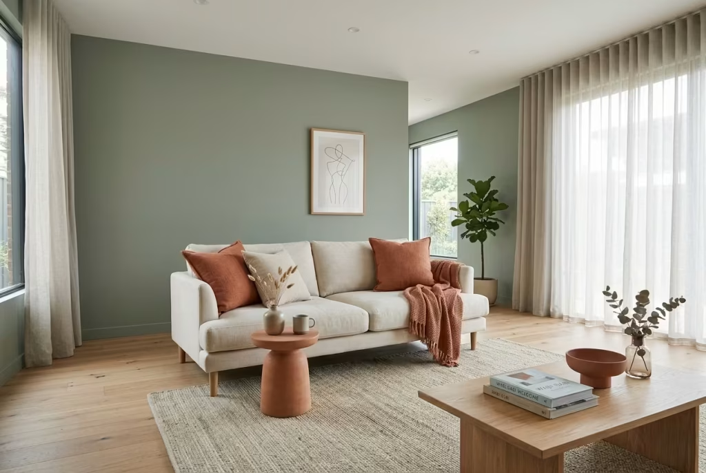
Sage green and soft terracotta work together because they sit on opposite sides of the temperature spectrum, yet meet comfortably in the middle when handled with restraint. Sage brings calm, cool stability, while terracotta introduces an earthy warmth that feels grounded rather than loud. The key here is subtlety.
This is not a high-contrast pairing designed to grab attention, but a slow-burn combination that reveals itself gradually. When balanced correctly, it feels like nature indoors in its most understated form, where cool foliage meets sun-baked earth, each one tempering the other.
Real-life application insight
In practice, this pairing often becomes the turning point in rooms that feel too restrained or slightly emotionally flat. I worked on a living room where sage had been used across walls and larger furnishings, but the atmosphere still felt a little too controlled, almost as if everything was behaving itself too well.
Introducing soft terracotta through cushions, a textured rug, and a ceramic side table immediately changed the emotional tone of the space. It did not overpower the sage, instead it warmed it.
The room began to feel more grounded, more approachable, like it had finally loosened its collar a little. That is the real strength of terracotta in moderation. It does not compete, it gently activates the palette.
Measurements and spatial considerations
With this combination, proportion is less about strict rules and more about visual restraint. Terracotta should typically occupy a smaller percentage of the overall palette, around 10 to 20 percent, so it reads as an accent rather than a competing base tone.
In practical terms, this might translate to a 45 x 45 cm (18 x 18 inches) cushion grouping, a small 60 to 80 cm (24 to 31 inches) accent chair, or ceramic pieces no taller than 200 to 300 mm (8 to 12 inches) placed on shelving or side surfaces.
In larger rooms, terracotta can be extended slightly through rugs or artwork, but it should always feel like it is punctuating the space rather than defining it. The sage remains the stabilising field, while terracotta acts as a warm interruption that draws the eye without demanding control.
Material pairing
This palette thrives on tactile, earthy materials that reinforce its natural origins. Terracotta works especially well when paired with raw or textured ceramics, unglazed finishes, and handmade forms that carry slight imperfections.
Sage green, meanwhile, benefits from softer surrounding materials like linen, wool, and brushed cotton, which prevent the contrast from becoming too sharp. Timber plays a crucial bridging role here, particularly warm oak or lightly smoked ash, which helps dissolve the boundary between the coolness of sage and the warmth of terracotta.
Stone surfaces such as limestone or travertine can further stabilise the palette, adding a quiet, neutral base that allows both tones to sit comfortably without visual tension.
Pros
- Introduces warmth and depth without overpowering the calmness of sage
- Creates a natural, earthy palette that feels grounded and inviting
- Works well in both contemporary and transitional interiors
- Adds subtle visual energy without relying on strong contrast
Cons
- Overuse of terracotta can quickly dominate and disrupt the balance
- Poor tonal selection may result in a clash rather than harmony
- Requires careful distribution to avoid visual clustering of accents
- Can feel unbalanced if sage is not maintained as the dominant base
When used with restraint, sage and soft terracotta feel like a conversation between cool and warm elements that never compete for attention. Instead, they meet in the middle, quietly shaping a space that feels both calm and lived in, like a room that has been gently warmed by time rather than design alone.
Sage Green and Glass Elements
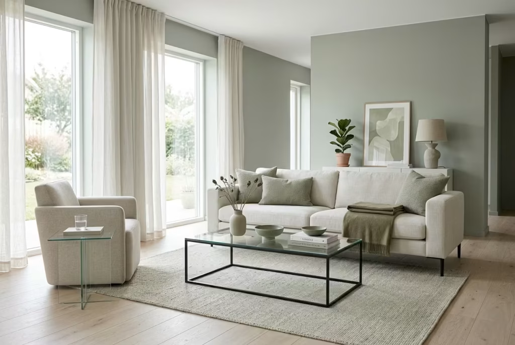
Glass is one of the quietest ways to keep a sage green living room from feeling too weighty, because it introduces reflection without insisting on attention.
Where sage naturally carries softness and a slightly grounded quality, glass brings a lift that stops the palette from settling too heavily into itself. It is a combination that works particularly well when you want the room to feel calm but not closed in, layered but not dense.
The effect is subtle, almost like opening a window within the scheme itself. The room stays composed, yet light moves more freely through it, which gives the whole interior a more effortless, less hemmed-in feeling.
Real-life application insight
In practice, this pairing can be a real game changer in rooms where sage has been used on the walls or in upholstery but the overall scheme still feels a touch grounded.
I have seen this most clearly in living rooms with limited natural light, where even a beautifully chosen sage can risk reading a little too matte if every other surface absorbs rather than reflects. Introducing glass, whether through a coffee table, a side table, cabinet doors, or even a carefully placed lamp base, immediately loosens the visual grip.
The room starts to feel less like it is holding its breath. That is the shift that matters. It is not about making the space shiny or fragile. It is about allowing the eye to move more freely, which is often what gives a room its sense of ease.
Measurements and spatial considerations
With glass, proportion is everything, because its visual lightness can either support the scheme beautifully or feel underwhelming if the scale is wrong. A glass coffee table typically works best at around 1000 to 1200 mm (39 to 47 inches) long in a standard seating arrangement, giving enough presence to function properly without visually crowding the room.
Side tables usually sit comfortably at 450 to 600 mm (18 to 24 inches) high, which keeps them aligned with armrest height and avoids awkward visual breaks.
In smaller rooms, clear or lightly tinted glass is often the best choice, as it preserves openness and avoids adding unnecessary visual weight. In larger spaces, ribbed, smoked, or lightly frosted glass can introduce just enough texture to keep the look from feeling too bare. The key is to let the glass support the room quietly rather than stepping into the spotlight.
Material pairing
Glass works particularly well when it is surrounded by materials with a little warmth and texture, otherwise the room can drift into something too cool or thin. Sage provides the soft colour base, while timber, linen, wool, and stone bring the tactile substance that grounds the composition.
Oak is especially useful here, because it warms the reflective quality of glass without competing with the calm of sage. A limestone surface or travertine detail can also help stabilise the palette, giving the eye a place to rest between the reflective and the matte.
If metal is introduced, it should remain understated, brushed brass or muted bronze tends to feel more at home than anything highly polished. The real art lies in balancing what reflects and what absorbs, so the room feels alive without becoming visually noisy.
Pros
- Keeps sage schemes feeling open, airy, and less visually heavy
- Introduces light reflection without overwhelming the calm of the palette
- Works well in both small and larger rooms, especially where natural light is limited
- Adds a refined, contemporary edge without disrupting the softness of the design
Cons
- Can feel too delicate if not balanced with stronger materials
- Overuse of glass may make the room feel cold or unfinished
- Requires regular cleaning, especially on larger surfaces and tables
- Poorly scaled glass pieces can look insubstantial rather than elegant
When used well, glass does not compete with sage green, it gives it room to breathe. The combination feels quietly intelligent, like a well-timed pause in a conversation, allowing the whole space to settle into something lighter, clearer, and far more graceful than it first appears.
You May also Like: Transform Your Space: 15 Sage Green Kitchen Ideas That Feel Soft, Fresh, and Elegant
Incorporating Plants with Sage Backdrops
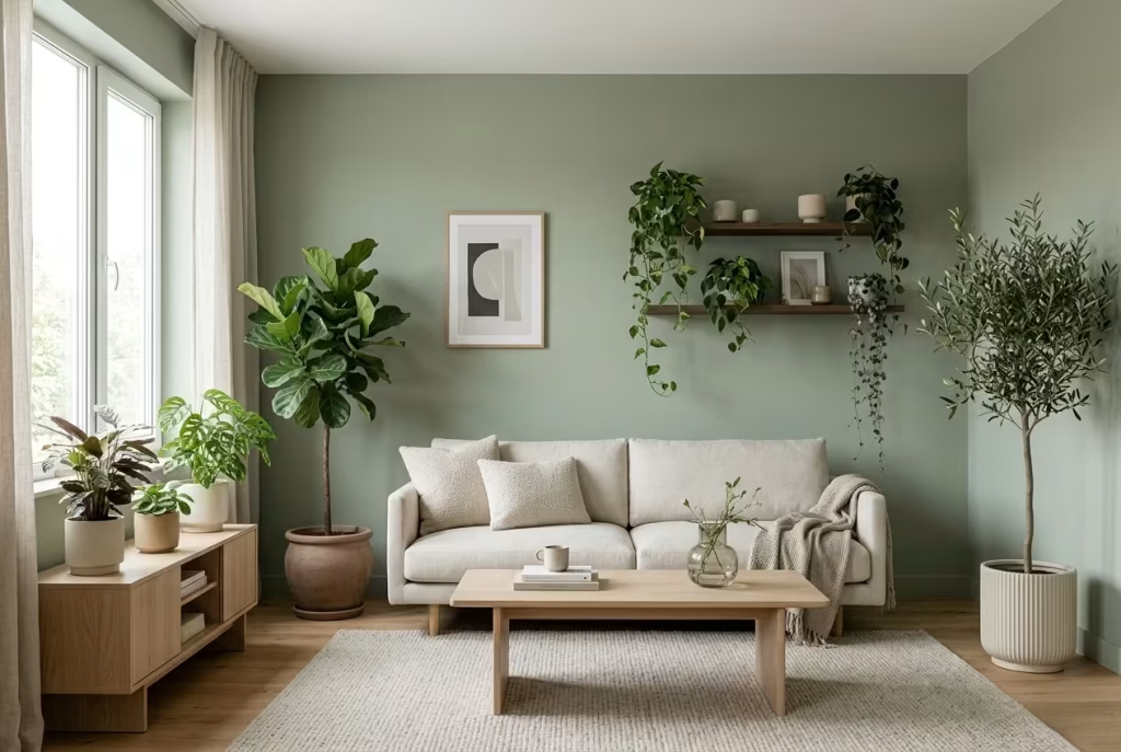
Pairing indoor plants with sage green backdrops is a study in tonal harmony rather than contrast. Instead of relying on bold visual separation, this approach leans into subtle variation within the green family, allowing foliage and wall colour to feel like they belong to the same natural language. Sage provides a muted, grounded base, while plants introduce movement, texture, and living variation.
The result is not decorative greenery placed against a coloured wall, but a layered composition where everything feels softly interconnected, almost as if the interior has grown into itself over time.
Real-life application insight
In practice, I have found this approach particularly effective in living rooms that risk feeling slightly static once the main palette is established. I worked on a space where sage walls and neutral furniture created a beautifully calm foundation, but the room still felt a touch too controlled. Introducing plants changed that immediately.
Large-leaf varieties placed near corners and softer trailing plants on shelving introduced a sense of rhythm that the architecture alone could not provide. What stood out was how the sage backdrop stopped feeling like a painted surface and started acting more like a natural field, allowing the greenery to blend in rather than sit on top of it.
It is one of those shifts that feels almost imperceptible at first, yet completely changes how the room is experienced day to day.
Measurements and spatial considerations
Scale is important when integrating plants into a sage-based scheme, because proportion determines whether the layering feels intentional or accidental. In most living rooms, larger floor plants should ideally range between 900 and 1800 mm (35 to 71 inches) in height, depending on ceiling proportions, which typically sit between 2400 and 3000 mm (8 to 10 feet). This ensures vertical balance without overwhelming sightlines.
Medium plants placed on consoles or side tables generally work well at around 400 to 800 mm (16 to 31 inches), allowing them to sit comfortably within the visual hierarchy of furniture. It is also important to vary plant heights across the room rather than clustering them at a single level, as this helps maintain a natural flow and prevents the composition from feeling staged.
Material pairing
The success of this combination relies heavily on supporting materials that do not compete with either the sage or the plants. Natural finishes such as oak, ash, and walnut help reinforce the organic quality of the palette, while linen and wool textiles soften transitions between hard and soft surfaces.
Ceramic planters in muted tones, especially off-white, clay, or stone-inspired finishes, tend to work better than highly decorative pots, as they allow foliage to remain the focus. Stone surfaces like limestone or travertine further enhance the natural dialogue, grounding the greenery while maintaining a calm visual rhythm.
Even metal elements, if used, should stay understated, with brushed or aged finishes that sit quietly within the scheme rather than pulling attention away from it.
Pros
- Strengthens the natural, biophilic quality of sage-based interiors
- Adds movement, texture, and life without disrupting colour harmony
- Enhances airiness and softness in otherwise controlled schemes
- Works well across both compact and larger living spaces
Cons
- Requires ongoing maintenance to keep plants healthy and visually consistent
- Overcrowding with greenery can dilute the calmness of the sage backdrop
- Poor plant selection may disrupt tonal harmony rather than enhance it
- Uneven placement can make the space feel visually unbalanced
When plants are introduced against a sage backdrop with restraint, the effect feels less like decoration and more like continuity. The room begins to blur the line between interior and natural world, settling into a quiet rhythm where colour and life coexist without effort, as if they were always meant to be together.
Sage Green Ceiling for Subtle Enclosure
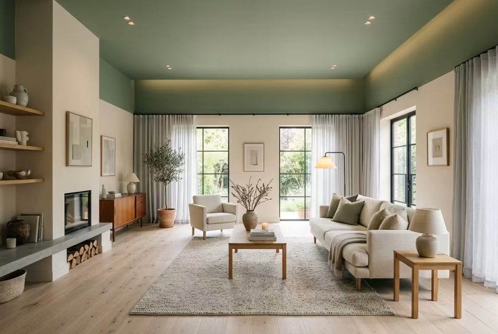
A sage green ceiling is one of those design decisions that quietly reshapes a room without altering its footprint. Unlike walls, which define boundaries at eye level, the ceiling influences how enclosed or expansive a space feels from above, which is where perception is often decided without us noticing.
Sage introduces a gentle downward softness, creating a sense of intimacy without tipping into heaviness. It is not about lowering the room visually in a harsh way, but about wrapping it in a controlled calm that feels intentional rather than enclosed.
In well-proportioned spaces, it can make a room feel cocooned in the best possible sense, like the architecture has been gently drawn inward rather than compressed.
Real-life application insight
In practice, ceiling colour is often underestimated, yet it can completely recalibrate how a space is experienced. I worked on a living room with generous proportions and high ceilings that initially felt almost too open, to the point where the furniture arrangement lacked intimacy.
Everything sat correctly, but the space did not quite “hold” the people in it. Introducing sage on the ceiling changed that dynamic immediately. The room stopped feeling like a volume of air and started feeling like a defined environment.
The walls remained light and neutral, but the ceiling brought everything back into focus. It was a subtle intervention, but it grounded the entire scheme in a way that no amount of furniture rearrangement had achieved.
Measurements and spatial considerations
Ceiling applications require careful attention to height, because the effect is highly dependent on proportion. This approach works best in rooms with ceiling heights of at least 2.7 metres (9 feet), where there is enough vertical volume for the colour to settle without feeling oppressive.
In spaces above 3 metres (10 feet), sage can be used more confidently, sometimes extending across full ceilings or architectural recesses to reduce excessive vertical distance and improve acoustic and visual comfort.
In lower rooms, partial applications such as ceiling framing or perimeter colour banding can achieve a similar effect without overwhelming the space. Lighting placement is also critical here, with fixtures ideally positioned to diffuse light evenly across the ceiling rather than creating concentrated hotspots that disrupt the softness of the colour.
Material pairing
When sage is introduced overhead, the supporting materials in the room become even more important because they anchor the downward visual shift. Light timber flooring in oak or ash helps balance the ceiling weight, ensuring the room does not feel top-heavy.
Wall finishes in soft neutrals, such as warm white, stone, or muted beige, act as transitional surfaces that prevent harsh separation between planes. Textiles like linen curtains and wool upholstery help soften the overall effect, reinforcing the sense of enclosure without making the room feel closed in.
Metallic finishes, if used, should remain restrained and warm toned, as overly cool or reflective metals can visually detach from the softened ceiling plane and break the cohesion of the scheme.
Pros
- Creates a subtle sense of intimacy without reducing actual space
- Helps balance rooms with overly high or visually disconnected ceilings
- Enhances acoustic softness, making large rooms feel more comfortable
- Adds a refined, architectural layer without altering furniture layout
Cons
- Not suitable for low ceilings, where it can feel visually compressing
- Requires careful lighting design to avoid uneven colour perception
- Can feel unusual if not supported by balanced wall and floor tones
- Mistakes in shade selection may reduce overall brightness of the room
When used with restraint and proper proportion, a sage ceiling does something quite rare in interior design. It quietly redefines the atmosphere from above, shaping how the room is felt rather than simply how it is seen, creating a space that feels gently held rather than simply enclosed.
Sage and Patterned Textiles
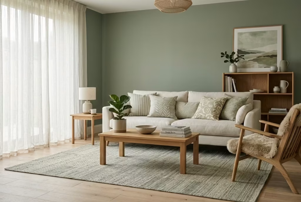
Sage green provides a remarkably steady foundation for patterned textiles, but the relationship only works when the pattern language remains restrained. The goal is not to introduce visual noise, but to create a soft rhythm within the room, where pattern feels like a whisper rather than a statement.
Low-contrast patterns, whether in stripes, organic motifs, or subtle geometrics, sit comfortably against sage because they echo its muted character rather than compete with it. This creates a layered interior that feels lived in and composed, yet never visually overworked. The key is control, where pattern is allowed to breathe rather than dominate.
Real-life application insight
In practice, I have found that patterned textiles often become the turning point between a room feeling “finished” and feeling truly considered. I worked on a sage-based living room where everything initially leaned too uniform, almost to the point of visual fatigue.
The introduction of softly patterned cushions and a muted woven rug changed that balance immediately. Nothing was loud or attention-seeking, but the room suddenly had movement, like a gentle undercurrent running through it. What mattered most was restraint in colour contrast.
The patterns stayed close to the sage palette, which meant they added complexity without disturbing the calm. It is a delicate balance, but when achieved, the space feels effortlessly layered rather than styled in layers.
Measurements and spatial considerations
When working with patterned textiles in a sage setting, scale needs to be carefully managed so the pattern supports the room rather than overwhelms it. In seating areas, cushions typically work best in mixed sizes such as 45 x 45 cm (18 x 18 inches) and 50 x 70 cm (20 x 28 inches), allowing pattern to appear in controlled moments rather than as a continuous visual field.
Rugs with subtle patterning should generally extend at least 20 to 30 cm (8 to 12 inches) beyond furniture groupings to maintain spatial grounding, while ensuring the pattern does not break awkwardly at the edges of the seating zone. In larger rooms, slightly larger repeat patterns can be introduced, but the tonal contrast should remain low enough that the eye reads texture before it reads pattern.
Material pairing
The success of patterned textiles in a sage interior depends heavily on the materials carrying those patterns. Natural fibres like linen, wool, and cotton blends tend to diffuse pattern edges, making them feel softer and more integrated into the space.
Woven textures often work better than printed ones because they carry variation within the material itself, which aligns more naturally with sage’s muted quality. Timber elements in oak or ash provide a grounding counterbalance, ensuring patterned textiles do not drift visually.
Stone surfaces, particularly limestone or lightly honed finishes, help maintain calm between patterned zones, acting almost like visual pauses within the composition. The overall effect should feel continuous, not segmented.
Pros
- Introduces subtle visual interest without disrupting the calm of sage
- Adds depth and layering through texture and tone rather than strong contrast
- Helps prevent sage-based interiors from feeling too uniform or flat
- Works well across cushions, rugs, curtains, and upholstered accents
Cons
- High-contrast patterns can quickly overwhelm the softness of sage
- Overuse of pattern may create visual fragmentation in the room
- Requires careful coordination to maintain tonal harmony across textiles
- Poor material choices can make patterns feel printed rather than integrated
When handled with restraint, sage and patterned textiles work in quiet harmony. The pattern does not take centre stage, yet it gently shapes the atmosphere, like a soft rhythm running beneath the surface of the room, adding depth without ever disturbing its calm.
Transitional Styling: Mixing Classic and Modern Elements
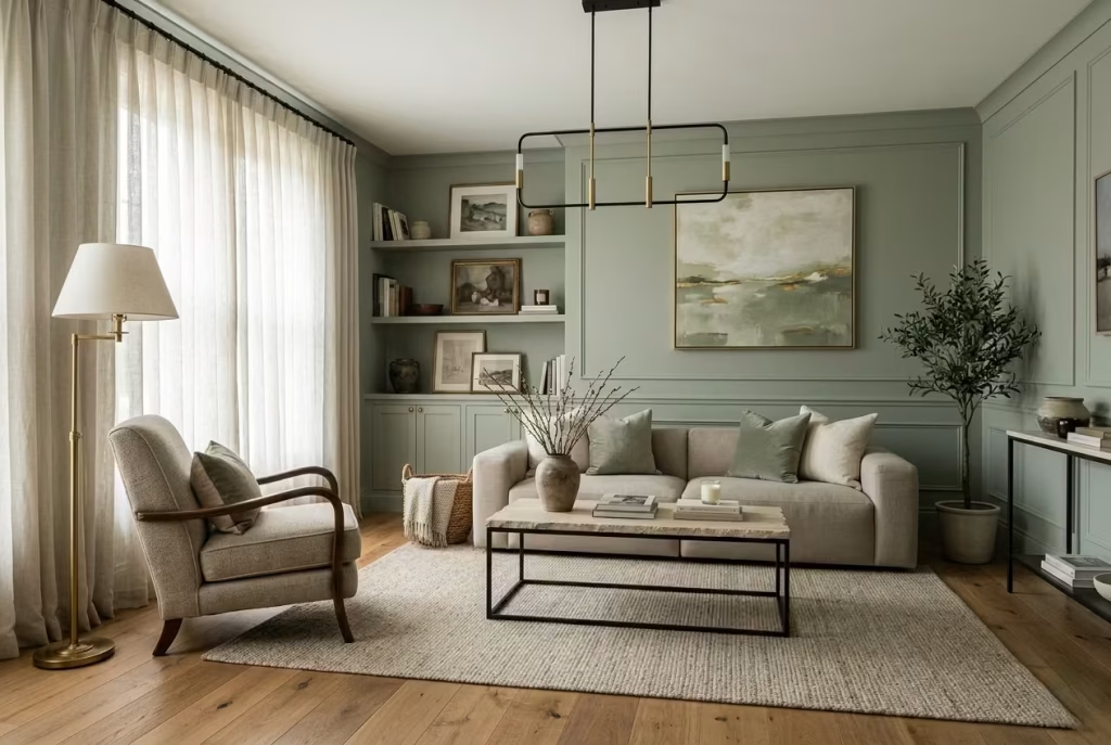
Transitional interiors rely on balance, not identity extremes, and sage green sits almost perfectly at that intersection. It has enough historical softness to sit comfortably alongside classic detailing, yet enough restraint to feel at home in clean-lined contemporary settings. This dual nature is what makes it so effective as a unifying thread.
In transitional styling, the challenge is rarely about selecting individual pieces, but about making them speak the same visual language. Sage does this quietly. It does not demand harmony, it facilitates it, allowing ornate forms and minimal silhouettes to coexist without visual tension.
Real-life application insight
In practice, transitional spaces often begin with a kind of quiet conflict. I have worked on rooms where traditional furniture pieces, often inherited or chosen for their craftsmanship, sit alongside more modern architectural interventions like sleek lighting or simplified layouts.
Without a unifying tone, the result can feel slightly disjointed, as if two design intentions are competing for attention. Introducing sage into these environments often resolves that tension in a surprisingly understated way.
In one living room, a classic armchair and a contemporary modular sofa finally felt like they belonged in the same conversation once sage was introduced through wall colour and upholstery accents. Nothing about the furniture changed, yet the room stopped feeling split in two and started behaving as a single, coherent space.
Measurements and spatial considerations
In transitional interiors, proportion and spacing become the quiet framework that allows different styles to coexist. Seating arrangements typically benefit from maintaining clear circulation paths of around 900 to 1200 mm (35 to 47 inches), ensuring that both traditional and modern pieces can be appreciated without feeling cramped together.
Larger anchor pieces, such as sofas measuring 200 to 260 cm (79 to 102 inches) in width, should be visually balanced with more refined, lower-profile items to avoid dominance from either side of the stylistic spectrum.
Wall treatments in sage work best when applied consistently across full surfaces rather than fragmented sections, allowing the colour to act as a continuous backdrop that visually ties differing furniture styles together.
Material pairing
The success of sage in transitional interiors depends on how effectively it bridges material contrasts. Classic elements like carved timber, upholstered detailing, or antique-inspired forms can sit comfortably alongside modern materials such as metal, glass, and smooth stone, provided sage remains the stabilising layer throughout. Warm oak and walnut help soften the edges of contemporary pieces, while matte black or brushed metal finishes can introduce subtle definition without disrupting cohesion.
Textiles like linen, wool, and soft cotton blends reinforce the sense of continuity, ensuring that no single material feels visually isolated. Stone surfaces such as limestone or travertine further support this balance, grounding both traditional and modern elements within a shared tonal framework.
Pros
- Acts as a cohesive bridge between classic and contemporary design elements
- Reduces visual tension between contrasting furniture styles
- Creates a calm, unified backdrop that supports diverse materials
- Offers long-term flexibility as styles evolve within the same space
Cons
- Requires careful curation of furniture to avoid stylistic imbalance
- Poor tonal consistency can weaken the unifying effect of sage
- Overuse of mixed styles without restraint may still feel disjointed
- Needs thoughtful lighting to ensure both classic and modern pieces are equally represented
When used as the connective layer in transitional interiors, sage green does not compete with either tradition or modernity. Instead, it quietly holds them together, allowing contrast to exist without conflict, like two different design languages finally learning to speak through the same, understated tone.
Common Mistakes That Undermine Sage Green Interiors
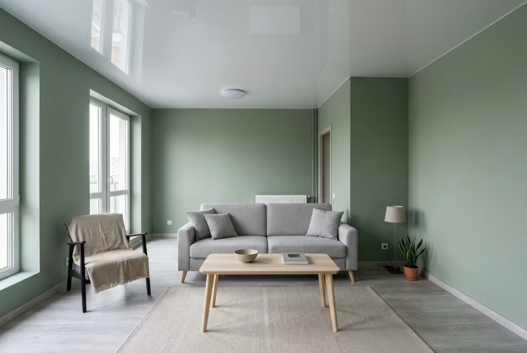
Sage green is often praised for its calm authority, but it is also one of those colours that can quietly lose its impact if handled without precision. In practice, I have seen beautifully chosen sage palettes fall short not because of the colour itself, but because of surrounding decisions that work against it. Lighting, finish, material balance, and tonal hierarchy all play a part, and when even one of these is misjudged, the entire atmosphere can feel slightly off, as if the room is speaking in the wrong register. The difference between a refined sage interior and a flat one is rarely dramatic, it is usually a matter of small, compounding choices.
Pairing with overly cool lighting (4000K+)
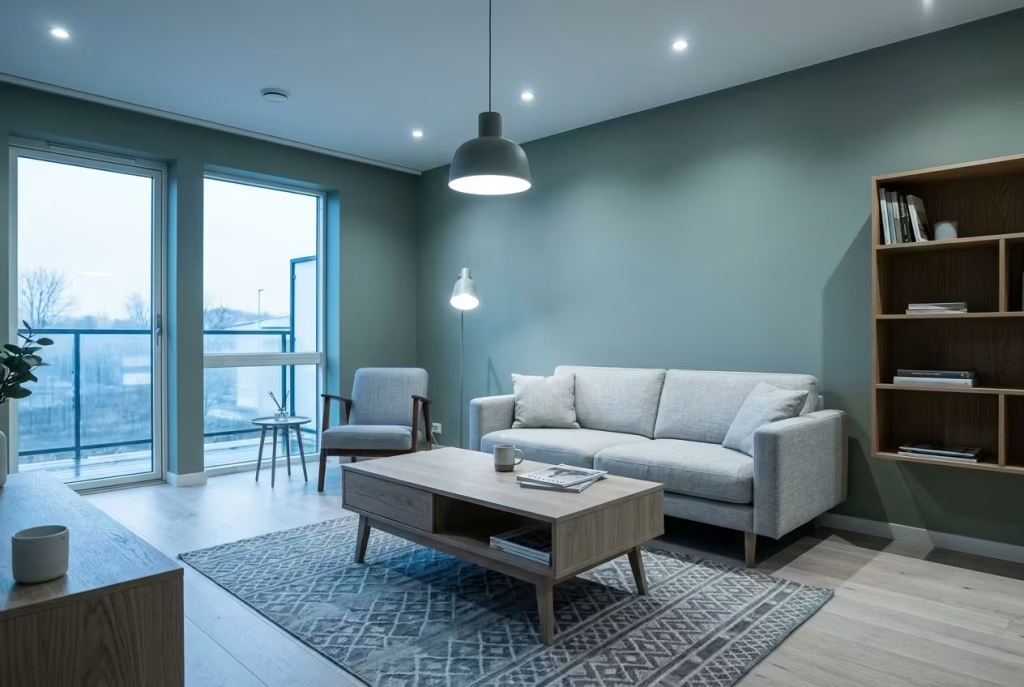
One of the most common missteps is using lighting that is too cool for sage green to properly express itself. Anything in the 4000K and above range tends to push sage into a flatter, more clinical territory, stripping away its natural warmth and muting its depth. Instead of feeling calm and grounded, the room starts to feel a little detached, almost like the colour has been rinsed of its character.
In real-world terms, I have walked into spaces where the palette was beautifully resolved on paper, yet under cool lighting everything felt slightly unsettled. The sage leaned grey, timber lost its warmth, and even textiles felt less tactile. Once the lighting temperature was brought down into a softer 2700K to 3000K range, the entire space recalibrated. The same materials suddenly felt intentional again, like someone had adjusted the focus on a lens that was slightly out of alignment.
The key takeaway is simple: sage needs warmth in its light environment to fully express its layered softness. Without it, the colour never quite lands.
Using high-gloss finishes instead of matte or eggshell
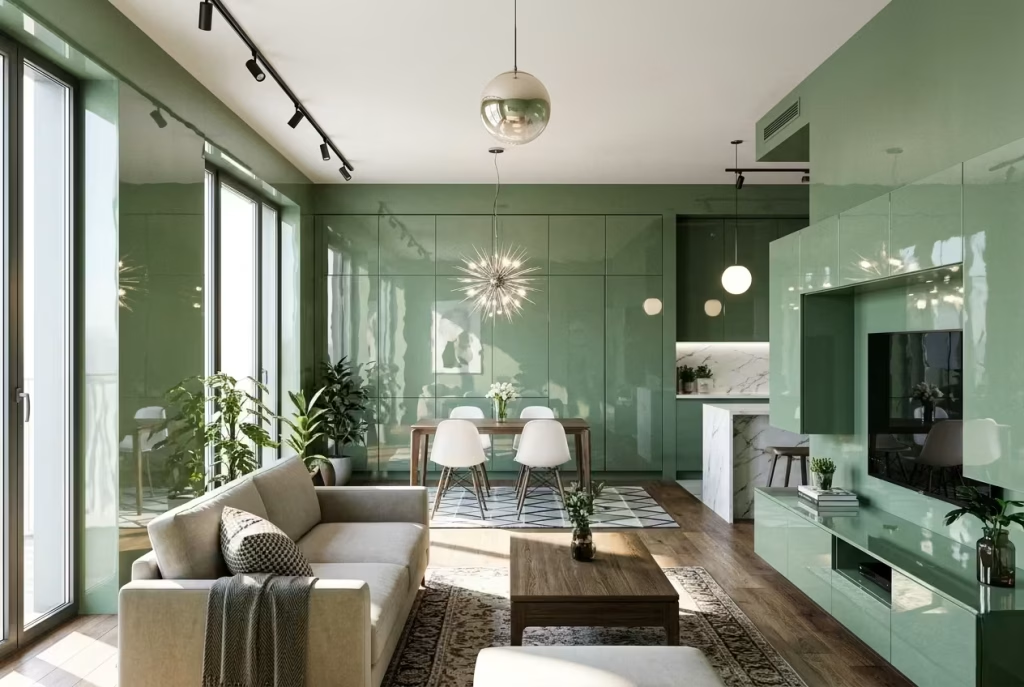
High-gloss finishes and sage green rarely sit comfortably together. Gloss introduces reflection and sharpness, while sage relies on diffusion and softness. When the two are combined, the result can feel visually disjointed, as if the surface is competing with the colour rather than supporting it.
In practice, I have seen this most often in spaces where clients wanted a “clean” finish and defaulted to gloss paint or overly polished cabinetry. The problem is not the finish itself, but how it interacts with sage. Instead of a calm, atmospheric surface, the walls start to bounce light aggressively, breaking up the gentle consistency that makes sage so effective in the first place.
Matte or eggshell finishes allow sage to behave properly. They absorb light in a controlled way, letting the colour sit quietly on the surface rather than shouting from it. In design terms, it is the difference between a room that feels composed and one that feels slightly overexposed.
Lack of material contrast
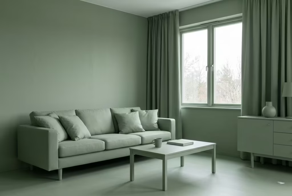
Sage green thrives on subtle contrast in materiality, not necessarily in colour. When everything in a room shares the same level of smoothness or softness, the result can quickly drift into visual monotony. It becomes difficult for the eye to find rest points or transitions, and the space starts to feel one-note, even if the palette itself is well chosen.
I have worked on interiors where sage walls, sage upholstery, and similarly toned textiles were all layered together with minimal variation in texture. On paper, it felt cohesive. In reality, it felt slightly flat, like a conversation without emphasis or rhythm. Introducing even small shifts, such as a rough linen against a smoother wool, or a matte stone surface beside soft timber, completely changed the dynamic.
The lesson here is that sage does not need louder colours, it needs quieter contrasts in material behaviour. Without that push and pull, the interior never fully comes alive.
Over-layering similar tones without hierarchy
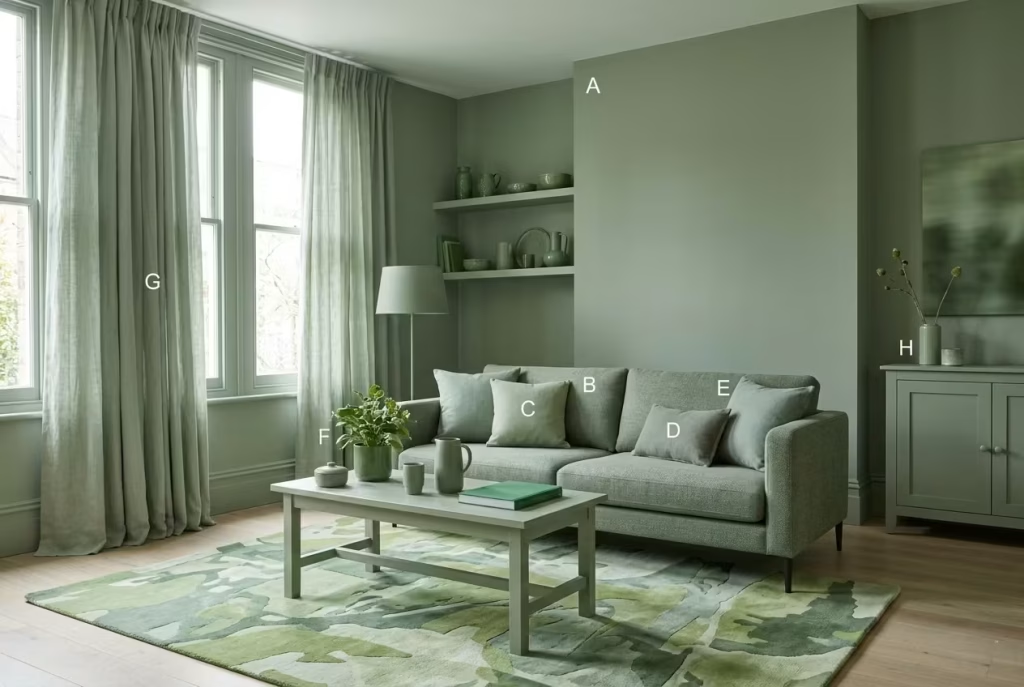
Perhaps the most subtle mistake is over-layering too many similar tones of sage and green without establishing hierarchy. While tonal layering can be beautiful when controlled, it becomes problematic when everything sits at the same visual intensity. The eye loses direction, and instead of depth, you get dilution.
In practice, I have seen rooms where multiple sage variations were used across walls, upholstery, rugs, and accessories, but without a clear dominant tone. The result was not chaotic, but strangely undefined, like the space had no focal point to anchor it. Once a clear hierarchy was introduced, with one dominant sage, one supporting neutral, and one restrained accent tone, the entire composition suddenly gained clarity.
Good design relies on rhythm. Sage works best when it leads, supports, or steps back, not when every element tries to sit at the same volume. Without that structure, even the most carefully selected palette can feel like it is quietly drifting rather than holding its shape.
When you step back and look at these mistakes together, a clear pattern emerges. Sage green does not fail because of the colour itself, but because of how easily its subtlety can be disrupted. It rewards control, restraint, and a certain discipline in execution. When those conditions are met, it settles beautifully. When they are not, it tends to reveal every imbalance in the room, almost without warning.
How to Choose the Right Shade of Sage Green
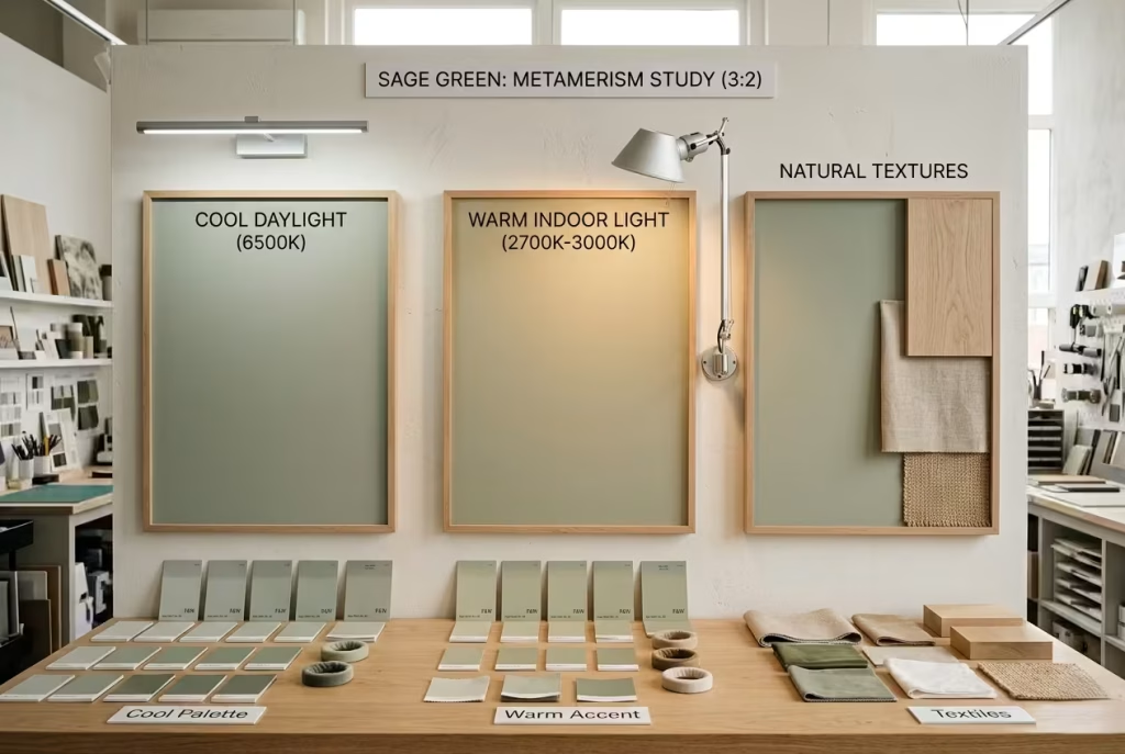
Choosing sage green is rarely about picking a single “nice colour” off a chart. In practice, it is about understanding how undertones behave in real light, real rooms, and real materials. I have seen the same sage sample feel beautifully soft in one home and unexpectedly cold or muddy in another, simply because the underlying undertone was not aligned with the space. That is where most decisions go off track, not at the level of taste, but at the level of subtle calibration.
Undertones Matter More Than Depth
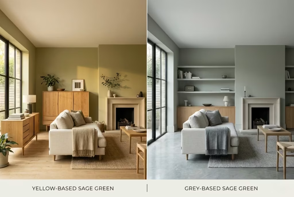
Yellow-based vs grey-based sage: If there is one principle that consistently separates a successful sage interior from a disappointing one, it is undertone sensitivity. Depth can be adjusted with lighting and layering, but undertone is what ultimately defines how the colour behaves in context. Sage is not a single fixed identity, it shifts depending on whether it leans warmer with yellow undertones or cooler with grey influence.
Yellow-based sage carries a softer, more organic warmth. It tends to sit comfortably in rooms with natural timber, warm stone, and softer daylight exposure. In real projects, I often find this version works beautifully in south-facing spaces where light already has a golden quality. It feels grounded, almost familiar, like it has been there for years without trying too hard.
Grey-based sage, on the other hand, is more restrained and architectural. It has a cleaner, slightly more modern edge, which allows it to sit well in contemporary spaces with sharper lines, concrete finishes, or cooler daylight conditions. However, it can easily tip into feeling flat or withdrawn if the room lacks warmth in materials or lighting.
The real skill is not choosing the “prettiest” sage, but matching the undertone to the room’s natural behaviour. When that alignment is right, everything else feels easier, like the space is quietly working with you instead of against you.
Sampling in Real Conditions
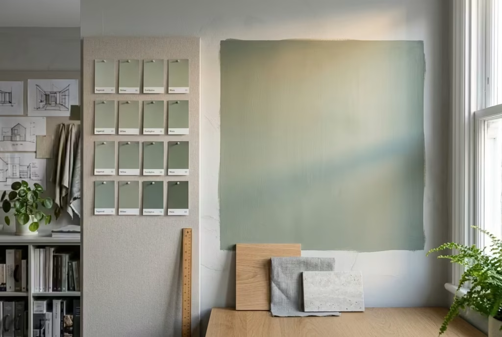
Why test panels should be at least 1m x 1m (3 x 3 ft): One of the most common mistakes I see is relying on small paint swatches or narrow sample strips when choosing sage green. On a small card, almost every shade looks balanced. In a full room, however, the truth emerges quickly and sometimes quite unforgivingly. Light shifts, shadows deepen, and undertones reveal themselves in ways that no handheld sample can predict.
This is why test panels should be substantial. A minimum size of around 1 metre by 1 metre (3 x 3 ft) is not excessive, it is realistic. At that scale, the colour begins to behave like a surface rather than an idea. You can see how it reacts to morning light, how it settles in the late afternoon, and how it holds under artificial lighting. It is only at this scale that sage starts to show its full personality.
In practice, I have seen clients completely change direction after viewing a properly sized sample wall. A sage that looked perfect on a chart sometimes felt too cool once applied broadly, while another that seemed slightly muted suddenly came alive once it occupied real space. That shift in perception is not uncommon, it is expected. Colour is never static, it is always in conversation with its surroundings.
The key is to treat sampling not as a quick preview, but as a small-scale rehearsal of the room itself. When you give sage enough surface area to perform, it stops being a guess and starts becoming a decision grounded in reality.
When these two principles are understood together, undertone awareness and real-world sampling, choosing sage green becomes far less about uncertainty and far more about control. It is not about chasing the perfect shade, but about recognising which version of sage actually belongs in the space you are shaping.
Common Combinations That Consistently Work (And Why)
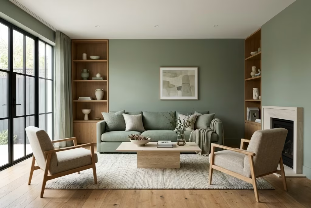
Some palettes with sage green simply stand the test of time, not because they are fashionable, but because they are structurally balanced at a material level. In real projects, I rarely think of these as “colour combinations” first. I think of them as systems where surface behaviour, texture, and light response are aligned. When that alignment is right, the room feels composed without effort, like everything has naturally settled into place.
Sage + warm white + oak
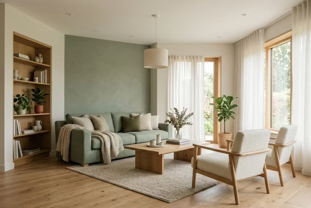
This is one of the most dependable combinations in residential interiors, and it works because each element plays a distinct material role rather than simply a visual one. Sage provides the muted tonal anchor, warm white acts as a reflective softener, and oak introduces grain, warmth, and structural grounding.
Warm white is doing more than sitting quietly on the walls. It controls how sage is perceived in changing light, preventing it from feeling too dense or too cool. In turn, oak interrupts visual flatness with natural variation in grain and tone, which keeps the palette from drifting into monotony.
I have used this combination in spaces where clients wanted calm but not sterility. In one living room, replacing a cooler white with a warmer off-white completely changed how the sage behaved. The oak flooring then tied everything together, almost like a visual bridge between vertical and horizontal planes. Nothing felt forced, yet everything felt intentional.
This combination works particularly well when you want a room to feel lived in, stable, and quietly confident, without relying on strong contrast or decorative excess.
Sage + limestone + bronze
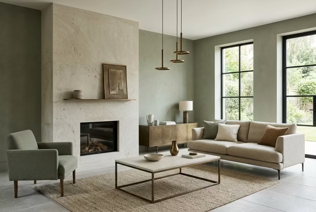
This pairing works because it is fundamentally material-led, not decorative. Limestone introduces softness through geological texture, sage provides tonal restraint, and bronze adds controlled warmth through reflective aging rather than shine.
Limestone is not just a surface choice here, it is a stabiliser. Its matte, slightly imperfect finish absorbs light in a way that prevents sage from feeling overly smooth or one-dimensional. Bronze, when used correctly, does not dominate. It patinates the space, adding a quiet depth that feels earned rather than applied.
In practice, I have seen this combination work exceptionally well in rooms where clients want a more architectural feel without losing warmth. In one project, a limestone fireplace surround paired with sage walls created a calm visual field, while bronze lighting details added just enough tension to keep the composition from feeling static. The result was not dramatic, but it had presence, like a room that understands its own material language.
This combination works best when you want subtle sophistication, where texture carries more weight than colour contrast.
Sage + soft grey + black accents
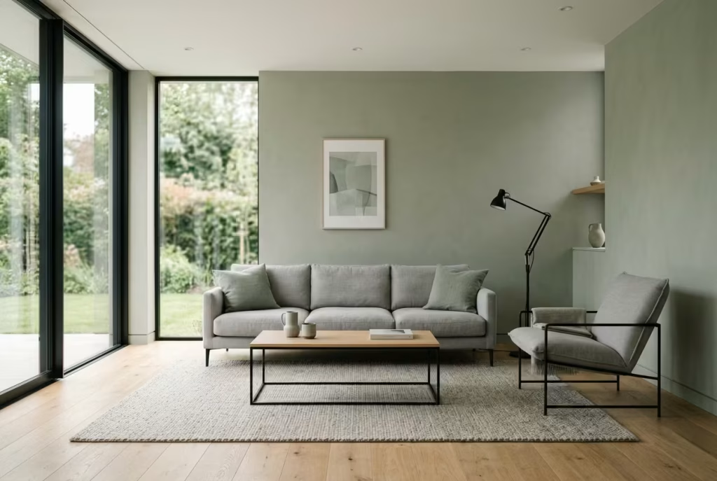
This is a more disciplined combination, and it relies heavily on proportion and restraint. Sage and soft grey sit close in tonal range, which means the success of the scheme depends on how black is used to define structure and prevent visual drift.
Soft grey acts as the intermediary layer. It reduces the intensity of sage without flattening it, allowing both tones to coexist without competition. Black, when used sparingly, introduces clarity and architectural definition. It should never feel decorative here, only functional in its visual role.
I have used this approach in more contemporary interiors where clients wanted something calm but with a sharper edge. In one apartment, sage walls combined with soft grey upholstery created a very quiet base. The introduction of black metal detailing in lighting and furniture frames prevented the space from becoming too soft or undefined. It gave the room a kind of visual punctuation, where edges felt intentional and nothing blurred together.
The success of this palette depends entirely on discipline. Too much black and the softness is lost. Too little and the composition lacks structure. When balanced correctly, it feels controlled, architectural, and quietly modern.
Across all three combinations, the underlying principle is consistent. Sage green performs best when it is supported by materials that either stabilise it, warm it, or define it. When those roles are clearly assigned, the palette stops being guesswork and starts behaving like a well-rehearsed system, where every element has a reason to exist and nothing feels accidental.
Budget Allocation: Where to Invest and Where to Hold Back
In sage green interiors, budget decisions are not just financial, they are spatial decisions in disguise. I have seen beautifully designed rooms fall short simply because money was spread too thin across low-impact elements, while the foundational layers that actually shape atmosphere were underfunded. The truth is simple: not every surface carries equal weight in how a room is experienced day to day.
A well-balanced budget behaves like a hierarchy, not a checklist.
High-Impact Investments
Upholstery, cabinetry, lighting: If there are three areas where investment consistently pays off, it is upholstery, cabinetry, and lighting. These are not decorative layers, they are structural to how a space feels and functions.
Upholstery in sage schemes is particularly important because it carries the colour at human scale. A sofa, typically around 200 to 240 cm (79 to 94 inches) in width, is often the largest soft surface in a living room. If this element is poorly made or visually weak, the entire palette loses authority, no matter how good the paint is.
Cabinetry is another long-term anchor. Built-in units, often running at depths of 300 to 450 mm (12 to 18 inches), shape how the room is read architecturally. In real projects, I have found that investing in well-proportioned joinery immediately lifts the perceived quality of the entire space. It stops the room from feeling assembled and starts making it feel designed.
Lighting, however, is where everything either succeeds or quietly falls apart. It is not an accessory, it is a spatial modifier. A well-planned lighting scheme, often layered across ambient, task, and accent levels, can completely shift how sage is perceived throughout the day. In practical terms, a modest living room lighting package can range anywhere from £1,500 to £4,000, but its influence on atmosphere is disproportionate to its cost. I have seen modest rooms feel premium simply because lighting was handled with care, while expensive finishes fell flat under poor illumination.
Areas to Be More Flexible
Accessories, soft furnishings: Accessories and soft furnishings are where flexibility becomes not just acceptable, but strategically smart. These elements are easier to update, seasonally adjustable, and far less structurally tied to the success of the room.
Cushions, throws, rugs, and decorative objects often operate within a relatively modest budget range, typically £200 to £1,000 total for a full living room refresh, depending on sourcing and material quality. Because of their replaceable nature, they should not be treated as long-term anchors in the same way as cabinetry or lighting.
In sage green interiors, these layers are best used to refine rather than define. A linen cushion in a slightly warmer or cooler green, a wool throw in muted beige, or a simple ceramic object can subtly adjust the tone of the room without requiring structural change. I often describe these elements as the “fine tuning layer” of a space. They should support the architecture, not carry it.
The mistake I see most often is over-investing here in pursuit of instant visual impact. In reality, these are the easiest elements to change, so they should never be carrying the emotional or financial weight of the scheme.
Real-Life Budget Insight
In many projects, I’ve seen clients overspend on finishes but underinvest in lighting, which ultimately defines the space
This is one of the most consistent patterns I have observed across residential projects. Clients often allocate significant portions of their budget to visible finishes like flooring, wall treatments, or decorative surfaces, sometimes spending £3,000 to £8,000 on flooring alone in a typical living space, while leaving lighting as an afterthought with a budget of only £500 to £1,000.
The problem is that finishes are static, but lighting is dynamic. Sage green in particular is highly responsive to light temperature and direction. A beautifully finished room can lose all its depth under poor lighting, while a modestly finished room can feel layered and expensive under well-considered illumination.
I remember one project where the client had invested heavily in premium stone flooring and custom joinery, yet the space still felt visually flat. The issue was not the materials, but the lighting strategy. Once we reallocated budget into layered lighting, including wall washers and warm ambient fixtures, the entire room shifted. The sage tones gained depth, the timber warmed up, and suddenly the space felt cohesive.
The lesson here is straightforward but often overlooked: surfaces are what you see, but lighting is what you feel. And in sage green interiors, feeling is everything.
When budget is allocated with intention rather than instinct, sage green interiors stop being a collection of nice materials and start becoming environments with clarity, rhythm, and quiet confidence.
Final Thoughts: A Colour That Doesn’t Compete, It Settles
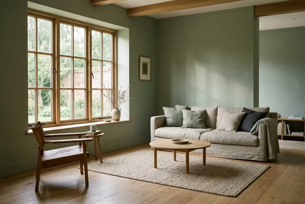
Sage green is not a colour that performs for attention. It does not arrive in a room and announce itself with confidence or contrast. It behaves differently. It settles first, then begins to work in the background, almost imperceptibly at times, until the entire spatial reading of the room shifts around it.
The most successful sage interiors I have worked on never tried to impress at first glance. In fact, the stronger ones often felt slightly underplayed when you first stepped into them. There was no immediate visual peak, no single moment designed to dominate attention.
Instead, they unfolded slowly, almost quietly, as your eye adjusted to light, texture, and proportion working in concert. And then something subtle happened. The room stopped feeling assembled and started feeling inevitable, as if it could not have been arranged any other way.
In one project I still return to mentally, the space was initially perceived as restrained to the point of understatement. Sage walls, oak flooring, and softly layered textiles did not compete for attention. Yet over time, the balance revealed itself.
Morning light softened the palette into warmth, evening light deepened it into calm shadow, and the room never felt static. It simply adapted. That adaptability is where sage shows its real strength, not in what it does at the moment of installation, but in how it behaves over time.
There is a quiet discipline required to work with it well. It asks you not to overstate, not to rush contrast, and not to chase immediate impact. Instead, it rewards restraint, patience, and a willingness to let materials breathe alongside it.
When that balance is achieved, the result rarely feels like design in the conventional sense. It feels more like alignment, where everything has naturally found its place without being forced into position.
In a landscape of interiors that often lean toward instant visual impact, sage offers something more enduring. It does not compete with the room. It absorbs it, stabilises it, and allows it to evolve without losing coherence. And perhaps that is its most valuable quality. It does not ask to be noticed immediately. It asks to be lived with.
Frequently Asked Questions about Sage Green Living Room
Is sage green a timeless colour for living rooms?
Yes, sage green has a strong sense of longevity because it sits in a muted, natural spectrum rather than trend-driven territory. In practice, I have seen it outlast sharper greys or highly saturated greens simply because it does not fight for attention. It stays relevant by staying calm, which is exactly why it works across both modern and traditional interiors without feeling dated.
What colours work best with sage green in a living room?
Sage green performs best when paired with materials and tones that support its softness rather than overpower it. Warm white, oak, limestone, soft grey, and muted terracotta are consistently reliable. The key is not contrast for its own sake, but material harmony. In real projects, combinations like sage with oak and warm white tend to feel the most naturally resolved, almost effortless in how they sit together.
Can sage green work in small living rooms?
It can, but it needs careful handling. In smaller spaces, sage works best when used in vertical applications such as feature walls or curtains rather than covering every surface. I often recommend keeping circulation clear and using lighter supporting tones to avoid visual compression. When balanced correctly, sage can actually make a small room feel more structured and less chaotic.
What lighting is best for sage green interiors?
Lighting temperature is critical. Sage green responds best to warm lighting in the range of 2700K to 3000K. Cooler lighting above 4000K tends to flatten its depth and push it towards a greyish, less inviting tone. In practice, layered lighting works best, combining ambient, task, and accent sources so the colour shifts naturally throughout the day instead of feeling static.
Should sage green be used on walls or furniture?
Both approaches work, but they create very different effects. Sage on walls creates a calming architectural backdrop, while sage on furniture or upholstery offers a more flexible, lower-commitment entry point. In many real projects, I start with upholstery first, then expand into walls once the client is comfortable with how the colour behaves in the space.
Does sage green make a room feel cold?
Not inherently. Sage only feels cold when paired with cool lighting, glossy finishes, or insufficient warm materials. When balanced with oak, linen, soft lighting, and textured surfaces, it actually feels grounded and comfortable. The emotional temperature of sage is not fixed, it is shaped by what surrounds it.
What finishes work best with sage green?
Matte and eggshell finishes are the most reliable. They allow sage to absorb and diffuse light rather than reflect it harshly. High gloss tends to undermine its softness and can make the colour feel less stable in changing light conditions. In real residential work, I rarely recommend anything more reflective than eggshell for sage-based schemes.
Is sage green suitable for open-plan living spaces?
Yes, and it is particularly effective when used for zoning. Sage can define living or dining areas without the need for physical partitions. It works best when applied to specific zones rather than the entire space uniformly, helping the eye understand function without breaking spatial flow.
What is the biggest mistake people make with sage green interiors?
The most common issue is imbalance in lighting and material contrast. Either the lighting is too cool, which flattens the colour, or the space lacks enough textural variation, which makes it feel one-dimensional. In many projects I have seen, the issue is not the shade itself, but how it is supported or undermined by everything around it.
Can sage green work with modern interiors?
Very well. In fact, it often performs better in modern spaces because it softens hard architectural lines. When paired with glass, black accents, and clean geometry, sage introduces a layer of calm that prevents contemporary interiors from feeling overly clinical or rigid.