16 Dreamy White Oak Living Room Ideas to Make Every Corner Feel Like Home
There’s a particular quiet that settles over a White Oak Living Room goes in, and I’ve never quite managed to explain it to a client without sounding a bit sentimental. You lay the first plank, stand back, and something in the air changes.
The light behaves differently. Even an empty room, still smelling of sawdust and fresh plaster, starts to feel like somewhere a life could happen. I’ve specified darker walnuts that read as moody and glamorous, and pale ashes that felt clinical within a year.
White oak is the rare material that manages to be both a backdrop and a statement at once, which is precisely why it keeps turning up in every brief that crosses my desk.
This isn’t a rundown of facts about the species. It’s sixteen ways I’ve actually used it, seen it used, or occasionally watched go slightly wrong, along with the honest trade-offs that come with each one.
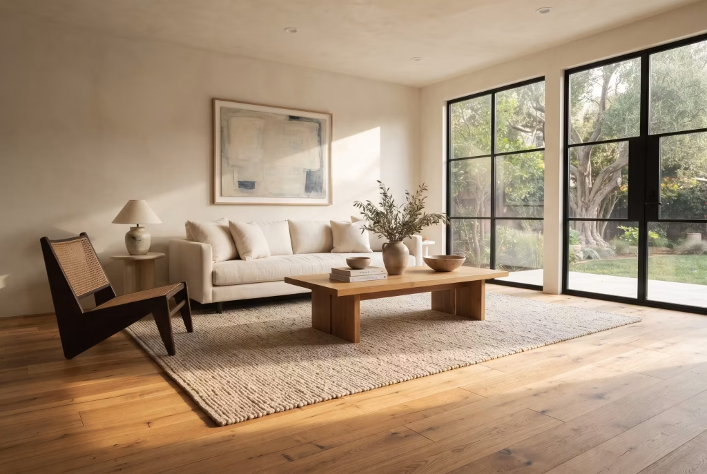
Wide plank white oak flooring as the room’s quiet foundation
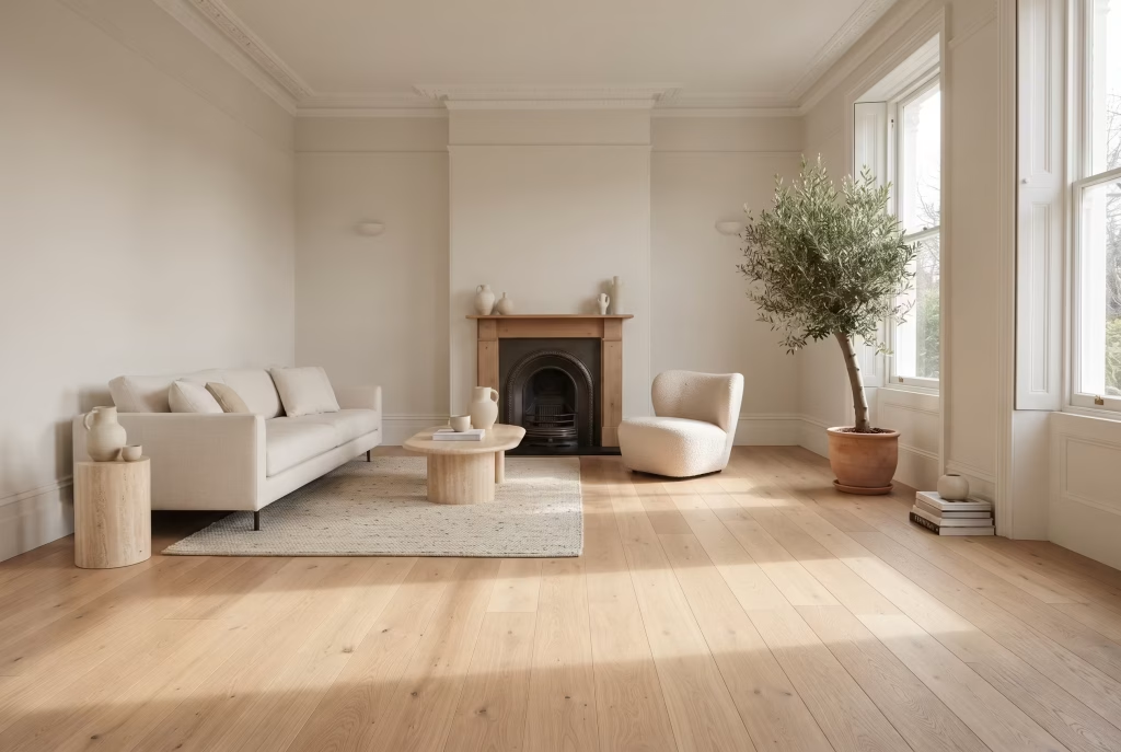
Width changes the mood of a floor before a single piece of furniture arrives. Go narrow and you chop the room into strips, a habit that turns even a decent-sized sitting room slightly restless underfoot. Push the plank out past 180mm and something shifts.
The oak stops behaving like flooring and starts behaving like architecture, one long, unbroken sweep that the eye reads in a single glance rather than plank by plank.
There’s a reason “wide plank” keeps cropping up in every renovation brief worth its salt. Fewer seams means fewer places for the eye to snag, and a room with nowhere to snag is a room that feels settled rather than busy.
Light direction decides your undertone more than most people expect walking into a showroom.
- South or west-facing room? A honey-leaning white oak will glow rather than shout, catching that low afternoon light beautifully.
- North-facing or short on windows? Go grey-toned. Warm stains without direct sun to lift them can slide towards muddy by mid-afternoon.
- East-facing, bright mornings, flatter evenings? A mid-tone, neither bleached nor honeyed, tends to hold its nerve across the whole day.
I fitted a 220mm engineered white oak into a Victorian terrace with famously low ceilings, the kind of room that always felt slightly boxed in no matter what the client tried on the walls. The width alone did more heavy lifting than knocking through ever would have. Sometimes the fix isn’t more space. It’s making better use of what’s already underfoot.
One thing worth saying plainly: samples lie, a little. A six-inch swatch under shop lighting and a full board under your own windows are two different animals entirely. Ask your supplier for a proper offcut, lay it on the actual floor, and live with it for a few days before you commit to a full room’s worth.
Herringbone floors for a living room with backbone
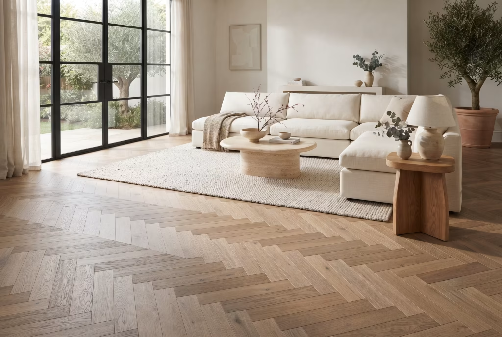
Herringbone has a way of making an empty room feel considered before a single lamp goes in. The zigzag catches light from a different angle every hour, so the floor reads silvery at nine in the morning and warms right up by teatime, a small trick that visitors clock without ever working out why the room feels so well put together.
Laying direction is where most of the pattern’s power sits, and it’s the detail people skip. Run the herringbone at forty-five degrees to your longest wall, not square to it, and the floor genuinely stretches the room’s proportions. Square-laid herringbone still looks smart, admittedly, but it plays it safe when it could be doing far more work.
Quick reference for getting the angle right:
| Room shape | Recommended lay | Effect |
|---|---|---|
| Long and narrow | 45° across the length | Widens the perceived space |
| Roughly square | 45° from the main window wall | Adds movement without confusing the eye |
| Awkward or irregular | Follow the longest unbroken wall | Gives the room a clear sense of direction |
Now, the rug question, because this is where I’ve watched otherwise beautiful rooms come slightly undone. Herringbone is already a pattern. A heavily patterned rug on top sets two busy things fighting for the same attention, and neither wins. Keep textiles plain, a chunky wool weave, a flat jute, something with texture but no competing print, and let the floor carry the visual interest on its own.
A few ground rules worth pinning up:
- Plain or subtly textured rugs only. Save the bold prints for a cushion instead.
- Rug edges should sit parallel to the herringbone’s dominant line, not skewed against it.
- In a small room, a rug that’s too small will chop the herringbone’s flow in half. Go bigger than instinct suggests.
I fitted herringbone into a first-floor flat a few years back where the client, against my advice at the time, insisted on a Moroccan-style rug with a heavy diamond print. Within a fortnight she’d swapped it for a plain oatmeal weave herself. Sometimes the room teaches the lesson faster than the designer can.
You May also Like: 25 Modern Spanish Colonial Living Room Ideas That Feel Timeless and Lived-In
Chevron oak flooring for a sharper, more architectural read
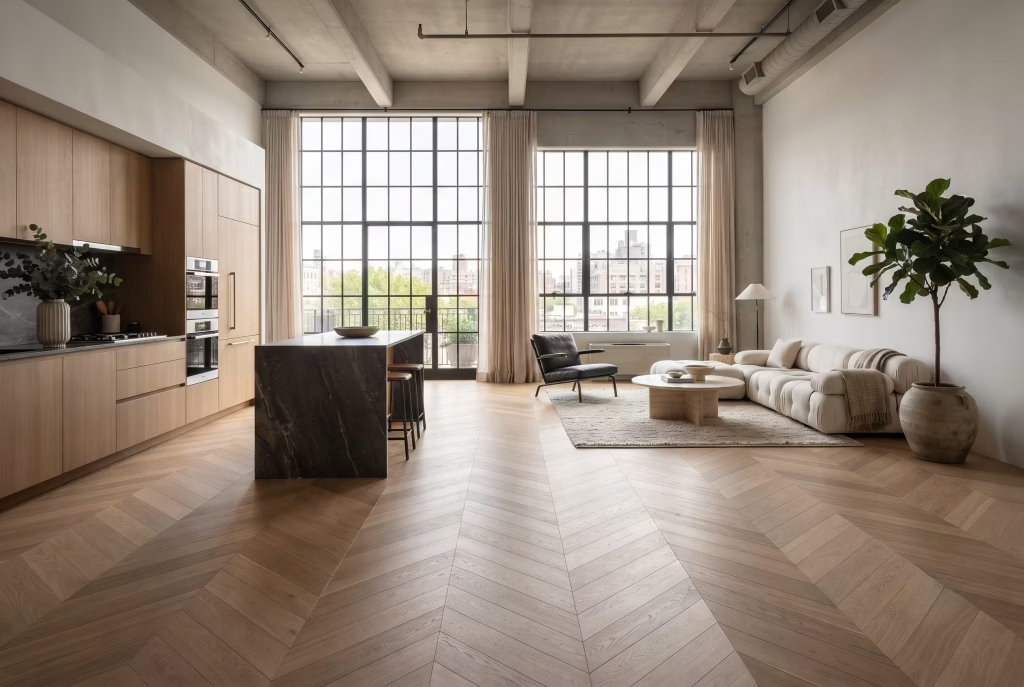
Chevron and herringbone get bundled together constantly, as though they’re the same idea wearing different hats. They’re not, and mixing them up is a bit like calling a tailored coat a jumper because both keep you warm.
Herringbone’s blocks sit offset against each other, which gives it a woven, almost fabric-like softness. Chevron does something entirely different. The planks meet at a mitred point and run as one continuous, unbroken zigzag, with no offset at all. The result reads sharper, more deliberate, closer to a piece of architecture than a floor covering. Where herringbone whispers “considered,” chevron says “designed.”
When chevron earns its place:
- In a genuinely contemporary shell, new-build, loft, or a heavily renovated space with clean sightlines throughout
- Where you want the floor itself to act as a statement rather than a supporting backdrop
- In open-plan rooms that need a clear sense of direction pulling the eye through the space
When to leave it well alone:
- Period cottages and Georgian or Victorian houses with softer, less regimented architectural bones. Chevron can look slightly at odds with cornicing and skirting that was never built with hard angles in mind.
- Small, broken-up rooms where the sharpness of the pattern has no runway to actually read properly.
I laid full-length chevron oak through a loft conversion last year, an open-plan living and kitchen space with barely a wall to speak of, and it did something no rug or furniture arrangement could have. The zigzag alone defined where “living” stopped and “kitchen” started, no partition required. That’s the real value chevron brings to the table. It’s not just prettier herringbone. It’s a tool for giving definition to a room that architecture itself hasn’t bothered to provide.
One honest note before you commit: chevron costs more to install than herringbone, sometimes noticeably so, because every plank needs a mitred cut rather than a simple square edge. Worth factoring into the budget conversation early, not after the quotes land.
Oak parquet against black and cream for a tailored contrast
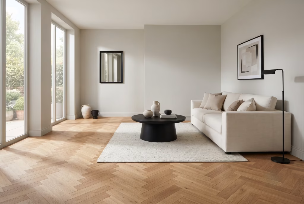
Parquet already brings enough movement to a floor on its own. That’s the whole point of it, and it’s exactly why everything sitting above it needs to earn its keep by staying still. Throw too much colour and pattern into a parquet room and you end up with visual noise fighting itself for attention. Get the restraint right, though, and the combination reads properly expensive.
My go-to pairing has stayed the same for years: warm oak herringbone parquet, a cream wall with just the faintest whisper of grey in it (Farrow & Ball’s Clunch does this without fail), and two or three sharp black pieces scattered through the room rather than clustered together. A coffee table here. A slender floor lamp there. Nothing more than that.
Think of black as punctuation, not decoration. A sentence without full stops just runs on and on, and a room without a few grounding dark notes drifts the same way, sweet, soft, slightly shapeless.
Where the black earns its place:
- A matte black coffee table, low and sculptural rather than boxy
- Slender iron floor lamps, one or two, never a matching pair flanking a sofa symmetrically
- Black-framed art or a single mirror, kept modest in scale
Where cream needs watching:
Undertone matters more than people assume walking into a paint shop. A cream that leans even slightly yellow will clash with the warm honey already living in the oak grain, and the two end up looking tired together rather than intentional. Aim for something with a cool, grey-adjacent base instead.
I worked on a townhouse a couple of years back where the client had originally chosen a buttery, yellow-leaning cream for the walls, convinced it would “warm the room up.” Against the parquet, it did the opposite entirely, flattening the wood’s natural richness rather than complementing it. One swap to a cooler cream and the whole room clicked into place within the afternoon.
Get this pairing right and the room does something rather clever. It looks tailored, considered, almost architectural, while still feeling entirely liveable. That’s the balance worth chasing: sophistication that doesn’t ask you to tiptoe around it.
Full-height oak wall panelling that gives a room a spine
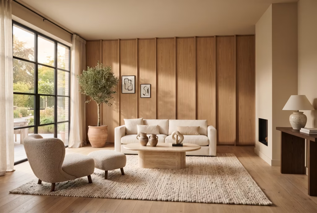
There’s a moment on every renovation site when the panelling goes up and the whole room shifts. It stops being a shell and starts being a place. I’ve watched it happen dozens of times and it still catches me slightly off guard, how much architectural weight a wall can gain from timber alone, without a single structural change to the building itself.
Full-height oak panelling running floor to ceiling gives a wall something paint simply can’t fake, real presence. Not decoration. Backbone.
Proportion is where this idea lives or dies, and it’s worth getting right before the joiner arrives:
- Low ceilings (under 2.4m): Slim, narrower panel widths, kept simple. Chunky profiles will pull the walls inward and make the room feel shorter than it already is, the opposite of what you’re after.
- Standard ceiling height: A medium panel width with shallow reveals reads as classic without dating quickly.
- Generous ceiling height (2.7m plus): You’ve got licence to go bolder, wider panels, deeper shadow gaps, more visual rhythm.
A rule I hold to on every site visit: measure the room’s height before you measure anything else. The panel profile should answer to the ceiling, not the other way round.
Colour-matching the panelling exactly to the surrounding wall is a small detail that does enormous work. Get it right and the texture reads as shadow rather than pattern, the whole surface becomes one calm, unified plane rather than a feature that’s been bolted on as an afterthought.
I worked on a project in Bath with a slightly awkward chimney breast, the kind that throws proportions off no matter what you try, and running matched panelling from skirting to cornice essentially solved the problem for us. No structural work. Just timber, paint, and patience.
A few ground rules worth pinning up before you commit:
| Consideration | What to check |
|---|---|
| Panel width | Scale to ceiling height, not personal preference |
| Paint colour | Match panelling to wall colour exactly, no near-misses |
| Reveal depth | Shallow for a subtle, classic finish; deeper for more drama |
| Wood tone | Keep consistent across the whole wall, mixing tones reads as unfinished |
One warning I give every client who falls for the boldest sample in the showroom: two different oak tones on the same panelled wall pulls the eye in competing directions. It ends up looking unresolved rather than considered, no matter how beautiful each individual plank might be on its own. Consistency, here, is what turns panelling from a feature into architecture.
A single panelled feature wall instead of the whole room
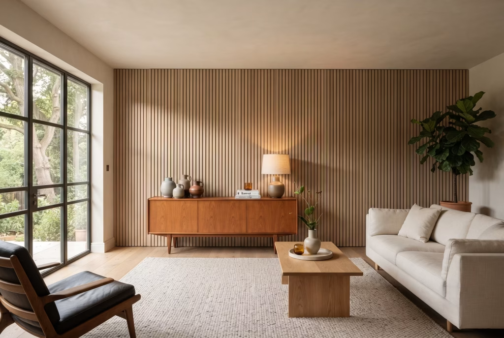
Not every brief wants, or frankly needs, wall-to-wall panelling. Sometimes the budget won’t stretch that far. Sometimes a client simply wants a taste of the look rather than a full commitment they might tire of. Either way, there’s no shame in scaling back, and one well-executed feature wall can carry a room every bit as convincingly as four.
The version I keep coming back to: vertical white oak strips, run floor to ceiling on a single wall, with shallow shadow-gap reveals between each board. That rhythm, thin, evenly spaced, repeating, is unmistakably midcentury without shouting about it. It’s a nod to an era, not a costume.
Why this works so well as a “test the waters” option:
- Far lower material cost than panelling an entire room
- Faster to install, often a weekend job rather than a full renovation phase
- Reversible in a way full panelling isn’t. Painted plasterboard sits behind it should tastes ever change
- Gives you the era-appropriate texture without asking every other surface to follow suit
Pair it with a low teak credenza, tapered legs throughout, and let the era come through in whispers rather than announcements. That’s the balance worth striking. A panelled wall paired with restrained, quietly midcentury furniture reads as considered. Pile on too many references at once, though, and the whole thing tips into pastiche rather quickly.
A short list of what to avoid stacking together:
- Starburst clocks
- Tulip chairs
- Pod-shaped pendant lights
- Atomic-print textiles
Any one of these, fine. All of them at once, alongside a feature wall that’s already doing plenty of visual work, and the room stops looking curated and starts looking like a themed set. I’ve seen it happen on a client project where enthusiasm ran slightly ahead of restraint, three separate retro pieces landed in one sitting room within a fortnight, and the panelled wall, originally the star of the show, got lost in the crowd entirely.
One feature wall, done properly, is a considerably more elegant solution than a whole room chasing an era it can’t quite settle into.
You May also Like: 25 Edwardian Living Room Ideas That Celebrate Period Elegance and Modern Comfort
A chunky oak beam mantel that anchors the fireplace
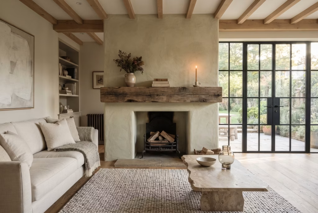
Few details earn their keep the way a proper beam mantel does. It’s the difference between a fireplace that looks fitted, bolted onto the wall as an afterthought, and one that looks as though the house was built around it. Weight matters here, both literally and visually. A beam has to feel substantial enough to hold the whole wall together.
Reclaimed timber is where the real character comes from, and it’s worth the extra legwork tracking it down. Fresh-milled oak looks fine, admittedly, but it’s a blank page. Reclaimed oak, salvaged from an old barn, a mill, a demolition yard, arrives already written on. Decades of checks, splits, and a worn, weathered surface do character-building work no amount of clever finishing can replicate in a workshop.
Where to actually find it:
- Architectural salvage yards, often better value than specialist reclaimed timber merchants
- Demolition contractors, ask before a barn conversion or old mill goes under the digger
- Local joiners who keep a stock of salvaged beams for exactly this kind of job
I sourced a beam for a client’s Cotswold cottage from a demolition yard just outside Cirencester, dusty, slightly bowed, exactly the sort of piece most people would walk straight past. It remains, hands down, the single most complimented feature in that entire house. Guests ask about it before they ask about anything else in the room.
A quick sanity check before you commit to a beam:
| Get this wrong | And you’ll end up with |
|---|---|
| Beam too narrow for the fireplace opening | A shelf, not a statement |
| Beam too clean, no reclaimed character | Something that looks bought, not built |
| Beam fitted flush with no depth | A flat feature that reads as an afterthought |
Measure generously. Err on the chunkier side rather than the safe one. A beam that’s slightly oversized for its opening reads as intentional and grounded. One that’s too slim just looks like it ran out of budget halfway through.
A stripped-back stone or plaster fireplace with an oak hearth bench
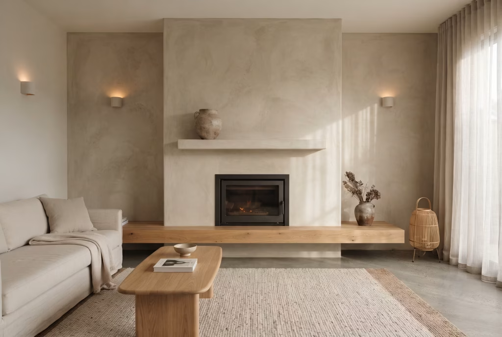
There’s real confidence in a fireplace that refuses to shout. Strip everything back to bare lime plaster, add one unglazed stoneware vessel on the mantel, and you’ve built a focal point that does more with less than most heavily dressed fireplaces manage with an entire mantel’s worth of ornaments.
Lime plaster earns its place here for one specific reason: it holds light differently to anything painted. Run your hand across it and you’ll feel a faint roughness, almost breathing, that catches shadow and softens it throughout the day. Nothing painted quite replicates that texture, no matter how good the finish.
What gives this look its Japandi calm:
- A low oak bench running along the hearth, keeping the eye close to the floor
- One stoneware vessel, unglazed, slightly off-centre on the mantel
- Bare plaster left genuinely bare, no shelf clutter, no gallery wall competing for attention
- Warm, low lighting rather than anything bright or clinical
A word on that bench, because it’s doing more than sitting there looking pleasant. Low furniture pulls the whole composition downward, closer to the floor, which is precisely the visual language Japandi interiors rely on. Swap it for a tall side table and the calm evaporates almost instantly.
Placement matters more than people expect:
| Placement | Effect |
|---|---|
| Vessel dead-centre on mantel | Reads as accidental, slightly stiff |
| Vessel slightly off-centre | Reads as considered, deliberately composed |
| Two or more objects clustered | Breaks the silence the whole design depends on |
I’d genuinely urge restraint here above anything else in this list. The temptation, once a fireplace is finished, is to dress it the way you’d dress any other mantel, candles, framed photographs, a small collection of something. Resist it. This look lives or dies on empty space doing the talking. Add even three or four objects and the whole quiet, considered mood you’ve built simply falls apart.
This is the kind of room that photographs beautifully, admittedly, but the real value shows up in daily life rather than on camera. Nothing to dust obsessively. Nothing to rearrange every few months chasing a look that’s slipped. Just a fireplace, a bench, and a single vessel, doing exactly enough.
Built-in oak shelving flanking the fireplace
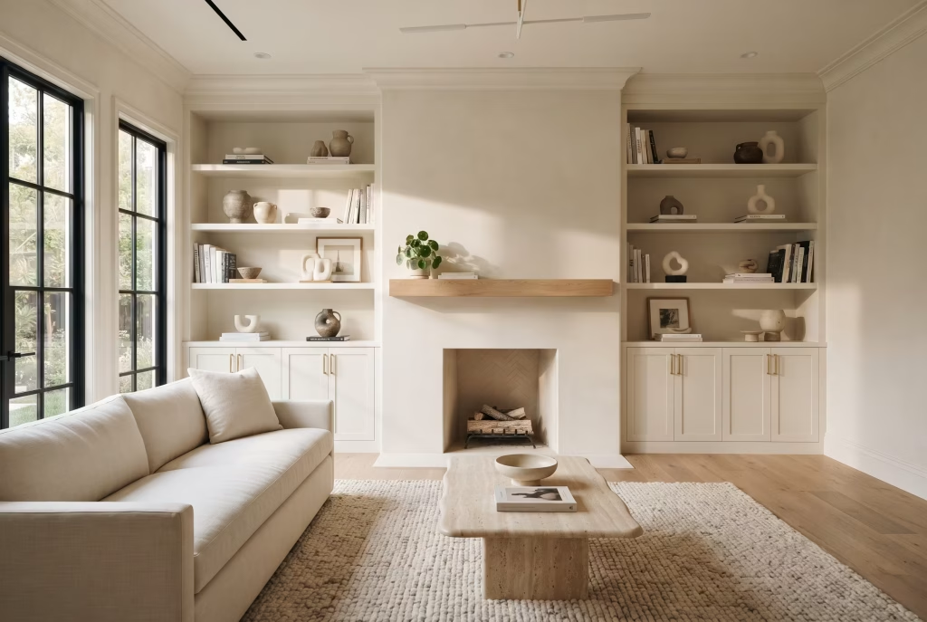
Symmetry does something almost immediate to a room, a kind of visual exhale the moment you walk in. Flanking a fireplace with matching built-in shelving either side is one of the most reliable moves I know for making a living room feel finished rather than furnished. Not decorated. Finished.
The trick, and it’s a small one that gets skipped constantly, sits in the paint tin. Colour-match the joinery to the surrounding wall exactly, no near-enough, no “close shade.” Get that right and the units stop reading as furniture that turned up after the fact. They vanish into the architecture instead, becoming part of the wall rather than something bolted onto it.
What separates joinery that reads as built versus bought:
- Same paint colour, wall and shelving, matched precisely rather than approximately
- Skirting detail carried through the base of the units, not stopped abruptly at the edge
- Consistent shelf depth throughout, no odd jumps in scale from top to bottom
- Handles or pulls kept minimal, brushed brass rather than anything showroom-shiny
I worked on a project where the client had sourced shelving from two different joiners at two different times, close enough in colour on paper, glaringly different once the afternoon light hit both walls. A single repaint, matched properly this time, fixed in an afternoon what months of styling never quite managed.
Depth is the other detail worth genuine care:
| Shelving depth | What happens |
|---|---|
| Too shallow | Feels flimsy, can’t hold real books or objects |
| Too deep | Crowds the hearth, chimney breast feels heavy and closed in |
| Just right | Balanced, open, lets the fireplace stay the focal point |
Keep the depth modest either side. The fireplace should remain the star of that wall, not compete with storage units for attention.
One honest note before committing: built-ins are a proper joinery job, not a weekend project. Budget for a cabinet maker who understands scribing to an uneven Victorian wall, because very few chimney breasts are as square as they look on paper. Get that groundwork right and the shelving earns its keep for decades, not just for the first photograph.
An oak media wall that makes the television disappear into the room
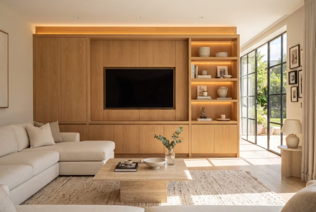
Nobody actually wants a television to be the star of a living room, and yet it so often ends up exactly that, a black rectangle glowering at everyone regardless of whether it’s switched on. A proper media wall solves this the clever way, not by hiding the screen entirely, but by folding it into the room’s architecture so it stops behaving like an intruder.
The build itself is straightforward in principle: floor-to-ceiling oak cabinetry either side of the screen, with the television recessed flush into the surrounding panels so its face sits in the same plane rather than proud of the wall. Done properly, the eye reads the whole surface as one considered composition, not a screen with shelving bolted round it as an afterthought.
What actually makes a media wall read as designed rather than assembled:
- TV recessed flush, never mounted proud on a bracket in front of the panels
- Consistent oak tone across cabinetry, no mismatched veneers creeping in
- A soft LED wash behind the screen, warming the wall in the evenings without competing with whatever’s on-screen
- Open shelving worked in on at least one side, breaking up the mass of solid cabinetry
Now, the part nobody likes discussing at the design stage: cables. It’s the unglamorous bit tucked behind every glossy media wall photo, and skipping it properly is the single most common regret I hear about afterwards. Trailing wires pooling at the skirting, or worse, visible against the oak itself, undoes every careful decision on that wall in roughly two seconds flat. It’s also the very first thing anyone spots the moment they sit down on the sofa opposite.
Plan cabling before joinery, not after:
| Get it wrong | And you’ll be looking at |
|---|---|
| Cables planned after cabinetry is fitted | Surface trunking, visible and hard to disguise |
| No routing for power behind the recess | An extension lead trailing across the floor |
| Speaker wire left as an afterthought | Drilling into finished panels to retrofit routing |
Have your electrician and joiner in the same conversation early, ideally before either one starts work. Chase channels behind the panels for power and any AV cabling, and have sockets recessed directly behind where the TV will sit. Get that groundwork sorted at first-fix stage and the finished wall genuinely does what it promises: technology and design pulling in the same direction, rather than one quietly undermining the other.
You May also Like: 25 Apartment Living Room Designs Ideas for a Chic, Cosy, and Functional Home
Floating oak shelves styled with real intention, not just books
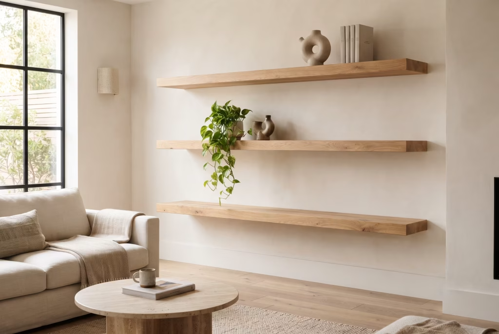
A shelf wall is deceptively easy to get wrong, and the usual mistake is filling it. Every gap gets a book, every book gets a companion, and within a month the whole run looks less like styling and more like storage that got dressed up in a hurry.
Rhythm is the word I keep coming back to when clients ask how professionals make shelving look effortless. It isn’t effortless, not really, it’s structured to look that way. Group items in loose clusters of three or four, never in a straight, evenly spaced line, and leave at least one shelf in every run genuinely empty. That gap does more work than another vase ever could. It gives the grain room to breathe and the whole arrangement somewhere for the eye to rest.
A simple rhythm that holds up on almost any wall:
- Cluster one: a stack of three or four books, spines turned inward, one small object leaning against the end
- Cluster two: a single ceramic vessel, left entirely alone, no supporting cast
- Empty shelf: genuinely bare, not “nearly bare”
- Cluster three: a plant or trailing greenery, letting something living break up the hard lines
Stagger the shelf heights too. A gap of roughly ten centimetres between runs stops the wall reading as a single uniform grid and gives it something closer to a considered, hand-arranged feel instead.
Height and spacing at a glance:
| Shelf spacing | Reads as |
|---|---|
| Uniform, identical gaps throughout | Flat, storage-unit energy |
| Staggered by ~10cm | Composed, intentional |
| Random, no logic at all | Chaotic, unfinished |
There’s a practical warning worth flagging too, and it’s one that catches people out more than styling ever does. Timber that’s too thin for its span will bow under the weight of books within a year, sometimes less. Once that sag sets in, no amount of clever arranging disguises it, the whole wall simply looks tired. Don’t cut corners on shelf thickness purely to save a few pounds at the joinery stage. It’s the sort of decision you only regret once, and by then the shelves are already up.
A white oak coffee table that quietly ties the room together
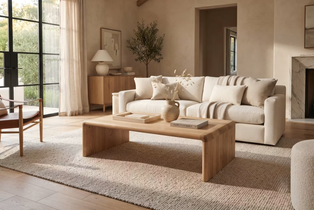
It’s easy to overlook the coffee table entirely while chasing bigger decisions, floors, panelling, the fireplace wall, and yet it’s often the piece doing the most understated work in the entire room. Get it wrong and nothing else you’ve done quite lands the way it should.
A low, flat-profile white oak table earns its place by picking up on everything already happening around it. The grain echoes the flooring. The tone leans toward whatever’s warming up the sideboard. Even a linen sofa across the room seems to soften slightly once there’s oak underneath it, tying the whole palette together without anyone consciously clocking how.
Scale is where this piece lives or dies:
- Small sitting room: Keep the table narrow and low, roughly two-thirds the length of your sofa, no wider
- Standard living room: A table sized to roughly the full sofa length works comfortably without dominating
- Open-plan or larger space: You can go bigger, but leave generous walking space on every side rather than centring purely on the sofa’s length
The rule I hold to on every site visit is simple: measure the walking space around the table before buying anything. A table sized to fill the room, rather than serve it, forces people to step around it constantly. Even the most beautiful piece becomes an irritation underfoot if it’s permanently in the way.
Styling it properly, once the scale is sorted:
| Group size | What to include |
|---|---|
| One | A single sculptural object, left entirely alone |
| Two | A tray plus one vessel |
| Three | A tray, a vessel, and one book or stem |
Threes read as relaxed rather than staged, which is precisely the effect worth chasing here. Anything busier than that and the table starts competing with the room instead of quietly holding it together.
I’ve watched more than one client fall for the biggest, most sculptural table in the showroom, only to spend the next six months apologising to guests for bruised shins. Proportion, in this instance, really is everything. A modest table that lets people move freely around it will always outperform a showstopper that gets in everyone’s way.
Pairing white oak with sage and warm neutrals
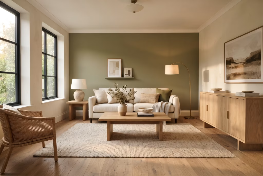
Sage green and white oak have edged dangerously close to cliché over the last few years, and I’ll admit I raised an eyebrow the first time a client requested it, half expecting another passing Pinterest phase. What actually won me over is the undertone chemistry, the warmth already sitting in the oak keeps sage from tipping cool or clinical, while the green stops an all-neutral room from reading flat and slightly forgettable.
The mistake I see repeated more than any other with this pairing: committing the entire room to sage before testing it against the actual floor. Paint just one wall and live with it. Let the remaining walls stay your warmest available white, and the green reads as a deliberate accent rather than a full-room gamble you might regret within a couple of years.
What separates sage that works from sage that fights:
- Warm, olive-leaning sage sits comfortably alongside honeyed oak tones
- Cool, blue-grey sage tends to clash, creating a slightly “off” feeling nobody can quite name
- Test swatches against your actual floor sample, never against a white wall in the paint shop
A genuine regret worth avoiding here, told properly rather than glossed over: a client of mine chose a beautiful, blue-leaning sage straight off a paint chart, entirely on its own merits, without holding it against her oak flooring sample first. Installed, the room looked oddly disjointed, two good materials that simply refused to sit comfortably together, as though two separate colour schemes had been installed by mistake. A single repaint in a warmer, more olive sage fixed what months of cushion-swapping and rug-shuffling never managed to solve.
Building the full palette once your sage is right:
| Layer | What to bring in |
|---|---|
| Base | Warm, olive-toned sage on one wall only |
| Textiles | Oatmeal linen, hand-knotted wool in warm neutrals |
| Furniture | White oak coffee table, echoing the floor’s grain |
| Metal | Brushed brass rather than chrome, warmth over coolness |
Get the undertone matching right from the outset and this combination does something genuinely clever. It grounds a room without weighing it down, calm without drifting into forgettable. Get it wrong, and you’re left chasing a mistake that a five-minute swatch test against your actual floor would have caught before a single tin of paint got opened.
A cooler, dove-grey palette that still feels inviting, not clinical
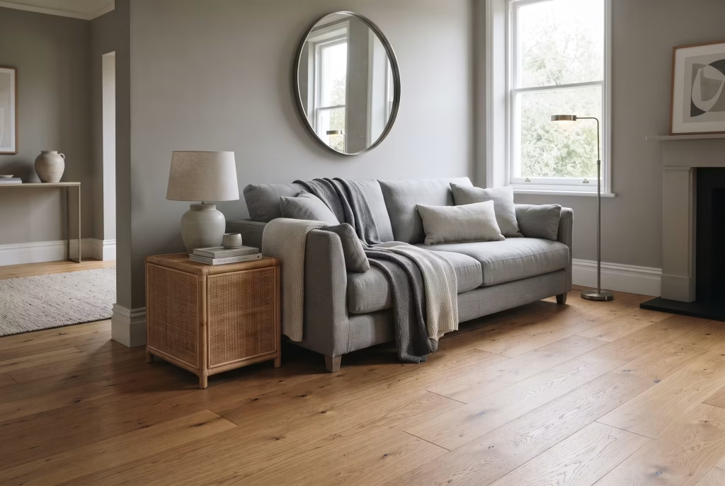
Not every white oak room needs to lean warm and rustic, and I’d argue the ones that don’t often surprise clients the most. There’s a version of this pairing that feels crisper, more editorial, closer to something you’d find in a design magazine than a farmhouse feature spread, and it works precisely because the oak is doing something quietly clever underneath it all.
Dove grey walls, a soft grey linen sofa, brushed steel lighting fixtures. On paper it sounds like it could tip cold fast. In practice, the oak’s natural warmth steps in and stops that from happening, acting almost like a thermostat for the room’s overall temperature.
Why this combination doesn’t read as clinical, when it easily could:
- Grey walls with a warm undertone, never a blue-based grey, sit far more comfortably against honeyed oak
- Steel fixtures brushed rather than polished catch light softly instead of glaring
- The floor itself is doing more visual heavy lifting than most people give it credit for
I worked with a couple renovating a first-floor flat who wanted “sophisticated but still somewhere you’d actually want to collapse on the sofa after work.” That’s a harder brief than it sounds, sophistication and cosiness tend to pull in opposite directions. The dove-grey palette against their existing white oak floor solved it almost by accident. Neither of us had planned for the oak to do quite that much work, but it did.
One small addition makes or breaks the whole scheme:
| Missing element | What happens |
|---|---|
| No organic texture at all | Room reads as smart but slightly sterile |
| One rattan piece added | Instantly softens without diluting the palette |
| Too much rattan or wicker | Tips the whole scheme rustic, loses its edit |
A single rattan piece, a side table, a small stool tucked by the armchair, does more softening than people expect from something so modest. Leave it out entirely, lean too hard into grey and steel alone, and you risk building a room that gets admired from the doorway rather than one anyone actually wants to sit in for an evening.
Get the balance right and this palette proves something worth remembering: cool doesn’t have to mean cold, provided the material underneath knows how to carry warmth quietly, without ever needing to raise its voice.
You May also Like: Nancy Meyers Style: The Ultimate Guide to Getting the Look in Every Room
A generous sectional that still lets the oak floor breathe
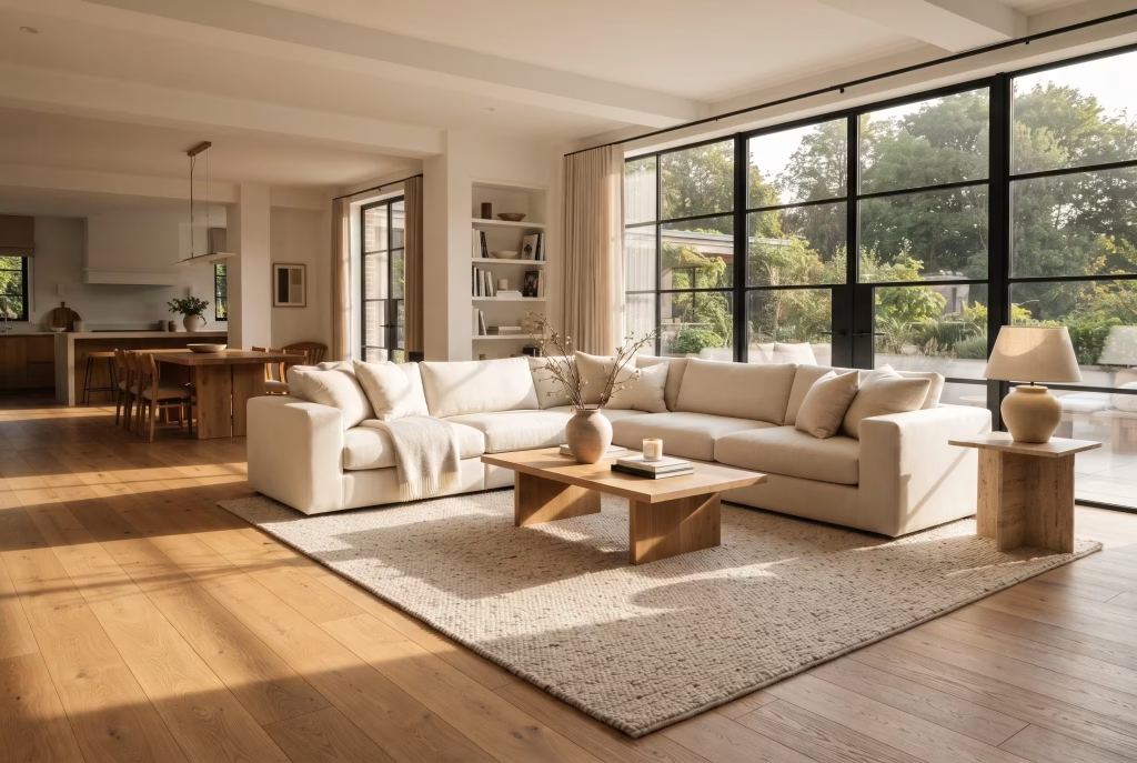
An L-shaped sectional gives an open-plan room something a scattering of smaller pieces never quite manages, a proper centre of gravity. People stop drifting around the edges of a space that hasn’t decided what it’s for, and instead the whole room pulls inward, settling around one obvious anchor. There’s a reason sectionals have become the default choice for open-plan living, and it isn’t just fashion. It’s spatial logic doing exactly what it should.
The rule I hold to on every single project, without exception, is this: leave a full sofa’s width of oak floor visible on the open side of the L. Not a token gap. A genuine, generous margin.
Why that specific measurement matters:
- Less than that and the floor starts to disappear entirely beneath the furniture, taking the room’s sense of openness with it
- Roughly a sofa’s width and the eye still catches the grain, the pattern, the warmth underfoot
- More than that, in a genuinely large room, and you can afford to be even more generous without the sectional feeling lost
I measured this out on a project a while back where the client had fallen, understandably, for the biggest sectional in the showroom. Beautiful piece, on its own. Positioned in her living room without checking the maths first, it would have swallowed nearly the entire floor whole, oak included. We sized down one bracket, kept the same silhouette and comfort, and suddenly the room had somewhere for the eye to land besides upholstery.
A quick sense check before you commit to a size:
| Floor left visible | What the room feels like |
|---|---|
| Barely any | Cramped, furniture-heavy, floor forgotten entirely |
| A full sofa’s width | Generous, balanced, invites people in properly |
| Excessive, oversized gap | Sofa feels lost, room lacks any real anchor |
This is where I’d gently push back against the instinct to size up simply because the space allows it. Bigger isn’t automatically better, not when white oak flooring is part of the investment you’ve already made. Sizing a sectional to fill every available metre hides the very material you paid to see, turning what should feel like an invitation into something closer to a furniture showroom nobody quite settles into.
Get the spacing right, and a generous sectional does something rather wonderful. It gives the room its gravity without asking the floor to disappear in the process, comfort and craftsmanship sharing the space rather than one crowding out the other.
You May also Like: 25 Blue Living Room Decor Ideas That Balance Calm, Character, and Longevity
Layering rugs, linen and brass so the room doesn’t go flat
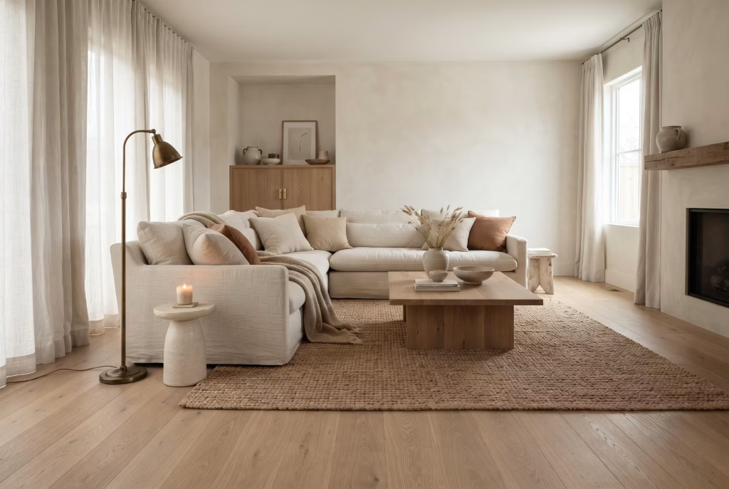
Here’s the honest bit most people selling you flooring would rather skip. A pale oak floor next to pale walls, left entirely on its own, can genuinely wash a room out rather than lift it.
I’ve watched it happen more than once, a beautiful natural stain that glowed in the showroom under carefully angled spotlights, only to read as flat and slightly strawy once it landed under ordinary grey British daylight. The wood didn’t change. The context around it simply wasn’t finished.
This is where texture takes over doing a job that colour, on its own, was never built for.
The three layers that fix it, roughly in order of impact:
- Rugs first. A chunky jute or wool weave grounds the floor visually, breaking up any expanse of pale, uninterrupted plank. Wool for warmth underfoot, jute for something a little more textural and relaxed.
- Linen second. Oatmeal reads considerably warmer than stark white, and it echoes the oak’s own undertone rather than fighting it. Cushions, throws, even curtains benefit from that same warm-neutral logic.
- Brass third. Aged rather than chrome, always. Cold metal against a pale floor tends to sharpen the room in a way that can tip cold quite quickly. Brass, especially unlacquered brass that’s been left to develop a soft patina, does the opposite entirely.
I worked on a first-floor flat where the client had chosen a genuinely lovely pale oak, natural, barely stained, exactly the kind of floor that photographs beautifully on a bright day. Moved in through a grey November, though, and she rang me slightly deflated, convinced she’d made the wrong call. Nothing was wrong with the floor.
The room around it simply hadn’t been dressed to support it yet. One rug, a change of cushion fabric, and a single brass floor lamp later, the same space felt entirely different, warm rather than washed out, considered rather than half-finished.
A quick gut check if your own room feels a touch flat:
| Missing | Add |
|---|---|
| Rug | Chunky jute or wool, plain over patterned |
| Warm textile | Oatmeal linen, not stark white |
| Metal accent | Aged brass, never chrome |
Texture, in the end, is doing the job colour alone simply can’t manage on its own. Get these three layers working together and a pale oak floor stops looking underdressed and starts looking exactly as intentional as it actually was all along.
Will White Oak Still Look Right in Ten Years?
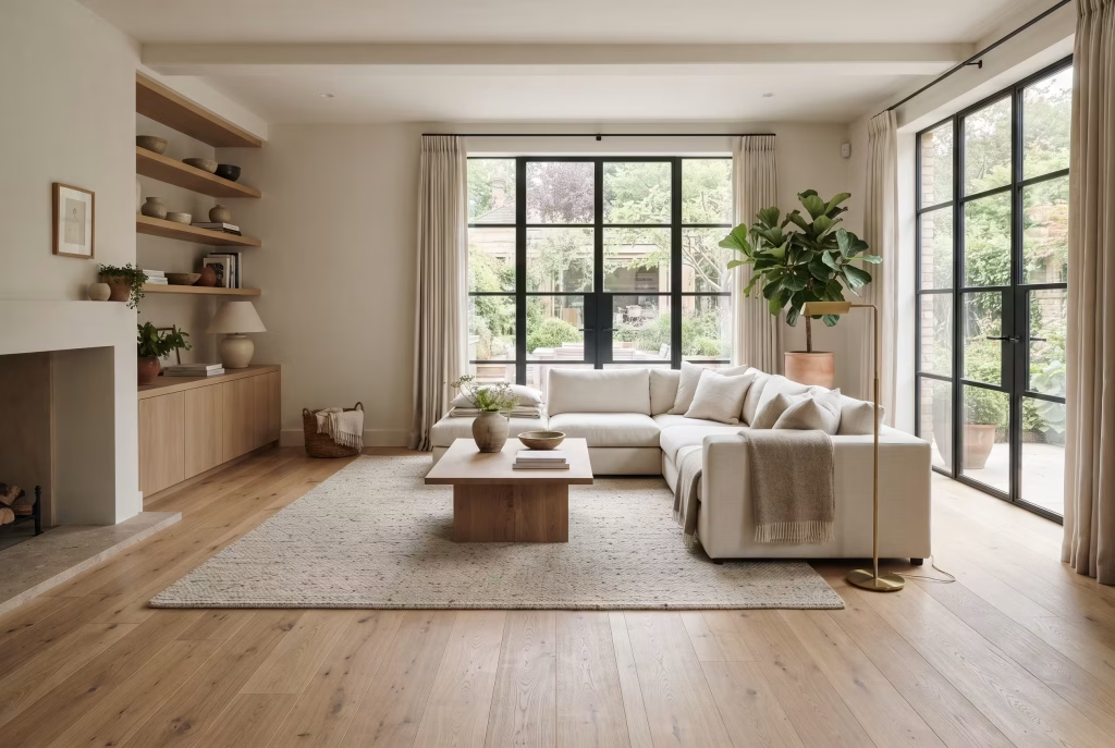
This is the question I get asked more than any other, usually somewhere around the second site visit, once the initial excitement of picking finishes has settled into something closer to nerves about actually committing to them. Fair enough. It’s a genuinely expensive material to get wrong.
The honest answer sits in the middle, and I’d rather give you that than a marketing line dressed up as reassurance. White oak the material, the grain, the tone range, the way it takes a stain, isn’t going anywhere. Designers have been specifying it for the better part of a decade now, and it still tops flooring trend reports year after year, which tells you rather more about staying power than about a passing moment in the sun.
What’s actually at risk of dating is one specific treatment of it. The ultra-pale, heavily bleached, grey-washed version that flooded Scandi-leaning interiors a few years back has started to feel, in the words of one designer I rate highly, like a default setting rather than a genuine design choice. I’ve watched clients specify that exact tone purely because it was everywhere, not because it suited their light or their home.
The wood itself is sound. Choose your tone with a bit more intention than simply reaching for the palest sample in the rack, and white oak will still be doing its quiet work in your living room long after the trend piece that sold it to you has been forgotten.
Choosing Your White Oak: A Few Honest Decisions First
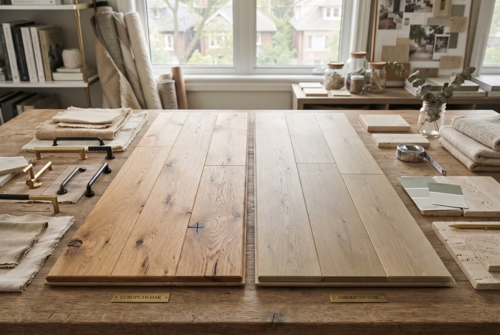
Before any styling decision matters, there’s a handful of judgement calls worth making properly rather than rushing through at the showroom counter. European and American white oak get discussed as though they’re interchangeable, and they’re not quite, not once you’ve lived with both.
American white oak tends to sit cooler, occasionally with a faint olive cast running through it, and it’s marginally harder on the Janka scale, which goes some way to explaining why it’s usually the more budget-friendly of the two.
European oak reads warmer and more golden straight away, carries more natural character in the grain, knots, movement, a bit of storytelling worked right into the board, and is typically finished with a hardwax oil rather than polyurethane, a choice that changes both the look underfoot and the long-term maintenance you’re signing up for. Neither is the correct answer, whatever a showroom sample might imply. It comes down to whether you want a cooler, quieter canvas or a warmer, more characterful one.
The decision that trips people up far more often, though, is contrast, or rather the lack of it. I watched a client nearly repeat a well-documented mistake, oak cabinetry sitting against oak flooring in almost identical tones, striking on the mood board, curiously flat once it was actually installed.
If your floor and your furniture, or your floor and your cabinetry, are landing in the same tonal family, bring contrast in somewhere else entirely, a darker rug, black ironmongery, a deeper paint colour on the joinery. Two shades of the same wood sitting side by side with nothing to separate them tend to cancel each other out rather than complement, no matter how good either looks in isolation.
Every Corner, Truly Feeling Like Home
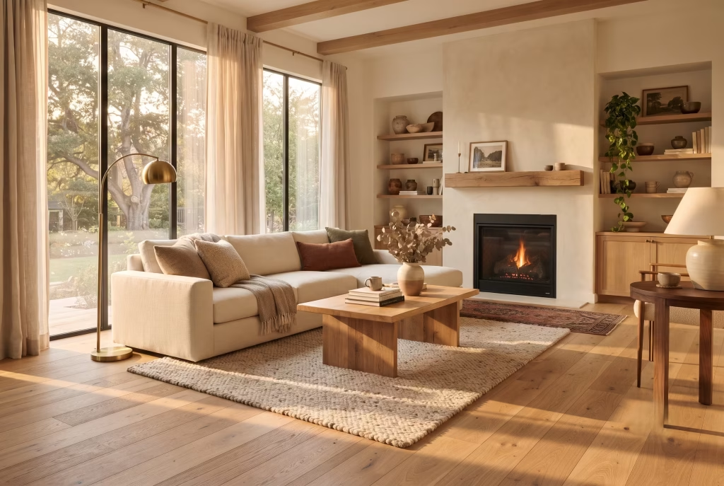
I always tell clients the same thing near the end of a project, once the last shelf has gone up and the last swatch has finally been retired to the recycling bin. A house doesn’t feel like a home because every decision was perfect.
It feels like one because the decisions actually fit each other, floor to fireplace to the light coming through the window at four in the afternoon. White oak, more than most materials I’ve worked with, has a rare talent for making that stitching invisible.
Get the tone right for your light, leave room for the wood to breathe rather than crowding it out, and resist the urge to chase the palest sample purely because it photographs well on someone else’s Pinterest board. Do that, and you won’t just have a beautiful living room. You’ll have somewhere that genuinely feels like it’s been waiting for you all along.
Frequently Asked Questions
Is white oak flooring going out of style?
Not in any meaningful sense. White oak has held its position as a leading flooring choice for the better part of a decade and continues to top industry trend reports. The specific bleached, ultra-pale grey-wash treatment is the part showing signs of fatigue, not the wood itself.
What’s the difference between European and American white oak?
American white oak reads cooler, sometimes with an olive undertone, and is slightly harder and generally more affordable. European oak leans warmer and more golden, carries more natural character, and is usually finished with hardwax oil rather than polyurethane, which affects both appearance and upkeep.
Is white oak too light for a small or north-facing living room?
Not inherently, but tone selection matters more here than anywhere else. A grey-based white oak holds its crispness better than a honey tone when natural light is limited, and layering in warm textiles stops the room reading as flat.
Is white oak flooring good for pets and children?
Broadly yes. It sits comfortably above walnut and cherry on the Janka hardness scale and its grain camouflages everyday scratches well. Finish matters just as much though, a satin or matte finish hides wear far better than a high-gloss one under direct light.
Do I need a rug on white oak floors?
Not strictly, but most rooms benefit from at least one. Beyond softening high-traffic areas and protecting the finish, a rug adds the textural warmth that keeps a pale oak floor from reading as flat, particularly where natural light is limited.
How much does white oak flooring typically cost compared with other hardwoods?
It sits above red oak and maple but below walnut and most European imports, with engineered options generally more affordable than solid boards. European white oak carries a premium over American, largely down to import costs and the character grading involved.
Can white oak flooring run seamlessly from the living room into an open-plan kitchen?
Yes, and it’s one of the strongest arguments for choosing it in an open-plan home. A continuous run of the same plank width and tone removes the visual break between zones, letting furniture and rugs do the job of defining space instead of a change in flooring.
Does white oak flooring need refinishing, and how often?
Solid white oak can be sanded and refinished multiple times over its lifespan, typically every seven to ten years depending on traffic and finish type. Engineered boards with a thinner wear layer refinish fewer times, so it’s worth checking wear-layer depth before installation if longevity matters to you.