25 Dark Cottagecore Bathroom Ideas That Feel Moody, Warm, and Beautifully Lived In
There is something quietly compelling about a bathroom that does not try to sparkle on command. A dark cottagecore bathroom draws you in slowly, almost like stepping into a room that has been there far longer than you have, holding its own stories in the grain of the wood and the softness of worn finishes. It is not about darkness for the sake of drama. It is about depth, about creating a space that feels grounded, intimate, and unmistakably lived in.
At its heart, dark cottagecore is a balancing act. On one side, you have shadowed tones, deep greens, inky blues, weathered browns. On the other, you have comfort, warmth, and a sense of ease that stops the room from feeling heavy. Get that balance right, and the bathroom becomes more than functional. It becomes somewhere you linger, even when you do not need to.
I have found, time and again in real projects, that this style works best in homes that already carry a bit of history. Smaller bathrooms, awkward layouts, low ceilings, even those slightly uneven walls that would frustrate a more polished scheme, suddenly start to feel like assets rather than problems. Instead of fighting the quirks, dark cottagecore leans into them. It turns limitations into character, and in doing so, the room begins to feel resolved rather than forced.
What keeps this style from drifting into trend territory is its reliance on materials that age well, both visually and practically. Painted walls in mineral finishes, timber that shows its knots and grain, tiles that are not perfectly uniform, metals that dull and soften over time. These are not choices made for a quick impression. They are decisions that settle in, that improve with use. A slightly worn edge here, a softened sheen there, it all adds up to a space that feels honest rather than staged.
Texture does most of the heavy lifting. In a darker palette, flat surfaces can fall lifeless if you are not careful. But introduce variation, a gently rippled tile, a brushed brass tap, a limewashed wall that catches the light unevenly, and suddenly the room has movement. It breathes. It shifts throughout the day depending on how the light lands, never quite looking the same twice.
Lighting, in this context, is not just functional, it is the quiet hero holding everything together. A single overhead light will flatten the room and undo all that careful layering in seconds. Instead, what works is a more considered approach. Wall lights at eye level, a soft pendant, perhaps a low glow near the bath. I have seen even the smallest bathrooms transform entirely just by introducing two or three gentle light sources rather than one harsh one. It is the difference between a room that feels closed in and one that feels cocooned.
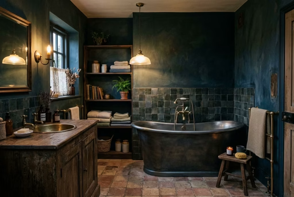
Of course, none of this matters if the space does not work in real life. A beautiful bathroom that frustrates you every morning is, frankly, a missed opportunity. The strength of dark cottagecore lies in how adaptable it is. Storage can be tucked into vintage cabinets or open shelves without breaking the mood. Surfaces can be sealed and made durable without losing their character. Even in tighter footprints, say a bathroom just 1.8 by 2.4 metres (roughly 6 by 8 feet), the style can hold its own if the proportions are handled carefully and the materials are chosen with intention.
What you are really creating is not a look, but a feeling. A room that softens the start of the day and slows the end of it. A place that does not shout for attention but rewards it, quietly, over time. And once it settles in, as these rooms tend to do, it is surprisingly hard to imagine going back to anything more clinical or polished.
What Makes a Dark Cottagecore Bathroom Work?
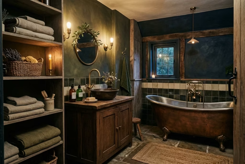
A dark cottagecore bathroom is not something you assemble overnight or pull together from a checklist. It comes together more like a well-lived room, slowly, thoughtfully, and with a certain restraint that lets each element breathe. When it works, it feels effortless. When it does not, it can tip into something either too heavy or overly styled. The difference, more often than not, lies in a handful of design principles that quietly hold the space together.
Deep, Earthy Colour Palettes That Set the Tone
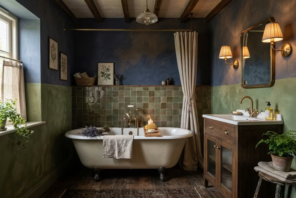
The palette does the first piece of storytelling. Dark cottagecore leans into colours that feel rooted rather than decorative. Think mossy greens, smoked browns, charcoal, muted navy, and the kind of off-black that absorbs light instead of bouncing it around. These shades are not chosen to make a statement. They are chosen to create atmosphere.
What matters is how those tones are layered. A single flat dark colour across every surface can feel like a closed door. But introduce variation, perhaps a deeper tone on the lower walls, a slightly softer shade above, and warmer accents through timber or textiles, and suddenly the room opens up without losing its mood. I often say it is a bit like cooking on a low flame. You are building depth slowly, letting each layer develop rather than rushing to the finish.
In practical terms, darker palettes also tend to be forgiving. In a working bathroom, where steam, splashes, and daily wear are part of the rhythm, these tones hide minor imperfections far better than stark whites ever could. They age with you, rather than against you.
Natural Materials That Carry the Weight of the Room
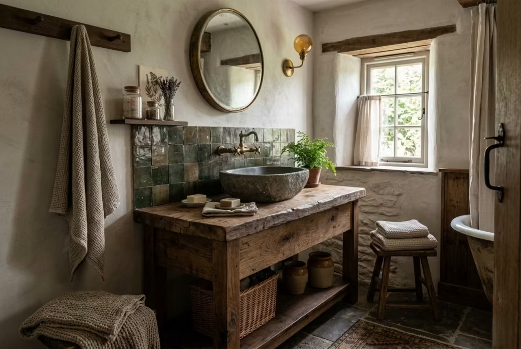
If colour sets the mood, materials give the room its backbone. Dark cottagecore depends heavily on surfaces that feel real to the touch. Timber with visible grain, stone that is slightly uneven, plaster or limewash that catches the light in a soft, irregular way, ceramics that are not perfectly uniform.
In one project I worked on, we replaced a standard vanity with a reclaimed oak piece, roughly 900 mm wide and about 500 mm deep, sealed properly for moisture. It was not flawless. There were knots, slight tonal shifts, even a faint mark from its previous life. But that was precisely the point. It anchored the room in a way no flat-pack unit ever could.
These materials do more than look good. They change how the space feels to use. A stone basin has weight. A timber edge warms the touch. A handmade tile reflects light unevenly, adding movement where you least expect it. It is this tactile quality, almost felt before it is fully seen, that gives the room its depth.
Vintage or Vintage-Inspired Fittings That Add Quiet Character
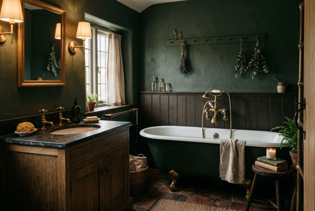
Fittings in a dark cottagecore bathroom should feel as though they belong, not as though they have been dropped in as an afterthought. This is where vintage or vintage-inspired pieces come into play. Crosshead taps, aged brass finishes, softly curved spouts, nothing too sharp, nothing too clinical.
That does not mean sacrificing performance. Modern plumbing behind traditional forms is often the sweet spot. You get the reliability you need, without losing the character that makes the room feel considered.
I tend to approach fittings as the jewellery of the space, but worn lightly. One or two standout elements are enough. Overdo it, and the room starts to feel like it is trying too hard, which is the quickest way to lose that relaxed, lived-in quality.
Soft Edges, Imperfect Finishes, and Surfaces That Invite Touch
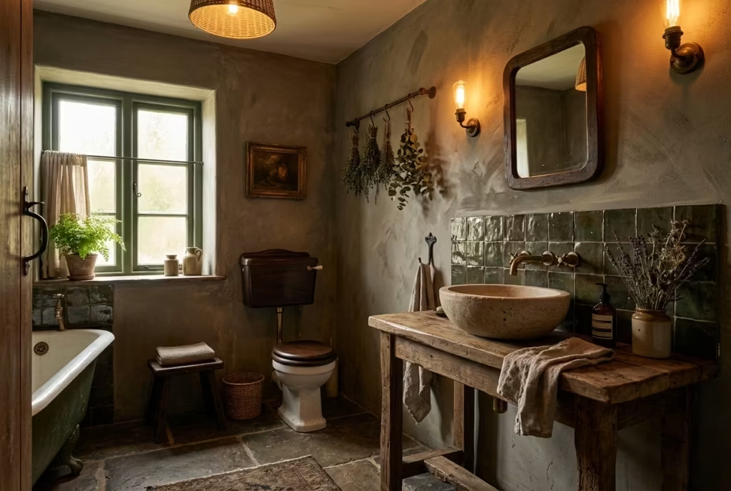
Perfection, in this style, is a bit of a red herring. The charm lies in the slight irregularities, the edges that are not razor-sharp, the finishes that have a bit of give in them. A gently rounded basin, a hand-finished tile with a subtle ripple, a painted surface where the brushwork is just visible if you look closely.
These details soften the room, both visually and physically. In a smaller bathroom especially, say around 1.5 by 2.2 metres (roughly 5 by 7 feet), overly crisp lines can make the space feel tighter than it is. Introduce a few softened edges, and the room begins to relax.
There is also something deeply human about imperfection. It signals that the room has been shaped, not manufactured. It invites use rather than caution, which, in a daily space like a bathroom, makes all the difference.
Lighting and Proportion: The Quiet Framework Behind Everything
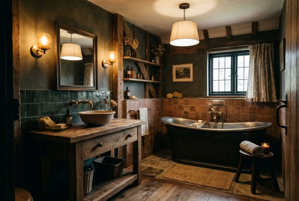
You can have the right colours and the best materials, but if the lighting and proportions are off, the room will never quite land. Lighting, especially in a darker scheme, needs to be layered and considered.
A single ceiling light will flatten everything, turning rich surfaces into dull planes. Instead, a mix works best. Wall lights at around eye level, spaced roughly 150 to 170 cm from the floor, a softer overhead source, and perhaps a lower glow near the bath or vanity. It is about creating pockets of light, allowing the room to reveal itself gradually.
Proportion, meanwhile, is what keeps the space from feeling either cramped or overfilled. In smaller bathrooms, I often scale back the number of elements and focus on fewer, better pieces. A well-sized vanity, for example, around 600 to 800 mm wide in tighter spaces, will feel far more balanced than trying to squeeze in something oversized.
It is a bit like knowing when to stop. Leave just enough room for the eye to rest, and the materials will do the talking.
Real-Life Insight: Letting the Room Settle Into Itself
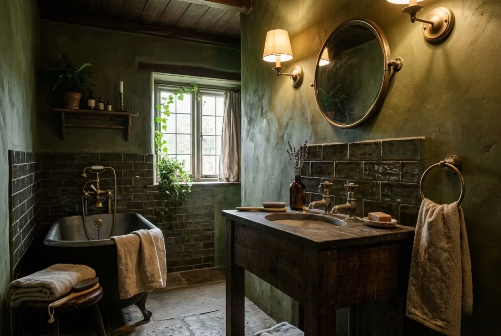
The part that rarely gets mentioned, but makes all the difference, is time. A dark cottagecore bathroom does not fully come into its own the moment the last fixture is installed. In fact, it can feel slightly disjointed at first, almost too new for its own story.
But give it a few months. Let the brass dull slightly. Let the timber deepen in tone. Let the textiles soften with use. Gradually, almost without noticing, the room begins to knit together. The edges blur in the best possible way, and what once felt like separate elements start to feel like a single, coherent space.
I have walked back into projects six months later and seen that shift happen. The room feels calmer, more grounded, as if it has finally exhaled. That is the moment you know it is working, not because it looks perfect, but because it feels right.
25 Dark Cottagecore Bathroom Ideas
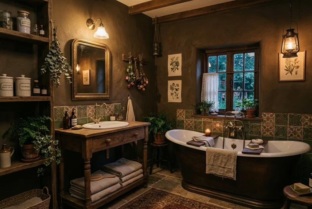
A dark cottagecore bathroom is not built from a single bold move, but from a series of small, considered decisions that quietly build on one another. Some ideas shift the mood instantly, others work more subtly, revealing their value over time. What follows is not a checklist to rush through, but a collection of design notes, the kind you return to, picking what fits your space, your light, and the way you actually live.
Paint the Walls in a Deep Earthy Tone
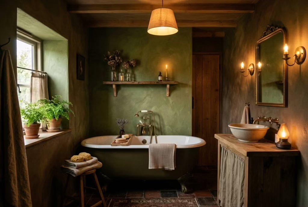
Painting the walls in a deep earthy hue is like giving your bathroom a quiet heartbeat it sets the tone without shouting for attention. Shades such as olive, umber, moss, or charcoal do more than just colour the space; they create a sense of intimacy, grounding the room in warmth and subtle drama. In real-life projects, I’ve found that even a small bathroom say around 1.8 × 2.4 metres (6 × 8 feet can feel cocooned rather than cramped when the walls are swathed in these rich tones.
The trick is not to let the darkness swallow the room. A single window or a strategically placed warm light source can lift the palette, allowing the walls to breathe rather than close in. Layered lighting wall sconces, a soft overhead pendant, and a low-level glow near the bath or vanity can highlight textures, bring out the natural nuances of the paint, and make the space feel alive rather than static.
Practical Life Hack: Choose a matte or chalky finish to avoid glare and let the colour read softer, almost like a shadow that moves with the light. This also makes minor scuffs and marks less visible, which is a blessing in a room that sees daily use.
Pros: Creates depth and atmosphere, hides minor imperfections, and lends a timeless, lived-in quality.
Cons: Can make a poorly lit bathroom feel oppressive if lighting is not carefully considered; darker tones are less forgiving if the space is extremely small or lacks ventilation.
Think of it as laying the foundation for a story; the walls aren’t just surfaces they are the stage on which textures, metals, and textiles will dance. When done right, this simple act of painting becomes the thread that ties the entire dark cottagecore bathroom together, quietly setting the mood from the very first glance.
Introduce a Freestanding Tub with Soft Curves
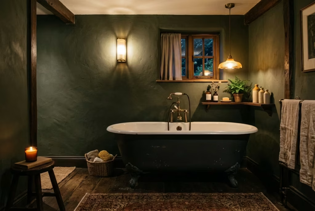
A freestanding tub, especially one with gentle, time-worn curves, has a way of anchoring a dark cottagecore bathroom without trying too hard. It is less about making a grand statement and more about setting a quiet rhythm in the room. The silhouette matters here. Avoid anything too sharp or sculptural. Instead, lean toward forms that feel softened by time, almost as if they have settled into the space rather than been placed there yesterday.
In practice, I have seen how a well-chosen tub can completely shift the mood of a bathroom. In one renovation, a compact roll-top bath, just under 160 cm (about 63 inches) in length, was introduced into a slightly awkward layout. The room was not large by any means, but by allowing breathing space around the tub, roughly 80 cm (31 inches) on the open side, it suddenly felt intentional rather than cramped. The curves did what straight lines often cannot, they guided the eye gently, softening the boundaries of the room and making everything feel a touch more relaxed.
There is also a tactile comfort to these shapes. When you step into a curved bath, the experience feels different, less rigid, more enveloping. It is a subtle shift, but one you notice at the end of a long day, when the room begins to do what it is meant to do, slow you down.
Real-life application: In larger bathrooms, aim to leave at least 75 to 90 cm (30 to 36 inches) of clearance around the bath. This is not just about circulation. It allows the tub to sit properly in the room, like a piece of furniture rather than something wedged into place. If space is tighter, even one open side with around 60 cm (24 inches) can make a noticeable difference.
Material choice also plays its part. A painted exterior in a muted tone, perhaps a soft charcoal or deep green, can help the tub blend into the darker palette, while a classic white interior keeps it feeling fresh. It is a bit like wearing a well-tailored coat over something simple underneath, understated, but quietly effective.
Pros: Creates a strong focal point, softens the room visually, enhances the bathing experience, and adds a sense of quiet luxury.
Cons: Requires thoughtful space planning, can feel out of place in very tight bathrooms, and typically comes at a higher cost than built-in options.
When it all comes together, the freestanding tub does more than just sit there. It becomes the heart of the room, not loud or showy, but steady, inviting, and just a little indulgent in the best possible way.
Use Aged Brass Instead of Polished Chrome
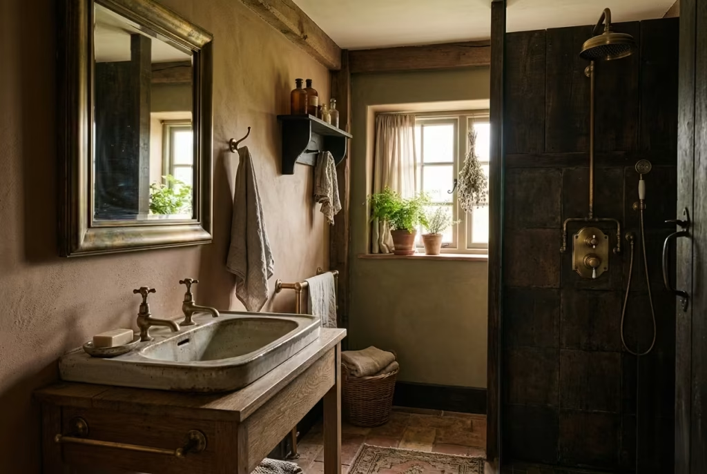
There is a noticeable shift the moment you swap polished chrome for aged brass. Chrome, for all its cleanliness, can feel a little too crisp, almost clinical, especially against the deeper tones of a dark cottagecore palette. Aged brass, on the other hand, softens the room at a glance. It carries warmth in a way that feels instinctive, like candlelight caught on metal, adding a quiet glow rather than a sharp reflection.
What makes aged brass particularly compelling is how it behaves over time. Unlike high-shine finishes that demand constant upkeep to stay looking new, brass is far more forgiving. It dulls gently, develops subtle variations, and, if left unlacquered, forms a natural patina that tells its own story. In one bathroom I worked on, we installed a set of brushed brass taps over a ceramic basin, nothing overly ornate, just well-proportioned and slightly traditional in form. Six months in, the finish had softened just enough to lose its showroom edge, settling into the space as if it had always been there.
Placement matters as much as the material itself. It is tempting to carry the same finish across every fitting, but a lighter touch often feels more resolved. Focus on key points, taps, shower fixtures, perhaps a mirror frame or wall light. Let those elements quietly echo one another rather than competing for attention. It is a bit like seasoning a dish, just enough to bring everything together, not so much that it overwhelms.
Practical note: If you are working with hard water areas, a brushed or antique brass finish is far more forgiving than polished surfaces, as it disguises water marks and fingerprints with ease. Also, consider pairing it with darker or matte surfaces, where its warmth can stand out without feeling flashy.
Pros: Adds instant warmth, ages beautifully over time, hides water spots and wear better than polished finishes, complements natural materials effortlessly.
Cons: Can vary in tone between suppliers, requires careful pairing to avoid mismatched finishes, and high-quality solid brass options can be an investment.
Used well, aged brass does not try to steal the show. It works in the background, tying materials together, taking the edge off darker tones, and adding that subtle, lived-in richness that makes the whole room feel considered rather than assembled.
Add Tongue and Groove or Panelled Walls
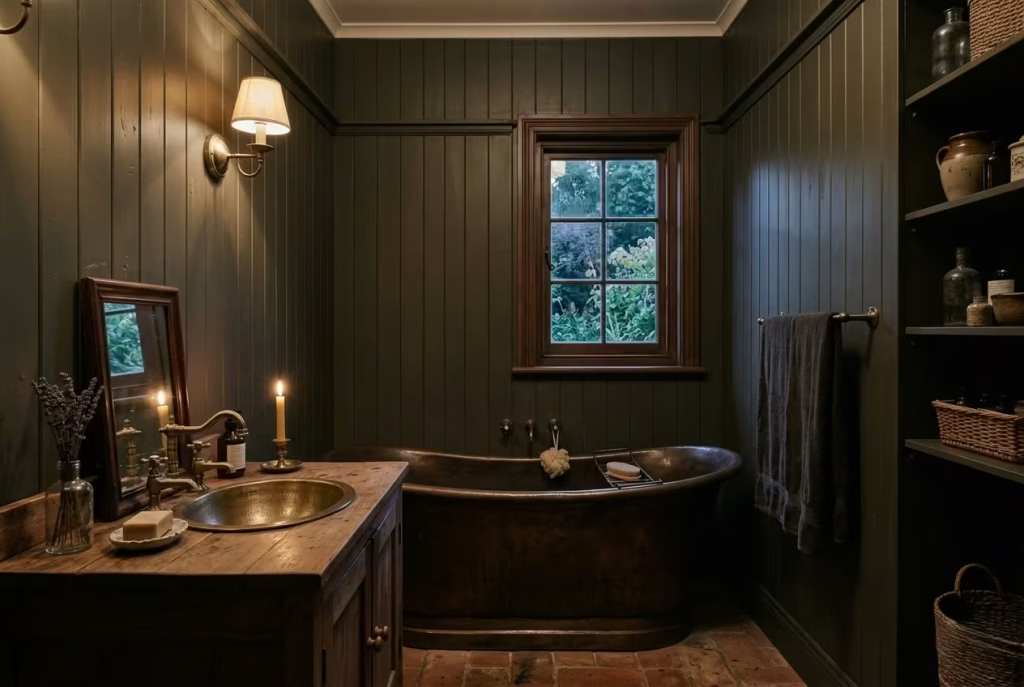
There is a quiet rhythm that panelled walls bring to a bathroom, the kind you do not always notice at first, but would certainly miss if it were gone. Tongue and groove or simple vertical panelling breaks up flat expanses of plaster, giving the room structure and a sense of cadence, almost like a gentle visual heartbeat running through the space. In a dark cottagecore setting, this detail does a lot of heavy lifting, adding depth without relying on pattern or ornament.
What I appreciate most about panelling is how it softens the formality of a bathroom. Plain plaster, especially when painted in darker tones, can sometimes feel a bit too stark, like a blank canvas waiting for something to happen. Introduce panelling, and suddenly the walls feel considered, layered, and more in tune with the character of an older home. Even in newer builds, it has a way of lending that “been here a while” quality, which is exactly what this style leans on.
In practical terms, proportion is everything. Full-height panelling works beautifully in rooms with ceilings around 240 cm (8 feet) or lower, where it draws the eye upward without overwhelming the space. In slightly taller rooms, I often prefer half-height or two-thirds height, typically around 110 to 140 cm (43 to 55 inches), finished with a simple ledge or trim. It gives you that same sense of structure while keeping the upper walls lighter, which can be a real advantage in smaller or darker bathrooms.
Material choice matters too. Moisture-resistant MDF is often the pragmatic route, especially around splash zones, but if budget allows, timber brings a warmth that is hard to replicate. Whichever route you take, a well-applied paint finish, preferably in a matte or eggshell, helps the detailing read softly rather than sharply. Gloss, more often than not, can tip the look into something a little too polished for this setting.
Practical note: In tighter bathrooms, say around 1.5 × 2.2 metres (5 × 7 feet), vertical tongue and groove can subtly elongate the walls, making the room feel taller than it is. Pairing darker lower panels with a slightly lighter tone above can also prevent the space from feeling boxed in.
Pros: Adds texture and architectural interest, softens stark walls, enhances the cottage feel, and works well with darker palettes.
Cons: Requires careful installation in wet areas, can feel busy if combined with too many other textures, and needs proportion to be handled thoughtfully.
When it settles in, panelling does something rather special. It stops the room from feeling like a blank container and starts to give it bones, a structure that everything else can lean on. And once that foundation is in place, the rest of the design tends to fall into step quite naturally.
You May also Like: 15 Bathroom Remodel Ideas That Will Inspire Your Dream Renovation
Bring in a Reclaimed Timber Vanity
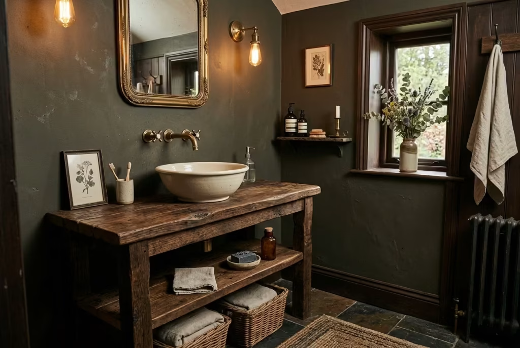
A reclaimed timber vanity has a way of grounding a bathroom that very little else can. It does not arrive looking pristine, and that is precisely its strength. The visible grain, the small knots, the slight shifts in tone, they all carry a quiet history, giving the room a sense of depth that flat, factory-finished pieces rarely achieve. In a dark cottagecore setting, this kind of texture feels right at home, like it has found its place rather than been dropped in to fill a gap.
I often lean toward vanities that feel more like furniture than built-in units. Something around 800 to 1000 mm wide (31 to 39 inches) works comfortably in most bathrooms, with a depth of 450 to 550 mm (18 to 22 inches), enough to be practical without crowding the room. In one project, we repurposed an old workbench-style piece, cutting it down slightly to fit a narrower layout. It still carried its original markings, faint scratches, a softened edge here and there, and once paired with a simple ceramic basin, it became the quiet anchor of the space.
What makes reclaimed timber particularly compelling is how it interacts with the rest of the palette. Against darker walls, it lifts the scheme just enough, adding warmth without breaking the mood. It is a bit like a well-worn leather chair in a dim room, not shouting for attention, but impossible to ignore once you notice it.
Of course, there is a practical side to consider. Bathrooms are unforgiving environments, with moisture, steam, and daily wear constantly in play. Proper sealing is not optional here. A high-quality water-resistant finish, often a matte or satin sealant, helps protect the timber while still allowing its natural character to show through. Done well, the surface will age gracefully, rather than deteriorate.
Practical note: If you are working with an uneven reclaimed piece, allow for slight tolerances when fitting basins and plumbing. A wall-mounted tap can be a smart move, freeing up the surface and avoiding awkward cut-outs in irregular timber.
Pros: Rich texture and character, adds warmth to darker schemes, unique and one-of-a-kind appearance, ages beautifully when maintained.
Cons: Requires proper sealing and ongoing care, can be more expensive or time-consuming to source, and may need bespoke adjustments to fit standard plumbing.
When it all settles into place, a reclaimed timber vanity does more than serve a function. It becomes part of the room’s story, adding that lived-in depth that makes the space feel layered, personal, and just a little bit timeless.
Choose Handmade or Irregular Tiles
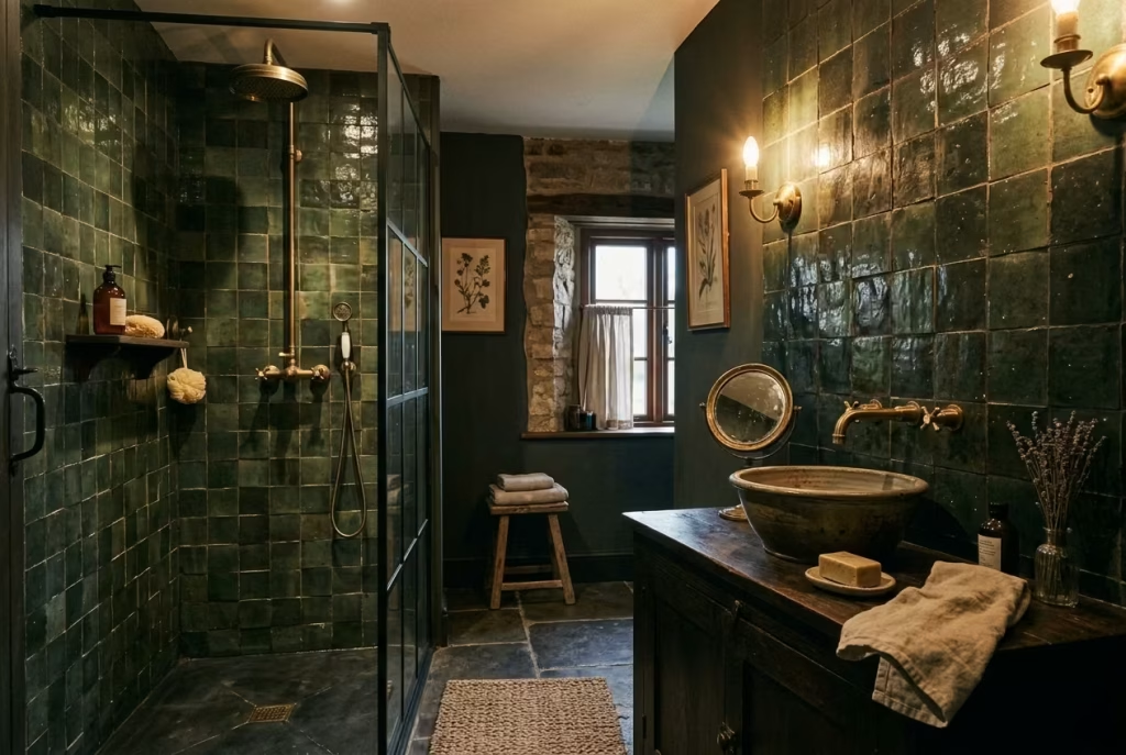
Handmade or irregular tiles bring a kind of quiet movement to a bathroom, the sort you only fully notice when the light shifts and the surface comes alive. Unlike perfectly uniform tiles, which can sometimes feel a little rigid or predictable, these carry slight variations in glaze, tone, and edge. It is those inconsistencies, subtle dips, a softened corner, a glaze that pools a touch darker in places, that give the room its lived-in, almost storied quality.
In a dark cottagecore setting, this kind of imperfection is not just welcome, it is essential. When you are working with deeper colours, flat, overly consistent surfaces can fall a bit lifeless, like a note held too long without variation. Handmade tiles, by contrast, break that monotony. They catch and reflect light unevenly, creating a gentle rhythm across the wall, especially effective in areas like a shower surround or behind a basin.
I often find that smaller formats work particularly well here. Tiles around 75 × 150 mm (3 × 6 inches) or 100 × 100 mm (4 × 4 inches) allow the variation to read more clearly, giving you that layered effect without overwhelming the space. In one bathroom, we used a deep green handmade tile across a shower wall roughly 1.2 metres wide (4 feet). On paper, it was a simple choice. In reality, once installed, the wall had depth and softness that a standard tile simply could not replicate.
There is also a tactile element at play. Run your hand across a handmade tile surface, and you feel the difference immediately. It is not perfectly flat, not machine-perfect, and that is exactly the point. It invites touch, which in a room used daily, adds a layer of quiet comfort.
Practical note: Because these tiles vary slightly in size and shape, they benefit from a slightly wider grout joint, typically around 2 to 3 mm (1/16 to 1/8 inch). A softer grout colour, close to the tile tone, helps keep the overall look cohesive rather than busy.
Pros: Adds depth and visual movement, enhances the lived-in aesthetic, reflects light beautifully, and feels more tactile and authentic.
Cons: Can be more expensive than standard tiles, requires a skilled installer to manage variation, and may take longer to fit due to irregularities.
When everything settles, handmade tiles do something quite special. They stop the room from feeling static and start to give it a quiet energy, a sense that the space is gently shifting with the light and the day. It is a small detail on paper, but in reality, it is often what tips the room from simply nice into something far more memorable.
You May also Like: 25 Bathroom Mirror Ideas That Balance Design, Light, and Everyday Use
Layer the Lighting Carefully
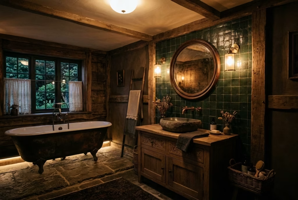
Lighting, in a dark cottagecore bathroom, is where the whole scheme either comes into its own or quietly falls apart. You can have the richest colours and the most beautiful materials, but if everything is lit from a single overhead source, the room will feel flat, almost like a stage with the house lights left on. Layered lighting, by contrast, allows the space to unfold gradually, revealing texture, depth, and warmth in a way that feels natural rather than forced.
The key is to think in layers, not fixtures. Start with a soft ambient glow, often a small pendant or a discreet ceiling light, just enough to give the room an overall wash. Then bring in wall lights, ideally positioned around 150 to 170 cm (59 to 67 inches) from the floor, flanking a mirror or placed strategically along the walls. These create a more intimate, human-scale light, the kind that flatters both the space and the person using it. Finally, add a lower, quieter layer, perhaps a subtle light near the vanity or a gentle glow close to the bath. This is what gives the room that cocooned feeling, especially in the evening.
I have seen this shift happen countless times. In one project, a bathroom that initially felt dull and slightly oppressive, despite beautiful materials, was completely transformed by adding two wall lights and a warmer bulb temperature. The same room, the same finishes, but suddenly it felt inviting, almost like it had exhaled. It is often that fine line, the difference between moody and gloomy, and lighting is what walks that line.
Warmth in light temperature plays a crucial role too. Aim for bulbs in the range of 2700K to 3000K, which cast a softer, more flattering glow. Anything cooler can strip the room of its warmth, making even the richest palette feel a little sterile. It is a small technical detail, but one that carries a surprising amount of weight in how the space is experienced day to day.
Practical note: If possible, place lighting on separate switches or dimmers. This allows you to adjust the mood depending on the time of day, brighter in the morning when you need clarity, softer in the evening when the room becomes more about slowing down.
Pros: Enhances depth and texture, creates a flexible atmosphere, makes darker palettes feel intentional rather than heavy, and improves everyday usability.
Cons: Requires more planning and wiring, can increase upfront cost, and needs careful placement to avoid shadows or uneven lighting.
When layered thoughtfully, lighting does not just illuminate the room, it shapes it. It draws out the character of each surface, softens the edges, and creates a space that feels considered from every angle. And once you experience that shift, it is hard to go back to anything more one-dimensional.
Hang a Vintage-Style Mirror
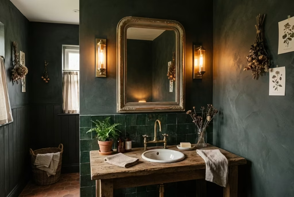
A mirror, in most bathrooms, is treated as a necessity. In a dark cottagecore space, it becomes something closer to a focal point, a piece that quietly anchors the wall while reflecting just enough light to keep the room from feeling closed in. Choosing a vintage-style mirror, with an ornate frame, a slightly aged edge, or a finish that has softened over time, brings a layer of character that a plain, frameless sheet of glass simply cannot offer.
What makes these mirrors so effective is the contrast they introduce. Against deeper wall colours, a softly worn gold frame or a muted bronze edge catches the light in a way that feels gentle rather than flashy. It is not about sparkle, it is about glow. I often describe it as the difference between polished jewellery and something passed down, one feels new, the other feels meaningful.
Scale plays a crucial role here. A mirror that is too small can feel like an afterthought, while one that is oversized, particularly in tighter bathrooms, can overwhelm the space. In most cases, I aim for a width that sits comfortably above the vanity, often around 70 to 90% of the vanity width. So, for a vanity measuring 800 mm (31 inches), a mirror between 560 and 720 mm (22 to 28 inches) tends to feel balanced. If you are working with a single statement mirror, letting it run slightly taller can also help draw the eye upward, subtly enhancing the sense of height.
There is also a practical advantage to these slightly aged finishes. Mirrors with a gently distressed edge or a softer reflection tend to disguise water spots, fingerprints, and daily wear far better than ultra-clear, highly polished glass. In a room that sees constant use, that is no small thing. It is one of those details that works quietly in the background, making everyday life just a little easier.
Practical note: Position the mirror so its centre sits roughly at eye level, usually around 150 to 160 cm (59 to 63 inches) from the floor. Pairing it with wall lights on either side, rather than a single light above, will enhance both function and atmosphere.
Pros: Adds character and depth, reflects light softly, enhances the vintage feel, and disguises everyday marks more effectively.
Cons: Can be harder to source in the right size and finish, ornate frames may require careful cleaning, and overly decorative pieces can feel heavy if not balanced with simpler elements.
When chosen well, a vintage-style mirror does more than reflect your image. It reflects the room itself, its textures, its tones, its quiet imperfections, tying everything together in a way that feels both natural and considered. It is one of those pieces that, once in place, makes you wonder how the space ever worked without it.
Mix Floral or Botanical Details Sparingly
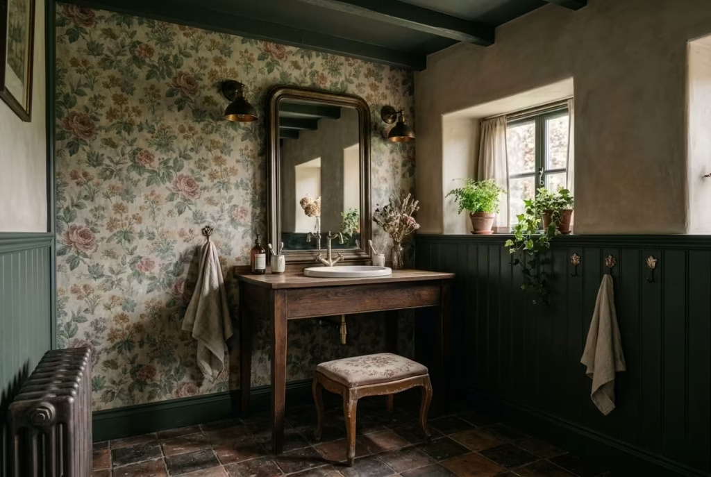
Floral and botanical elements sit right at the heart of cottagecore, but in a darker, more grounded version of the style, they need a lighter hand. It is very easy to tip the balance from quietly evocative to overly themed, where the room starts to feel more like a set than a space you actually live in. The trick is restraint, letting these patterns appear in moments rather than dominate the entire room.
Used thoughtfully, a botanical detail can soften the depth of darker tones and bring a gentle sense of life into the space. A wallpaper with a muted, slightly faded print behind a vanity, a linen curtain with a subtle trailing pattern, or even a cushioned stool upholstered in a small-scale floral can do the job beautifully. It is less about filling the room and more about placing a few well-chosen notes, like a melody that comes in quietly and lingers.
In one project, we introduced a soft botanical wallpaper on a single wall in a bathroom measuring roughly 2 × 2.5 metres (6.5 × 8 feet). The rest of the room was kept deliberately simple, deep green panelling below and a muted plaster finish above. That one patterned wall carried just enough visual interest to lift the space, without pulling it into something overly decorative. It felt balanced, like everything knew its role.
Scale and colour are where most people either get it right or go a step too far. Larger, bolder florals can quickly overwhelm a smaller bathroom, while very fine patterns, when used across too many surfaces, can start to feel busy. I tend to lean toward mid-scale prints in softened tones, sage, dusty rose, muted ochre, colours that sit comfortably within the overall palette rather than competing with it.
Practical note: If you are introducing pattern, keep surrounding materials quieter. Pair a botanical wallpaper with plain tiles or simple painted surfaces, allowing the pattern to breathe. In humid areas, ensure wallpapers are suitable for bathrooms or placed away from direct water exposure.
Pros: Adds softness and visual interest, brings a sense of nature indoors, enhances the cottagecore feel without needing structural changes.
Cons: Can feel overwhelming if overused, requires careful coordination with other elements, and may date more quickly if the pattern is too bold or trend-led.
When handled with care, floral and botanical details do not shout for attention. They sit in the background, gently weaving the room together, adding that touch of life and movement that makes the space feel not just designed, but genuinely lived in.
Add Open Shelving with Restraint
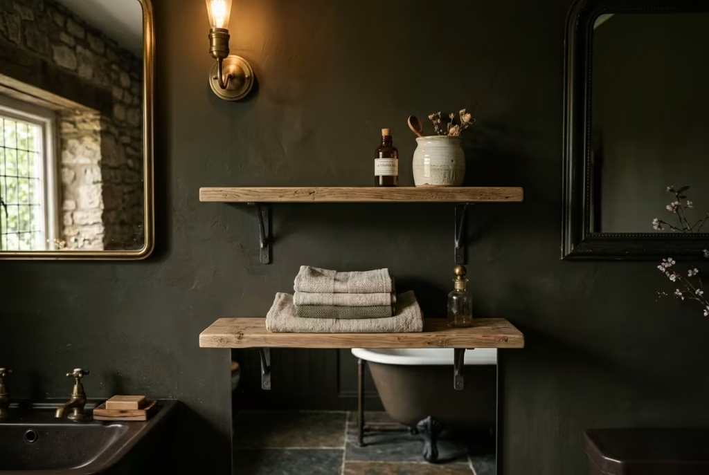
Open shelving, when handled with a light touch, can bring a quiet sense of ease to a dark cottagecore bathroom. It shifts the room away from feeling overly fitted or rigid and introduces something more relaxed, almost as if the space has evolved over time rather than being locked into a single moment. But it is a fine line to walk. Done well, it feels effortless. Overdone, it quickly turns into visual noise.
The key lies in editing. Not everything deserves a place on display. A few folded linen towels, a ceramic jar, perhaps a glass bottle or two, these are the pieces that earn their spot. They add texture, break up darker surfaces, and give the room that lived-in softness without tipping into clutter. It is a bit like setting a table. You leave space between elements so each one can be appreciated, rather than crowding them together until they lose their presence.
In practical terms, scale and placement matter more than most realise. Shelves that are too deep can feel bulky, while overly narrow ones become impractical. I often aim for a depth of around 15 to 20 cm (6 to 8 inches), enough to hold essentials without protruding awkwardly into the room. Positioning them at a comfortable reach, typically between 110 and 150 cm (43 to 59 inches) from the floor, keeps them functional without interrupting sightlines.
Material choice plays its part as well. A simple timber shelf, especially one with a bit of grain or age to it, ties in beautifully with the rest of a cottagecore palette. Paired with darker walls, it lifts the space just enough, creating contrast without breaking the mood. Brackets, if visible, should feel understated, nothing too ornate, nothing too industrial, just something that quietly supports the whole.
Practical note: In bathrooms with limited storage, combine open shelving with concealed options elsewhere. This allows you to keep everyday clutter out of sight while maintaining that curated, relaxed look on display.
Pros: Adds warmth and personality, keeps essentials within easy reach, softens the overall feel of the room, and allows for subtle styling.
Cons: Requires regular tidying to avoid looking cluttered, offers less hidden storage, and exposed items may collect dust or moisture over time.
When it settles into place, open shelving does not just store things, it tells a story. A stack of linen, a well-used jar, a simple ceramic piece, each one adds a layer of quiet character. And when you resist the urge to overfill it, the effect is far more powerful, a space that feels considered, calm, and comfortably lived in.
Use a Stone or Stone-Look Basin
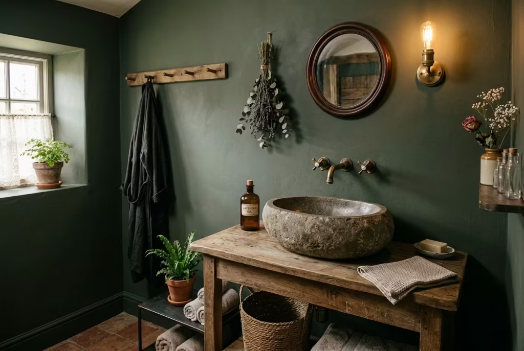
A stone basin has a quiet authority to it. The moment it sits on a vanity, the room feels more grounded, as if it has found its centre of gravity. In a dark cottagecore bathroom, where texture and material carry so much of the atmosphere, this single element can do more than most decorative additions combined. It is not about making a statement in the usual sense, but about adding weight, both visually and physically, that anchors everything around it.
Natural stone, whether limestone, marble, or a darker composite, brings a tactile richness that is hard to replicate. Run your hand along its surface and you feel the difference immediately, a subtle unevenness, a softness to the edges, a temperature that shifts with the room. It is these small, almost unnoticed qualities that make daily use feel a little more considered. Even something as routine as washing your hands starts to feel less mechanical, more connected to the space itself.
In practical terms, proportion is key. A basin that is too small can feel lost, while one that is oversized can dominate the vanity. For most setups, a width of around 350 to 450 mm (14 to 18 inches) works well, paired with a vanity depth of 450 to 550 mm (18 to 22 inches). In one project, we used a softly rounded stone basin, about 400 mm wide (16 inches), set on a reclaimed timber surface. The contrast between the cool stone and the warmer wood created a balance that felt instinctive rather than forced.
Stone-look options, often made from ceramic or composite materials, can offer a more practical route without losing the visual effect. They tend to be lighter, easier to maintain, and more resistant to staining, which can be a real advantage in a busy household. The key is to choose finishes that mimic the irregularity of natural stone, avoiding anything too uniform or glossy.
Practical note: Ensure the basin is properly sealed, particularly with natural stone, to protect against water absorption and staining. Pairing it with a wall-mounted tap can also help keep the surface cleaner and visually uncluttered.
Pros: Adds depth and authenticity, provides a strong focal point, enhances the tactile experience, and pairs beautifully with natural materials.
Cons: Natural stone can be heavy and require additional support, may need regular sealing, and can be more expensive than standard ceramic options.
When it all comes together, a stone basin does not just sit there as a functional piece. It becomes part of the room’s language, quietly reinforcing the sense that this is a space shaped by materials that matter, not just by design decisions on paper.
Choose Encaustic or Patterned Floor Tiles
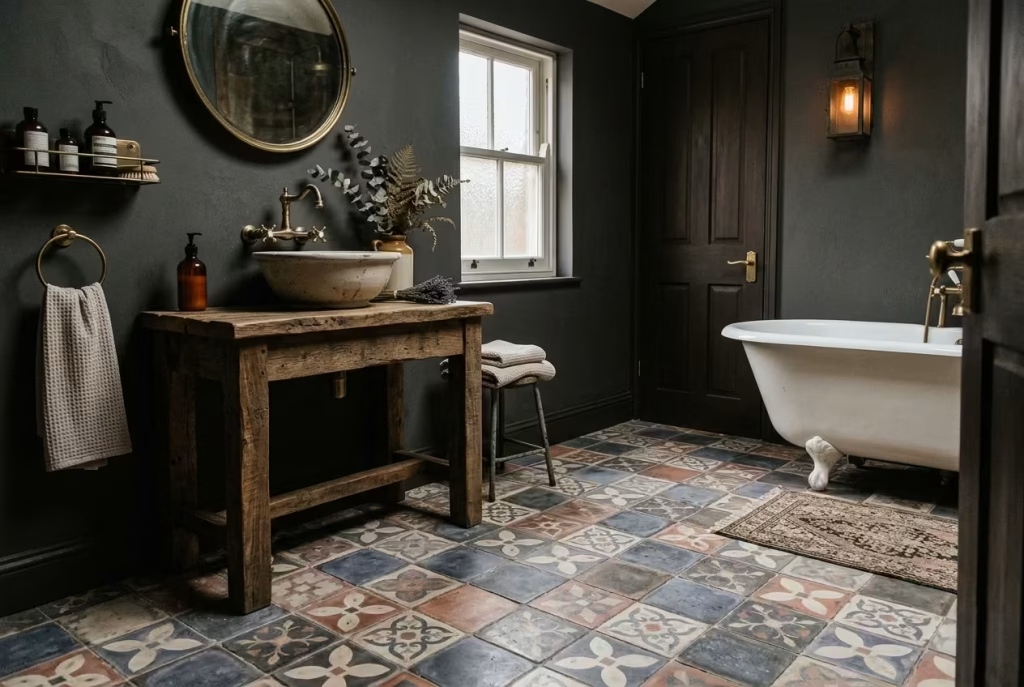
Flooring often carries more than its fair share of responsibility in a bathroom. In a dark cottagecore scheme, the floor can anchor the room, provide a visual counterpoint to deep walls, and create a rhythm that leads the eye naturally through the space. Encaustic or patterned tiles are perfect for this, offering subtle movement and a quiet sophistication that plain tiles simply cannot achieve.
Encaustic tiles, with their hand-applied pigments and slightly uneven surfaces, have a tactile richness that rewards both sight and touch. Patterns do not have to be loud to make an impact; even restrained motifs in muted colours can lend a room a sense of story and place. When paired with darker walls and natural materials, they prevent the space from feeling heavy, instead giving it an undercurrent of energy like a whisper of character woven into the fabric of the room.
In real-world applications, scale is crucial. For smaller bathrooms, tiles around 150 × 150 mm (6 × 6 inches) or 200 × 200 mm (8 × 8 inches) work beautifully. Larger tiles can feel overwhelming, particularly if the pattern is complex, whereas smaller formats allow subtle repetition that feels both balanced and intentional. In one renovation, we installed encaustic-style tiles in a 2 × 3 metre (6.5 × 10 feet) bathroom with walls painted a soft charcoal. The floor became the unspoken hero of the space drawing the eye downward and providing a tactile reference point without competing with the rest of the design.
Practicality should also guide the choice. Matte finishes tend to be more forgiving underfoot, reducing slip hazards, and patterned tiles often conceal wear and minor staining better than uniform surfaces. Keeping the walls quieter is key; a dark, textured wall paired with a bold floor can easily feel chaotic, so I often recommend muted patterns or restrained colour palettes on the floor, letting the texture and geometry speak subtly rather than shouting.
Practical note: Ensure a good seal for encaustic tiles, especially in areas prone to moisture. Position the pattern so that key design elements, such as the bath or vanity, sit over calmer sections to prevent visual clutter.
Pros: Adds visual depth and rhythm, grounds the room, creates tactile interest, and enhances character without overwhelming the space.
Cons: Can be more expensive and labor-intensive to install, requires careful coordination with wall finishes, and may need sealing depending on material choice.
When chosen and positioned with care, patterned floor tiles do more than cover the floor they give the room a subtle heartbeat, a visual cadence that makes walking into the bathroom feel like stepping into a space that has been curated, considered, and quietly celebrated over time.
Soften the Scheme with Linen Textiles
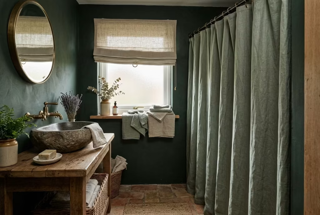
In a dark cottagecore bathroom, materials carry a heavy weight, both literally and visually. Deep walls, stone basins, and timber vanities set a tone that is rich, moody, and tactile but without softer layers, the space can verge on austere. Linen textiles are the antidote, introducing a relaxed, domestic quality that feels effortless yet considered. A simple linen blind, a shower curtain that drapes naturally, or a stack of hand towels folded with care can instantly make the room feel more human, more lived-in, more welcoming.
I often encourage clients to let linen do the talking quietly. Choose muted tones that complement the deeper palette sage, oatmeal, dusty rose, or soft charcoal. The slightly irregular weave of natural linen brings texture and depth that even the most carefully painted walls cannot. Unlike cotton, linen breathes with the space: it moves with the breeze, softens the harshness of tile, and absorbs ambient light in a way that lends the room warmth rather than coldness.
Scale and placement matter. A floor-length shower curtain in 180 × 200 cm (71 × 79 inches) works beautifully in a standard bath enclosure, while blinds or roman shades should fit snugly inside the window frame for a neat, tailored feel. In one project, I layered a linen blind over a small frosted window and paired it with hand towels casually draped on a timber shelf. The result was subtle, but the space immediately felt calmer, less staged, and more like a room that had been slowly lived into.
Practical note: Linen wrinkles naturally, and that is part of its charm, but avoid overcrowding shelves or towel rails; keep the look curated and intentional. Soft folds, careful layering, and small touches of pattern or embroidery can elevate the feel without adding visual clutter.
Pros: Introduces softness and warmth, enhances the tactile experience, complements dark and textured surfaces, and adds a relaxed, lived-in character.
Cons: Requires regular washing to avoid mildew in humid areas, may need ironing for a sharper look (if desired), and lighter colours can show stains more easily.
When woven into the room with thought, linen textiles do more than soften surfaces they create a subtle rhythm between the hard, moody elements and the everyday rituals of living. They are quiet companions, making a dark, textured bathroom feel approachable, intimate, and just a little more like home.
Bring in Deep Green or Brown Cabinetry
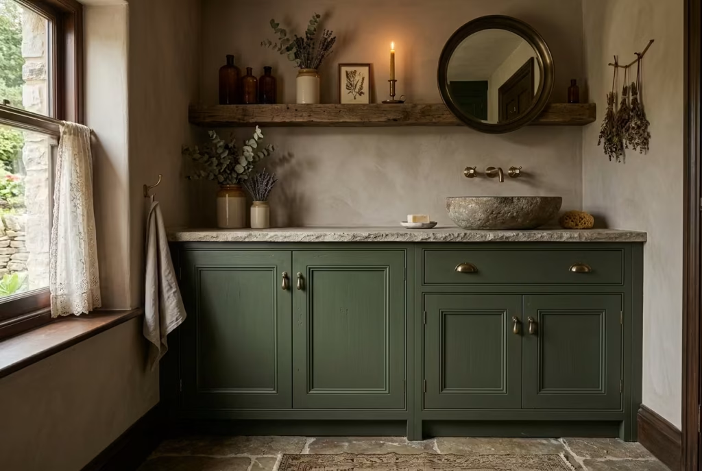
Cabinetry in a dark cottagecore bathroom is far more than storage it sets the tone for the room and anchors the palette in a way that other elements alone cannot. Deep, earthy greens or rich browns evoke a sense of permanence and natural harmony, as if the space has grown organically rather than being assembled in a rush. These hues work beautifully against stone, timber, and muted plaster, reinforcing that lived-in, quietly luxurious atmosphere that defines the style.
I’ve found that deep greens, particularly olive, forest, or moss tones, feel at once grounding and sophisticated. Brown cabinetry, from chocolate to chestnut, adds warmth and pairs seamlessly with both aged brass fittings and tactile stone surfaces. It’s a combination that can make even a smaller bathroom feel enveloping, cosy, and intentional rather than dark or oppressive. The key is to let the colour do the talking while keeping detailing restrained panelled doors, subtle mouldings, or a gentle matte finish often work best.
In terms of scale, cabinets should be proportionate to the room without dominating it. For a standard vanity, widths of 800 to 1200 mm (31 to 47 inches) allow enough surface for a basin while maintaining clearance around the bath or shower. Taller storage units can reach up to 2000 mm (79 inches) without feeling overwhelming if paired with lighter wall treatments above. In a real renovation, I installed moss-green cabinetry beneath a stone basin and paired it with a timber shelf above; the result was a cohesive, tactile layering that invited both touch and admiration.
Practical note: Dark cabinetry can make a space feel smaller if overused. I often recommend balancing it with lighter walls or natural materials, or adding brass or ceramic handles to create subtle highlights. Matte or lightly textured finishes work well in high-humidity spaces, as they hide fingerprints and watermarks more gracefully than glossy surfaces.
Pros: Brings depth and richness, anchors the palette, pairs beautifully with natural materials, and reinforces a grounded, cottagecore aesthetic.
Cons: Dark tones can make small spaces feel more enclosed, finishes need careful selection for humidity resistance, and colour choice must be coordinated with lighting to avoid feeling heavy.
When chosen thoughtfully, deep cabinetry does more than provide practical storage it gives the room its backbone. It speaks of permanence, craft, and subtle luxury, and in a dark cottagecore bathroom, it is often the element that ties every material, surface, and light source together into a coherent, quietly dramatic whole.
You May also Like: 25 Eye-Catching Bathroom Floor Tile Ideas for a Luxurious Look
Add Artwork or Framed Botanical Prints
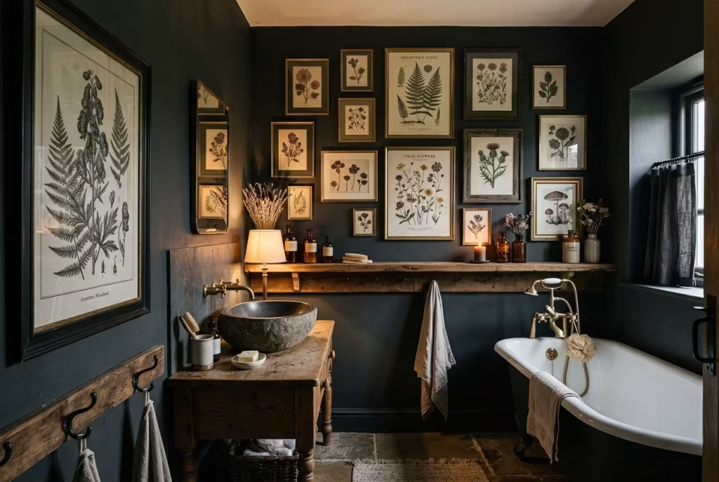
Art in a dark cottagecore bathroom is not about filling blank walls it is about giving the room a sense of personality and narrative, making it feel collected rather than simply decorated. A carefully chosen print, especially botanical or natural studies, introduces a subtle visual rhythm that complements deep walls, textured surfaces, and tactile materials. It’s the sort of detail that whispers character rather than shouts it.
Botanical prints, pressed florals, or vintage engravings framed in soft timber or aged brass lend an organic sophistication. Their muted tones sit comfortably against moody paint or panelled walls, creating pockets of interest that draw the eye without overwhelming the space. I often mix sizes a small print tucked above a shelf, paired with a larger, statement piece near the bath to create a layered, informal gallery feel, almost as if the room has been curated slowly over time.
In real-life applications, scale is key. For a medium bathroom wall, prints around 300 × 400 mm (12 × 16 inches) work well individually or in groups, while a larger format of 600 × 800 mm (24 × 32 inches) can act as a focal point behind a bath or vanity. Groupings should be arranged with careful spacing, around 50 mm (2 inches) between frames, to keep a sense of airiness and avoid a cluttered look.
Practical note: Choose materials that can tolerate humidity, such as sealed frames and UV-protected glass, especially near showers or baths. Artwork that hangs slightly away from direct water exposure will maintain its longevity and look fresh over time.
Pros: Adds personality and narrative, balances dark walls, introduces texture and rhythm, and makes the room feel thoughtfully curated.
Cons: Requires careful humidity considerations, can be damaged by steam if placed too close to water, and needs conscious styling to avoid a crowded or overly themed feel.
Well-chosen artwork in a bathroom doesn’t merely decorate it elevates the space, adding a quiet sophistication that suggests the room has evolved naturally, shaped by layers of taste, experience, and daily life. It is one of those subtle touches that, once in place, makes a room feel complete and quietly lived-in.
Mix Metals with Care
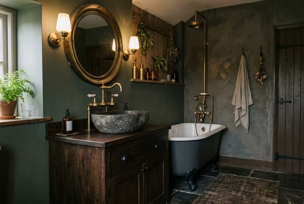
Metal finishes in a bathroom can easily make or break the mood, particularly in a dark cottagecore setting where texture, warmth, and subtlety reign supreme. The key is balance: one primary metal finish should dominate, while a secondary finish adds depth and contrast without creating visual discord. Too many competing metals can make a space feel disjointed, like a sentence with too many adjectives overstuffed and awkward.
I often lean toward aged brass as a primary finish. Its warm, subdued glow complements deep timber, stone surfaces, and earthy walls, and its gentle patina ages beautifully over time. A secondary metal, such as matte black or brushed nickel, can be used sparingly on handles, hooks, or fixtures to create interest and a sense of layering without stealing the spotlight. The result is a space that feels rich, textural, and deliberately composed, rather than cluttered or overly styled.
In practical application, consistency in scale and placement matters. For instance, if you choose brass for taps and bathware, let the secondary metal appear in small doses perhaps on a mirror frame, towel rail, or light fitting. This controlled interplay keeps the eye moving and prevents the room from feeling static. I once paired aged brass taps with subtle black hinges on cabinetry; the contrast was barely noticeable at first glance, but it added a quiet sophistication that anchored the entire design.
Practical note: Mixing metals works best when the finishes share a similar undertone. Warm metals like brass, bronze, and copper harmonize naturally, while cooler metals such as chrome, nickel, or pewter should be paired thoughtfully to avoid clashes. Always test samples together in the room’s lighting before committing.
Pros: Adds depth and visual interest, emphasizes material layering, enhances the room’s character, and allows for subtle personalization.
Cons: Poorly executed combinations can feel chaotic, too many metals overwhelm small spaces, and inconsistent undertones may clash with surrounding materials.
Handled with intention, mixed metals elevate a dark cottagecore bathroom from merely functional to carefully curated. They introduce quiet intrigue and complexity, hinting at a designer’s hand behind what might otherwise appear to be a naturally evolved space. The trick is restraint let them whisper, don’t shout.
Use Beadboard, Shiplap, or Plaster Texture
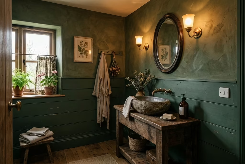
Texture in a dark cottagecore bathroom is the unsung hero. Walls and surfaces can easily feel heavy or flat when painted in deep hues, so introducing subtle surface variation through beadboard, shiplap, or textured plaster adds dimension and depth without the need for bold patterning. These materials quietly guide the eye across the room, offering tactile richness that invites touch as much as it delights visually.
Beadboard and shiplap introduce a rhythm, a sense of vertical or horizontal movement, which works beautifully in smaller spaces to elongate or widen the perception of the room. Plaster, whether smooth with soft trowel marks or slightly rougher Venetian-style finishes, adds a warm, lived-in feel. The key is irregularity: perfection looks staged, while subtle imperfections give the impression that the room has settled naturally over time, a signature of the cottagecore ethos.
From a practical standpoint, scale and proportion are essential. Beadboard panels around 10 cm (4 inches) wide suit most walls, while shiplap boards between 12 and 15 cm (5–6 inches) create a clean but tactile effect. Plaster can be applied wall-to-ceiling or in a lower dado for visual interest, depending on ceiling height around 240 cm (8 feet) works beautifully with full-height treatments, while partial height avoids the room feeling boxed in. In one project, textured plaster was paired with deep olive walls and a reclaimed timber vanity; the resulting layering created subtle depth that felt rich without needing additional ornament.
Practical note: These surfaces work best when balanced with smoother materials elsewhere. Beadboard and shiplap should be sealed or painted with moisture-resistant finishes in bathrooms, while plaster needs proper curing and water-resistant treatment if near showers or baths.
Pros: Adds visual and tactile depth, complements dark colour schemes, softens the mood, and gives the room character without pattern overload.
Cons: Requires careful finishing to withstand humidity, textured surfaces can be harder to clean, and overuse may make a small room feel busy if not balanced with smoother elements.
When layered thoughtfully, these textured surfaces make a bathroom feel like it has grown into its own story. They create a quiet dialogue between walls, fittings, and fixtures, allowing the room to breathe and revealing that the most subtle details often make the greatest impact.
Choose a Sink Skirt or Fabric Detail
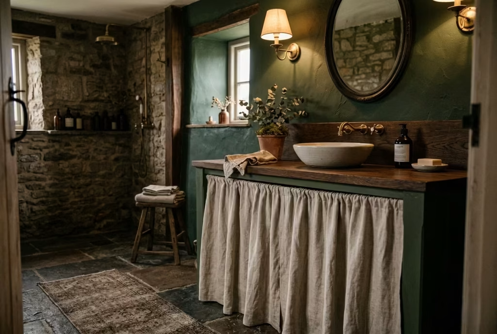
Introducing a sink skirt or other subtle fabric detail is one of the easiest ways to soften a bathroom’s harder lines and introduce a touch of traditional domesticity. In a dark cottagecore bathroom, where stone basins, timber vanities, and deep wall colours dominate, a carefully chosen fabric element can bring a human, tactile softness that balances the more rigid materials. It is like adding a whispered punctuation mark to a sentence that might otherwise feel too formal or heavy.
A linen or cotton sink skirt, gently pleated or loosely draped, works particularly well. It can conceal plumbing, while simultaneously adding texture, movement, and a hint of old-world charm. The choice of colour should harmonise with the room’s palette muted greens, soft greys, warm taupes, or faded florals complement dark walls without creating dissonance. In one renovation, we used a natural linen skirt beneath a moss-green vanity; the result was quietly elegant, the room instantly feeling softer, warmer, and more approachable.
Proportion and length are key. A skirt should just brush the floor or stop a few centimetres above it, roughly 10–15 mm (0.4–0.6 inches) clearance, to avoid damp contact while still feeling grounded. Width should match the vanity front precisely to avoid sagging or a cramped appearance. Small touches like a stitched hem or subtle pattern can elevate the look without competing with other decorative elements.
Practical note: Choose fabrics that can withstand humidity. Linen is ideal because it breathes and dries quickly, but it will naturally wrinkle, which contributes to the relaxed, lived-in aesthetic. Consider removable or washable options for ease of maintenance.
Pros: Softens harsh lines, introduces a tactile, domestic element, conceals plumbing, and adds understated elegance.
Cons: Requires regular washing to maintain freshness, lighter fabrics may show wear over time, and improper length or fit can make the installation appear messy.
When used thoughtfully, a sink skirt or fabric detail does more than fill space it adds a human touch that makes the room feel lived-in, intimate, and deliberately layered. In the context of dark cottagecore, it whispers comfort and tradition, reminding you that luxury can be tactile, approachable, and quietly personal.
Keep the Windows Dressed Lightly
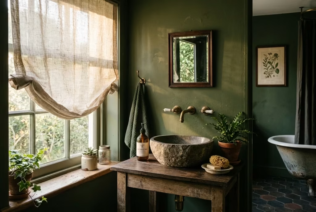
Windows in a dark cottagecore bathroom are not just practical they are mood makers. Heavy drapes can quickly make the space feel oppressive, while bare panes risk exposing too much light and leaving the room feeling cold or clinical. A light, airy treatment, such as a sheer curtain or café-style blind, strikes a delicate balance, offering privacy while maintaining a softness that harmonises with the room’s textures and deep palette.
Sheers in natural fibres, like linen or cotton, diffuse light gently, creating a warm, ethereal glow that plays off stone basins, timber vanities, and aged brass fittings. Café-style curtains, which cover just the lower half of a window, allow light to enter from above while shielding the interior from outside eyes a practical compromise that retains intimacy without sacrificing daylight. In one project, we paired a soft oatmeal linen blind with moss-green walls; the filtered light animated the textured surfaces, making every shadow and imperfection feel intentional rather than harsh.
Measurements and proportion matter. Sheers should ideally extend just beyond the window frame, about 5–10 cm (2–4 inches) wider on each side, and drop to the sill or slightly below for a relaxed feel. Café curtains should be tailored to the window’s midline, around 100–120 cm (39–47 inches) from the floor in most bathrooms, to allow light to pour in from above while preserving privacy below.
Practical note: Choose fabrics that dry quickly and are mildew-resistant, particularly for bathrooms with higher humidity. Lightweight cotton or linen blends are ideal and can be easily washed or replaced if needed.
Pros: Maintains natural light while ensuring privacy, softens the room’s edges, adds subtle texture, and complements deep, moody walls.
Cons: Lighter fabrics may need frequent washing, sheer panels do not block strong sunlight completely, and care must be taken to avoid fabric touching wet surfaces.
A lightly dressed window in a dark cottagecore bathroom does more than filter light it frames the room, draws attention to textures and materials, and creates a gentle rhythm between the interior and exterior. It’s a subtle touch that allows the room to breathe, keeping it intimate, inviting, and naturally luminous.
You May also Like: 25 Dark Cottagecore Bedroom Concepts: How to Master the Moody Aesthetic
Introduce Dark Wood Accents
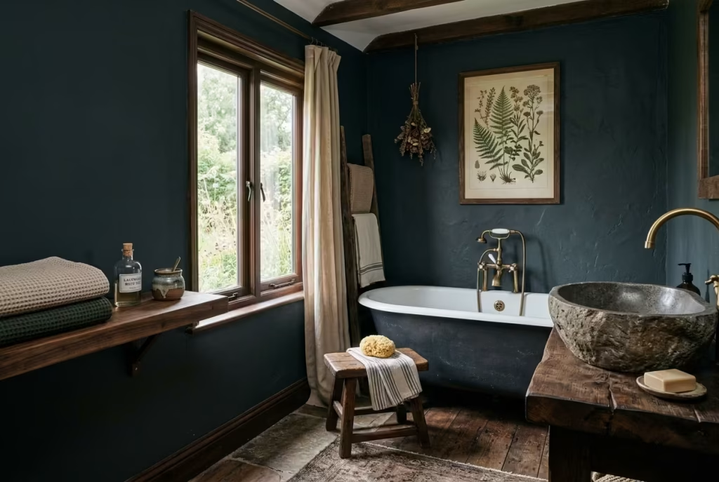
In a dark cottagecore bathroom, deep walls and textured surfaces can feel rich, but sometimes they risk reading as cold or heavy if not counterbalanced. Introducing dark wood accents whether a small stool, floating shelf, mirror frame, or even a timber bath tray injects warmth and tactility, anchoring the palette and creating visual punctuation without overpowering the space. It’s the kind of detail that reads as natural rather than staged, the subtle equivalent of adding a pinch of spice to a familiar recipe.
Walnut, oak, or smoked elm are ideal choices, their grains and knots adding organic interest that contrasts beautifully with matte tiles, stone basins, or aged brass fixtures. A well-placed stool beside a freestanding bath offers both function and textural depth, while a timber shelf can break up a deep wall and provide a curated stage for glass bottles, pottery, or folded linens. In one project, we introduced a dark oak frame around a botanical print and paired it with a small elm stool; the room immediately felt layered, warm, and intentionally tactile, giving a sense that each piece had been thoughtfully positioned over time.
Scale and proportion are crucial. Small accents like a 35 × 35 cm (14 × 14 inch) stool or 20–25 cm (8–10 inch) deep shelf integrate comfortably in compact bathrooms, while larger timber pieces should respect circulation space typically allowing at least 75–90 cm (30–36 inches) clearance around the bath or vanity. Placement should feel purposeful: avoid scattering items randomly, as dark wood’s visual weight can quickly dominate if not grounded.
Practical note: Choose woods that are properly sealed or treated to resist moisture. Oil finishes or waxed surfaces allow the grain to show while offering protection, and they can be rejuvenated over time, which reinforces the idea of a room that evolves gracefully.
Pros: Introduces warmth and tactility, balances darker walls and stone surfaces, enhances the sense of layering and craft, and contributes to a lived-in, natural aesthetic.
Cons: Dark wood can show water marks or wear if unsealed, improper placement may make small rooms feel crowded, and requires occasional maintenance to retain its finish.
When layered thoughtfully, dark wood accents act as the whispering backbone of a dark cottagecore bathroom. They warm the room without shouting, create visual rhythm, and connect the tactile world of stone, brass, and linen into a harmonious, quietly luxurious whole.
Add a Rug Where the Room Allows It
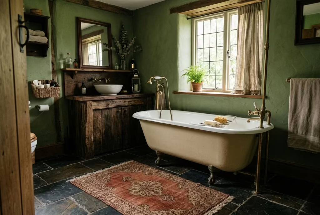
A rug in a dark cottagecore bathroom is not merely decorative it is the element that brings warmth, softness, and an immediate sense of domestic comfort underfoot. In a space defined by stone, timber, and deep wall tones, a carefully chosen rug can break the severity of hard surfaces and add a subtle, textural punctuation that makes the room feel lived-in rather than showroom-perfect. Think of it as the finishing brushstroke on a carefully composed painting it completes the picture without stealing the scene.
Vintage-style rugs, whether faded Persian motifs or muted floral patterns, work particularly well in this context. Their worn-in patina mirrors the gently aged textures of cabinetry, brass, and timber, reinforcing the room’s narrative of slow evolution and quiet charm. Colour choice should complement the dark palette muted olives, charcoals, or soft creams layered with understated patterning can anchor the floor while allowing the walls and fittings to remain the star. In one project, a small 80 × 120 cm (31 × 47 inch) wool rug in muted terracotta sat before a freestanding bath, softening the stone tile and subtly echoing the cabinetry tone; the effect was tactile, warm, and unforced.
Practical placement is essential. Rugs should sit clear of wet zones like shower bases or directly under taps to avoid water damage or slipping hazards. Flatweave or low-pile rugs are ideal in bathrooms, providing texture without excessive bulk. For smaller bathrooms, a runner of 50–60 cm (20–24 inches) wide can subtly elongate the space, while larger rooms allow a more substantial rug that visually unites the bath, vanity, and floor area.
Practical note: Choose natural fibres such as wool or cotton that are breathable, durable, and quick-drying, and ensure a non-slip underlay for safety. Rugs with a slight fade or vintage patina tend to look better over time, embracing the aesthetic of imperfection that defines cottagecore.
Pros: Adds warmth and softness underfoot, anchors the room visually, complements the rustic, lived-in aesthetic, and introduces pattern without overwhelming.
Cons: Requires care against moisture, may need regular cleaning, and larger rugs can dominate a small space if not scaled correctly.
When chosen thoughtfully, a rug does more than decorate it pulls the room together, offering comfort, texture, and subtle narrative. It’s a small touch that transforms a dark cottagecore bathroom from a functional space into one that feels tactile, inviting, and fully complete.
Use Glass Jars and Ceramic Containers Instead of Plastic Storage
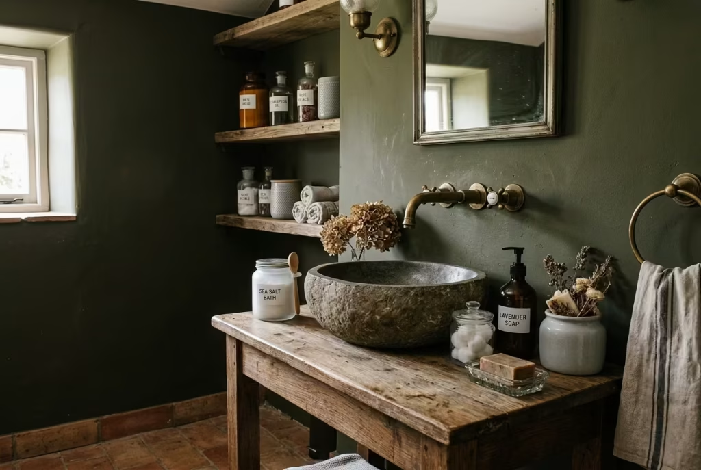
In a dark cottagecore bathroom, the smallest details can make the largest impression. Swapping utilitarian plastic bottles and tubs for glass jars or ceramic containers is one of those subtle yet transformative choices. It elevates the everyday, turning ordinary toiletries into curated elements that harmonise with the room’s textures, materials, and moody palette. It’s a classic example of the “devil is in the details” small touches that quietly define the space’s character.
Clear or frosted glass jars, earthenware pots, or lightly glazed ceramic containers add tactility and a sense of permanence that plastic simply cannot replicate. They catch and reflect light softly, contribute to the layered aesthetic, and integrate beautifully with timber, stone, and brass accents. I often arrange glass jars with bath salts, soaps, or cotton balls on open shelving or atop a vanity; the result is a bathroom that feels both functional and intentionally composed, as if each element has its rightful place in a story slowly unfolding over time.
From a practical standpoint, sizes and proportion matter. Small jars of 100–200 ml (3–7 fl oz) are perfect for toiletries, while larger 500–750 ml (17–25 fl oz) containers can store bulk items like bath salts or cotton pads. Grouping multiple containers of varying heights and finishes can create a casual, collected look without tipping into clutter. In one renovation, a set of soft-grey ceramic pots paired with amber glass jars lifted a dark olive wall scheme, adding contrast and a tactile warmth that softened the room’s heaviness.
Practical note: Glass and ceramic are more durable aesthetically than plastic but require careful placement to avoid accidental knocks or slips. Non-slip mats under heavier jars or trays on shelves are advisable to prevent accidents. Choose glazed ceramics or sealed glass for ease of cleaning in humid bathroom conditions.
Pros: Elevates the room’s aesthetic instantly, adds tactile and visual texture, complements natural and vintage materials, and encourages thoughtful curation.
Cons: More fragile than plastic, heavier to move, and requires careful handling and placement in wet environments.
Even though this seems like a small tweak, replacing plastic with glass or ceramic is a deceptively powerful way to enhance a dark cottagecore bathroom. It turns everyday objects into design moments, reinforcing the sense that every element has been chosen, layered, and aged with intention exactly what gives the style its quietly luxurious charm.
Let One Piece Feel Slightly Imperfect
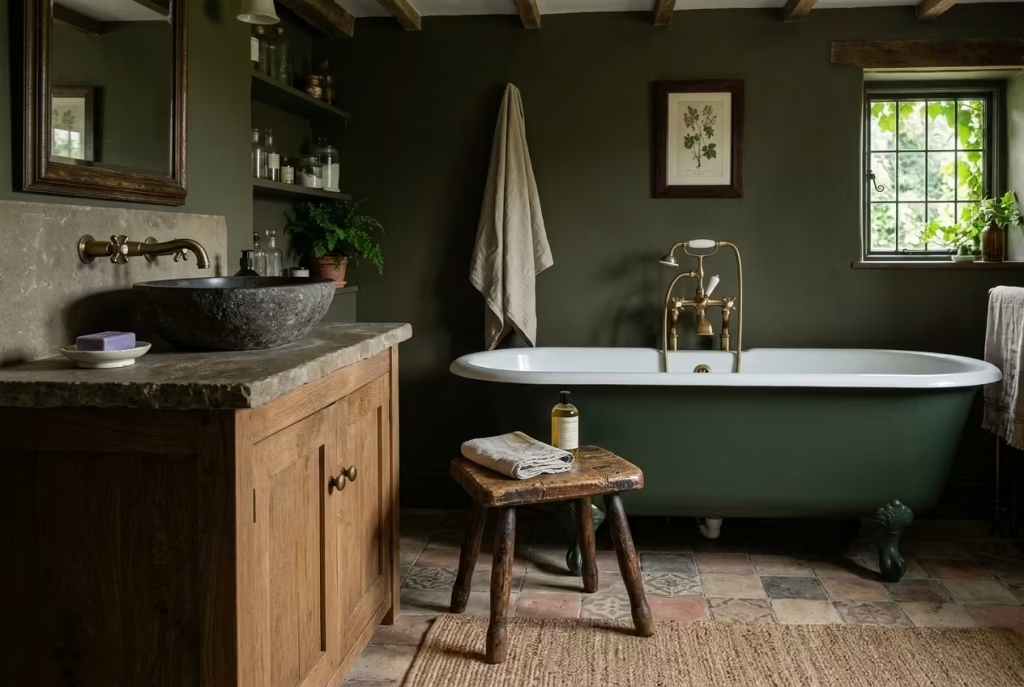
In a dark cottagecore bathroom, perfection can sometimes read as cold or contrived. Allowing one element to feel slightly imperfect whether a worn stool, an antique tray, or a weathered vase injects a sense of authenticity and charm that no pristine installation can replicate. It’s the quiet flourish that transforms a curated space into one that feels lived-in and approachable, like a familiar sentence with a gentle, unexpected twist that makes it linger in the reader’s mind.
Imperfections don’t need to dominate; a single, well-chosen piece is enough to anchor the room in reality. A timber stool with softened edges, a metal tray with faint oxidation, or a vase with subtle glazing inconsistencies introduces texture, history, and a tactile human touch. In one renovation, a small antique oak stool with worn legs sat beside a freestanding tub; it immediately made the room feel layered and narrative-driven, as though the bathroom had evolved naturally over time rather than being installed all at once. The eye is drawn to it without feeling forced, giving the room a whisper of story and intimacy.
Scale, placement, and balance are important. Choose one piece that is visible but not overwhelming. In smaller bathrooms, a stool around 35 × 35 cm (14 × 14 inches) works well, while in larger spaces a slightly larger antique element can act as a focal point. Pair it with simpler, quieter elements nearby so it stands out without creating visual chaos.
Practical note: Imperfect pieces often require extra care. Timber may need occasional oiling, metals should be checked for loose fittings, and ceramics may need a stable surface to avoid accidental tipping. These are minor investments for a major payoff in aesthetic depth.
Pros: Introduces character and authenticity, prevents the space from feeling staged, adds a tactile or visual point of interest, and reinforces the lived-in cottagecore ethos.
Cons: Imperfections may age further over time, require maintenance, and need careful placement to avoid disrupting the room’s functional flow.
Allowing one element to feel slightly imperfect is a powerful design strategy. It reminds us that luxury in a cottagecore bathroom is not about absolute flawlessness it’s about layers, history, and the quiet stories told through surfaces and objects that have been allowed to live, breathe, and age gracefully.
You May also Like: 30 Stunning Desert Bathroom Design Ideas for a Warm, Natural Look
Build Around Scent as Well as Sight
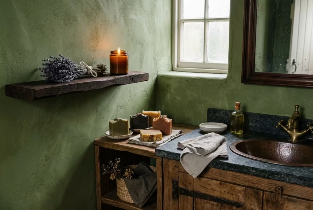
A dark cottagecore bathroom is a feast for the eyes, but the true magic happens when it engages all the senses particularly scent. Carefully curated soaps, scented candles, and dried botanicals can transform a space from merely visually appealing into a fully immersive retreat. It’s the subtle art of layering atmosphere, where smell weaves quietly into the room’s narrative, adding depth and memory in a way that colour or texture alone cannot.
Natural soaps in muted, earthy tones think olive, honey, or clay double as décor and olfactory delight. Beeswax candles, vanilla or sandalwood blends, and dried herbs or flowers in small ceramic vases offer both visual texture and gentle fragrance. The trick is restraint: too many competing scents can overwhelm the space, while a single, well-chosen note becomes a signature, a quiet whisper of personality that lingers long after leaving the room. In one project, placing a small bundle of dried lavender on a dark walnut shelf, paired with a hand-poured beeswax candle, gave a moss-green bathroom a calm, layered presence, reinforcing both the tactile and emotional warmth of the space.
Placement and scale are crucial. Candles should sit safely away from damp zones and be paired with a tray or tile surface to catch drips. Soap bars or botanical bundles work best on open shelving, vanities, or window sills, where they can be seen, touched, and smelled. For larger bathrooms, grouping 2–3 scented elements at varying heights creates visual rhythm and ensures scent disperses gently.
Practical note: Natural materials are preferred in humid environments. Avoid synthetic fragrances that can feel harsh; instead, choose oils, dried herbs, or naturally scented wax. Replace or refresh botanicals periodically to maintain both fragrance and aesthetic appeal.
Pros: Engages multiple senses, enhances mood, adds a curated, layered feel, and reinforces the cottagecore story.
Cons: Requires upkeep to maintain fragrance and appearance, candles must be monitored for safety, and overly strong scents can dominate the subtle atmosphere.
In the end, scent is the invisible thread that ties a dark cottagecore bathroom together. By thinking beyond sight and integrating fragrance, the room evolves into an intimate retreat a place that whispers calm, comfort, and quiet luxury at every turn.
Keep the Room Edited, Not Crowded
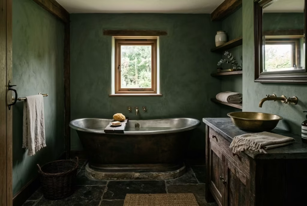
The essence of dark cottagecore is richness without chaos, depth without clutter. Even the most beautifully chosen materials timber, stone, brass, and linen need room to breathe. A bathroom overloaded with ornaments, jars, textiles, and knickknacks quickly loses its quietly layered charm and begins to feel weighed down. Think of it as composing a symphony: each note, texture, and object must have space to resonate, allowing the eye to move gracefully across the room without tripping over unnecessary elements.
Editing a dark cottagecore bathroom means being intentional with every object and surface. Open shelving should display only essentials or select decorative items; vanities should retain clear surfaces; textiles should be minimal yet meaningful. In one renovation, a moss-green bathroom with a freestanding tub and timber vanity felt instantly claustrophobic when a dozen jars and trays were added. Removing all but the most functional and visually harmonious pieces allowed the natural patina of wood, the warmth of aged brass, and the subtle texture of handmade tiles to shine, giving the space a calm, narrative-driven flow.
Scale and proportion remain crucial. Avoid overfilling small shelves or narrow window sills. Even small bathrooms benefit from “visual breathing space,” typically leaving 20–25 cm (8–10 inches) of clear surface between decorative objects. Larger pieces, such as stools, trays, or rugs, should not block circulation; allow at least 75–90 cm (30–36 inches) of clear floor space around the bath or vanity for comfort and movement.
Practical note: Regularly assess what you keep in view rotate objects seasonally or as the room evolves. Minimalism here is not starkness; it is intentionality, allowing the textures, colours, and materials to narrate the story without shouting.
Pros: Enhances the feeling of space, allows textures and materials to stand out, creates a serene, considered atmosphere, and maintains long-term visual harmony.
Cons: Requires restraint and regular editing, small decorative items may need storage elsewhere, and over-curation can risk the room feeling too sparse if not balanced thoughtfully.
Ultimately, a dark cottagecore bathroom achieves its quiet luxury when every element has breathing room. It is the interplay between depth and restraint that makes the space feel lived-in yet effortlessly elegant a room that invites you to pause, linger, and appreciate the tactile richness of each surface and detail.
Best Colour Palettes for a Dark Cottagecore Bathroom
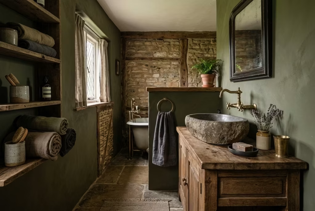
Colour does the quiet heavy lifting in a dark cottagecore bathroom. It sets the mood, but it should never shout over the materials. The most successful schemes feel layered and considered, with one tone slipping naturally into the next, so the room reads as a whole rather than a collection of competing parts. The aim is not to create a colour showpiece, but to build a backdrop that lets timber, stone, brass, linen, and texture do their work. Get that balance right, and the room feels rich, settled, and unmistakably lived in.
Olive and Cream
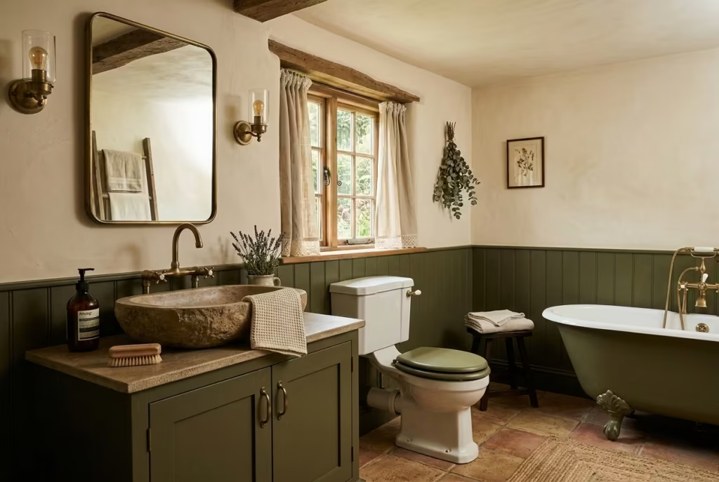
Olive and cream is one of the most dependable pairings for this style because it manages to feel grounded without becoming too heavy. Olive brings that earthy, slightly aged quality that immediately feels at home in a cottage-inspired space, while cream lifts the scheme just enough to stop it from sinking into shadow. It is a combination that feels quietly intelligent rather than trying too hard.
In practice, olive works beautifully on cabinetry, panelling, or the lower half of a wall, while cream can sit above it, on ceilings, trims, or window dressings. That contrast gives the room a sense of structure and breathing space. I have seen this palette work especially well in bathrooms with limited natural light, where cream acts like a softening veil rather than a stark brightener. It takes the edge off the depth, which is exactly what you want.
The beauty of olive and cream lies in its flexibility. You can push it towards rustic with reclaimed wood and handmade tiles, or keep it slightly more refined with aged brass and plaster textures. Either way, it stays on the right side of timeless.
Charcoal and Aged Brass
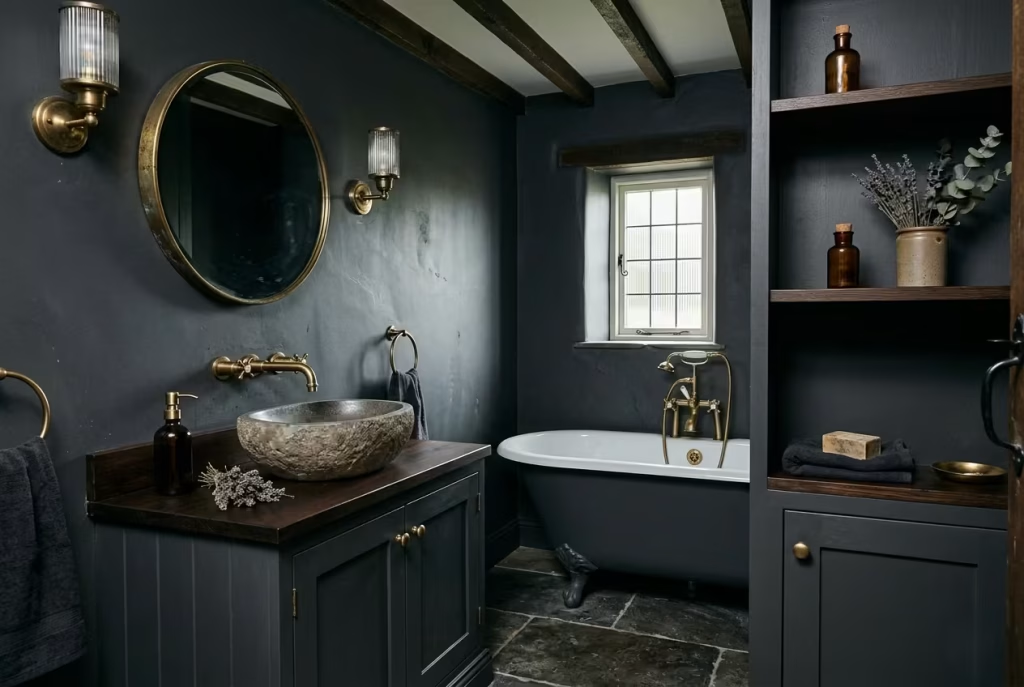
Charcoal and aged brass is a sharper, moodier combination, but when handled well it feels deeply composed. Charcoal gives the room a strong architectural base, creating a cocooning effect that can be very powerful in a bathroom. Aged brass then steps in as the warmer counterpoint, catching the light and softening the severity of the darker tone.
This pairing works best when the charcoal is not overly flat or cold. A softer matte finish, or a mineral paint with a bit of depth to it, will always feel more forgiving than a hard, glossy surface. Brass, meanwhile, should be used with a light hand. It is the accent that keeps the room from feeling one-note, not the main event. Tapware, mirror frames, light fittings, and perhaps a towel rail are usually enough.
In real rooms, this palette has a slightly more tailored feel than some of the others. It suits bathrooms with strong proportions, decent ceiling height, and materials that can hold their own. Think stone basins, ribbed glass, and dark timber rather than anything too decorative. It has presence, but not in a flashy way.
Deep Brown and Muted Sage
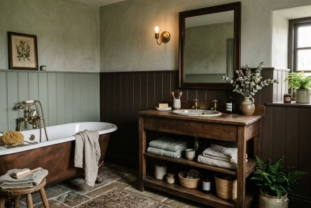
Deep brown and muted sage is a pair that feels especially rooted in nature. Brown brings warmth, weight, and a sense of permanence, while sage introduces a gentler, greener note that keeps the room from feeling too dense. Together, they create a palette that feels calm, organic, and quietly enveloping.
This is one of those combinations that benefits from a soft touch. The brown might appear in cabinetry, shelving, or a freestanding vanity, while sage can sit on the walls or in smaller elements such as textiles and painted panelling. The effect is a room that feels collected rather than contrived. It has the easy confidence of a scheme that knows exactly what it is doing.
I particularly like this palette in older homes, where the colour seems to settle into the architecture rather than sit on top of it. It also works well with tactile finishes, especially limewash, aged wood, and handmade ceramics. The room starts to feel less like a bathroom and more like a quietly tended interior that has evolved over time, which is precisely the appeal.
Forest Green and Warm White
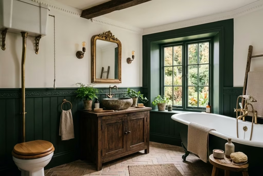
Forest green and warm white is a classic for a reason. Forest green gives the room depth and drama, but warm white keeps it open, lifted, and easy to live with. The key here is avoiding anything too stark. A bright, blue-white tone would cut across the mood; a softer, cream-leaning white feels far more in step with the cottagecore spirit.
Forest green is particularly effective on cabinetry, panelling, or a feature wall, where it can create that rich, enveloping feeling without overwhelming the whole room. Warm white can then be used on ceilings, upper walls, or tilework to create a gentle contrast. The room feels balanced, with enough darkness to be atmospheric and enough light to keep it practical.
This palette is especially strong in bathrooms with architectural detail, such as cornicing, dado rails, or panelled walls, because the contrast gives those features definition. It is one of those combinations that always feels reliable, a bit like a well-cut coat that never goes out of style. It has enough gravitas to feel elegant, but enough softness to remain approachable.
You May also Like: 25 Cozy White Interior Ideas That Prove White Can Feel Warm
Inky Blue and Timber
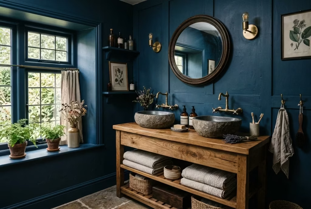
Inky blue and timber is perhaps the most atmospheric pairing of the group. Inky blue creates a sense of depth and stillness, almost like a room settling under evening light, while timber brings warmth and texture back into the frame. Without the wood, the blue might feel too cool; without the blue, the timber might lose some of its quiet drama. Together, they strike a remarkably handsome balance.
This palette works particularly well when the timber has visible grain or a slightly aged finish. Oak, walnut, or reclaimed wood all help to ground the blue and stop it from feeling too polished. Inky blue can be used across walls, cabinetry, or tiled surfaces, but I find it especially effective in rooms with some natural daylight, where the colour shifts gently through the day rather than reading as a flat block.
It is a palette with a little more depth and mood than some of the others, which makes it ideal for bathrooms that are meant to feel intimate and slightly tucked away. Pair it with brushed brass, linen, and stone, and the whole space begins to feel layered in the best possible sense.
Editorial Note: Let Colour Support the Materials
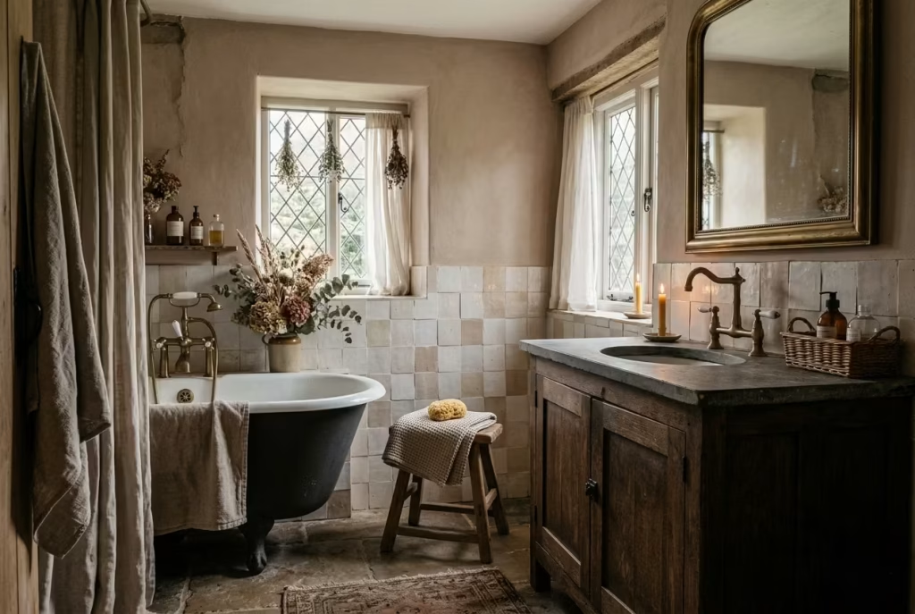
In a dark cottagecore bathroom, colour should never be the whole story. It should support the materials, not outmuscle them. The most compelling schemes are the ones where paint and palette quietly frame the stone, timber, brass, and textile details, allowing those surfaces to carry the emotional weight of the room.
That means choosing tones that flatter the materials rather than competing with them. A beautiful timber vanity will look richer beside olive, sage, or inky blue than it ever would against a harsh white. Aged brass needs depth around it to glow properly. Handmade tiles need a backdrop that lets their irregularity breathe. When colour is handled with restraint, the room develops that elusive quality designers always chase: it feels complete without feeling overworked.
The best dark cottagecore bathrooms do not rely on a single heroic colour. They feel built up, layer by layer, until the palette and the materials begin to speak the same language. And once that happens, the room stops feeling designed and starts feeling inevitable.
Materials That Make the Style Feel Authentic
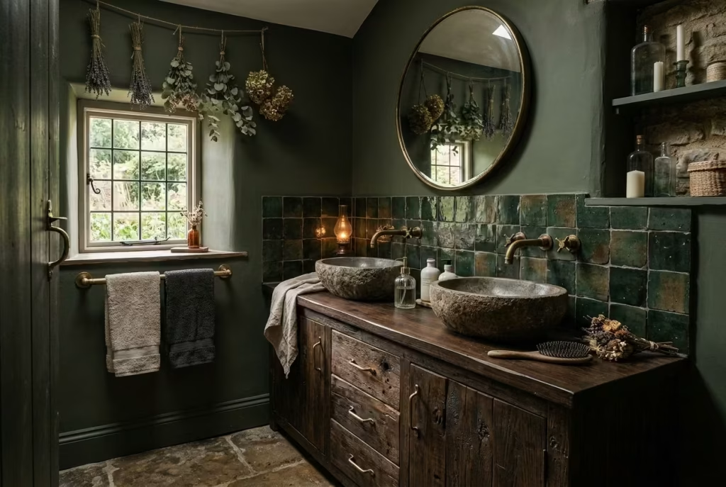
The hallmark of a dark cottagecore bathroom is the way materials speak for themselves each surface contributing to a layered narrative that feels natural, tactile, and grounded in time. Colour, lighting, and furniture are important, but it is the materials that lend credibility and soul. Selecting the right textures, finishes, and compositions transforms a room from merely styled to genuinely lived-in, while ensuring functionality in a high-moisture environment like a bathroom.
Timber
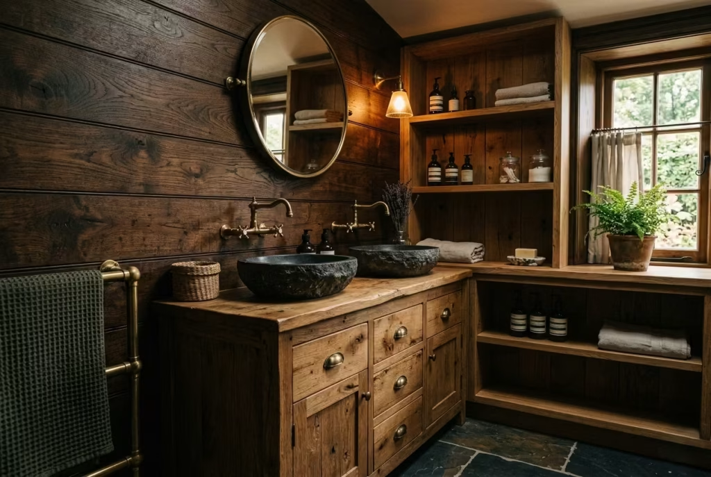
Timber is the backbone of cottagecore charm. Reclaimed oak, walnut, or pine with visible knots and grain instantly conveys warmth and age. In bathrooms, timber works beautifully as vanities, shelving, or panelled walls, and a slightly worn finish enhances authenticity.
Pros: Timeless aesthetic, tactile warmth, ages gracefully.
Cons: Needs sealing to resist moisture; can warp or stain if exposed to prolonged damp; requires occasional oiling to maintain beauty.
Real-life note: In one project, a reclaimed pine vanity with an oil-finished top survived over five years of daily bathroom use without losing its character, simply by being carefully sealed and ventilated.
Hand-Glazed Tile
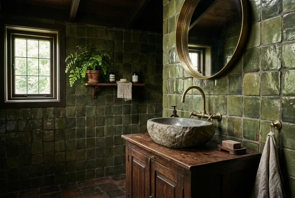
Hand-glazed tiles add subtle variation and the quietly imperfect feel central to cottagecore. Slight irregularities in colour and finish catch light differently across the surface, giving walls or splashbacks a depth impossible to replicate with mass-produced tiles.
Pros: Unique, artisanal texture; durable if glazed; visually rich.
Cons: Slightly higher cost; requires careful grout maintenance; uneven surfaces may trap dirt if not sealed properly.
Design insight: Pair soft olive or cream tiles with darker grout to enhance the handmade look without overpowering the room’s calm tone.
Limewash or Mineral Paint
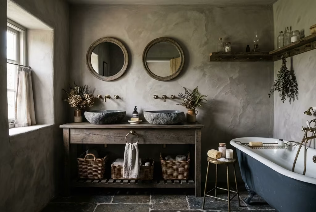
These paints provide a soft, chalky finish that interacts beautifully with light, lending walls a subtly worn, organic presence. Limewash is particularly effective in high-moisture areas because it can breathe, preventing trapped condensation.
Pros: Breathable, environmentally friendly, natural patina over time.
Cons: More delicate than modern paints; can stain; may require touch-ups in areas of heavy splashing.
Tip from practice: On a renovation with 240 cm ceilings, layering limewash over textured plaster created gentle shadows that animated the wall throughout the day.
Stone
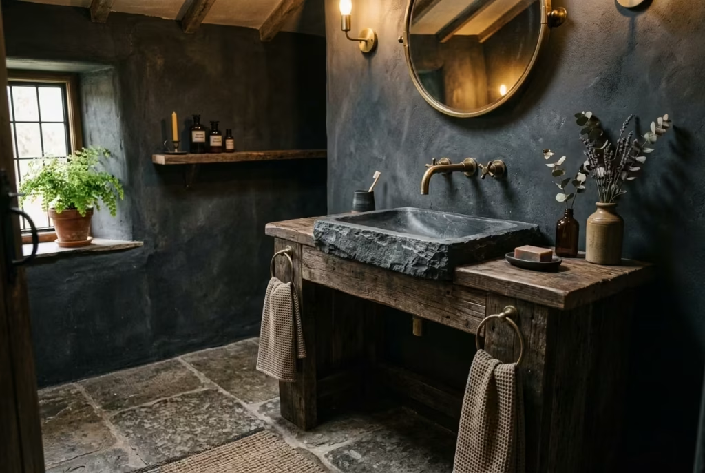
Stone anchors the space, giving basins, flooring, or accent surfaces a sense of permanence. Materials such as marble, limestone, or slate feel tactile and enduring, grounding the softer, more transient textures around them.
Pros: Durable, tactile, ages beautifully; naturally cool underfoot.
Cons: Can be porous and stain-prone; heavier and may require reinforced cabinetry; often more expensive.
Practical insight: A slate basin paired with a timber vanity adds visual weight and a quiet narrative of old-world craftsmanship, while ensuring longevity if sealed properly.
Linen
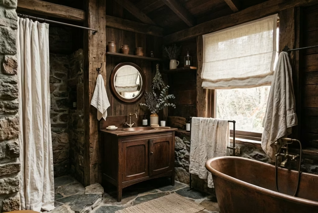
Textiles like handwoven linen for towels, blinds, or shower curtains introduce softness, warmth, and subtle movement. Linen’s slightly crumpled texture contributes to the lived-in, relaxed aura central to the style.
Pros: Breathable, natural, visually softens hard surfaces; ages beautifully.
Cons: Needs frequent laundering; can fade over time; prone to wrinkles.
Design application: In a small bathroom, linen curtains in muted sage or cream helped balance a dark timber vanity and earthy tiles without competing for attention.
You May also Like: Mid-Century Modern Bathroom Ideas: 26 Ways to Create a Timeless, Stylish Space
Aged Metal
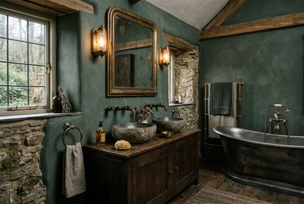
Fixtures and accents in aged brass, bronze, or iron provide contrast against timber, stone, and paint, while offering a sense of history. Aged metals glow subtly in layered lighting and avoid the harshness of polished chrome.
Pros: Adds warmth, patina over time enhances character; durable.
Cons: Can tarnish if exposed to water; requires periodic cleaning with gentle products.
Insight from renovation: A single aged brass tap or mirror frame can elevate an entire bathroom, providing a visual anchor without overwhelming the palette.
Ceramic Accessories
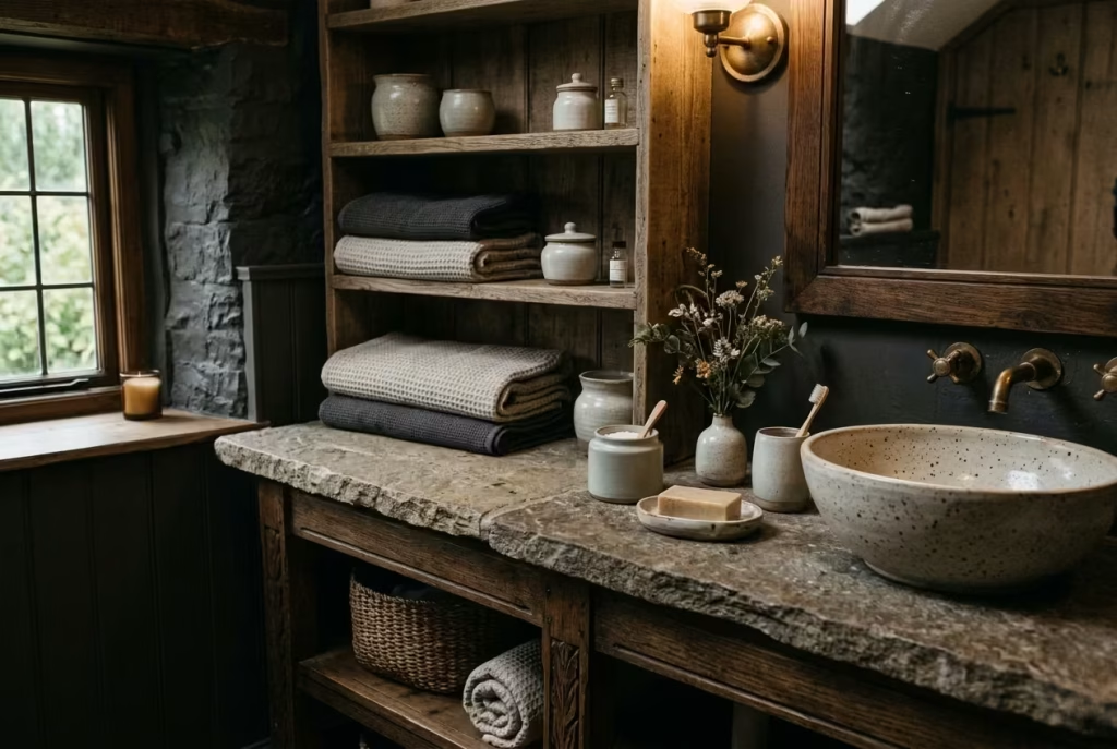
Ceramics soap dishes, jars, basins, and vases reinforce the tactile, human-scale charm of cottagecore. Subtle glazing, matte finishes, or soft imperfections prevent the room from feeling overly manufactured.
Pros: Easy to clean, versatile, texturally rich; can be customized or handmade.
Cons: Can chip if mishandled; heavier pieces need stable placement; glazed surfaces can feel cold without accompanying warm textures.
Practical note: Grouping ceramic jars with folded linens and a small botanical element on open shelving balances functionality with narrative, making storage feel curated rather than cluttered.
By prioritising these materials thoughtfully, a dark cottagecore bathroom achieves depth, tactility, and authenticity. The interplay between timber, stone, metal, and soft textiles creates a space that is not only beautiful but enduring one that ages gracefully, tells a story, and rewards daily use with both comfort and quiet elegance.
Common Mistakes to Avoid
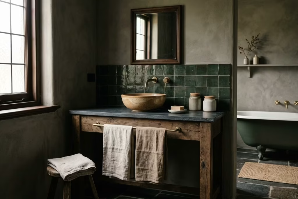
A dark cottagecore bathroom has a lot of charm, but it is one of those styles that rewards restraint and punishes overcommitment. The best rooms feel layered and grounded, not overcooked. It is very easy to lose the thread by pushing the mood too far, chasing too many references at once, or neglecting the practical bones of the space. The good news is that most of the common missteps are simple to avoid once you know where the traps lie.
Making the Room Too Dark with No Contrast
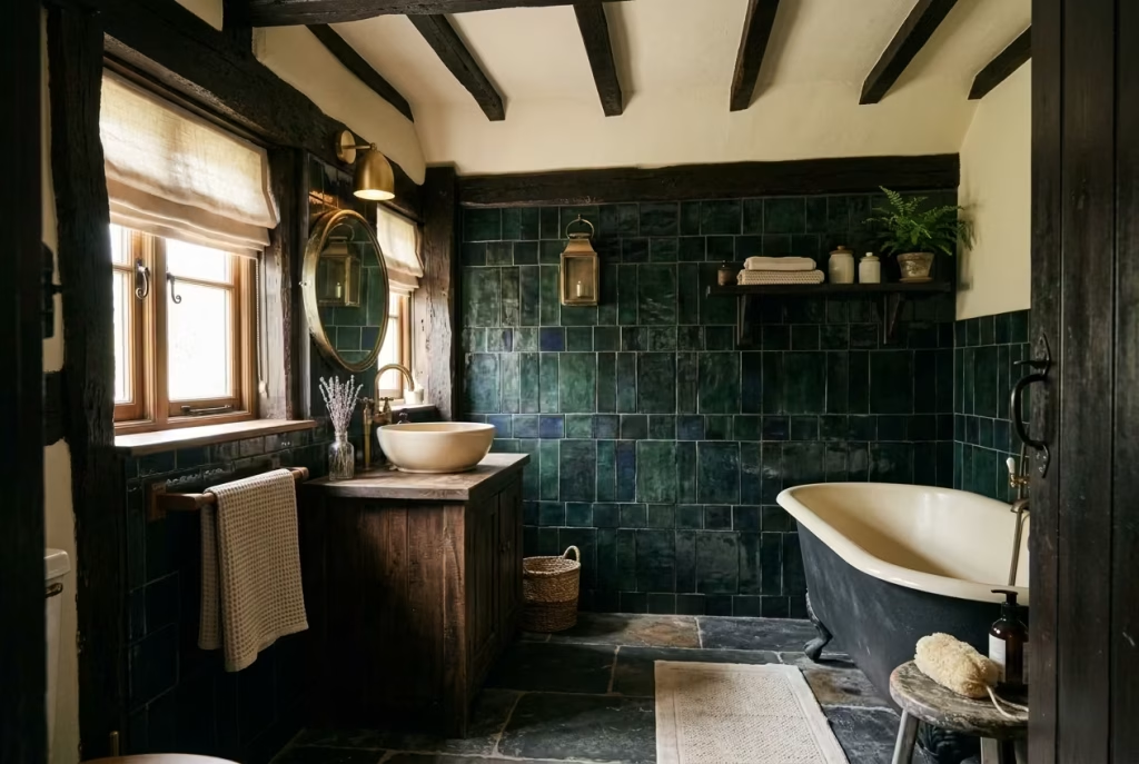
Depth is the point, but if every surface is swallowed by darkness, the room can quickly lose its shape. A bathroom without contrast starts to feel flat rather than atmospheric, which is a world away from the quiet richness this style is trying to achieve. You need somewhere for the eye to rest. That might mean a cream ceiling, a lighter basin, a pale linen blind, or simply a warmer-toned light bouncing off a matte wall.
I have seen rooms where the intention was strong, but the execution missed the mark because there was no relief in the scheme. The result was not moody, just heavy. That is the difference between a room with presence and one that feels like it is closing in around you. The trick is to let the darker tones do their work while giving them something softer to lean against. A little light goes a long way here.
Using Too Many Patterns
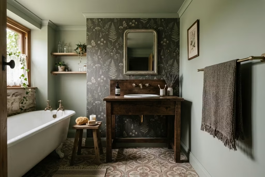
Pattern can be lovely, but too much of it and the room starts to feel as though it is competing with itself. One floral print, one patterned tile, one woven textile, that can be enough. Add too many decorative voices, and the whole thing begins to lose its rhythm. It is a bit like turning up all the instruments at once; nothing stands out, and the melody gets lost.
For a dark cottagecore bathroom, pattern works best when it feels incidental rather than dominant. A botanical wallpaper behind a vanity can be beautiful if the rest of the room stays quieter. A patterned floor can carry the scheme if the walls are more restrained. But once you start stacking patterns on top of one another without breathing room, the room begins to feel fussy rather than poetic. The strongest spaces usually know when to stop.
Choosing Overly Glossy Finishes
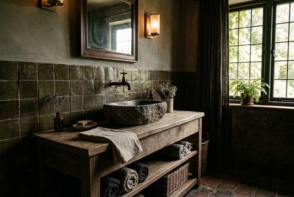
High-gloss finishes can undo the whole atmosphere in a heartbeat. They reflect too much light, often in a way that feels sharp rather than soft, and they can make natural materials look oddly formal. In a style that thrives on patina, texture, and gentle imperfection, too much shine tends to pull the room away from its grounded feel.
This does not mean everything must be matte, but the balance matters. A little sheen on a glazed tile or a polished tap can be useful, especially if you need light to bounce around a darker room. The problem begins when glossy surfaces start taking over, because then the room begins to read as slick rather than soulful. In real life, softer finishes are usually more forgiving as well. They disguise fingerprints, soften reflections, and sit much more comfortably alongside timber, linen, and stone.
Relying on Novelty Décor Instead of Good Materials
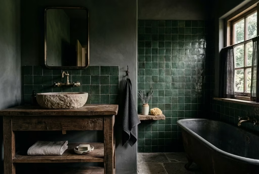
This is probably the most common way a room loses its footing. It is tempting to reach for decorative objects that shout “cottagecore” at first glance, but novelty rarely carries a scheme for long. A few jars, a floral sign, a basket here and there, and suddenly the room is all costume, no substance. The trouble is that decorative tricks fade fast, while good materials keep working quietly in the background.
If the bones are right, you do not need to lean so heavily on props. A timber vanity, a handmade tile, a stone basin, an aged brass tap, those are the things that give the room credibility. They have weight, texture, and staying power. Decorative accents should feel like the last layer, not the whole story. Otherwise, the room risks becoming a set dressing exercise rather than a space that feels genuinely lived in.
Forgetting Storage and Lighting
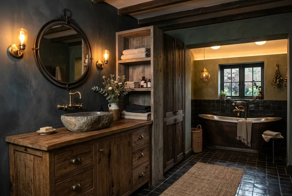
A beautiful bathroom that does not function properly is, frankly, a false economy. Storage and lighting are not the glamorous parts of the design, but they are the bits that shape daily life. Forget them, and the room will betray you at the first busy morning. Clutter has a way of flattening even the loveliest interiors, and poor lighting can make every surface feel harsher than it really is.
Storage should be tucked in with intention, whether that means a vanity with drawers, an open shelf used sparingly, or a cabinet that sits quietly in the scheme. Lighting needs just as much care. One overhead fitting is rarely enough, especially in a darker palette. You need layers: a mirror light, a softer ambient source, perhaps something with a warmer glow near the bath. That is what makes the room feel comfortable, not just visible.
When storage and lighting are neglected, everything else has to work harder. When they are handled well, the whole room settles into itself. The design feels calmer, the materials read better, and the bathroom becomes a place you actually enjoy using rather than simply looking at.
A dark cottagecore bathroom works best when it feels composed rather than crowded, moody rather than murky, and thoughtful rather than theatrical. Avoiding these few pitfalls keeps the room on track and lets the materials, colour, and texture do exactly what they are meant to do.
How to Make Dark Cottagecore Feel Comfortable in a Real Home
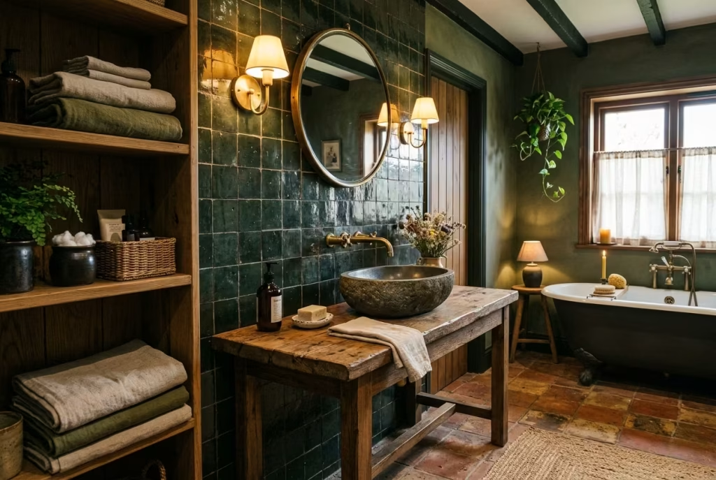
A dark cottagecore bathroom can be stunning on paper, but the difference between a showpiece and a lived-in space comes down to thoughtful execution. The charm of this style lies in its ability to feel timeless, tactile, and quietly luxurious but it needs careful calibration to work in real life. It is the interplay of proportion, materials, light, and practical function that allows the room to sing rather than shout.
Adapting the Look for Small Bathrooms
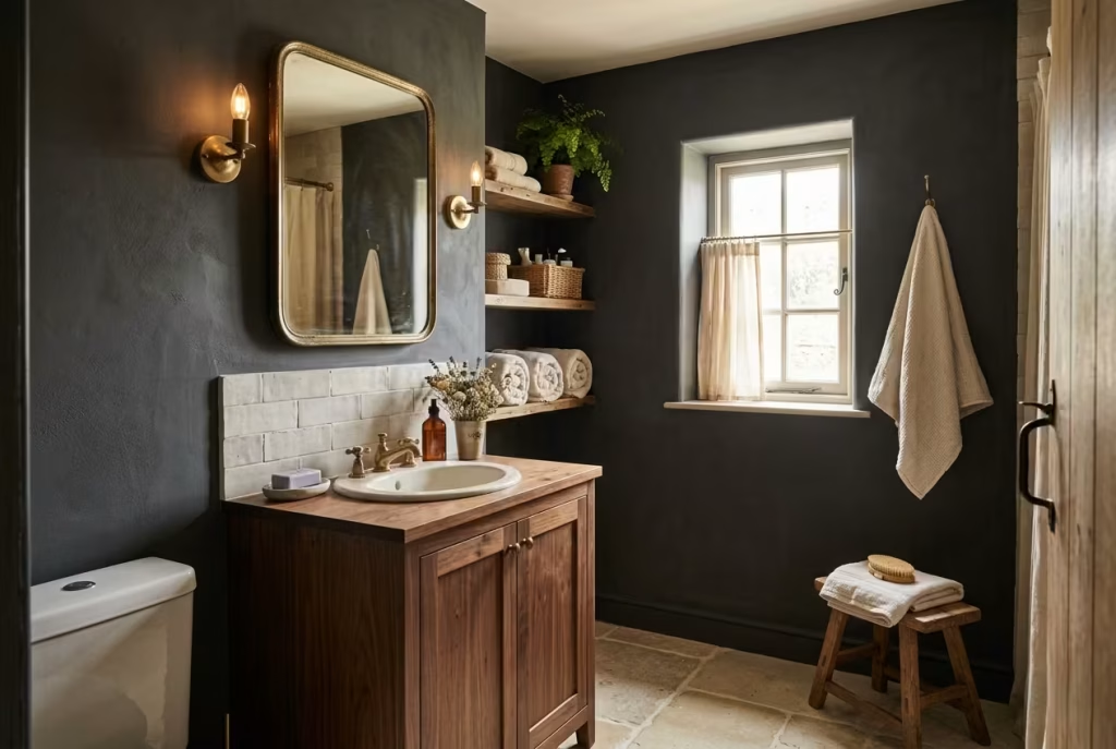
Smaller bathrooms demand restraint, but they do not need to sacrifice personality. In tight spaces, darker tones can still work if you allow a little breathing room: lighter ceilings, reflective surfaces such as a softly aged mirror, or subtle glazing in tiles can prevent the scheme from feeling claustrophobic.
Practical insight: On one compact project, I used charcoal walls and a deep walnut vanity but balanced them with a pale stone floor and soft cream linen textiles. The room felt enveloping without closing in, proving that layering textures and allowing light to bounce can give depth even in a tiny footprint.
Balancing Mood with Function
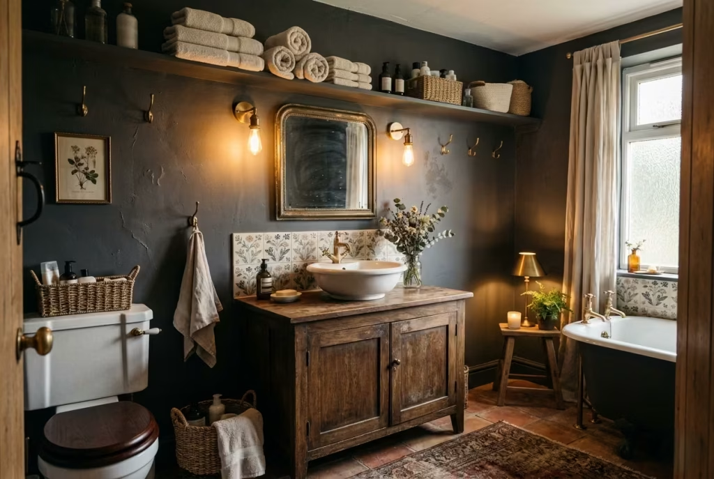
The moodiness of dark cottagecore is one of its strengths but if the room does not function comfortably, the charm becomes frustrating. Lighting should be layered, with task light for grooming, ambient glow for bathing, and accent illumination to showcase material textures. Storage must be considered as carefully as aesthetics, keeping daily essentials accessible yet discreet.
Idiom in practice: The key is “not to let style crowd out substance.” Even the prettiest floral tile or antique basin will lose its appeal if towels pile up on a countertop or a tap splashes everywhere. Function is the silent partner of beauty here.
Where to Spend More and Where to Save
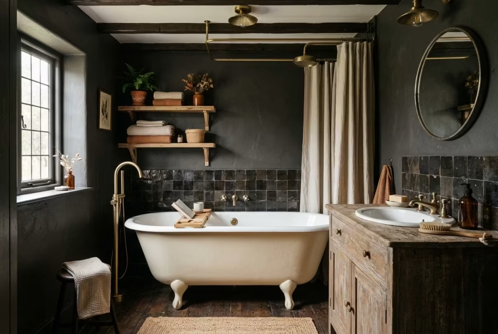
Some elements are worth investing in because they define the room: a freestanding bath with gentle curves, a timber vanity that ages gracefully, or handmade tiles that catch the light differently. Other items can be more economical: a ceramic soap dish, small open shelving, or linen textiles that are replaceable if stained.
Real-world note: In one renovation, splurging on a hand-glazed tile backsplash and aged brass fittings while keeping storage containers simple achieved a balance between luxe and livable that cost less than trying to elevate every single detail.
Why Proportions Matter as Much as Colour
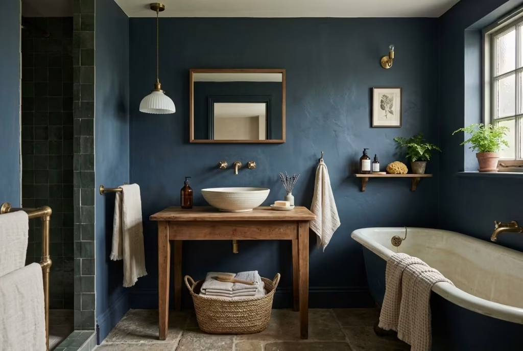
In dark cottagecore design, proportions are the invisible scaffolding. A vanity that is too small will feel lost against a deep wall; a pendant that hangs too low can swamp a low-ceilinged room. The dimensions of fixtures, furniture, and even decorative accents need to be considered in relation to the space to avoid visual imbalance.
Insight from experience: One bathroom with inky-blue walls felt oppressive until a wide, shallow basin and a matching low-profile mirror were introduced. The colour remained moody and rich, but the space finally “breathed.”
The best dark cottagecore bathrooms are not the most decorated; they are the most considered. Each element earns its place, textures and finishes speak for themselves, and every layer from lighting to textiles serves both aesthetic and functional purpose. When approached with this balance in mind, a small or large bathroom alike can feel enveloping, serene, and entirely human, proving that the quiet beauty of cottagecore thrives not in clutter, but in care.
Final Thoughts about Dark Cottagecore Bathroom Designs
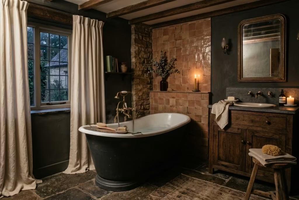
A dark cottagecore bathroom is a lesson in subtlety and restraint, where richness is measured in texture, depth, and the quiet patina of materials rather than in overt statement pieces. These spaces work not because they shout, but because they whisper: a freestanding bath curves softly into view, an aged brass tap catches the light just so, and a hand-glazed tile glimmers in the layered glow of well-considered lighting. It is the cumulative effect of thoughtful choices each element allowed to breathe that gives the room its enduring appeal.
What makes this style truly compelling is its intimacy. Unlike trend-driven schemes, it does not demand immediate admiration. Instead, it rewards time spent within it: the way shadows play across a timber vanity, how linen curtains soften the edges of a window, or how a slightly imperfect ceramic jar adds a note of humanity. In my experience, the best dark cottagecore bathrooms feel lived-in without being cluttered, curated without feeling contrived, and rich without ever appearing forced.
Ultimately, these rooms succeed because they are grounded in real materials, thoughtful proportions, and human-scale details. They are intimate, quietly personal, and full of narrative a bathroom that tells a story rather than announcing one. Like a well-worn novel or a favourite piece of furniture, the magic of dark cottagecore reveals itself slowly, layer by layer, leaving a sense of calm and comfort that never wanes. It is a style that does not fade; it matures, settles, and becomes more compelling with every glance.
Frequently Asked Questions About Dark Cottagecore Bathrooms
What is a dark cottagecore bathroom?
A dark cottagecore bathroom is a moody, characterful space that blends earthy colours, natural materials, vintage-inspired details, and a soft, lived-in feeling. It is less about perfection and more about atmosphere, texture, and quiet charm.
Can dark cottagecore work in a small bathroom?
Yes, and often beautifully. The key is balance. Use darker tones on selected walls or cabinetry, then soften the scheme with warm lighting, lighter ceilings, reflective mirrors, and natural textures so the room feels cocooning rather than cramped.
What colours work best for this style?
The most successful palettes are grounded and muted: olive and cream, charcoal and aged brass, deep brown and sage, forest green and warm white, or inky blue with timber. The colour should support the materials, not overpower them.
What materials make the look feel authentic?
Timber, hand-glazed tile, limewash or mineral paint, stone, linen, aged metal, and ceramic accessories all help create that layered, timeworn quality. These materials give the room texture, depth, and a more genuine sense of age.
How do I stop a dark bathroom from feeling too heavy?
Bring in contrast. Use layered lighting, softer textiles, lighter ceilings, and a few reflective surfaces such as mirrors or glazed tile. Dark cottagecore should feel intimate and grounded, not flat or gloomy.
Do I need vintage pieces for the style to work?
Not necessarily. Vintage pieces help, but vintage-inspired fittings and well-chosen modern items can work just as well. What matters most is that the shapes, finishes, and proportions feel calm, timeless, and slightly softened.
Is this style high maintenance?
It can be if you choose the wrong finishes. Matte paints, sealed timber, and durable tiles help keep upkeep manageable. The style looks best when it is allowed to age gently, so a little patina often works in its favour.
What makes a dark cottagecore bathroom feel finished?
Restraint. The most successful rooms are not overloaded with décor. They feel complete because the colours, materials, lighting, and proportions all work together, leaving the space edited, warm, and quietly layered.