16 Sage Green Bathroom Ideas for a Serene and Stylish Space You’ll Love
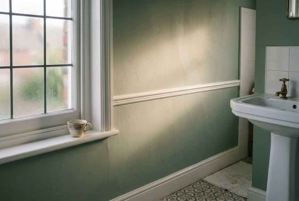
The first thing you notice isn’t the colour at all. It’s the light. I remember standing in a Victorian terrace in Bristol just after seven on a March morning, watching the sun come low through a frosted window and land on a wall painted somewhere between eucalyptus and dishwater green, and thinking: this is why people fall for sage.
Not because it’s fashionable, though it is, and not because a paint chart told them to, but because it does something to a room that white simply can’t. It softens. It breathes. A Sage Green Bathroom that could have felt clinical instead felt like somewhere you’d actually want to linger with a cup of tea going cold on the windowsill.
Yes, someone will always ask whether sage green is having a moment or building a legacy, and that’s a fair question worth its own conversation. For now, park it. What matters here is range, not permanence. Sage isn’t a single look you either commit to or avoid.
It’s a colour with sixteen different personalities, from a whisper-quiet wall behind a white suite to a near-black statement that swallows a room whole and makes it feel expensive doing it. What follows isn’t a mood board. It’s sixteen ways I’ve seen this colour actually work, room by room, tile by tile, with the measurements and the trade-offs that never make it onto Pinterest.
Soft Sage Walls with Crisp White Trim
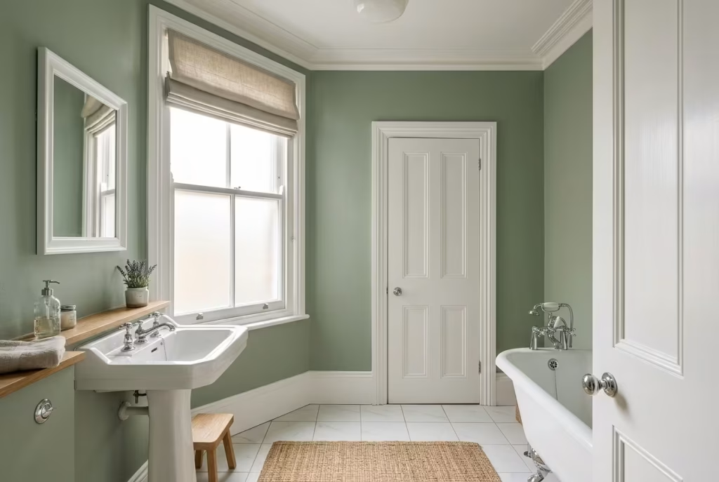
Every designer has a starting point they return to when a client hovers on the edge of a decision, and for sage green in a bathroom, mine is almost always this one. Soft sage on the walls, white on every scrap of trim, and nothing else fighting for attention. It’s the equivalent of a well-cut white shirt. Not showy, but the sort of thing that never lets you down.
Here’s where people go wrong, though. They hear “safe” and their mind jumps to “boring,” as if the two were the same word wearing different coats. They’re not. A pale, chalky sage against gloss white skirting is quietly one of the most flattering combinations you can put in a room with awkward light or an odd-shaped window, and I say that having repainted more bathrooms than I care to count for clients who wanted colour without the commitment of colour. It gives a room somewhere to rest its eyes.
The detail that actually makes or breaks this look isn’t the shade of green at all. It’s the joinery underneath it. Standard UK skirting boards run around 100mm to 150mm, and if yours are sitting at the shorter end in an older property, it’s worth having a carpenter build them up before you paint, because taller skirting reads as more considered and grounds the sage rather than letting it float.
If the room has decent ceiling height, a dado rail at roughly 900mm to 1m from the floor gives you a natural line to split the wall, sage below or above, whichever way the light falls best. In a smaller bathroom without that height to play with, skip the dado altogether. It’ll only chop the room in half and make it feel shorter than it is.
Where this idea genuinely earns its keep is in reversibility. If you’re renting, or simply someone who likes to change things up every few years without a full renovation on the cards, painted walls cost you an afternoon and a few tins, not a skip hire and a fortnight without a bathroom.
The trade-off, and I won’t pretend there isn’t one, is that flat colour on flat plaster can read a little one-note if you don’t bring in some texture elsewhere: a woven bath mat, a linen blind, anything with a bit of grain to it. Without that, even the loveliest sage can end up looking like it’s waiting for the rest of the room to catch up.
Pros: low-risk, fully reversible, forgiving of most lighting conditions, budget-friendly Cons: can feel flat without a textural counterpoint, relies heavily on trim quality to look considered rather than default
Sage Green Vanity, White Everything Else
A client of mine in Cheltenham, a young couple doing up their first house together, spent the best part of an hour going back and forth over whether to paint their entire bathroom sage. He was keen. She wasn’t sure. In the end, we split the difference, and it turned out to be the better decision anyway.
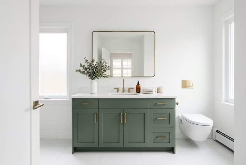
We kept the walls, floor and suite crisp white, and painted the vanity unit a deep, muted sage that reads almost like moss in low light. It became the one thing you notice when you walk in, without either of them having to gamble on a colour swallowing the whole room.
That’s really the appeal of this idea. It gives you all the character of sage without asking you to live inside it. A bathroom is a small space by nature, and there’s only so much surface area to work with, so putting your colour budget into one considered piece of furniture rather than four walls tends to punch well above its weight.
Now, the practical bit, because this is where people trip up. You’ve broadly got two routes: painting an existing cabinet, or buying pre-finished cabinetry in the colour from the outset. A painted vanity, even with a good quality eggshell or a specialist furniture paint, will show wear at the edges and around the handles before too long, especially in a family bathroom where steam builds up daily and little hands are forever opening the doors.
I’ve seen painted vanities start chipping at the corners within eighteen months in busier households. Pre-finished cabinetry, the kind that comes with a factory-applied lacquer or a proper spray finish, holds its colour and its edges far better under sustained humidity, and it’s worth the extra spend if this vanity is going into a bathroom that gets genuine daily use rather than an occasional guest cloakroom.
There is a limit to this idea, and I’d rather tell you now than let you find out the hard way. It only works if the room actually has a sightline to the vanity as you walk in, something for the eye to land on straight away. In an awkward layout where the vanity is tucked round a corner or hidden behind a door, all that lovely colour goes to waste on nobody. Measure your doorway sightline before you commit, not after the cabinet’s fitted.
Pros: delivers genuine personality without overwhelming a small footprint, easier and cheaper to update later than a full repaint, works brilliantly as a focal point in an otherwise neutral scheme Cons: painted finishes wear faster under steam and daily use than pre-finished units, the whole effect falls flat if the vanity isn’t the natural focal point of the room
Full Sage Tiling, Floor to Ceiling
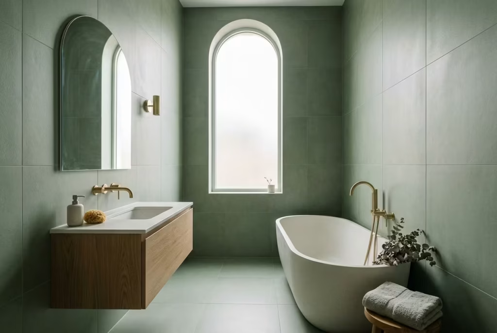
Most people ask the wrong question before they take this idea on. They ask whether their bathroom is big enough. What they should really be asking is whether it’s tall enough, because floor-to-ceiling tiling lives or dies on vertical proportion, not square footage.
I’ve tiled a bathroom in a converted chapel with only four square metres to play with, and full sage tiling made it feel like a private grotto rather than a cupboard, purely because the ceilings soared past 3m. Put the same tile scheme in a standard new-build with a 2.2m ceiling, and you risk something closer to standing inside a green shoebox. Height is the whole game here.
Once you’ve established the room can take it, the next decision is format, and it changes the character of the room entirely. Large-format tiles, anything from 600mm by 600mm upwards, minimise grout lines and let the colour read as one continuous, calming plane, which suits a contemporary scheme that wants sage to feel architectural rather than decorative. Metro or small-format tiles do the opposite.
They break the surface into rhythm and texture, and they’re far more forgiving if your walls aren’t perfectly true, which in a lot of period UK housing, let’s be honest, they rarely are. I tend to steer clients with older properties towards a smaller format for exactly that reason. It hides a multitude of sins that large-format simply cannot.
Grout colour is where I see the most regret after the fact, so let’s deal with it properly. A grout that closely matches your sage tile keeps the whole surface looking seamless, almost sculptural, and it’s the choice I’d make nine times out of ten for that grotto-like, enveloping effect.
A contrasting white or pale grey grout does the opposite on purpose, it makes each tile visible as its own object and gives the room a crisper, more graphic feel, closer to a Scandinavian bathroom than a Mediterranean one. Neither is wrong. But decide which mood you’re chasing before the tiler turns up, because changing grout after the fact means chiselling it out, and that’s not a job anyone enjoys doing twice.
This is, without question, the most committed idea on this list, and it’s only fair to be upfront about what that means for your future self. Full tiling isn’t something you repaint on a whim in eighteen months when you fancy a change.
It’s a proper investment, both in materials and in labour, and reversing it later means stripping tile off plasterboard or brick, which is neither quick nor cheap. Go into it with your eyes open and it rewards you tenfold. Go into it on a whim and you may be living with a decision you’ve outgrown.
Pros: creates a dramatic, cohesive, almost immersive space; hides the joins and quirks of an older room better than paint ever could; genuinely elevates resale appeal when done well Cons: demands real ceiling height to avoid feeling oppressive; the most expensive and least reversible idea in this whole guide; grout choice is permanent once installed
You May also Like: Best Warm Neutral Paint Colours That Never Feel Flat
Sage Green Half-Tiled Walls with Wainscoting
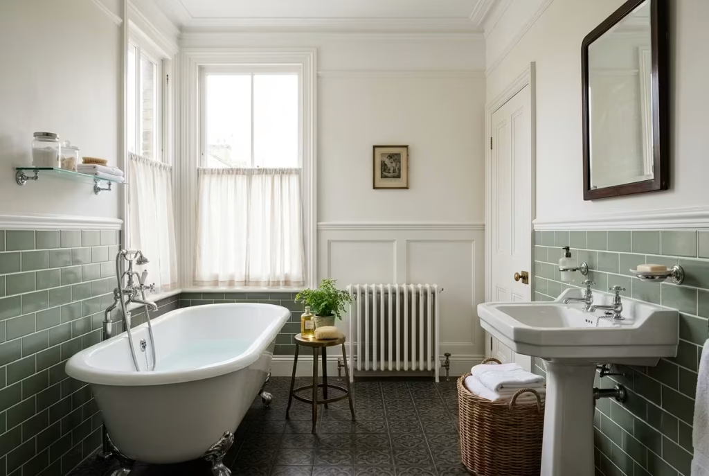
If there’s one idea on this list that feels like it was made for the UK’s housing stock rather than borrowed from somewhere else, it’s this one. Walk through any Victorian or Edwardian terrace, the sort with high ceilings, original coving and a bathroom that was probably squeezed into a former box room decades after the house was built, and you’ll find the bones for this look are already there. Half-tiled sage walls with wainscoting above don’t fight against that period character. They lean into it, the way a good tailor works with your shoulders rather than against them.
The proportion is what separates this from looking charming and looking like a mistake, so let’s be precise about it. Wainscoting, whether you’re using tongue and groove panelling, tiling, or a moulded MDF kit, wants to sit somewhere between 900mm and 1m off the floor in most standard UK bathrooms. That height roughly aligns with where a dado rail would traditionally fall, and it’s not an arbitrary number pulled from a style guide.
It sits just below the average worktop or basin height, so the visual break happens where your eye naturally expects a pause, rather than cutting awkwardly through the middle of a window or a mirror. Get that height wrong, drop it too low and the room looks squat, push it too high and it starts to resemble a wall that’s simply run out of paint, and the whole effect unravels.
Below that line, sage tiling in a metro or classic subway format handles splashback duty beautifully and takes the daily wear a bathroom throws at it. Above the line, a soft off-white or warm white keeps the room feeling light rather than closing in, and it lets the sage do its work without demanding the entire wall. It’s a genuinely lovely way to bring period detail into a bathroom that might otherwise feel like every other new-build on the street.
Where people come unstuck is proportion drift, and I’ve seen it happen more than once. A wainscoting height borrowed from a Pinterest photo of an American colonial home, often sitting far taller than 1m, can look completely out of step with a modest British bathroom ceiling.
The panelling starts eating the room rather than framing it, and instead of period charm you end up with something that reads as dated the moment it’s finished, not in ten years’ time but immediately. Measure your own room, not somebody else’s.
Pros: brings genuine architectural interest to a plain, boxy bathroom; complements period features rather than competing with them; splits the practical (tiling) from the decorative (panelling) sensibly Cons: get the height ratio wrong and it can look dated on day one rather than with age; adds installation complexity and cost compared with a simple painted wall
Sage and Warm Brass Hardware
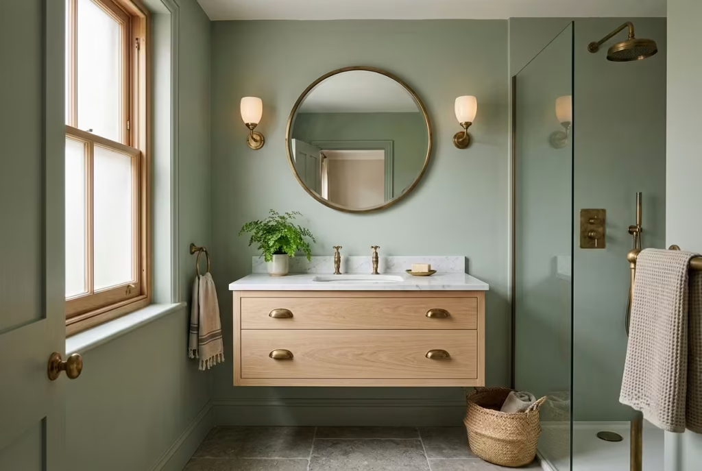
There’s a reason brass keeps coming up whenever people talk about sage green bathrooms, whether that’s a designer’s mood board or the endless back-and-forth on home renovation forums where actual homeowners hash out what worked and what didn’t.
Sage, particularly the cooler, greyer end of the shade spectrum, can turn a little clinical on its own. It needs something to take the chill off. Brass does that job better than almost any other finish, because it carries its own warmth in the metal itself, the way a good wool jumper warms a cool grey suit.
I fitted a pair of unlacquered brass taps in a client’s ensuite in Bath a few years back, paired with a soft, slightly dusty sage on the walls, and the difference it made was almost embarrassing given how small a change it was on paper. The room had felt fine before. Afterwards, it felt considered, like somebody had actually thought about it rather than simply ticked boxes off a suite catalogue.
Now, the bit that genuinely matters if you’re specifying this yourself: lacquered brass and unlacquered brass are not the same product wearing different names, they age in completely different directions. Lacquered brass comes with a clear protective coating that keeps that bright, uniform gold tone locked in place for years, resisting tarnish and fingerprints, and it’s the safer choice if you want the fixture to look exactly the same on day one and day one thousand.
Unlacquered brass has no such shield. It’s raw metal, and it will develop a patina over time, darkening slightly, picking up a warmer, slightly uneven character, especially around handles and taps that get touched daily. Some people adore that living, evolving quality. Others find it looks tired rather than characterful, and there’s no shame in preferring the version that stays put.
Practically speaking, if you’re in a hard water area, and a fair chunk of the UK is, unlacquered brass will show watermarks and limescale more readily than lacquered, simply because there’s no coating between the metal and whatever’s coming out of your taps. It’s not a dealbreaker, but it does mean a bit more upkeep, a wipe-down after use rather than letting droplets sit and dry into spots.
Pros: warms a cool sage instantly, brings genuine character and depth to an otherwise simple scheme, unlacquered options develop a patina many find increasingly beautiful over time Cons: unlacquered brass demands more regular maintenance, especially in hard water areas, and its evolving finish isn’t to everyone’s taste
Sage and Matte Black Fixtures
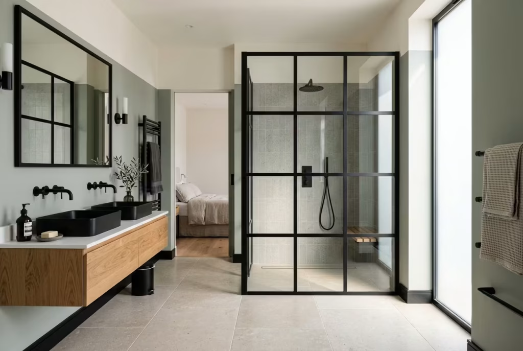
Where brass warms a room up, matte black does the opposite job entirely, and it’s worth understanding that difference before you pick a side. This pairing is sharper, more architectural, closer to the kind of contemporary bathroom you’d see photographed for a design magazine than the softer, more traditional feel brass tends to bring. Against a muted sage wall, black taps and a black shower frame read almost like punctuation, giving the room definite edges rather than letting everything blur softly together.
I did a full ensuite in a new-build near Reading using exactly this combination, matte black taps, a matte black framed shower screen, sage on the lower half of the walls, and the client’s reaction on seeing it finished was that it looked “expensive,” which is about the best compliment a fixture choice can earn. There’s something about that contrast, dark against soft green, that photographs beautifully and lives well day to day, provided you go in with realistic expectations about upkeep.
And here’s the detail that genuinely catches people out, because it’s counterintuitive if you haven’t lived with matte black fixtures before: it’s not the walls that show wear, it’s the taps. A matte black wall or panel is remarkably forgiving, the texture of the finish hides dust and light marks well. Taps are a different story entirely.
Every droplet of hard water that dries on a matte black tap leaves a faint chalky ring behind, and because the surface is matte rather than polished, those marks don’t catch the light and disappear the way they would on chrome.
They sit there, visible, until you actually wipe them off. I always tell clients fitting matte black taps to keep a small microfibre cloth on the side of the basin. It sounds fussy written down, but in practice it takes seconds and becomes second nature within a week.
This is very much a finish for someone who doesn’t mind a bit of ongoing care in exchange for a genuinely striking result, and if you’re in one of the UK’s harder water regions, the East of England or parts of the South East particularly, that maintenance step isn’t optional, it’s just part of owning the look.
Pros: sharp, contemporary, high-contrast finish that photographs and lives beautifully against a soft sage backdrop; walls and larger surfaces hide daily wear well Cons: taps and smaller fixtures show water spotting more visibly than chrome or brass, particularly in hard water areas, and need regular wiping to stay looking sharp
Sage Green Herringbone Tile Flooring
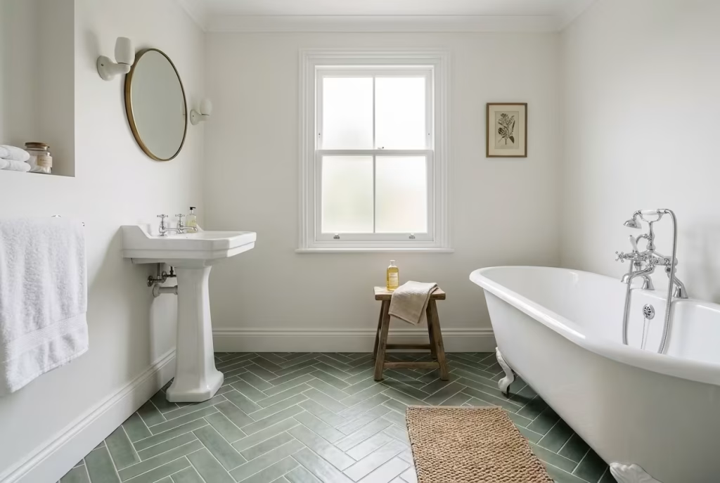
Of everything in this guide, this is the idea I bring up most often to clients who don’t yet know it exists, because floor design is where sage green rarely gets a look-in. Everybody thinks walls, walls, walls, and the floor becomes an afterthought in a pale grey or plain white.
That’s a missed trick. A sage herringbone floor does something a flat wall colour simply can’t: it moves. The zigzag of a herringbone lay catches light differently depending on where you’re standing, and against white walls and fixtures, it turns the floor into the room’s quiet showpiece rather than the bit you walk over without noticing.
On format, there’s more choice than people expect. Traditional herringbone plank tiles typically run around 50mm by 200mm or 75mm by 300mm, giving you a fine, busy weave that suits a smaller bathroom nicely, since the tighter pattern doesn’t overwhelm a modest floor plan.
Larger-format herringbone, sometimes up to 100mm by 400mm, reads more relaxed and contemporary, better suited to a bigger family bathroom where you want the pattern felt rather than fussed over.
Some of the interior forums I follow closely have made this exact point when homeowners debate flooring choices for smaller bathrooms: the scale of the tile matters just as much as the colour, and going too large in a tight space can make the herringbone lay feel cramped rather than elegant.
I fitted this in a narrow, awkward bathroom outside Cheltenham a couple of years back, one of those long, thin rooms that never quite knows what to do with itself, and the herringbone lay genuinely tricked the eye into reading the space as wider than it is.
That’s not a marketing line, it’s simply how a diagonal pattern behaves. It draws the eye across the room rather than down its length, which is exactly what a narrow space needs.
Now, the honest bit, because I won’t sugar the pill. Herringbone is a pattern, not a straightforward lay, and that means labour. A tiler cutting and setting each individual plank at an angle takes considerably longer than laying large-format square tiles in a straight run, and that time shows up on the final invoice.
It’s not a weekend DIY job for most people either, the cuts around the edges of the room need to be precise or the whole pattern looks slightly off. Budget for the pattern itself as much as the tile, because with herringbone, the labour genuinely is where a fair chunk of the cost lives.
Pros: brings visual movement and craftsmanship to a floor that’s usually an afterthought, makes narrow or awkward rooms feel more generous, works beautifully with a restrained wall palette Cons: meaningfully higher labour cost than a standard tile lay, requires a skilled tiler for clean, precise edge cuts
You May also Like: 25 Spanish Bathroom Design Ideas Full of Color, Texture, and Mediterranean Charm
Sage Green with Natural Stone Countertops
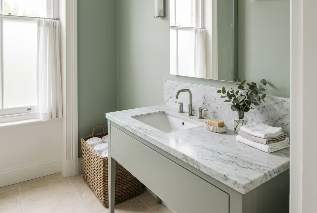
There’s a pairing question I get asked more than most, and it usually goes something like “does stone actually work with a coloured wall, or does it just fight it?” With sage, the answer depends entirely on which vein you choose, and getting that choice right is what separates a countertop that elevates the whole room from one that sits there looking mildly confused about why it’s there.
Stone with cool grey or soft green-grey veining, the kind you find in certain Carrara variants or in quartzite with a subtle grey cast, tends to pick up on sage rather than compete with it. The eye reads them as related, part of the same family of tones, so the countertop feels like it grew out of the wall colour rather than being bolted on top of it.
Stone with strong warm veining, heavy golds or rust-brown streaks running through it, does the opposite. It pulls attention sideways and creates a slight tug-of-war between two things trying to be the main event. I’m not saying warm veining can never work near sage, but it takes a confident hand and usually a bit more brass or wood in the room to bridge the two tones together.
On the practical side, and this matters more than most people realise until they’ve lived with it: natural stone near a basin sits in one of the wettest, most heavily used spots in the entire house. I fitted a honed marble countertop in a client’s bathroom in Gloucestershire a while back, absolutely beautiful stone, soft grey-green through it that sat perfectly against a muted sage wall, and the very first thing I did before it ever saw a drop of water was seal it properly with a penetrating sealer designed for wet areas, not a surface coating that wears off within months. Stone is porous by nature, and around a basin where toothpaste, soap and standing water are a daily occurrence, an unsealed or poorly sealed surface will stain, sometimes permanently, sometimes within weeks rather than years.
That sealing isn’t a one-off job either. Depending on the stone type and how heavily the bathroom is used, most natural stone benefits from resealing every twelve to twenty-four months. It’s a small task, an afternoon at most, but it’s the kind of maintenance that’s easy to forget about until you’re staring at a water ring that won’t budge.
Pros: genuinely elevates the whole palette when the veining is chosen well, brings texture and natural variation that painted or engineered surfaces can’t replicate Cons: porous by nature and requires proper, ongoing sealing to avoid staining near a basin, the wrong veining can visually compete with sage rather than complement it
Small Bathroom, Big Sage Statement (Downstairs Cloakroom Focus)
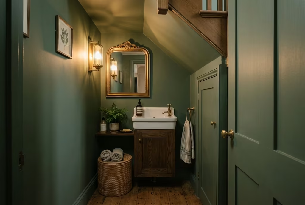
If there’s one room in a British house where people finally let their hair down, decoratively speaking, it’s the downstairs cloakroom. The main bathroom carries too much daily responsibility to risk on a whim, that’s the room everybody uses, morning after morning, and nobody wants to regret a bold choice at seven a.m. before coffee.
The cloakroom, tucked under the stairs or off the hallway, gets none of that pressure. It’s the one room in the house people are genuinely braver in, and I’ve watched clients who wouldn’t touch anything darker than magnolia upstairs go for a deep, saturated sage down by the front door without a second thought.
There’s good reasoning behind that bravery, not just habit. A small, often windowless cloakroom is exactly the sort of space where a darker or more saturated sage tends to work better than people expect, and it runs against what most homeowners assume.
The instinct is always to keep tiny rooms pale, on the theory that light colours make a space feel bigger. In a room with no natural light to bounce around in the first place, that logic doesn’t really hold.
A pale, washed-out sage in a windowless cloakroom can look flat and slightly grubby under artificial light, whereas a deeper, more confident sage embraces the room’s compact scale rather than fighting it, and it reads as intentional rather than apologetic. Confidence, in a small space, often reads better than caution.
That said, this idea comes with one condition that isn’t optional: lighting becomes everything. Without a window to keep the colour honest throughout the day, your artificial light source does all the work, and different bulbs will pull a deep sage in genuinely different directions. Warm LED bulbs, anything around 2700K to 3000K, tend to nudge sage toward a richer, slightly olive warmth.
Cooler bulbs, up around 4000K, push it toward a greyer, more clinical tone that can lose some of that cocooning quality altogether. I always tell clients fitting out a windowless cloakroom to test the actual paint sample under the actual bulb they intend to use, in the room itself, in the evening when the room will realistically get most of its use. A tester pot dries very differently under a hallway pendant than it does on a website swatch.
Pros: low-risk space to experiment boldly without disrupting the household’s daily routine, a saturated sage genuinely suits a small, windowless room better than a pale one often does Cons: entirely dependent on getting artificial lighting right, since there’s no natural daylight to correct a poor bulb choice, and the wrong colour temperature can shift the whole mood of the room
Sage Green Panelling (Tongue and Groove)
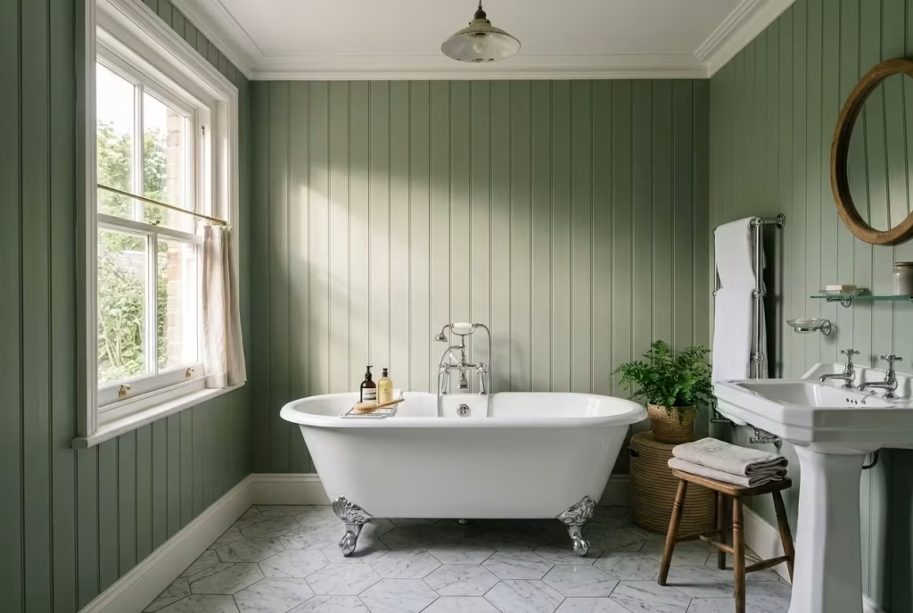
Flat paint and panelling might carry the same colour, but they behave nothing alike once light hits them, and that’s the whole reason this idea deserves its own entry rather than sitting as a footnote under “sage walls.”
Tongue and groove creates a series of shallow grooves and raised edges running down the wall, and every one of those grooves catches a sliver of shadow that flat plaster simply cannot produce.
Watch a panelled wall through the course of a day, morning light coming in low, then afternoon light overhead, then a warm bulb in the evening, and you’ll notice the sage seems to shift in depth even though not a single thing about the paint has changed. That’s the panelling doing the work, not the colour.
On sizing, most tongue and groove boards used in UK bathrooms run somewhere between 95mm and 145mm in width, and the choice between the two ends of that range genuinely changes the room’s character. Narrower boards, closer to 95mm, give a tighter, busier rhythm that suits a more traditional or cottage-style bathroom, echoing the kind of panelling you’d find in a period seaside property.
Wider boards, up around 145mm, read calmer and more contemporary, with fewer joints breaking up the wall, which tends to suit a modern scheme better. As for coverage, panelling to full wall height uses considerably more material and labour than the half-height wainscoting approach covered earlier in this guide, so it’s worth deciding early which effect you’re actually after rather than defaulting to full height out of habit.
There’s a practical bonus here that doesn’t get talked about nearly enough: panelling is remarkably forgiving of a wall that isn’t quite plumb. In older UK properties, and there are plenty of them, walls have often shifted, settled, or been replastered more than once over the decades, and flat paint shows every dip and wave under the wrong light.
Panelling sits proud of the wall on a batten frame, so minor imperfections underneath simply disappear behind it. I’ve used tongue and groove specifically to solve a wonky wall more than once, and nobody’s ever clocked it wasn’t the plan from the start.
Where it can go wrong is scale, particularly in a genuinely narrow bathroom. Panelling adds physical depth to a wall, typically somewhere between 15mm and 25mm depending on the batten and board thickness, and in a room that’s already tight for space, running it floor to ceiling on both sides can start to feel like the walls are closing in rather than adding character. In a narrow room, half-height panelling with a plain painted upper wall almost always reads better than the full commitment.
Pros: adds genuine depth and shadow play that flat paint can’t replicate, disguises uneven or imperfect walls beautifully, suits both period and contemporary schemes depending on board width Cons: eats a small amount of physical space off the wall, which can feel oppressive in a genuinely narrow room if taken floor to ceiling
Sage and Terracotta or Warm Clay Tones
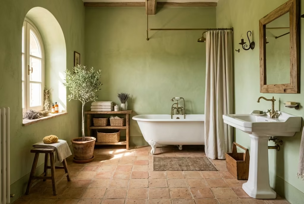
This is the pairing I bring out when a client tells me their bathroom feels a bit too polite. Sage on its own, especially the paler end of the shade, can drift toward gentle and safe if you let it, and there’s nothing wrong with that if gentle is what you’re after.
But bring warm terracotta or clay tones into the mix, and the whole room shifts register entirely, from a quiet English garden to something closer to a farmhouse kitchen in Puglia. It’s a bolder move, undeniably, but it’s one of the most characterful pairings on this entire list when it’s handled with a bit of nerve.
The finish you choose on the terracotta side decides whether this pairing sings or squabbles, and it’s not something to leave to chance. Matte, unglazed terracotta tile, the kind with a slightly chalky, sun-baked surface, sits beautifully alongside sage because both materials share that same muted, earthy quality, neither one shouting over the other.
Glazed terracotta, by contrast, brings a shine and a saturation to the orange tone that competes rather than complements, and against a soft sage wall it can start to look like two different rooms got squeezed into one. If you’re set on terracotta, hunt down the unglazed, honed, or lightly waxed finishes rather than the glossy versions, and the pairing will hold together far more convincingly.
I did a client’s bathroom near Bath a couple of years back where we ran matte terracotta floor tiles against a warm, slightly golden sage on the upper walls, with white fixtures keeping the whole thing from tipping into overload. It took genuine confidence on the client’s part, she nearly backed out at the sampling stage, worried it would feel too much, too rustic, too far from what everyone else on the street had done. It didn’t. It felt like the one bathroom on the street with actual personality.
That confidence point is worth dwelling on, because this pairing genuinely isn’t for everyone, and I’d rather say that plainly than oversell it. Two warm, earthy, saturated tones sitting side by side can tip into visual heaviness if you’re not careful, particularly in a smaller room without much natural light to lift it.
The easiest way to overdo it is piling on too much of both at once, terracotta floor, terracotta splashback, and sage on every wall, with nothing pale to give the eye somewhere to rest. Keep one element quiet, whether that’s white fixtures, a pale ceiling, or simply less terracotta than your instinct first suggests, and the balance holds.
Pros: rich, characterful, and genuinely distinctive against the more common pale sage schemes, brings warmth and texture that few bathrooms in the UK actually attempt Cons: requires real confidence to pull off well, and it’s easy to tip into visual heaviness if both tones are used too generously without a pale element to balance them
You May also Like: 31 Beautiful Coastal Bathroom Ideas to Inspire Your Next Remodel
Sage Green with Exposed or Reclaimed Wood
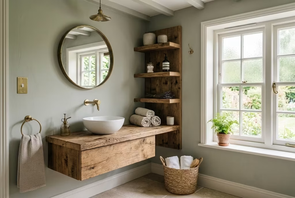
Of every pairing in this guide, this is the one that grounds a room most convincingly, in the literal sense of the word. Sage on its own has a slightly ethereal quality, it floats, it softens, it can feel a touch weightless if there’s nothing solid anchoring it down. Bring in exposed or reclaimed timber, a beam, a shelf, an old floorboard repurposed as a vanity top, and suddenly the room has roots. It stops looking like a colour scheme and starts looking like a space that’s actually lived in.
Not every timber belongs in a bathroom, though, and this is where good intentions go wrong more often than people expect. A bathroom is one of the most hostile environments in the house for wood, humidity climbing every time someone runs a hot shower, condensation settling on any cool surface within reach.
Softwoods like standard pine will swell, warp, and eventually rot if they’re left untreated in that kind of environment, no matter how lovely they looked in the reclaimed yard. The species that actually hold up are the denser hardwoods, oak and teak being the two I reach for most often, since both have natural oils and a tighter grain that resists moisture far better than most softwoods manage.
Reclaimed scaffold boards, provided they’re properly kiln-dried and sealed before fitting, are another favourite of mine for exactly this kind of project, they bring genuine character without the premium price tag of aged oak.
The treatment itself matters just as much as the species you start with. Untreated timber in a wet room is asking for trouble within a year, sometimes less. A proper marine-grade varnish or a penetrating oil finish designed for high-humidity environments creates a barrier that keeps water from soaking into the grain, and I always specify at least two, often three, coats before the wood goes anywhere near a working bathroom.
Even then, this isn’t a fit-and-forget material. Most oiled timber in a bathroom benefits from re-oiling roughly once a year, sometimes every six months in a genuinely steamy family bathroom, to keep that protective barrier topped up rather than letting it wear thin and leave the wood exposed.
I used reclaimed oak floorboards, cut down and mounted as open shelving, in a bathroom outside Stroud a while back, paired with a soft, slightly grey-leaning sage on the walls, and it remains one of my favourite finished rooms purely for how effortless the combination looks despite the actual planning that went into keeping that wood alive in a wet environment. Effortless on the surface, considered underneath, which is really the whole point of good design.
Pros: brings genuine warmth, texture and a sense of history that painted or tiled surfaces can’t replicate, grounds sage’s softer, more ethereal quality beautifully Cons: demands the right species and proper moisture treatment from the outset, and needs periodic re-oiling to stay protected rather than being a true set-and-forget material
Sage Green Bathroom with a Freestanding Bath as the Anchor
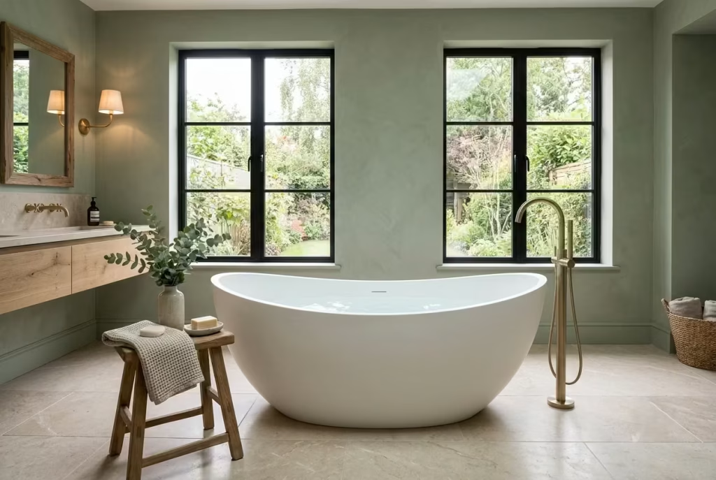
There’s a specific kind of disappointment I see in this job more than most, and it’s a client falling in love with a freestanding bath online, ordering it, and then discovering it simply won’t sit comfortably in their room. This isn’t an idea you can retrofit into any old bathroom. It’s one you plan the whole room around, and the shape of the space matters more here than in almost anything else on this list.
A freestanding bath wants a room with enough breadth to let it sit as an object in space, rather than being wedged against two walls the way a standard bath is. Square or generously proportioned rectangular rooms handle this far better than long, narrow ones, because the bath needs clearance on more than one side to actually read as freestanding rather than simply awkward.
As a working minimum, I tell clients to allow at least 700mm of clear floor space around the sides and end of the bath for it to feel like a considered centrepiece rather than an obstacle you shuffle past. Anything tighter than that, and the eye stops seeing “statement bath” and starts seeing “trip hazard,” which rather defeats the purpose.
Against a sage backdrop, this is genuinely one of the most striking combinations available to you. A pale or mid-tone sage wall makes a white freestanding bath glow by contrast, the way a good frame lifts a painting rather than competing with it, and it gives the room that hotel-suite quality people are usually chasing when they mention wanting their bathroom to “feel like a spa.”
I fitted one in a loft conversion near Cirencester, a room that had been deliberately left open plan with the bath positioned to catch the light from a roof window, sage on the walls behind it, and it remains one of those rooms clients send photos of years later, still delighted with it.
The honest limitation, and I’d be doing you a disservice not to say it plainly, is that a great many UK bathrooms simply don’t have the floor area this idea needs. Older terraces and standard semi-detached houses were rarely built with a freestanding bath in mind, and forcing one into a room that’s genuinely too tight for it tends to make the whole space feel cramped rather than luxurious, working against the very effect you’re after.
If your bathroom is under roughly four square metres, it’s worth being realistic before you fall for the bath itself rather than the room it needs to live in.
Pros: creates a genuine hotel-like focal point, pairs beautifully with sage by letting the wall colour frame the bath rather than compete with it Cons: demands real floor space many standard UK bathrooms don’t have, and cramming one into too tight a room undermines the entire effect
You May also Like: 25 Bathroom Mirror Ideas That Balance Design, Light, and Everyday Use
Sage Green with Patterned or Encaustic-Style Floor Tile
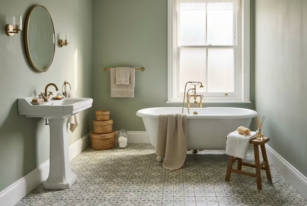
Sometimes the cleverest decorating move is knowing when to stay quiet, and this idea is built entirely on that principle. Instead of asking sage to carry the whole room, you keep the walls deliberately restrained, a soft, plain sage or even a pale off-white, and let a patterned or encaustic-style floor do all the talking underfoot. It flips the usual hierarchy on its head. The floor becomes the room’s personality, and the walls simply provide the calm backdrop it needs to be seen properly.
I like this approach for clients who love pattern but worry, quite reasonably, about living inside it on every wall. A patterned floor gives you all that character in a plane you view from above and around, rather than one staring back at you every time you look up from the basin. Encaustic-style tiles, whether genuine cement encaustic or the more practical porcelain versions that mimic the look with far less maintenance fuss, bring a handmade quality to the room that flat sage tiling simply can’t replicate on its own.
Scale is where this idea can quietly unravel if you’re not careful, particularly in a smaller UK bathroom. A busy, large-repeat pattern that would look glorious across a generous hallway can feel chaotic and cramped once it’s squeezed into a two or three square metre room, because there’s no distance to let the pattern breathe before it hits a wall or a bath panel.
My rule of thumb is simple: the smaller the room, the smaller and more restrained the repeat should be. A tight geometric pattern with a repeat under roughly 150mm tends to sit far more comfortably in a compact bathroom than a bold, sprawling design meant to be viewed from several metres back. Save the larger, showier patterns for bigger spaces where the eye has room to take them in properly.
I fitted a pale sage half-height wall scheme with a soft, muted encaustic-effect porcelain floor in a small bathroom near Bristol, greys and greens in a tight, repeating geometric pattern, and the client’s instinct beforehand had been to worry it would feel busy. It didn’t. Because the walls stayed so quiet, the floor had every bit of room it needed to be the star without the whole space feeling overloaded.
The trade-off worth knowing before you commit is permanence. Paint is forgiving. If you fall out of love with a wall colour in a few years, it’s an afternoon’s work to change your mind. A patterned floor, particularly a proper encaustic-style tile bedded and grouted in, is not something you casually swap out on a whim. Choose a pattern you can genuinely see yourself living with for a decade, not just the one that photographed best on your phone last week.
Pros: adds genuine character and a handmade quality without overwhelming the walls, avoids the slightly flat, overly matched look that too much of one colour can create Cons: far more permanent and costly to change than paint, and getting the pattern scale wrong in a small room can tip the effect from characterful into chaotic
Dark, Moody Sage (Near-Black Green) for a Statement Ensuite
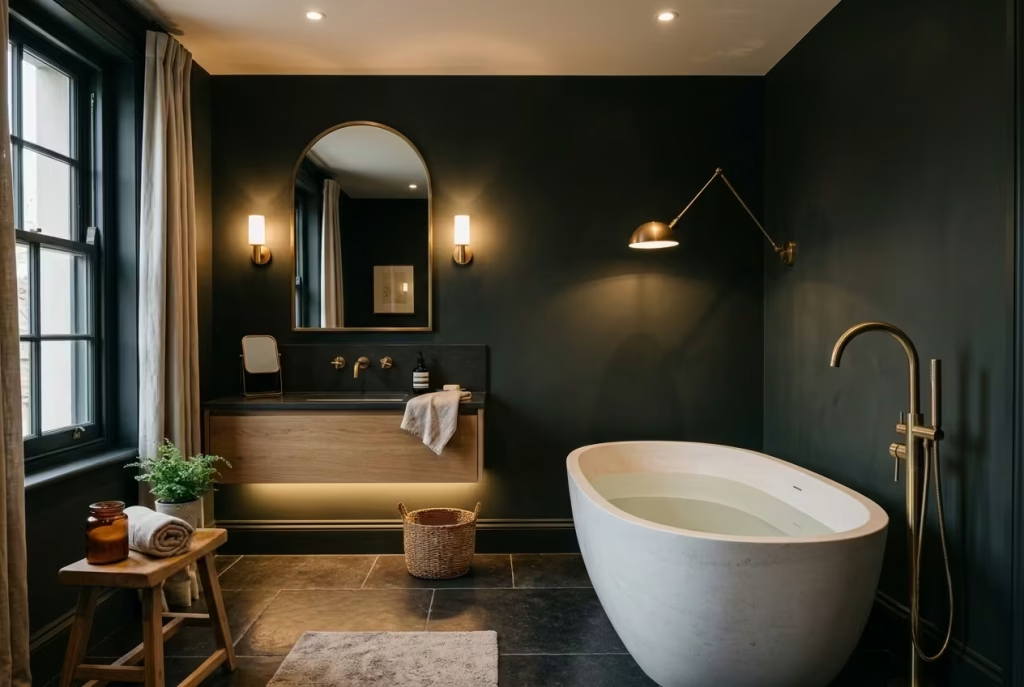
Every guide like this needs a closing statement, something that pulls all the confidence you’ve built through fifteen ideas into one last, bold move, and this is it. Near-black sage, sometimes sold under names that lean toward “hunter” or “bottle” green rather than sage itself, but sharing that same soft, muted undertone, isn’t a colour you ease into gently. It’s a colour you commit to fully, and when it’s done properly, the results feel less like a bathroom and more like the sort of ensuite you’d find tucked behind the door of a boutique hotel room, the kind you don’t want to leave.
Here’s what makes this different from every paler shade covered earlier in this guide, and it’s not really about the colour at all. It’s about light. A pale sage forgives a poor lighting scheme because there’s enough reflectivity in the colour itself to bounce whatever light is available around the room.
A near-black sage does the opposite. It absorbs light rather than reflecting it, which means a single central pendant, the sort of bare overhead fitting that gets away with murder in a white bathroom, will leave a dark sage room feeling flat, gloomy, and frankly a bit like a cave rather than a cocoon. The line between those two words, cave and cocoon, is entirely down to how many light sources you’ve actually planned for.
Getting it right means layering light rather than relying on one fitting to do all the work. I always specify at least three distinct sources in a dark ensuite: task lighting around the mirror, ideally either side rather than above, to avoid harsh shadows falling across the face, a warm ambient source, whether that’s a pendant or a run of downlights, and then something lower and softer, a wall light or even LED strip lighting under a vanity unit, to stop the room reading as one flat block of darkness from floor to ceiling.
Warm colour temperatures matter enormously here too, staying around 2700K rather than drifting toward cooler daylight bulbs, because cool light against a near-black green can turn the whole room slightly clinical rather than enveloping, working directly against the mood you’re trying to create.
I did exactly this in a client’s ensuite outside Cheltenham, walls in a deep, almost black-green, brass fittings picking up the light beautifully once the layering was sorted properly, and it remains one of the rooms I’m proudest of on the whole portfolio. It photographs like something from a five-star hotel brochure, but more importantly, it lives that way too, every single morning, not just for the camera.
Pros: genuinely luxurious, cocooning, and distinctive, the kind of statement room that photographs and feels expensive in equal measure Cons: entirely dependent on getting a proper layered lighting scheme right, a single poorly placed light source can tip the effect from luxurious into genuinely gloomy
How to Achieve a Perfect Sage Green Bathroom
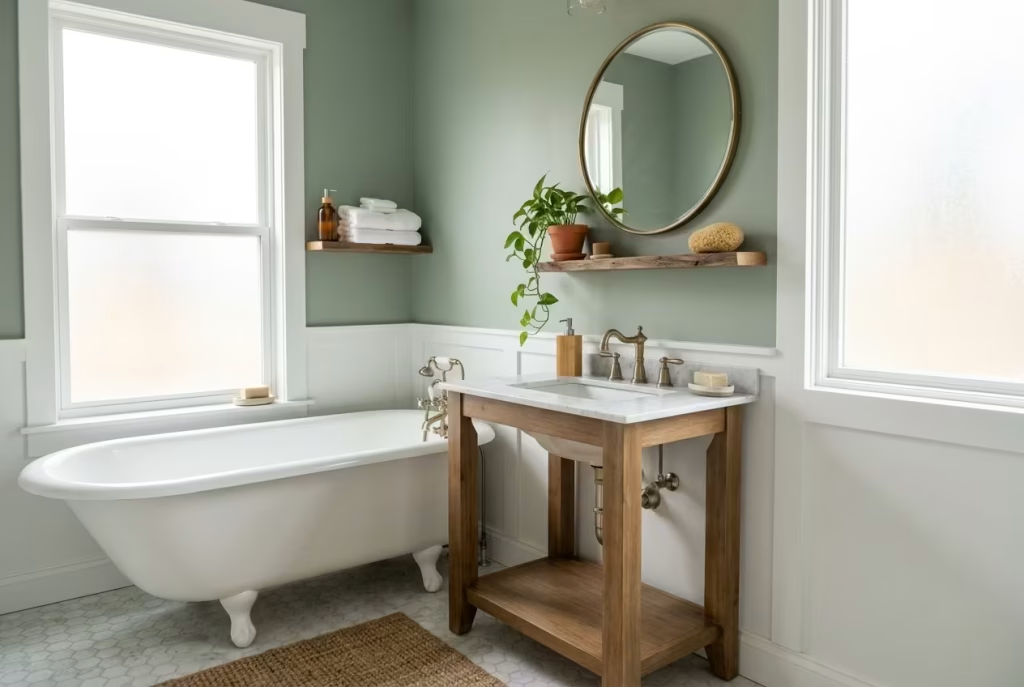
Everything in the sixteen ideas above assumes you’ve already made the big decision, sage, yes, this is the colour. What nobody tells you is that the gap between “I love this colour” and “this bathroom actually looks right” is where most people trip up, not in the choosing but in the doing. This is the practical spine that holds the whole thing together, the bit worth reading properly before a single tin of paint gets opened.
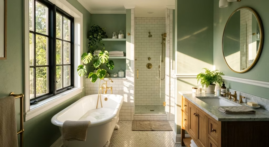
Start with the light your room actually gets, not the light you wish it had. A north-facing bathroom, cool and flat for most of the day, needs a warmer-leaning sage to stop it looking grey and lifeless by mid-afternoon. A south-facing room flooded with direct sun can take a cooler, greyer sage without it ever feeling clinical, since the warmth of the light does half the work for you. Stand in your bathroom at three separate points during the day, morning, midday, evening, before you settle on a shade. It sounds like overkill until you’ve watched a “perfect” sample turn faintly swamp-like the moment the sun drops behind next door’s roofline.
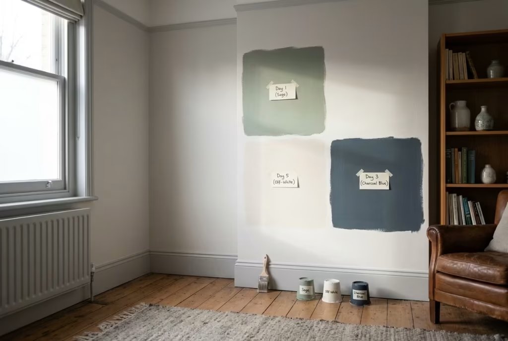
Sample properly, not lazily. A postage-stamp swatch propped against the skirting tells you almost nothing. Paint a section at least 30cm square directly onto the wall, ideally in more than one spot, since light hits different walls of the same room quite differently. Live with it for the better part of a week. Colours that look confident on day one sometimes turn a bit shouty by day five, and it’s far cheaper to discover that with a sample pot than with four walls fully painted.
Decide your undertone before you buy a single tile. Cool, grey-leaning sage and warm, olive-leaning sage are not interchangeable, and mixing the two families in one room is where a lot of otherwise lovely schemes come slightly unstuck. If your fixtures, taps, worktop, existing flooring, lean warm, oak, brass, cream stone, choose a sage with a touch of warmth in it. If everything’s cooler, chrome, pale grey stone, white marble, stick to the greyer end of the sage spectrum. Hold your sample directly against those materials before committing, not against a white wall in the shop.
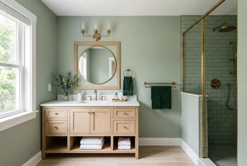
Balance the palette using something close to the 60/30/10 rule. Let sage dominate roughly 60 percent of the visible surface, walls or tiling, whichever you’ve chosen as the main event. Bring in a secondary neutral, white, cream, natural wood, at around 30 percent, on trim, vanity or flooring. Then let a genuine accent, brass, black hardware, a single bold towel, take up the final 10 percent. Rooms that ignore this ratio, going too heavy on sage everywhere with nothing to break it up, are the ones that end up feeling flat rather than considered, no matter how lovely the shade itself was on the chart.
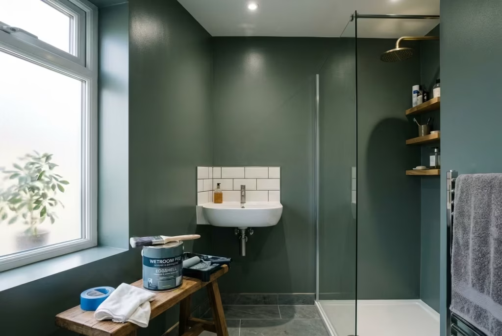
Get your finish right for a wet room, every time. Standard matt emulsion has no business anywhere near a shower or a basin splashback. Specify a proper bathroom-rated paint, typically a durable eggshell or a specialist moisture-resistant formula, on any wall that takes regular steam or splash contact. It costs a little more per tin and it’s worth every penny when you’re not repainting peeling patches eighteen months later.
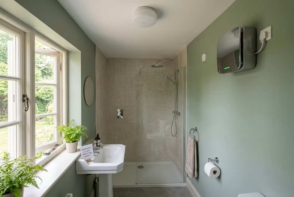
Think about ventilation before you think about aesthetics. This is the detail almost every inspiration piece skips entirely, and it’s arguably the one that determines whether your sage green bathroom still looks good in five years or starts showing damp patches and flaking paint in two. A bathroom without proper extraction, whether that’s an extractor fan running for a sensible period after every shower or genuine cross-ventilation from a window, will trap moisture regardless of how well you’ve sealed your stone or treated your timber. Good ventilation isn’t a footnote here. It’s the difference between a room that ages gracefully and one that doesn’t.
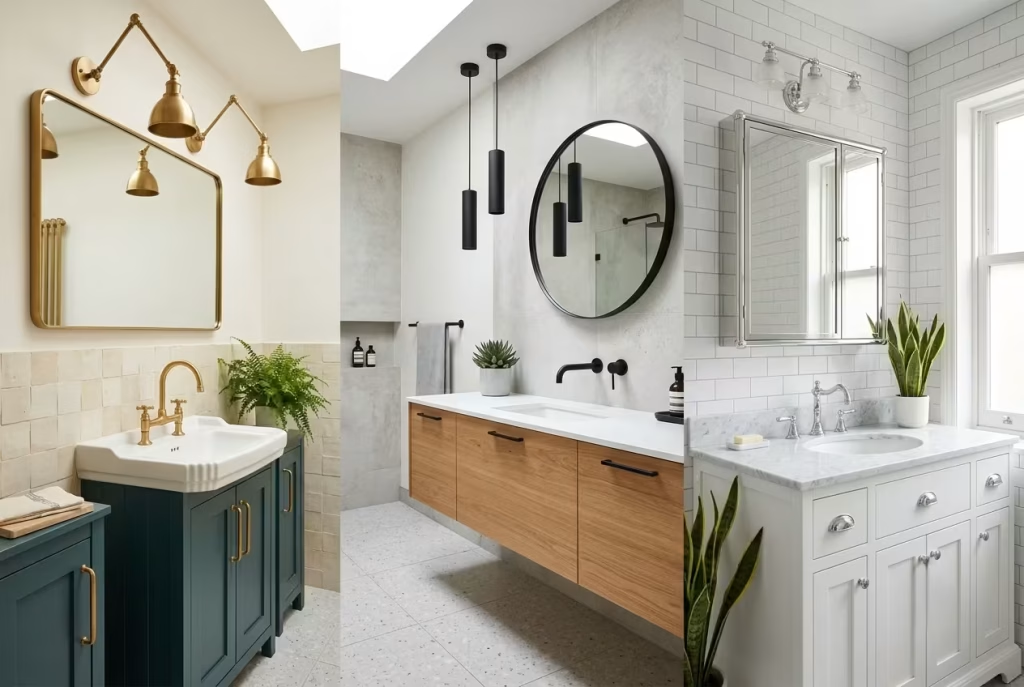
Choose your hardware and finishes to match the mood you actually want, not the trend of the moment. Warm brass for softness, matte black for something sharper and more graphic, chrome if you’d rather keep things quietly classic. Whichever you choose, stay consistent across taps, handles and any lighting fixtures in the room. A mix of finishes that weren’t chosen deliberately reads as accidental rather than eclectic, and that’s rarely the effect anyone’s actually going for.
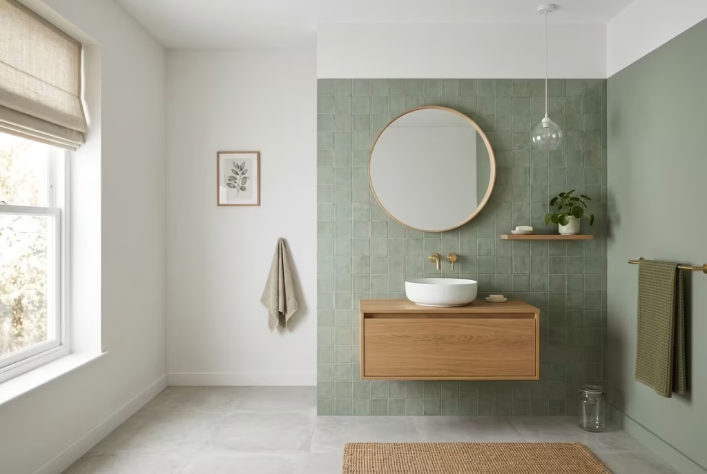
Finally, give the room somewhere to breathe. Whether that’s a plain white ceiling, a single quiet wall left untiled, or restraint on accessories, every successful scheme in this guide has one element that stays deliberately understated. Sage is a generous colour, but even the most generous colour needs a little negative space to actually be seen properly rather than simply absorbed into a wall of its own making.
Get these fundamentals right and the specific idea you choose from the sixteen above becomes far less of a gamble. The colour was never really the risky part. The planning underneath it always was.
You May also Like: 30 Stunning Desert Bathroom Design Ideas for a Warm, Natural Look
Common Mistakes to Avoid while designing a Sage Green Bathroom
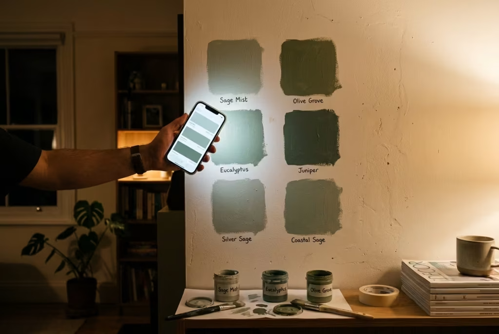
Choosing the shade from a screen, not the room. Every sage swatch looks slightly different lit by a phone screen at nine in the evening than it does on your actual wall at seven in the morning. Always buy a proper sample pot, paint a section directly on the wall rather than a scrap of card you move around, and live with it for a few days before committing. What reads as fresh and green on a laptop can turn out grey and a bit flat once it’s actually up.
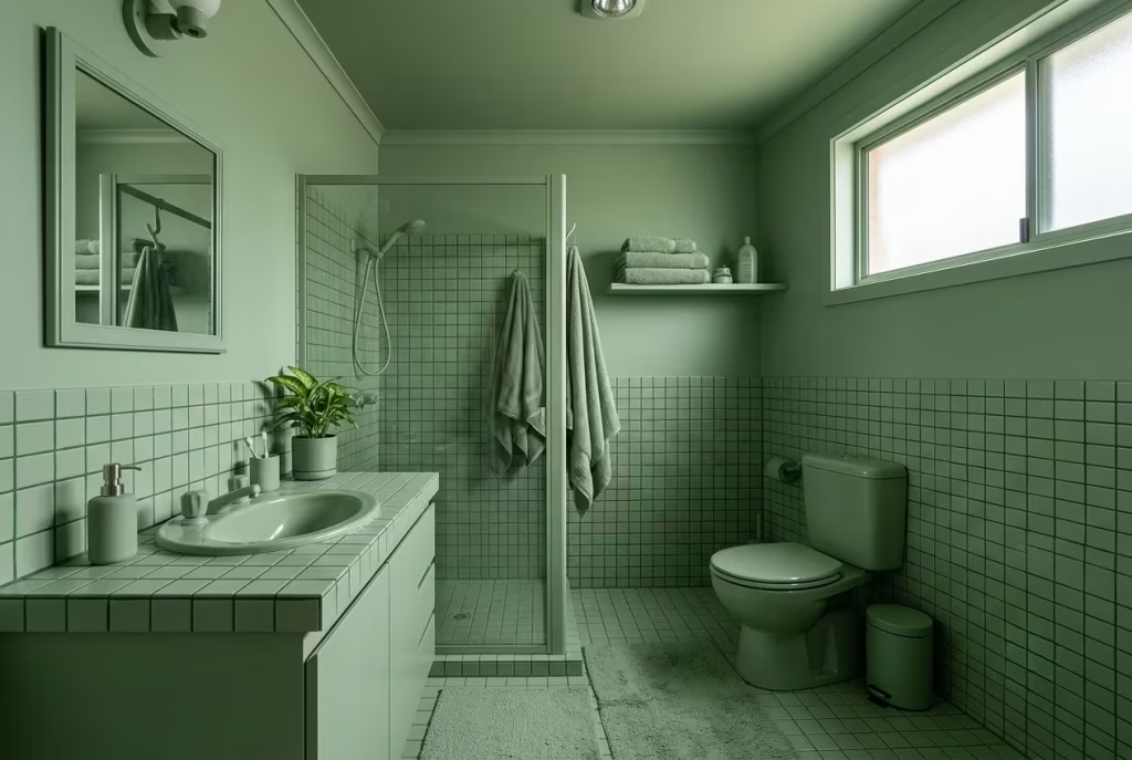
Matching everything too closely. A bathroom where the walls, tiles, towels and accessories are all the same tone of sage stops looking considered and starts looking like it ran out of other ideas. The strongest schemes in this guide work because something stays quiet, white fixtures, pale grout, a plain ceiling, giving the eye somewhere to rest.
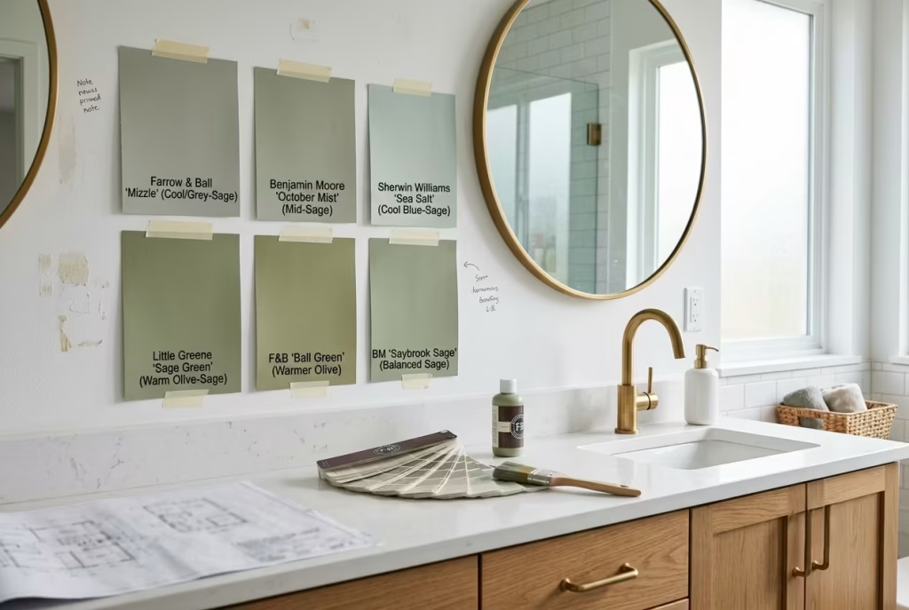
Ignoring undertone against your fixtures. Cool, grey-leaning sage can clash with warm brass or oak that’s already in the room, and nobody notices until it’s tiled and too late to change cheaply. Hold your paint sample next to your actual taps, worktop or flooring before ordering anything.
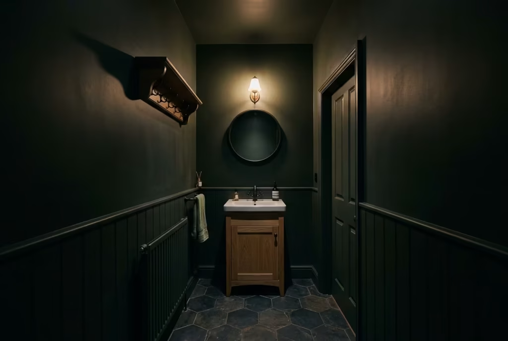
Skipping the lighting plan in a dark scheme. A near-black sage or a windowless cloakroom without proper layered lighting will read as gloomy rather than luxurious, no matter how good the colour choice was on paper.
Treating porous or organic materials as maintenance-free. Natural stone and exposed timber both need proper sealing and periodic upkeep near water. Skipping that step is the fastest way to regret a beautiful material within a year.
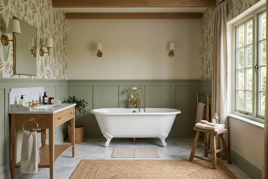
Copying a room proportion that isn’t yours. Wainscoting height, panelling depth, freestanding bath clearance, all of it needs to suit your actual room, not the one in the photo you saved. Measure first, decide second.
Final thoughts about Sage green bathroom
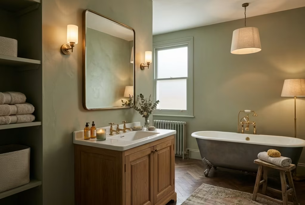
Choosing between these sixteen isn’t really about ranking them, since half of them would look wrong in the very room where another one would sing. Start with what you actually have: a small, windowless cloakroom wants confidence and layered light, not a pale wash that flattens under a single bulb. A generous, tall room can carry full tiling or a freestanding bath in a way a narrow terrace bathroom simply can’t. And be honest with yourself about temperament too. Some people want colour they can repaint on a whim. Others want to commit properly and let a room grow into itself over years, not months.
If you’re still weighing up whether sage is the right long-term choice at all, rather than which version of it suits your space, that’s a slightly different question, and one worth answering properly before you pick up a paintbrush.
There’s no single correct way to do this. There’s only the version that suits the room you’re actually standing in, and the person you actually are when the lights go down and the steam clears.
You May also Like: Mid-Century Modern Bathroom Ideas: 26 Ways to Create a Timeless, Stylish Space
Frequently Asked Questions
Is sage green a good colour for a bathroom?
Genuinely, yes, and not just because it’s having a moment. Sage sits in that rare category of colours that flatters almost every skin tone under bathroom lighting, works with both cool and warm hardware if you choose the right undertone, and doesn’t fight against natural materials like stone, wood or brass the way some bolder greens can. The people who end up disappointed with it are usually the ones who picked a shade off a screen without checking it against their own light. Get that part right and sage rarely lets you down.
Will sage green bathrooms look dated in a few years?
This is the question that comes up more than any other, on forums, in client consultations, everywhere, and the honest answer is that it depends far more on how you use sage than whether you use it at all. Painted walls are low commitment and easy to refresh if tastes shift down the line. Sage baked into permanent fixtures, full tiling, cabinetry, a bathroom suite itself, carries more risk of feeling tied to this particular moment. If you’re worried about longevity, lean on paint and soft furnishings for your sage and keep the expensive, permanent choices in a genuine neutral.
What colours go best with sage green in a bathroom?
White and cream do the heavy lifting in most successful schemes, keeping the room feeling light and giving sage room to breathe rather than closing everything in. Beyond that, warm brass and natural wood bring out sage’s softer, more organic side, while matte black pushes it in a sharper, more contemporary direction. Terracotta and warm clay tones work too, though that pairing wants a confident hand rather than a cautious one. What consistently trips people up is warm wood clashing against a cool, grey-leaning sage, so always check your undertones sit together before committing to anything.
What is the best shade of green for a bathroom?
There isn’t one single “best,” despite how often that phrase gets searched, because the right shade depends entirely on your room’s light and your own fixtures. A cooler, grey-leaning sage suits a bright, south-facing bathroom beautifully but can turn flat and grey in a dim, north-facing room. A warmer, olive-leaning sage does the opposite, glowing in low light but occasionally looking a touch heavy in a room already flooded with sun. Test properly on your own walls rather than trusting a name on a paint chart to make that decision for you.
Does sage green make a small bathroom look bigger or smaller?
Both, and which one depends entirely on how you use it, which is probably the least satisfying answer in this whole FAQ but also the truest. A pale, soft sage kept consistent across walls and ceiling can make a small room feel calm and cohesive rather than boxed in, since there’s nothing chopping the space up visually. A darker, more saturated sage in the same room can either feel cocooning and intentional, or genuinely shrink the space, depending almost entirely on whether the lighting has been properly layered to support it. Small rooms aren’t automatically ruled out of bold colour. They just demand more thought about light before you commit.
Does sage green work in a bathroom with no natural light?
It can work brilliantly, and this genuinely surprises people. A windowless cloakroom or ensuite often handles a deeper, more saturated sage better than a pale, washed-out one, since artificial light can make a light sage look flat and slightly lifeless without daylight to keep it honest. The one non-negotiable is getting your bulb choice right. Warm, low colour-temperature lighting, roughly 2700K, keeps a dark sage feeling rich rather than murky. Cooler bulbs tend to drain the warmth out of the colour and can leave the whole room feeling a bit clinical.
What hardware finish goes best with sage green?
Brass and matte black cover the vast majority of successful pairings, and for good reason. Brass warms up a cooler sage and adds a sense of quiet luxury, while matte black sharpens the whole look into something more graphic and contemporary. Chrome isn’t wrong exactly, but it tends to read as the safest, least characterful option against sage specifically, more of a default than a considered choice. Whichever you pick, keep it consistent across taps, handles and lighting rather than mixing finishes without a clear reason.
How do I stop my sage green paint looking grey or “off” once it’s on the wall?
This is one of the most common frustrations people run into, and it’s almost always down to one thing: testing the colour somewhere other than the actual room. Paint samples shift dramatically depending on the light source, the surrounding wall colours, even the finish of the paint itself. Always paint a proper-sized sample, at least 30cm square, directly onto your own wall, and check it morning, midday and evening before deciding. A sage that reads perfectly green on a laptop screen can genuinely look like a completely different, greyer colour once it dries in your actual bathroom.
Is sage green too much for a small bathroom or cloakroom?
Not remotely, provided the choice is deliberate rather than accidental. Small spaces, particularly a downstairs cloakroom, are actually where people tend to feel braver, since there’s less daily pressure riding on the decision compared with a main family bathroom used every morning. The mistake to avoid isn’t boldness itself, it’s boldness without a lighting plan behind it. A small room in a rich, saturated sage with good layered lighting can feel like one of the most memorable rooms in the house.
What’s the difference between sage green and other muted greens like eucalyptus or olive?
They sit close together on the colour wheel but read quite differently once they’re actually on a wall. Sage tends to carry a soft grey undertone, giving it that calm, slightly dusty quality people associate with the colour. Eucalyptus leans a touch cooler and more blue-green, often reading fresher and a little brighter. Olive sits at the warmer, more yellow-toned end, feeling earthier and occasionally heavier in a small space. If a sage sample is looking greyer than expected, eucalyptus or olive alternatives are worth testing side by side before ruling green out altogether.